Before coming to ADM, I had a very difficult time being myself in my Junior college. I hated my classmates and hardly talk to them, well unless its absolutely necessary. I was uncomfortable with them, it felt like I wasn’t accepted because of my strong and radical opinions. Throw in the stress of preparing for “A” levels along with preparations of art, I became even more withdrawn, and barely talked to my classmates. But, I found a awesome group of friends in my Junior college too. That group of friends are my art classmates with one of them being your student in the earlier class, Jocelyn. As I felt very comfortable with them, my energy level kinda exploded. its like a 180 switch from a quiet and reserve girl to this ball of nonsensical energy. As I was very all of with my classmates, this lead to many misunderstanding such as I’m a stuck up, After junior college, I went to a design firm for an internship. There I struggled to put extroverted facade as I constantly wanted to go back to my safe zone. this project will be based off my roller coaster feelings through the day in the office.
The four aspects that I want touch on are:
Nervous me + first day at work = putting on a facade
Inexperienced me + paper work = Silent rage
Awkward me + office cafeteria = seating arrangement dilemma
tired me + my safe zone = recharging time
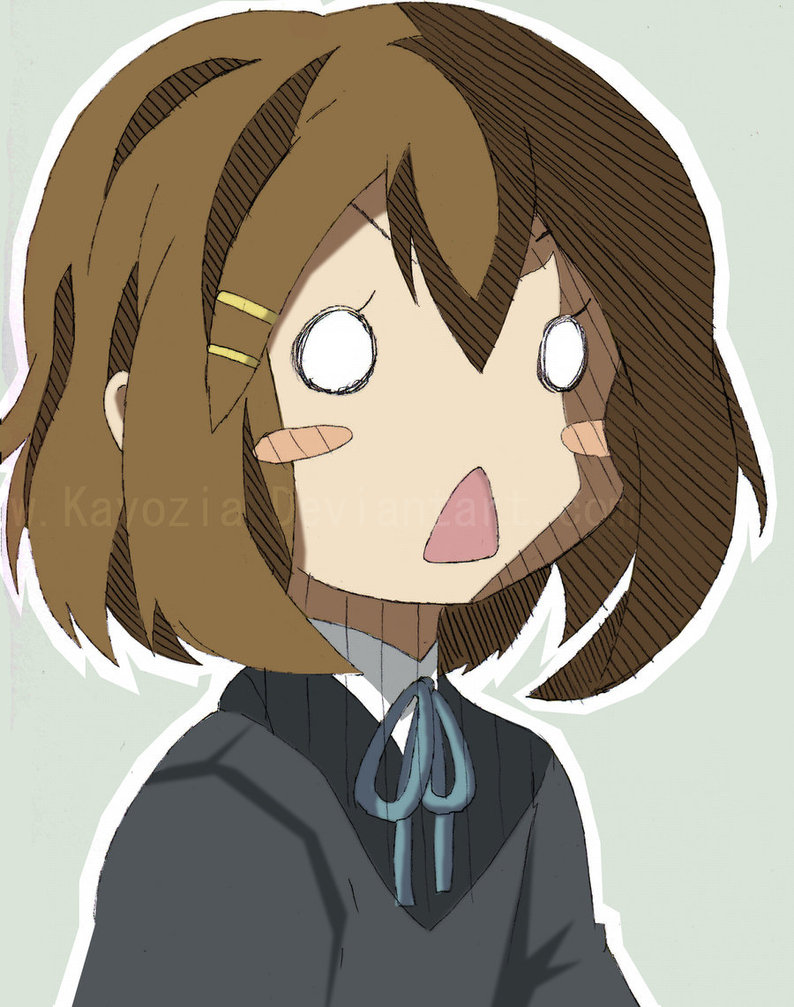
for my stylist inspiration, I’m greatly inspired by the facial expression of anime characters. I like how Managua tend to over exaggerate the eyes and the facial color to express the emotion. in addition I will be using her hair to further exaggerate her emotions.Below are some of the characters I have taken inspiration from:
Tadakoro Megumi – Food wars
Yui – K-On
my second source of inspiration is retros Afshar. I like his use of simple geometric shapes to establish the back ground setting. I also like his simple two tone illustration, making the character look flat but has enough shades to differentiates the shirt and the pants
I find solace in the silence. Often, when I’m bored, I would picture myself as the main character if a story. This allows me to escape into a fictional world, away from all my stress and my problems.
I tried to create a portal of dimensions into my fantasy world. Inspired by null gravity, where directions do not exist. I made use of different motif to create patterns that do not have to be seen from a specific direction This makes the work more interesting and dynamic, similar to my ” inner world”. I will be developing this piece for my final, by incorporating principles of designs.
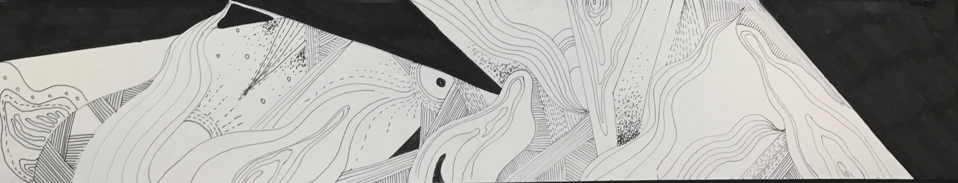
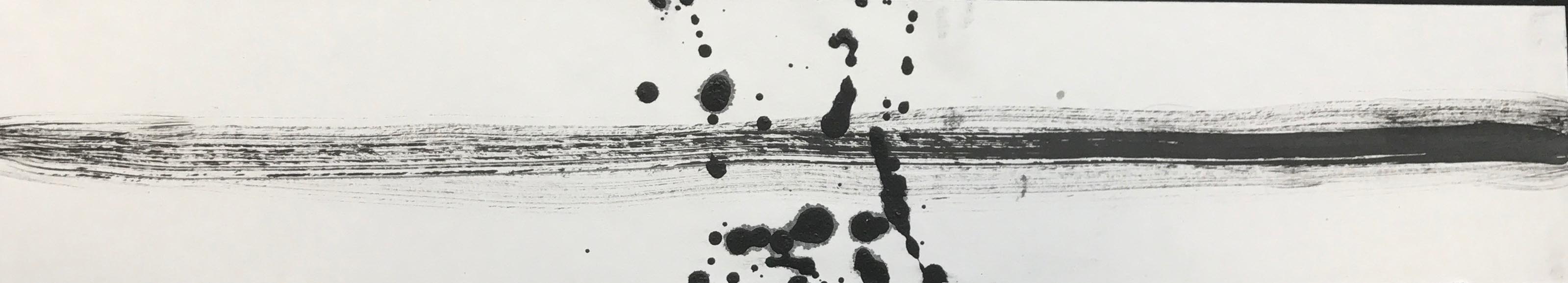
ANXIETY
ANXIETY
I experienced a breakdown during my J2 in Nanyang Junior Colledge. I couldn’t balance my academic studies with the huge amount of time I spent in art. Furthermore, I didn’t get along very well with my classmates. This made me feel very suffocated and isolated in my JC. For the feeling of fear, I will focus on the different aspects of anxiety I felt during my A-level period.
The scribbles of my pen represent my emotional state, where my mind is in a jumble. The dark harsh strokes done in black acrylic paint represents my mental state, where anxiety has hijack and taken over my body, rendering me useless. Finally, the hazy black part done by dabbing paint represents my physical state, where everything is in a haze, where I cannot think properly. Tracing paper is used to bring across the idea that anxiety is a complex multi-layered emotion.
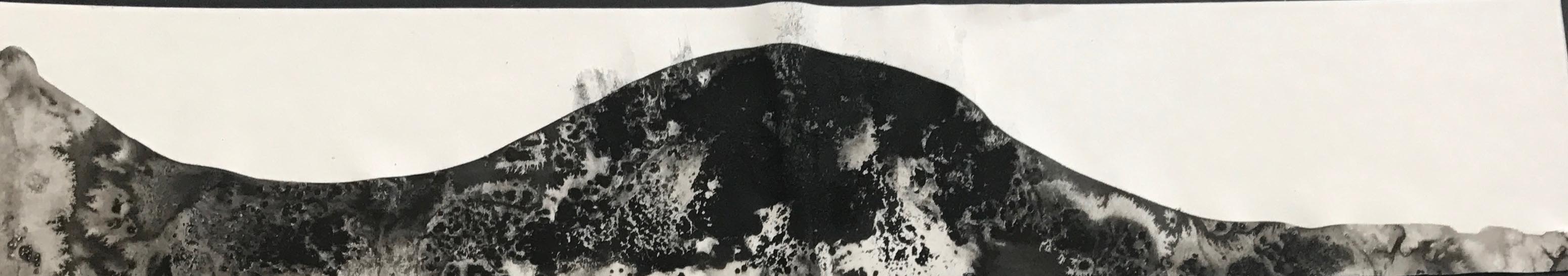
SADNESS
SADNESS
I based this emotion of my sadness in the parting of my close friend to London. I met her seven years ago at tuition, where we bonded over cookies. ( I was ten years old then) We then coincidentally went to the same secondary school and were classmates for 4 years. She has been a constant, a given in my life. However, on the 21 of September, she will be heading over to Goldsmith London to further her studies. To me, sadness hits the hardest when you take things for granted.
For this piece, I used is salting. After being with someone for a very long time, they own a tiny part of you. When they leave, you will feel empty. Similarly salt absorbs the water taking part of the ink away. Furthermore, salt is a by-product of tears, which is commonly shed during partings. In addition, the shape suggests the high and low of emotions. It peaks in the middle to show denial and then go back to a rest to show acceptance.
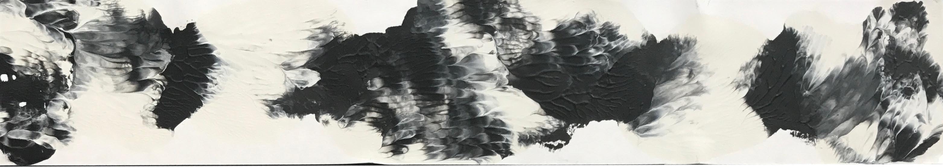
FRUSTRATION
FRUSTRATION
But I have different intensity of anger. I often choose to approach the situation calmly, using logic and reasoning. Often I would walk out of arguments if it gets too heated. I would speak to the other softly laying facts and the truth. However, when someone repeatedly does something after I told them to stop, I would become a volcano. I lose my rationality and shout at the person. As if there is a haze, blocking out my sensible thinking.
The white paper suggests my rationality. the black paint suggests anger blocking out my rationality. The white paint expresses the burst in my anger despite trying to keep them down.
SURPRISED
SURPRISED
I will be basing the emotion of surprise of my experience in fright night. I’m super easily scared. During fright night in ADMFO, I originally had no idea that it was fright night until I saw the ghost. At the beginning, I was very calm and repeated to myself in my head that there are no such things as ghosts. This is represented by the thick and sturdy line starting from the right across the paper. However, when the first jump scare appeared, I was so shocked that my legs turned to jelly and I fell. However, I just brushed it off laughing while I stood up again, to continue on the whole journey, despite being super scared. The jump scare is represented by the spattering of paint in the middle. the frayed line towards the end illustrates how I try to act as if I’m not scared but in actual fact, I really am.
LOVE
LOVE
To me, two halves do not make a perfect circle. I view love as a way of development and growth. It’s about the merger of two vastly different people, coming to terms and accepting each other’s differences and weakness.
I wanted to show the merger of two to become a better version of yourself. I used the technique of decalcomania for this piece. I place blobs of paint onto the paper before sandwiching them, allowing the paint to blend and mix with each other. The white and the black paint represents two people that are starkly different and opposite of each other. The gray shows their development and acceptance of each other. I like this result a lot as it shows the gentleness of the relationship through the soft blending of colors and the turmoil of the relationship through the jagged areas.