Category Archives: Foundation 2D 1 – G1

Ego: stylistic rendering

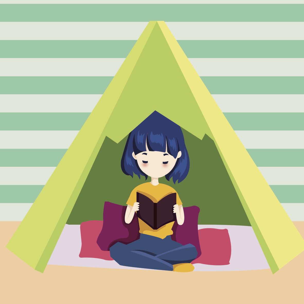
I had a very hard time deciding what type of stylistic illustration should I do, so I tried a few tradition and a few vector illustrations.

For my traditional medium I tried both acrylic and color pencils.

first I used acrylic paint, but because the, paint was very thin, I had to apply three coats before the base couldn’t be seen anymore. but this made the painting became fatter as I couldn’t keep in the lines. The shades were too similar to each other so I had to use the pen to outline to bring focus and definition to the character. if I were to do this again, I would definitely choose to do this with gauche or poster paint.

The second traditional medium that I used is cloud pencil.  As the composition looked to bare I added a tent, I had greater control over the medium in this case. in additions the clouds are more vibrant which I greatly preferred. However, as much I love this medium, it was too slow and I had other projects due to…

So I went back to illustrations, but I couldn’t find a balance between the complexity and simplicity.

in the first one, I felt like the line work is flat and lack variations. (but if you zoom in and see the line works actually have variations) I lack the proper brushes on illustrator to do the line work so I had to forgo this style

As the line =works wasn’t doing justice to the actual sketch I removed it completely. However,  that made the character look unfocused and lack definition…

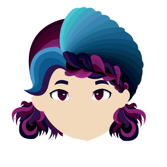
So I thought to myself that I need to simplify my illustration by only using maximum three colors: highlight, mid tone and shadow. that worked out pretty well, and I decided to use this stylistic illustration instead.


EGO: Inspirations and equation

Before coming to ADM, I had a very difficult time being myself in my Junior college. I hated my classmates and hardly talk to them, well unless its absolutely necessary. I was uncomfortable with them, it felt like I wasn’t accepted because of my strong and radical opinions. Throw in the stress of preparing for “A” levels along with preparations of art, I became even more withdrawn, and barely talked to my classmates. But, I found a awesome group of friends in my Junior college too. That group of friends are my art classmates with one of them being your student in the earlier class, Jocelyn. As I felt very comfortable with them, my energy level  kinda exploded. its like a 180 switch from a quiet and reserve girl to this ball of nonsensical energy. As I was very all of with my classmates, this lead to many misunderstanding such as I’m a stuck up, After junior college, I went to a design firm for an internship. There I struggled to put extroverted facade as I constantly wanted to go back to my safe zone. this project will be based off my roller coaster feelings through the day in the office.

The four aspects that I want touch on are:

Nervous me + first day at work = putting on a facade
Inexperienced me + paper work = Silent rage
Awkward  me + office cafeteria = seating arrangement dilemma
tired me + my safe zone = recharging time

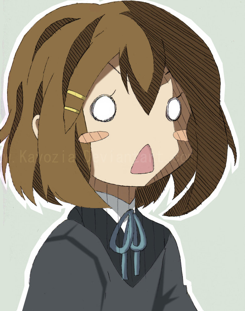
for my stylist inspiration, I’m greatly inspired by the facial  expression of anime characters. I like how Managua tend to over exaggerate the eyes and the facial color to express the emotion. in addition I will be using her hair to further exaggerate her emotions.Below are some of the characters I have taken inspiration from:

Tadakoro Megumi – Food wars

Yui – K-On

my second source of inspiration is retros Afshar. I like his use of simple geometric shapes to establish the back ground setting. I also like his simple two tone illustration, making the character look flat but has enough shades to differentiates the shirt and the pants 


Forrest Gump Alice in Wonderland: “I don’t know” Alice said. the cat replied:” then it doesn’t matter.”

For this quote, I’m going to focus on the uncertainty of paths.

Design 1

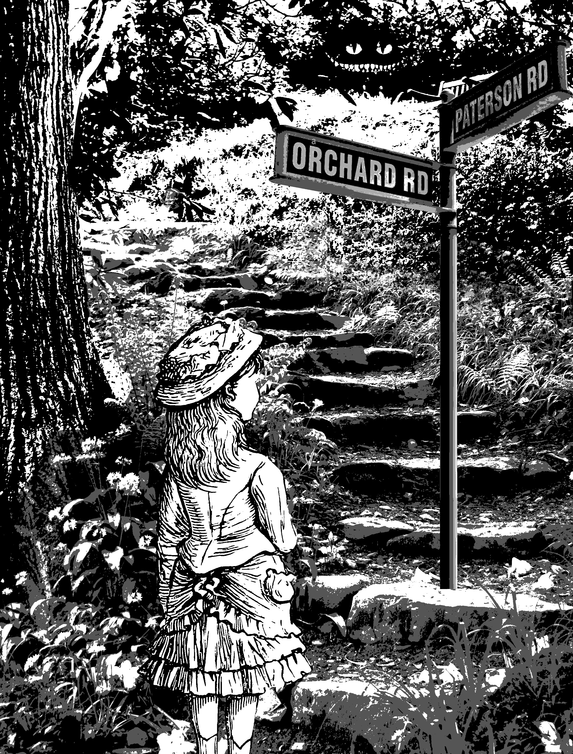
Firstly, I tried to show crossroads by giving her a signboard which gives her two directions to go. The reason why it says Patterson road and orchard road is because I took it directly off the internet without changing anything.

Design 2

the second I idea I had was to put Alice in a maze and bombard her with signs and direction. however, this didn’t work out too well as there isn’t a lot of places where I could superimpose the signs on. Moving on.

Design 3

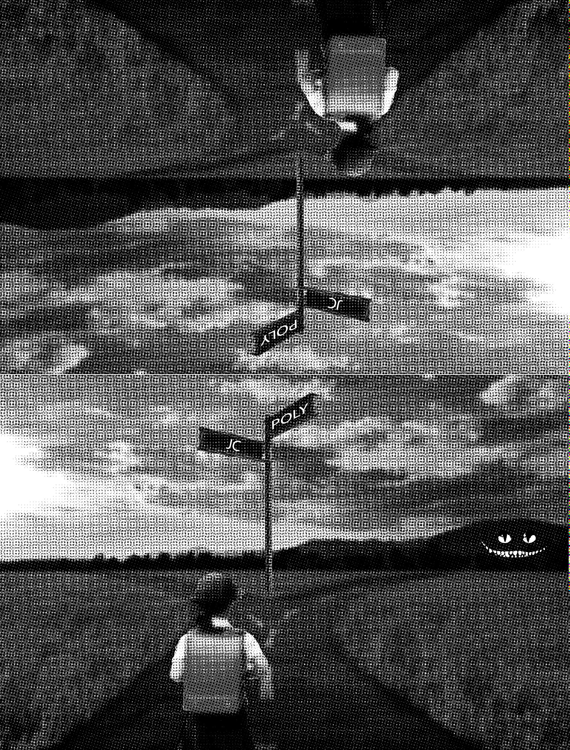
For this design, I decided to go for a literal crossroad. I wanted to make it bizarre so I reflected the image vertically. I tried to conceptualize it to my life and decided to change it to JC and Polytechnique a crossroad most students in Singapore face.

Design 4

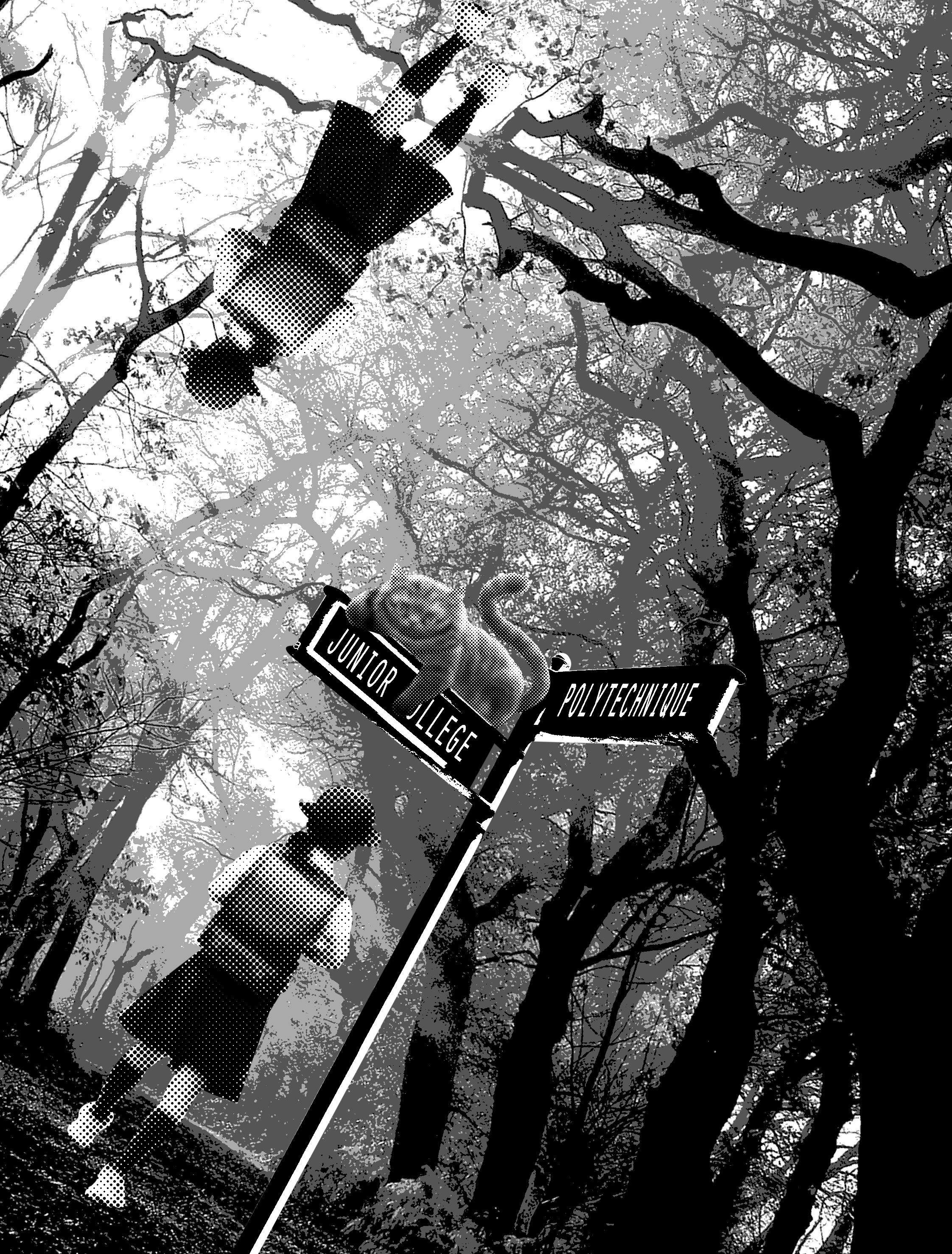
I decided to use the setting of the story: the forest as a background. I wanted to use a school girl wearing a pinafore as Alice, but I couldn’t find a suitable image. so I replaced her with a Japanese school girl.

Design 5
Design 6

In these two designs, i tried to incorporate the Cheshire cat more subtly. the first one I used the silhouette of the Cheshire cat. I think the second one is more successful as it is more subtle and less in your face.

Design 7

Similarly, I tried to distort the image by introducing halftones with threshold. however, this didn’t work out too well, as it does not convey depth at all. it made the background looks flat instead.

Design 8

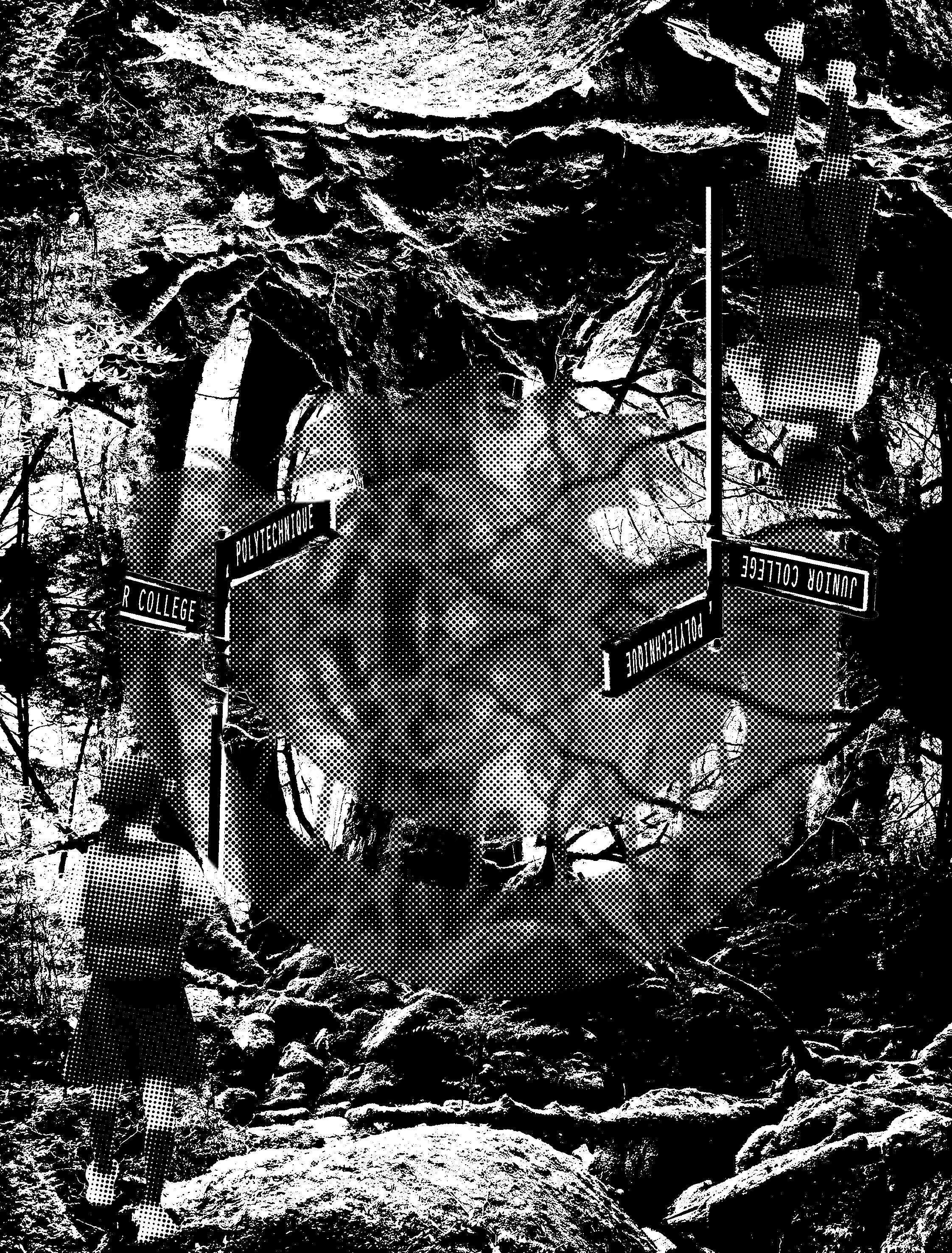
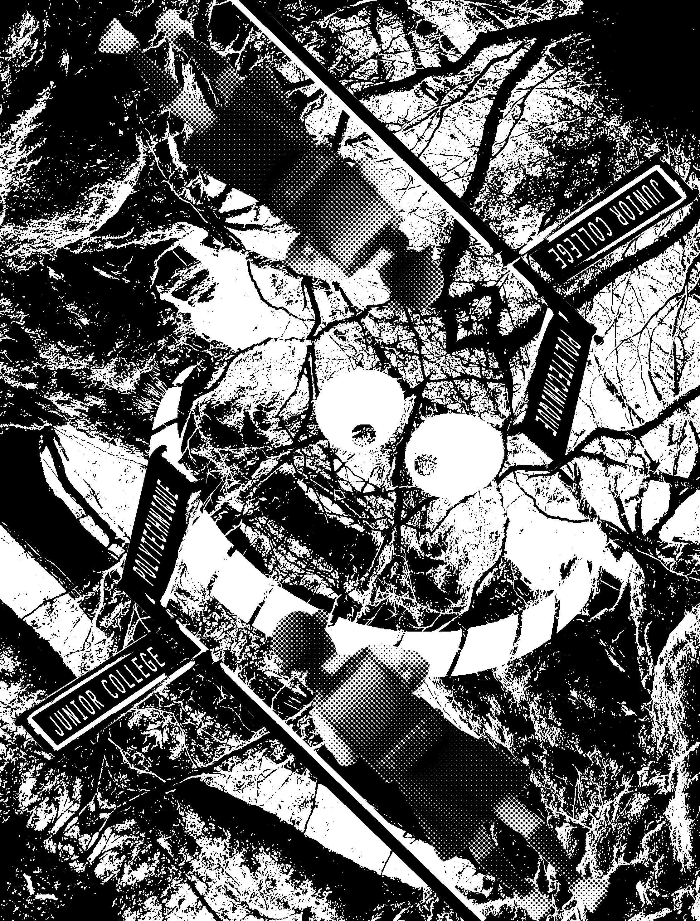
I tried to distort the image further by titling it. however, like the previous few designs, it lacks the context of Alice in Wonderland and the design is too complicated. furthermore, the designs do not look retro but futuristic instead.

Design 9

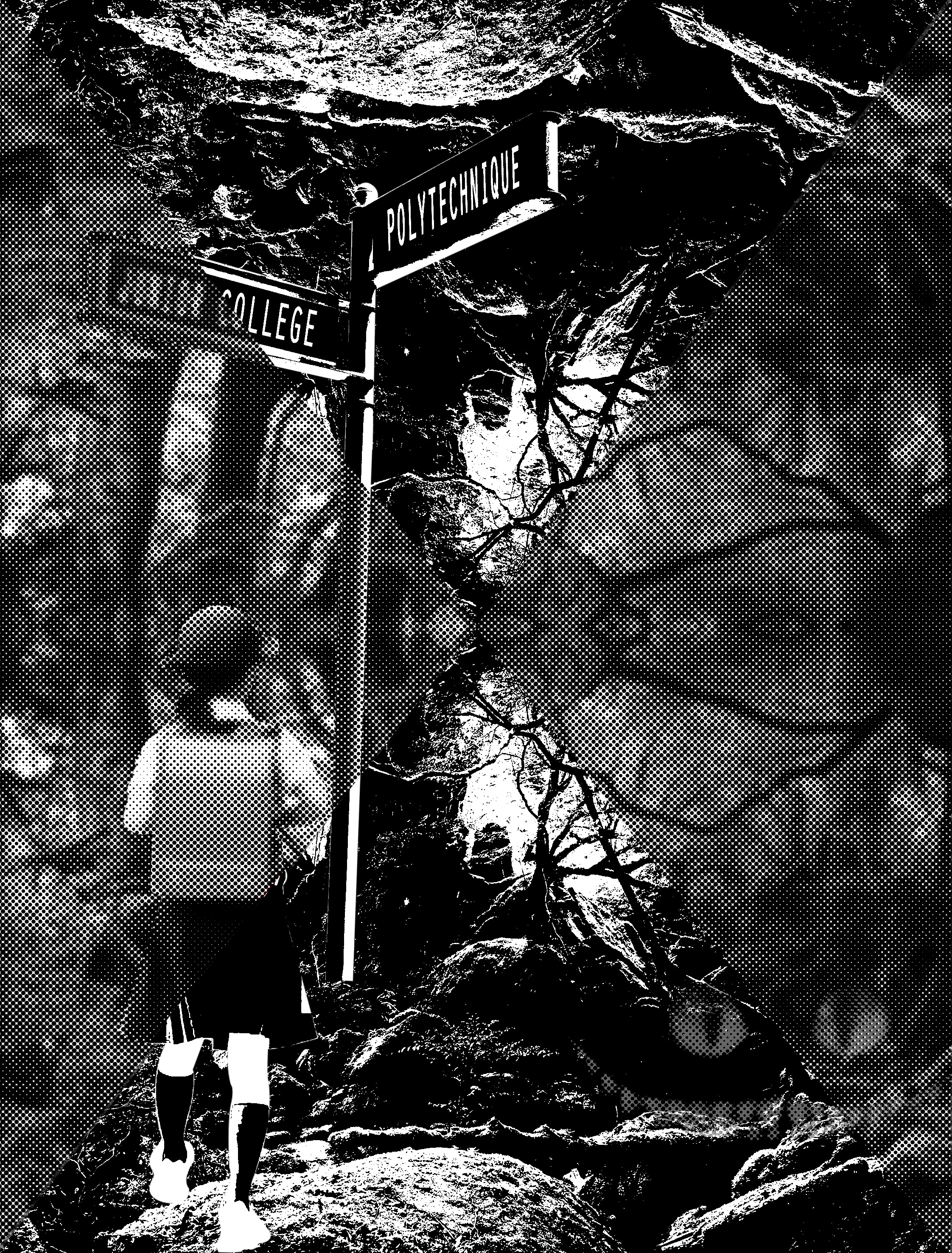
I tried to make it look more retro. and obviously, in this, i failed again very badly.

Design 10

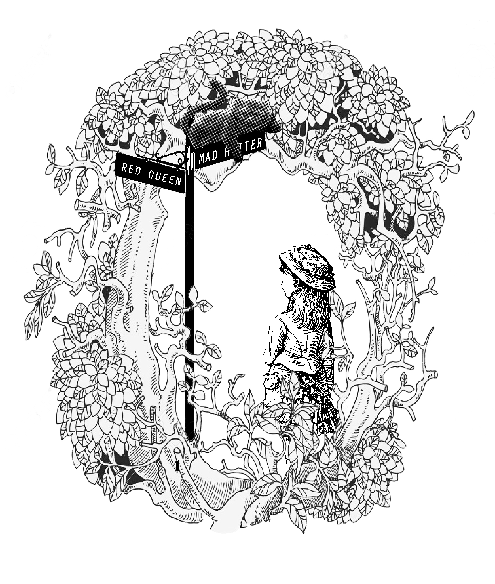
taking Mi Mi advice I begin searching for comics and illustrations. I found a forest shaped in an “O” and decided to throw in the elements of the signboard, Alice and the cat inside. while I finally did succeed in getting the visual language right. I really didn’t like it. anybody could have thought of this. Meh, just no…

Design 11

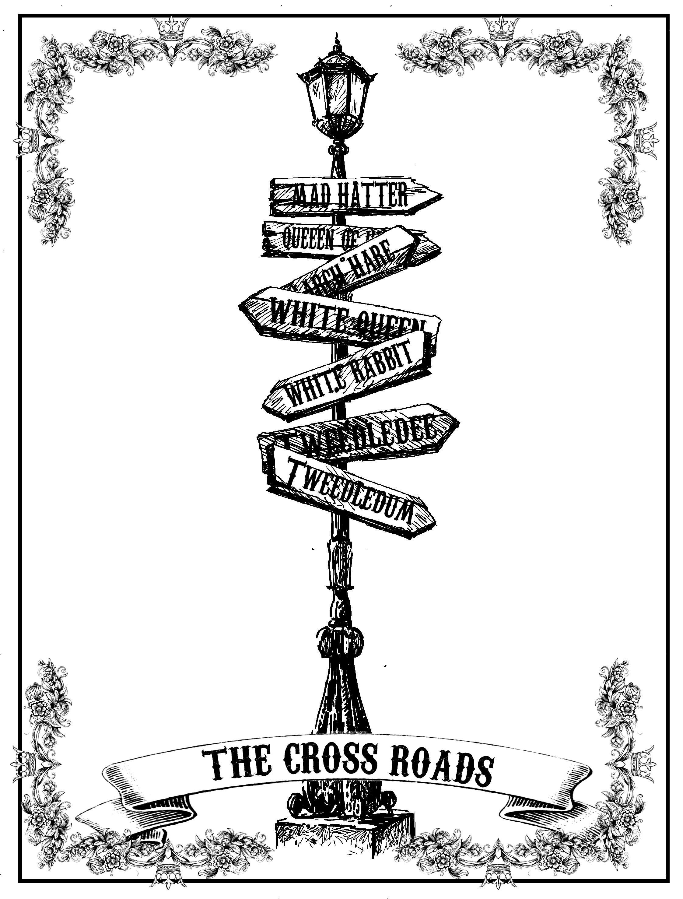
For this design, I was very inspired tarot cards and that’s why I used the fancy borders. again the border worked against me and stole the attention away from the main object. In addition, I felt that the design could have been developed further.

Design 12

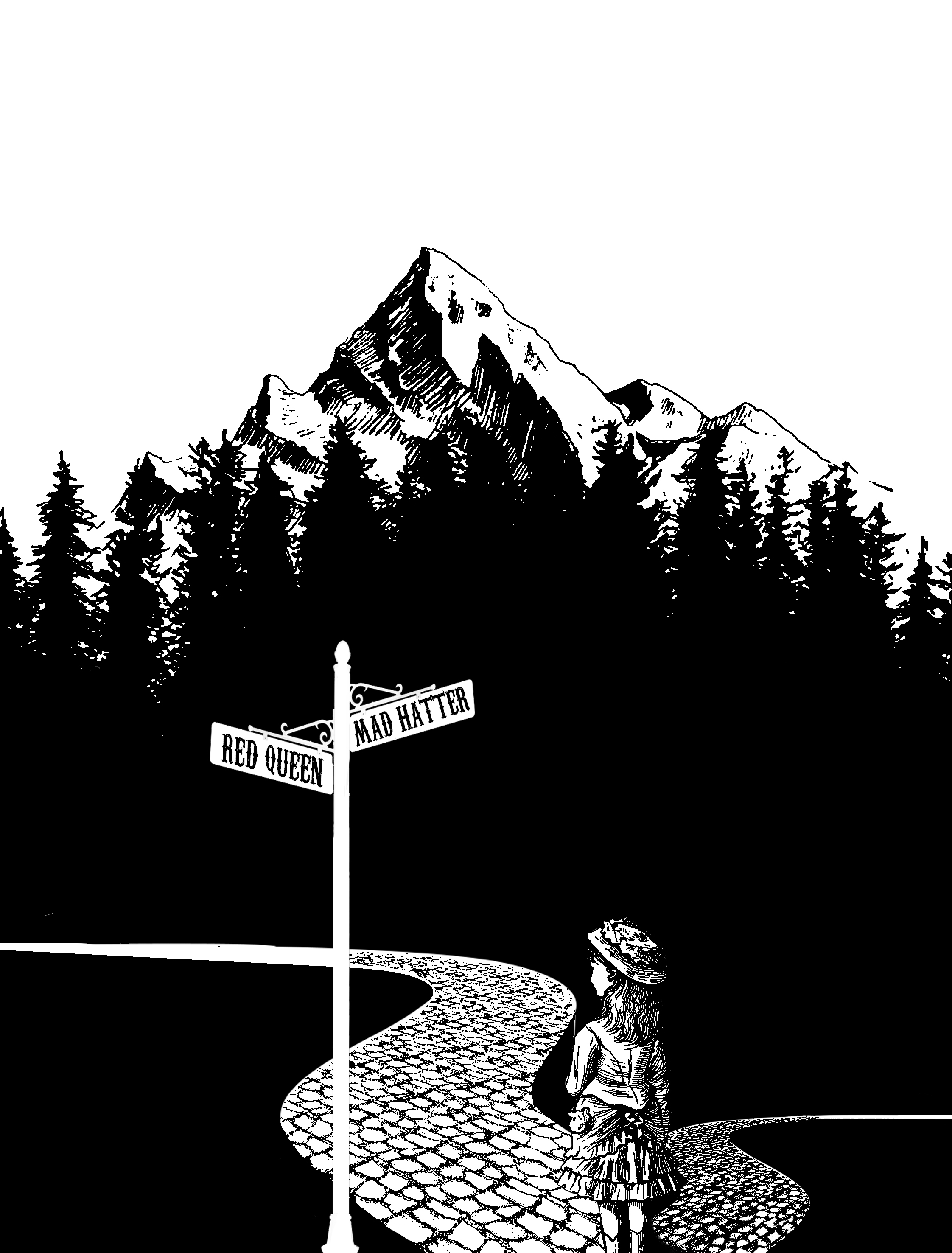
I chanced upon this photo of the forest while searching the web, then I had a sudden inspiration to extend the bottom and make use of the negative space. as there is a very high contrast, a great amount of emphasis is being placed on Alice. In addition, the background acts as a border framing the main subject up nicely.

Forrest Gump: Mulan – “The most beautiful and rare flower blooms in adversity”

For this quote, I will be focusing on the keywords of beauty and flower

Design 1
Design 2
Design 3
Design 4

for the first four designs, I literally tried to combine a flower and a female together. and it didn’t work well. firstly the contrast is too high. Secondly, there is absolutely no context of Mulan here. Third, the visual language is wrong like the previous few draft. Fourth I just didn’t like it. moving on.

Design 5
Design 6

I tried to make a collage of flowers and the warrior equipment and soldiers in these two designs. However, it did not work out very well as the elements seem very individual and not well gelled together.

Design 7

Using the previous idea as a stepping stone, I tried to incorporate the elements together to form a flower shape. But meh I didn’t like it at all.

Design 8

For this designs, i tried to incorporate parts of the flower into the warrior body as if the flowers bloomed from the warrior. for those that were in his body I used threshold, while for the parts of the flowers that are sticking out, I used halftones to give it a softer look. I wanted to express that Mulan had both sides of her; the feminine and the badass.

Design 9

For this design, I incorporated a lotus for the flower. I chose the lotus as it is a symbol of purity. There is a Chinese saying that the lotus is a very pure flower, despite from growing in the muds. I thought that this flower reflected Mulan’s personality and this quote very well. As much as I love this design, there warrior silhouette that I added as a mask layer in photoshop isn’t showing very well. in addition, the design is too futuristic. I was also told to draw inspirations directly from the quotes keywords instead.

Design 10

For this design, I was partially inspired by tarot cards and hence I gave it an elaborate framing. however, it worked for me as it took the attention away from my main subject.i decided to encapsulate the flower in a black circle to draw the focus onto the flower. However, I have neglected one of the major keywords: adversity.

Design 11

incorporating the flower element above I decided to add and show the warrior side of her with a Samurai mask. But it is still too plain and I decided to open the design.

Design 12
Design 13

For these two designs, I tried to use diagonal composition where I placed her warrior side on the right and her feminine side on the left. As I couldn’t find a suitable Chinese battle helmet, I had to substitute it with a Japanese Samurai head mask. I used skulls to further accent her bad ass side. For Mulan’s feminine side, I used flowers. I decided to use halftone for the flowers to give it a softer feeling while I used threshold on the other side to give it more of a harsher and crude texture.

Forrest Gump Mulan: I can wear a mask and fool the world. but I can’t fool my heart

This quote is taken from a verse in reflection, where Mulan laments how she could be the perfect bride. For this quote, I would be focusing on the words mask and heart, while showing a dual image.

Design 1

For this design, I used two gender fluid models. the one on the left is a female who models male clothes and the one on the left is a male who model female clothes. I decided to use a genderfluid model as they challenge and break gender norms today just like how Mulan did. I used a smoky effect to fade their faces off into the distance to show how they are lost like how Mulan was at this stage of her life.

Design 2

Similarly, this design uses the same concept as the previous one, but this one there is an afterimage of a little girl in the smoke. it’s like his lingering thoughts of needing to conform to society views.

Design 3
Design 4

In this two designs, I thought I would create some sort of mask, by removing parts of their faces with flowers. I decided to use flowers as it embodies what Mulan tries to be but cannot achieve.

Similar to the previous few designs, I was told that it was too futuristic and does not contain the historical Chinese look that Mulan had. In addition, I had to incorporate more elements from the movie.

Design 5
Design 6

For these two design, i decided to draw my motif from a Chinese opera mask especially from the changing face performance. I like how the Chinese mask is very expressive with distinct emotions such as anger and happiness. I wanted to portray Mulan putting on many facades with the different masks.

Design 7
Design 8
Design 9
Design 10

For the next few designs, I wanted to emphasize how Mulan kept some parts of herself hidden. so I used a curtain to express that she has kept her true self (the warrior side) hidden from her family. I wanted to have a woman caged on the other side of her face. however, I had a very hard time finding images to suit the second half of the face. In the first one, I used a female bounded by the flower. I wanted to show that Mulan is actually being chained by the feminine ideals which are represented by the flowers. however, the image is too small and blurry to be seen properly. in the second one, i used a pair of hands. For this, while the image could be seen very clearly, I couldn’t fit the hands in properly. if I fit both hands it would be too small. if I enlarged it, only one hand can be seen and the message is hindered. so I decided to settle with the last image. it is a halftone image of a girl being locked in a cage. as the picture isn’t very clear I used the eraser tool to erase part of the face to make the bars come out. As all of the images I could find is problematic, I had to settle for the less evil so I picked the last design as my final.

Forrest Gump Mulan: When will my reflection show who I am inside

For this quote, I will be focusing on the keywords: reflection. Mulan sings this line in the song reflection, where she laments how she is unable to conform to the female ideals in China. For this quote, i will be focusing on the word, reflection. when I thought of the word reflection, I immediately thought of mirrors and water. Hence mirrors will be my main motif for this design.

Design 2
Design 3

The first 2 designs, I wanted to show how Mulan shatters through that stereotypical image of her in the movie. I placed a shattered glass panel in front of her image with the bullet hole right in front of her face in the first one and her heart in the second. In the first one, I wanted to how she shattered her image through physical appearance. In the second design, I wanted to show how her heart has won over as she decided to be a tomboy instead of the docile wife she is expected to be. I felt that the drama wasn’t enough in the first design and decided to add broken grass shards around her.

Design 4

Similarly, i tried to express shattering the stereotype in another way. the model ic hose is a genderfluid model. he is biologically a male but his physical appearance is a female. I wanted to show how people are breaking the gender norms in today world just like how Mulan did. the geometric shapes are inspired by broken glass shards.

Design 5

Similarly, this is another androgynous model. I wanted to express a difference in the outward portrayal of the image with the inner mental image of oneself.

Design 6

For this design, I wanted to focus on revealing the actual person inside. Like the previous 2 designs, the female at the back is an androgynous model who has transitioned from a male to a female. so by placing the glass shard in front of him, i revealed his true gender: a male. However, the previous few designs did not meet the brief requirements of looking retro as it looked too modern and futuristic, In addition, i was told that t=it lack the ancient Chinese setting in my design.

Design 7

Keeping Mi Mi comments in mind I tried to incorporate more retro and vintage olden chinses elements into my design. for the next few designs, I was inspired by tarot cards and wanted to add an ornate frame. I used the Yin and the Yang symbol to show how Mulan is both a warrior and a female at the same time.

Design 8
Design 9

for this design, I used a mirror to show both sides of Mulan: a female as well as a badass bitch. I used a white background for her feminine side and a black background for her warrior side. to further emphasize the warrior aspect, I gave her an Oni mask, to symbolize her bravery and strength.

Unfortunately, I don’t think I will be using this quote as it has the same meaning as my other quote by Mulan in the same song: “if I wear a mask I can fool the world,  but I can’t fool my heart” which I like a lot better.

Forest Gump Alice in Wonderland: Sometimes I believe in as many as six impossible things before breakfast

I wanted to focus on the setting and the things that Alice counted during her battle with the Jabberwocky.

Design 1

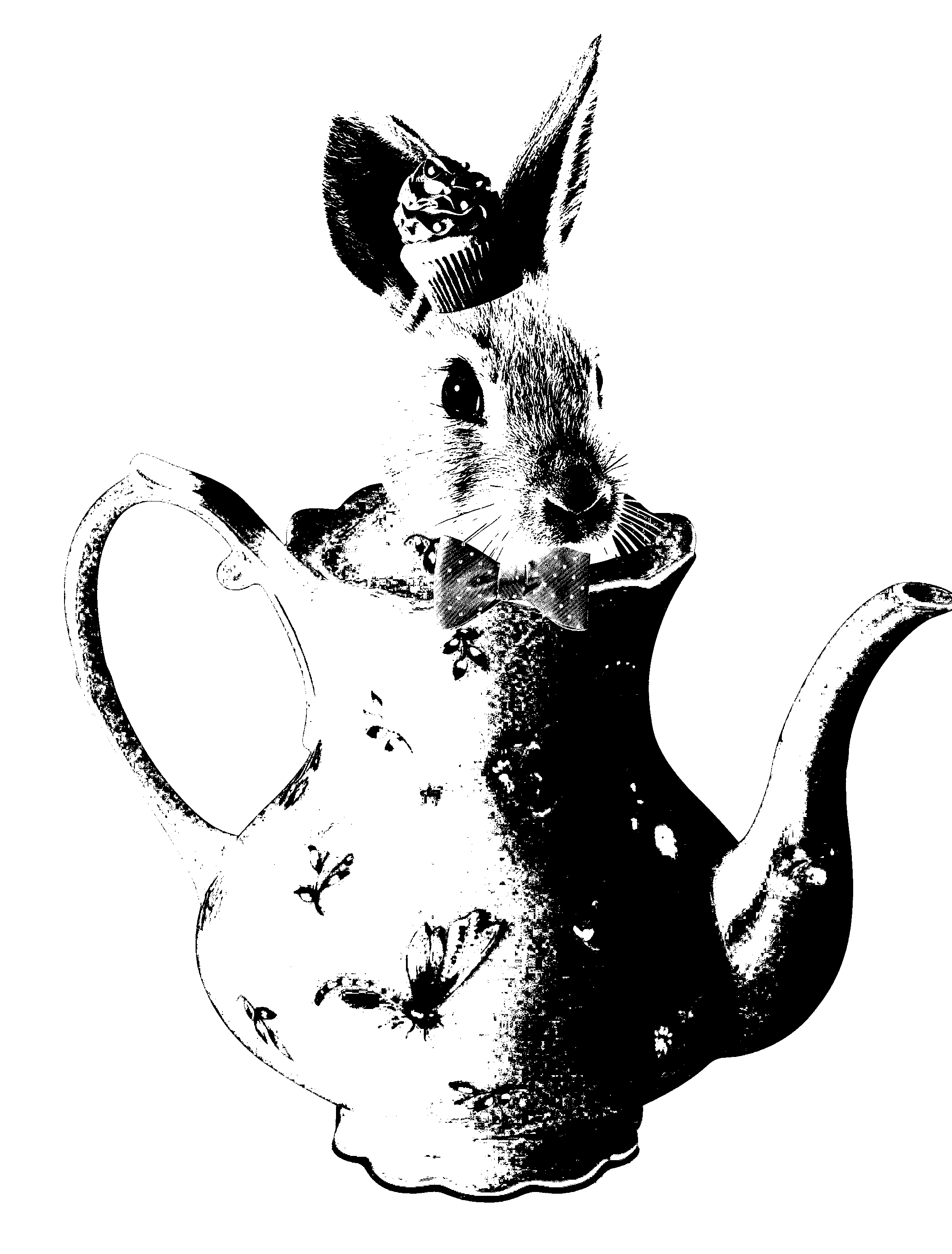
For the first design, I focus on the setting where Alice had tea with the mad hatter and March Hare. I tried to emulate the bizarreness of the teapot by juxtaposing the march hare head onto a teapot. Inspired by the hatter’s love for eccentric hats, I gave him a hat made up of cupcake

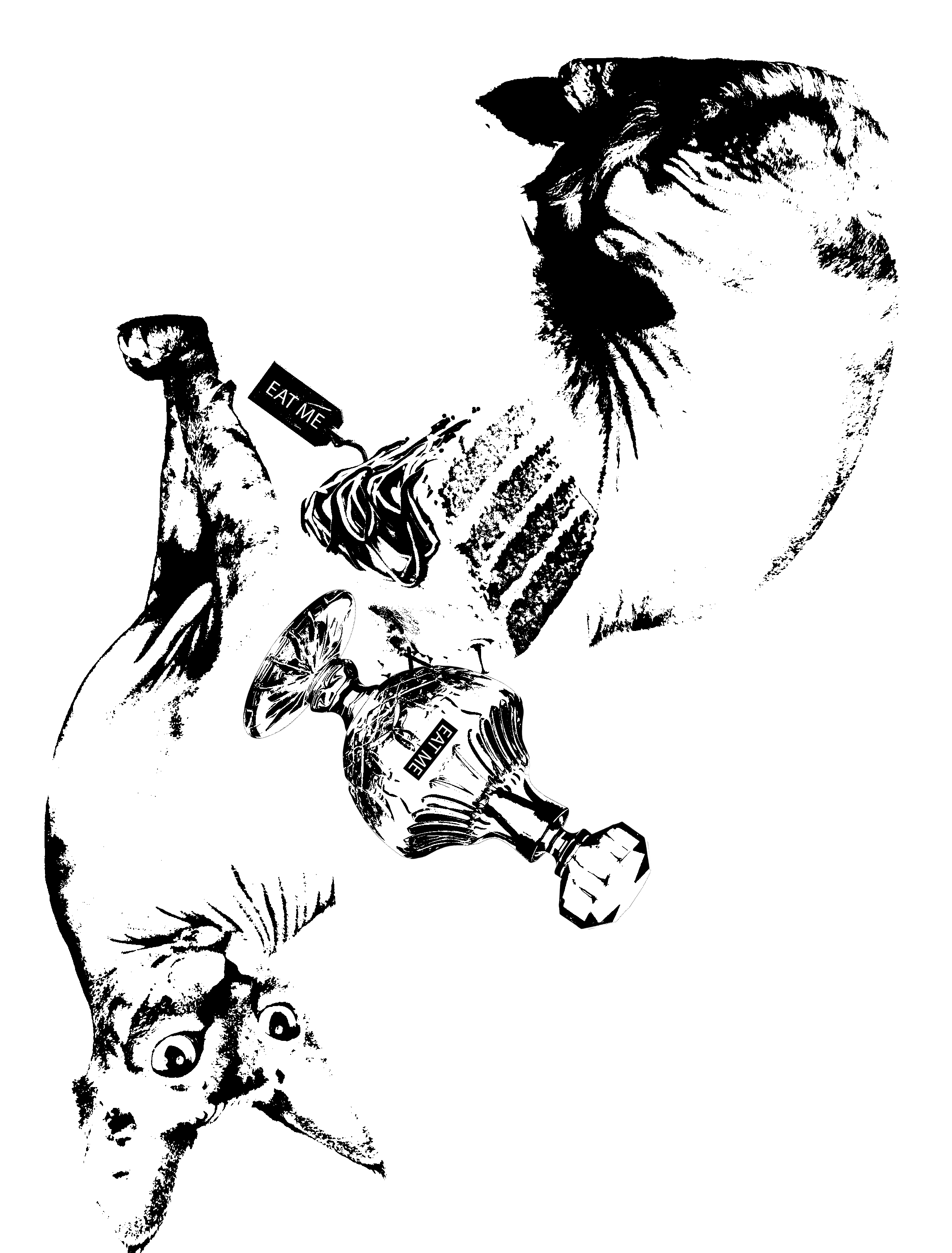
for the second design, I was inspired by the things that Alice counted during her battle with the Jabberwocky. the three elements that I have incorporated is: a cake that makes you grow smaller, a drink that makes you bigger and cats can talk. For the Cheshire cat, I used a siamese cat because it look rather unusally from a common house cat. I separated his body into halg to illustarte his ability to appear and dissapera out of nowhere. However, i saw told that the elements do no gell well with each other.

Design 3

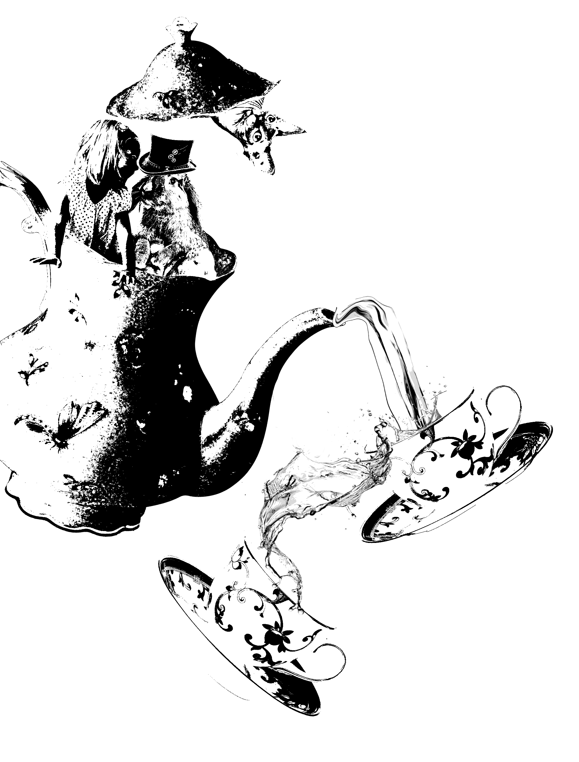
For this design, i went back to focusing on the scene where Alice was at the tea party. I decided to incorporate a more bizarre feeling into the design. I placed Alice and the March Hare together as they peer out of the pot. The design wasn’t executed really well, as the contrast was too high. Also, I was told to focus on the keywords such as “breakfast” more while bringing in more context of Alice in Wonderland where I brought in the actual character into my work.

Design 4

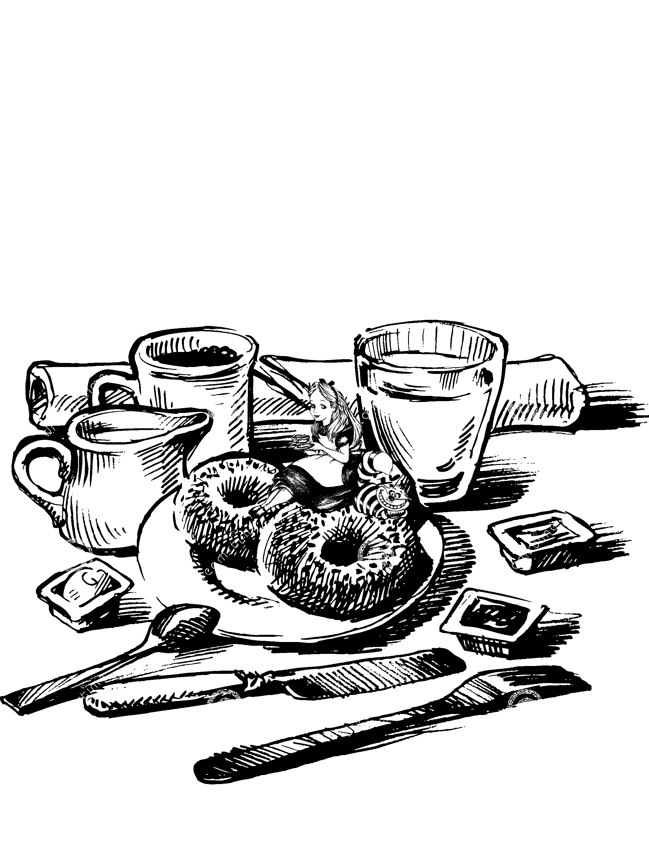
Heading the advice of Mi Mi where I had to incorporate more of the movie context and the keywords, I decided to focus on the word “breakfast”. I also decided to focus on the impossible. I tried to bring that aspect out by making it bizarre, weird or paradoxical. In this design, I decided to manipulate with the scale to make it bizarre. but I felt that I was playing too safe in this design. it is just not bizarre enough.

Design 5
Design 6

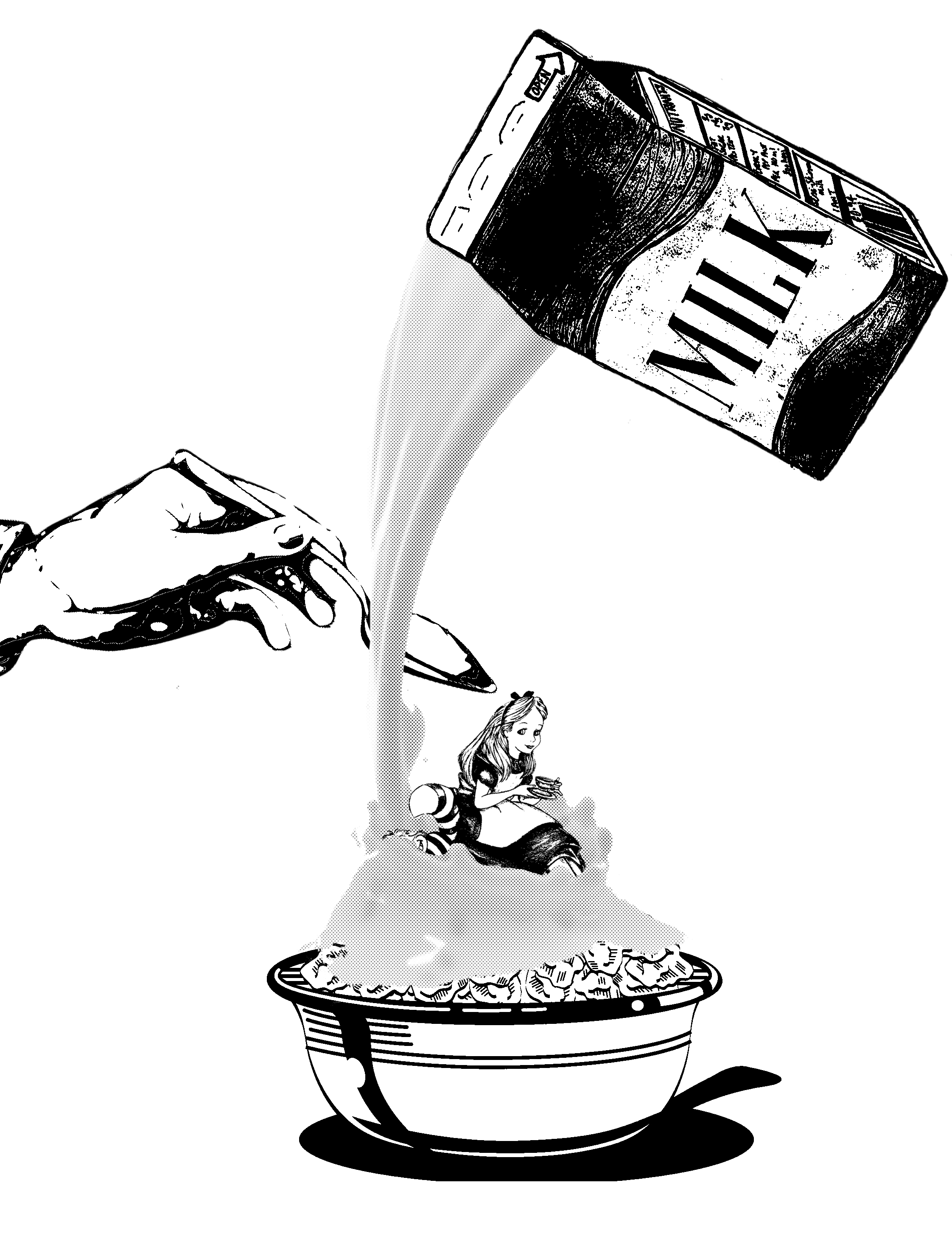
For design 5 and 6, I had this grand plan of having a top view of Alice swimming in cereal while she floats in a bathing suit with a flamingo float. so I had to substitute I do with a front shot of a cereal bowl with Alice sitting inside the cereal. I chose cereal as it is a very common breakfast food for many. but I felt that the elements were rather individual and aren’t gelling well with each other.

Design 7

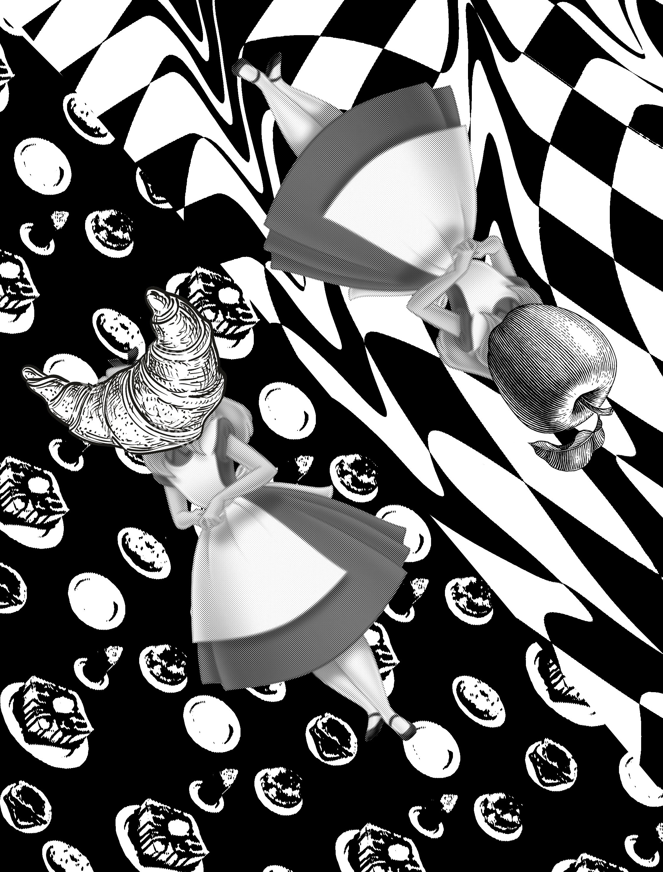
So I settled for this design. where I split the paper into half. The first half of it is a distorted checkerboard. with Alice and an apple superimposed on it. I chose a chessboard as I felt that Alice in Wonderland concept was very much like a game. i also chose the apple as it is a convinent breakfast food for all. On the other side, i used a backdrop of panckaes and scones as a background. alice is given a crosant for a head as it is a very common bread in frnace.

Forrest Gump: My Chosen Quotes + Artist references

MY CHOSEN QUOTES

For my first quote, I will be using Tim Burtons Adaptation of Alice in Wonderland – ” Sometimes I think of as much as six impossible things before breakfast.” this line appeared in the movie three times. the first time, Alice was having a nightmare, and her father calms her down with this line before tucking her back into bed. The second time, Alice said this to the Mad hatter to give him courage and encouragement. the third time Alice said this, she was about to kill the Jabberwocky. The six things that Alice counted before she killed the Jabberwocky is: 
There’s a potion that can make you shrink.
And a cake that can make you grow.
Animals can talk.
Cats can disappear.
There is a place called Wonderland.
I can slay the Jabberwocky.

The meaning of this quote is to believe in the impossible and the impossible will happen. take faith and leap. ?

For my second quote, I will be using Disney animated adaptation of Alice in Wonderland – “I don’t know” Alice said. the cat replied:” then it doesn’t matter.” This was said by the Cheshire cat to Alice when she was lost in the forest and had no idea where to go.

For my third quote, I will be using Disney 1998 Mulan – ” when will my reflection who I am inside.” This famous line was sung by Mulan when she lamented how she was very different from the ideal feminine stereotype in China.

For my fourth quote, I will be still using Mulan – “if I wear a mask, I can fool the world, but I can’t fool my heart.” Similarly, this was taken from a verse in the song reflection sung by Mulan.

For my fifth quote, I will be using Mulan – ” the Flower that blooms from adversity is the rarest and beautiful of all” This was said by the emperor in Mulan when Mulan revealed that she was a female and disgraced the country. I really love the movie Mulan as it is very similar to me: neither a feminine girl nor a 100% tomboy. I also love how they portrayed the female power in this movie despite it being created in 1998.

ARTIST REFERENCE

The first artist that I referenced is Martin O’Neill a graphic illustrator based in the U.K.. I love how he tasteful cut up the face and join them back through implied lines created by the flowers.

The Second artist I’m referencing is Rohan Daniel. I love how he played with the negative space to imply the trees. I also love how he used texture to differentiate the ground along with the sky and the background.

The third artist that I’m going to reference is Ugo Gattoni. I love how he implied the horse by changing and wrapping the pattern of the building onto the horse.

The last artist I’m going to reference is the manga XXXHOLLIC. I love how the mandala designs her manga cover page and how she incorporates unique borders for each volume.

My Line Is Emo: Final

JOY

DAYDREAM

I find solace in the silence. Often, when I’m bored, I would picture myself as the main character if a story. This allows me to escape into a fictional world, away from all my stress and my problems.

I tried to create a portal of dimensions into my fantasy world.  Inspired by null gravity, where directions do not exist. I made use of different motif to create patterns that do not have to be seen from a specific direction This makes the work more interesting and dynamic, similar to my ” inner world”. I will be developing this piece for my final, by incorporating principles of designs.

ANXIETY

ANXIETY

I experienced a breakdown during my J2 in Nanyang Junior Colledge. I couldn’t balance my academic studies with the huge amount of time I spent in art.  Furthermore, I didn’t get along very well with my classmates. This made me feel very suffocated and isolated in my JC. For the feeling of fear, I will focus on the different aspects of anxiety I felt during my A-level period.

The scribbles of my pen represent my emotional state, where my mind is in a jumble. The dark harsh strokes done in black acrylic paint represents my mental state, where anxiety has hijack and taken over my body, rendering me useless. Finally, the hazy black part done by dabbing paint represents my physical state, where everything is in a haze, where I cannot think properly. Tracing paper is used to bring across the idea that anxiety is a complex multi-layered emotion.

SADNESS

SADNESS

I based this emotion of my sadness in the parting of my close friend to London. I met her seven years ago at tuition, where we bonded over cookies. ( I was ten years old then)  We then coincidentally went to the same secondary school and were classmates for 4 years. She has been a constant, a given in my life. However, on the 21 of September, she will be heading over to Goldsmith London to further her studies. To me, sadness hits the hardest when you take things for granted.

For this piece, I used is salting. After being with someone for a very long time, they own a tiny part of you. When they leave, you will feel empty. Similarly salt absorbs the water taking part of the ink away. Furthermore, salt is a by-product of tears, which is commonly shed during partings. In addition, the shape suggests the high and low of emotions. It peaks in the middle to show denial and then go back to a rest to show acceptance.

FRUSTRATION

FRUSTRATION

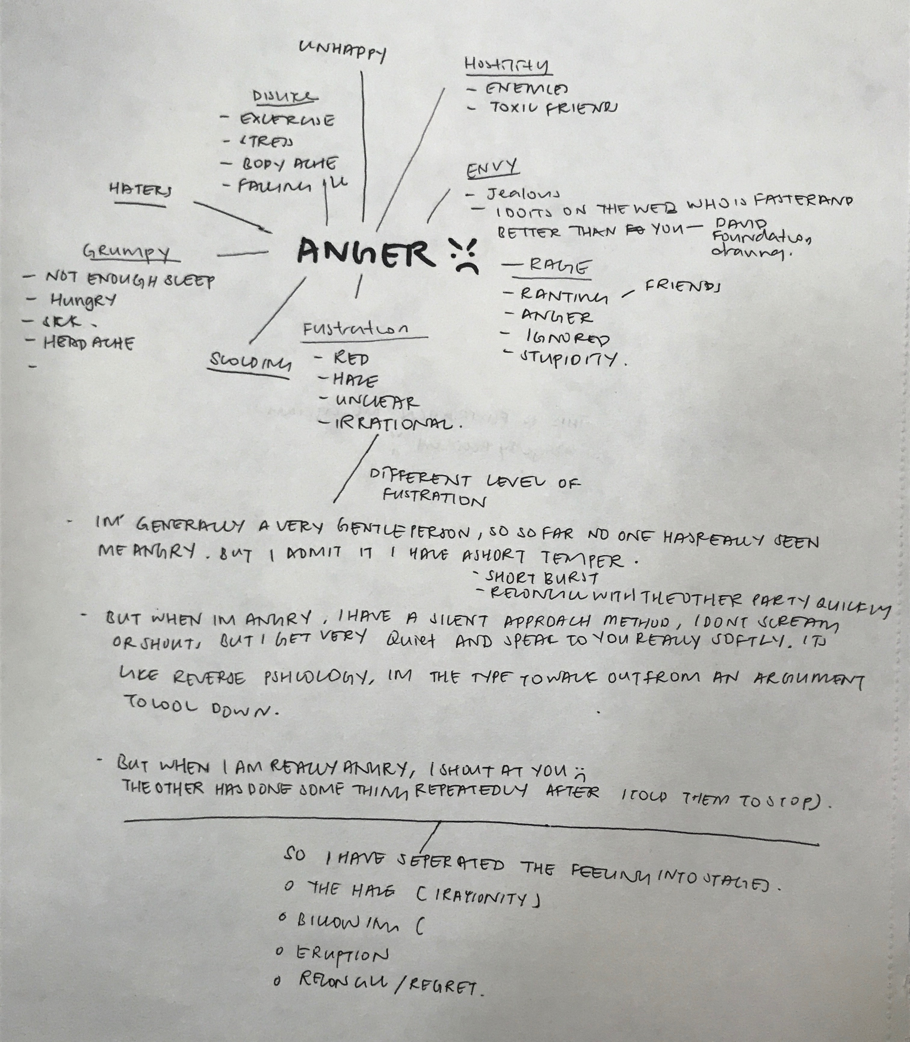
But I have different intensity of anger. I often choose to approach the situation calmly, using logic and reasoning. Often I would walk out of arguments if it gets too heated. I would speak to the other softly laying facts and the truth. However, when someone repeatedly does something after I told them to stop, I would become a volcano. I lose my rationality and shout at the person. As if there is a haze, blocking out my sensible thinking.

The white paper suggests my rationality. the black paint suggests anger blocking out my rationality. The white paint expresses the burst in my anger despite trying to keep them down.

SURPRISED

SURPRISED

I will be basing the emotion of surprise of my experience in fright night. I’m super easily scared. During fright night in ADMFO, I originally had no idea that it was fright night until I saw the ghost. At the beginning, I was very calm and repeated to myself in my head that there are no such things as ghosts. This is represented by the thick and sturdy line starting from the right across the paper. However, when the first jump scare appeared, I was so shocked that my legs turned to jelly and I fell. However, I just brushed it off laughing while I stood up again, to continue on the whole journey, despite being super scared. The jump scare is represented by the spattering of paint in the middle. the frayed line towards the end illustrates how I try to act as if I’m not scared but in actual fact, I really am.

LOVE

LOVE

To me, two halves do not make a perfect circle. I view love as a way of development and growth. It’s about the merger of two vastly different people, coming to terms and accepting each other’s differences and weakness.

I wanted to show the merger of two to become a better version of yourself. I used the technique of decalcomania for this piece. I place blobs of paint onto the paper before sandwiching them, allowing the paint to blend and mix with each other. The white and the black paint represents two people that are starkly different and opposite of each other. The gray shows their development and acceptance of each other. I like this result a lot as it shows the gentleness of the relationship through the soft blending of colors and the turmoil of the relationship through the jagged areas.


My Line Is Emo: Conceptualization ( Anger, Surprised, Love)

ANGER 

For me, I have a short temper and I lose my temper easily. But I have two different intensity of anger. I often choose to approach the situation calmly, using logic and reasoning. Often I would walk out of arguments if it gets too heated. I would speak to the other softly laying facts and the truth. However, when someone repeatedly does something after I told them to stop, I would become a volcano. I lose my rationality and shout at the person. As if there is a haze, blocking out my sensible thinking. for the emotion of frustration, I will be focusing on the different stages and intense anger.
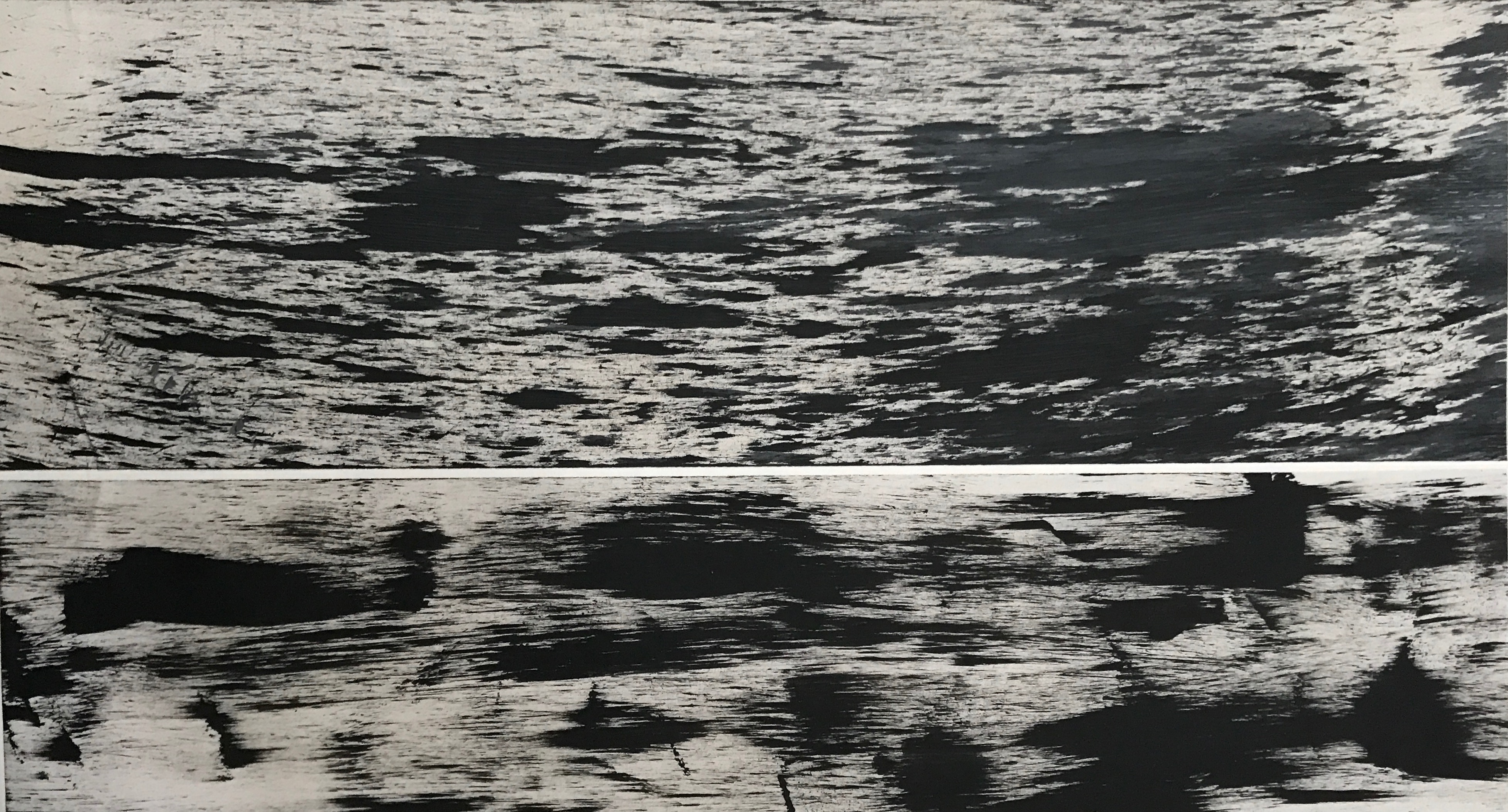
The first piece I tried to capture the essence of frustration. I blasted heavy rock metal music through my headphones and channeled all my anger onto the paper. I achieved this by rolling a sponge with acrylic paint over strips of paper.


The second piece is a different rendition aiming to capture the essence of anger too. but this time I applied blobs of acrylic paint to the paper before spreading them out with a broom. I really like the texture captured and created by the broom.

While I feel that these captured the essence of anger very well, this approach is very simplistic and common.
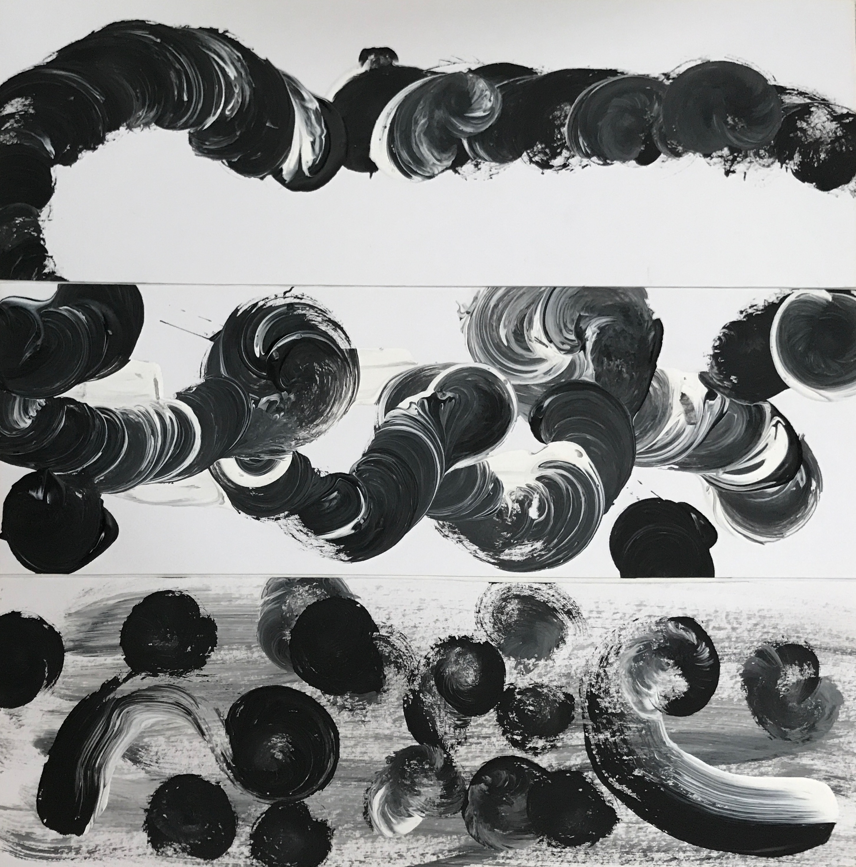
In the third piece, I explored with the billowing of my emotions before it becomes a full-blown shouting match. For this, I dipped half of my brush into black acrylic paint and the other half into the white acrylic paint. then I painted circular motif on the papers. During this in-between state, I often have an inner turmoil with myself, fighting the urge to scream at the other party. the sweeping strokes are inspired by a tornado, where the emotions are building and is becoming increasingly destructive.
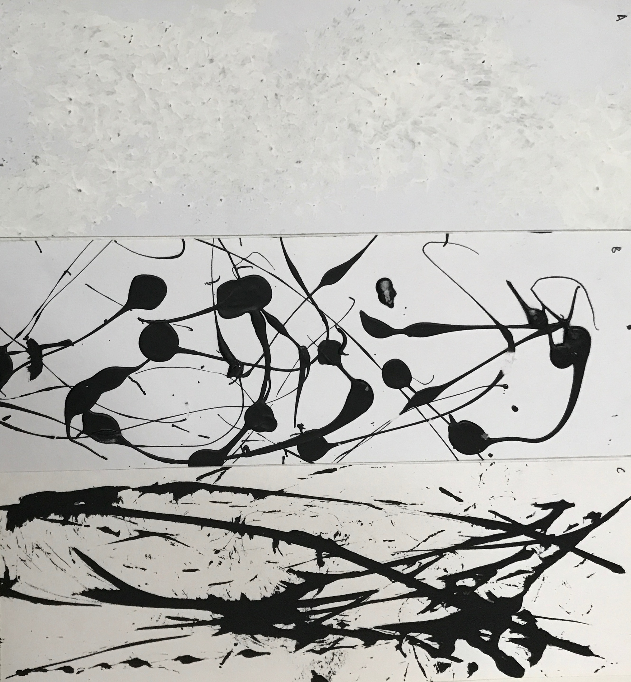
Lastly, I tried to express the destructive and explosive part of my anger. in the first strip, I wanted to focus on the texture of the paint. The rough finish of the paint makes it look very rough and poses a form o raw energy. In the second piece, I tried to express the feeling of anger bursting out from under my skin. For this, I  splattered acrylic paint from a height using a paintbrush. for the last one, I wanted to focus on the destructive and explosive aspect of my anger. I dipped a string attached to a needle into Chinese ink, before dragging them across the paper. This gave it a raw finish which goes well with anger. However, these expressions are too common and I need to give the emotion more layers for it to be uniquely mine. In addition, I should have splattered the paint from a greater height with more strength as currently, the splatters look very energetic. I would be improving on this by adding a dry brush stroke as a base, before splattering the white paint on the top.

SURPRISED
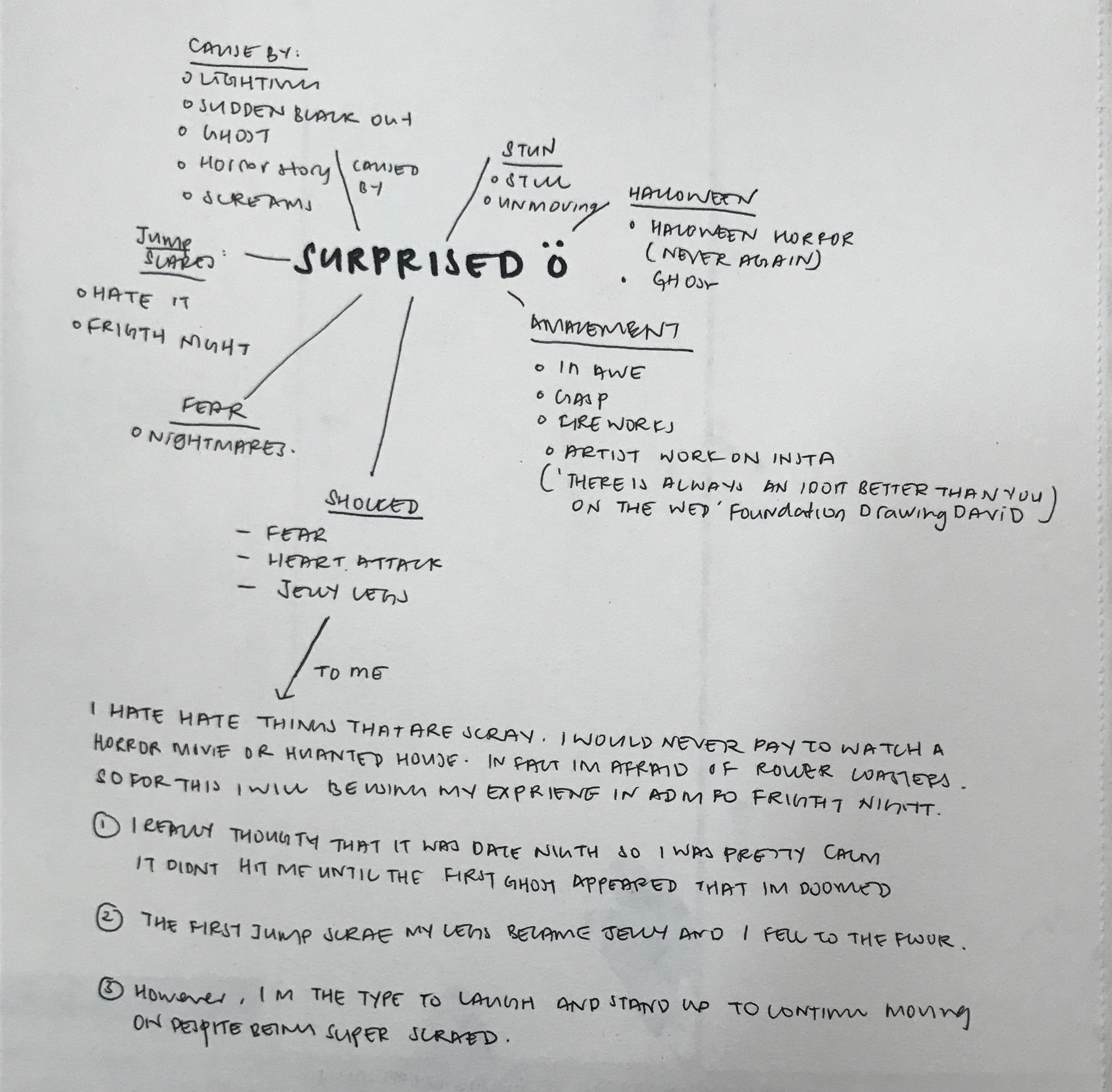
For me, I’m super easily scared. I would not pay to be scared or be paid to be scared. During fright night in ADMFO, I originally had no idea that it was fright night until I saw the ghost. At the beginning, I was very calm and repeated to myself in my head that there are no such things as ghosts. However, when the first jump scare appeared, I was so shocked that my legs turned to jelly and I fell. However, I just brushed it off laughing while I stood up again, to continue on the whole journey, despite being super scared. I will be basing the emotion of surprise of my experience in fright night.
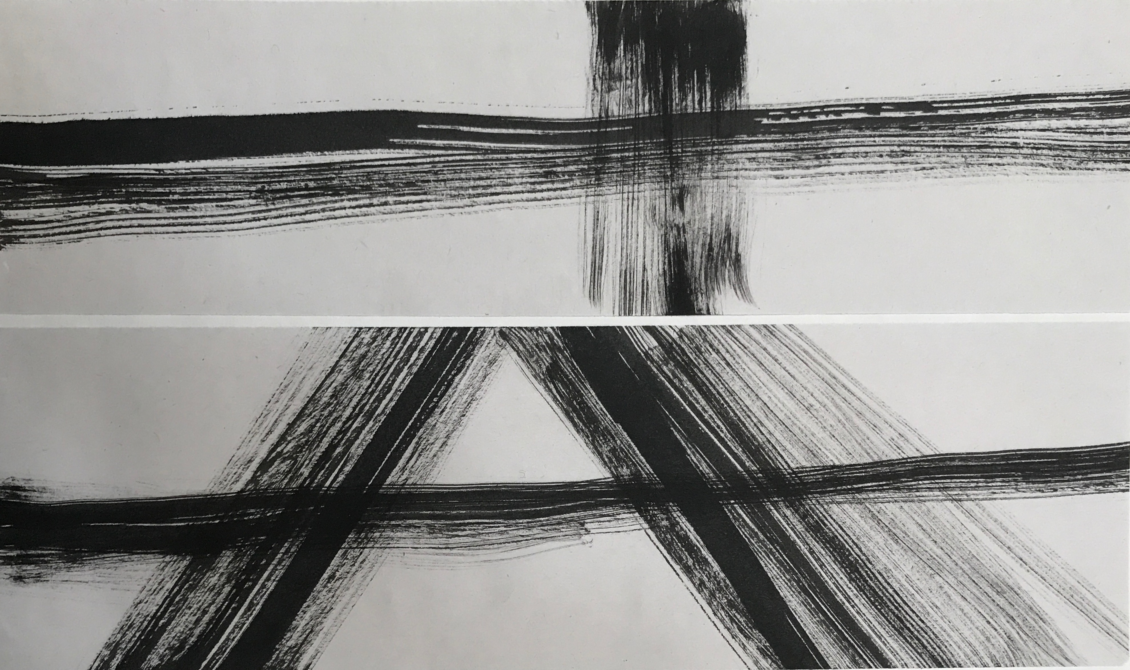
For the first piece, instead of focusing on my experience in fright night, I wanted to try to suggest surprise through the creation of an anomaly in my work. In both pieces, there is a harsh contrast between the lines, horizontal versus vertical, diagonal versus horizontal. I feel like this is a very superficial way of expressing the emotion of shock hence I decided to scrape it.
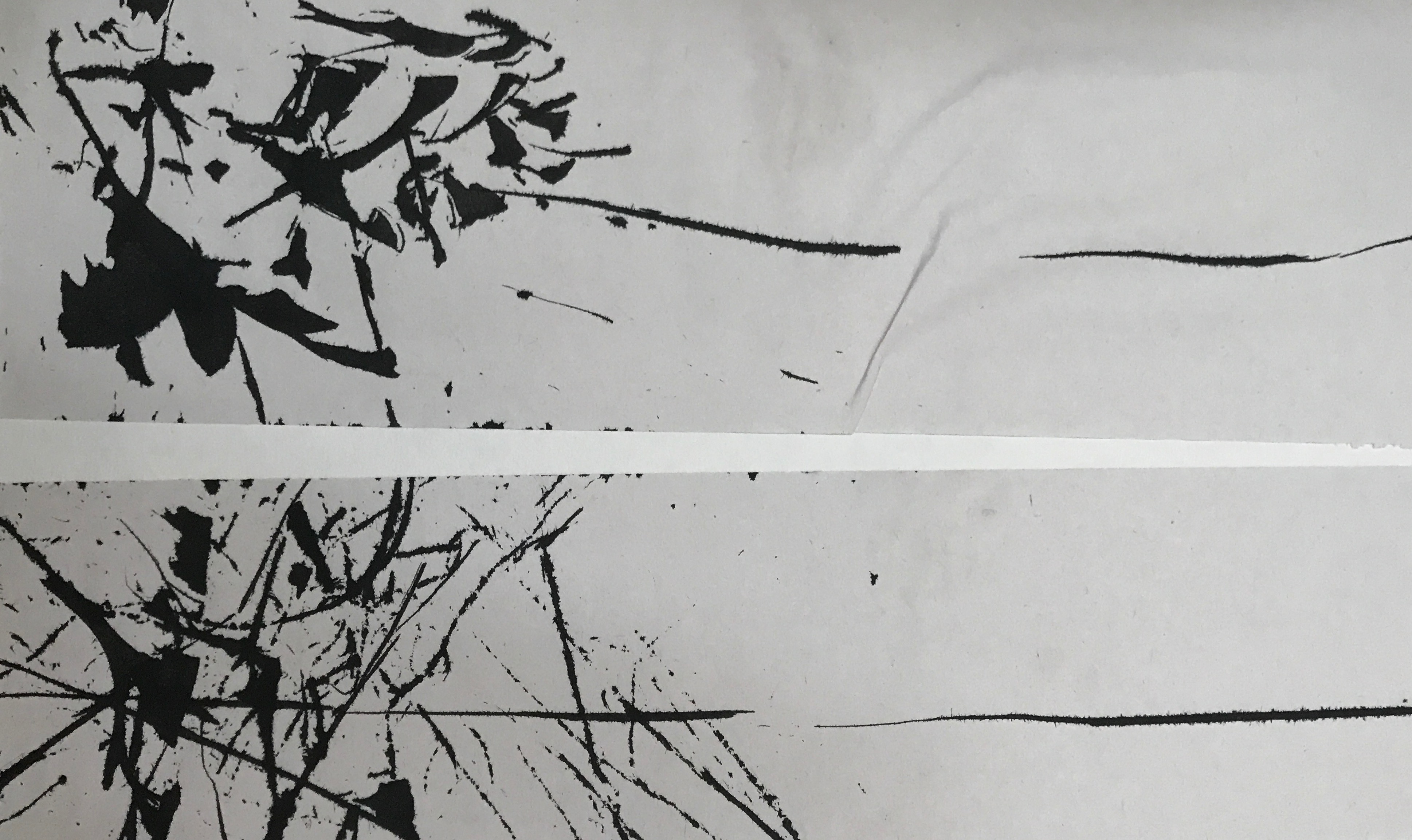
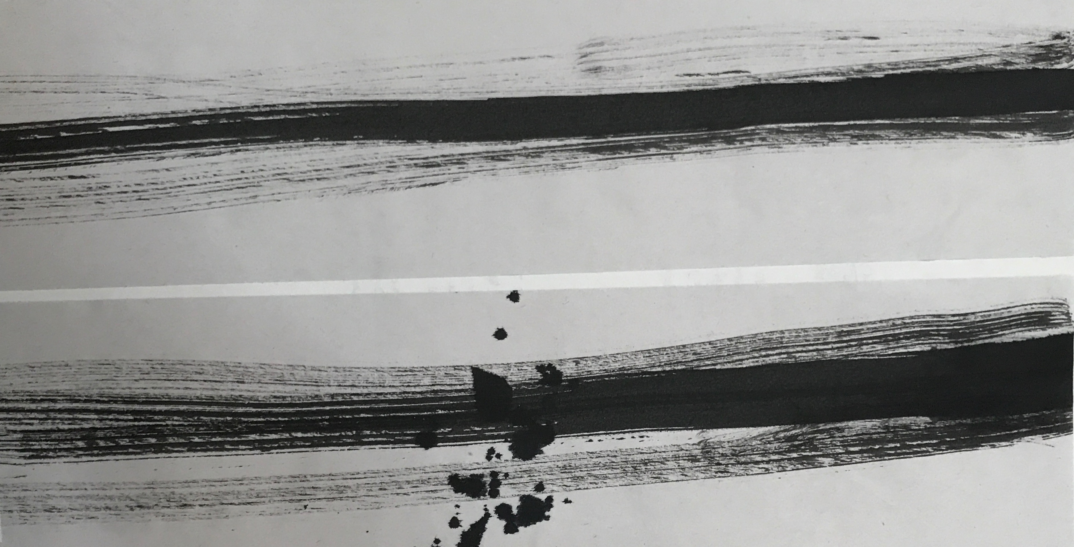
For the next series of work, I was inspired by a heart monitor measuring my heartbeat during a jump scare in ADMFO. First, I would be calm as I don’t know what is happening. This is represented by the flat lines on the left after the jumpscare happens and my heart beats super fast causing a sudden rise in my heartbeat. This results in the fraying of my emotional state as shown by the diagonal lines in the first and the splatter in the second. The first piece is done by dipping thread into the ink and bringing it around the paper. the seconf=d one is done with a dry brush dipped into acrylic paint. Among the two, I prefer the second one. The second one has a frayed line that continues on to the end of the paper. I like this connotes the fact that even though I try to act fine and brush the fact that I got scared, my mentality is still frayed and I’m super scared on the inside.

LOVE

For me, I don’t believe in love and neither have I experienced a romantic relationship. so I’m going to base love of my idealistic and perfect ideology. To me, two halves do not make a perfect circle. I view love as a way of development and growth. It’s about the merger of two vastly different people, coming to terms and accepting each other’s differences and weakness.
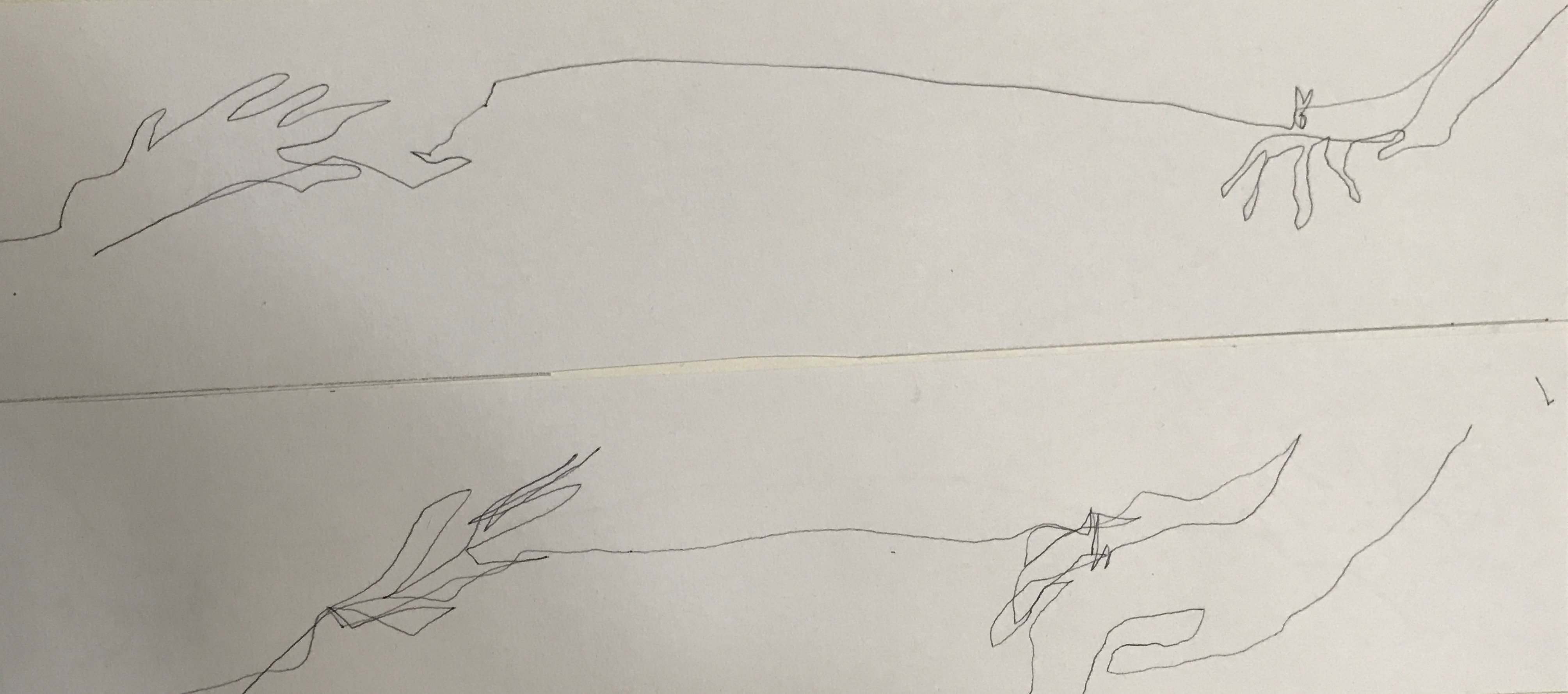
For this piece, I was inspired by the Chinese legend, the red string of fate: two lovers will be bounded by a red string tied onto the pinky. I tried drawing the idea of having your pinky bounded by doing blind counter drawing for both my left hand and my right hand. However, the end result did not turn out great as it is hard to distinguish what I drew much less tell the emotions.
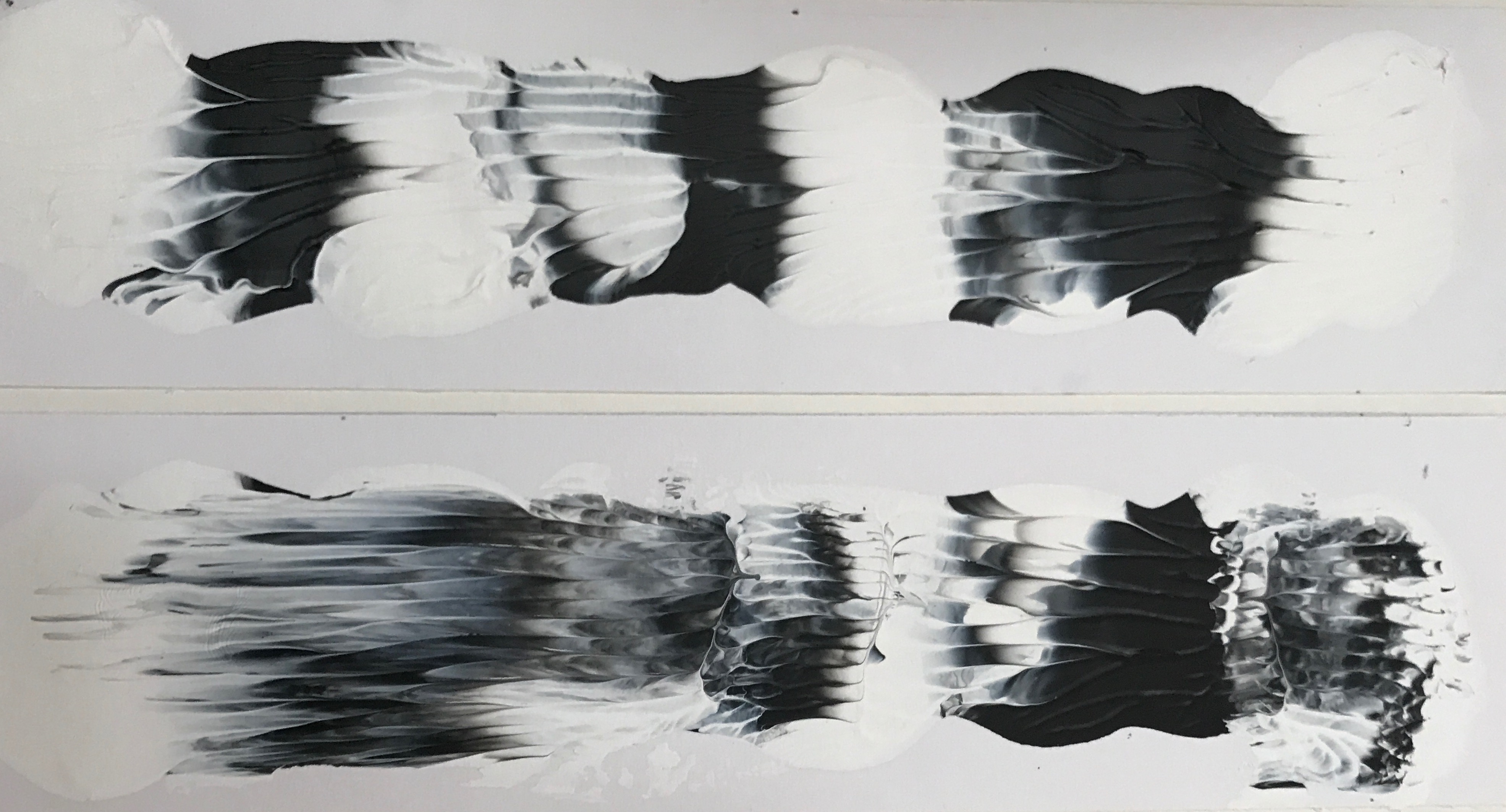
For the last piece, I wanted to show the merger of two to become a better version of yourself. I used the technique of decalcomania for this piece. I place blobs of paint onto the paper before sandwiching them, allowing the paint to blend and mix with each other. The white and the black paint represents two people that are starkly different and opposite of each other. The gray shows their development and acceptance of each other. I like this result a lot as it shows the gentleness of the relationship through the soft blending of colours and the turmoil of the relationship through the jagged areas. I will most definitely be exploring this technique on a larger scale for my final.