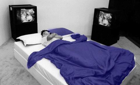
The viewers are invited to a room with a bed (A). Thousand of miles away, another participant lies on the same bed (B), with a camera above recording their movements. These movements are monitored and then projected back onto bed A. The viewers are encouraged to lie down on the bed to interact with the other party. The telematics collaboration of both viewers from different places in an intimate setting of a bed creates a really interesting paradox, which I would further explore below.
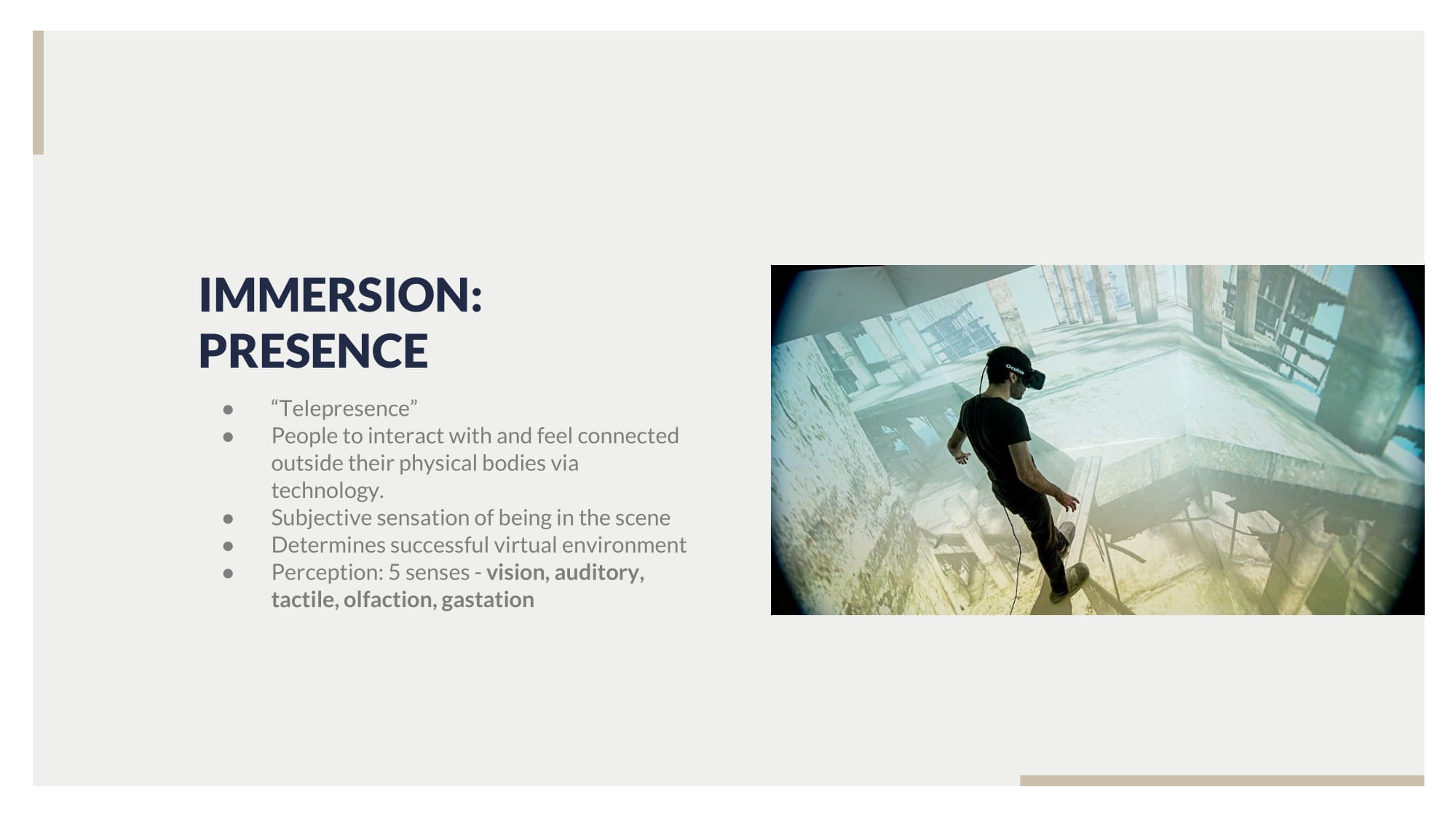
Immersion:
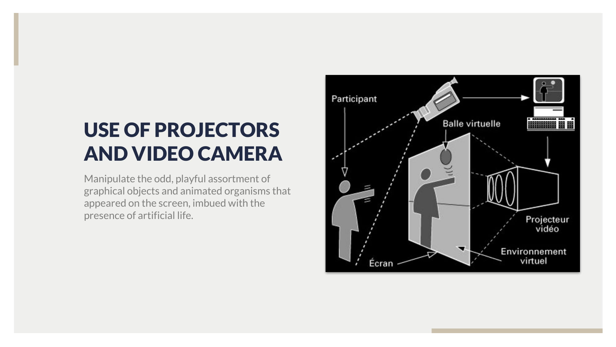
Ivan Sutherland’s Ultimate Display, describe immersion as the removal of the physical space and plunging into a virtual world, where one could see, smell, taste, and touch. While Paul Sermon did not achieve full immersion, he managed to bridge the physical presence and the telematic presence through a physical object: the bed. The bed plays a paradoxical role here. It carries the intimate setting of a personal space, however, in this artwork, it also becomes an open space. By inviting a stranger into a bed feels only intimate, and this intimacy is made more real with the physicality of the bed. Through touch, the participants can interact with the bed hiding under the blankets. This makes it more personal as if the other virtual party is intruding your space.
viewer reacting to the other party removing the keys away from them
What I felt was very interesting, was how people really respected the image of the other party. During the run of this project, almost no one sat on the image of the other party on the bed. In one case, when one of the projected participants reached a set of keys on the bed. On the other end, the participants actually physically moved the keys out of the way as if the projected image is physically able to take the keys away. It’s very interesting to see how the audience is conscious of the projected parties presence, despite not physically being there. Paul Sermon managed to attain such a deep level of immersion, despite only utilising sight, hearing and touch. I guess one reason, why this worked so well is due to the incorporation of the bed in our reality, the physical space. Paul Sermon doesn’t try to create a virtual world in a third space. In a way, our moral and ethics and sense of realism are retained as we do not “travel to a fictional space”. This makes it more real, more intimate.
Entropy
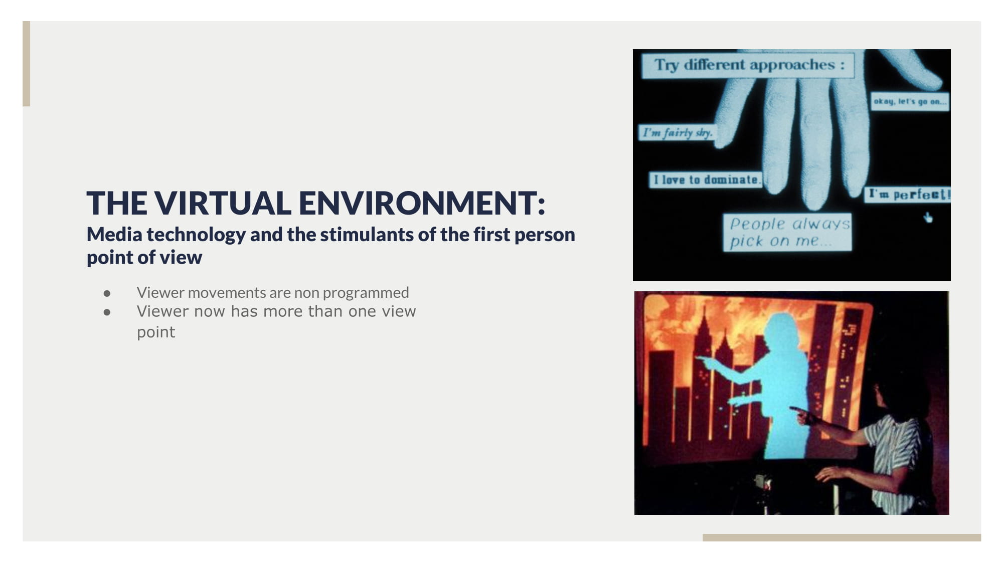
Paul sermon also stimulates the first person experience, through the use of entropy. Telematic dreaming has an opened participation to it. There is no pre-programmed route embedded into the artwork. All of the interactions with the artwork is organic and based on the two participants. There is no to little artist interference or involvement in the interaction of the work. The artist role here is to provide the platform: the bed and the projection.
Conclusion:
Overall, I think that telematics is a very successful interactive artwork. While it did not achieve full entropy or achieved the Ultimate Display, I think it is perfectly fine. These two concepts itself is very extreme. Achieving the Ultimate Display will raise up a lot of ethic and moral questions. The Ultimate Display calls for a virtual world so real that I could actually feel the pain of dying. This extreme manifesto rings a lot of alarm bell for me. What if someone died in the virtual world and experienced trauma so bad that he is unable to function in the real world. For this artwork, what if the projected image is so real that one participant actually starts getting intimate with the projected image? Is it considered rape if that isn’t your physical body? Even without engaging all of our five senses, Paul Sermon is able to create this “reality” of the other projected party that we respect their space as described above. Today, I think that it is impossible to achieve full entropy in an artwork. Nothing would happen. Leave a blank wall in the museum, it would still be blank after years. There needs to be an input to achieve a response from the audience and ultimately achieving an output. In Paul sermon case I believed that his artwork a substantial amount of entropy. Paul sermon controls the input (interacting with the bed) and the output (the projection). However, the response is organic and is solely based on the participant’s reaction to the work. I believed that is the greatest extent of entropy an artist can ever achieve in a successful work.
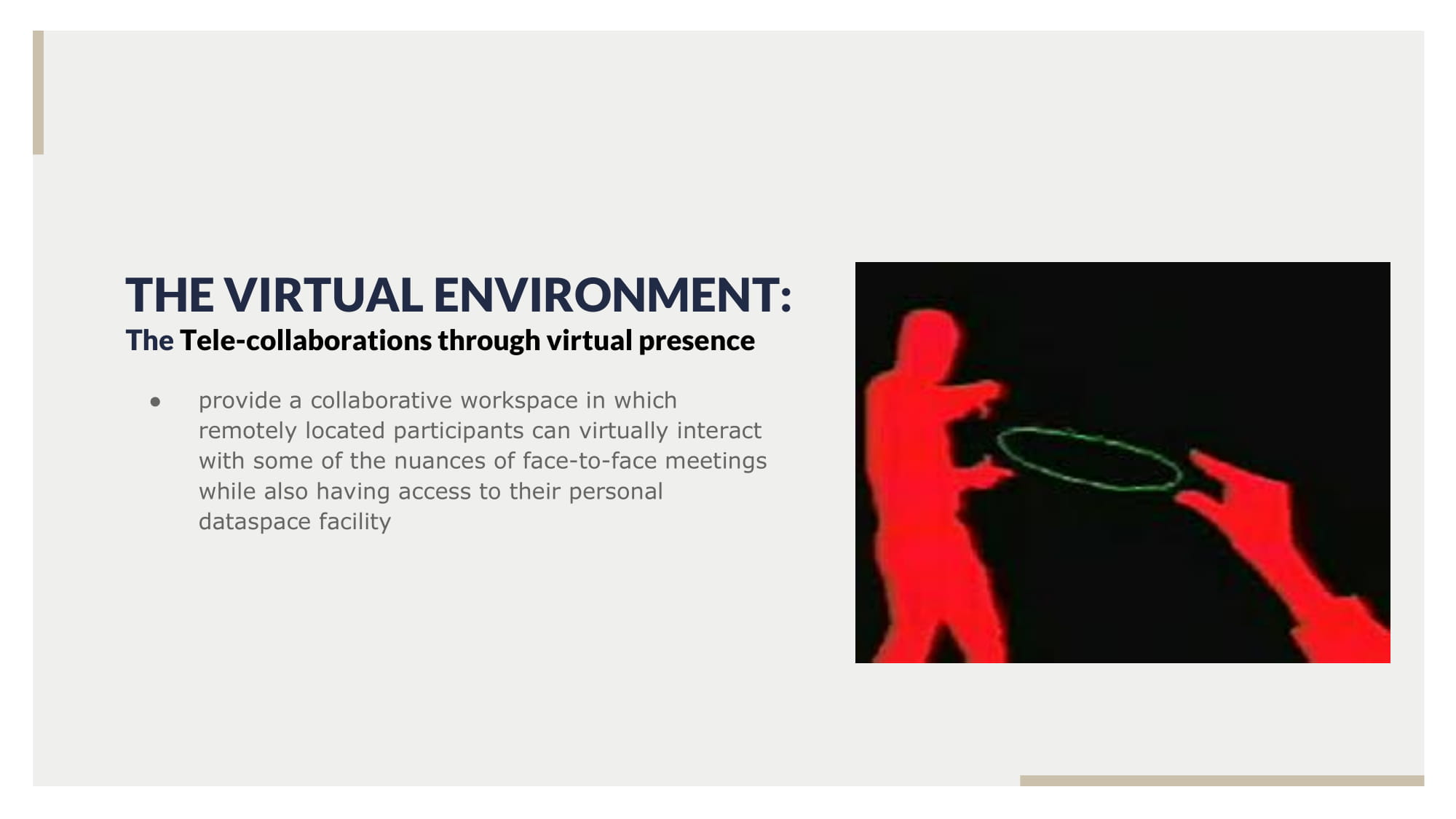
Telematic Dreaming is a telecollaboration piece done by Paul Sermon in 1992
The video image of the audience lying on a bed is captured by a camera and processed. This is then projected onto another bed, where another audience interacts with the image and is sent back to the first bed. Telematic dreaming bridges the third space by inviting users into an intimate setting of the bed. The video projection allows the viewer to be intimately alive despite being in two remote sites.
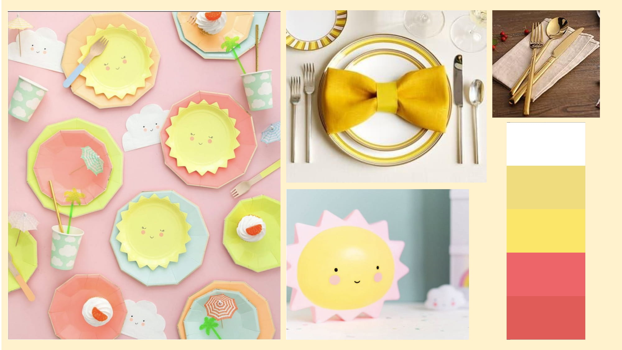
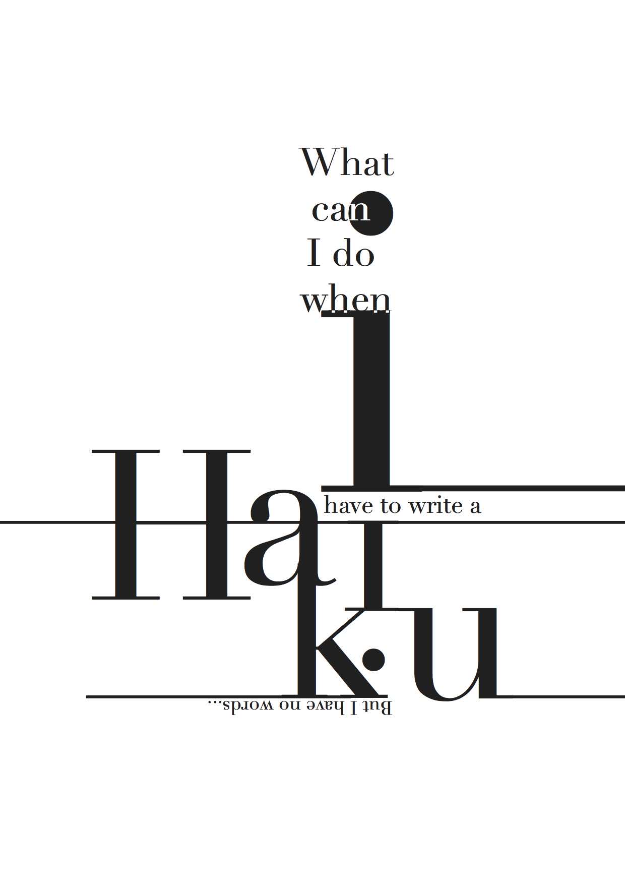
I wanted to focus on the simplicity of the text since there is no visual imagery in my poem. I wanted to focus on the word haiku since the project is about writing a haiku. As haiku originated from Japan, I wanted to incorporate some Japanese elements into the design. I was inspired by the clean Japanese minimalistic style.
I am on the crystal goblet side for this argument, but at the same time, I’m a gaudy goblet person. After all, I’m guilty of creating complex and detailed graphic designs to cover the fact that my concept isn’t as strong as my classmate. I understand both sides of the argument, but I mostly agree with Beatrice Warde.
The crystal glass the place more importance on the function then the aesthetics of the font. To this, I greatly agree. A designer job is to project their client’s message to the masses. However, if the public takes home a different message as compared to what the client wanted, the campaign has fallen through. You have just wasted your time and your poor client’s money. Without an emphasis on the message, how can it be a good design? Legibility and readability are crucial in a design. Legibility refers to the ability to read the words correctly and readability refers to how fast you can read the text. Both are equally important in a utilitarian design. In today world, everything is moving at an extremely fast pace. Give the masses a convoluted text, they would spare no glance at the design. Information is being passed at such an incredible speed that readability and legibility is an indispensable part of the design.
However, the crystal glass is too monotonous. By laying itself bare, all of it looks the same. There is no creativity. It’s rather stiff and rigid. 10 works done, it still looks the same. The gaudy goblet, on the other hand, offers something new every time. It’s fresh and new. The play of the text may take away the legibility and the readability, however, it adds to the context of the work. Take a look at Paula Scher noise poster. The experimental text adds so much to the poster. The text is funky and it looks as if its almost moving and popping to the music.
All in all, I believe that everything has a place and time. While I agree that a utilitarian design is important, it isn’t everything. Both goblets have their own merits and demerits. You just need to be able to leverage on them. One can always marry the two. They just need to find the balance. Hey, who says I can’t enjoy wine in a fancy embellished crystal goblet.
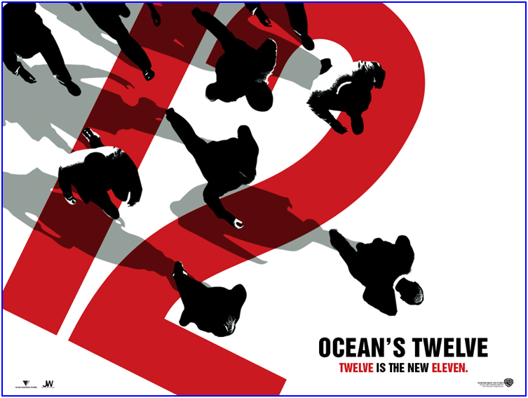
Paula Scher is one of the most influential American Graphic designers in the world. She seeks to bridge the familiarity with the unfamiliar. She tiptoes between the fine line of pop culture and fine arts in her work
When I was watching the video, one thing that she said about creating storefront really struck me. The type is being layered over something, be it the shop or the background. This shocked me greatly. Being a designer, we are very used designing logos and designs against a pure white background. But in reality, that’s not how our designs will exist in the real world. There is always a background, a very noisy one. That interplay with the background and the form is often ignored by designers. Type is all about layering
I love her attention to detail. How something so simple holds so much at the same time. Her typography choices embody the quality and the soul of the subject matter.
Her noise funk poster embodies this special quality of her designs. The typo feels almost as if it’s moving and popping to tap dancing.
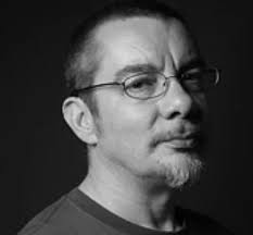
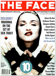
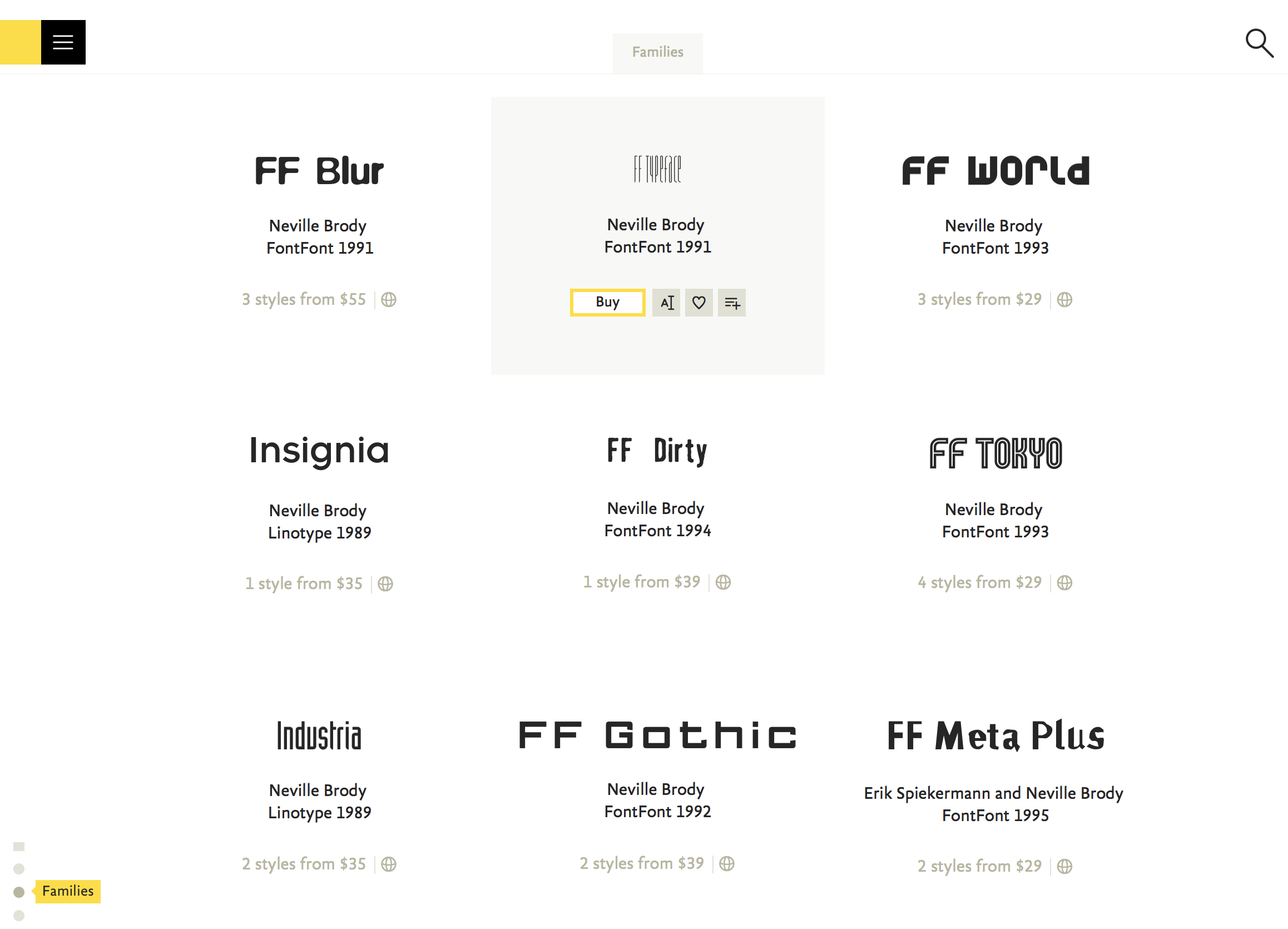
Neville is an English experimental typographer. He takes great influences from the punk rock era in 1977. His designs have this edgy and popping vibe to it. He began as an art director to many magazines such as The Face and later the Arena.
Among all in his biography, his persistence really struck me. Despite his tutor constantly demarking his work as “unmarketable”, he never gave in and continued to experiment. I love how he challenged the common notion back then. The grids, page canons, safe and tested economic strategy, were all traded for this eddy and almost chaotic style. In the video, he highlighted the notion of failure and play. He points out that through constant experimenting and playing, one often find themselves making mistakes or simply failing. This failure, open our minds and eyes to new things that we haven’t seen before. Through these happy accidents, we are able to expand our graphics knowledge. I wholeheartedly agree with this statement. To be honest, I wished I would embrace this concept more. I have the tendency to go for the safe route. I hate the unknown. Heck, I feel insecure about leaving my designs to chance or even the public. I feel safe by the known. I certainly will make a conscious effort to let myself go wild and play with my design in the future.
He also co-founded the FontShop, a closer look at the website, I immediately fell in love with a few of them. A few of my favourites include Industria and FF Tokyo. I love the curve and the form of the font. It’s so elegant and timeless. Mind you these were designed in the 1990s. For them to still look relevant and modern, is a great feat.
Lastly, he mentions design being a multi-faceted medium. A designer is not just isolated in his adobe creative suite world. Graphic design has evolved to encompass more than that. Technology is increasingly being incorporated into designs. Beck’s playable poster makes use of conductive ink in its printing, to play music upon touch. A designer today is one that actively tries to marry different disciplinary into one seamless project.
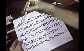
Ignoring the bad quality video and the cheesy music, the one thing the really struck me was how “people took type for granted”. This is undeniably true. To the untrained eye, all fonts may or may not look the same. Sure they might be able to discern the difference between a san serif and a serif font. However, they are still ignorant to the nuances a type hold. This results in terrible font choices especially the rampant use of comic sans. Shudders. I feel like this attitude towards type was propelled by the creation of the computer. Turn on a MacBook and you have a whole directory of type (tadaa font book). Using type became easier and more brainless. I feel like this change resulted in type turning from an art form to one of utility purpose.
From this video, my respect for typewriters in the past has greatly increased. The amount of labour and repetitive work that is placed into creating each type. I wished that a greater amount of people is able to see this video and appreciate type more. Type is more than Microsoft words, it’s the life and the sweat of a typewriter. This video also made me more appreciative of illustrator. Today I swear by the pen tool and the direct selection tool in all my design works. With a few clicks of the mouse, I am able to distort and tweak the type. However, all of these had to be done manually in the past.