Category Archives: Process

IMAGE THROUGH TYPE: R

IDEATION AND SKETCHES 

R was the first design that I started out with. At the very beginning I was very inspired by this studio ghilbi fan art, celebrating the 30 anniversary by Milena Młynarska.

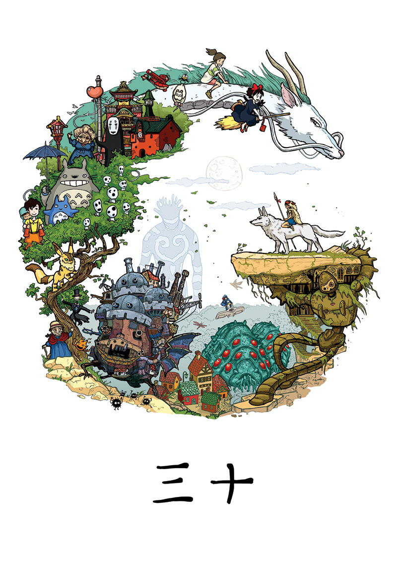
greatly inspired by this I set of to create my Disney version.

preliminary sketches
refined sketch

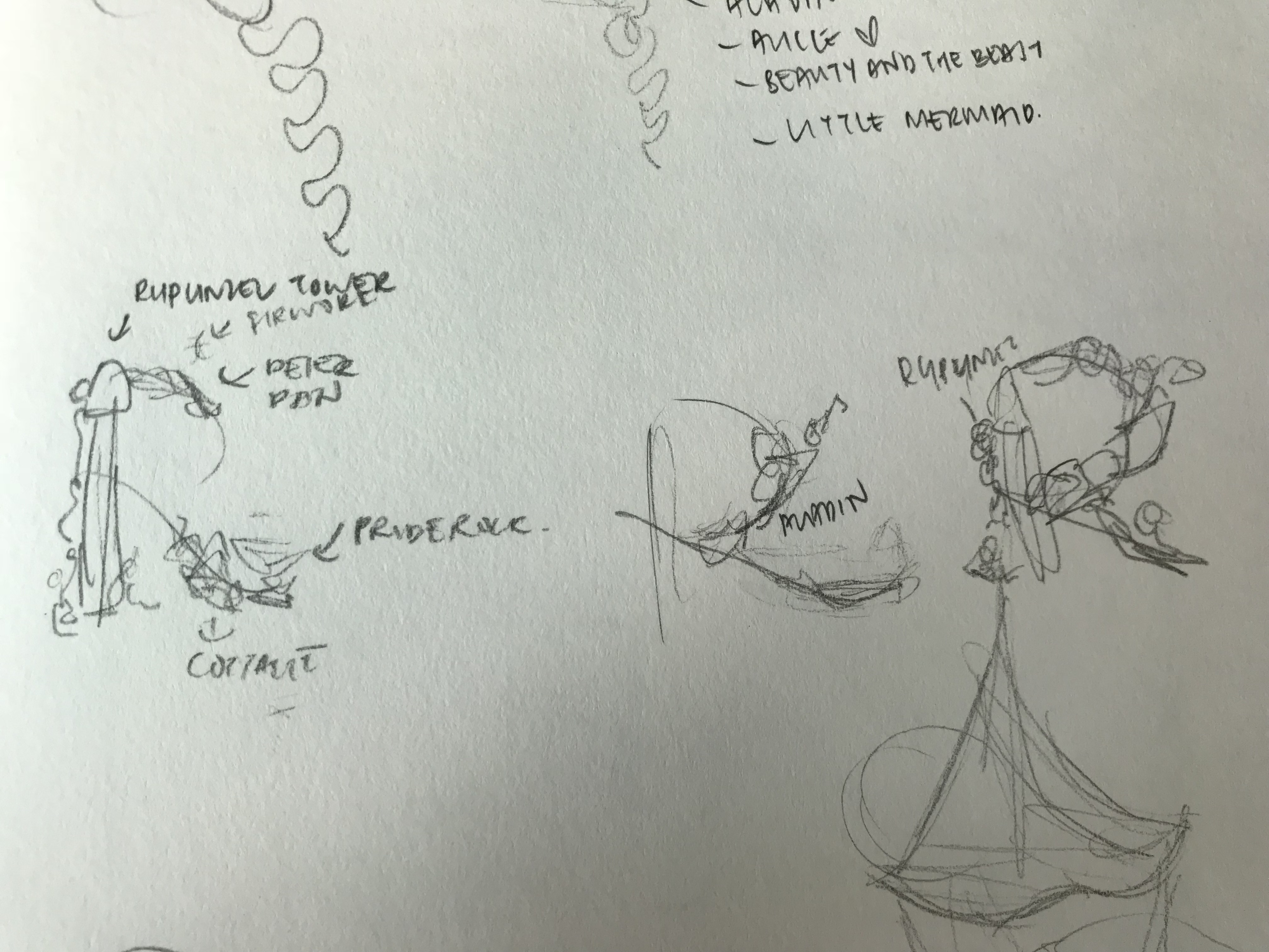
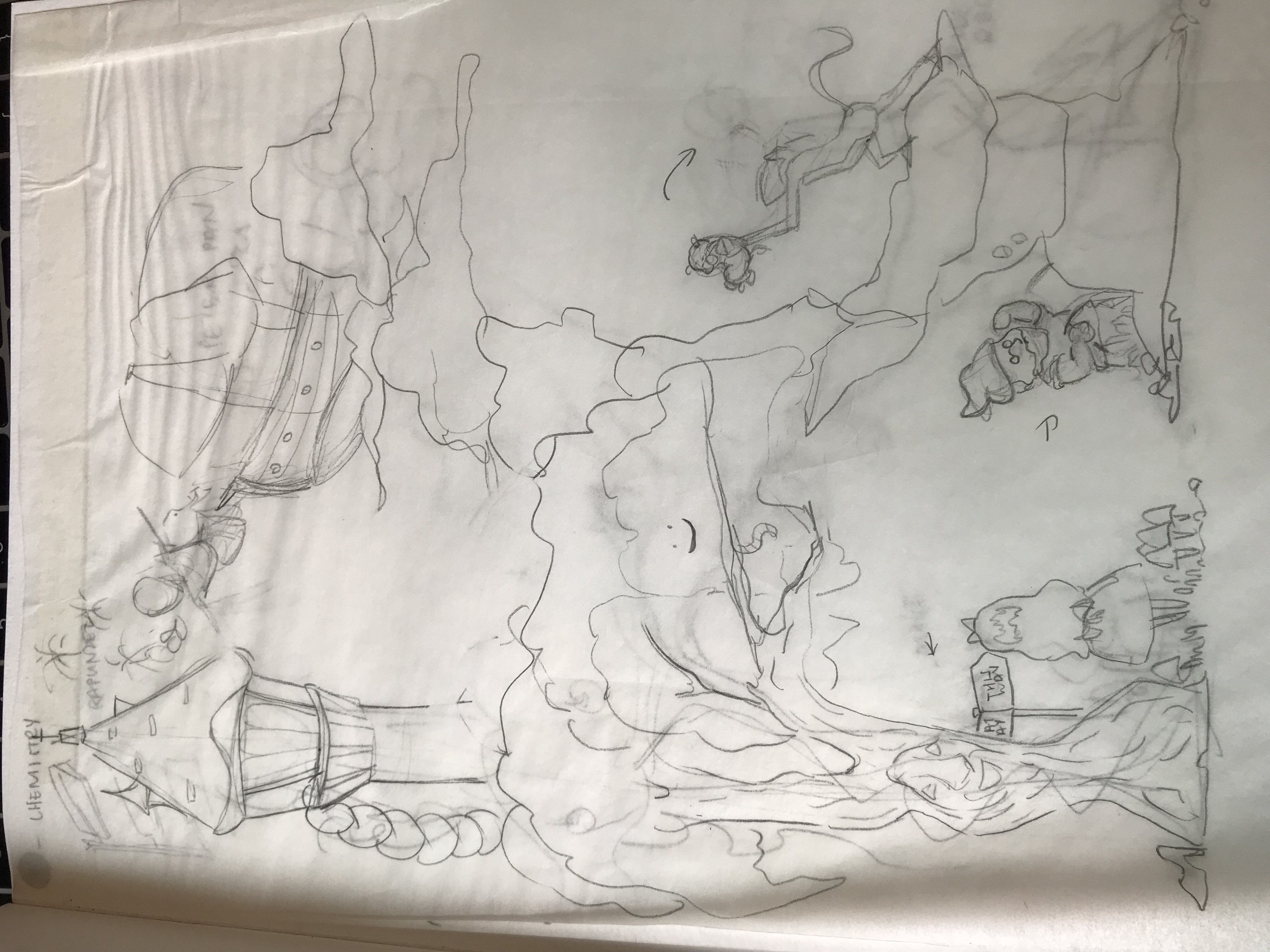
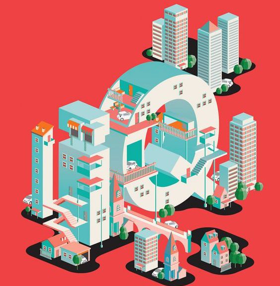
The vertical part of R is made up of the willow tree in Pocahontas, and Rapunzel tower with her hair. the curved part of r is made of Peter Pan’s ship and Tinkerbell. the last part is made up of pride rock with Rafiki holding up Simba. As much as I loved this design, I decided not to use it for two reasons. 1. this style of rendering is very flat unlike my other isometric vectors. I generally like having my work as a body instead of having individual pieces. 2. This isn’t really practical, there is too much details to be completed in the then 4 week project. Hence I decided to create a isometric version of Disneyland.


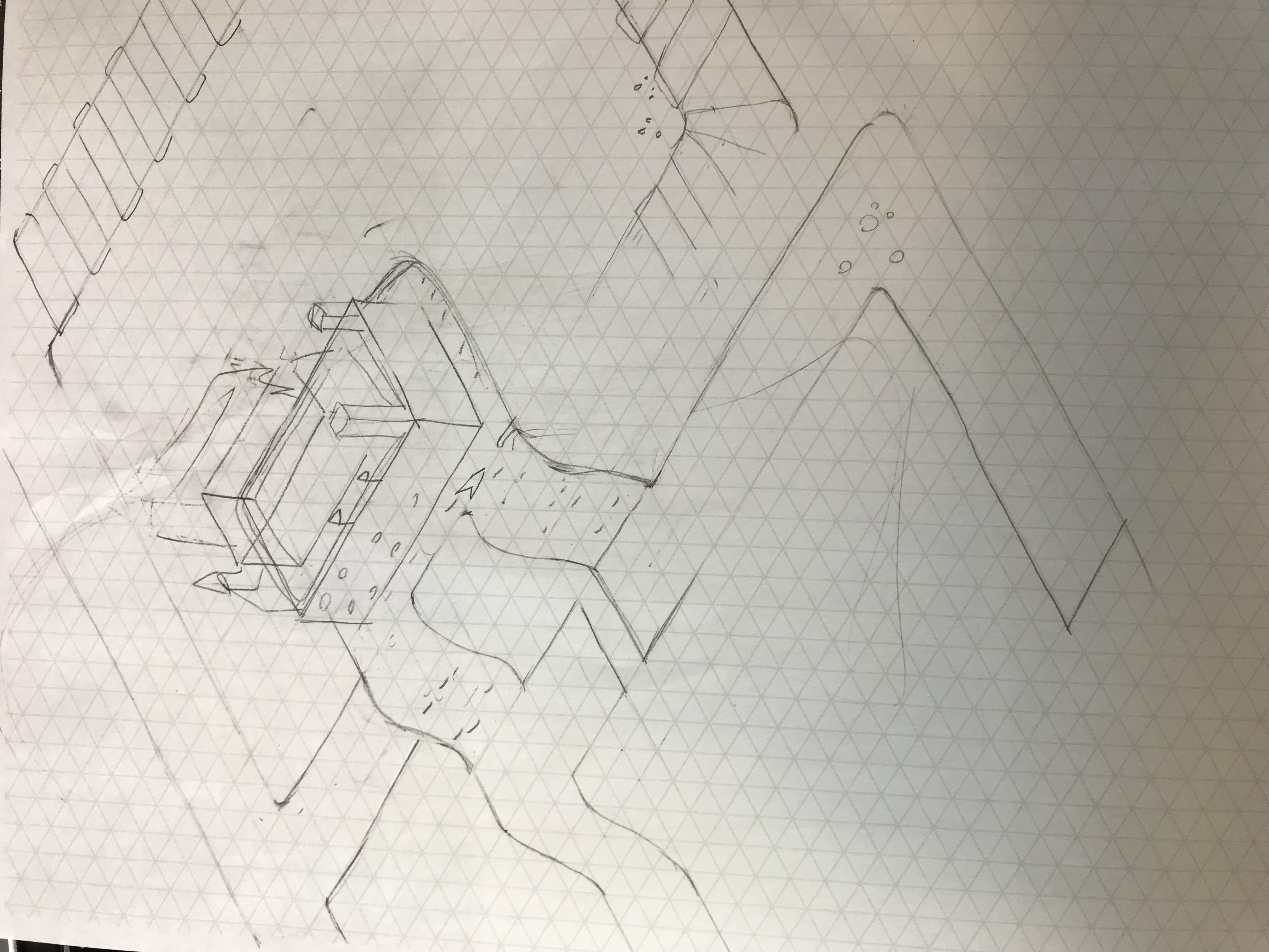
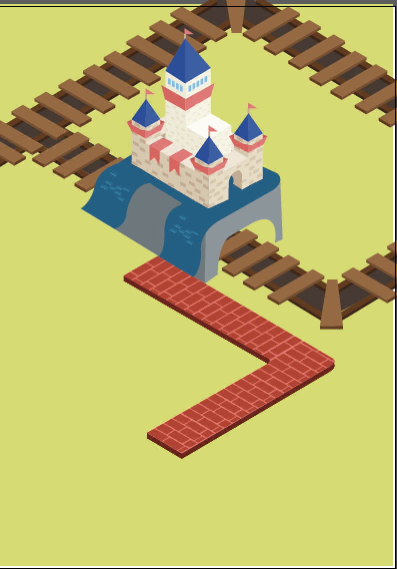
For this design I wanted to play with gestalt, I wanted to hide part of the form R but still allowing the viewer to recognize the form. for this form I incorporated it into the roads and river of the theme park.  I wanted to incorporate elements of the Disney train and their river safari into the piece (both of the rides are one of my favorite when my little brother starts getting tired).

This design wasn’t really well thought out. I kinda failed to plan so I planed to fail. I decided to scrap it and re-do.

I realized the reason why I had so much trouble conceptualizing for Disney was because of the influx of reference I had. I wanted to incorporate so many things into the design that I had no idea what to focus on. So instead of working for Waltz Disney, I decided to work for myself. I’m going to make y own Disneyland.

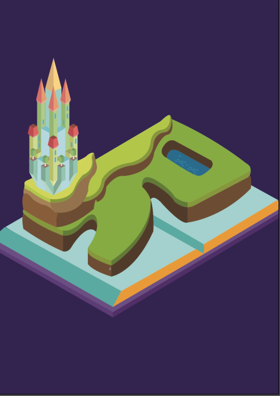
I decided to use the motif of a storybook as thats the first medium of waltz Disney works I was first exposed to. Also I staggered the lands by creating three tiers the top tier is the castle, second tier is the forrest and the last one is the village. I was inspired by the set up of many princess stories.

And then I hit another crisis, color combination for the background. So I played with cloud picker and tried to find the best color.

In the end to maintain the color scheme I decided to go with secondary colors of either orange or purple.

purple version
orange version

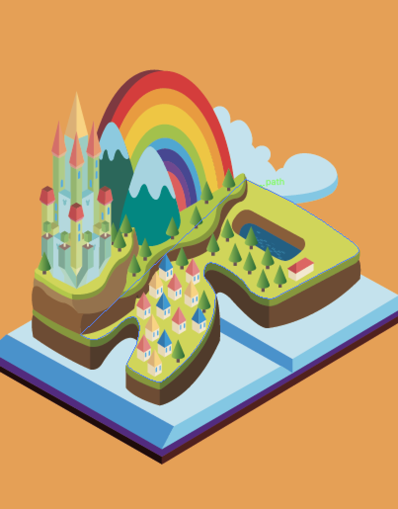
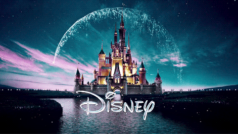
In the end I preferred the orange version and changed the books to blue for a greater contrast and emphasis. I added the rainbow as a homage to waltz Disney castle
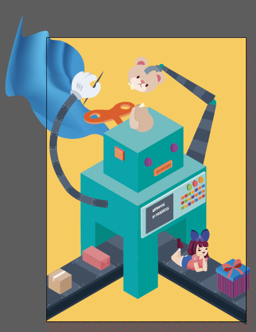
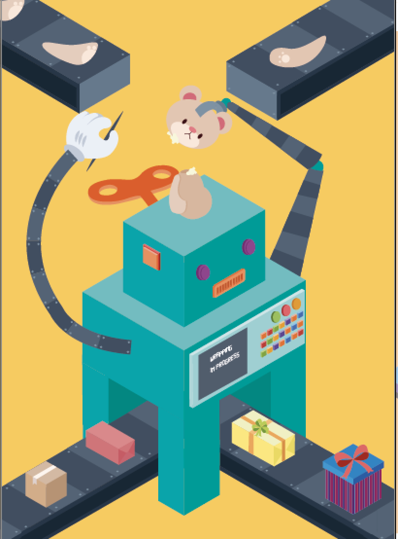
FINAL ILLUSTRATIONS

Image Making Through Type: X

IDEATION: Sketches

As a child, i didn’t grow up having much barbie and dolls. I guess, my parents really wanted me to be a guy, that why they gave me really boyish toys. So instead of having the fantasy of being a princess, I was out about, playing in the garden, watching power rangers and transformers. The one toy that my father loved buying for me and my sister is lego, and I hated it. I just simply couldn’t follow the instructions. But as a child I distinctively remembered that my father got us a huge lego set, which allowed us to build and design houses. needless to say, I was the assistant handing my sister the right pieces as she build them together.

inspiration for 1st design

So my first idea was too create a house in the letter form X. However that didn’t go too well as seen by the sketch below, my foundation of perspective is way too week to pull the design and technical drawing for it to look semi realistic.

yeah I kinda gave up on it

So then I went to the web and typed: toy maker and images of workshop popped out. Then I begin thinking: who has a workshop? Santa.

reference piece for Santa workshop

But what if I create a machine that make toys instead? So I set out sketching and referencing robots to create my machine.

preliminary sketch
refined version on isometric paper

I liked how the conveyor belt formed the bottom half of the X and the arms of the machine formed the upper part of the X. However I was really afraid that the arms were too organic and wouldn’t show the X structure so I created another version.

secondary idea

this time I used conveyor belts to feed part of the soft toys to the machine at the top while it churns out the finished product and package it at the bottom. While this design showed the form more clearly, I preferred the design above as it was cuter and more interesting. I thought that I could, make the arms more rigid, to show and emphasize the geometric and rigid structure of the x in the first design.

Illustartions

more rigid arms
more organic arms

So my worries are through and they back fire. The rigid arms did nothing much to help suggest the letter form X and looked awards instead. so I decided to revert back to the more organic arms instead. Then Joy suggested to me that I could have ribbon feeding into the machine from the back to complete the X form, while making it seems like its part of the wrapping mechanism.

Well that didn’t work out too well. I had no idea how to illustrated cloth in vectors without using more than three colors while preventing it from looking like a clip art. So I tried to use the distort tool along with the gradient tool in Illustrator to create the look above. However the sudden use of gradient caused a conflict in styles which look oddly placed. so I decided to remove it and incorporate elements of the second design above to salvage the illustration.

I decided to use the conveyor belt idea in the second design to form the upper part of the X. to be honest, I felt that the letter form could be better expressed if I pulled the conveyor belt on the top to meet in the centre. However that would cover up the arms of the machine creating the soft toy, hence I decided against it.

In the beginning I wanted to have a little girl interacting with the machine to add a bit of character and cheekiness.

first sketch

I begin sketching this with my Wacom in photoshop.

illustration

But then I relied that her posture and her anatomy was super flawed so I redid her. In addition, I felt that she was way to stiff and decided to make her lie down in the end.

second sketch
final sketch

I have no idea why, but when I did the sketch digitally the proportions and anatomy are very flawed. So I lowered the opacity and hand drew them instead.

However I felt that there was a contrast in style. my vector illustrations were all isometric, thus giving it depth. However, my human illustrations were flat and somewhat 2d-ish from the lack of shades. So I decided to remove her in the end.

FINAL PIECE

final illustration

Image Making Through Type: concept

CONCEPT

So when I first got this project I immediately though of the jobs that I could pick from. But I realized that the period of time when we got questioned on our dreams and aspirations the most was during our childhood. We had many big dreams and aspirations when we were younger, however some aspects may have been twisted or fantasied. For example, I’ve always wanted to be a chemist when I was 7. I thought all they did was to pour chemical from one flask to another, create an explosion, or make poison. So that spurred my concept for this project. I based it off my childhood aspirations with a bit of spice and magic.

JOBS THAT I’VE CHOSEN

  • Chemist
  • Disneyland  Imaginner
  • Secret Agent
  • Toy maker

These jobs that I have chosen are some of the many childhood aspirations I had while growing up. Some of them are even jobs that I wish I could do as an adult.

LETTER FORM CHOSEN

Right of the bat, I wanted to only chose one alphabet for each occupation, for two reasons. Firstly, I wanted to keep things simple, and focus on incorporating the letter form into the work. secondly, it reminded me of the alphabet placards that we taught children alphabet and spelling with. Which tied in nicely with my concept.

Also I decided that I wanted to spell my name abbreviated in the four designs, X, R, E, I.

I decided to use “X” for the Toymaker, as it was more structured and I thought of stacking legos to create the shape. I assigned Disneyland to “R” as it was more organic, and I thought that the magical elements would work well with the fluidity of the form. Thirdly, I assigned chemist to “E” as I thought that the form allowed stacking and thus creating chain reactions. Lastly I gave “I” the occupation of Secret Agent as I thought that the form resembled a secret operation base building.