Tag Archives: illustrations

Image Making Through Type: X

IDEATION: Sketches

As a child, i didn’t grow up having much barbie and dolls. I guess, my parents really wanted me to be a guy, that why they gave me really boyish toys. So instead of having the fantasy of being a princess, I was out about, playing in the garden, watching power rangers and transformers. The one toy that my father loved buying for me and my sister is lego, and I hated it. I just simply couldn’t follow the instructions. But as a child I distinctively remembered that my father got us a huge lego set, which allowed us to build and design houses. needless to say, I was the assistant handing my sister the right pieces as she build them together.

inspiration for 1st design

So my first idea was too create a house in the letter form X. However that didn’t go too well as seen by the sketch below, my foundation of perspective is way too week to pull the design and technical drawing for it to look semi realistic.

yeah I kinda gave up on it

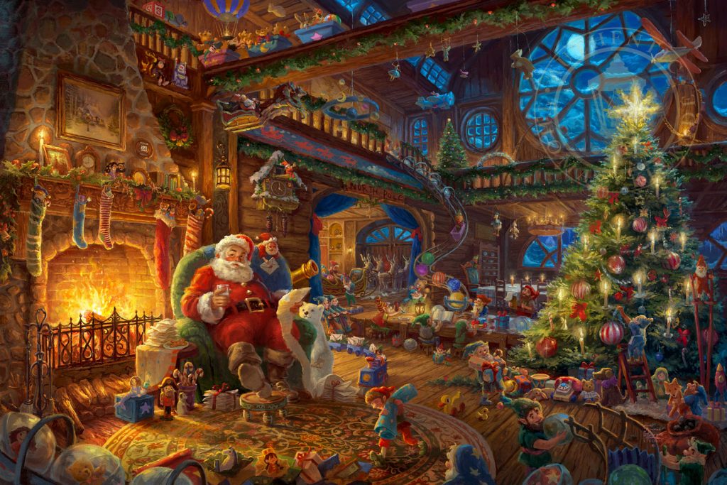
So then I went to the web and typed: toy maker and images of workshop popped out. Then I begin thinking: who has a workshop? Santa.

reference piece for Santa workshop

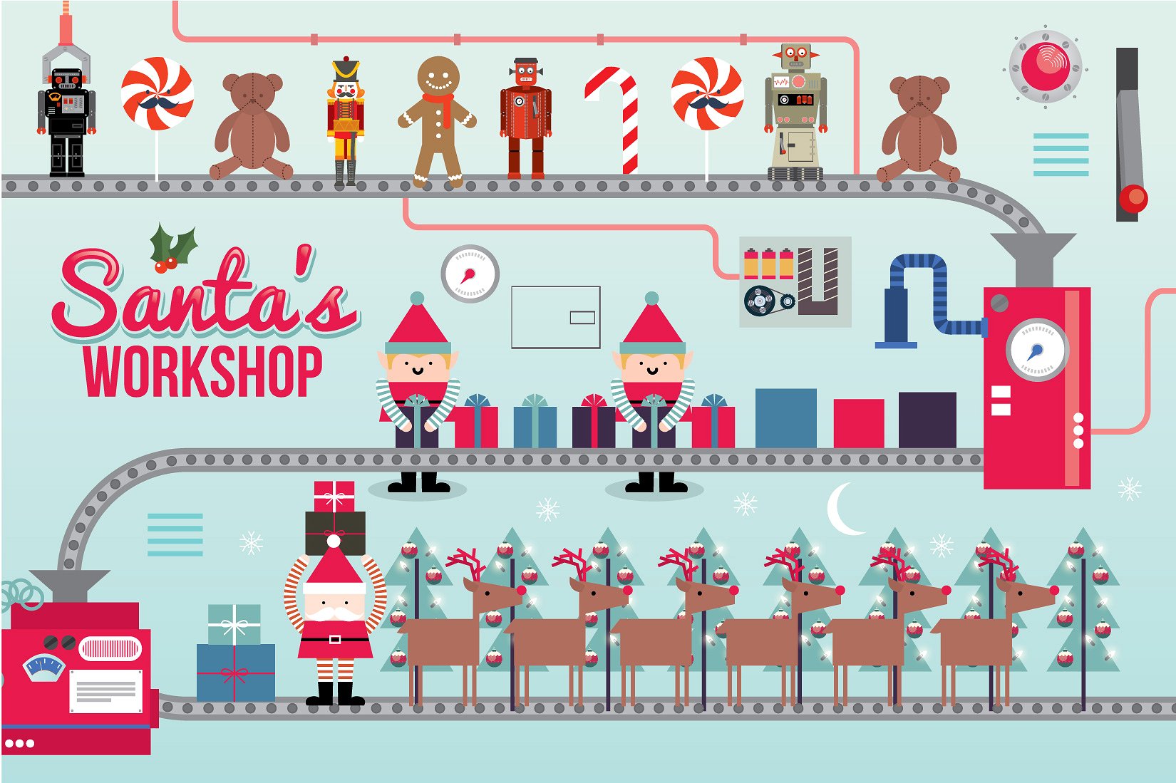
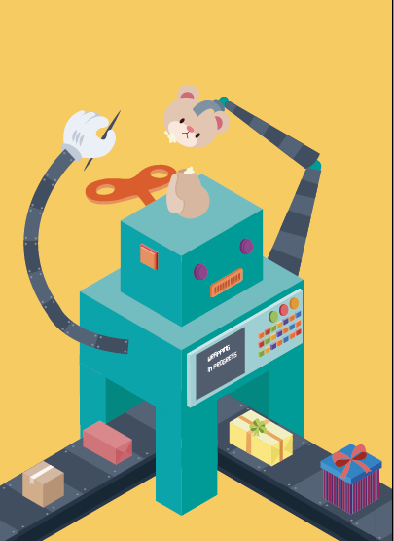
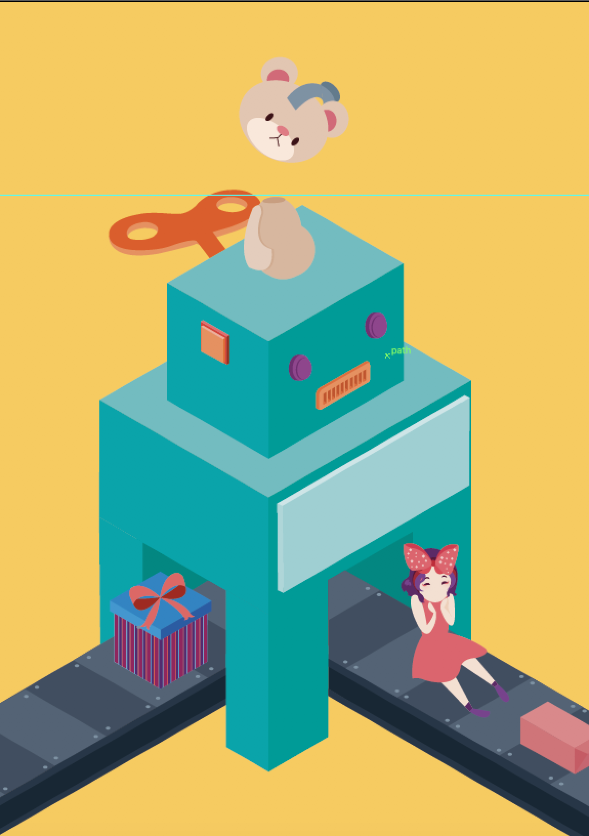
But what if I create a machine that make toys instead? So I set out sketching and referencing robots to create my machine.

preliminary sketch
refined version on isometric paper

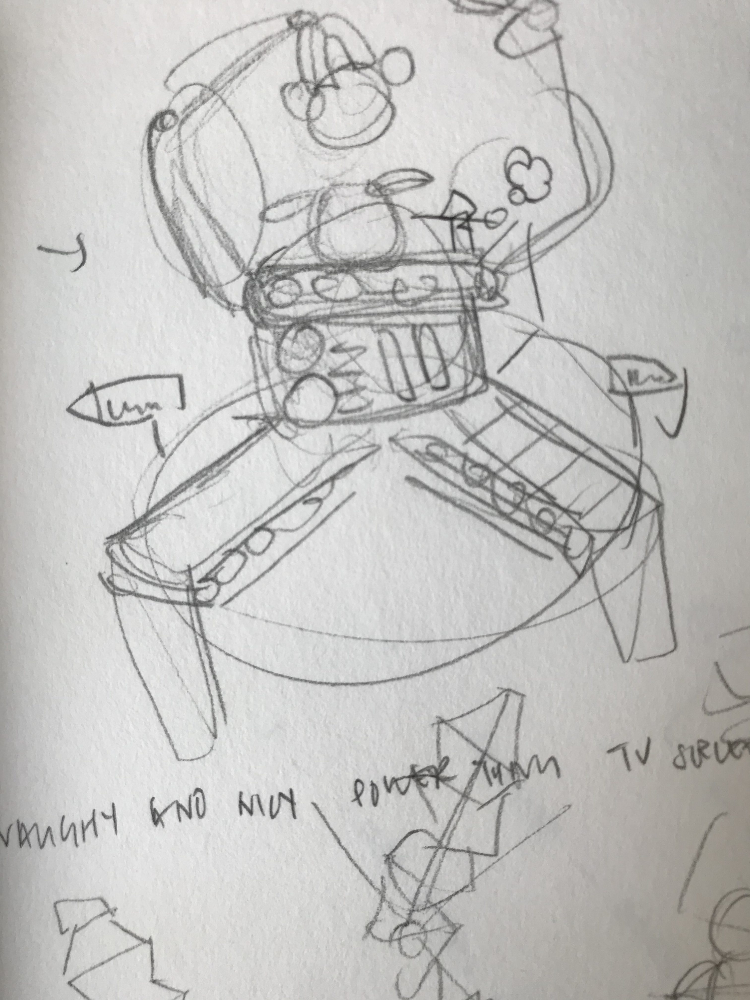
I liked how the conveyor belt formed the bottom half of the X and the arms of the machine formed the upper part of the X. However I was really afraid that the arms were too organic and wouldn’t show the X structure so I created another version.

secondary idea

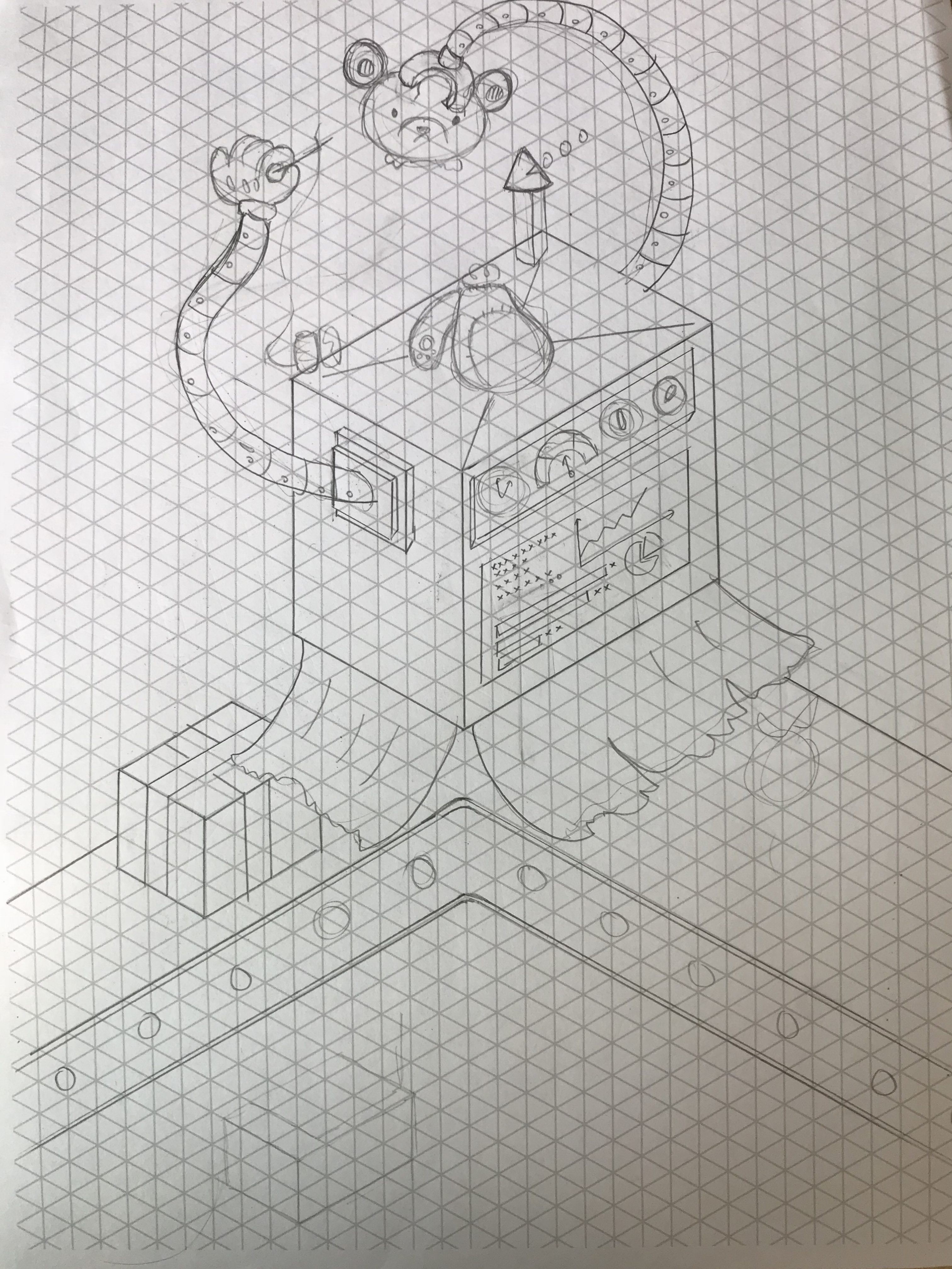
this time I used conveyor belts to feed part of the soft toys to the machine at the top while it churns out the finished product and package it at the bottom. While this design showed the form more clearly, I preferred the design above as it was cuter and more interesting. I thought that I could, make the arms more rigid, to show and emphasize the geometric and rigid structure of the x in the first design.

Illustartions

more rigid arms
more organic arms

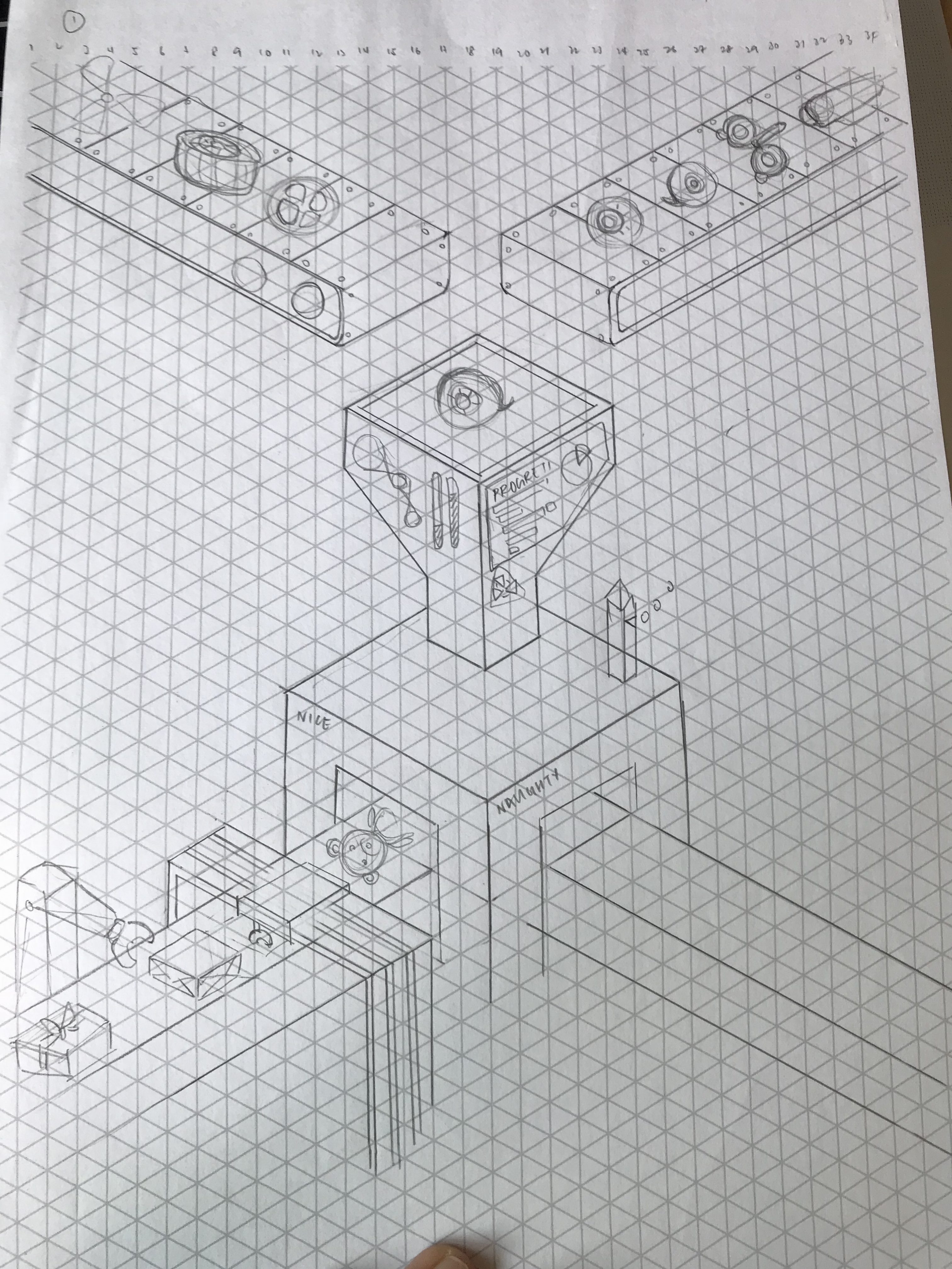
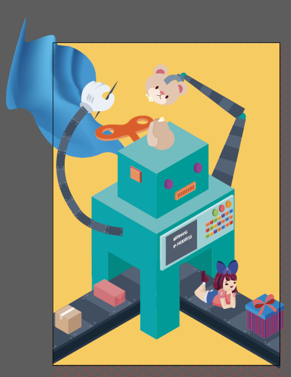
So my worries are through and they back fire. The rigid arms did nothing much to help suggest the letter form X and looked awards instead. so I decided to revert back to the more organic arms instead. Then Joy suggested to me that I could have ribbon feeding into the machine from the back to complete the X form, while making it seems like its part of the wrapping mechanism.

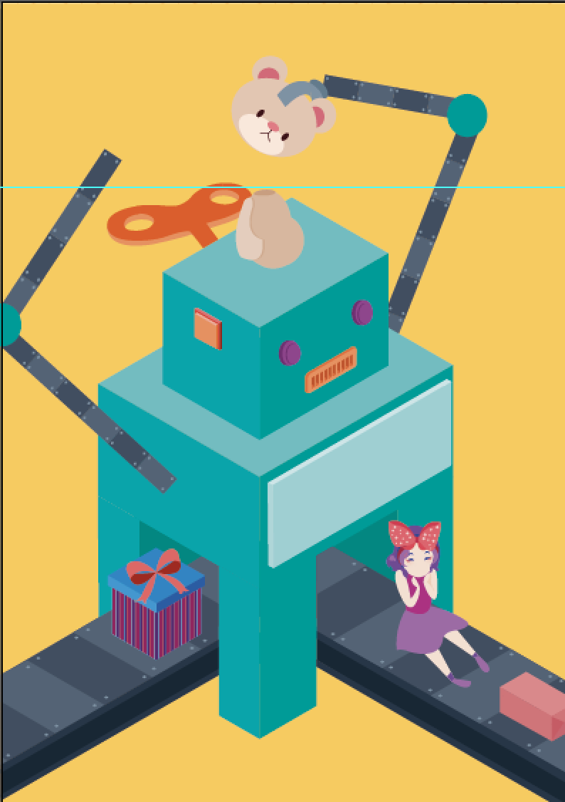
Well that didn’t work out too well. I had no idea how to illustrated cloth in vectors without using more than three colors while preventing it from looking like a clip art. So I tried to use the distort tool along with the gradient tool in Illustrator to create the look above. However the sudden use of gradient caused a conflict in styles which look oddly placed. so I decided to remove it and incorporate elements of the second design above to salvage the illustration.

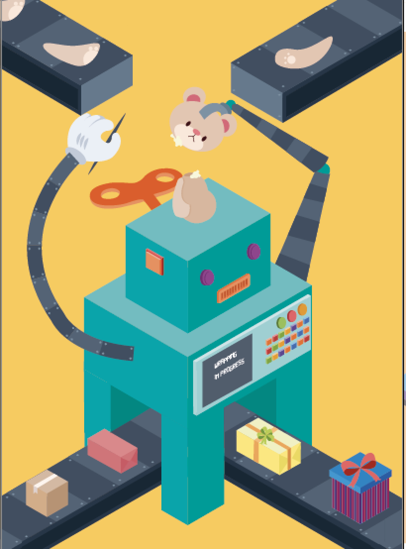
I decided to use the conveyor belt idea in the second design to form the upper part of the X. to be honest, I felt that the letter form could be better expressed if I pulled the conveyor belt on the top to meet in the centre. However that would cover up the arms of the machine creating the soft toy, hence I decided against it.

In the beginning I wanted to have a little girl interacting with the machine to add a bit of character and cheekiness.

first sketch

I begin sketching this with my Wacom in photoshop.

illustration

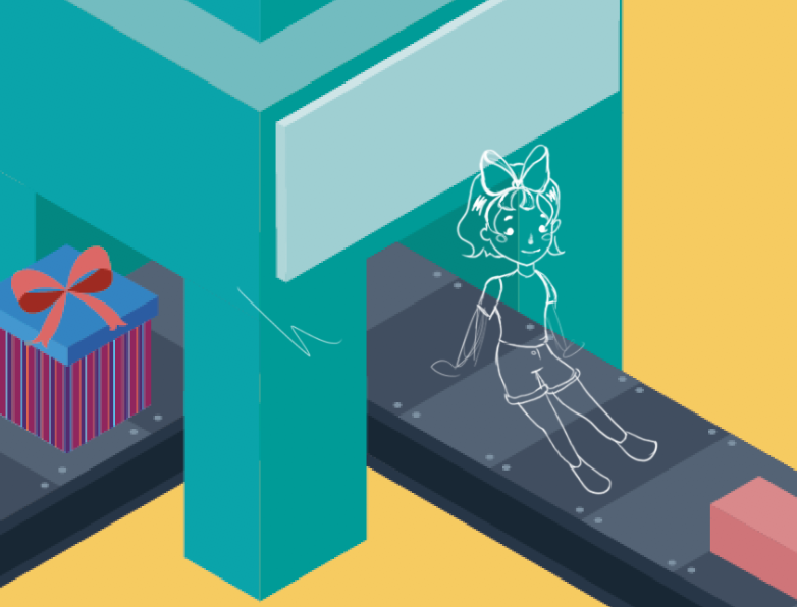
But then I relied that her posture and her anatomy was super flawed so I redid her. In addition, I felt that she was way to stiff and decided to make her lie down in the end.

second sketch
final sketch

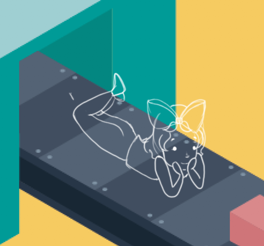
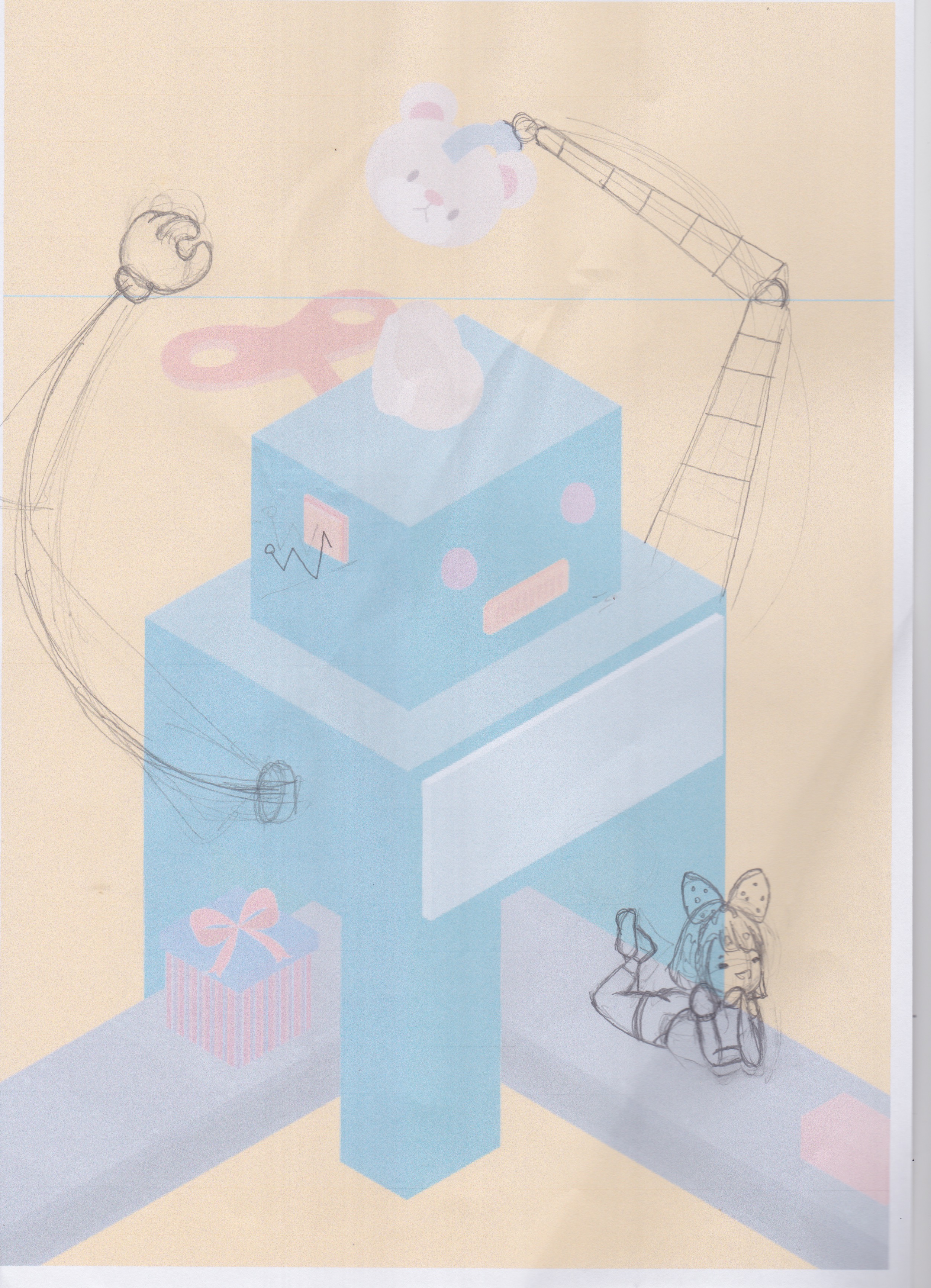
I have no idea why, but when I did the sketch digitally the proportions and anatomy are very flawed. So I lowered the opacity and hand drew them instead.

However I felt that there was a contrast in style. my vector illustrations were all isometric, thus giving it depth. However, my human illustrations were flat and somewhat 2d-ish from the lack of shades. So I decided to remove her in the end.
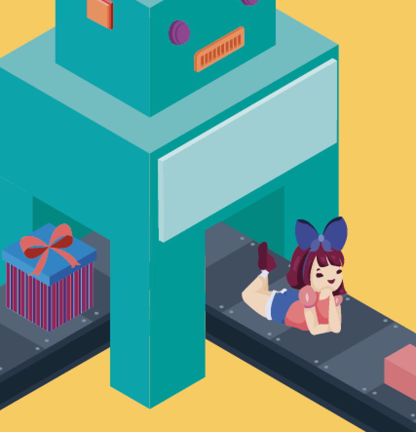
FINAL PIECE

final illustration

Project 2: Creating an Advertorial for Arizona Green Tea

MY INSPIRATIONS

The object that I have received from the draw was Arizona Green Tea. The first thing that caught my eye was how they incorporated the Japanese motif into the design of the bottle; the sakura blossom on the front of the bottle. Therefore the first images I associated the tea with was the Geisha and the Maiko ( Shrine Maidens ). Traditionally, Geishas would entertain their guest with the arts including the Tea Ceremony.

Maiko during the tea ceremony

This imagery connotes the authenticity of the Japanese green tea.

in addition, i thought that green tea has a very light and refreshing taste as it doesn’t have a strong taste. So I wanted to bring the idea of a  refreshing drink. Lipton fruit teas advertisement commonly use the imagery of a fruits, mints and summery activities to bring across the idea.

Incorporating the imagery of summer activities
Incorporating the imagery of a Lime

I also research on how Japanese advertise for green tea. Most of them focus on the vibrant green colour of the powder.

Japanese advertisement for green tea

In addition, some also incorporated the minimalistic Japanese illustration into the advertisement as shown below.

Tea time japanese traditional ceremony advertisement poster vector illustration

CONCEPTUALISATION

I was very certain that I wanted to use the imagery of a Geisha in my advertisement. While scrolling through my Instagram feed, I came across this artwork by Damon Belanger.

sidewalk shadow painted by Damon Belanger

I like how the shadow connotes the idea of the true origin or form of the green tea is from the Geisha’s tea ceremony. My original plan was to feature the Arizona green tea in the middle with a silhouette of a geisha preparing the tea as the background. However, this is too ambitious of me as I was unable to manipulate the perspective of the shadow to fit the bottle. Therefore, I scraped this idea away.

The Second Idea I had was to have a foreigner and a Geisha participating in a tea ceremony. But instead of serving the foreigner from the traditional equipment used to make the tea, I wanted to serve the foreigner tea directly from the Arizona green tea bottle. This further solidifies the authenticity of the green tea. As I had a hard time finding an image of a Geisha suitable for the advertorial, I decided to illustrate the characters so as to not compromise on my design.

However, I felt that there was too much visual information in this advertisement. The illustration is very cluttered and there is a lack of emphasis on the Arizona green tea bottle. Hence, I decided to remove the foreigner so as to bring a greater emphasis on the product.

So I decided to simplify the advertisement, only including the Geisha and the product. The geisha’s intricate and bright kimono catch our attention first. Her gaze and her outreach arm lead our eyes towards the green tea bottle. This imagery connotes the idea that the taste of the Arizona green tea is so authentic that it taste exactly like the ones prepared in the Japanese tea ceremony.

AREAS FOR IMPROVEMENT

I should have paid more attention to my choice of colour as some of the detailing such as the shadow of the neck have gotten lost. In addition, I should have used a more Japanese stylised illustrative approach (as in the Japanese woodblock print style) in this work to further bring out the Japaneseness of this advert.