Category Archives: Project 2 – Forest Gump – Research

Forrest Gump Alice in Wonderland: “I don’t know” Alice said. the cat replied:” then it doesn’t matter.”

For this quote, I’m going to focus on the uncertainty of paths.
Design 1

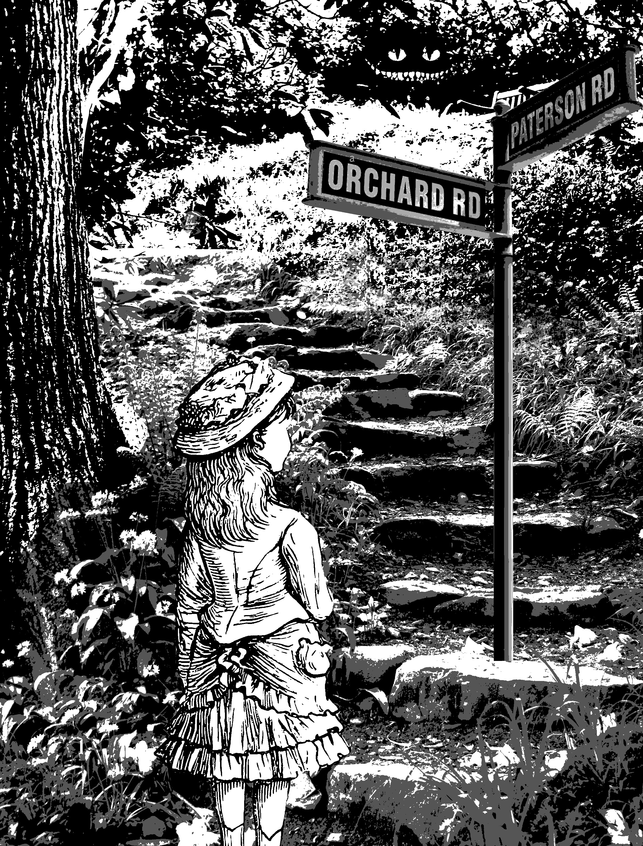
Firstly, I tried to show crossroads by giving her a signboard which gives her two directions to go. The reason why it says Patterson road and orchard road is because I took it directly off the internet without changing anything.

Design 2

the second I idea I had was to put Alice in a maze and bombard her with signs and direction. however, this didn’t work out too well as there isn’t a lot of places where I could superimpose the signs on. Moving on.
Design 3

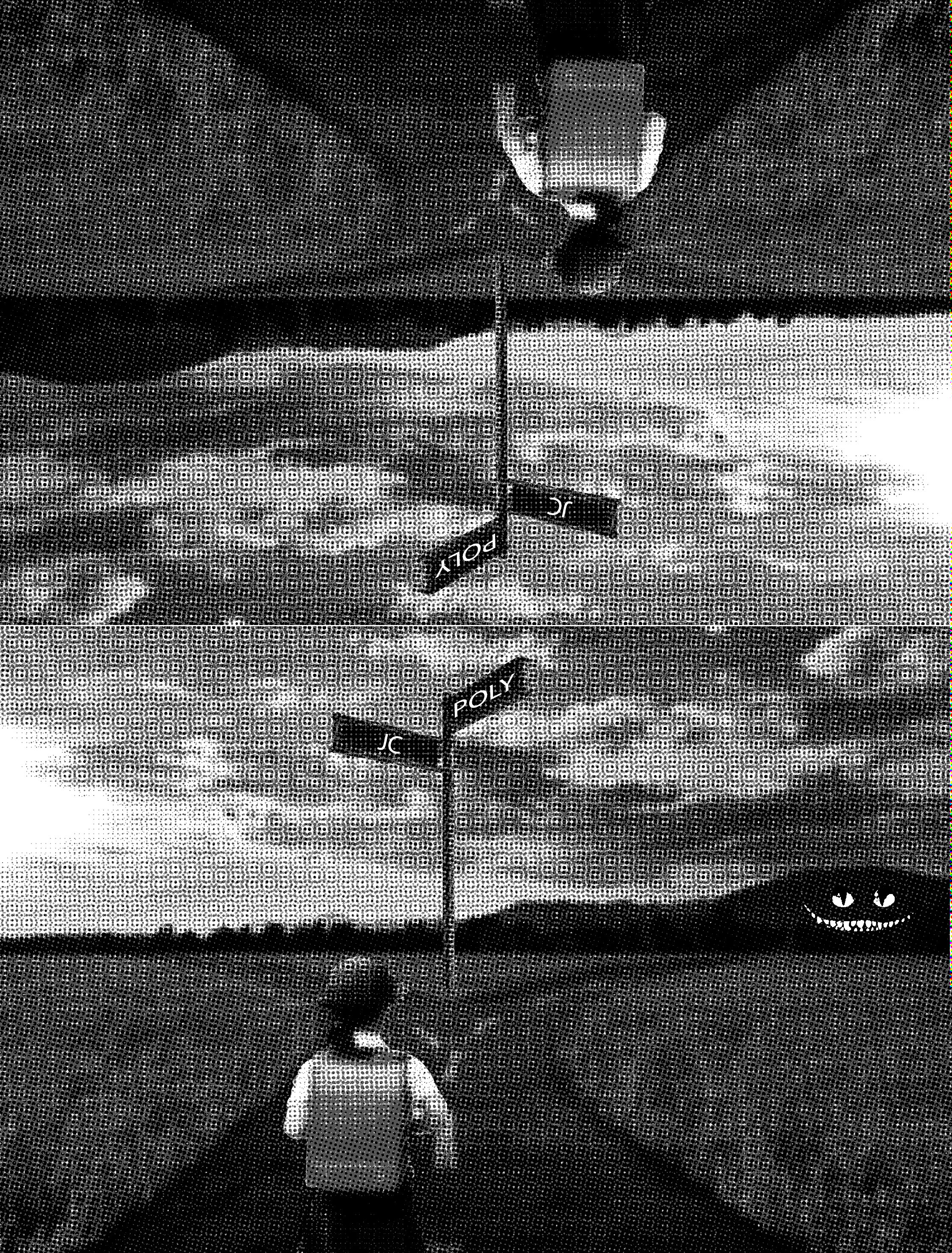
For this design, I decided to go for a literal crossroad. I wanted to make it bizarre so I reflected the image vertically. I tried to conceptualize it to my life and decided to change it to JC and Polytechnique a crossroad most students in Singapore face.
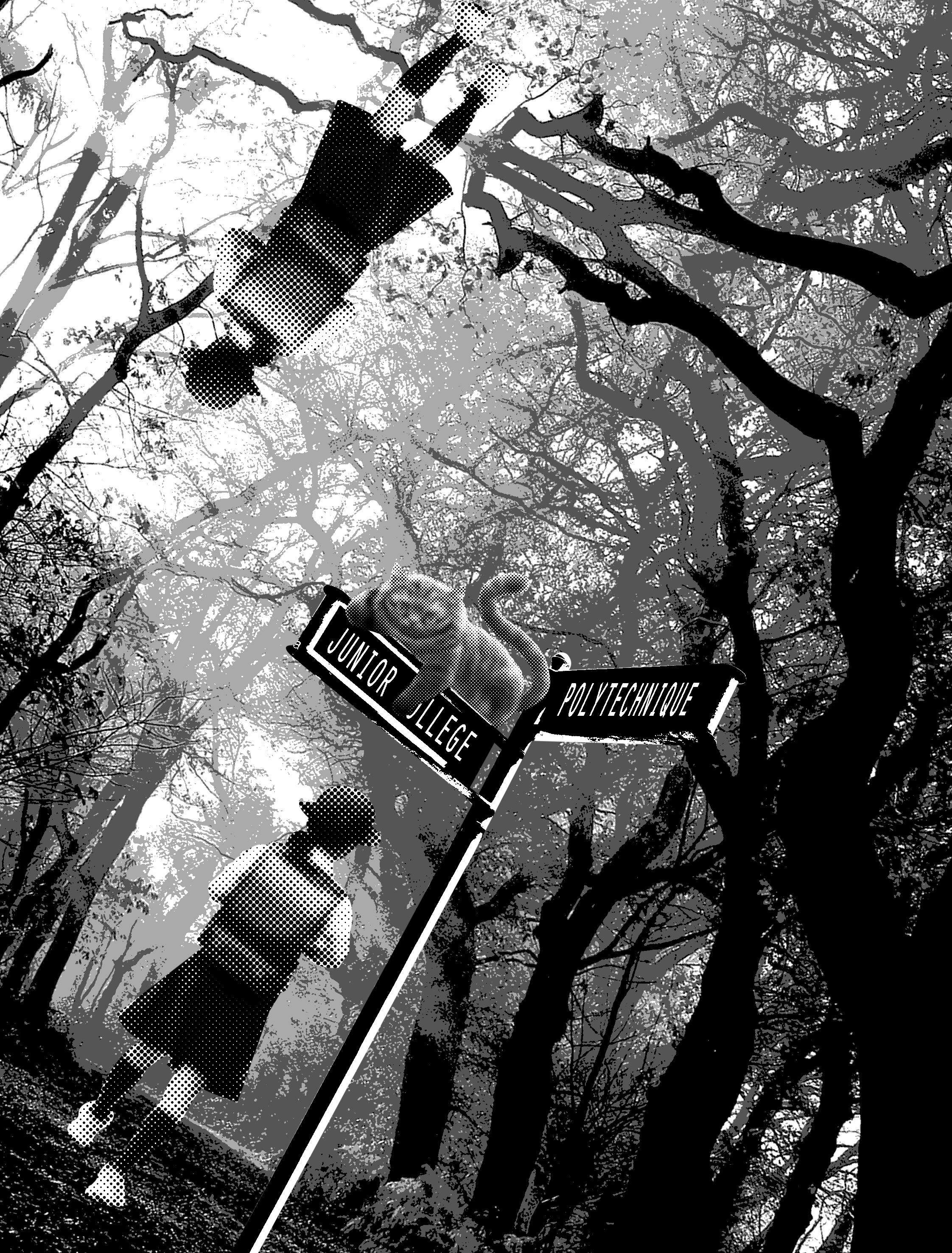
Design 4

I decided to use the setting of the story: the forest as a background. I wanted to use a school girl wearing a pinafore as Alice, but I couldn’t find a suitable image. so I replaced her with a Japanese school girl.

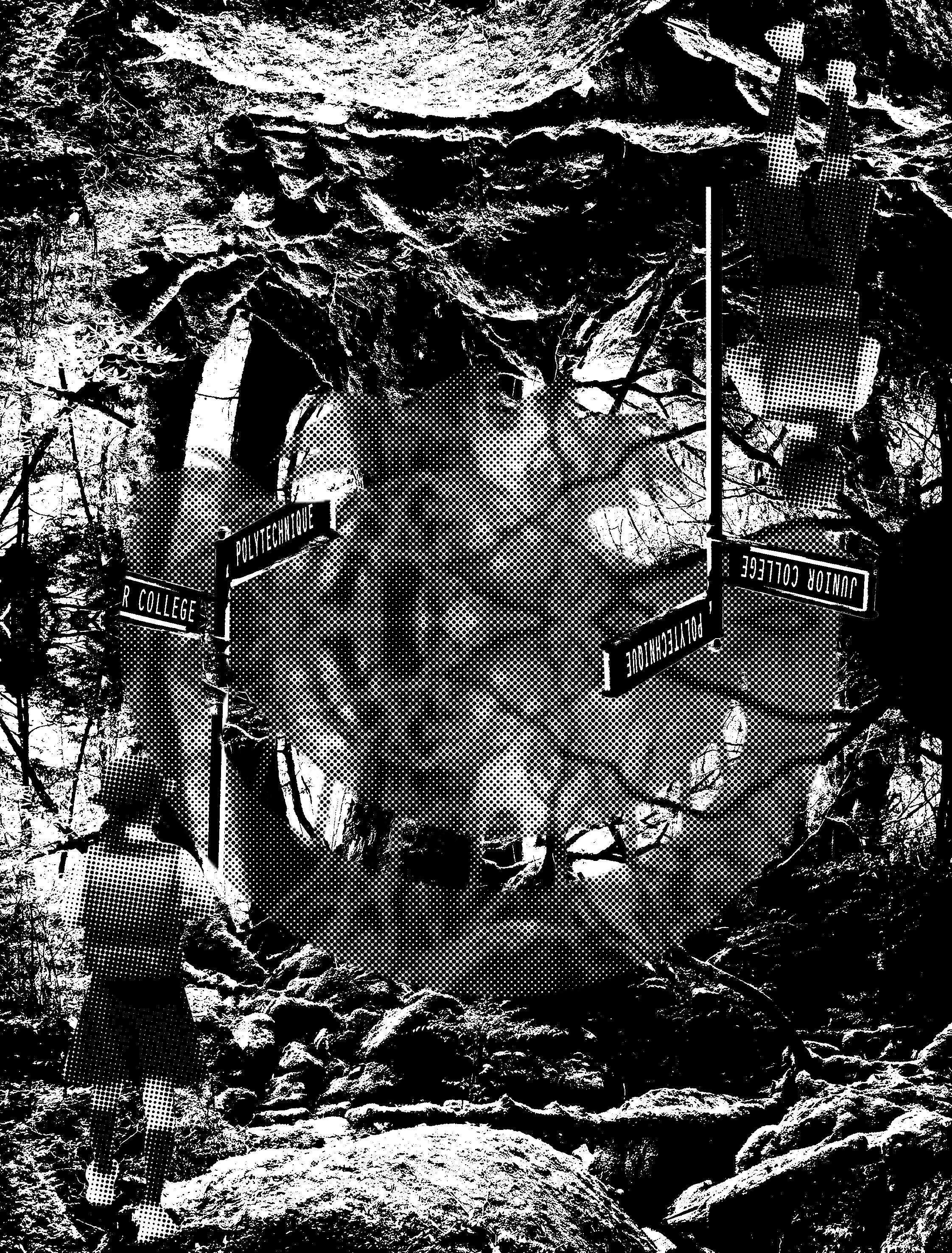
Design 5
Design 6

In these two designs, i tried to incorporate the Cheshire cat more subtly. the first one I used the silhouette of the Cheshire cat. I think the second one is more successful as it is more subtle and less in your face.
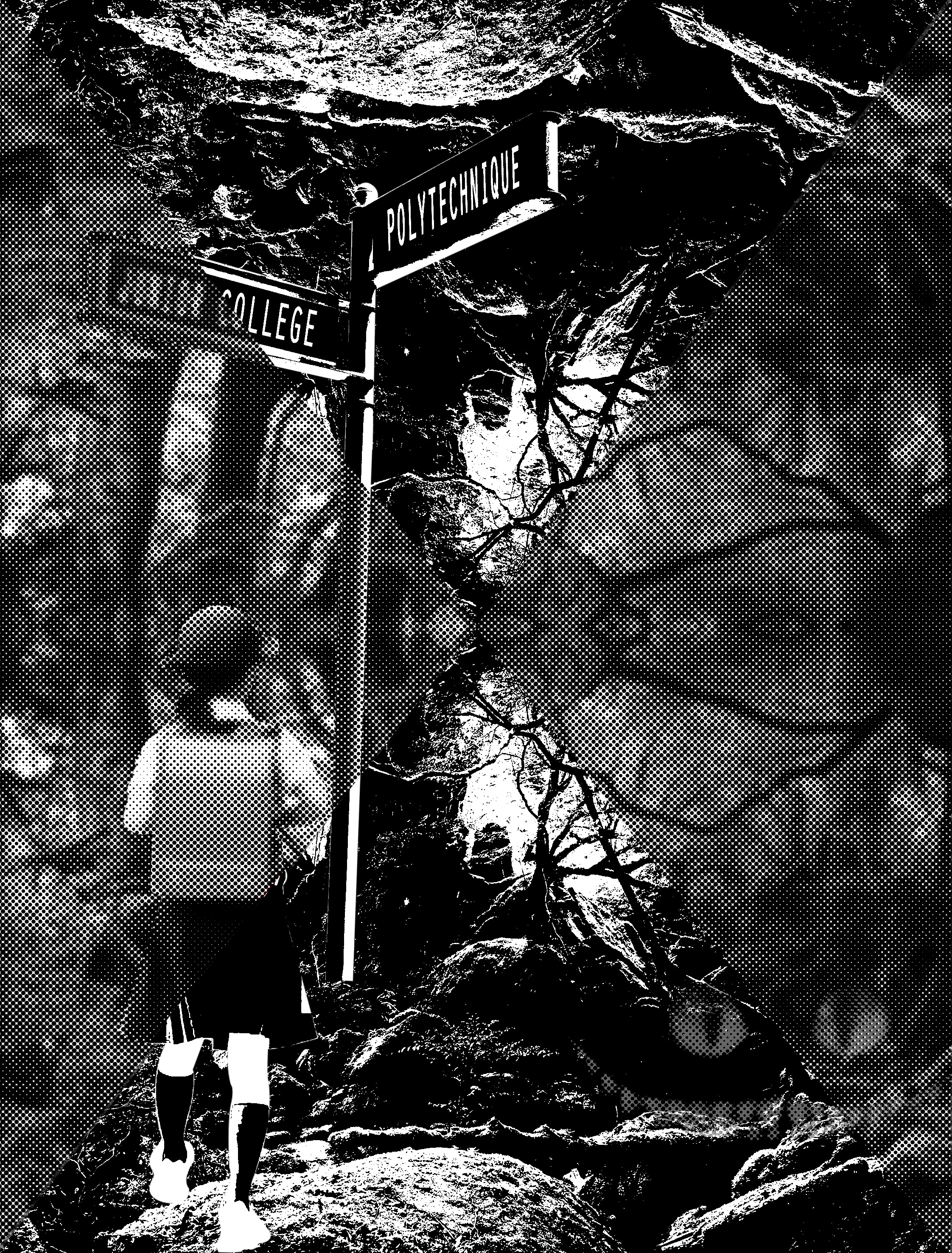
Design 7

Similarly, I tried to distort the image by introducing halftones with threshold. however, this didn’t work out too well, as it does not convey depth at all. it made the background looks flat instead.
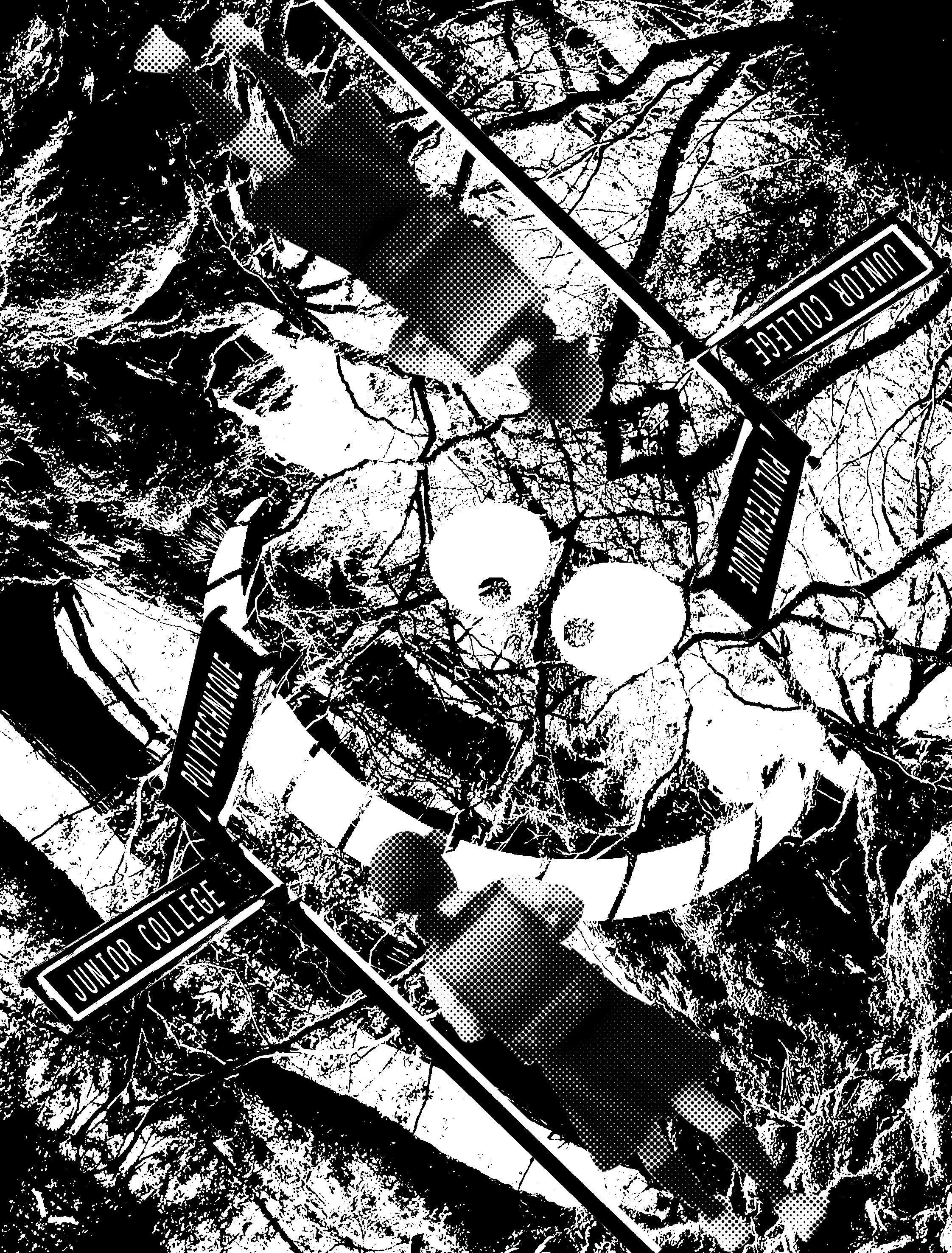
Design 8

I tried to distort the image further by titling it. however, like the previous few designs, it lacks the context of Alice in Wonderland and the design is too complicated. furthermore, the designs do not look retro but futuristic instead.

Design 9

I tried to make it look more retro. and obviously, in this, i failed again very badly.
Design 10

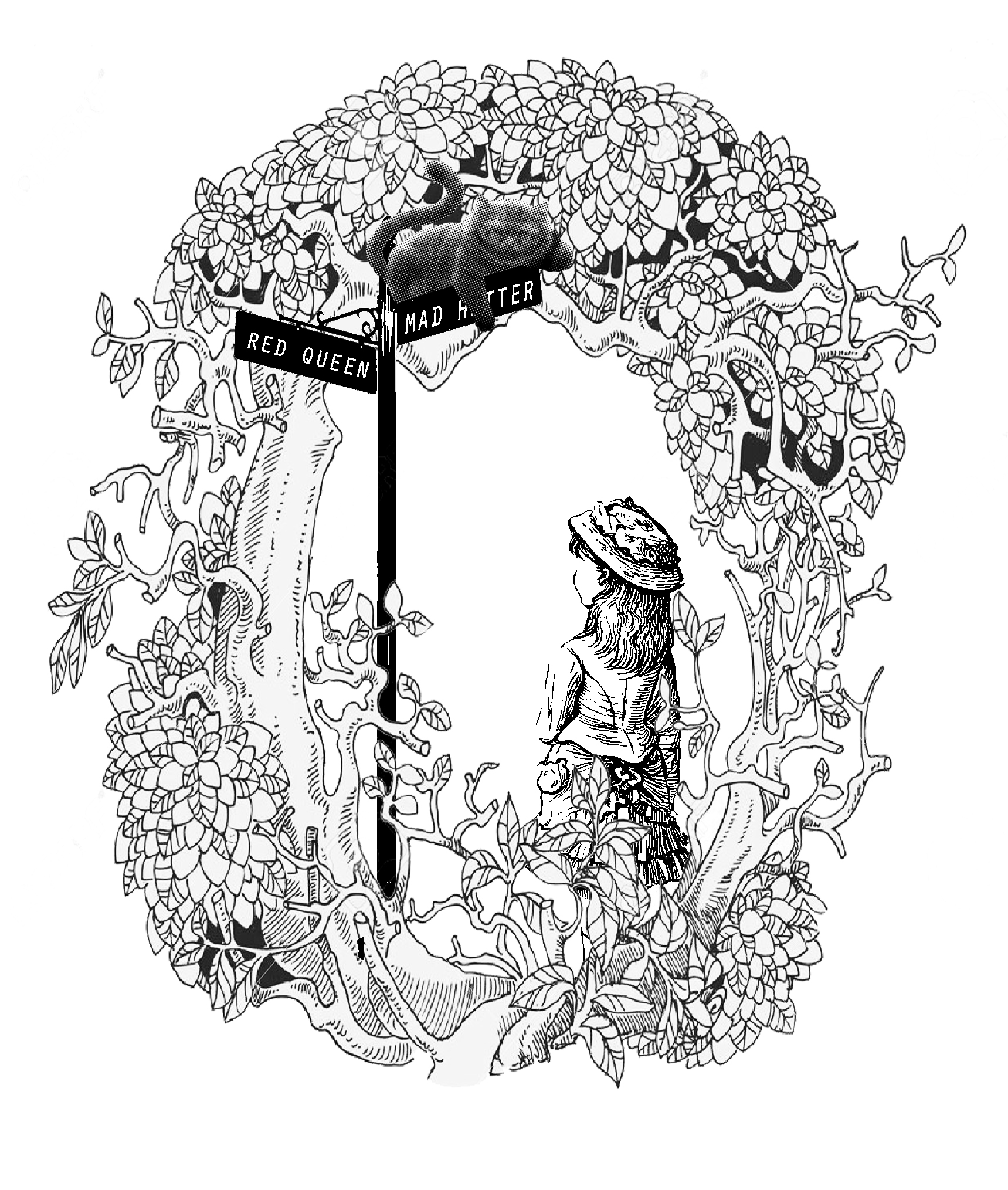
taking Mi Mi advice I begin searching for comics and illustrations. I found a forest shaped in an “O” and decided to throw in the elements of the signboard, Alice and the cat inside. while I finally did succeed in getting the visual language right. I really didn’t like it. anybody could have thought of this. Meh, just no…
Design 11

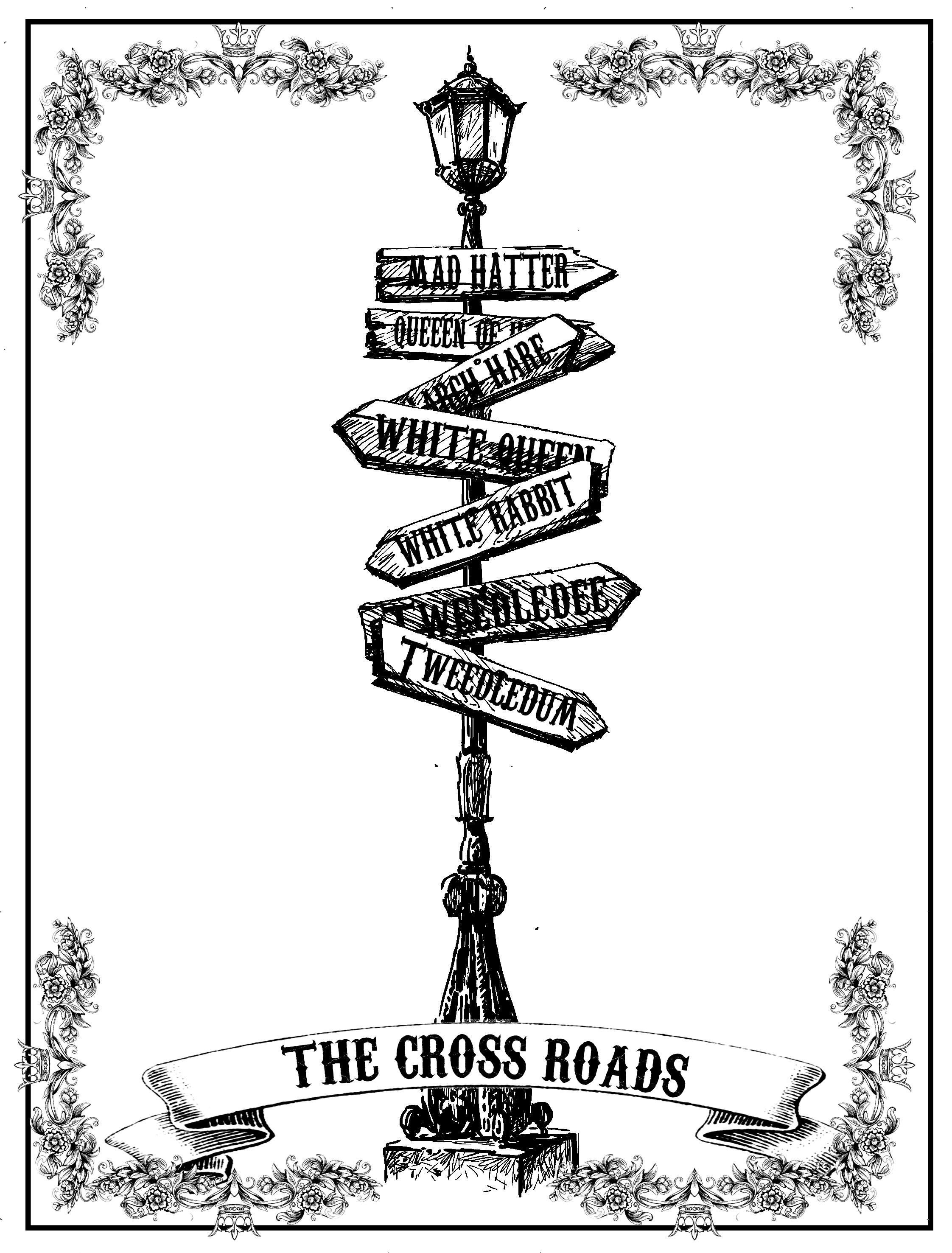
For this design, I was very inspired tarot cards and that’s why I used the fancy borders. again the border worked against me and stole the attention away from the main object. In addition, I felt that the design could have been developed further.
Design 12

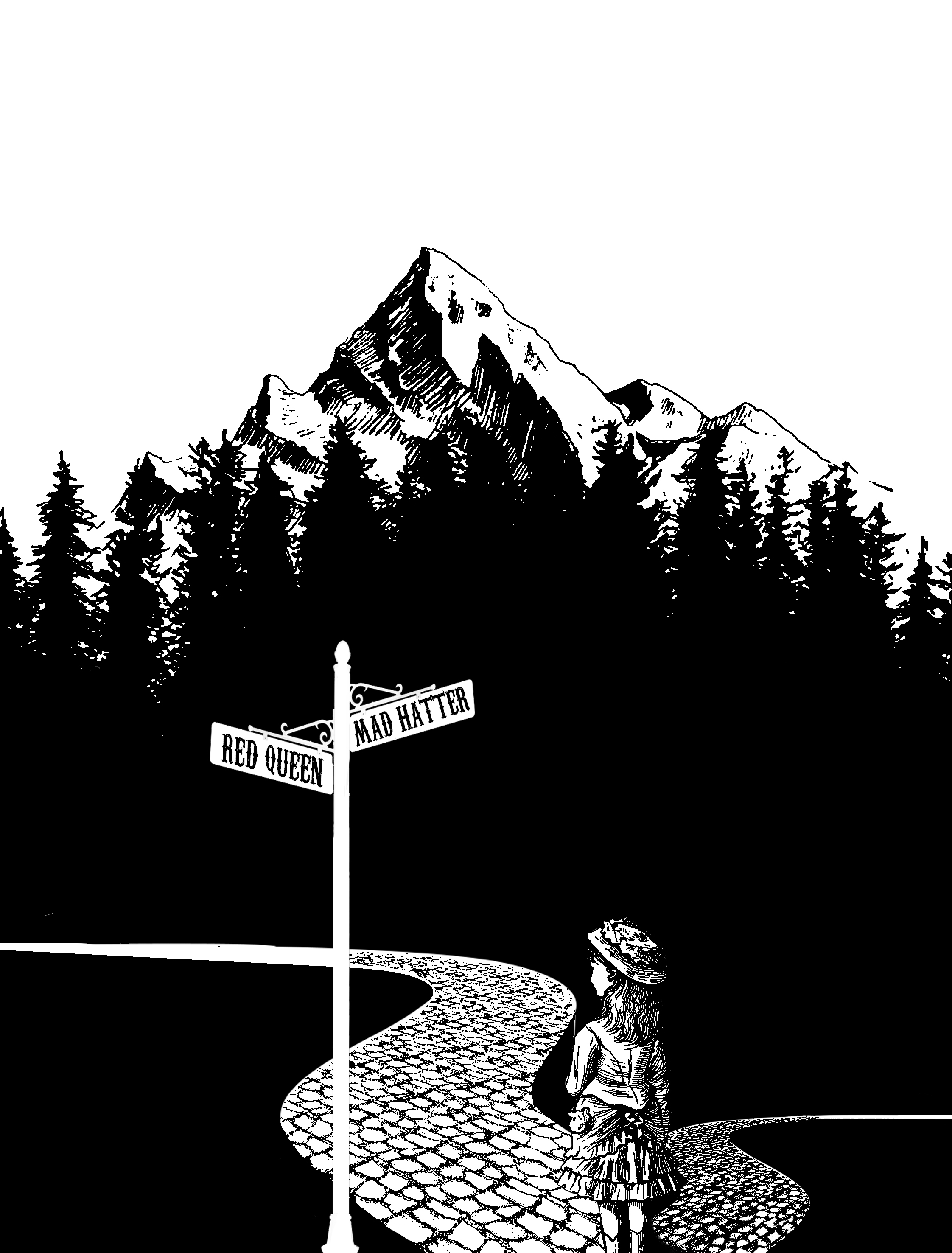
I chanced upon this photo of the forest while searching the web, then I had a sudden inspiration to extend the bottom and make use of the negative space. as there is a very high contrast, a great amount of emphasis is being placed on Alice. In addition, the background acts as a border framing the main subject up nicely.

Forrest Gump Mulan: I can wear a mask and fool the world. but I can’t fool my heart

This quote is taken from a verse in reflection, where Mulan laments how she could be the perfect bride. For this quote, I would be focusing on the words mask and heart, while showing a dual image.

Design 1

For this design, I used two gender fluid models. the one on the left is a female who models male clothes and the one on the left is a male who model female clothes. I decided to use a genderfluid model as they challenge and break gender norms today just like how Mulan did. I used a smoky effect to fade their faces off into the distance to show how they are lost like how Mulan was at this stage of her life.

Design 2

Similarly, this design uses the same concept as the previous one, but this one there is an afterimage of a little girl in the smoke. it’s like his lingering thoughts of needing to conform to society views.

Design 3
Design 4

In this two designs, I thought I would create some sort of mask, by removing parts of their faces with flowers. I decided to use flowers as it embodies what Mulan tries to be but cannot achieve.

Similar to the previous few designs, I was told that it was too futuristic and does not contain the historical Chinese look that Mulan had. In addition, I had to incorporate more elements from the movie.

Design 5
Design 6

For these two design, i decided to draw my motif from a Chinese opera mask especially from the changing face performance. I like how the Chinese mask is very expressive with distinct emotions such as anger and happiness. I wanted to portray Mulan putting on many facades with the different masks.

Design 7
Design 8
Design 9
Design 10

For the next few designs, I wanted to emphasize how Mulan kept some parts of herself hidden. so I used a curtain to express that she has kept her true self (the warrior side) hidden from her family. I wanted to have a woman caged on the other side of her face. however, I had a very hard time finding images to suit the second half of the face. In the first one, I used a female bounded by the flower. I wanted to show that Mulan is actually being chained by the feminine ideals which are represented by the flowers. however, the image is too small and blurry to be seen properly. in the second one, i used a pair of hands. For this, while the image could be seen very clearly, I couldn’t fit the hands in properly. if I fit both hands it would be too small. if I enlarged it, only one hand can be seen and the message is hindered. so I decided to settle with the last image. it is a halftone image of a girl being locked in a cage. as the picture isn’t very clear I used the eraser tool to erase part of the face to make the bars come out. As all of the images I could find is problematic, I had to settle for the less evil so I picked the last design as my final.

Forrest Gump Mulan: When will my reflection show who I am inside

For this quote, I will be focusing on the keywords: reflection. Mulan sings this line in the song reflection, where she laments how she is unable to conform to the female ideals in China. For this quote, i will be focusing on the word, reflection. when I thought of the word reflection, I immediately thought of mirrors and water. Hence mirrors will be my main motif for this design.

Design 2
Design 3

The first 2 designs, I wanted to show how Mulan shatters through that stereotypical image of her in the movie. I placed a shattered glass panel in front of her image with the bullet hole right in front of her face in the first one and her heart in the second. In the first one, I wanted to how she shattered her image through physical appearance. In the second design, I wanted to show how her heart has won over as she decided to be a tomboy instead of the docile wife she is expected to be. I felt that the drama wasn’t enough in the first design and decided to add broken grass shards around her.

Design 4

Similarly, i tried to express shattering the stereotype in another way. the model ic hose is a genderfluid model. he is biologically a male but his physical appearance is a female. I wanted to show how people are breaking the gender norms in today world just like how Mulan did. the geometric shapes are inspired by broken glass shards.

Design 5

Similarly, this is another androgynous model. I wanted to express a difference in the outward portrayal of the image with the inner mental image of oneself.

Design 6

For this design, I wanted to focus on revealing the actual person inside. Like the previous 2 designs, the female at the back is an androgynous model who has transitioned from a male to a female. so by placing the glass shard in front of him, i revealed his true gender: a male. However, the previous few designs did not meet the brief requirements of looking retro as it looked too modern and futuristic, In addition, i was told that t=it lack the ancient Chinese setting in my design.

Design 7

Keeping Mi Mi comments in mind I tried to incorporate more retro and vintage olden chinses elements into my design. for the next few designs, I was inspired by tarot cards and wanted to add an ornate frame. I used the Yin and the Yang symbol to show how Mulan is both a warrior and a female at the same time.

Design 8
Design 9

for this design, I used a mirror to show both sides of Mulan: a female as well as a badass bitch. I used a white background for her feminine side and a black background for her warrior side. to further emphasize the warrior aspect, I gave her an Oni mask, to symbolize her bravery and strength.

Unfortunately, I don’t think I will be using this quote as it has the same meaning as my other quote by Mulan in the same song: “if I wear a mask I can fool the world,  but I can’t fool my heart” which I like a lot better.

Forest Gump Alice in Wonderland: Sometimes I believe in as many as six impossible things before breakfast

I wanted to focus on the setting and the things that Alice counted during her battle with the Jabberwocky.

Design 1

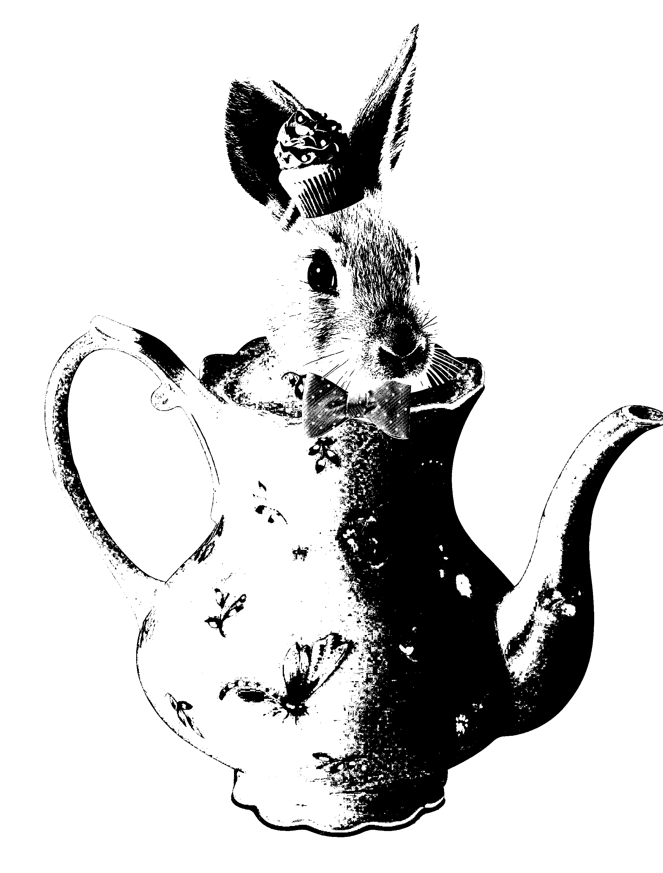
For the first design, I focus on the setting where Alice had tea with the mad hatter and March Hare. I tried to emulate the bizarreness of the teapot by juxtaposing the march hare head onto a teapot. Inspired by the hatter’s love for eccentric hats, I gave him a hat made up of cupcake

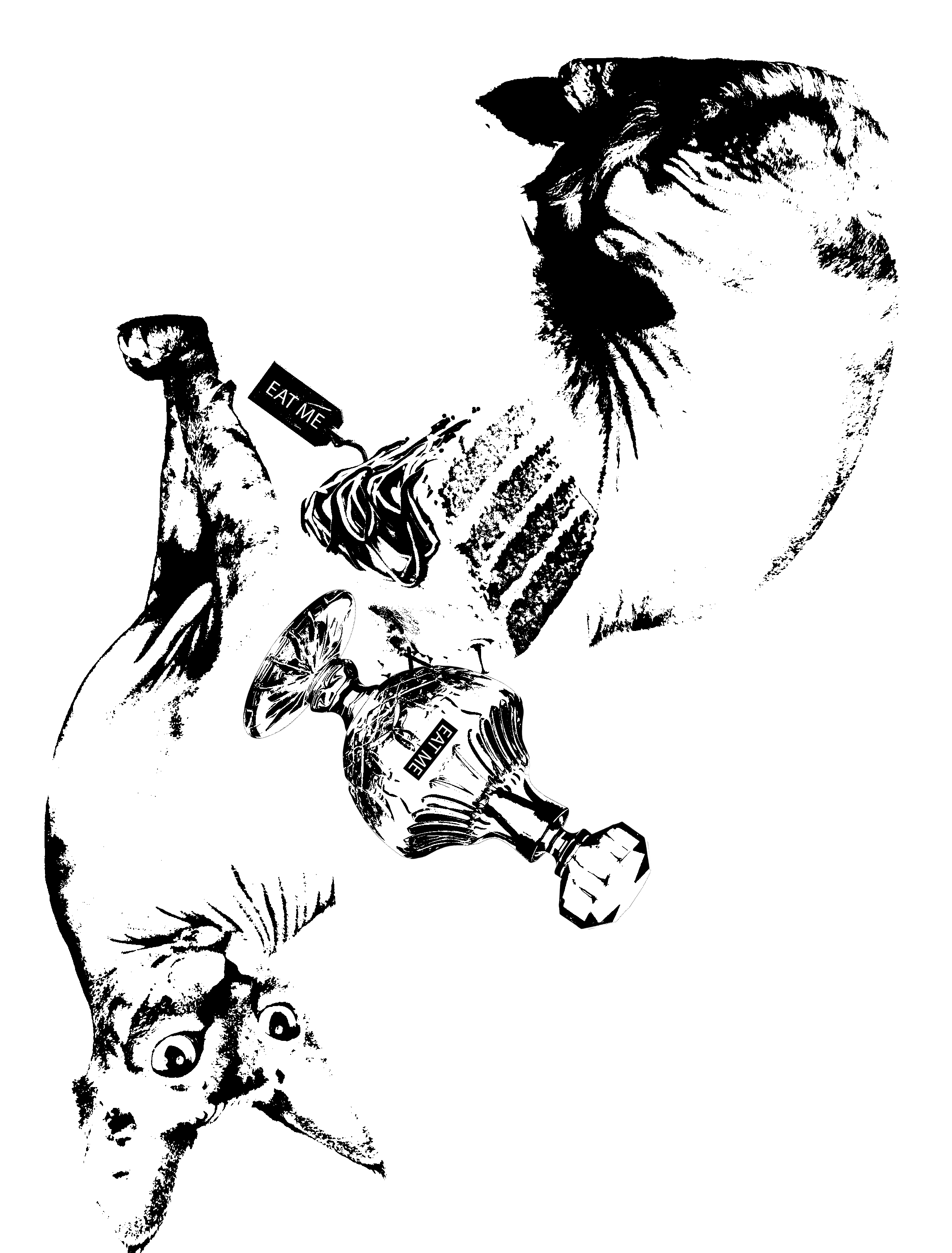
for the second design, I was inspired by the things that Alice counted during her battle with the Jabberwocky. the three elements that I have incorporated is: a cake that makes you grow smaller, a drink that makes you bigger and cats can talk. For the Cheshire cat, I used a siamese cat because it look rather unusally from a common house cat. I separated his body into halg to illustarte his ability to appear and dissapera out of nowhere. However, i saw told that the elements do no gell well with each other.

Design 3

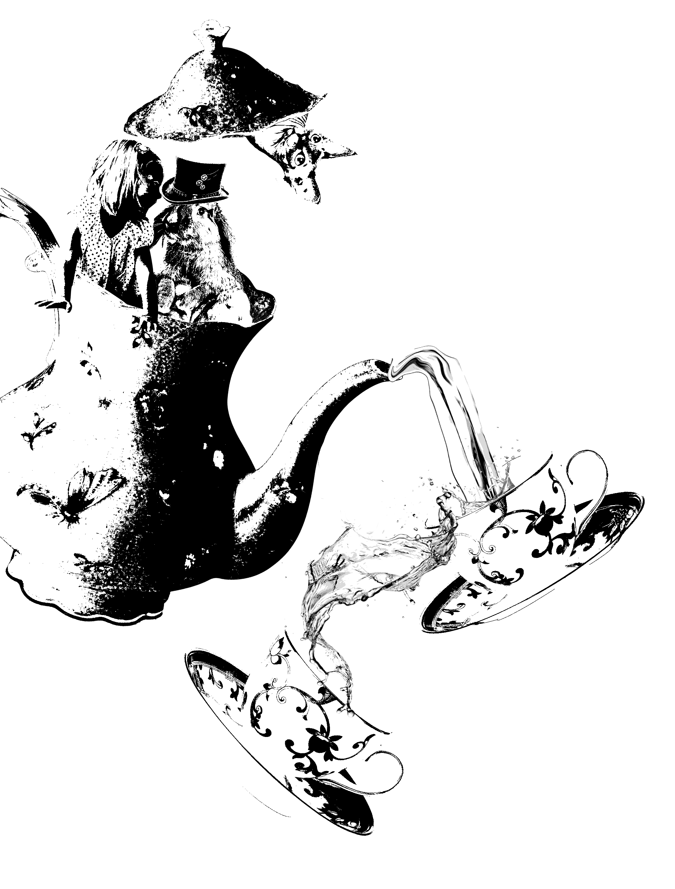
For this design, i went back to focusing on the scene where Alice was at the tea party. I decided to incorporate a more bizarre feeling into the design. I placed Alice and the March Hare together as they peer out of the pot. The design wasn’t executed really well, as the contrast was too high. Also, I was told to focus on the keywords such as “breakfast” more while bringing in more context of Alice in Wonderland where I brought in the actual character into my work.

Design 4

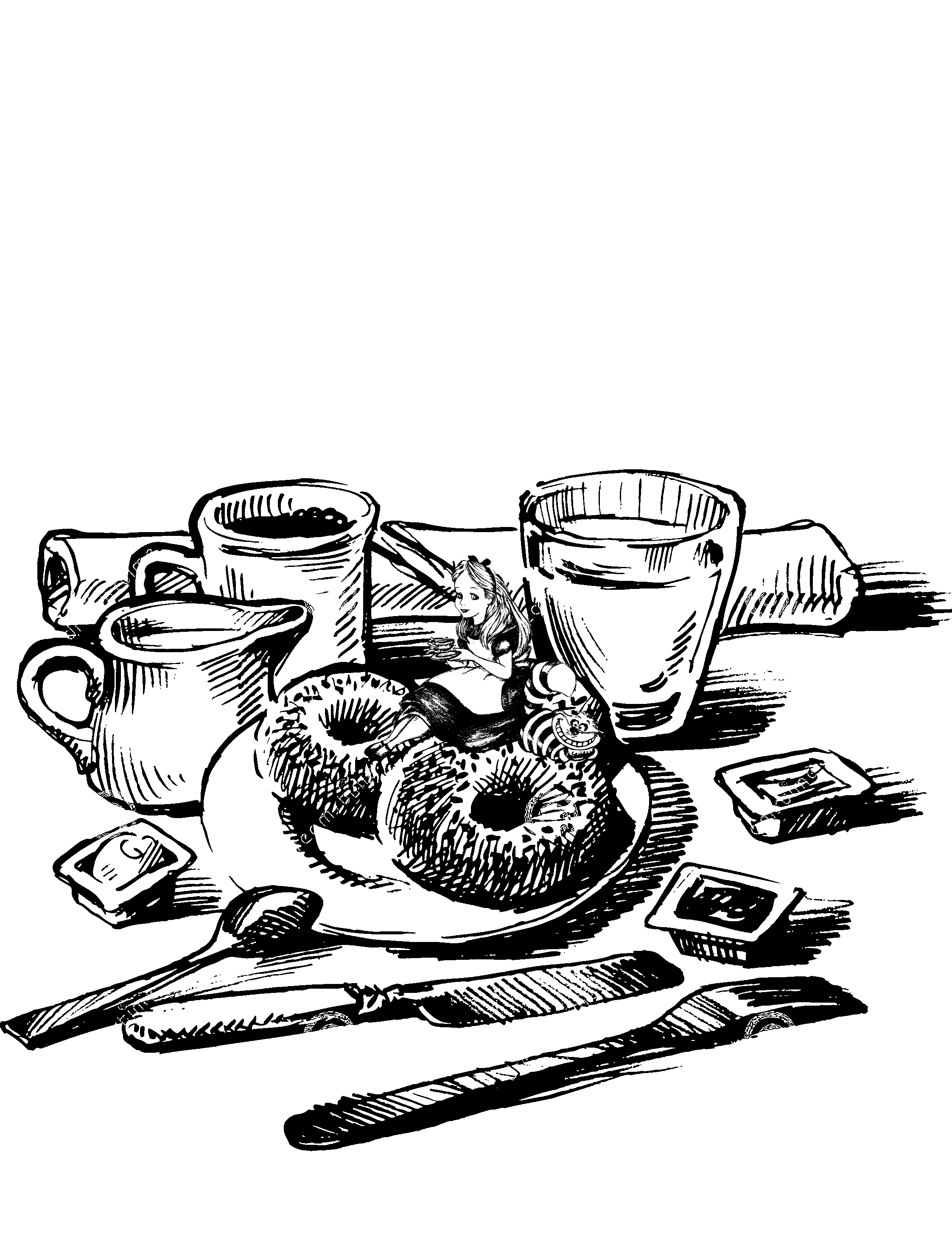
Heading the advice of Mi Mi where I had to incorporate more of the movie context and the keywords, I decided to focus on the word “breakfast”. I also decided to focus on the impossible. I tried to bring that aspect out by making it bizarre, weird or paradoxical. In this design, I decided to manipulate with the scale to make it bizarre. but I felt that I was playing too safe in this design. it is just not bizarre enough.

Design 5
Design 6

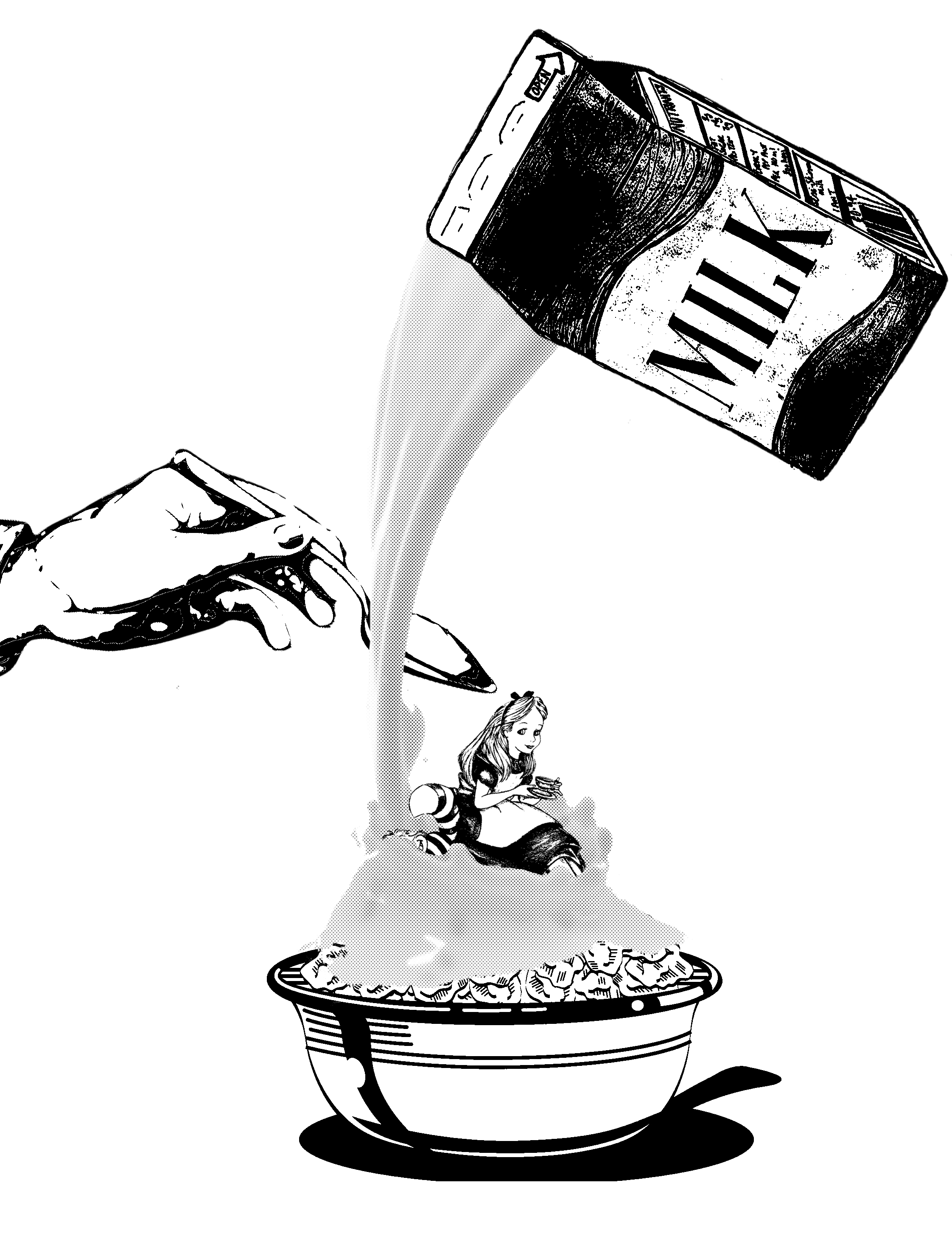
For design 5 and 6, I had this grand plan of having a top view of Alice swimming in cereal while she floats in a bathing suit with a flamingo float. so I had to substitute I do with a front shot of a cereal bowl with Alice sitting inside the cereal. I chose cereal as it is a very common breakfast food for many. but I felt that the elements were rather individual and aren’t gelling well with each other.

Design 7

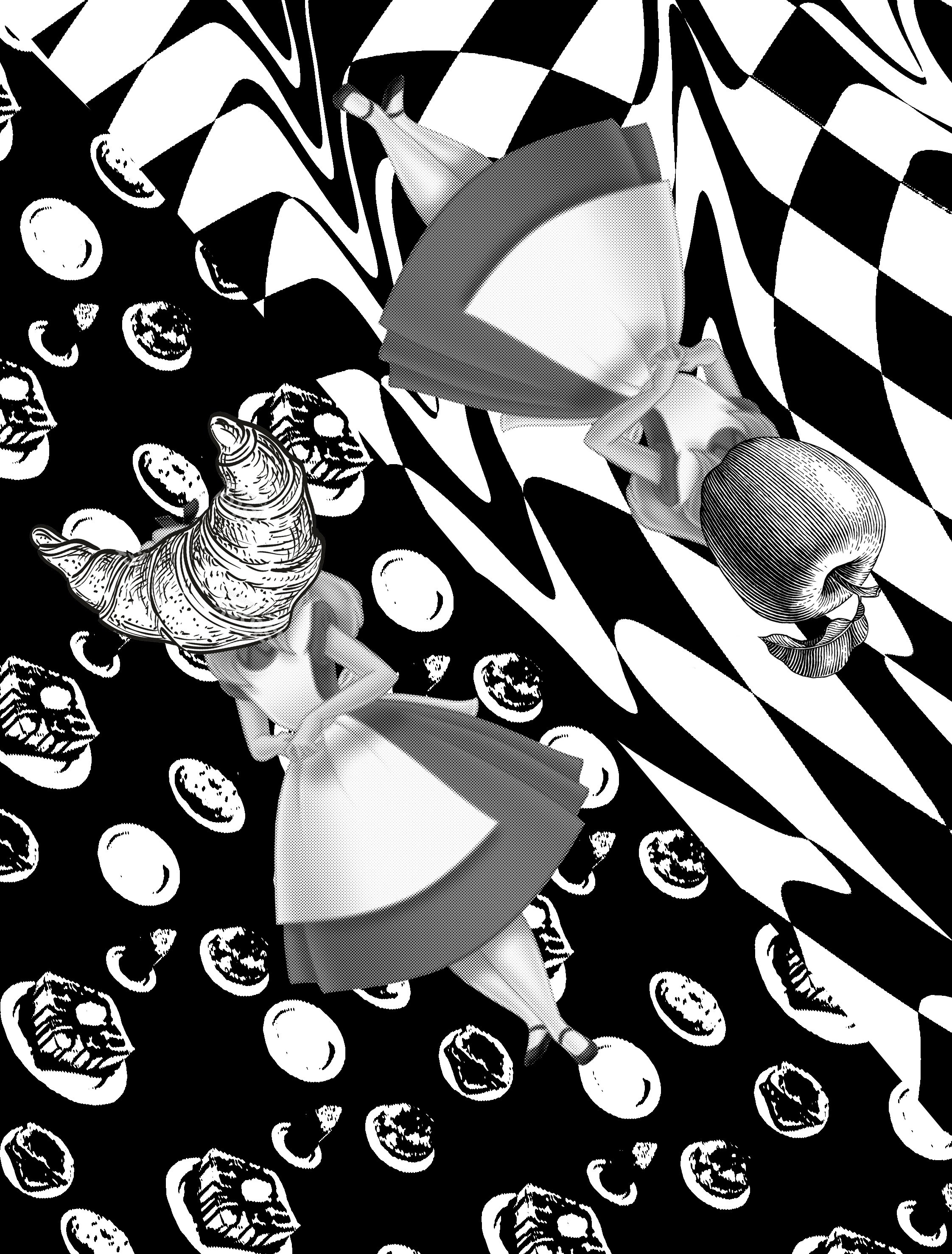
So I settled for this design. where I split the paper into half. The first half of it is a distorted checkerboard. with Alice and an apple superimposed on it. I chose a chessboard as I felt that Alice in Wonderland concept was very much like a game. i also chose the apple as it is a convinent breakfast food for all. On the other side, i used a backdrop of panckaes and scones as a background. alice is given a crosant for a head as it is a very common bread in frnace.