Tag Archives: reflection

Dialogue in the Dark: Reflections

I was really afriad when we first entered the room. When they told us to remove our hands off our friend’s shoulders I freaked out. Even in broad daylight, I can’t even do a trust fall with a trusted friend. Much less a stranger (the guide) leading me through the unknown. I was so afraid of getting lost and being left behind in the complex.  Suddenly all my insecurities were placed in front of me, and I was forced to face them. I took comfort in the fact that I could rely on my friend’s voices and helpful hands guiding me to the right places.

I also realise how important sight is to me. I was overreliant on my sight. Everything that I did, was depended on my sight. When it was taken from me, I realised how to slow down and appreciate other things base on my sense of touch and smell. This made me a lot more aware of how a visually impaired person encounters and experience graphic designs. In our eyes, the visual aesthetics are the most crucial aspect of graphic designs. However, for the visually impaired, the texture, the smell and the audio were their words. It also made me more aware of the type of font that we chose when designing for a client. In the room, we touched and felt the text on a signboard and a sculpture. The non-cursive font was so much easier to decipher as compared to the cursive one. In addition, I found out that braille is not commonly understood among the visually impaired. This made me realise how important is it to understand the client that we are designing for.

By taking on roleplaying, we are better able to understand and emphasise with our clients. There are some things that we take for granted in life, things that we won’t pause to think about. By roleplaying, we are able to immerse ourselves in their shoes. Through feeling for them, from their perspective, we are able to uncover more things that we never thought of before. However, there is an aspect of roleplaying where it can never fully mimic the reality of the visually impaired. In the setting of dialogue in the dark, we had the help of the guide, the never-ending walls and our friends to help us navigate through the place. It was a safer and more controlled environment, as compared to the reality they face on a daily basis.

However that being said, roleplaying is still an essential part of design thinking. The designers can better understand the needs of the clients, thus are better able to design to their needs. After all function over form.

Forrest Gump Mulan: When will my reflection show who I am inside

For this quote, I will be focusing on the keywords: reflection. Mulan sings this line in the song reflection, where she laments how she is unable to conform to the female ideals in China. For this quote, i will be focusing on the word, reflection. when I thought of the word reflection, I immediately thought of mirrors and water. Hence mirrors will be my main motif for this design.

Design 2
Design 3

The first 2 designs, I wanted to show how Mulan shatters through that stereotypical image of her in the movie. I placed a shattered glass panel in front of her image with the bullet hole right in front of her face in the first one and her heart in the second. In the first one, I wanted to how she shattered her image through physical appearance. In the second design, I wanted to show how her heart has won over as she decided to be a tomboy instead of the docile wife she is expected to be. I felt that the drama wasn’t enough in the first design and decided to add broken grass shards around her.

Design 4

Similarly, i tried to express shattering the stereotype in another way. the model ic hose is a genderfluid model. he is biologically a male but his physical appearance is a female. I wanted to show how people are breaking the gender norms in today world just like how Mulan did. the geometric shapes are inspired by broken glass shards.

Design 5

Similarly, this is another androgynous model. I wanted to express a difference in the outward portrayal of the image with the inner mental image of oneself.

Design 6

For this design, I wanted to focus on revealing the actual person inside. Like the previous 2 designs, the female at the back is an androgynous model who has transitioned from a male to a female. so by placing the glass shard in front of him, i revealed his true gender: a male. However, the previous few designs did not meet the brief requirements of looking retro as it looked too modern and futuristic, In addition, i was told that t=it lack the ancient Chinese setting in my design.

Design 7

Keeping Mi Mi comments in mind I tried to incorporate more retro and vintage olden chinses elements into my design. for the next few designs, I was inspired by tarot cards and wanted to add an ornate frame. I used the Yin and the Yang symbol to show how Mulan is both a warrior and a female at the same time.

Design 8
Design 9

for this design, I used a mirror to show both sides of Mulan: a female as well as a badass bitch. I used a white background for her feminine side and a black background for her warrior side. to further emphasize the warrior aspect, I gave her an Oni mask, to symbolize her bravery and strength.

Unfortunately, I don’t think I will be using this quote as it has the same meaning as my other quote by Mulan in the same song: “if I wear a mask I can fool the world,  but I can’t fool my heart” which I like a lot better.

Rhetoric of the Images by Roland Barthes

What are some of the key questions Barthes aims to investigate in the article?

In this paper, Barthes aims to investigate the context of an image: how the image gets its meaning when does the interpretation stop, if there is anything beyond the meaning. He investigates this through categorizing the meaning of an image into three categories, the linguistic message, a coded iconic message and a non-coded iconic message. The linguistic message comes from the captions, labels, accompanying press articles, film dialogue, and comic strip balloons. This message can either be connoted or denoted. The coded iconic message comes from the pure image. To infer this message one needs to have a background cultural knowledge of the image. The third message, the uncoded iconic message is constituted by the object and its scene, the relationship between the code signified and the analogical representation.

All images are polysemous where the viewer is able to choose some and ignore the others. There are two functions of a linguistic message: anchorage and relay. An Anchorage text is a text, prone to multiple meaning. They direct the reader through the signified of image, causing him to read some and miss the others. This is one of the most frequent functions of a linguistic text and is commonly found in press photographs. where as relay texts and the image compliments each other, allowing the fragments of messages to be read at a higher level of unity. relay text can be often found in films.

Barthes also brought across the point that the coded nature of a drawing can be read at three levels. Firstly a set of rules that governs the transposition of an image (perspective). Secondly, the artist needs to divide the significant from the insignificant where he reproduce parts in details while omitting the rest. Thirdly, the drawing requires an apprenticeship.  In other words, the denotation of a drawing is less pure as compared to a picture. as the camera cannot alter the object while the artist is able to in a drawing.

Do you agree or disagree with his argument and point of view?

I do agree with Roland Barthes point of view. An image has both the connoted and denoted signs. these signs complement each other to allow the viewer to read and understand the image better. However, I disagree with his point on the denotation of a drawing is less pure as compared to photograph. Despite having the freedom to alter the objects to fit in with the ideal standard in paintings, photography also has the ability to alter the object: Photoshop. Photographers are able to digitally manipulate to create an image that is equally unrealistic and heavily edited.

The Rhine II (1999) Andreas Gursky

For example, Andreas Gursky digitally manipulated this image of a river into perfectly horizontal parallel planes of the land and the water body. Hence, I strongly disagree with Barthes point where denoted paintings are less pure as compared to photography.

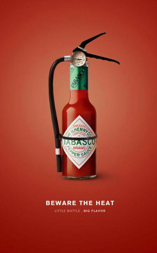
Provide a brief analysis (200 words) on an advertisement of your choice by using the terms/ concepts proposed by Barthes and discuss the role of text and its relationship with the image in the advertisement. Please include an image the advertisement in your post.

This is an advertisement for Tabasco Hot sauce. The literature message reads: “Beware the heat, little bottle, big flavor accompanies the text. The purpose of a fire extinguisher is to put out a fire. Taking away the literature message, A small bottle of Tabasco bottle can be seen placed against a red background with a fire extinguisher noose, the pure image. The imagery further solidifies the text saying “beware the heat”. This implies that the hot sauce is so spicy that literally a fire extinguisher is needed to put out the flames. The bigger text acts as an Anchorage text, guiding us in reading this message as the spiciness of the hot sauce ( focus is on the fire) instead of the hot sauce being cooling ( fire extinguisher extinguishing the fire). The smaller text: “little bottle, big flavor” acts as a relay text further reinforce the idea of the spiciness of this hot sauce.