Category Archives: Visual Communication 1 – G1
Symbol of Hope: Adding colour to the graphics
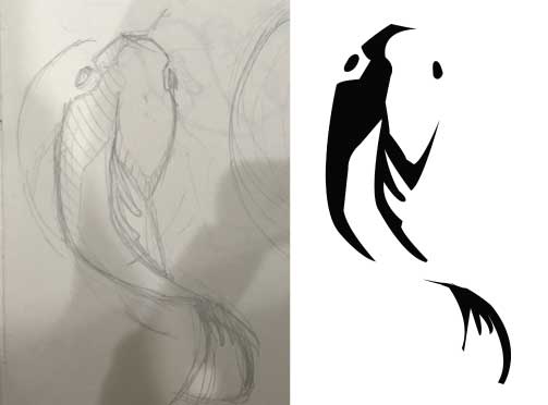
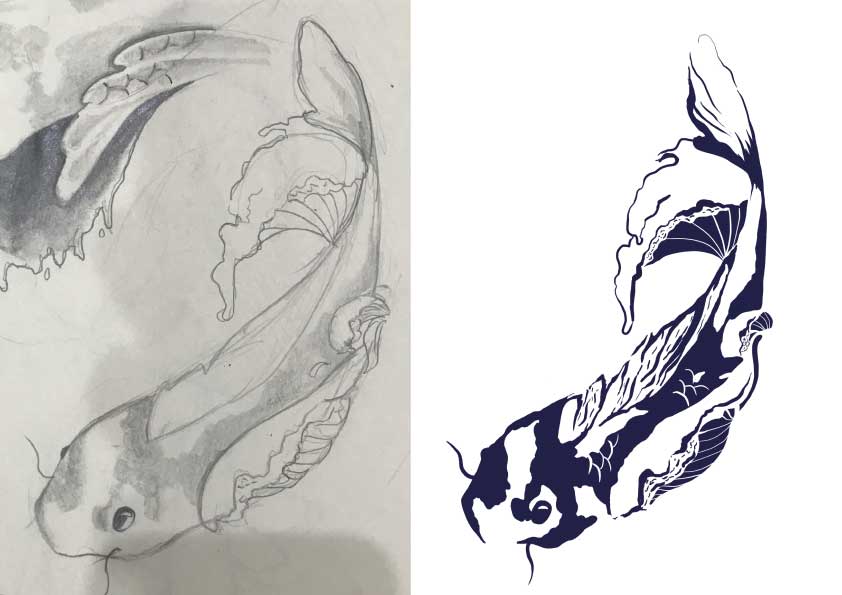
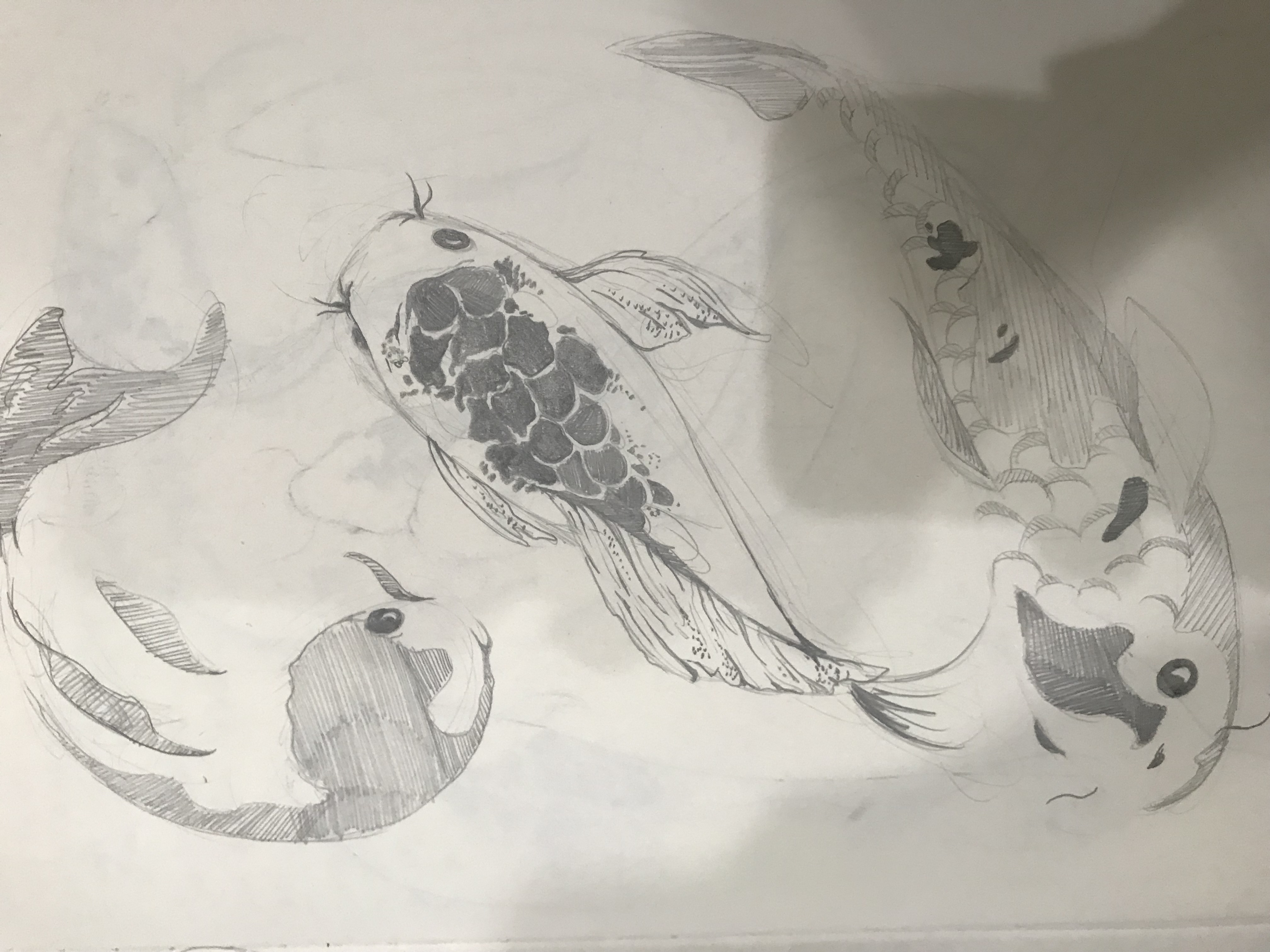
Designing the koi fishes
By this time, I was really lost and decided to go back to the basics with black and white: 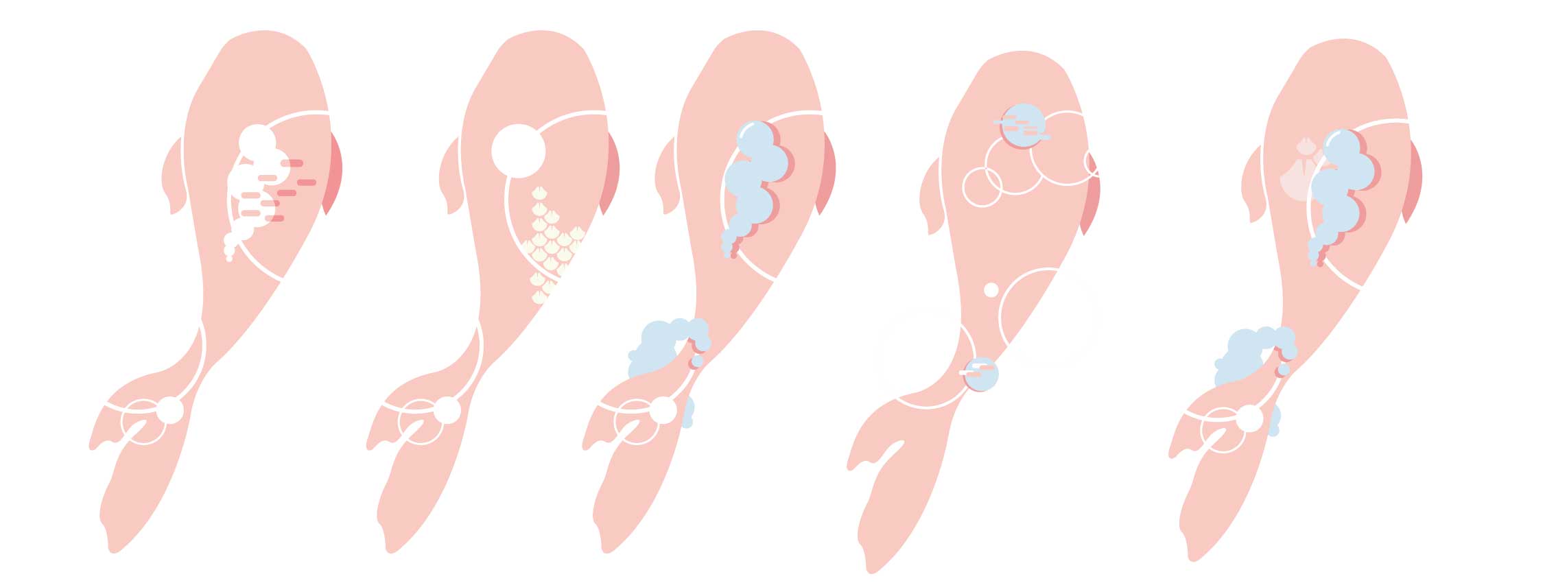
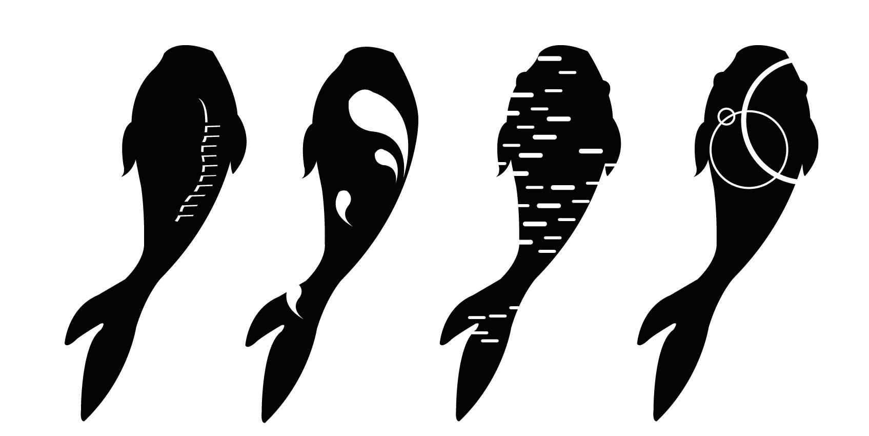
So I came up with these 4 designs, where I tried to incorporate the waves and ripples into the fish. I also tried to suggest the dynamic movements and form of the fish through the motif. Then I begin adding colour:
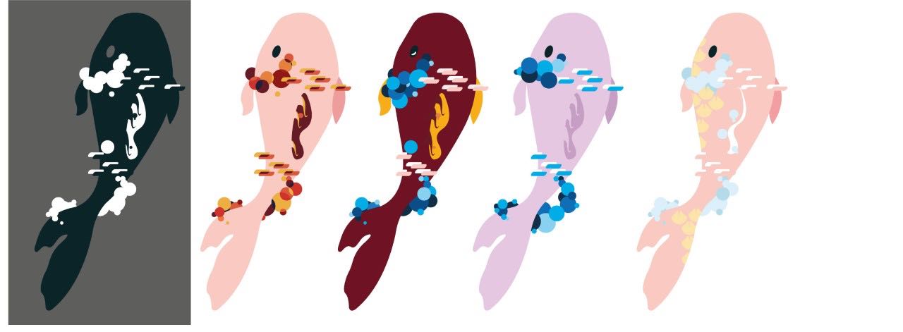
Design 1:
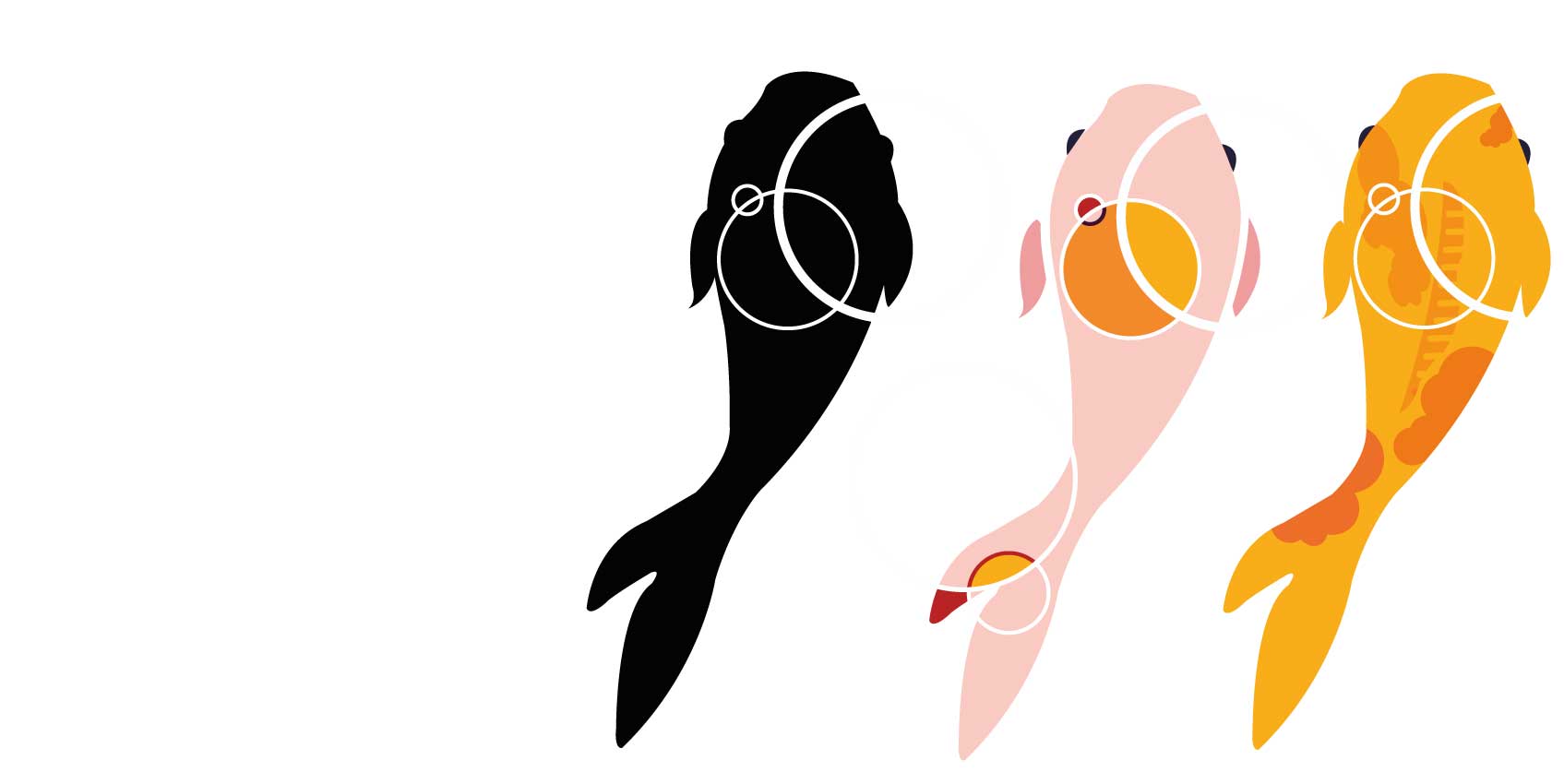
Design 2:

Among these two designs, I felt that they were rather plain, and wanted to play with patterns.
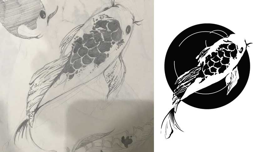
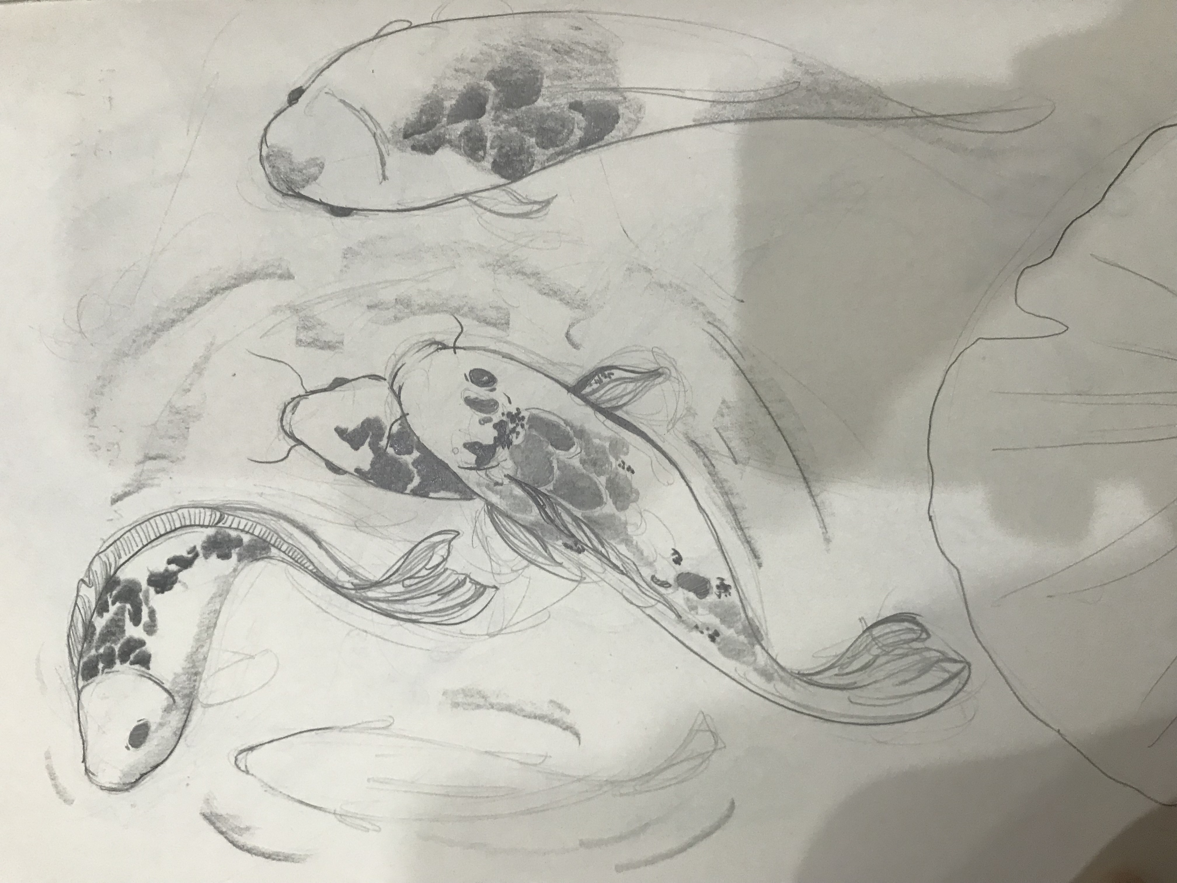
Design 3
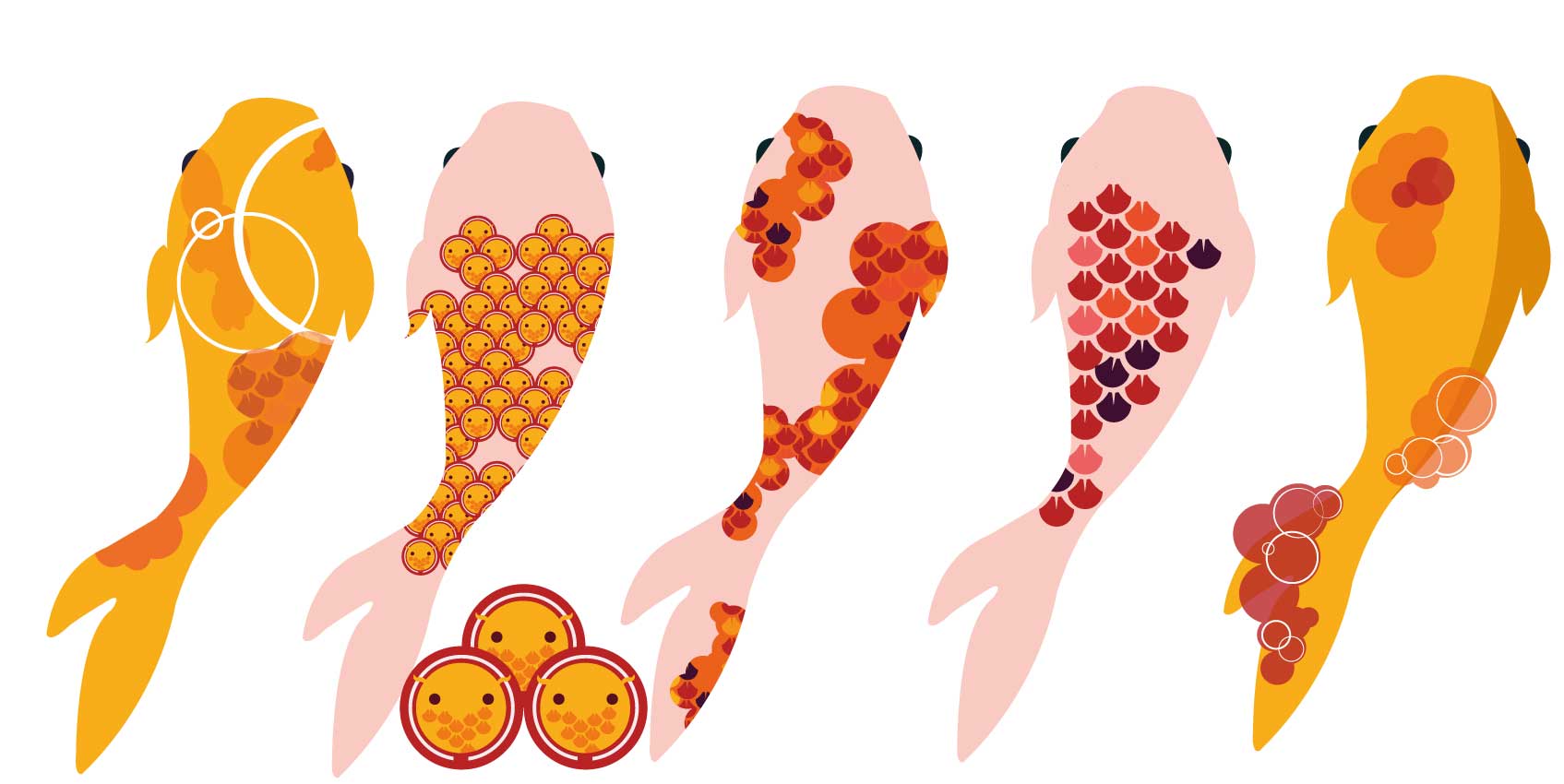
I tried to mimic the spots found on koi fishes and incorporating ripples for the last one. my favourite from this series is the first one where I tried to incorporate everything in a subtle way. I had a lot of fun creating the second fish. The patterns are made of mini koi fishes. It’s like a koi fish inception.
Design 4
I decided to push the design further, by trying to incorporate more ripples and the patterns. I really love the designs especially number 2. I love how the patterns aren’t constrained and looked a lot more fluid as compared to the previous designs.
Design 5
I really love how the layering and ordering of the circles create the form of waves while establishing foreground and background. However, by this point, I was seriously off brief. It was still to illustrative. I had to simplify. Less is more. I was advised to limit my colour palette and choose between patterns or ripples.
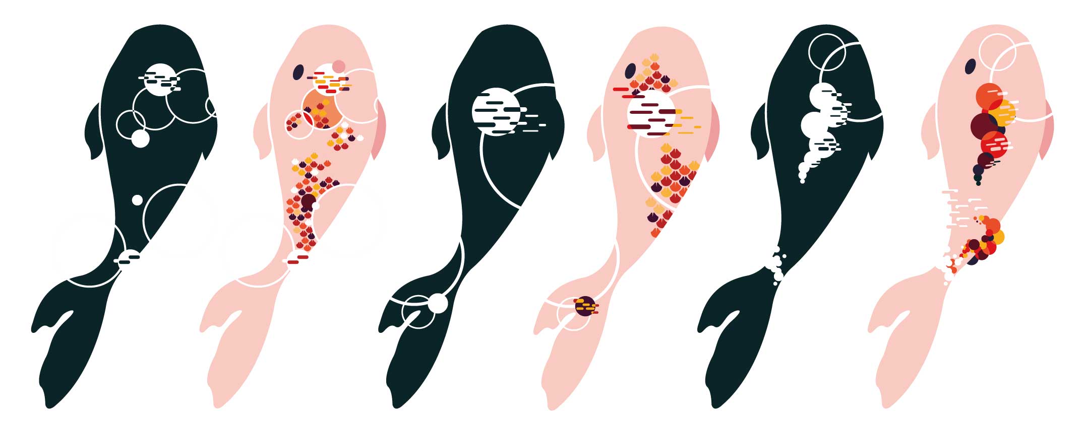
Design 6
This time I tried to limit my colour palette to 2 colours. I also forced myself to choose between the ripple and the patterns as the main element. After much exploration, I decided to go with the fifth koi. the circular bubbles not only represent the air bubbles that the fish boobles out, but it also suggests the dorsal fin of the koi too. The pattern that can be found isn’t too overbearing. That was what made me choose this design, I was finally able to marry both my concepts! (both patterns and ripples)
Colour scheme
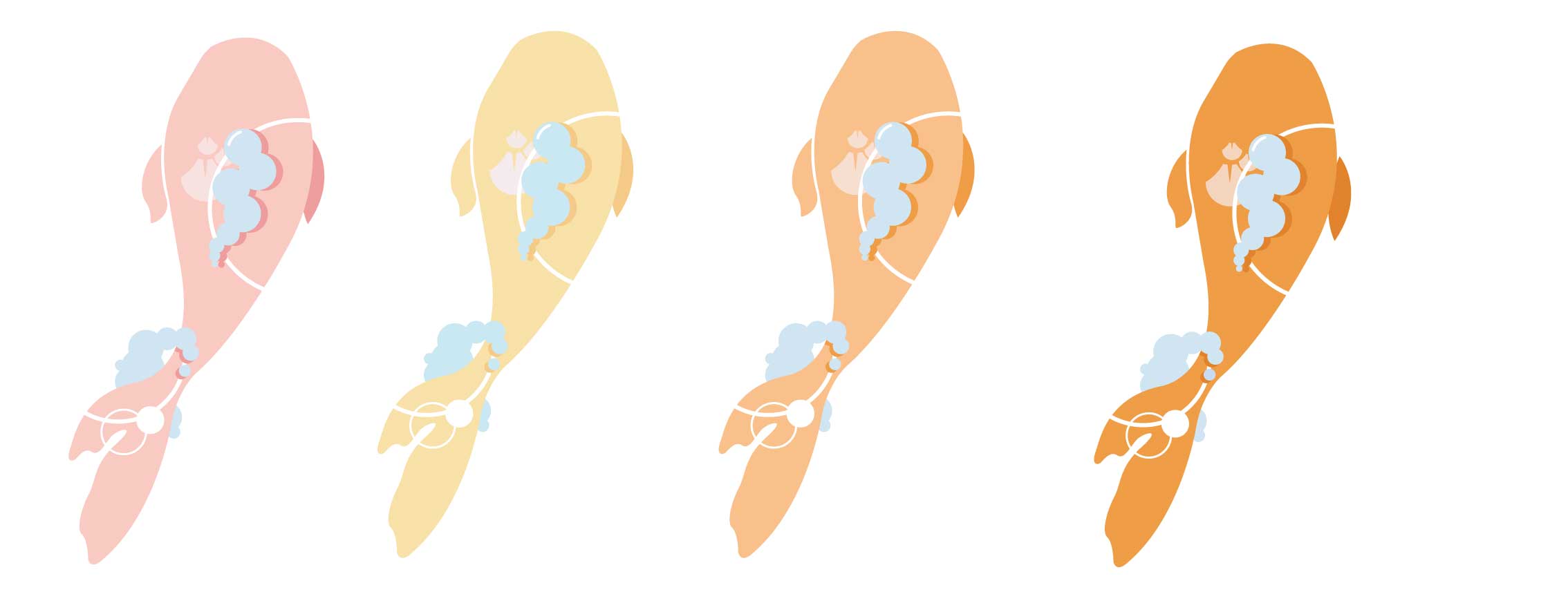
I decided to go with a warm analogous colour scheme. I felt that warm colours would be suitable for the image of hope. warm colour rises and cool colour sinks. I wanted the colours to have an uplifting effect on the patients. In addition, I used a lighter colour scheme to add to this lifting effect. In addition, I thought the colours should be soothing, to aid the patients’ recovery instead of a bright bombastic yellow.
Designing the girl:
Design 1
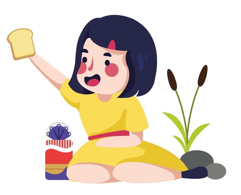
I wanted the girl to be sitting and feeding the fishes bread. However, her movements are too static and the whole illustration lacks energy. Then I went back to drawing and referring to images online to get the pose right.
Sketching

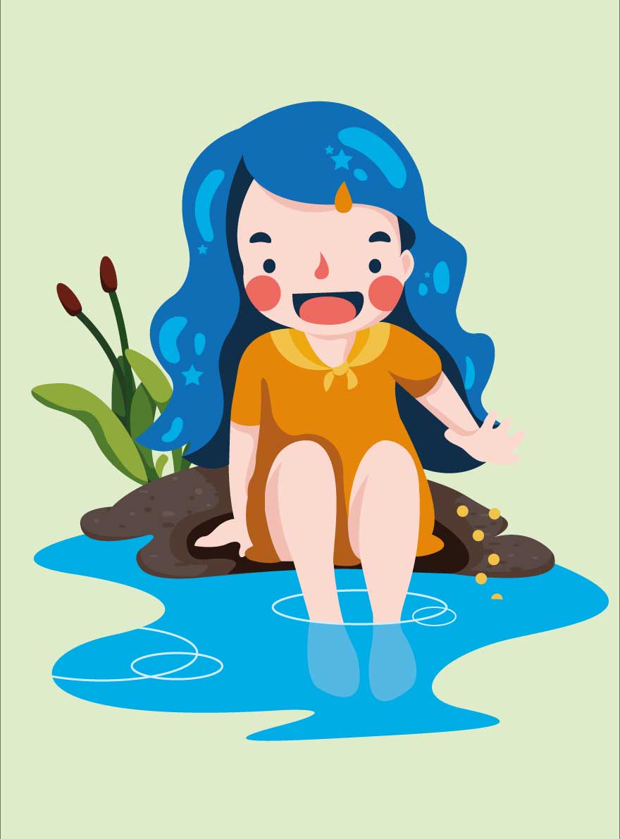
among both drawings, I decided to go with the second one. The pose was more relaxed, more natural and more energetic. I also decided to use stronger and more saturated colours for the girl.
Symbol of Hope: Translating into Graphics
Graphic Design 1 & 2
 ‘
‘
For the first two designs, I tried going for the minimal style, trying to use basic shapes to suggest the form of the fish. Honestly, I didn’t like any of my digital attempts. I felt that it looked a lot better on paper. I think this is due to the geomatrical way i illustarted it with the pen tool. It looks rather stiff, as if its dead.
Graphic Design 3
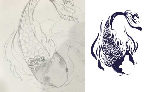
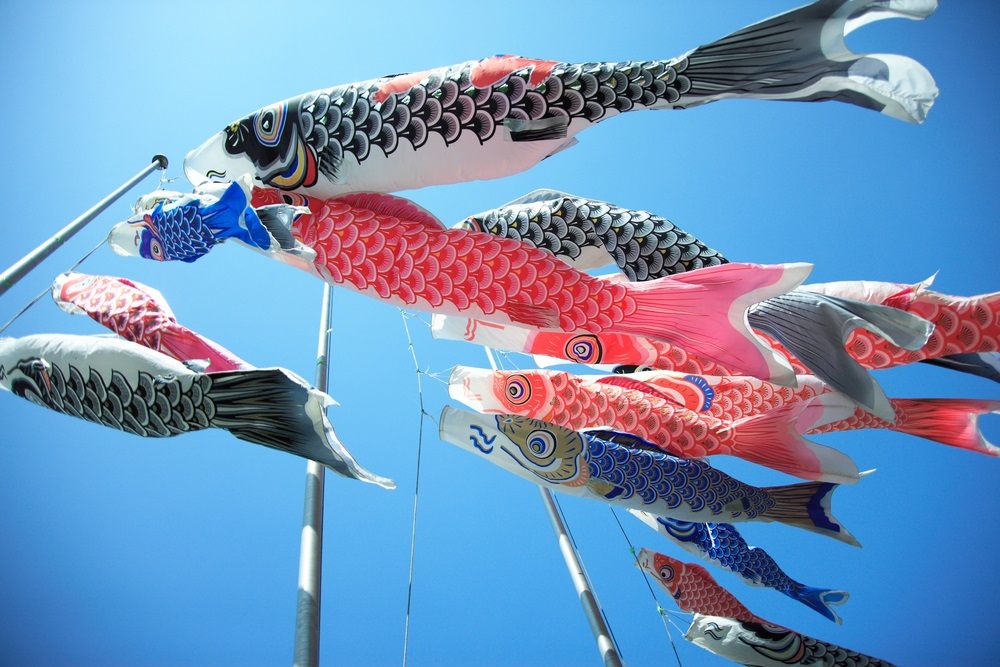
For my third design, I was inspired by Koinoburi: koi flag motif that is commonly found in Japan.
I really love the patterns that can be found on the body of the fish. This acted as the main inspiration for my design. I tried to incorporate as many Japanese motifs I can find, to see which would work better.
In the end, this design looked too messy and needs to be simplified by only applying one type of motif.
Graphic Design 4 & 5
For design 4 and 5 I went down the illustrative route. The designs were inspired by koi tattoos. I love how the line work and subtle shadings suggested the form of the fish.
In general, this attempt was too illustrative and I had to simplify the all of the elements.
Design 6:
For the last design, I think I may have lost it when I was doing it. I went full abstract. needless to say, it is too abstract I need more elements to bring out the form of the koi.
scroll down for the “deciphered” fish

Yeah, I’ve lost it…
Feedback:
Simplify all of the illustrations, stray away from an illustrative approach, make use of shapes instead of line works.

VSICOM: Symbol of hope initial ideation and sketches
Idea 1
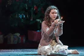
I love the image of the little matchstick girl, striking a match wishing for the simple pleasure in life. Sometimes the simplest things in life are what you miss the most after they have been robbed from you. The simplicity of her wishes struck me and I wanted to express that in my designs. The light and the heat provided by the fire that is used to sustain life in the cold winter reminded me of hope. The comforting warmth that envelops your whole body reminds me of a huge family warming up by the fireplace, cheerful laughter filling up the whole space.
Initial sketches:


Feedback:
The fate of the matchstick is a little cruel. Her happiness was short-lived after the fire burned out. To worsen things she eventually died and joined her grandmother in heaven. The hospital should be filled with things with positive vibes and hence this idea was eventually dropped.
Idea 2
The moment that I heard about the brief being set in the hospital, I immediately decided that I needed to incorporate “Zeness” in my designs. After all, hospitals are a place for healing. I then decided upon koi fishes. After a bit of researching, I realise that Koi is a perfect icon for this.
Symbol of hope:
There is a legend surrounding the Koi as a symbol of strength. The ancient tale tells the story of a school of koi swimming up the yellow river. Nearing the end they reached a waterfall. Upon reaching the foot of the mountain, many of the koi gave up except for one. He tried and tried swimming up the mountain, but he always failed. Many mocked his attempts, but he never gave up. After hundreds of years, the koi finally succeeded The gods recognized the koi for its perseverance and determination and turned it into a golden dragon, the image of power and strength. Strength is a congruent part of hope. Strength is needed to overcome the bad days when the pain gets too much to function. To continue smiling, to push on with the medication, to see the next day requires strength. And to me that embodies hope.
Icon of Zen
There is something about koi, that gives off the feeling of calmness. The serene yet powerful movements of the koi, combined with the peaceful ripples create a tranquil atmosphere. Where one can almost connect with their inner self, resting, and healing themselves. This became one of the main drivers for my graphic designs.
The action of feeding:
I wanted to draw on some childhood memories in my design. I remember my favourite thing to do when I’m at Botanical Garden was to feed the fishes. I would beg my parents to buy a bag of bread to feed the fishes. Furthermore, the action of feeding also incorporates the action of nurturing. The constant care and attention are given to raise the koi, reminds me of mother’s love. Which is why I was adamant on incorporating the action of feeding into my designs.
Initial Sketches

Proposed idea:
I wanted to create a dynamic upwards swirling movement of the fishes going upwards towards a girl feeding them. The upward movements of the fish symbolise the uplifting of emotions and I hope I can put a smile to the patient’s faces when they see them.
Feedback:
Explore more on the dynamic movements of the fish while incorporating ripples into the designs.
Poster Research

Slogan Ideation:
Bringing design into the community:
- Eat live breath design
- Living amongst design
- Designer edition: Heartland takeover
Developing the Singapore brand:
- Coloring the little dot