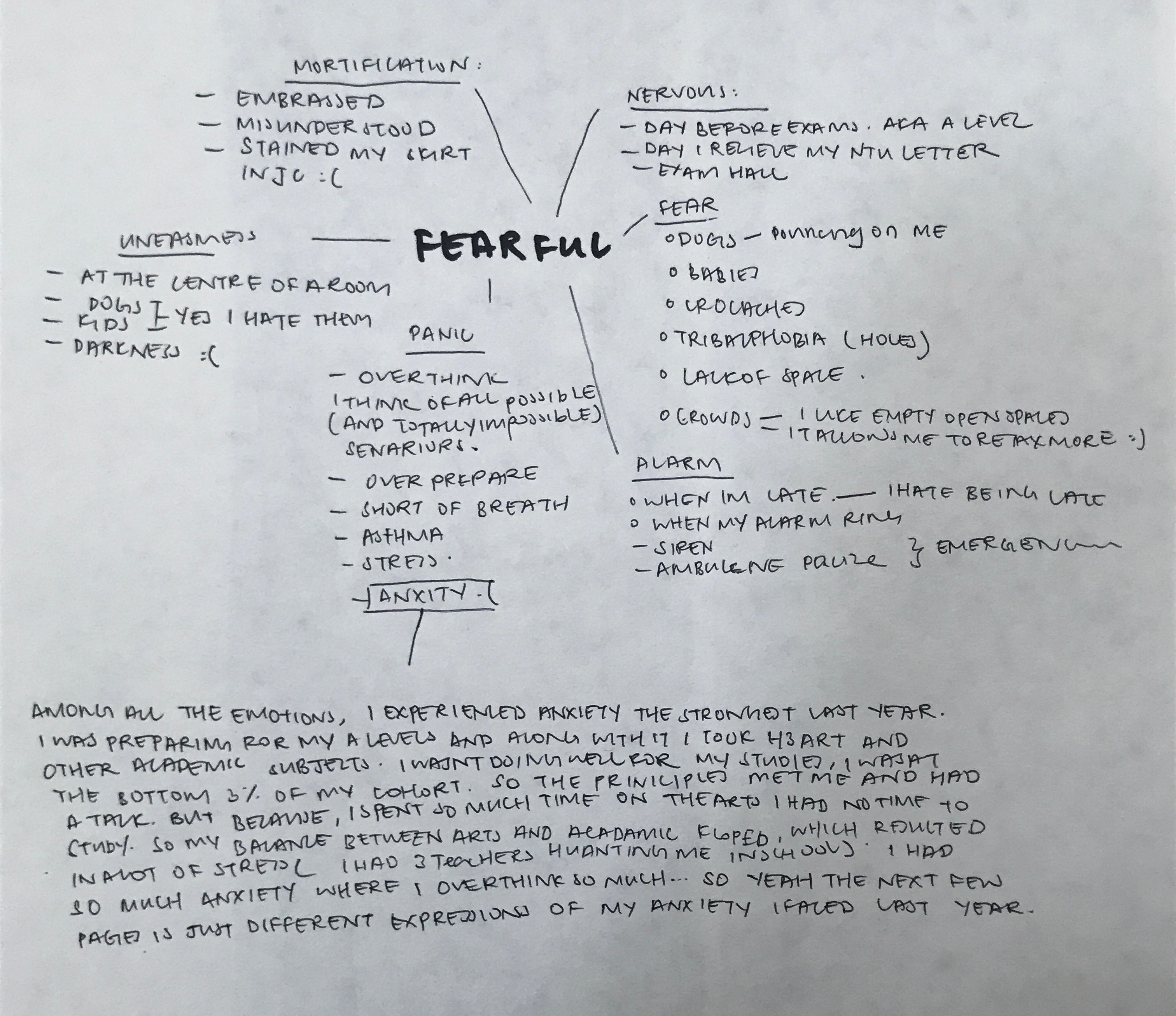
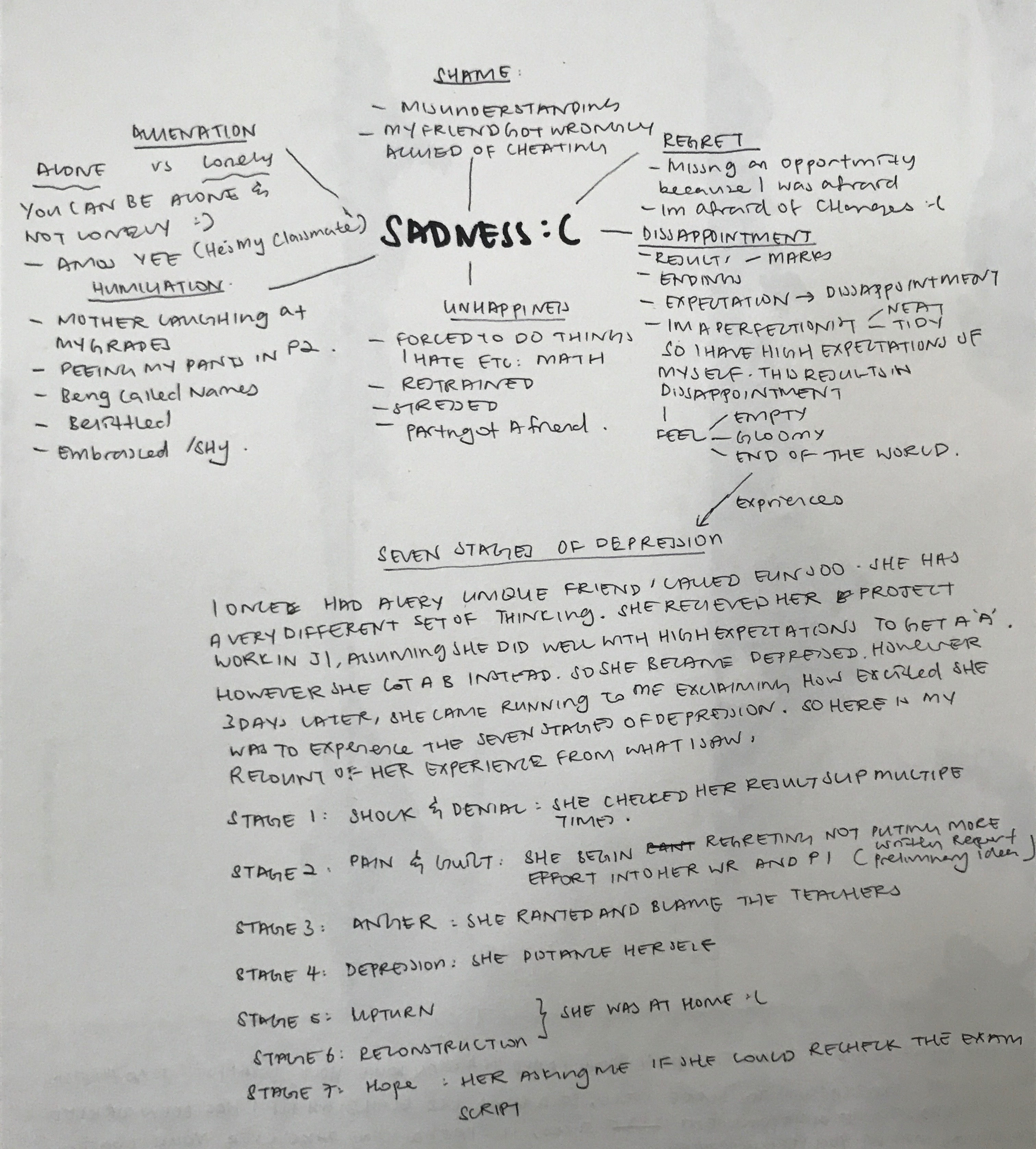
Tag Archives: Chinese ink

My Line Is Emo: Conceptualization ( Anger, Surprised, Love)

ANGER 

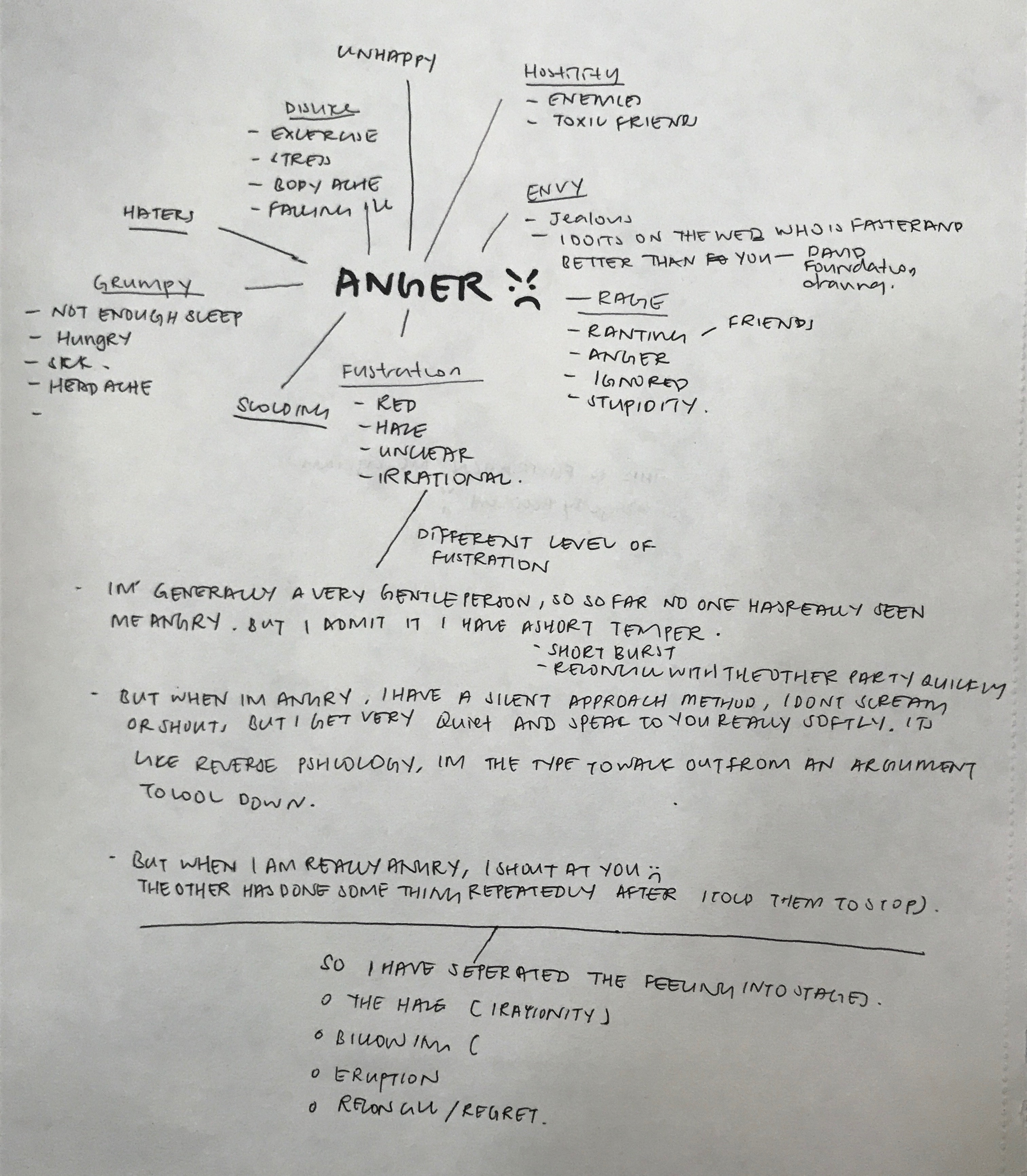
For me, I have a short temper and I lose my temper easily. But I have two different intensity of anger. I often choose to approach the situation calmly, using logic and reasoning. Often I would walk out of arguments if it gets too heated. I would speak to the other softly laying facts and the truth. However, when someone repeatedly does something after I told them to stop, I would become a volcano. I lose my rationality and shout at the person. As if there is a haze, blocking out my sensible thinking. for the emotion of frustration, I will be focusing on the different stages and intense anger.

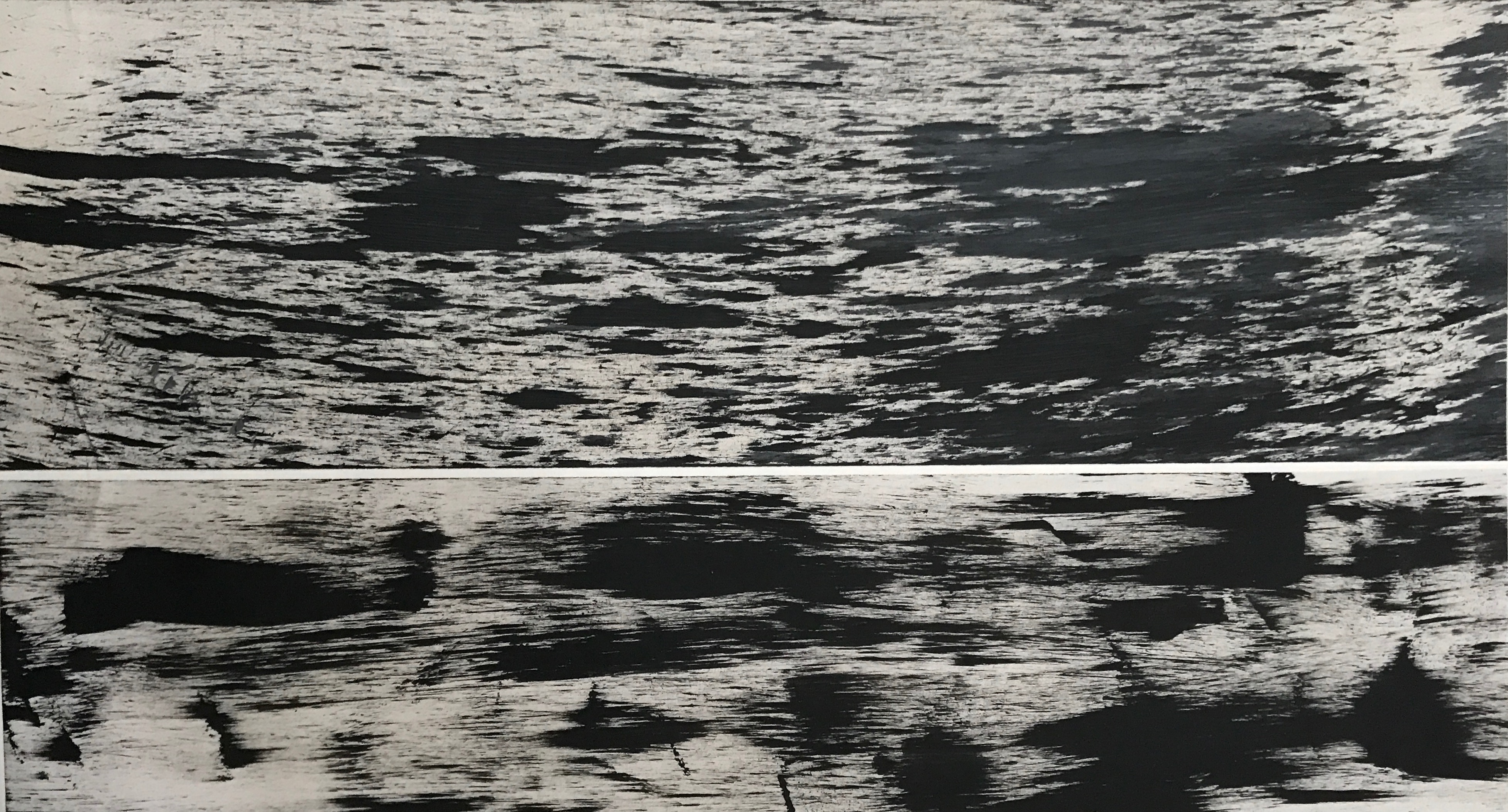
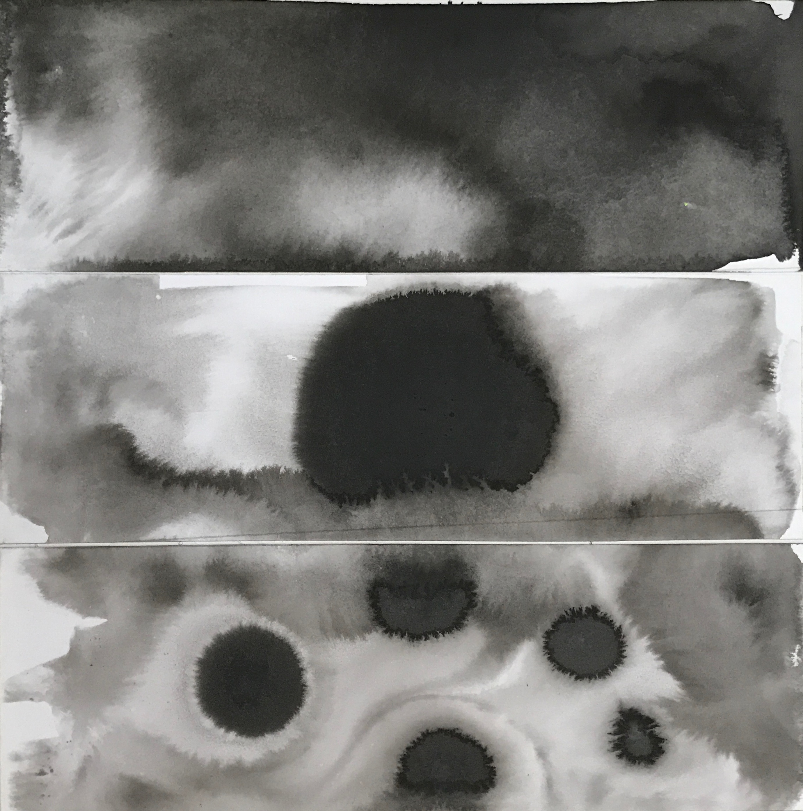
The first piece I tried to capture the essence of frustration. I blasted heavy rock metal music through my headphones and channeled all my anger onto the paper. I achieved this by rolling a sponge with acrylic paint over strips of paper.


The second piece is a different rendition aiming to capture the essence of anger too. but this time I applied blobs of acrylic paint to the paper before spreading them out with a broom. I really like the texture captured and created by the broom.

While I feel that these captured the essence of anger very well, this approach is very simplistic and common.

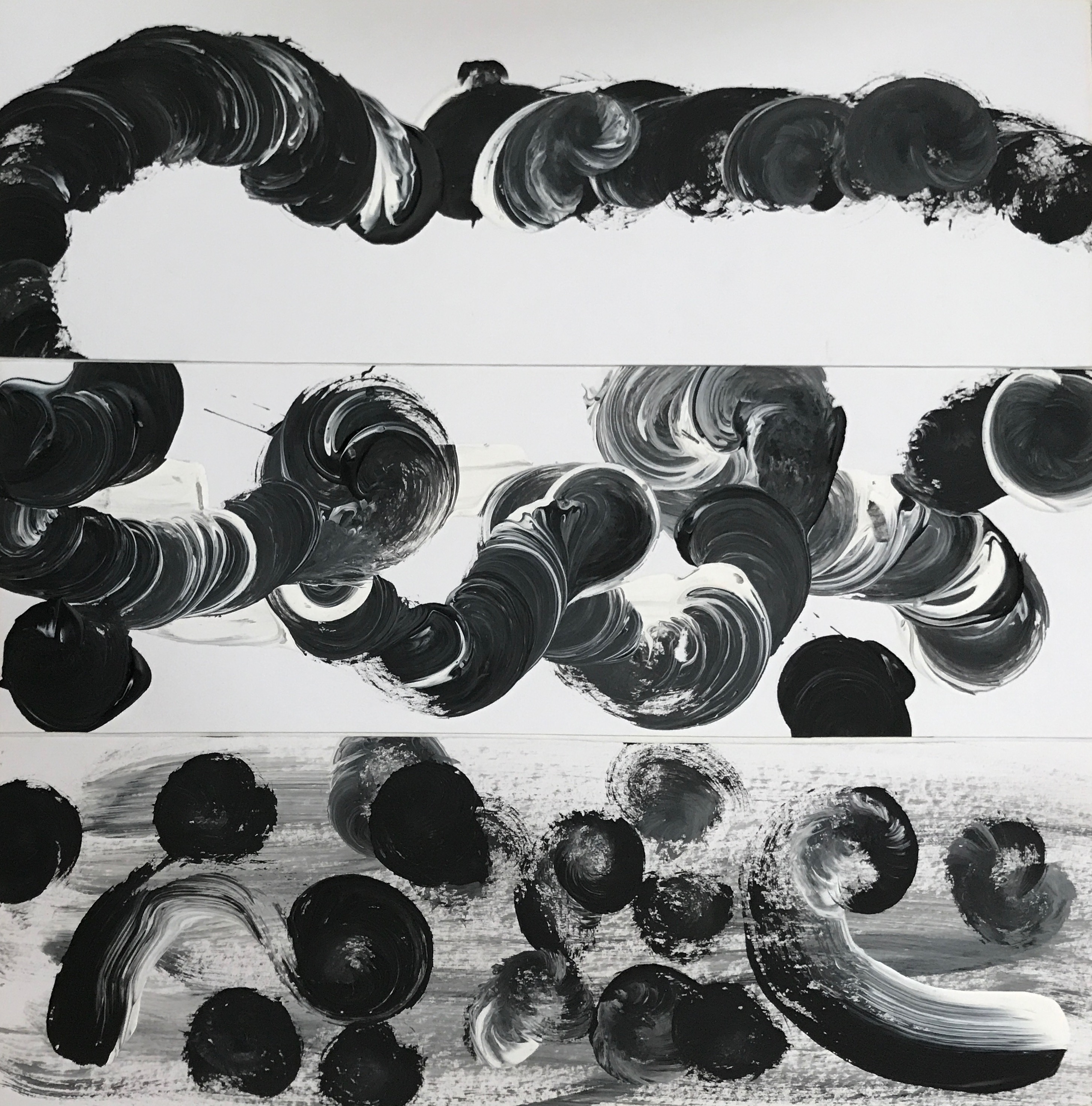
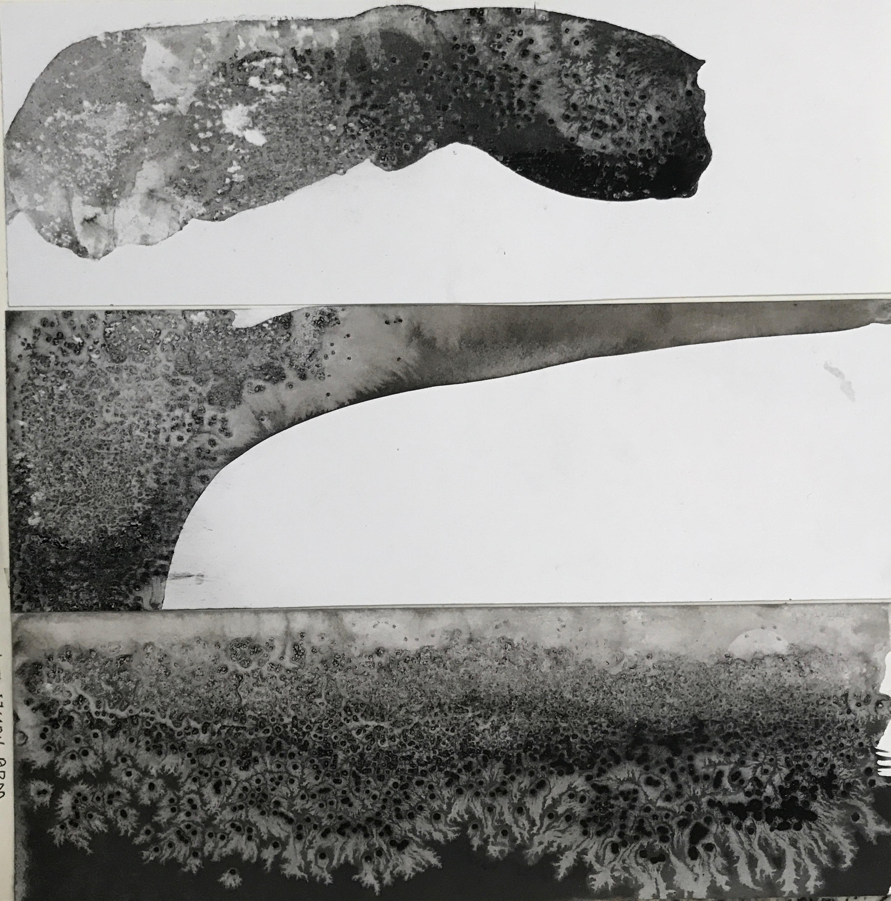
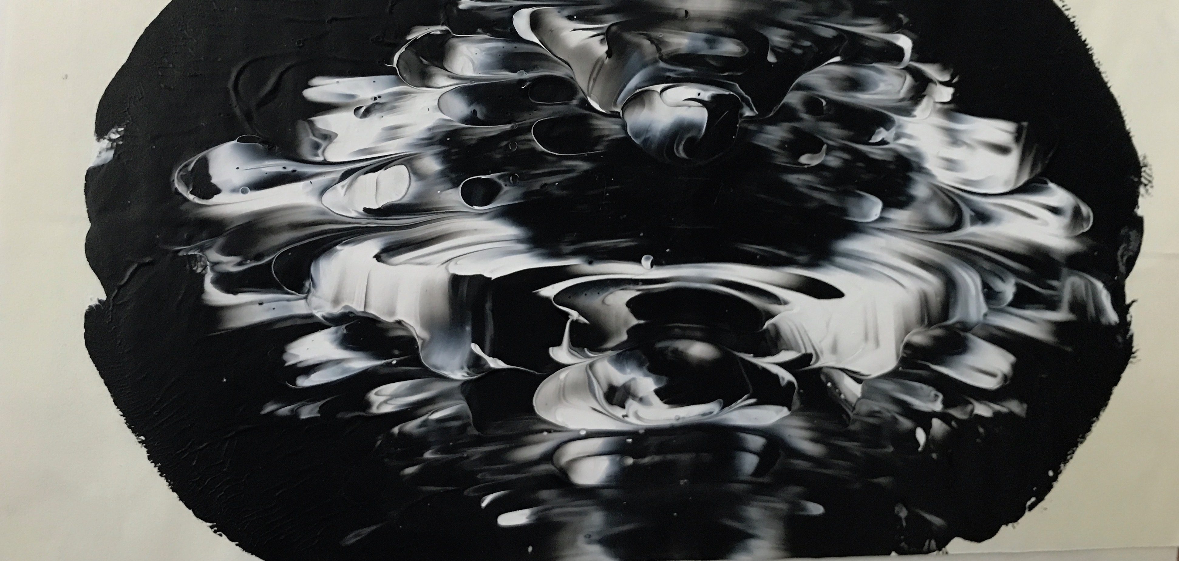
In the third piece, I explored with the billowing of my emotions before it becomes a full-blown shouting match. For this, I dipped half of my brush into black acrylic paint and the other half into the white acrylic paint. then I painted circular motif on the papers. During this in-between state, I often have an inner turmoil with myself, fighting the urge to scream at the other party. the sweeping strokes are inspired by a tornado, where the emotions are building and is becoming increasingly destructive.

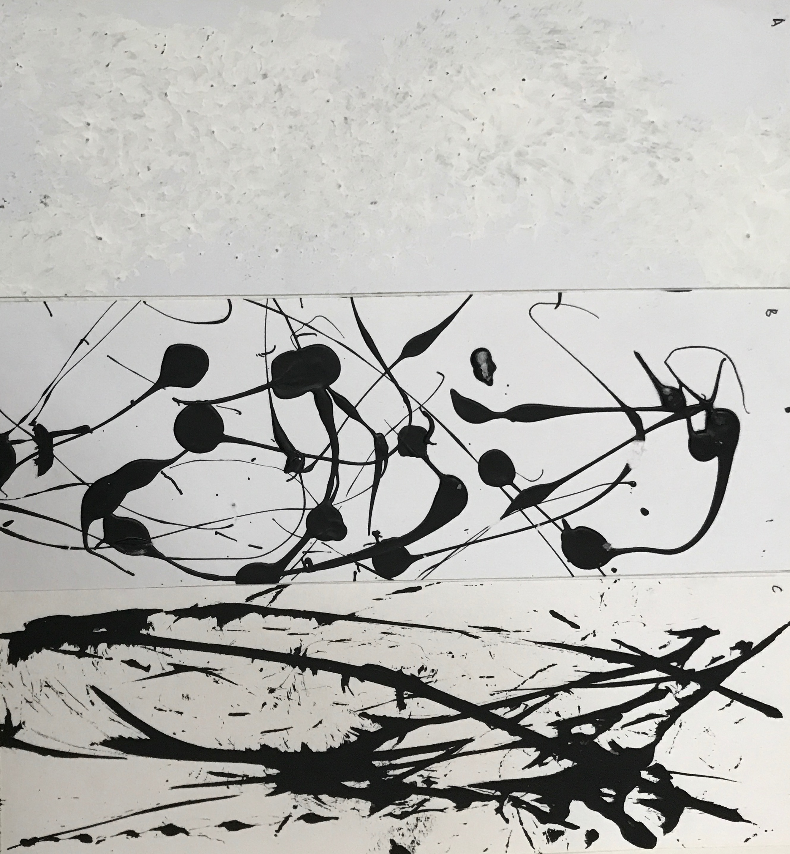
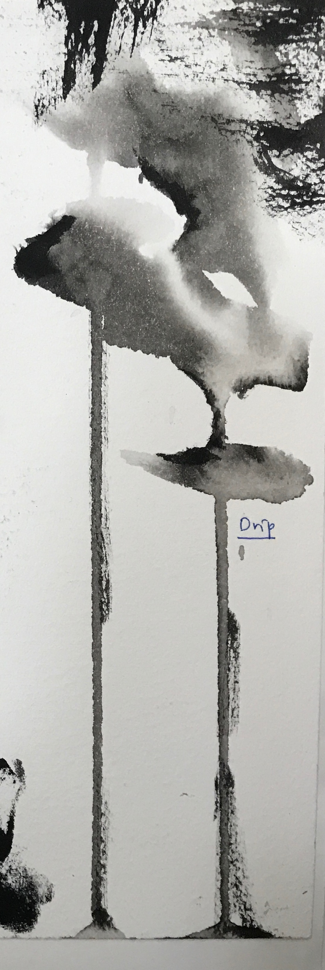
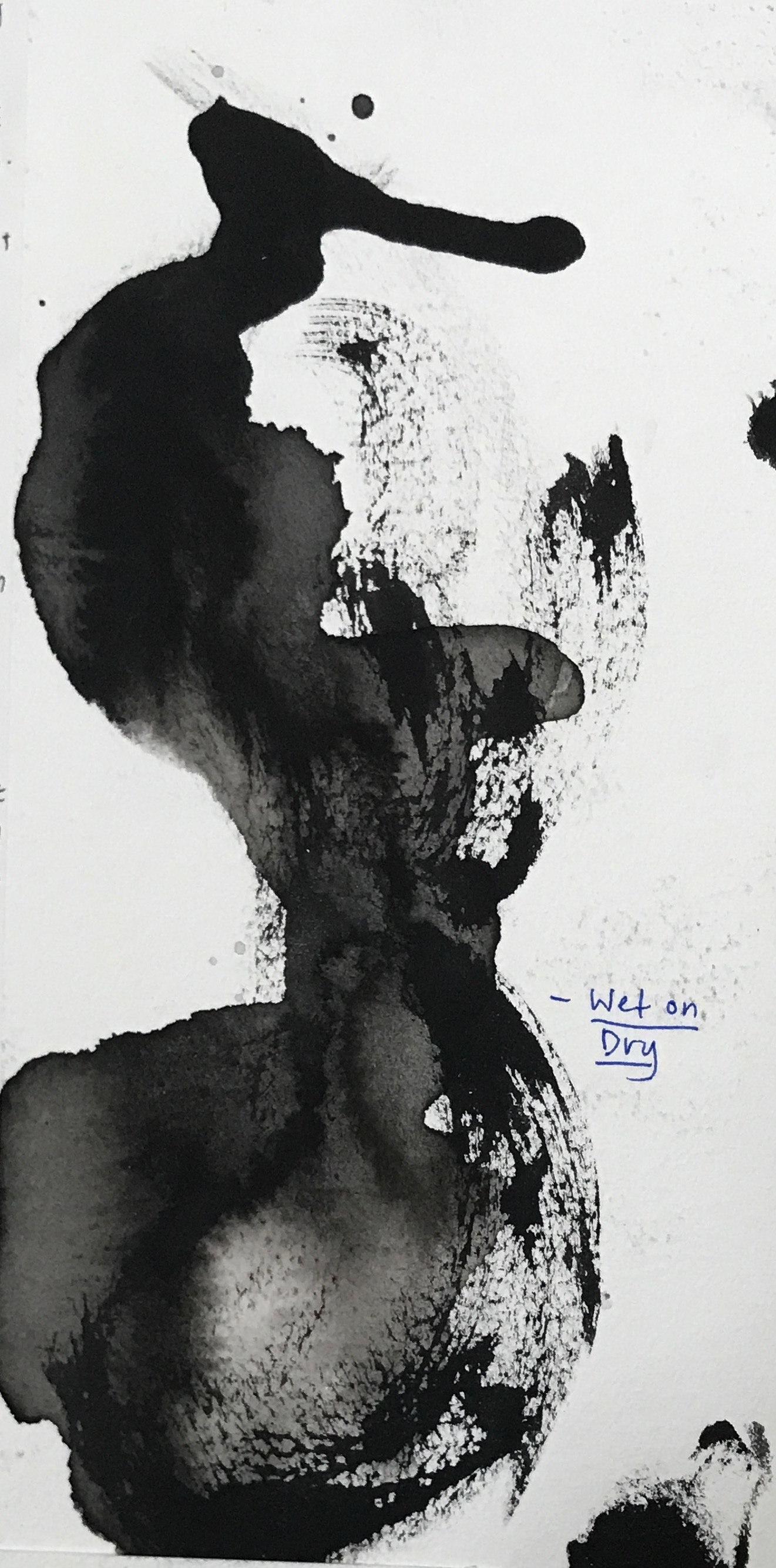
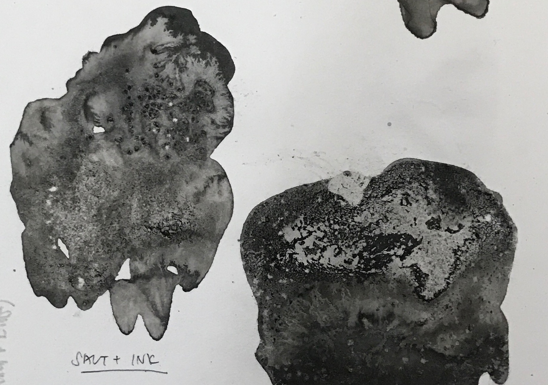
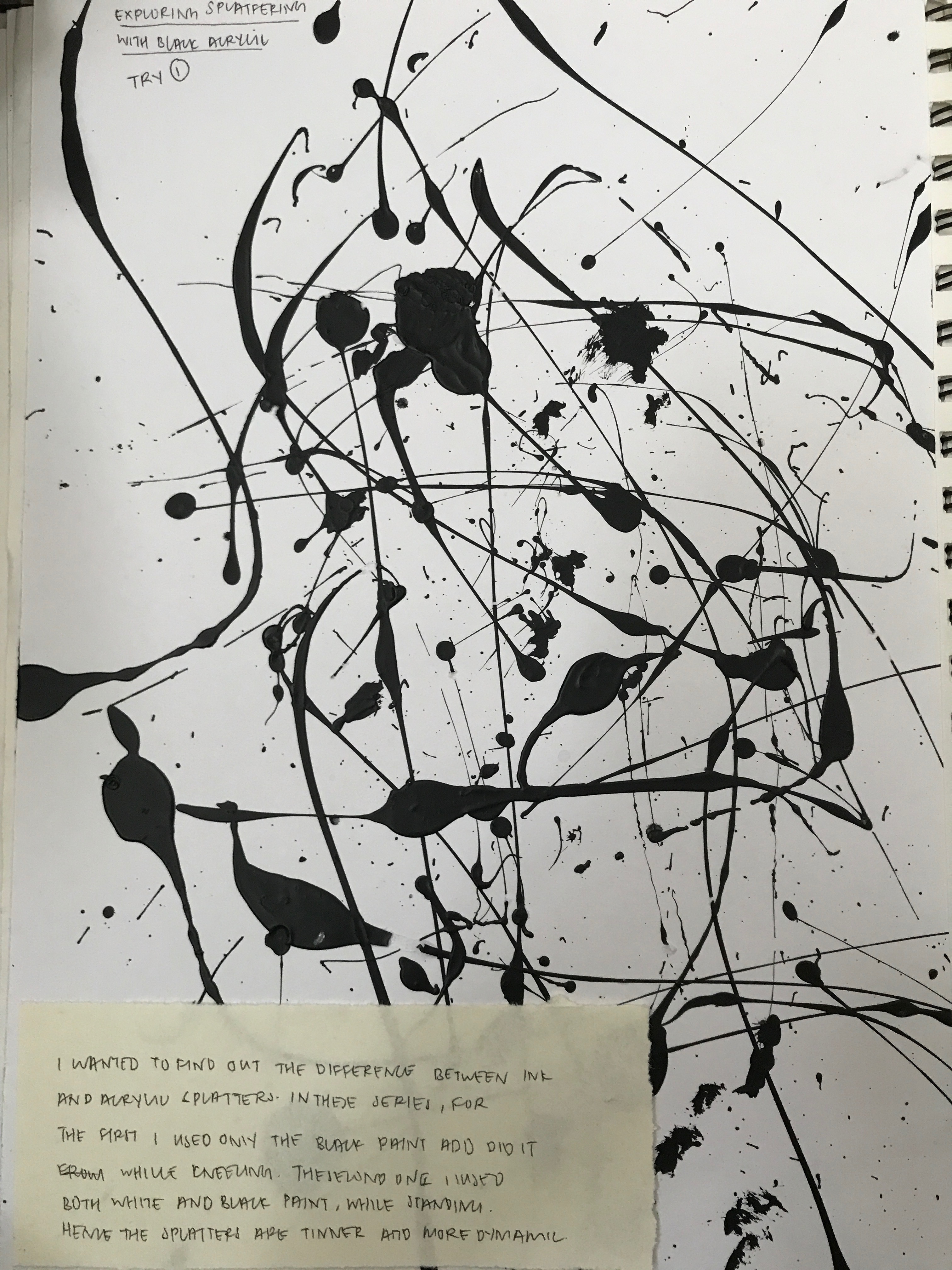
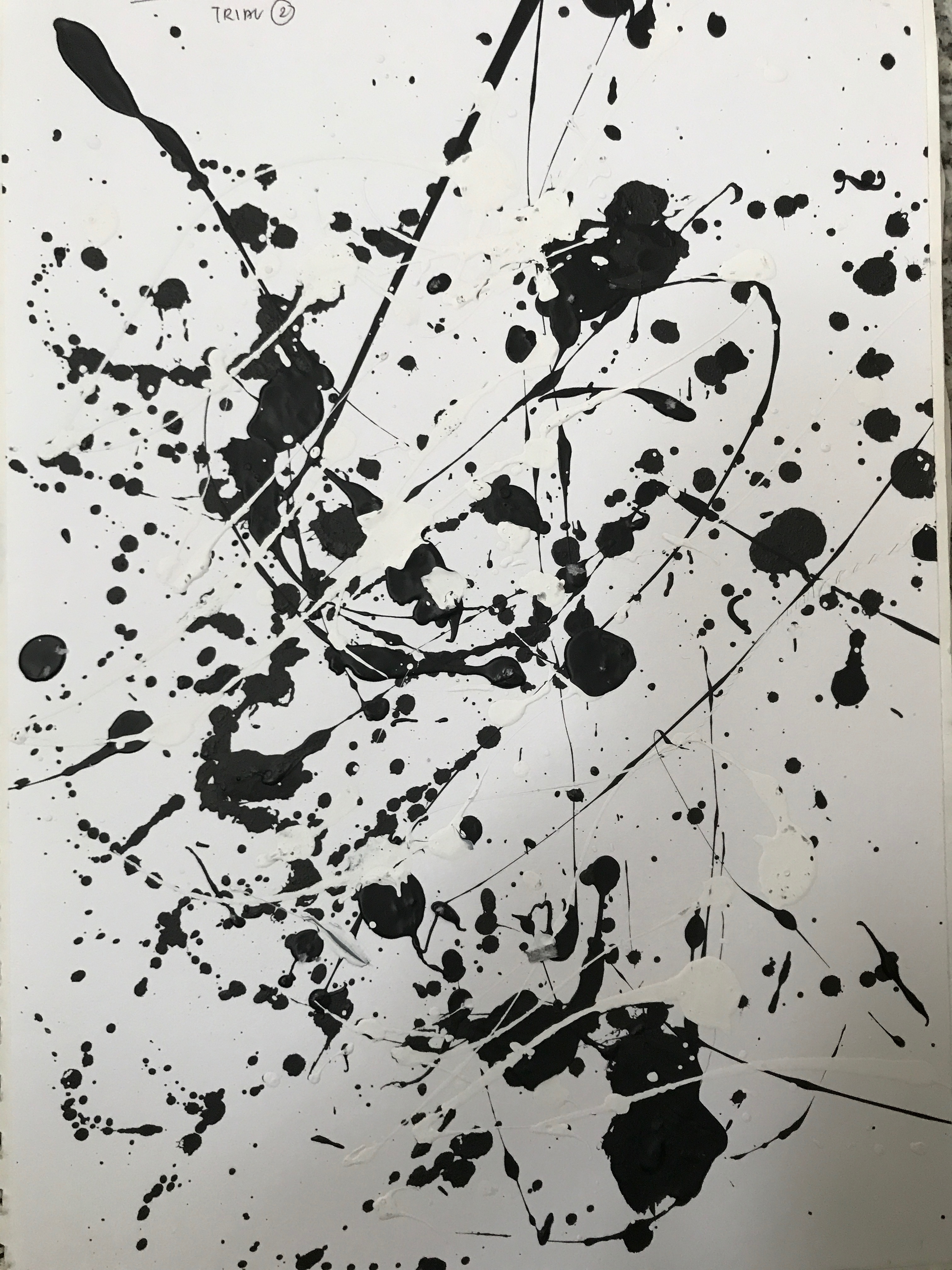
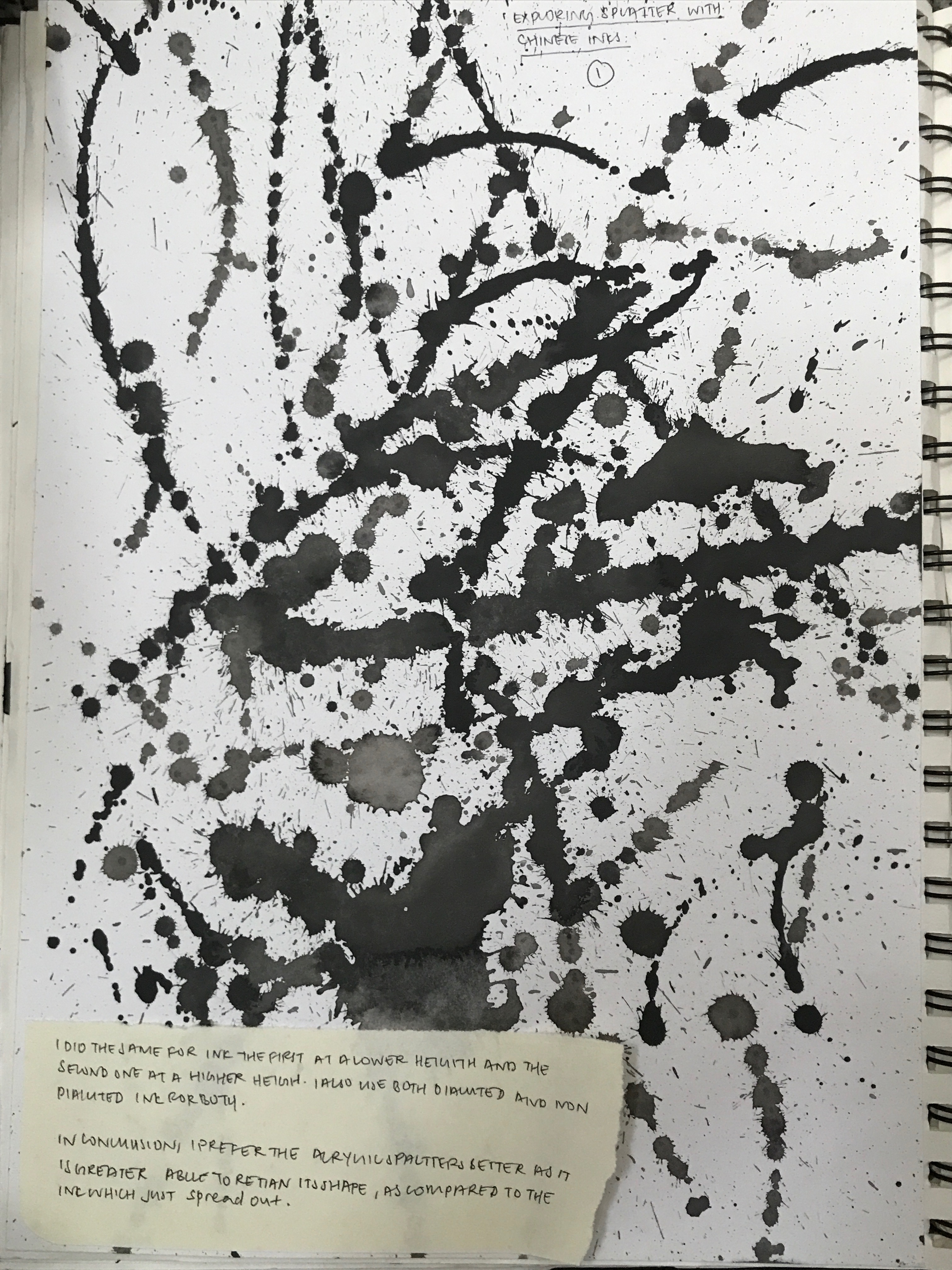
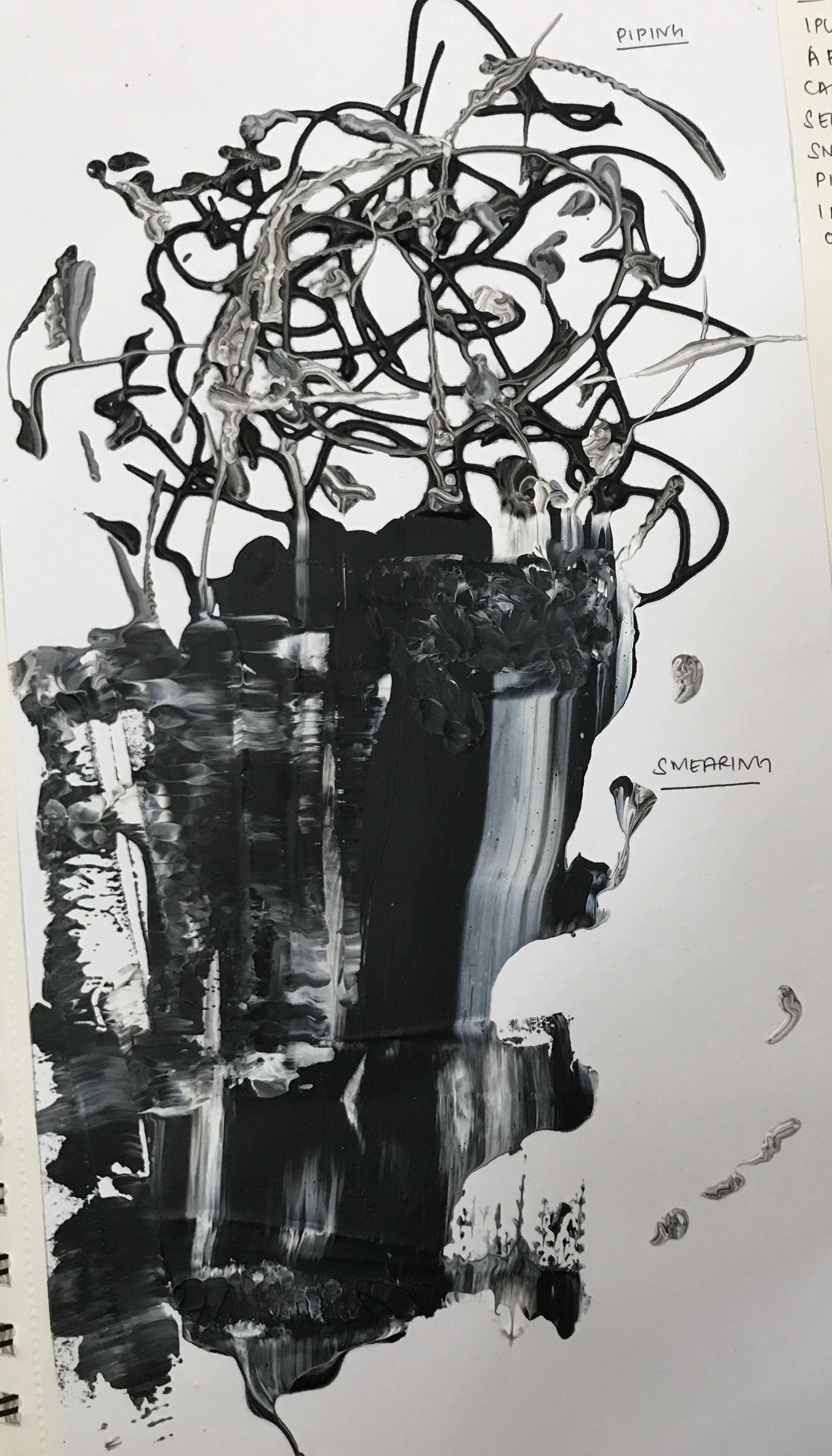
Lastly, I tried to express the destructive and explosive part of my anger. in the first strip, I wanted to focus on the texture of the paint. The rough finish of the paint makes it look very rough and poses a form o raw energy. In the second piece, I tried to express the feeling of anger bursting out from under my skin. For this, I  splattered acrylic paint from a height using a paintbrush. for the last one, I wanted to focus on the destructive and explosive aspect of my anger. I dipped a string attached to a needle into Chinese ink, before dragging them across the paper. This gave it a raw finish which goes well with anger. However, these expressions are too common and I need to give the emotion more layers for it to be uniquely mine. In addition, I should have splattered the paint from a greater height with more strength as currently, the splatters look very energetic. I would be improving on this by adding a dry brush stroke as a base, before splattering the white paint on the top.

SURPRISED

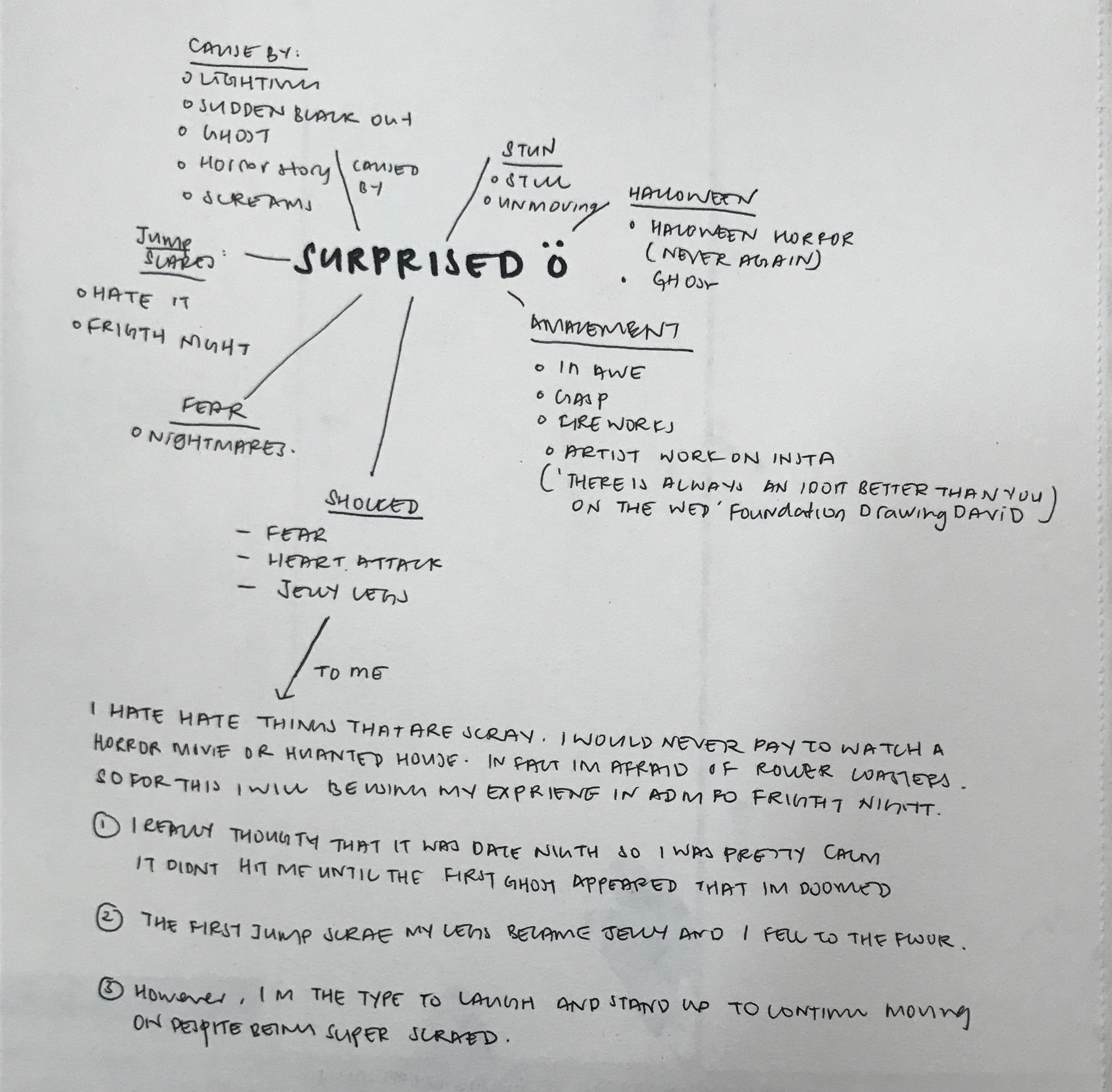
For me, I’m super easily scared. I would not pay to be scared or be paid to be scared. During fright night in ADMFO, I originally had no idea that it was fright night until I saw the ghost. At the beginning, I was very calm and repeated to myself in my head that there are no such things as ghosts. However, when the first jump scare appeared, I was so shocked that my legs turned to jelly and I fell. However, I just brushed it off laughing while I stood up again, to continue on the whole journey, despite being super scared. I will be basing the emotion of surprise of my experience in fright night.

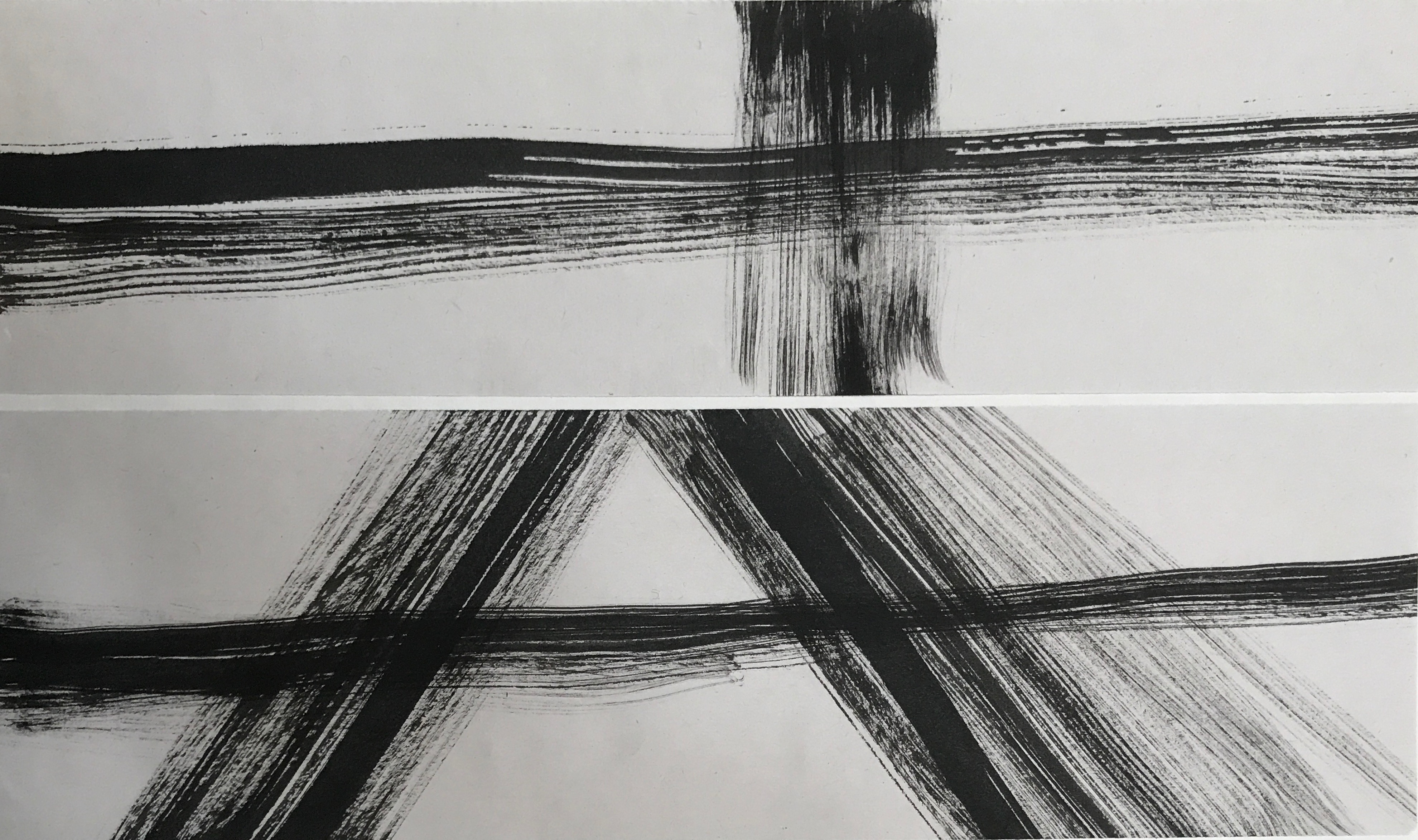
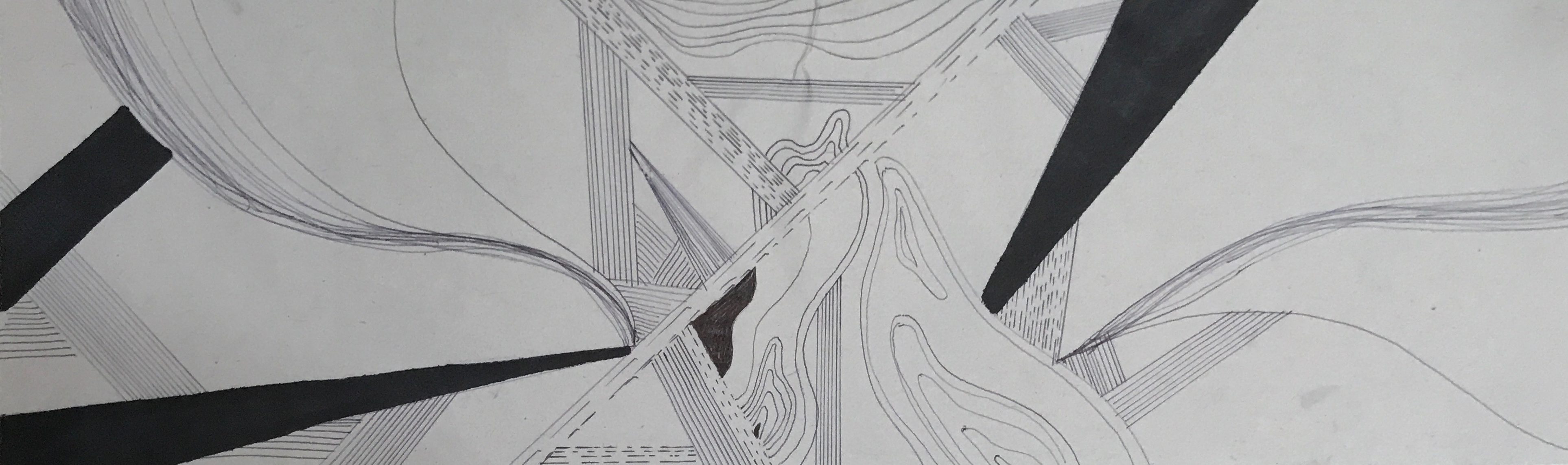
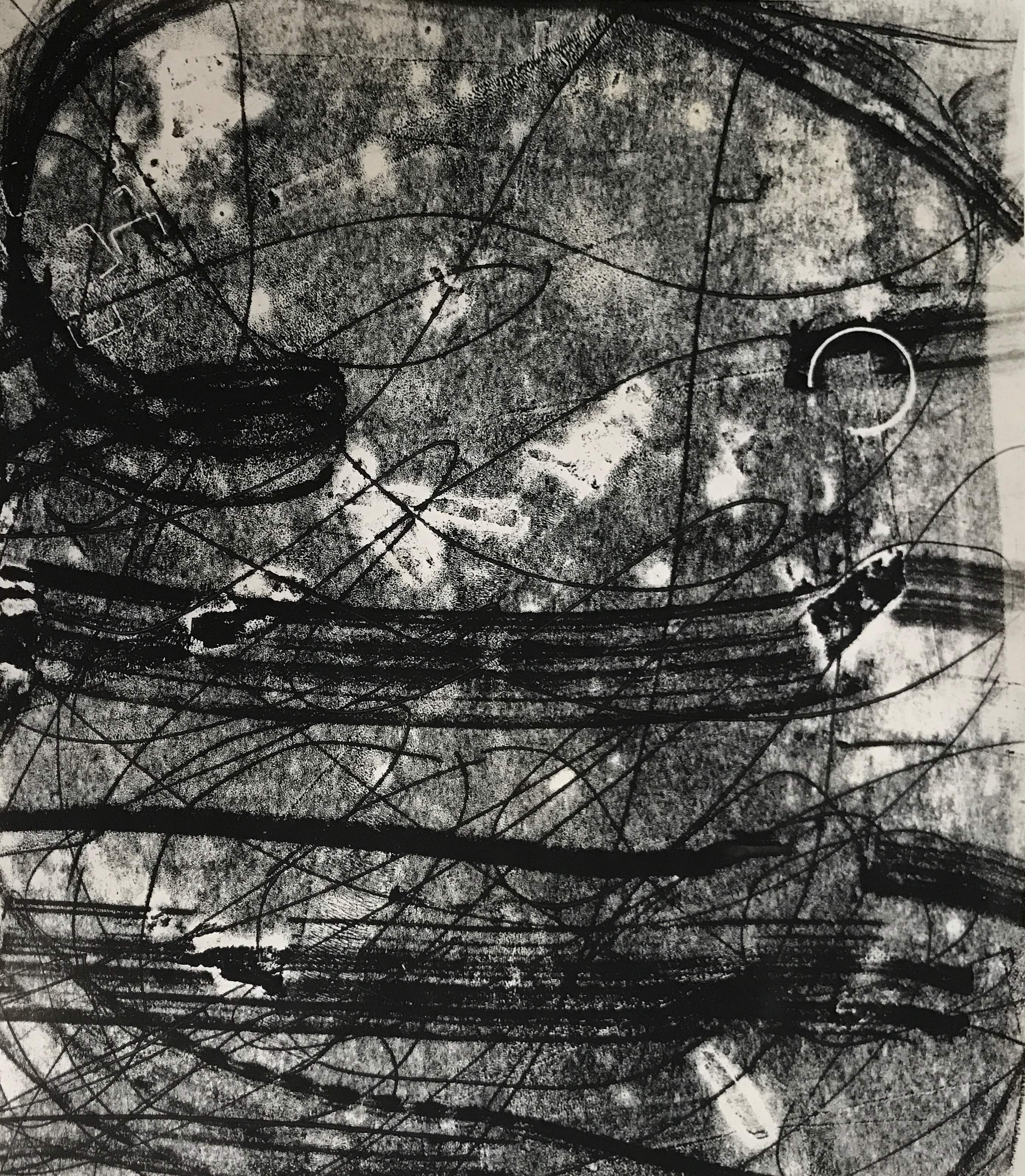
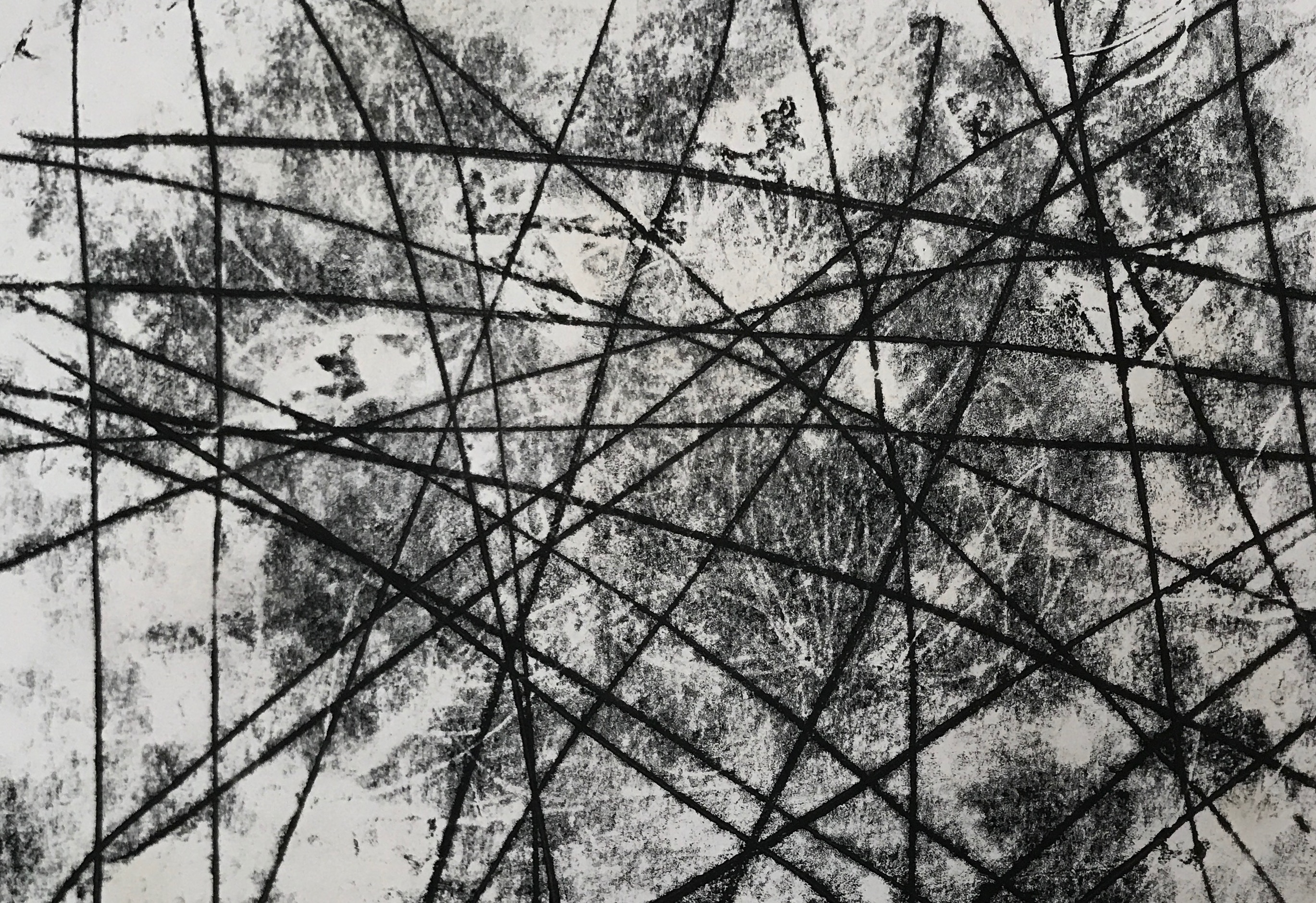
For the first piece, instead of focusing on my experience in fright night, I wanted to try to suggest surprise through the creation of an anomaly in my work. In both pieces, there is a harsh contrast between the lines, horizontal versus vertical, diagonal versus horizontal. I feel like this is a very superficial way of expressing the emotion of shock hence I decided to scrape it.

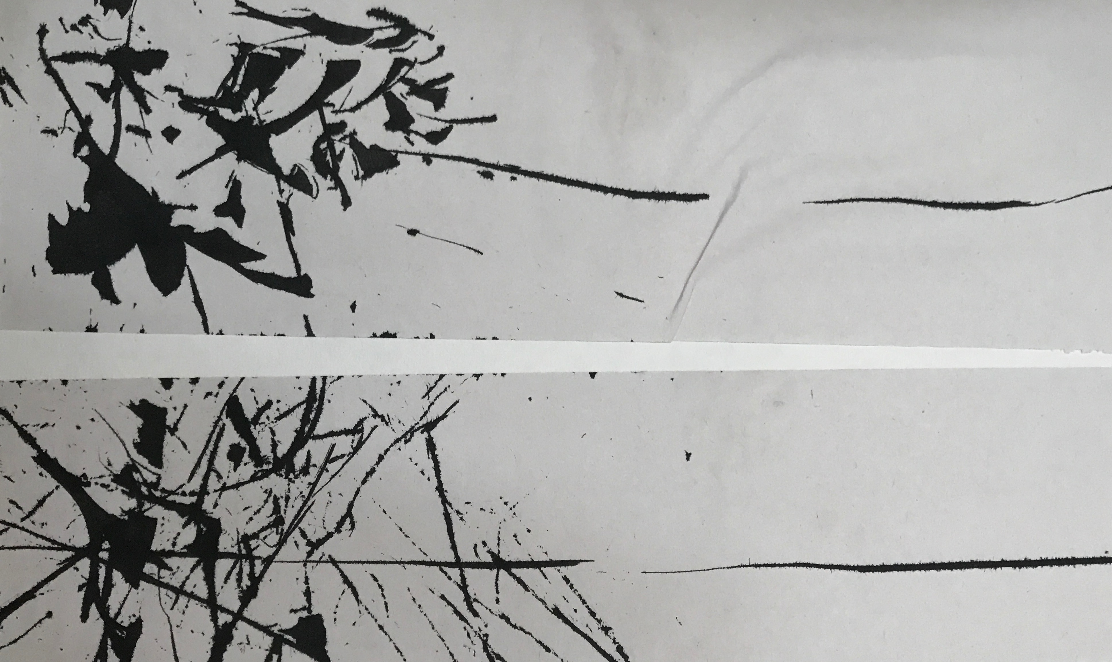
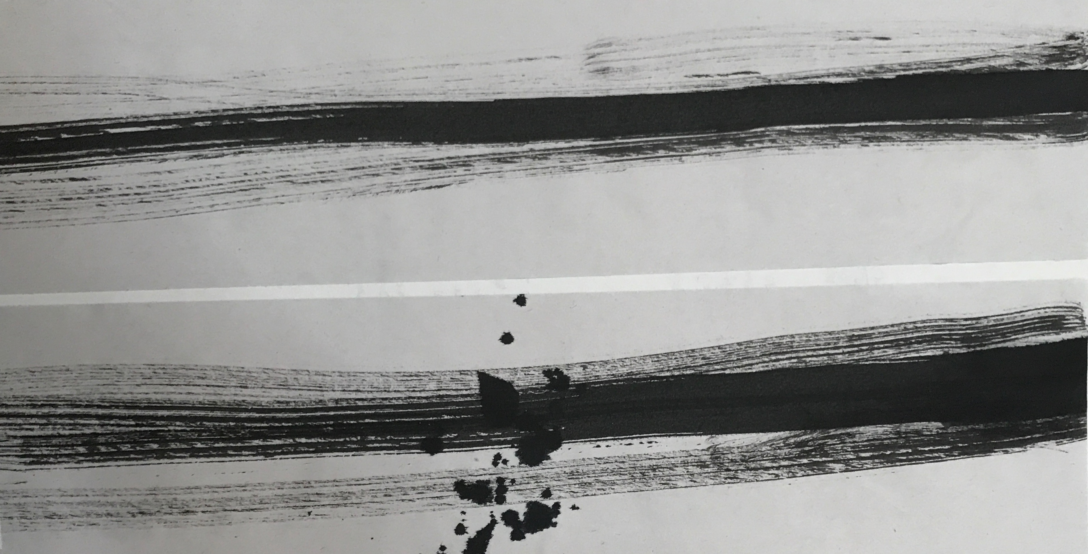
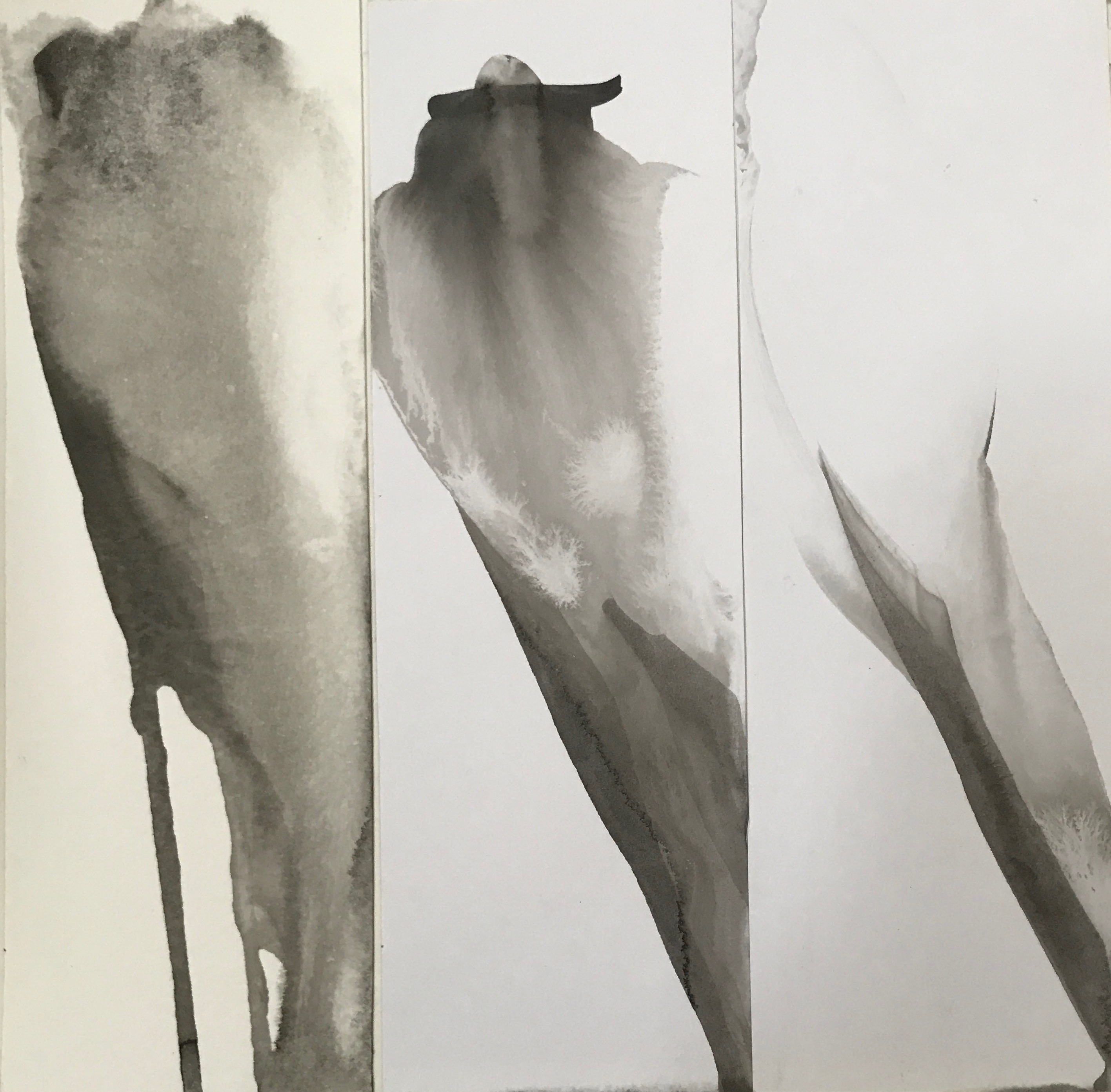
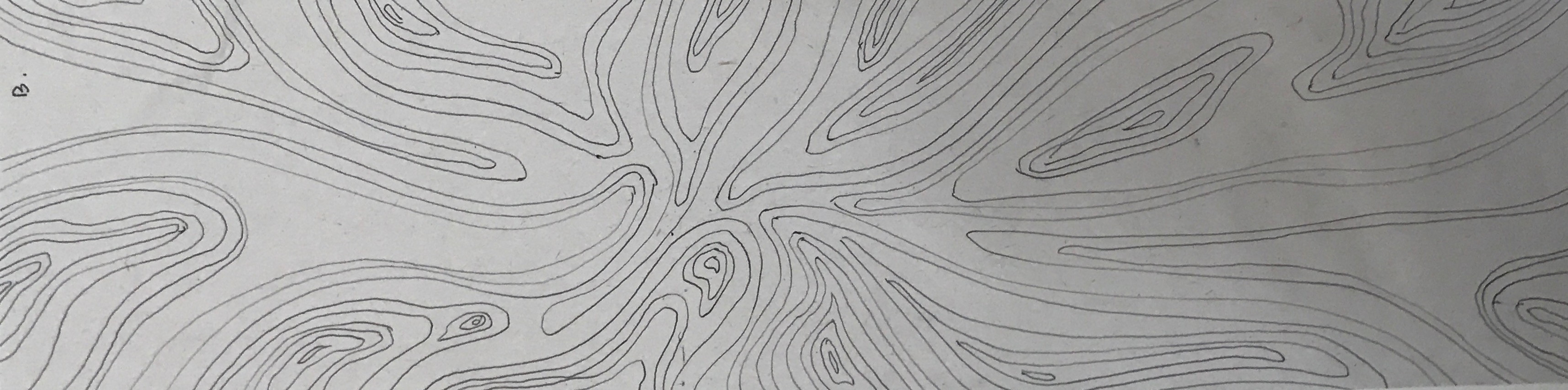
For the next series of work, I was inspired by a heart monitor measuring my heartbeat during a jump scare in ADMFO. First, I would be calm as I don’t know what is happening. This is represented by the flat lines on the left after the jumpscare happens and my heart beats super fast causing a sudden rise in my heartbeat. This results in the fraying of my emotional state as shown by the diagonal lines in the first and the splatter in the second. The first piece is done by dipping thread into the ink and bringing it around the paper. the seconf=d one is done with a dry brush dipped into acrylic paint. Among the two, I prefer the second one. The second one has a frayed line that continues on to the end of the paper. I like this connotes the fact that even though I try to act fine and brush the fact that I got scared, my mentality is still frayed and I’m super scared on the inside.

LOVE

For me, I don’t believe in love and neither have I experienced a romantic relationship. so I’m going to base love of my idealistic and perfect ideology. To me, two halves do not make a perfect circle. I view love as a way of development and growth. It’s about the merger of two vastly different people, coming to terms and accepting each other’s differences and weakness.

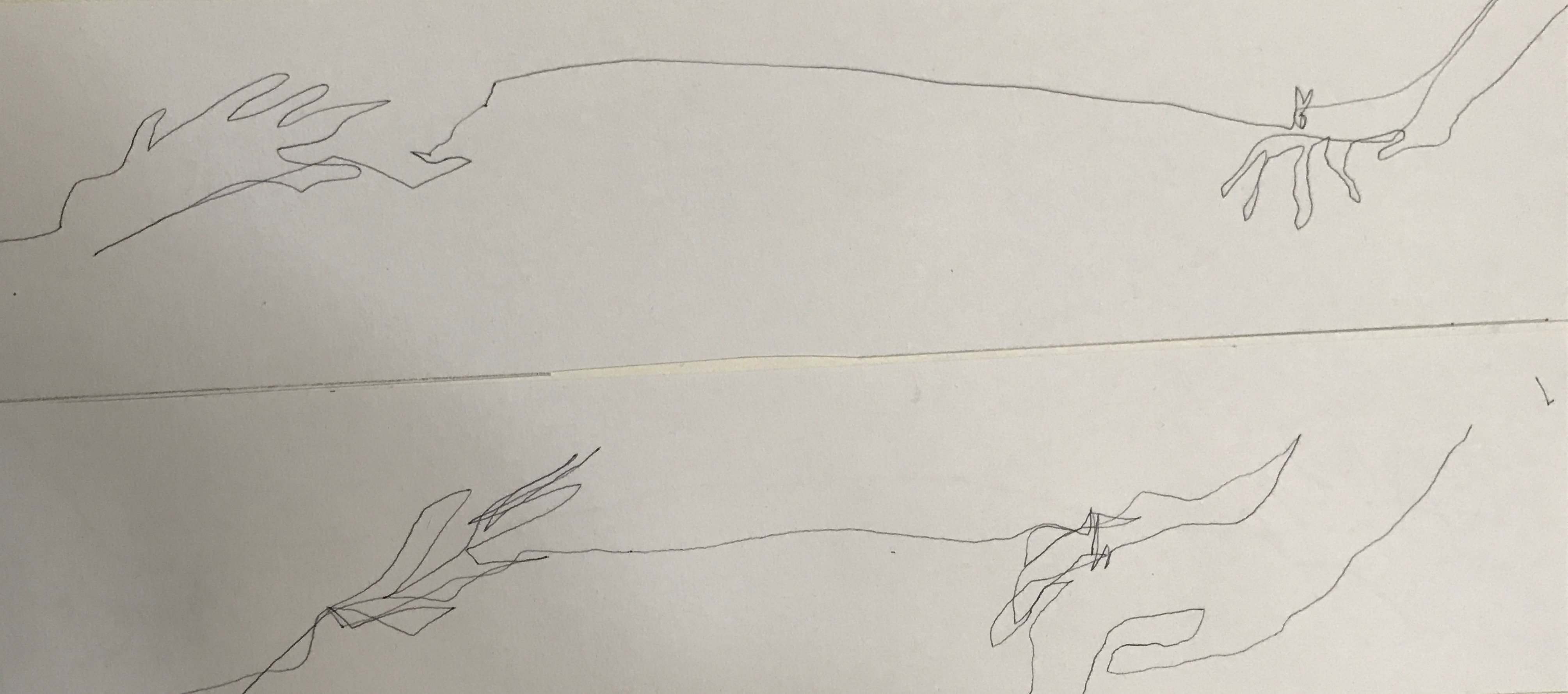
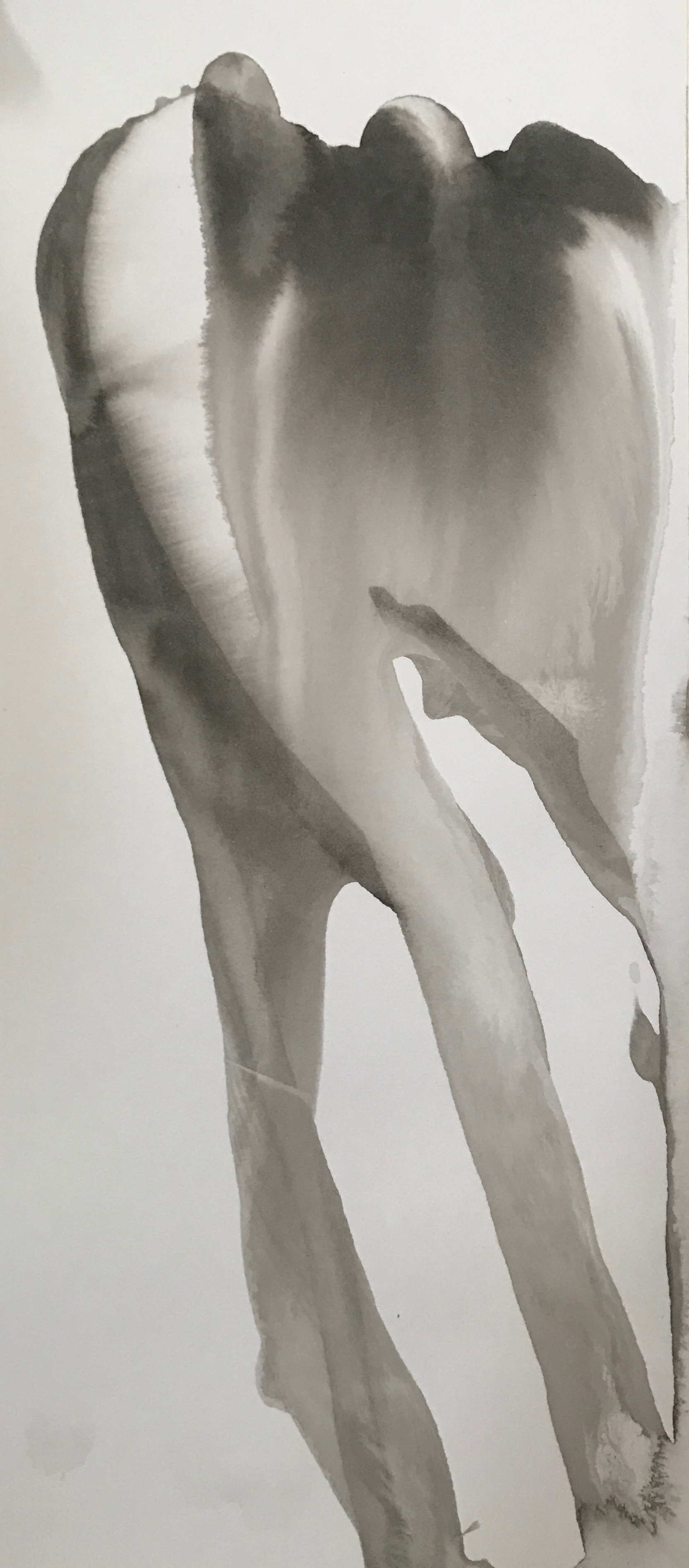
For this piece, I was inspired by the Chinese legend, the red string of fate: two lovers will be bounded by a red string tied onto the pinky. I tried drawing the idea of having your pinky bounded by doing blind counter drawing for both my left hand and my right hand. However, the end result did not turn out great as it is hard to distinguish what I drew much less tell the emotions.

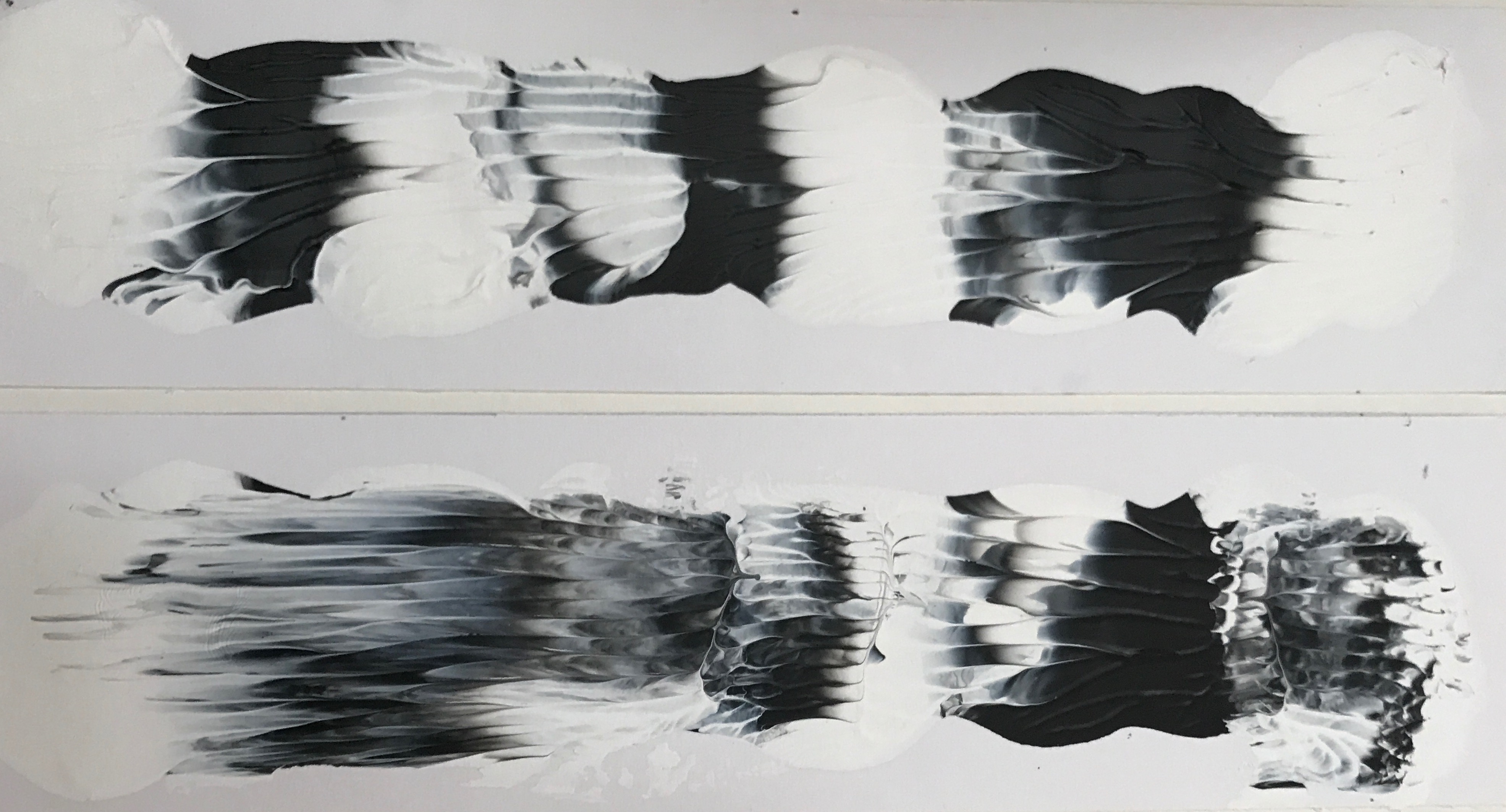
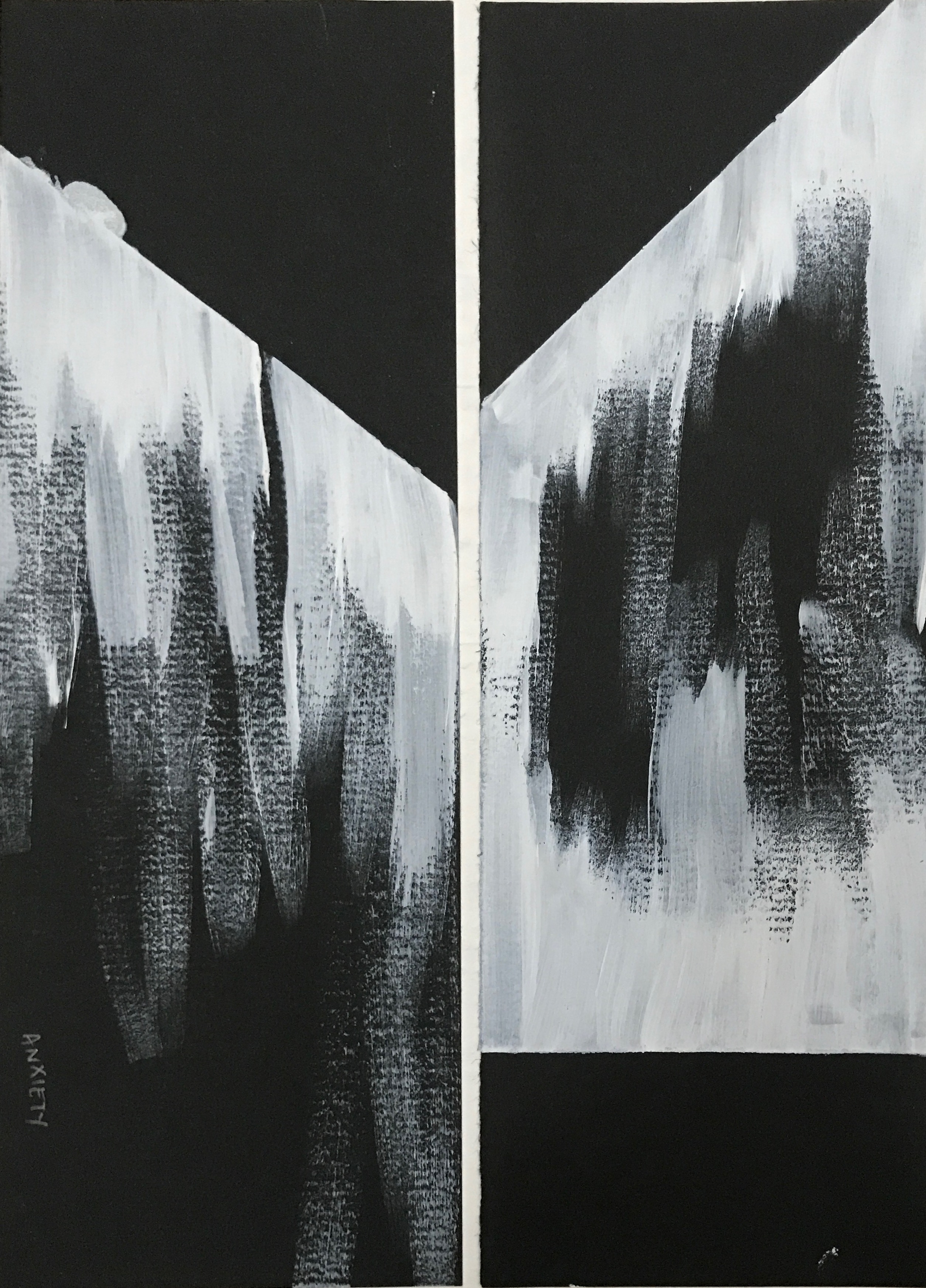
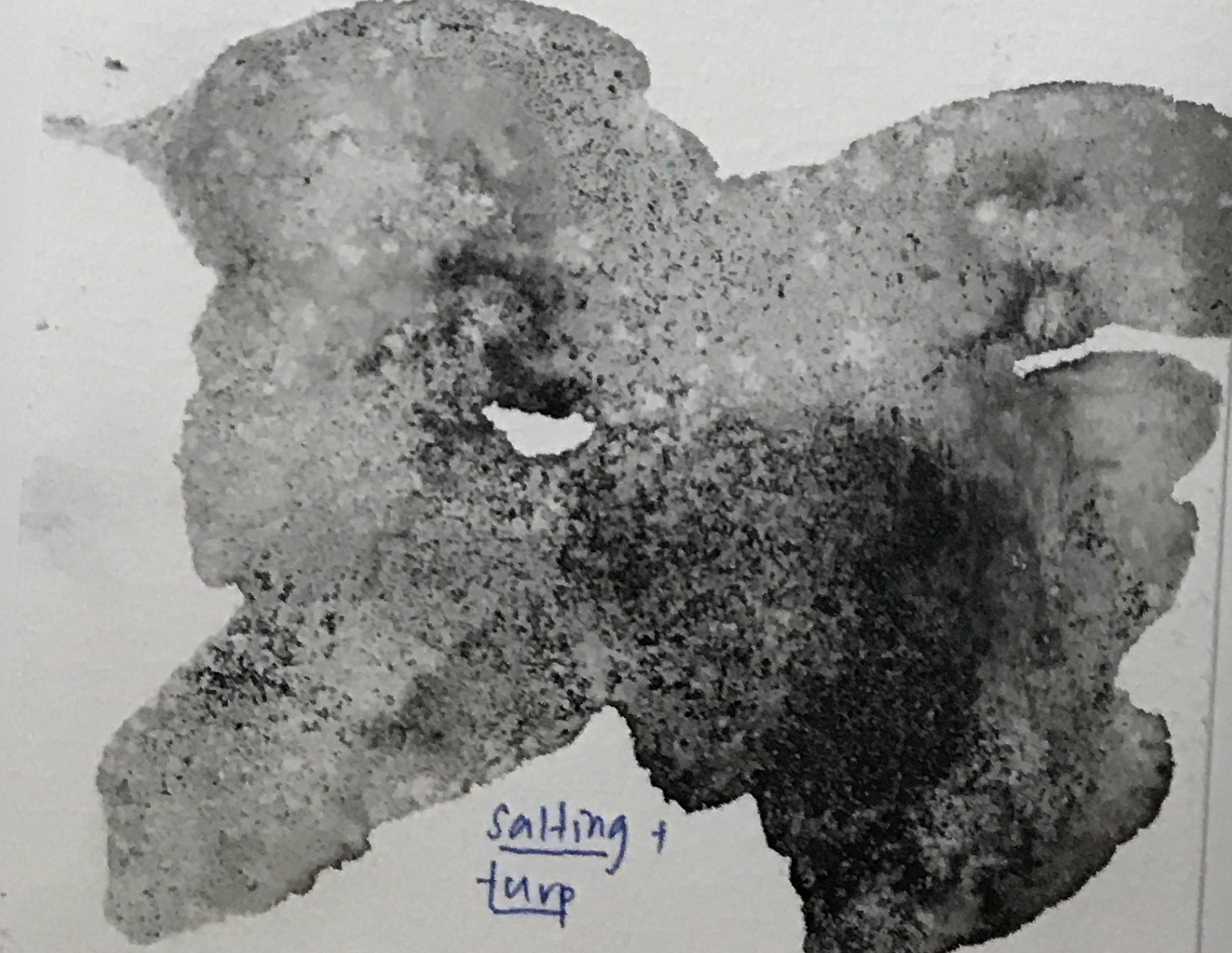
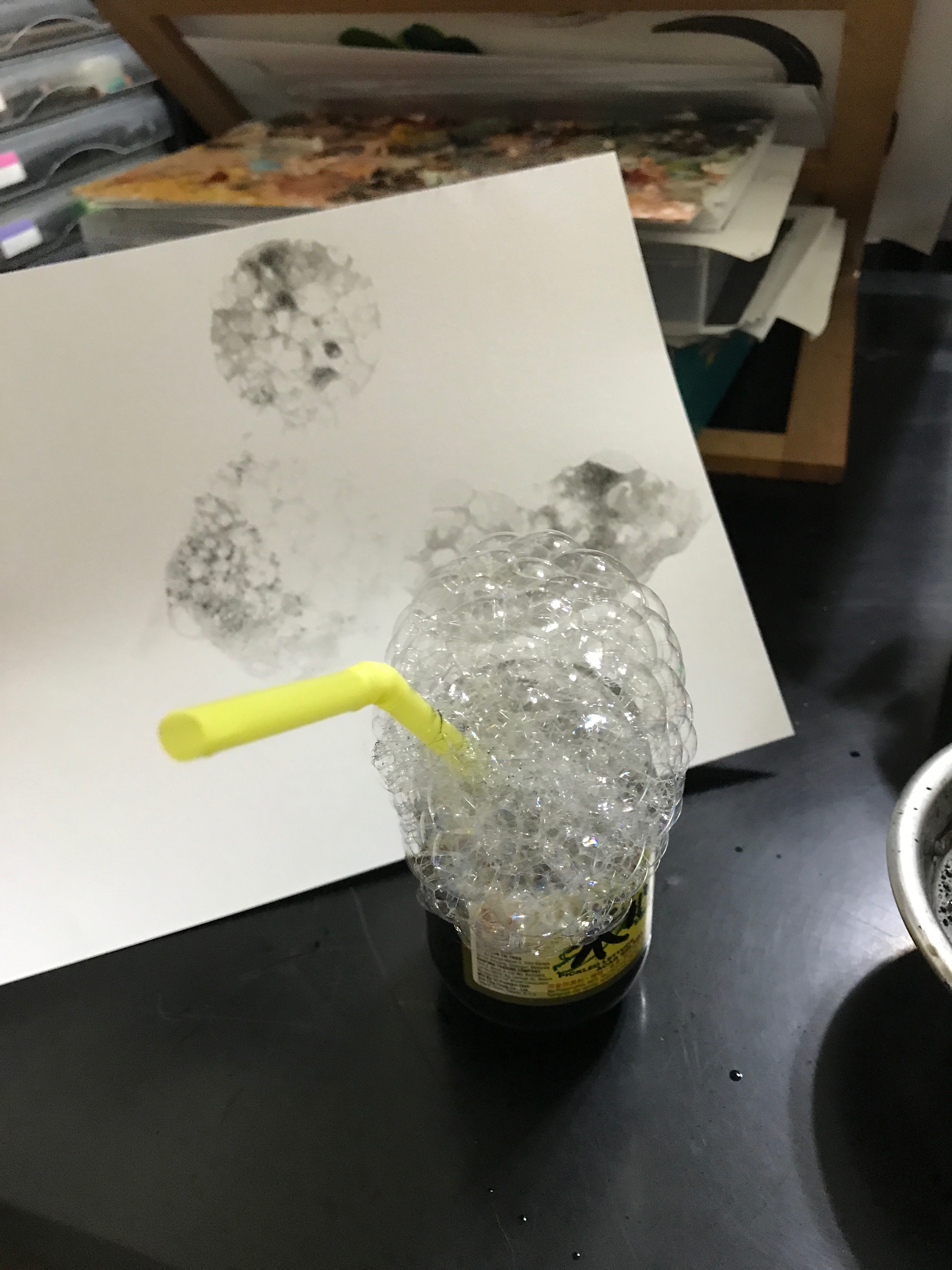
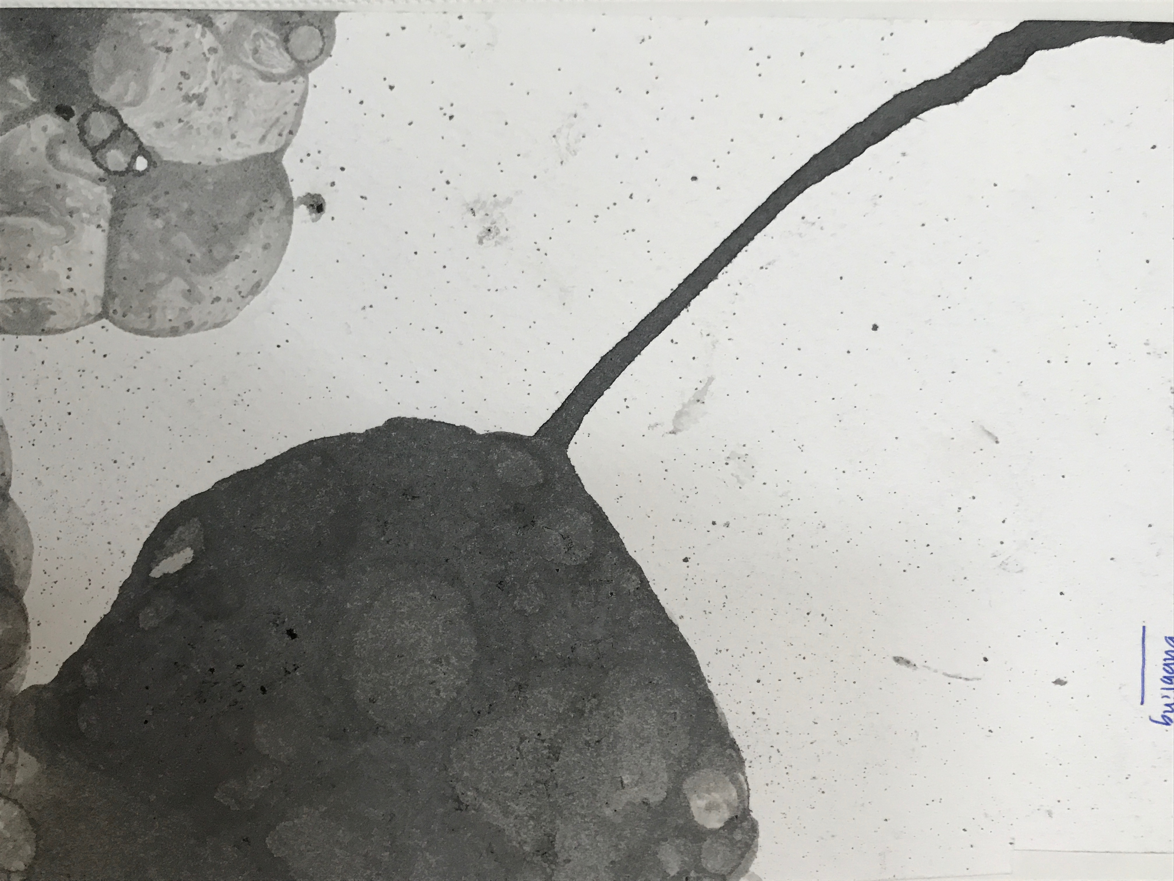
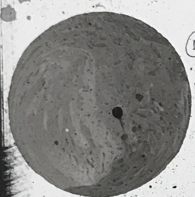
For the last piece, I wanted to show the merger of two to become a better version of yourself. I used the technique of decalcomania for this piece. I place blobs of paint onto the paper before sandwiching them, allowing the paint to blend and mix with each other. The white and the black paint represents two people that are starkly different and opposite of each other. The gray shows their development and acceptance of each other. I like this result a lot as it shows the gentleness of the relationship through the soft blending of colours and the turmoil of the relationship through the jagged areas. I will most definitely be exploring this technique on a larger scale for my final.

My Line is Emo: Conceptualization ( Joy, Fear, Sadness)

JOY

I included a mindmap of what joy means to me above. But in a nutshell, I derive joy from being alone. I am an introvert, while I like spending time with others, after a while, I need to retreat to “recharge” myself in my dungeon (room). To some, they fear to be alone as it would result in loneliness.  But for me, I find solace in the silence. I’m highly entertained by my own thoughts and imagination. Often, when I’m bored, I would be picturing myself as the main character if a story. To me, this is my greatest joy. This allows me to escape into a fictional world, away from all my stress and my problems.

The first subcategory emotion that I explored with is pride. To me, acknowledgment is what I constantly seek for. raised in an Asian family, compliments are hard to come by. Hence when someone compliments me, I take pride that my work is recognized. Pride is a very dangerous feeling for me. I may be blinded by my arrogance and pride, that I may fall very badly from my high horse.

I tried to express the idea of getting over the head and falling through bubbles as similarly, bubbles will float upwards before bursting. In addition, I like the how bubbles connote the idea of being obvious to the surrounding one’s actions as the bubble isolates the person from the surroundings.

The second subcategory that I wanted to express was the feeling of at peace. To depict the silence and the monotony of peace, I used the palette knife to create a rhythmic texture. The repeated tessellation, suggest boredom.

I chose to use white paint instead as the paint is more translucent and more reflective and allows a greater focus on the texture. I won’t be using this idea for the final piece. while it suggests monotonous activity and boredom, silence does not result in boredom for me. On the contrary, it’s vibrant and interesting for me.

In the next piece, I tried to express my mental state: at peace away from all the stress and worries by using the ink + water flowing technique.

Among the three, I like the last one the most. I was tempted to recreate this for my final but there were 2 problems I faced. Firstly, I realized that my classmate is using part of this technique in their works.Secondly, this work has to be seen vertically instead of horizontally as stated in the project brief.

The last piece I explored and express the fantasy “world” inside my mind when I’m daydreaming. For this piece, I chose to use pens and markers instead of using acrylic or ink. This gives me a greater control over the medium, allowing me to add more details and into the work. I feel that this goes very well with my concept as my “world” is very complexed and confusing.

I tried to create what I call a portal of dimensions into my fantasy world. I made use of different motif to create patterns that do not have to be seen from a specific direction. This is inspired by null gravity, where directions do not exist. This makes the work more interesting and dynamic, similar to my ” inner world”. I will be developing this piece for my final, by incorporating principles of designs.

FEAR

For me, I experienced a breakdown during my J2 in Nanyang Junior Colledge. I took art as one of my subject for the A-levels. This took up most of my time in school, as I often had to stay back until 10 pm to work on my artwork. This resulted in me neglecting my academic studies. I was the bottom three percentile of my cohort in J1, and J2. in J1 I purposely skipped an exam to force the school to project my chemistry test score, so I could promote to J2. So I had many teachers haunting me for consultation and whatnot. Furthermore, I didn’t get along very well with my classmates. This made me feel very suffocated and isolated in my JC. For the feeling of fear, I will focus on the different aspects of anxiety I felt during my A-level period.

The first anxiety that I will be exploring is my fear of being around my classmates. I didn’t fit very well with my class, as I had a vastly different timetable from them. I would avoid the crowded area in my school, where there was a high possibility of chancing upon my classmates.

For this piece, I tried to highlight how anxiety looms over you. I also tried to depict the feeling of closing in, trapping and suffocating me.

I did another variation of the feeling of being trapped by using the technique of stippling. to me, each dot represents a human. Think of it as a very crowd from the top view. The empty circle in the middle represents me while I am being trapped by countless of people.

In the third piece, I explored by mental state. My mind was in a whirlwind, then. I had the tendency to overthink. I will think of all the possible ( and highly impossible) scenarios and go over them in my mind, mentally preparing myself for the worse. This worsens my anxiety which causes me to think even more, which results in a never-ending spiral. This causes my mind to be in a jumble, where I’m in an utter state of confusion.

For this piece, I was inspired by the topographical maps. the fluid multilayer contours disorientate you, thus suggesting the emotion of confusion. But the main reason why I chose to use the contours is that, despite being a geography student, I can’t read a map to save my life. Reading maps just gives me a huge headache and a whole lot of confusion.

In the last piece, I decided to express all three realms at the same time: my mental, physical and emotional state. I decided to use collage for this work. By cutting up and reorganizing the pieces, it breaks up the formal cohesion, bringing about more chaos in the work.

The scribbles of my pen represent my emotional state, where my mind is in a jumble. the dark harsh strokes done in black acrylic paint represents my mental state, where anxiety has hijack and taken over my body, rendering me useless. Finally, the hazy black part done by dabbing paint represents my physical state, where everything is in a haze, where I cannot think properly. I will be developing this concept to a greater extent while bearing in mind the empty spaces that I’m leaving behind. I will also be trying out tracing paper to bring across the idea that anxiety is a complex multi-layered emotion.

SADNESS

For me, what I fear the most is change. I met by one of my closet friends, seven years ago at tuition, where we bonded over cookies. ( I was ten years old)  We then coincidentally went to the same secondary school and were classmates for 4 years. She has been a constant, a given in my life. However, on the 21 of September, she will be heading over to Goldsmith London to further her studies. To me, sadness hits the hardest when you take things for granted. For this emotion, I will be focusing on the subcategory of sadness in parting.

For the first piece, i tried to express the grief spreading through one’s body, after having a close one part from you. First, I wet the entire paper before dripping ink onto the paper. the ink than diffuses out staining the paper black. This gives a very gloomy and empty feeling. However, I will not be using this technique for the final as it is too common.

The second technique that I used to explore this concept is bubbling. There is a Chinese there is a saying where you disappear into bubbles, leaving no trace behind. I wanted to capture that essence. in addition, bubbles do not last forever as they burst easily.

The last technique that I used is salting. I like the concept of salting. As you have been with someone for a very long time, they own a tiny part of you. By leaving it feels empty. Similarly salt absorbs the water taking part of the ink away. Furthur, salt is a by-product of tears, which is commonly shed during partings. From all three techniques, I prefer salting the most as it gave the most interesting texture. I will be developing this technique on a larger scale while playing with the shape and the concentration of salt that I add.

MY LINE IS EMO: Experimenting Different Techniques With Ink and Acrylic

In this post, I’m going to focus on the different texture and mark making I achieved with acrylic paint and Chinese ink.

EXPERIMENTING WITH LINOCUT

As this is my first time trying linocut, I wanted to play with all the different textures that linocut could possibly offer me. The first thing that I did was to carve the linocut. As it was my first time, there is a lot of uneven thickness of the lines.

Print from my Linocut

While I like the varying width of lines that the print produces, I face two issues that I didn’t like the linocut print.

Firstly, the printed image lines are too clean. This gave it a very mechanical look as if it was mass produced. I feel that emotions are raw and fluid, which cannot be produced through a linocut print.

Secondly, I don’t like how the linocut is too pre-planned. everything on the linocut print can be planed, corrected. There is no room for mistakes. I feel that the print than becomes artificial.

I also used the lino cut pad to create textures, by imprinting objects and drawing on the paper.

In the first two prints, I added too much ink to the pad hence it turned out too dark, with little contrast between the impression and the background. In these two artworks, I used a combination of a tree branch (the thicker and hazier lines) and my fingernails ( the thinner and more consistent lines)  to create the impressions.

So in the following prints, I used lesser ink, which gave me better results. in all three, I used both the blunt end and the sharp edge of the carving knife for the impressions. While I like the control this technique gives me over my work, similarly, I feel that the lines are too clean and artificial to express the fluidity and the complexity of the emotions.

EXPERIMENTING WITH CHINESE INK 

Chinese ink is more fluid as compared to both the printing ink and acrylic paint. This allows for more fluidity and a greater variance of texture.

The first technique I wanted to try was dripping, wet on wet and dry on wet.  For dripping, I elevated my paper on a book stand before applying the ink at the top allowing it to flow down. To make the work more interesting, I added dry brush strokes over the drips.

For the wet on wet technique, I added water to a specific spot on the paper before adding ink directly applying the ink to the paper, allowing the ink to diffuse out. Similarly, I added dry brush strokes over to create a more interesting look. In addition, I also tried adding white ink over to create layering and depth.However, I didn’t like the shininess of the dried white ink. (and also because it was too expensive and precious)

The second technique I wanted to experiment with is salting. I added a copious amount of water to the paper before adding the ink. Afterwards, I added salt to the ink and left it overnight. The salt would absorb the water present in the ink and leave behind a crystallization effect.

I really like the effects of this technique and would be definitely trying it out on a larger scale the next time.

The third technique that I will be experimenting with is bubbling.  For this, I added soap, water, and ink to a bowl. Using a straw, I blew into the bowl to create bubbles, before pressing my paper on top of the bubbles.

I love the airiness and the effect of this technique so I definitely will be trying this out on a larger scale 🙂

A variation I did to this technique was instead of blowing into the bowl I blew onto the paper directly, this created a bubble like impression on the paper.

The fourth technique that I experimented with was a happy mistake. wanted to wash away a mistake I made by placing the paper under a running tap. This created a beauty effect as the ink captures the movement of the running water. This results in a very zen effect.

EXPERIMENTING WITH ACRYLIC PAINT

Unlike Chinese ink, acrylic paint is stiffer and is better able to hold its shape after it dries. However, after drying it has a shiny and plastic finish which I don’t like. This can be demonstrated through the technique of spattering paint onto the paper.

as seen in the first 2 done by acrylic paint, the spatters do not spread on the paper and retain its shape. This allows for more movement and energy to be seen from the paint.

The second technique that I experimented with is creating texture with the palette knife. The paint dried up forming reliefs, giving the marks an extra dimension and layer. I tried both dabbing and scraping.

I like how the texture of the paint is able to add another dimension to the flat marks. I also love how that by alternating the angle and the stress applied on the palette knife, gave me different textures and marks.

The third technique that I experimented with was dabbing balls made up of tissue paper, newspaper, clingwrap, and aluminum.

Of all the aluminum and the cling wrap gave the most textured effect while the tissue paper has the softest edge and the most blending. I really like the texture that the aluminum and clingwrap offered, and would definitely be trying this out on a greater scale.

The fourth technique that I experimented with was piping. I placed a mixture of white and black acrylic paint into a plastic bag and snip the end of before piping it onto the paper, like how you would with cake frosting. The acrylic is less dense as compared to oil paint, hence the paint droop downwards as it driers, making it flatter than I hope it would be.

The fifth technique that I tried was the decalcomania. I applied both black and white paint onto a paper and folded it into half allowing the paint to mix. it resulted in a beautifully symmetrical artwork.

The last one that I did was a total happy mistake. I had a lot of ink and acrylic paint remaining. So I mixed the white acrylic with water and the black acrylic with ink so as to make it more fluid, before pouring both paints at the same time from a height. I think that the ink and the acrylic didn’t mix well, resulting in the fragmenting of the ink particles, which I love.


EXPERIMENTING WITH MOTIF SHAPES AND ILLUSTRATIONS

I wanted to explore the use of motif to suggest emotions and textures.

The first three motifs that I created, were too rigid, for my liking. I prefer the fourth and the fifth one better as it is more unique and fluid. While I don’t like how uniform and clean this looks, by combining multiple motifs together can create an interesting and complex composition.

I will be mainly using this technique to produce my final works~