Hi Micheal, I can’t figure out how to embed the Vedic so here is a link~
Hi Micheal, I can’t figure out how to embed the Vedic so here is a link~
Unlike my other kids who spent their childhood growing up in playgrounds, playing with their friends and of course the TV, I was a little different. I grew up in my maternal grandparent’s house as my mom was often busy at the farm that the family owned. Back then, we were going through some financial difficulties, and my parents could afford to hire a nanny. So my mom bought me to the farm every holiday, to look after me. So yes. I spent a good part of my childhood (from when I was 5 to 11) darting about in the office cubical, pretending that I was invisible. (The part where they house livestock were unknown to me due to hygiene and AVA rules)
However, due to the government re-urbanization of Chua Chu Kang area, the farm had to be shut down and moved to the Kranji countryside area in 2011. Today, the place remains desolated as it awaits a new project. So I decided to go back and base the project on my memories of growing up in the place.
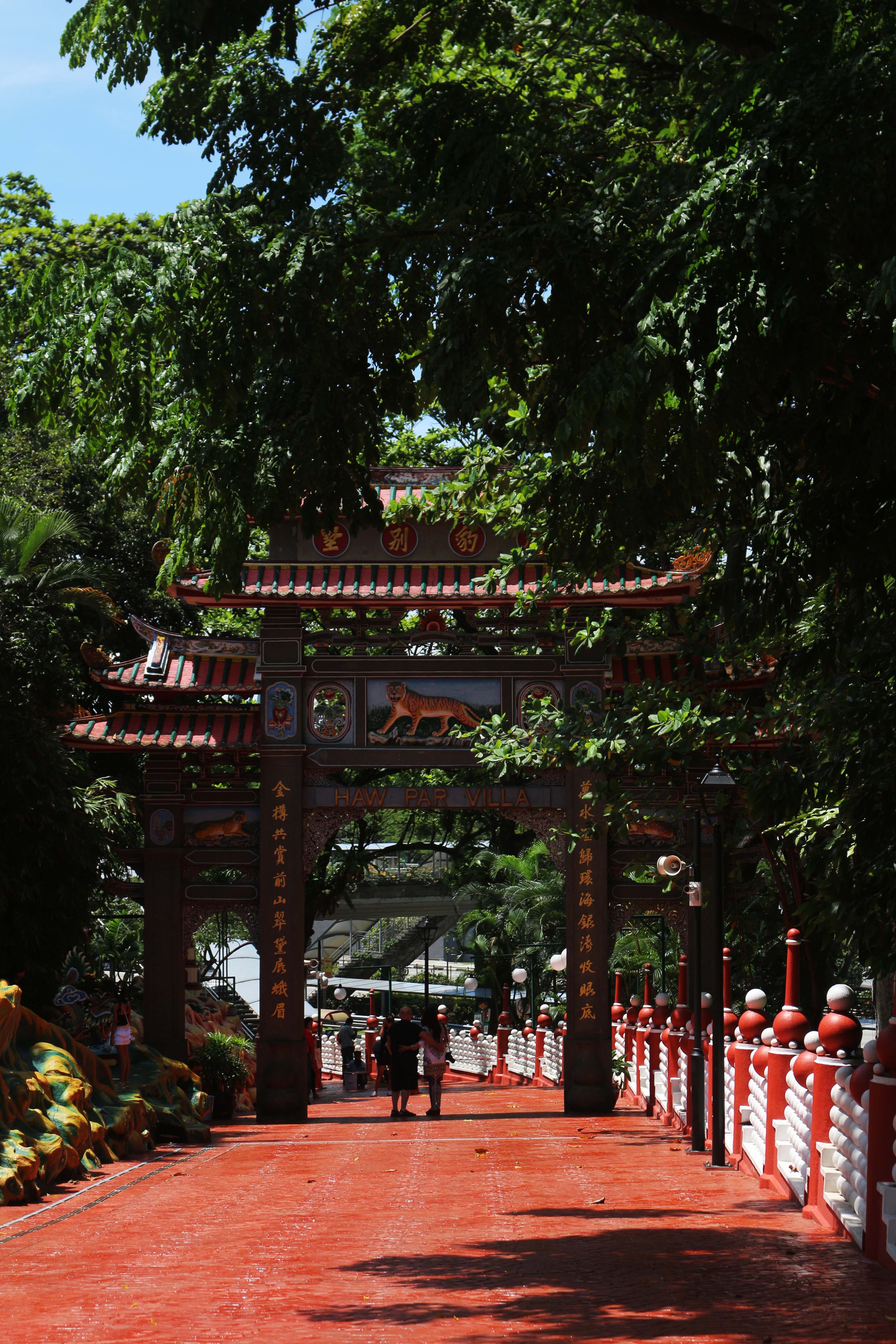
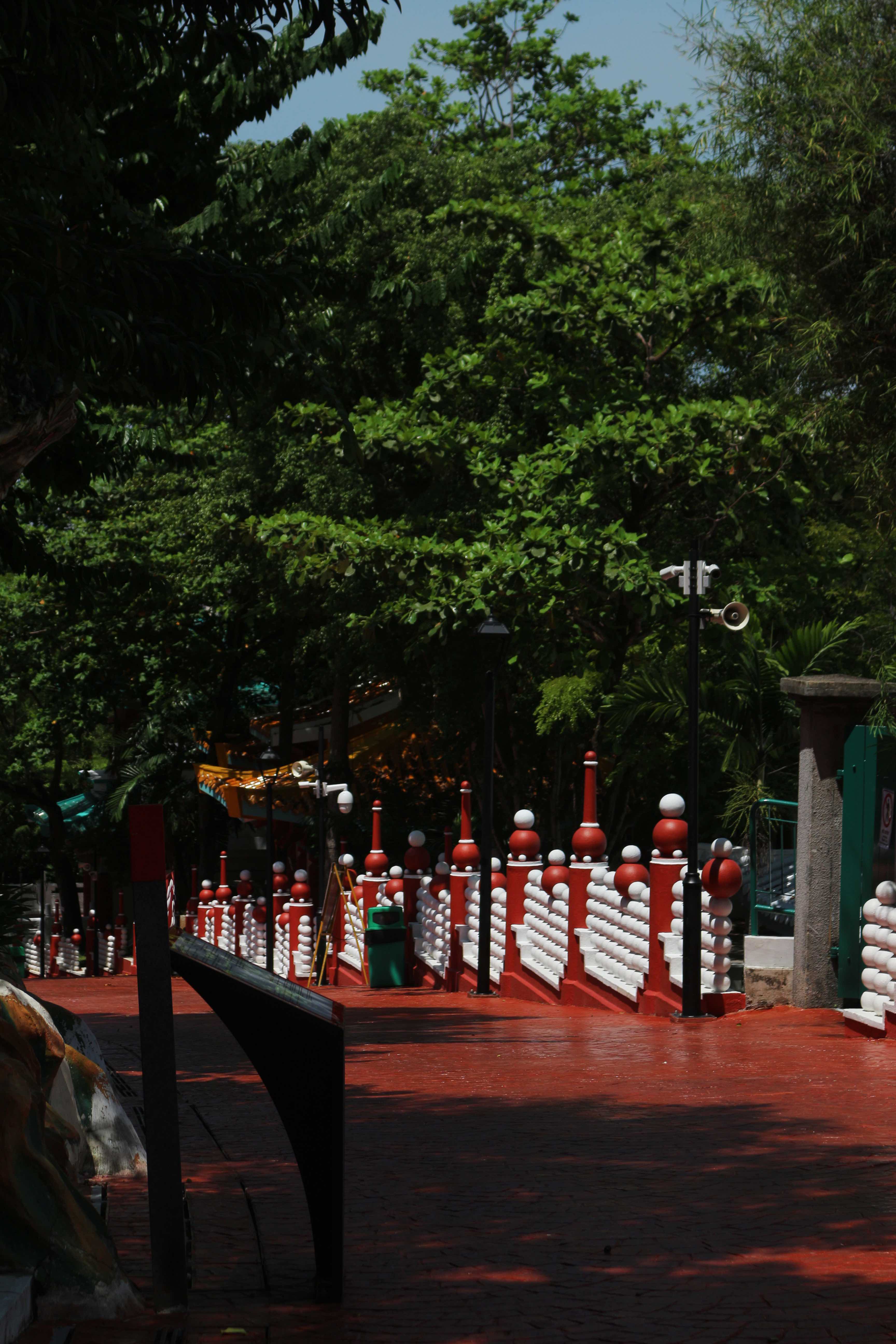
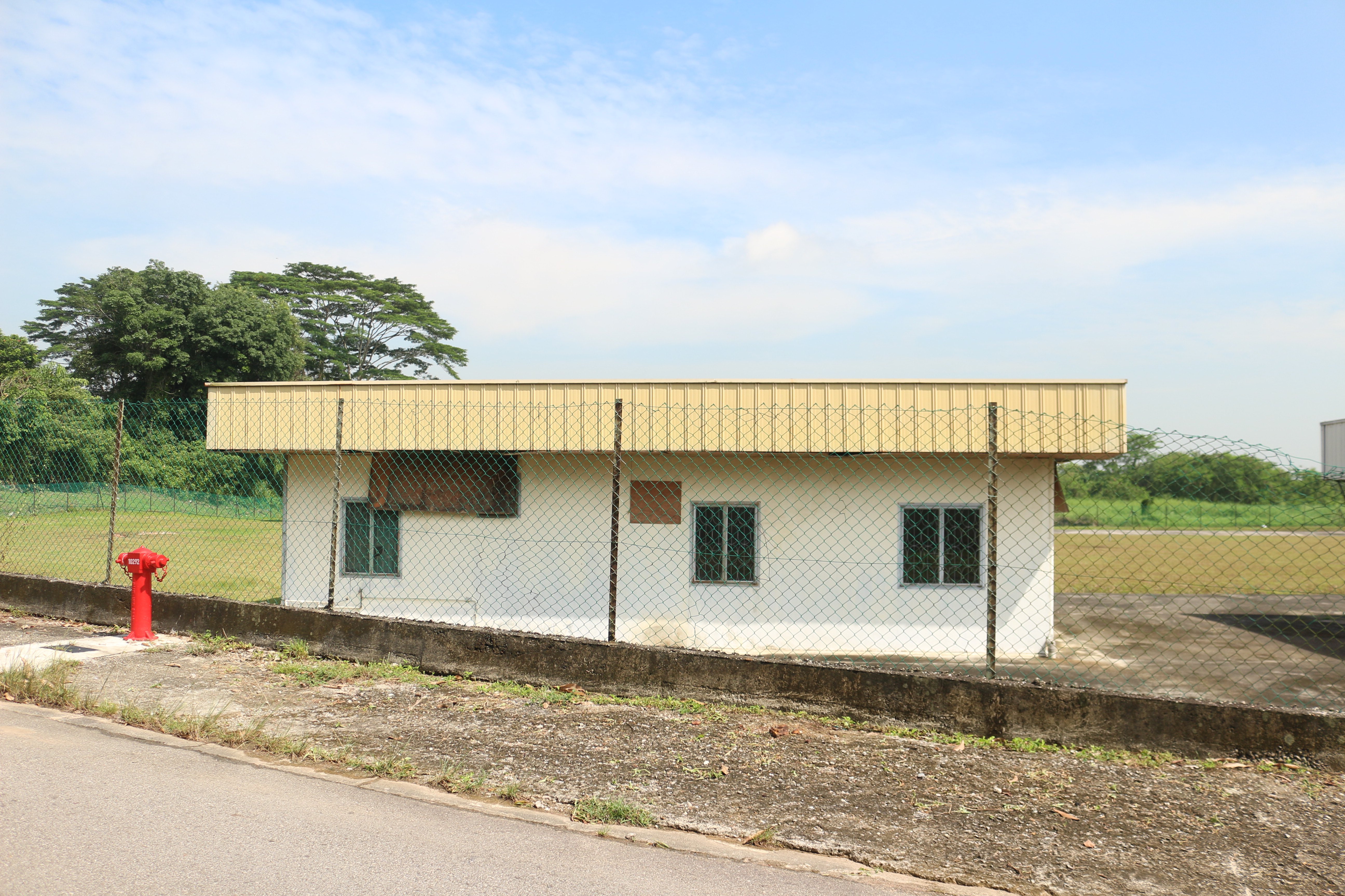
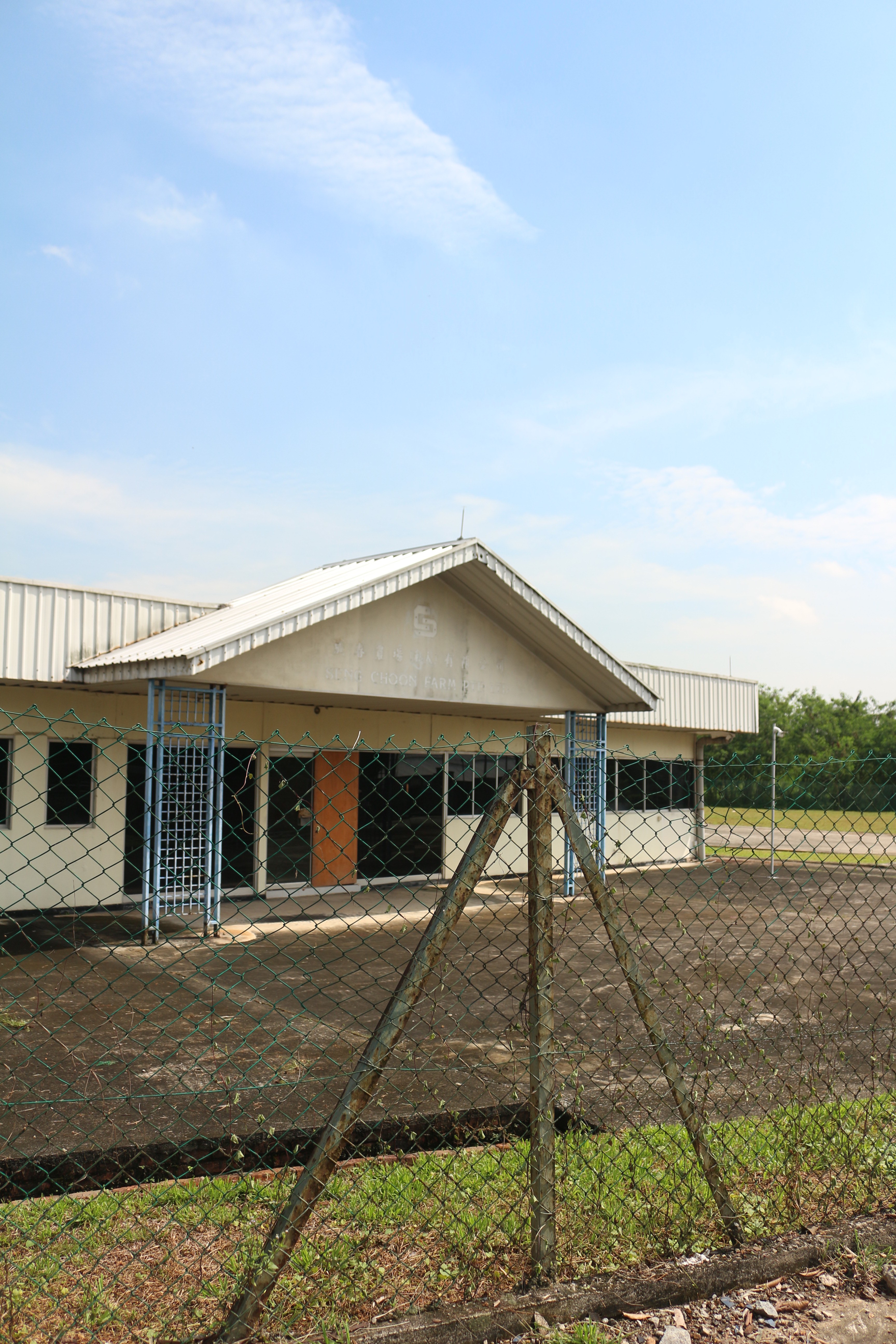
Unfortunately, the area was on locked and under a 24-hour surveillance by a CCTV. So I could only view the perimeters of the farm. below are some of the pictures that I took:
This was the place where my mom grew up in. When my mom was about 19, the house was undergoing some renovation. Along with her siblings, they stayed in this house for about 10ish years. Apparently, when we were there my mom told me that this was the place where mum was married off to my father.
This is the office where my mum spent most of her youth working in. This was also my “playground” when I was primary 1. I would dart in and about the cubicles, disturbing my aunts and uncle as they worked.
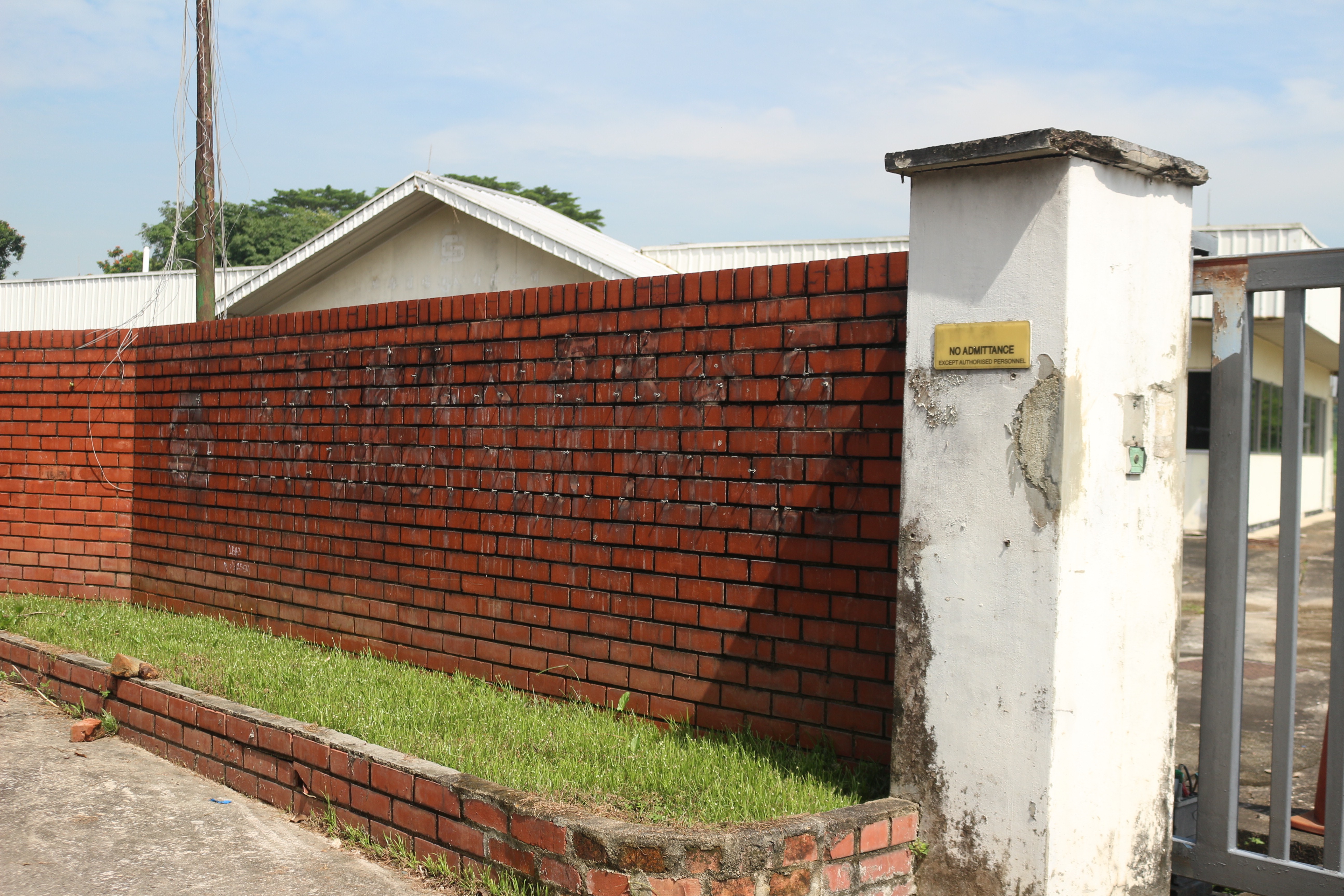
This is the front gate where you can still slightly see the mars and impression left behind the signboard.
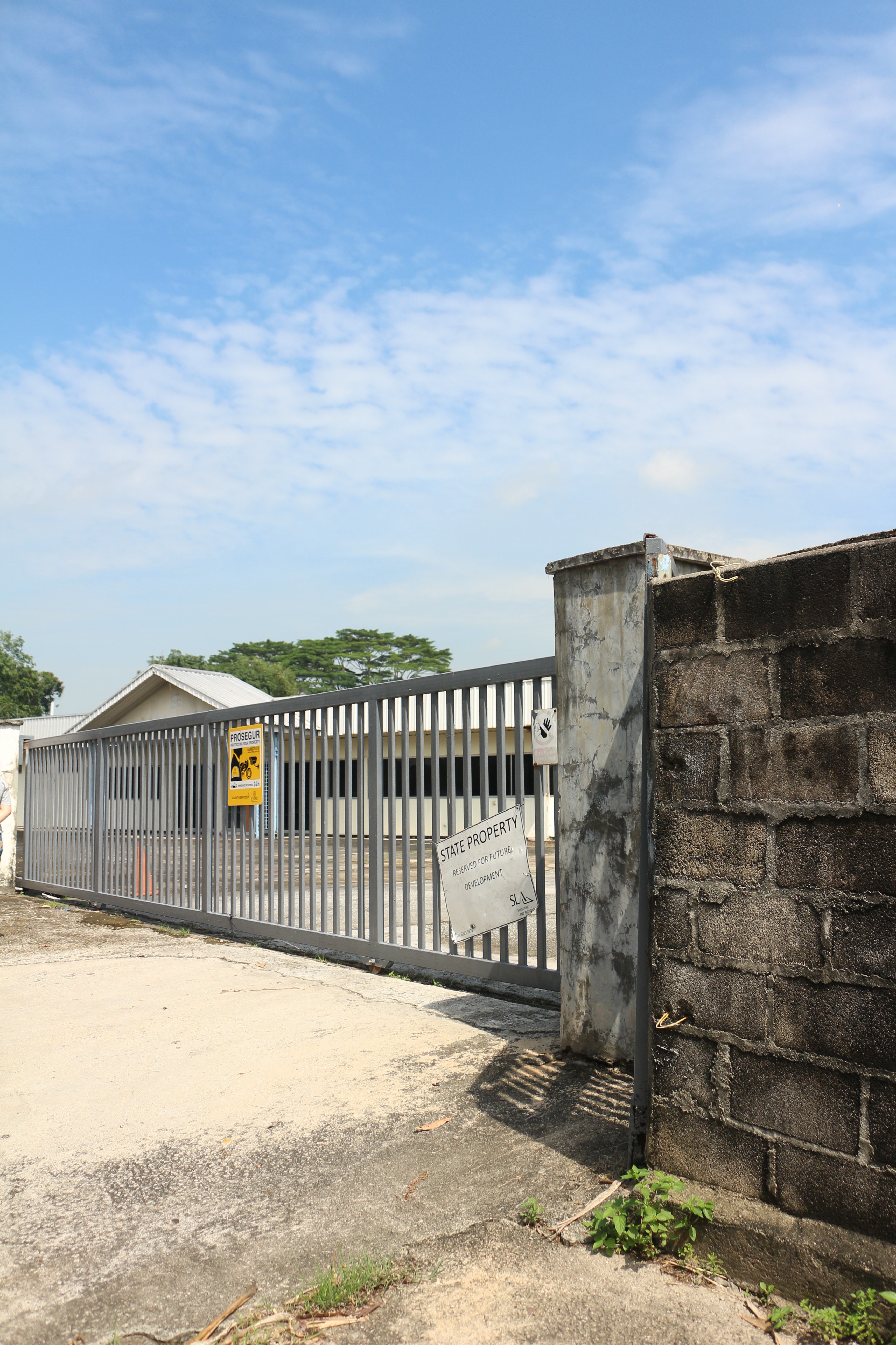
Today, only the office and the little house remains. I have absolutely no idea, why didn’t the government cleared the whole land. today it just lays abandon waiting for the next project.
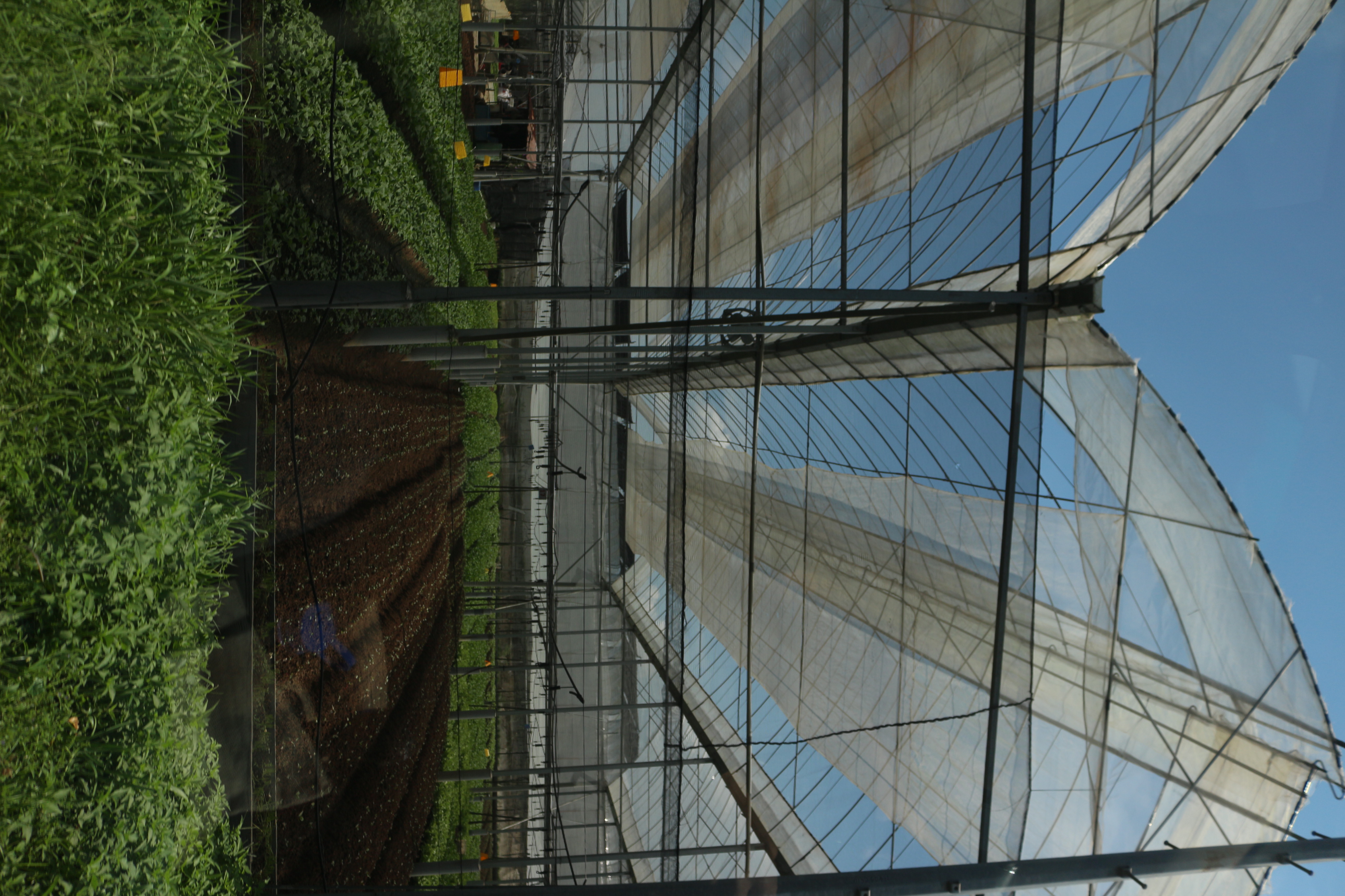
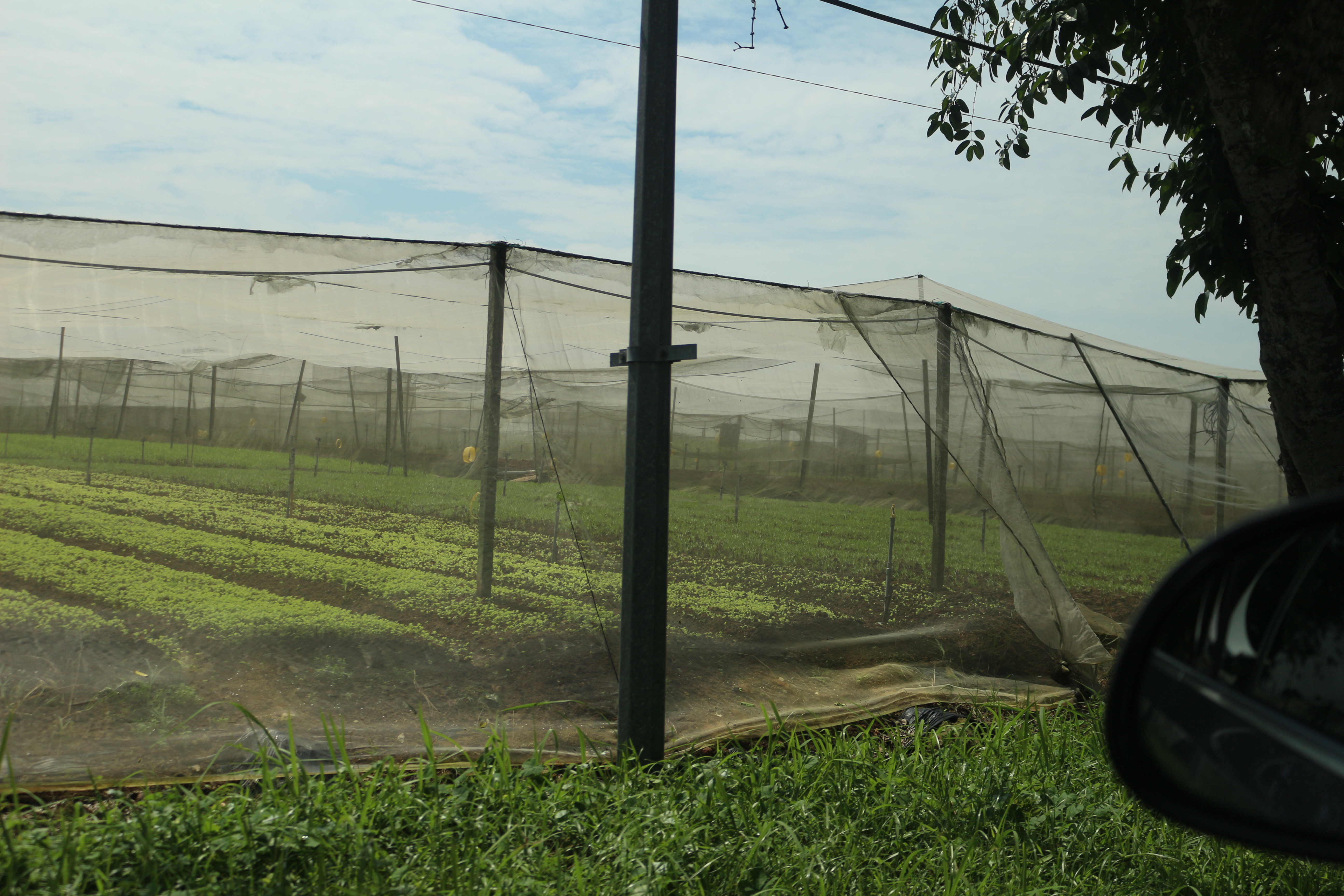
While we were there, I bumped into the old neighbor, the boss of Kok Fah vegetables, the leading hydroponics crop grower in Singapore. There outside in the hot sun, they had a heated discussion on the future of agriculture in Singapore. To be honest, I believe that the agriculture is doomed in Singapore. Long story short, lack of government combined with the lack of successor has made agriculture a dying trade. Undeniably, agriculture is essential for Singapore, but it is unsustainable in our pragmatic society.

What is sound?
Sound can include many things. some of which includes music kinetic sculpture instruments conceptual art sound effect and much more. Edgard Varese defines sound as all organize sounds. In a performance piece 443, he demonstrated that silence is also a sound. On the other hand, Paul DeMarinis argue that there are three parts to any sound recorded.The first sound is the sound that we try to record with a bit of distortion. The second sound refers to the sound of the environment. The third one refers to the whirring mechanics of the recording machine.
How has it been used in culture and society?
Sound art has been widely incorporated into the arts. by 1955 sound arts have almost become an art fad. It is widely adapted to music, kinetic sculptures, instruments played by the wind or the general public and more. surface noise is often employed as the backdrop for continued attention and suspended belief. In the earlier times, the sound was used to create and emphasize on the silence.
What makes it an art?
Paul Dementist that that sound art has been loosely categories into the visual arts. Similarly, as it lacks a purpose. I strongly believe that art has to have a purpose. Art is a reflection of reality. I feel that arts should offer a new perspective and probe the audience’s thoughts and feelings. Similarly, in traditional art, the meaning of the painting does not lie within the medium but on the subject matter of the work, unlike sound art where the medium of the meaning.
How does advancement in audio technology affect our sense?’
Advances in the audio technology allow us to normalise, compress and fill every moment with sounds. This results in us rejecting the silence, and the surface noise. This has resulted in many scholars opposing the classical and academical circles elevating silence to the highest pedestal in sound. This can be seen clearly in john cage 433, where he invited a musician to “play” a piano for 4 min and 33 seconds before leaving the stage. For John Cage, this is a composition of the varrying lenght of sielnce.
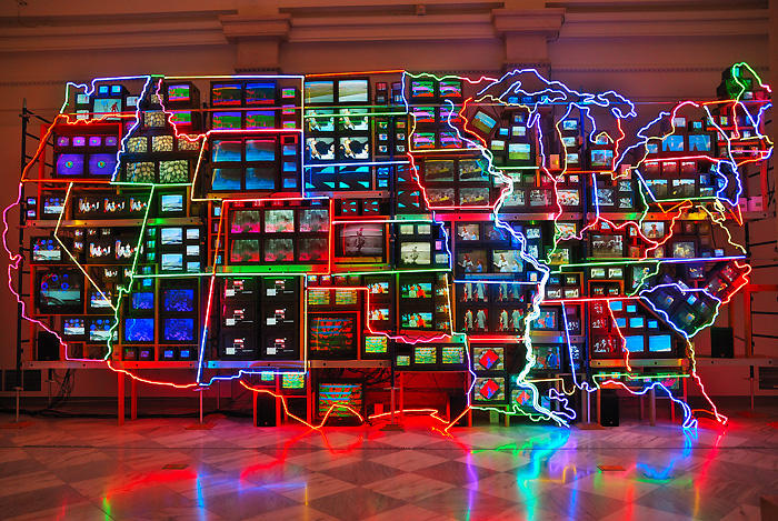
The first artwork that I chose is Electronic Superhighway by Nam Jun Paik. This is a 51 screen installation in the shape of the USA map. Nam Jun Paik aims to explore the relation of mass media and how it affects humans. The 51 screen installation plays a different video on each screen. Paik speading up and slowing down the video, purposefully adding interruptions into the clip. This installation includes a jumble of sounds coming from the different video.
I do like this work a lot, and in fact, I think that the sound helps to further strengthen the message that Paik was trying to bring across. In this artwork, piak makes a statement about the huge amount of visual and auditory information we receive from the internet. the jarring jumble of sounds further confuses the viewers as they try to comprehend the imagery shown on the screens. Therefore I love how sound is incorporated into this piece.
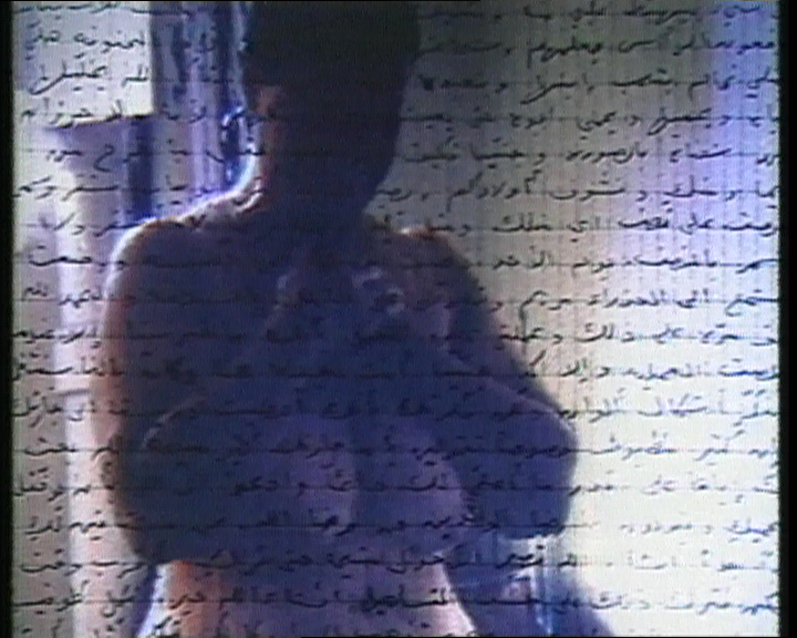
The second artwork that I have chosen is Mona Hatoum Measure Of Distance. Measures of Distance is a video work comprising several layered elements. Letters written by Hatoum’s mother in Beirut to her daughter in London appear as Arabic text moving over the screen and are read aloud in English by Hatoum. The background images are slides of Hatoum’s mother in the shower, taken by the artist during a visit to Lebanon. Taped conversations in Arabic between mother and daughter, in which her mother speaks openly about her feelings, her sexuality and her husband’s objections to Hatoum’s intimate observation of her mother’s naked body are intercut with Hatoum’s voice in English reading the letters.
Similarly, I feel that the element of sound further solidifies the artist view of an outsider. The intimate video of her mother bathing is partially hidden by the Arabic script, however, the conversation is translated into English and played in the background. The sense of the viewers as the outsider is thus furthur emphasized as we should not be able to understand this conversation, thus making them the outsiders.
MY INSPIRATIONS
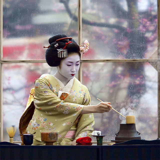
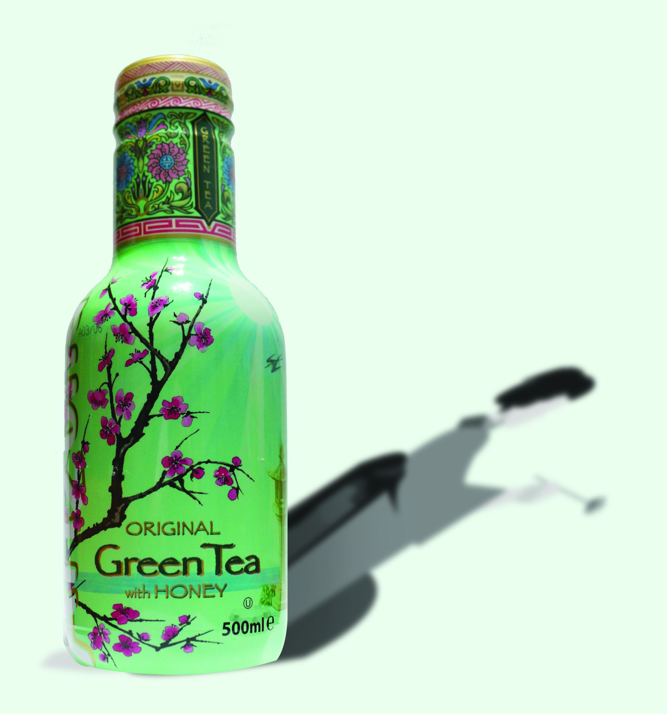
The object that I have received from the draw was Arizona Green Tea. The first thing that caught my eye was how they incorporated the Japanese motif into the design of the bottle; the sakura blossom on the front of the bottle. Therefore the first images I associated the tea with was the Geisha and the Maiko ( Shrine Maidens ). Traditionally, Geishas would entertain their guest with the arts including the Tea Ceremony.
This imagery connotes the authenticity of the Japanese green tea.
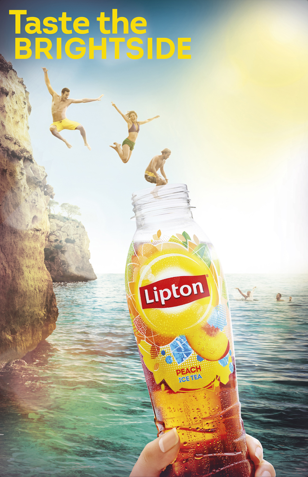
in addition, i thought that green tea has a very light and refreshing taste as it doesn’t have a strong taste. So I wanted to bring the idea of a refreshing drink. Lipton fruit teas advertisement commonly use the imagery of a fruits, mints and summery activities to bring across the idea.

I also research on how Japanese advertise for green tea. Most of them focus on the vibrant green colour of the powder.

In addition, some also incorporated the minimalistic Japanese illustration into the advertisement as shown below.
CONCEPTUALISATION
I was very certain that I wanted to use the imagery of a Geisha in my advertisement. While scrolling through my Instagram feed, I came across this artwork by Damon Belanger.
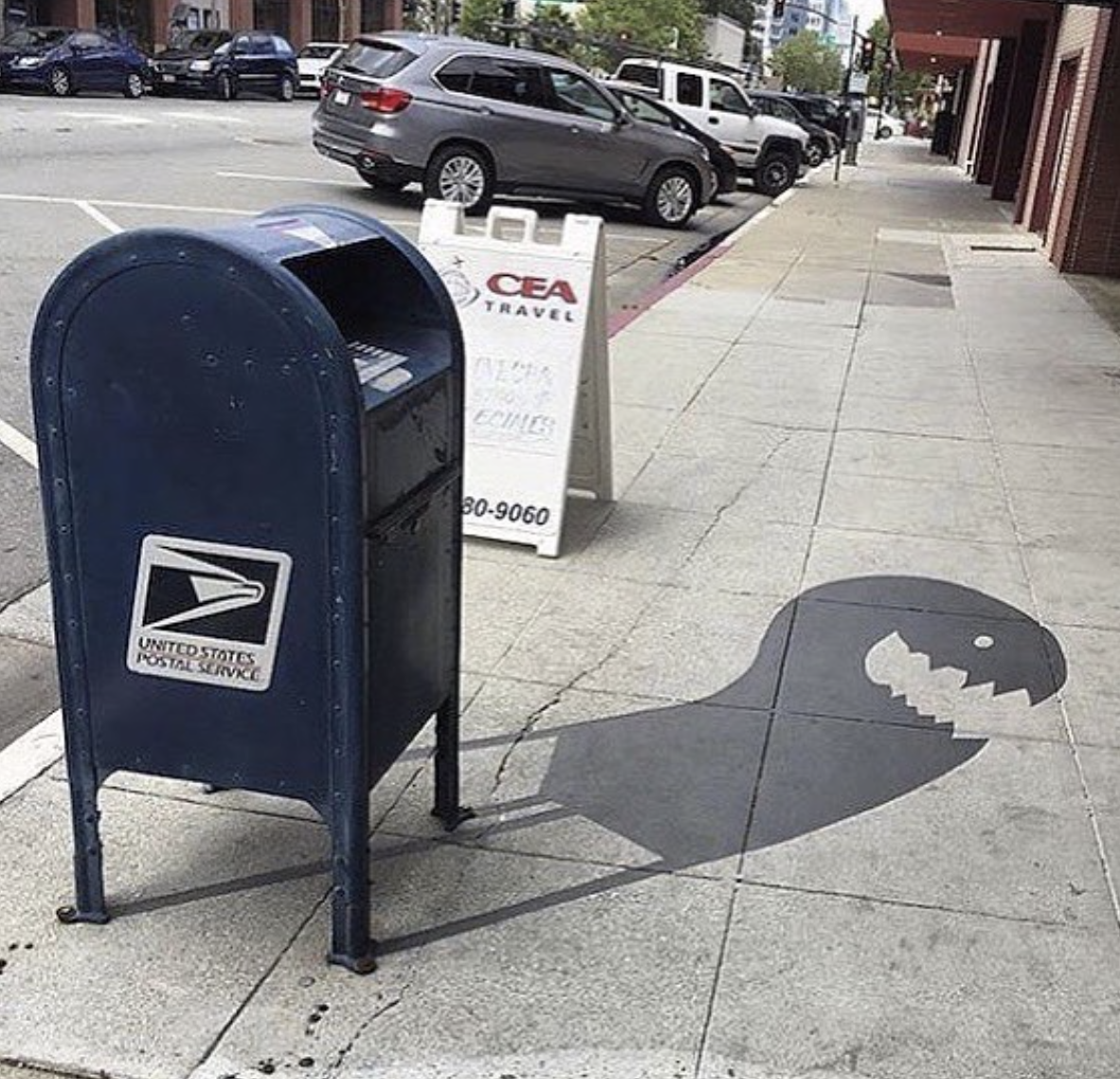
I like how the shadow connotes the idea of the true origin or form of the green tea is from the Geisha’s tea ceremony. My original plan was to feature the Arizona green tea in the middle with a silhouette of a geisha preparing the tea as the background. However, this is too ambitious of me as I was unable to manipulate the perspective of the shadow to fit the bottle. Therefore, I scraped this idea away.
The Second Idea I had was to have a foreigner and a Geisha participating in a tea ceremony. But instead of serving the foreigner from the traditional equipment used to make the tea, I wanted to serve the foreigner tea directly from the Arizona green tea bottle. This further solidifies the authenticity of the green tea. As I had a hard time finding an image of a Geisha suitable for the advertorial, I decided to illustrate the characters so as to not compromise on my design.
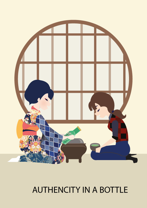
However, I felt that there was too much visual information in this advertisement. The illustration is very cluttered and there is a lack of emphasis on the Arizona green tea bottle. Hence, I decided to remove the foreigner so as to bring a greater emphasis on the product.

So I decided to simplify the advertisement, only including the Geisha and the product. The geisha’s intricate and bright kimono catch our attention first. Her gaze and her outreach arm lead our eyes towards the green tea bottle. This imagery connotes the idea that the taste of the Arizona green tea is so authentic that it taste exactly like the ones prepared in the Japanese tea ceremony.
AREAS FOR IMPROVEMENT
I should have paid more attention to my choice of colour as some of the detailing such as the shadow of the neck have gotten lost. In addition, I should have used a more Japanese stylised illustrative approach (as in the Japanese woodblock print style) in this work to further bring out the Japaneseness of this advert.
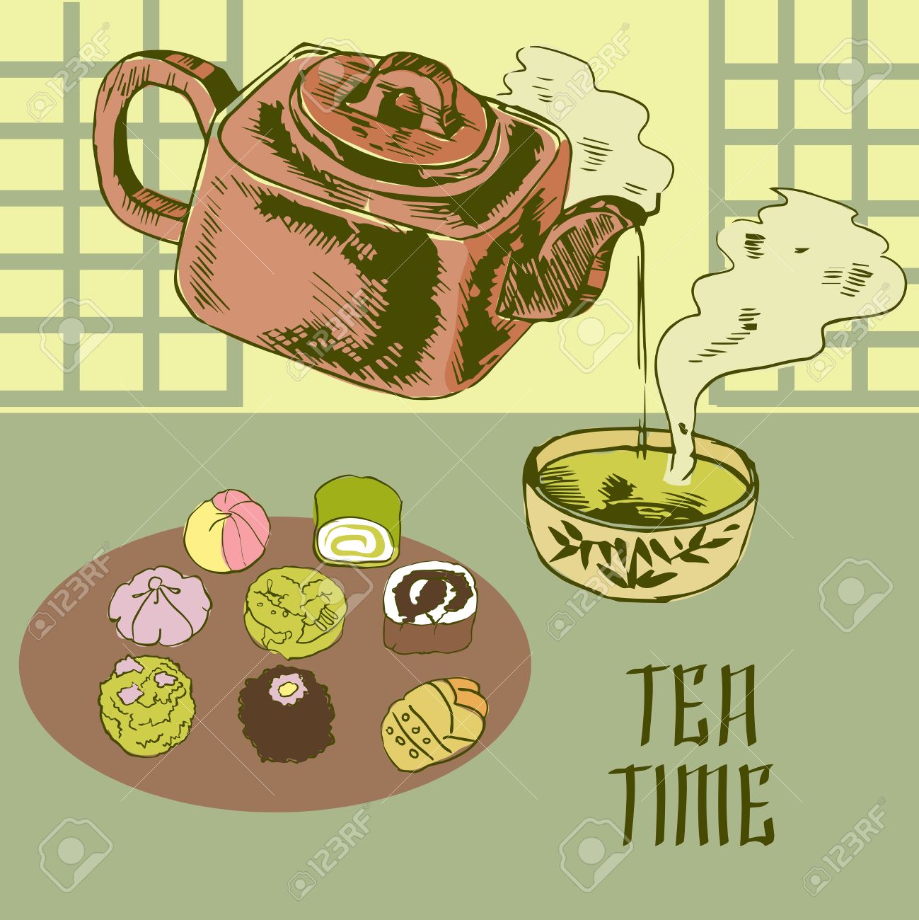
When I got this brief, I still cannot let go of the concept of Alice in Wonderland. My favorite portion of the movie was the tea party when Alice and the White Rabbit joined the March Hare and the Mad Hatter for tea. The paradox of this situation is that it’s always tea time for the Hatter and the March Hare. this incident arises from when the Hatter tried to sing for the Queen of Hearts at a celebration of hers, she sentenced him to death for “murdering the time.” The Hatter escaped decapitation, but, angry about the Hatter’s attempted “murder”, Time halts himself in respect to the Hatter, keeping him and the March Hare stuck at 6:00 forever. Hence my paradoxical strange world revolves around the theme of a tea party at odd timings.
my inspiration
I decided to explore with the various type of shots to aid in my composition.
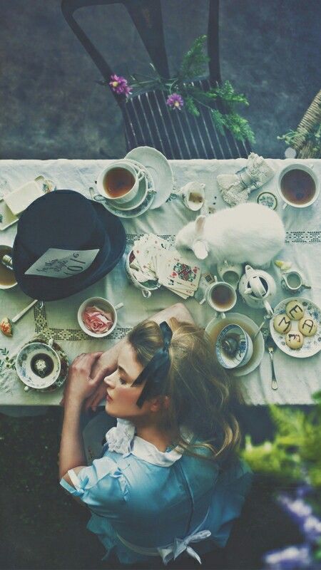
This is a close-up shot of Alice amidst the tea party. while I like the interesting and unusual perspective this composition brings about, I would be restricted in my image selection as there aren’t many images available online that features an aerial view.

This is a medium shot of a tea party. I like how the character’s emotion and the background are captured with equal detail. I also love how the scene portrays the paradoxical time of the tea party through the evening sky.

However, I decided to use a long shot as my composition in the end. I as the paradox isn’t on the character, but the background. This allows me to insert more details of the paradoxical setting into my composition.
My Composition
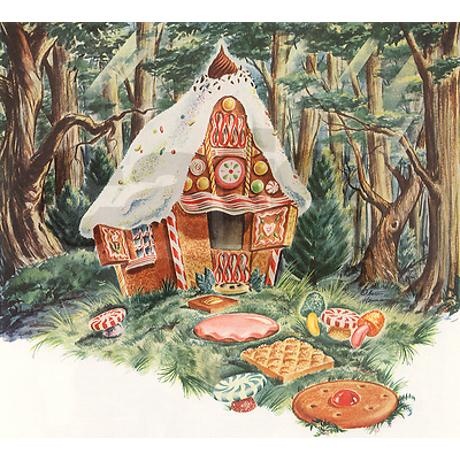
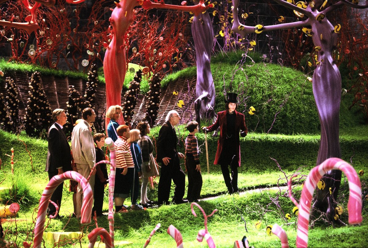
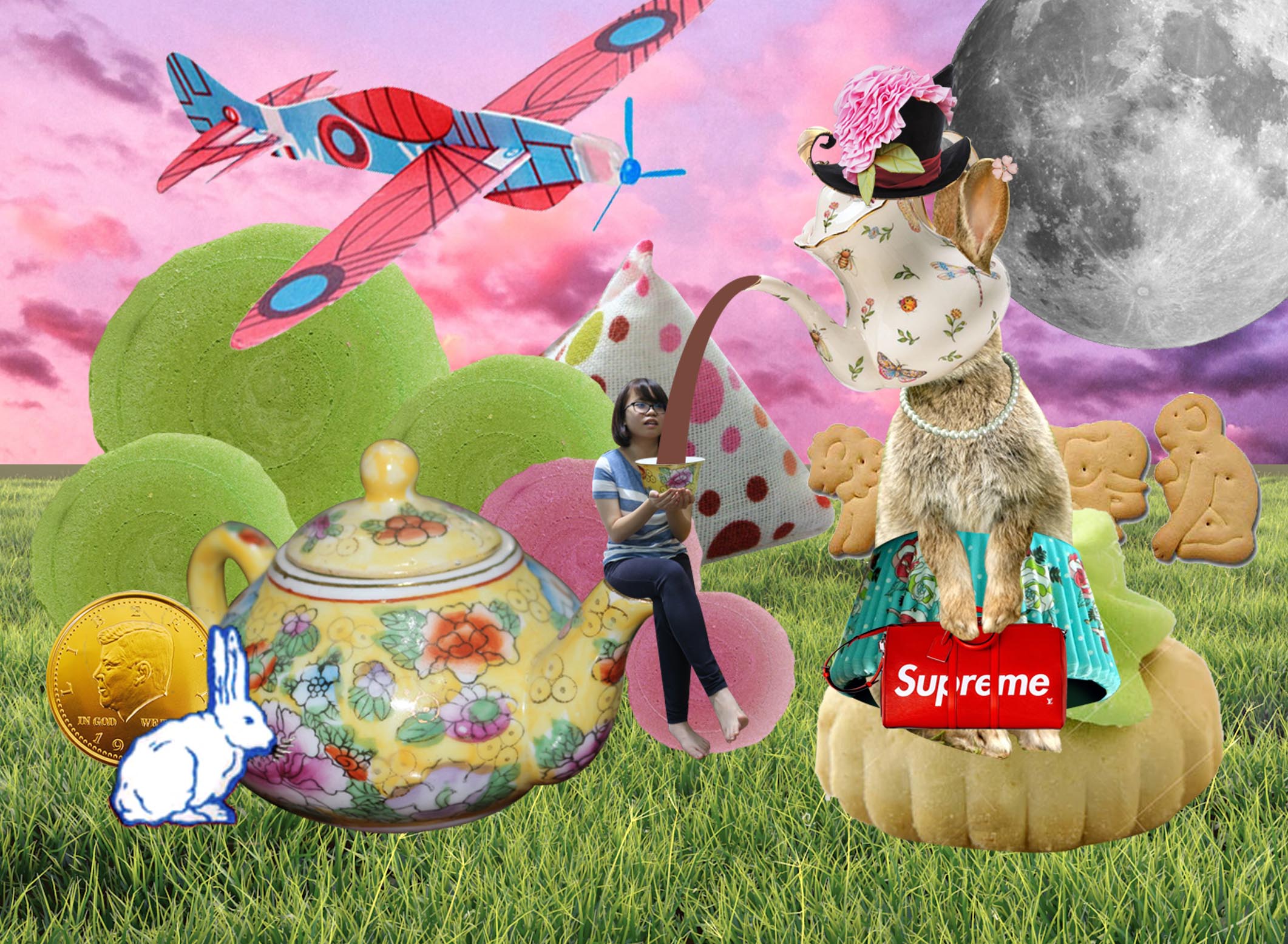
Since it’s my Wonderland, I wanted to create a landscape that I would escape to as a kid. As there is a requirement to incorporate Singaporean elements inside my composition, I immediately thought of using childhood snacks and game that I often play. There has been many renditions of a landscape being made up of sweets and food. such include: Charlie and the Chocolate Factory, Hansel and Gretel.
Using this imagery in mind I begin creating my world. I used many iconic snacks and sweets from the 90s. of such includes the: White Rabbit Candy, gold chocolate coin, animal biscuit, ice gem and the tri-coloured biscuit wafer. I also included some iconic games such as the styrofoam airplane and the five stones in the back ground. To make the scene more paradoxical, I decided to incorporate my Mad Hatter character from the previous assignment, by making him serve me tea through his head. I also manipulated with the scale to make my setting more paradoxical. The various food dwarf over me, thus questing the subconsciousness of the viewer. In addition, I swapped out the usual tables and chairs for a teapot. Thus further adding to the strangeness of this world. So as to establish an odd timing I decided to use a bright pink sky as the background. The strange and bizarre color of the sky questions a sense of reality and timing in the composition. The moon in the top right hand Conner further emphasizes the apparent lack of time in this composition.
What are some of the key questions Barthes aims to investigate in the article?
In this paper, Barthes aims to investigate the context of an image: how the image gets its meaning when does the interpretation stop, if there is anything beyond the meaning. He investigates this through categorizing the meaning of an image into three categories, the linguistic message, a coded iconic message and a non-coded iconic message. The linguistic message comes from the captions, labels, accompanying press articles, film dialogue, and comic strip balloons. This message can either be connoted or denoted. The coded iconic message comes from the pure image. To infer this message one needs to have a background cultural knowledge of the image. The third message, the uncoded iconic message is constituted by the object and its scene, the relationship between the code signified and the analogical representation.
All images are polysemous where the viewer is able to choose some and ignore the others. There are two functions of a linguistic message: anchorage and relay. An Anchorage text is a text, prone to multiple meaning. They direct the reader through the signified of image, causing him to read some and miss the others. This is one of the most frequent functions of a linguistic text and is commonly found in press photographs. where as relay texts and the image compliments each other, allowing the fragments of messages to be read at a higher level of unity. relay text can be often found in films.
Barthes also brought across the point that the coded nature of a drawing can be read at three levels. Firstly a set of rules that governs the transposition of an image (perspective). Secondly, the artist needs to divide the significant from the insignificant where he reproduce parts in details while omitting the rest. Thirdly, the drawing requires an apprenticeship. In other words, the denotation of a drawing is less pure as compared to a picture. as the camera cannot alter the object while the artist is able to in a drawing.
Do you agree or disagree with his argument and point of view?
I do agree with Roland Barthes point of view. An image has both the connoted and denoted signs. these signs complement each other to allow the viewer to read and understand the image better. However, I disagree with his point on the denotation of a drawing is less pure as compared to photograph. Despite having the freedom to alter the objects to fit in with the ideal standard in paintings, photography also has the ability to alter the object: Photoshop. Photographers are able to digitally manipulate to create an image that is equally unrealistic and heavily edited.

For example, Andreas Gursky digitally manipulated this image of a river into perfectly horizontal parallel planes of the land and the water body. Hence, I strongly disagree with Barthes point where denoted paintings are less pure as compared to photography.
Provide a brief analysis (200 words) on an advertisement of your choice by using the terms/ concepts proposed by Barthes and discuss the role of text and its relationship with the image in the advertisement. Please include an image the advertisement in your post.
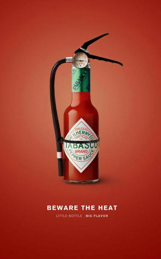
This is an advertisement for Tabasco Hot sauce. The literature message reads: “Beware the heat, little bottle, big flavor accompanies the text. The purpose of a fire extinguisher is to put out a fire. Taking away the literature message, A small bottle of Tabasco bottle can be seen placed against a red background with a fire extinguisher noose, the pure image. The imagery further solidifies the text saying “beware the heat”. This implies that the hot sauce is so spicy that literally a fire extinguisher is needed to put out the flames. The bigger text acts as an Anchorage text, guiding us in reading this message as the spiciness of the hot sauce ( focus is on the fire) instead of the hot sauce being cooling ( fire extinguisher extinguishing the fire). The smaller text: “little bottle, big flavor” acts as a relay text further reinforce the idea of the spiciness of this hot sauce.
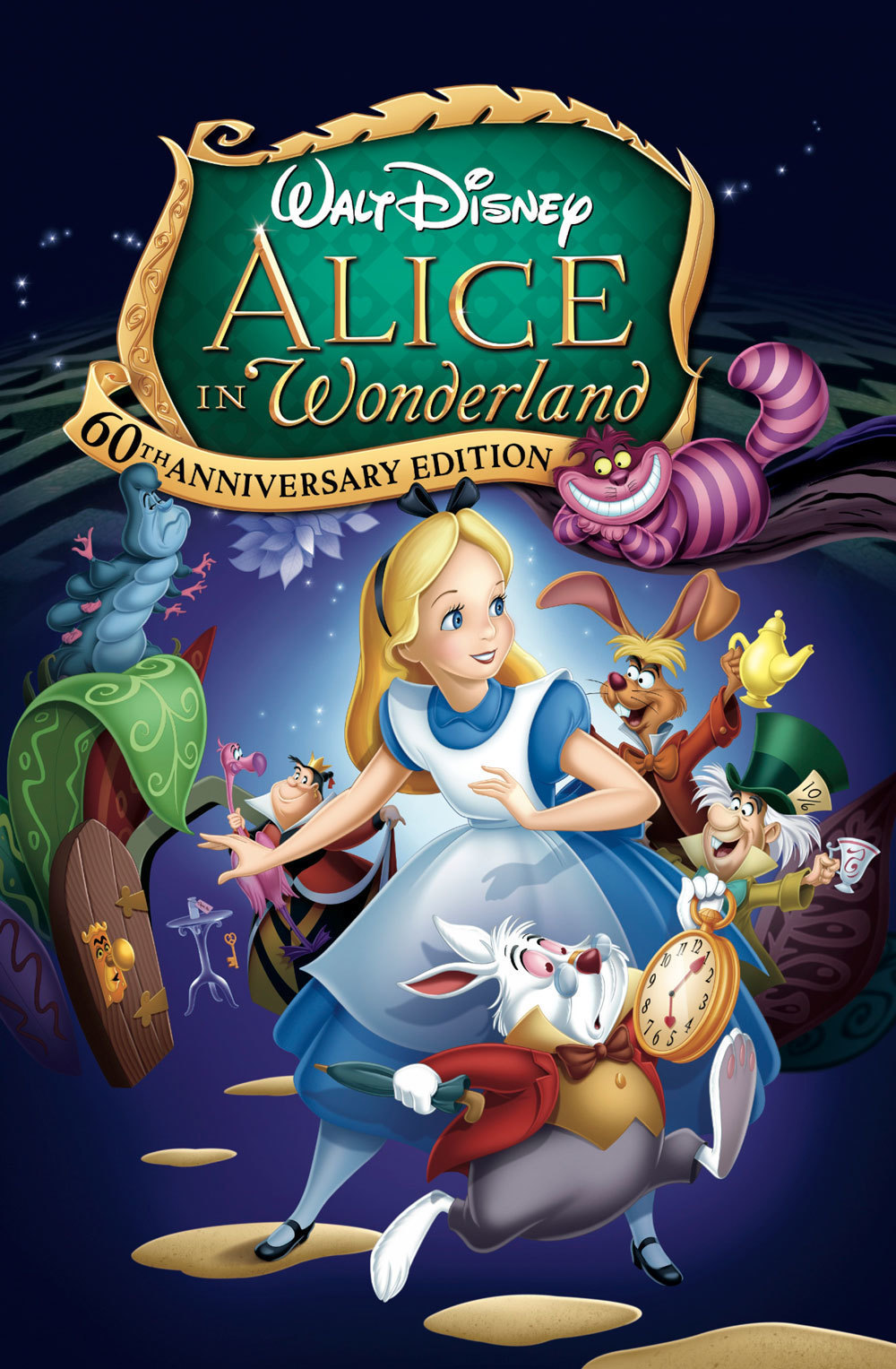
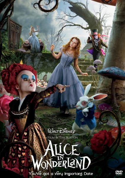
So, when I first got the project brief, my first thought went to “Alice in Wonderland” by C.S. Lewis. Alice in Wonderland has been appropriated many times by the mass media of such includes:
For this project, I will be exploring 4 of my favourite Characters, The Chesire Cat, The Queen, The White Rabbit and the Mad Hatter.
The Cheshire Cat
Inspirations:
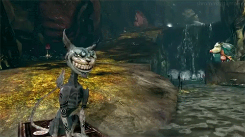
Both Disney and Burton portrayed the Cheshire cat similarly. Both were a cryptic and mysterious cat, who pointed Alice in the right direction when in need. Both Stylised the character with a cheeky wide smile which disappears from time to time.


While in Disney and Burton film the cats are portrayed with cuteness, in the video game, the Cheshire cat is portrayed with a more sinister vibe. It has protruding bones, angular body structure, with multiple tribal signs over his body.
My Character:
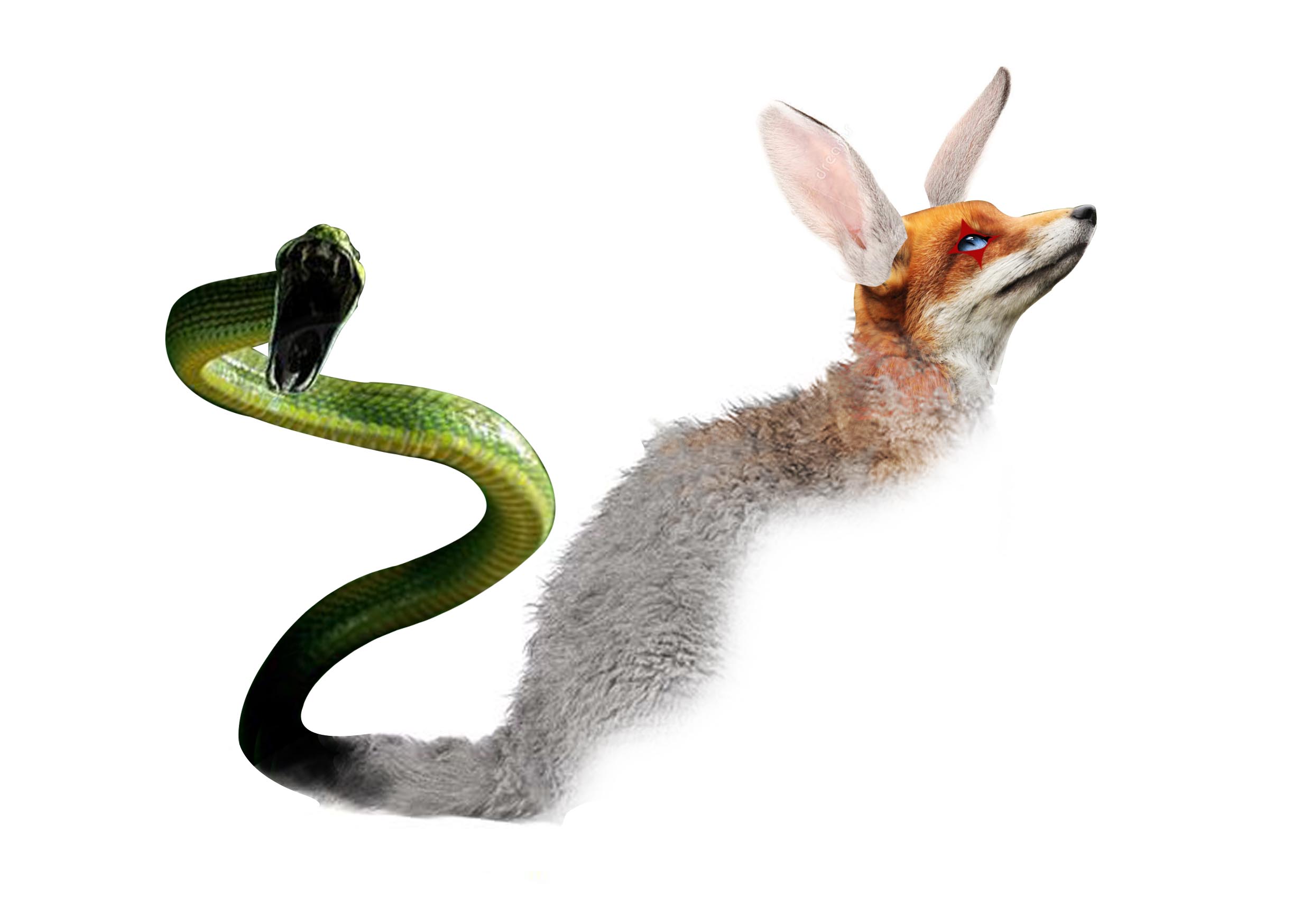
To make my character unique, I decided to take the most distinctive traits of each character and appropriate it into the everyday Singaporeans. For the Cheshire cat, I decided to focus on his cheeky personality. The Chesire cat reminds me of that one particular prankster we all had in class. I decided to use a black cat as my base. I chose the colour black specifically because they are commonly associated as a familiar of a witch. Hence bring on the connotation of it being magical and unordinary. I also decided to give it a fox head to depict his sly and cheeky nature. As the Cheshire cat always gives advice out in a cryptic riddle, the advice can go both ways either good or bad depending on the reader interpretation. Hence I decided to give him a snake for his tail to symbolise that the Chesire cat may not always be good and may backstab you sometimes. As a homage to the Cheshire cat’s ability to turn invisible, I erased half of my character’s body.
However, the character did not fit in with my other three characters so I decided to scrape him away.
The Queen of Hearts
Inspirations
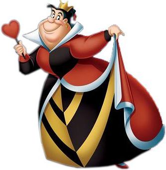
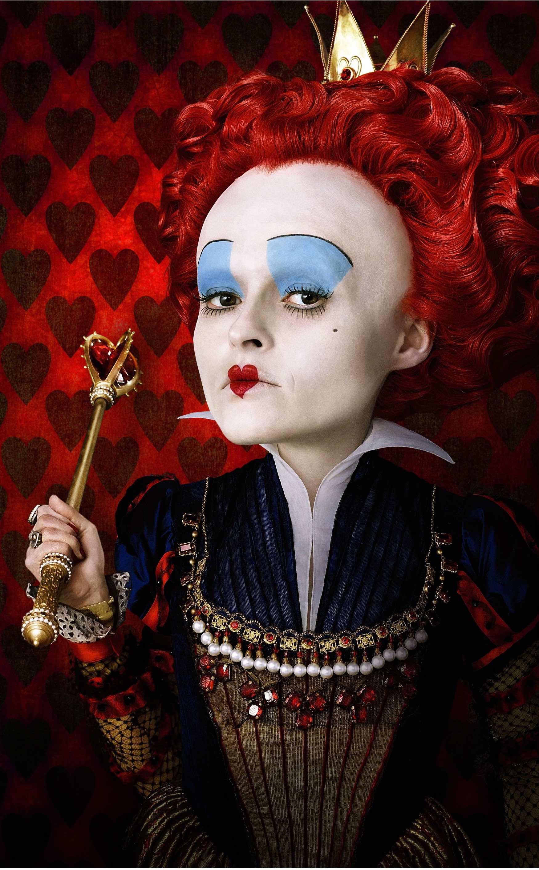
Both Disney and Burton Strongly used the motif of a heart in their films. The Queen of Hearts is often seen as a hard headed woman, dictating her soldiers and issuing out ridiculous orders. In Burton’s rendition, the motive of the heart can be seen clearly in the form of her hair and the red lip stick. I love the way Burton manipulated the proportions of this character. The Queen of Hearts is given a rather large head and a tiny body. This further emphasises the irrational quality of the Queen of Hearts.
My Character
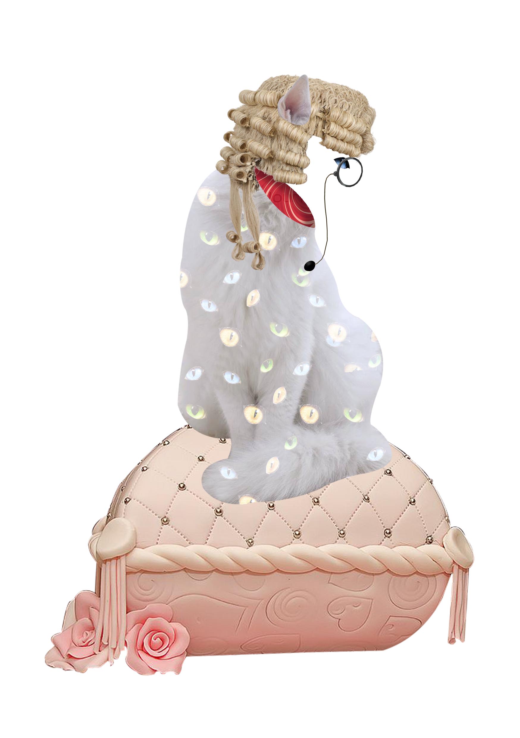
Similarly, I envision The Queen’s personality fitting a dictator, a judge, a prosecutor the best. Her stubborn persona reminded me of a prosecutor who is bounded by countless laws. I decided to use a white cat as a base, as they have a very pristine and regal look. especially the picture that I have chosen, the cat glances away from the viewers as if their presence isn’t worth her attention. So as to emphasize her royalty, I decided to place her on a plush velvet cushion. however, I couldn’t find one online that is in the right perspective hence I decided to use a fondant cake decoration instead. Secondly, as the Queen favourite line is: ” Off with her head!” I decided to “behead” the cat. In addition, this solidifies my point of the bureaucracy being headless as money, bribery is able to influence a case in someone’s favour. I also gave the cat a judges wig to symbolise her position as a prosecutor.
Other Considerations
I wanted to replace the head of the cat with famous dictators such as Hitler, Chairman Mao and Kim Jong Un, however, I couldn’t find pictures of these leaders in a correct angle and I was afraid it was “politically incorrect”.

The Mad Hatter
My inspirations
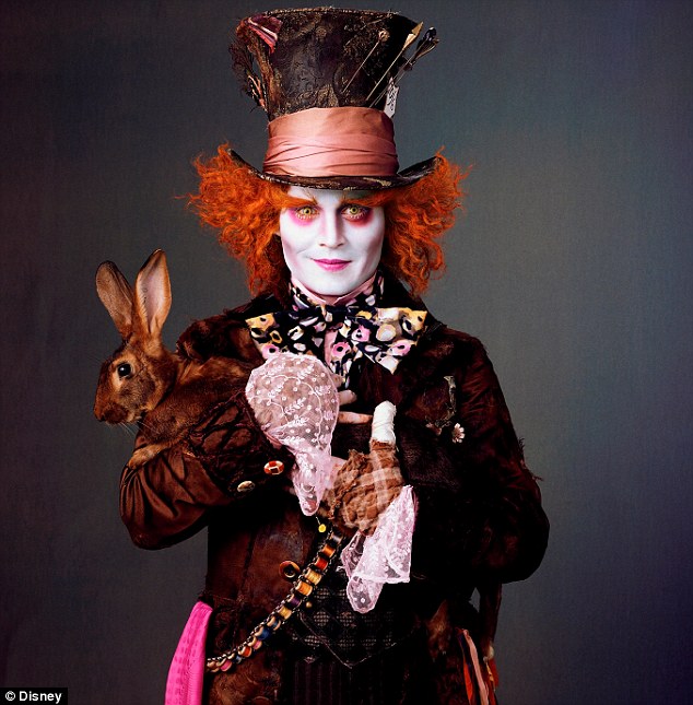
“As Mad as a hatter!” was a phrase popularised by the infamous mad hatter. Both Disney and Burton portrayed the character as an eccentric man, with terrible temper and mood swings. The mad hatter absolutely loves his tea and has a great taste in hats. in the Disney animation, the quirky characters of the Hatter were brought out by his actions and his fluffy hair style. whereas in Burtons film they used makeup to emphasize his eccentric behaviour. counter that is done in pink, unnaturally bright and fluffy hair and eyebrows are just a few.

My Character
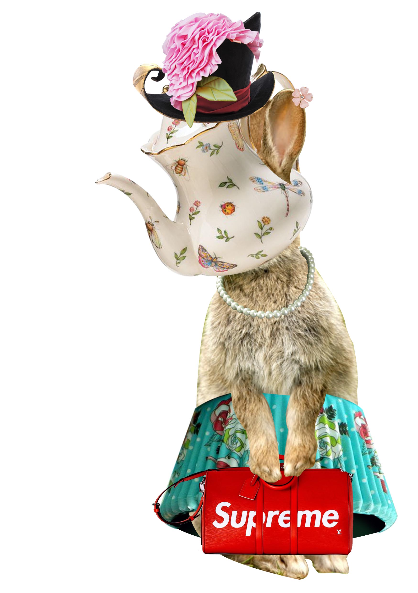
instead of focusing on the personality of the Hatter, I decided to focus on what the Hatter likes: Fashion, hats and tea. Hence the idea of tea party became my main motive of this piece. Then I thought, who in Singapore has the time to enjoy all these frivolous activities? Rich Tai Tai. Hence the base personality of this character is rich ladies. I choose to use an image of a bunny as the base character as a homage to the Hatter’s dear and equally mad friend: the March Hare. Using the motif of a tea party, I replaced the head of the rabbit with a fine china teapot and gave her a skirt of a cupcake liner. I then, added more jewellery to the character to further emphasize her standing as a rich lady ( pearl necklace, red LV bag and the ebony earrings)
The White Rabbit
My inspiration
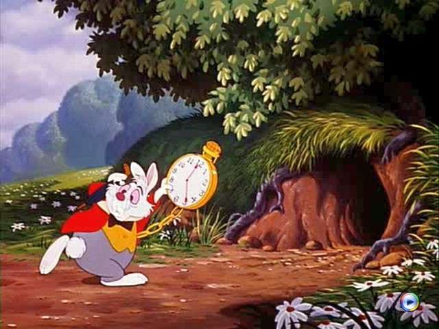
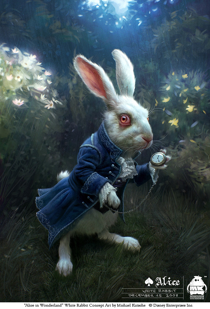
The White Rabbit, the main culprit that brought Alice down the rabbit hole. In the Disney film, the White Rabbit is portrayed as a two face character, that alternates back and forth a pompous behaviour toward his underlings and a sickening grovelling behaviour towards his superiors. However, in Burton’s film, the white rabbit is portrayed as a skittish character, who works undercover against the Queen of Hearts to assist Alice in his adventures. Both films used a common motive of a clock. The White Rabbit is often seen fervently checking his pocket watch and lamenting about the lack of time. A popular quote by the White rabbit is: ” I am late, I am Late! for a very important date, no time to say hello, no time to say goodbye. I am late, I am late!”
My Character
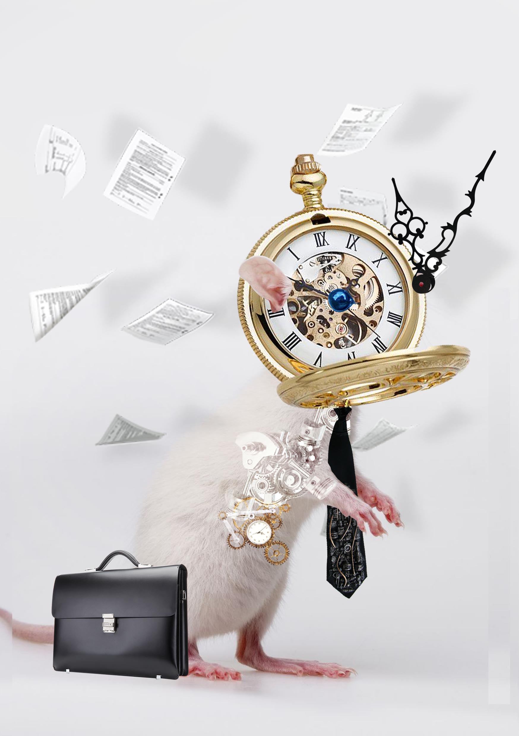
I felt that the personality of a disgruntled office worker is exactly the same as the White Rabbit. Both are equally pressed for time, rushing datelines and adding extra hours. I also like how both the White Rabbit two face personality fits in perfectly with a disgruntled worker: boot licking and complimenting their supervisors and abusing the poor intern. I decided to use a mouse with both hands up to show how skittish and easily swayed this character is. I gave him a pocket watch as his face to show how to obsess he is with time. I gave the mouse a tie and a black brief case to solidify his role as an office worker.
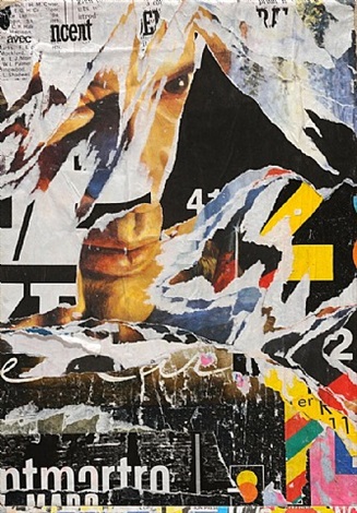
This art work is done by Jacques Villeglé, a French artist, best known for his torn collaged works. Jacques would paste multiple layers of posters and advertisments he has collected from the streets onto his canvas, before tearing away the layers to reveal a decollage artwork. In this artwork the torn posters reveals a man face in the middle. The deep set gaze of the man captures the viewer’s attention in a glance. Furthermore, the textured surface of the collage almost allows us to sense the artist feeling and thoughts as he completes this work. Jacques destabilizes our perception through the quick and abrupt changes in the imagery. This bombard of imagery and information, leaves the viewer questioning the source and the intention of the poster.
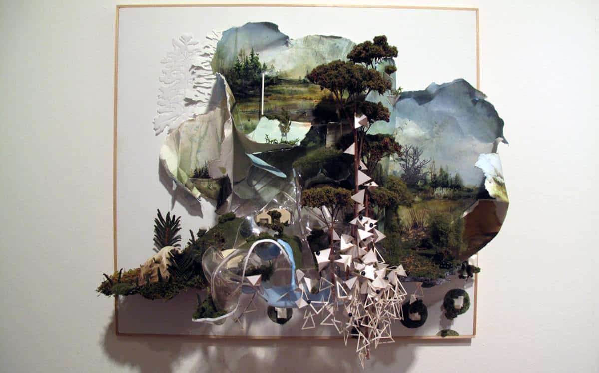
This artwork is by Gregory Euclide, an American contemporary artist, who draws inspiration from the rich and diverse wildlife around him. Euclide contrast the organic form of nature with the harsh and geomatic shapes of the triangular structures. Euclide distorts our perception of depth as he intwines the two-dimensional paintings with his three-dimensional relief paintings. His adept use of chiaroscuro further solidify the illusion of realism in the paintings as seen in the trees.