For this quote, I’m going to focus on the uncertainty of paths.
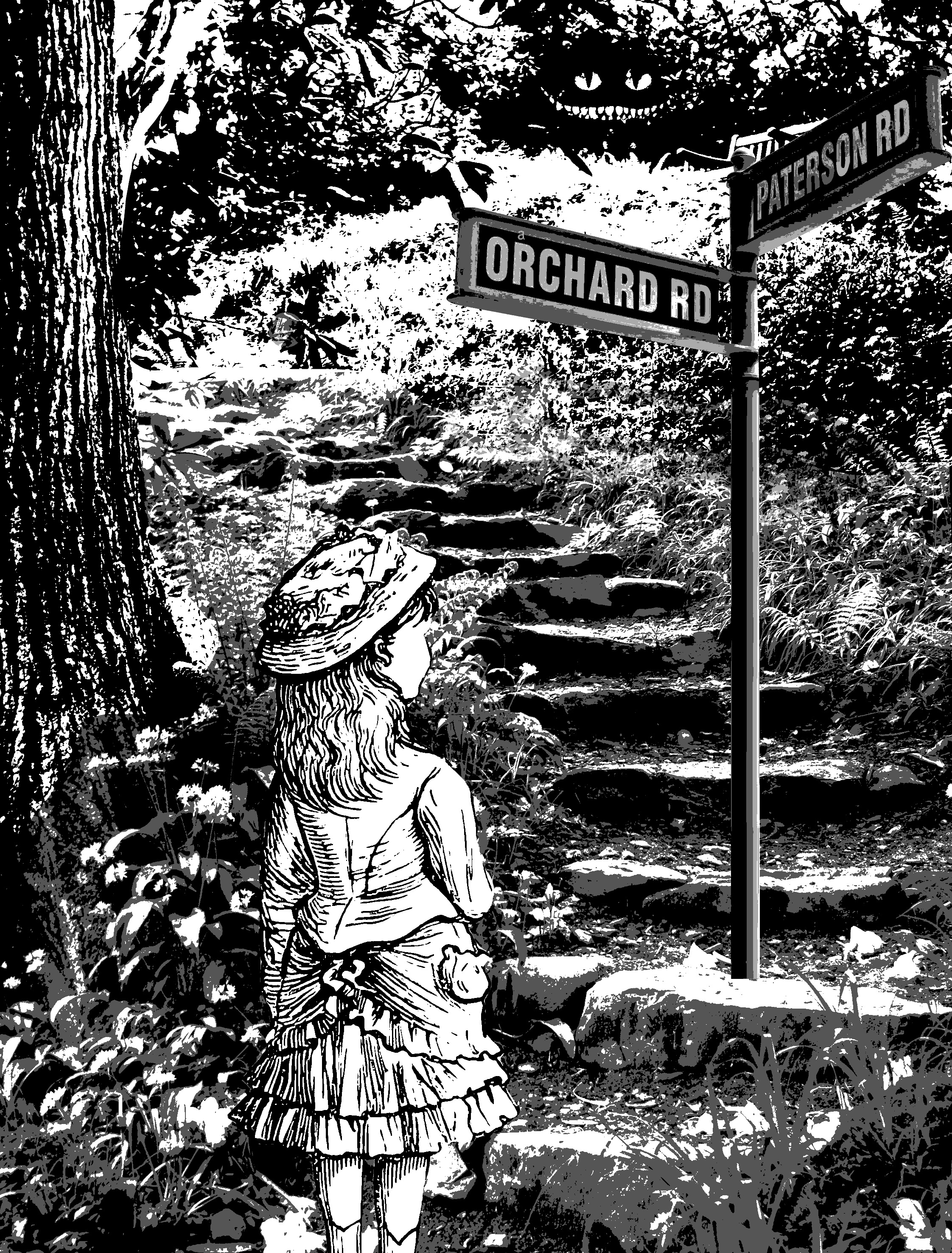
Firstly, I tried to show crossroads by giving her a signboard which gives her two directions to go. The reason why it says Patterson road and orchard road is because I took it directly off the internet without changing anything.

the second I idea I had was to put Alice in a maze and bombard her with signs and direction. however, this didn’t work out too well as there isn’t a lot of places where I could superimpose the signs on. Moving on.
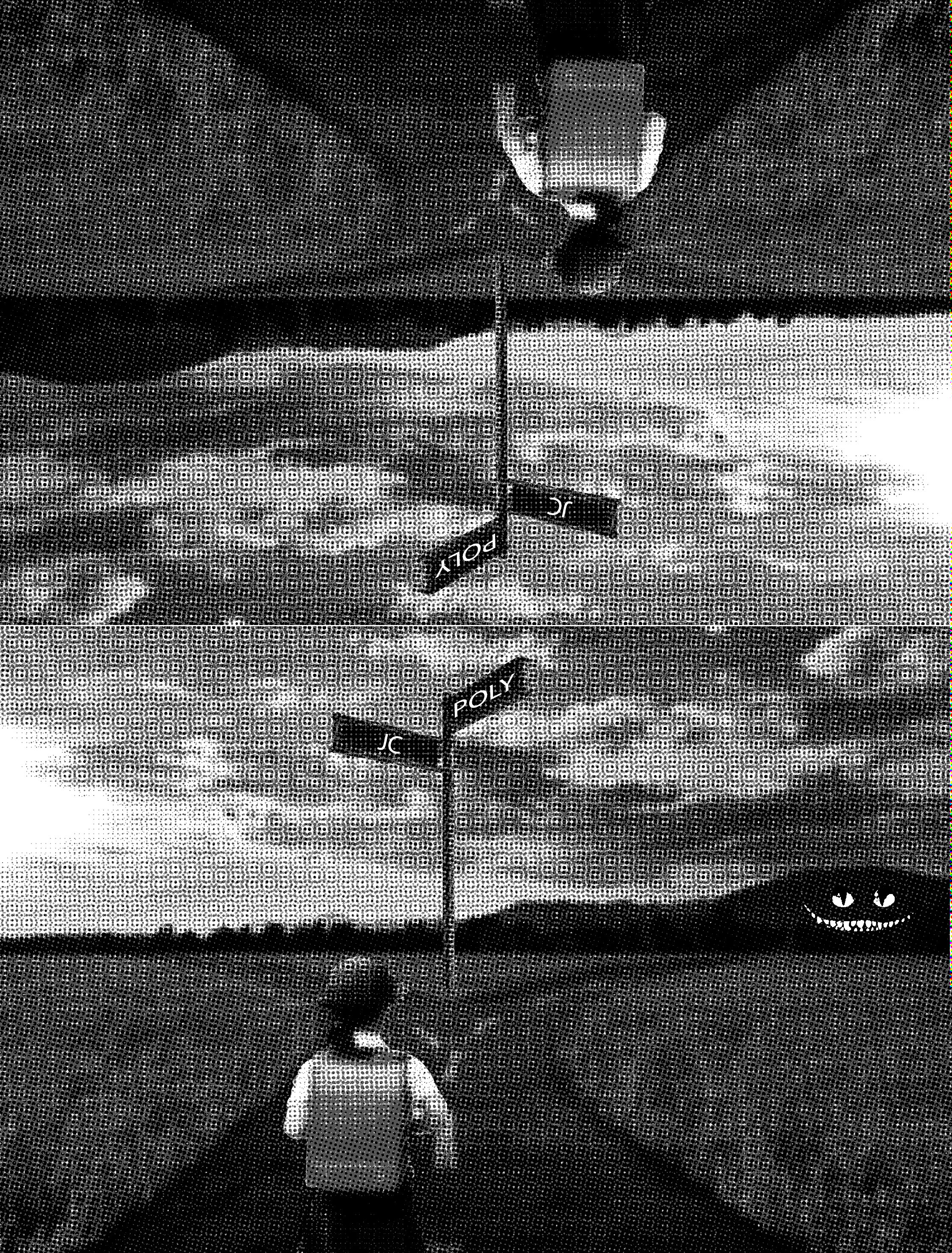
For this design, I decided to go for a literal crossroad. I wanted to make it bizarre so I reflected the image vertically. I tried to conceptualize it to my life and decided to change it to JC and Polytechnique a crossroad most students in Singapore face.
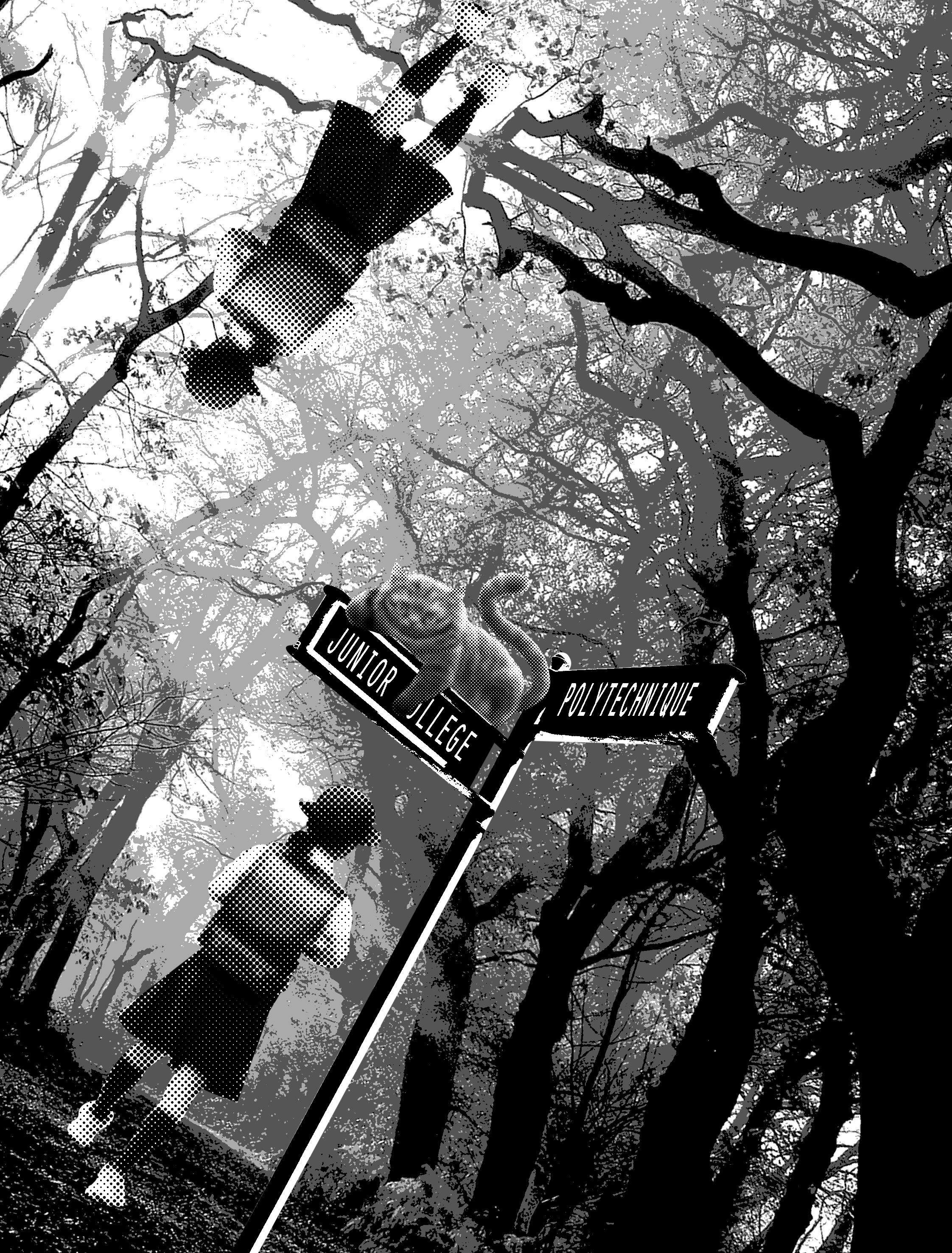
I decided to use the setting of the story: the forest as a background. I wanted to use a school girl wearing a pinafore as Alice, but I couldn’t find a suitable image. so I replaced her with a Japanese school girl.

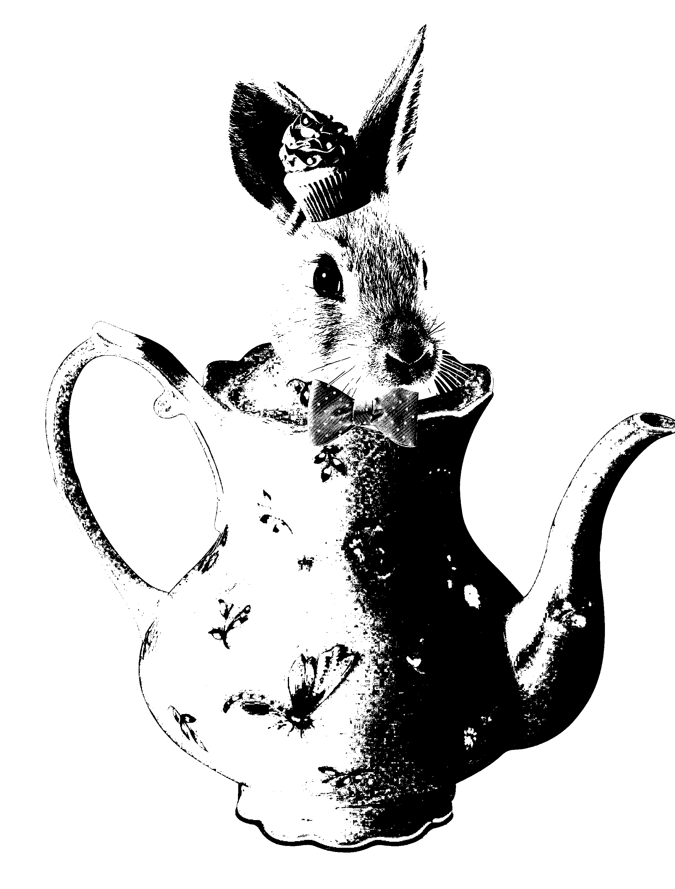
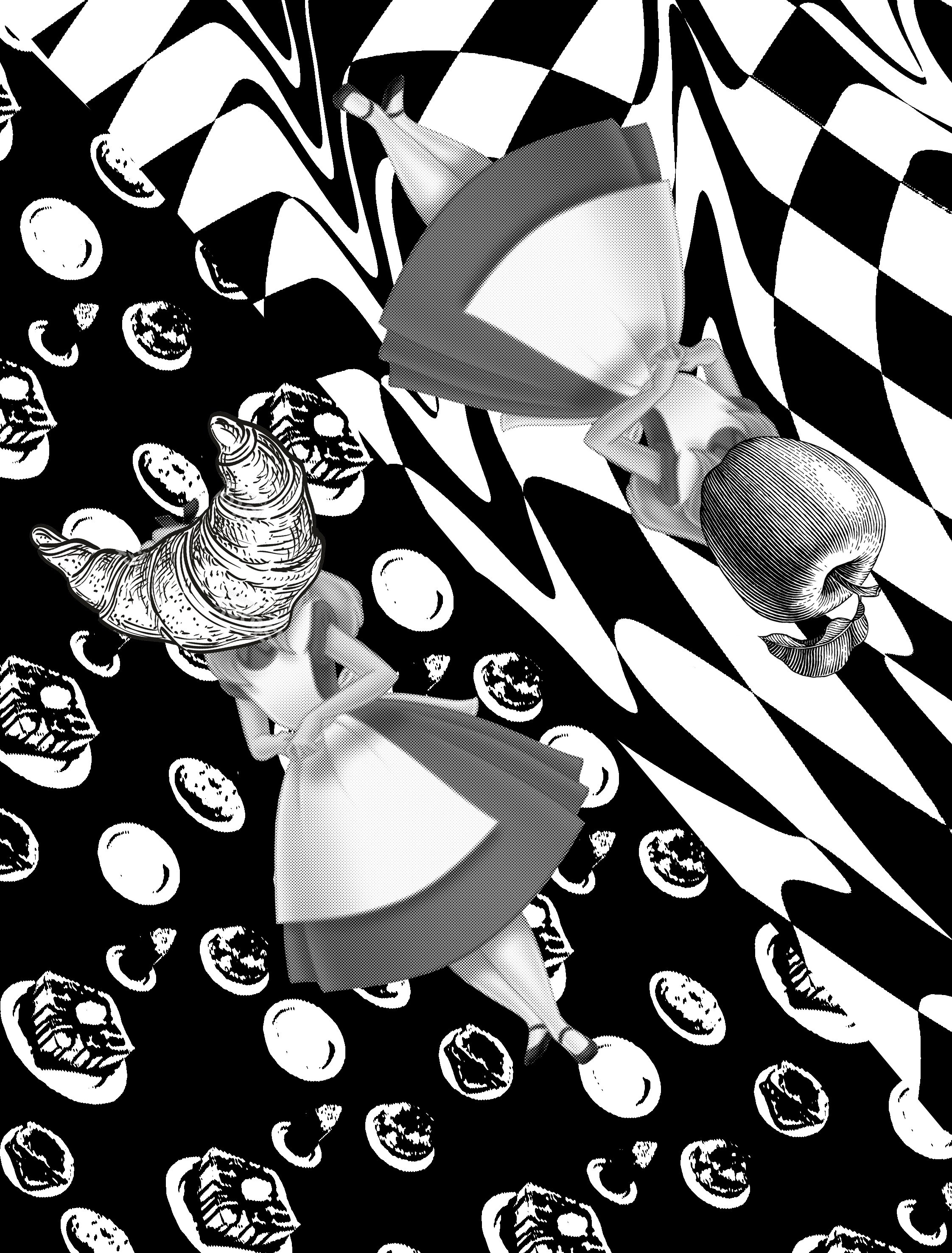
In these two designs, i tried to incorporate the Cheshire cat more subtly. the first one I used the silhouette of the Cheshire cat. I think the second one is more successful as it is more subtle and less in your face.
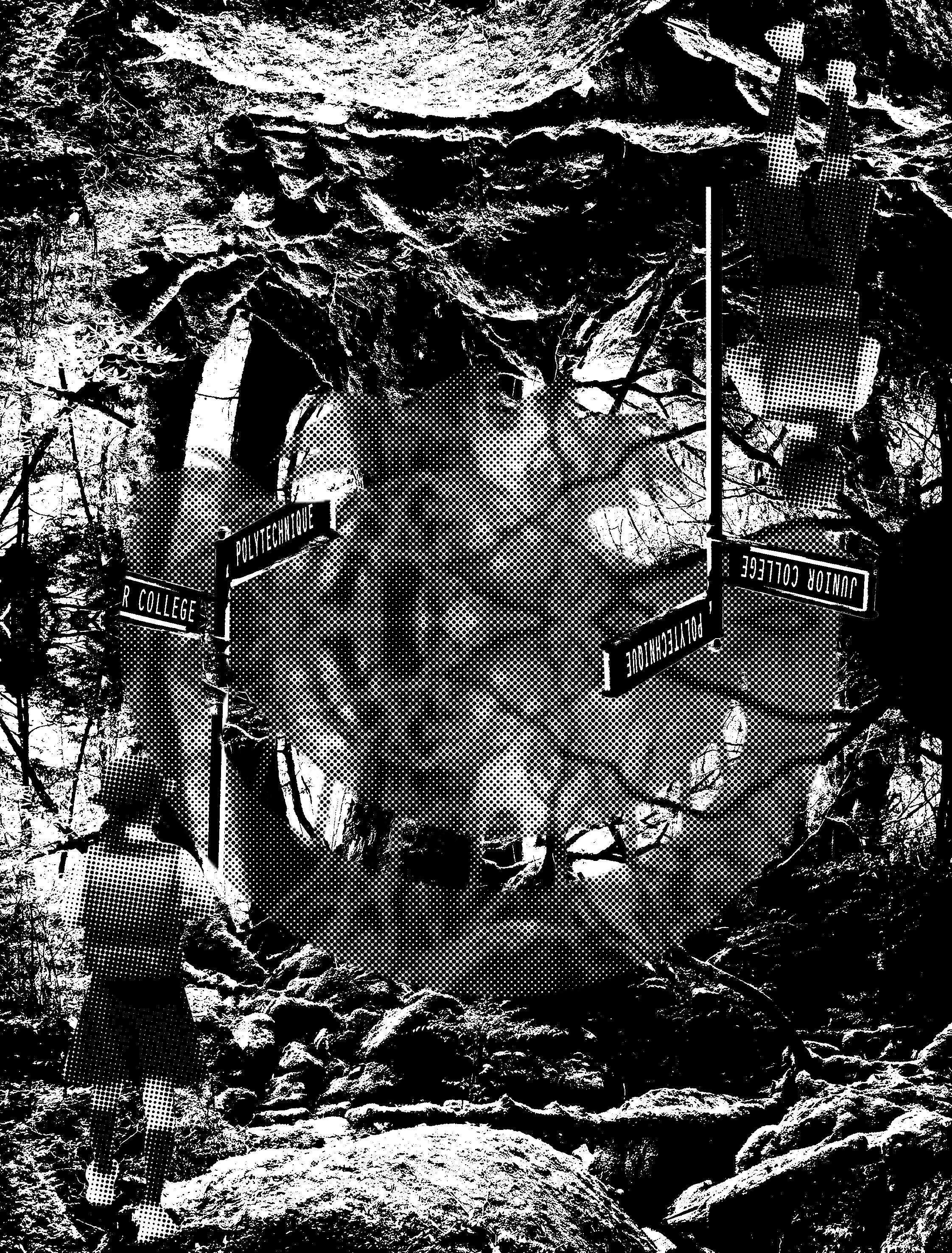
Similarly, I tried to distort the image by introducing halftones with threshold. however, this didn’t work out too well, as it does not convey depth at all. it made the background looks flat instead.
I tried to distort the image further by titling it. however, like the previous few designs, it lacks the context of Alice in Wonderland and the design is too complicated. furthermore, the designs do not look retro but futuristic instead.

I tried to make it look more retro. and obviously, in this, i failed again very badly.
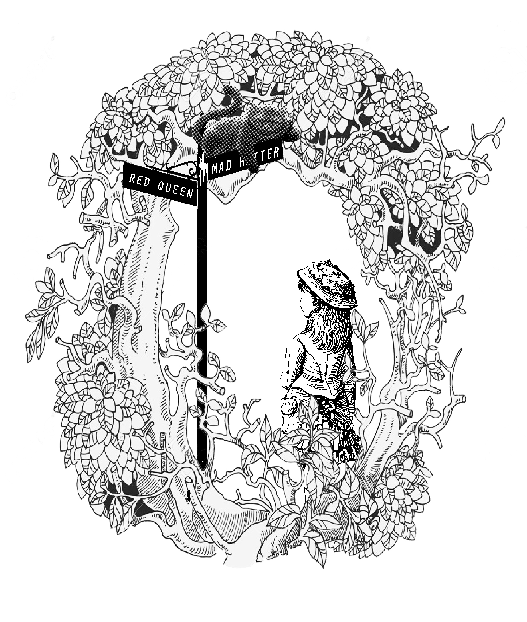
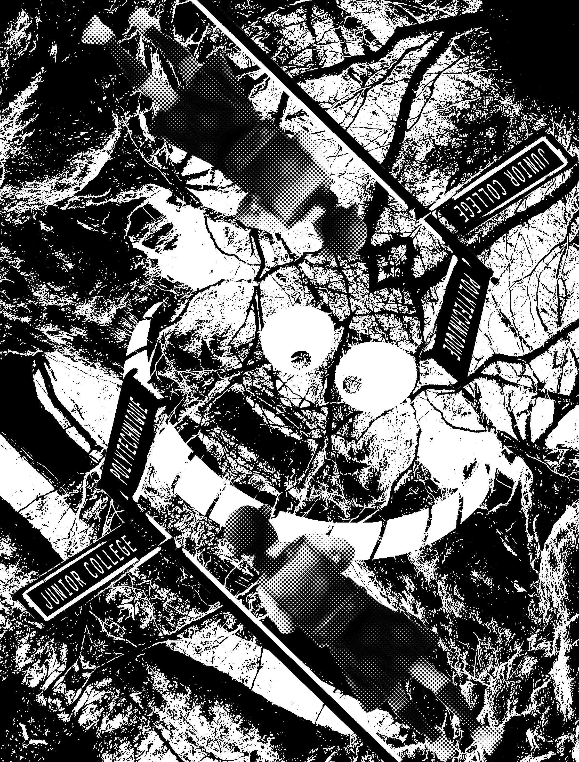
taking Mi Mi advice I begin searching for comics and illustrations. I found a forest shaped in an “O” and decided to throw in the elements of the signboard, Alice and the cat inside. while I finally did succeed in getting the visual language right. I really didn’t like it. anybody could have thought of this. Meh, just no…
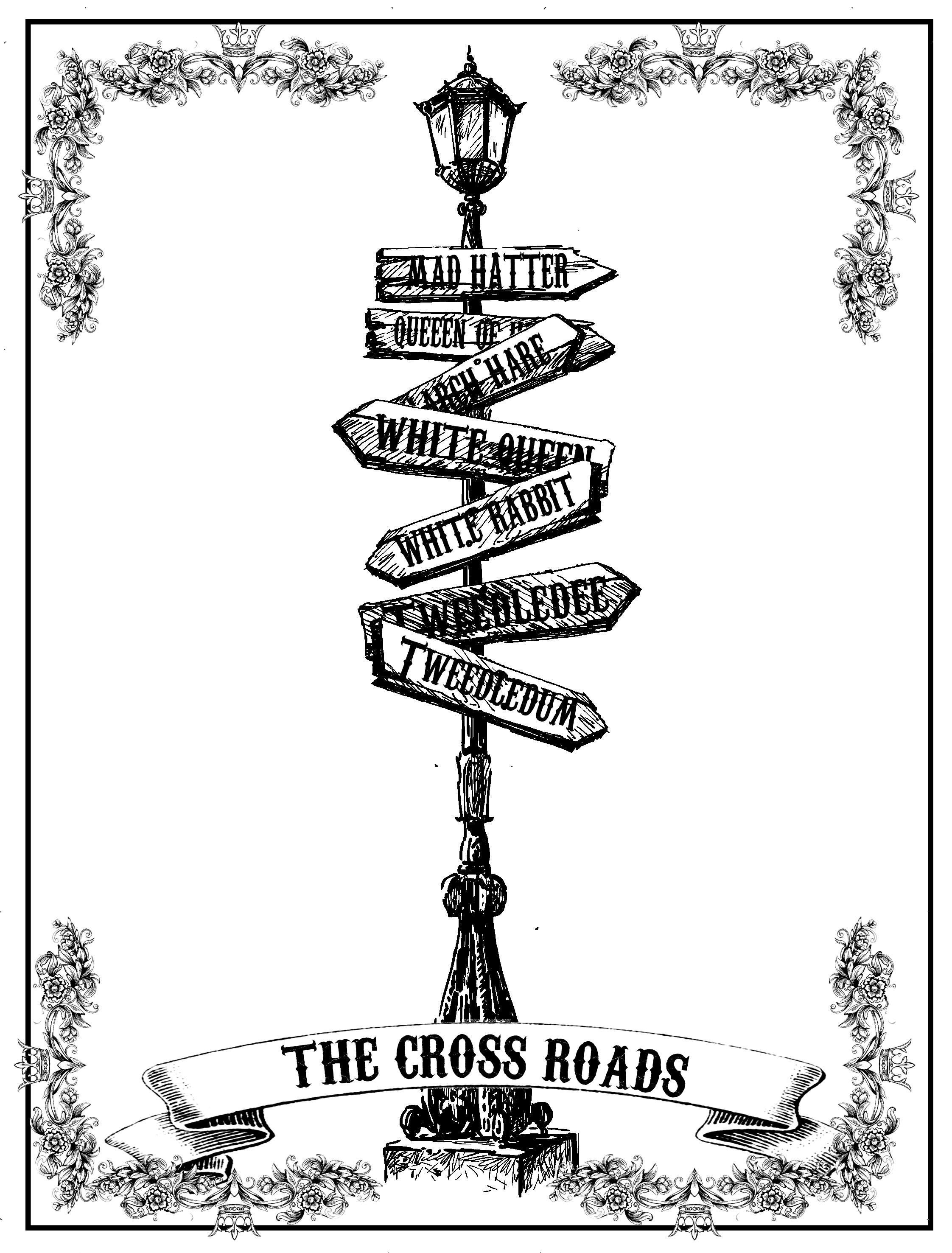
For this design, I was very inspired tarot cards and that’s why I used the fancy borders. again the border worked against me and stole the attention away from the main object. In addition, I felt that the design could have been developed further.
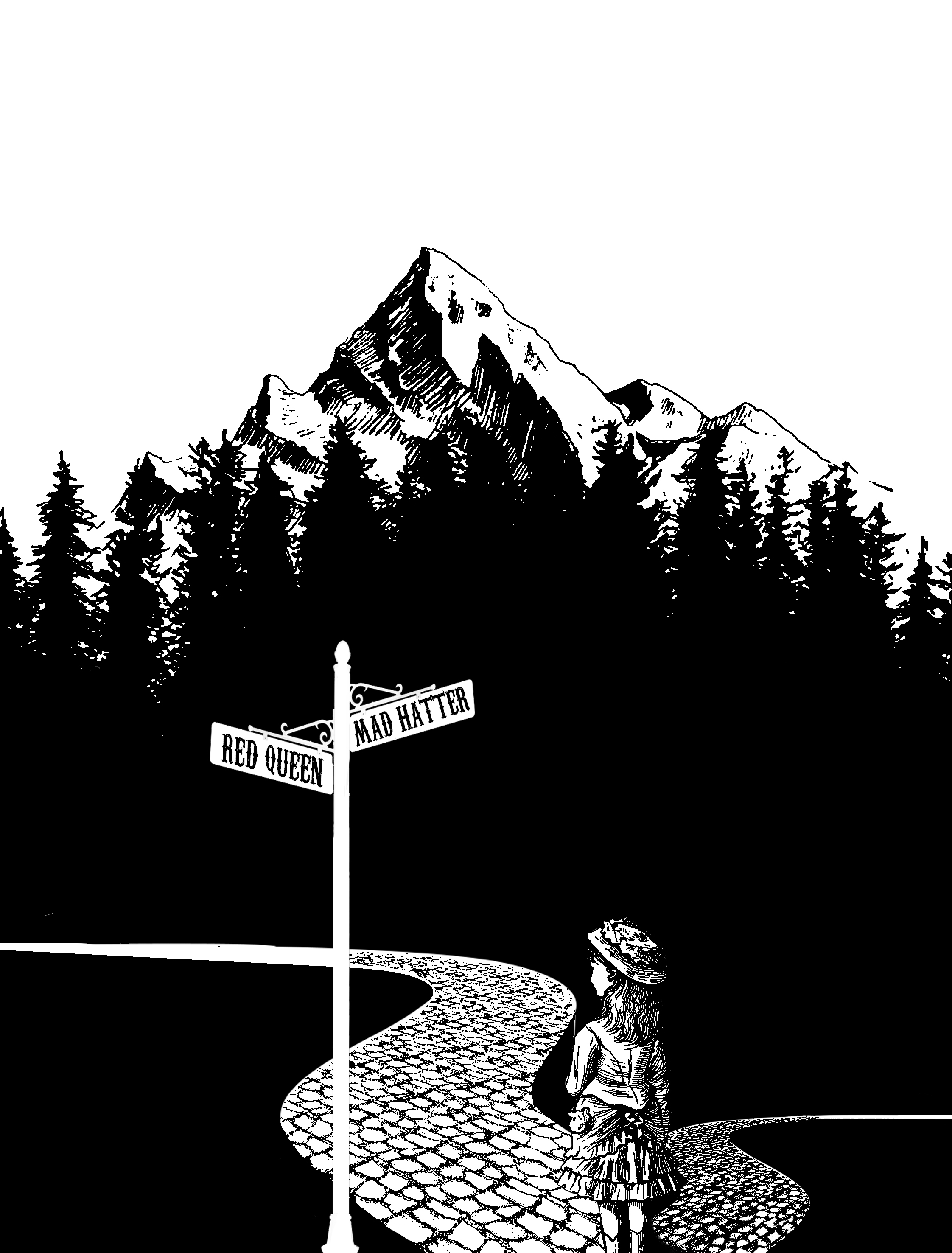
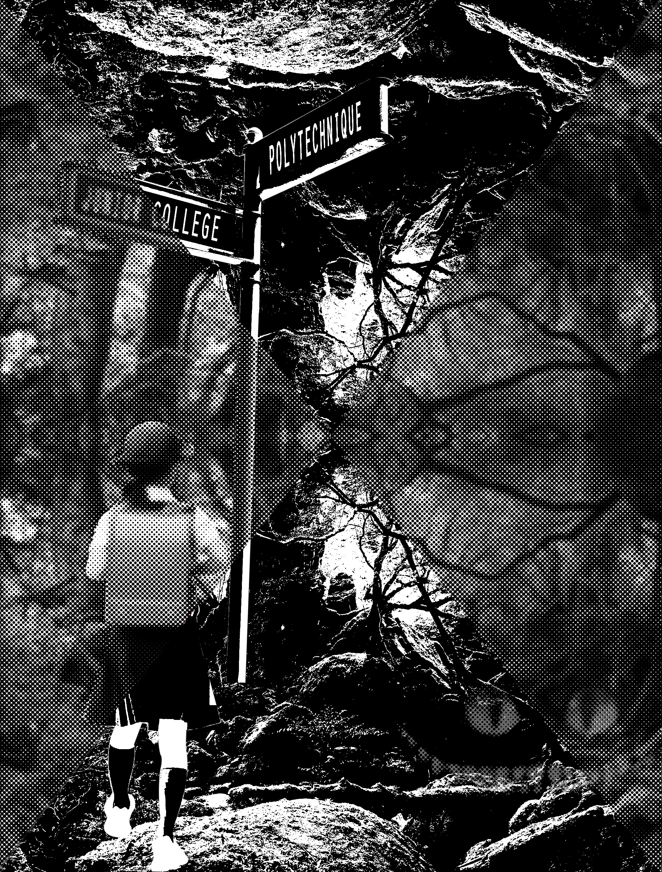
I chanced upon this photo of the forest while searching the web, then I had a sudden inspiration to extend the bottom and make use of the negative space. as there is a very high contrast, a great amount of emphasis is being placed on Alice. In addition, the background acts as a border framing the main subject up nicely.