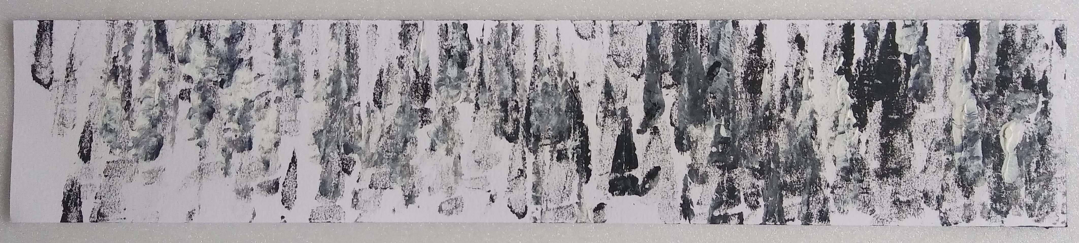
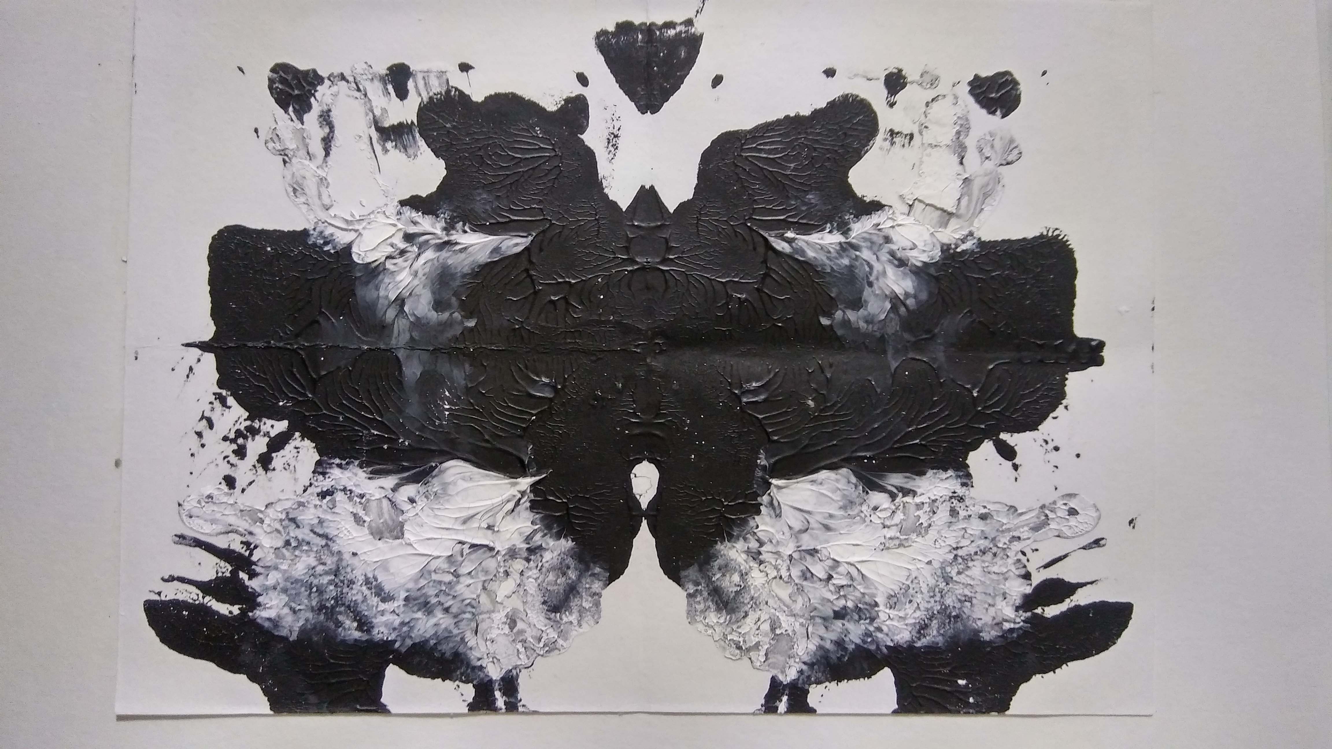
My Line is Emo: Development

Love

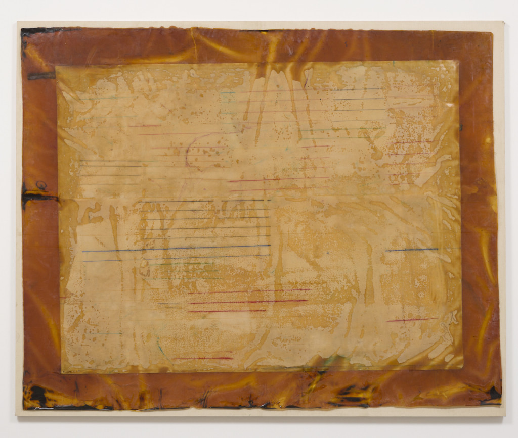
Concept: I want to show the feeling of being loved by another. The love you feel in a hug; being embraced when you feel down. There is this ‘warmth’ that feels up inside you as if transferring from the hugger to the hugged. The phrase ‘Love brings light into your life’.

Idea: I am thinking of using the contrast in texture to represent the troubled soul and the ‘love flame’. Textured or crushed paper to represent the troubled soul. Smoothness of paint to represent the ‘love’ flame. In this case, I could try to make my own paper as suggested during consultation! The problem is that with the gloomy weather going on, I am not sure it is going to dry in time for submission… (i could also pressed the paper onto some coins or something to create creases?)

Results: 

Crepe and tissue

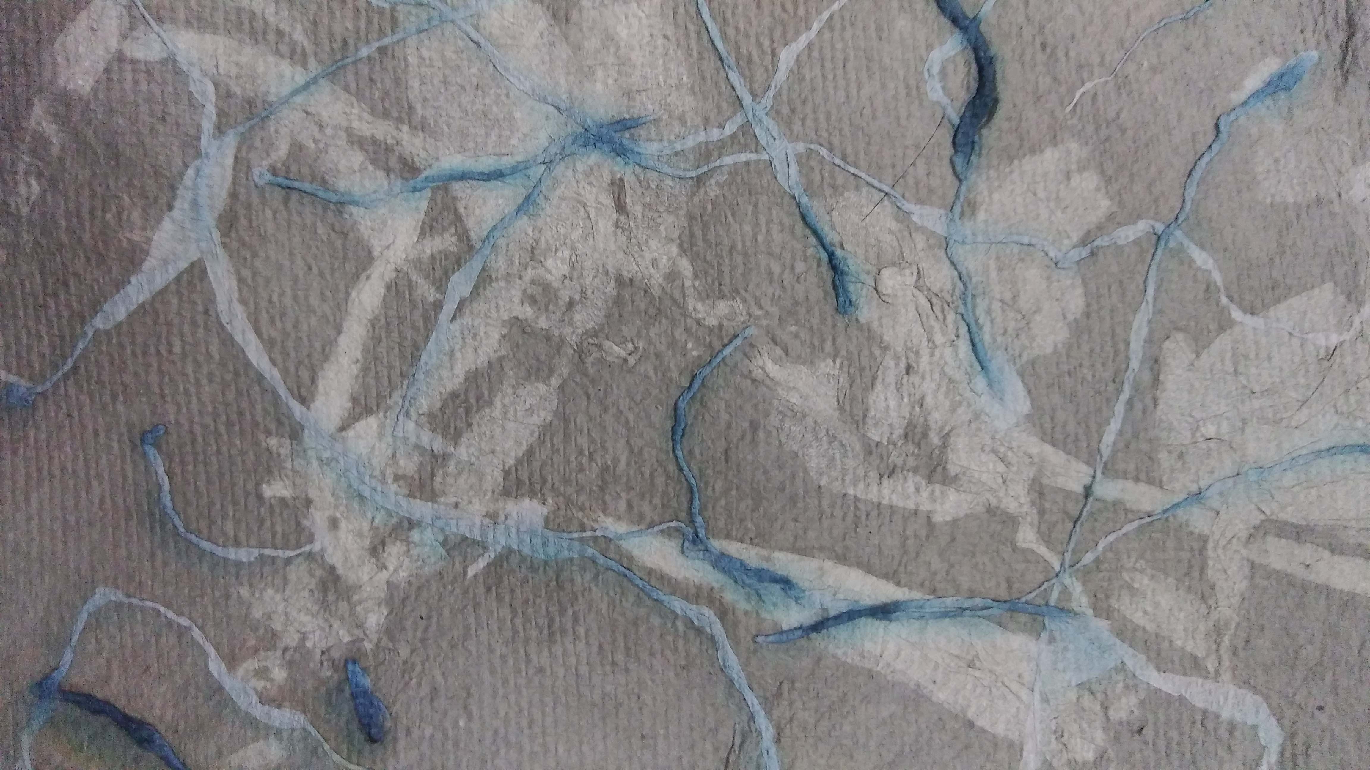
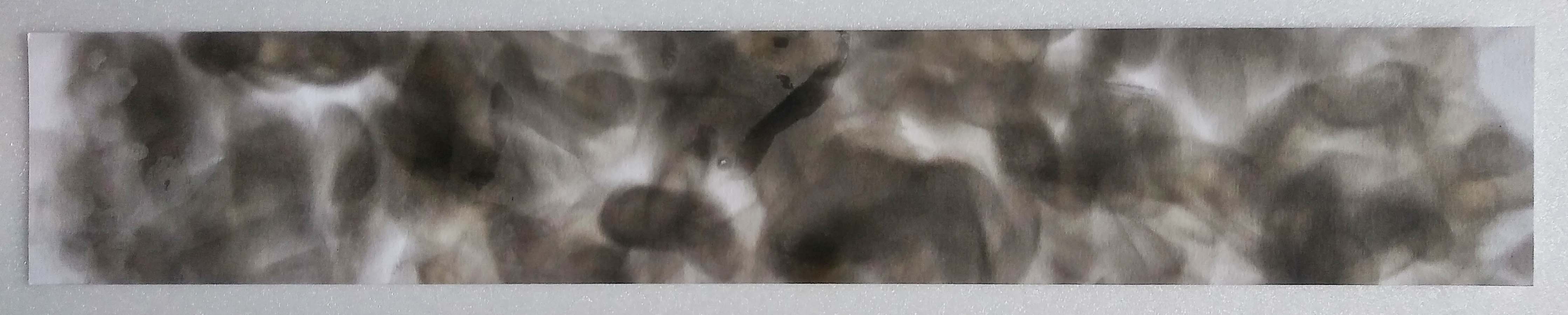
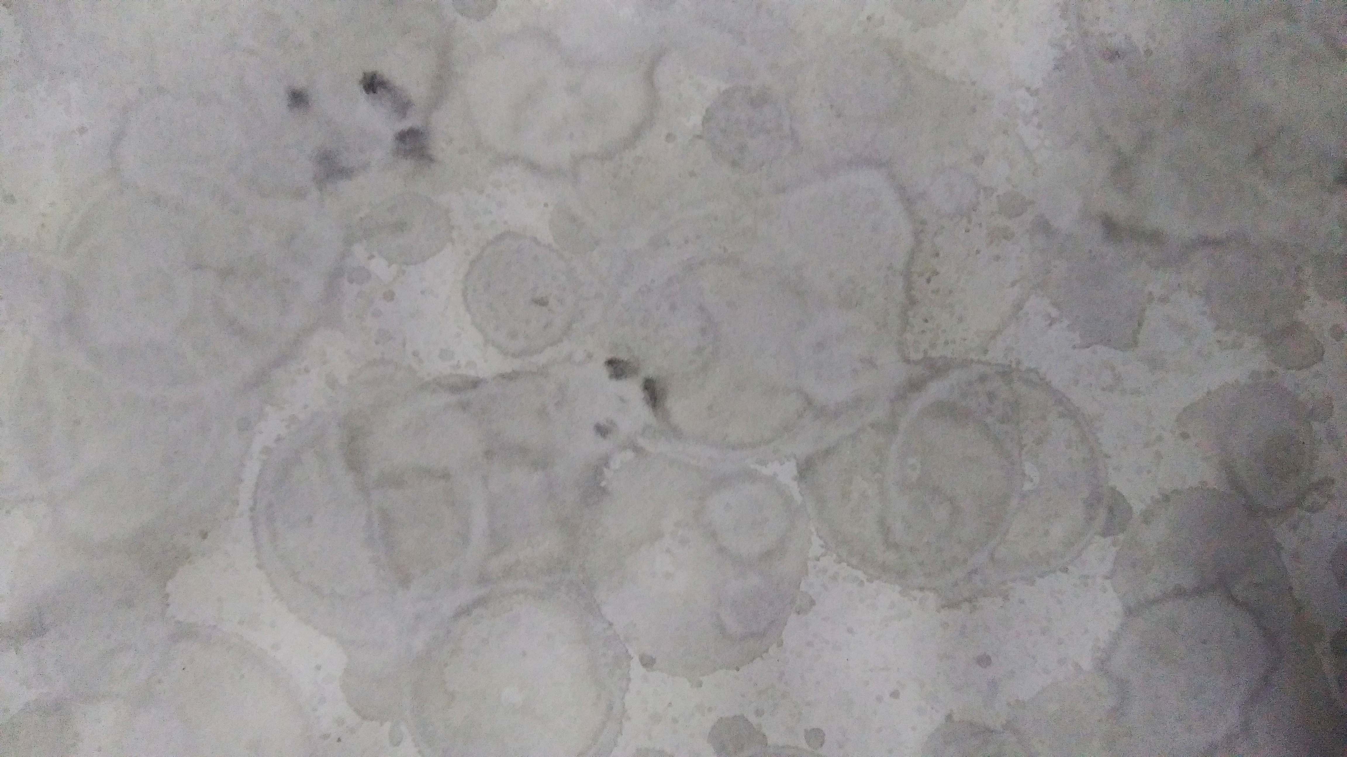
I pressed twisted black crepe paper into the damp paper before it dried. But the colour ran and turned blue.

Eggshells

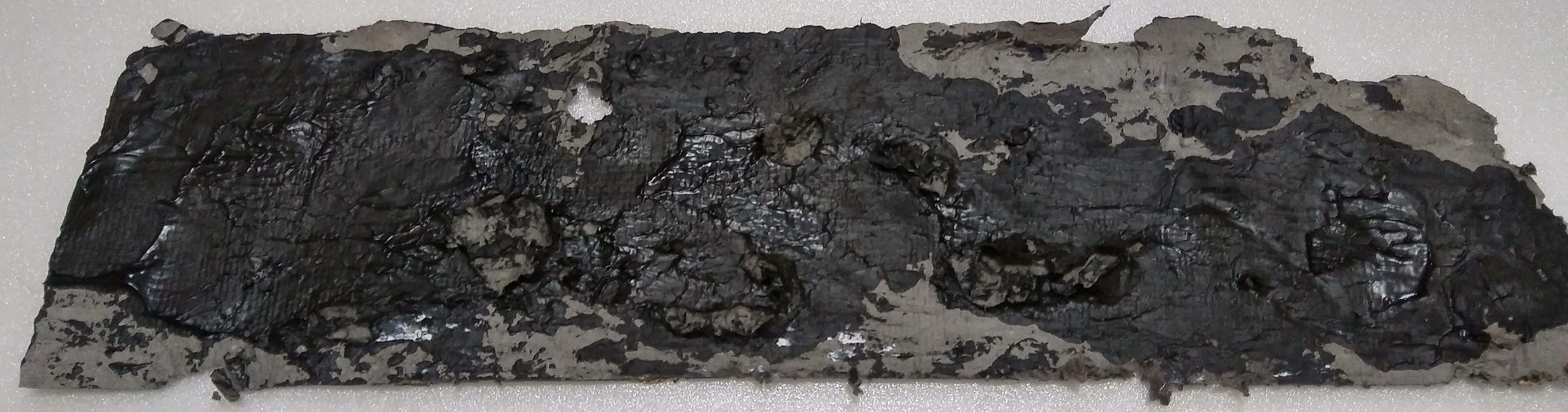
I tried dyeing the eggshells black with Chinese ink but because it was water base the ink was washed away; barely even stained it.

Peanut Shells (black)
Peanut Shells (white)

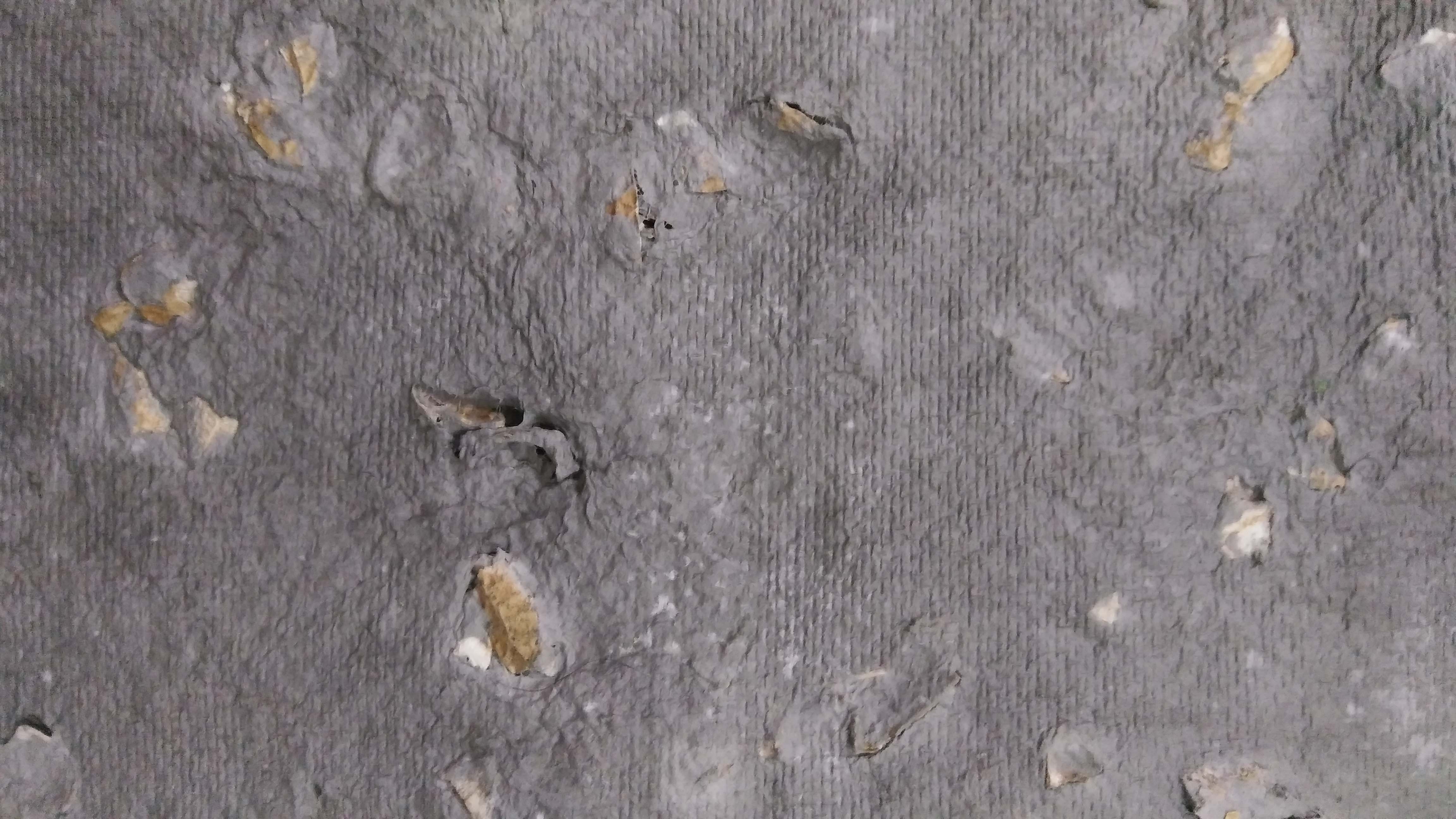
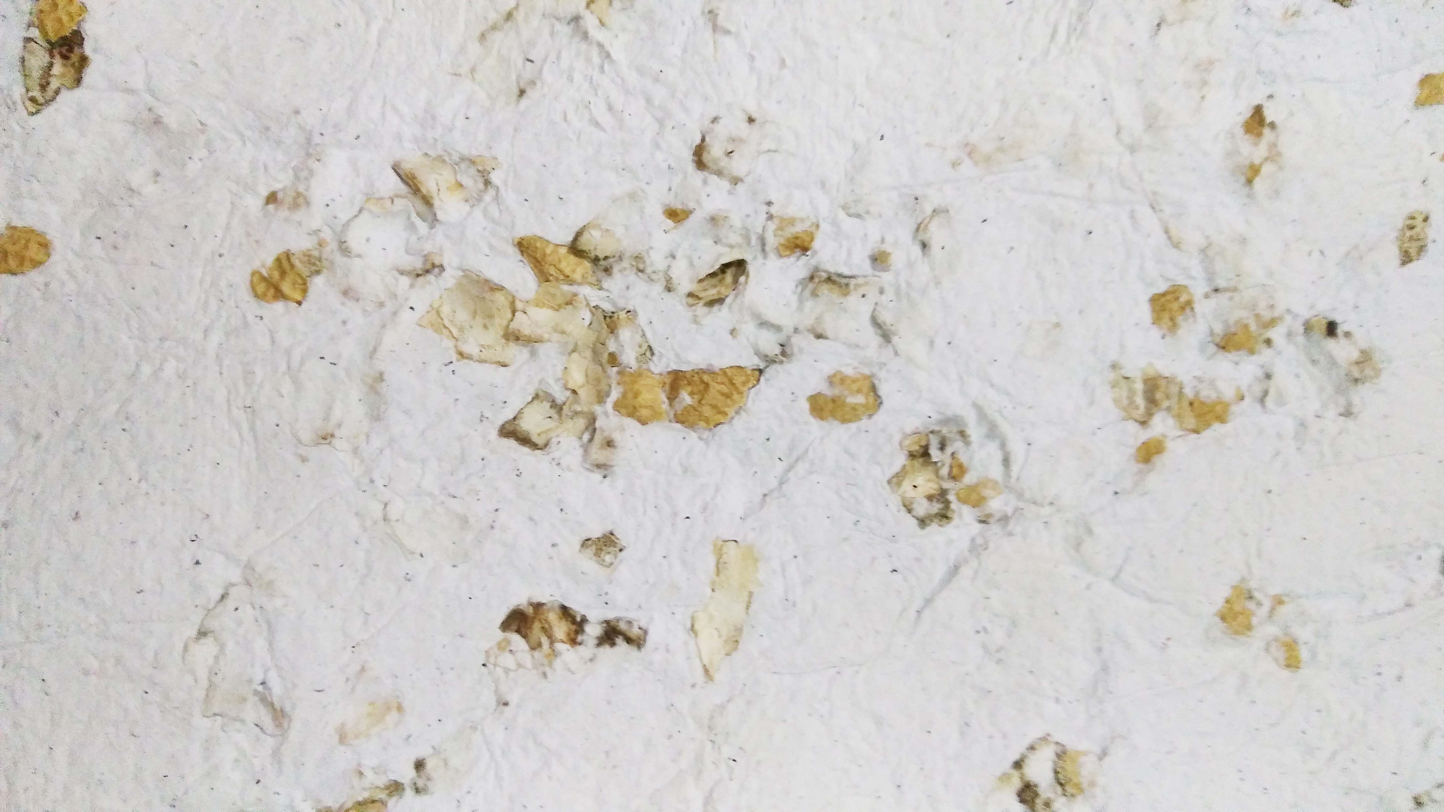
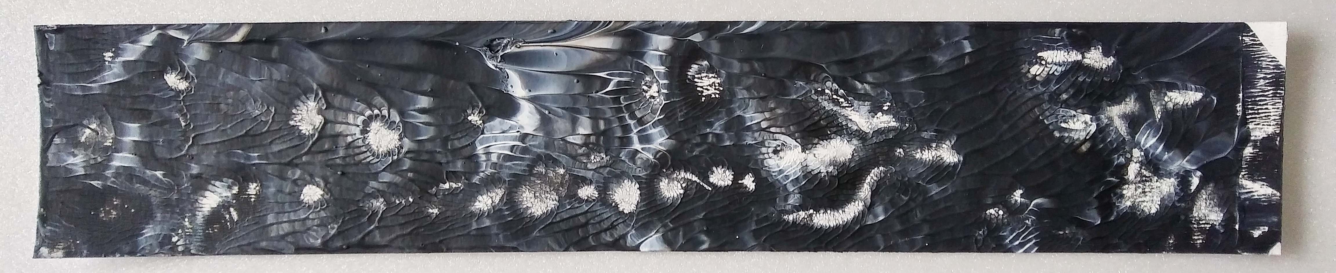
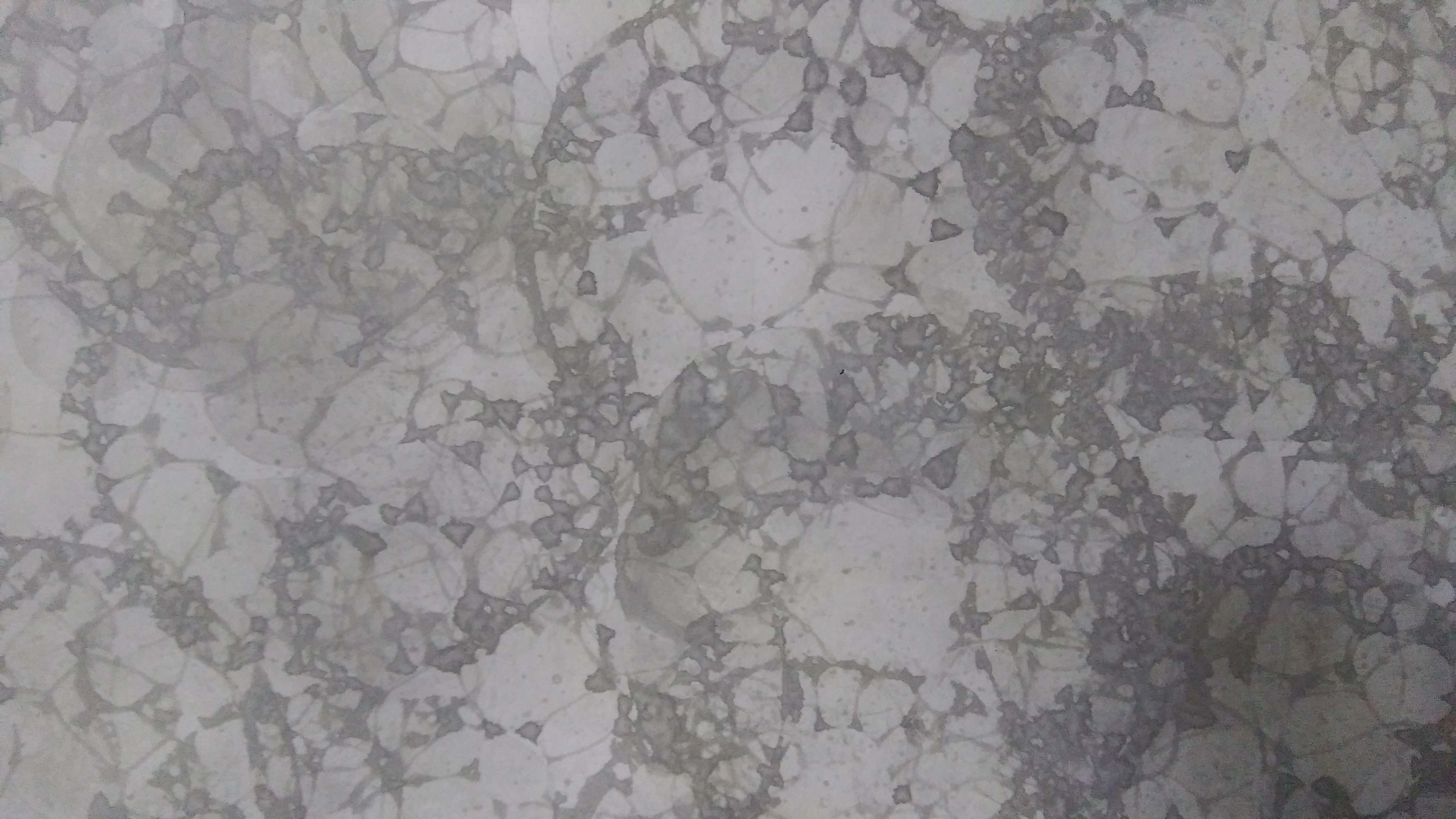
I chose the peanut shells because out of the three, the peanut shells came out the most bumpy and rough. Also the texture is reflected on the back. So even though the peanut shells are not black/white, I can use the back of the paper.

Testing 1

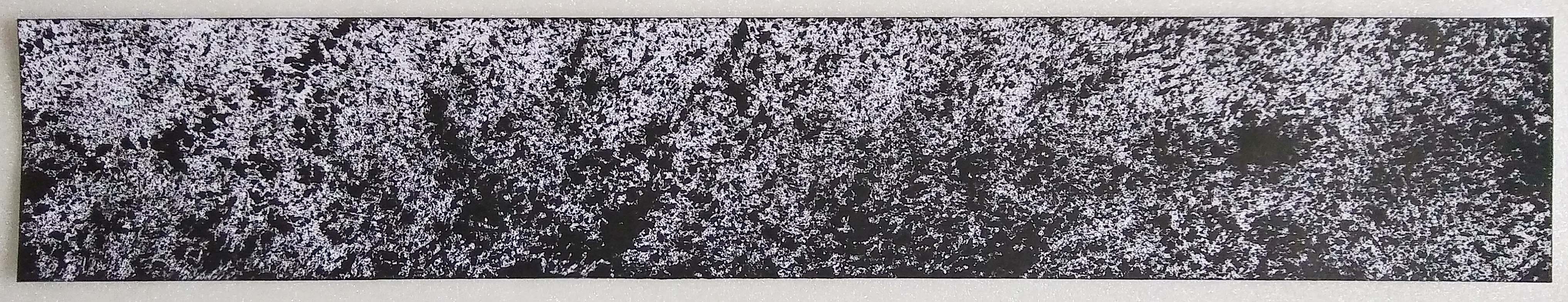
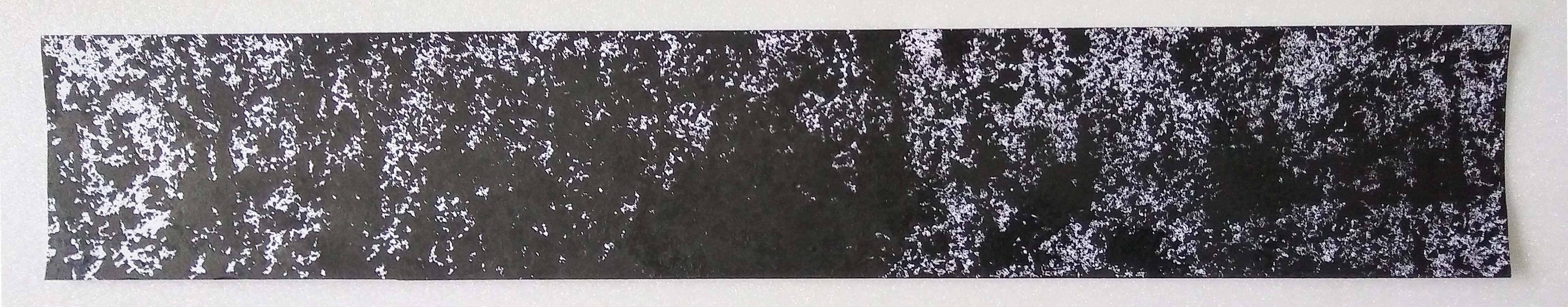
At first I wanted to use a single colour ( white on white)  and focus on the texture difference. Since I only have one white handmade paper, I did a black only test.

Testing 2

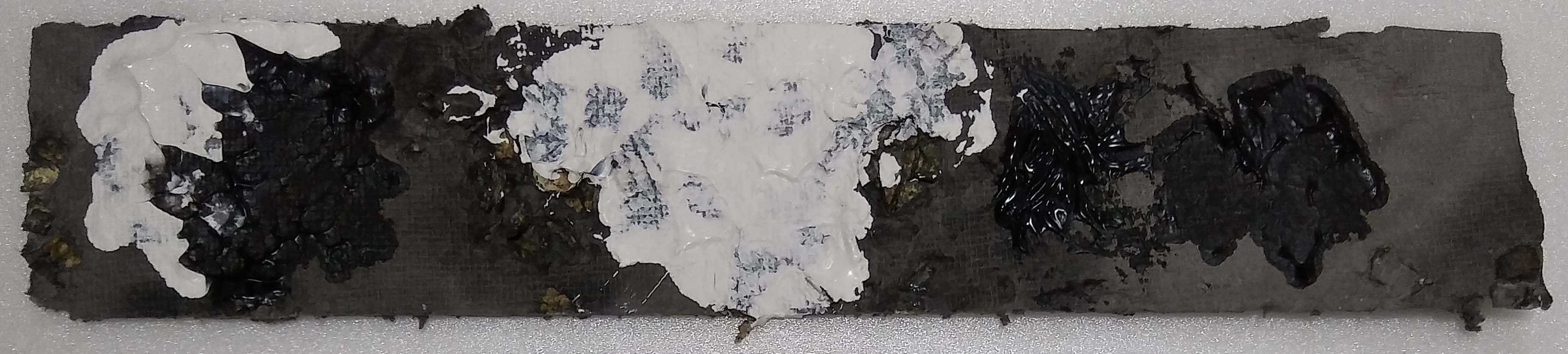
Then I tried colour mixing.

Testing 3

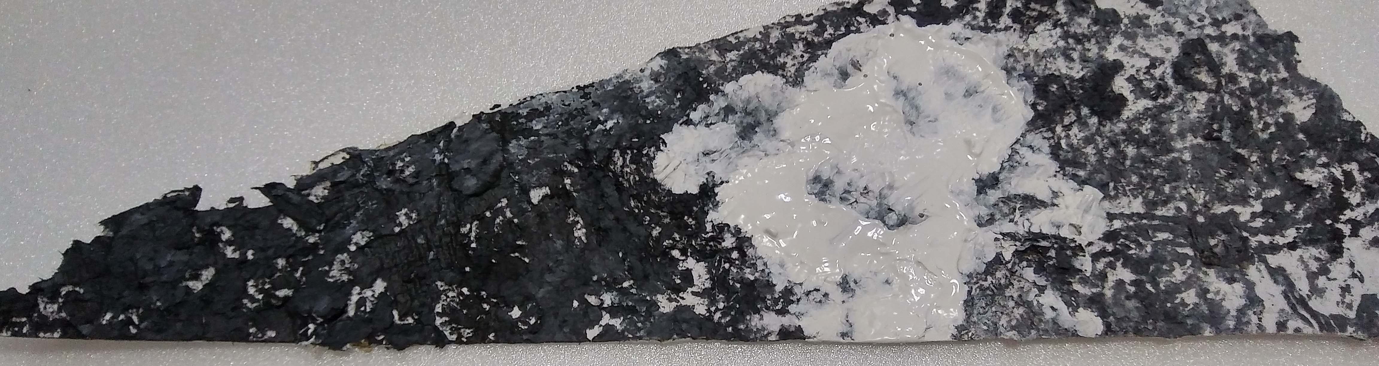
Then i realised that when I rolled the acrylic paint over the paper I could lift the pulp – texturizing it even more.

Surprise

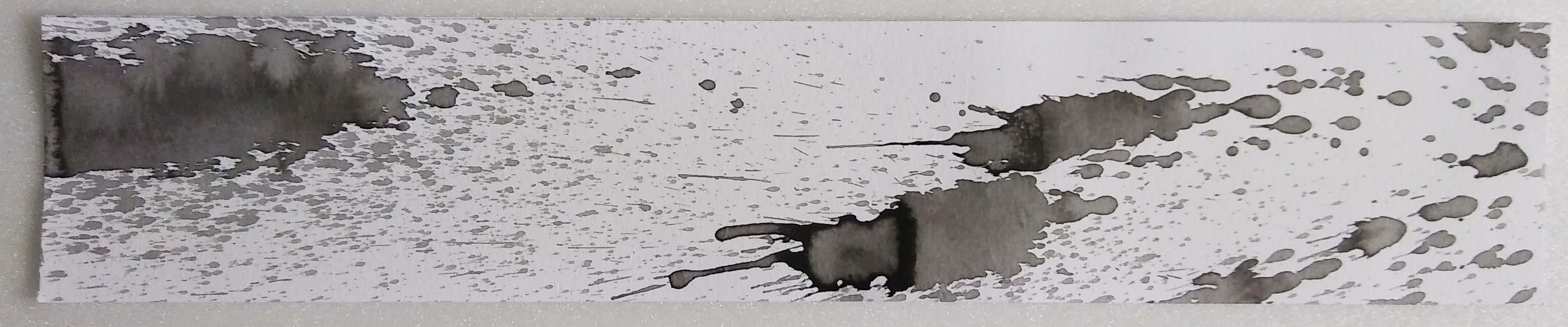
Concept: I rarely get surprised but when I do, I feel it in an instant and then its gone. It is an explosive feeling and you scream. After the moment of shock everything is back to normal. One BAM! and then nothing.

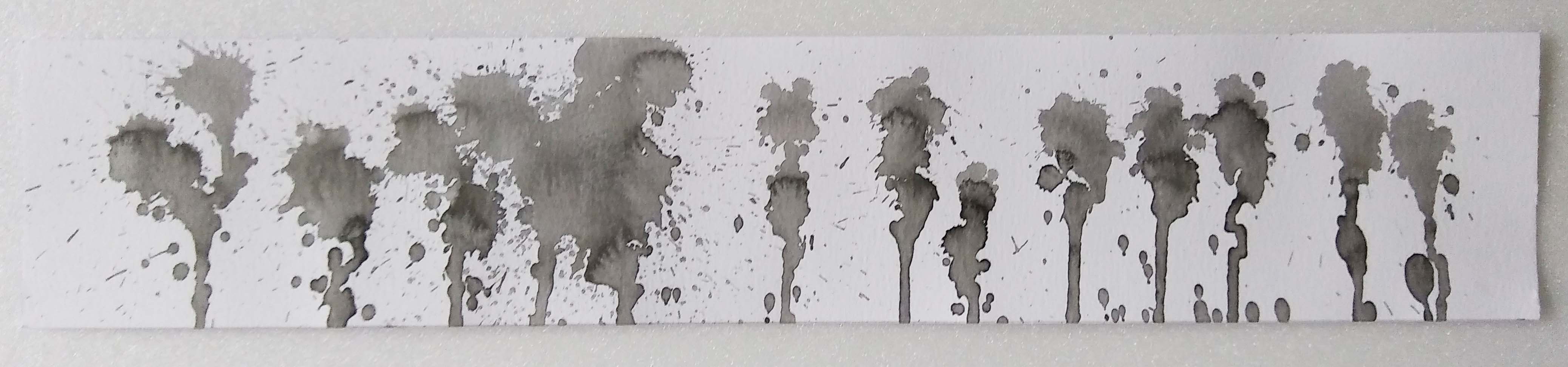
Idea: In translation it would be 1 big splatter on a smooth surface. Is this where I can use transparency??? I could use different objects to create the splatter. Water balloon? Plastic bag?

Results:

Black Splatter on white paper

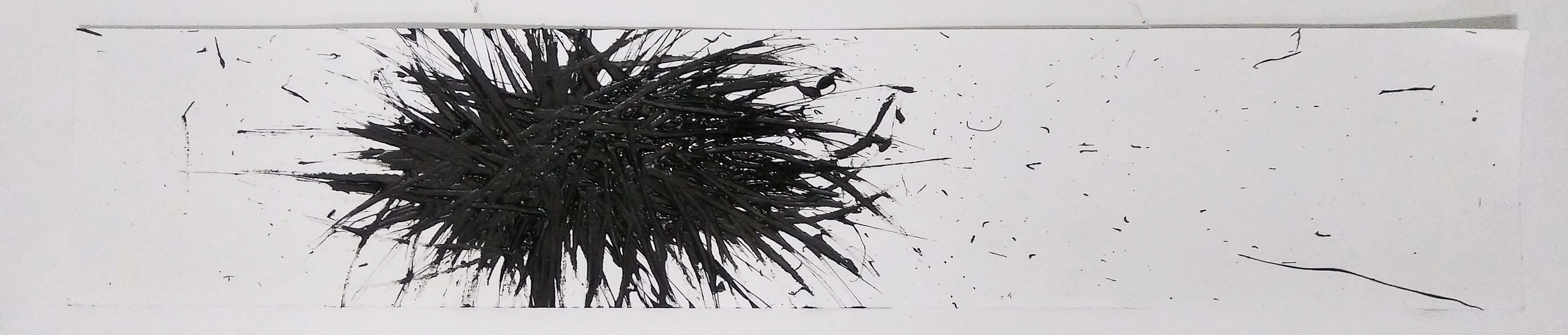
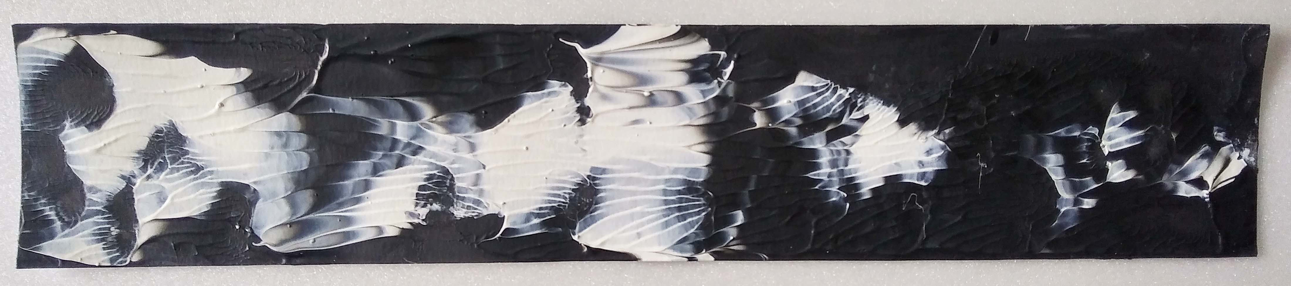
Single colour spat looks quite boring.

Black and white splatter on white paper

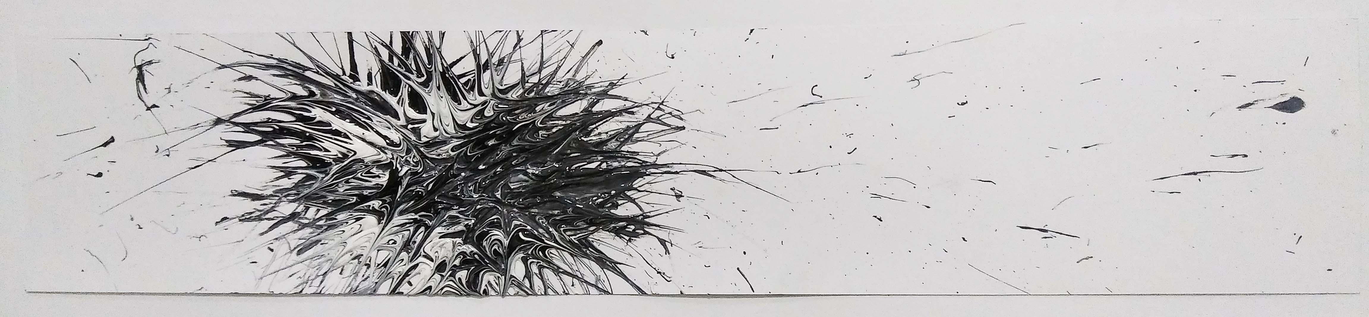
Mixed of black and white because I felt perhaps surprise is not always ‘bad’ (black). It is more like a mixture of both positive and negative feelings.

Black and white splatter on transparency

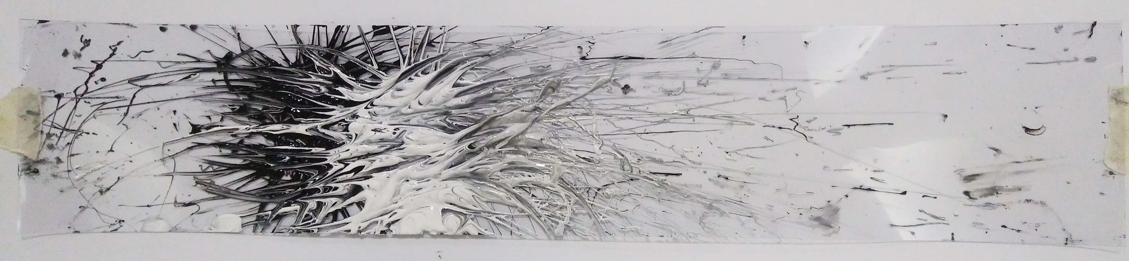
To emphasize the “One BAM! and then nothing.” feeling. I decided to use transparency.
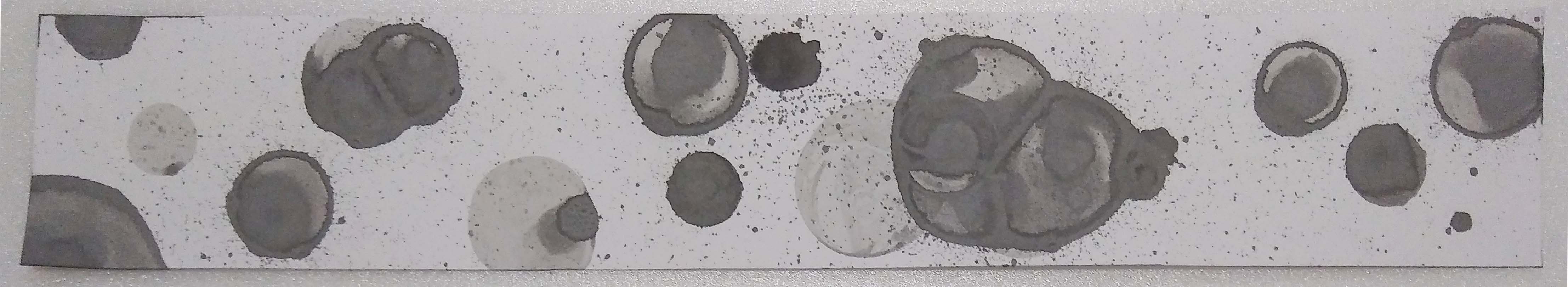
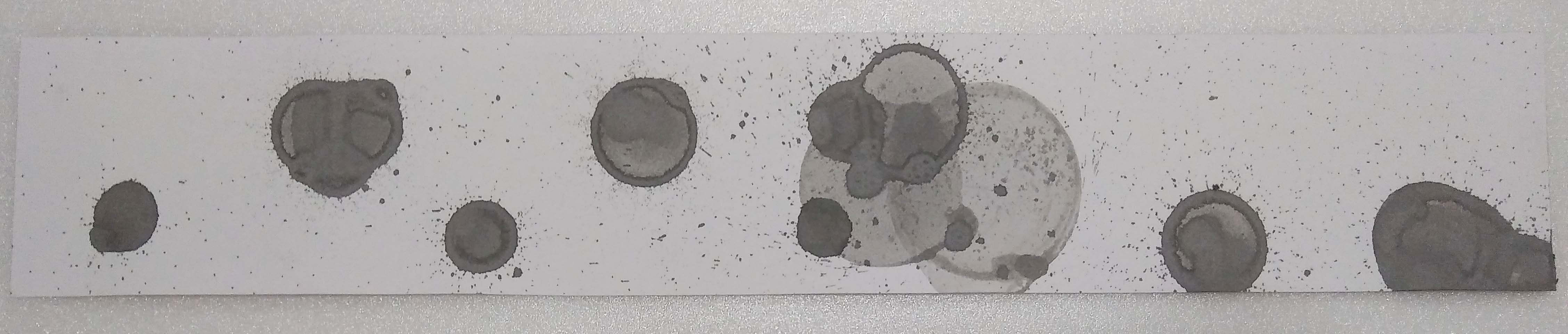
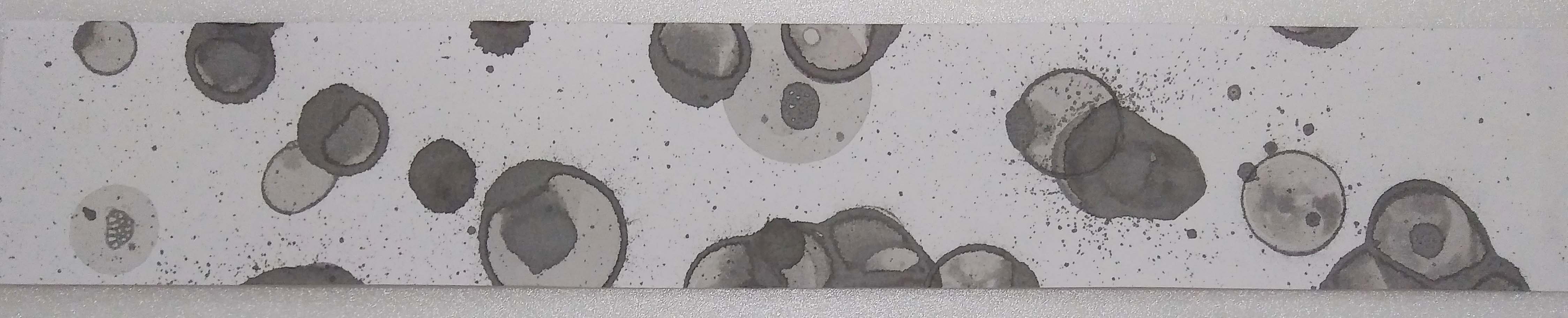
Joy

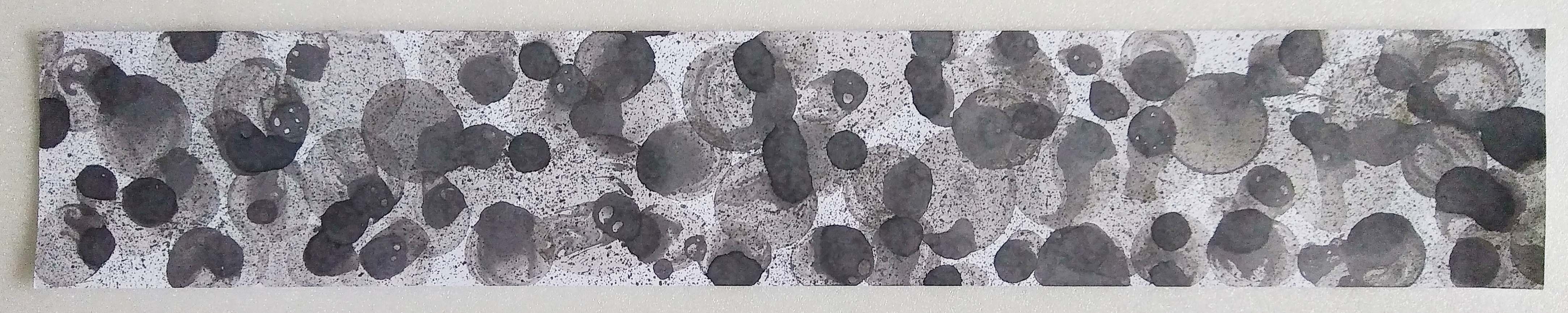
Concept: If surprise is one big explosion, Joy/ecstatic would be many tiny explosions. Or explosions of various degrees. Feeling ecstatic is when you feel so much joy and excitement you want to do a little victory dance.

Idea: This emotion is not violent – gentle explosions. I could make tiny burst of paint with the use of bubbles. It explains the emotion but is not special or anything because I have seen others done it already.

I could directly translate the victory dance though. That sounds interesting. With something that looks like feet??? Toy feet. Fingers. Toes. An object related to victory? A trophy or medal. Something I am ecstatic about? My figurine! But I rather not ink it though… Or you know I could do both! 🙂

Results:

In the end I did not try to create a ‘Victory Dance’ piece but I did try to incorporate rhythm to the arrangement of bubbles to make it look as if  its ‘dancing’.
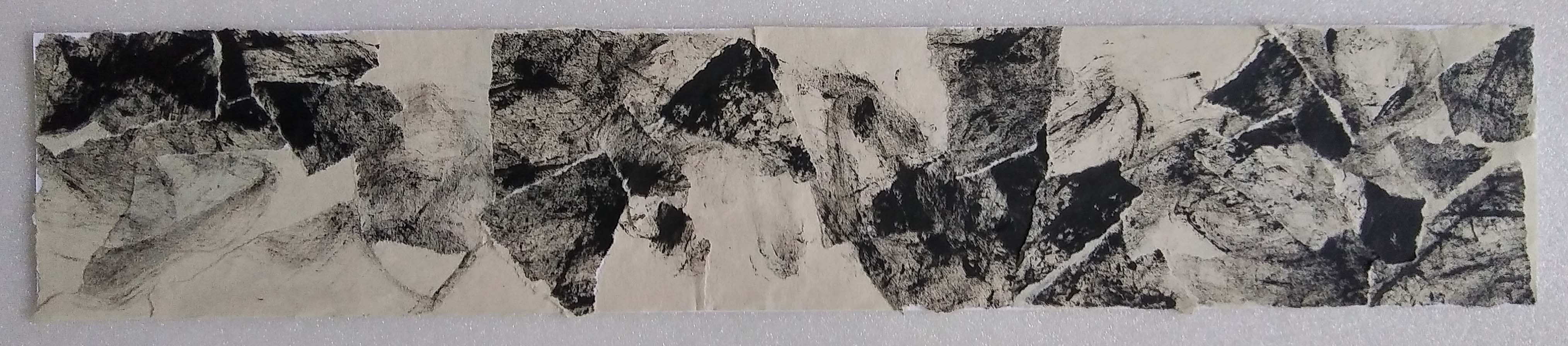
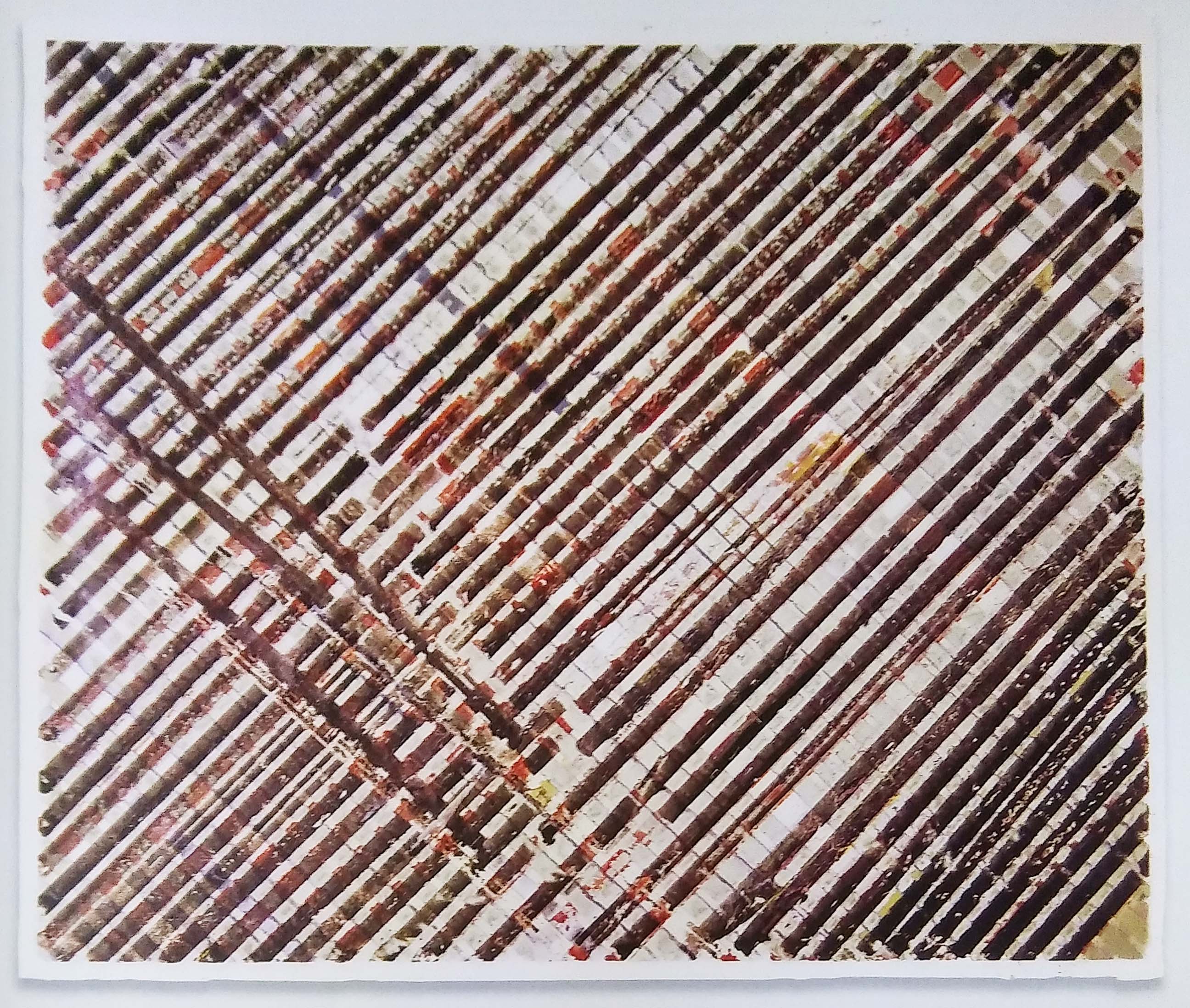
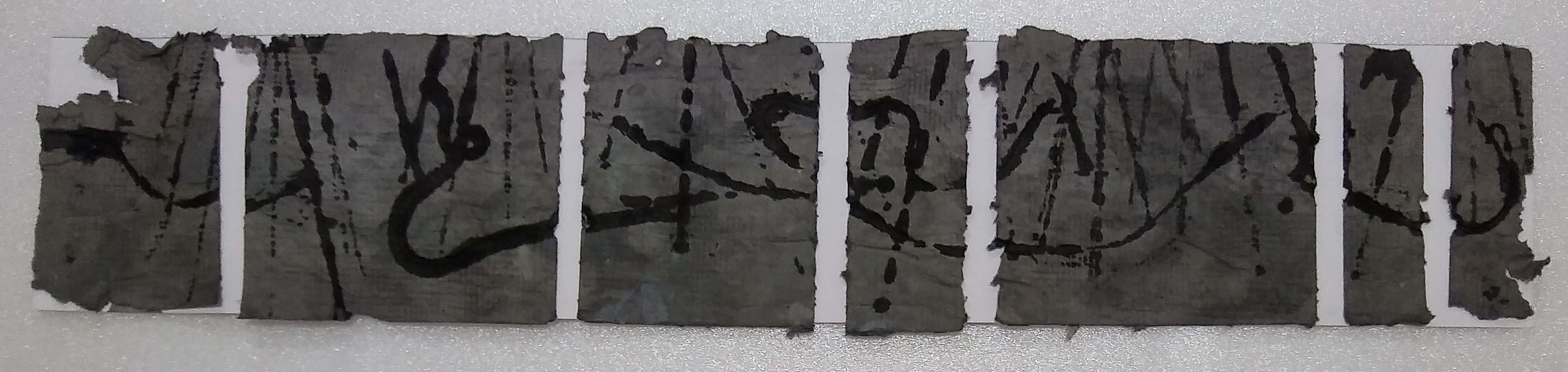
Iteration 1
Iteration 2
Iteration 3

Regret

Concept: When I feel regret I desperately want to travel back in time and fix my mistake. But since time travel is impossible, I try to fix it the best I can but it does not work and it’ll never be the same. It is like taping torn paper together. The paper is still torn; the tear cannot be mended back to the way it was before.

Idea: Naturally the idea is to tear up a print and put it back together. Creating empty spaces on purpose to patch up later. So the question is -what kind of print? I could use fabric, it also cannot be mended even after you sew it back together. (too simple to just sew fabric back together? not interesting.) Maybe something structured, something regular. After it is destroyed and patched up it becomes irregular… Perhaps a grid will work? It would make it looks distinctly wrong than just a random paint smear. Possibly combine the two?

Results:

I thought maybe patching up a grid would make the message more apparent – mending a ‘perfect’ structure.

Grid patching with solid lines
Grid patching with lines of varying gradient

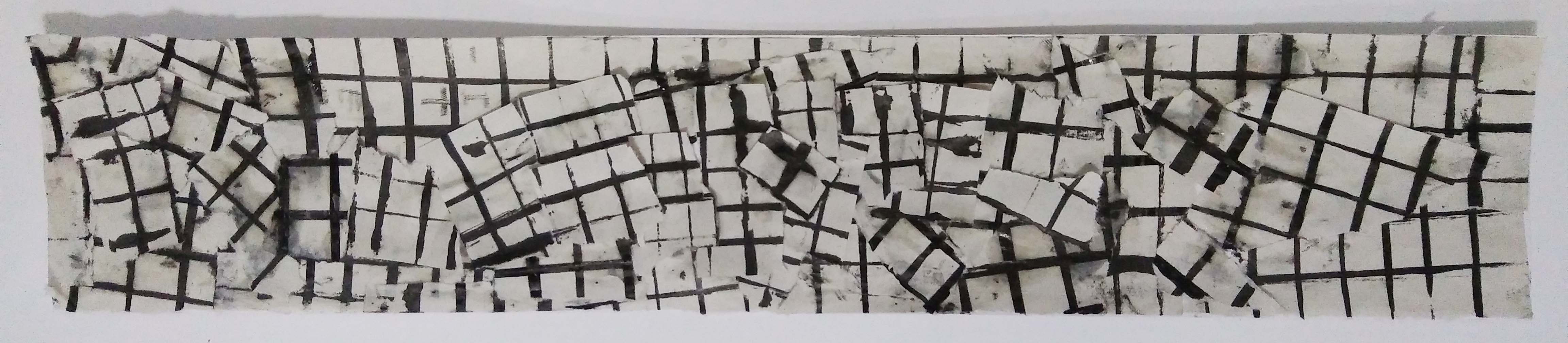
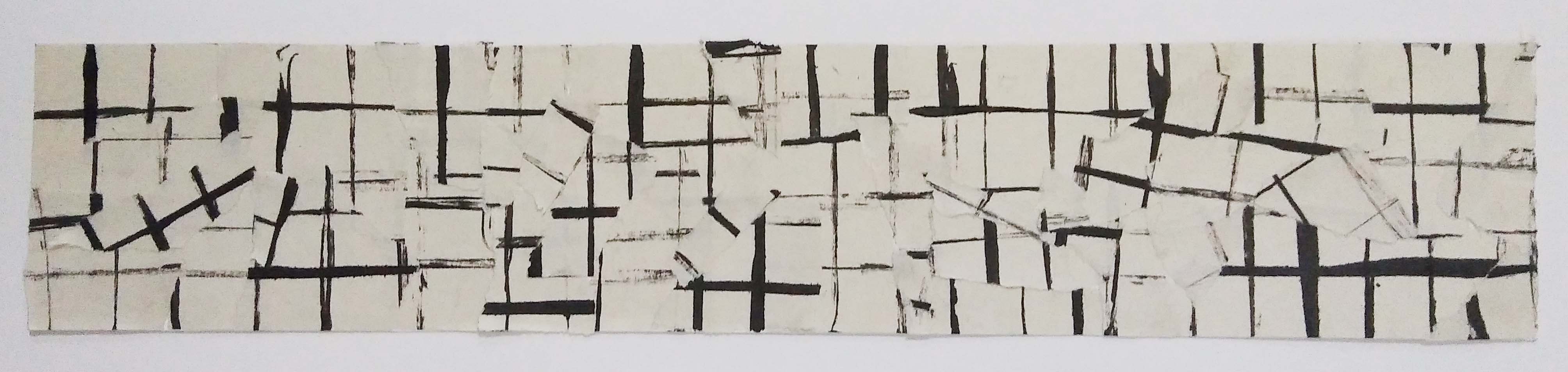
However, I did not feel the regret in the results. It looked more like confusion. The previous strip I did had much more impact than these two.
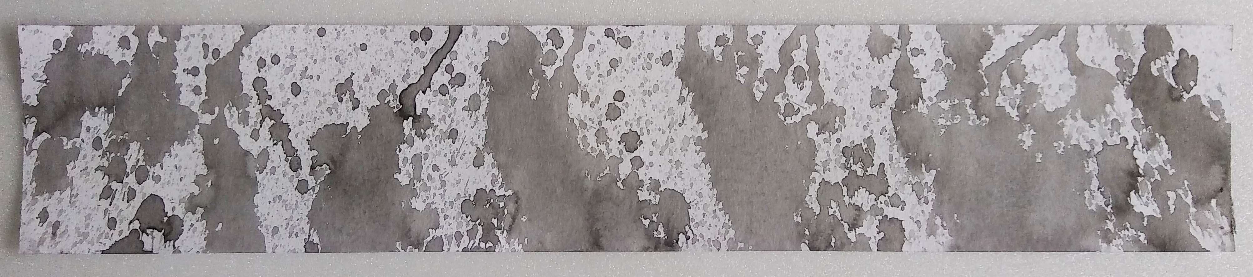
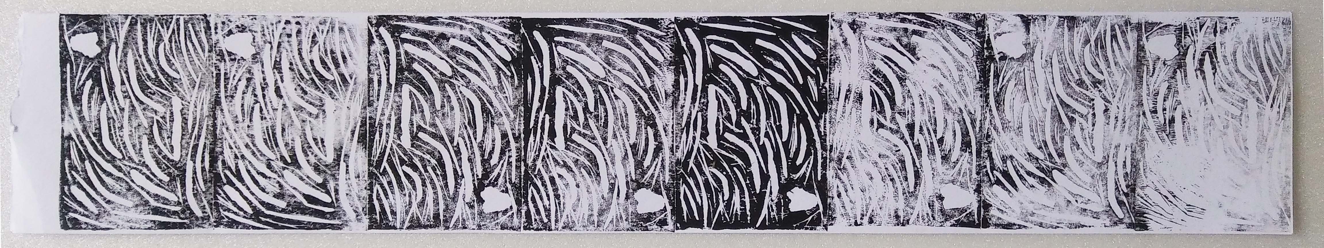
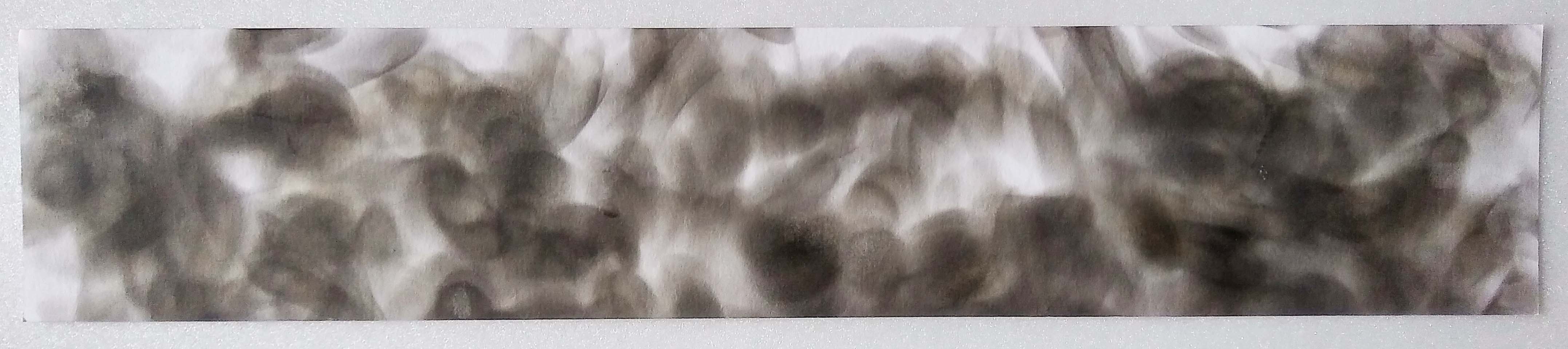
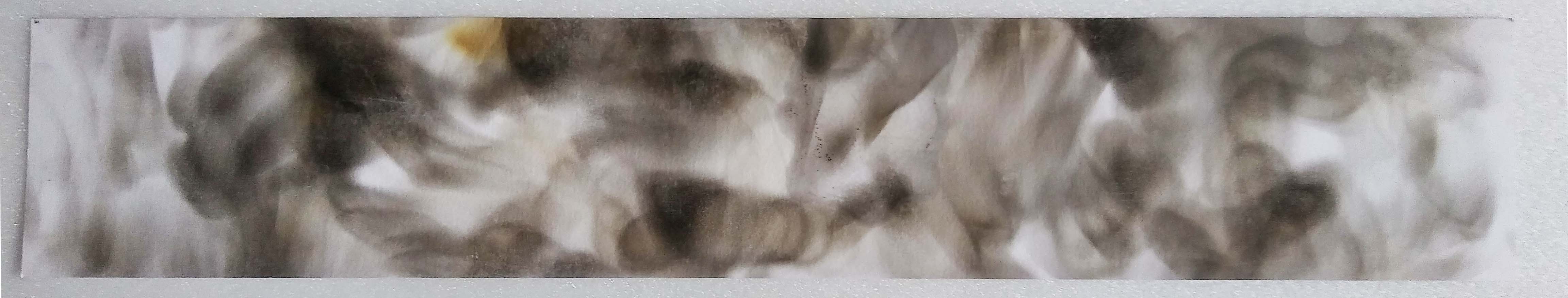
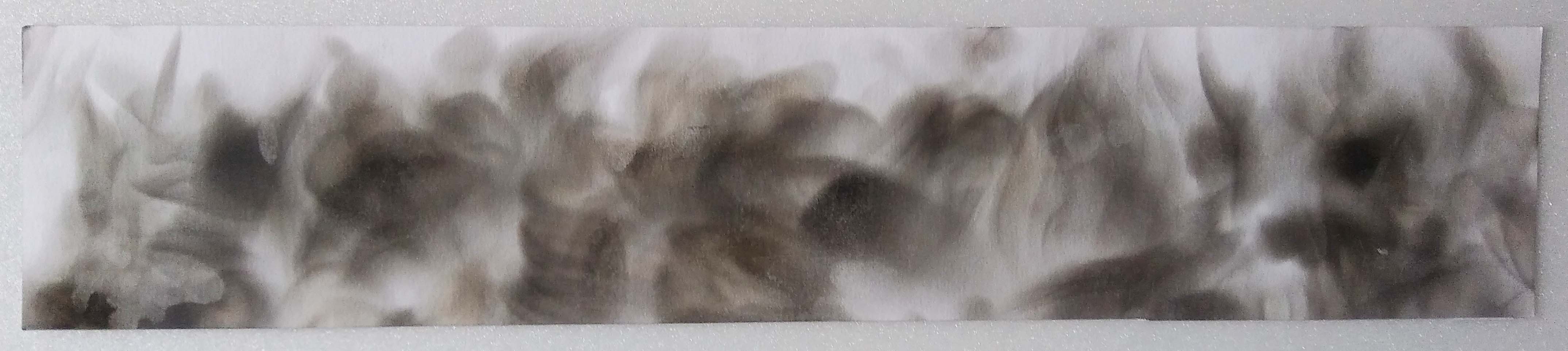
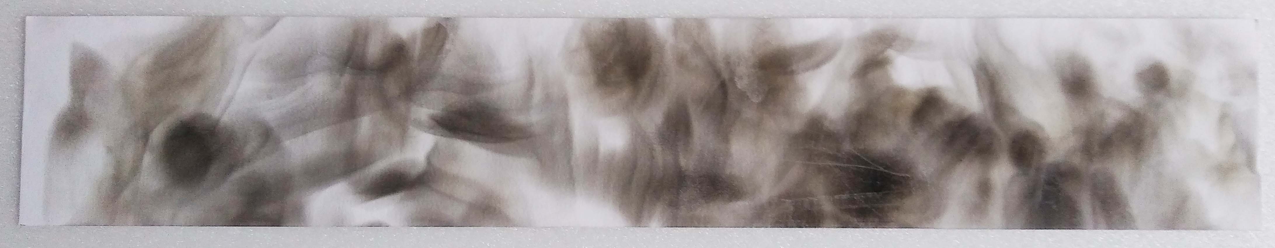
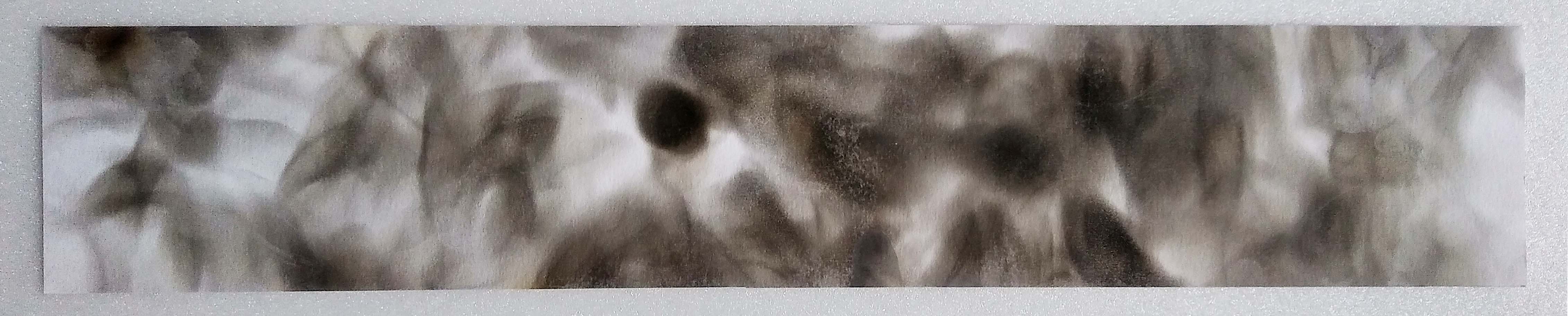
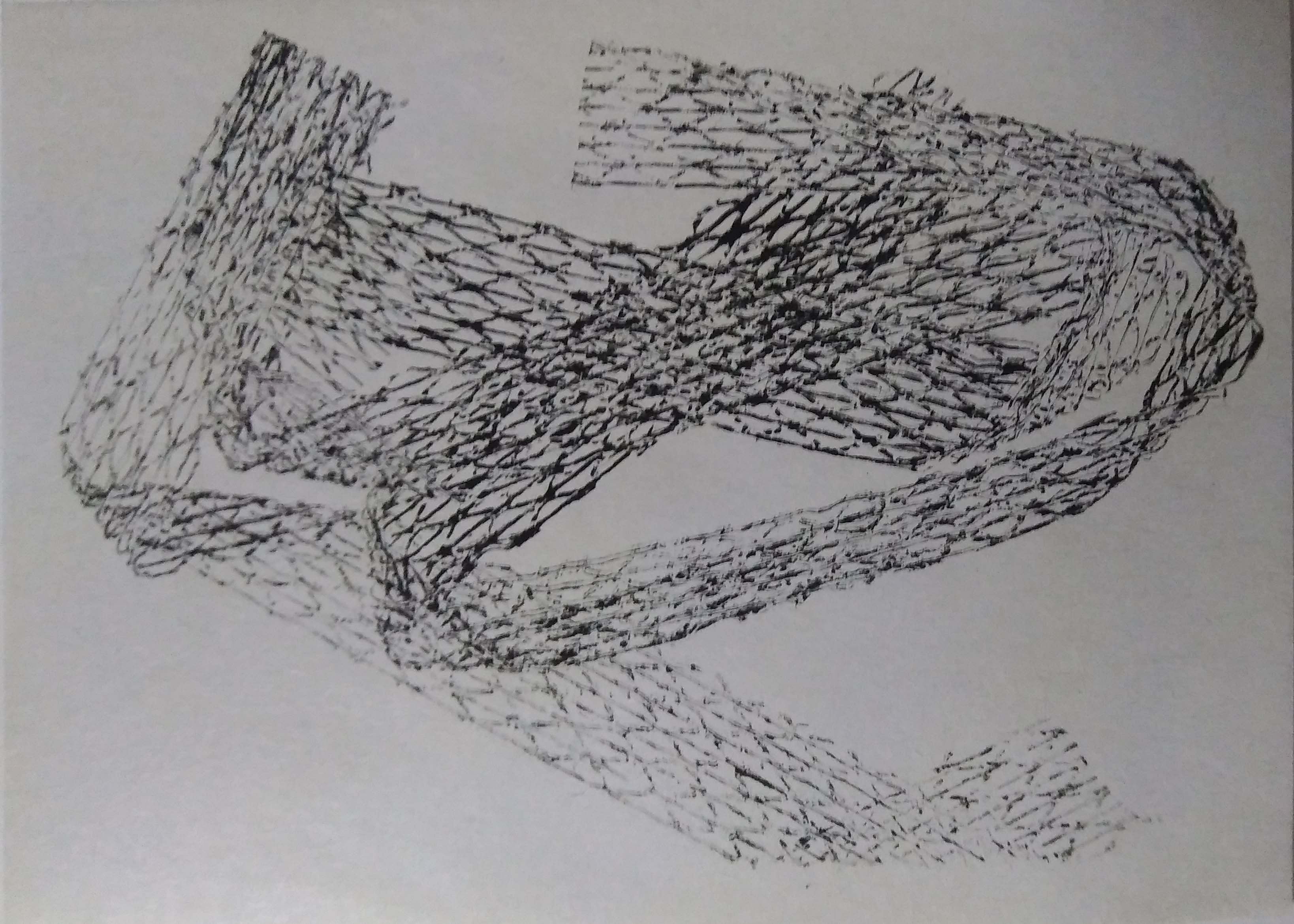
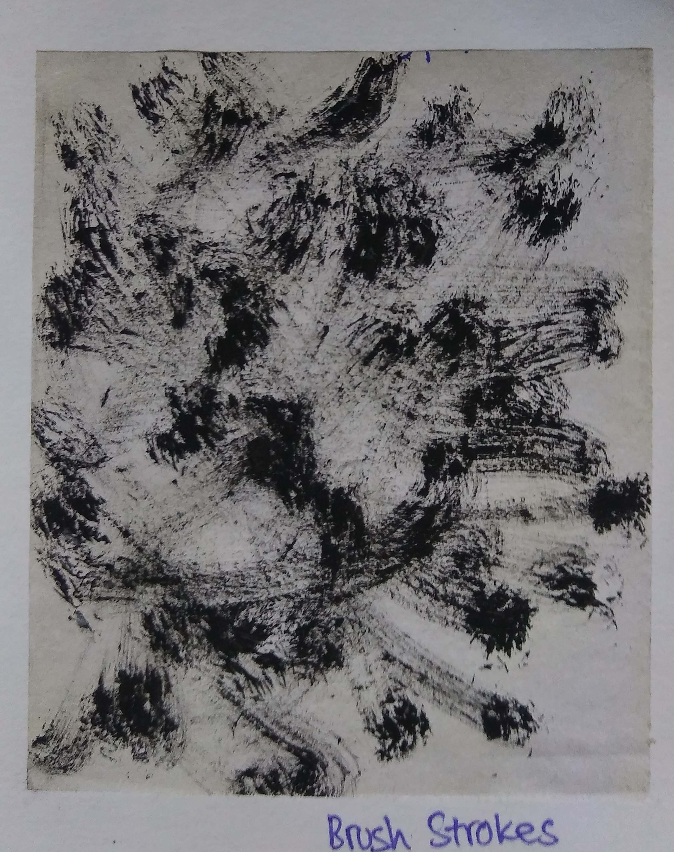
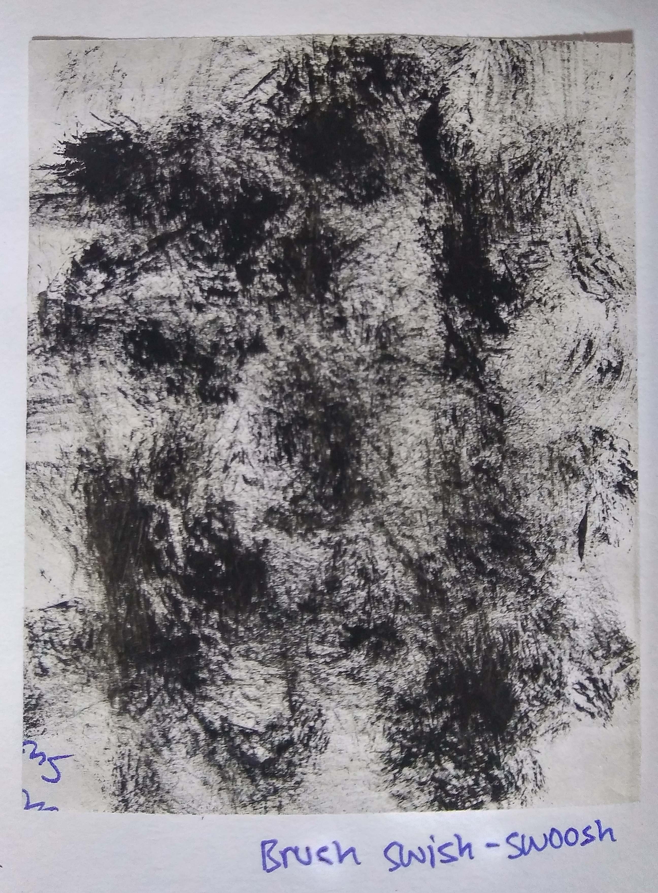
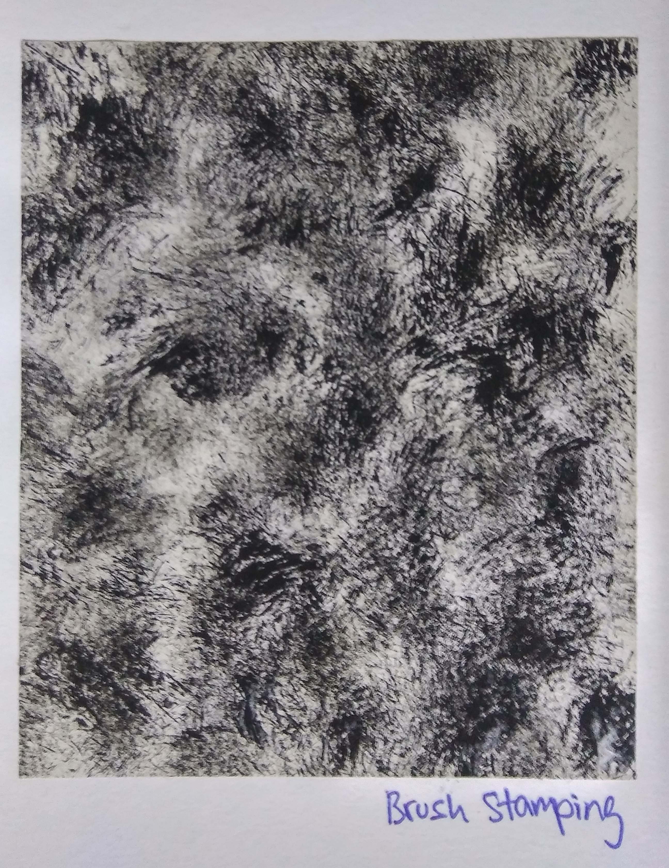
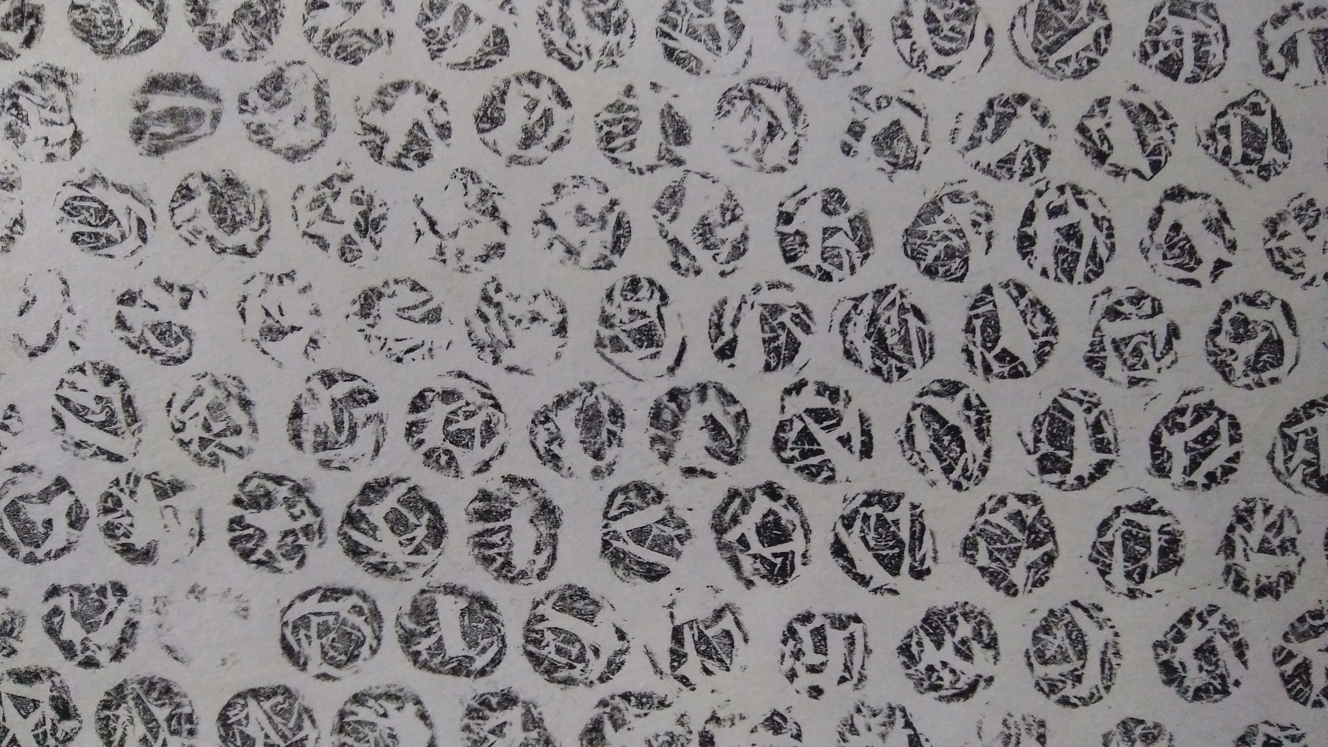
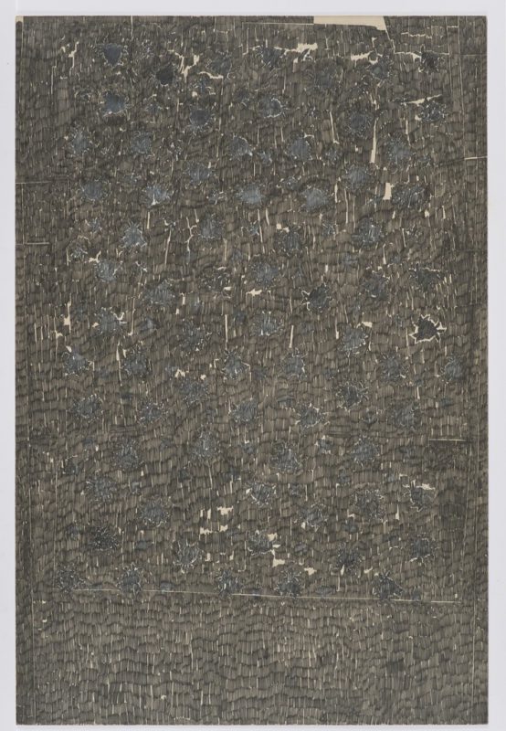
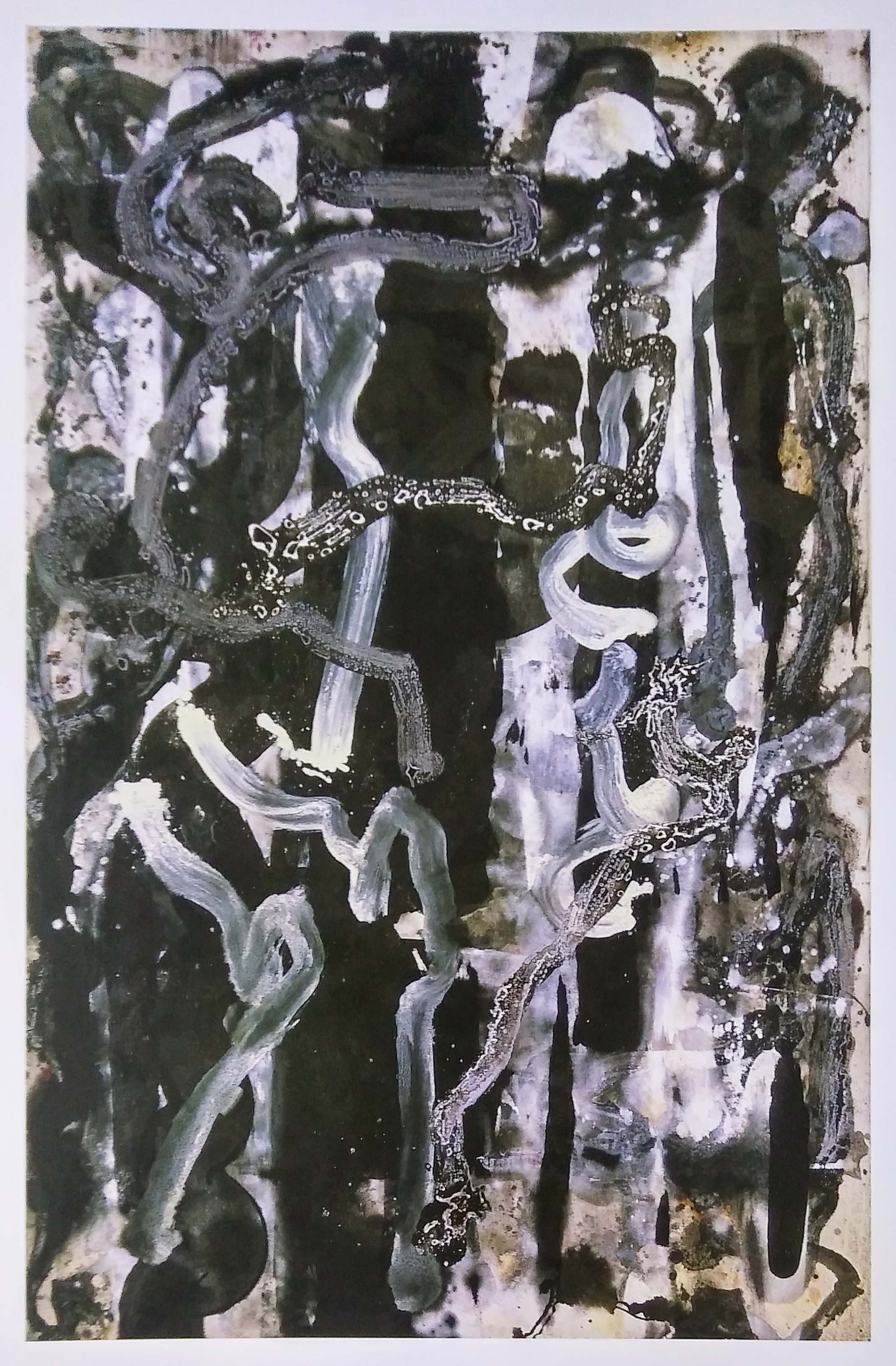
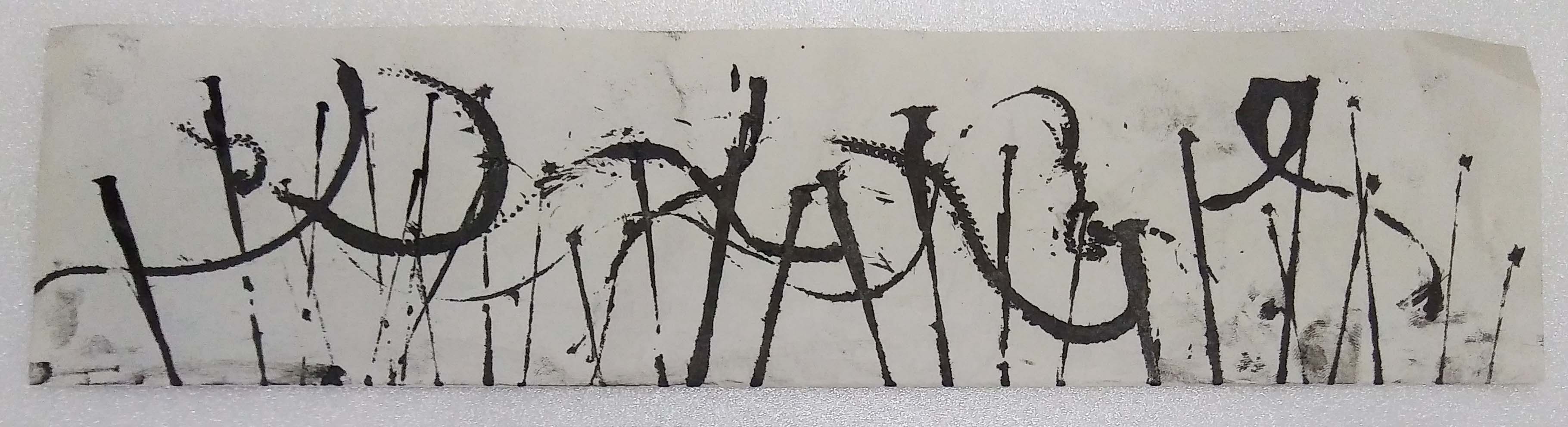
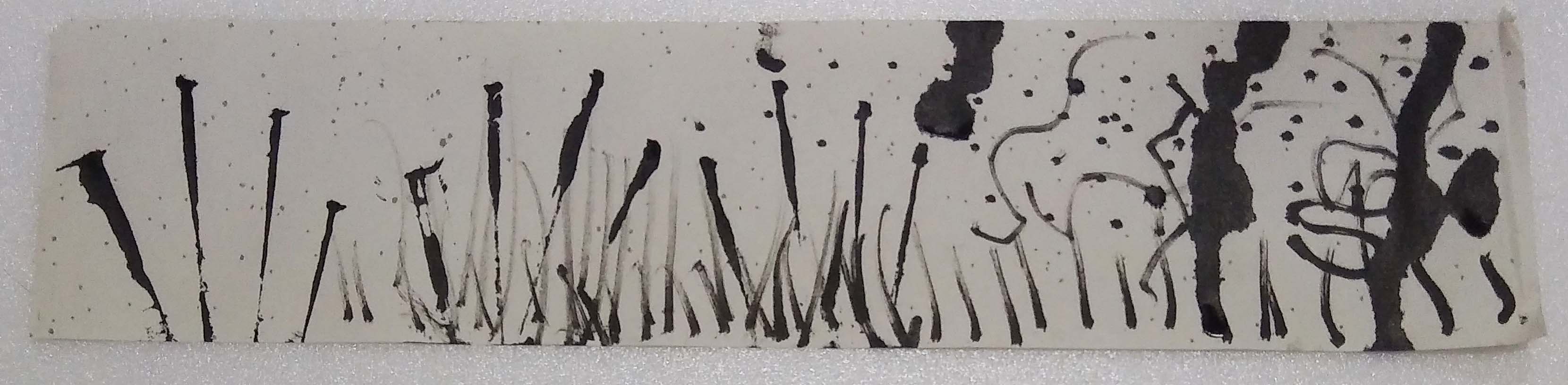
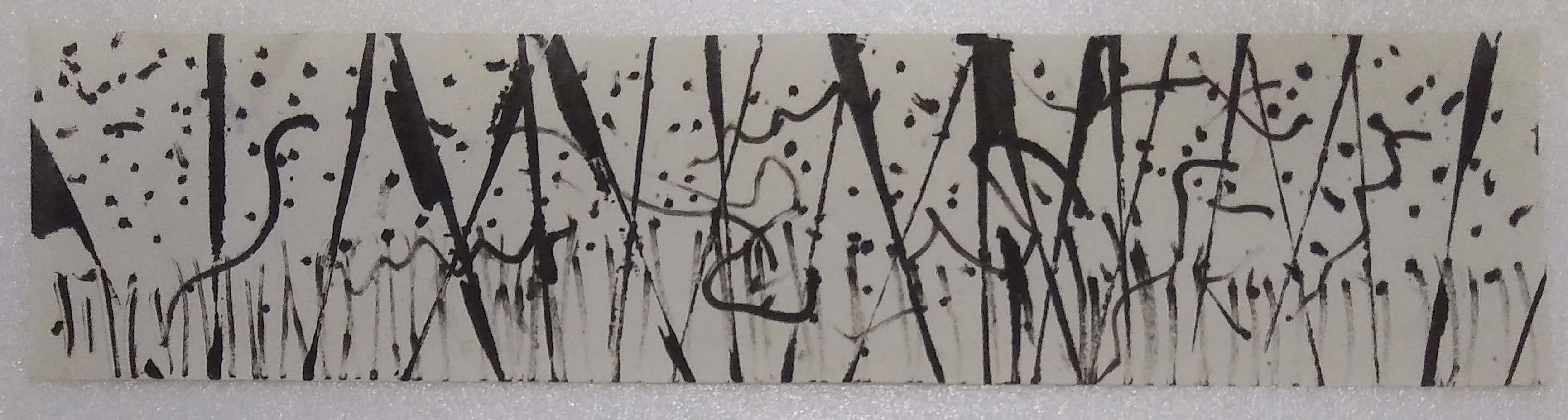
Fear

Concept: Fear when watching a horror movie. The moment the music indicate a jump-scare is coming up I get scared, my heart beat increases and I cover my eyes.  At the same time I want to know what the ghost or demon looks like. So in the end I cover my eyes and watch the movie at the same time; peeking through the holes between my fingers.

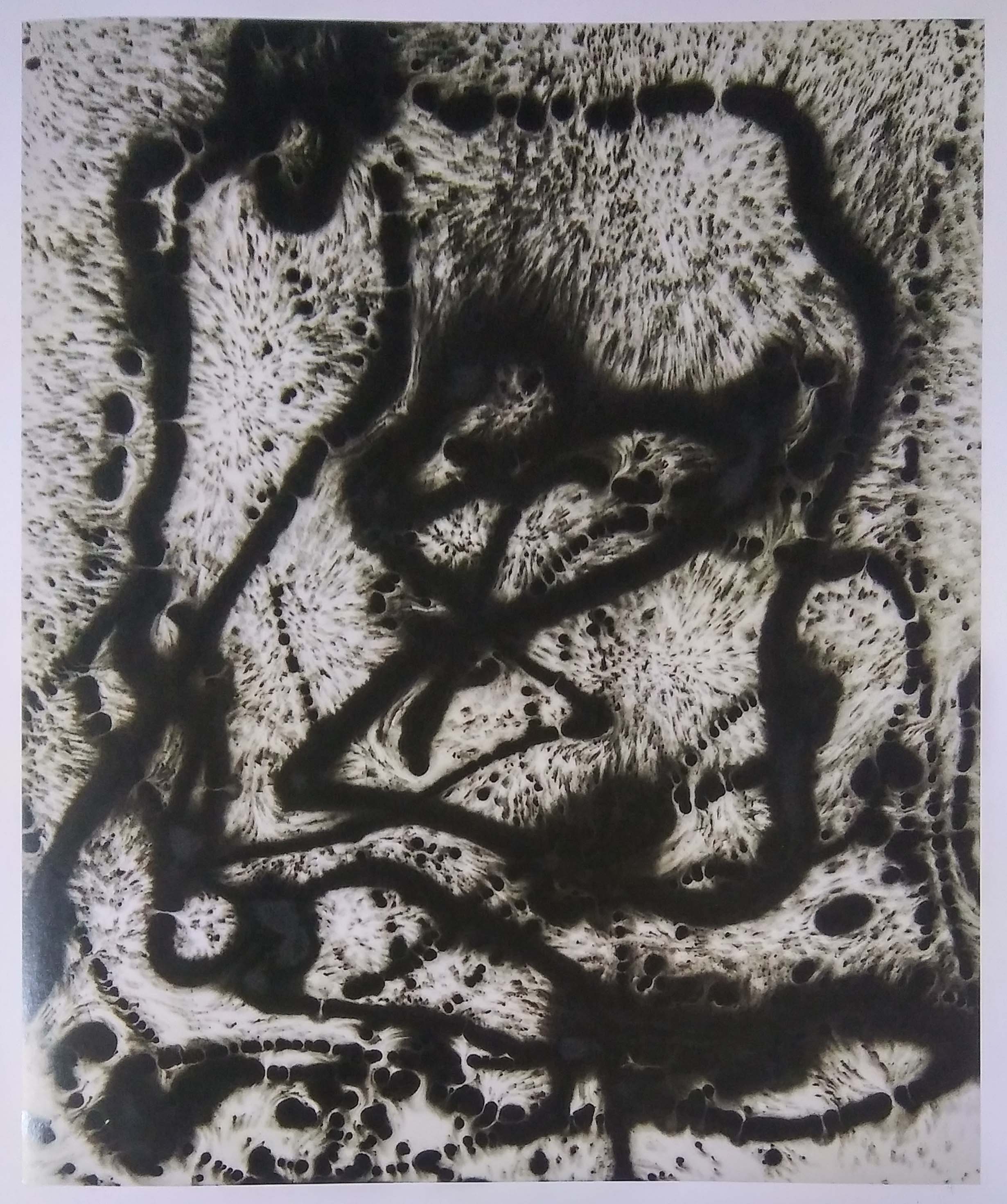
The other kind of fear that I want to portray is phobia, such as trypophobia – a proposed phobia (intense, irrational fear, or anxiety) of irregular patterns or clusters of small holes or bumps. When I see a trypophobia triggering image or object, shivers run down my spine, I get goosebumps and my hair stands.

(I am going to try both and see which is looks more interesting)

Idea:  irregular horizontal lines? But horizontal lines means peaceful, even. Jaggered horizontal lines? Fan out lines to represent peeking out through fingers? For the second interpretation I could include the basic shapes – cluster of circles, trembling lines and vertical lines.

Results:

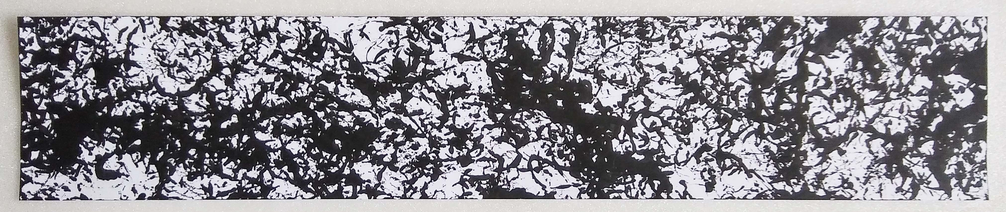
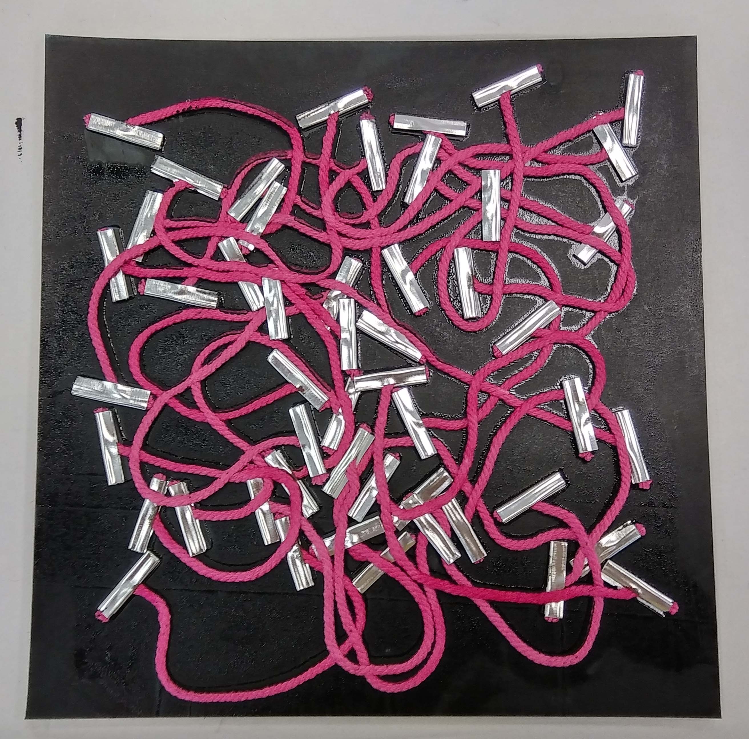
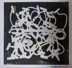
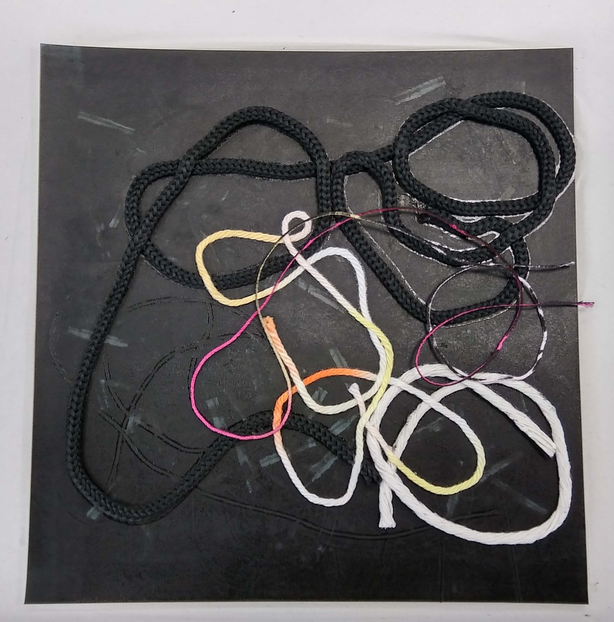
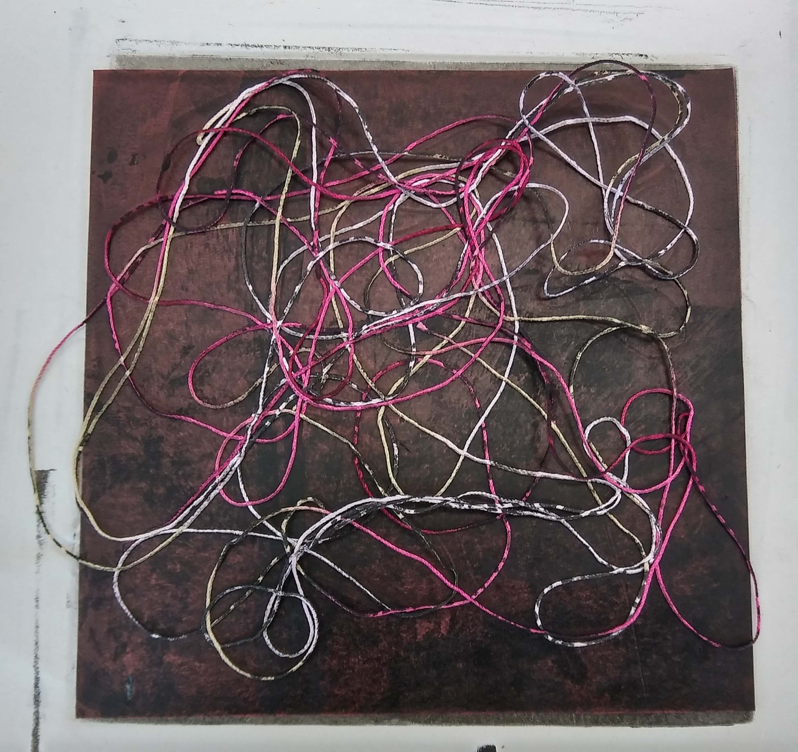
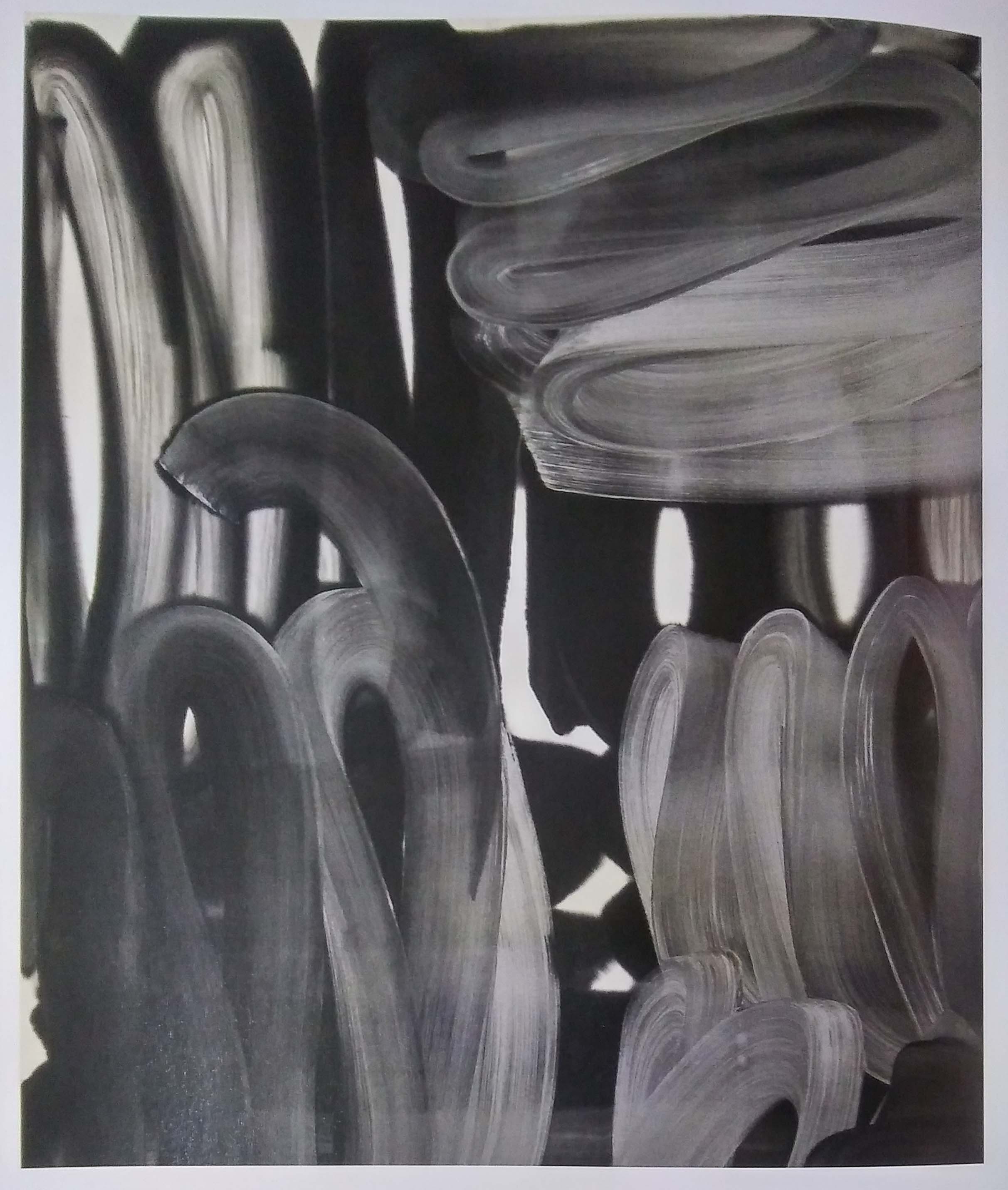
I was trying to depict my fear of worms. Using strings dipped in ink to create the curve squiggles and satay stick to make the ‘handprints’. Iteration 1 looks quite interesting but it does not go along with my story.
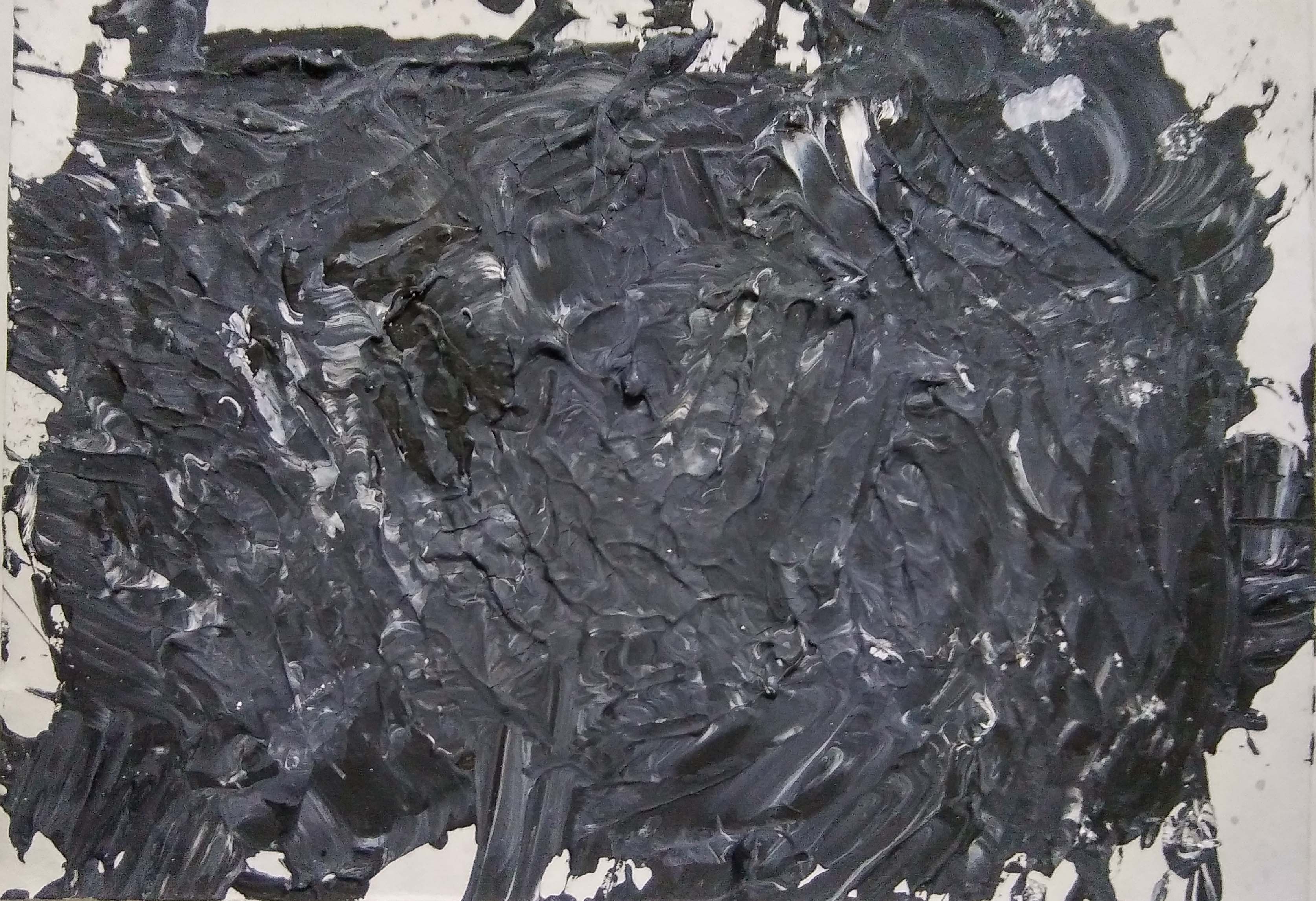
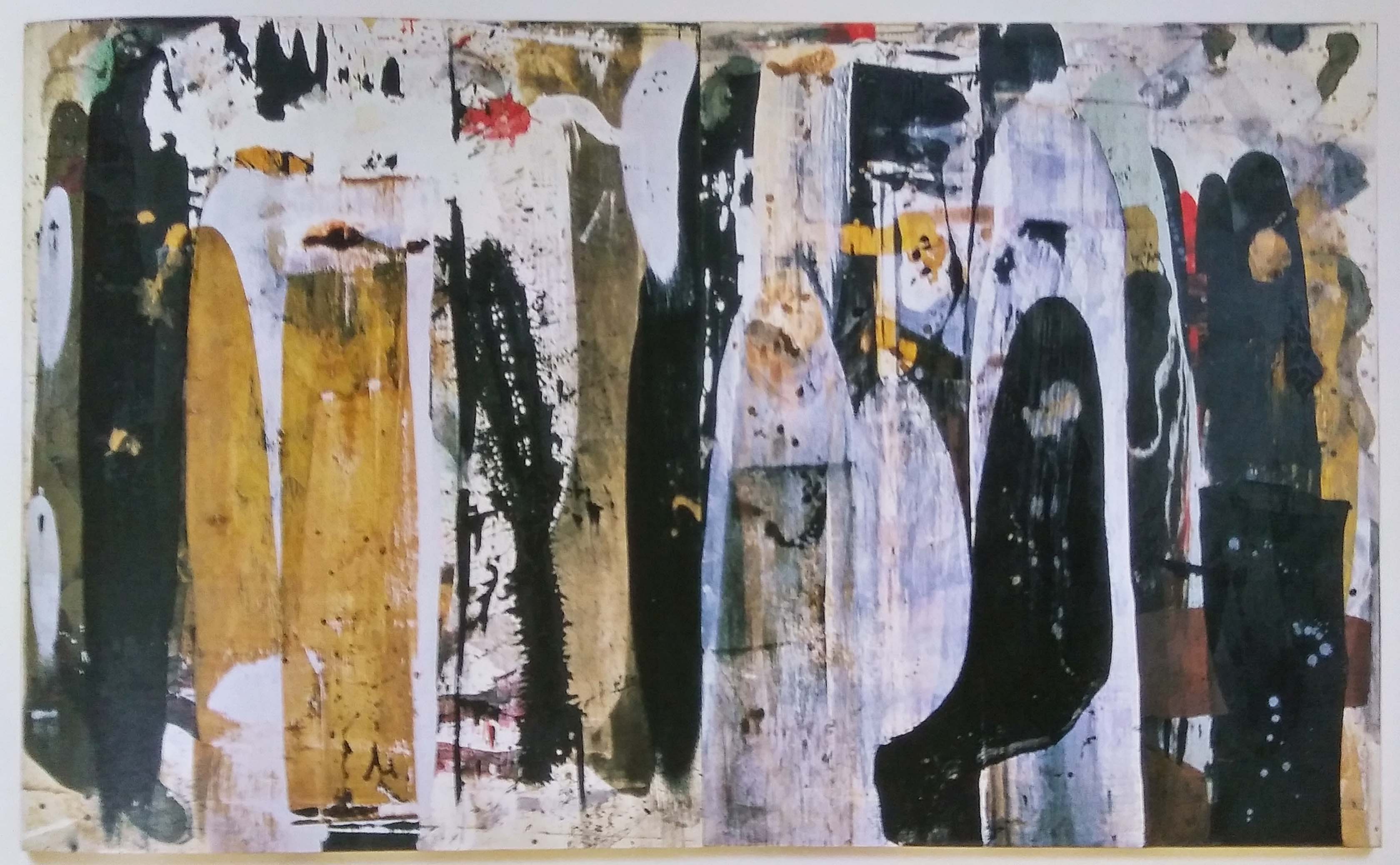
Iteration 1
Iteration 2
Iteration 3
Iteration 4
Iteration 5

Anger

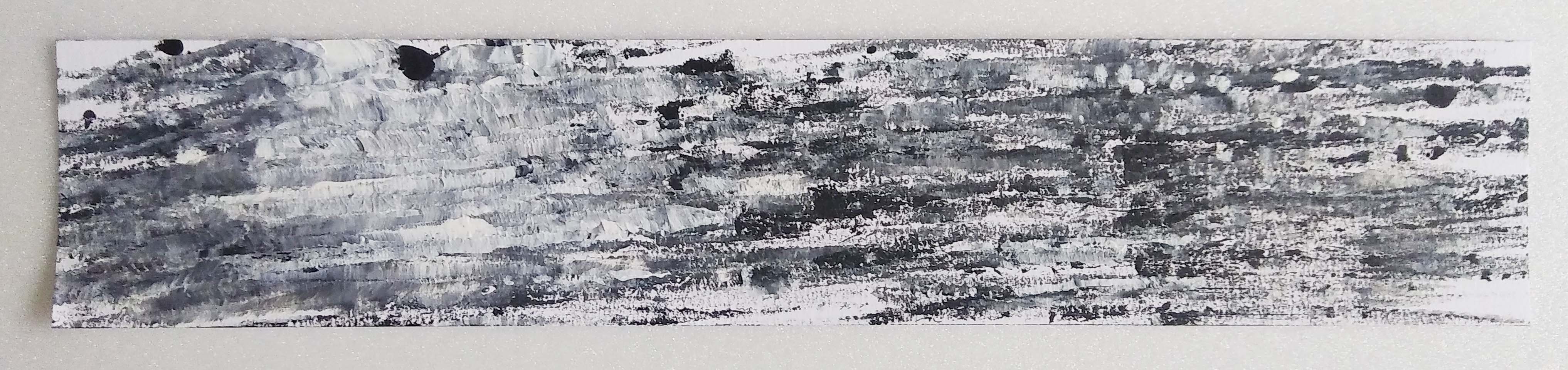
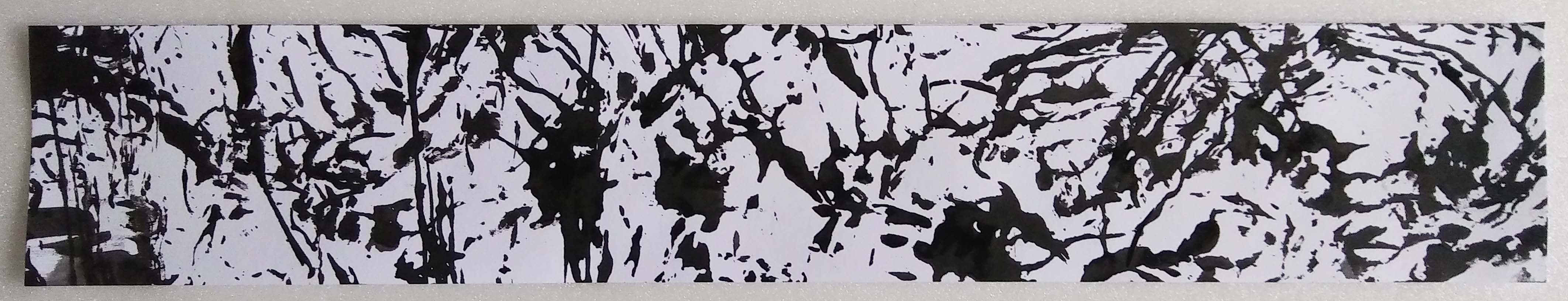
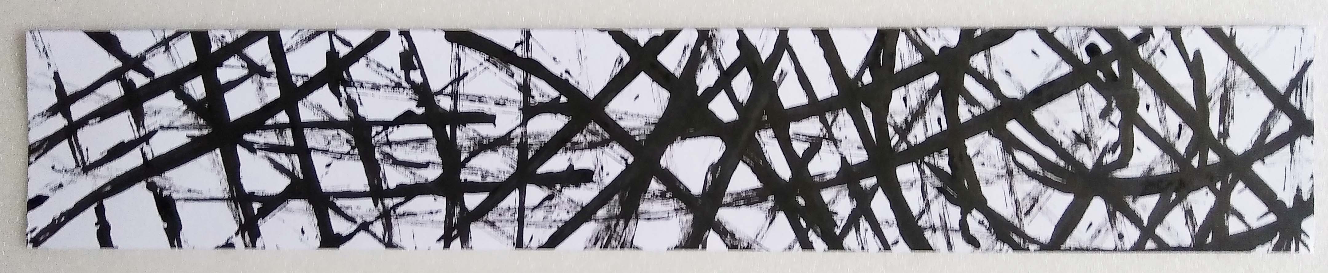
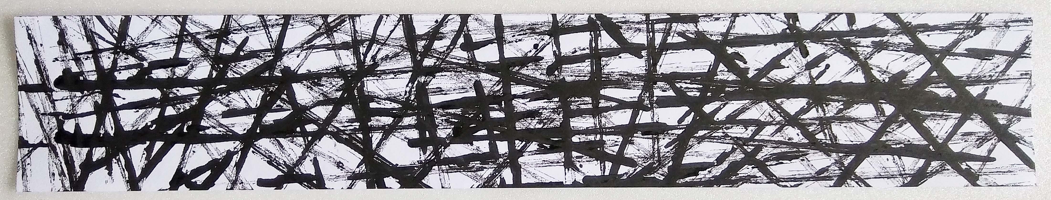
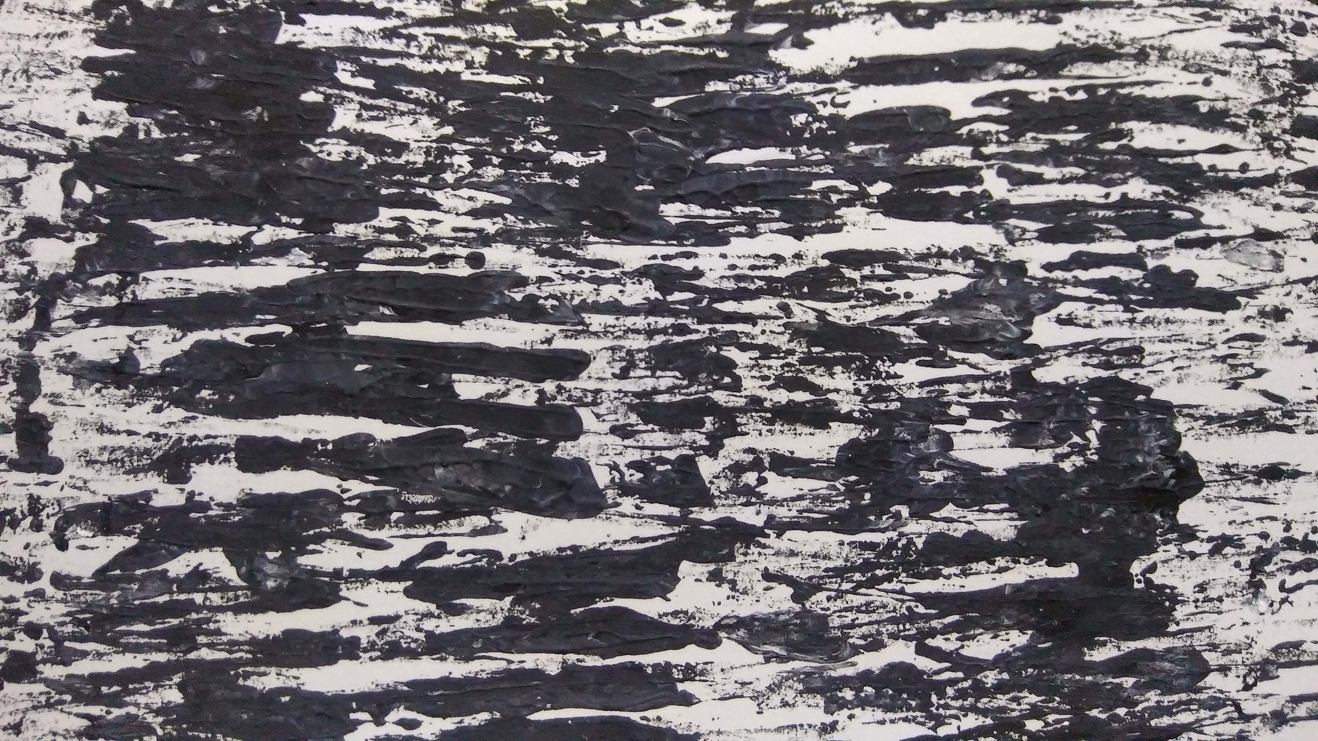
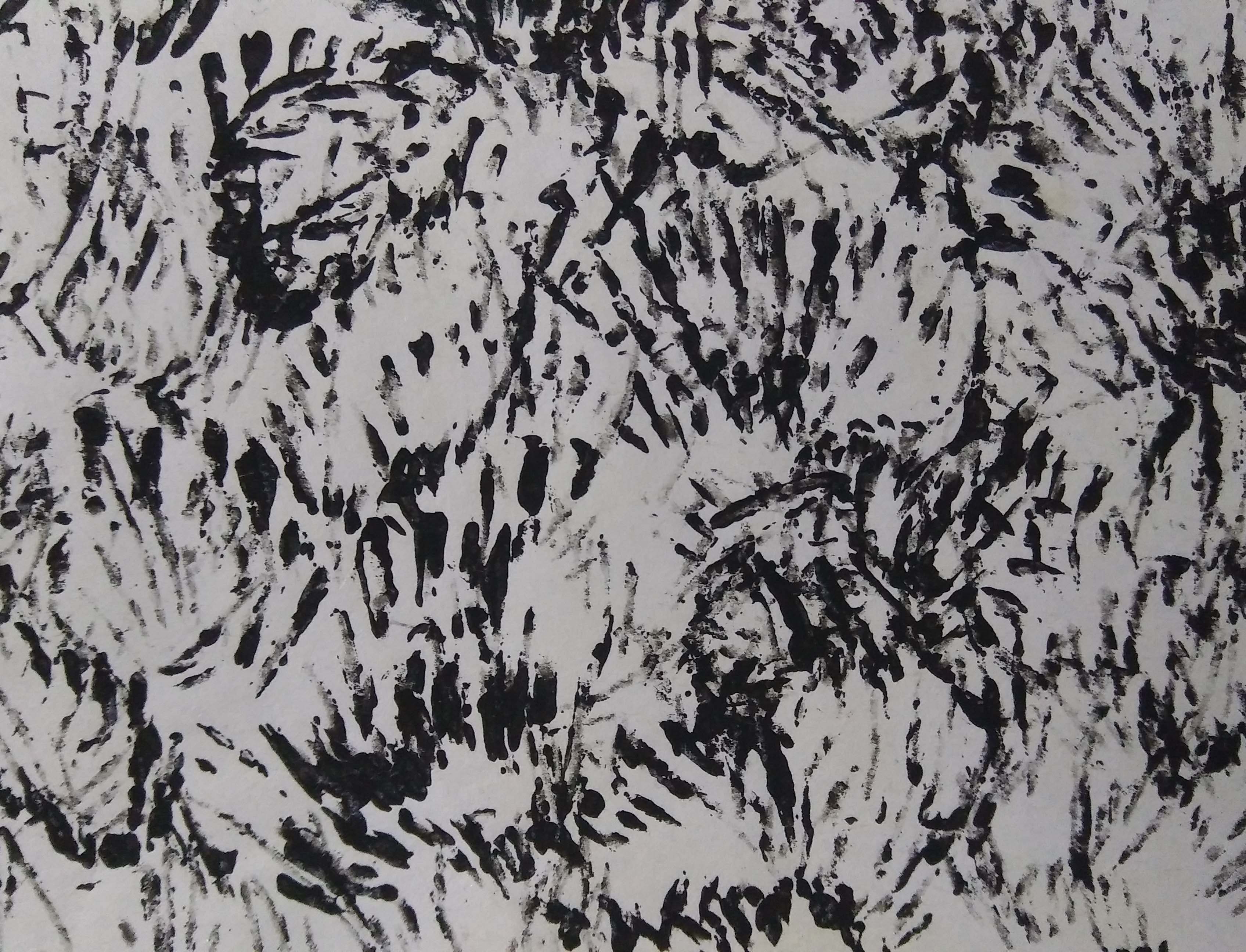
Concept: Natural reaction of anger is to lash out. The image of parents disciplining their child is what comes to mind. It is a form of ‘love’ but many would agree it is mostly out of anger and disappointment than love. It is a destructive and controlling emotion. When you are angry you are not in the right set of mind. You urge to shout, scream, punch etc to vent your rage.

Idea: My first thought to translate this feeling is to just directly do the same on paper. To cane the paper. Use hanger or belt? Feather duster. Ruler. Then the medium would have a hazy background representing the absence of common sense. The point would also result in a textured surface? Instead of using paper I could use tender fabric? Is there even such a thing? Tissue paper perhaps? Butter paper? No butter paper is not white/black. Tracing paper. I could use some crepe paper; they are easily torn.

Result:

Caning on crepe paper on the floor
Caning on crepe paper suspended
Caning on tracing paper suspended


Next Post: https://oss.adm.ntu.edu.sg/ytan149/?p=488&preview=true

My Line is Emo: Some Idealization and more Experimentation

At this stage I was still pretty confused with what I wanted to do. So I made multiple patterns with different objects that I found around my home. Thus almost all of them look like ‘fabric prints’, with no actual narrative and composition. 

Tenseness

During consultation everyone agreed that this depicts the feeling of Tenseness. To portray the emotion, I used satay sticks dipped in Chinese ink then carefully press it onto the paper at different angles. It looks like war zone with spears sticking out of the ground everywhere or a laser security system. We interpret the diagonal lines as twisted or warp state of mind; something is not right kind of feeling.

Surprise
Surprise (Rejected)

I see surprises as an explosive emotion. The shock you feel happens in an instant; then it fades away. The second piece was rejected as it does not fit the description as well as the first.

Regret

When I feel regret, I desperately want to turn back time and amend my mistakes. But since there is no such thing as time travelling, the only thing that I could do is patch things up the best I can. However no matter how well you try to fix it, it’ll never be the same again.

I tore a piece of print I made smearing Acrylic paint with a plastic bag. Then paste it onto the strip while purposely leaving empty spaces to be patch up with bigger pieces.

Love

I made this piece with the intention of positive emotions. Using a satay stick, I spread the paint in a wavy motion diagonally. Mixing the black and white, sometime more black and sometimes more white to show the happiness and disappointments in love.

Attraction (Not really)

I tried connecting two blotch of paint from different ends to depict attraction. Maybe it is too direct? Too simple? There is no narrative behind it thus it is somewhat boring.

Disgust (Rejected), Love (Suggested)

I thought these pieces described Disgust because of the veins and holes in the paint. But others do not agree because of the fluidity of the veins, how gentle it looks and the gradient from the mixed paint.

Disgust (Rejected), Joy (Suggested)
Joy (Not sure)

At first I thought this could show disgust because of the multiple ‘holes’; trypophobia triggering. But I guess the concept is not strong enough because normally we associate bubbles with joy and happy children trying to pop them. I also think the bubbles create a dreamy effect which could also show Tranquility.

Irritated (Rejected)
Annoyance (Rejected)

These are what I imagine my mind to look like when I feel irritated or annoyed. Being irritated is like hearing this continuous buzzing that would not stop and would keep building up in your head until you burst out in anger. Being annoy is also the same concept but much stronger than being irritated. Both were rejected because of the lack of dynamics, narrative and composition.

Next course of action: 

The next step I am going to take is to think about the narrative and composition of the emotions. What is the story behind my strip? How does it describe the emotion? What part of anger do I want to represent in my strip?

Also the use of materials/ medium in my concept. Maybe explore the different kinds of paper? Handmade paper was suggested in the consultation to achieve a very textured paper. For anger perhaps I could just texturize the paper by beating the crap out of it?

Other rejects:

Next Post: https://oss.adm.ntu.edu.sg/ytan149/my-line-is-emo-development/

My Line is Emo: Research and Experimentation

“The notion of origins, the promotion of inexpert forms of expression, as well as the “discovery” of the uncharted subconscious realm as unveiled by Sigmund Freud, unleashed a creative frenzy in the era of surrealism and resulted in the invention (or reinvention) of many drawings and drawing-based techniques: Automatic drawing, …” (Jones, 10)

English translation by Hollo from “On The Veiled Swings” by Jean Arp

The book ‘talks’ about chance drawings and collages with the example of Jeans (born Hans) Arp, a German-French poet, artist etc. He had a peculiar way of writing his poems where he would “close his eyes and randomly underline words and sentences in newspaper articles and advertisements that would become the foundations for his poems.” (Jones, 19)

Jeans (born Hans) Arp, Germany, 1886-1966, active France and Switzerland, Automatic Drawing, 1917-18, Ink and Graphite, 16 3/4 x 21 1/4 in. (42.6 x 54 cm), The Museum of Modern Art, New York, given anonymously

“For Arp, chance manifested the order (or disorder) of nature to which he aimed to connect, rather than his unconscious. His so-called automatic drawing beginning in 1917, for example, are derived from his wanderings in nature, not from the wanderings of his mind. Drawn after his habitual nature walks, the works capture Arp’s recollection of trees, branches, and other plant life.” (Jones, 19)

“Essential to the process was speed. “When one goes very quickly, the drawing is mediumistic. as if dictated by the unconscious.”” (Jones, 25) So the faster you draw, the less you think. Therefore the drawing is more from one’s sub-conscious.

The Birth of the World, Joan Miró, Spanish,1925. Oil on canvas, 8′ 2 3/4″ x 6′ 6 3/4″ (250.8 x 200 cm), https://www.moma.org/learn/moma_learning/joan-miro-the-birth-of-the-world

In the same page it also mentions Joan Miro. The “loosely drawn and schematic nature functions like multivalent pictograms or signs; that is a single form may connote several different meanings.” (Jones, 27)

After gaining some knowledge of automatic techniques, I became very eager to try them all out.

Strings: 

This is the first mono-printing I did. I just played around and see what effects it would create.


I tried putting crochet flowers in to see if the ink would penetrate the tiny openings. They did not; perhaps because the strings were knotted too tightly.

Here I tried with strings of different thickness.

… and strings of a single width…

Net: 

I thought mono-printing a net would result in a print of a net because the ink would have passed through the holes of the net. But that did not happened; with and without the printing-press.

 I was able to achieve the print of the net only by inking it and pressing it under the printing-press.

Brush:


Bubbles:

Bubbles bring about a dreamy effect. They are related to positive emotions; I could use them for Joy, Love or Surprise.

Fork:

I did not expect the stamping of a fork would look this terrifying and intense.

Seashells:

These are prints made from the stamping of seashells that I picked from a beach in New Zealand long ago.

Automatic Techniques:

Decalcomania

I made an attempt with pressing paint between papers that mixes the paint and creating interesting vein-like texture.

Fumage

I was very interested in the Fumage technique and wanted to try it for myself.

Miscellaneous:

Here I tried to make the impasto textured effect with acrylic paint and a fork. The attempt to keep the swirls of black and white was a failure; and it was not as textured as I liked it to be.

Next Post: https://oss.adm.ntu.edu.sg/ytan149/my-line-is-emo-some-idealization-and-more-experimentation/

Reference:

Jones, Leslie, 2012, Drawing Surrealism, Los Angeles, CA : Los Angeles County Museum of Art ; Munich : Prestel, [2012]

My Line is Emo: Ed Moses

I was going through all the artist reference listed in the project brief and Ed Moses’s drawings really stood out to me. The images that turned up when I googled “ed moses drawings” really drew me in and my mind sparked ideas for the project.

However I found that it was quite a challenge to search information online. Everything was so private since the museums did not give anything away. So I went to the ADM Library to borrow the Ed Moses book which was much easier since it had all that I was looking for. The book allows a more intimate connection between the reader and Ed Moses because of the interviews recorded in it.

From what I have gathered, Ed Moses does a lot of experimentation on materials and techniques in his work. He is constantly taking risks, trying out new materials and testing new forms; moving away from his comfort zone.

“Untitled (Hegeman Series)” , 1970| acrylic, resin & masking tape on canvas| 77″ x 95″| Collection of Cedd and Pamela Moses

https://vimeo.com/176224264

Ed Moses used resin for his Hegemann Series and I thought it was really interesting. In the book he stated that by putting the canvas face down on a big Mylar table, he could pour resin on the backside and it would bleed through the canvas out to the edge. He would then put fiberglass cloth around the edge to give it some structure. When it dried, he would peel the whole thing off and the result will be a surprise. The resin embedded in the canvas, as were the snap lines- they turned out shiny in some places and flat in others.

Why do you paint on both sides of the canvas?

That was what Frances Colpitt, a professor and Deedie Potter Rose chair of art history from Texas Christian University, asked Ed Moses. He mentioned of his discovery of ‘ghost’ painting when he reversed the canvas and the ghost images came through, which he liked a lot. So he wanted to put some kind of mark to it that indicated he made it, rather than being ‘found’. His idea of these ‘ghost’ paintings really intrigues me. It is like recycling an artwork when you don’t like it. Or creating a 2 in one.

Below are some of the works that I picked out from the book.

Rafe Bone, 1958| Oil on Canvas|72 7/8″ x 65 1/2″| Collection of Hanna Finkelstein, Los Angeles, CA
Rose #6, 1963| Graphite and acrylic on Strathmore board| 60″ x 40″| Collection of the artist
Cut Place #4, 1966|Graphite and paper foldout|13″ x 16 3/8″| Collection of Avilda Moses, Ojai, CA
Pulled Warp, 1972| Acrylic and masking tape on canvas| 66″ x 78″| Collection of Murray and Ruth Gribin Family Trust, Beverly Hills, CA
Broken Wedge A/1, 1973| Rhoplex and pigment on laminated tissue|84″ x 72″|Collection of the artist
NY Trac, 1974| Acrylic and tissue on nylon| 72″ x 84″| Collection of the artist
Red W-L, 1982| Acrylic on wood panels| 84″ x 122″| Collection of the artist
Bak, 1988-89| Acrylic and oil on canvas|96″ x 60″| Collection of the artist
Cocoteni, 1989| Acrylic and oil on canvas| 78″ x 132″| Collection of Fabian Carisson, New York, NY
Ranken #2, 1992| Acrylic and asphaltum on canvas| 60″ x 48″| The Molly and Walter Bariess Family Collection
Bozook, 2002| Acrylic on canvas| 96″ x 120″| Collection of the artist
So-Wh, 2004| Acrylic on canvas| 72″ x 60″|Collection of the artist
Cta-Hola, 2006|Acrylic on canvas|78″ x 66″| Collection of Jayne D. Murrell, Newport Beach, CA
Double, 2007| Acrylic on canvas| 72″ x 60″| Collection of the artist


Next Post: https://oss.adm.ntu.edu.sg/ytan149/foundation-2d-my-line-is-emo/


Curating Self: Final

Task 1: Object and representation of self

I had been playing the violin for as long as I could remember; from the age of three to be exact. Going for lessons every week for 17 years has made the instrument become a part of me.

Opportunites

It really opened many opportunities for me. During my learning years, I got to travel to many countries such as Australia and Korea. Also by completing all 8 Grades meant that I could teach the skill to others in the future.

With a medium shot I was able to show the enjoyment I had from the oversea trips through facial expression. I also chose to take the horizon of the sky and ocean to represent the countless possibilities that I could do with my musical skills.

Lonely

I started taking solo classes instead of group classes because everyone in my group class was advancing at lightning speed. I ended up lagging behind. Being not talented at all and I felt left out.

Taking a long shot from a high vantage point gives a sense of isolation. Translating the feeling of loneliness from being left in the dust by child prodigies. The waves and the beach creates a contrast in texture. Those kids were already sailing the seas while I still tread on oncoming waves.

Trapped

Playing music was really fun but learning the Violin was not easy. It hurt my jaw, my hands cramp up, the Rosin made me sneeze, most likely the noise I made was unsatisfactory. I felt trapped by my extremely slow improvement.

I decided to make use of tonal difference with lighting to depict this emotion. A contrast is created between the background and the foreground. The background being bright and colorful while the foreground is much more dark and dull.

Task 2: My World

During my childhood my family often came to West Coast Park for picnics on weekends, sometimes with friends or relatives. Having not been there in a long time and thought to take the chance to visit the park. I wanted to capture the  fun and energy of the place.

Volleyball

As the shot captures the players in the middle of motion, we tend to anticipate their movement.

The foreground, middle ground and background in this photo are very clear-cut. The people playing volleyball in the foreground. The trees in the middle ground and the sky in the background. These create some depth to the photo.

The Pyramid

I took this as a framing shot through the hexagonal shape made by the ropes. Then I thought it was a perfect example of multiple viewpoints with the lines criss-crossing one another. It made the photo quite messy but the boy in blue attracts attention and guides your sight from right to left.

Cycling Family

This is a one point perspective from taken from eye level. It also communicates movement with the swaying bicycles. There is also some depth to the image due to the converging lines.

Scattered Belongings

This image does not communicate much energy but I thought it was interesting that people would leave their belongings scattered around the field. As if to say they were carefree and had so much fun that they dumped their things wherever they like. Also that the place is friendly and safe enough to do so.

Curating Self: Task 1 Process

When looking at a photo we ask these questions:

What techniques were used?
What visual elements make up the photo?
How do the elements work together?
How the image is composed?

Photo manipulation techniques  – http://www.coursera.org/learn/exposure-photography/lecture/bGm8S/responding-to-photographs

In this project I try to experiment with the basic techniques of photo manipulation:

Framing and cropping is use to include or exclude details that may change the meaning of the photographs. By moving the frame of the camera or cropping an image, the creator controls and defines the content of what we see.

Subject Distance refers to the proximity of the camera lens to the subject. The closer the camera move in, the viewer becomes more involved with the details such as texture, expressions, while becoming less involved with the surrounding and environment of the subject.

Vantage Point or angle determines the position where the camera is place before a shot. By varying the angle of shot from above, below or at eye level can result in interesting images that could distort, manipulate or offer visual pleasure and surprise.

https://www.coursera.org/learn/exposure-photography/lecture/CuNoe/the-effects-of-vantage-point-choices

Vantage Point:

Long Distance + Vantage Point:

Long shot taken from a high vantage point
Cropped chosen photo

By cropping this image I eliminate the people in the background making the photo much cleaner and the tone of the photo becomes lighter. Leading the viewer to think that the photo was taken at an empty beach.

The long shot taken from a normal/medium vantage point depicts the subject playing out to the sea and sky. From this view it is as if the subject is envious of the freedom the ocean and the skies provide.

A long shot with a low vantage point here resulted in an empowering effect the subject. There is also some effect of framing from the clouds behind that helps to focus on the subject.

If i were to cropped the image and turn it into a medium shot, the original effect would be lost.

Normal/Medium Shot + Vantage Point:

I attempted this as a close up shot only to realize it is actually a normal shot because my camera can only zoom so far.

Close Up Shot + Vantage Point:

With this close up shot and angle, I was trying to capture the feeling of being trapped by my inferior skills of the instrument thus the darker tone.  There is also a drastic contrast between the inside (dark and monotone) and the outside (bright and colorful).

From the front much more emotion is revealed than the side. The instrument can be seen being held drooping downward much obviously than from the side.

The back view shows the difficulty and tension that goes into gripping the instrument between one’s jaw and shoulders. Otherwise, there is not much to be seen from this view.

Framing: 

Next Entry – https://oss.adm.ntu.edu.sg/ytan149/curating-self-task-2-process/

Curating Self: Catherine Opie

*TRIGGER WARNING* MAY CONTAIN EXPLICIT CONTENT

Catherine Opie is a social-documentary photographer. She was inspired to be one after encountering Lewis Hine’s images of child laborers from the early 20th century. Her interests lies in the relationship between the private and the public politics, the mainstream versus the infrequent. She was known for her works about the LGBT and BDSM community.

Pervert, 1994. Self Portrait.

Catherine Opie decided to wear a hood in this piece because she wanted the focus to be her body and not the distortion on her face. It is about the existence of the word “Pervert” and what it meant. The politics lie in the fact that she dared inscribe it on her body, it does not lie in her eyes.

Why would she do this?

This piece were made in reaction to the gays and lesbians coming out of the closets during that time. All the sudden appearance of homosexuals segregated society and Catherine Opie wanted to push the viewer’s boundaries of normality; challenging our cultural code for relationships.

Cutting, 1993. Self Portrait.

Catherine chose the background to reference seventeenth century paintings. The photo is took with intent of having a fruit bowl over her head, which queers the image with a little humor.

In her words “You’re looking at this juxtaposition of cutting of two stick figures, you know, women holding hands, with this comic fruit bowl over my head in the fabric.” https://transatlantica.revues.org/6430

According to the creator this piece was made after the break-up of her first domestic relationship and she was working our her ideas of longing. It is also a representation of what a queer child might make at school.

Oliver in a Tutu, 2004. From the series In and Around Home.

Not all her works that tackle homophobia are so intense. The above is a photo of her son in a tutu and tiara.

Catherine, Melanie & Sadie Rain, 1998. From Domestic series.

For the Domestic series, Catherine Opie rented an RV and spent three and a half months traveling the states.  She wanted to complete the story of domesticity in a show that she attended.

“One of the things I always think about is who I want to have conversations with, what does it mean to create history related to a history that is already present, the need to add a conversation to a given situation, because something is not being represented, something is left out of the telling of the story. ”  https://transatlantica.revues.org/6430

Catherine Opie also documents other events such as the Inauguration and High School Football.

Firefighters, 2005. From the series In and Around Home.
Untitled #1, 1994. From Freeways.
Untitled #14, 1999. From 1999.
In Protest to Sex Offenders, 2005. From the series In and Around Home.
M.L.K. Parade, 2005. From the series In and Around Home.
Untitled #1, 2009. From Inauguration series.
Josh, 2007. From High School Football.
Rusty, 2008. From High School Football.
Football Landscape #3, 2007. From High School Football.
Football landscape #18, 2009. From High School Football.
Football Landscape No. 13, 2008. From High School Football.
Football Landscape #12, 2008. From High School Football.

Catherine Opie’s photography style is nothing special it is not especially aesthetic but rather mundane. Just normal day to day lives that most people can relate to, which really ties in with her concept of interconnection.

Next Entry –  https://oss.adm.ntu.edu.sg/ytan149/curating-self-process-part-1/

Pandora: Final

Zing

Definition – energy, enthusiasm, or liveliness.

Synonyms – sparkle, relish, eagerness.

My intepretation – A fancy word for magic. With a touch of wonder.

Front, Side, Back and Top view respectively
2D Analysis

The idea was to raise curiosity and wonder in the viewer. Levitating the marble piece on a flimsy looking wire mesh seemed to be an impossible feat. I imagine the viewer to be amaze and curious to find out how the structure could stand on its own.

When viewed from the side the Zing happens as they will realize it is being held by a piece wedge between the wire mesh and the marble. Even with the magic unveiled it still is unbelievable because of the lightness of the dominant and sub-ordinate being porous and transparent respectively.

Possible Applications:

Creeping Plant Pot
Clock Tower

Pandora: Final (Not)

With the use of actual materials, the Zing becomes much more distinct.

Front view

In the front view, the sub-ordinate is missing. Only the Dominant and sub-dominant could be seen so it seems that the sub-dominant is floating (at an angle). But how? Strange…

Side view 1
Side view 2

Even from the side view you can hardly tell what is actually going on. You see the sub-ordinate peeking out from the back but it does not answer your question of how the sub-dominant is floating.

Back view
Top view

The sub-ordinate can only be seen clearly from the top and back view. This is the ZING part where you go “oooooohhh~” and be amaze that a mere wire-frame can support such a ‘heavy stone’.

(If I have time, I will try to fix the tilted ‘marble’ block. Because now the entire structure is very loosely attached. Looks like it will fall over any minute.)