DIWO – Do It With Others

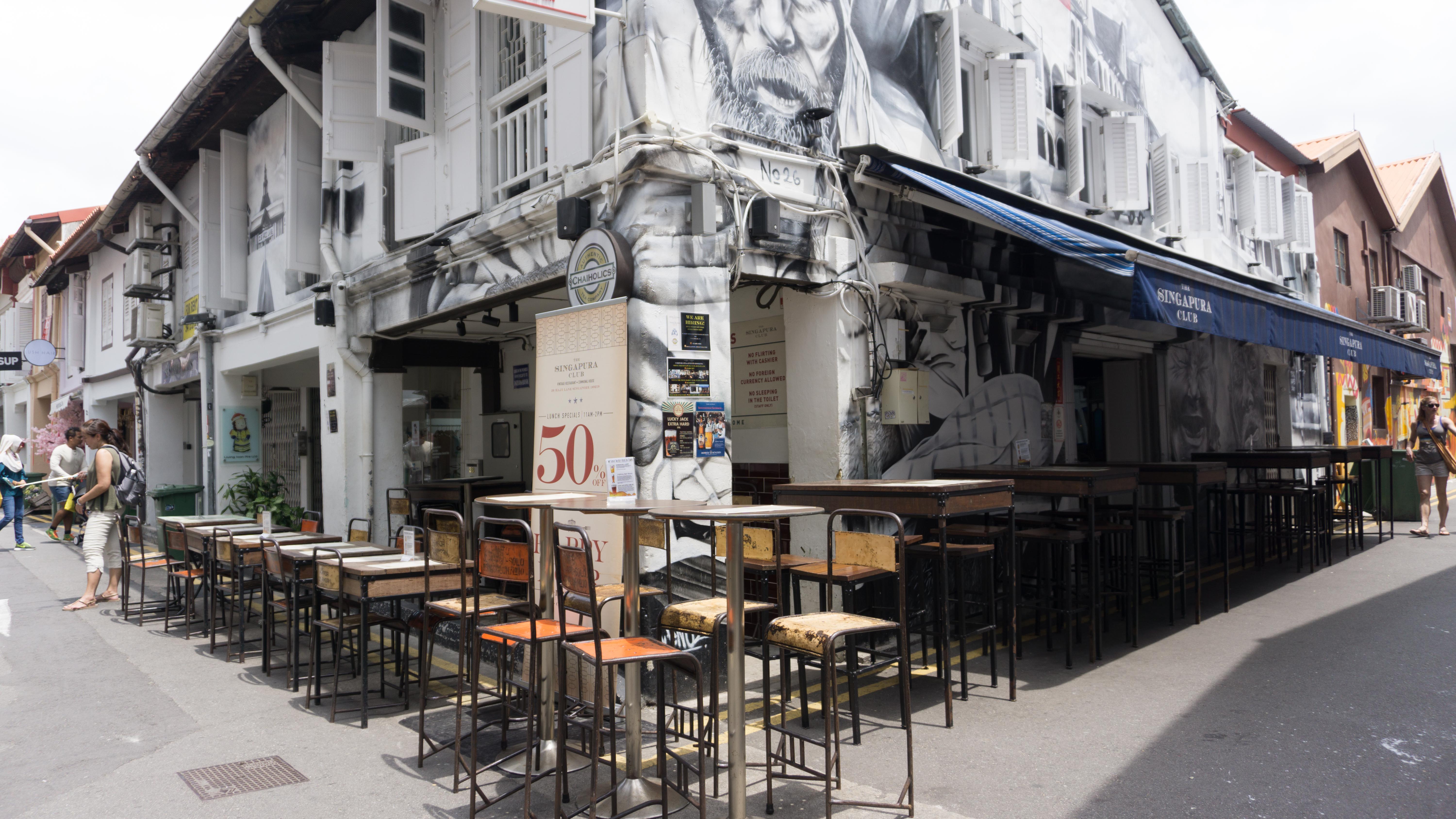
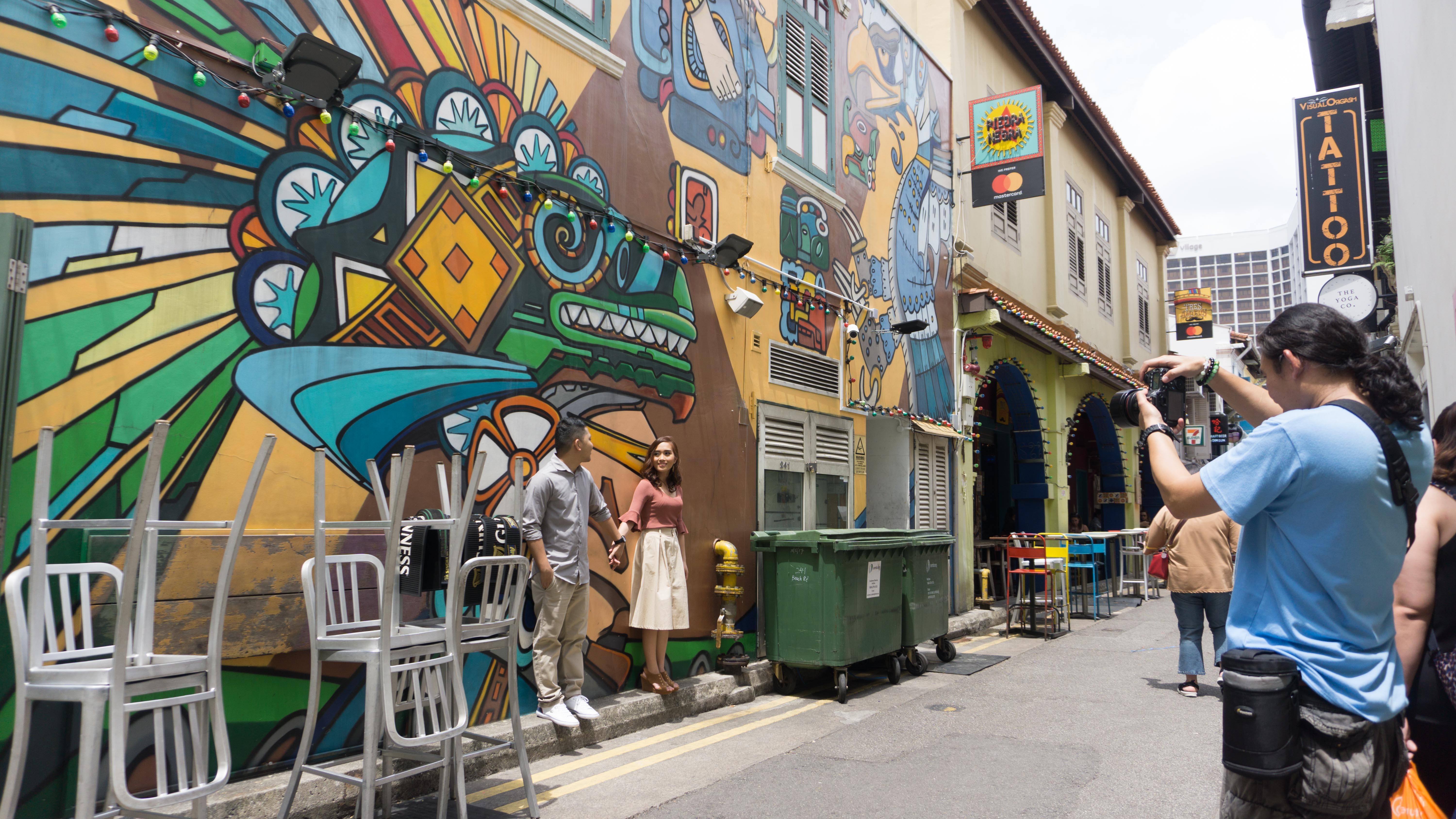
The idea behind DIWO – Do It With Others is for the freedom of collaborative works of all sorts of mediums and can begin from all sorts of mediums. Like what was stated on the Furtherfield website, “Peers connect, communicate and collaborate, creating controversies, structures and a shared grassroots culture, through both digital online networks and physical environments.”

Some of the contexts of where DIWO or Furtherfield derived is from DIY – Do It Yourself – itself, where people started everything by themselves, creating communities, having more control. Then they get inspired by other artists that question the world around them, the politics, the technology, which allows them to be able to explore the ideas of the artists. They don’t do art for marketing, but more of creating a culture and getting ideas. Not only to understand new technology but to see what you can do with it. They also encourage to learn something beyond what you are used to, exploring “a new cultural dynamic”. Create a content that is not by the individual, but creates something more engaging by challenging to work with others.

This has allowed “people to learn a lot of new things which is they wouldn’t even have the privilege of learning” according to Mark Garrett in the lecture. Also, it doesn’t matter if the works are technology savvy or not, but the more important thing is whether or not the works communicate with the audience.

In the lecture, it also mentioned that, Farecoin and Furtherfield also plan to work together to create their own culture coin and a shared value system, which is a very DIWO concept – not achieving something alone and ending it there, but rather putting the whole team out there and achieving it together as a team.

As mentioned earlier, DIWO not only encourages to work with others but also encourages the individual to explore something that is out from the comfort zone. How it would work with others is by working with someone who you can learn something different and new from them and also in a way making the work better by involving different media and elements, not just from one person or one type of method or style. What was mentioned in the lecture was:

“If you’re on your own, isolated and you try to produce genius, you’re not. The genius is in others not just in yourself. A collective genius”

One can’t exist without the other.

How it has worked in Open Source is that people with different minds and understanding could contribute to an existing content to make it better. This has also created an understanding for me on how to collaborate and work together with other people in the class in a way that putting more minds together to make a project work better. Do something you cant possibly do alone, and create something that you would not have thought of by yourself.
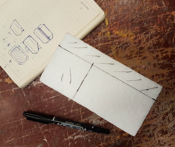
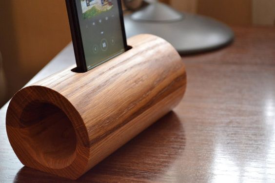
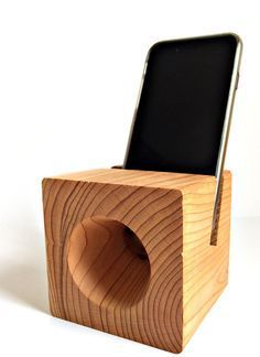
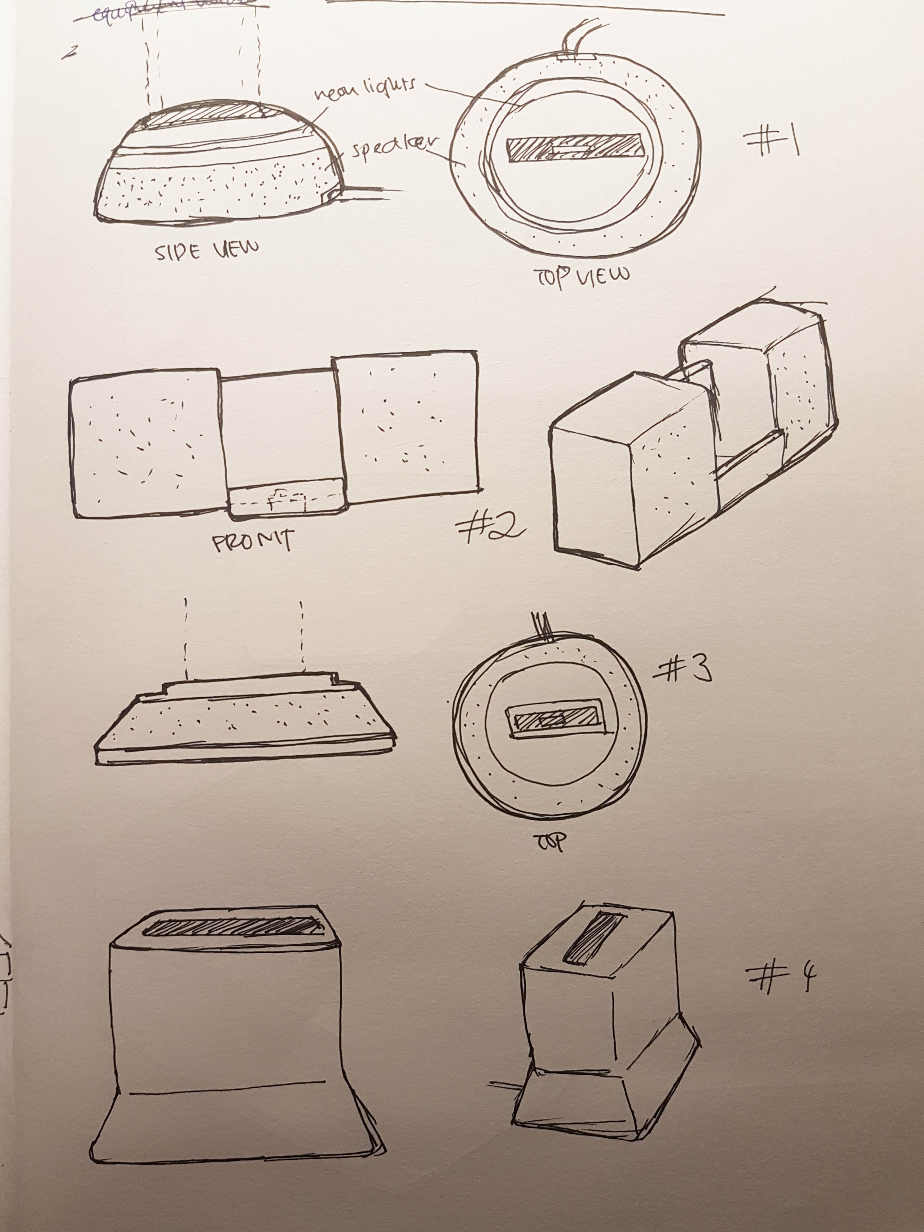
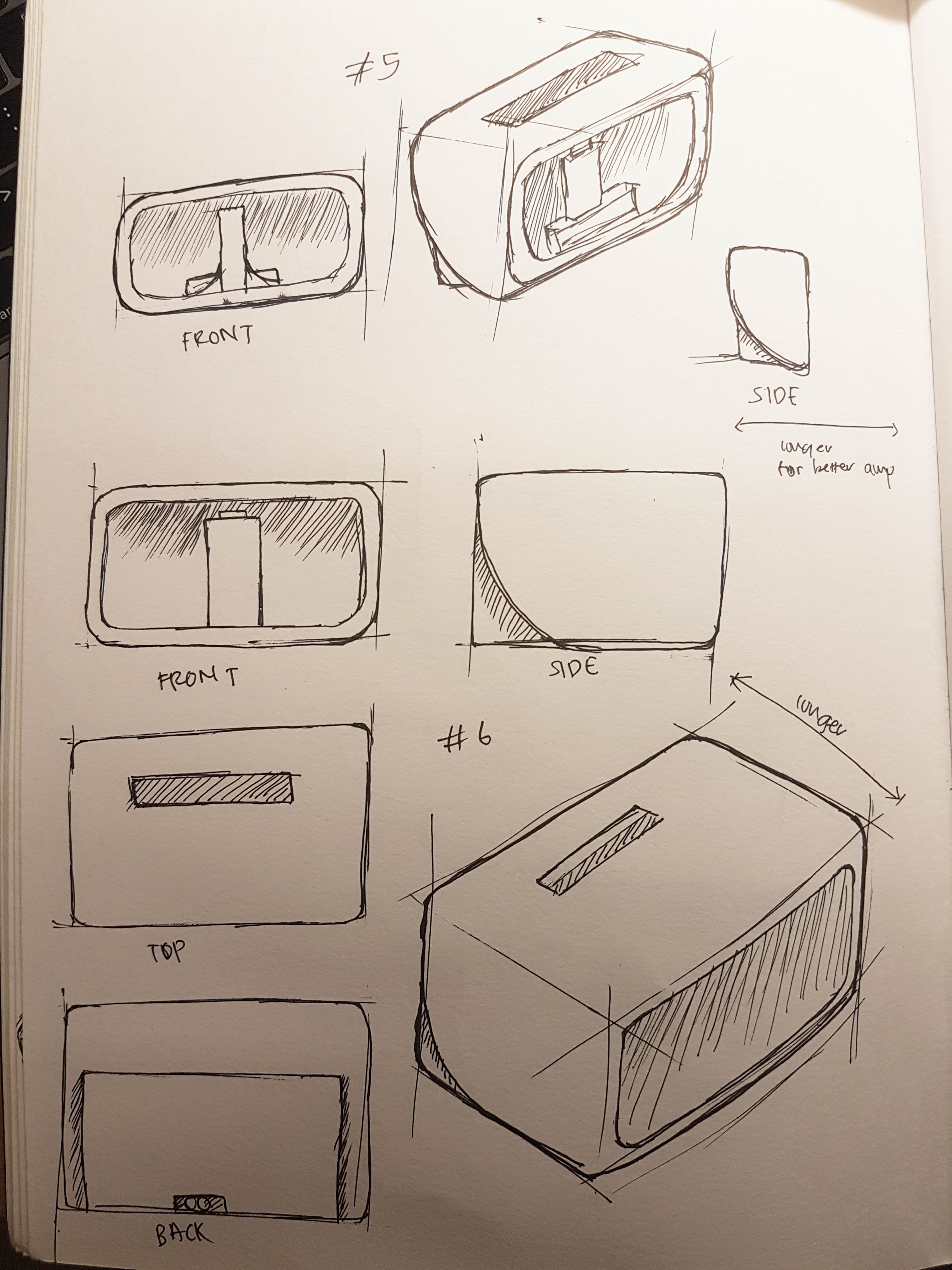
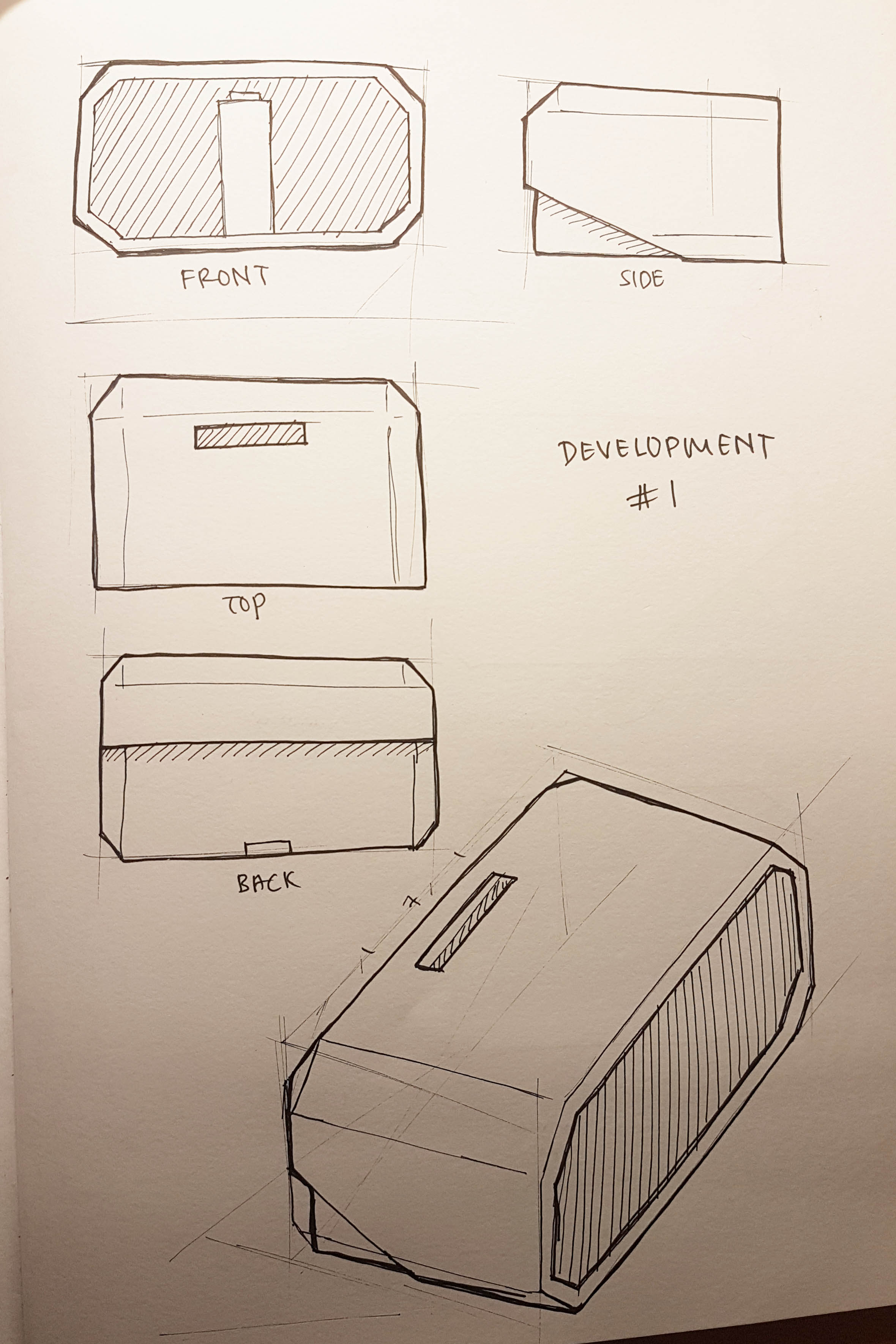
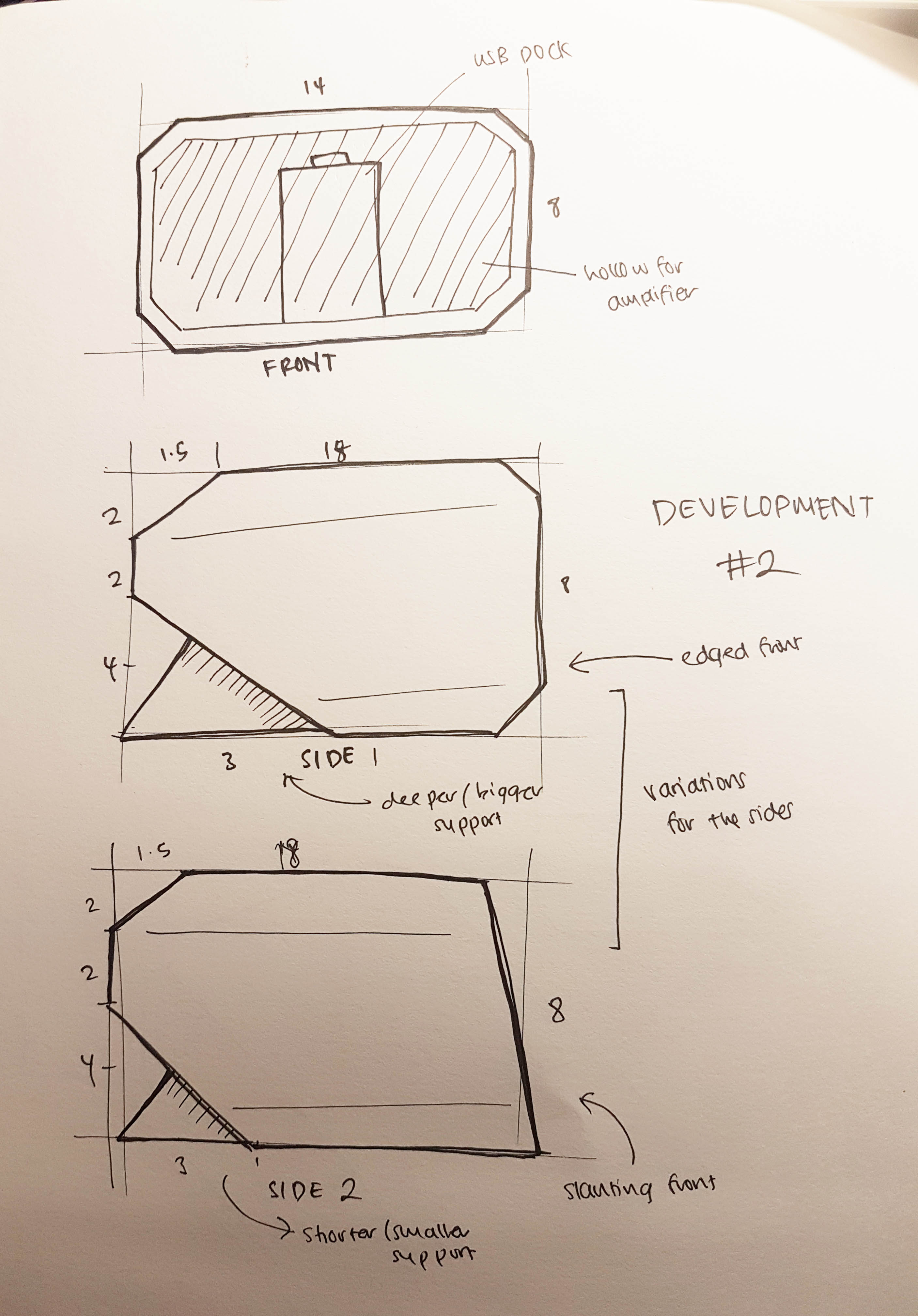
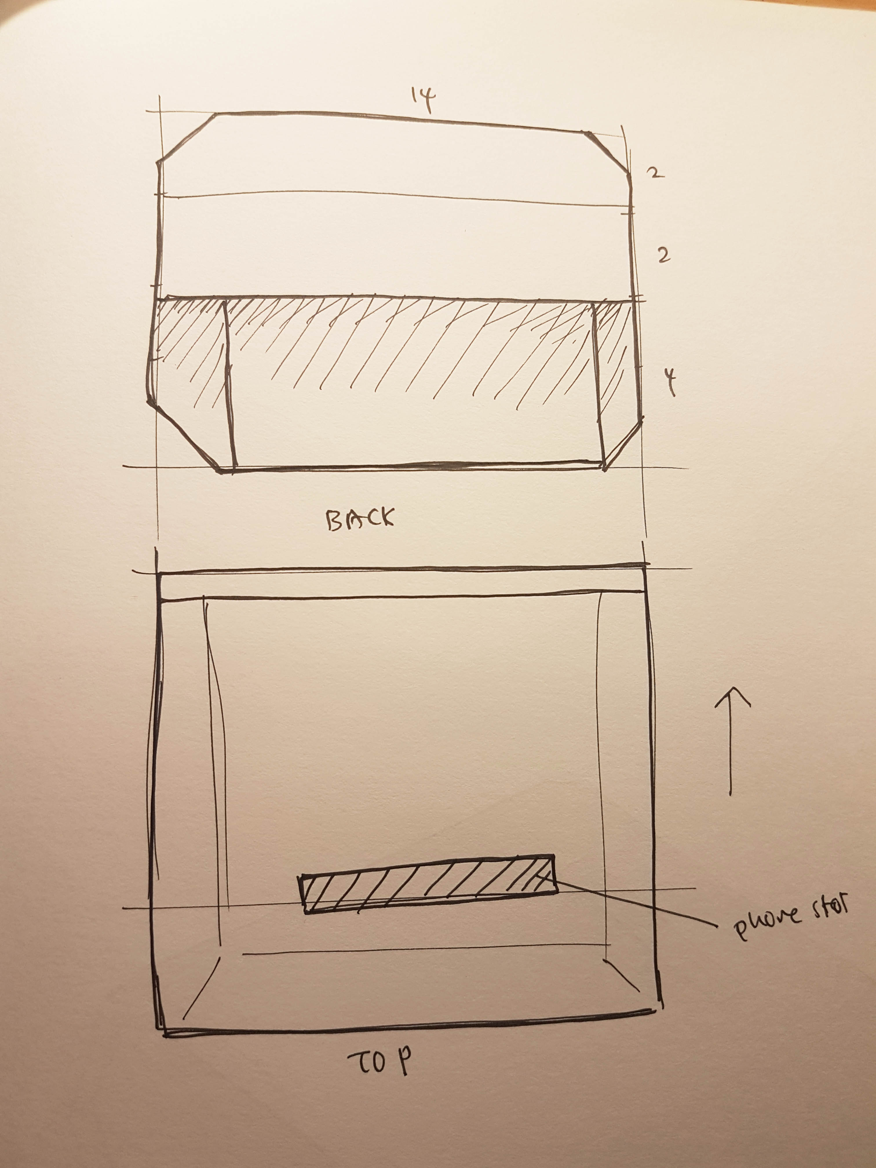
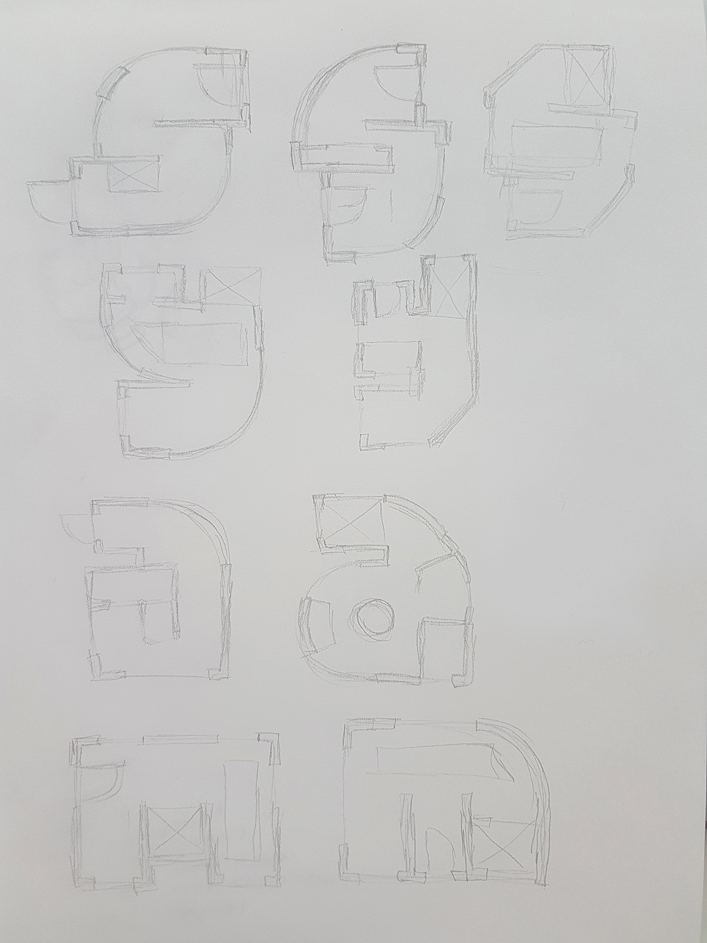
Midterm Project: Face Pong

Groupmates: Christina, Esther, Syam.

For our midterm project, we did a Facepong game, where a ball bounces around the screen and the paddle is the face through face detection. To score points, the player has to hit the ball with the paddle. However, if the ball touches the bottom of the screen, a point will be deducted.

To increase the difficulty, there will be different stages where after reaching certain scores, like the ball getting smaller, the paddle getting smaller, and also a wall coming down from the top of the screen to make the play space smaller.

What went well? What didn’t?

Even when we split the work amongst ourselves, there was no issue when combining codes as we took most of our reference from the same source and the coding style and how we organise the code is similar between 3 of us.

The main challenge for the coding is still definitely how to make it work as a lot of the codes in a way overlaps each other. If we tweak one code to fix one problem, it will mess up the other codes and we would need to frequently backtrack our process if we were to make any changes.

Who did what?

Christina did the hardest one, in my opinion, which is the face detection. She faced the biggest problem but managed to overcome it.

Esther did the shrinking effect, where it would be applied to the ball and the paddle after some time which is to increase the difficulty.

As for me, I did the wall that comes down from the top of the screen. I also did the scoring system, where a point will be added whenever the ball hits the paddle and be deducted when the ball touches the bottom of the screen.

What major difficulties were there?

There are quite a few difficulties faced.

  1. The ball keeps going through the paddle, in between the top and bottom of the paddle, and every time that happens the scoring system adds multiple points.
  2. Initially, we wanted to add a game over + lives function, but then we realise that would make the game almost unplayable as the ball will keep falling to the bottom.
  3. The mirroring function did not work properly so we had to look for codes online to see how to fix it. This took the longest to fix.

Click here to see the issue we had with the face detection and mirroring.

What problems still exist? How might you solve them?

The paddle and the ball would still glitch when interacting with the ball. We might need more time to fix this with trial and error.

How would you move this project forward?

Would definitely still try the lives system which would make the game more challenging. Adding more levels would be awesome too, like adding more obstacles and challenges or objectives would make the game more interesting. Sound and music could be added to make the game more fun too.


Graphics done by Christina.

Types of Bag Fastening and Closure

Zippers

Image result for plastic and metal zipper

Types of standard zippers

Image result for invisible zipper

Invisible zipper

Image result for closed end zipper

Difference between open and closed end zippers

  • Open-end can have the two sides separated (eg, jackets)
  • Closed-end still attached at the bottom (eg, jeans)
Image result for 2-way zipper

Two-way zippers

  • Two-way open zippers can be opened from the bottom and top, and can also be separated. The function of both open and closed zippers
  • ‘O’ type zippers split in the middle
  • ‘X’ type zippers split at the ends
  • ‘R’ type zippers have functions of ‘O’ and ‘X’ just that it cant be separated

Image result for bag zippers

Normally placed at the top part of the bag where you want it to close.


Magnetic Snaps

Related image

Magnetic snap

Related image

Normally place on a flap, with one on each side.


Hook and Loop

Image result for velcro

Standard hook and loop, also called hook and loop

Usage
Image result for velcro on bags

Hook and loop for clutches

Image result for velcro straps

Hook and loop strap, to hold something together or join a flap together.


Twist & Lock

Image result for twist and lock bag

Standard metal twist and lock

Usage of twist and lock

Image result for twist and lock bag


Side Release Buckle

Image result for side release buckle

Standard side release buckle

Image result for bag buckles

Modern side release buckle

Usage of side release buckles
Image result for side release buckle bags

Over the bag flap

Image result for side release buckle bags

Under the bag flap


Drawstring

Image result for drawstring bag

Standard drawstring bag


Buckles

Image result for bag buckles

Normally comes with a magnetic snap

Image result for buckles

‘Hidden’ buckle style

Usage
Image result for buckle bags

Double buckle style with a magnetic snap


Hook & Eye

Image result for hook and eye

Standard hook and eye


Image result for hook and eye bags

Mechanism style


Image result for hook and eye bags

Normally seen in pants


Buttons

Image result for buttons

Flat buttons

Image result for toggle buttons

Toggle buttons

Image result for shank buttons

Shank buttons

Usage
Image result for buttons bag

Usage of flat buttons

Related image

Usage of flat buttons


Tuck lock

Image result for tucklock

Usage
Image result for tucklock bags

Sometimes comes with a locking system

Mobile Phone Dock and Speaker

The assignment is to create a phone dock that also has a speaker function. So as usual, before I start on the model itself, I went to look for inspiration and ideas.

Some ideas and inspirations

A dock with a clock element added to it (https://www.pinterest.com/pin/72409506488637032/)

Amplifier style

I was leaning towards making an amplifier instead of a speaker as I think that it would be more practical and I could see myself making it, rather than a speaker which is more technical with all the wiring.

A wooden phone dock that also acts as an amplifier (https://www.pinterest.com/pin/134052526387512858/)

An amplifier where the sound goes to the side instead of the front (https://www.pinterest.com/pin/450641506447976288/)

Early Sketches

So I started sketching my first ideas, for both the normal speakers and the amplifier kind.

These are some of my early sketches, but they basically look like some random basic shapes that just functions as a speaker and dock. They look very normal and probably already been mass produced before.

My idea of all these early sketches is to get these out of my mind first. Normally these ideas are very normal and what first comes to mind when approaching a brief. Most of the ideas are probably average and not much thought comes into it.

Sketches Development

I have decided to go with the last amplifier idea but I was still configuring the shape and size of the object. I have also decided to make it more angular instead of rounded as I think that it is more interesting.

I think that my first development looks good however I think that the model is too wide and short, and at the same time is it too low in my own opinion. So I decided to make those improvements in my next development.

The Process


Zine for Kampong Glam (Part 3 – Further Research and Ideas)

After the site visit, I continued my research before I could finalise my idea and direction that I would go for.

Kampong Glam in the News

There’s quite a bit of news about Kampong Glam but I picked out 2 that are interesting to me.

Basically, this article mentions how despite the government’s efforts to conserve the architecture and the make it as close as to what it was before, which is an Arab/Malay community, many of the original residences and tenants are still unhappy as the culture is not the same. The place has become too commercialised and it has lost the original kampung spirit, which is the real culture of Kampong Glam.

However, this article by Today, as a National Day Special, focused on how Kampong Glam turned from a fishing village community to a modern tourist attraction. It also mentions, in contraction to the previous article, that eventhough it has lost some of the old cultures, it is still similar. In the past, people from different countries come together bringing in culture and trade. But in this modern times, people from different backgrounds still come to this location to do business. Kampung spirit is still there, with shop owners helping each other out. Even a mention of owners coming together during the fasting month to break their fast together. In a way, it is just a modern version of what was going on in the past.

Ideas for the Zine

Time to get some ideas going

Idea 1: Trades of Kampung Glam

As there are many trades in Kampung Glam, I could feature them in the Zine. Silk, fabric, rattan, fragrances, using the elements of those items of trade and creating designs in the zine.

Idea 2: Architecture of Kampung Glam

Knowing that the architecture could pretty much be the same in the past and present, I could maybe play with this idea, where it shows the transition and the differences over time.

Idea 3: No lost of culture, just modernisation

From the articles, there are mentions of Kampung Glam being too commercialised and lost the original culture of the place, and also that it is not lost but it is just a modernised version of the old. I could play with this idea of blending the old and the new cultures together to make it seem like it’s not lost, just different.

Zine for Kampong Glam (Part 2 – Site Visit)

So after doing the pre-search for Kampong Glam, I finally went there now having already mentally prepared myself.

When approaching Kampong Glam, you would definitely see the shophouses first as the whole perimeter of the area is lined by them. No matter where you come in to enter Kampong Glam, you will for sure be greeted with a row of shophouses.

Some of the shophouses that you find: As you go deeper into the area, you will come to this famous street, which aligns nicely with the Sultan Mosque. Both sides of the street are filled with eateries selling Middle Eastern cuisine and some other shops selling unique items like textiles and fragrances.

And of course, the main feature of Kampong Glam, the Sultan Mosque, with its shiny golden dome high above everything else in the area.

The Sultan Mosque. Probably the tallest structure in Kampong Glam

Moving into the right lane and you will spot something that is not a shophouse. It is the old Temenggung palace, now converted into the Malay Heritage Center.

The Malay Heritage Center, which used to be the palace.

The Architecture

As mentioned in the previous post, there are 4 main types of architecture found during my research. So I decided to look for these 4 different styles.

Art Deco Shophouse Style

It took me a while to look for this one as the main features are hidden behind the signboard, but what gave it away is the “striped” pillars.

Late Shophouse Style

This one was not hard to find as it was the most decorated and detailed amongst all the shophouses.

First Transitional Shophouse Style

This was quite hard to find as it was across North Bridge Road and I would not expect it to be there, at the famous Zam Zam store!

Early Shophouse Style

These few shophouses, eventhough colourful, was a little out of the way and was furthest from the center.

Trades of Kampong Glam

So based on the research that I found, I tried to look for the different trades in Kampong Glam. There were a lot of different kinds of trades that can be found around Kampong Glam, but most of them are located along Arab Street. There you can find mostly carpet traders and tailors who also sell different kinds of fabrics.

There were a few shops selling carpets of different designs and shapes

On one side of Arab Street, you can literally find a whole row of fabric shops.

Alot of the fabric shops also offers tailoring and can be seen having mannequins outside

Another type of shop that you can find are perfume shops.

Modernisation of Haji Lane

Most of the things you see in Kampong Glam would seem old and dated, very traditional. However, if you go towards the famous Haji Lane and Bali Lane, you will find more modern shops such as boutiques, hipster cafes and bars.

The sign that you see at the entrance of Haji Lane

Towards the other end of Haji Lane, there are more pubs, tattoo parlours and more graffiti works on the walls, which have been an attraction by itself for tourists and occasionally for locals too, making it a photo spot.

Some of the photos of pubs. It’s considered empty as I went there on a weekday lunchtime. It would be more crowded in the evening and weekends.

And some of the graffiti works that you can find filling up the walls of this section of Kampung Glam:

Zine for Kampong Glam (Part 1 – Early Research)

So the brief of the project is to design and do up a brief based on an assigned location

After getting the brief for the project, I was pretty thrilled with the project as I get to do one of my favourite pass times – exploring. I also thought that I could do photography. Then we got to know that we cannot focus too much on the photography side, but that is fine too.

After a random draw lots from my group, I got assigned Kampong Glam as a location for the Zine. Despite going there before and quite often, I would start the project with some research.

Where is Kampong Glam?

It is the area of shophouses between Bugis and Lavender MRT stations. It’s not hard to spot as it is the only shophouses in the area surrounded by high rise buildings.

Research of Kampong Glam

Before going to the site itself, I would definitely want to know more about the place first.

The History

Kampong Glam (originally spelt “Campong Gelam” when it was named around 1830) is one of 10 subzones of the Rochor area located in the central region. The road names in Kampong Glam such as Bussorah, Muscat and Kandahar streets – named after places in the Muslim world.

Kampong Glam was land set aside for the Sultan and 600 family members after he signed the treaty to the East India Company. The Sultan also instructed the Temenggong, a governor to the Sultan, to build his palace there.

Aside from the royal family, there were many other ethnicities living there too, such as the Bugis, Arabs, Boyanese, Javanese and Muslim immigrants. All these different groups set up their own mini-kampungs, which created Kampong Bugis, Kampong Melaka & Kampong Java.

Temenggong’s Palace now the Malay Heritage Centre (https://thoughtmoments.me/tag/kampong-glam/)

Further research

Many would think that Kampung Glam is just a place full of hipster cafes, boutiques and filled with Arab and Malay influence. So knowing this, I would try to avoid doing up something based on that,  … but what?

I started asking what people know about Kampong Glam, aside from the mentioned above.

The trades of Kampong Glam

Before it is known for its hipster cafes and graffiti walls, Kampong Glam is known for its different trades. From the old days, many cultures live amongst each other bringing in culture and items for trade to make a living.

Some of the trades that are frequently mentioned in my research include fabrics, carpets, and fragrances. Some of the shops that you see at Kampong Glam now has been there for a long time.

Other crafts are also available, such as rattan and cane furniture, and also other intricate handicrafts.

The architecture

Through my research, I also found out that Kampong Glam has been gazetted into a conservation area in 1989, where the buildings in the area have to stick to certain guidelines, like retaining and restoring the exterior of the buildings.

Meaning to say, the buildings that you see today at Kampong Glam could have possibly looked like that ever since it was built! With the exception of the colours and modern pipes of course.

And the shophouses all come in 4 different types of shophouses:

Sources:

Image Making Through Type (Part 4 – Final Outcome)

The Interior Designer

For this design, I stuck with the elements and design similar to the ones used in making the floorplans of houses and spaces. I used the shapes for the types of furniture and the variations of thickness used for the walls and windows.


The Confectioner

For this, I joined all the 4 letters together as if they are made from the same base. Then I “overlayed” or “layered” each of the different letters with a different coating.

  • Bubblegum for the “S”
  • Chocolate and nuts for the “Y”
  • Glazed doughnut and strawberry icing with rainbow sprinkles for the “A”
  • Candy coating for the “M”

Art direction wise I tried to stick with the more detailed illustration but the outlines and generally all the same thickness.


The Radiographer

I tried to make it look like a real X-ray scan with the bones and things in the body being the more prominent part of the design, while the skin and outer layers of the “body” being more to the faded side, almost not visible.

I added grainy texture and blurred it overall so that is it not too clear and more like a real x-ray scan. I also added more textures and erased off some parts of the bones to make it more realistic.

Also, I have added a little humour into the work, like a fractured bone and a mouse running in the skull.


The Contractor

Seeing that it is a flat design approach, I tried to get as many details into the design as I can. I used the bright colours yellow, orange and red because these are the colours that are commonly used in construction sites. I have also added shadow in the back so as to make the type stand out.

Image Making Through Type (Part 3 – Art Direction and Colour Scheme)

With further remarks from peers and others based on my first drafts, further changes are made, mainly in the art direction and the colour scheme.


The Interior Designer

Art Direction

For the art direction, I plan to follow as closely to a real floor plan as possible to make it look like it is real. The thick borders on the outside, followed by a thinner inner wall and also the really thin furniture and doors. I also will try to stick to the style used for the windows and doors.

Colour Scheme

I will make the design black and white as most of the floor plans I found are in black and white. I have decided to not go for the blueprint design as I was told that that direction is overused.


The Confectioner

Art Direction

Illustration by Julian Burford (http://www.julianburford.com/client/)

Illustration by Mackenzie Child (https://www.mackenziechild.me/)

Since this will be the more colourful works among the 4, I have decided to go for something more fun and friendly, so I will be doing illustration based. As seen above, it looks very quirky with thick outlines, and details include the highlight and shades in close colours. I will also try my best to get as many details into the illustrations as possible to make it look more interesting.

Colour Scheme

This colour scheme is most important as it involves a lot of colours. So I had to look at the different individual sections of the type for colours, but I have decided to stick to the pastel colour scheme as it will appear most friendly and pleasing for the candy-like theme.


The Radiographer

Art Direction

The art direction for this is pretty straightforward – the x-ray. Again, I try to stick as closely as possible to the original x-ray so that it is clearly represented. As mentioned in the previous post, the x-ray concept has 2 layers – the inner and outer layer. The outer layer is more faded as compared the inner layer that is much brighter, almost neon-like.

Colour Scheme

For the colour scheme, I will stick to the blue-ish colours of the x-ray. The thicker areas would appear whiter while the outer layer will be more faded and dark. Anything that I would want to stand-out would be among the brightest.


The Contractor

Art Direction

I would want to attempt a flat illustration style for this, as compared to The Confectioner, which is more detailed. At the same time, flat illustration should try to capture as much detail as possible.

Colour Scheme

Black and yellow used on a toy crane (https://www.amazon.co.uk/Caterpillar/pages/1656735031)

Yellow and black used on a construction website (https://www.freepik.com/free-photos-vectors/excavator)

For the colour scheme, I thought of using the black and yellows as they are common colours used in construction sites. It is also contrasting and striking.


Image Making Through Type (Part 2 – First Attempt)

So I have to narrow down to 4 different jobs to proceed on with the project:

  1. Interior Designer
  2. Confectioner
  3. Radiographer
  4. Contractor

The Interior Designer

The first job that I decided to proceed with is an architect. So I started to look at what are the factors and elements that I could use for the design.

Blueprints & Floorplans

The first thing that comes to mind would be that architects use blueprints in their work. Sometimes it shows the side views of the structure or like a perspective view. In other times it shows the interior floorplan of the structure.

But if to decide between the floorplan or the blueprint designs, I think it would be better to use the floorplan design because it is more flexible in a sense that the floorplan can make out more shapes than a vertical structure/a side view of a building.

Interior Designer tools

Another way to attempt based on the interior designer is through the tools used by an architect. They have different tools used to form different shapes and to create different drawings.

Architect tools – such as the t-rule, compass, protractor (https://www.vecteezy.com/vector-art/144324-vector-architect-tools)

The tools are already in odd shapes, which can be used to form the different letters of my name already.

First draft

First draft for The Interior Designer

I tried to implement the concept of a floorplan into the letters. Still exploring the different forms, whether or not to make it angular or has more curvature.

Comments from peers & lecturer:

  • Floorplan design has been used too much by seniors, especially by using blueprints. So I have to stick to more of the interior design floor plan concept, which includes more of the interior contents of the structure so as to differentiate it from previous samples.

The Confectioner

I thought of food, but the idea of using food as a chef cooking has already been taken and used. So I branched out from food to candy.

Types of candy

I guess the first step is to find out what sort of candy there is, and from there I can pick out the elements and work with them.

Patterns & Textures from candy

From the types of candy, I can try and pick out the different patterns formed and the textures from the different candy.

Bubblegum texture, can consider the art style too! (https://www.emaze.com/@AWRCLIRT/untitled)

And the list of textures goes on, but the idea is to maybe form the basic structure with the candy and at the same time have the textures in mind and implement them into the design.

First draft

First draft for The Confectioner

So I tried to join all 4 letters of my name to show that the design is interconnected rather than separate units and I tried to make it seamless and flowy as if it is made from one line.

I implemented the different textures and patterns of confectioneries, starting from bubbly bubblegum on the “S” connecting to droopy and nutty chocolate for the “Y’, glossy doughnut with rainbow sprinkles for the “A”, and candy cane patterns and churros texture for the “M”

Comments from peers & lecturer:

  • I have to make sure that the connection is obvious and it flows seamlessly through all 4 letters
  • Try to get as many details on the texture to make it more realistic
  • Colours have to be attractive (Pastel? Cannot use dark colours)

The Radiographer

I thought of doing something based on the human body but seems a bit too normal or complicated. So I decided to stick to the human form but more of x-ray style.

X-ray design

The idea of the x-ray is like thin neon lights but shows a faint outer layer while showing the inner object.

Body parts internal structure study

Another step to do is to look at how the internal structure of the body looks like so that it would look more realistic.

A possible concept that I thought of when doing this is that the inner layer could be just the type, while the outer layer shows something else. Or the outer layer could be the type, while the internal is showing something different.

First draft

First draft for The Radiographer

For my attempt at this layout, I tried to implement the x-ray studies into the letters so that it looks like real bones and tissue in the x-ray. I also tried to make the outer layer of the letters look a bit different from the inner layers.

Comments from peers & lecturer

  • I could include bone fractures

Funny or dangerous objects inside the x-ray scans. See if I would want to convey a more serious tone or humorous tone


The Contractor

I wanted to do more of using real objects for this since I have already tried other styles for the other.

Contractor tools

So elements that I could pick up from the job of a technician is the tools that they use.

So the idea is to create the letters using the different tools of a technician.

First draft

First draft for The Contractor

I tried to implement the tools into the formation of the letters, and I used wires to in a way join the letters together and also to form more of the curvy letters.

Comments from peers & lecturer:

  • The approach is too direct in a sense that the tools are used directly as the shape forms – like pareidolia
  • Lack of manipulation should have more
  • Combination of different equipment to form each letter, rather than using just one tool to form a letter.