For this 2D Final Project, we are supposed to come out with 12 frames (4 panels) of stories. While many decided to go with digital media, I decided to go with traditional media, mainly using mixed media paper cuttings.
However, I did not go for newspapers or magazines, where I felt that it did not suit the theme of my project.
My project is entitled ‘Little Snippets of Joey’.
It basically revolves around the little happenings I had in my life in my childhood. Hence, I chose to use paper cuttings, along with mixed media textures (acrylic, coloured papers, and gouache). These were more suited if I went for a style alike children storybooks and picture books, as compared to intricate and complicated styles.
I had my inspirations from mainly two artists;
- Eric Carle
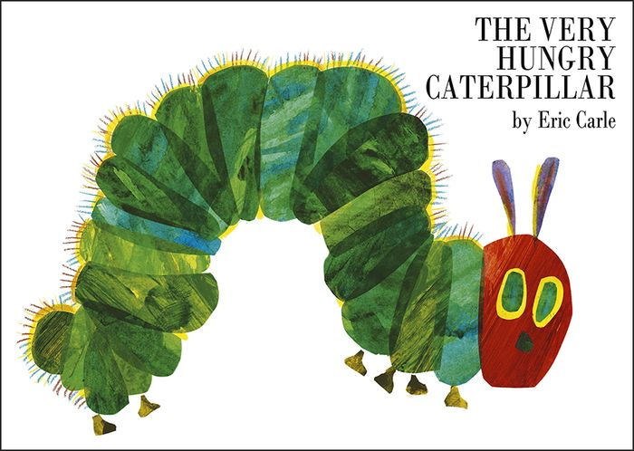
The Very Hungry Caterpillar by Eric Carle

Eric Carle
Eric Carle uses a lot of different textures and simple paper cuttings to emulate his own style. His texture is very obvious and distinct, made with different paints. It is very special, and makes ordinary paper cuttings seem overly simple. I made use of his style to bring out the main details of my paper cutting, while keeping the rest of it simple.
2. Paula Marten

Paula Marten
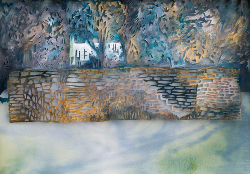
Pier – Paula Marten
I was secondly inspired by Paula Marten. She visits many different places to do paper cuttings and paintings of them. She uses many different colours to emulate illusory textures despite her works being mainly in 2D. She also uses overlapping to create the implied depth in her work. I also like how her paper cuttings, while being intricate, feels free and undefined. It is as though she is cutting at free will and without a fixed direction and detail in mind. Yet, it still appears so natural and at home. It is truly unique.
Draft 1:
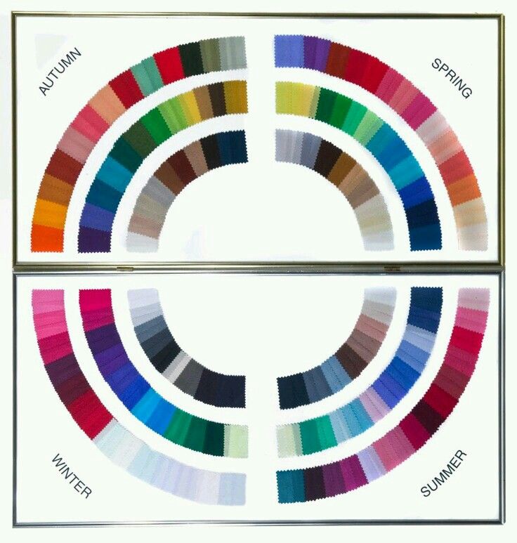
4 Seasons Colour Wheel
I tried to make use of the 4 Seasons to emulate the 4 situations I would portray myself in based on my old memories. However, I realized that the 4 seasons had too many colours and hues defined in their nature. It create a mess of colours which were hardly harmonious, and became a bunch of confusion. The main focus could barely be identified clearly, and as a result I scraped it.
Draft 2:
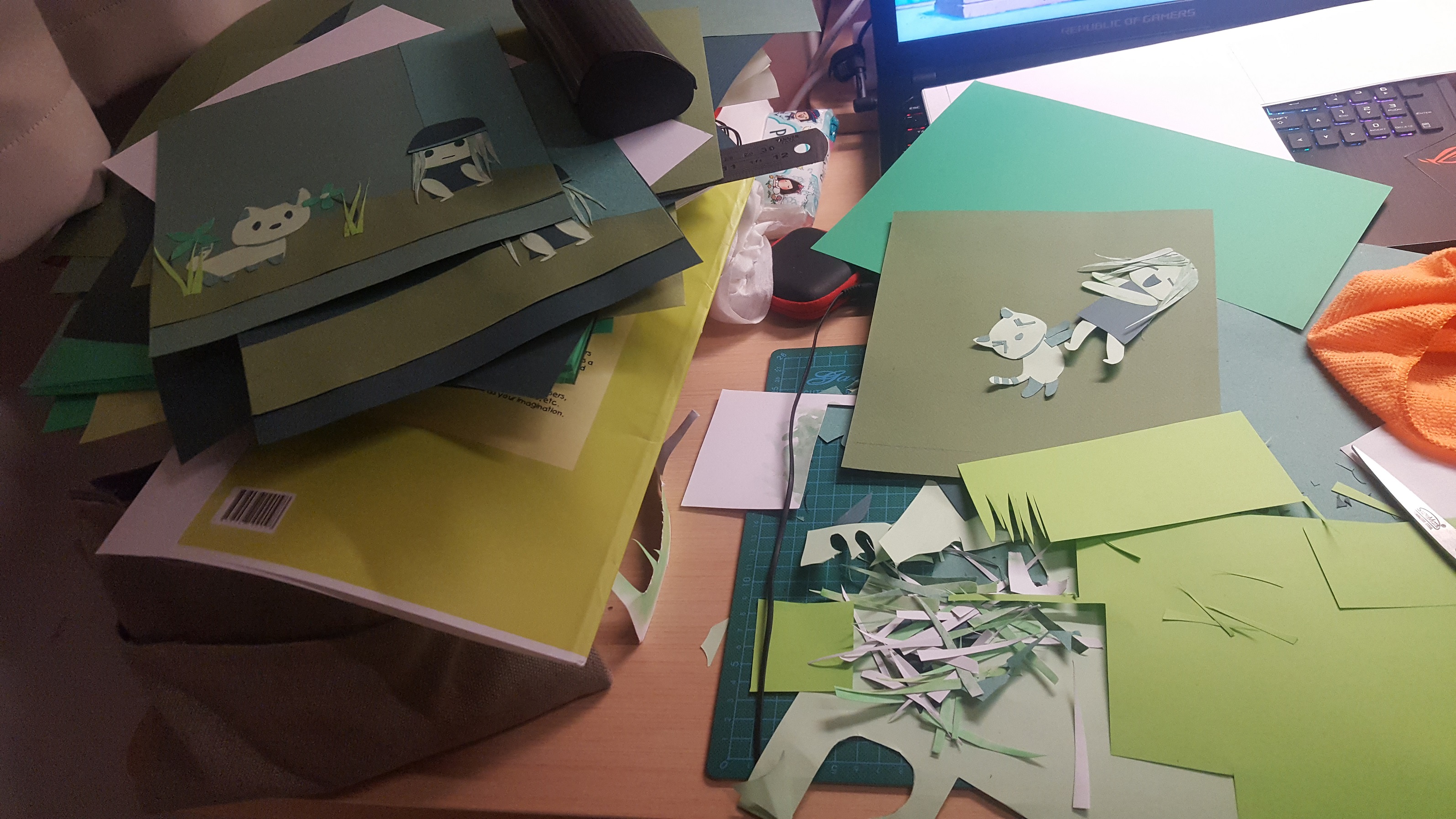
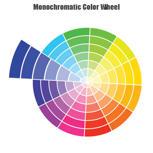
My Process
Instead of going for Analogous colours, I went for Monochromatic colours instead. After pondering for a long time, I realized that Monochromatic colours matched my idea of portraying a child’s picture book. This is because children do not have such in depth analysis of colours, hence relating better to feelings when they are placed in simple and common colour tones.
However, my design turned out being too simply without any depth. Everything was messy as they clashed together on the same level.
Final Draft:
For my final draft, I made use of foam tape to create depth. I also simplified the colour tones such that they will not clash as much. I minimized overlapping, and ensured that the main details meant to be focused on will stand out.