This Zine Project has been a huge roller coaster for myself. I went through so much pain and torture because I chose a difficult location as my subject; St. John’s Island. Do not get me wrong, I adore the place to the moon and back, but it was just too special. I could identify a lot of things with St. John’s Island and it was just so magical the two times I went there, but to pinpoint something and make it into an abstract was considerable hard work for me. I spent weeks thinking and pondering about what I wanted to focus on, running different ideas through my brain.
AT THE BEGINNING:
When the Zine Locale brief was given, I couldn’t really think of a striking place in Singapore that interested me. I decided to explore my options off the coast of the Mainland and my options quickly arrived on the Southern Islands. I chose St. John’s Island because I knew it was just that unique. It was so different from all the other places I have been to in Singapore, and despite the high ferry cost, it was an island gem few visited. It was for adventurers, and for people who wanted to get away from the bustling city life.
The few things I identified at first were:
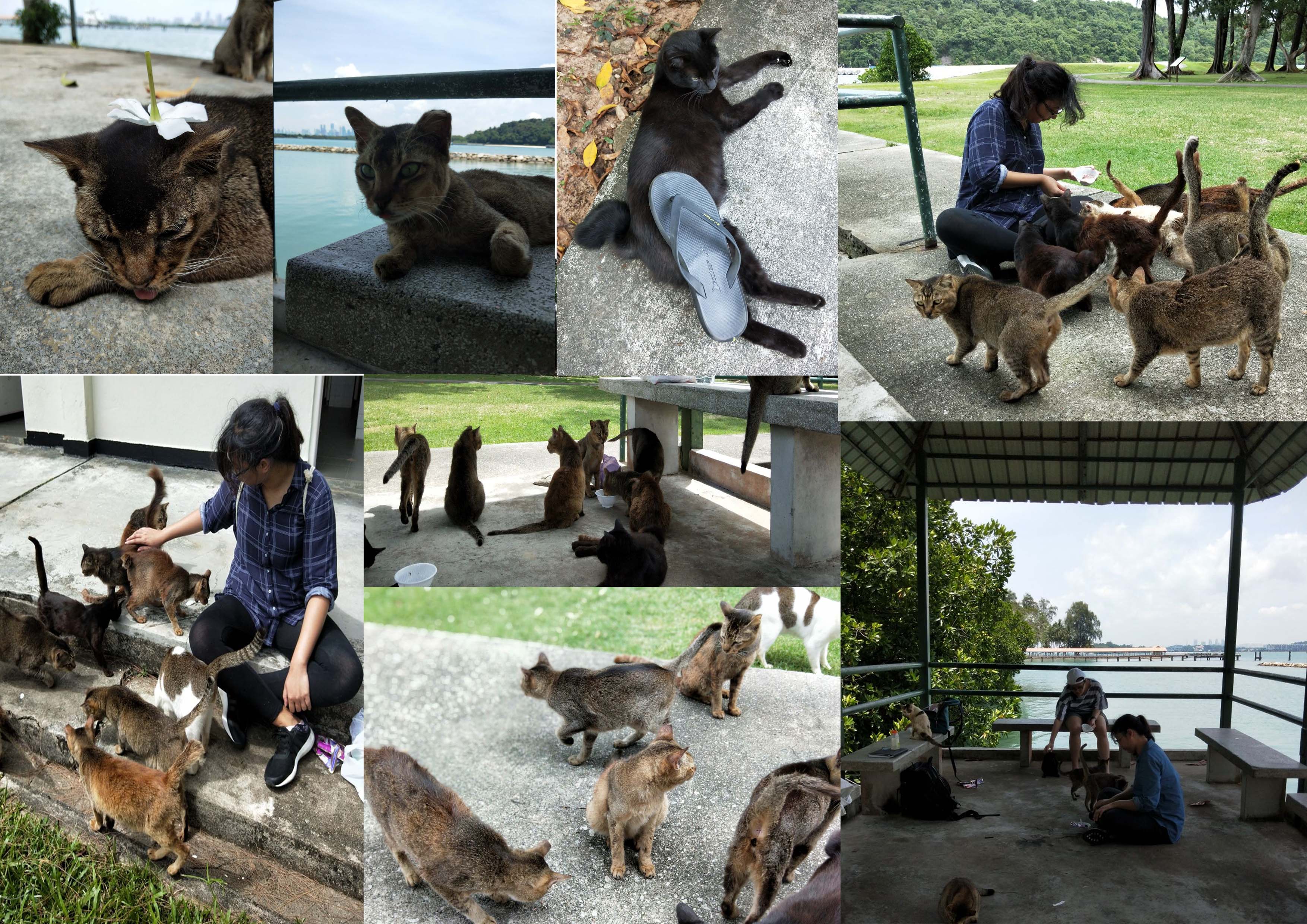
There were a lot of cats. 3 colonies of over 30 cats was really nothing I’ve ever seen on Mainland Singapore.
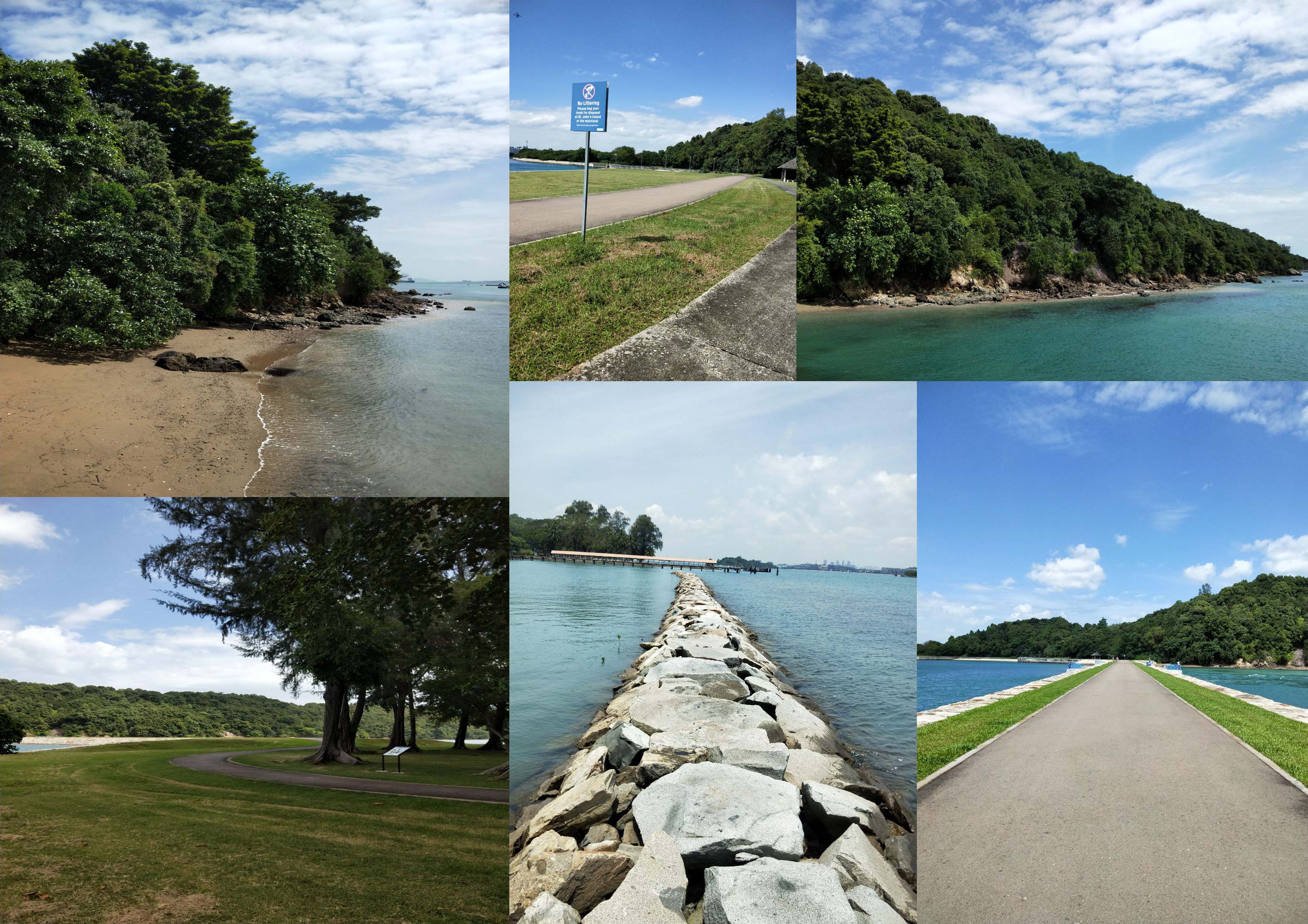
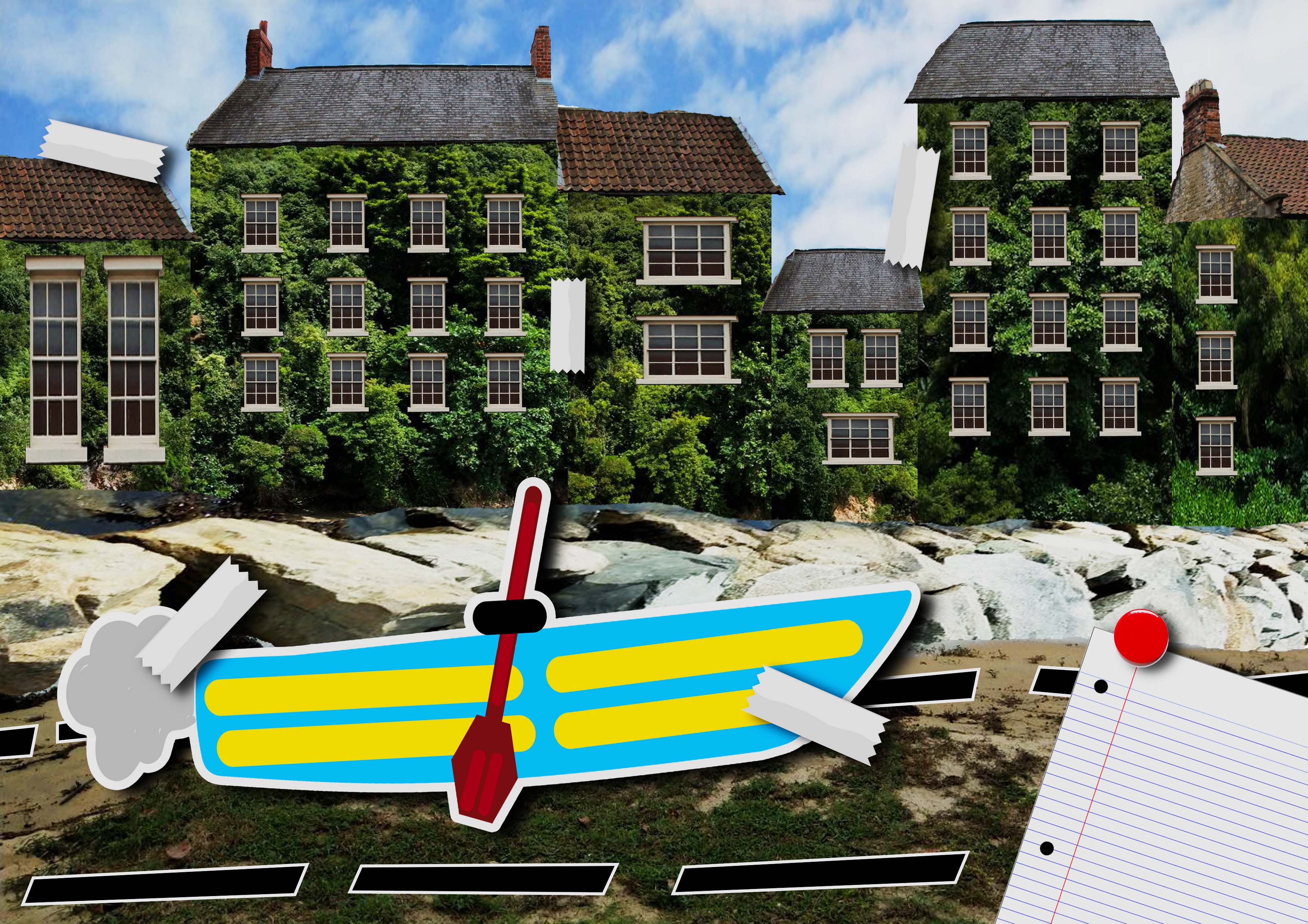
It was just like a Maldives. A mini one. The clear waters, beautifully coloured seas, clean rocks and soft sand simply said it all. There are even mangroves and heritage trees. An island of magic, definitely.
There is a Kampung on an island! Not one with farms and cows and chickens, but one where you fish for a daily meal. That was rare. Especially in concrete jungle Singapore.
There are abandoned houses around the island. Pretty eerie but cool.
Formal penal settlement, drug-rehabilitation centre, quarantine island for people coming from Mecca, mass execution grounds during WW2, Marine Research laboratory, former detention centre for illegal immigrants. Really, its history was the most striking element on the island. The island is rumoured to be haunted as well.
Holiday camp! There are so much activities that can be done on the island but with no security guard supervision. That means that if you die, you die.
It’s rich biodiversity of marine life.
There were too many things. Seriously.
At first, the direction of my project was at a totally different from my final one. I was dead stubborn about focusing my project on its history simply because it was so rich, and there was no place in Singapore with so many events occurring so crazily. However, I was rejected (crai) and decided to focus on its scenic instead. I made surveys with people I knew to ask them about what they thought about the island (https://docs.google.com/forms/d/11iX6LJYCWFe6jqpMG6GyMtnZMCnnFx2b5dPf1AFxwg8/edit), and recorded interviews with strangers on the island (https://www.youtube.com/watch?v=sISCwhbE54k). I took many photos, without an actual idea about the direction I was going into.
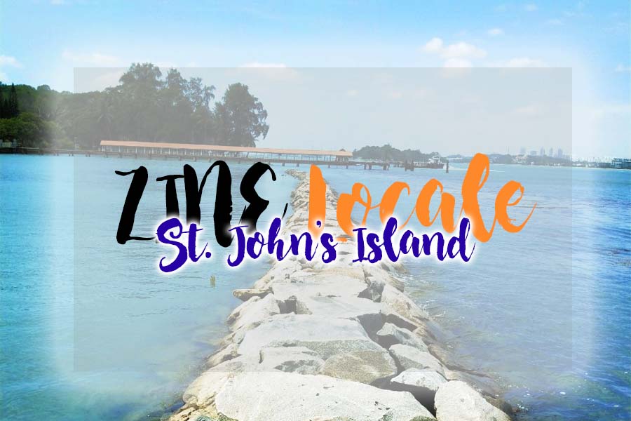
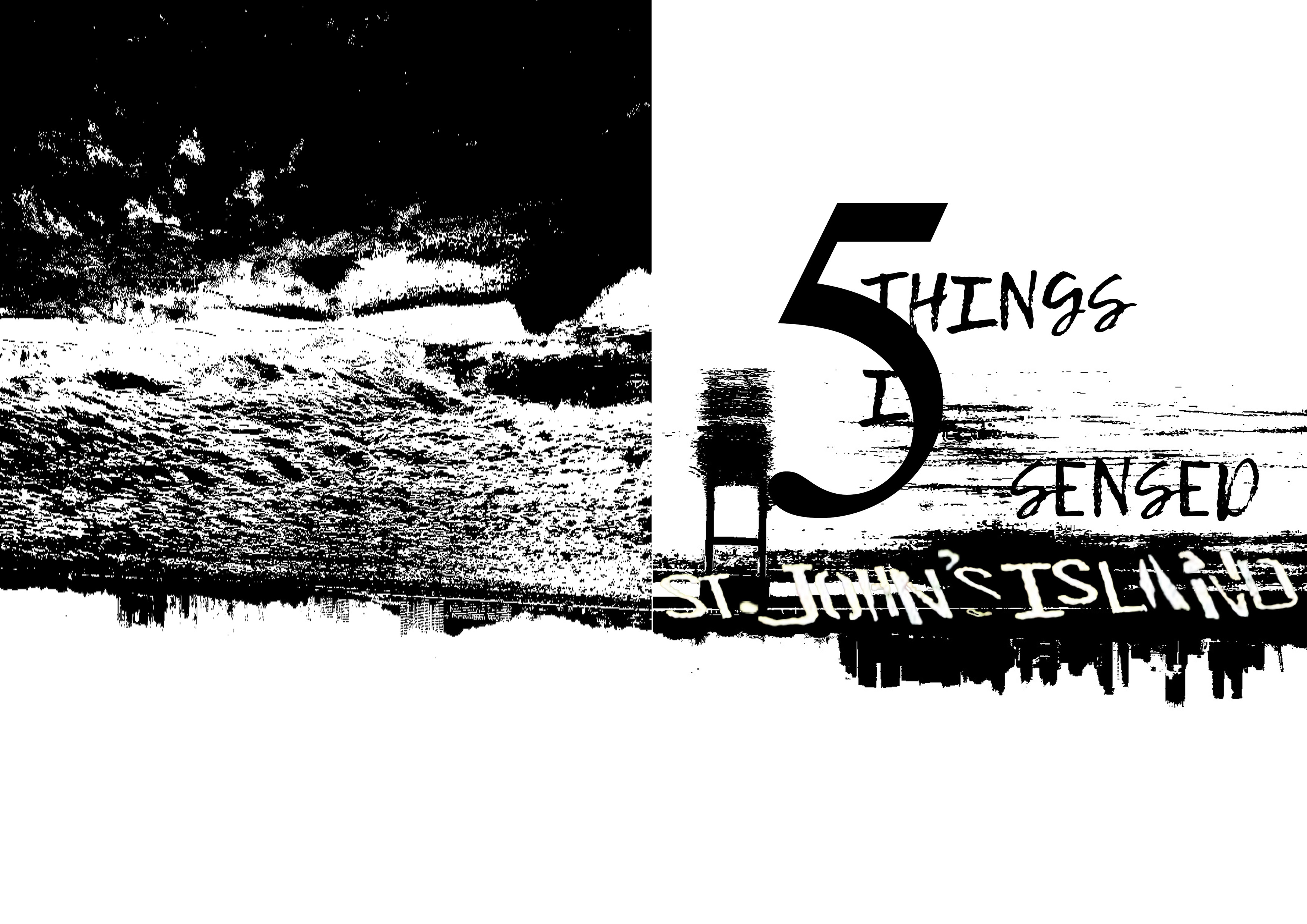
St. John’s Island | A Scenic Snapshot
St. John’s Island | A Scenic Snapshot 2.0
St. John’s Island | Cats
Soon, I decided that I should stop being so narrow-minded just because I adored history, and instead go for something more light-hearted.
Below is my ZINE I presentation:
ZINE I | Slides
AND THEN I BEGAN THE TOUGHER PART:
Now, I had to determine what was the one quality of the place I wanted to focus on. It had to be special and found in no other part of Singapore. The construction of ZINE II had to be abstract as well. I was stuck stiff for sure.
I ran through different inspirations and decided hey, why not let us go with the idea of how different St. John’s Island is from Mainland Singapore. I determined earlier that SJI was just like a Jack (or John?) of all trades; it had a little of everything special and was so good at its job. I read through the comments given by my friends and then chose to work on a storyline of two children who lived on Mainland Singapore and SJI respectively, who exchanged letters and scrapbooks and photos about their way of life in the two different places.
However, I hit a wall; I could not reconcile the two ideas properly because it may dangerously fall into the territory of talking about SJI in just about half of the Zine. Hence, I decided to make it like a scrapbook combining both children’s experiences together, utilizing photos from the island (a requirement).
Spread 1
Spread 2
However… it was turned down because it was not abstract enough. Sigh.
So I wrecked my brain and did a few mental backflips, staring at the list and rough idea sketch I made previously:
City vs St. John’s Island
Smell, touch, feeling, sight, sound.
NOISE + WORK AND STUDIES: Background: Smoke
Pollution
Angry
Blurry
Smoke
Dirt
Tire marks
Garbage
Life
Bright
Lights
Fatigue
Rough
Smelly
Stuffy
Sand
Books
Paperwork (In stacks)
Suffocation
Heavy
Dried out
Barren
Peace: Background: CLEAN CLOUDS
Quiet
Fresh Air
Clear Waters
Water
Grass
Sand
Fresh
Clear Rocks
Crystal (Clear)
Nature, Forestry
Soft, Cushy, fluffy
Lost in own world
Cosy
Breeze
Flowers
Pillows, clouds
Abundance of nature
Technology: Background: Road
Fast-paced
High-tech transport
Road markings
Train tracks
Tire Markings
Sharp, fiery
Fast
Hot
Wheels
Beeping
Hard to catch up
Kampung Life: Background: Sea
Slow-paced
Traditional transport
Cat fur (furry, fluffy, cosy mass)
Nature, plants
Breeze
Time stopped?
Melty (because relaxed)
Instant: Background: Marble Counter
Salads
Fast Food
Restaurants
Food Wrappers
7-11
Convenience Food
Fangs (sharp to the health)
Sizzling Plan
Dessert Tower
Chocolate dip, sweets, desserts
Natural and Slow: Background: Wooden Counter
Fishing
Seafood
Steamer
Fish
Fishing Rod
Plants (Healthy Food)
Leafy
Wooden Table and utensils
Cooking ingredients
Then, I decided that I talking about how I felt about the island. In other words, my 5 senses. Through my previous consultations, I was also told to explore mark-making. I also then realized that the reason why I had so much difficulty figuring out what I wanted to focus on was because my experience at the island was not one I could justify with both text and images. I decided to reconcile all these points and create a Zine about how a person would feel if they were at the island; how they smelled, touched, heard, saw and tasted the island. What if you lost all your 5 senses? How would you describe these feelings you had at the island?
Here are my inspirations:
LUC SZIVO: Zine cover An A4 publication about street and abstract landscapes through photography, illustration and mark making
(SQNCS) zine abstract black art texture collage ink dark design artwork paint
hiveminer.com
hiveminer.com
Here are my draft 1s:
The feedback that I got was that it was too literal (the text) so I should remove the words and replace it with words that followed the flow of how I wanted the audience to focus on my work. I also got feedback that my panel on “smell” did not really convey my idea. I also needed to put in more technical ideas. Hence, I had to rework my ideas.
Here is my final piece:
ANALYSIS:
The colour palette I have chosen is Black and White, because I decided that if someone had lost his or her senses, colours would not matter anymore. It was the sensations they felt which becomes most sensitive for them. I chose to create images spread into two pages, because I was talking about the environment of St. John’s Island; it would seem inappropriate to limit the space on an island where I could feel free and seemingly void of tension.
For the first and last page, I chose to use the SJI words on the island itself. Then, I inverted the sight of the city I caught from the island, to show that I was going to talk about the island from top to bottom.
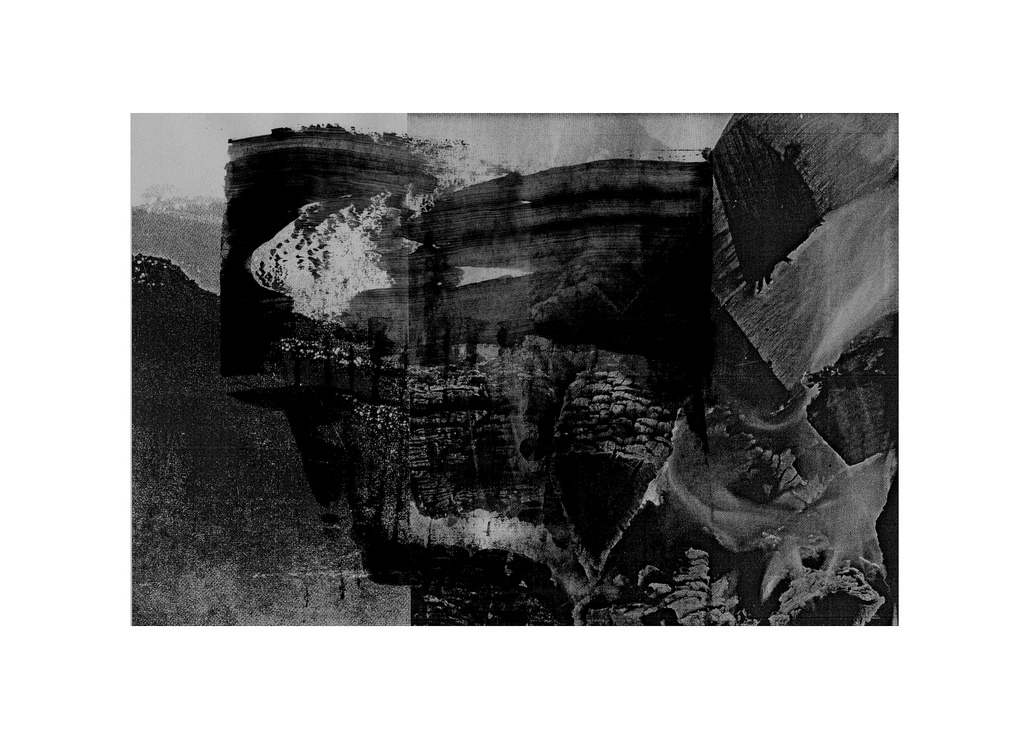
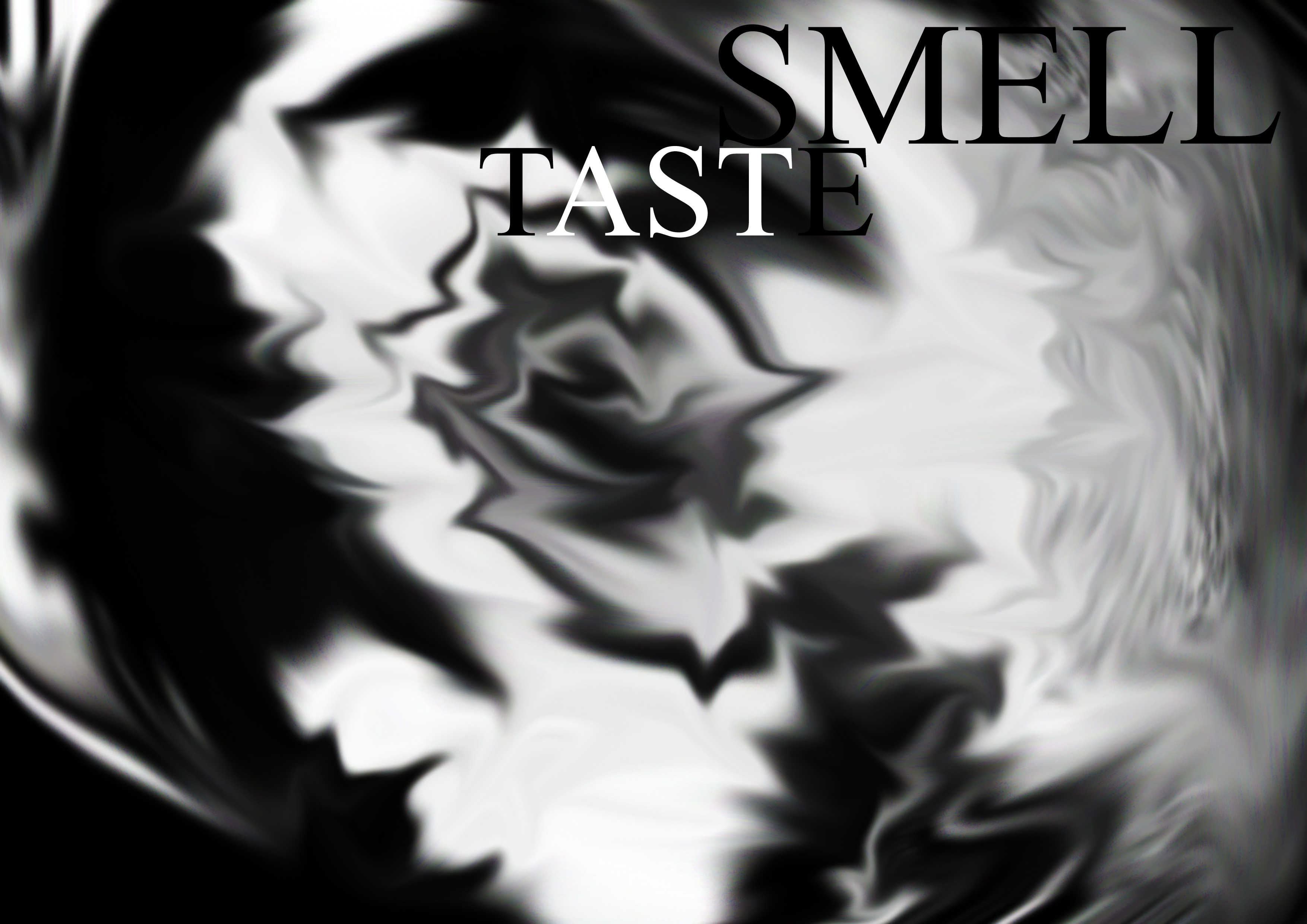
Smell and Taste:
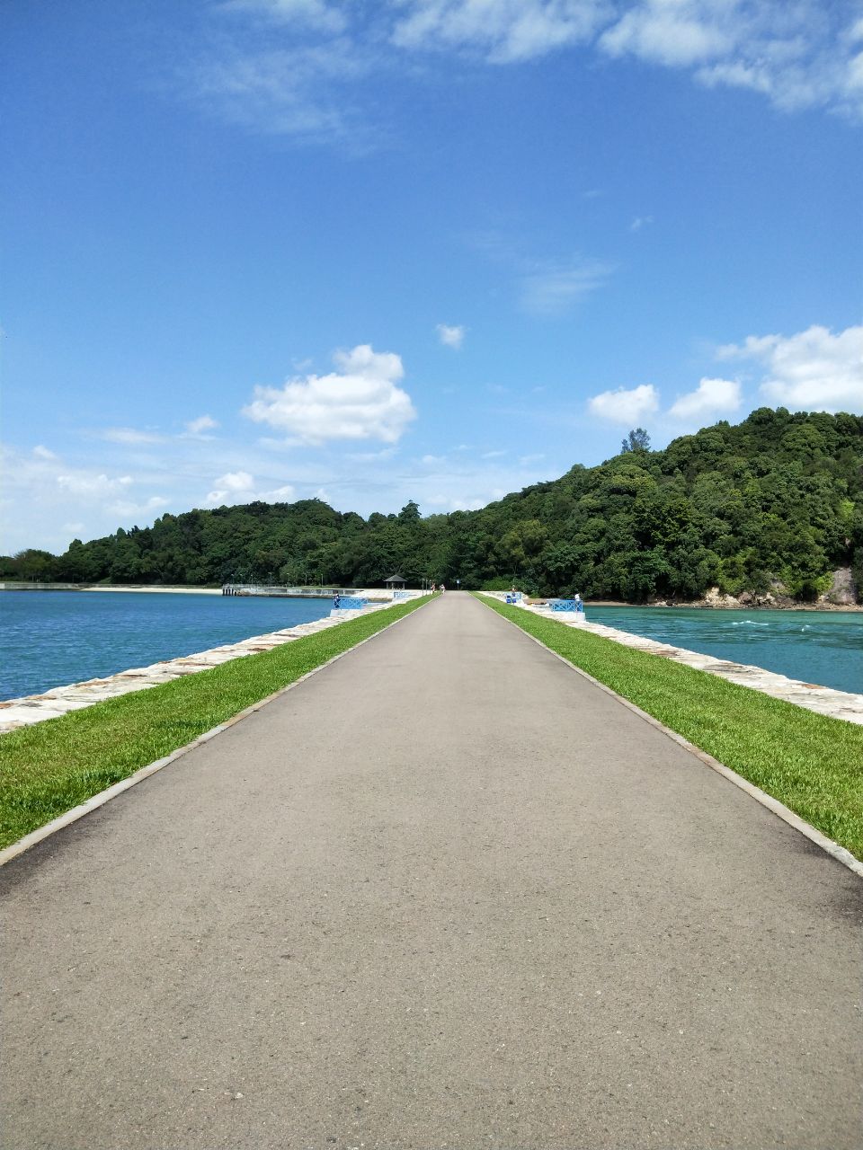
For me, SJI smelled and tasted very raw to me because of its untamed nature and freshness. However, it was also very smooth because of its lack of tension and interruptions (like pollution) in the air and combined together, they were very cohesive. Hence, you can see a dark and light tone contrast, which symbolize how the raw and smooth qualities have bonded into the grey tints in the image. I attempted to use the golden ratio to create an image that is comfortable to the eye. The spirals on the right page symbolizes the calming, controlled smell on the island; light yet different altogether. The sharper angles on the left page symbolized more of the musky yet sharp air I tasted on the island. The emphasis is placed on the right page (where the smell is), hence the weight of the image is on the right. This is because the smell of the island is the first thing I experienced upon stepping on shore, and remained one of the most significant throughout my stay. The image I used to create this pattern is that of one of the pathways by the sea, which I felt reconciled the rocks, the sea, the trees and the sky. It was the one place that had all these main elements I favoured from the island. The image I used is as shown below:
St. John’s Island | Pathway between the seas
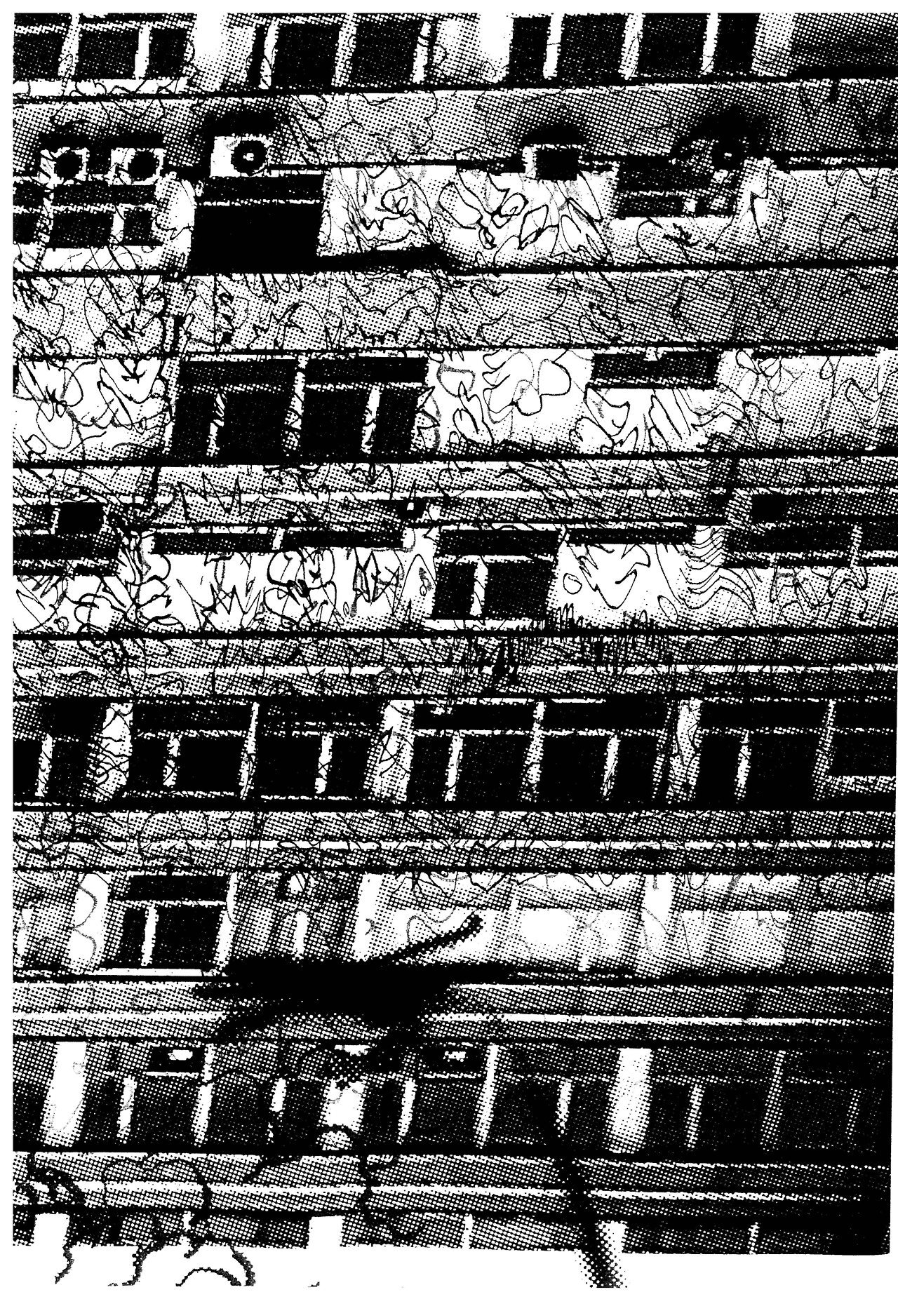
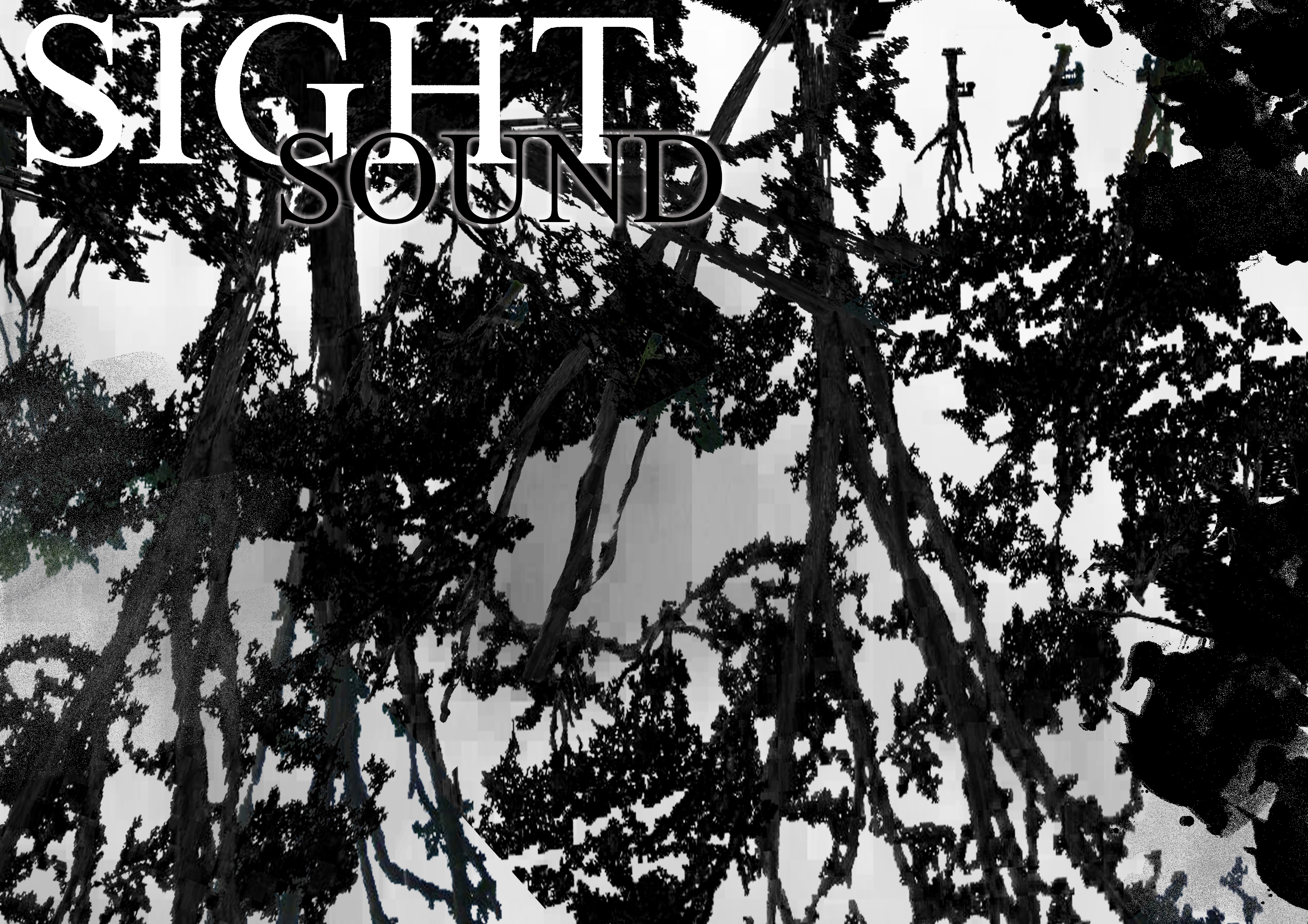
Sight and Sound:
For sight and sound, the things you hear and see are usually just a pile of mess; either the vast seas, the abundant trees and grass, many rocks, etc. There is always a lot of everything, and all these elements when combined together gives us one impression of the island. However, when you take all these qualities apart and analyse them one by one, you are able to determine the magic from each one mark. I used layering of many trees to create this effect. On the left page, it seems that everything is layered quite intense and the tree branches help to establish that there is a lot of noise present. Then, slowly proceeding to the right page, the negative space increases and the branches clashes less now. There is more space to breathe. The total image create a sort of gradient from dark to light to establish how the dark sides are the noise and abundance of all the sounds and sights we see but as we take the elements we see and hear apart and focus on one thing, they become clear as day; very defined, and well-received. The texture is also rough, to represent how each sound and each thing we see has its own personality and detail about it.
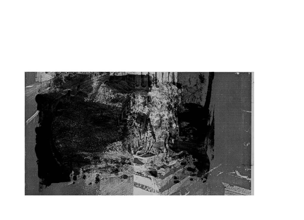
Touch:
The feeling of touch I got from St. John’s Island was mixed. It was scrunchy because of the sand and grass and leaves. Rough, yet sort of easy to grab onto. That was main part I experienced on the island since I never went into the water. Hence, it is the focal point of my image on this spread, and it had the greatest opacity and noise. At the sides, the colours are much lighter, like in light grey and white. These textures are smoother as well, which represented the skies and waters; how they are clear and easy-flowing. The opacity is less, because they are lighter, and are sort of floating in the background compared to where I was standing on the grass and concrete path. It is downward sloping serving as a function to help the eyes flow better. In this picture, the gradient is almost non-existent because I wanted to show how the touch between different elements are very different and defined at the same time.
Overall this project was a long, tedious yet life-changing one for me because I was able to break out of my stubborn shell to explore so many different options for one of the first times. I was forced out of my comfort zone to take on new ideas I was not sure would work and could experience myself jumping up in the middle of the night at the thought of new ideas that could potentially work.
Here are the different processes for my various typography works.
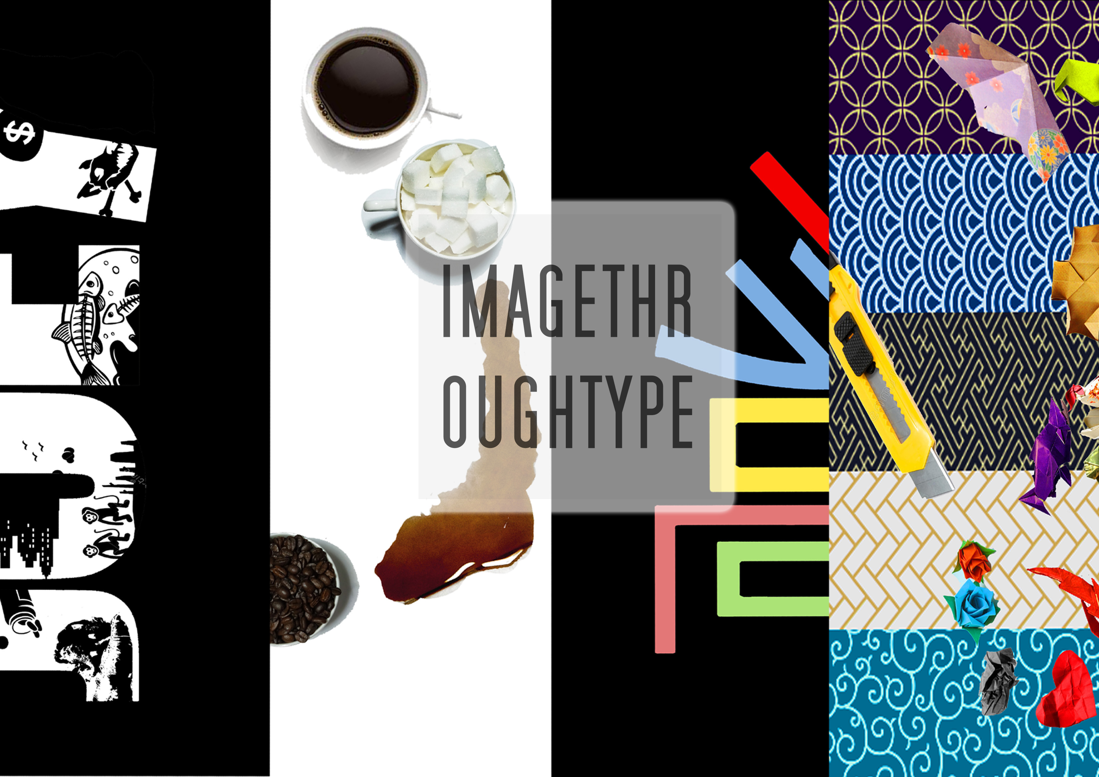
Occupation #1: Cafe Owner
Cafe Owner- Research
I took inspiration for this typography from how many posters and photos online always feature Flat Lay photography- which makes coffee look really good. The variety of coffee available also inspired me to use different coffees to describe different moods; for me, I like drinking sweet ice-blended drinks when I am happy and I turn to hot mochas when I am feeling quiet. The use of coffee stains also inspired me, because coffee stains have a tendency to stain things whereas keeping its soft and comfortable quality.
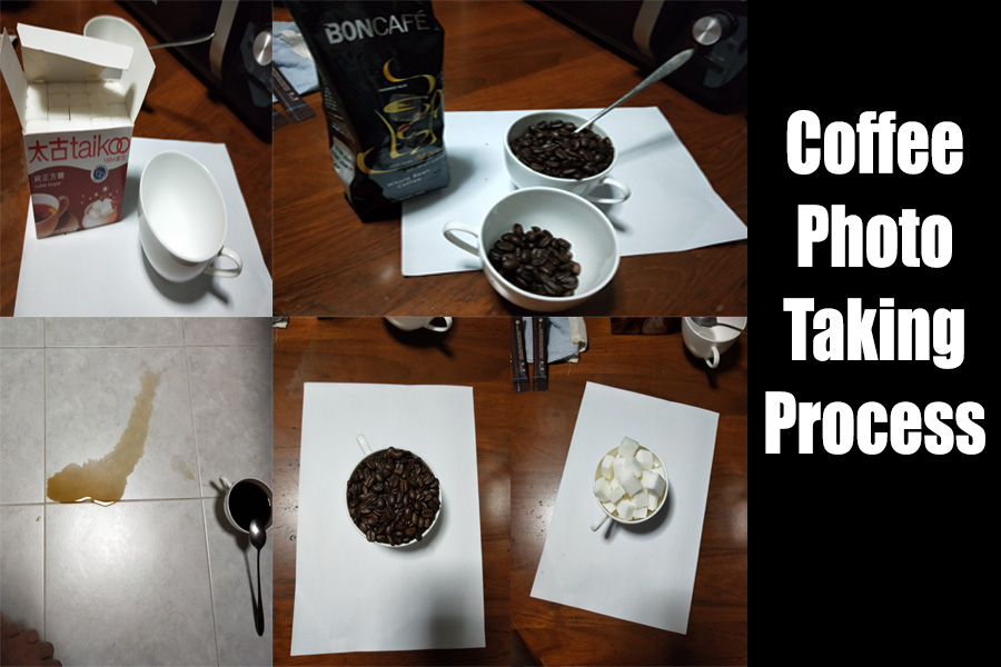
Coffee Photoshoot in my kitchen. T.T
Photoshoot for Coffee was really hard without the right equipment and lighting. I used my Oppo R11 and my regular kitchen light to take the photos. This was also probably the reason why I decided to keep the white background- it was easier to edit for someone as inexperienced as me. Oops.
Initially, I wanted to utilize non-coffee things such as rocks and feathers, but I decided that it would mess up the cohesion of my composition.
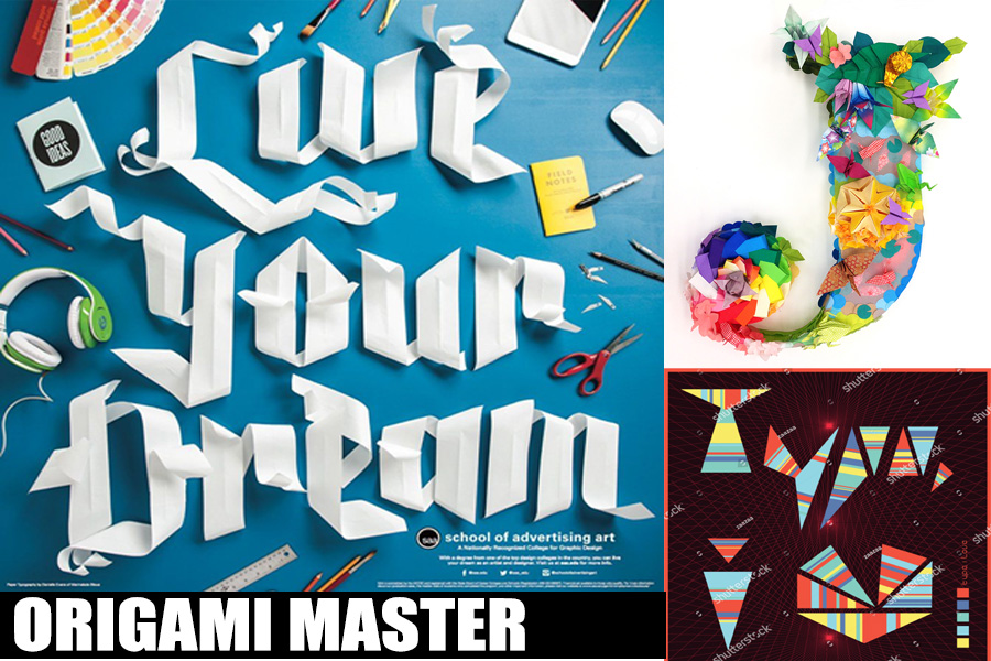
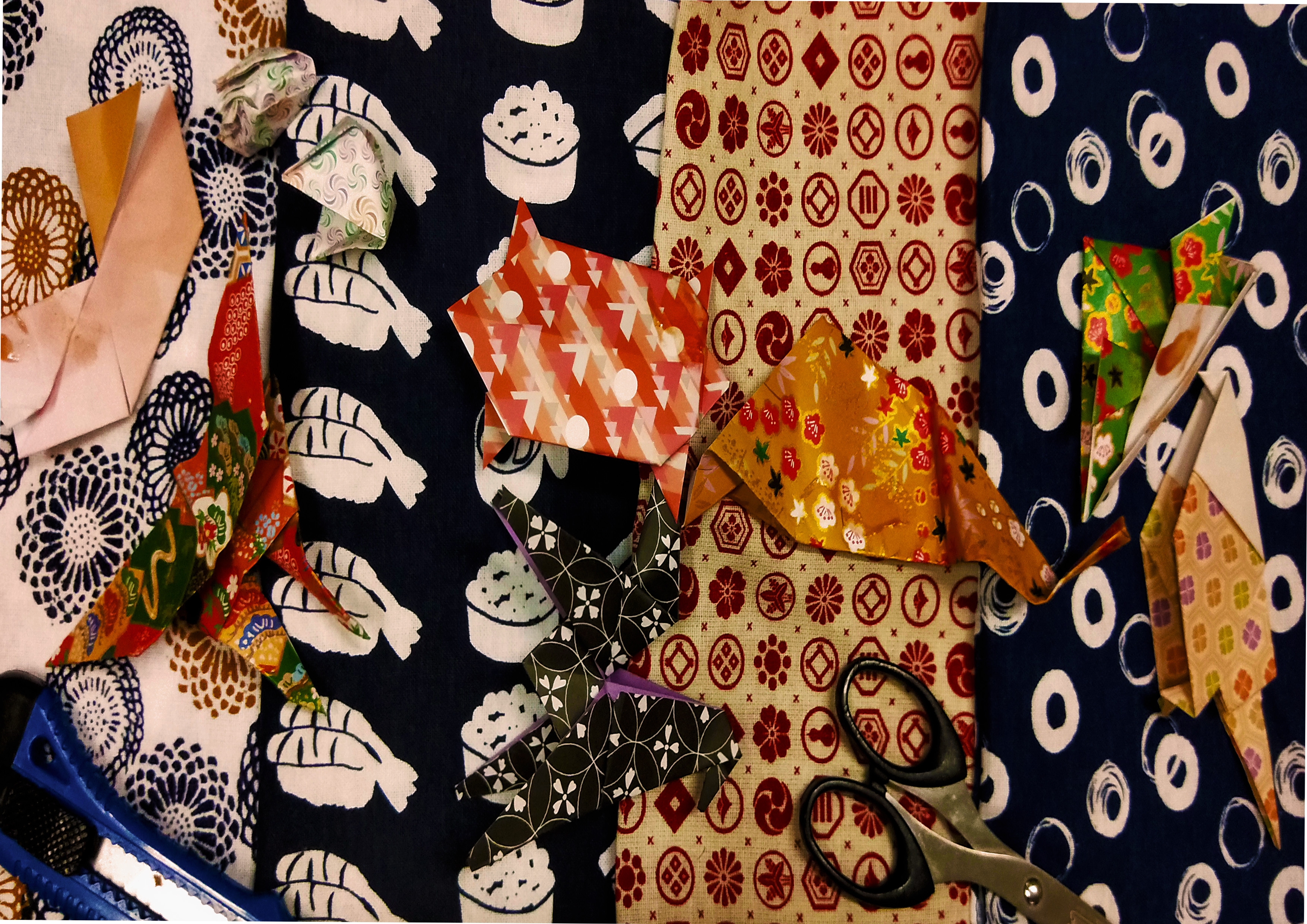
Occupation #2: Origami Master
Origami Master- Research
For this occupation, I was inspired by how artists from School of Advertising Art and Japanese Art Festival made use of their own culture to create their art pieces. To be honest, making the origami was really hard, and I had to go through so many drafts that I could cry.
My depressing Draft 1: Origami Master
My first draft was a cohesive photo. I made the origami with different kinds of traditional Japanese origami papers, and placed them on traditional Japanese patterned cloths. However, that did not turn out too well because of how the patterns and colours clashed and the Japanese words did not end up being seen.
Then, I changed my approach and decided that I should remake the origamis with more defined shapes, and use a more regular (less patterned) origami paper instead. Also, I should not have photographed all the origami patterns together at once since I did not have the right contrasts and lighting. Hence, I decided to photograph each and every origami piece against a white background, before cropping all of them via photoshop and pasting them together on another blank canvas on photoshop.
For the background, I decided to use one from the internet instead, because I realized that my fabric was indeed too bumpy, and was of the wrong shades of colours to bring out the contrasts in my work.
Then, I spilled sauces against a white paper, and photographed them too. I photoshopped these stains onto the origami, because when I stained the origami directly, the sauces could barely be seen despite being layered on thickly.
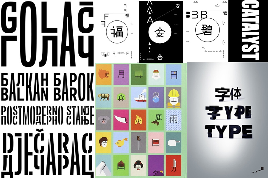
Occupation #3: Catalyst
Catalyst – Research
For my work, I took inspiration from works from artists such as ShaoLan, Chinese Ancient Scripts, Balkans Sans Font, and Word Play on Behance. These art pieces and creations rely on the mix of visual graphics and a mix of western and eastern typography to create a new sort of typography. I found it really interesting, and decided to play along with it.
Draft 1: Catalyst
Initially, I tried to play on the idea on how I can alter the J of my name and convert it into an unexpected catalyst by altering the most important component of the letter that makes the alphabet… well, J. However, I realized that I wanted to be aware of what I was doing, hence not really being ‘unexpected’. I didn’t want to be a lunatic after all. And this construction of the illustration did not sit very well with me. Hence, I decided to trash this typography and rework on another one.
Hence, my next idea revolved reworking, reconstructing and re-layering the Chinese direct translation for my name, 喬. I changed the direction of my name at the second half my name to show how a ‘plot twist’ is present, and how I mingled both the eastern and western influences of my name together.
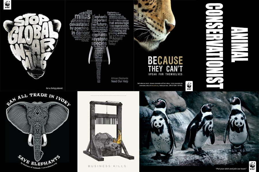
Occupation #4: Animal Conservationist
Animal Conservationist – Research
Since I was young, I have always been one to love animals a lot. When I lived at my Grandpa’s house over holiday breaks, I would always play with the strays all around the Kampung (they live in Malaysia) and would occasionally play with the hunting dogs (they hunt in the forests) because they seldom get tender loving care from the hunters. I’m also the kind of person who will go around chasing dogs and cats just to feed them and play with them; these are the animals who do not really get cared for because they do not have owners, and it pains my heart to see them so. When I was 18, I decided to join the SPCA to help out with the Animal Shelter, and am waiting for myself to hit 21 before I join ACRES. In a sense, I’m already part Animal conservationist, and would like to continue on this route especially when I am able to get schooling out of the way (so I have more time to help out in the shelters).
The root of my idea is actually in how animal endangerment and conservation posters often depict sad pictures of deprived animals and how we should help them, but rarely about what is the cause of their sadness. Maybe these conservation posters are afraid of corporate backlash when they throw out the causes of animal endangerment in their posters, but I feel that the impact is lessened when they do not remind people about how these animals are being mistreated and harmed in the first place. All sad animal posters do is to evoke feelings of pity in people, but rarely the feelings of ‘oh shit, we did this and caused this? Oh shit.’. Hence, I placed these causes in my typography poster, in an attempt to spread the message about how animal endangerment has come about- due to human consumerism and ideals.
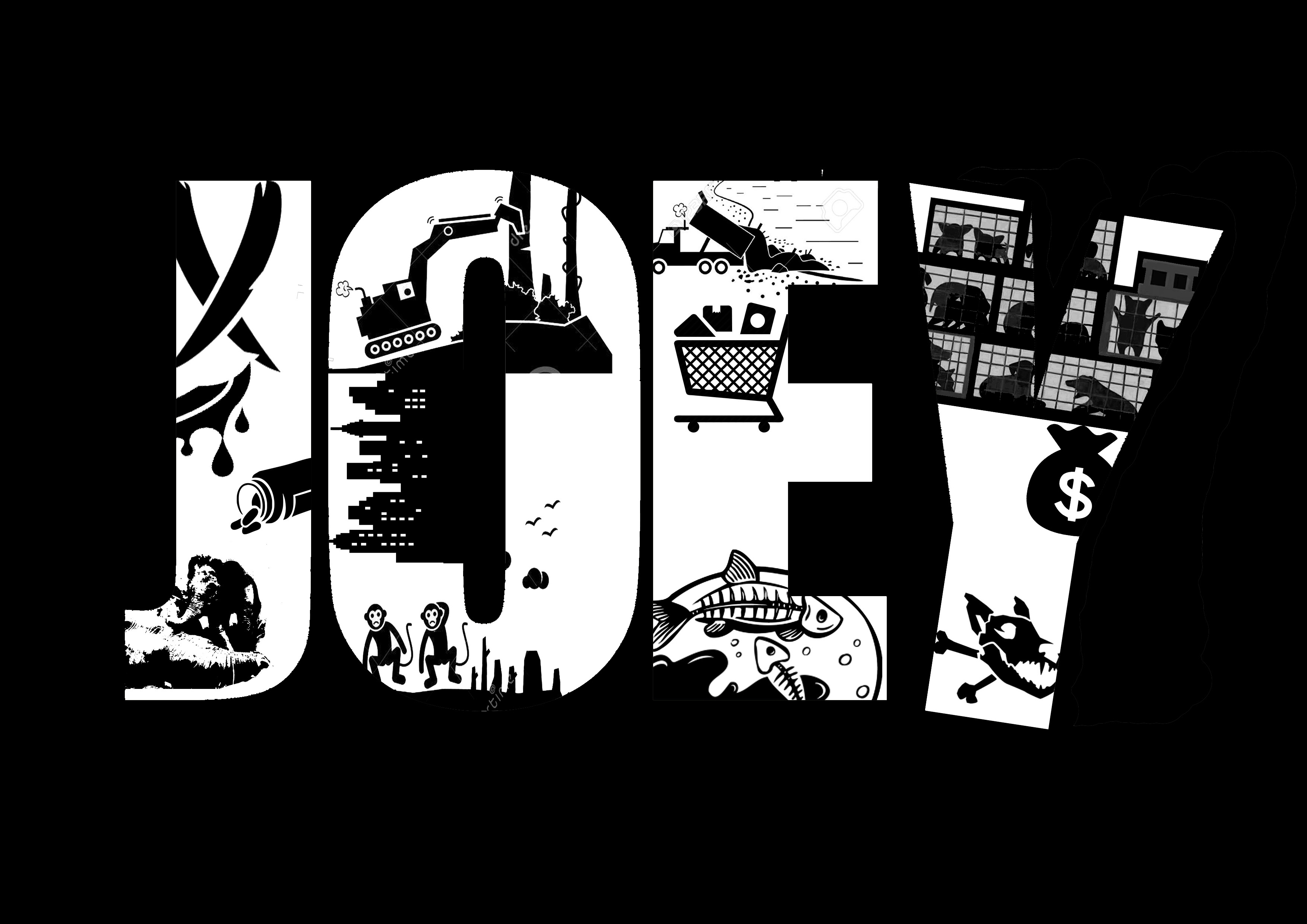
Draft 1: Animal Conservationist
My first draft was a collage of real animal endangerment, their causes and their consequences. However, it was messy and a little too direct.
Draft 2: Process
Afterwards, I decided to go for a black and white collage, focusing on mingling elements of the original pictures with the background to establish a sort of Gestalt and black and white quality.
For this project, I centered my theme around the things I dreamed of doing and would like to do in the future if I was given the opportunity to do so.
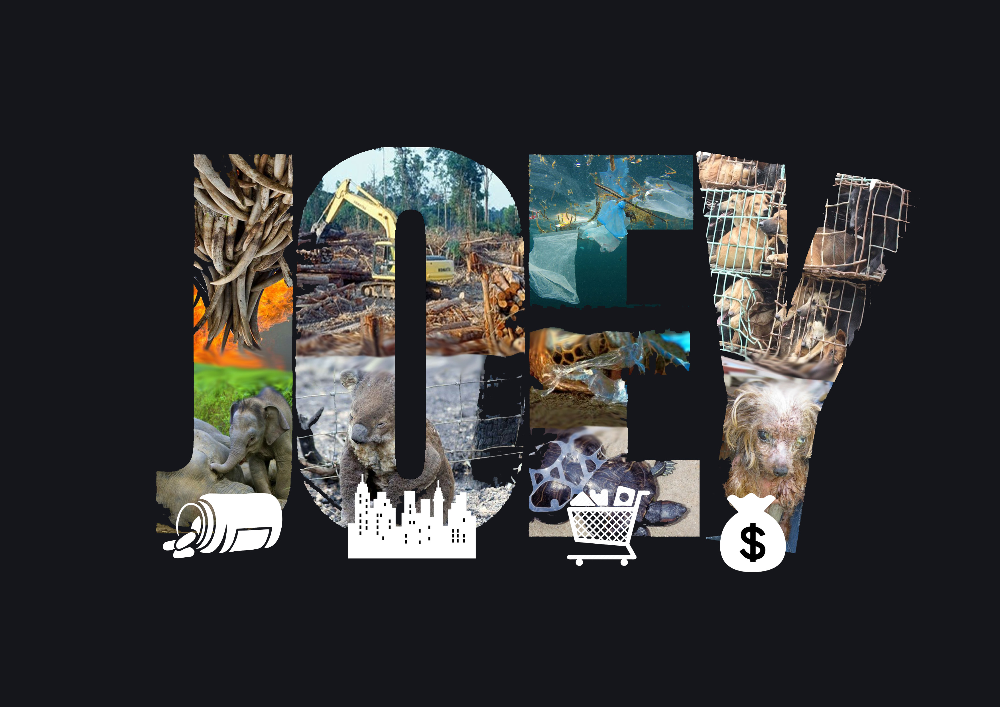
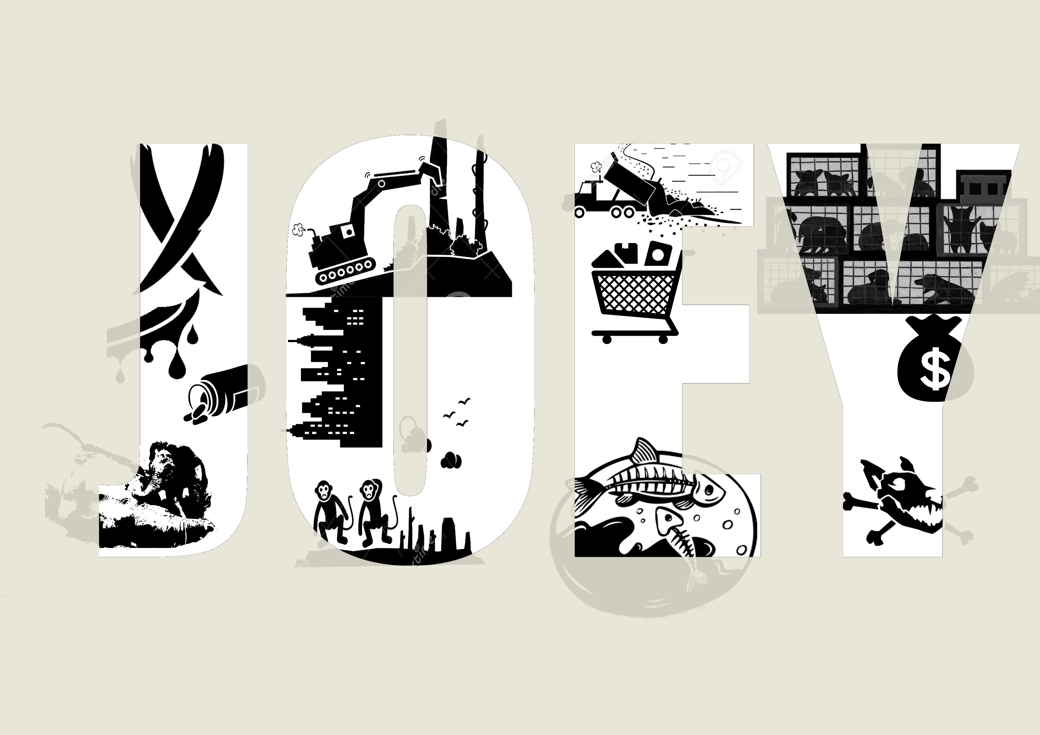
My name is JOEY and I am an Animal Conservationist.
Since I was young, I have always been one to love animals a lot. When I lived at my Grandpa’s house over holiday breaks, I would always play with the strays all around the Kampung (they live in Malaysia) and would occasionally play with the hunting dogs (they hunt in the forests) because they seldom get tender loving care from the hunters. I’m also the kind of person who will go around chasing dogs and cats just to feed them and play with them; these are the animals who do not really get cared for because they do not have owners, and it pains my heart to see them so. When I was 18, I decided to join the SPCA to help out with the Animal Shelter, and am waiting for myself to hit 21 before I join ACRES. In a sense, I’m already part Animal conservationist, and would like to continue on this route especially when I am able to get schooling out of the way (so I have more time to help out in the shelters).
My idea is rooted in how animal endangerment and conservation posters often depict sad pictures of deprived animals and how we should help them, but rarely about what is the cause of their sadness. Maybe these conservation posters are afraid of corporate backlash when they throw out the causes of animal endangerment in their posters, but I feel that the impact is lessened when they do not remind people about how these animals are being mistreated and harmed in the first place. All sad animal posters do is to evoke feelings of pity in people, but rarely the feelings of ‘oh shit, we did this and caused this? Oh shit.’. Hence, I placed these causes in my typography poster, in an attempt to spread the message about how animal endangerment has come about- due to human consumerism and ideals.
The J of this typography depicts hunters poaching for ivory which is then used to make medicinal pills which are often fake. As a result, animals such as elephants and rhinos often become orphans, at the mercy of these hunters who have slayed their parents.
O depicts how deforestation to build cityscapes and buildings in our concrete jungle have resulted in homeless animals. These animals consist of those in the forest, and often relies on trees to build their habitats. I used monkeys, because they are one of the main animals living on the trees.
E highlights the danger of dumping waste into the oceans. We often accumulate waste because of the non-biodegradable rubbish we throw away after shopping for them. As a result, marine animals such as fishes get either poisoned, suffocated, strangled, or smashed to death.
The last letter, Y, depicts how we always like to have cute pets and to gain a lot of profits at a low-cost margin, one of the mass pet producing factories have emerged; puppy mills. These animals are crammed in large numbers in small cages and end up being extremely sick, or even dead.
The issues I have highlighted are greatly relevant in today’s context. I used Gestalt and black and white to depict this art also because I wanted to show that this is a very black and white (obviously bad and good) situation, yet people are not doing much to stop this crisis. Also, black and white represents how a lot of these problems arise due to contracts and agreements to produce and consume. Mere contracts and paperwork can result in the loss of lives for these animals.
For the font, I used a very clear-cut and bold font, because it helps to create an impact. It is loud and almost hard to ignore. Also, I placed the letters very close together to symbolize how all these problems are essentially very closely related to each other, and that we hence cannot ignore the rest of the problems just because we think it does not apply to us. The Y of the JOEY is also tilted, to show that as more of these problems arise, the world around us will start to disintegrate and collapse. And this is only just the start of the issues we have to face if we do not start saving these animals.
My name is J and I am a Café Owner.
I have always wanted to be a Café owner because it is very peaceful and calming. There is also something called Coffee Therapy, which is basically how you pour hot water into your coffee beans- it is very calming, and the taste of the coffee differs based on how you pour your coffee. I would like a café that I own to be a place where people of all sorts of moods to be able to enjoy and relax in. They will be welcome to talk about their troubles, to vent their problems, and to sink into the sweet aroma of coffee beans. It will hopefully serve as a sort of second home, where they can always go to.
The cups are all kept white, because they symbolize how everyone almost always start from the same capacity- being a human being. The contents of the cups contain the different moods people may feel when they come for coffee; so fatigued and weak they need an entire mug of coffee beans, fluffy and happy like a cup of sugar cubes, a normal, relaxing cup of coffee, and a cup of fancy latte. Ultimately, I would like my customers to end up like the gentle curve of the J, where they will be relaxed and comfortable after visiting my café. I chose to use only 4 cups because I would like my café to be one not like crowded Starbucks or Coffee Bean, but one which is not popular, yet a humble abode and a secret paradise.
My name is ジョーイ and I am an Origami Master.
I am one who really loves traditional patterns and culture. Hence, I picked an occupation which is a speciality of the Japanese culture; origami. I wanted to emulate the childish innocence we have as children, hence using origami to form Japanese words that are a direct translation of my name; Jōi, otherwise also known as ジョーイ. I used the Japanese Kanji because I wanted to link it back to the traditional Japanese roots. This presentation is supposed to be a depiction of a child’s best origami collection. If you look closer, some of the origami creatures are really well made, while some are really crumpled and have been refolded over and over again, such as the heart, grey blob, shark and dragon. The purple fan at the side and the brown origami in the middle is also incomplete, showing that the child has given up at some point. The chicken origami figure and the green bird at the side has sauce stains on them, too. In a sense, the childhood innocence shines through how the child’s best work is flawed, yet he or she is proud to present it. At last, the scissors and the cutter is randomly placed to show that the child is careless and still does not have the same mature foresight we have as adults to present our work in perfection. Through this work, I also took inspiration from ‘Accidental Typography’, a concept where you put things in unplanned positions, only to accidentally form a sort of lettering.
My name is JOEY (喬) and I am a Catalyst.
Catalyst
This concept may seem confusing, but I chose this ‘occupation’ with the reasoning that I would like to be the only one who can trigger and affect my own life. In a way, I am essentially saying that I want to be someone who can shake my own world so powerfully. I faced many difficulties in the Art field because I had no art background, and was only backed up by my own interest in art. I guess this spurred on my motivation to be successful and to become someone I can be proud of. As a result, I decided to create an art piece which shows a ‘plot twist’. I chose the word that is a direct translation of my Traditional Chinese name (well, I used Chinese because it is my origin), otherwise known as Qiao (喬) (To note that this is only Jo). I inverted the letter, and kept the first part of the name, which highlights how I retained the originality of my identity. It also forms ‘Jo’. Then, midway through, I inserted a ‘Plot twist’ and inserted a western influence into my name, creating a change in my identity. I did not remove any part of the Chinese word at all, but I sliced the top half of the word into half and changed its direction to form ‘Ey’. Hence, my Chinese identity was configured into something that was a mix of eastern and western culture.