Chris Milk
A career founded upon music videos and photography, Chris Milk’s work has expanded beyond the traditional: his art embraces experimental genres and unfamiliar mediums, turning new technologies, digital grounds, emotions and even physical gestures into new found canvasses.

Chris Milk Interactives
Working on cross-media innovations to enhance emotional human storytelling, Milk reveals the beauty in the physical, the digital and the intangible; these are the elements which connects people in a relational manner. As Norbert Wiener mentions in his text Cybernetics in History, “society can only be understood through a study of the messages and the communication facilities which belong to it.” Through his art pieces, Milk created a language which established a mutual societal understanding; his work is a ‘communication facility’.

Chris Milk- Installation Art
He makes use of personal, emotive and powerful music and breakthrough technologies to create a visual experience rooted in a global consciousness. His ability to create a crowd-fueled installation that physically connects the audience and their collective emotional response plays a heavy part in establishing ‘entropy’; in a sense, he downplays a generic audience reaction by making them react intensely and emotionally. As each audience may connect differently about a certain art piece, it then establishes a disharmony and disorganization in the audience’s predictability. This ‘entropy’ as mentioned by Norbert Wiener in his text, is a form of evolution of the new media; where expectations are aimed to be subverted for the audience.
Treachery of the Sanctuary by Chris Milk
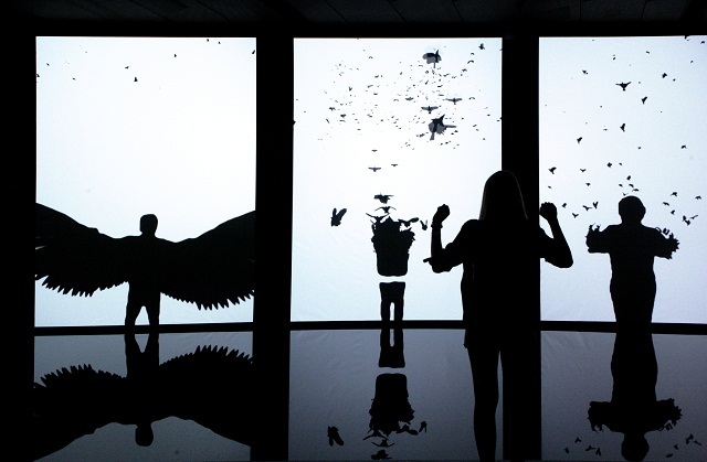
‘Treachery of the Sanctuary’ is a large-scale interactive giant triptych: a story of birth, death and transfiguration that utilizes the shadows of the participants’ own bodies and their actions to unlock a new artistic language. This language is created and conveyed through the participants’ actions. It is an interactive art installation created to explore one’s creative process through interactions with digital birds.
The first screen allows a person’s shadow to be reflected on it, while it slowly disintegrates into a flock of birds who flies away. This represents the moment of creative inspiration, our imagination taking flight form our own minds and identities.

The Third Screen
In the second screen, the shadow of the person will be pecked away by virtual birds diving in from above. This symbolizes critical response, where ideas and the person’s identity are being evaluated and critiqued by others.
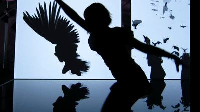
The last screen, things start to look up; the person interacting with the screen will be able to generate their own set of majestic, giant wings that flap as you move. This is supposed to capture the instant when a creative thought transforms into something larger than the original idea.
The second and third screen.
This whole installation draws upon the idea of how human interactivity (and their active participation) can be key in creating art alongside technology. This art installation demonstrates an inter-discipline through the integration of art and technology simply by allowing participants to dictate how they want their art work to look like.
At the same time, participants are also immersed into this experience because every single movement they make will affect the final presentation of the performance created by the installation. Whether you move to your right or left, or start raising your arms, these little movements do matter.
As mentioned by Roy Ascott, “While the general context of the art-experience is set by the artist, its evolution in any specific sense is unpredictable and dependent on the total involvement of the spectator.” This reinforces the function of the art piece, where the spectator gets to depict the portrayal of the artwork. This makes use of feedback, where “the modern artist… set feelings and ideas in motion, to enrich the artistic experience with feedback from the spectator’s response.” This feedback comes in the form of the input by the audience when they strike a certain action, and the output is the portrayal of their actions in the form of the digital birds’ actions. This total structure is a ‘Complex Action’ (as termed by Norbert Wiener) where the data is introduced to provide an effect on the outer world.
Ascott also mentions that “the human being constantly aspires, where freedom and responsibility combine to reduce our anxiety of the unknown and unpredictable while enlarging our experience of the unfamiliar and irresistible.” Milk builds up on this idea through the emotional aspect of his art piece. As the participant strives to achieve different results since they are granted the autonomy to present any version of their art (through their actions translating into digital birds), it is in their curiosity to explore and experiment. This is all part of the human tendency, which Milk managed to achieve when he wanted his art work to be emotive and relational.
Ultimately, Milk’s art piece is aligned to what Ascott mentions; “As matrix, [behaviourist art] is the substance between two sets of behaviours; it neither exists for itself nor by itself. As a catalyst, it triggers changes in the spectators’ total behaviour. Its structure must be adaptive implicitly or physically, to accommodate the spectators’s responses, in order that the creative evolution of form and idea may take place.” Treachery of the Sanctuary well expresses how the autonomy in the participants as well as their random reactions– in other words, their behaviour– can help to build up on an original art piece that is an actual performance rather than an expected performance, otherwise defined by Wiener as a ‘feedback’. The active participation required for the art piece to function as an interactive installation is dependent on the response of the spectators and their imagination.
The output (observer response) is to act as an input, which ‘introduces more variety into the system and leads to more variety in the output (observer’s experience)’. The spectator is then a ‘self-organizing sub-system’ and the artwork is ‘not usually at present homeostatic.’ Armed with emotive and high-impact works which binds art and technology together on not only a physical level but also an emotional level, Chris Milk has achieved the optimum level of a behaviorist new media art with Treachery of the Sanctuary.
References:
http://milk.co/treachery
https://makeagif.com/gif/treachery-of-sanctuary-kinetic-wings-at-the-creators-project-OxaQb0
https://onedio.com/haber/yeni-baslayanlar-icin-13-maddede-dijital-sanat-707526
Norbert Wiener, “Cybernetics in History,” 1954, Multimedia: From Wagner to Virtual Reality
Roy Ascott, “Behavioral Art and the Cybernetic Vision,” 1966, Multimedia: From Wagner to Virtual Reality


/s3/static.nrc.nl/bvhw/files/2017/09/data19540606-ee35f6.jpg)