Rhetoric of the Image by Roland Barthes
What are some of the key questions Barthes aims to investigate in the article?
Some of the key questions Barthes aims to investigate in the article are whether analogical representations are actual interpretations of signs, and are not just simple unions of different symbols. He also poses about whether we will be able to accept analogical ‘codes’ as proper analysis for images. Further, he implores about how images can conceive meaning, and if it does, where does it stop relaying a message? Is there anything further than the message that is conveyed if there is a halt to the supposed message relayed?
What are some of the key terms/ concepts introduced and discussed?
There are multiple key terms and concepts introduced and discussed in his research. Barthes believes that the image is an embodiment of lived experiences. There are people who feel that image is a fundamental way of conveying messages compared to language. They suggest that images are so prosperous in its messages and conveyance that language becomes something less significant compared to what images can do.
In an image used for advertisement, there are usually three messages. The first message is the linguistic message, usually twofold; denotational and connotational. When we take away the linguistic message, we are then left with the pure image. This image is immediate in providing us with a whole list of intermittent signs. The message we receive from the image that is shown to us is a result of the things we acquire and learn from what have previously been promoted to us by the market. It is a message that is very common, because of how the ideas have been frequently planted into us through our daily habits and widespread culture.
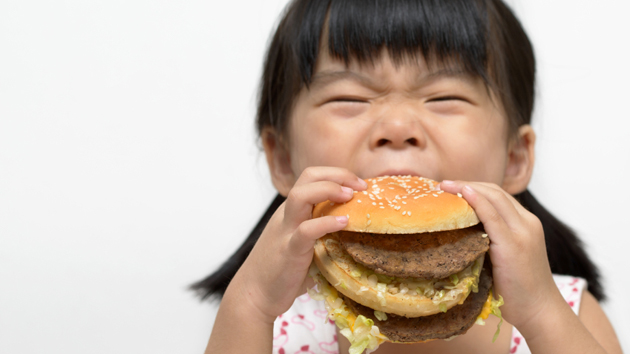
This is also related to how the message the linguistic message provides may be obsolete, because the message may hold meanings special enough for us to recognize. The meanings the image provides may provide us with similarities with typical tourist identifications with a culture. For example, coconuts are usually associated with Hawaii.
The composition of an image may also relate to ‘still life’, where it portrays the lack of text and labels to convey the message, alike a painting. This would require a general set of cultural knowledge, and how to imbed these values into the image such that they are recognized globally.
The second message that we can identify is the iconic message. Without needing the assistance of shapes and colours, we are still able to continue identify and understand the images we are exposed to, if they are objects that we are familiar with. The relation between thing signified and image signifying in analogical representation is not ‘arbitary’, and is rather quasi-tautological. There is a loss of similarities of true sign systems and a statement of quasi-identity. In other words, the inference made for an image is not selected from a uniform stock, and is not coded. We are brought up against the paradox of a message without a code. To identify messages in the image, all we require are the knowledge we have, together with our perception.
This is known as the literal message, as opposed to the previous symbolic message.
There are hence three types of messages; the linguistic message, the coded iconic message, and the non-coded iconic message.
The linguistic message can be easily divided away from the coded and non-coded iconic messages, but since they are both iconic messages, there is debate about whether we should separate them. When we read into both iconic messages, the reader simultaneously understands both the perceptual and cultural message.
If this separation allows us to understand the way the image is arranged in a simple and coherent way, and further justifies an explanation of the role of image in our society, we will consider it to be justified.
Of the two iconic messages, the first is in a way imprinted on the second. The literal message appears to support the meaning of the ‘symbolic’ message. In this case, the literal image is denoted and the symbolic image is connoted.
Now, we can split the three types of messages; the linguistic message, the denoted image and the connoted image.
For us to find images that have no words in their descriptions, we need to backtrack to partially illiterate societies, where images are mainly pictorial. Do images duplicate certain information in the text such that they become obsolete, or do text help viewers to gain new information from the image?
To research, we will have to look back at the classical period, where the passion for books with pictures were strong.
The linguistic message can be seen conveyed in most images; as a title, a caption, an accompanying press article, a film dialogue, and even a comic strip balloon.
It is not precise to identify image as belonging to a certain civilization. Even in the present, we are still very reliant on writing, speech and images to convey information.
There are two functions of the linguistic message with regards to the iconic messages; anchorage and relay.
All images are polysemous. They have many layers of meanings underlying their signifiers, and readers have the freedom to select which meanings to focus on, and which meanings to ignore. Even if this freedom is considered a flaw in society, images that shake the perceptions of its viewers may sway viewers to a biased point of view, distorting the facts.
In every society, multiple different methods are used to resolve the floating chain of signifieds, in a way that would help prevent the terror of uncertain signs. The use of linguistic message is one way.
Text helps us to infer the pure aspects of the scene and the scene itself. It is a matter of a denoted description of the image, or in Hjelmslev’s terminology, of an operation. To Barthes, this allows him to choose the correct level of perception, so that he can focus on both his gaze and his understanding.
When it comes to the ‘symbolic message’, the linguistic message not only helps us to identify, but also to interpret messages. It constitutes a kind of vice which holds the connoted meanings from proliferating, whether towards excessively individual regions or towards dysphoric values.
The text by linguistic message guides the reader through the signifieds of the image. It is often done by delicate communication, and automatically plods him to a meaning that is chosen in advance.
Elucidation is selective, a metalanguage applied not to the totality of the iconic message but only to certain elements of its signs. Meanwhile, Anchorage is a control for the use of the message while competing with the projective abilities of images. Anchorage is most frequently used, whereas the function of relay is less common.
Text (most often a short dialogue) and image are usually complementary. The text is like images; they are smaller parts of a more general syntagm and the unity of the message is thus realized at a higher level. This comprises the story, the anecdote, and the diegesis.
This relay-text is vital in media such as film, where dialogue functions are not just elucidation, but do help to move the action forward in a sequence of messages. The interpretations of the messages are not necessarily found in the image alone.
Text and image can co-exist as an iconic whole. The dominance of one or the other is the result of what has been prioritized in the piece of work.
When text has the diegetic value of relay, the information is more expensive because of its need to utilize the digital code. When it has a substitute value e.g. anchorage or control, it is the image which helps to retain the information. With the image being more analogical, the information displayed becomes more inactive. The distinction between the literal message and the symbolic message is functional. The characteristics of the literal message cannot be of main importance, but only as a sign indicating relevant connection.
A message by eviction, consisting of what is left behind in the image when the signs of connotation are purposefully ignored, naturally corresponds to a plenitude of virtualities; it is an absence of meaning full of all the meanings. It is a sufficient message, since it has at least one meaning at the level of the identification of the scene represented (the image).
This intelligibility remains virtual because it is a weak interpretation, since society commonly accepts only knowledge that outweighs the mere anthropological and perceives more than just the use of text.
The denoted image can appear as a kind of Edenic state of the image; when we remove its connotations, it becomes more objective, and even innocent.
Barthes brings out the comparison between photographs and drawings. The photograph is a kind of image which seems to consist of a message without a code. It is opposed to drawing, which even when denoted, is a coded message.
Pictures require a set of self-governed transpositions. There is no essential nature of the pictorial copy and the codes of transpositions are historical.
In drawings, it does not reproduce everything. Although we can select what to draw, even its point of view and angle, we are not able to interfere with the inner object. The denotation of the drawing is less pure than a photograph, because different drawings also conveys different styles.
The coding of the literal prepares and facilitates connotations since it establishes a certain discontinuity in the image. The process of the drawing itself consists a connotation.
In such, it is no longer a relationship between nature and a culture (alike photographs), but that of two different kinds of culture.
The photograph the level of literal message- the relationship of signifieds to signifiers- is not one that produces deeper meanings through the execution of the image, but of direct ‘recording’. Photographs captures images mechanically, unlike drawing which does it humanely.
Man’s interventions in photograph by altering framing, distance, lighting, focus and speed, belongs to the plane of connotation. This establishes not a consciousness of the being-there of the thing, but an awareness of its having-been-there.
This brings us a new space-time category; spatial immediacy and temporal anteriority. The photograph is never experienced as an illusion, yet it can be determined that there is no conscious presence. As a result, it diminishes the projective power of the image.
Films are different from photographs in this sense. Films, on the other hand, has a fictional consciousness that is more projective, whereas photographs are limited to its spectator consciousness.
Photographs can also avoid recordings of history despite its advancements, dedicating its representation to being a ‘flat’ anthropological fact. The denoted image hence naturalizes the symbolic message.
The more technology can record information and images, it is able to convey better the constructed meaning under the appearance of the given meaning. Even when the signifiers seem to extend over the whole image, it is nonetheless a sign separated from the others.
When a normal system has signs drawn from a cultural code, then number of readings of the same lexical unit or lexia (if the same image) varies according to individuals. The variation in readings however, is anarchic. It depends on the different kinds of knowledge- practical, national, cultural, aesthetic- invested in the image and these can be classified and brought into a typology. The image would then seem to represent multiple different people perfectly co-existing together as an individual.
A lexicon is a portion of the symbolic language which corresponds to a body of practices and techniques. There can be multiple lexicons co-existing in a single person, which forms in a person’s idiolect. The various readings would not threaten the ‘language’ of the image if we classify that language can consist of idiolects, lexicons and sub-codes. By regulating artificially, the analysis of their form will become easier.
Rhetorics inevitably vary by their substance, be it articulated sound, image or gesture, yet not necessarily by their form. Thus, the rhetoric of an image is specific such that it is subject to the physical constraints of vision but general to the extent that the ‘figures’ are never more than formal relations of elements. In the total image, they still consist intermittent and scattered traits.
Not all the elements of the lexia can become connotations, and there would always be denotations which discourse would not be possible.
Do you agree or disagree with his argument and point of view?
I agree with Barthes’ point of view, because when we analyse the form of an image, it can really be split into many different perspectives of how we view it. Further on, different kinds of images would essentially produce different styles, which conveys different messages. In the end, the way we interpret messages is reliant on how we perceive it as different individuals.
Provide a brief analysis (200 words) on an advertisement of your choice by using the terms/ concepts proposed by Barthes and discuss the role of text and its relationship with the image in the advertisement. Please include an image the advertisement in your post.

‘When Fries Can’t Resist The Attraction’, Heinz Tomato Ketchup Advert
This is an image which advertises Heinz brand Tomato Ketchup. From the image, there is both the use of text and image. The linguistic message explains to us the literal message of the poster. When we take away the linguistic message ‘When Fries Can’t Resist The Attraction’, we are left with the pure image which is more analogical than the text. The image holds the main signified, while the text supports the meaning which in this case duplicates the meaning of the image. Furthermore, the size of the text is small, while the image occupies most of the poster. When we look at the image, we are influenced by the knowledge we already have. In this case, it is common culture stereotype that fries usually go with ketchup. With the fries having unusually strong attraction for the Ketchup bottle, it signifies to us that the Ketchup is unusually attractive. Being a food product, we also associate taste to the Ketchup, hence diagnosing through our own knowledge that the Ketchup is attractive because it is delicious. Ultimately, for this poster, both the text and the image co-exists as one entity, despite more emphasis being placed on the image than the text.
Site for Reading:
file:///C:/Users/NTU%20user/Downloads/RolandBarthes_Rhetoric%20of%20the%20Image.pdf