My Forrest Gump project revolves around many childhood elements. It is relatively more childish compared to everyone’s work, and I always have this trouble of my work being too dark. Nevertheless, I enjoyed my own ideas despite it not being as compelling and deep as other people’s.
- I hate Space – Gravity (2013)
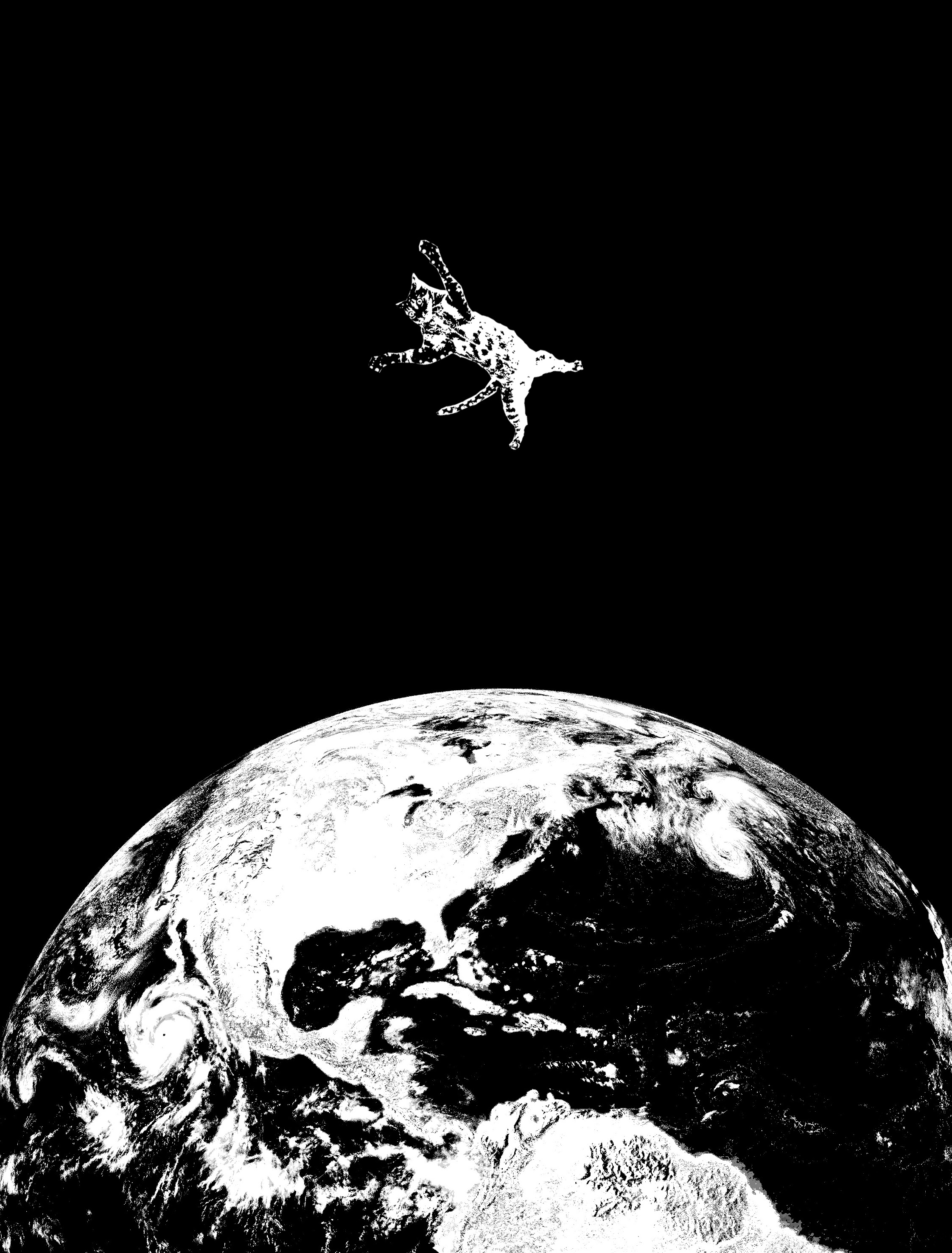
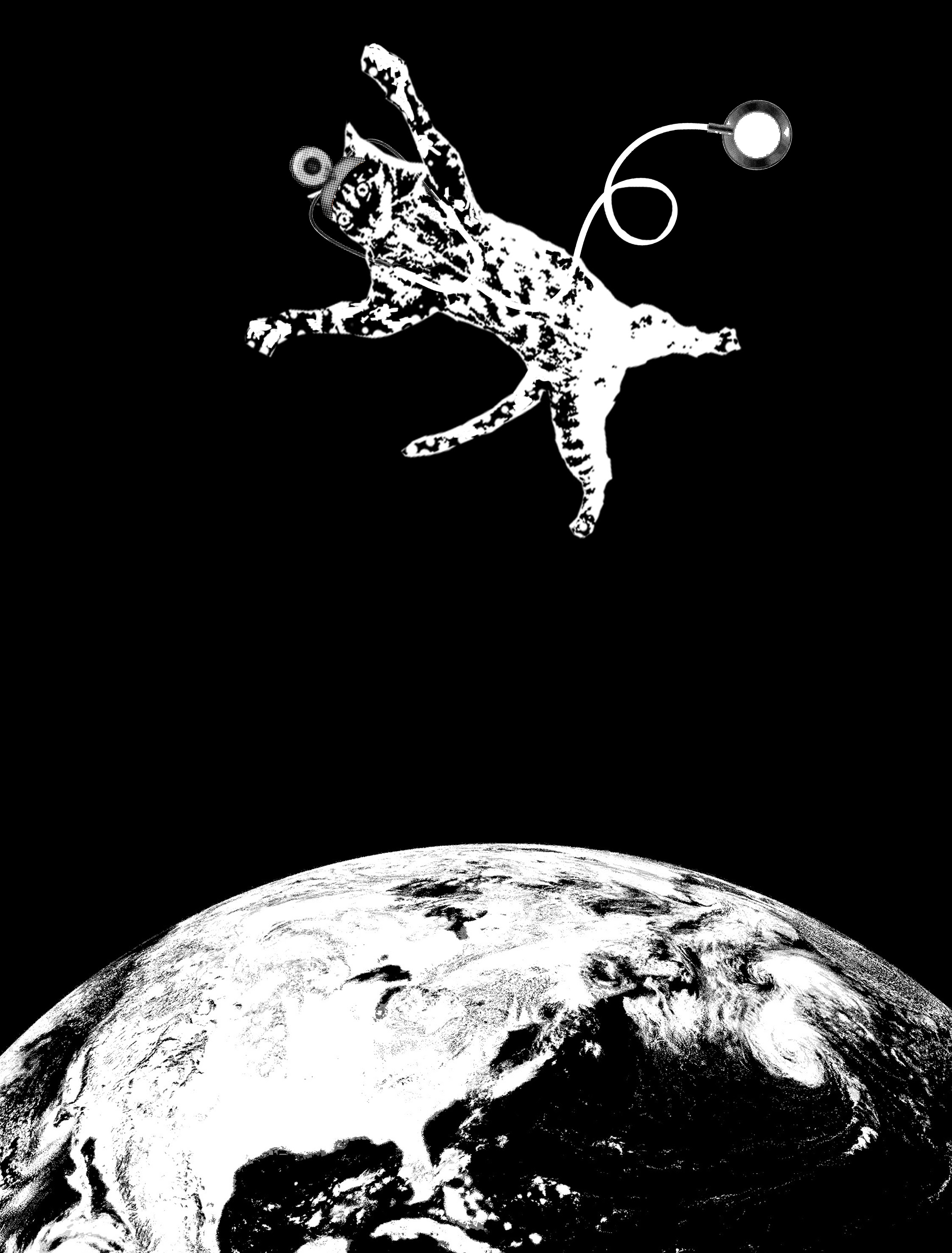
I hate space, by Joey Chan. Draft 1.
My Draft 1 revolved around a cat floating helplessly on top of planet Earth. The cat is actually representative of the main character, Dr. Ryan Stone; she is strong, determined and brave, yet scared and helpless at times. I left a big black space around the cat to emphasize on the concept of a void/vacuum.
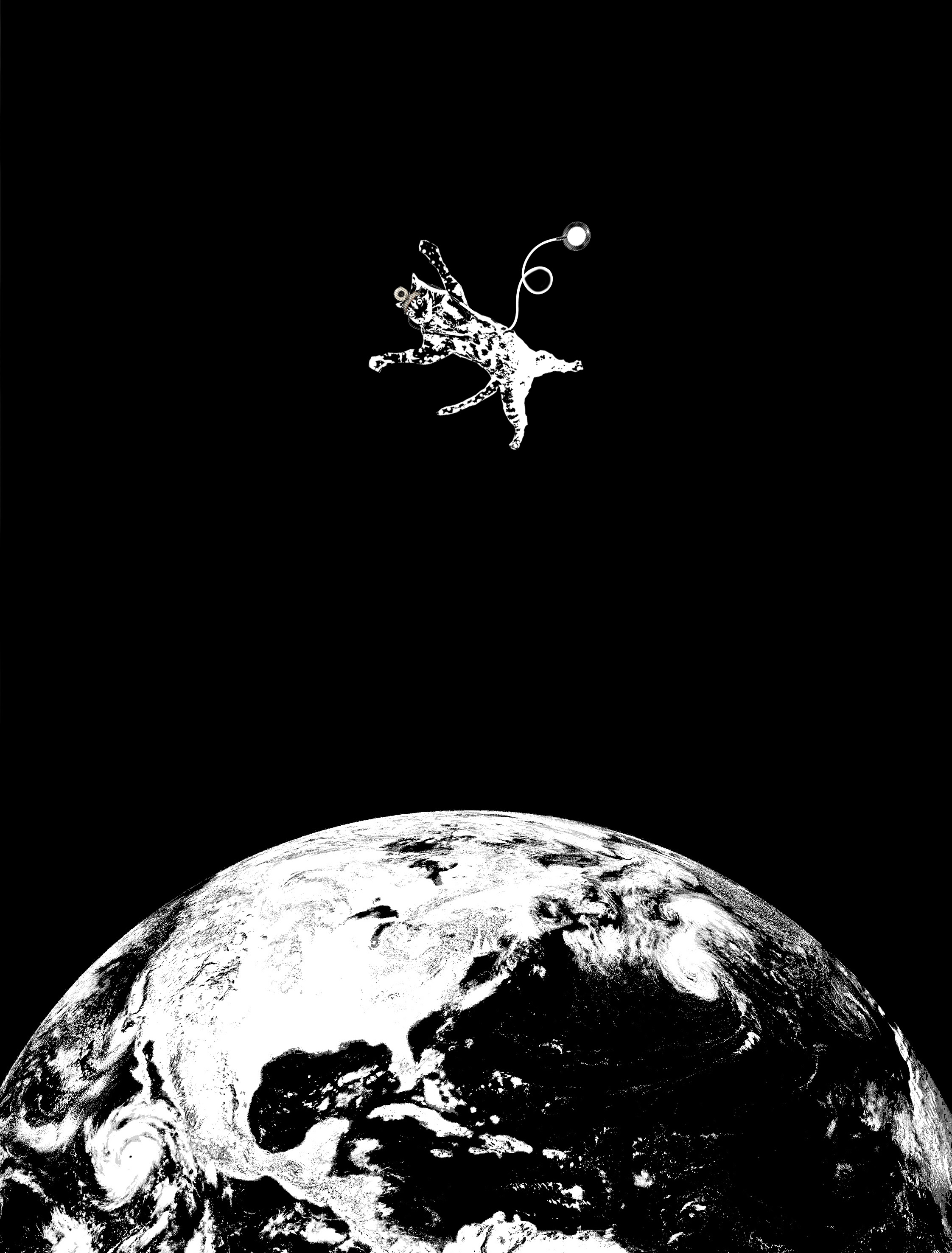
I hate space, by Joey Chan. Draft 2.
In Draft 2, I inserted elements of a doctor to better represent Dr. Ryan Stone. She is a doctor, but not a medical one. Hence, I tried to put a labcoat on the cat. However, the nature of Threshold made it such that it looked like a funeral garb instead. Hence, I identified other elements that were in conjuncture with Doctor, even if they were of the medical field. As a result, I used a head mirror and a stethoscope on the cat instead.
However, after trying to print it onto the tote bag, I realized that the details were so tiny that they could not be scanned and imprinted. Hence, I enlarged the cat and the planet.
I hate space, by Joey Chan. Draft 3 (Final).
Printing was still difficult, but it was better than before!
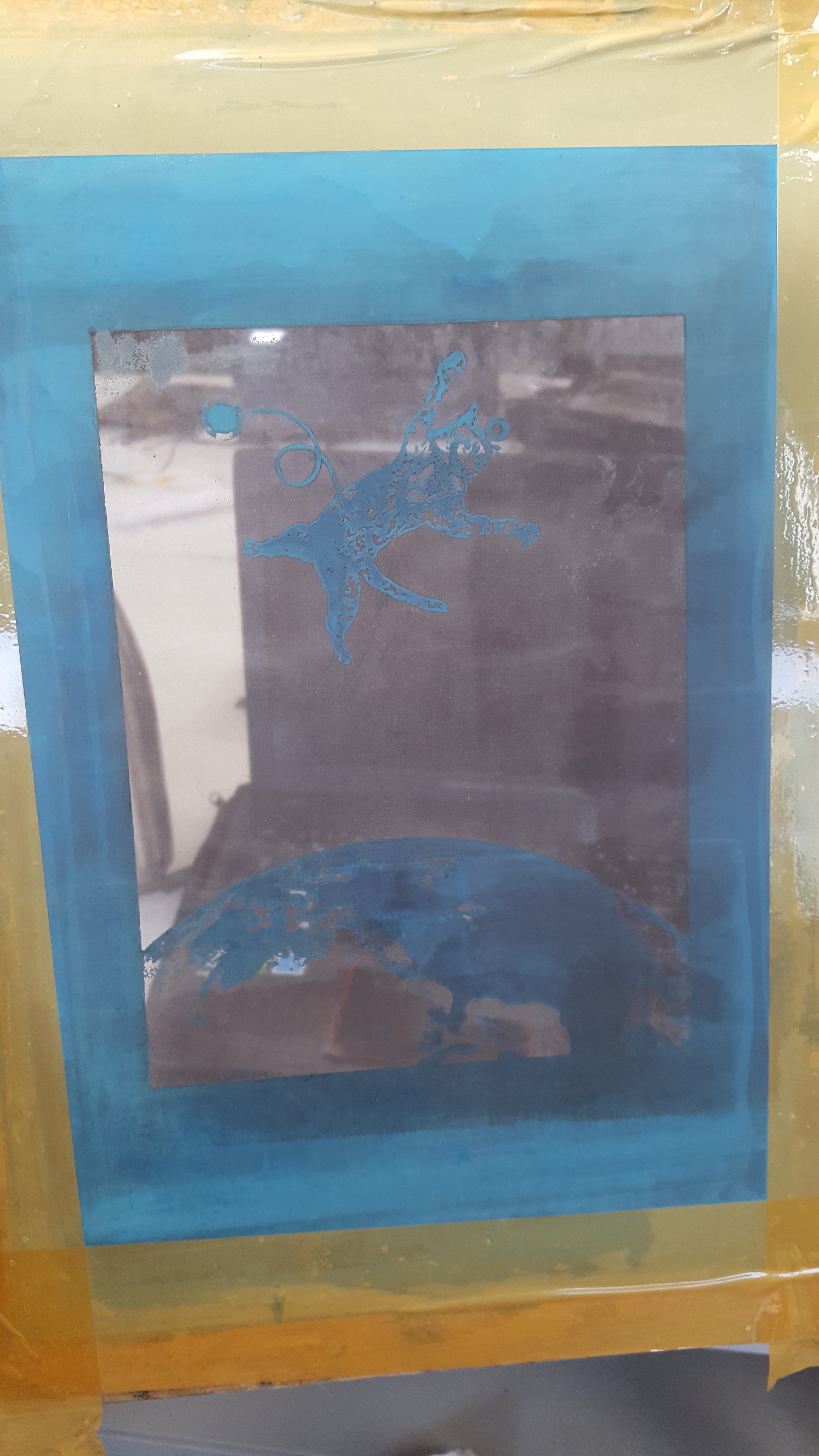
Emulsion piece!
But I messed up on the printing scale; the print turned out too small on the tote bag. 🙁
2. Roads? Where we’re going we don’t need roads. – Back to the future (1985)
In the actual movie, the scene depicts how a car has turbo thrusters and is able to fly up into the sky from the road.
However, I wanted to create a subversion of reality that is even more jarring.
Hence, I chose a ‘suicide’ scene.

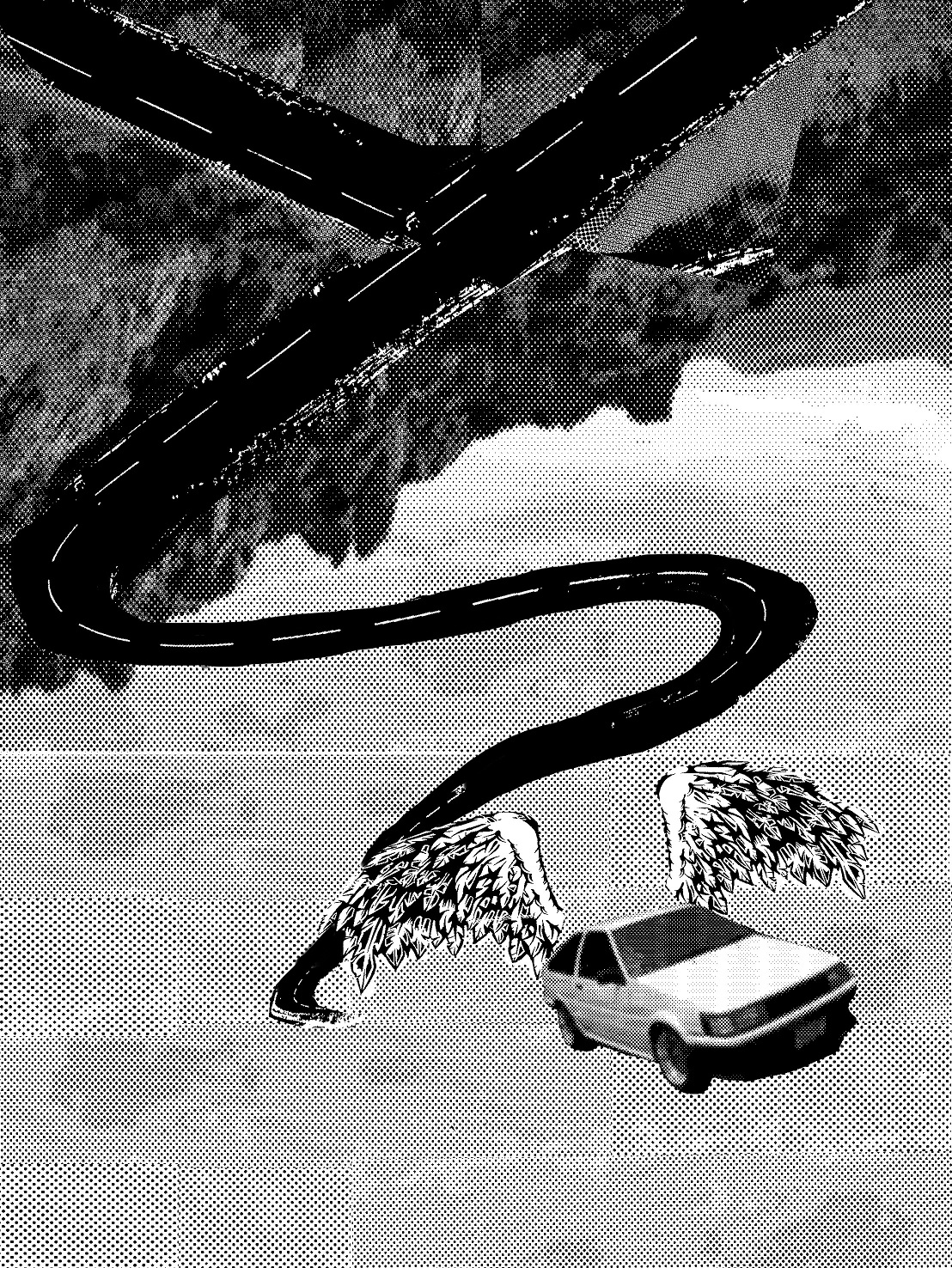
Roads? Where we’re going we don’t need roads. By Joey Chan. Draft 1.
Usually, when a car dives off a cliff, it ends up in death. However, I aim to subvert reality by making the car fly off reality into fantasy (established by wings) instead of dropping down the cliff to its inevitable death.
Roads? Where we’re going we don’t need roads. By Joey Chan. Draft 2.
Roads? Where we’re going we don’t need roads. By Joey Chan. Draft 3.
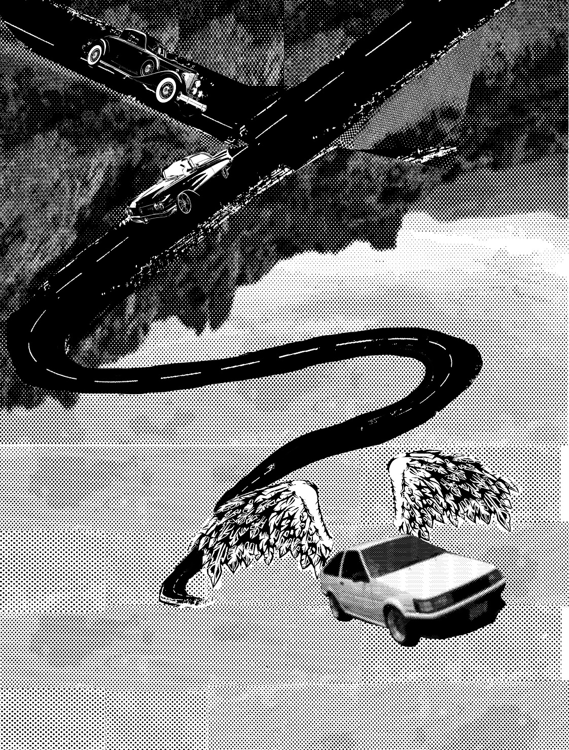
For Draft 2 and 3, I changed the perspective of the cliff to something that is more interactive with the audience. I also changed the idea of a cliff (the one in the first draft was too covulated and messy) to that of a highway instead. However, the roads turned out messy and disconnected. I tried to add cars to improve the effect but it did not really help. However, what worked was how I inverted the highway to create a more jarring distortion of reality. It does give the magical feel. I retained the wings, too.
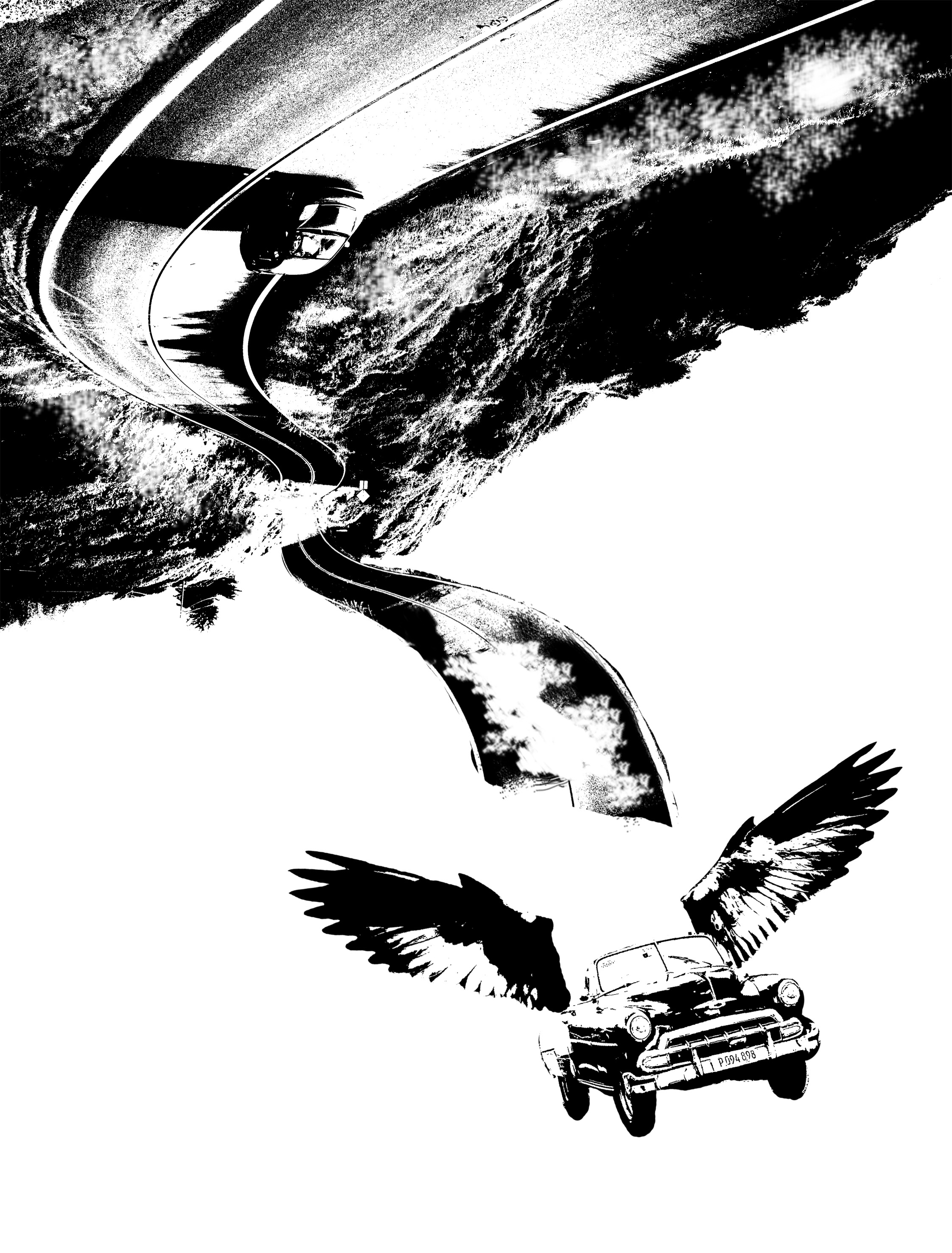
Roads? Where we’re going we don’t need roads. By Joey Chan. Draft 4 (Final).
In my final draft, i refined everything. I picked a clearer highway, a more retro car, better looking wings (cropped off a bird) and a better contrast in both the hatching of the black and the white. The inversion of the highway is further emphasized with the upside down car, which is going the ‘right way’ in comparison to our car who looks like it just drove down the cliff, yet is able to fly up again with the help of the wings.
3. In the face of overwhelming odds, I’m left with only one option, I’m gonna have to science the shit out of this. – The Martian (2015)
My Draft 1 was pretty embarrassing. I mixed it up with another movie about mars where people had to fight aliens off. The actual movie is about how Matt Damon is stuck on Mars because his friends left him behind thinking that he was dead. While waiting for his friends to come save him, he had to come out with ways to survive on Mars. During this scene, he manages to plant vegetables for sustenance- a whole damn garden.
However, in my first draft, I went along with the idea of a pure, destructive force. An explosion. Then I thought about science. The first representation I could think about was Albert Einstein, the king of E=MC^2. A mad genius. Then, I thought about the scene from the Dark Knight (Batman), where Joker struts off in distilled cool vibes as the hospital exploded behind him. Another mad genius. Then, I compared Joker and Einstein, and decided that the idea of combining the both was amazing because they were so similar.
Einstein in Joker Make-up, an explosion behind him just like the scene from the Dark Knight.
Was I not a pure genius?
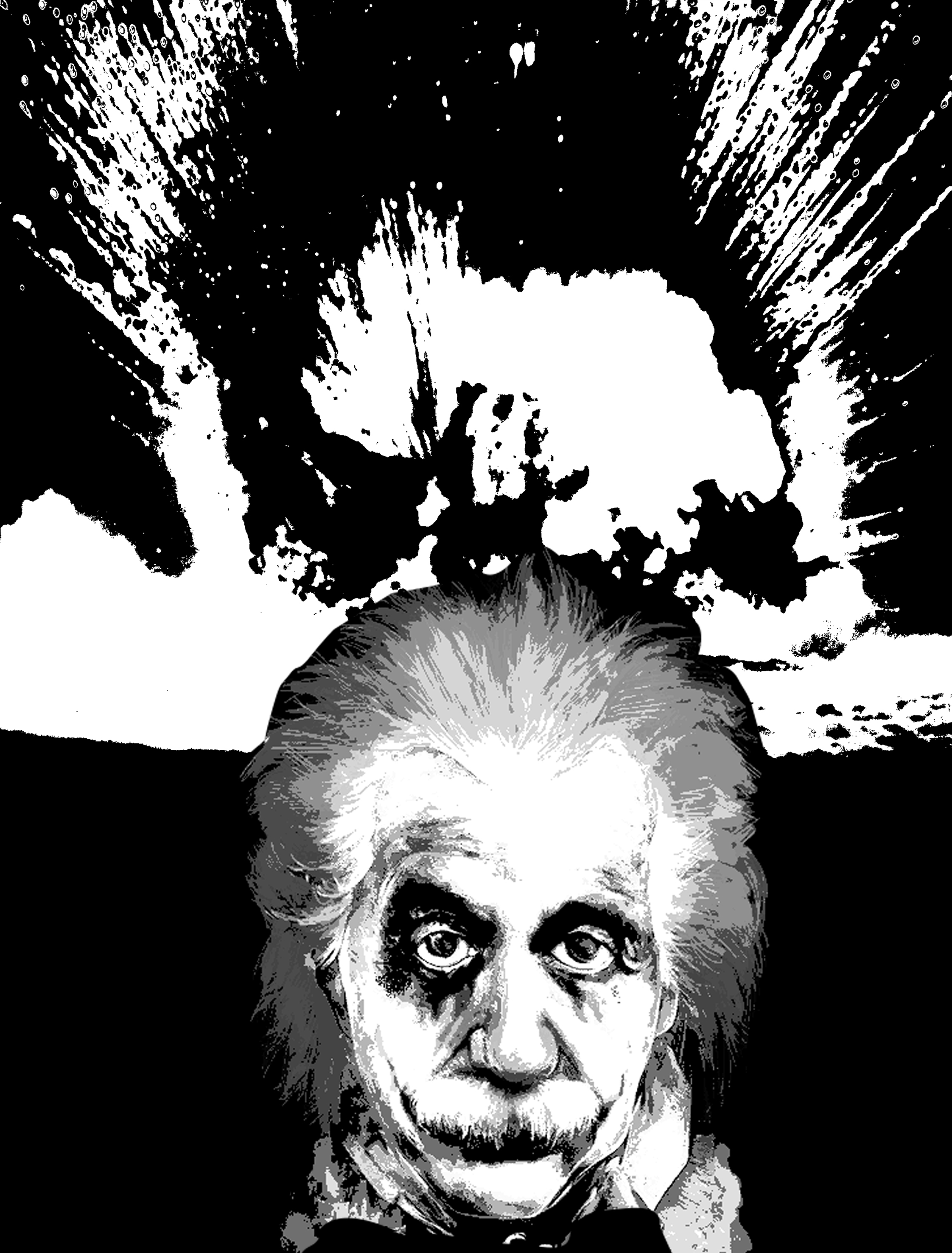
In the face of overwhelming odds, I’m left with only one option, I’m gonna have to science the shit out of this. By Joey Chan. Draft 1.
Except that I was not.
My idea got rejected immediately because it did not have any movie elements. And it does not portray the idea of my quote. Boo. Moving on…
In the face of overwhelming odds, I’m left with only one option, I’m gonna have to science the shit out of this. Draft 2.
Draft 2 was when I realized I got the plot wrong and started burying my face in my hands begging the movie god for forgiveness.
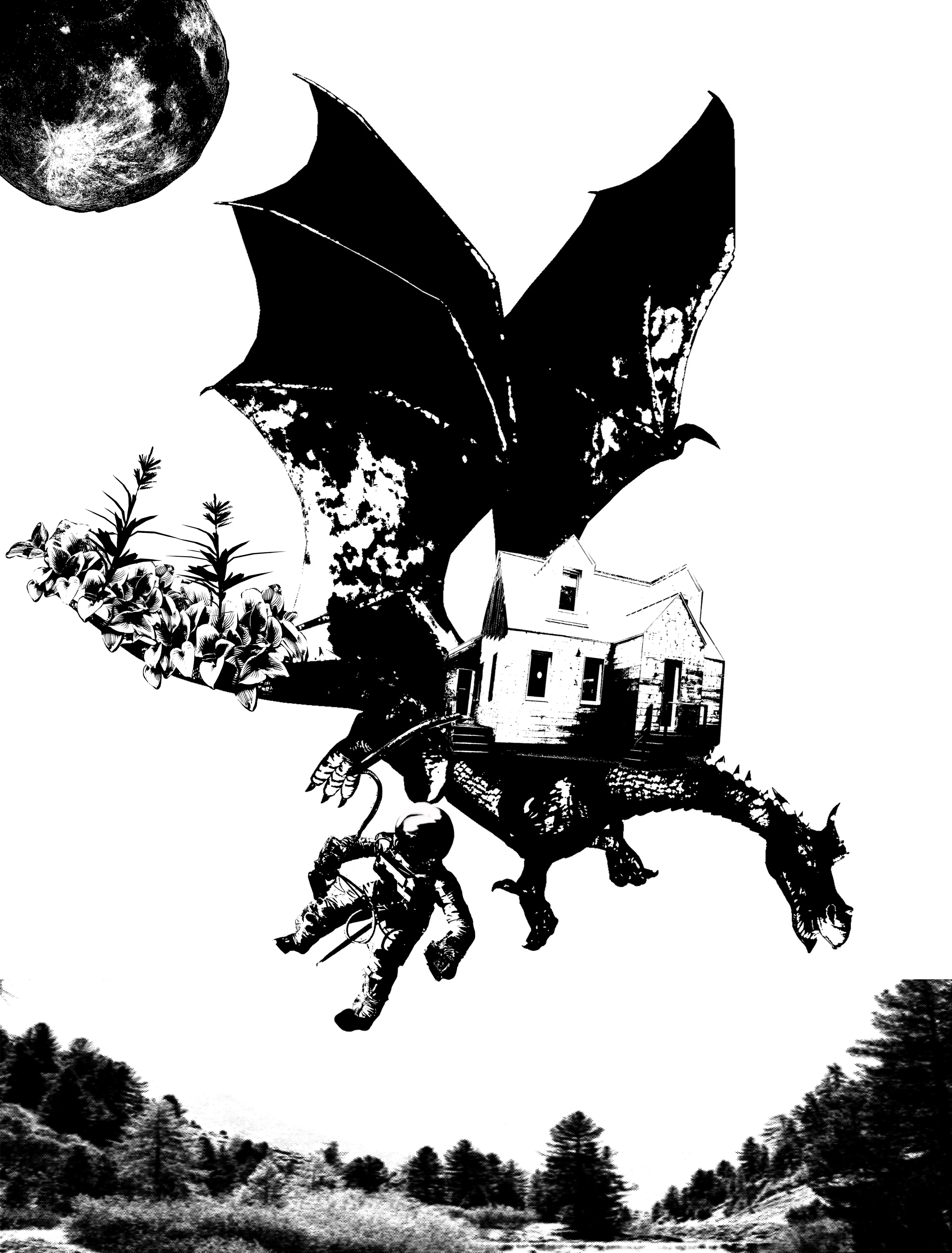
Hence, I decided to change the idea! I incorporated movie elements such as the garden and the astronaut (Matt Damon) into the picture. I also included a dragon, which is the symbol of power and strength required to plow through any difficulties, alike what Matt Damon has done in the movie (plowing through difficulties, not becoming a dragon). I also implanted a house on the dragon, to symbolize his survival.
The idea revolves around how the character has scienced so much that magic and fantasy happens. Hence, we have a dragon out of fantasy, and even a house on top of the dragon, and a garden on the dragon’s tail.
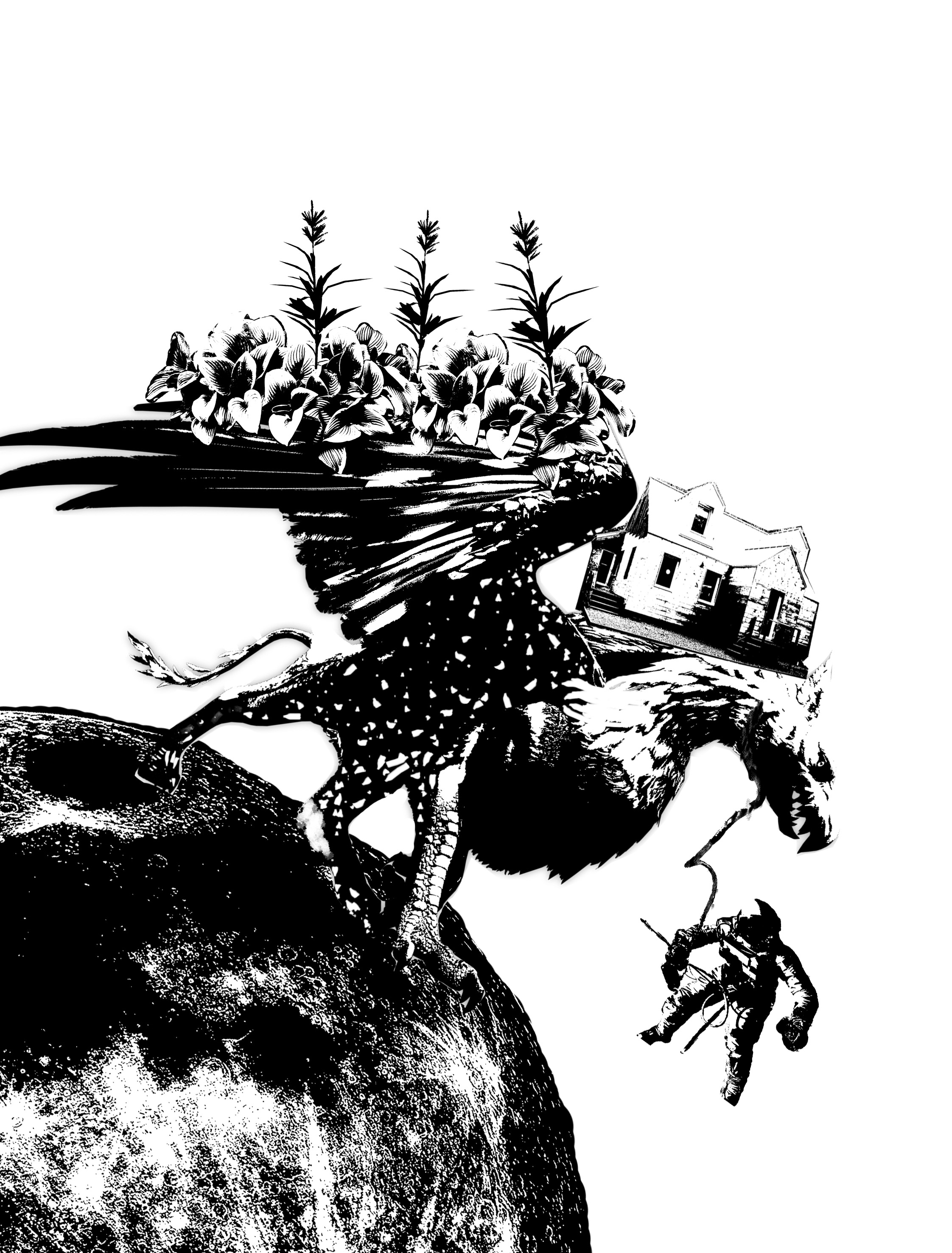
In the face of overwhelming odds, I’m left with only one option, I’m gonna have to science the shit out of this. Draft 3 (Final).
In my final draft, I tried to lighten up my picture by removing a lot of black. However, dragons are generally quite dark, which is why I changed my creature to something equally strong and powerful- a Griffin.
It would be weird to suspend the Griffin in the air, hence I put him on Mars for some ground. It also helps in framing my picture.
4. Wouldst thou like to live deliciously? – The Witch (2015)
It is rare for someone to take quotes from a horror movie, but I did it.
The movie was about a Witch who kept driving a girl (Thomasin)’s family members into delusions and into doing stupid, crazy things. In the end, Thomasin had enough of their shittery and decided to become a Witch instead. Wew.
My first draft had little reference to the movie. But I wanted to play on the idea of living and deliciously. Hence, I had the idea of dumping a woman in a delicious pie, and the woman has to look comfortable and high attractive- to seduce people into doing the same, maybe?
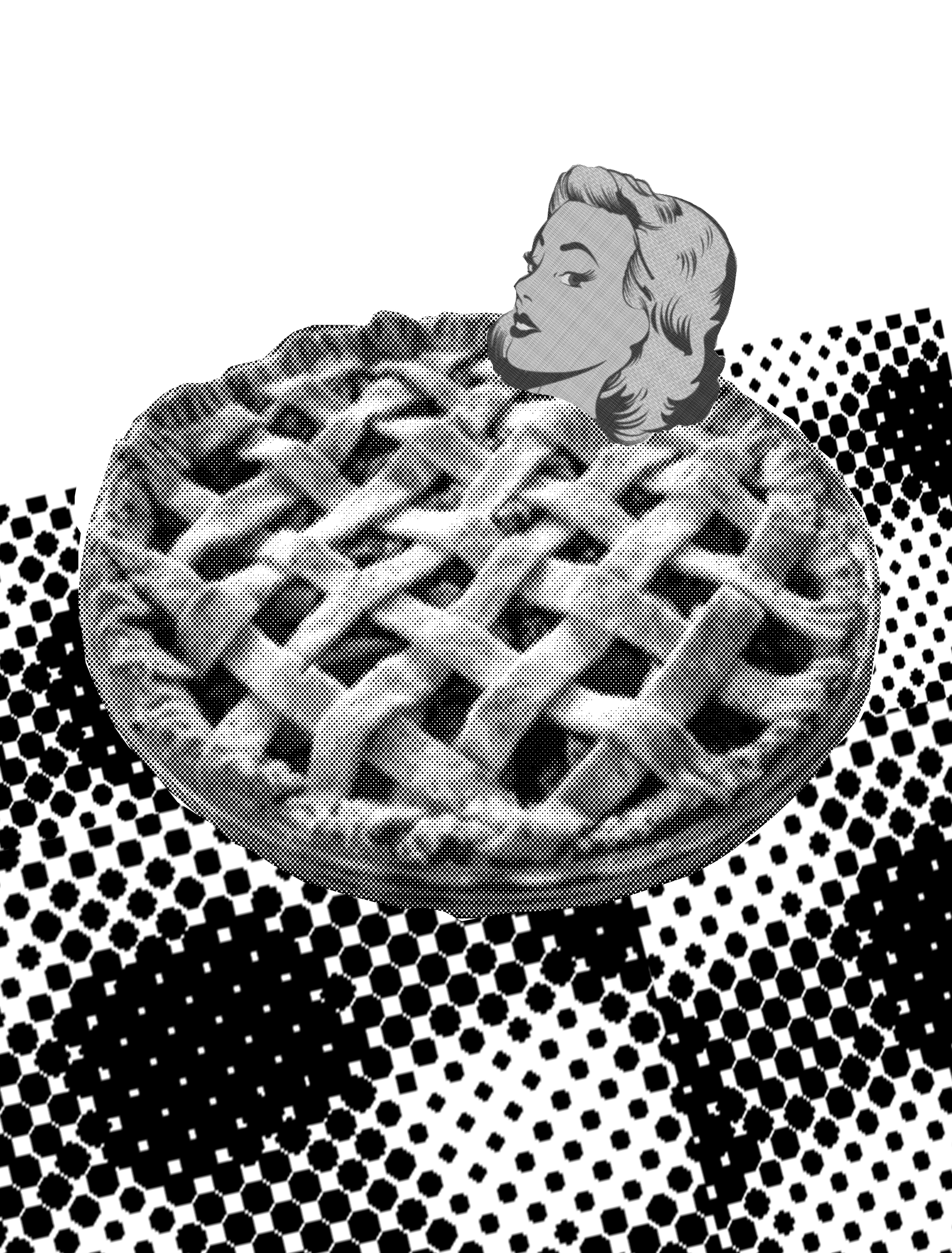
Wouldst thou like to live deliciously? By Joey Chan. Draft 1.
Rejected, of course.
It was too literal.

Wouldst thou like to live deliciously? By Joey Chan. Draft 2.
Wouldst thou like to live deliciously? By Joey Chan. Draft 3.
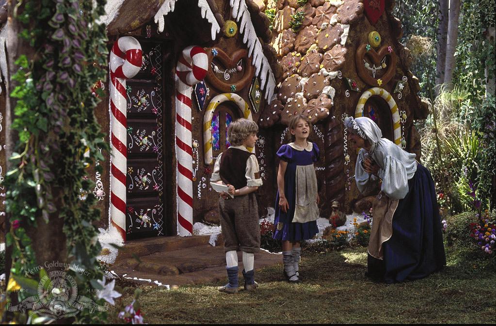
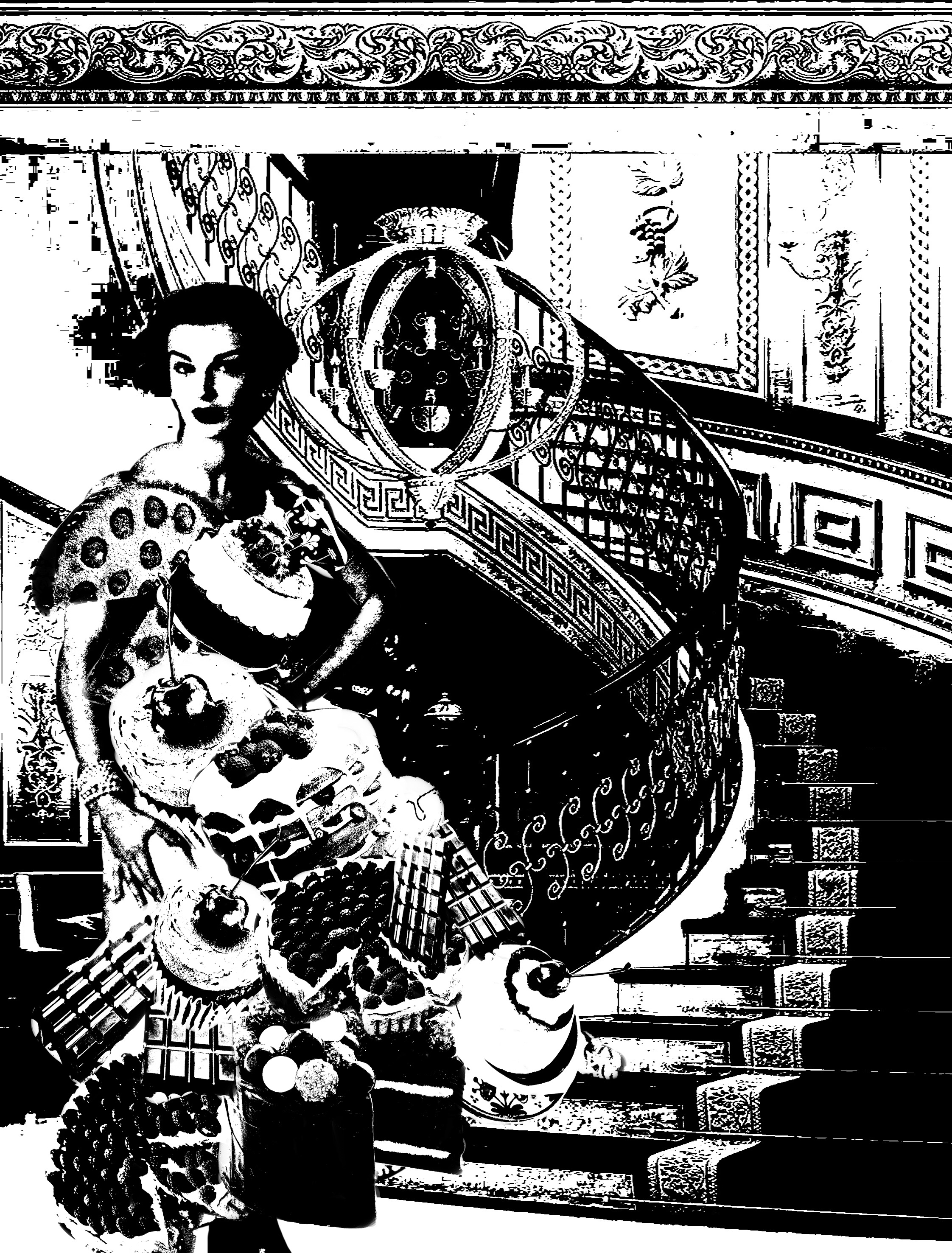
In Draft 2 and 3, I took my idea from Hansel and Gretel. I coated a rich looking retro woman’s dress in delicious food, which instantly gives the idea of richness and attractiveness, such as the witch’s house in Hansel and Gretel. I inserted a rich background to emulate the wealth she holds.
However, the darkness was too strong, which makes the dress barely visible in contrast to the background.

Wouldst thou like to live deliciously? By Joey Chan. Draft 4 (Final).
In my final draft, I tried to change the background into something less dark. However, the final result still turned out very dark. What I could have done if I had more time and advice was to generate more crosshatching in the background or at least around the white spaces such as in my previous works, in order to make the lady stand out more.