Project 1: Image making through Type (Process)

Standard

Here are the different processes for my various typography works.

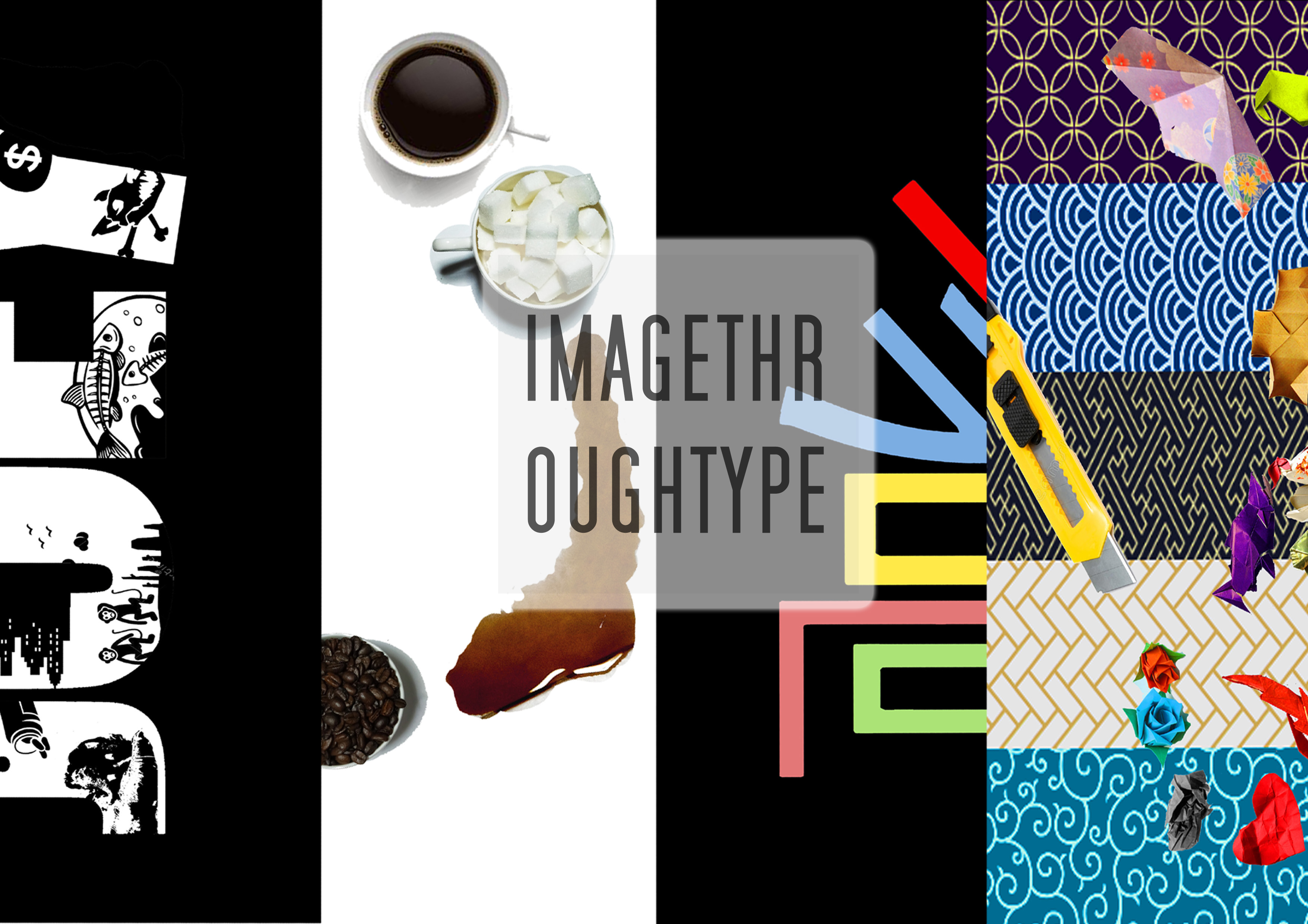
Occupation #1: Cafe Owner

Cafe Owner- Research

I took inspiration for this typography from how many posters and photos online always feature Flat Lay photography- which makes coffee look really good. The variety of coffee available also inspired me to use different coffees to describe different moods; for me, I like drinking sweet ice-blended drinks when I am happy and I turn to hot mochas when I am feeling quiet. The use of coffee stains also inspired me, because coffee stains have a tendency to stain things whereas keeping its soft and comfortable quality.

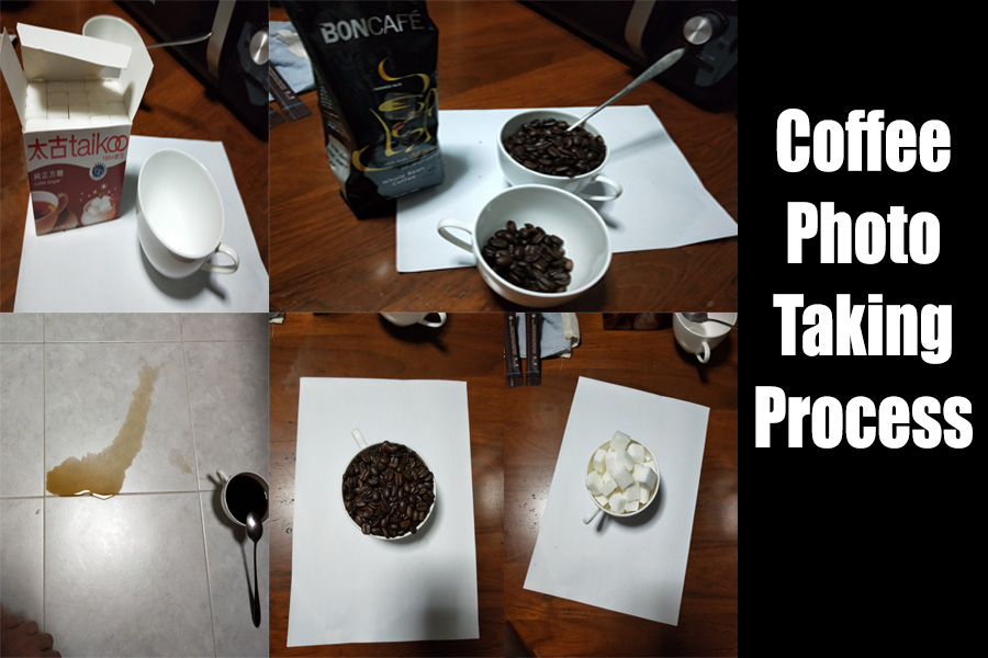
Coffee Photoshoot in my kitchen. T.T

Photoshoot for Coffee was really hard without the right equipment and lighting. I used my Oppo R11 and my regular kitchen light to take the photos. This was also probably the reason why I decided to keep the white background- it was easier to edit for someone as inexperienced as me. Oops.

Initially, I wanted to utilize non-coffee things such as rocks and feathers, but I decided that it would mess up the cohesion of my composition.


Occupation #2: Origami Master

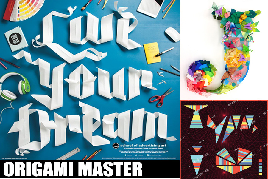
Origami Master- Research

For this occupation, I was inspired by how artists from School of Advertising Art and Japanese Art Festival made use of their own culture to create their art pieces. To be honest, making the origami was really hard, and I had to go through so many drafts that I could cry.

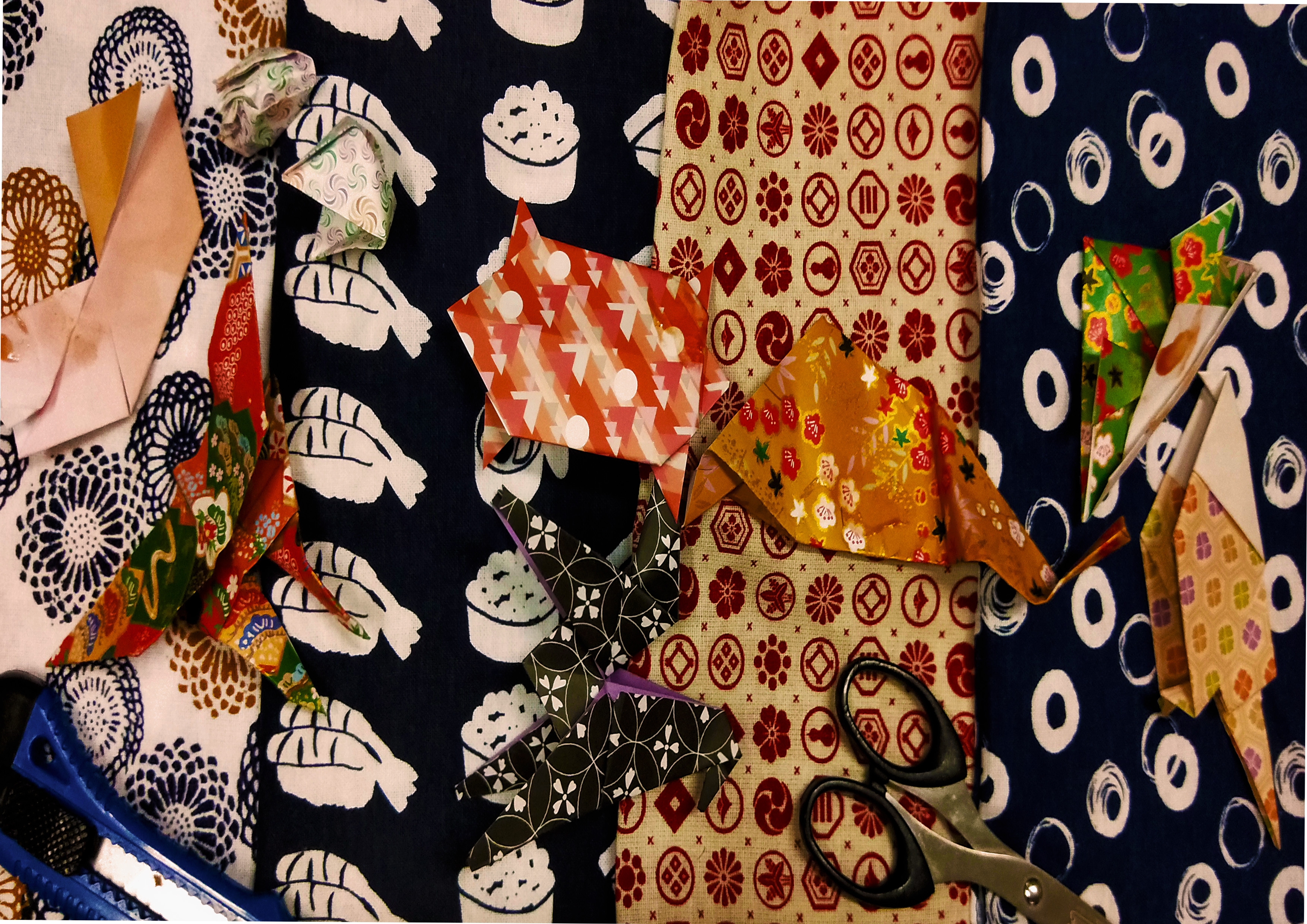
My depressing Draft 1: Origami Master

My first draft was a cohesive photo. I made the origami with different kinds of traditional Japanese origami papers, and placed them on traditional Japanese patterned cloths. However, that did not turn out too well because of how the patterns and colours clashed and the Japanese words did not end up being seen.

Then, I changed my approach and decided that I should remake the origamis with more defined shapes, and use a more regular (less patterned) origami paper instead. Also, I should not have photographed all the origami patterns together at once since I did not have the right contrasts and lighting. Hence, I decided to photograph each and every origami piece against a white background, before cropping all of them via photoshop and pasting them together on another blank canvas on photoshop.

For the background, I decided to use one from the internet instead, because I realized that my fabric was indeed too bumpy, and was of the wrong shades of colours to bring out the contrasts in my work.

Then, I spilled sauces against a white paper, and photographed them too. I photoshopped these stains onto the origami, because when I stained the origami directly, the sauces could barely be seen despite being layered on thickly.


Occupation #3: Catalyst
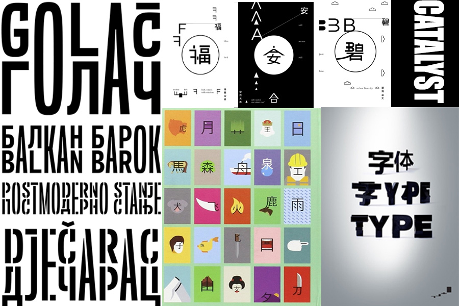
Catalyst – Research

For my work, I took inspiration from works from artists such as ShaoLan, Chinese Ancient Scripts, Balkans Sans Font, and Word Play on Behance. These art pieces and creations rely on the mix of visual graphics and a mix of western and eastern typography to create a new sort of typography. I found it really interesting, and decided to play along with it.

Draft 1: Catalyst

Initially, I tried to play on the idea on how I can alter the J of my name and convert it into an unexpected catalyst by altering the most important component of the letter that makes the alphabet… well, J. However, I realized that I wanted to be aware of what I was doing, hence not really being ‘unexpected’. I didn’t want to be a lunatic after all. And this construction of the illustration did not sit very well with me. Hence, I decided to trash this typography and rework on another one.

Hence, my next idea revolved reworking, reconstructing and re-layering the Chinese direct translation for my name, 喬. I changed the direction of my name at the second half my name to show how a ‘plot twist’ is present, and how I mingled both the eastern and western influences of my name together.


Occupation #4: Animal Conservationist

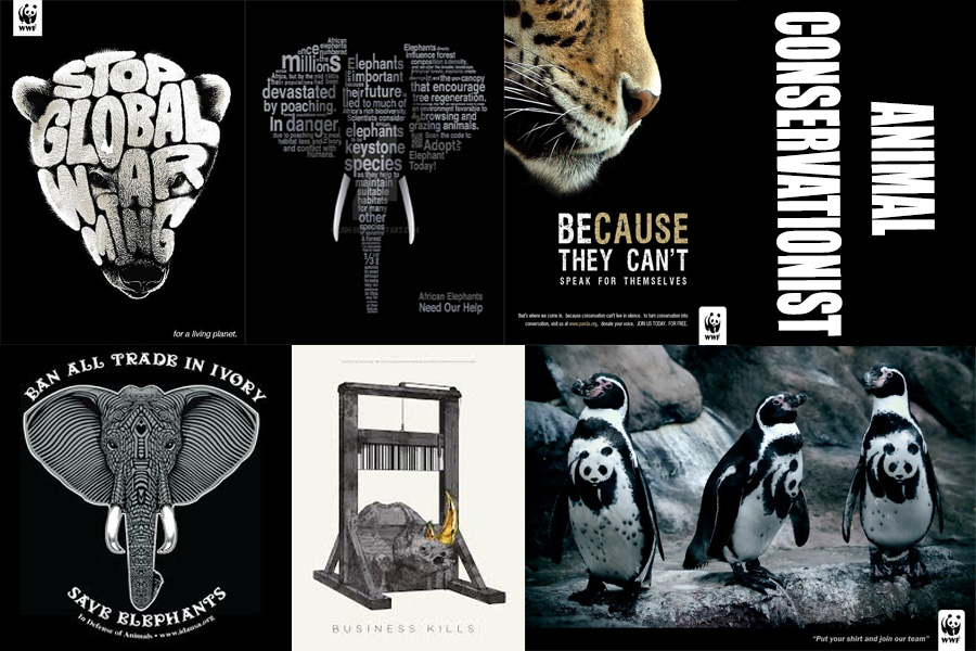
Animal Conservationist – Research

Since I was young, I have always been one to love animals a lot. When I lived at my Grandpa’s house over holiday breaks, I would always play with the strays all around the Kampung (they live in Malaysia) and would occasionally play with the hunting dogs (they hunt in the forests) because they seldom get tender loving care from the hunters. I’m also the kind of person who will go around chasing dogs and cats just to feed them and play with them; these are the animals who do not really get cared for because they do not have owners, and it pains my heart to see them so. When I was 18, I decided to join the SPCA to help out with the Animal Shelter, and am waiting for myself to hit 21 before I join ACRES. In a sense, I’m already part Animal conservationist, and would like to continue on this route especially when I am able to get schooling out of the way (so I have more time to help out in the shelters).

The root of my idea is actually in how animal endangerment and conservation posters often depict sad pictures of deprived animals and how we should help them, but rarely about what is the cause of their sadness. Maybe these conservation posters are afraid of corporate backlash when they throw out the causes of animal endangerment in their posters, but I feel that the impact is lessened when they do not remind people about how these animals are being mistreated and harmed in the first place. All sad animal posters do is to evoke feelings of pity in people, but rarely the feelings of ‘oh shit, we did this and caused this? Oh shit.’. Hence, I placed these causes in my typography poster, in an attempt to spread the message about how animal endangerment has come about- due to human consumerism and ideals.

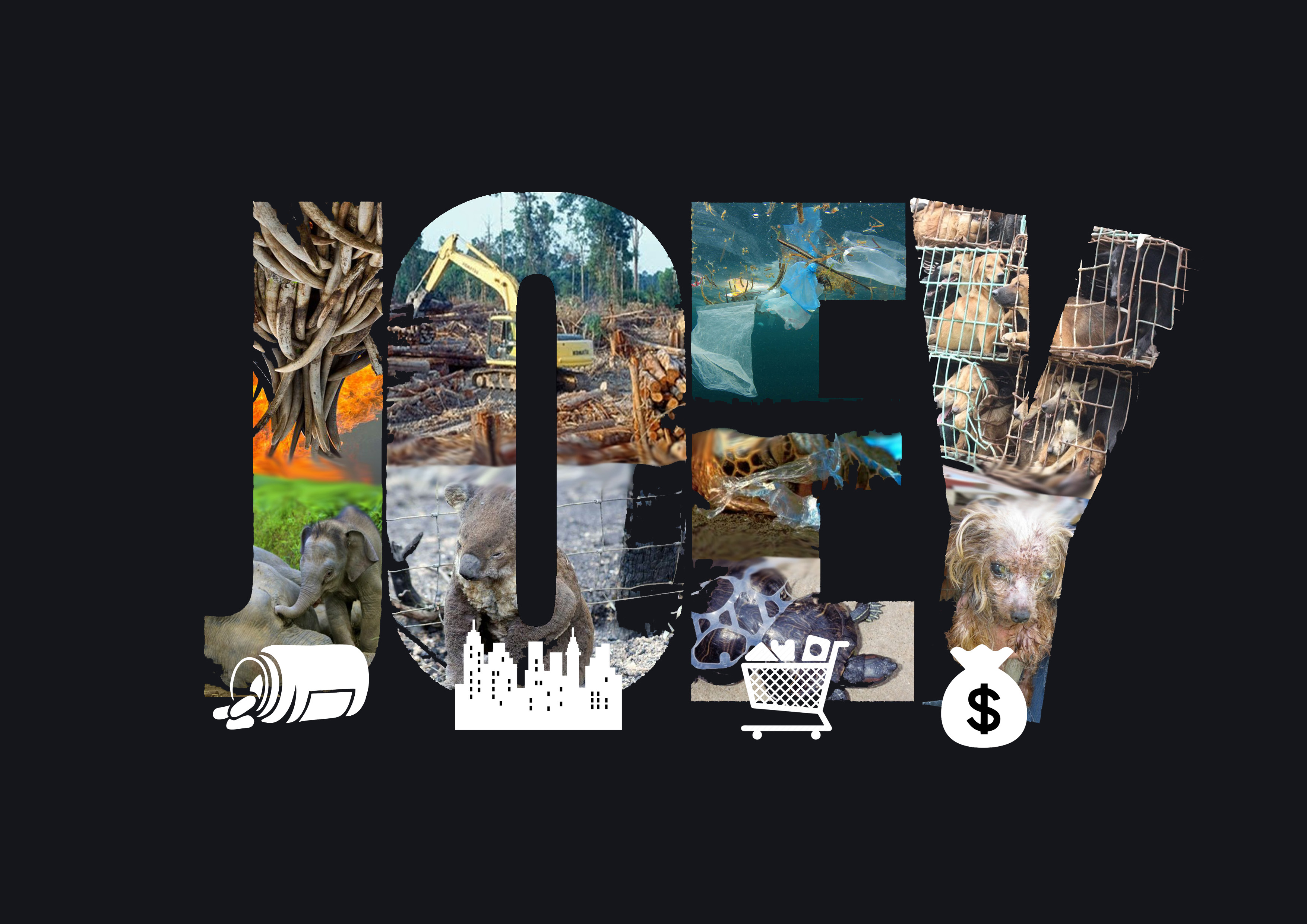
Draft 1: Animal Conservationist

My first draft was a collage of real animal endangerment, their causes and their consequences. However, it was messy and a little too direct.
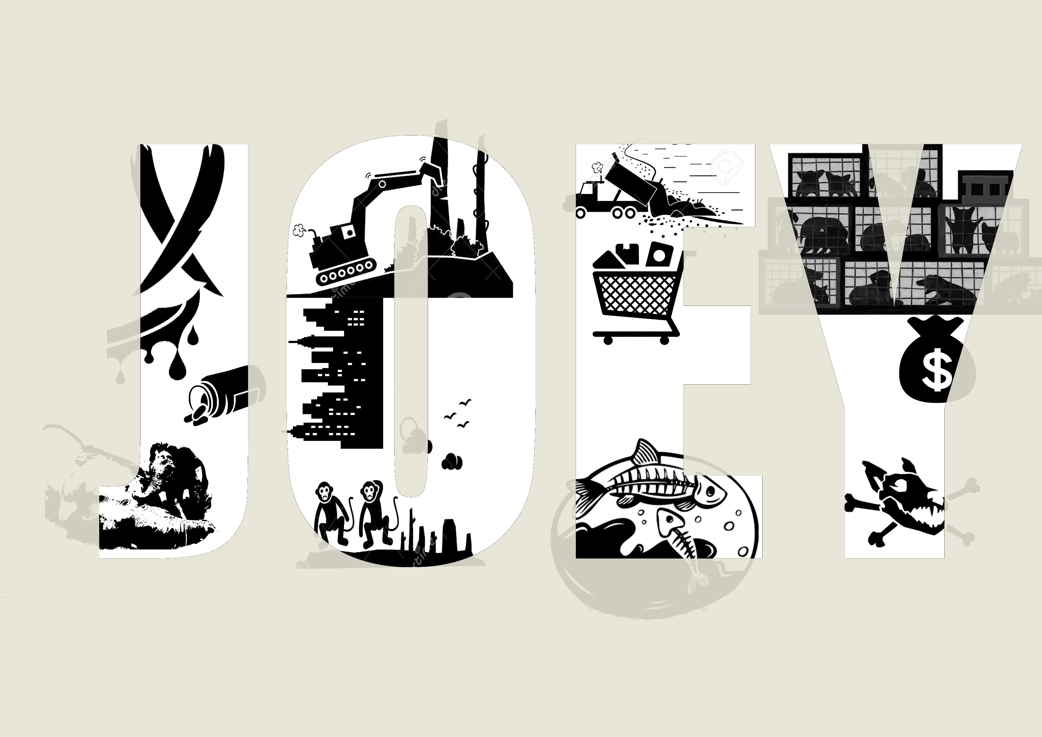
Draft 2: Process

Afterwards, I decided to go for a black and white collage, focusing on mingling elements of the original pictures with the background to establish a sort of Gestalt and black and white quality.

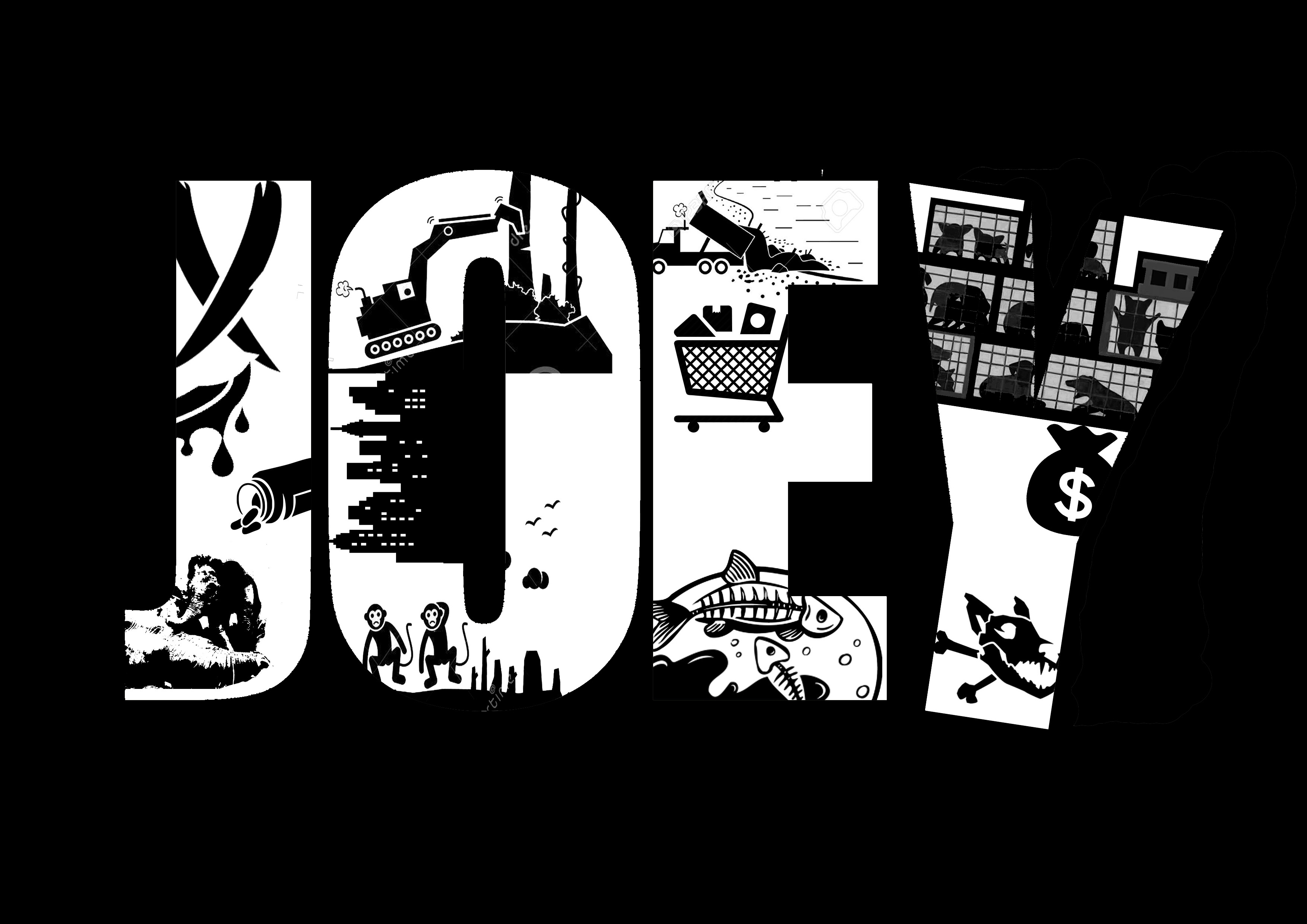
Final Product for Animal Conservationist

And bam, the final product!

Project 1: Image making through Type

Standard


For this project, I centered my theme around the things I dreamed of doing and would like to do in the future if I was given the opportunity to do so.

My name is JOEY and I am an Animal Conservationist.

Since I was young, I have always been one to love animals a lot. When I lived at my Grandpa’s house over holiday breaks, I would always play with the strays all around the Kampung (they live in Malaysia) and would occasionally play with the hunting dogs (they hunt in the forests) because they seldom get tender loving care from the hunters. I’m also the kind of person who will go around chasing dogs and cats just to feed them and play with them; these are the animals who do not really get cared for because they do not have owners, and it pains my heart to see them so. When I was 18, I decided to join the SPCA to help out with the Animal Shelter, and am waiting for myself to hit 21 before I join ACRES. In a sense, I’m already part Animal conservationist, and would like to continue on this route especially when I am able to get schooling out of the way (so I have more time to help out in the shelters).

My idea is rooted in how animal endangerment and conservation posters often depict sad pictures of deprived animals and how we should help them, but rarely about what is the cause of their sadness. Maybe these conservation posters are afraid of corporate backlash when they throw out the causes of animal endangerment in their posters, but I feel that the impact is lessened when they do not remind people about how these animals are being mistreated and harmed in the first place. All sad animal posters do is to evoke feelings of pity in people, but rarely the feelings of ‘oh shit, we did this and caused this? Oh shit.’. Hence, I placed these causes in my typography poster, in an attempt to spread the message about how animal endangerment has come about- due to human consumerism and ideals.

The J of this typography depicts hunters poaching for ivory which is then used to make medicinal pills which are often fake. As a result, animals such as elephants and rhinos often become orphans, at the mercy of these hunters who have slayed their parents.

O depicts how deforestation to build cityscapes and buildings in our concrete jungle have resulted in homeless animals. These animals consist of those in the forest, and often relies on trees to build their habitats. I used monkeys, because they are one of the main animals living on the trees.

E highlights the danger of dumping waste into the oceans. We often accumulate waste because of the non-biodegradable rubbish we throw away after shopping for them. As a result, marine animals such as fishes get either poisoned, suffocated, strangled, or smashed to death.

The last letter, Y, depicts how we always like to have cute pets and to gain a lot of profits at a low-cost margin, one of the mass pet producing factories have emerged; puppy mills. These animals are crammed in large numbers in small cages and end up being extremely sick, or even dead.

The issues I have highlighted are greatly relevant in today’s context. I used Gestalt and black and white to depict this art also because I wanted to show that this is a very black and white (obviously bad and good) situation, yet people are not doing much to stop this crisis. Also, black and white represents how a lot of these problems arise due to contracts and agreements to produce and consume. Mere contracts and paperwork can result in the loss of lives for these animals.

For the font, I used a very clear-cut and bold font, because it helps to create an impact. It is loud and almost hard to ignore. Also, I placed the letters very close together to symbolize how all these problems are essentially very closely related to each other, and that we hence cannot ignore the rest of the problems just because we think it does not apply to us. The Y of the JOEY is also tilted, to show that as more of these problems arise, the world around us will start to disintegrate and collapse. And this is only just the start of the issues we have to face if we do not start saving these animals.

My name is J and I am a Café Owner.

I have always wanted to be a Café owner because it is very peaceful and calming. There is also something called Coffee Therapy, which is basically how you pour hot water into your coffee beans- it is very calming, and the taste of the coffee differs based on how you pour your coffee. I would like a café that I own to be a place where people of all sorts of moods to be able to enjoy and relax in. They will be welcome to talk about their troubles, to vent their problems, and to sink into the sweet aroma of coffee beans. It will hopefully serve as a sort of second home, where they can always go to.

The cups are all kept white, because they symbolize how everyone almost always start from the same capacity- being a human being. The contents of the cups contain the different moods people may feel when they come for coffee; so fatigued and weak they need an entire mug of coffee beans, fluffy and happy like a cup of sugar cubes, a normal, relaxing cup of coffee, and a cup of fancy latte. Ultimately, I would like my customers to end up like the gentle curve of the J, where they will be relaxed and comfortable after visiting my café. I chose to use only 4 cups because I would like my café to be one not like crowded Starbucks or Coffee Bean, but one which is not popular, yet a humble abode and a secret paradise.

My name is ジョーイ and I am an Origami Master.

I am one who really loves traditional patterns and culture. Hence, I picked an occupation which is a speciality of the Japanese culture; origami. I wanted to emulate the childish innocence we have as children, hence using origami to form Japanese words that are a direct translation of my name; Jōi, otherwise also known as ジョーイ. I used the Japanese Kanji because I wanted to link it back to the traditional Japanese roots. This presentation is supposed to be a depiction of a child’s best origami collection. If you look closer, some of the origami creatures are really well made, while some are really crumpled and have been refolded over and over again, such as the heart, grey blob, shark and dragon. The purple fan at the side and the brown origami in the middle is also incomplete, showing that the child has given up at some point. The chicken origami figure and the green bird at the side has sauce stains on them, too. In a sense, the childhood innocence shines through how the child’s best work is flawed, yet he or she is proud to present it. At last, the scissors and the cutter is randomly placed to show that the child is careless and still does not have the same mature foresight we have as adults to present our work in perfection. Through this work, I also took inspiration from ‘Accidental Typography’, a concept where you put things in unplanned positions, only to accidentally form a sort of lettering.

My name is JOEY (喬) and I am a Catalyst.

Catalyst

This concept may seem confusing, but I chose this ‘occupation’ with the reasoning that I would like to be the only one who can trigger and affect my own life. In a way, I am essentially saying that I want to be someone who can shake my own world so powerfully. I faced many difficulties in the Art field because I had no art background, and was only backed up by my own interest in art. I guess this spurred on my motivation to be successful and to become someone I can be proud of. As a result, I decided to create an art piece which shows a ‘plot twist’. I chose the word that is a direct translation of my Traditional Chinese name (well, I used Chinese because it is my origin), otherwise known as Qiao (喬) (To note that this is only Jo). I inverted the letter, and kept the first part of the name, which highlights how I retained the originality of my identity. It also forms ‘Jo’. Then, midway through, I inserted a ‘Plot twist’ and inserted a western influence into my name, creating a change in my identity. I did not remove any part of the Chinese word at all, but I sliced the top half of the word into half and changed its direction to form ‘Ey’. Hence, my Chinese identity was configured into something that was a mix of eastern and western culture.

Micro-Project 4: Exquisite Glitch

Standard

Here are my eyes.

I don’t really know what happened, but I was reduced from a human being to some sort of micro-organism or amoeba.


Describe how this process of collective image creation and decomposition creates a glitch transformation.

How is each transformation creating a new form of its precursor?

Research Critique 2

Standard

A Normal Day for a Normal Girl doing a Normal Activity by Tanya and Joey

Tanya and I worked on a project revolving around a normal girl doing a normal activity (Studying, surfing the net, etc.) on a normal day. It all sounds very normal, but there is a certain intimacy in this normal moment. We believed that but portraying a personal and private moment, we are recreating Third Space; a virtual platform consisting the fusion of the physical and remote space for displaying any ideas.

We break down the walls of a physical environment in the same way as Third Space does; this scene is not something someone would willingly show to other people and is meant only for themselves, yet they may post about it on social media, a Third Space.

We further reinforce this invasion of privacy by recreating the girl’s activities with two people; Tanya being the face of the girl, and me being the one who controls what she does. Despite being in two different places, we can recreate a moment of intimacy, reinforcing how Third Space allows us to form intimacy through exposure.

As Maria Chatzichristodoulou mentions, “the absence of textual narrative and the focus on movement and visuals made such explorations more intuitive.” Without any text or verbal communications, we have to coordinate our actions based on instincts and careful mirroring.

This is also a ‘fracturing of perception’, as Randall Packer has mentioned. There is a distinction of being in the first (Me) and second (Tanya) perspective, yet also simultaneously depicting the same scene. Third Space allows this distortion to happen, like watching a reality show on TV.

Micro-Project 2: It’s Storytime!

Standard

MICRO-PROJECT 2: It’s Storytime!

It’s Storytime! Micro-Project 2

Members: Celine, Nok Wan, Naomi, Joey

In our game, everyone sits beside each other and write a story together. Everyone is only given one or two lines to write within 30 seconds before they must pass the story on. Three people will also have to ballot a genre, a variable and a catchphrase to include in the story. There must be a plot twist and a character must disappear. After the story has been finished by everyone, it becomes an art piece.

Balloting Slips, Micro-Project 2: It’s Storytime!

Instructions for Micro-Project 2: It’s Storytime!

The viewer of this textual art must contribute their interpretation of the story and creativity to complete the story. The artist is only present to provide the boundaries and limitations to guide the story along. It involves social interaction because a co-creator must view other co-creator’s responses to the artwork and how they interpret it before they can build onto it. Essentially, it becomes a collective artwork where artists share different thinking to succeed a shared aim.

At different points of time, people’s perspectives and way of thinking may change, which can affect the flow of the story based on their mood. Also, when people from faraway and different places come together to write the story, it can introduce different elements that we might not have thought of due to the difference in how people are raised in their respective environments.

Our D.I.W.O artwork is a departure from traditional art because instead of how an artwork is pre-planned and personal, our collective artwork provides a collaborative platform which evokes a sense of unpredictability and unplanned creativity. Adding obstacles and requirements also serves to raise its levels and to make it more challenging and controlled to establish a common goal.

More pictures heheh

I believe that through D.I.W.O, artists can bond together through social media and collaborations with communities. It also helps people to ‘connect people with other cultures, outside of their own nation states…ideologies.’, as stated by Marc Garrett. This is a departure from traditional artists because they must suffer to maintain a stable finance, threatened by ill-informed perspectives and a rigid infrastructural tie and framework.

Our crowd-sourced time-based artwork is different from the other artworks shown because it incorporates text as a form of art. Also, it is passive, and there are hidden elements that certain co-workers would not know about. This inspires more creativity and difference in portraying the result of the artwork because of how everyone thinks differently.

However, it is also similar to Yoko Ono’s Cut Piece. Each viewer must contribute their part, based on what the others before them has already done. There is a line where you must wait for your turn, and the art piece will not be as effective should everyone contribute simultaneously. The viewers are in full control and are placed in the artist’s shoes. A good comparison would also be the Human Clock, where viewers submit their own image to capture that moment of time. The beauty of the art work is in how a single person’s actions is now obvious and significant in creating the artwork.


Micro-Project 3 – Tele-Drift by Tanya and Joey

Standard

Posted by Joey Chan on Monday, 29 January 2018

Micro-Project 3- Tele-Drift (FB Live Collaborative Video)

Brief Description:

For our micro-project 3, we used Facebook live to create this video about a girl going about her day. The video was made within ADM, with Joey stationed at the basement and Tanya at an outside bench.

Objective:

The objective of this video was to capture two perspectives of a girl as she carried out her daily activities as a University student; Joey filmed the first-person perspective while Tanya filmed the second-person perspective. To do this, we had to make sure the timing of our actions was synchronized. For example, when we wanted to show the girl throwing her paper ball behind her shoulder, Tanya had to watch Joey’s side of the Facebook live split screen to know when to continue the arm motion.

This concept of a Third Space was actually a platform for long-distanced intimacy in my opinion. One is able to connect to another person despite a physical distance being there. By using a platform where we can react simultaneously and almost immediately to each other, we can become side by side through a digital screen.

The reason we decided to film such a mundane scene (a girl doing her daily things) is because it is something that is usually not seen, and not shown to other people. It is a scene that is personal, and is not considered something desirable to be displayed (other than for proud parents and teary-eyed professors who are amazed that there are actually students who do study). Hence, it provides a more intimate feeling when both Tanya and I, two separate people, work together to enact a one-person scene. We violated personal space by creating a third space where two people get to experience how it is like to be a single person.

Overall, it was more difficult to carry out than we thought, especially since distance kept us from communicating efficiently to one another. Nonetheless, through scripting, some practicing, and a few retakes, we managed to get a more synchronized version of what we had in mind. However, it was still difficult to carry out our actions at the same time due to the video buffering on one side and the error carrying forward onto the other person’s video perspective. Also, videoing with only one hand also resulted in a lack of stability in the video we wished we could have avoided.