This Zine Project has been a huge roller coaster for myself. I went through so much pain and torture because I chose a difficult location as my subject; St. John’s Island. Do not get me wrong, I adore the place to the moon and back, but it was just too special. I could identify a lot of things with St. John’s Island and it was just so magical the two times I went there, but to pinpoint something and make it into an abstract was considerable hard work for me. I spent weeks thinking and pondering about what I wanted to focus on, running different ideas through my brain.
AT THE BEGINNING:
When the Zine Locale brief was given, I couldn’t really think of a striking place in Singapore that interested me. I decided to explore my options off the coast of the Mainland and my options quickly arrived on the Southern Islands. I chose St. John’s Island because I knew it was just that unique. It was so different from all the other places I have been to in Singapore, and despite the high ferry cost, it was an island gem few visited. It was for adventurers, and for people who wanted to get away from the bustling city life.
The few things I identified at first were:
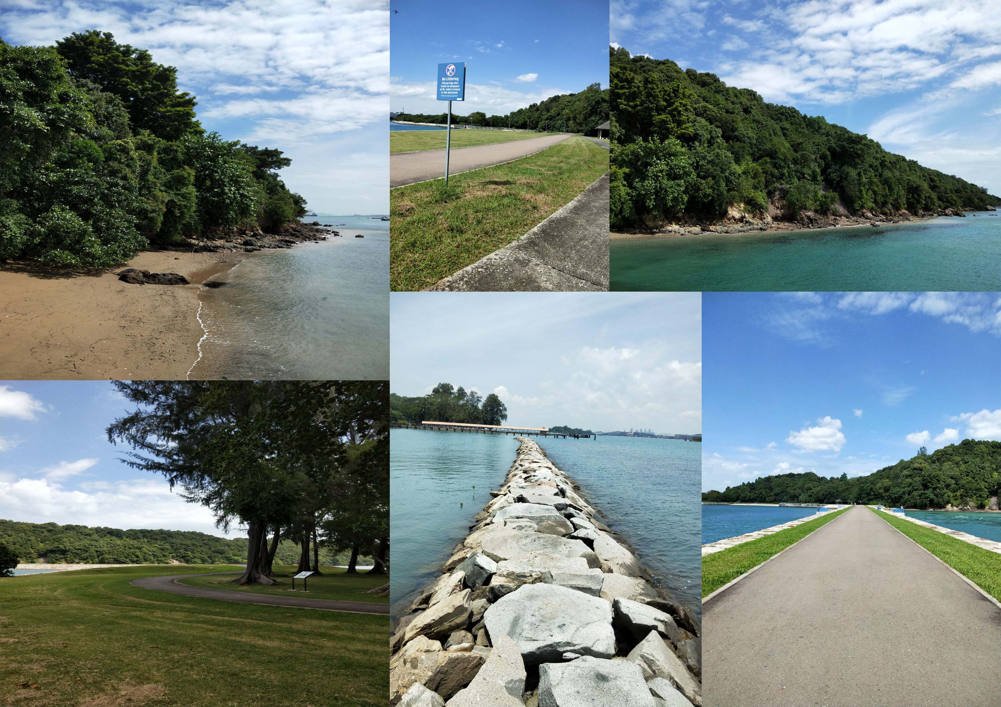
- There were a lot of cats. 3 colonies of over 30 cats was really nothing I’ve ever seen on Mainland Singapore.
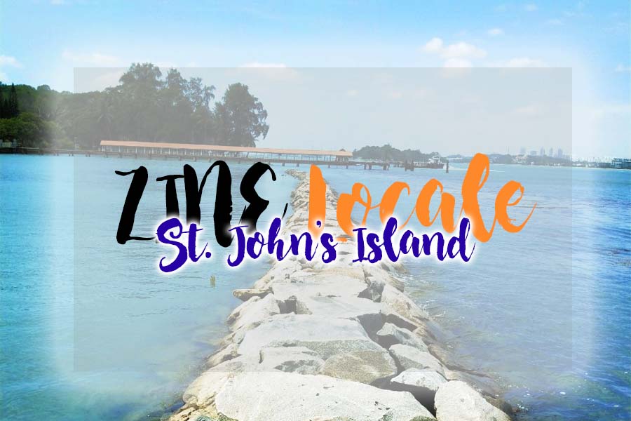
- It was just like a Maldives. A mini one. The clear waters, beautifully coloured seas, clean rocks and soft sand simply said it all. There are even mangroves and heritage trees. An island of magic, definitely.
- There is a Kampung on an island! Not one with farms and cows and chickens, but one where you fish for a daily meal. That was rare. Especially in concrete jungle Singapore.
- There are abandoned houses around the island. Pretty eerie but cool.
- Formal penal settlement, drug-rehabilitation centre, quarantine island for people coming from Mecca, mass execution grounds during WW2, Marine Research laboratory, former detention centre for illegal immigrants. Really, its history was the most striking element on the island. The island is rumoured to be haunted as well.
- Holiday camp! There are so much activities that can be done on the island but with no security guard supervision. That means that if you die, you die.
- It’s rich biodiversity of marine life.
There were too many things. Seriously.
At first, the direction of my project was at a totally different from my final one. I was dead stubborn about focusing my project on its history simply because it was so rich, and there was no place in Singapore with so many events occurring so crazily. However, I was rejected (crai) and decided to focus on its scenic instead. I made surveys with people I knew to ask them about what they thought about the island (https://docs.google.com/forms/d/11iX6LJYCWFe6jqpMG6GyMtnZMCnnFx2b5dPf1AFxwg8/edit), and recorded interviews with strangers on the island (https://www.youtube.com/watch?v=sISCwhbE54k). I took many photos, without an actual idea about the direction I was going into.
St. John’s Island | A Scenic Snapshot

St. John’s Island | A Scenic Snapshot 2.0
St. John’s Island | Cats
Soon, I decided that I should stop being so narrow-minded just because I adored history, and instead go for something more light-hearted.
Below is my ZINE I presentation:

ZINE I | Slides
AND THEN I BEGAN THE TOUGHER PART:
Now, I had to determine what was the one quality of the place I wanted to focus on. It had to be special and found in no other part of Singapore. The construction of ZINE II had to be abstract as well. I was stuck stiff for sure.
I ran through different inspirations and decided hey, why not let us go with the idea of how different St. John’s Island is from Mainland Singapore. I determined earlier that SJI was just like a Jack (or John?) of all trades; it had a little of everything special and was so good at its job. I read through the comments given by my friends and then chose to work on a storyline of two children who lived on Mainland Singapore and SJI respectively, who exchanged letters and scrapbooks and photos about their way of life in the two different places.
However, I hit a wall; I could not reconcile the two ideas properly because it may dangerously fall into the territory of talking about SJI in just about half of the Zine. Hence, I decided to make it like a scrapbook combining both children’s experiences together, utilizing photos from the island (a requirement).
Spread 1
Spread 2
However… it was turned down because it was not abstract enough. Sigh.
So I wrecked my brain and did a few mental backflips, staring at the list and rough idea sketch I made previously:
City vs St. John’s Island
Smell, touch, feeling, sight, sound.
NOISE + WORK AND STUDIES: Background: Smoke
- Pollution
- Angry
- Blurry
- Smoke
- Dirt
- Tire marks
- Garbage
- Life
- Bright
- Lights
- Fatigue
- Rough
- Smelly
- Stuffy
- Sand
- Books
- Paperwork (In stacks)
- Suffocation
- Heavy
- Dried out
- Barren
Peace: Background: CLEAN CLOUDS
- Quiet
- Fresh Air
- Clear Waters
- Water
- Grass
- Sand
- Fresh
- Clear Rocks
- Crystal (Clear)
- Nature, Forestry
- Soft, Cushy, fluffy
- Lost in own world
- Cosy
- Breeze
- Flowers
- Pillows, clouds
- Abundance of nature
Technology: Background: Road
- Fast-paced
- High-tech transport
- Road markings
- Train tracks
- Tire Markings
- Sharp, fiery
- Fast
- Hot
- Wheels
- Beeping
- Hard to catch up
Kampung Life: Background: Sea
- Slow-paced
- Traditional transport
- Cat fur (furry, fluffy, cosy mass)
- Nature, plants
- Breeze
- Time stopped?
- Melty (because relaxed)
Instant: Background: Marble Counter
- Salads
- Fast Food
- Restaurants
- Food Wrappers
- 7-11
- Convenience Food
- Fangs (sharp to the health)
- Sizzling Plan
- Dessert Tower
- Chocolate dip, sweets, desserts
Natural and Slow: Background: Wooden Counter
- Fishing
- Seafood
- Steamer
- Fish
- Fishing Rod
- Plants (Healthy Food)
- Leafy
- Wooden Table and utensils
- Cooking ingredients
Then, I decided that I talking about how I felt about the island. In other words, my 5 senses. Through my previous consultations, I was also told to explore mark-making. I also then realized that the reason why I had so much difficulty figuring out what I wanted to focus on was because my experience at the island was not one I could justify with both text and images. I decided to reconcile all these points and create a Zine about how a person would feel if they were at the island; how they smelled, touched, heard, saw and tasted the island. What if you lost all your 5 senses? How would you describe these feelings you had at the island?
Here are my inspirations:
LUC SZIVO: Zine cover An A4 publication about street and abstract landscapes through photography, illustration and mark making

(SQNCS) zine abstract black art texture collage ink dark design artwork paint
hiveminer.com
hiveminer.com
Here are my draft 1s:


The feedback that I got was that it was too literal (the text) so I should remove the words and replace it with words that followed the flow of how I wanted the audience to focus on my work. I also got feedback that my panel on “smell” did not really convey my idea. I also needed to put in more technical ideas. Hence, I had to rework my ideas.
Here is my final piece:
ANALYSIS:
The colour palette I have chosen is Black and White, because I decided that if someone had lost his or her senses, colours would not matter anymore. It was the sensations they felt which becomes most sensitive for them. I chose to create images spread into two pages, because I was talking about the environment of St. John’s Island; it would seem inappropriate to limit the space on an island where I could feel free and seemingly void of tension.
For the first and last page, I chose to use the SJI words on the island itself. Then, I inverted the sight of the city I caught from the island, to show that I was going to talk about the island from top to bottom.
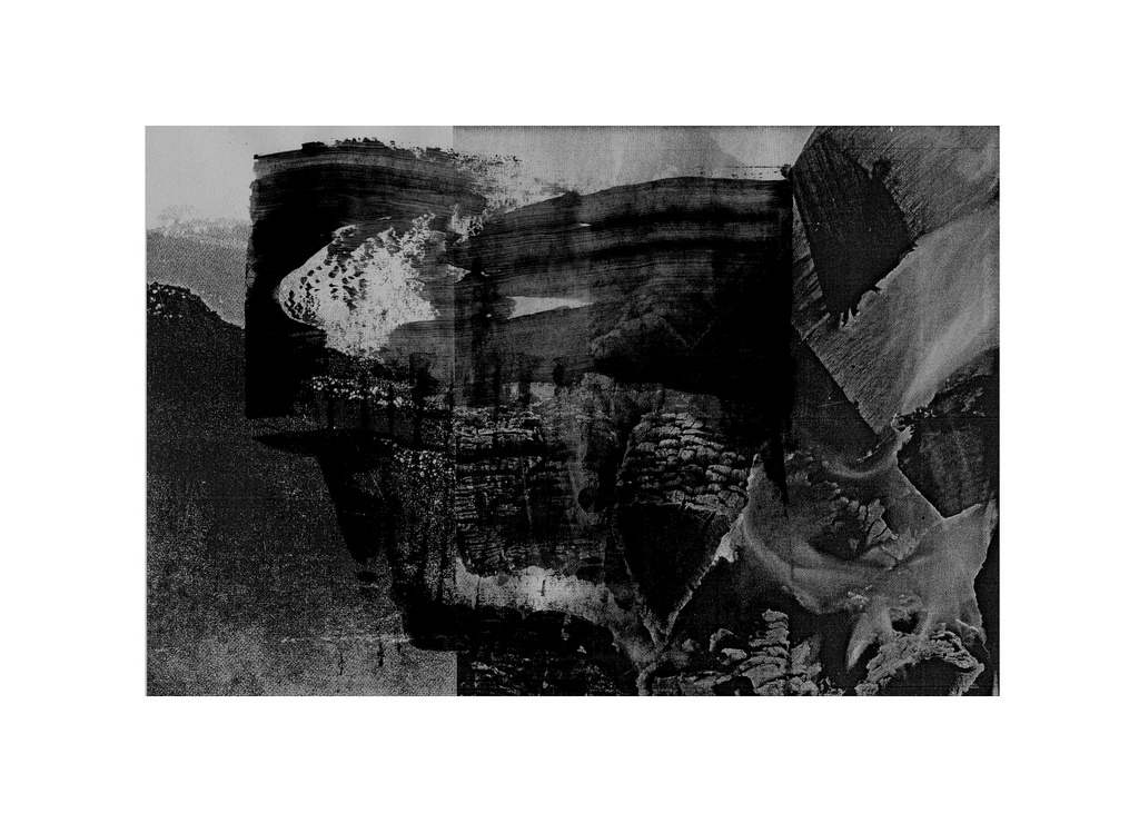
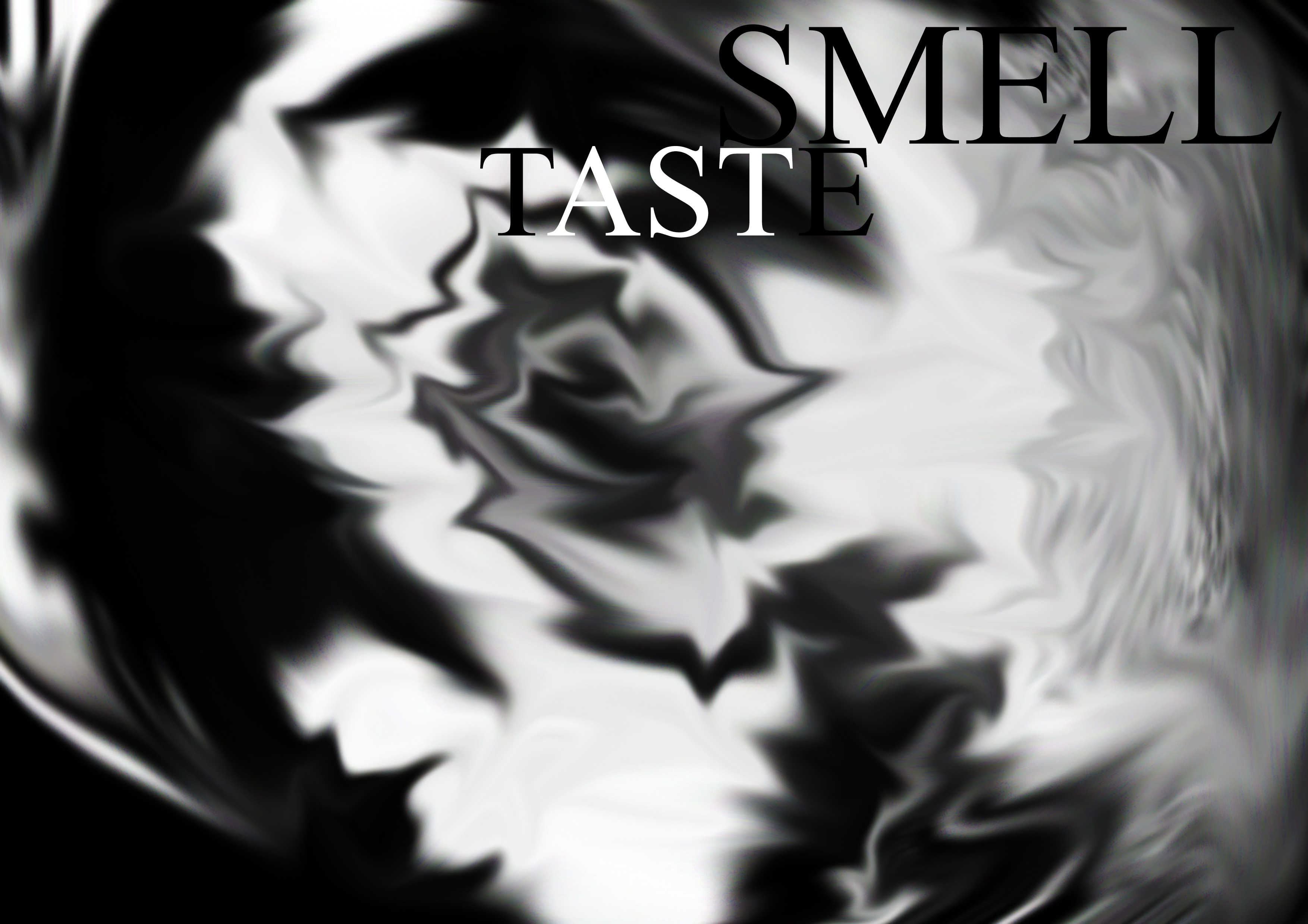
Smell and Taste:
For me, SJI smelled and tasted very raw to me because of its untamed nature and freshness. However, it was also very smooth because of its lack of tension and interruptions (like pollution) in the air and combined together, they were very cohesive. Hence, you can see a dark and light tone contrast, which symbolize how the raw and smooth qualities have bonded into the grey tints in the image. I attempted to use the golden ratio to create an image that is comfortable to the eye. The spirals on the right page symbolizes the calming, controlled smell on the island; light yet different altogether. The sharper angles on the left page symbolized more of the musky yet sharp air I tasted on the island. The emphasis is placed on the right page (where the smell is), hence the weight of the image is on the right. This is because the smell of the island is the first thing I experienced upon stepping on shore, and remained one of the most significant throughout my stay. The image I used to create this pattern is that of one of the pathways by the sea, which I felt reconciled the rocks, the sea, the trees and the sky. It was the one place that had all these main elements I favoured from the island. The image I used is as shown below:
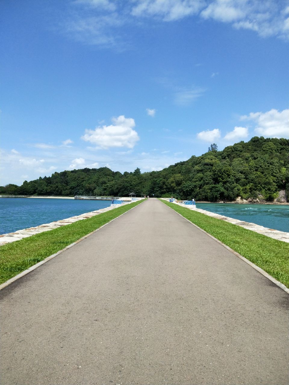
St. John’s Island | Pathway between the seas
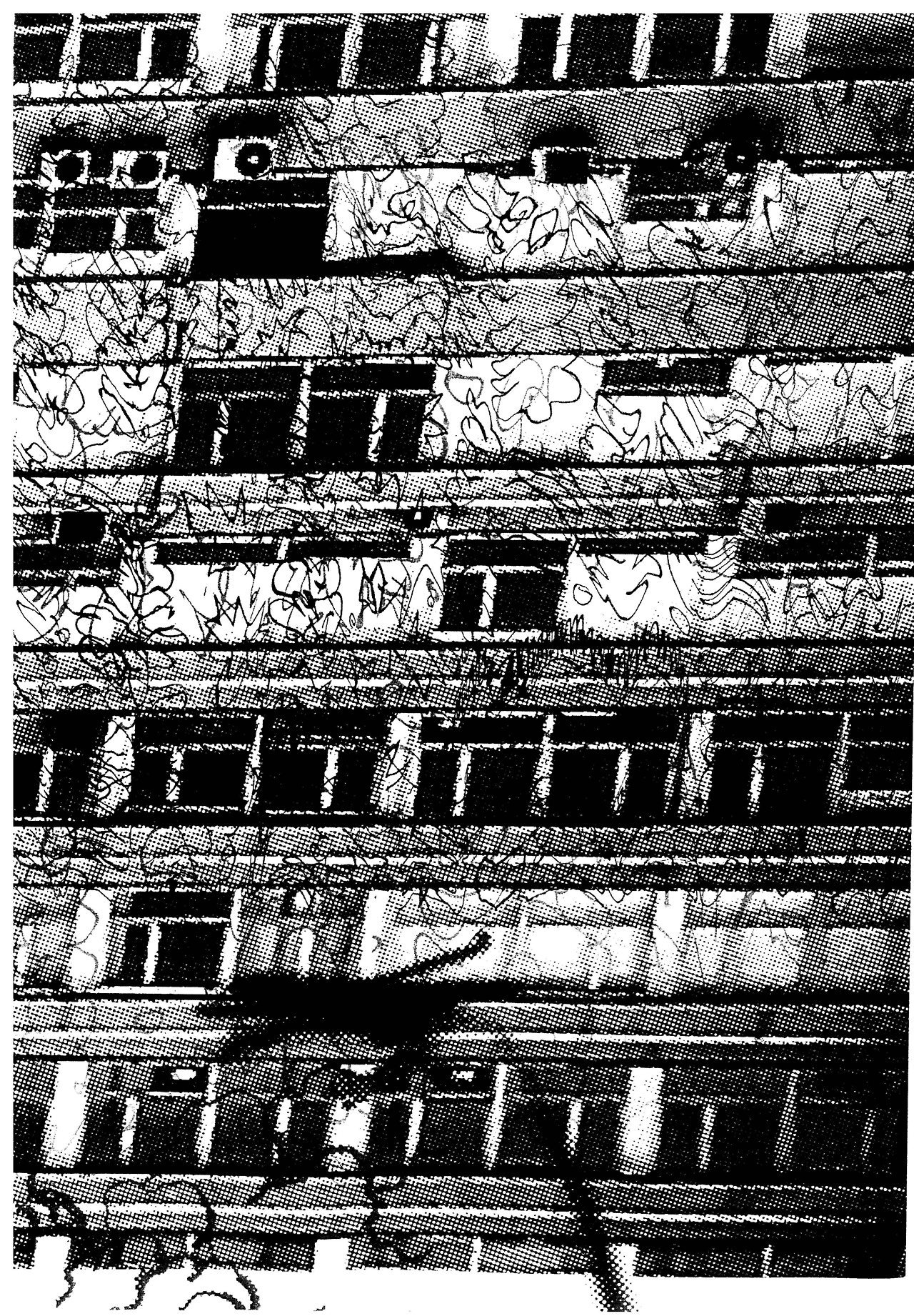
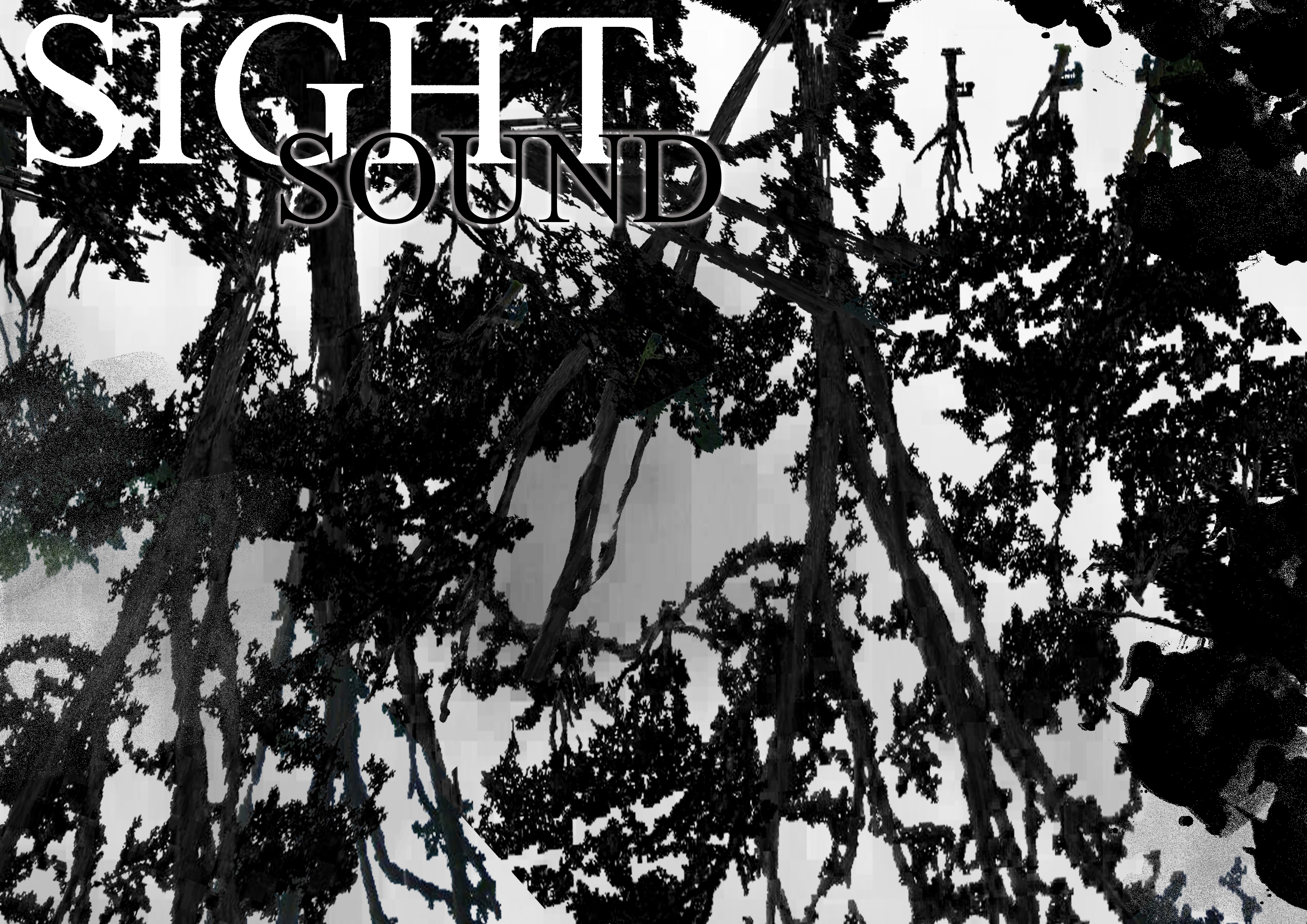
Sight and Sound:

For sight and sound, the things you hear and see are usually just a pile of mess; either the vast seas, the abundant trees and grass, many rocks, etc. There is always a lot of everything, and all these elements when combined together gives us one impression of the island. However, when you take all these qualities apart and analyse them one by one, you are able to determine the magic from each one mark. I used layering of many trees to create this effect. On the left page, it seems that everything is layered quite intense and the tree branches help to establish that there is a lot of noise present. Then, slowly proceeding to the right page, the negative space increases and the branches clashes less now. There is more space to breathe. The total image create a sort of gradient from dark to light to establish how the dark sides are the noise and abundance of all the sounds and sights we see but as we take the elements we see and hear apart and focus on one thing, they become clear as day; very defined, and well-received. The texture is also rough, to represent how each sound and each thing we see has its own personality and detail about it.
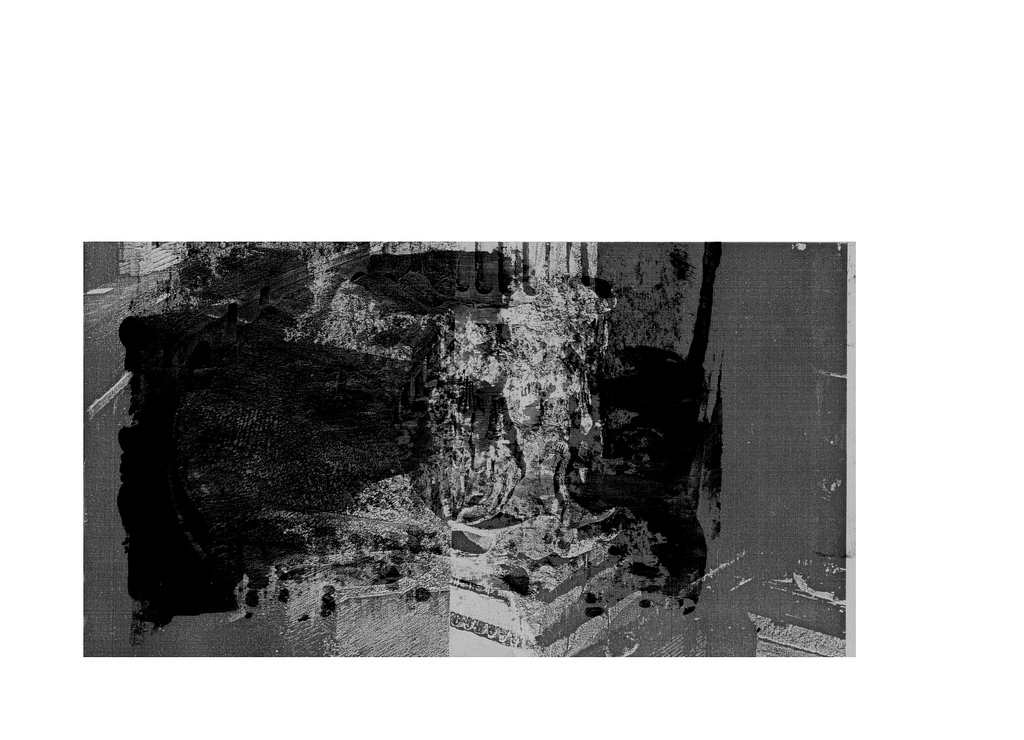
Touch:
The feeling of touch I got from St. John’s Island was mixed. It was scrunchy because of the sand and grass and leaves. Rough, yet sort of easy to grab onto. That was main part I experienced on the island since I never went into the water. Hence, it is the focal point of my image on this spread, and it had the greatest opacity and noise. At the sides, the colours are much lighter, like in light grey and white. These textures are smoother as well, which represented the skies and waters; how they are clear and easy-flowing. The opacity is less, because they are lighter, and are sort of floating in the background compared to where I was standing on the grass and concrete path. It is downward sloping serving as a function to help the eyes flow better. In this picture, the gradient is almost non-existent because I wanted to show how the touch between different elements are very different and defined at the same time.
Overall this project was a long, tedious yet life-changing one for me because I was able to break out of my stubborn shell to explore so many different options for one of the first times. I was forced out of my comfort zone to take on new ideas I was not sure would work and could experience myself jumping up in the middle of the night at the thought of new ideas that could potentially work.
Man, it was one long and tiring journey.