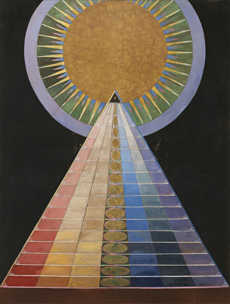
In the process of researching for this task, we had to find out more about the reference artists, as highlighted by my previous posts. I found some interesting reference points from various specific artists, such as Hilma af Klint and Jackson Pollock. Both of these artists reference greatly to Mysticism within their artworks- Klint using symbolism of Mysticism to overlay details into her work, while Pollock captures the spirituality of Mysticism with his colors and spontaneous drips. Hence, I was drawn to the idea of emotions and Mysticism elements. I found it interesting that people have always associated emotions with the natural elements, how a volcano eruption and smoke represents Pele’s anger (Hawaiian Fire Goddess), or a calm ocean tide represents Poseidon’s (Greek God of Sea) relaxed state.
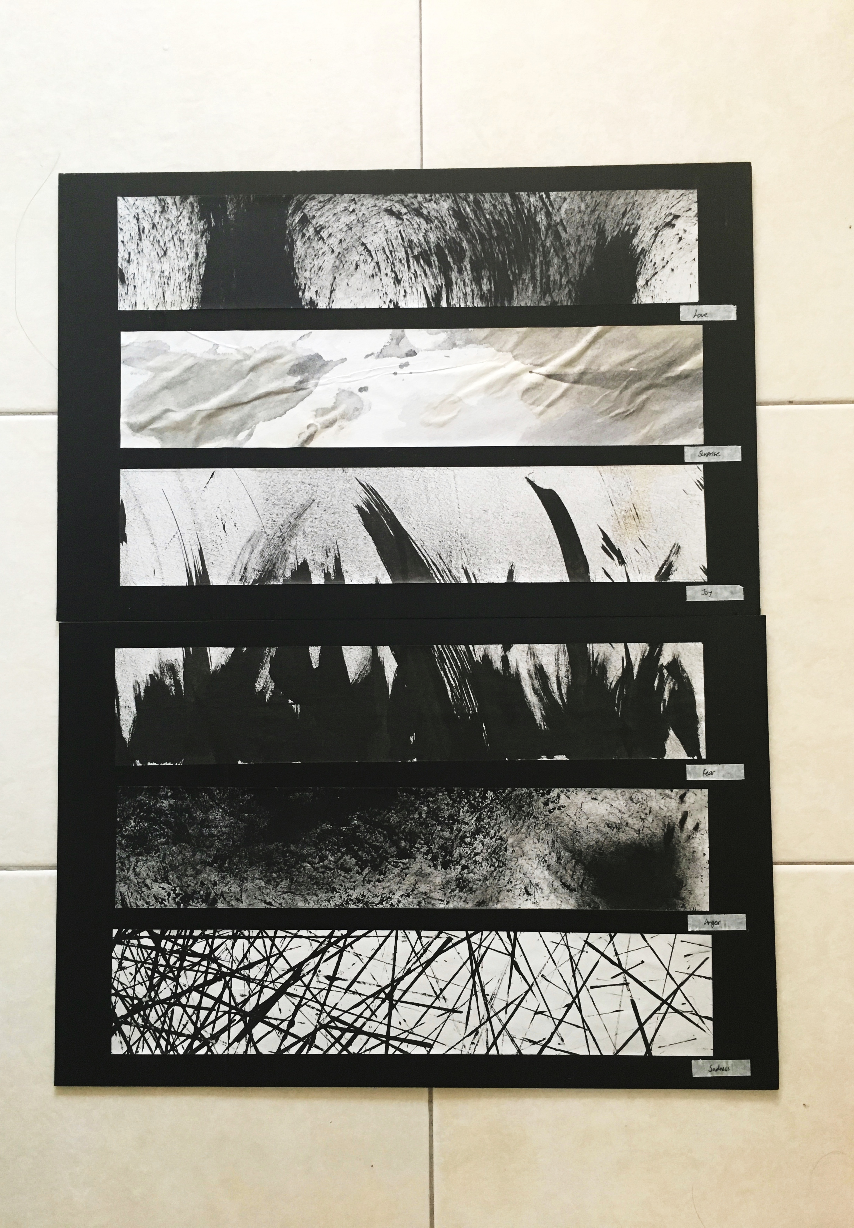
With this project, I referenced all 6 emotions to a natural element each. In addition, I wanted to portray all 6 elements/emotions coming together, showing the process of the emotion building up, instead of a fully formed emotion.
Love, Surprise, Joy, Fear, Anger, Sadness
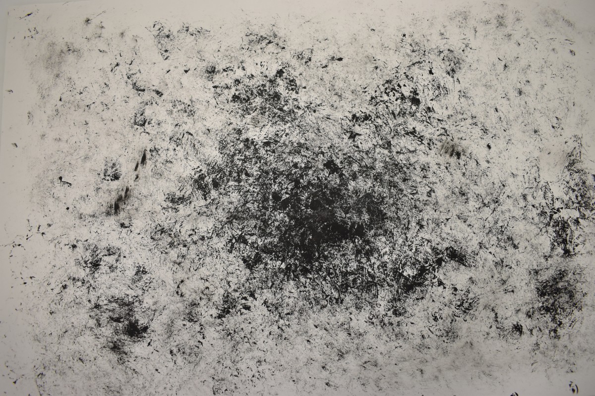
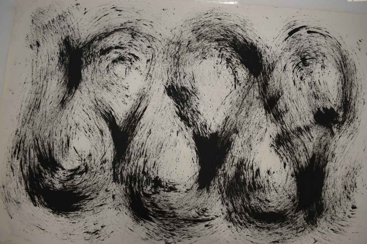
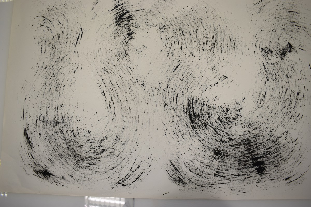
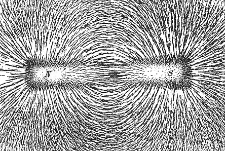
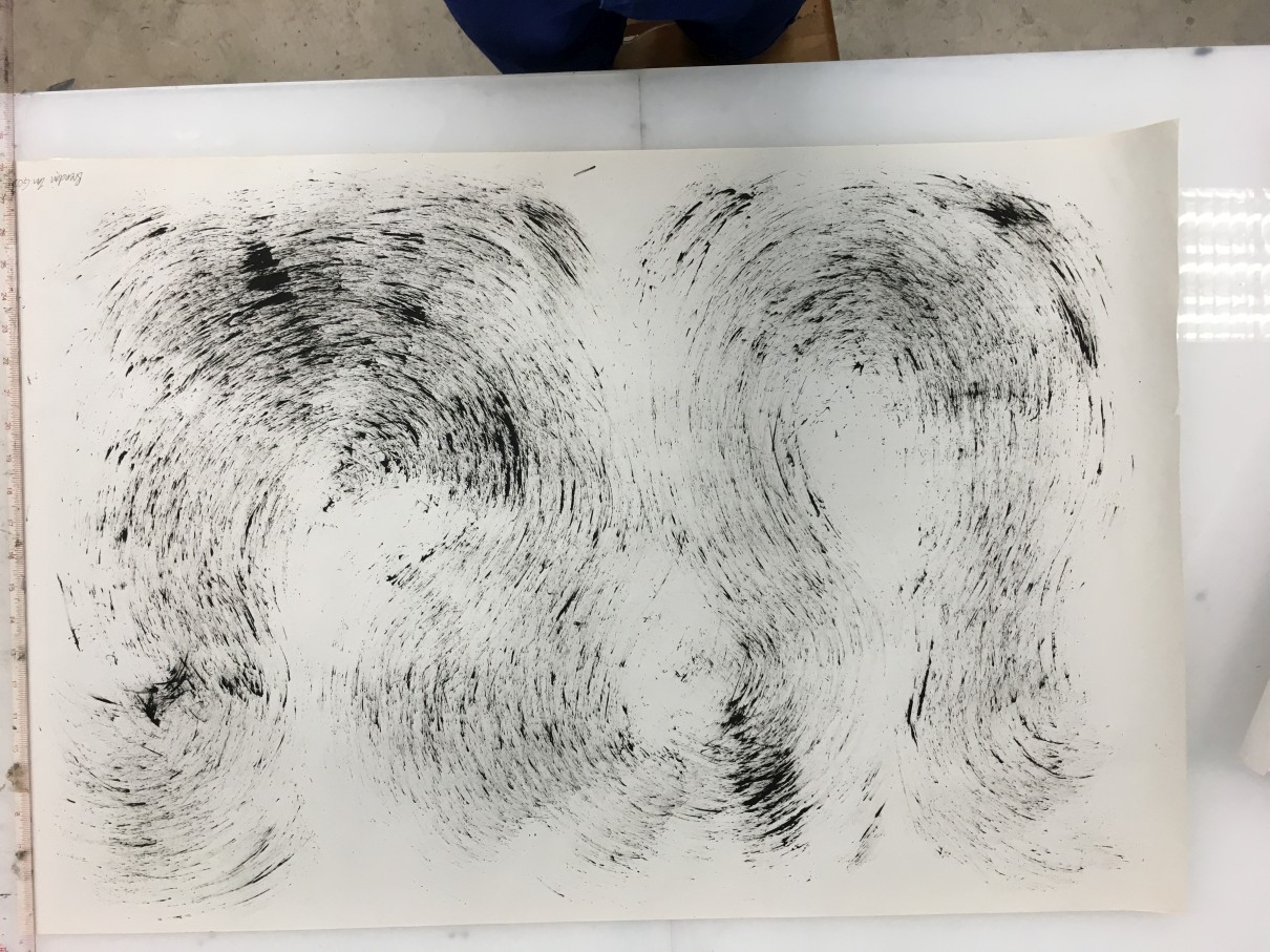
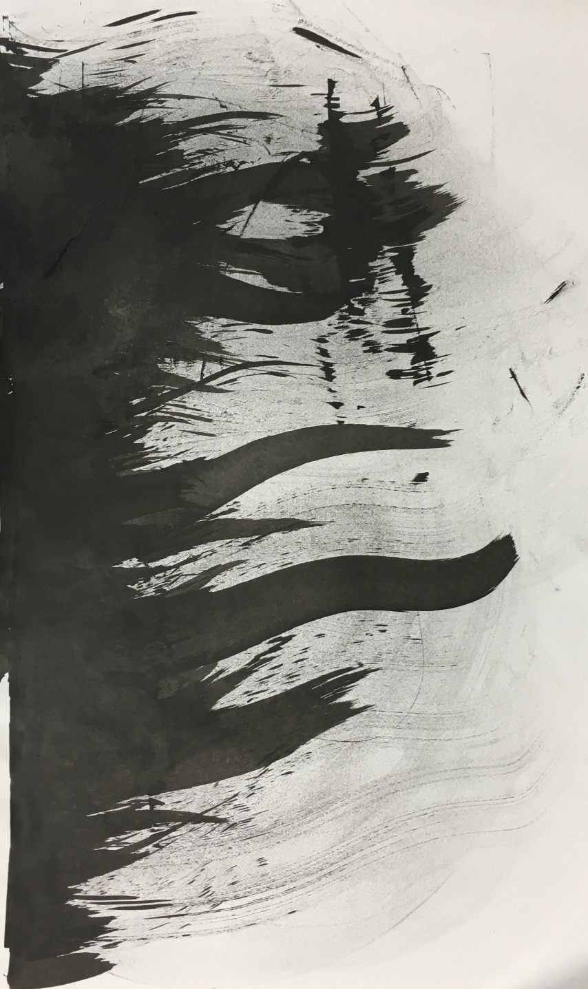
Love- Electricity/Magnetism
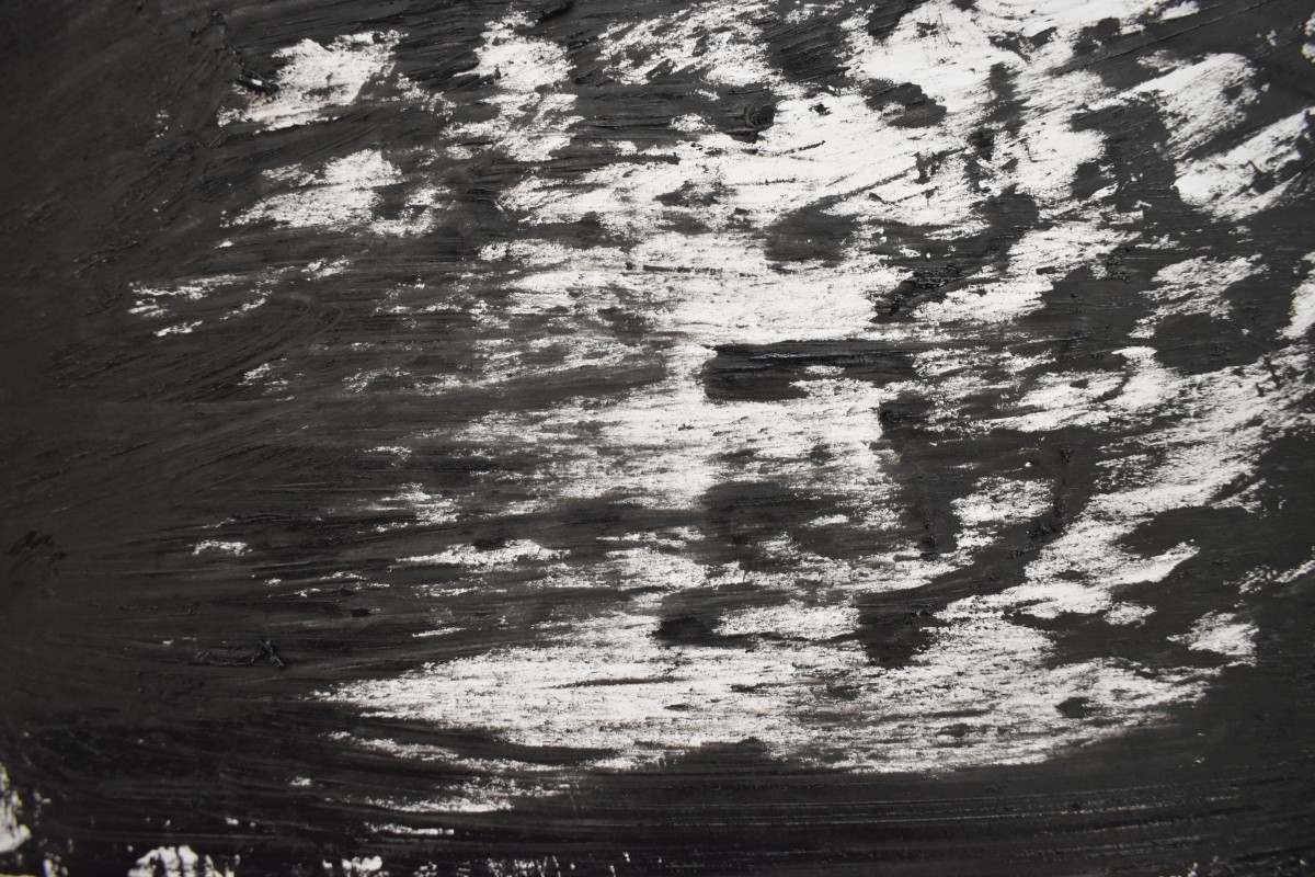
Under the emotion of Love, I broke it down into attraction and passion. I wanted to recreate the imagery of magnetic waves undulating in different wavelengths, shown in the diagram below. The concentration of magnetic waves at different points and coming together with an invisible force represents the physical imagery of love.
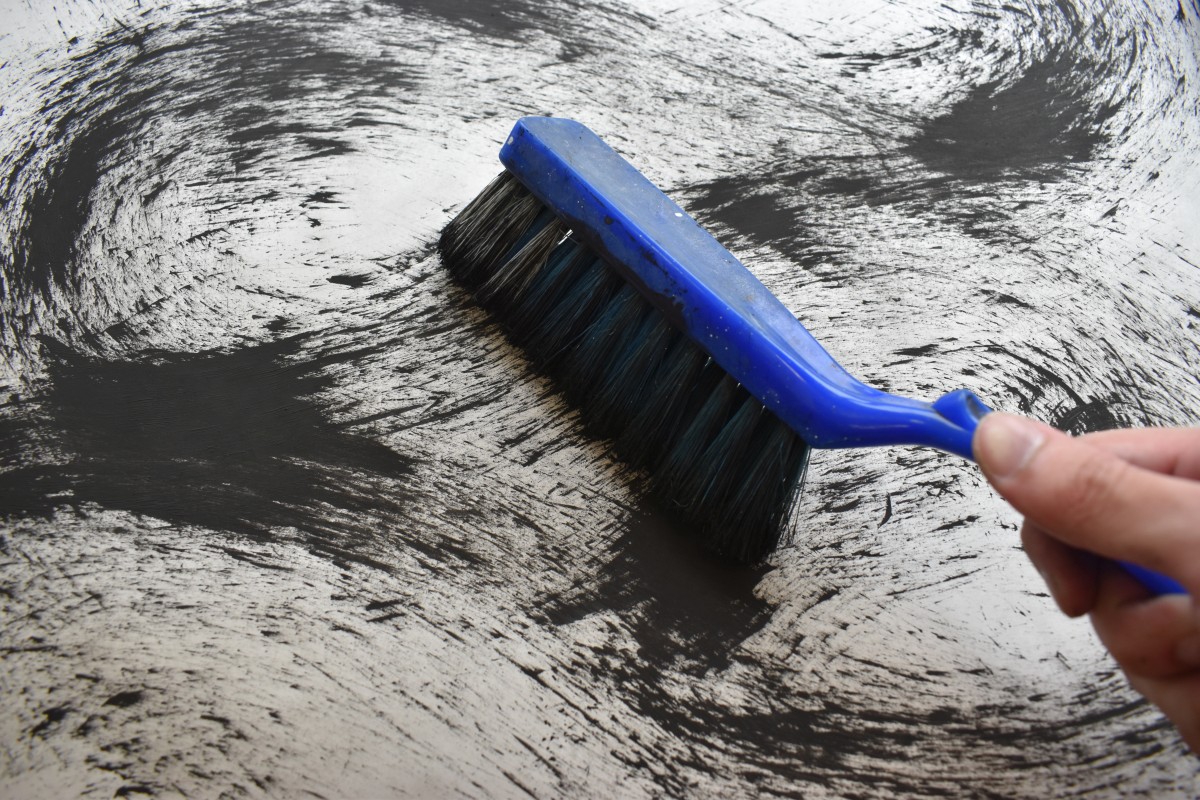
I used wire brush with a close length in between each hair follicle to paint the “magnetic waves”. I did it in a wave- like manner, curving at each end, and pressing with more force at the curves to signify concentration. I played with the texture of the print- areas with little concentration dabbled with short lines with rougher surface while area with high concentration is dark and visually heavier, portraying passion. The visual tension depicts the emotion of love coming together.
A problem faced with this emotion was the application. I had to choose between the spontaneity of using the wire brush or using a sharp tipped pen to draw out the physical “magnetic waves”. The former was chosen due to the spontaneity of the chosen emotion.
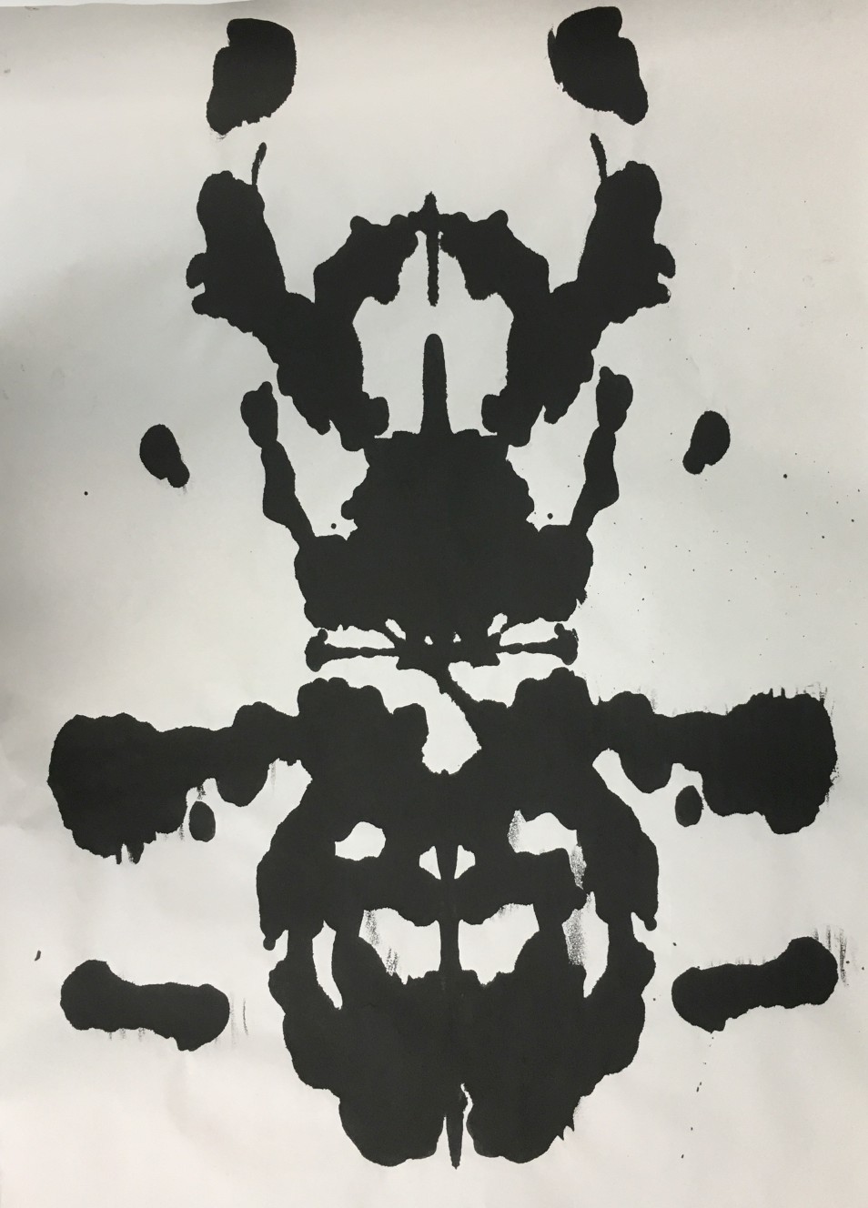
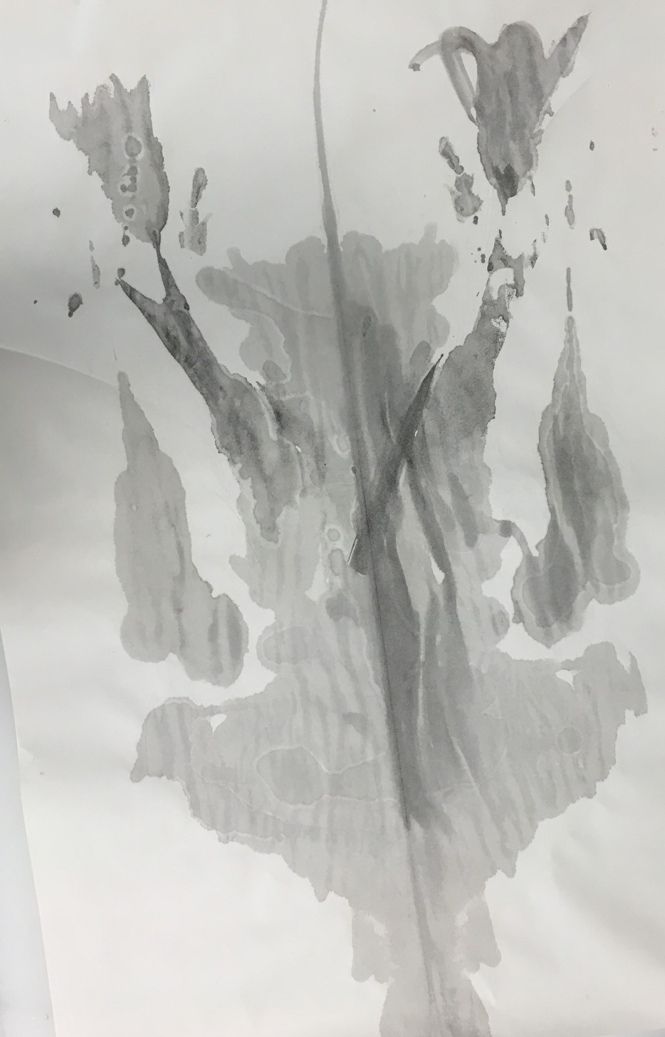
Surprise- Water
Under the emotion of Surprise, I wanted to portray the idea of surprise genuinely as it was an emotion that differs from people to people. Hence, I decided to explore on the concept of Rorschach, referenced to Warhol’s Rorschach series. However, I found that a typical black ink Rorschach to be too dense with its color, unable to physically decipher its texture and space, hence I used diluted ink instead. The Rorschach will differ according to the individual audience’s perspective, hence becoming a surprise. The dilution of the Rorschach will feature the texture of the moving ink, portraying the liquidity trait of the ink, as if frozen in its movement, building up the surprise.
I used a diluted bottle of ink, added with vanilla essence to provide an additional sense of surprise, creating a lightly dabbed Rorschach with an interesting scent- creating a double layer of surprise, sight and smell.
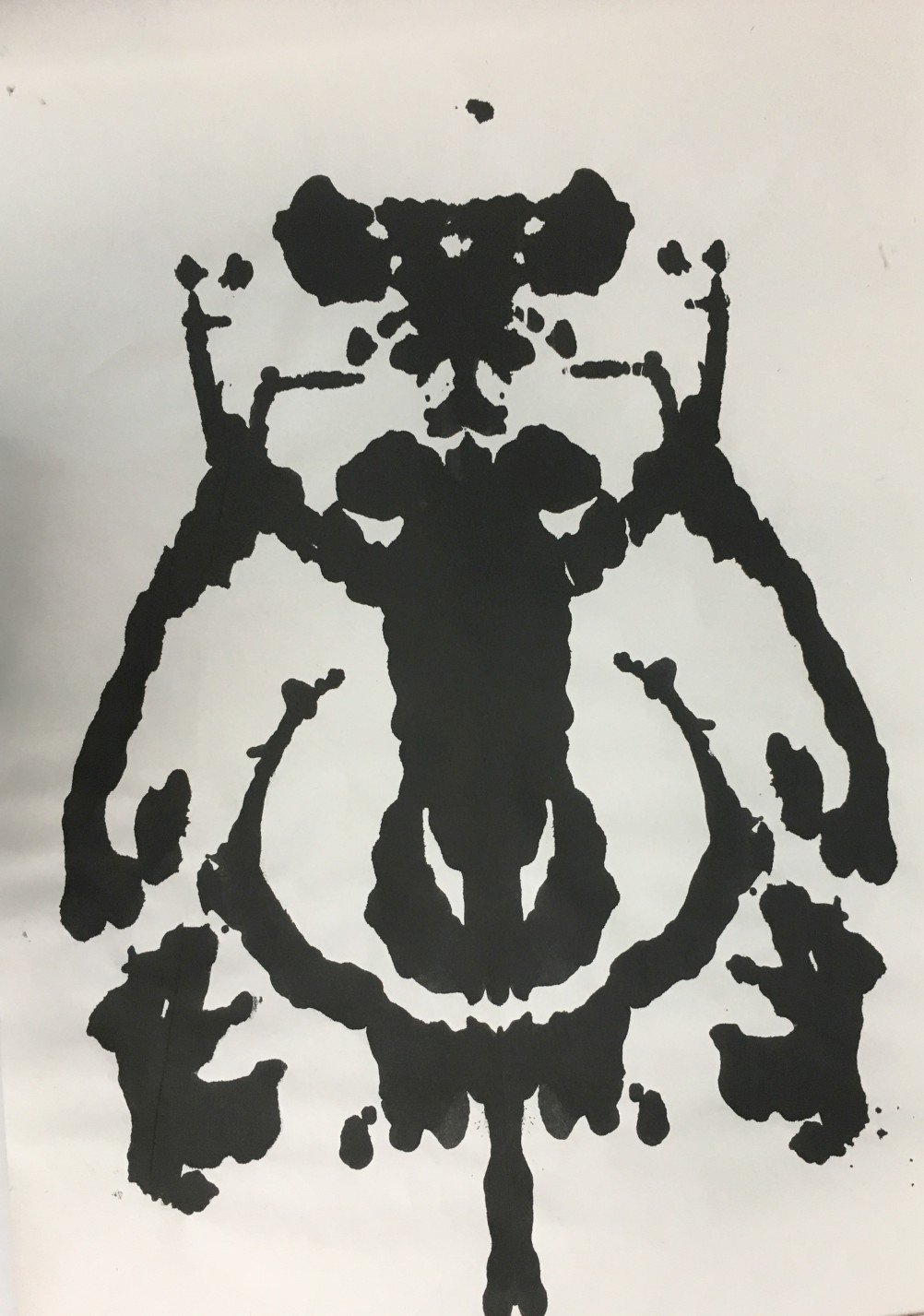
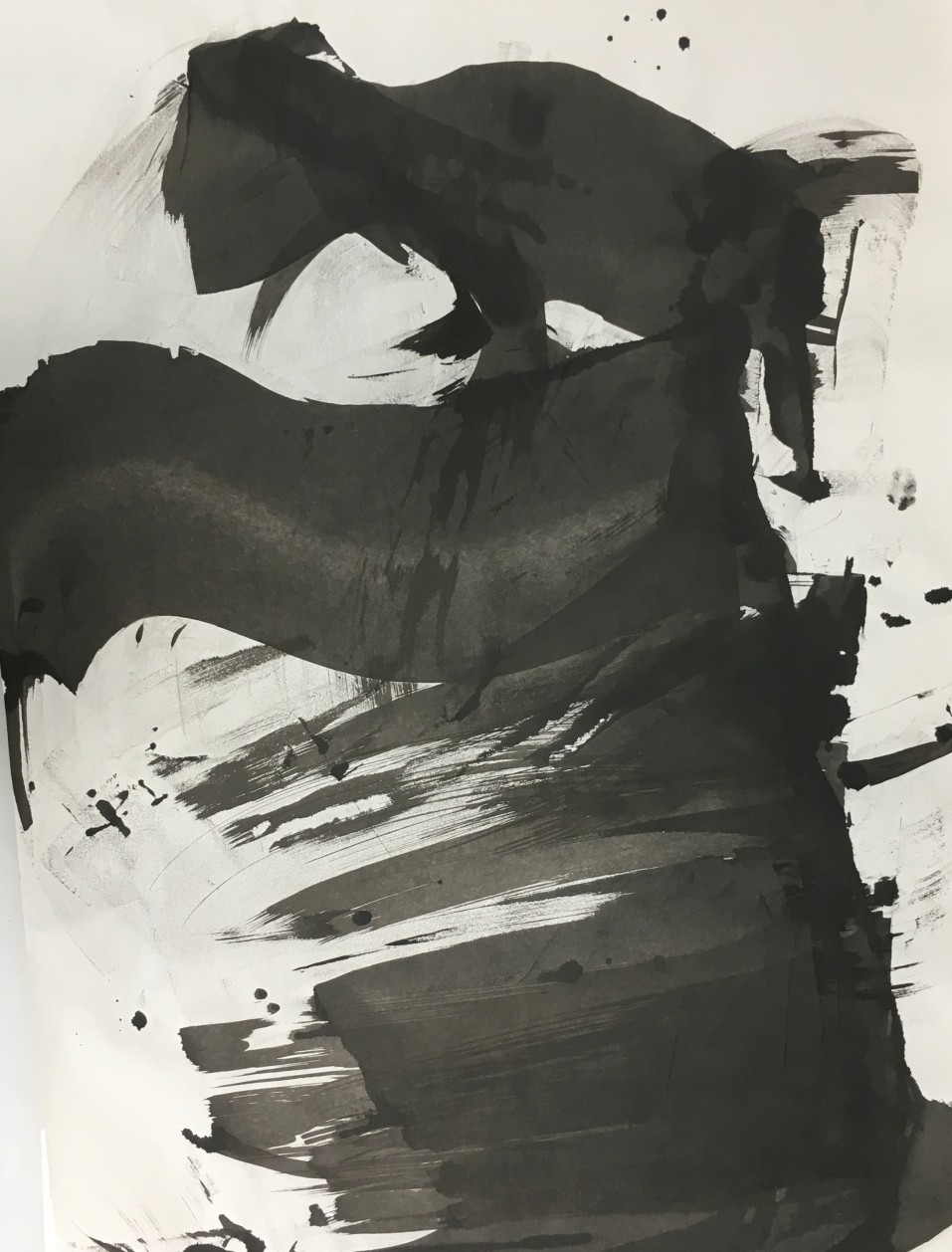
Joy/Positivity- Light. Fear/Negativity- Dark
Under the emotions of Joy and Fear, I decided to explore both emotions together as they are contrasting emotions of the same spectrum. I referenced this work to Andy Warhol’s shadow series, using the positive space concept for the “Fear” emotion, while the “Joy” aspect uses negative space heavily. In deciphering Fear and Joy, I see it as polarizing emotions, much like Dark and Light. Hence, I used the same artwork and cut it into two pieces for these emotions- the one with strong negative space being light while the one with heavy positive space being dark.
I used a metal ruler to physically drag the ink over a paper, mimicking Andy Warhol’s Shadow. The physical motion of dragging ink creates a denser area at the bottom, while the lack of ink at the top creates a faint texture mimicking light, much like light and dark conflicting each other. (https://oss.adm.ntu.edu.sg/bren0022/psychoblop/) I found that the test making of a controlled composition of bottom up more suitable for the theme of duality in this emotion, since the test making of the tones coming from all angle was slightly more overwhelming with “Fear” than conflicting emotions.
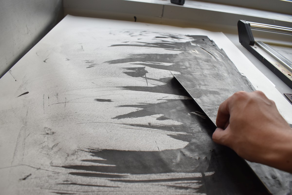
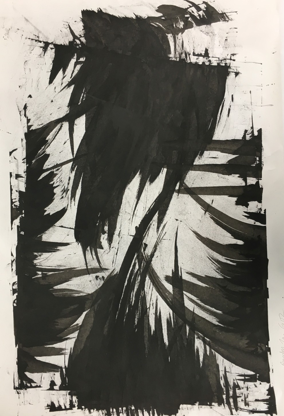
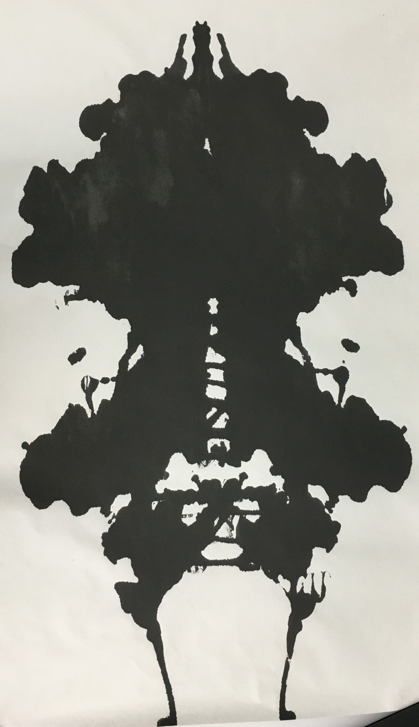
Anger- Fire/Smoke
Under anger, it was easier as fire is always personified as angry due to the presence of tension and energy building up. I referenced to Cai Guo Qiang’s Gunpowder series, using the stains of smoke marks to hint of fire, as smoke and fire comes as a duo. I wanted to create an imagery of smoke becoming thicker in different areas, a metaphor of anger building up. In creating such features, I dabbed a crushed soft tissue with ink onto the paper, layering and layering the ink to create the desired imagery. I also added circling movements to create a smoky texture. I had previously explored on these themes on an earlier post. https://oss.adm.ntu.edu.sg/bren0022/a-jar-of-ink/
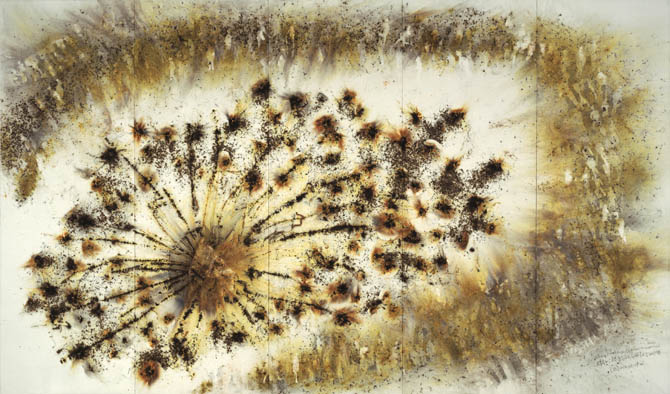
Gunpowder on paper,
2006
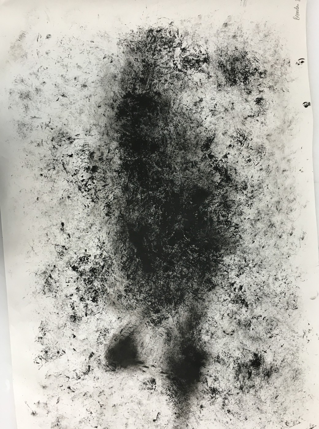
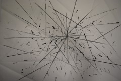
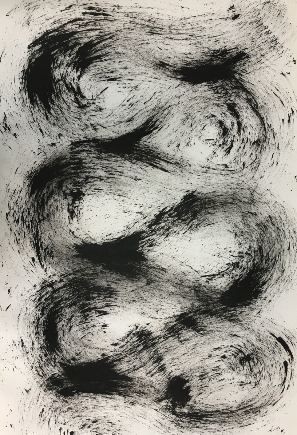
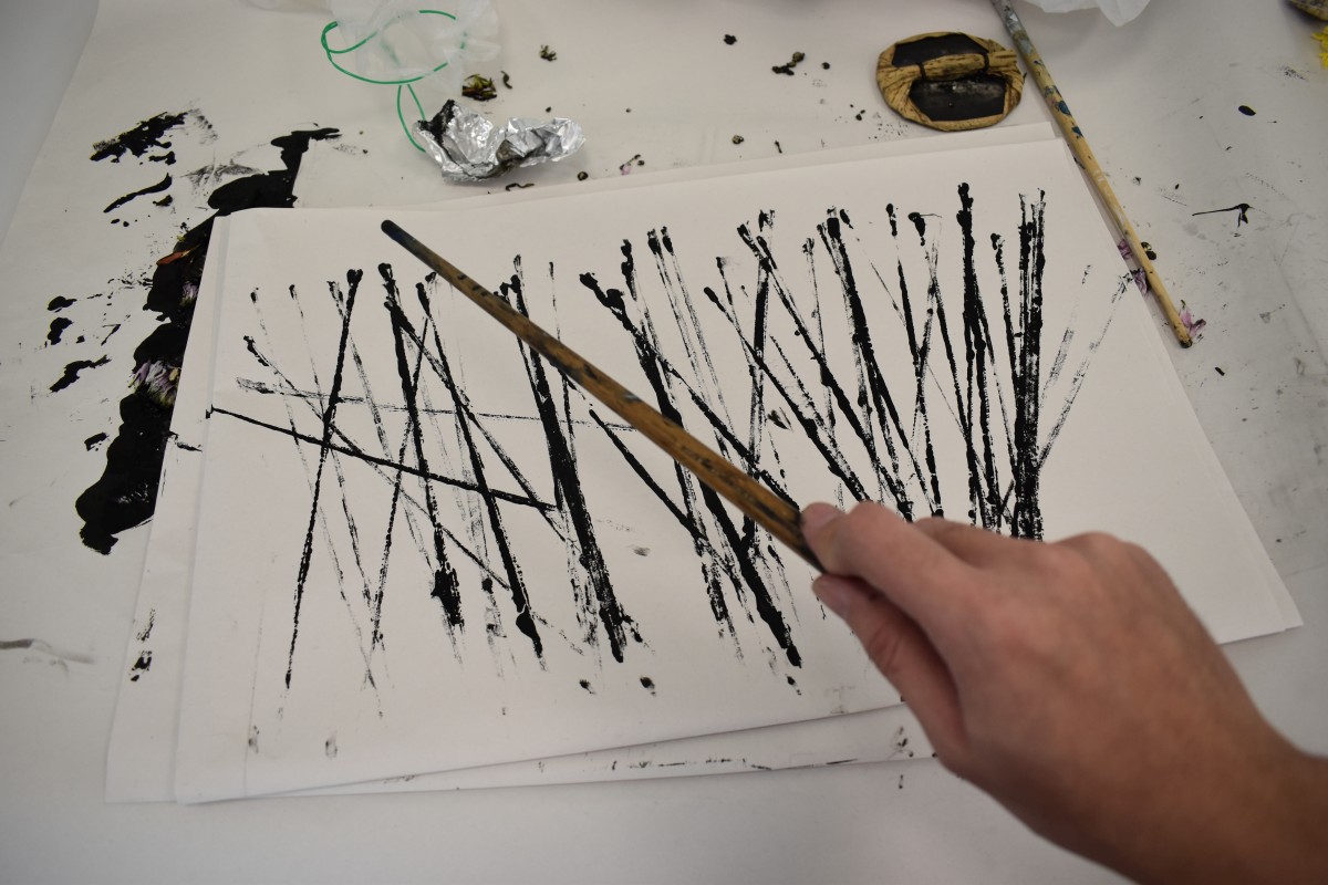
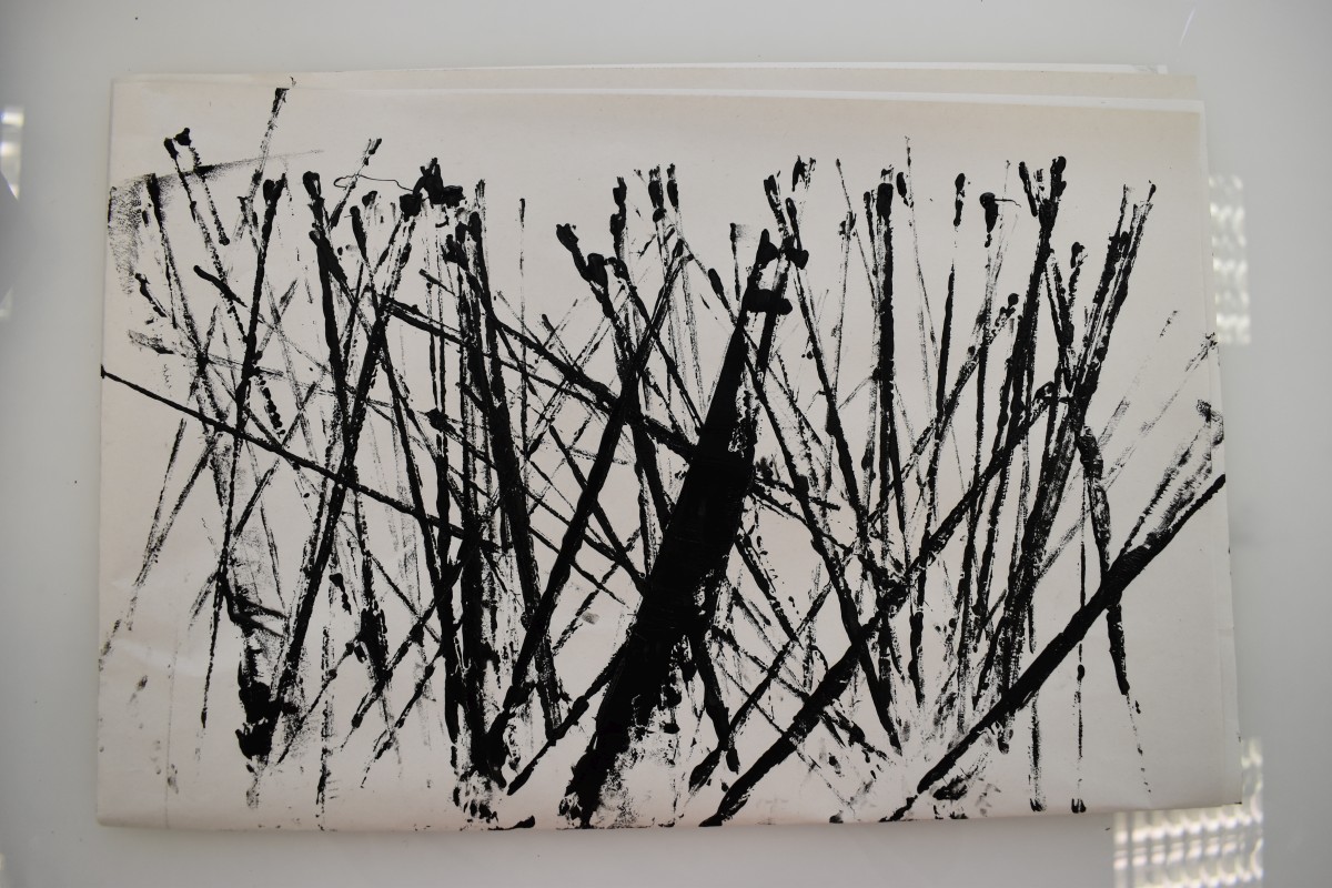
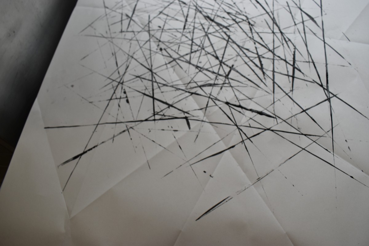
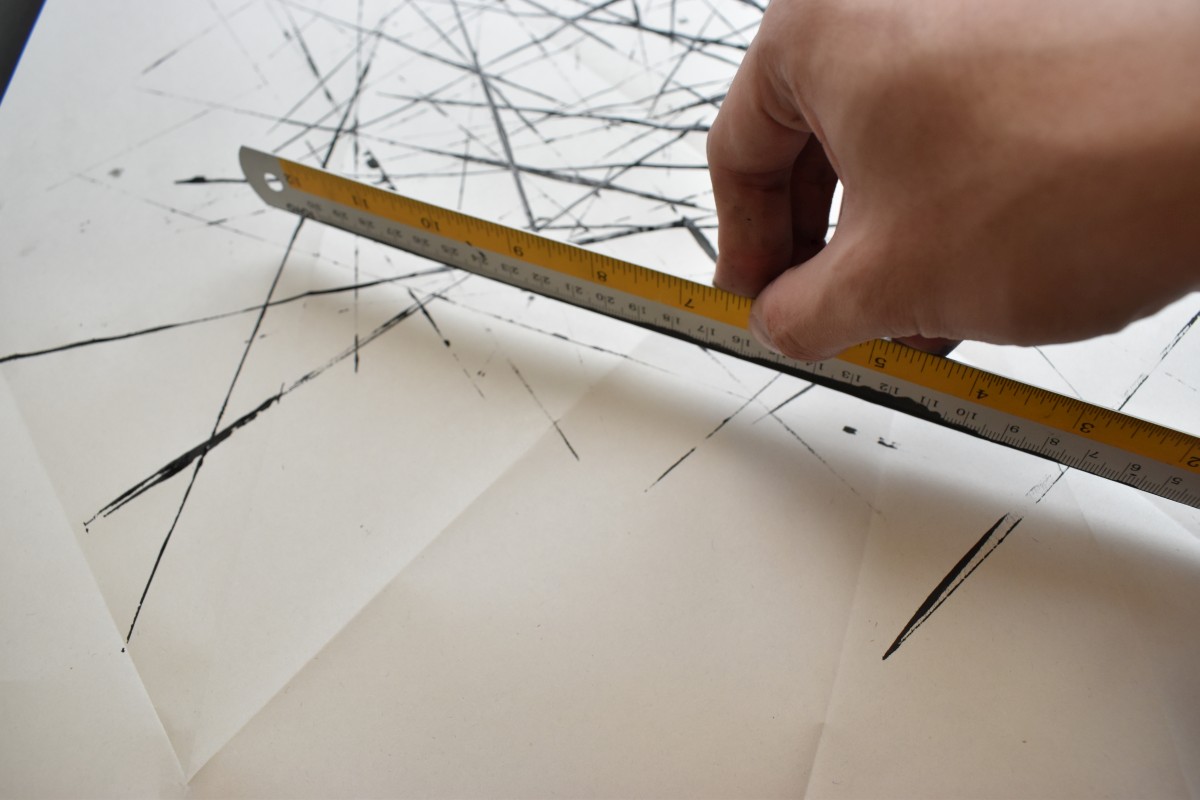
Sadness- Ice
Under the emotion of sadness, I wanted to portray the idea of loneliness as a poetic “cold shoulder”, hence I chose the element Ice. Ice has always been an element referenced as isolating and apathetic, therefore literary terms like “Ice queen” exists. I wanted to capture the sharp edged and clean cut form of Ice, much like the physical form of a snowflake.
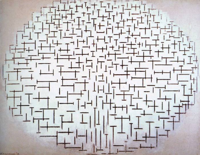
In creating the imagery, I dabbed a long ruler along its length to create a long lined mark on the paper. I did so continuously, forming an image of sharp lines coming together in the centre. After exploration of spontaneous mark making and also controlled application, I decided to use the controlled version due to the hardy texture and geometric space “Ice” as an element encompasses. I also used the width of the long ruler to create shorter lines. The usage of lines, dark and light, creates a visual space of foreground and background, and without a subject matter like Pollock’s works, isolates the audience. In attempts to create a stronger foreground background contrast, i folded the paper to form thin but yet visible lines. This references heavily to Willem de Kooning‘s Expressionistic work and Piet Mondrian‘s Pier & Harbour Series, using the visual dimension to draw audience in, and without a subject matter, creates the idea of isolation.
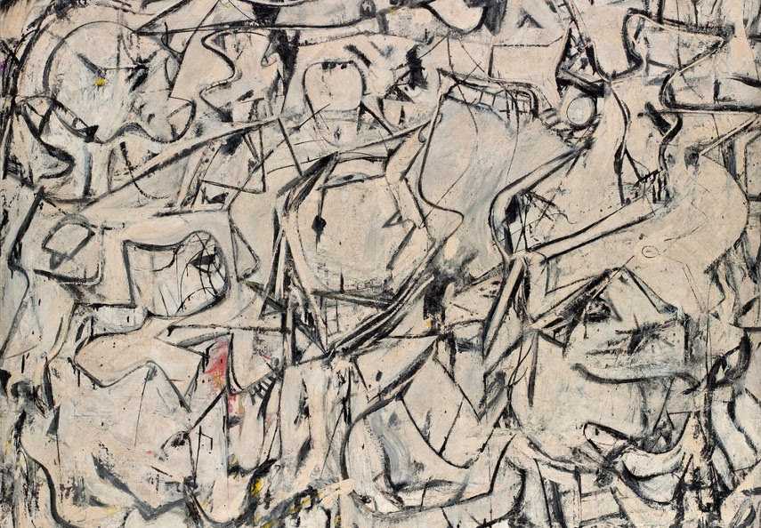

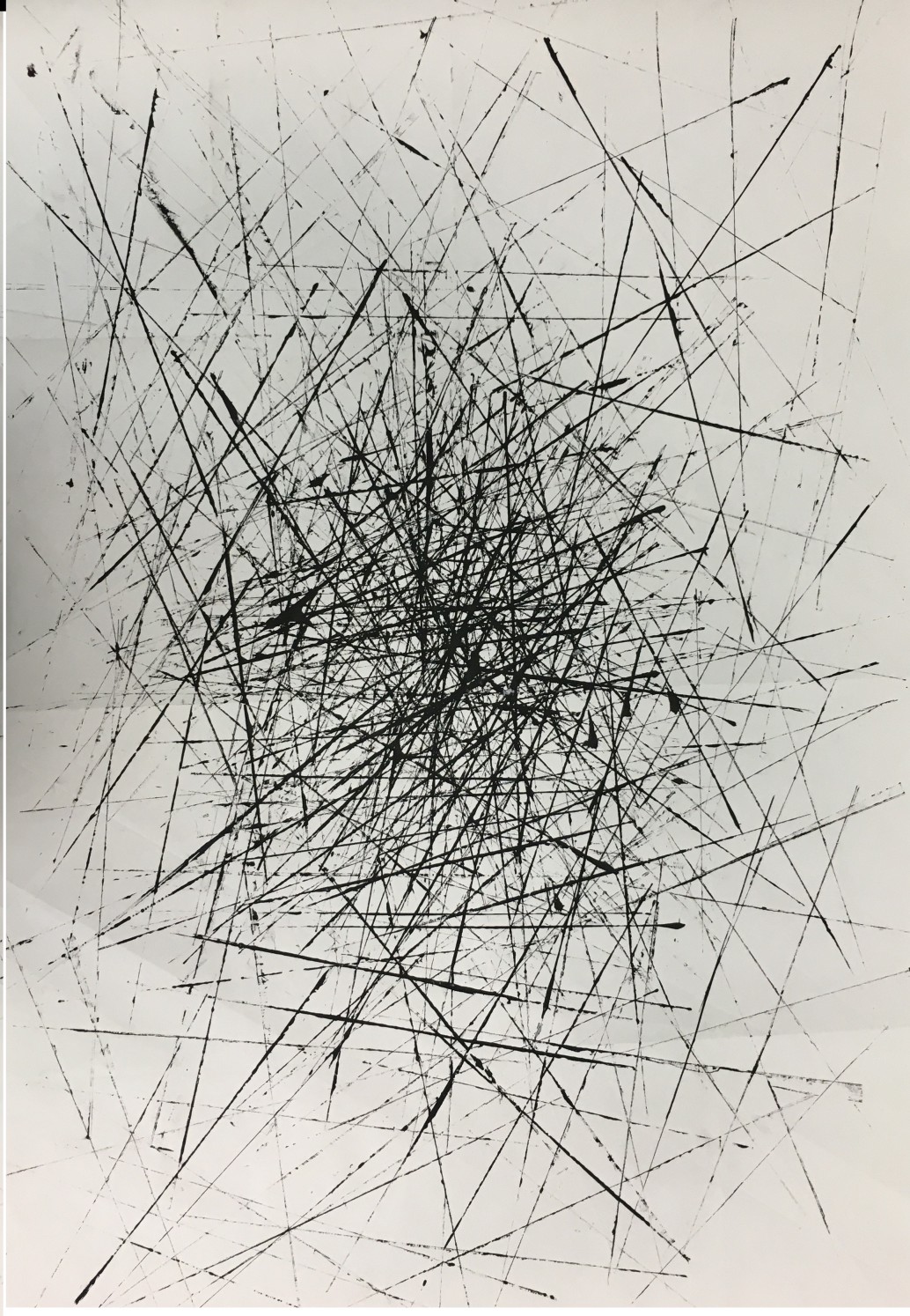
Overall, the main difficulty I experienced with this assignment was the attempt of concentrating the desired emotion within one small patch of paper, which was difficult since famous artists like Pollock and de Kooning are able to portray emotions through their works because the sheer size of their works are almost mural like. However, I had to distinctively choose out areas to crop out of my works, giving rise to the final composition seen below. Also, there was a lot of conflicting ideas between choosing how the final application is carried out, be it spontaneous or controlled application, ultimately, it depended on the emotion’s visceral nature.