
Brief
With part 2 of the Locale project starting, I had a clearer idea of what to do using the critique reviews from part 1. Consultations, as well as brainstorming ideas, reveals a direction towards illography- illustrations and photography of the photos I took from part 1. I would also envision trying out mark making to heighten a stronger sense of location identity.
Zine

https://drive.google.com/file/d/1_jlsO2hpgKt1iiZ9N9w1oqx1M-84QYGh/view?usp=sharing
This zine in summary is a visual representation of the relationship between the people and the location within different time periods, conveniently labelled as the ghosts of the past, present and future. It navigates through this location from public to private spaces, seeking out what makes this place unique and representational of their feelings.
The past refers to the students who graduated before,
the present refers to the students who are still studying there and
the future refers to the students who might study there.
A big big BIG summary
looking at the Big picture, i wanted to show a series of ideas as the audience would look through the zine, looking through the eyes of the narrative I want to tell. Hence, I arranged for the narrative to follow a sequence throughout the front, back and 3 spreads consistently :
- Colours
The colours starts off with a muted and tamed theme on the first spread, mainly black as background that shows intensity with situation. There is little light and colours to justify how the students of the past are losing their memories and connection to a place they are no longer in connection with.
I also made a note to not overkill or overuse the colours, thus giving rise to my idea of using it in a fluctuating manner, dark-colourful.


The colours become more greyish with a stronger play of colours, indicating that this spread belongs to the students who are currently studying there and experiencing the place, but is met with the inevitable idea of having to leave this place they call home after two years.

The last spread is the most vibrant with the strongest play with colours as the future is deliberately made optimistic with saturated colours. No one wants to know that the future is bleak.


Green is also a special colour used especially in the present and future spread as we discussed about the idea of merger of Pioneer Junior College (PJC) with Jurong Junior College (JJC) in the recent years.

- Glitch

The glitching effect is made by the website https://snorpey.github.io/jpg-glitch/, utilising four different toolbars to create the glitch effect desired be it colourful, pixelated, blockish or grainy.
Using the photographs that I took of PJC, I decided to create glitch effects that tell of three different kind of concept: Forgotten, Configuring and Unknown.
Forgotten
The first spread starts off with a glitched background that is pixelised but retains a strong sense of form. It references to how ones memory will gradually lose its shape as the years go by, hinting that the students who graduated has a slight idea of what life was in PJC, but as years goes by, starts to lose its structure.

Configuring
The second spread has a glitched background that is deconstructed, but still having a strong idea of structure. It gives the idea of one being in the situation, but not appreciating what there is, thus not seeing the true form.


Unknown
The last spread is totally glitched with colours and shape. It refers to how no one knows about the future, thus depicting the future as an amorphous plaster of colours and shapes.

- Characters
Different characters were also planted within the zine, each representing something that I have gotten from the interviews with the alumnis or students from PJC. However, two main characters would be the lady on the front and back page, as well as the glitch man.
Front-Back
as the front and back page are the first and last thing that the audience see, I wanted the characters on both pages to tell a story.
the front page features a girl with adequate decorations and having two heads staring into two different directions. However, as the character moves through the series, it eventually ends off with a confident posture. This character follows one of my interviewees who experienced an increase in growth of character and confidence as she found her way through PJC. This character pays homage to the students who found comfort in the space of PJC. The posture in the back page, as well as her glitchy backdrop is reminiscent of Francis Bacons paintings, who exudes confidence in his own space of identity.
There is also overlays of the word “ghost of past, present and future” placed all over the front and back page as I didn’t want the zine to be overwhelming with a context, but not enough to not let the audience understand what it is about.

glitchman
the glitchman utilises the central spread, which is the only spread that is connected together when printed. Hence, I intentionally made the glitch man printed with disconnecting body bodys, with the paper as the demarcation. This was to intentionally intensify the glitch effect
.
- Space
Throughout the zine, I incorporated the idea of a navigation through public to private space, which is an idea that was apparent in my Part 1: Locale.
In the context of PJC, it is an isolated location that only the alumni or students or even relevant personals have access to, and my job for this project is to highlight its uniqueness.
Hence, from the first page to the last page, it navigates the main character through the spaces of PJC from public to private, or even activities, into the bowels of PJC and what makes it unique.

It starts off in public places like the canteen and field where everyone can access it, just in plain sight.
Then we move into a location where students dwell in introspection, like the classrooms or art room (specific to my friends and I). This engages in a semi private space where we get lost in our own thoughts.

The last spread features the most private location where the students remember enjoying the company of their friends, look ing under the stars, sharing a space in the art room or looking at the sunset after vigorous training in school.
Furthermore,
to add on to the idea of a isolated space, I wanted to create a sense of three point depth within the zine. This meant that the glitched background would be one layer of space. The characters in the photograph would be in one layer of space. And the mark making I tried to make would be another layer of space.
The results were as follows.

However, the issue was this visual quality was eventually lost once I scanned it into the computer, since the task at hand required all works to be digitise, I had no choice but to give up on this mark making effort.
These mark making were done by pasting the site’s unique features like water cooler drain with acrylic ink, then overlaying it with a transparency or paper.


Reflections on Illography:
Since there weren’t a lot of time to spare during critique, I couldn’t elaborate more on how the procedure of the illograph was done. Firstly, I took the photos and printed them out on a high quality standard A4, which gave me prominent space to draw my illustrations on. I was worried that the visual quality would be lost once I used a scanner.
Then, I used transparency and overlaid onto the photographs, which I then draw over. Each illograph attempts to accentuate the space within the photograph, and also to highlight the uniqueness of the site, which I will elaborate below.
I used paint markers, which allowed me to get the textural quality that is missing from using Adobe Illustrator on digital files. This was an idea suggested by Joy, using the scanner to render that textural quality I want to retain.
I realised that illography also emphasised a lot on the idea of symmetry, in which balance gives off the strongest composition in illograph as they give a strong structural aesthetics compared to something messy and chaotic. There is also an inherent beauty in the idea of asymmetrical balance, however this would have to be balanced off with a play of colours.
Drawing technique wise I have learnt to use dots and lines to create textural details, each style requiring an acute sense of pressure since the paint marker is very sensitive.


Each individual characters
front page

As mentioned above, the first character you see follows the main protagonist who enters PJC, but has trouble deciding where to go from there on. The illography on this character attempts to highlight the wavy hair and keep the decorations to a bare minimum as the back cover character is the one that is excessively decorated. The colours in the hair follows a transition of PJC logo colours of red, black and white into the colour of JJC, which is just green. I also wanted the art direction of semi-tribal and surrealistic as both themes employ heavy usage of colours.
First Spread

This illograph utilises the abundant space in the background, using only white to accentuate the dark space. It is supposed to be the canteen at which students dwell and enjoy one another’s company. Hence, I decided to portray the presence of people through the usage of leftover bowls and chopsticks piling up. There is also a presence of a puddle motif with sticks poking out to give off a trypophobic atmosphere, alongside actual dark holes all around, giving a creepy sensation when looking at it.

This character has a small tint of red covering it. She is seen in the field, lying down looking at light which represents the hopes and dreams lost as the time goes by. The red checkers is supposed to be reminiscent of the red checkered picnic mats in Alice in Wonderland, giving a feint idea of being trapped down, along with actual chains drawn to tie her down. The circular neck-brace helps to give a sense of three-dimensional space within the photograph.

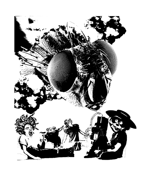
The last photograph in the first spread features an abandoned glitch face with cockroaches crawling out, while a pair of legs stand behind it. There is light coming out of the glitch, reminiscent of the lights shown in the photograph above. This idea of looking down at the glitch parallels to one of the interviews I had with an alumni, who mention that she sees glitch whenever she visits PJC, but because this idea is so distant, she no longer does- This represents that imagery. Cockroaches are motifs that are related to her experience in the art room ,which is full of cockroaches crawling around.
The patterns on the shoes serve to contour the shoes in the dark environment, making audience know that it belongs to a noteworthy character. The yellow cockroaches also help to shape the three-dimensional quality in the picture.
second spread

This spread starts to have more colours at play, depicting the current students who are still in PJC. The glitch character is seen in the central page, disconnected by the central border. It is seen glitching with white and black pixels popping out of the eyes, while colourful pixels are sucked into the mouth. It represents the idea of how this glitch character sucks away all the happiness that the students find in PJC. This was a visual effect mentioned by one of the interviewees I had.

This character is seen opening a door of a toilet in PJC, as if opening itself into a world of mystery given how dark the environment is. Behind her is a bud of an orchid, which are common flowers that can be found in the location. The white pixels link up to the image above.

The same motif of opening a door happens again here but this time with the character going out. There are black pixels that link up to the character above. The character is seen having a transformation where she has a triangular head, one of the more abstract creatures seen throughout the zine so far. It reminds the audience of how short the time in PJC is, which is limited to two or three years per batch. The yellow triangular head helps to highlight the central empty space of the door.
Last spread
the last spread is the most surrealistic one out of all three spreads, with interesting creatures interacting with the character, as well as colours bursting into the image.
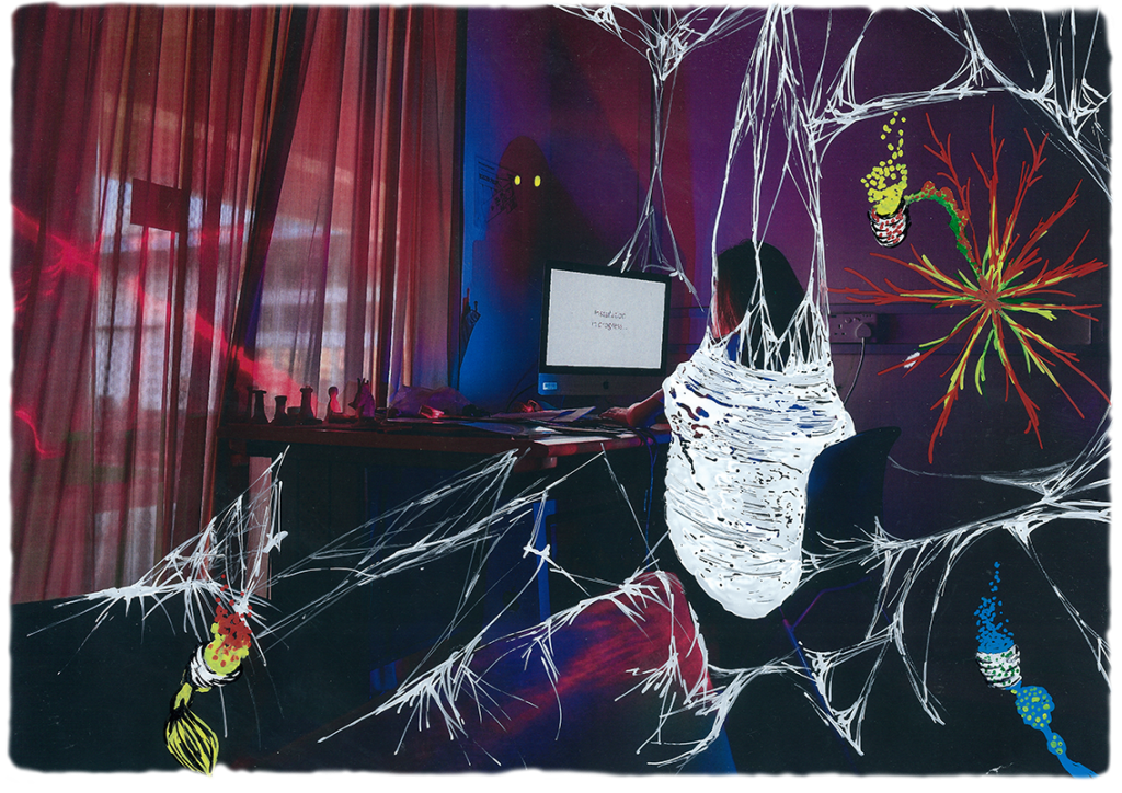
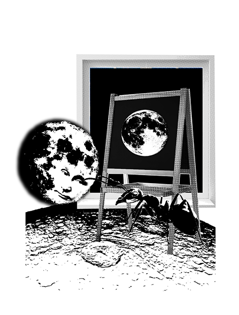
In this scene, the central character is seen in a nest of web staring into a computer that says installation in progress. This location is actually the art room , where many art students have said is the best location they would stay in PJC. I wanted to bring across the idea of comfort and isolated space, thus having webs drawn around it. The tiny details is achieved by acute pressure to draw thin lines. The shadow cast infront of the character is drawn to have two yellow sparkly eyes staring back at the character, implying how isolated this location is, and the possibility of it being haunted. (A rumor) There are three plant like creatures of red, yellow and blue origin, giving off pixels of colours that we see in the previous spread. however, this time round, the creature is less insidious, seen as giving off light rather than taking away light.
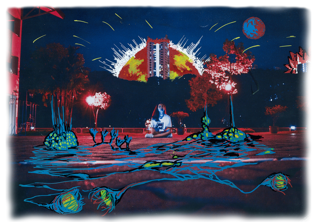
In this panel, we have the main character seen sitting under the sunset, which is a common activity to do amongst many of my interviewees. The sunset however, is seen as violent and strong, to represent the intensity and passion that the interviewees had when describing this little hobby of theirs. The mix of yellow and red intensifies this idea of passion and energy, with yellow stars shooting out. There are also blue creatures from the previous photograph seen crawling out from the nearby trees. The idea of a criss cross roots or stem helps to accentuate the space within this photograph, which is mainly the pattern of the gravel on the floor.
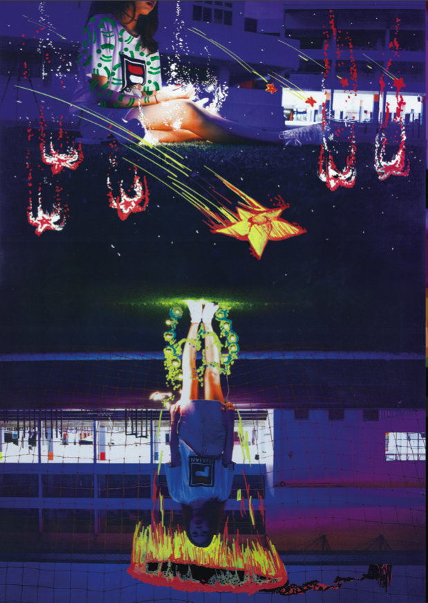
This panel is a continuation of two different photographs of the same place but with contrasting emotions. The top image shows the character looking at the stars, which is another private activity the interviewees enjoy after a whole day of school. The stars are seen falling down and drooping from the sky, as if their dreams are fallen down. This is a commentary to the PJC0JJC merger, highlighted by the green logos drawn as tattoos on the characters arms. Many interviewees mention that they believe the merger of the school would kill of identity of the school, effectively killing off the dreams and hope of every students who might come into PJC in the future. This is represented by the upside down image, that supposedly represents the same space. The lights that she is standing on is sucked away into this black hole that is connected to the sunset that is happening in the image above.
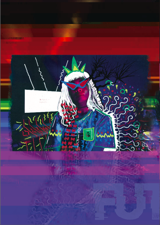
The back page features the last illograph of the zine, which is the character drawn to dress more intensely with details. She is seen more confident and decorated as if she is is the queen. As mentioned, the style is inspired by Francis Bacon’s portraits, an idea I wanted to use to elevate the idea of confidence with a surrealistic persona. The details actually falls out into an overlay with the background, giving out a glitchy effect apparent throughout the zine. This was appropriate as it features a private corner in the art room where no one was at, just the character, her computer, her corner and a camera.
Reflections
Moving on from this project, it was satisfying doing the locale project on a location that actually means something to me. The idea of playing with dream-scape and a childhood memory heavy location has always been a project that I wanted to embark on.
Feedback from the critique was mainly positive, with a few exceptions on the dark quality of the zine being too intense. I also forgot to mention how the navigation from public to private space is an important factor in this zine.
It would be a great way to end off this project by passing a copy of this zine to all the interviewees who provided their story for me to tell.


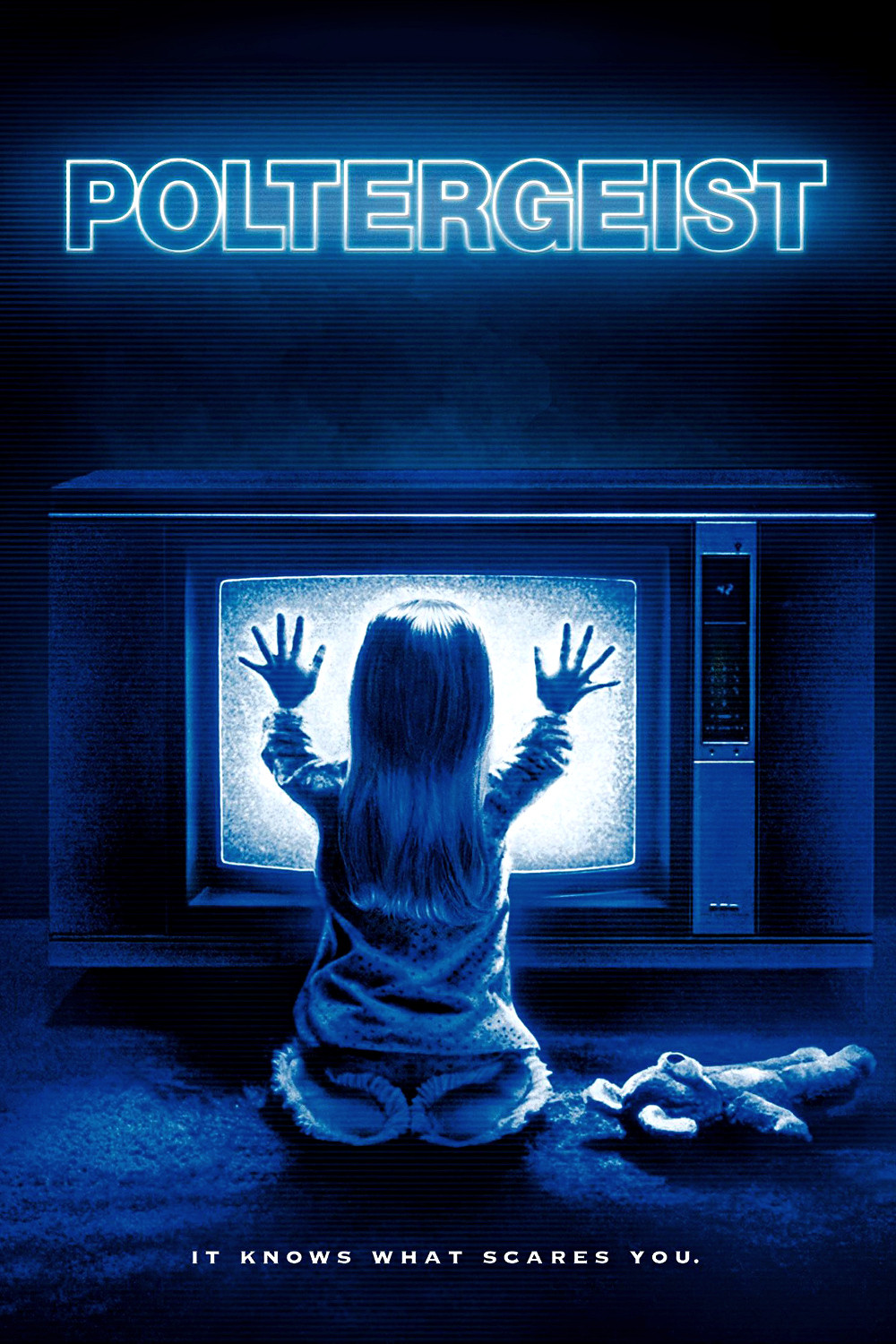
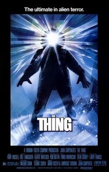
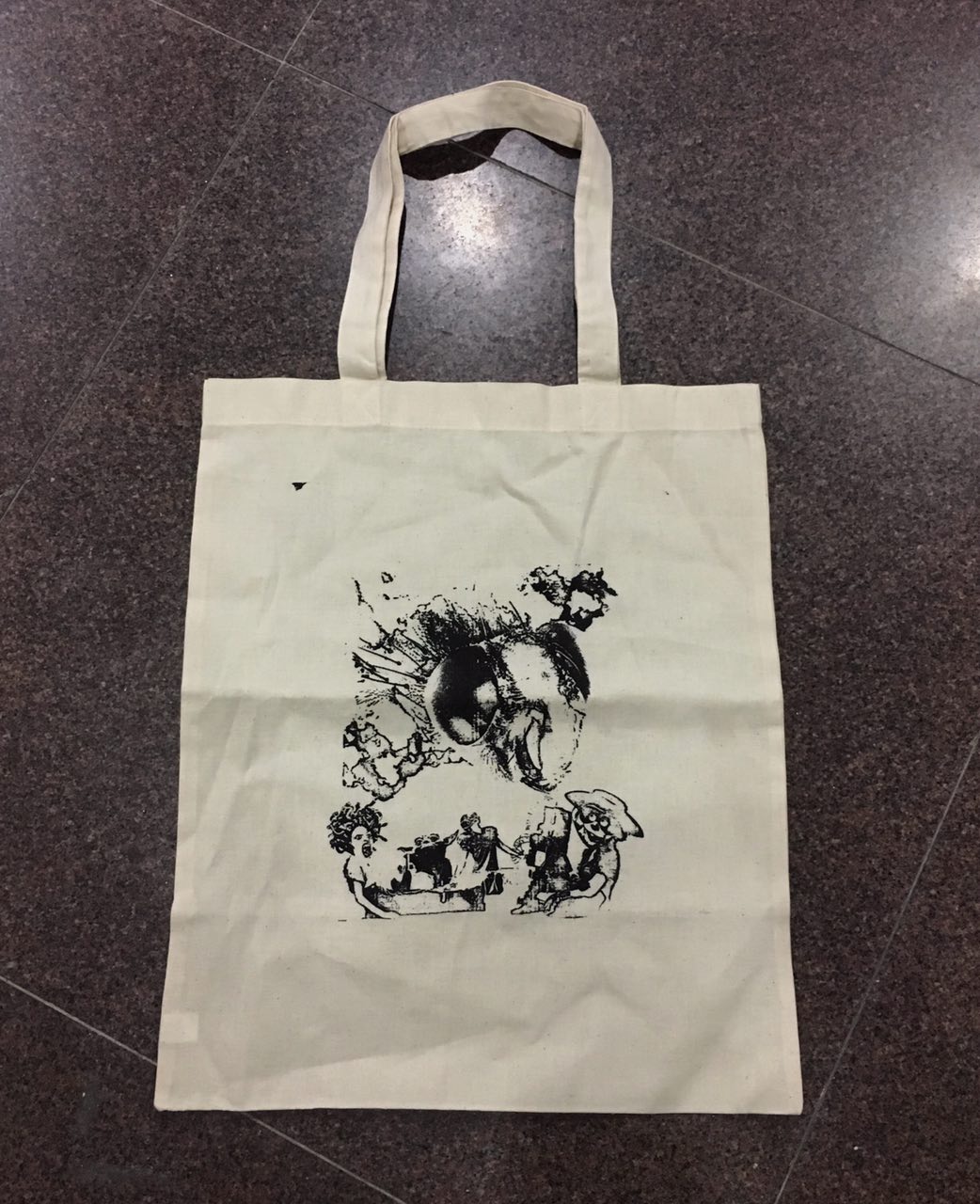
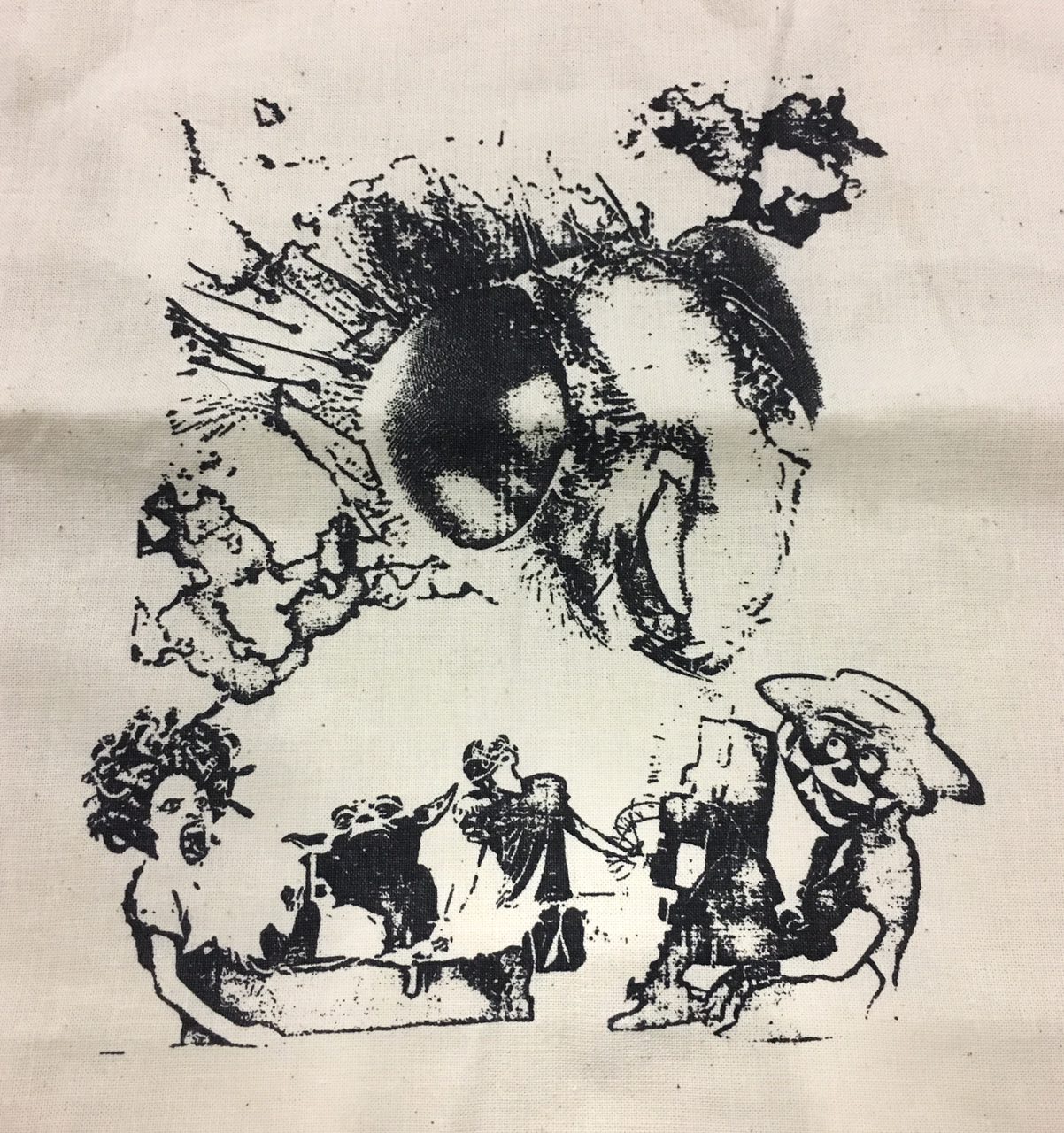
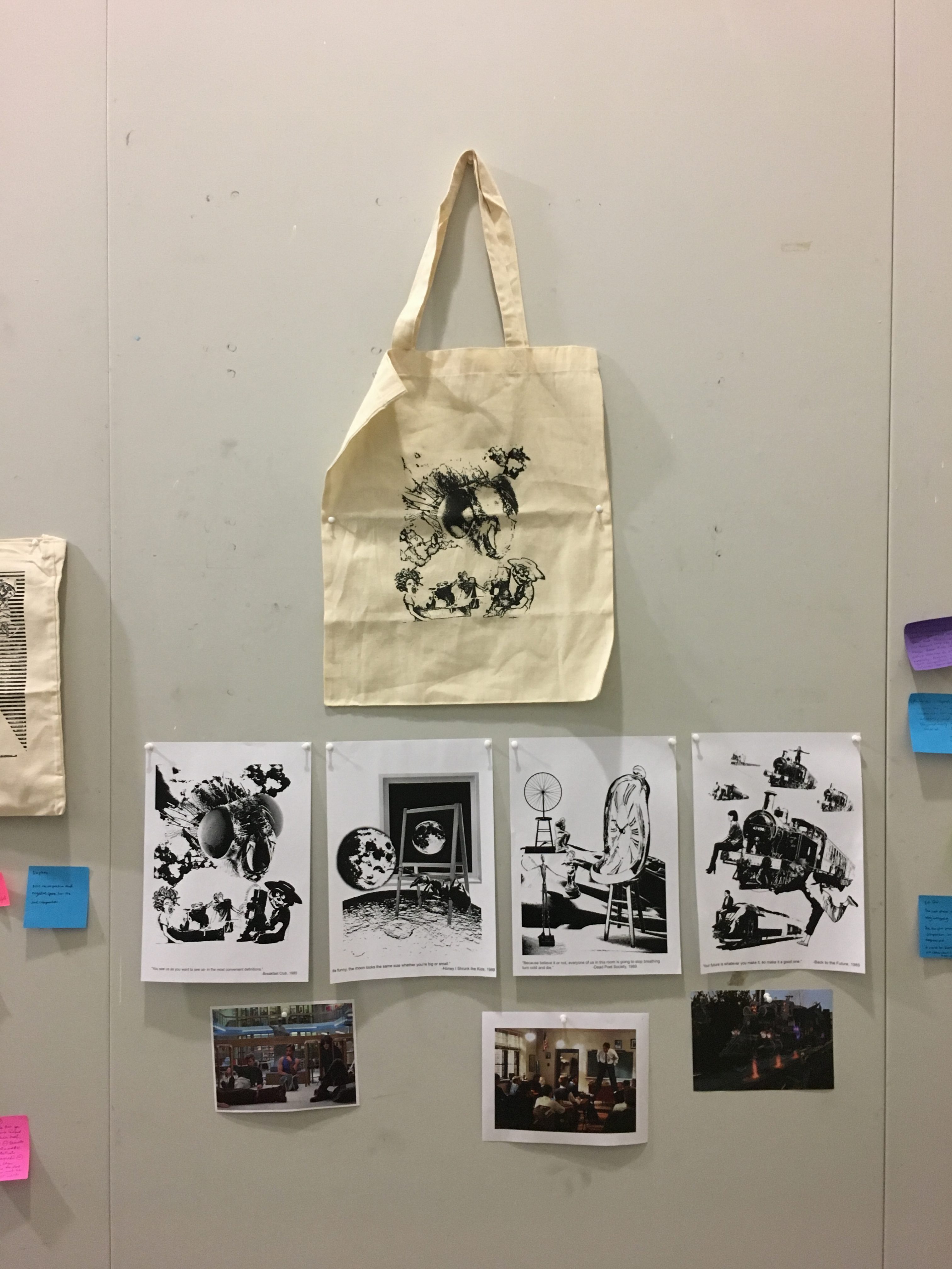
 With a list of my favourite 1980’s movies, I had to come up with a few to quote from and that could only be done through re-watching everyone of them. After a few movie marathons, I realised that the movies that I quoted from were predominantly from coming-to-age related movies, which was a genre of film that focused on the protagonists’ growth into adulthood- to say the least, was relatable to me.