
“The utility of any artefact presumably depends on how well it performs a specific function. Apart from its utility, it may be emblematic of a way of life involving powerful emotional commitments.” -Project Brief
Research
In the investigation of objects and subverting its meaning, I was assigned the hammer. The hammer was a convenient tool being a hand held tool, purchasing it was easy as well, priced at $6.95. In my research, I found out many details regarding its origin and historical value, mostly its value as an emblem for the Soviet Union, presumably due to its labour-esque origins. I characterised the hammer as a tool that fixes items by using nails, also a tool that can destroy due to its heavy and strong exterior. I chose to investigate the latter for a dynamic approach and narration.
The below sketches are some exercises assigned to explore on some ways we can expand our vision of the objects, such as personifying the hammer in different situations.


We also had a take on the removal, replacement and redefinition techniques, where we (quite literally) removed, replaced and redefined parts of the hammer.
The sketches below are a few concepts I envisioned in investigating the traits of the hammer under Task 1:Denotation. I wanted to investigate the duality of the hammer as previously stated, how it is both a fixer and a destroyer. In the sketches below, I wanted to highlight the contrast between the hammer’s heaviness with paper’s lightness. Also, how the hammer is a sturdy object compared to the items it fixes.


Artist References
In the process of brainstorming for Task 2: Connotation, I wanted to approach it with a performance element due to the dynamism of the Hammer. The element of movement with the hammer is inborn and cannot be replaced. As stated, I wanted to investigate the idea of healing and the first artist I thought of with both elements would be Joseph Beuys. In Beuys’s work, he takes on a shamanistic role as he “performs” a healing ritual for the audience. In “How to Explain Pictures to a Dead Hare”, he uses objects like honey and felt, items symbolically linked to healing, and interacts with a dead hare. This process hints of resurrection and communication with a spiritual side of Beuys. The ludicrous attempt of talking to the dead hare is as ridiculous as a hammer being a healing tool and that references to the Dada artists we researched for under this project brief. In Beuys’s work, he attempts to talk to the dead hare and even teaches the hare, creating a ridiculous narrative that builds up a fantastical meaning for the objects (Felt and Honey).

After consultation, I decided to eliminate the mysticism side that is inherent in Beuys’s work as there is a gap in the conceptualisation between the object and its subverted meaning. I decided to explore on the idea of the hammer being an actual healing tool by enhancing its medical effects, such as it being a plaster cast. This subverts the hammers meaning as the hammer is inherently a tool to fix wooden or inanimate objects, and not human beings. The subversion is the change of the subject matter that it interacts with. Under this, I decided to explore on Damien Hirst’s Pharmacy, an installation work that features a clinical pharmacy that takes on the theme of mortality, healing and consumerism (a little bit on mysticism).

Referencing to Hirst’s works, I wanted to recreate the clinical environment to enhance the meaning of my object, in his case- medicines. In Hirst’s Pharmacy, he investigates mortality as the flies fly into the bug zapper and dies, in an apparent healing environment (pharmacy). He uses the conical flask filled with coloured water to represent mystical elements, redirected by the almighty entity (bug zapper), looking over the pharmacy of healing powers. There is an overall hint of sound element due to the visual implications that come with a bug zapper, a characteristic I want to achieve in my work with the hammer.


________________________________________________________
Task 1: Denotation
In Task 1, I wanted to feature the visual symbolism of the hammer. This meant that I wanted to bring out the physical qualities inherent with the hammer through the pictorial narration, e.g. weight, sturdiness, metallic exterior. For example in shot 1, I contrasted the heaviness associated with the hammer by placing it in a wide shot of flying paper. As you look down the series, the photographs become less apparent in movements, a trait apparent in a moving hammer (action to static).

In shot 2, I wanted to represent the power of a moving hammer compared to a still subject, hence I chose this image. The shot also links up to Task 2: Connotation through a unspoken narrative of the model’s legs being healed by the hammer.

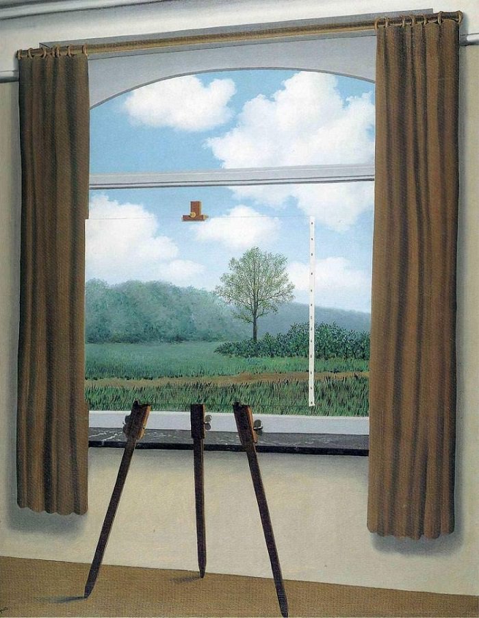
In shot 3, I wanted to play with the audience’s visual symbolism of the hammer. In common understanding, we all know that a hammer is a relatively heavy object to hold. I played with this concept by taking a shot of the hammer “floating” with balloons. This references to Magritte’s work in Treachery of Images where the object’s visual quality hints of its supposed presence, how a curved wooden object in the shape of a pipe is or isn’t a pipe, as represented in Magritte’s work. In my work, I wanted the audience to know the hammer’s quality just by looking at it and understanding that paradox of quality, heaviness versus light-weight. However, by tilting the photograph in different orientation, the quality and focus changes. The first photograph highlights the lightness of the balloon as “floating” is its inherent background, then the audience’s visual focus moves to the hammer, and then questions why the hammer is floating. In the second shot, the hammer and balloons are facing down, this environment belongs to the hammer as the objects are pulled down by gravity, hinting of weight. The visual focus stands with the hammer due to its stronger visual weight.


________________________________________________________
Task 2: Connotation
In task 2: Connotation, I wanted to create a narrative of healing, as referenced in Beuy’s work. In shot 1, I chose to represent a motion of the model jumping of the chair, playing to the duality of sturdiness versus vulnerability; the idea of the chair breaking off easily yet it is strong enough to hold a human’s weight. The hammer in this case is used to fixed the broken chair by its wooden handle, a function that it is not supposed to do. This photograph references a plot in comparison to the second shot.

In the second shot, the hammer is once again used to heal, but this time it is placed on a human being. The narrative becomes more ludicrous as the hammer is not conventionally used to fix a broken bone like a plaster cast. There is an implied paradox as pointed out by Lei during critique as I wanted to reference to Magritte’s style of satire on an object’s identity. The paradox exists between the idea of a hammer healing wood and the hammer being a nursing tool, both of which heals. As pointed out by some of my classmates during critique, the idea of subversion in this theme of woodwork and nursing is questionable. However, the initial plan was to create a silent paradox that is apparent in Magritte’s works that audience will be led to believe because of how similar yet contrasting its functions are. For example in Magritte’s Human Condition, the similar square features of the object allows the audience to question if the subject matter is a window or a canvas, therefore questioning its intentions. In my work, I wanted to use the “healing” tool of inanimate objects (hammer) and juxtapose it into a clinical environment that doesn’t make functional sense.

In the last photograph, I wanted to achieve a unity to the series of the healing hammer, therefore I chose a wide shot of the patient-model in the waiting area of the clinic. The wide shot provides a visual culmination to the plot of the healing hammer, the conclusion of the patient being healed. In this photograph, there is an interaction between the patient and the outside world. The lady in camouflaged outfit stares at the patient intently as she tries to stand up. The idea of ridiculousness stands apparent as the woman in camouflage is not exposed to the idea of a healing hammer, and yet this fantastical function only exists within the realms of the patient-model.

________________________________________________________
Task 3: Image and Text


In my final task, I chose the shot 2 of Task 2 to represent the idea of the healing hammer. This task is inherently an extraction of the reality within the photograph into real life as a pop up sale. The text I chose was the price tag of the supposed healing hammers, sold in the context of plaster cast which are sold by its weight. In the final work, I presented the text in the pairings of red-white and yellow-grey to play with the composition of the photograph. With the price tag of the healing hammer placed on the photograph, there is an assurance in the reality of the photograph, whereby the audience can actually purchase the hammer if they want to, questioning the realism or surrealism of the context. ($6.95 was the actual price of the hammer)
________________________________________________________
Test Shots


________________________________________________________
Learning Point
In this project, I have found difficulty in achieving a balance between an adaptable function and a subverted function as the line of difference is really thin. There are however, many reference artists who provided good pointers to note, such as Duchamp and Magritte’s work.
https://oss.adm.ntu.edu.sg/bren0022/a-surreal-nonsensical-dream/
I also encountered problems in achieving a unity in the narrative since this project only allowed three photographs per series, thus choosing the right photograph was also an important decision that we cannot underestimate.