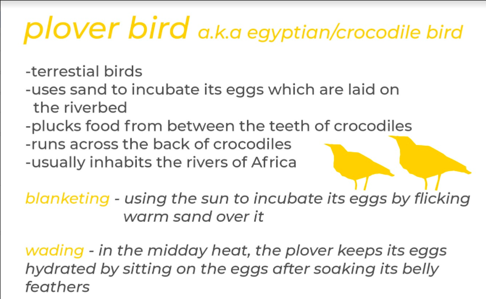
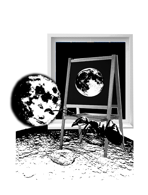
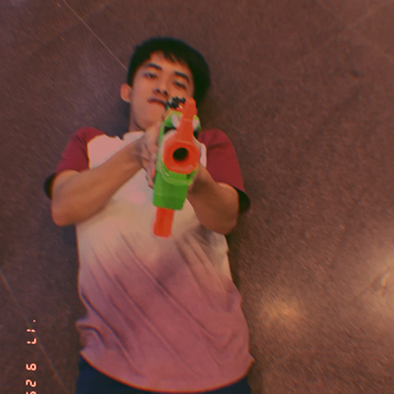
After a tedious process of taming the beasts, we finally understood how our designated animals interact, individually and together. Minjee and I came together with our final project-
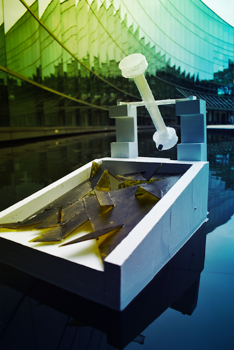
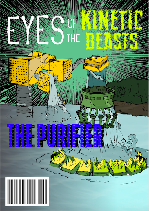
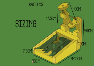
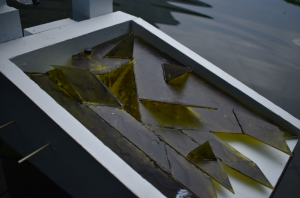
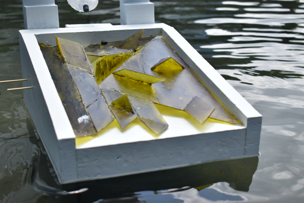
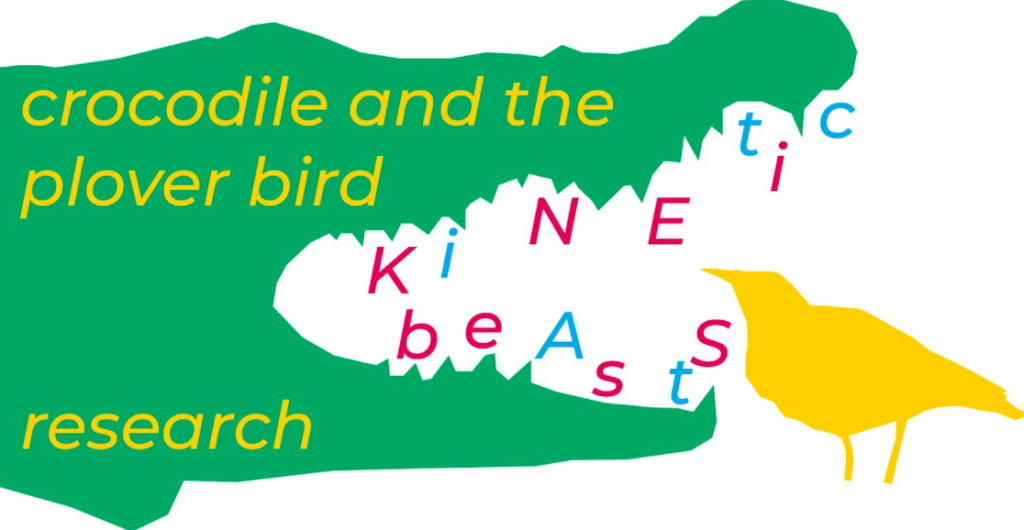
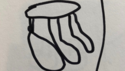
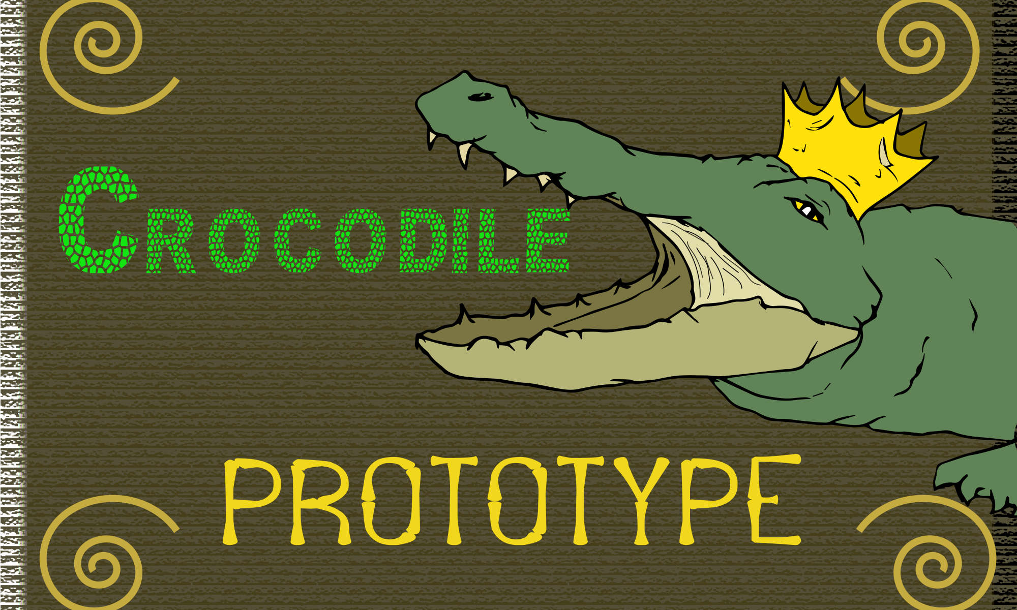
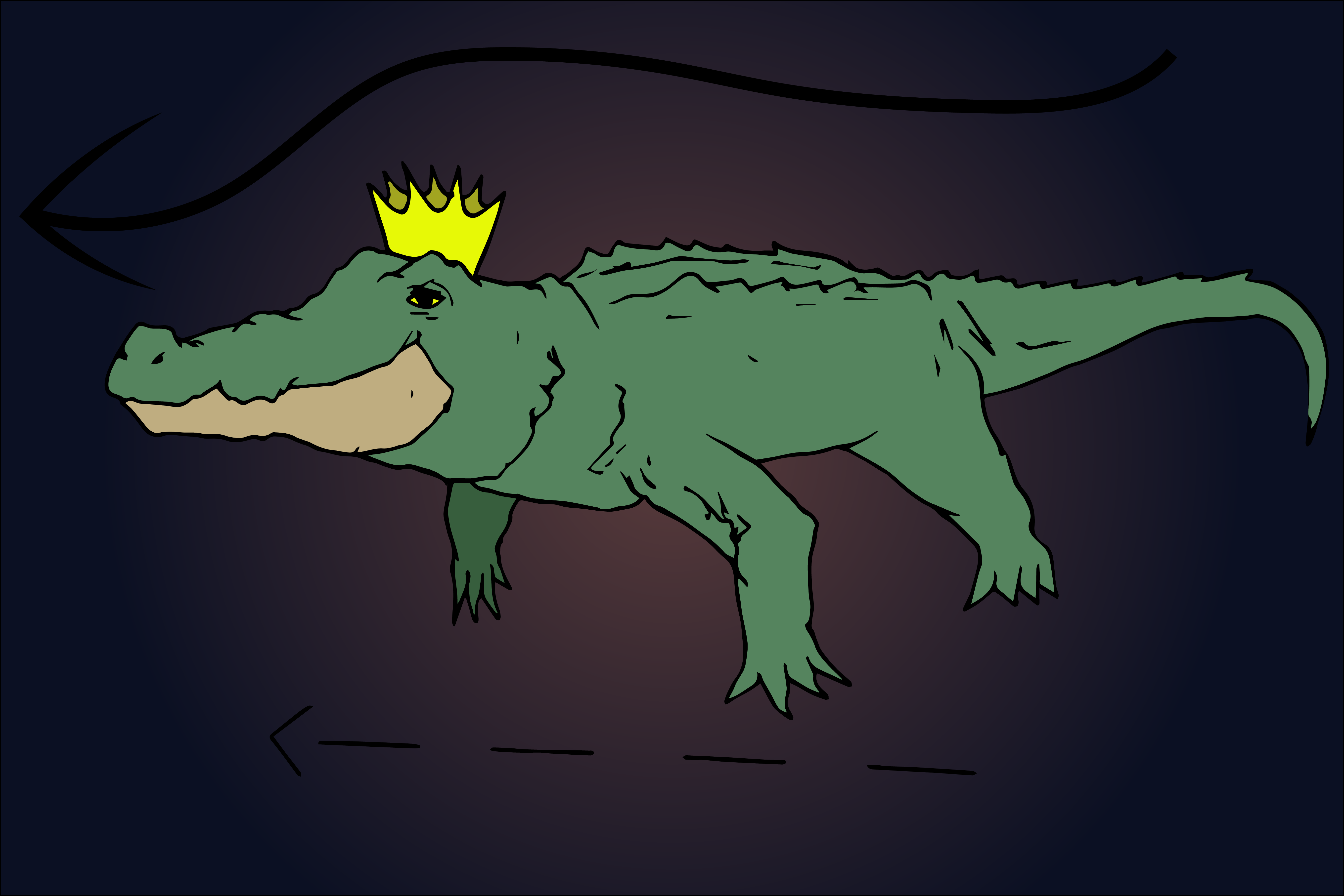
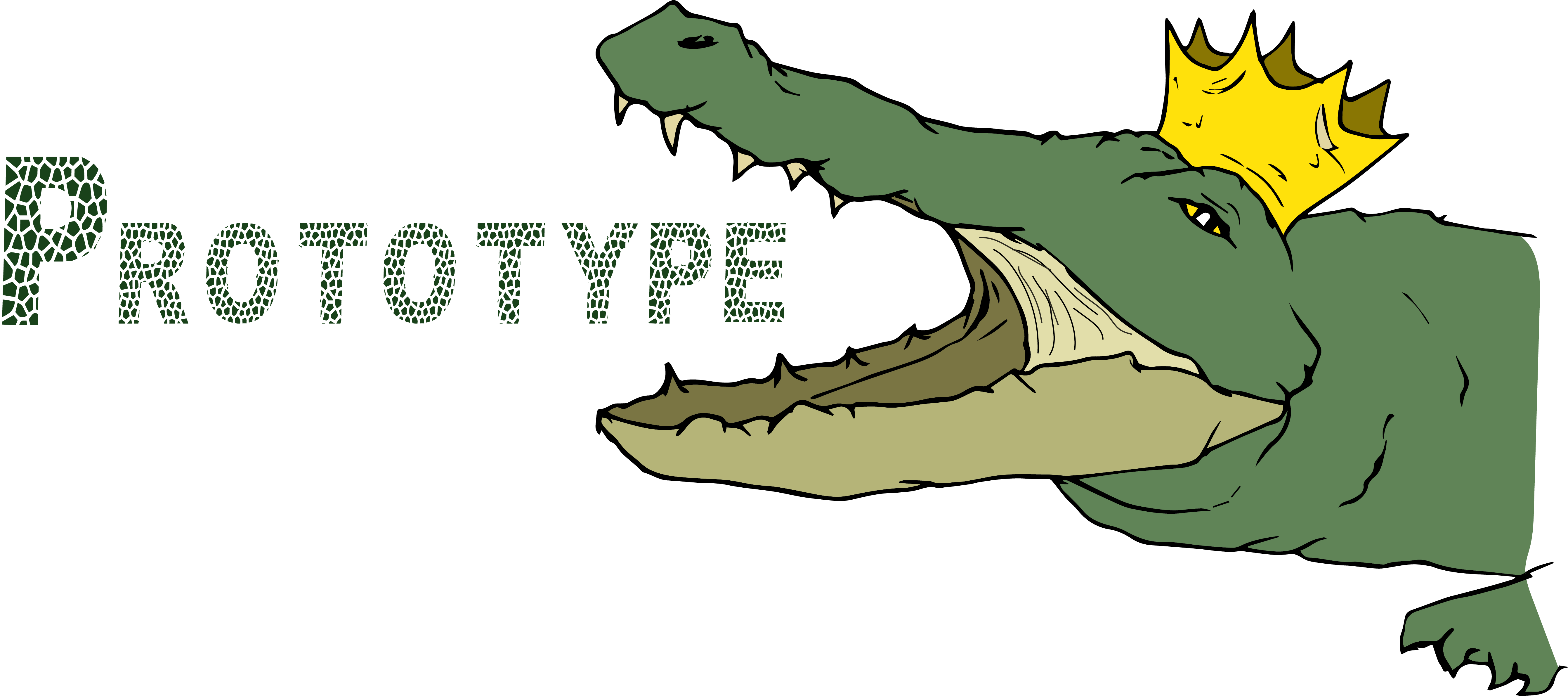
Product Brief: Our kinetic installation named The Purifier, is an amalgam of the quiet aggression of a crocodileand theperky routinesofa ploverbird.
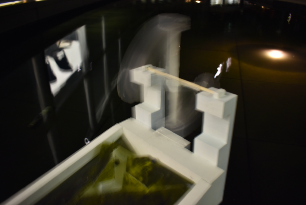
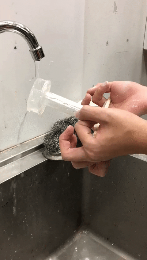
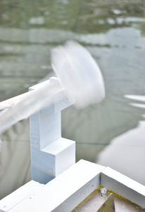
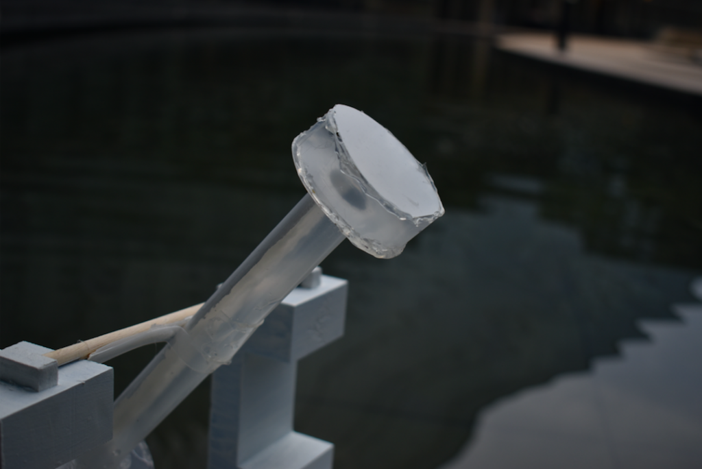
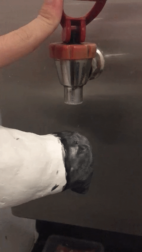
It is a moving platform constructed with a Japanese “deer fountain” pivot that directs hot water down a scaly acrylic board brushed with thermo-chromatic paint.
The pivot represents the ploverbird‘s plucky energy of pecking incessantly at the crocodiles‘ teeth. The slanted scale mimics the body of a crocodile, slowly and gently floating on water while being cleaned up by the ploverbird. It hides its sharp teeth within its scale exoskeleton.
Meanwhile, both animals share an affinity with warm temperature, where the ploverbird uses the heated water to lay eggs and the crocodile uses its back scales to source out heat. We chose to represent this common trait with colours that changes according to temperature. And hot water is a concept that is physically and aesthetically charged with energy.
The process of starting this installation starts from funnelling hot water down onto the peak of the pivot, which the water accumulates weight against the balance point and eventually pours out. The hot water brings the “ploverbird” down to the “crocodile” and trails down the slope. The hot water seeps down the acrylic, turning the acrylic from dark green to yellow as it moves along protruding edges, slithering like a crocodile.
The hot water sliding off the acrylic propels the installation away.
添 水
movement of pivotcolour changing to heat
visionocean purifier
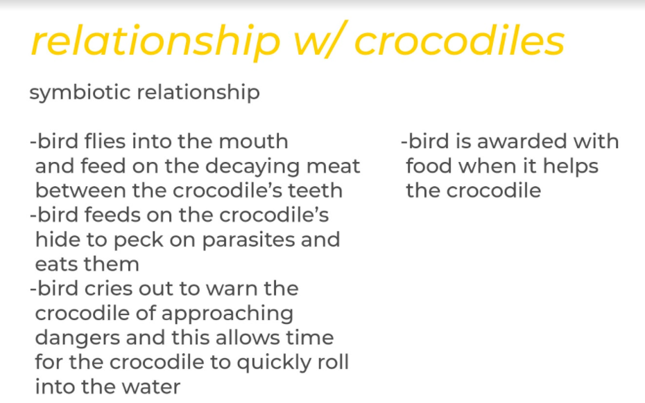
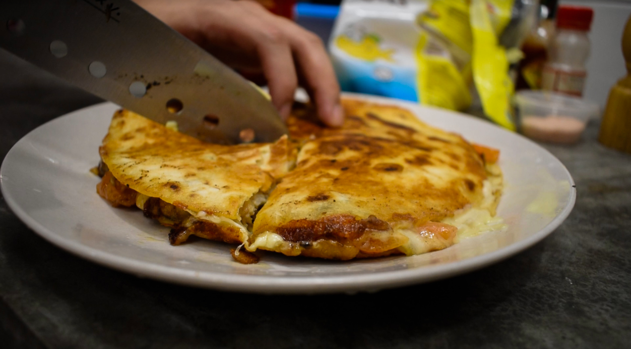
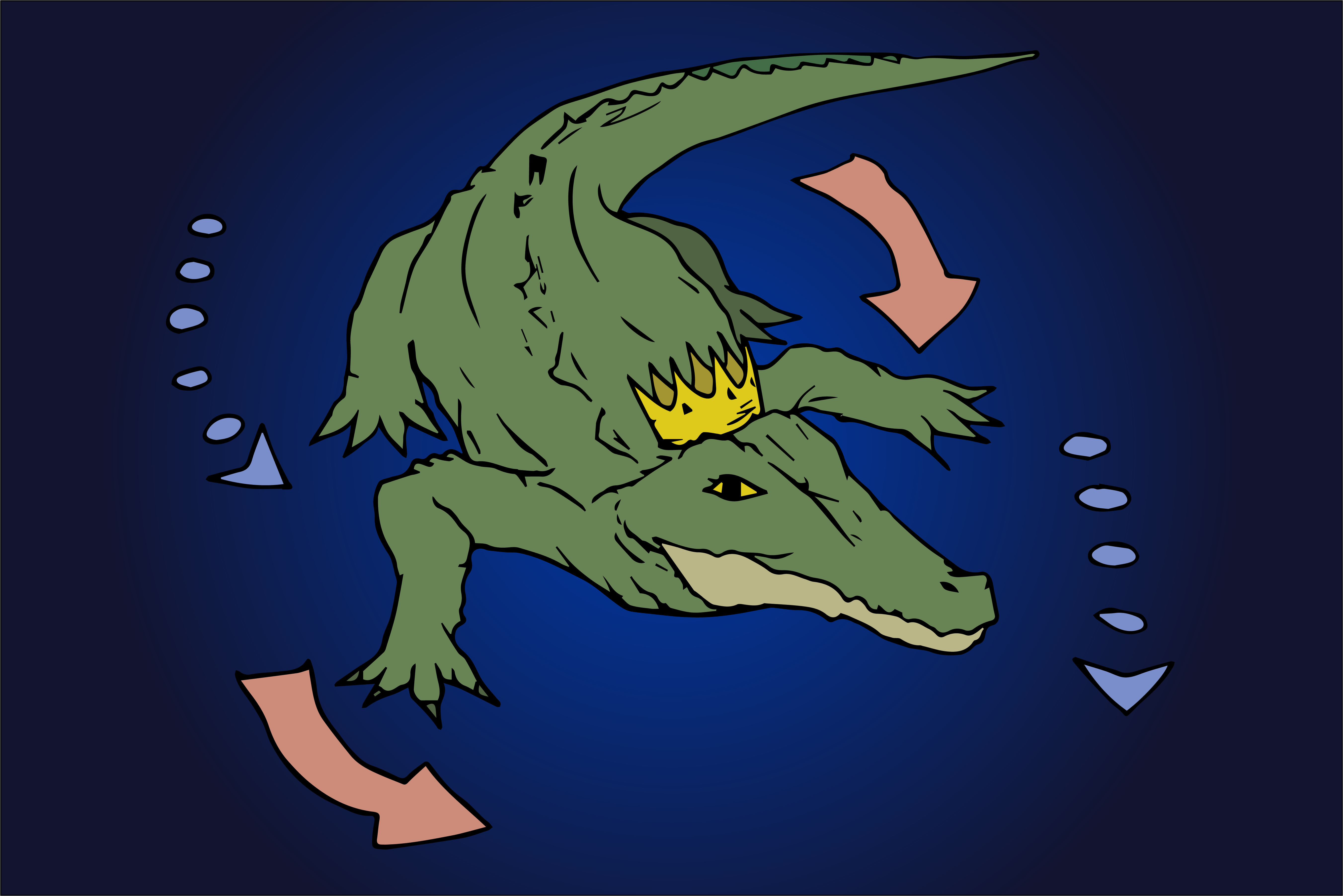
After much consideration, we realised that there was one obvious function that this installation could be broken down into- Cleaning.
The very fundamental relationship between the crocodile and the plover bird stems from the plover bird eating flesh off the crocodile who just lies in the water stale and awaiting for a chance to pound. This could not point further than an ocean purifier.
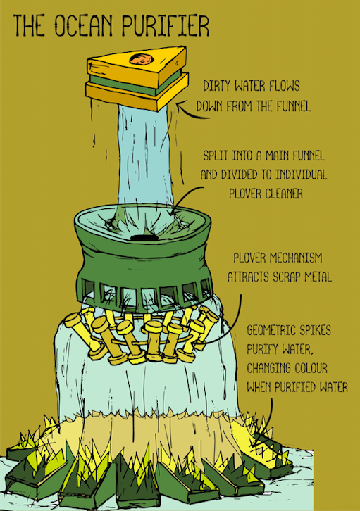
The Ocean Purifier is a futuristic device that is self functioning, afloat the ocean.It moves around the ocean without manual control, filtering the ocean clean of pollution. Dirtied water spirals down the polygonal funnel, splitting into the magnetic pivot filters, picking up metal scraps. The water then moves down into the jagged base, where bigger chunks of junk are retained. Technology is advanced and the jagged base releases a non-toxic chemical that purifies the water. It changes colour the moment water touches it, becoming visually stunning whilst in a concept that is often seen “dirty”
To accentuate this idea and installation, many explorations were done and those can be found on Minjee’s OSS. The process of making this installation functional was tedious and that will be explained below.
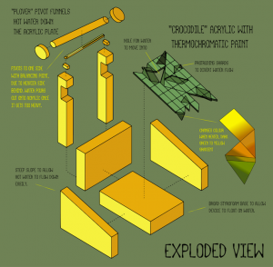
Plover’s Pivot
Minjee started out with a great abstract representation of the plover bird that funnels water as it moves along a pivot, much like a water wheel. We later found out that this was a concept commonly known as a “deer fountain” or sōzuwhich is commonly used to frighten crop pests away. We took a while to understand and harness the concept of balance, our attempts are shown below.
more failed attemptssuccessful attempt
We realised that this entire structure is based on balance and weight. The pivot is a beam lined with an off-centred balance thats heavier behind. This creates a default position of perking upwards like a bird shown in the sozu shown below. The water’s weight when accumulating on the beam pushes it downwards and releases the water. We realised the reason why our model did not work efficiently was because it lacked space below the beam. This meant that the beam lacked space for the pivot to rotate down and move up, losing ability to gain momentum. We picked up on it and adjusted the model’s height accordingly.
sozumovementperspective view
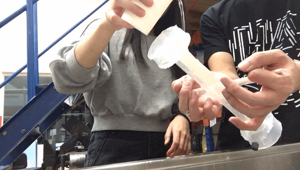
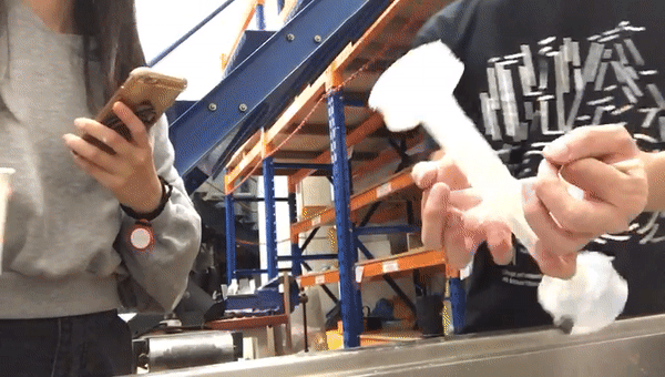
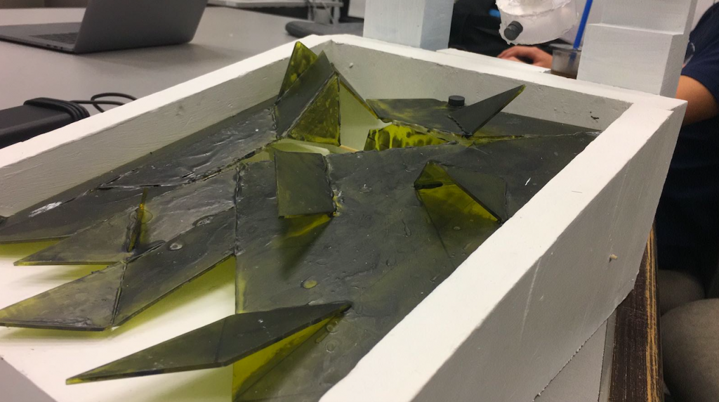
Crocodiles Scales
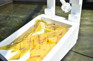
The crocodiles’ scales were less restrained with technicality, since it is just mainly acrylic shards with thermo chromatic paint. The crocodiles’ scales thus changes colour according to the heat. Our initial model was abstracted scales that rises with water, which we eventually turned into a flat plane where water floated on, which is further abstracted into protruding spikes. The spikes allow the water to flow around in a slithering pattern, instead of one smooth flow.
initial colours- dark greenheated colour- yellow
On the day of presentation, the scales turned yellow 1 minute into standing outside. This immediacy and adjustment to heat is representative of this dynamic ability of the crocodile.
perspective viewcloseup
The shards are placed at an angle that allows the water to flow in a slithering position. They are also placed at an angle such that the water can flow over.
Initially the thermo-chromatic paint was lined over the plover bird instead of the crocodile. It was meant to have the bird change colour when the hot water funnels down. Instead, we decided that the water flowing over the crocodile’s back would be more visually engaging.
We realised that the thermo-chromatic paint (which is actually heat-sensitive nail polish) turns transparent when heated. We had an issue earlier on as we realised that the black paint turns white, which is coincidentally the colour of the plover bird model.
plover changing colours
To further elaborate on the movement of the animals within this installation:
The crocodiles’ movement is represented as the slithering motions of the trailing water hot water, leaving a line of yellow amongst the dark green acrylic. It is also represented in the floating motion of how a crocodile hunts, snout above the water. More subtly is the representation of having teeth underneath the acrylic board, which will be discussed further in part 2.
The plover bird’s movement is the pecking action of picking out meat from the crocodiles teeth, just a routine action of falling up and down.
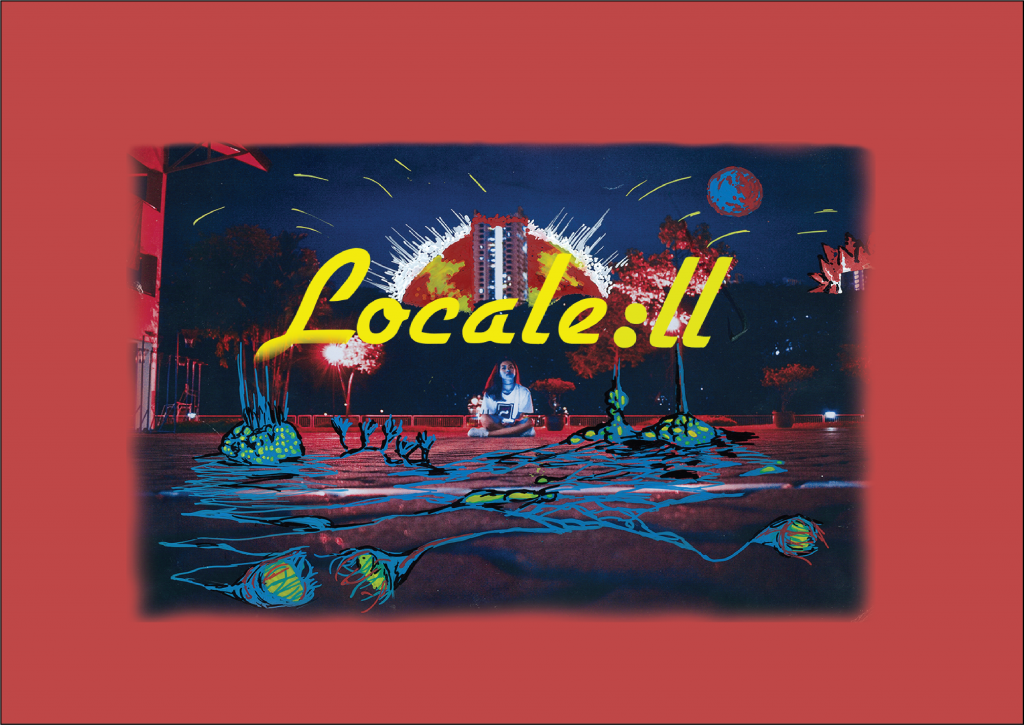
With part 2 of the Locale project starting, I had a clearer idea of what to do using the critique reviews from part 1. Consultations, as well as brainstorming ideas, reveals a direction towards illography- illustrations and photography of the photos I took from part 1. I would also envision trying out mark making to heighten a stronger sense of location identity.
This zine in summary is a visual representation of the relationship between the people and the location within different time periods, conveniently labelled as the ghosts of the past, present and future. It navigates through this location from public to private spaces, seeking out what makes this place unique and representational of their feelings.
The past refers to the students who graduated before,
the present refers to the students who are still studying there and
the future refers to the students who might study there.
A big big BIG summary
looking at the Big picture, i wanted to show a series of ideas as the audience would look through the zine, looking through the eyes of the narrative I want to tell. Hence, I arranged for the narrative to follow a sequence throughout the front, back and 3 spreads consistently :
Colours
The colours starts off with a muted and tamed theme on the first spread, mainly black as background that shows intensity with situation. There is little light and colours to justify how the students of the past are losing their memories and connection to a place they are no longer in connection with.
I also made a note to not overkill or overuse the colours, thus giving rise to my idea of using it in a fluctuating manner, dark-colourful.
The colours become more greyish with a stronger play of colours, indicating that this spread belongs to the students who are currently studying there and experiencing the place, but is met with the inevitable idea of having to leave this place they call home after two years.
The last spread is the most vibrant with the strongest play with colours as the future is deliberately made optimistic with saturated colours. No one wants to know that the future is bleak.
Green is also a special colour used especially in the present and future spread as we discussed about the idea of merger of Pioneer Junior College (PJC) with Jurong Junior College (JJC) in the recent years.
Glitch
The glitching effect is made by the website https://snorpey.github.io/jpg-glitch/, utilising four different toolbars to create the glitch effect desired be it colourful, pixelated, blockish or grainy.
Using the photographs that I took of PJC, I decided to create glitch effects that tell of three different kind of concept: Forgotten, Configuring and Unknown.
Forgotten
The first spread starts off with a glitched background that is pixelised but retains a strong sense of form. It references to how ones memory will gradually lose its shape as the years go by, hinting that the students who graduated has a slight idea of what life was in PJC, but as years goes by, starts to lose its structure.
Configuring
The second spread has a glitched background that is deconstructed, but still having a strong idea of structure. It gives the idea of one being in the situation, but not appreciating what there is, thus not seeing the true form.
Unknown
The last spread is totally glitched with colours and shape. It refers to how no one knows about the future, thus depicting the future as an amorphous plaster of colours and shapes.
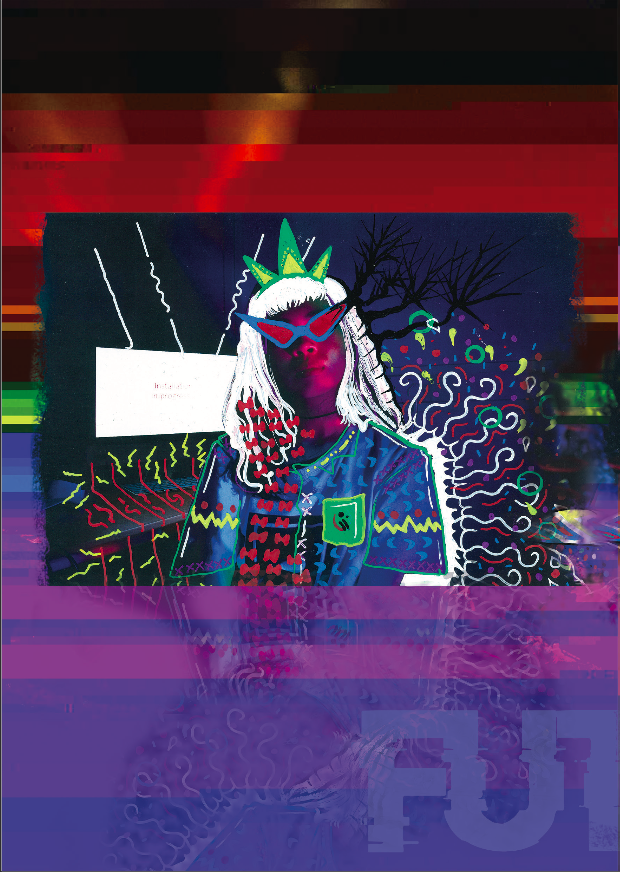
Characters
Different characters were also planted within the zine, each representing something that I have gotten from the interviews with the alumnis or students from PJC. However, two main characters would be the lady on the front and back page, as well as the glitch man.
Front-Back
as the front and back page are the first and last thing that the audience see, I wanted the characters on both pages to tell a story.
the front page features a girl with adequate decorations and having two heads staring into two different directions. However, as the character moves through the series, it eventually ends off with a confident posture. This character follows one of my interviewees who experienced an increase in growth of character and confidence as she found her way through PJC. This character pays homage to the students who found comfort in the space of PJC. The posture in the back page, as well as her glitchy backdrop is reminiscent of Francis Bacons paintings, who exudes confidence in his own space of identity.
There is also overlays of the word “ghost of past, present and future” placed all over the front and back page as I didn’t want the zine to be overwhelming with a context, but not enough to not let the audience understand what it is about.
seated figure 1961
glitchman
the glitchman utilises the central spread, which is the only spread that is connected together when printed. Hence, I intentionally made the glitch man printed with disconnecting body bodys, with the paper as the demarcation. This was to intentionally intensify the glitch effect
.
Space
Throughout the zine, I incorporated the idea of a navigation through public to private space, which is an idea that was apparent in my Part 1: Locale.
In the context of PJC, it is an isolated location that only the alumni or students or even relevant personals have access to, and my job for this project is to highlight its uniqueness.
Hence, from the first page to the last page, it navigates the main character through the spaces of PJC from public to private, or even activities, into the bowels of PJC and what makes it unique.
1st spread1st spread
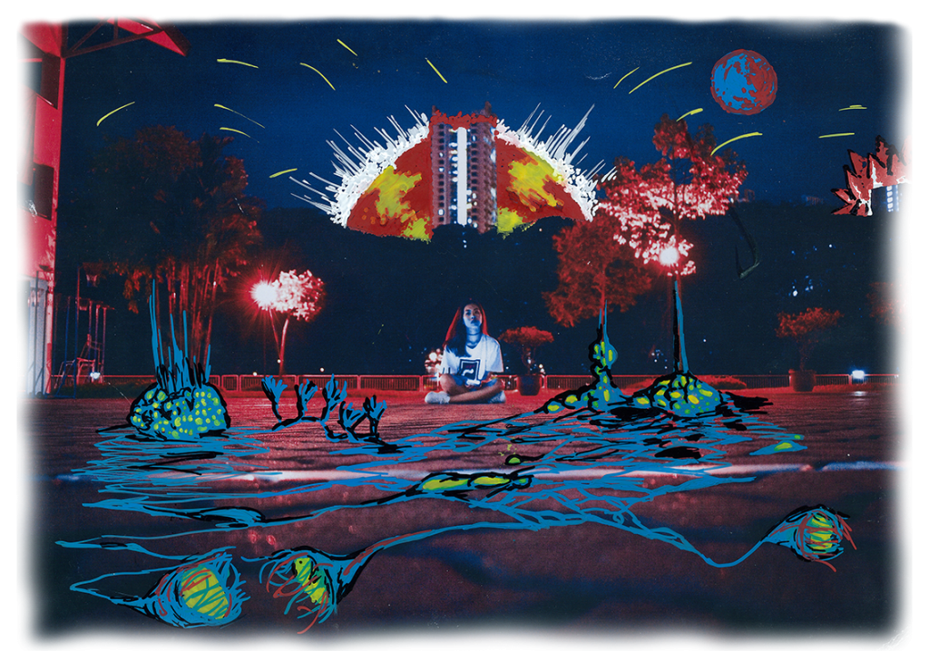
It starts off in public places like the canteen and field where everyone can access it, just in plain sight.
2nd spread
Then we move into a location where students dwell in introspection, like the classrooms or art room (specific to my friends and I). This engages in a semi private space where we get lost in our own thoughts.
The last spread features the most private location where the students remember enjoying the company of their friends, look ing under the stars, sharing a space in the art room or looking at the sunset after vigorous training in school.
Furthermore,
to add on to the idea of a isolated space, I wanted to create a sense of three point depth within the zine. This meant that the glitched background would be one layer of space. The characters in the photograph would be in one layer of space. And the mark making I tried to make would be another layer of space.
The results were as follows.
However, the issue was this visual quality was eventually lost once I scanned it into the computer, since the task at hand required all works to be digitise, I had no choice but to give up on this mark making effort.
These mark making were done by pasting the site’s unique features like water cooler drain with acrylic ink, then overlaying it with a transparency or paper.
toilet window panefinal
Reflections on Illography:
Since there weren’t a lot of time to spare during critique, I couldn’t elaborate more on how the procedure of the illograph was done. Firstly, I took the photos and printed them out on a high quality standard A4, which gave me prominent space to draw my illustrations on. I was worried that the visual quality would be lost once I used a scanner.
Then, I used transparency and overlaid onto the photographs, which I then draw over. Each illograph attempts to accentuate the space within the photograph, and also to highlight the uniqueness of the site, which I will elaborate below.
I used paint markers, which allowed me to get the textural quality that is missing from using Adobe Illustrator on digital files. This was an idea suggested by Joy, using the scanner to render that textural quality I want to retain.
I realised that illography also emphasised a lot on the idea of symmetry, in which balance gives off the strongest composition in illograph as they give a strong structural aesthetics compared to something messy and chaotic. There is also an inherent beauty in the idea of asymmetrical balance, however this would have to be balanced off with a play of colours.
Drawing technique wise I have learnt to use dots and lines to create textural details, each style requiring an acute sense of pressure since the paint marker is very sensitive.
using colours to complement each otherstrong contrast between specific colours onlywaxy texture that has a gradient
Each individual characters
front page
As mentioned above, the first character you see follows the main protagonist who enters PJC, but has trouble deciding where to go from there on. The illography on this character attempts to highlight the wavy hair and keep the decorations to a bare minimum as the back cover character is the one that is excessively decorated. The colours in the hair follows a transition of PJC logo colours of red, black and white into the colour of JJC, which is just green. I also wanted the art direction of semi-tribal and surrealistic as both themes employ heavy usage of colours.
First Spread
This illograph utilises the abundant space in the background, using only white to accentuate the dark space. It is supposed to be the canteen at which students dwell and enjoy one another’s company. Hence, I decided to portray the presence of people through the usage of leftover bowls and chopsticks piling up. There is also a presence of a puddle motif with sticks poking out to give off a trypophobic atmosphere, alongside actual dark holes all around, giving a creepy sensation when looking at it.
This character has a small tint of red covering it. She is seen in the field, lying down looking at light which represents the hopes and dreams lost as the time goes by. The red checkers is supposed to be reminiscent of the red checkered picnic mats in Alice in Wonderland, giving a feint idea of being trapped down, along with actual chains drawn to tie her down. The circular neck-brace helps to give a sense of three-dimensional space within the photograph.
The last photograph in the first spread features an abandoned glitch face with cockroaches crawling out, while a pair of legs stand behind it. There is light coming out of the glitch, reminiscent of the lights shown in the photograph above. This idea of looking down at the glitch parallels to one of the interviews I had with an alumni, who mention that she sees glitch whenever she visits PJC, but because this idea is so distant, she no longer does- This represents that imagery. Cockroaches are motifs that are related to her experience in the art room ,which is full of cockroaches crawling around.
The patterns on the shoes serve to contour the shoes in the dark environment, making audience know that it belongs to a noteworthy character. The yellow cockroaches also help to shape the three-dimensional quality in the picture.
second spread
This spread starts to have more colours at play, depicting the current students who are still in PJC. The glitch character is seen in the central page, disconnected by the central border. It is seen glitching with white and black pixels popping out of the eyes, while colourful pixels are sucked into the mouth. It represents the idea of how this glitch character sucks away all the happiness that the students find in PJC. This was a visual effect mentioned by one of the interviewees I had.
This character is seen opening a door of a toilet in PJC, as if opening itself into a world of mystery given how dark the environment is. Behind her is a bud of an orchid, which are common flowers that can be found in the location. The white pixels link up to the image above.
The same motif of opening a door happens again here but this time with the character going out. There are black pixels that link up to the character above. The character is seen having a transformation where she has a triangular head, one of the more abstract creatures seen throughout the zine so far. It reminds the audience of how short the time in PJC is, which is limited to two or three years per batch. The yellow triangular head helps to highlight the central empty space of the door.
Last spread
the last spread is the most surrealistic one out of all three spreads, with interesting creatures interacting with the character, as well as colours bursting into the image.
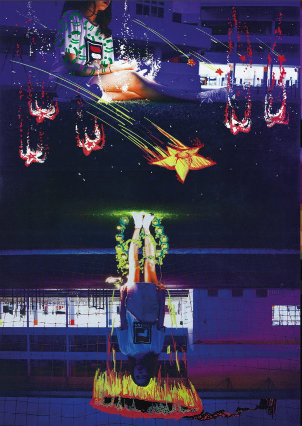
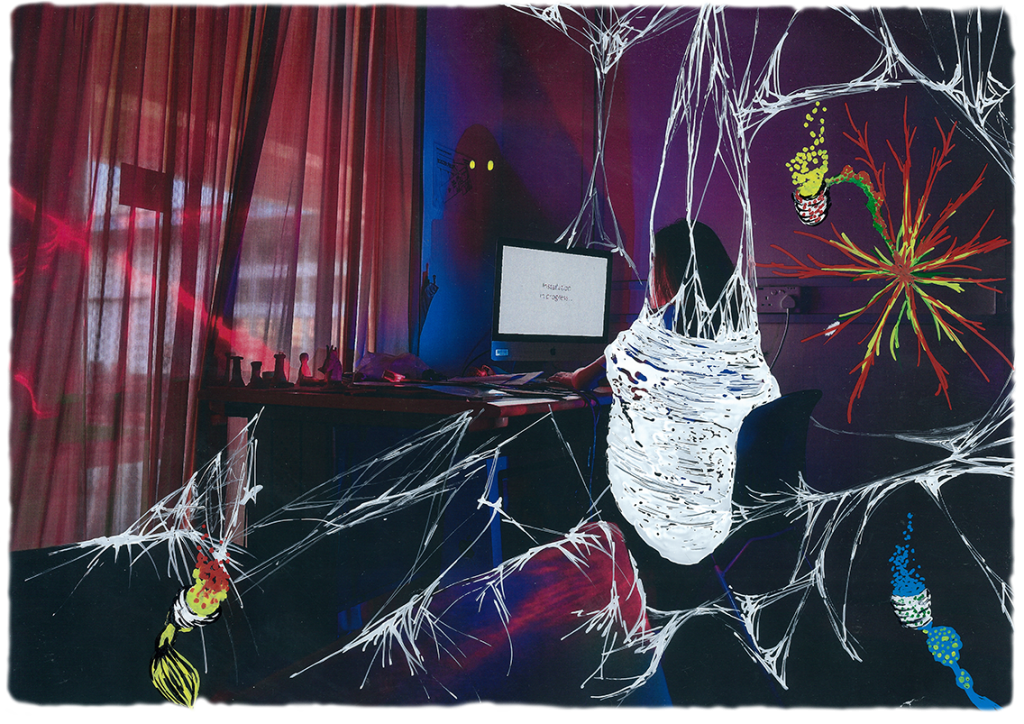
In this scene, the central character is seen in a nest of web staring into a computer that says installation in progress. This location is actually the art room , where many art students have said is the best location they would stay in PJC. I wanted to bring across the idea of comfort and isolated space, thus having webs drawn around it. The tiny details is achieved by acute pressure to draw thin lines. The shadow cast infront of the character is drawn to have two yellow sparkly eyes staring back at the character, implying how isolated this location is, and the possibility of it being haunted. (A rumor) There are three plant like creatures of red, yellow and blue origin, giving off pixels of colours that we see in the previous spread. however, this time round, the creature is less insidious, seen as giving off light rather than taking away light.
In this panel, we have the main character seen sitting under the sunset, which is a common activity to do amongst many of my interviewees. The sunset however, is seen as violent and strong, to represent the intensity and passion that the interviewees had when describing this little hobby of theirs. The mix of yellow and red intensifies this idea of passion and energy, with yellow stars shooting out. There are also blue creatures from the previous photograph seen crawling out from the nearby trees. The idea of a criss cross roots or stem helps to accentuate the space within this photograph, which is mainly the pattern of the gravel on the floor.
This panel is a continuation of two different photographs of the same place but with contrasting emotions. The top image shows the character looking at the stars, which is another private activity the interviewees enjoy after a whole day of school. The stars are seen falling down and drooping from the sky, as if their dreams are fallen down. This is a commentary to the PJC0JJC merger, highlighted by the green logos drawn as tattoos on the characters arms. Many interviewees mention that they believe the merger of the school would kill of identity of the school, effectively killing off the dreams and hope of every students who might come into PJC in the future. This is represented by the upside down image, that supposedly represents the same space. The lights that she is standing on is sucked away into this black hole that is connected to the sunset that is happening in the image above.
The back page features the last illograph of the zine, which is the character drawn to dress more intensely with details. She is seen more confident and decorated as if she is is the queen. As mentioned, the style is inspired by Francis Bacon’s portraits, an idea I wanted to use to elevate the idea of confidence with a surrealistic persona. The details actually falls out into an overlay with the background, giving out a glitchy effect apparent throughout the zine. This was appropriate as it features a private corner in the art room where no one was at, just the character, her computer, her corner and a camera.
Reflections
Moving on from this project, it was satisfying doing the locale project on a location that actually means something to me. The idea of playing with dream-scape and a childhood memory heavy location has always been a project that I wanted to embark on.
Feedback from the critique was mainly positive, with a few exceptions on the dark quality of the zine being too intense. I also forgot to mention how the navigation from public to private space is an important factor in this zine.
It would be a great way to end off this project by passing a copy of this zine to all the interviewees who provided their story for me to tell.
The presentation focused on showcasing the information that I have absorbed throughout the duration as well as how I internalised it into my theme of relationship through time. I also curated the photographs according to the exposure to people through time, as well as a journey through a public-private space.
The project starts with my inspiration, and that stemmed from my previous assignment of Image-Making Through Type, linked —
In my understanding of finding a location special to me, that specificity links deep inside my brain, and often surface as dreams and nightmares (A key point in my previous assignment) Hence, I wanted to investigate my alma maters as a locale research. Granted that my primary school, Dazhong Primary School, was the location that I dreamt of the most, the accessibility to it is no longer viable. This pushed me to my next option- Pioneer Junior College.
Research
Before starting on the project, I knew for sure that there were a few questions I have to answered, and that was:
What are the dreams and nightmares specific to Pioneer Junior College (PJC)?
Why is this a special place?
(Given the recent merging of school information about PJC) Do you have any opinions on PJC’s merger?
To answer the question myself, I believe that dreams and nightmares are subconscious bubbles that we have that links up to our inner psyche. This meant that every bits and pieces of dreams we have about the location means a greater deal than what we make ourselves up to believe. PJC is special to me due to various reasons, and that is my story to tell in the later part of the project. However as of now, the onus lies in telling the story about the place by bringing out the voices of the people.
Survey
I utilised SurveyMonkey as a tool to garner mass opinion and continual survey relay, alongside my role as an alumni of the PJC. My target audience we generally PJC students, with exception of a few Jurong Junior College friends that I have as they play an important role in the PJC_JJ merger as well. The questions were the ones listed above, totally to 53 responses. The highlights are shown below.
Although I only received a 53 respondent crowd, it was a strong variety of people. In attempts to understand my concept better, such as difference between arts student and science student, or older students and younger students, I tried to categorised the information. Out of the 53 people, 18.8% of the student body are students who graduated before 2014. 35.8% graduated with me during the year 2014-2015. And 45.2% of the surveyee graduated after that said timeline. Zooming out to the big picture, there were a fair contrast of science students and art students, listed above. (Pale ghosts are the science students)
Out of the surveyed results, I realised that there were not a lot of people who had dreams revolving around PJC, even so that wasn’t academic related. Hence, I decided to abandon the correlation of dreams to locations being special, although holding onto that dream-like quality to my art direction.
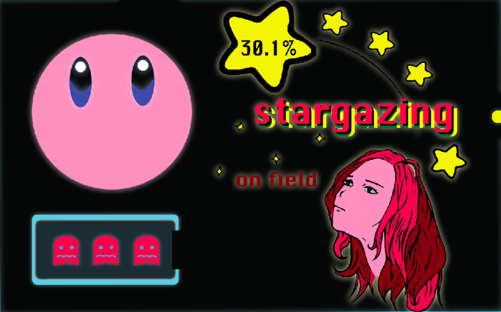
I decided to focus more on the results of the favourite locations, and that was a useful find. According to the survey results, most people enjoyed spending time in the canteen or cafe. The second biggest batch preferred stargazing on the field, while the third biggest batch loves the art-room. There would be a possible statistic error as a former art student, my access to art student based information would be very biased.
From my understanding of these results, there seem to be a certain correlation of public space and private space, as well as the recreational activities you can do in that location. Hence, I formatted my presentation slides according to that idea of following through from a public space into a private space. This was relevant with my perspective as an art student who preferred hanging out in the art room.
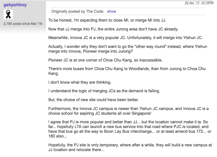
Forums
With the information at hand, I knew better about what I wanted to know about PJC and follow through with my project. And this led to my discovery of the forums that talked about the PJC and JJ merger, where I found some useful information regarding the topic.
My survey results also indicated a 100% of people thinking that the merger being detrimental to the schools identity, which is topic that would be discussed further later down.
Interviews
If you havent watched the video above, this is the exact video compiled of the interviews I arranged with various students of PJC.
The extra footages are interviews that were too long to be cut into the video. There were some recordings of interviews that weren’t captured on camera as well.
Recorded Interview with Hilman 17A03 (look at 2:51)
Recorded Interview with Michaela 17A03
Recorded Interview with Narisa 17S14 and Jamie 17A07
Recorded Interview with Zoey 18A08, Braden 18A05 and Stella 18A05
A general summary of the recorded interviews:
There was a clear indication that the students do not have dreams or nightmares about PJC in visceral aspect, which would be hard in the direction that I was going forth. Hence, I had the idea of recreating the activities that they enjoyed doing in the location, as well as the emotions that they felt with the location, resulting in my additional questions asked during the interview.
An interesting pointer would be the interview held with Hilman and Micheala, where they talked about the identity of the school being lost in the process of the merger- This really made me interested in exploring the relationship between the people and the location in time aspect. This trigger point came about when I realised that the same idea wasn’t apparent in the J1 students, who have not experienced the same culture. I derived at the notion of investigating the relationship of people and location from the past, present and possibly the future.
Photography
Site visit
Joy pointed out that the green motif is a good direction that points towards the PJC and JJ Merger.
I do like the idea of a quiet space at night that doesn’t have students in it, highlighting its innate quality of being a location, without function.
Apart from the site visit mandatory photographs, which are shown above, I decided to bring along my friend to take some concept shots. These concept shots are based off on information I received from the survey results as well as interviews. It was to assist me in reaching an abstract idea of telling the relationship between the people and the location, without physically acting out the activities.
C o n c e p t
Stargazers
Glitch (Mentioned in the interview with Hilman)
Miscellaneous.
(More explanation/documentation of the photographs to come in part 2/)zine.
As the research element of the zine came to an end, I found a good sense of how I wanted to direct myself towards the eventual zine. I wanted to portray the dream-like connotation of the relationship between the location and the people. This could be done through illustrations- which illography might be a good platform since I have done it previously in Project: Ego, and I already had a set of photographs that I can build the project on.
A friend from another class responded to the set of photographs with an interesting perspective of how the narration of my zine could be, which stems from the idea of how this zine isn’t my story to tell, but as if I am lending the voices and putting it into one booklet.
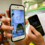
. . . A fun and engaging reality T.V cooking show hosted by Bryan, Dion, Joel and I. Each game requires one person to draw while the other person shops for groceries and cook, all while communicating through Insta-live! Audience comment, judge and laugh as our participants show us their goofy antics and silly mistakes. May the best team win.
Here is a short clip featuring the sneak peek to our show, featuring team Jacob and Tiffany’s process of buying mushroom and butter. Look out for how our show runs and how the simple process of buying mushroom and butter becomes a chaotic mess. A highlights section features the gag reels of the episode.
Ideation Creation
This show started out with a quick brainstorming session within the team. We were throwing ideas around and we realised we really loved the concept of having hall pantry as our main theme- We all lived in hall. (Note: Bryans my roommate) The initial idea was to have a cooking show, but the cooking show would rely on people getting ingredients from neighbours, and relying on third space communication to get instructions to cook. It was a raw idea.
After further discussion, we finally agreed on the idea of non-verbal communication, which was the method of speed drawing and guessing what it was, similar to pictionary. We finalised the ideas and agreed that the process should entail a pair, where one draws while the other buy ingredients and cook, while broadcasting the process through Insta-live.
Sell the trial, Char kway teow
We began our trial run a week plus after the ideation process, attempting to remove any obstacle before our actual shoot.
The trial rundown was important as we found out a lot of problems hidden within the process. We did solve it through an urgent skype meeting, trimming away all the fats.
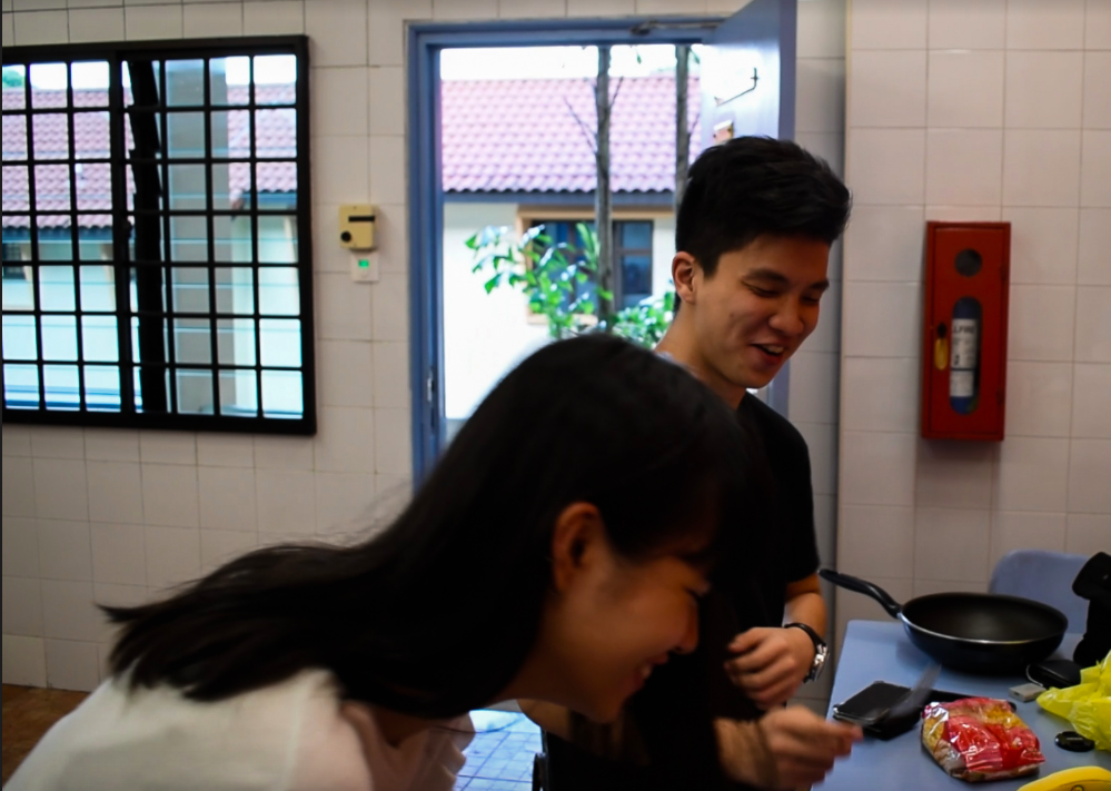
Jumping into the enthusiasm of our finalised ideas, we started our process of setting up our show. We arranged for our friends (in order of appearance): Tiffany, Jacob, Alena and Hannah, to be our guest players of the day. Tiffany and Jacob would be the strangers team while Alena and Hannah would be the friends team.
We discussed and decided on our roles for the day, with Dion and Joel going with the drawer’s side (Artist) while Bryan and I would assist the cooker’s side (Chef). Individually, Dion and Bryan would be the moderators liasing with the players while Joel and I would be the filming team. I would eventually edit the clips according to the theme of the show our group have decided to adopt.
Team Noob, Duck Soup
A comedic duo that was suppose to be the team formed with strangers, featuring Tiffany and Jacob. Tiffany did mention that she can cook rice, but was surprised that she has to cook something else other than that. Kudos to her for not chickening out. Jacob’s drawing was hilarious and brought a lot of laughter to the audience that we newly factored in.
Team Pros, Crunchy Toast
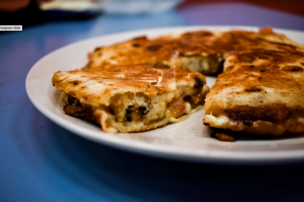
The team that made an unbelievably beautiful quesadilla that was picture perfect. This team was made up of friends who we assumed would have no problems communicating, which they have proven with their camaraderie, buying every item and cooking every item to the T.
Setup, Buttercup
Bryan made these beautiful posters that we broadcasted to all our friends a day before the actual shoot to reel in a crowd for the live show. It worked as our friends we really enthusiastic with joining in for the show, helping out the players in making difficult decisions.
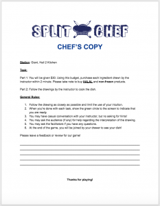
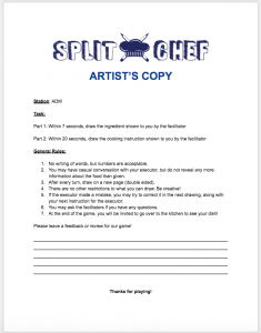
Also, these professional forms to inform the players what they need to do.
The final screen recording of the live process can be found here.
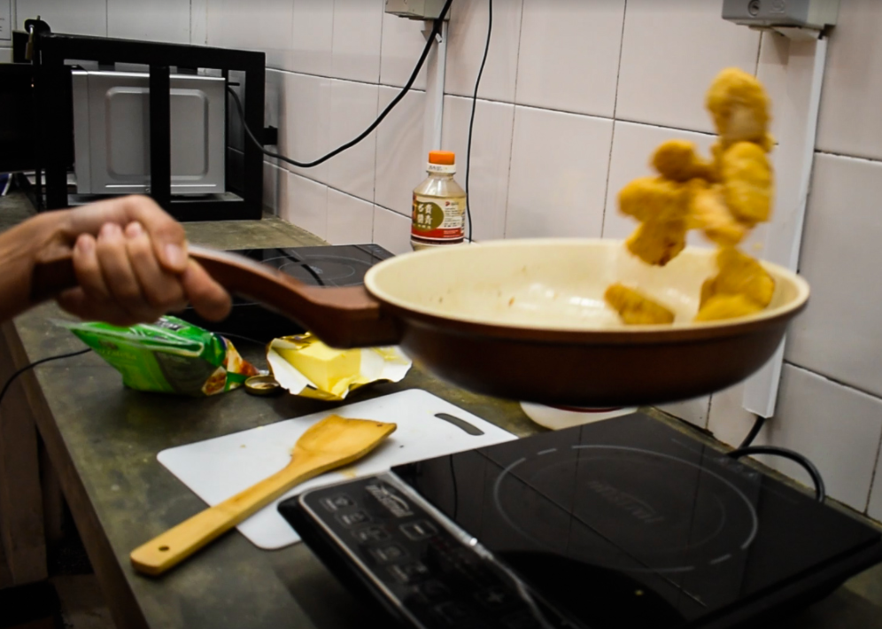
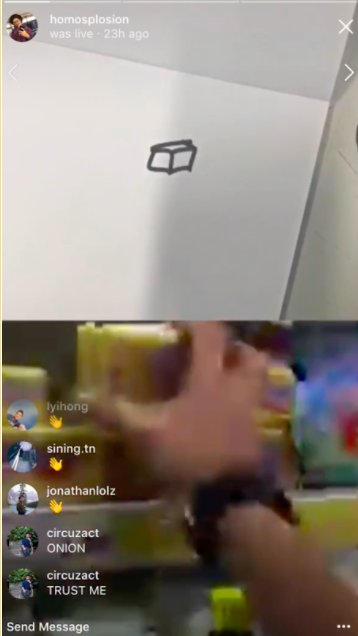
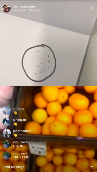
Miscommunication – There were a lot of miscommunication for this team as neither of them were good at what they were doing. Jacob wasn’t particular good at illustrating and Tiffany wasn’t particularly good at cooking, this resulted in many miscommunication that started from the beginning of the game play. This snowballed into things like buying peanuts for chicken as well as buying a eggs for butter. (Right: Butter drawing, Left: Chicken mistood for peanut)
butter
chicken profile
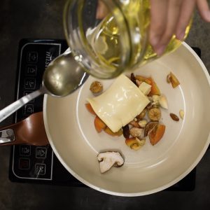
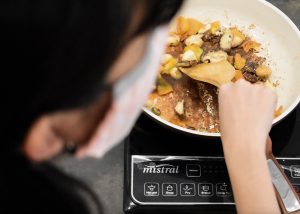
Cooking Inexperience – There weren’t any problems with the instincts of the chef being played here as Tiffany wasn’t adept at cooking at all. This resulted in her having to follow the instructions completely step by step. This created problems like her following instructions to a T, where she placed cheese in a pan without oil, waiting for the next instruction. She also had many dangerous moves that we were forced to assist like burning the surface of the pan as well as her way of chopping the nuts and garlic. She would have known how to cook mushroom or garlic otherwise.
dry fryingmessed up pan
Audience participation – This team was particularly popular with the comments (maybe because it was earlier in the day) as the drawings as well as cooking were humour-inducing. This caused a lot of commotion with the audience, commenting relentlessly, trying to participate in the game. Kudos to Tiffany and Jacob for being cool with the laughter.
banana
Stranger Connection – This team was originally suppose to represent the strangers team, which was the team that were intended to be bad at the game because they lack the kindred communication between friends. However, we soon realise that there were no relations between how bad the gameplay was with the real communication of strangers. This was because Jacob and Tiffany had no problems communicating, it was how inefficient the execution was, mostly deteriorated because of their ability to draw or cook. Hence, we decided to change the experiment hypothesis to how your ability to draw or cook can affect the game drastically.
Final Product
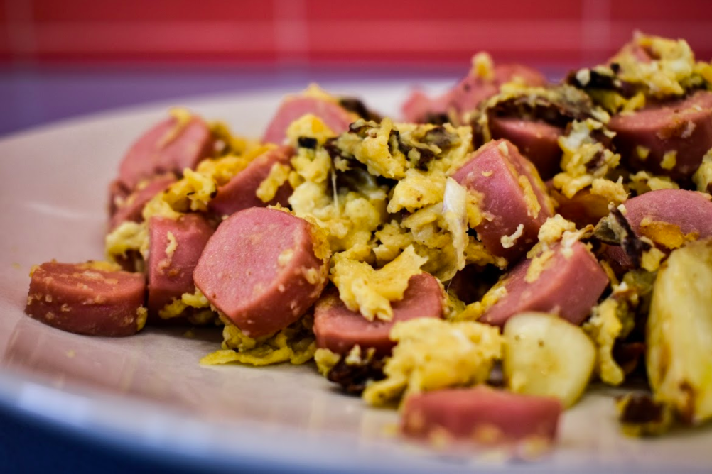
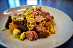
scrambled eggs with semi-cooked mushroom, topped with cocktail peanuts, sausage and garlic with skin
taste test
It was salty.
(Team Alena and Hannah )
Skills – Hannah and Alena were definitely better in the skills needed for this game as every aspects of their game were smooth running.
nugget flipping
Communication – Communication within this group was definitely better, although it was more or less inclined towards how good Alena and Hannah were as artists and chefs. With the same drawing of a box representing butter, Hannah could understand that the image meant butter instead of eggs, which Tiffany bought. We could only assume that this was because Hannah had more experience as a chef as no other form of communication was made during this time to Hannah by Alena. Hannah could also understand that Alena was drawing a pack of tortilla wrap instead of an orange.
Audience – The gameplay for this team took place later in the night as we wanted all factors of the game to remain similar, thus having the game back to back. However, the audience did not had the patience to sit through a 4 hour cooking show and we loss our audience count through the night, albeit having a loyal few who stayed on and off. However, our players were able to entertain themselves by playing with the Instagram’s filter ability, using the dog filter to joke around through the 3rd space.
Final Product
quesadilla
cutting the final producteating the food
Fun fact: Alena is a vegetarian.
G!itc hSngap#r3
Crowdsource
Crowdsourcing happens when our players utilises the opinions given by our live audience and use this information to their advantage. Sometimes the player might be too overwhelmed with the task at hand and might not be able to comprehend the drawing, even if it is a cuboid like what Tiffany saw. With the information given by a clear head, she might be able to understand and take the hint.
DIWO
DIWO takes place when we enlisted the help of our friends to play the game. With the fresh perspective of Tiffany, Jacob, Alena and Hannah, we are able to execute this idea without any prejudice and play along. This idea was apparent especially in the trial run where Joel and Bryan had to play the game. Dion and I had to withhold much of the recipe and gameplay alterations as possible so as to ensure the sanctity of the game is upheld. We are also only a 4 member group and we might not have the necessary skills or lack of skills to achieve the character needed for the game, such as a good chef or a bad chef.
3rd space
With the usage of Insta-live dual screen playing system, we are able to use the split screen to communicate between the two players. This helped us to achieve our goal of the communicative element of the game through visual stimuli only. This element is different in real life as we tend to want to over do on the communication part and using only 3rd space communication really helps to create a controlled environment. The 3rd space also helps to enable an effective audience participation without having a set of live audience that might create unnecessary pressure for our players. The 3rd space helps to foster a physical border that actualise our test of visual cues as communication devices. It also helps to connect people of different location into one centralised kitchen or drawing room.
Glitch
The glitch aspect for this game was the most apparent aspect as it can come in early on in the game. For Tiffany and Jacobs team, the glitch was more evident. During the grocery phase, Tiffany accidentally bought nuts and cucumber for the chicken and quesadilla, which kills off the entire recipe within 30seconds. This glitch happens when she overlooks the initial function of the recipe and ingredients, which is to make a chicken quesadilla, but instead look at the ingredients as basic units to a whole dish. When she overlooks the designated function set by us, she saw new and unrestrained potential in the dish, creating the sensational scrambled eggs shown above. This glitch aspect is snowballed throughout our game as there is nearly no way of trying to overturn it, instead one should just embrace this glitch and try to make the best out of it.
Videopackaging
Since I filmed the entire cooking process while Joel filmed the drawing process, I got the chance to edit the trailer for the final project. However, there were still maximum participation from all team members in terms of how we envision the video looking like and how we wanted to package the video, checking back with them every now and then with the video edits.
We wanted the trailer to look intense, as if it is a real cooking show with fast tempo beats. However, we did not want to include too much reels of the gameshow as it defeats the purpose of a trailer- which is to entice the audience into buying our show as a idea. We also want the glitch aspect to be apparent, thus adding in words that helps guide the audience into understanding our show as it is. We even have our own opening sequence that features glitch graphics.
In our highlights video, we featured a short clip of how Tiffany and Jacob interacted with their purchasing of mushroom and butter. This was important as these items are contextualised as a success and a failure. It was important to understand what was a failure and success in our show. The video is played one frame at a time as we did not want to confuse audience with too many screens, which they will be able to see through our Insta-live show.
Resolutions
this project could be better with a stronger managerial procedure as we are not trained to handle a game show of such complexities. If able to, we would have a stronger processing procedure, documenting from all angle, including the perspective of audience who are watching our show.
We could also expand this project into an app, as suggested by Desmond, and link up with a food app that allows students to download recipes and we provide the ingredients. This ties in with us as fundamentally we wanted to achieve the relationship between food and hall life.
With the information we have from our research process, we attempt to create a model that moves in the eyes of the kinetic beast, much like Theo Jansen’s Strandbeests.
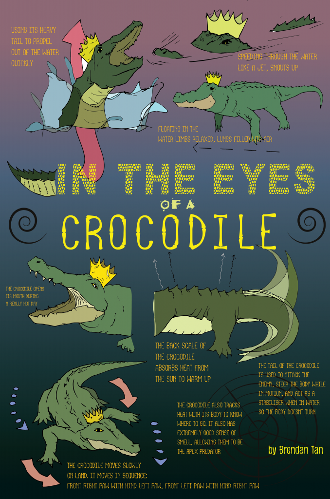
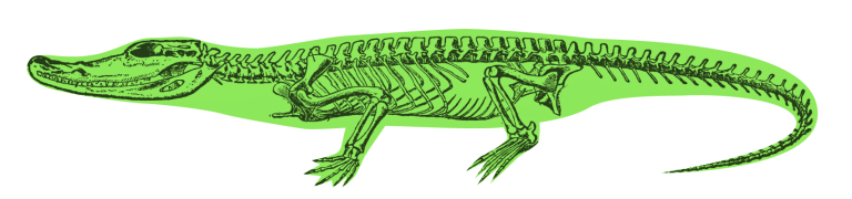
Breaking down the movements of a crocodile, I summarised it into two main movements: the slithering pattern inherent in its streamline bodyas well as the concurrent movement of opposite front leg and hind leg.
Refer to the diagram from the previous research process.
Slithering starts with floating in the middle of the water, then paddlingConcurrent movement of opposite legs
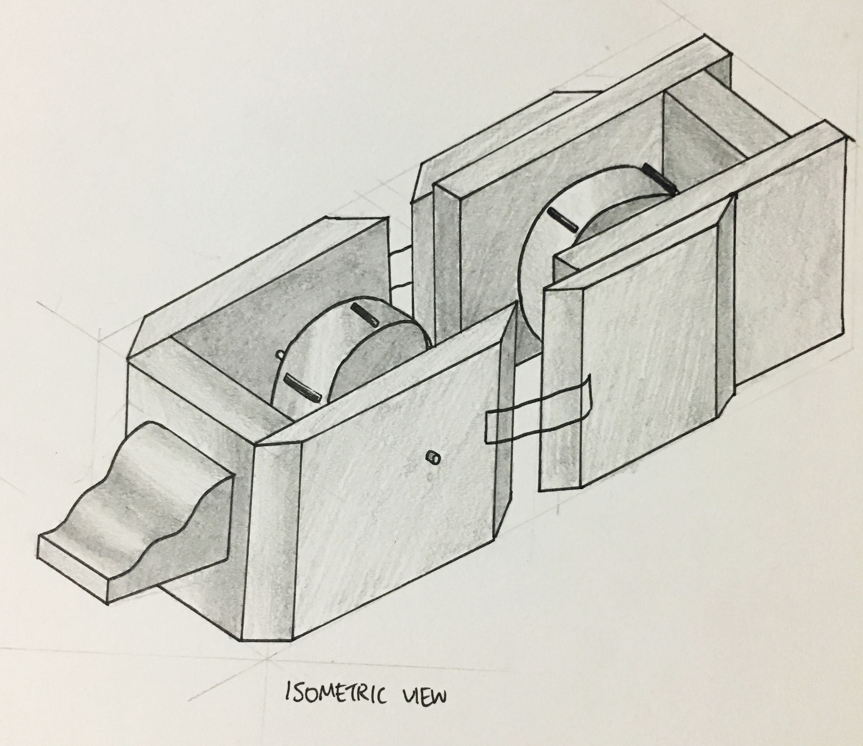
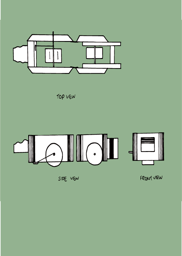
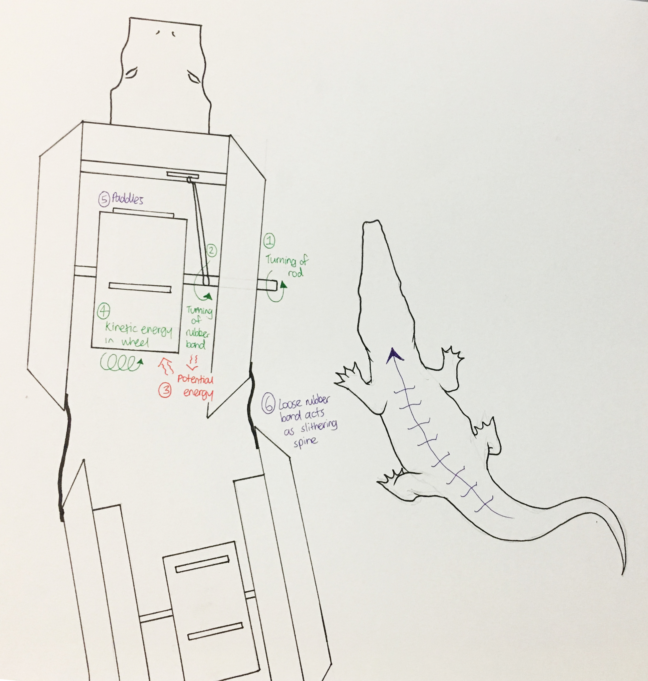
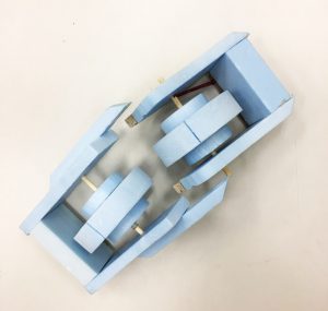
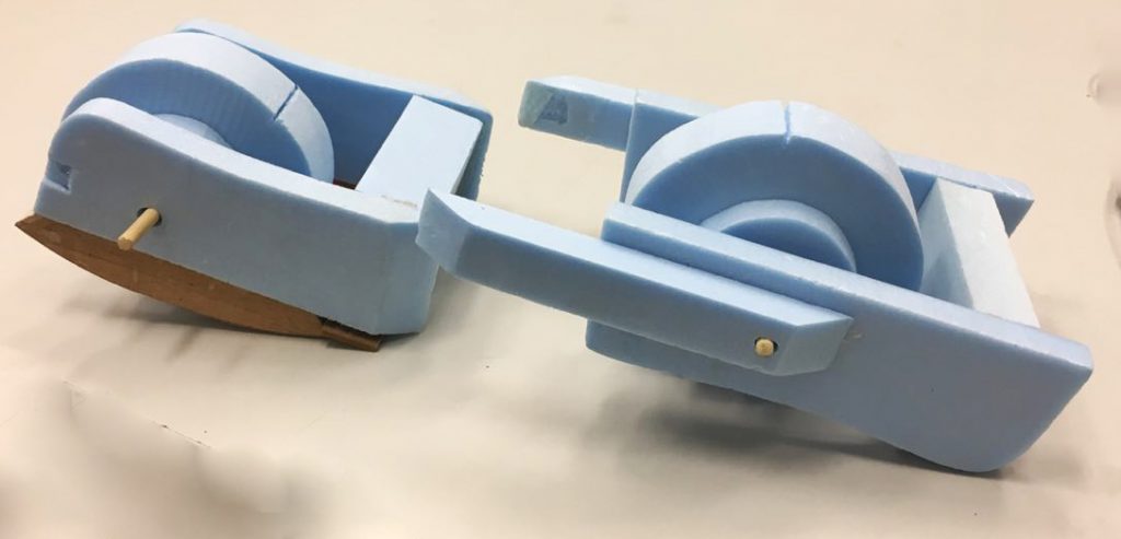
The first prototype attempts to investigate the slithering pattern inherent in a crocodile’s streamline body. This movement is only allowed with the flexibility of the pivotal mechanisms of the spine. Hence, I tried to apply it to the model by building it into two sections.
Isometric drawing of model
Mechanisms
Explaining the process of the machine, I used a wind-up mechanism to create movement. The rubber band is tied to the turnable rig that extends into the wheel. The rubber band is tied tightly onto the rig as well. Hence, when the rubber band is turned by the rig, it converts the kinetic energy of the spin into potential energy stored in the elastic band, shown in the diagram above. When released, the prototype mimics a wind up toy or pull back motor, and moves forward with the rubber band’s potential energy released as kinetic energy. The movement forward is enhanced with the paddles inserted into the wheel of the prototype. The loose spine connecting the two sections help to create the slithering movement of a crocodile.
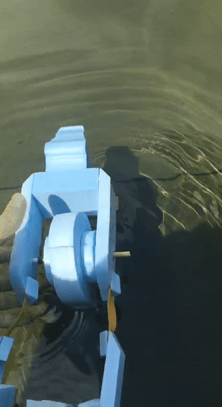
Test drive
The prototype did not work well as the foam was too light. This made the prototype float above the water, resulting in a weaker albeit moving motor. The prototype only moved a short distance and did not slither as much as I envisioned. I added wood panels to the bottom in later adjustments.
I realised that the current equipment I have set up for the wind up mechanism is too weak, despite trying out different rubber bands of different elasticity. I tried latex rubber band, generic red rubber bands and hair band as well. Hence, I decided to change up into something else, and maybe work on the second movement- concurrent movement of opposite front leg and hind leg.
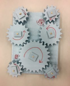
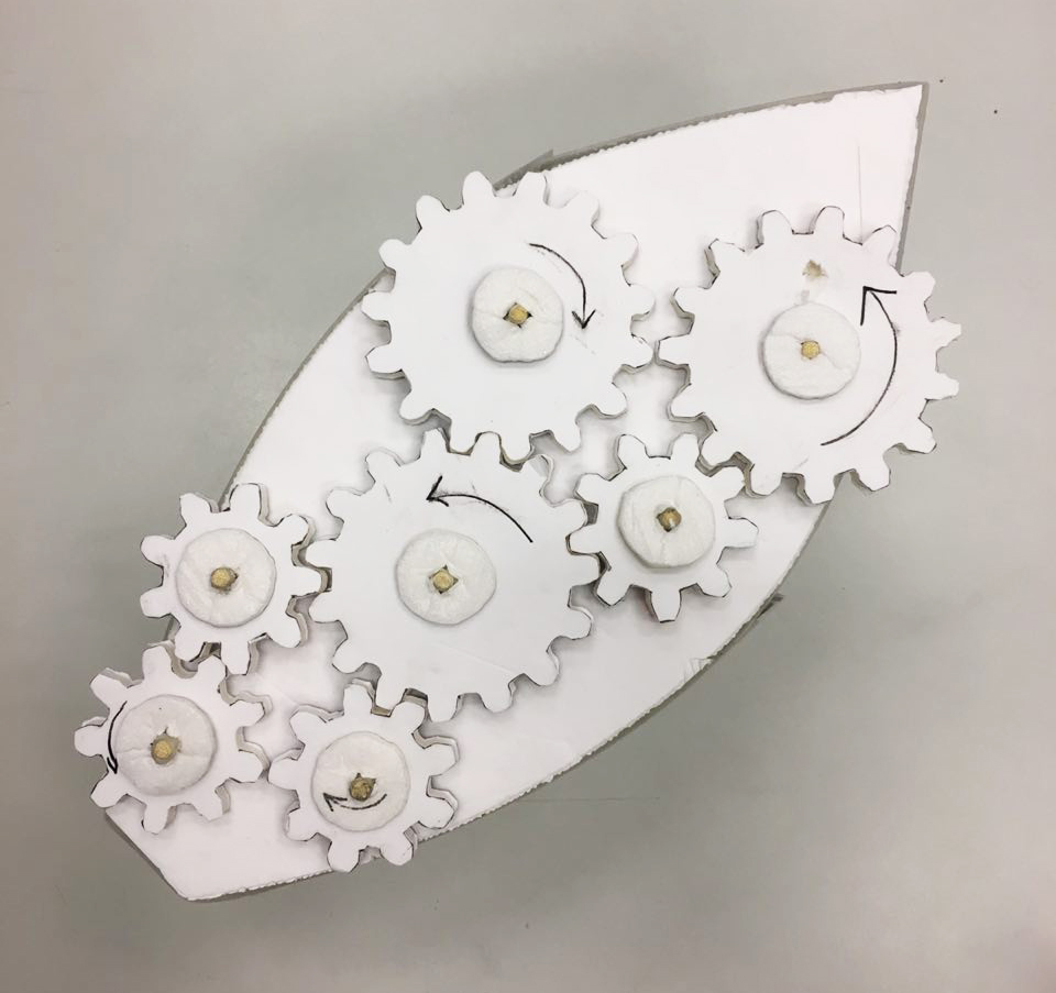
With the set-up above, I utilised gears to create different directions of movement. With the central gear acting as the main source of movement, it creates different direction between the top left leg- hind right leg and the top right leg-hind left leg. This concurrent movement of gears mimics how a real crocodile moves. This set-up would be useful if its morphed with the first prototype’s streamline shape, using either elastic band or wind energy to power the motor.
In the end, I was sick and didn’t attend class. However, Minjee did update me on the feedbacks given by Cheryl. Hence, we listed the characteristics down and planned how our final work would encompass, which are: Bobbing up and down the water like a crocodile, pecking of the plover bird and changing of colours with the temperature. Do take a look at Minjee’s OSS for the understanding of her plover bird prototype, in comparison for the mutualism relationship it shares with a crocodile.
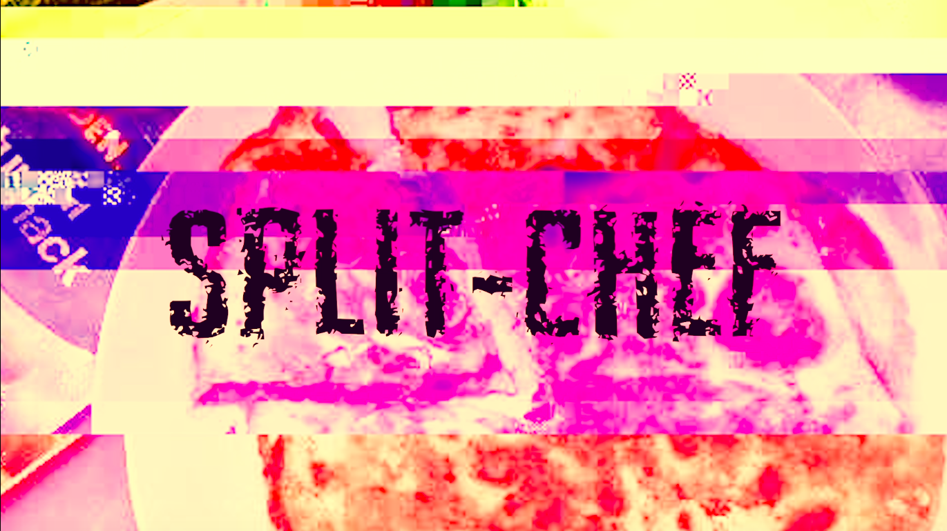
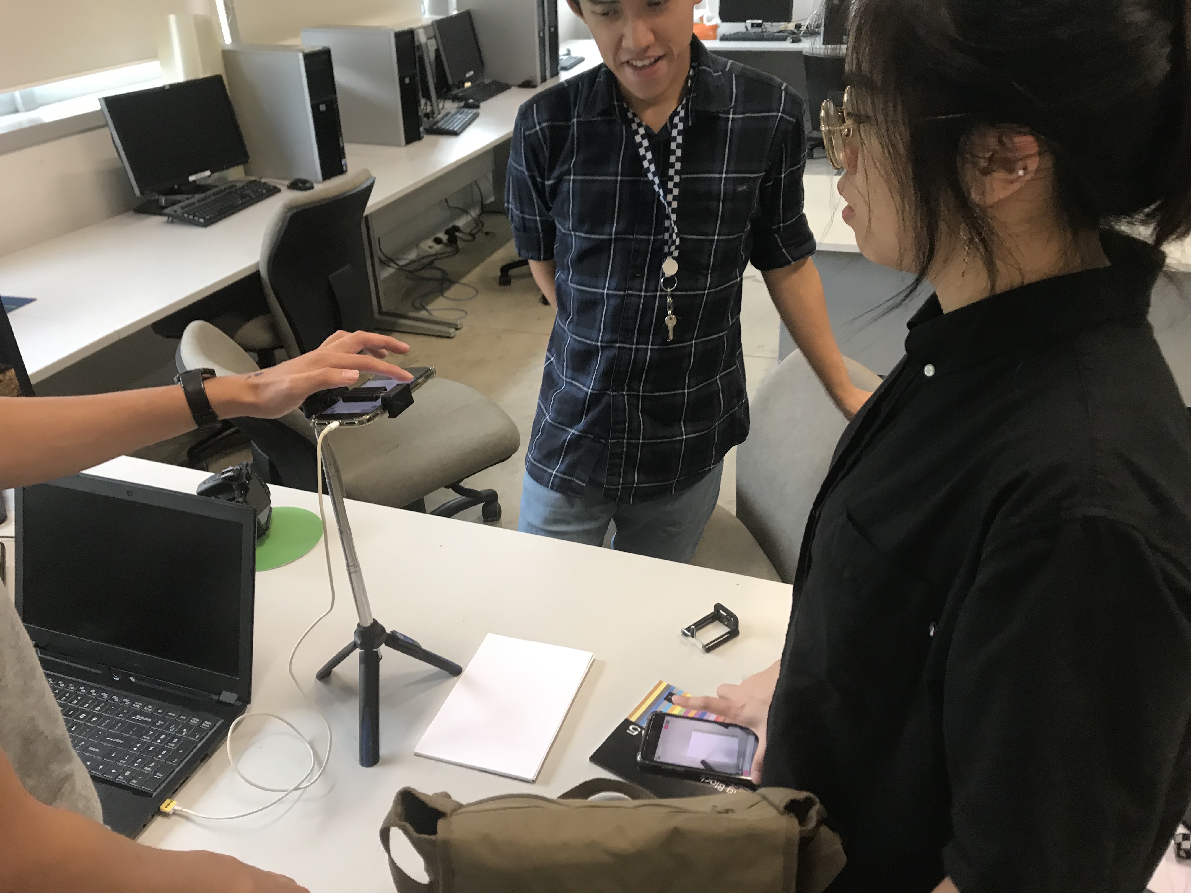
Progressing towards the end of semester, we expedited the process of our final project: Split Chef. We took to the 3rd space to discuss how to proceed with our project, fixing the tiny glitches we encountered during our trial run.
After much discussion, we cleared our doubts and set the date to 9th April to carry out our final project.
Points:
Instincts like bee stings
Previously discussed in the trial run, we mentioned that some players tend to have instincts with cooking and this instincts can be sharp enough to pick out certain clues. For instance, ludicrous instructions like frying for 20 seconds might not seem to be too little but to some it doesn’t seem like a problem at all. To maintain the sanctity of the project, we decided to uphold a strict level of instruction following, where the cook has to accurately present or execute the instructions by the drawer.
Hi-five for wifi
During the trial run, we had problems with the wifi and data as the pantry we visited had very thick walls. This time round, we borrowed a pantry within the same area for efficiency sake, but we tested out the wifi connectivity beforehand. There were even electric plugs located in the pantry in case our phones run out of battery.
Chicken and equipment
If you watched the video, you would realise that we did not have a chopping board or a frying pan that was useable and we had to make use with what we had. This was uncomfortable for the cook as well as the moderator. We have to bring enough equipments for the execution day itself.
Look back at the previous Split Chef post for more information!