Tag Archives: typography

Typographer of the Week: Jan Tschichold

I have to admit, I have never heard of Jan Tschichold before. With that being said, the readings were astounding to me; to know that this artist has left such a great impression on typography and a legacy behind in the typography world.

Jan Tschichold
Jan Tschichold is an influential German author and typographer. He was vital in the development of typography in the 20th century, most notably because of advocating the beauty of sans serif fonts, set principles of typography and also developing the page canons.

Notable works 

1. Die Neue Typographie by Jan Tschichold

Following the success and intrigue of his manifesto, Tschichold focused his attention on dealing with this idea of ‘modern typography’.  He wrote ‘Die Neue Typographie’ and had it published in Berlin. People described it as sympathising with the philosophy of the communist revolution. In Die Neue Typographie, Tschicold also provided a set of rules that standardized the practices relating to modern typography.

2. Page Canons

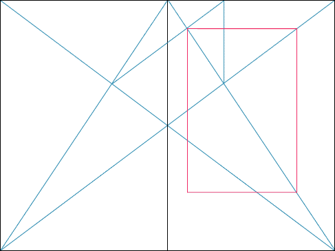
In one of his books, he wrote, “Asymmetry is the rhythmic expression of functional design.”  He found the way to design a harmonious page. A perfect page. There were many rules, guides and ratio which he has set in order to create the perfect page he desired. Every single detail matters. Some of the guides are the Van de Graaf Canon and Tschichold’s recommended 2:3 page-size ratio. Many of these guides are still evident in today’s design.

   
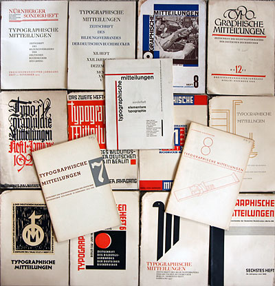
Sonderheft Typographische Mitteilungen (1925) by Jan Tschichold


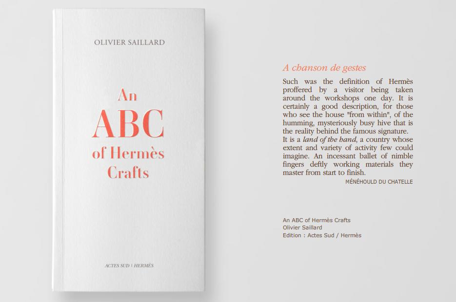
ABC of Hermes Crafts


Kinfolk Magazine

Some thoughts:


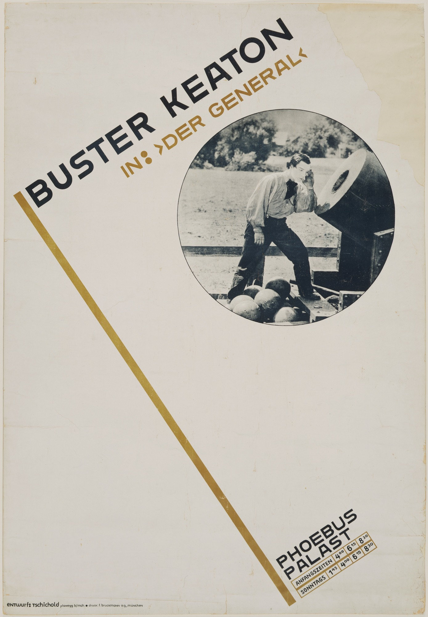
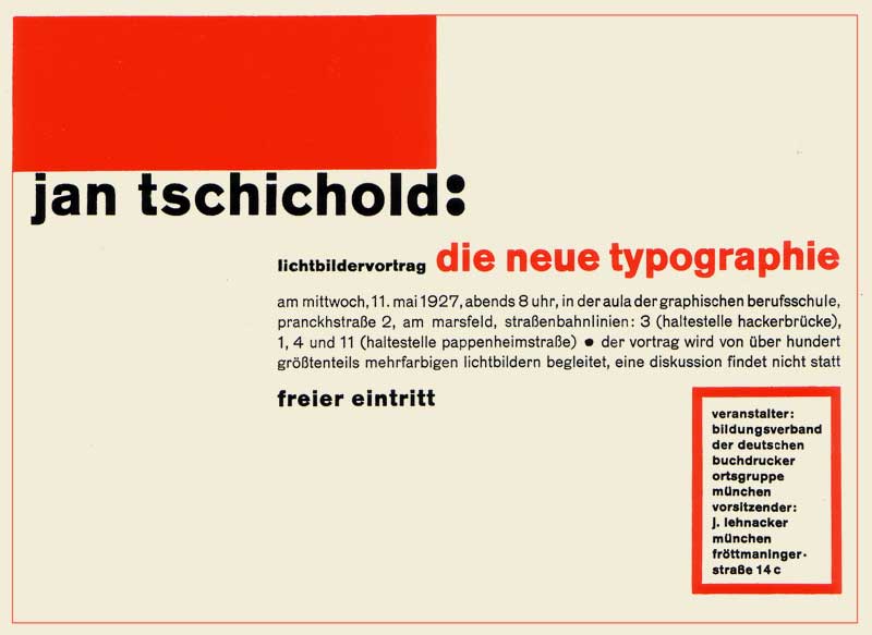
A poster by Jan Tschicold 

His way of creating is definitely something worth remembering and learning. The different ways in which he played with typography, space, layout – very experimental yet essential. He was bored of seeing the same type layouts over and over again and it motivated him to be experimental with typography and layout. This experimental mindset is what will set an artist apart from the rest.

One thing which I really love about his works is the perfect page harmony. The canons of page construction can basically turn a page into something so aesthetically beautiful and pleasing to the eye, as the reader reads the text or admires a picture in a book. I have learnt that in typography, there is a fine line between order and disorder. Underlying the what (might seem) disorderly or asymmetrical text might be the typography guides that these designers have been using since then.

References:

The Secret Law of Page Harmony


https://thecharnelhouse.org/wp-content/uploads/2016/11/jan-tschichold-the-new-typography-1928.pdf

Type In The Wild

Firstly, I’ve never put in much thought about type in signages/posters/billboards around Singapore – or maybe I subconsciously do. I could, however, tell whether one poster or even a shop sign looks aesthetically pleasing or not; and that is actually what I think, we all have been learning in class. Why does it look aesthetically pleasing? All of this is thanks to, the font used, kerning, leading, emphasis, harmony, etc.

And these are some pictures which I took when I travelled to Tiong Bahru/Redhill area. In general, what I noticed about sign boards (not for shops, but for directional, instructional ones), is that the fonts are more formal and readable. For the “Tiong Bahru Road” sign and the “Pedestrians, use crossing signs” in the picture with a cat, they are sans serif type, Grotesk Sans Serif – heavier in weight, uniform and cleaner as there are no serifs. As these fonts are easily readable, the text on the signs has both form and function. (Unlike the No smoking sign which has an awkward (to me) serif font that says “By Law” – lighter in weight, too much vertical stress as the “L” barely visible.

Many of the other shop signs and even the poster, used sans serifs fonts. Overall, they give a cleaner look and enhances readability. However, some places choose to use serif fonts but I realised that they are mostly brand names (many alcohol brand logos are in serif), short words and texts or that they have a more “traditional” look.

Here comes the bad typography. (in my opinion)

(The irony of this picture though)

Regardless, I think the suitability of the typeface used is extremely important and determines the outcome. Some fonts just don’t work out. For example, the menu picture from Tiong Bahru Bakery – yes, the handwritten typeface style is cute and friendly but it takes quite some time to read a font like that – it is lightweight, irregular, and has asymmetrical curves. Other than readability issues, it is not entirely a bad font.

The last bad typography would be the “Xiao Long Bao”. Firstly, the g stands out like a sore tongue. I have no idea why they chose comic sans, but I do find the readability good as it is heavier in weight and the round edges make it look like “friendly, less-edgy and approachable”.

First Impressions

Good typography is just all about nice fonts. Am I right? Wrong. 

We are all surrounded by fonts and we see them everyday. Having to actually learn about them in details is slightly new to me. My first impression of typography lessons was that we will be going straight into using texts, learning about fonts and doing editorial/poster stuff. But, I came to realise after the lessons that what we learn here are back to the basics, foundational knowledge that every design student should be aware of and skilled in. Even things such as the history of typography and the books many renown, key artists have written, are very important in the learning process. Why does a particular layout or font look better the way it is? I guess we can now answer this kind of questions.

Nonetheless, it was fun thus far and my group is Bangkok Fish n Chips. We chose Bodoni as our font and it would be an interesting journey to be learning more about this font.


01 Image Making Through Type: Final

Here’s the final outcome of project 1!

To view the design process and research, you can click on the links below:

01 Image Making Through Type: Artist Research

01 Image Making Through Type: Ideation and Process

01 Image Making Through Type: Final (this post)


THE JOURNEY OF DREAM JOBS

Tone: Positive

Sometimes, dream jobs are seemingly impossible due to constrictions and practicality. Nonetheless, going through this identity crisis of being conflicted with what we want is mandatory to find ourselves; in hopes that everything will eventually work out.


THE PATISSIER


In this design, I selected “K” and “T” as my initials. The letterform is mostly incorporated into objects of greater significance, such as, the cracked plate and plastic utensils made for kids.

Due to the angularity of both letterforms, I felt that it is more appropriate to deliberately incorporate them into those objects. As for the choice of case, “K” and “T” had not much of a difference but I went ahead with an upper case “K” and lower case “T” to make the placement of objects more natural. I used counter spaces/positive and negative spaces as form for the letter “K”.


THE ARCHITECT


Atavistic Vestiges After the Rain (1934) by Salvador Dali

In my second design, my creation of an “impossible architecture” was greatly inspired by Salvador Dali’s paintings, which consists of organic shapes. I chose the upper case “K” and lower case “T” in this design. As my letterforms were incorporated into the sticks at the bottom of the structure, to look as though it is barely supporting it, the angularity of both “K” and “T” had helped formed the shape easily. If these letters were curvy instead, the end results would differ quite a bit.

I also used the symmetrical properties of these selected letterforms to create a reflection which says “Kt”. This also ties in with my concept of being in someone else’s shadow as I am blindly following someone else’s dream.


THE TATTOO ARTIST


For this piece, I illustrated a mix of line drawings, a reference from line art tattoos, and vectors. By using contrasting styles, I wanted to portray this dream job as something far from reality and unattainable.

Inspired by Ukiyo-e prints, I used more organic shapes to create my vectors and letterforms. My letterforms, as seen in the red patch of blood and the chain, represents the cultural constrictions this job has. The chain, made using a pattern brush, signifies the constrictions, as though the tattoo artist’s hands are restricted.  By using a pattern brush, it helps to make an angular letterform more organic and natural. For the letter “K”, I played with the boldness/thickness of the letterform as it is an organic shape.


THE PACKAGING DESIGNER


This piece was inspired by the memphis art style. It adopts a great a sense of movement it in as I wanted to this piece to look fun and quirky.  I particularly picked candies as objects to be packaged as I wanted a similar motif which links to my first dream job – the patissier. The positive message from this is that things will eventually work out and this “Journey of Dream Jobs” is something mandatory so that we are able to find ourselves. Thus, reminding us that even though we might not be able to have that “ridiculous” job we wanted when we were young, it does not mean that you cant work your way around it and do something within your interests.

The letterforms, portrayed in the ribbons, started off looking geometrical. After a few versions, I decided to make the letter “K” look more organic and that it follows the curves of the ribbons which wraps around the box nicely. Altogether, I really wanted to capture the moment of having a job you love; although messy with the tapes still around, it is still bursting with joy and excitement.


Some comments from Joy and my peers:

  • colour choices were great and appealing
  • nice narrative and vector style
  • maybe centralise certain letterforms
  • 1st and last composition could have been less distracting
  • 2nd composition is good

I had met several challenges while doing this project. Firstly, incorporating the letterforms with consideration was tougher than I thought as I tend to lean towards a more illustrative way to express myself rather than in typography. I also struggled with trying to make the letterform more visible as initially, it was subtle and small in size. All in all, I enjoyed this project as I have learnt many useful illustrating techniques and also learnt about the properties of a letterform on a deeper level.

01 Image Making Through Type: Ideation and Process

IDEATION

I began my ideation with the basics,

“My name is…”

I wrote down as many variations of my name, which I felt that will be helpful later on, when I have to decide which name/initials will be more suitable for my letter form.

Concept (process):
As we have to come up with 4 different designs, I felt that maybe I could link them up and tell a story. I started with looking into my dream jobs and these are some jobs which I listed out:

Architect
Interior designer
Packaging designer
Brand identity designer
UIUX/User experience designer
Goldsmith/jeweller (jewel crafter)
Pastry chef/pâtissier
Tattoo artist
Spiritual healer (shaman/witch/enchanter)  
Fragrance chemist (Alchemist)
Adventurer


Eventually, I narrowed down the list and got my 4 jobs.

The Journey of Dream Jobs
Tone: Positive
Message: Sometimes, dream jobs are seemingly impossible due to constrictions and practicality. Nonetheless, going through this identity crisis of being conflicted with what we want is mandatory to find ourselves; in hopes that everything will eventually work out.


In chronological order,

Patissier
Architect
Tattoo artist
Packaging designer


As this project was to incorporate the letterform which reflects a particular job, I found these examples really interesting and useful: how they managed to visualise both letterforms and shapes and make sense out of it.


Chineasy by ShaoLan Hsueh


Moonshine poster by Jon Klassen


Mariano Pascual’s 36 Days of Type (click to see the rest)

36 Days of Type by Shiffa


PROCESS

PATISSIER


To show this impossible dream of mine, I portrayed a dessert to be pretty-looking on the outside and disgusting on the inside.

Initially, I wanted to use solely complementary colours but subsequently, I felt that it was lacking colours and vibrancy.

Also, in the composition with the green background, my letterforms were incorporated into the reflection of the slime (k a i). However, after consultations, Joy mentioned that the letterforms could be incorporated into something more significant to my story/dream job.

So, I have made some changes, like the colours used. I included a range of analogous colours instead. The letterform, K, is in a form of the crack seen on the plate instead: showing how impossible this dream is and that is a bad choice for me to do so.

As compared to the letterforms in the slime, I found it slightly easier to incorporate the letter K as a crack as it is angular. Whereas, the slime took on an organic shape and fitting angular letterforms would cause it to warp even further, losing their readability.

ARCHITECT


I was Inspired by Zaha Hadid, an Iraqi-British architect. Known as the “Queen of Curves”, her architecture style is advanced and sleek.


In this design, I wanted to illustrate impossible architecture through exaggerating the structure and subtracting the basics of what makes a building foundationally sound and strong. In my sketches, I tried creating this structure using geometrical and organic shapes, or a mix of both. Depending on my choice, the letterforms chosen varies. My initials, “KT”, as compared to “KAI” seemed more appropriate as the angularity of it is an advantage. The letterforms are illustrated as sticks which are trying to support the structure but from consultations, Joy suggested to make this structure look “even more impossible”.

For the last design, I added texture to it so that it looks more dynamic.

TATTOO ARTIST


Inspired by the Ukiyo-e art movement, I wanted to design something which reflected a rebellious phase of mine, and also the practicality of being a tattoo artist due to cultural constrictions. I started off experimenting with the neon-sign look as it reminds of shady places that bad and messed up people visit. Also, the tattoo artist is drawn in lines, unlike the person getting tattooed, as it represents this dream job of mine does not even exist at all; an impossible vision.

However, I couldn’t think of how should my letterforms be in this composition as the line work illustrations are a little distracting.

In the last picture, I experimented with the brush tool that I have learnt in class. Instead of illustrating the chain manually, I made a pattern brush, using chains. Most probably, I would include this chain element in my letterform as it represents the cultural restrictions of being a tattoo artist.

PACKAGING DESIGNER


Memphis artist, Peter Judson,
with his vivid isometric illustrations.


In my final design, I played with basic shapes as I was inspired by memphis art style. By utilising this art style, I felt that the placement of elements and colours used played a great part in creating a dynamic composition; one that looks playful and joyful.

References

https://www.behance.net/gallery/16735099/36-Days-of-Type
http://www.mariano-pascual.com/36-Days-of-type
http://www.nathanfowkesart.com/
https://www.kickstarter.com/projects/shaolanchineasy/chineasy-begins-
https://www.pinterest.com/pin/192599321539037000/
https://www.pinterest.com/pin/463378249133358484/