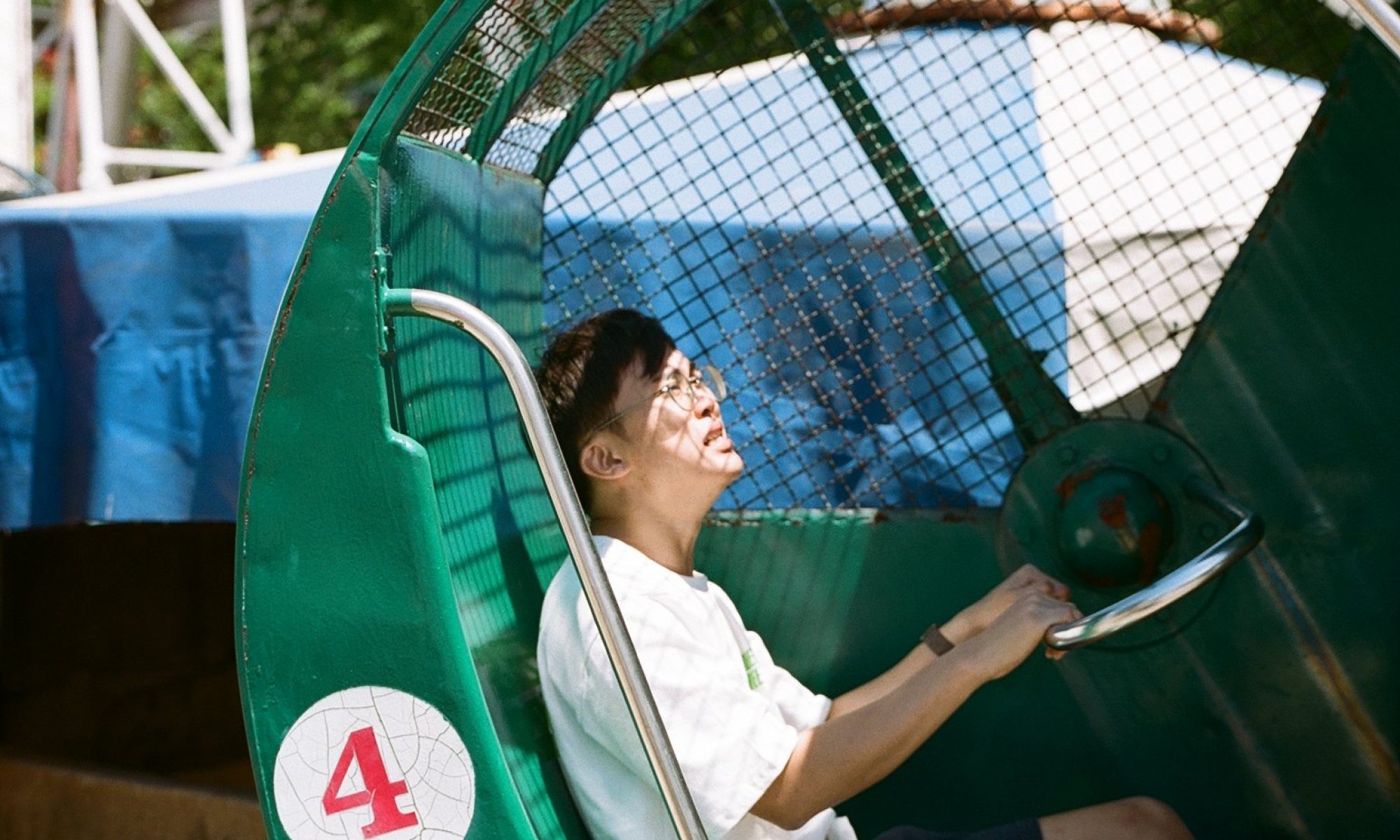
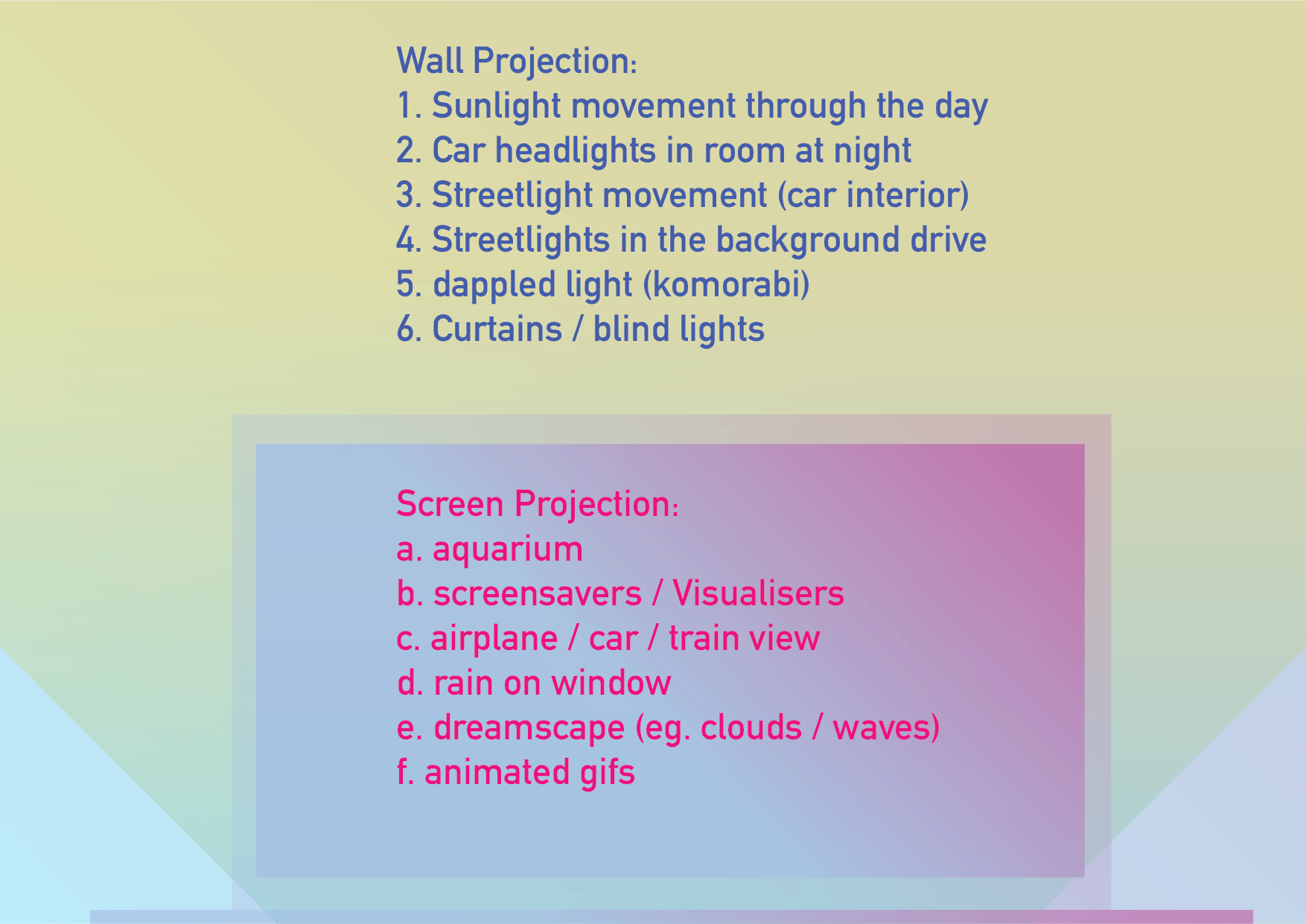
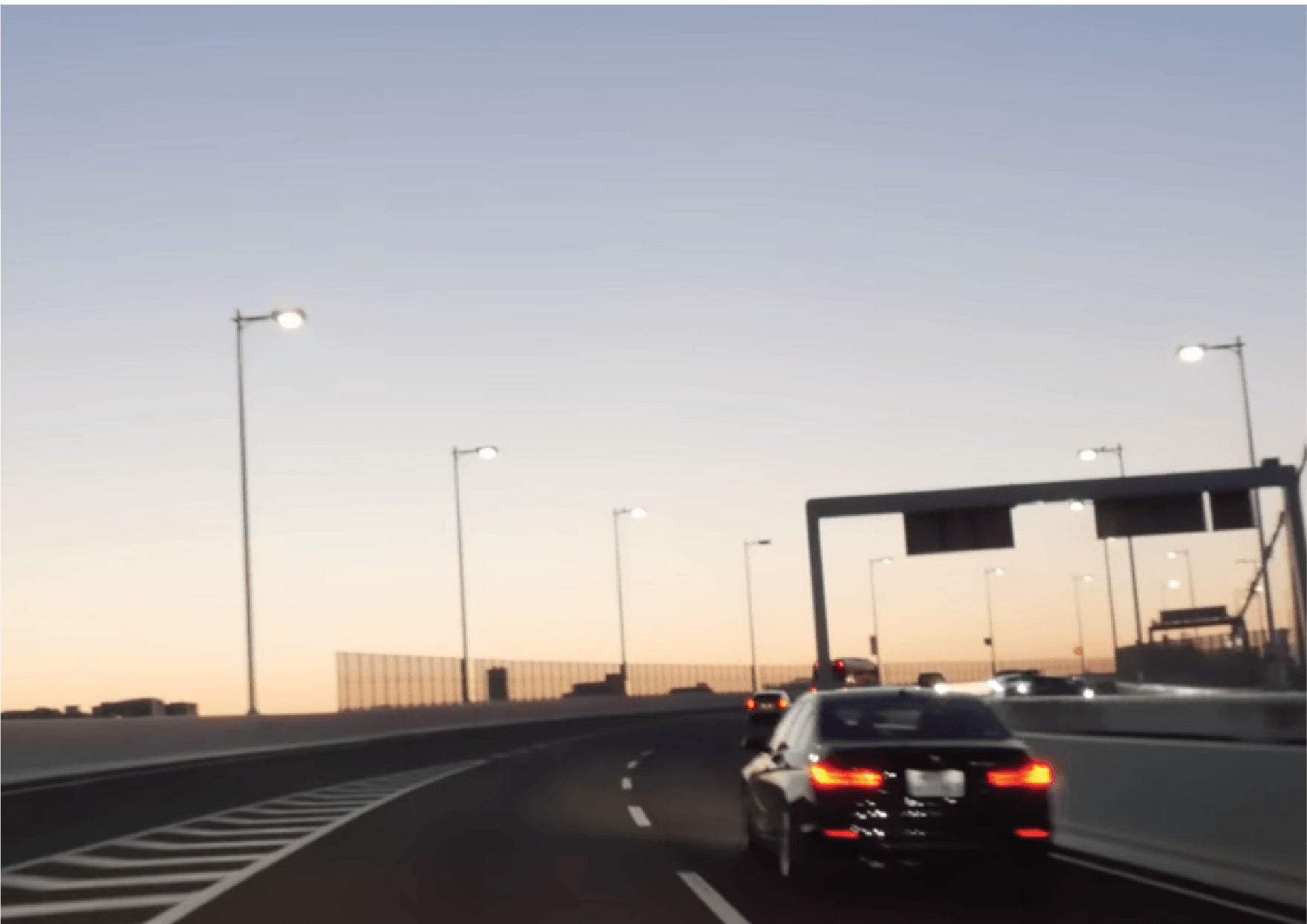
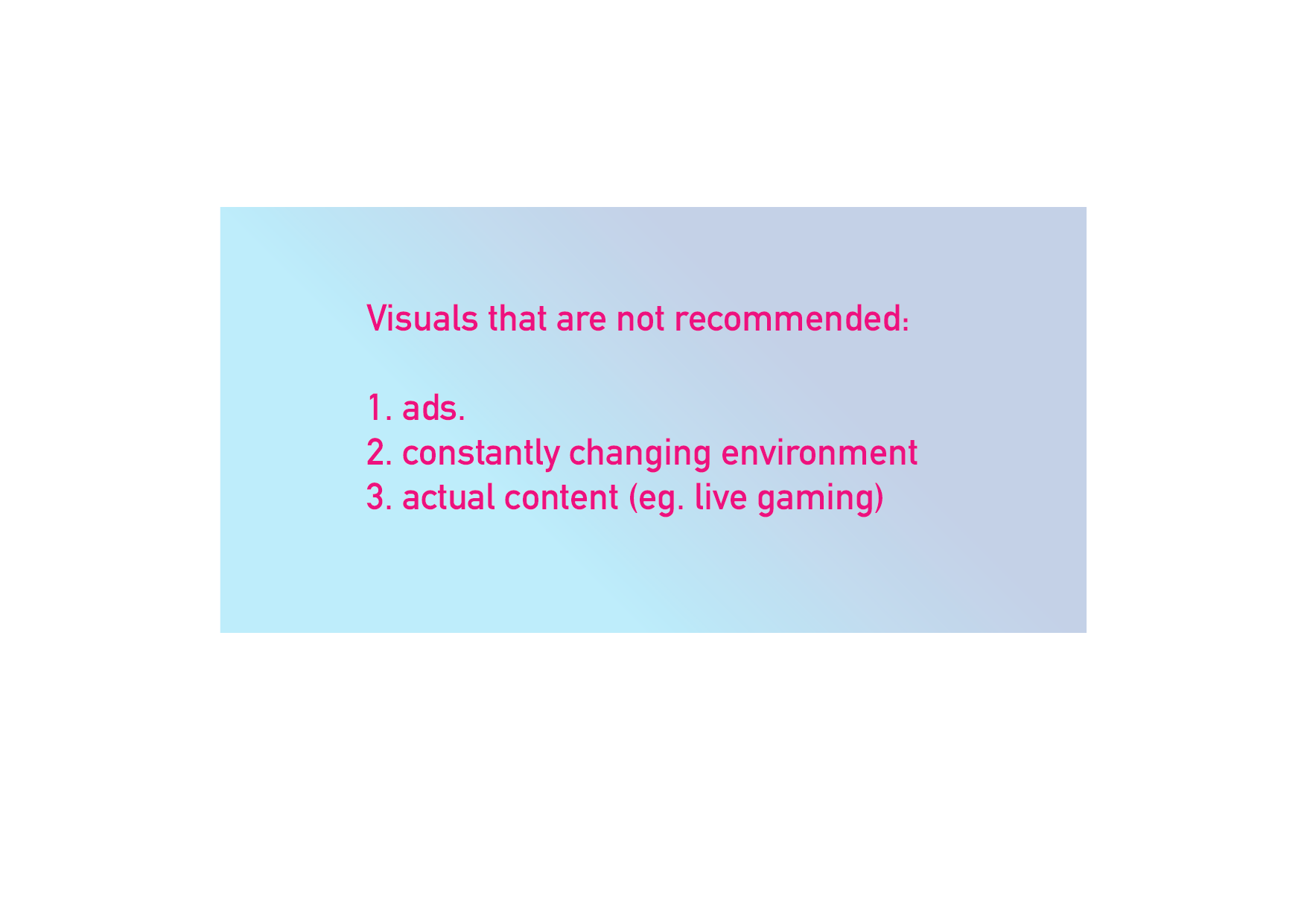
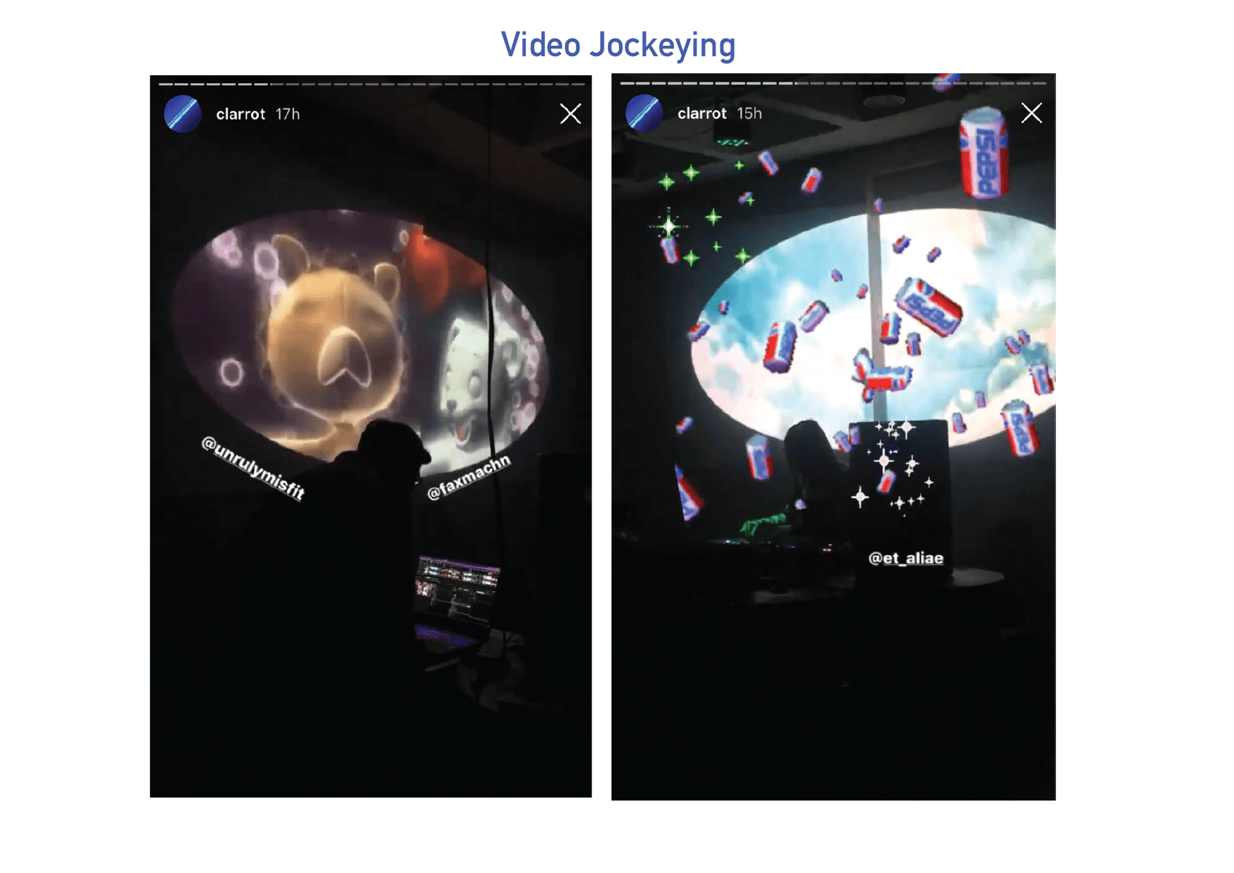
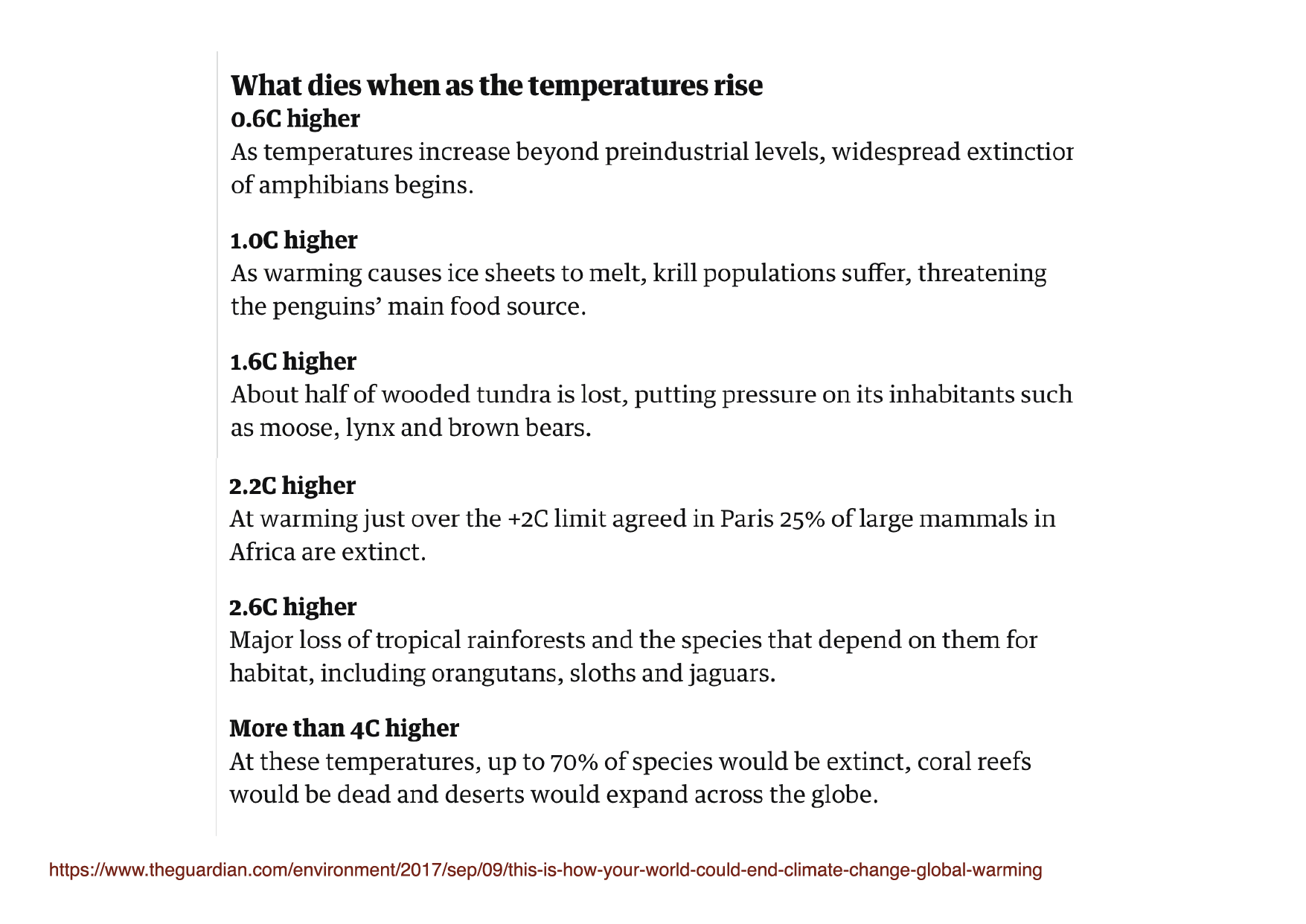
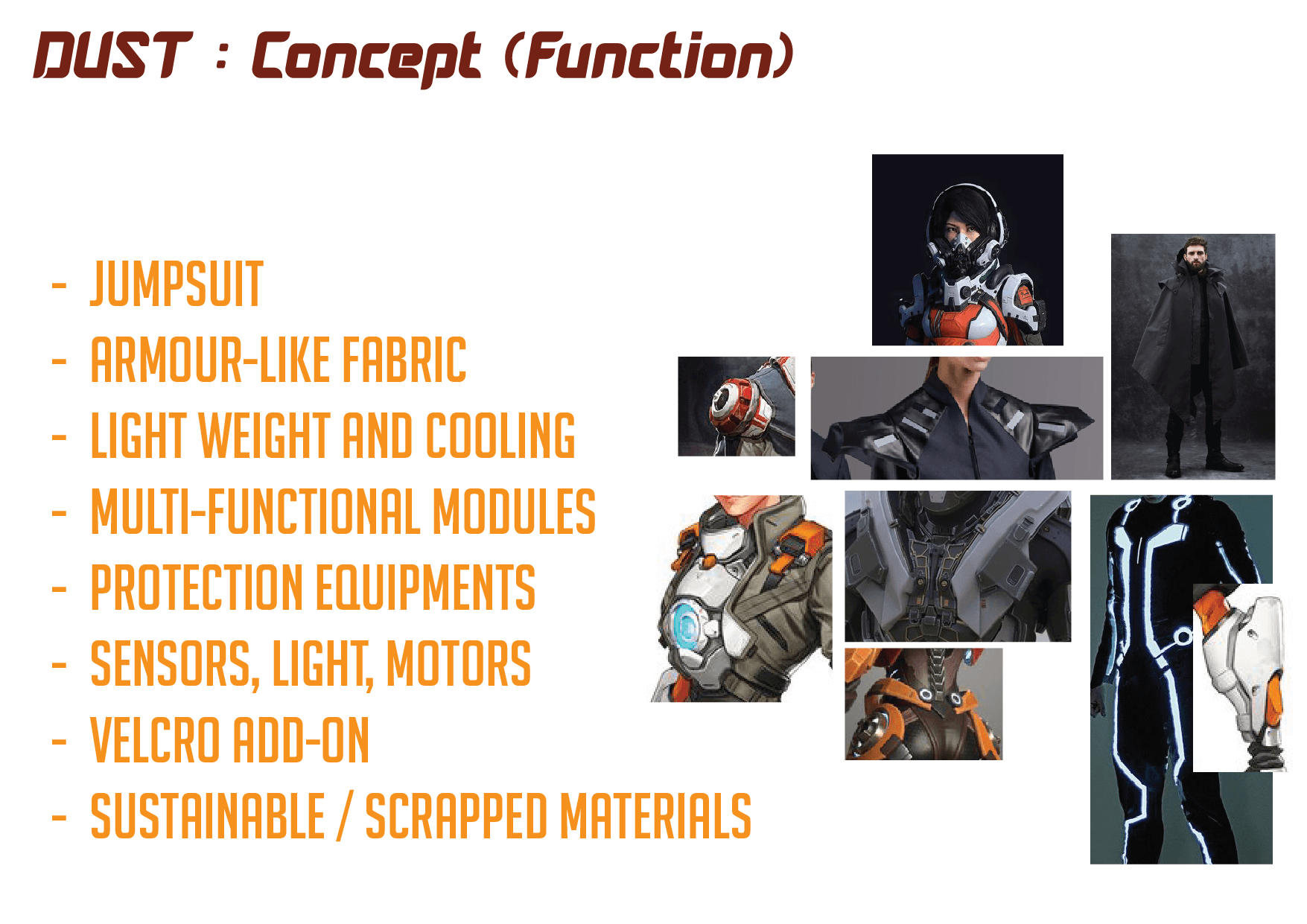
Use processing or something to create the light streaks
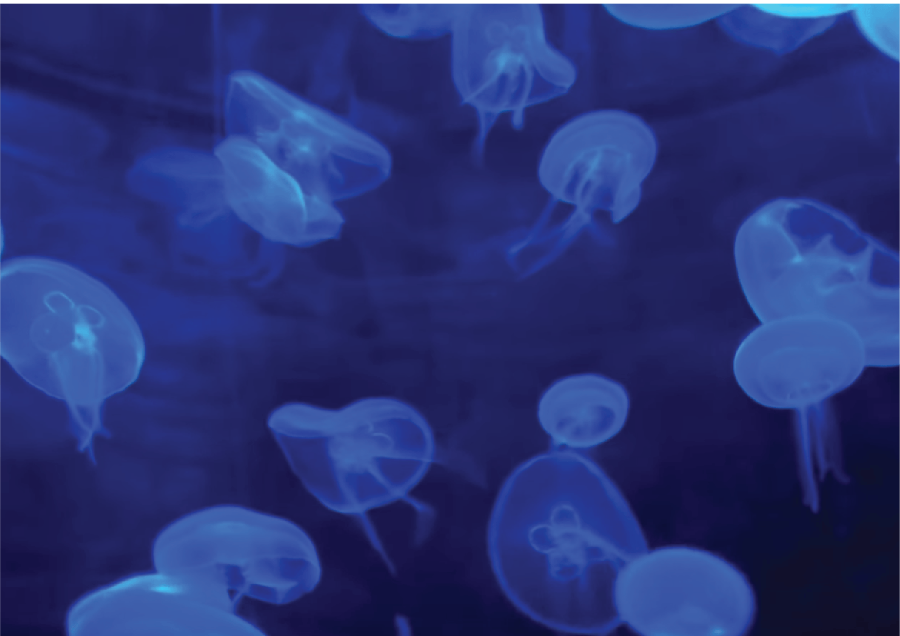
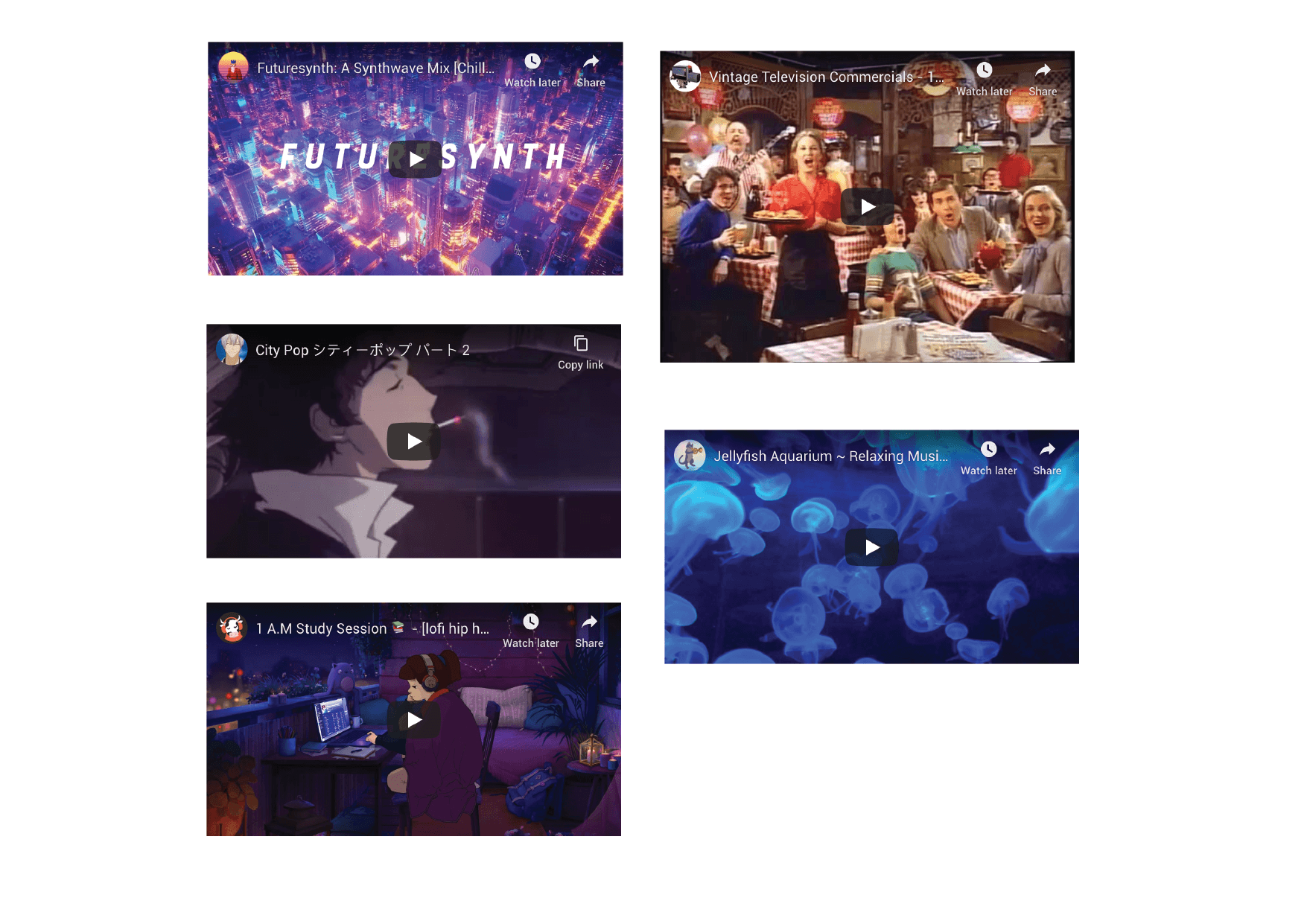
see if can make the jellyfishes, or just use video. (will it be allowed?)
See the vibe of it. after trying once
Plan further and then add more interactive elements.
Sound is important.
can the environment change on its own via user’s subconscious input? eg. heartrate.
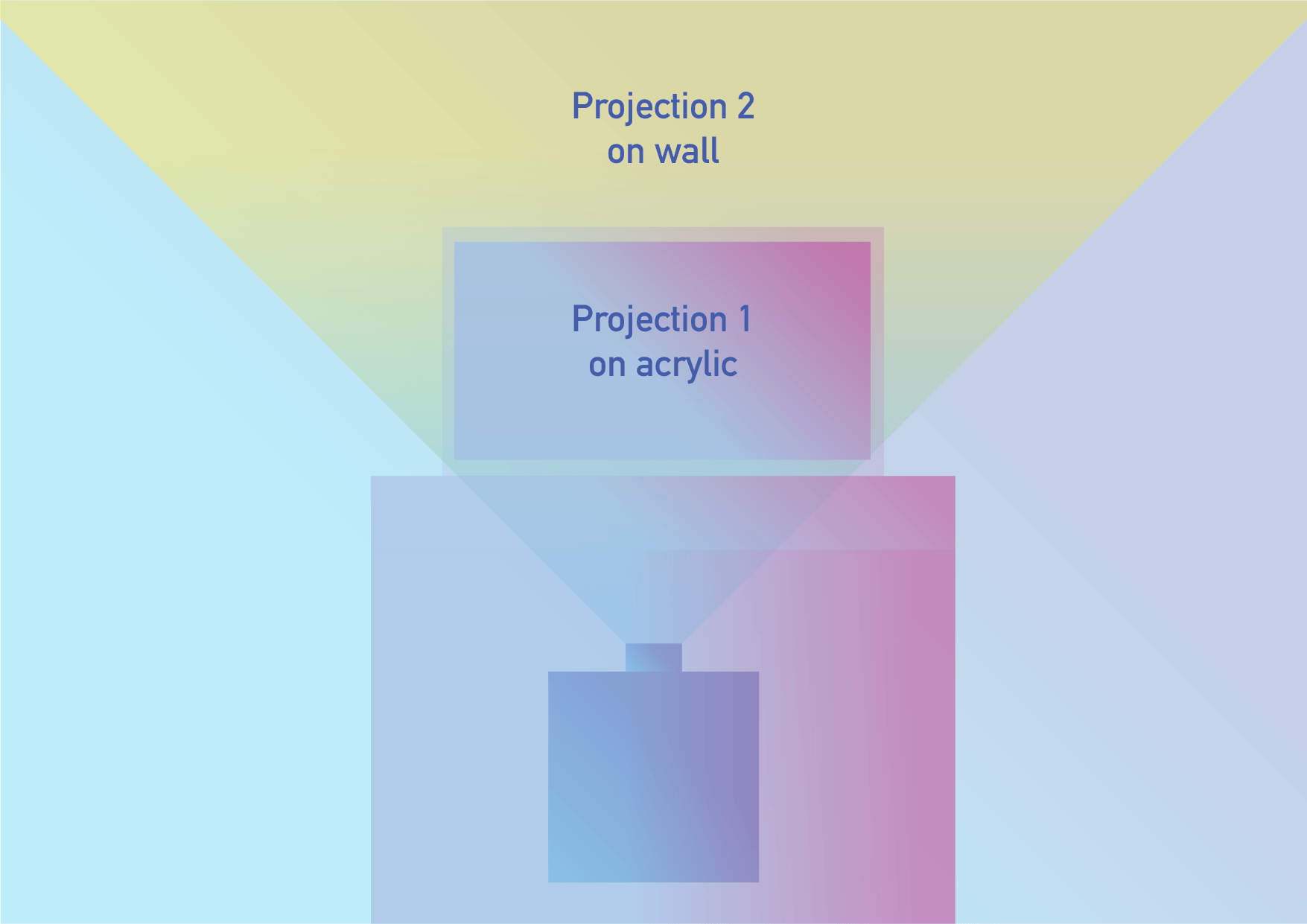
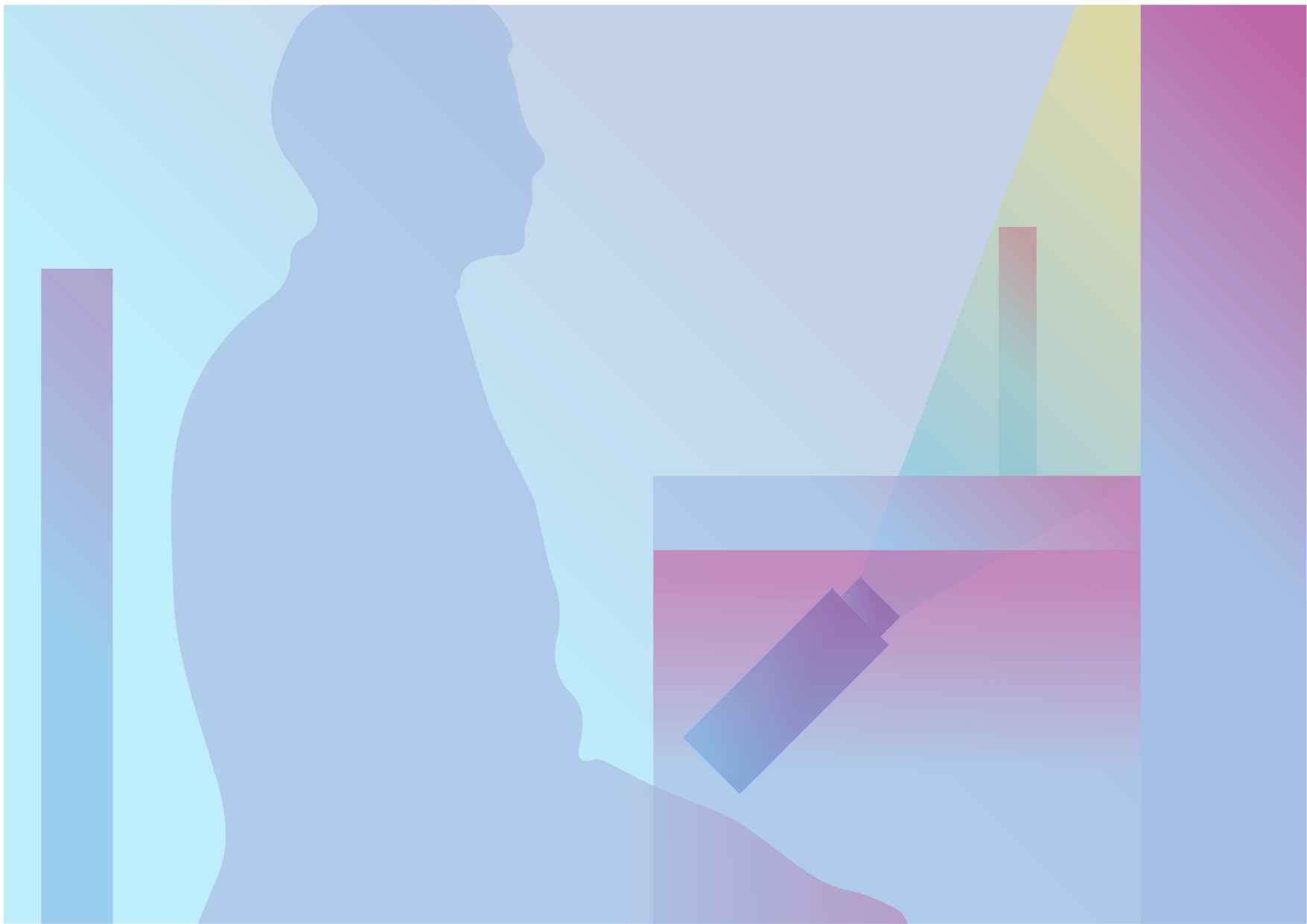
VPT8 for projection mapping
Other things I wrote last time:
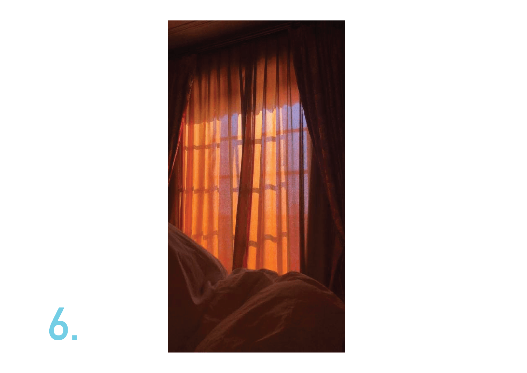
“Doesnt demand too much of one’s curiosity, but has a life of its own. It is alive on its own, unpredictable in its way of life, but is predictable in the larger scale, making it useful staying in our peripheral vision, undistracting.”
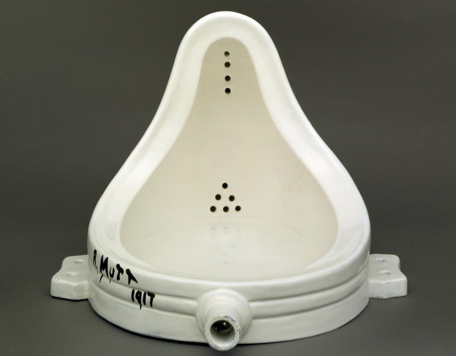
Neo Conceptualism happened between the 1980s to 1990s, which is the revival of Conceptualism of the 1960s to 1970s. The very idea of conceptualism stems far into the past, during the 1910s where Dadaism was formed. Dada founded the idea of conceptualism, through Marcel Duchamp’s “Fountain”. Displaying a found object in an art gallery for the first time, Duchamp broke the rules of art at that time, which are usually carefully made paintings to specifically fit a certain style. The Fountain is an actual urinal found in a men’s room, placed flatly down on the gallery stand to be turned into “art”. By taking the object out of context and switching of the orientation, Duchamp have transformed the meaning of a urinal into something else. The function of the urinal became something more conceptual: a mockery of art, and a stance on art being something that should be without rules. By doing so, Duchamp started Dadaism, which made use of seemingly nonsensical, meaningless, and provocative artworks to express their protest to bourgeois ideas of art as well as their discontent with the war at that time. This has influenced many more artists like Hannah Hoch to create more Dadaist artworks.
Fast forward, Dada influenced neo-conceptualism in some ways, as can be seen from John LeKay’s “Untitled” which features a wheelchair on top of a ladder. This is very similar to Duchamp’s “Bicycle Wheel” visually. The usage of readymades which started from Duchamp took off to show us new ways that art can be represented. While both artworks are conceptually different, the idea of Dadaism stuck.
The most direct influence was Conceptualism. The whole idea of conceptualism was to question the concept of art-making. When thinking about conceptualist artworks, we must remember how art used to be like in order to contextualise the reasonings behind conceptual art. The Young British Artists are a group of British artists who exhibited together in 1992 that drove Neo Conceptualism to where it is today. They influenced the movement greatly through their branding which is easily recognised worldwide. Members of the YBA includes Damien Hirst and Tracey Emin. Due to the openness of their usage of materials, they can easily create sensationalised artworks that challenges our ideas of what art is supposed to mean. By doing so, the artists are able to create artworks that have provocative characteristics like in Dada, shocking audiences to a larger extend that is better than what a painting or sculpture can do. This can be seen from “The Physical Impossibility of Death in the Mind of Someone Living”, an artwork by Damien Hirst. The artwork is an actual dead shark, preserved by formaldehyde, stored in a tank. The concept behind this artwork is that death is something that we cannot imagine. We cannot imagine how it is like to be dead, like the dead shark. At the same time, we cannot imagine ourselves to be dead, due to the shark’s powerlessness, despite its fearsomeness when it is still alive. The artwork has everything that makes a conceptual art great — Interesting mediums, extraordinary concept, and really shocking imagery. Despite the cost and criticism, we cannot help but to admire both the grandeur of such an artwork, as well as really contemplate on the whole meaning of the artwork. The art is also able to fully express itself now that the medium is open to not just sculptures and paintings. Other than that, the artwork also provoke questions about the real meaning of art. Should art be about the idea or the object itself? Should mediums like these be acceptable as “art”? Therefore, conceptual art have fulfilled its goals to completely challenge the way we see art.
We can see the evolution on the ideas of what a conceptual artwork should be, from Duchamp’s Dadaist “Fountain” to Hirst’s “The Physical Impossibility of Death in the Mind of Someone Living”. Neo Conceptualists continue to experiment on different mediums, extending into performances, photography, and even more. Neo Conceptualism seems to be an expansion of Conceptualism, which gave rise to what we know as Contemporary Art today.
I would like to offer another perspective towards Contemporary Artworks. Perhaps, the idea of creating such works would also be a testing of what works and what does not, in the context of art. Surely, the freedom for artists to do whatever they want as long as they have an idea is a double-edged sword. Artists can be easily criticised as like creating their concepts and artworks. However, criticism and questioning could be the next driving force artists need in order to evolve. We can think of such artworks as a bridge that links the old, rigid, and traditional ways towards a greater future of art itself. Through this experimentation, art can evolve to something that is perhaps more free, yet elegant at the same time. We live in a time of transition and that is something that we should not take for granted.
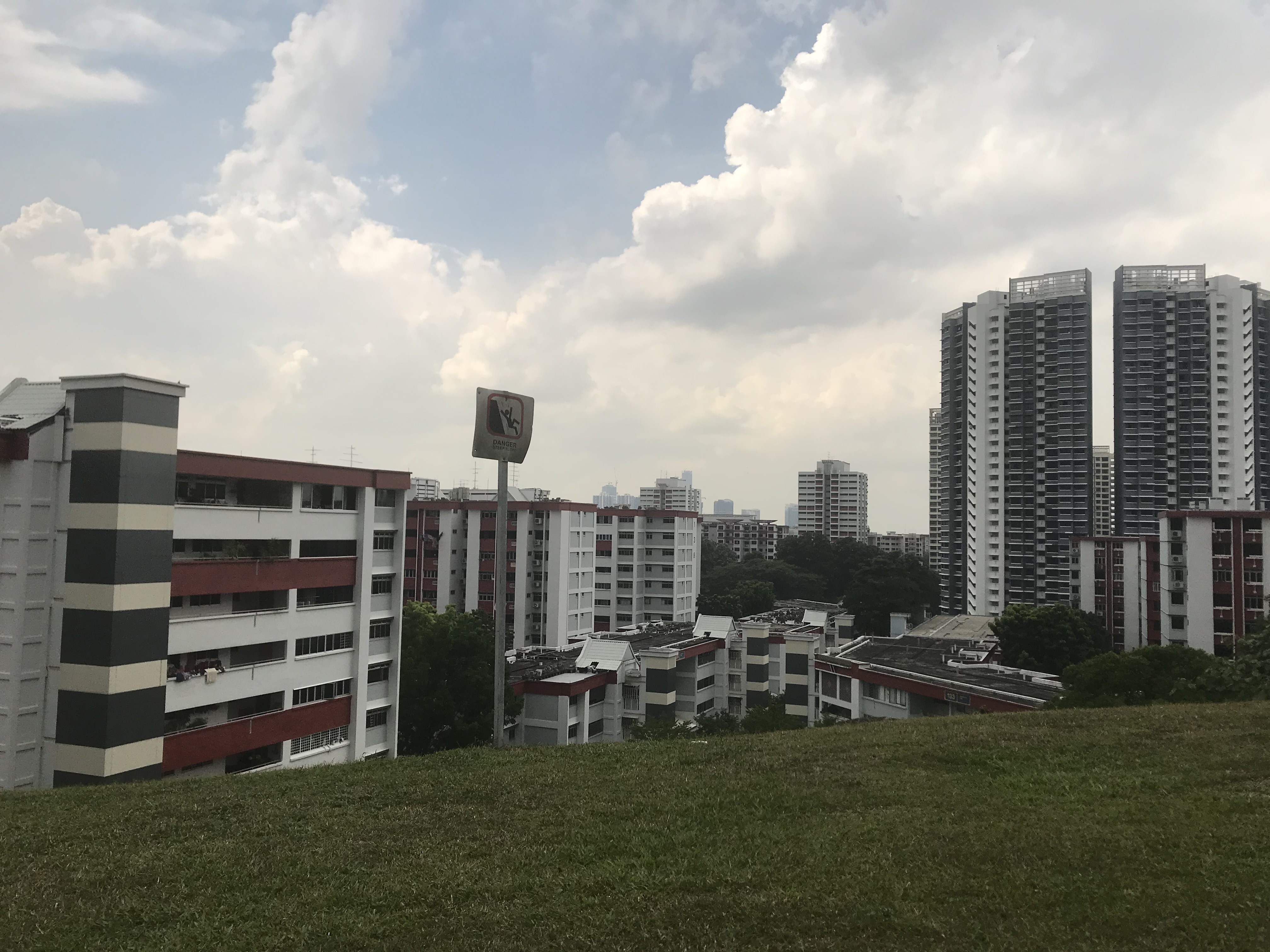
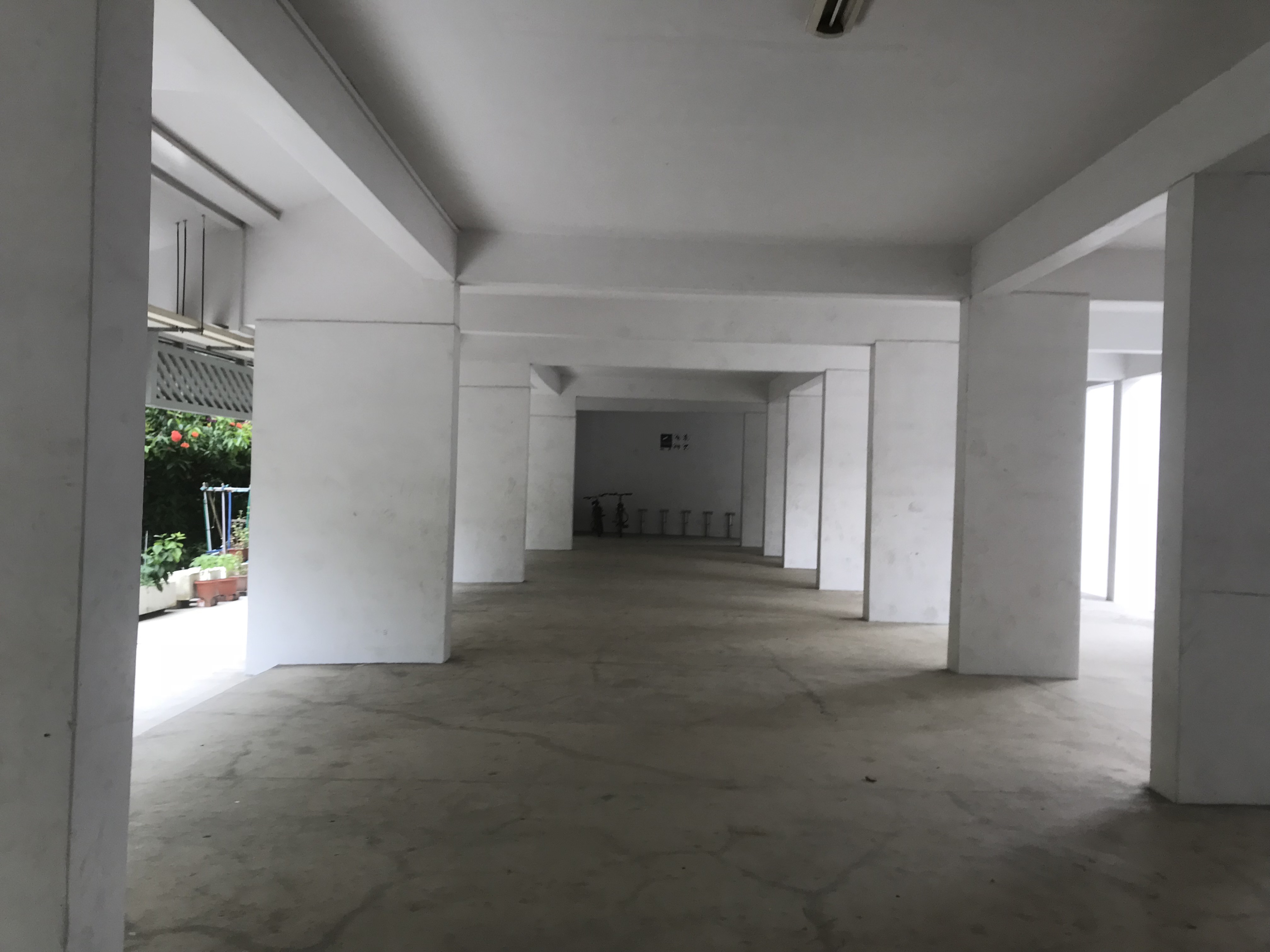
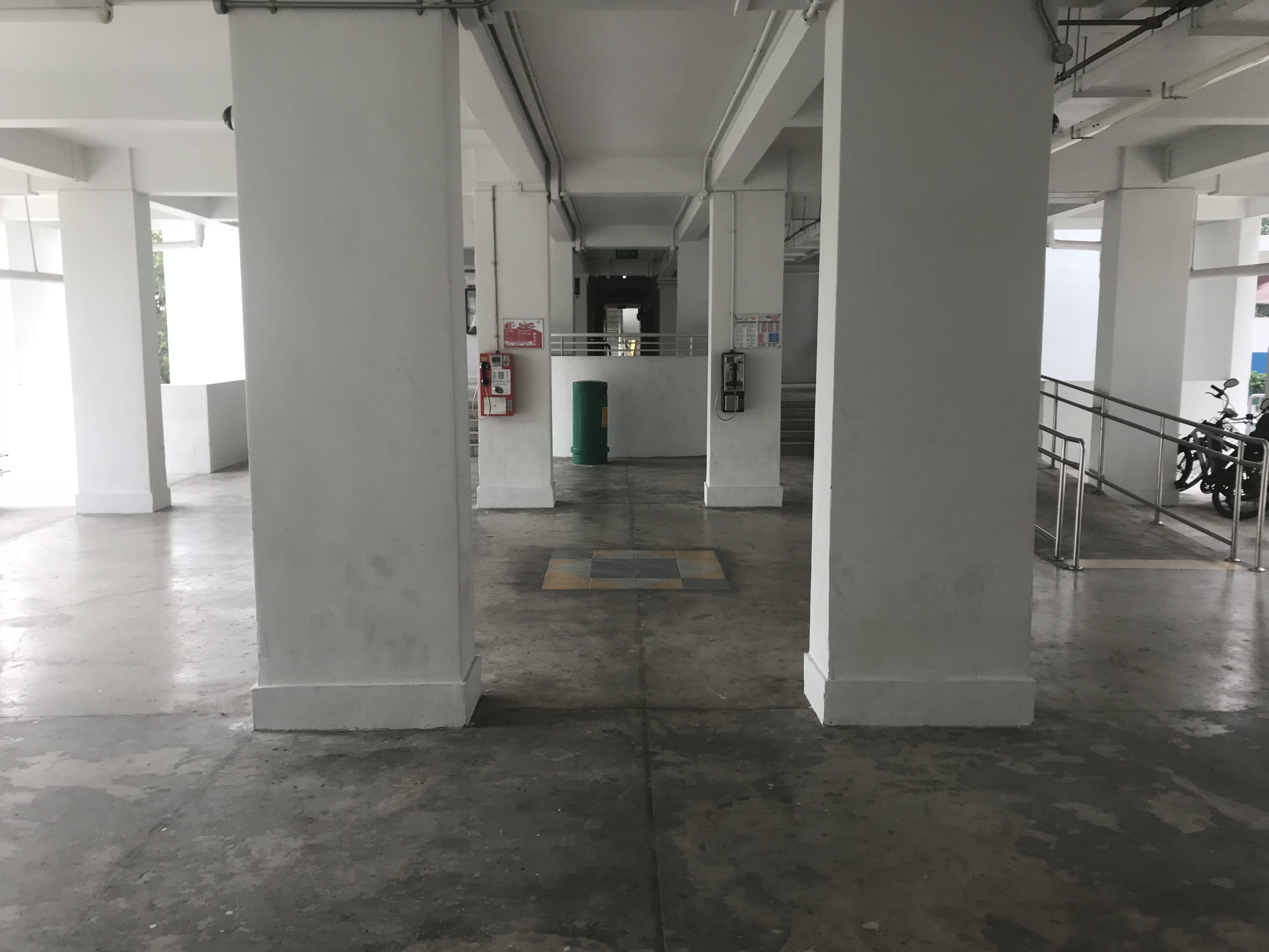
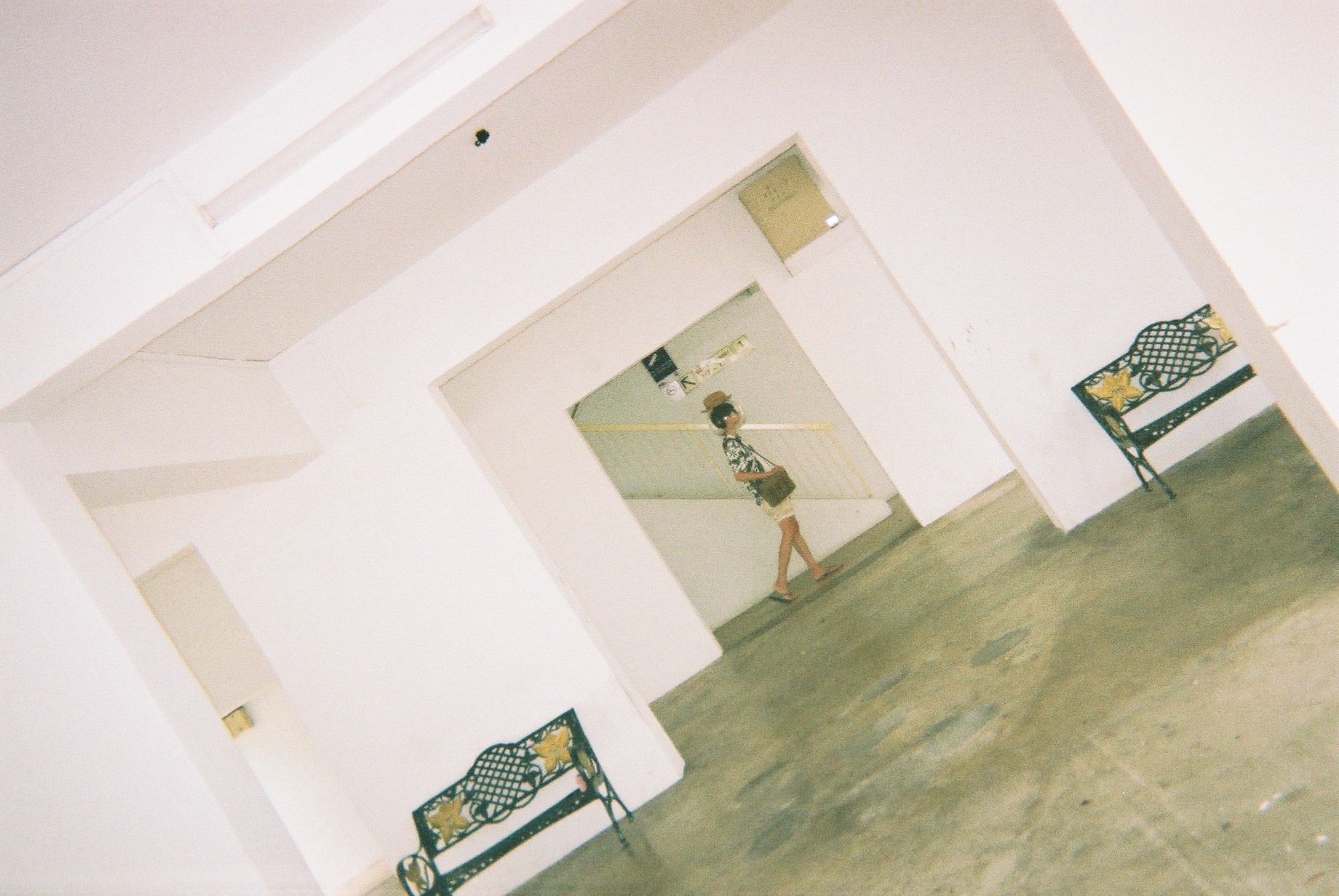
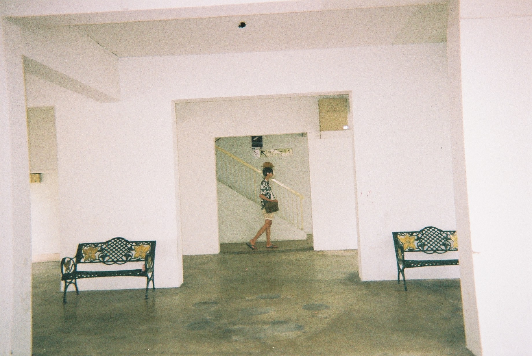
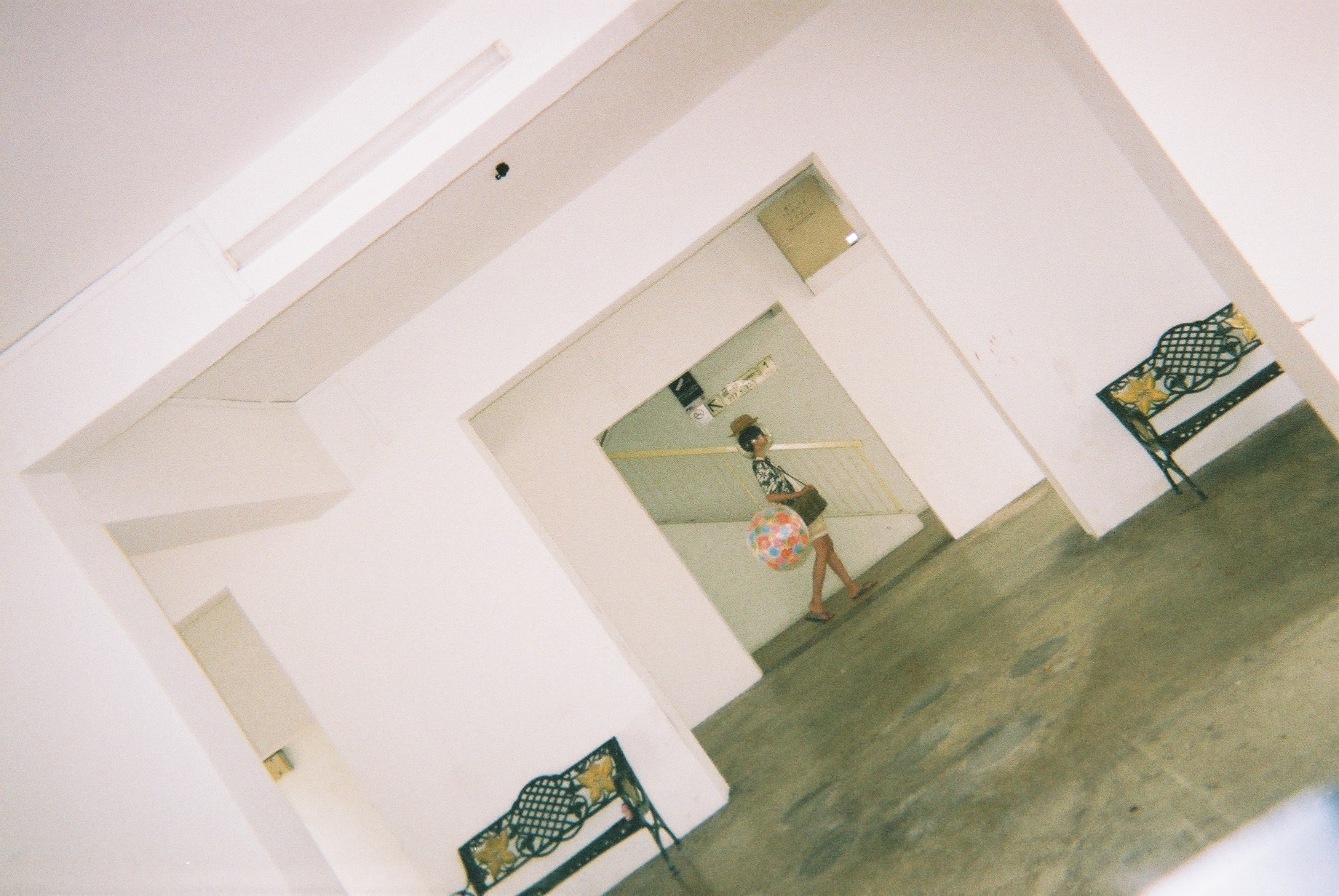
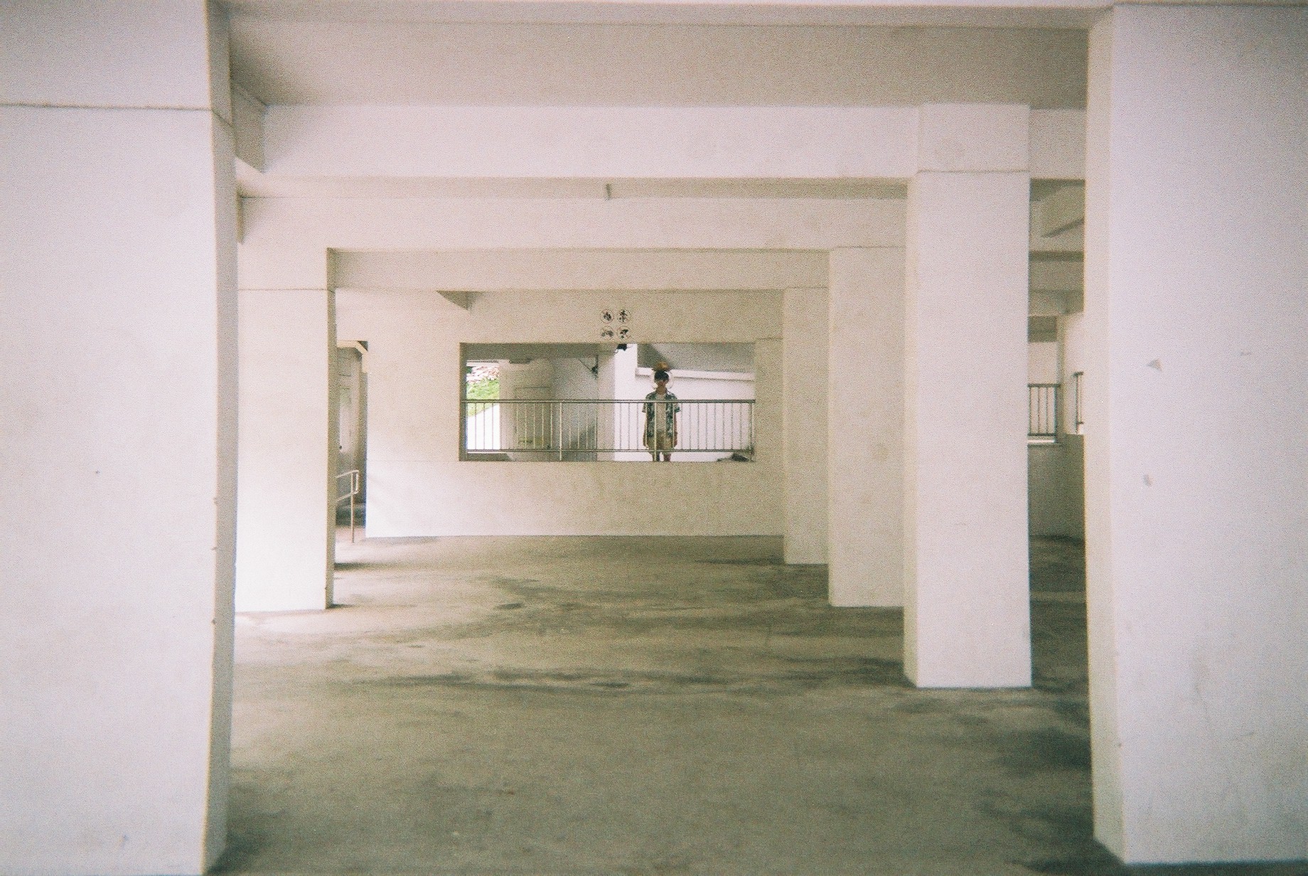
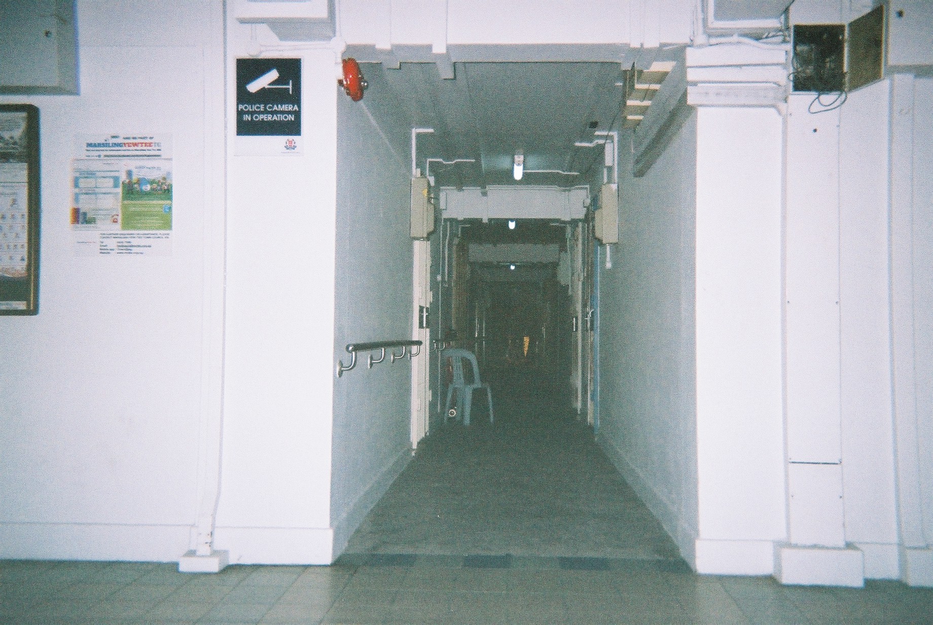
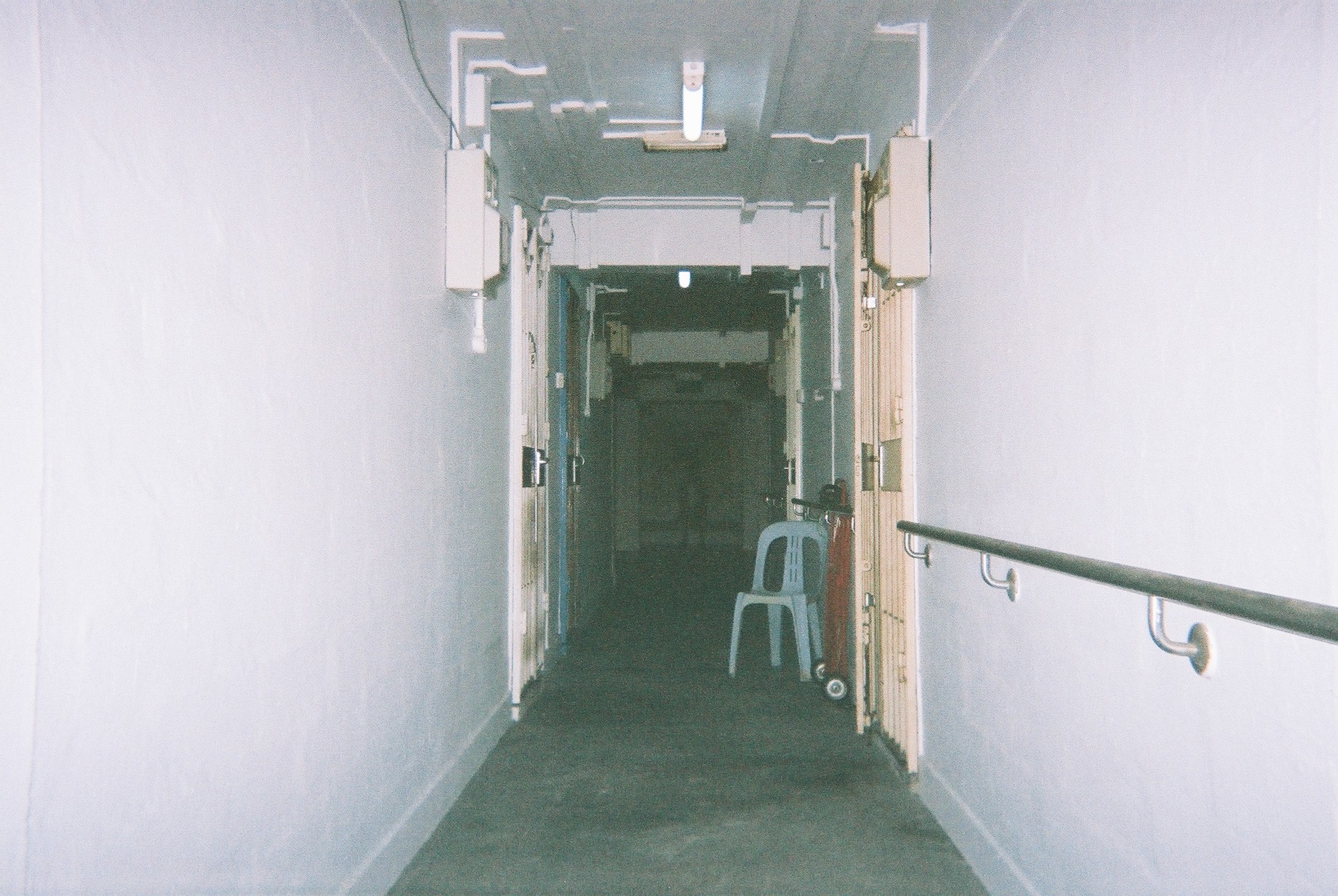
After the 17th March visit to Marsiling, I decided to revisit it to plan my shoot. Here are the few selected locations:
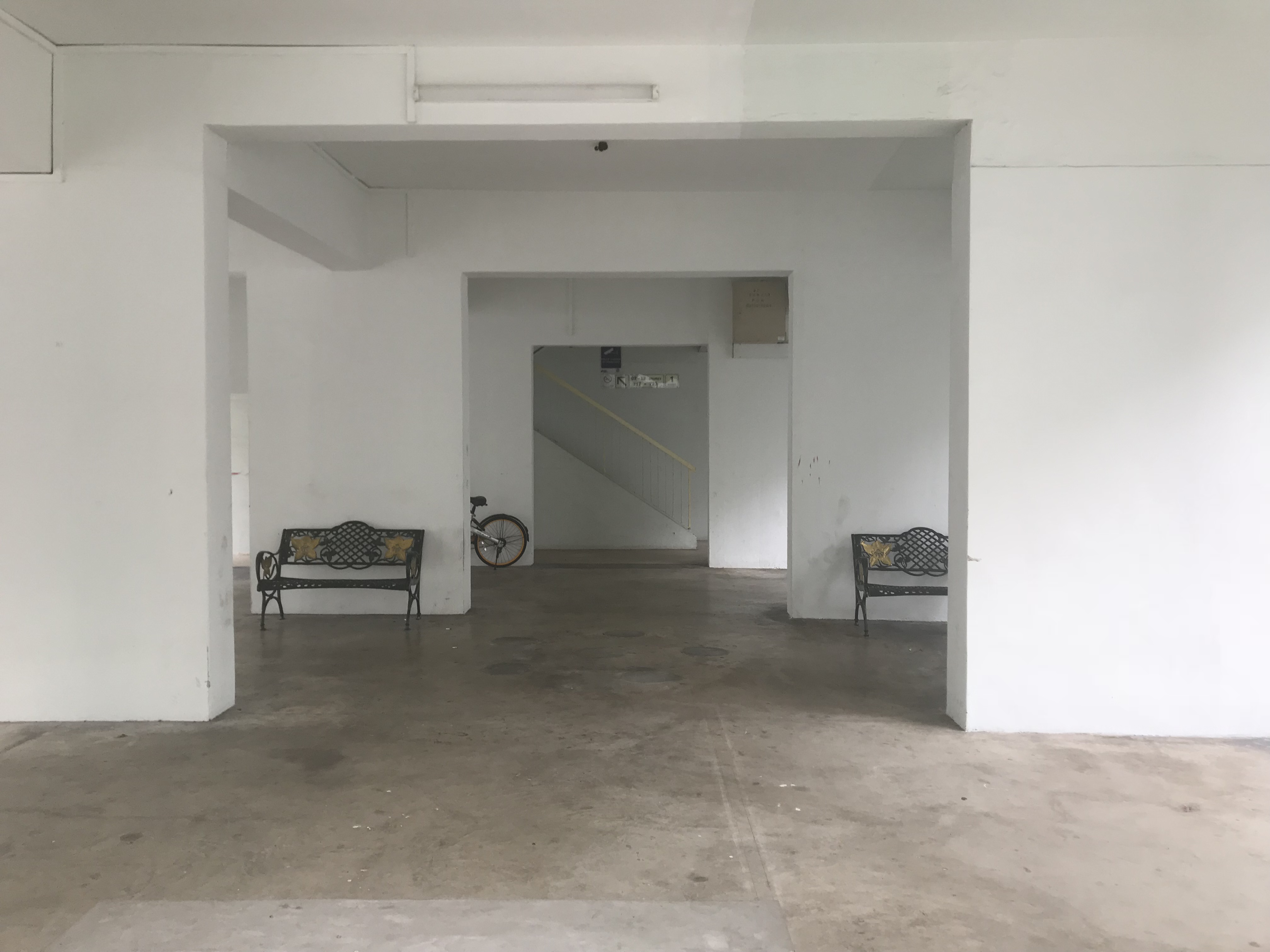
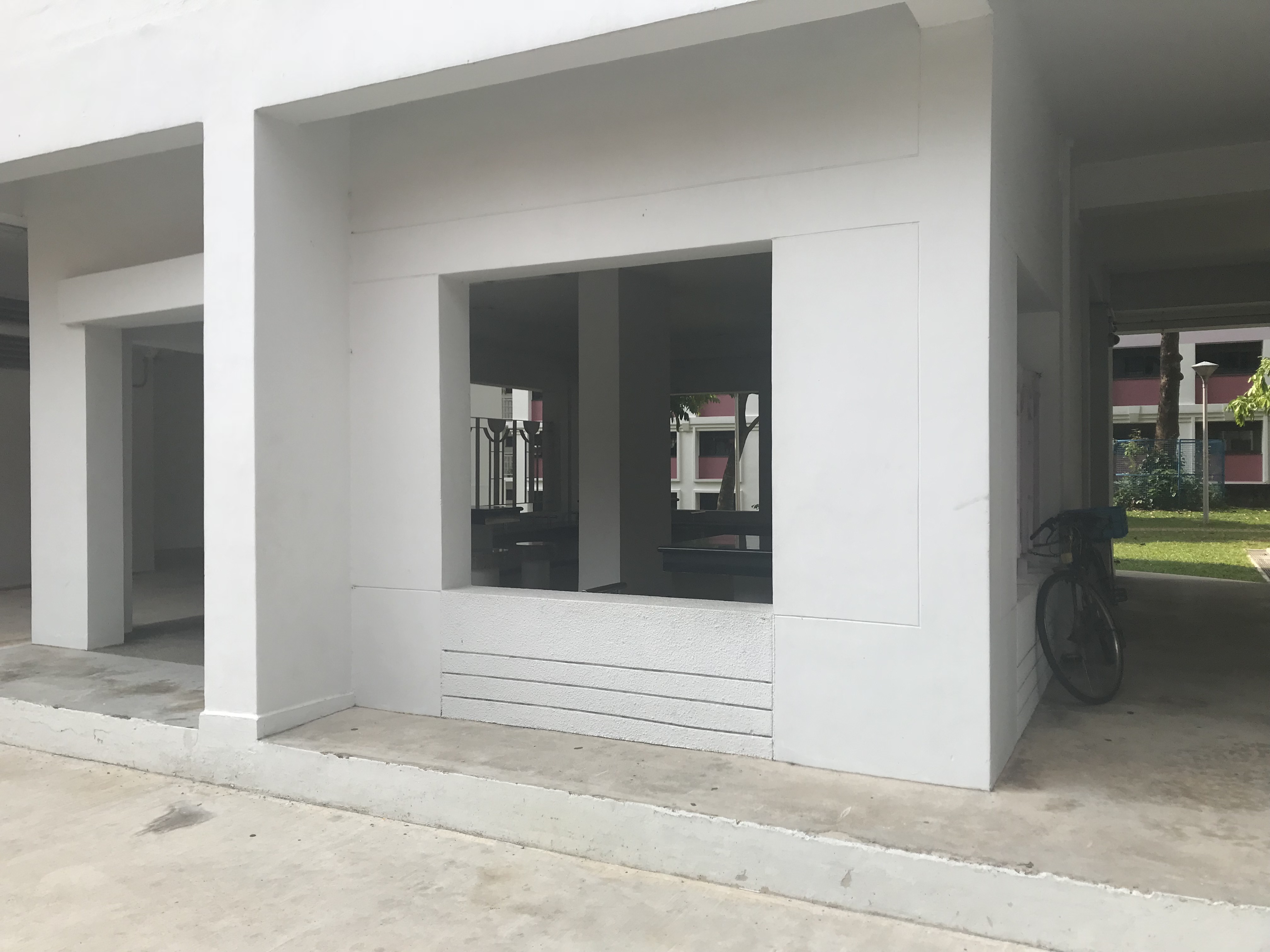
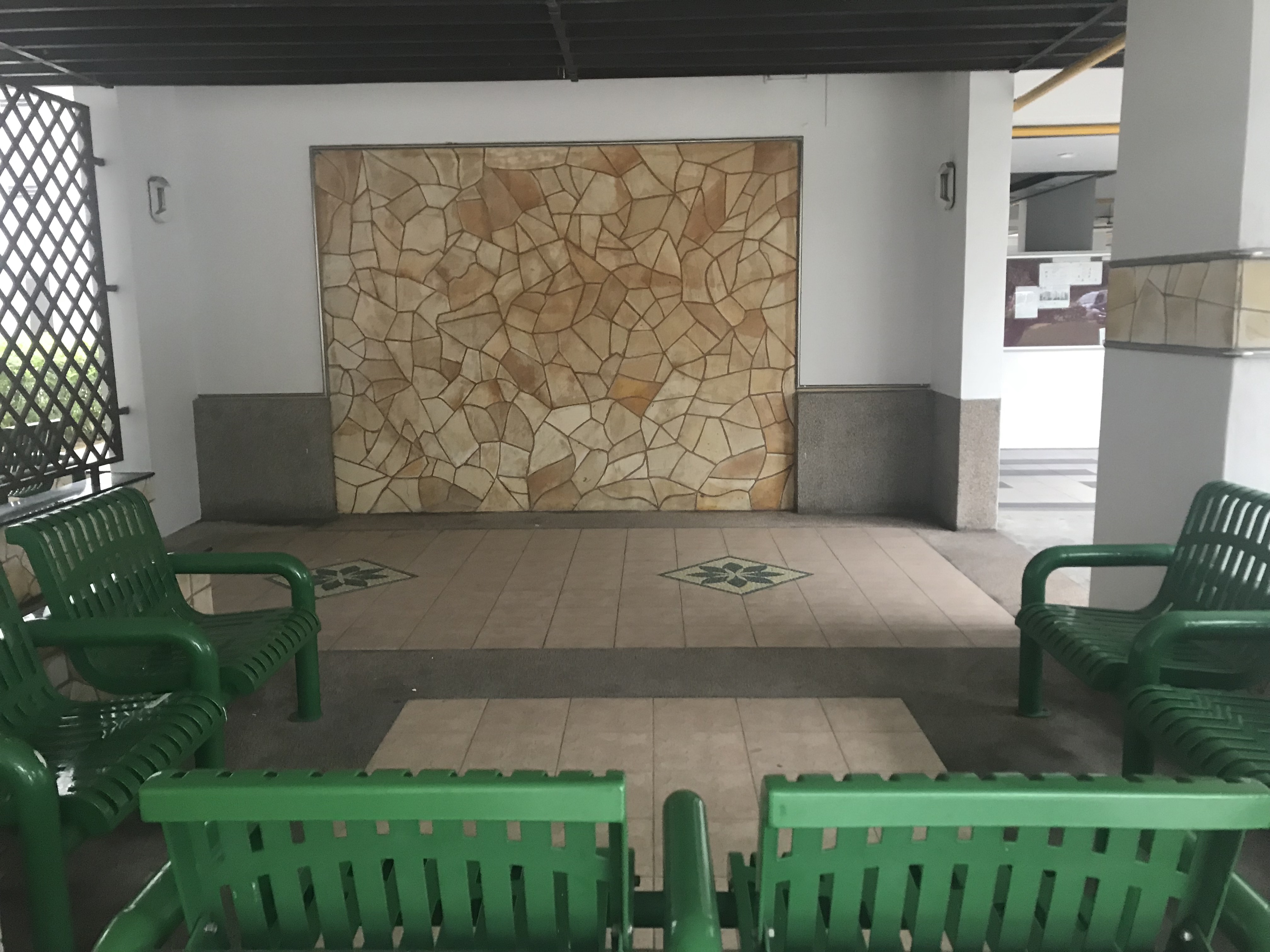
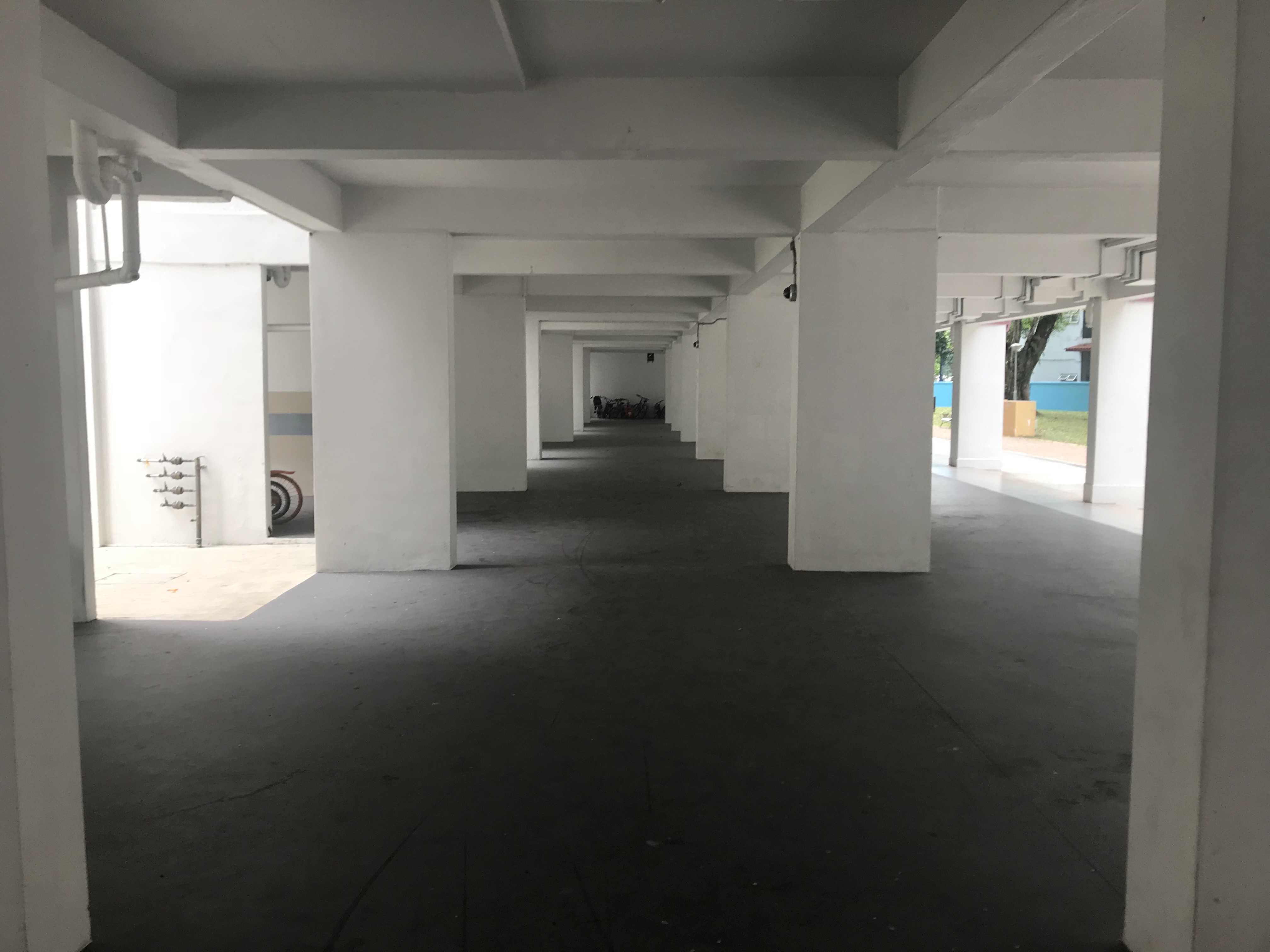
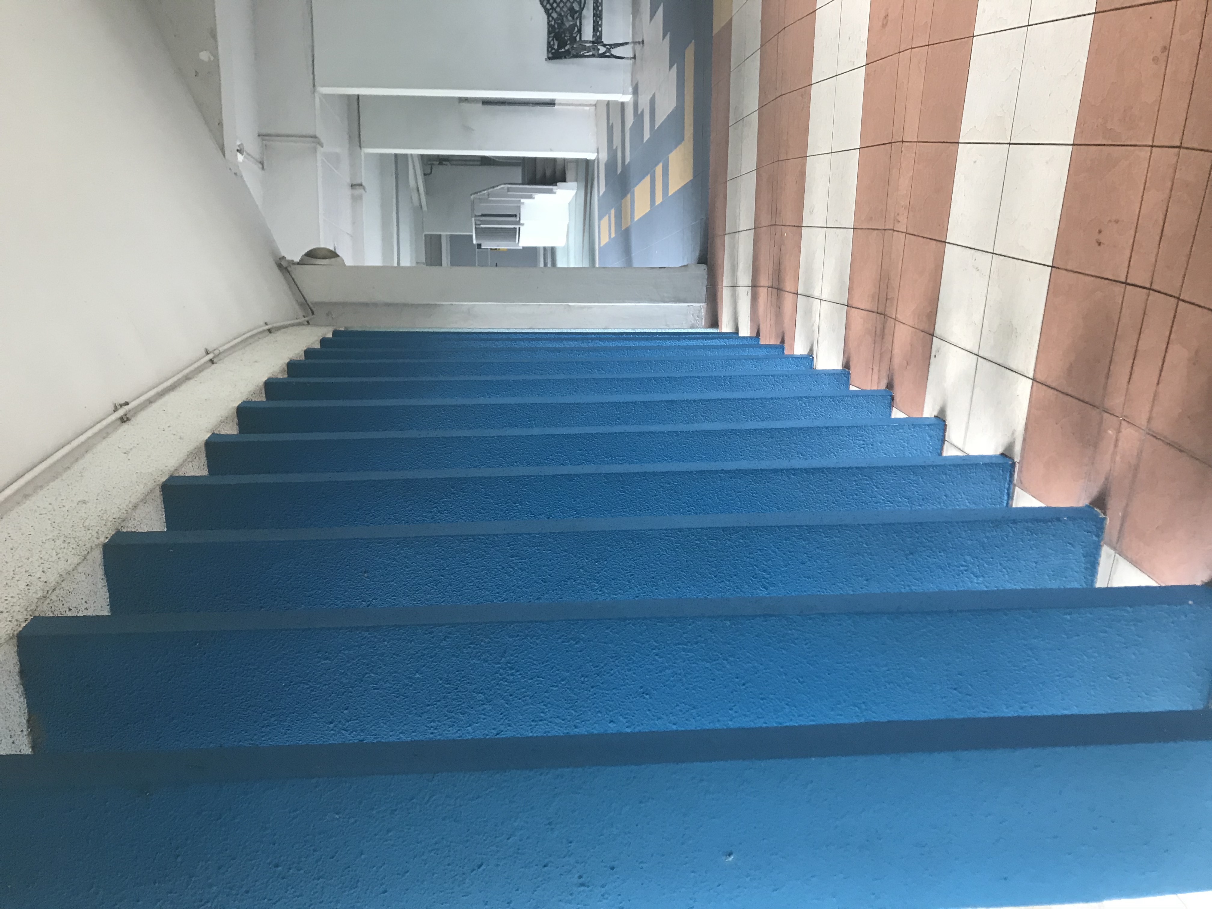
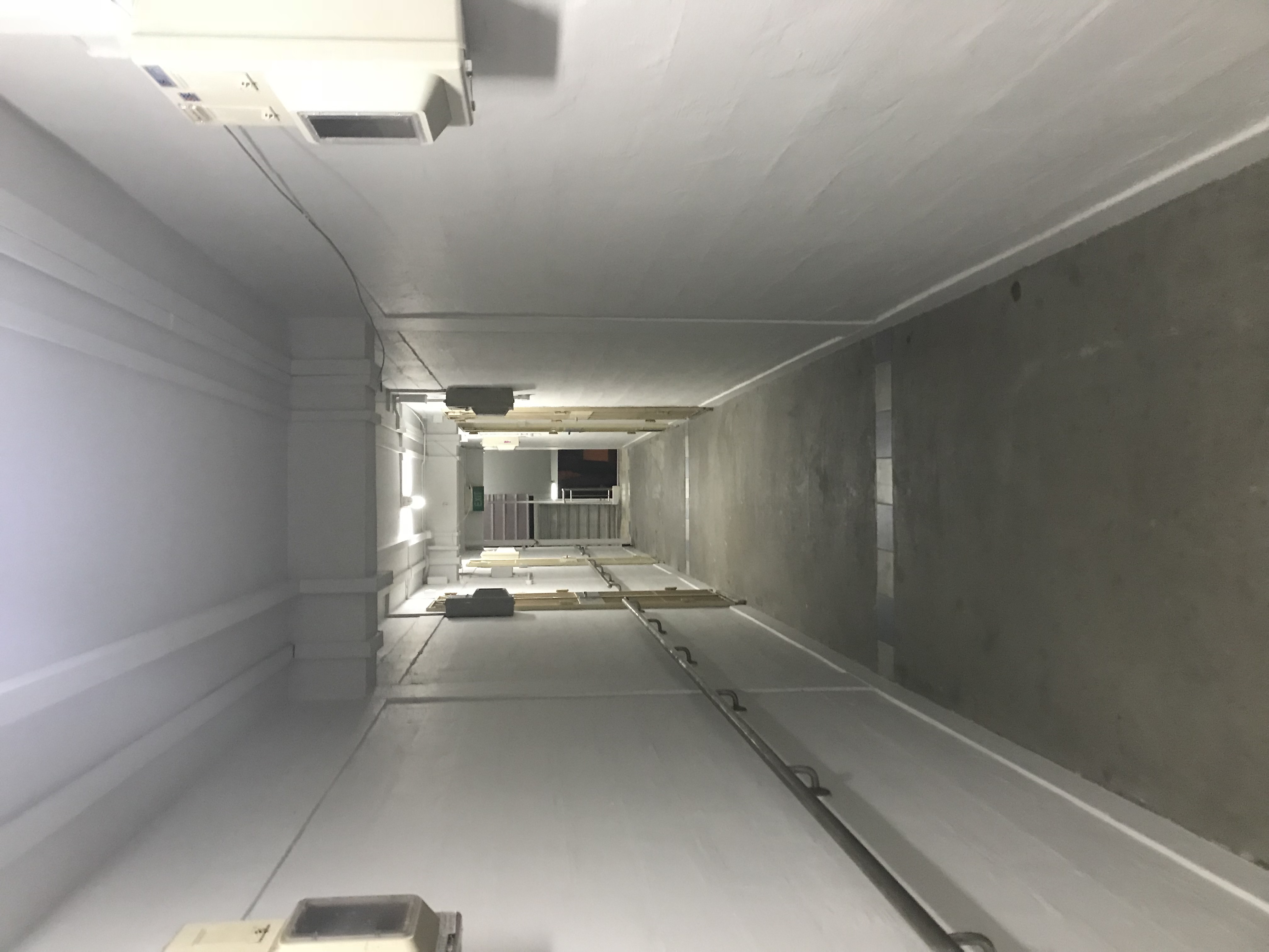
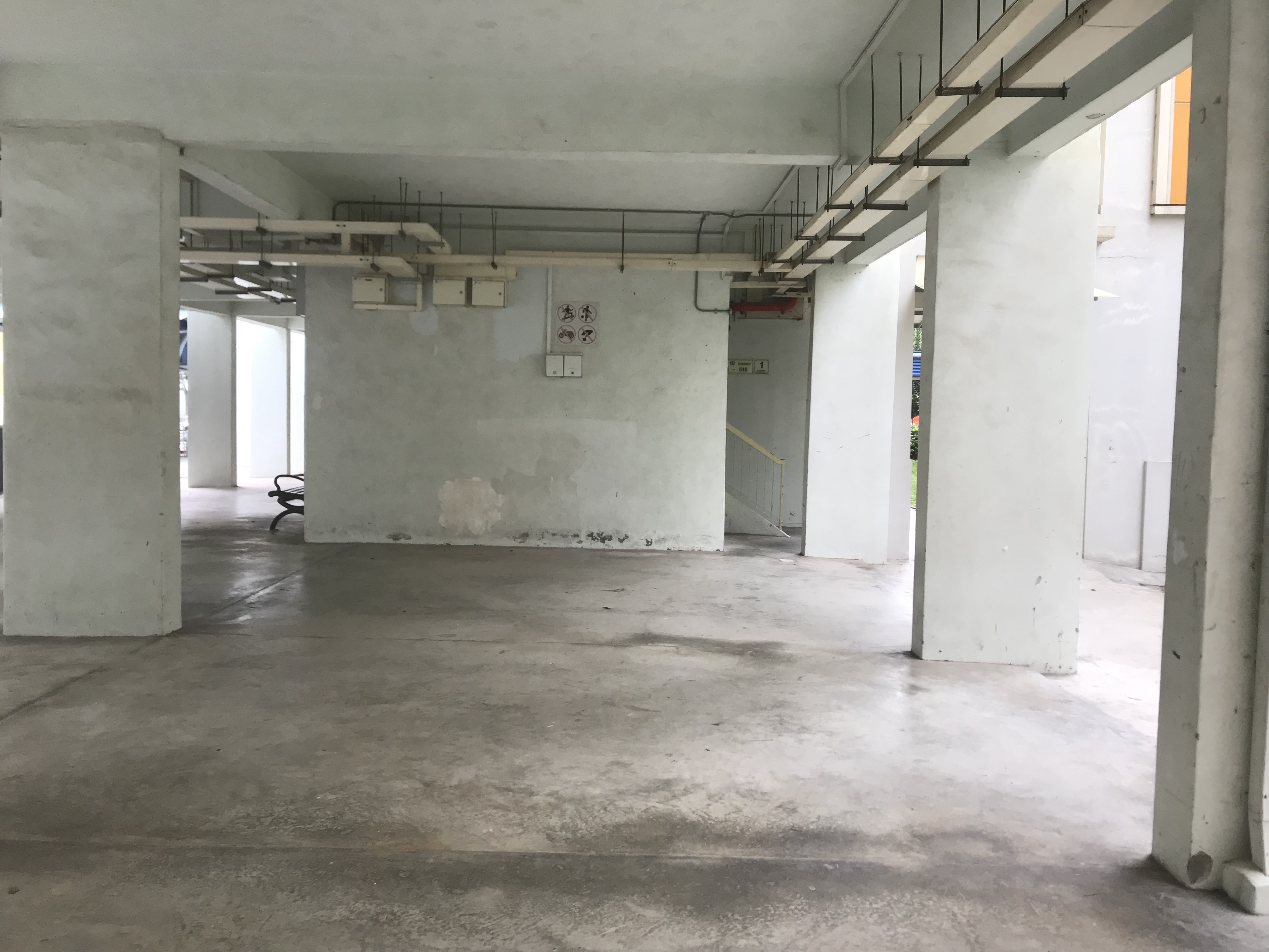
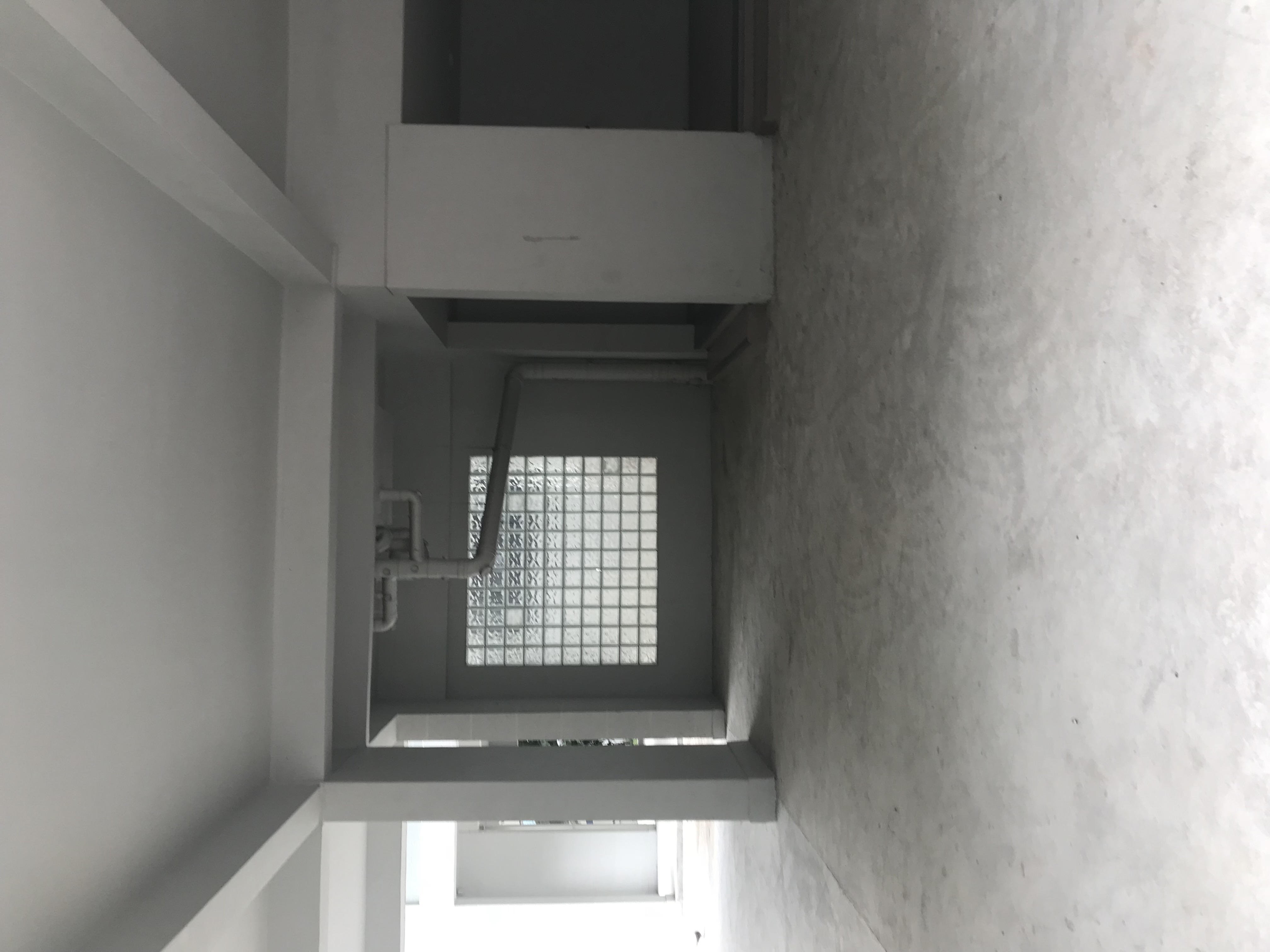
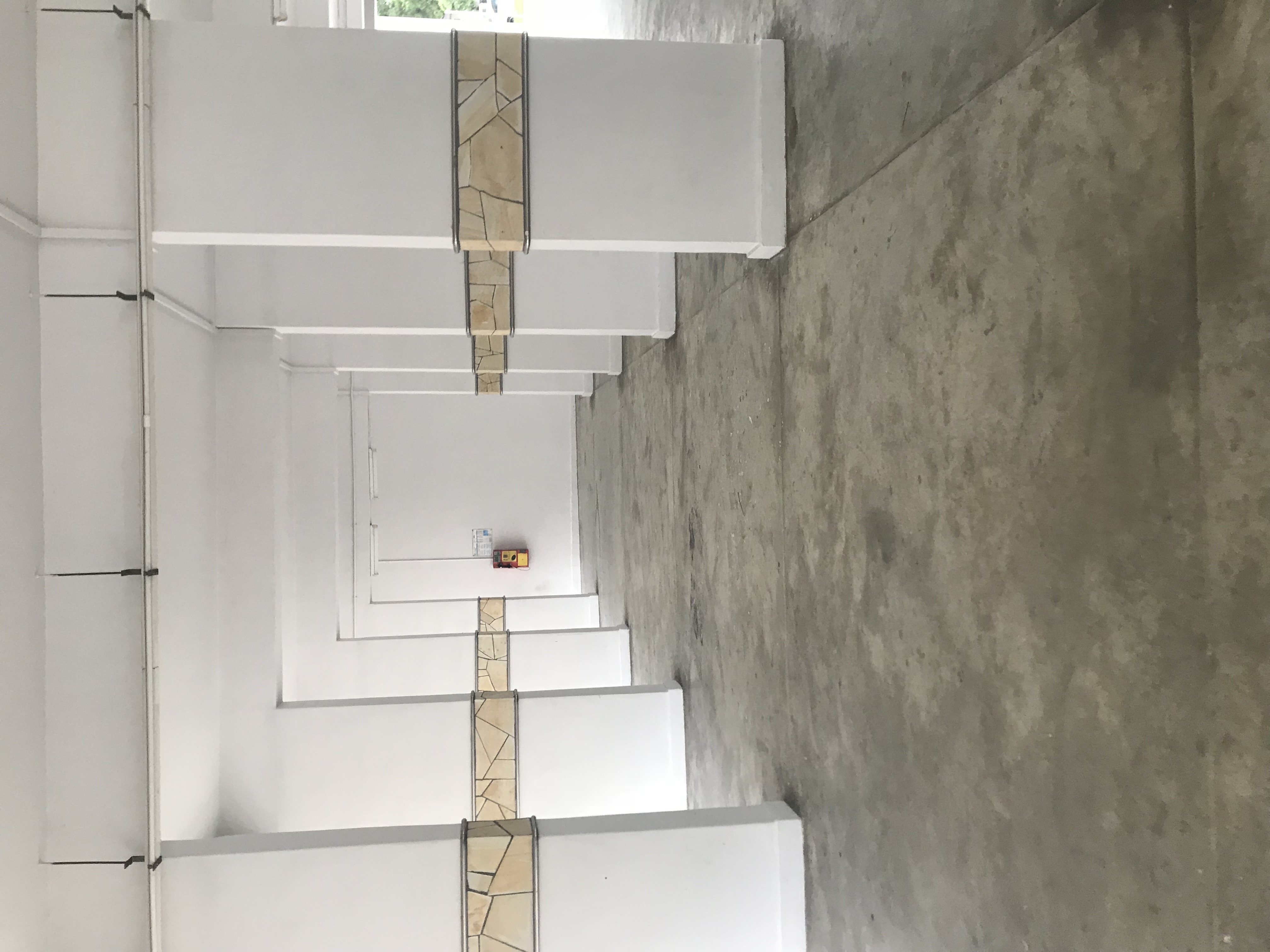
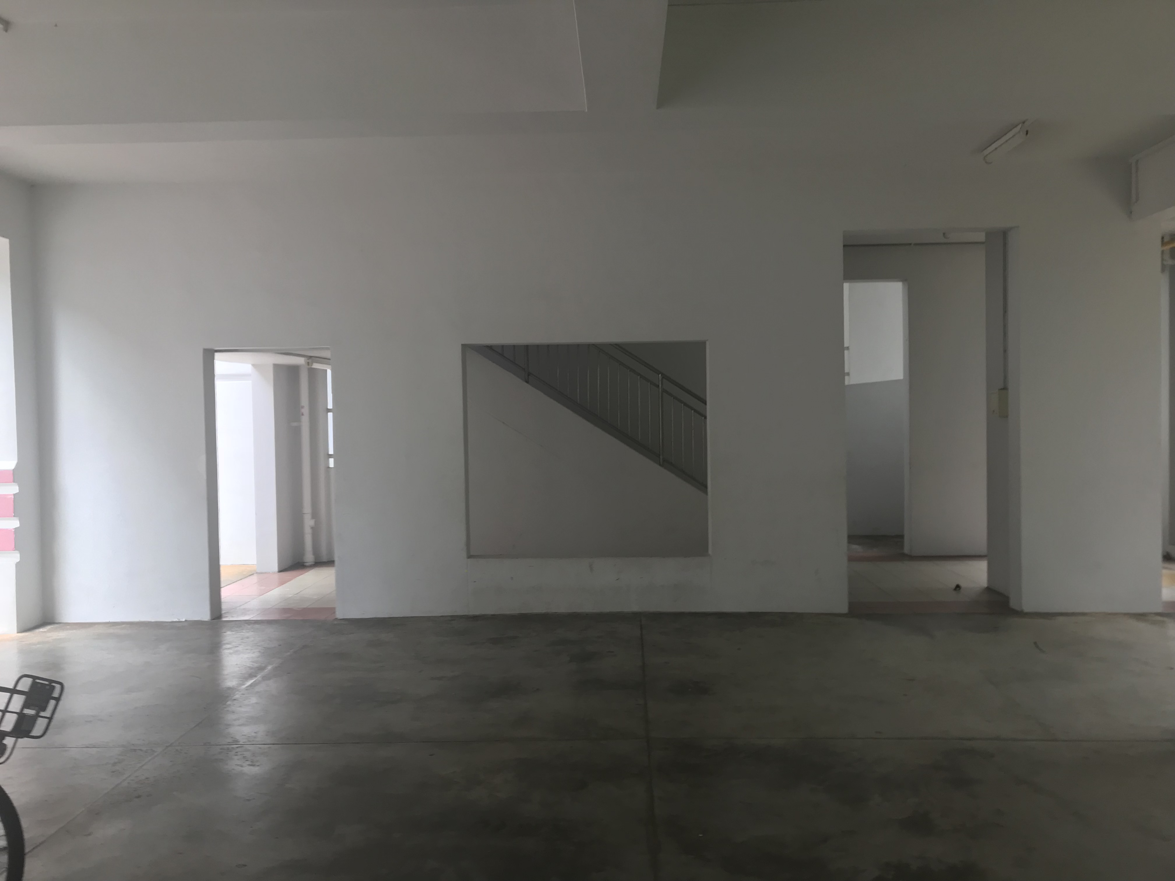
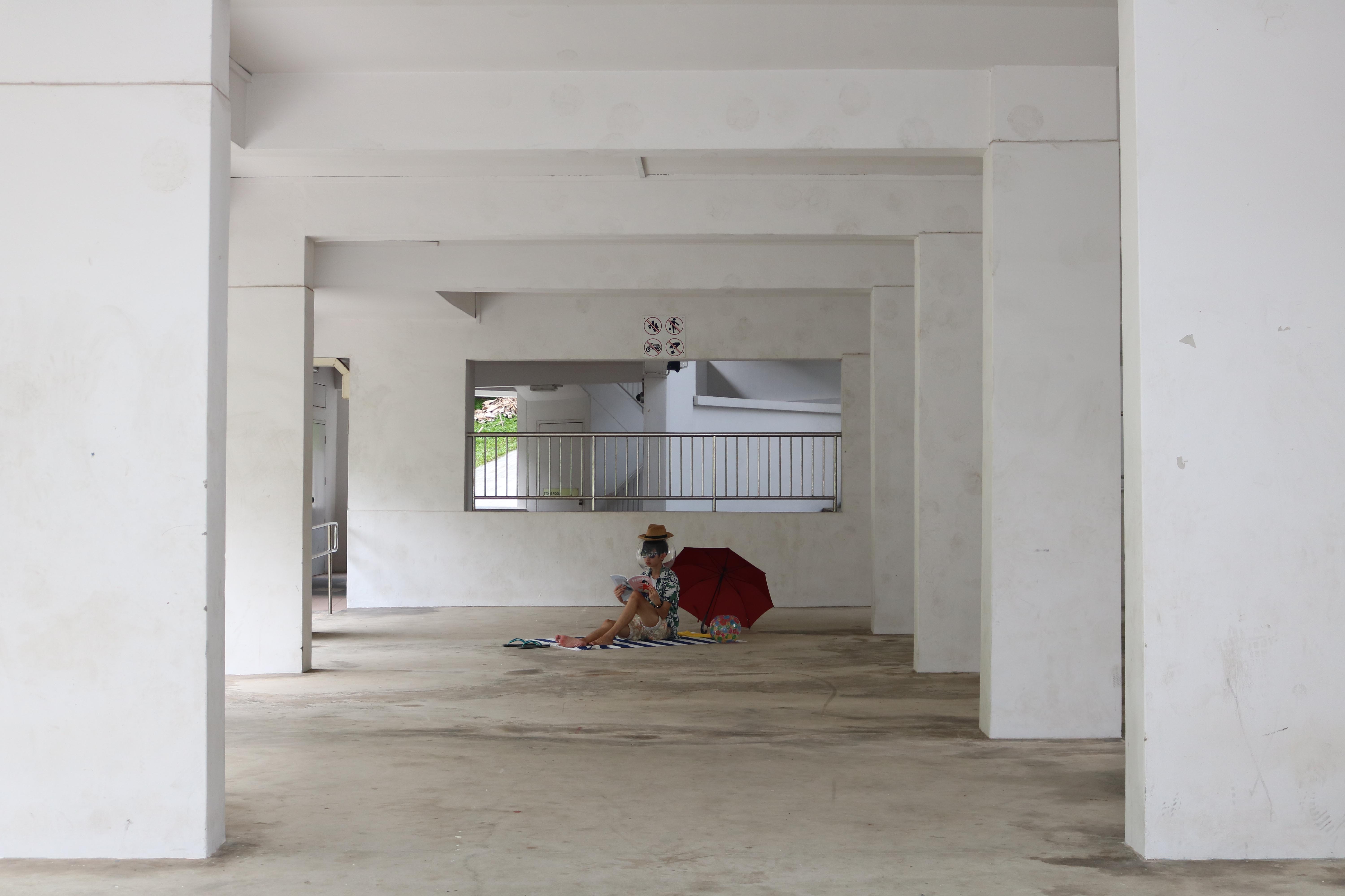
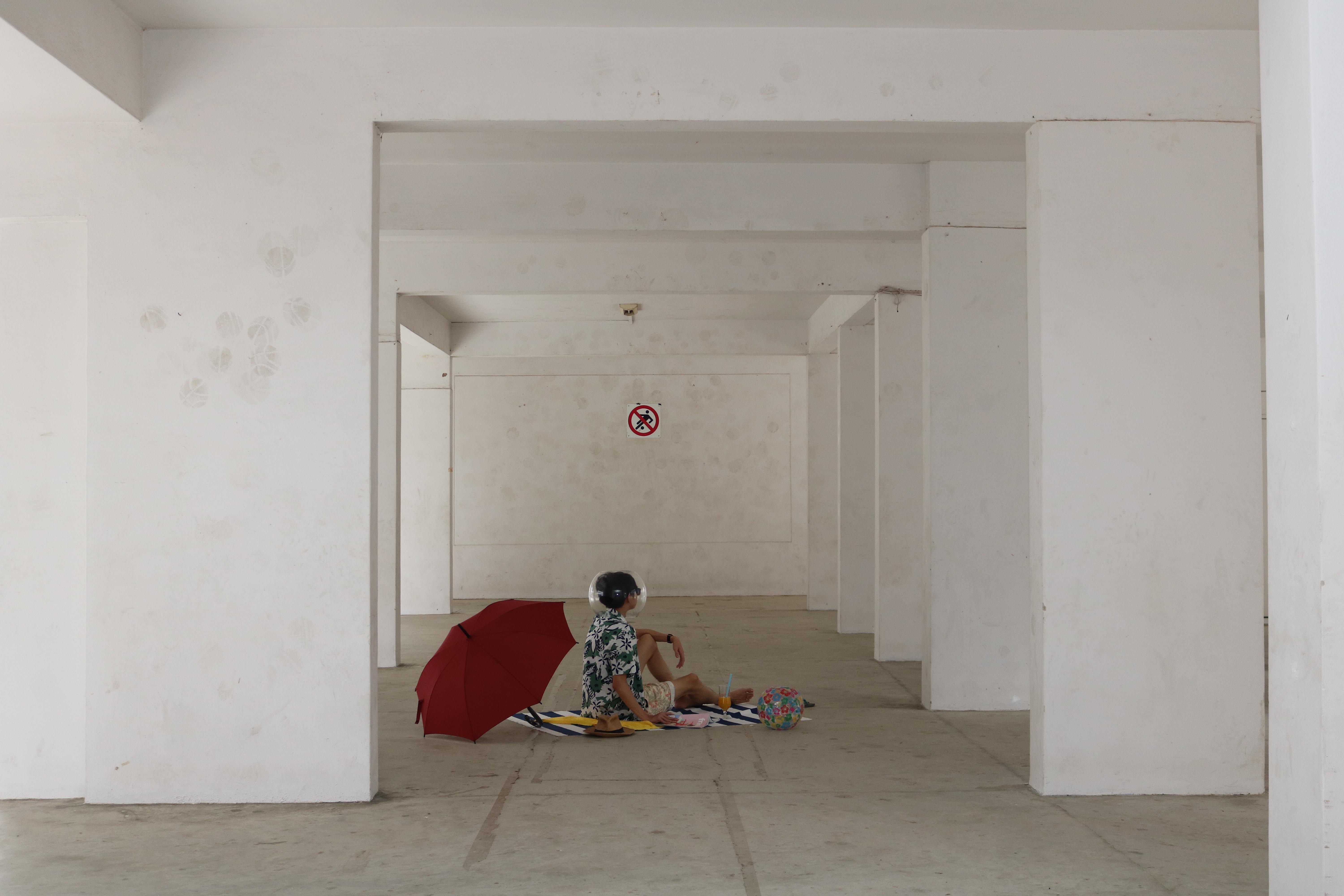
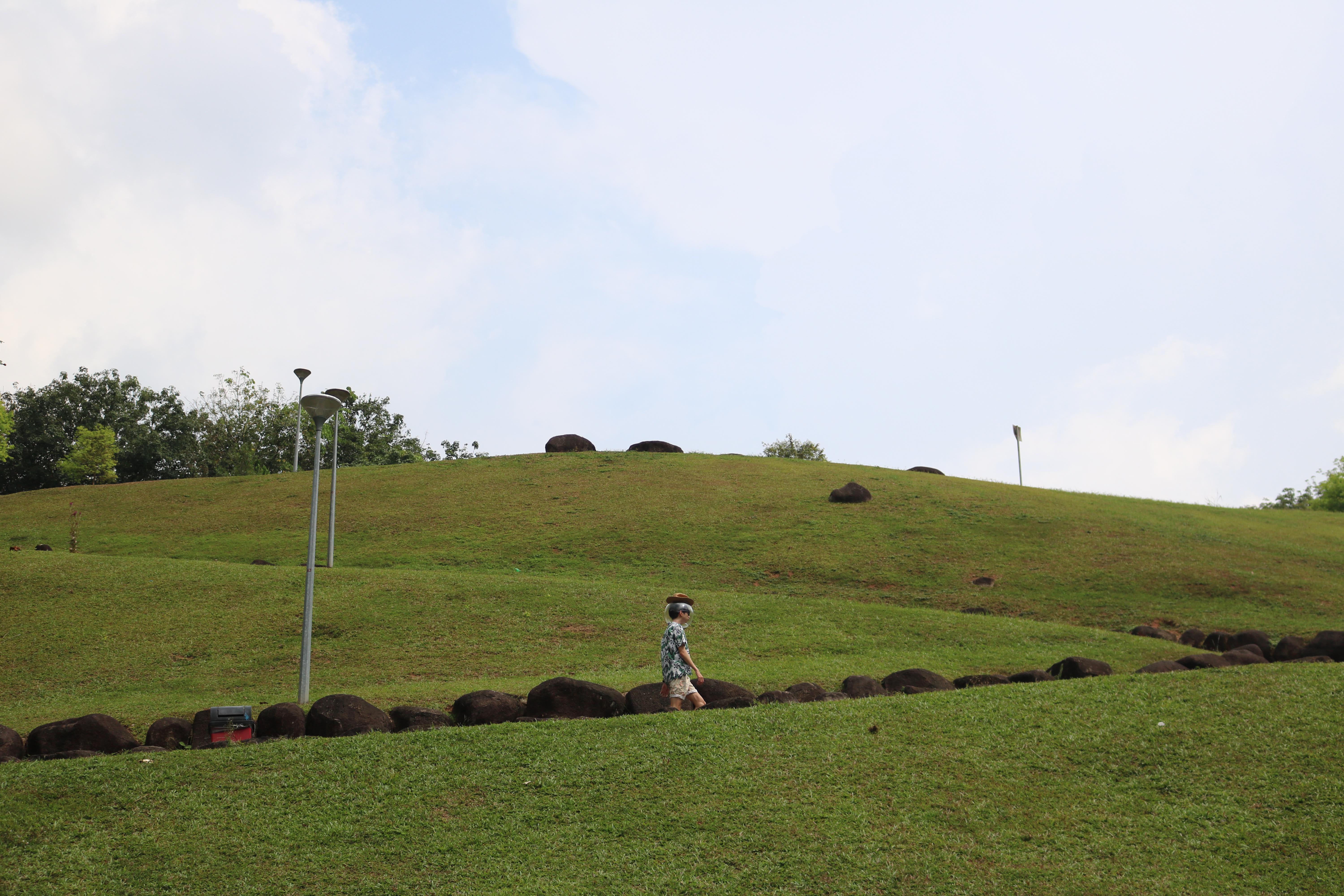
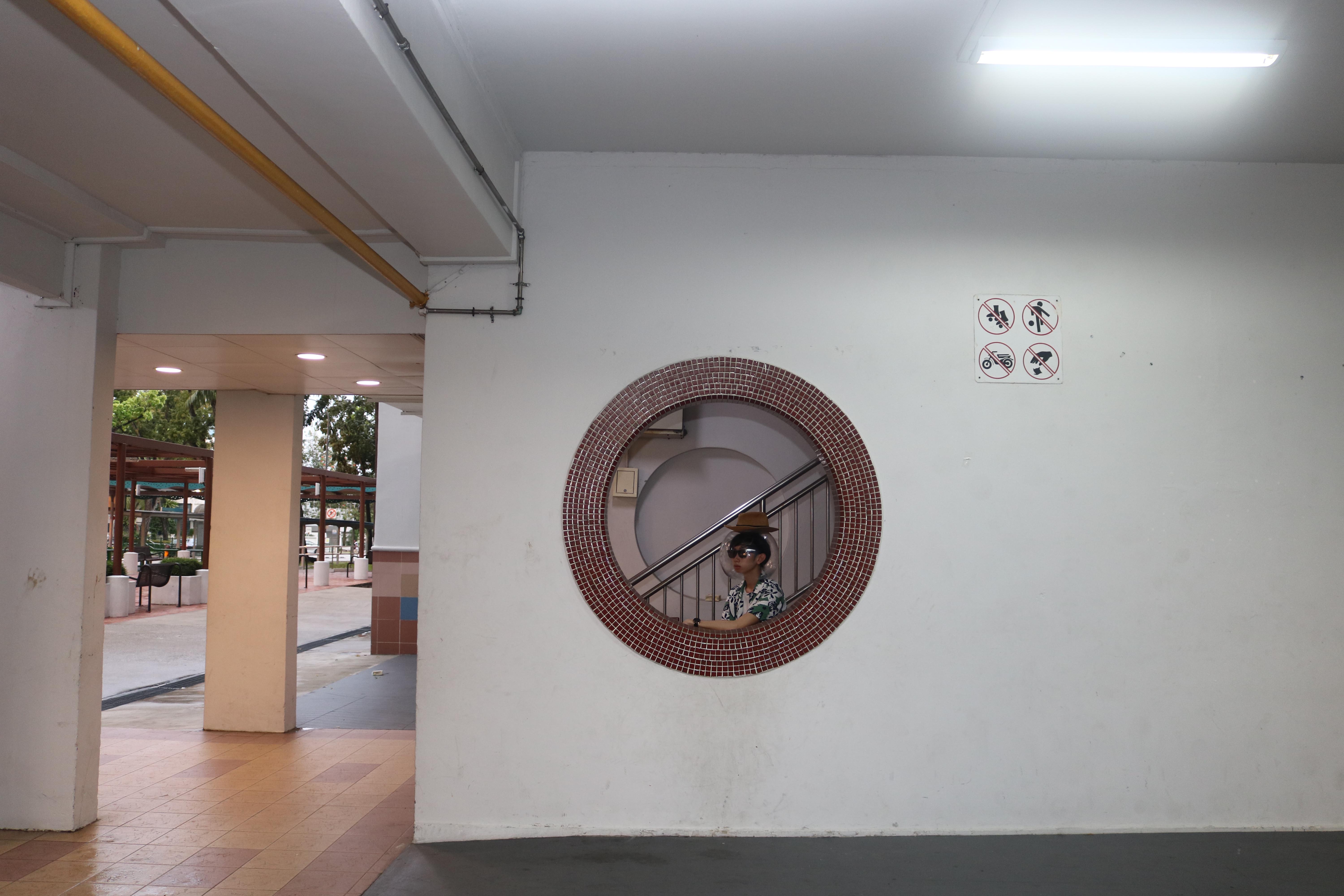
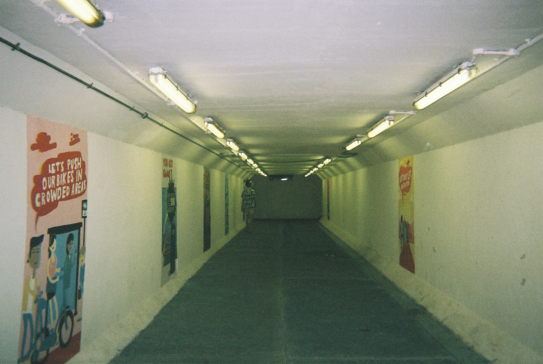
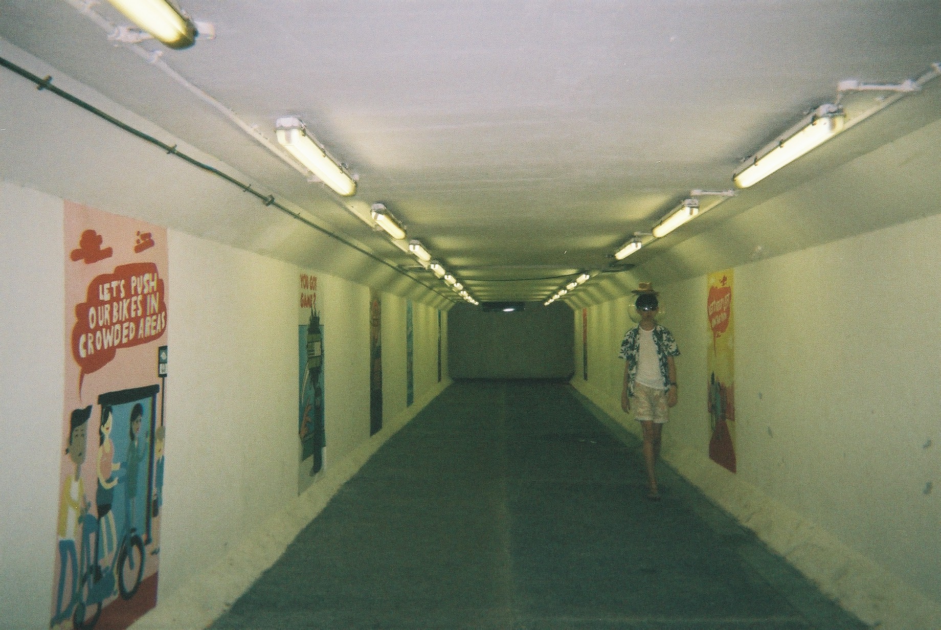
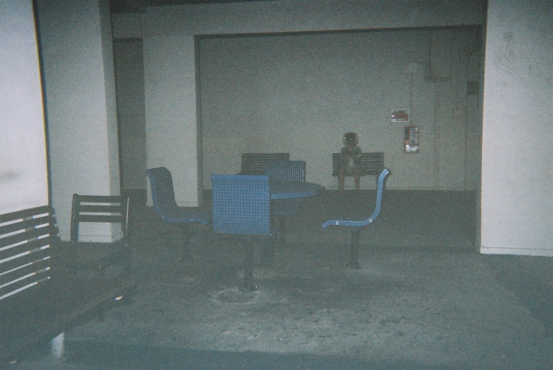
Around Blk 177 areaUnderpass near Blk 24Blk 158 – nice compositionSomewhere near Blk 142Blk 5ASomewhere near Blk 211Blk 9 I thinkMarsiling HillBlk 132 – SpaciousBlk 36 – interesting blue pillarsBlk216 – Round iconic windowBlk 4 – Old residential areaBlk 5ABlk 158 areaBlk 158Forgot where this is but nice wall texturesBlk 9 cool window panelForgot where this is but it’s niceBlk 6, hierarchy “portals”Blk 34 windows by the envelope boxNear blk 142
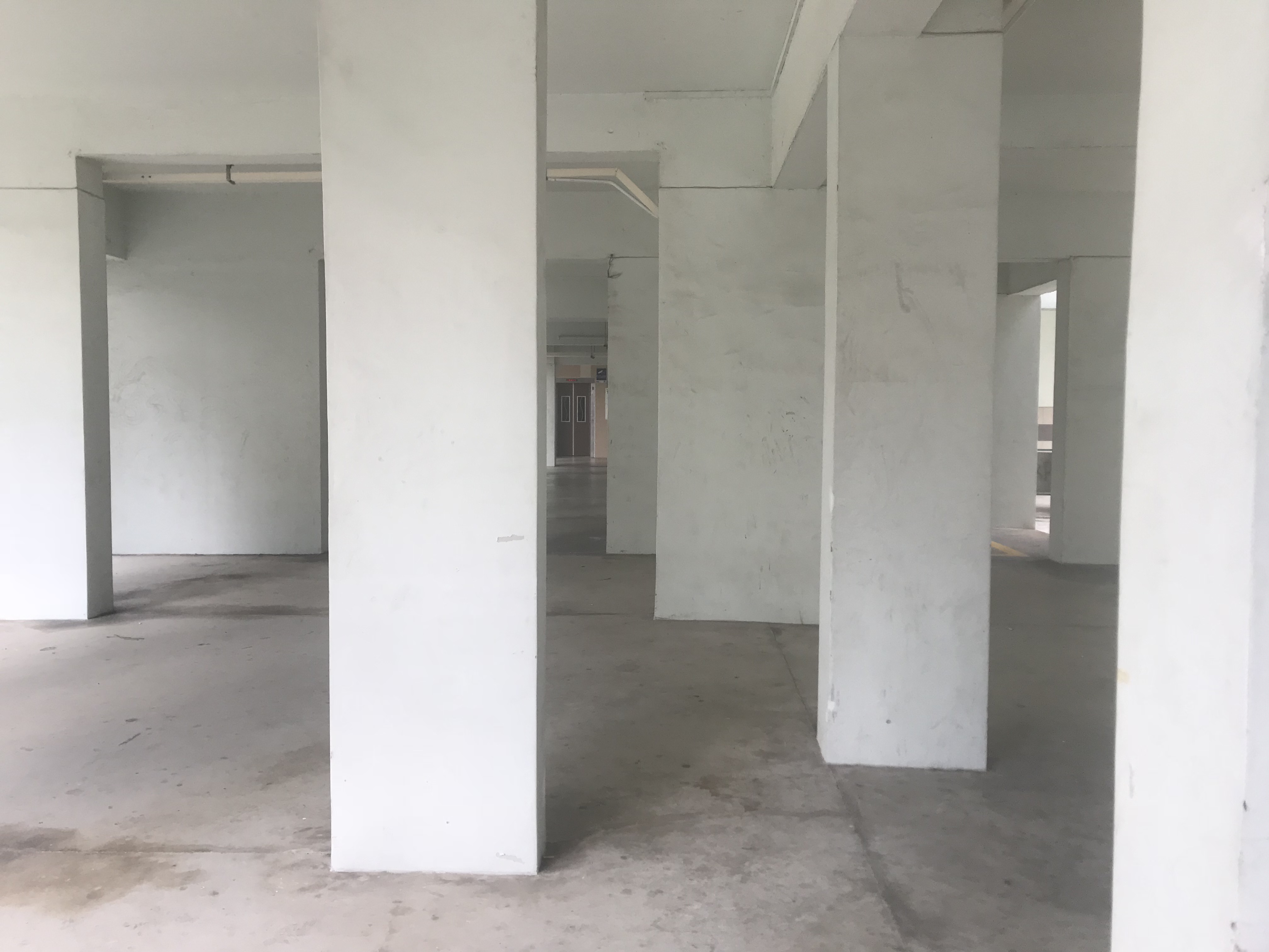
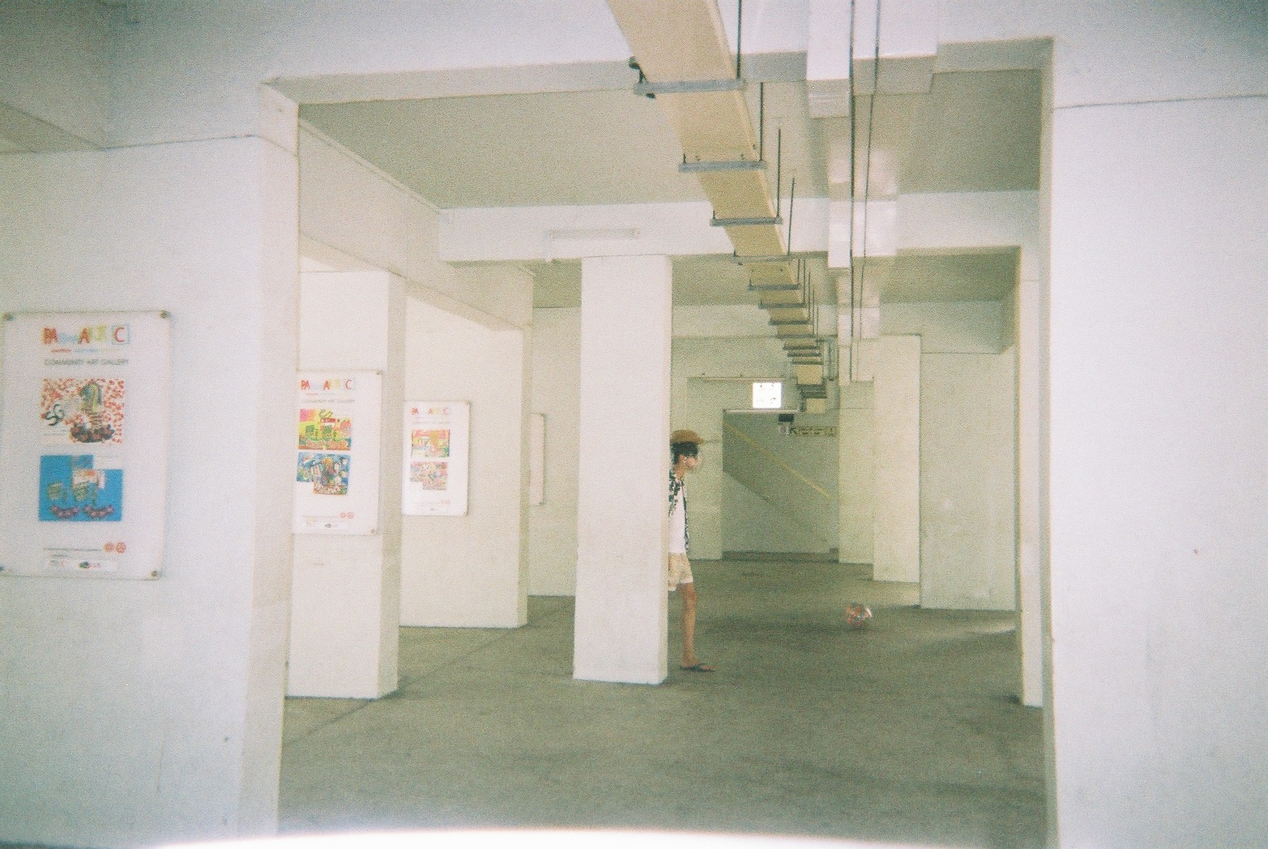
Blk 4 foyer
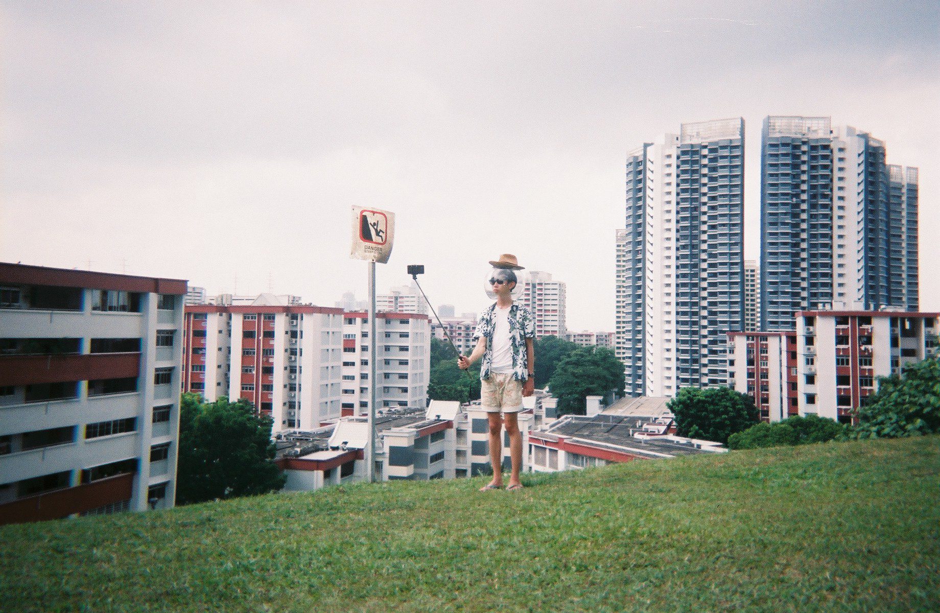
So, pinpointing these locations, I planned my zine’s Art direction. I decided to go for a spacey theme as I want to depict Marsiling as a strange “planet”, using a pun I got from Marsiling (Mars and iling). Using this idea, I want to try to depict a tourist’s trip to this strange land called Mars iling.
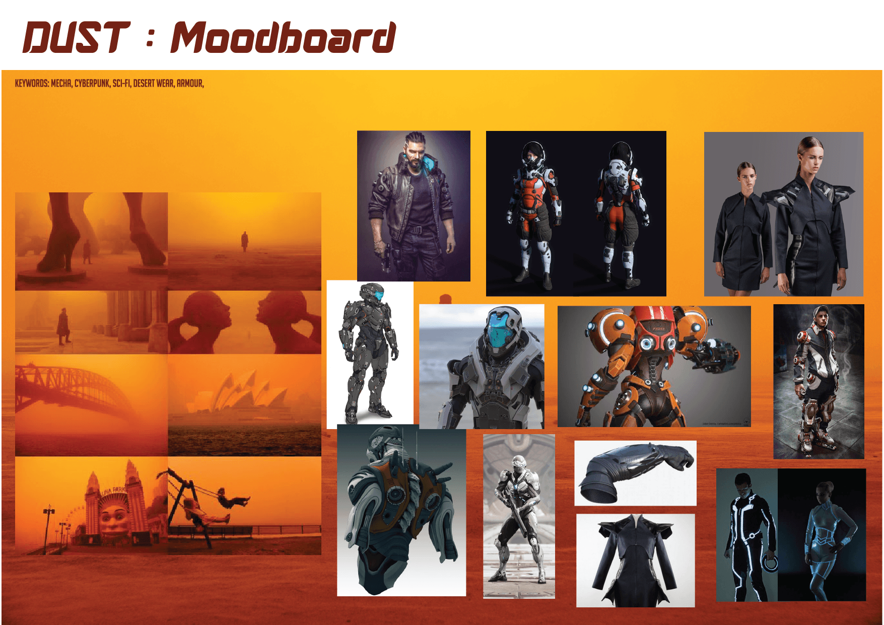
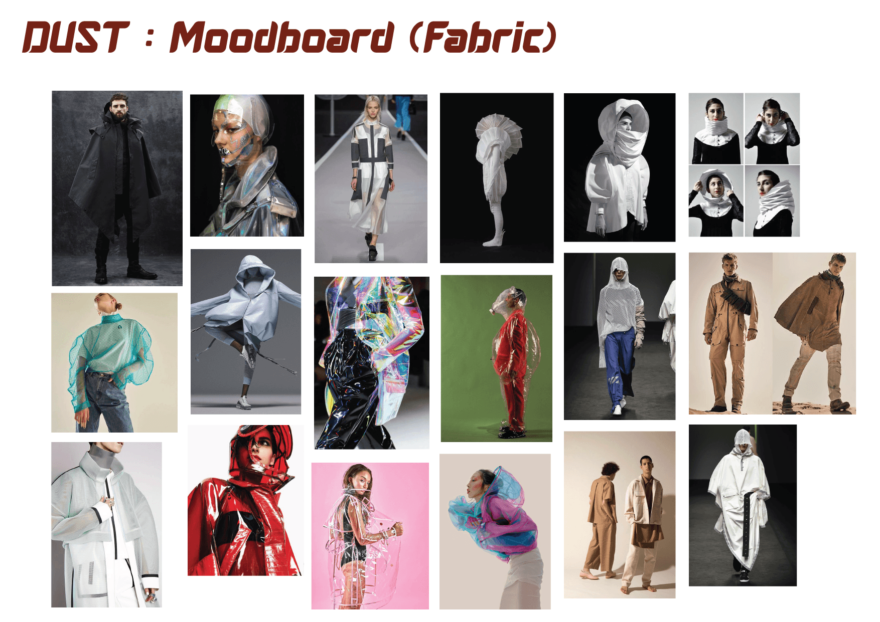
Here’s my mood board:
I want to go for a vacation-esque style stereotypical tourist. So by merging this theme and the space theme, I designed my character — a space tourist.
With these in mind, I prepped my props.
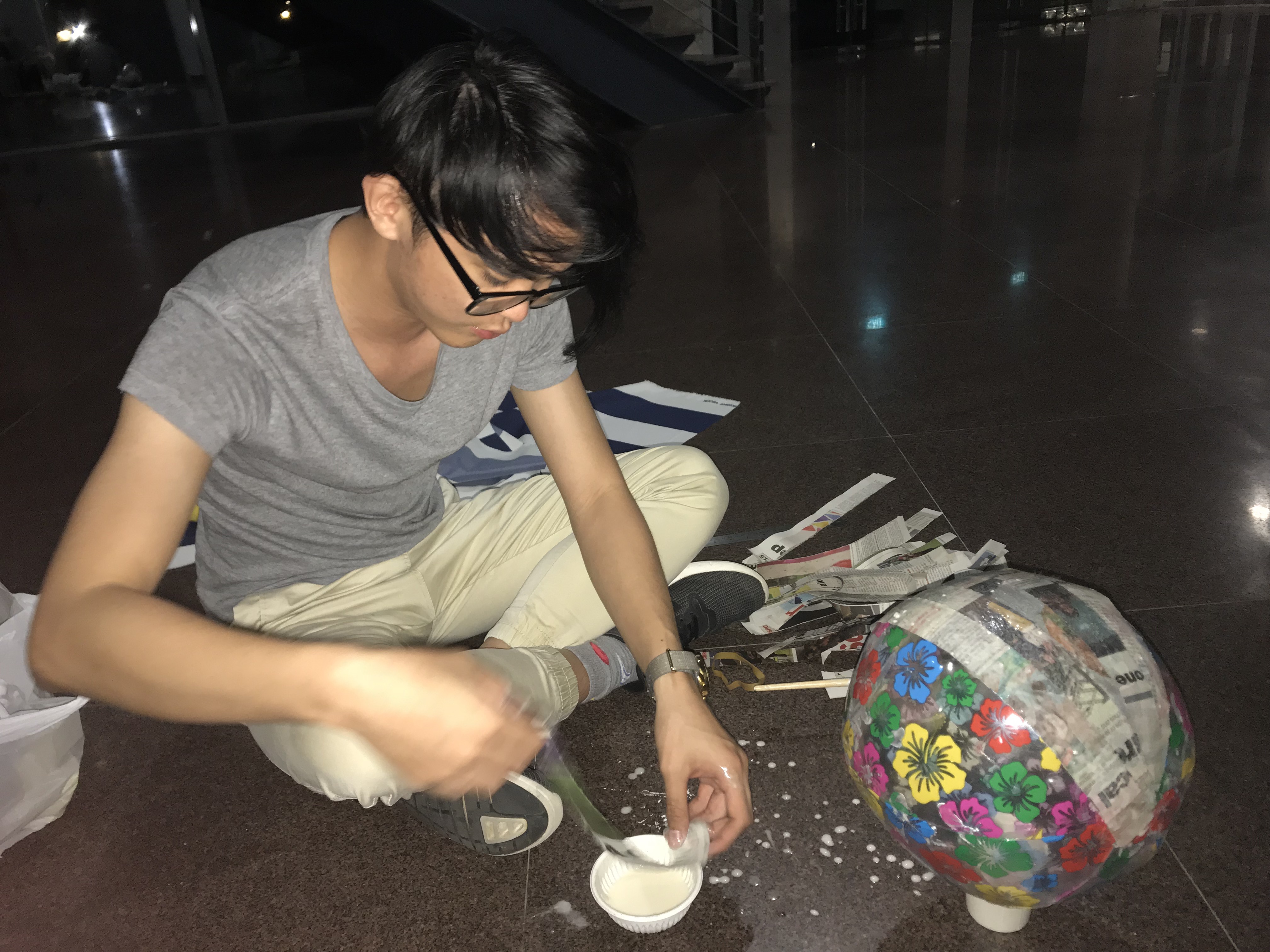
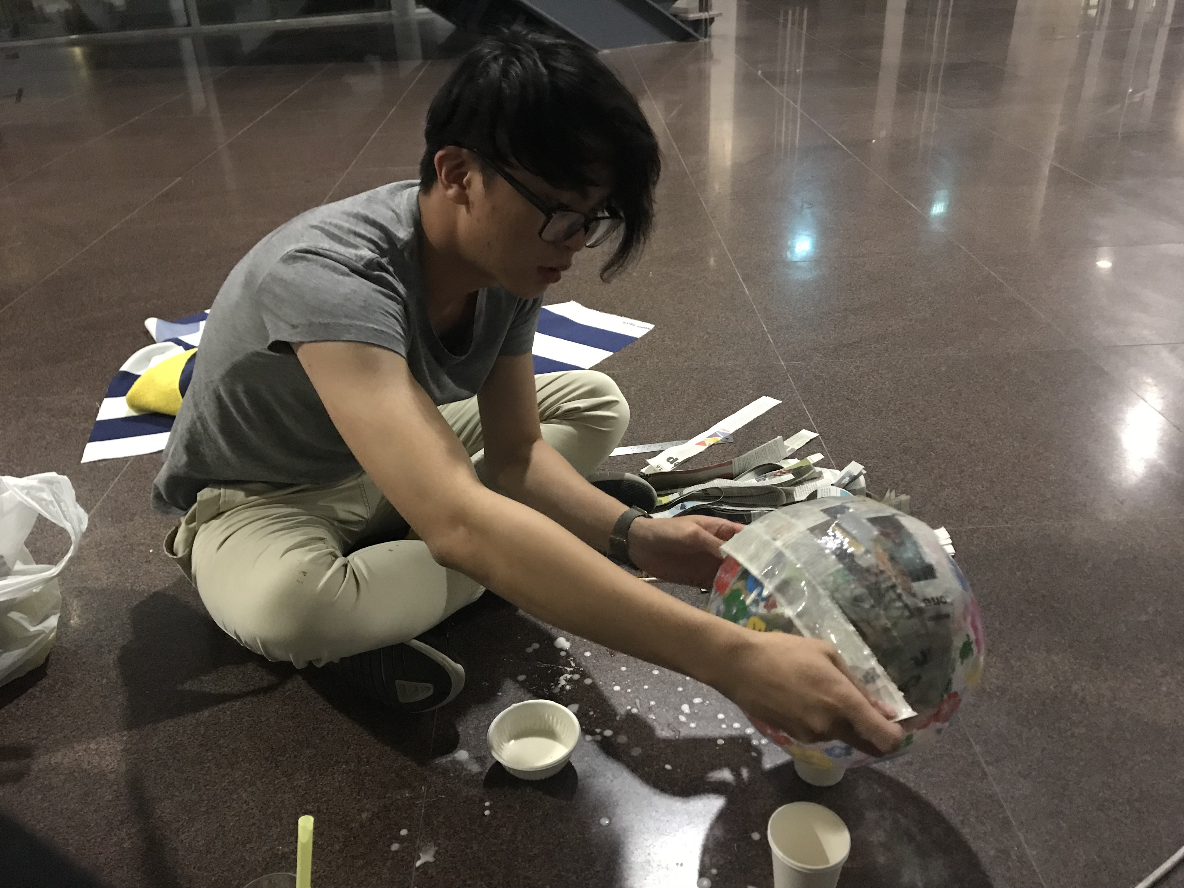
Space Helmet
I couldn’t find a space bubble helmet so I got a beach ball from Daiso and started making paper mache.
Afterwhich I used a heat gun to melt a few sheets of transparencies to create the “glass” capsule.
It fits but I really dislike it as it became very crumply due to the transparency sheet not being the proper shape to warp it down to a sphere. Still, I rolled with it since I couldn’t find any other materials.
Other Props
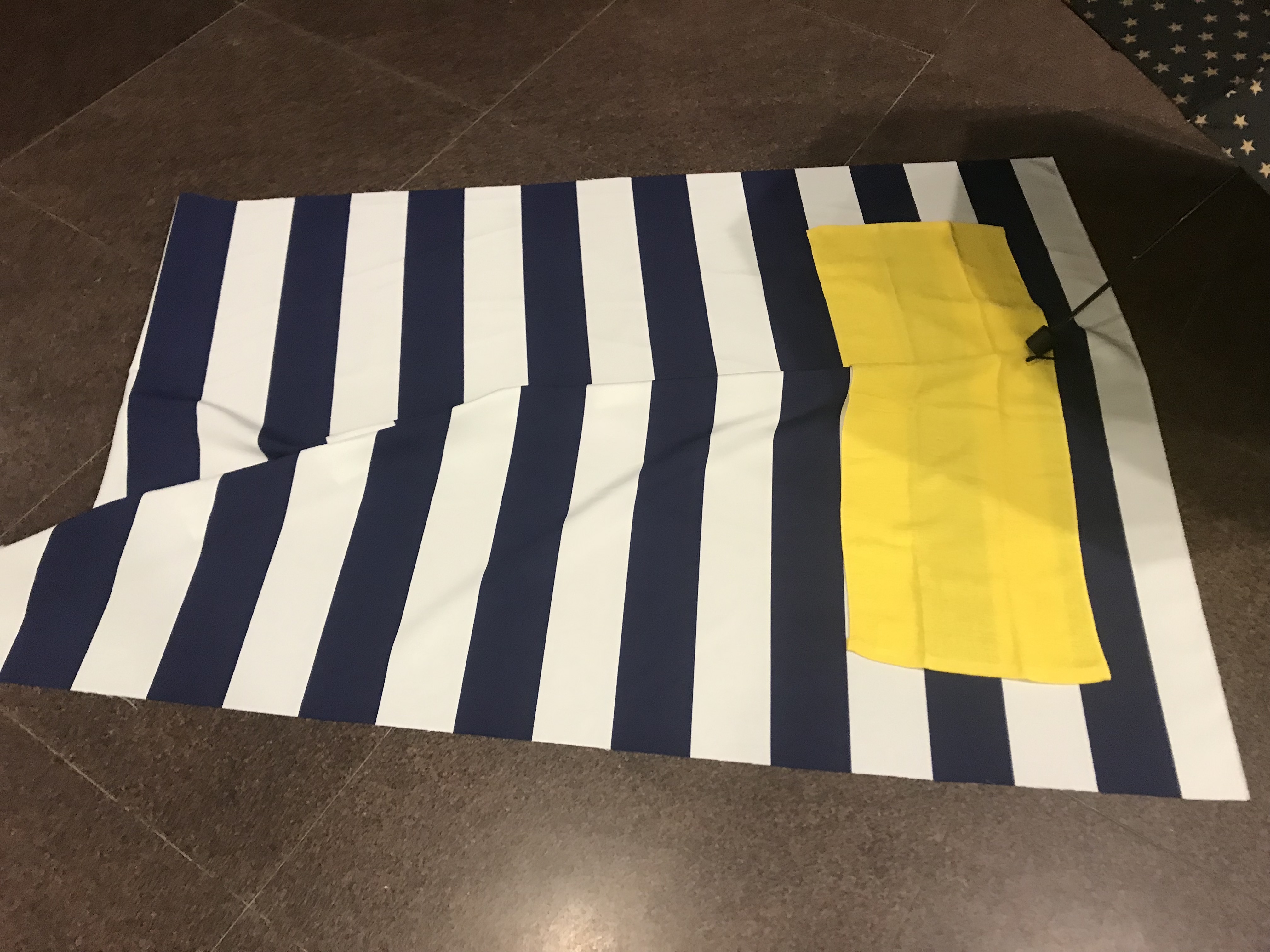
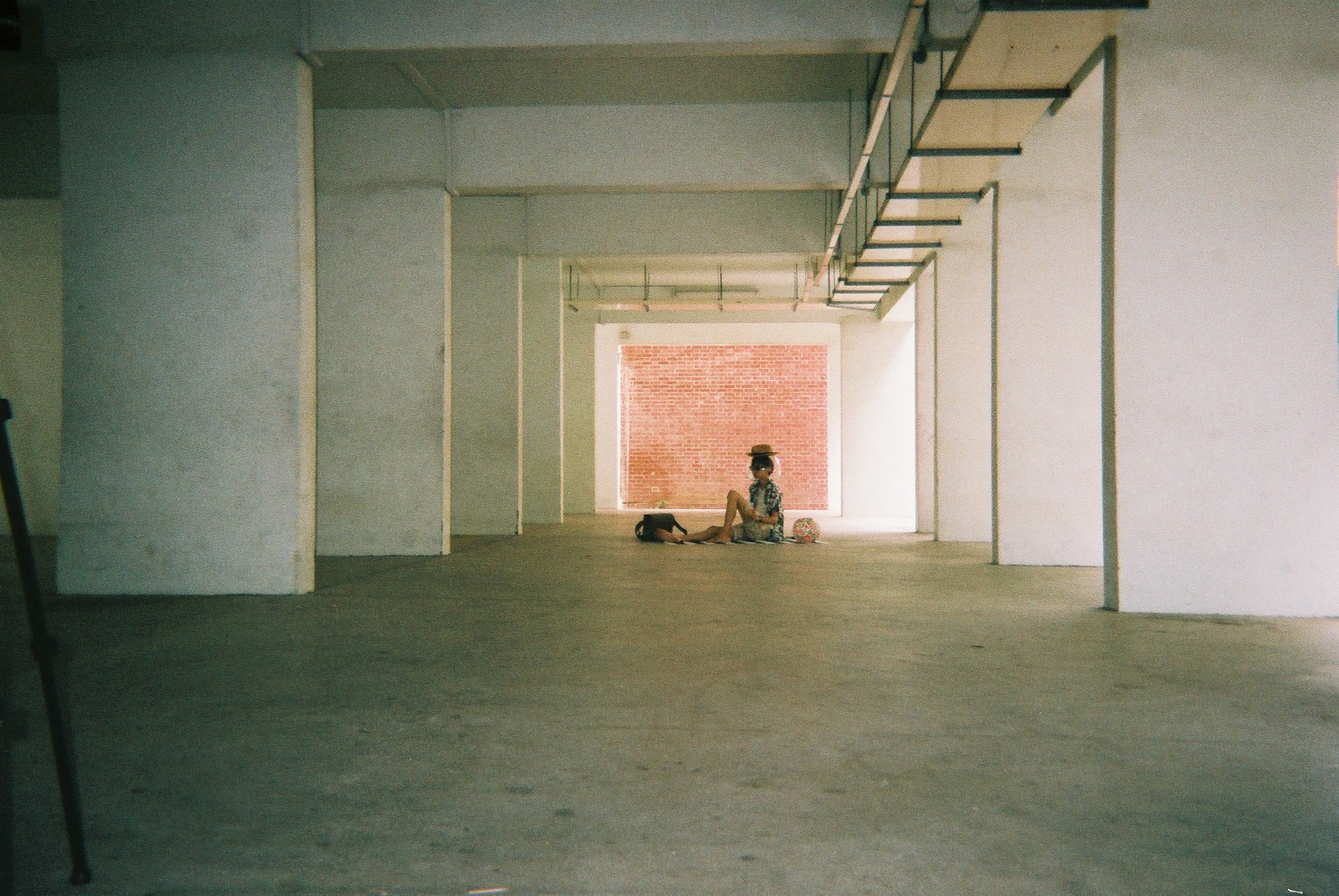
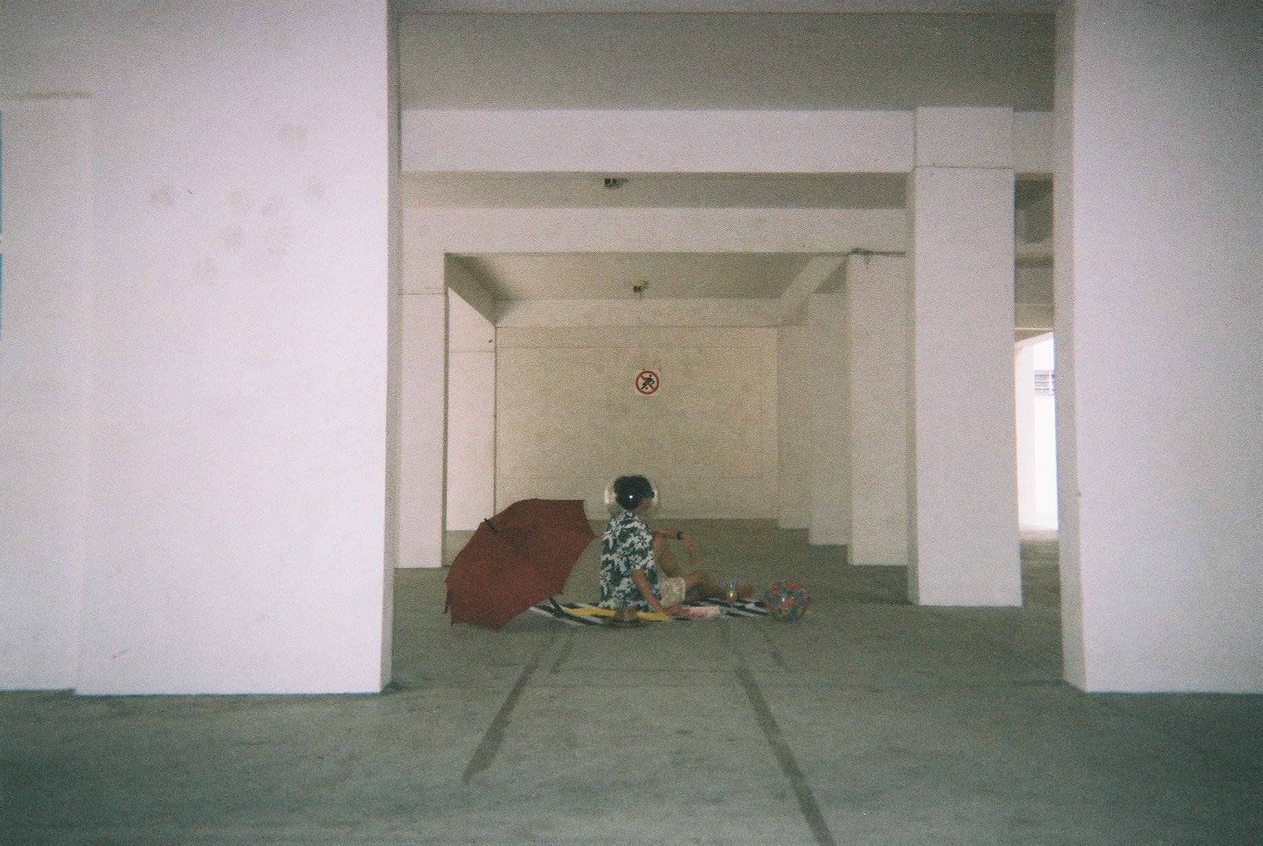
I also bought some other props: this beach-mat looking canvas and a yellowtowel. I also bought an extra beachball, red umbrella, books&magazines and wine glass to add to the aesthetics.
My model is Jeremy Lim, my good friend from my NS days.
Please follow @j.emery on Instagram 🙂
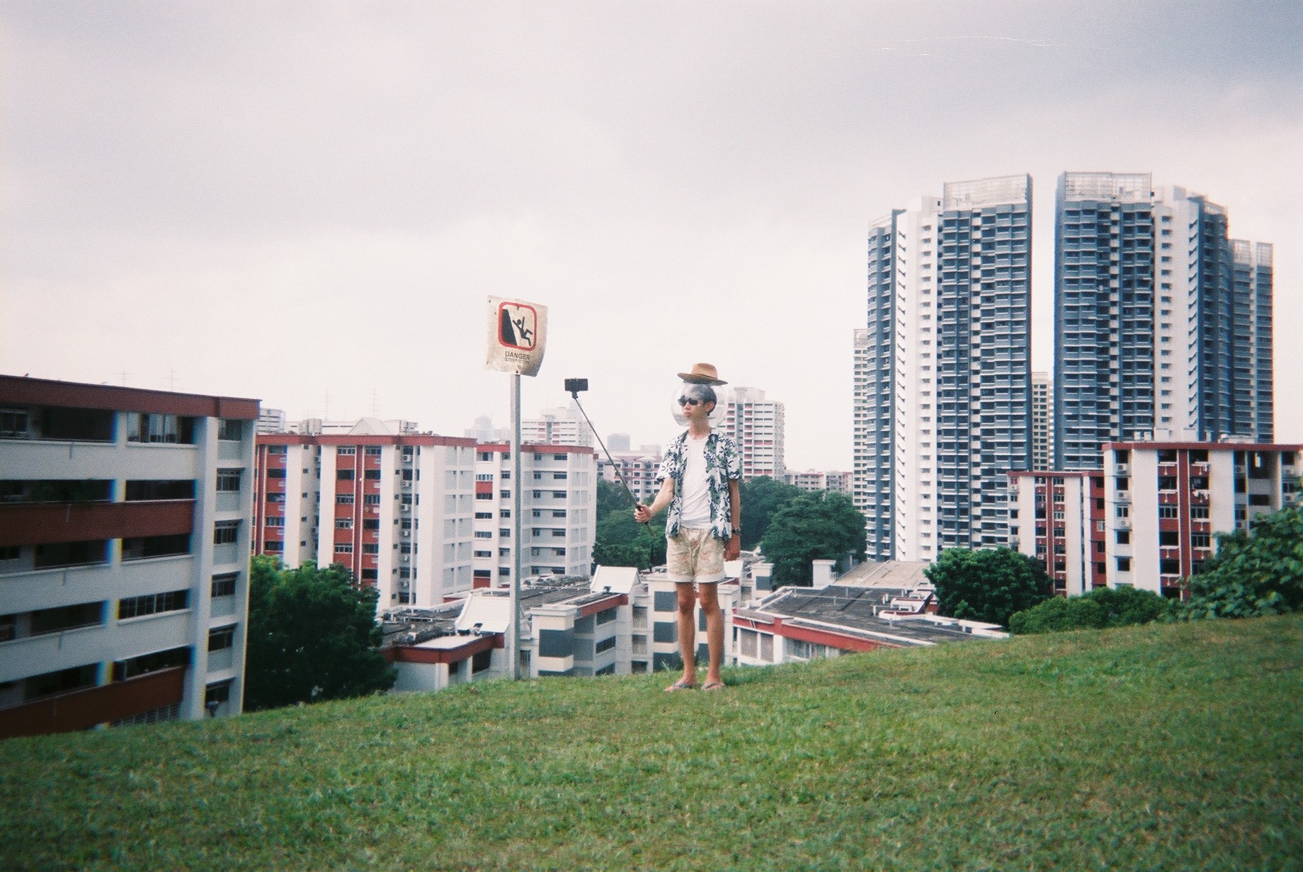
For the attire, I went for holiday shirt, a straw hat, shades, shorts, and slippers.
Shoot
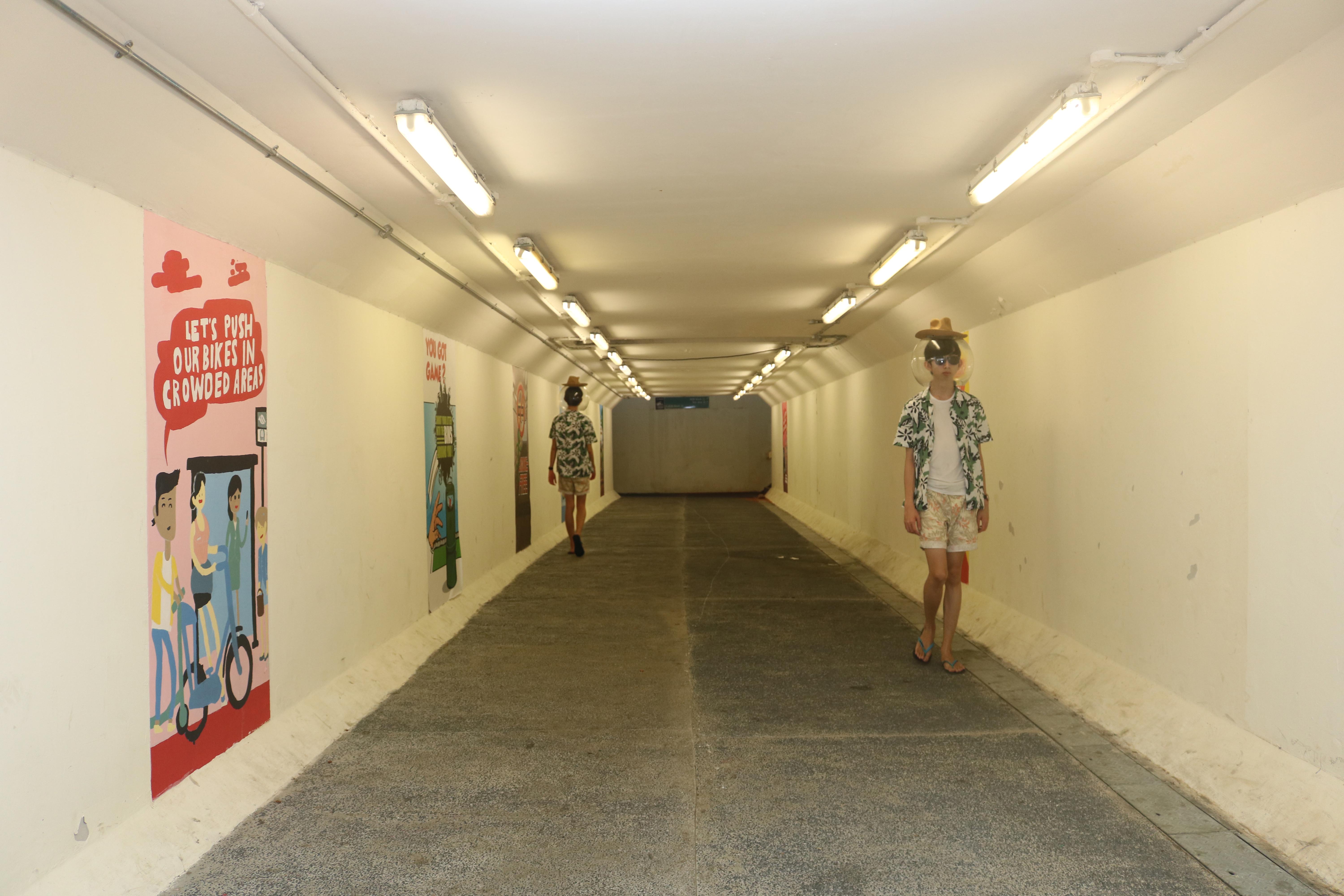
I went on a shoot on 30th March. I brought all the props, as well as a DSLR and a disposable camera (Fuji Simple Ace, 39 shots, 400 ISO). The DSLR is a backup to the disposable camera in case the shot did not go well, as do with all disposable cameras. The DSLR is also a really great way for me to test my shots and compose it before taking it on the DSLR. Despite the higher quality, I opt for the film for a more personal effect. I shot halfway and it rained, so I couldn’t continue and decided to go back and shoot again.
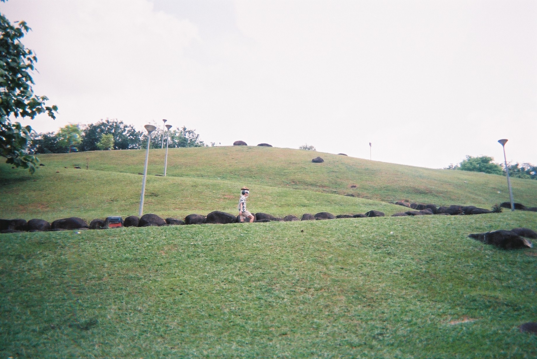
On the 1st of April, we went on another shoot and this time, we braved through the rain (AGAIN, it always rains when I go Marsiling) and we completed the shoot by 8PM.
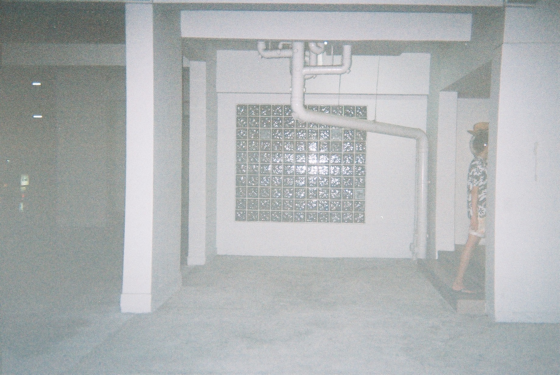
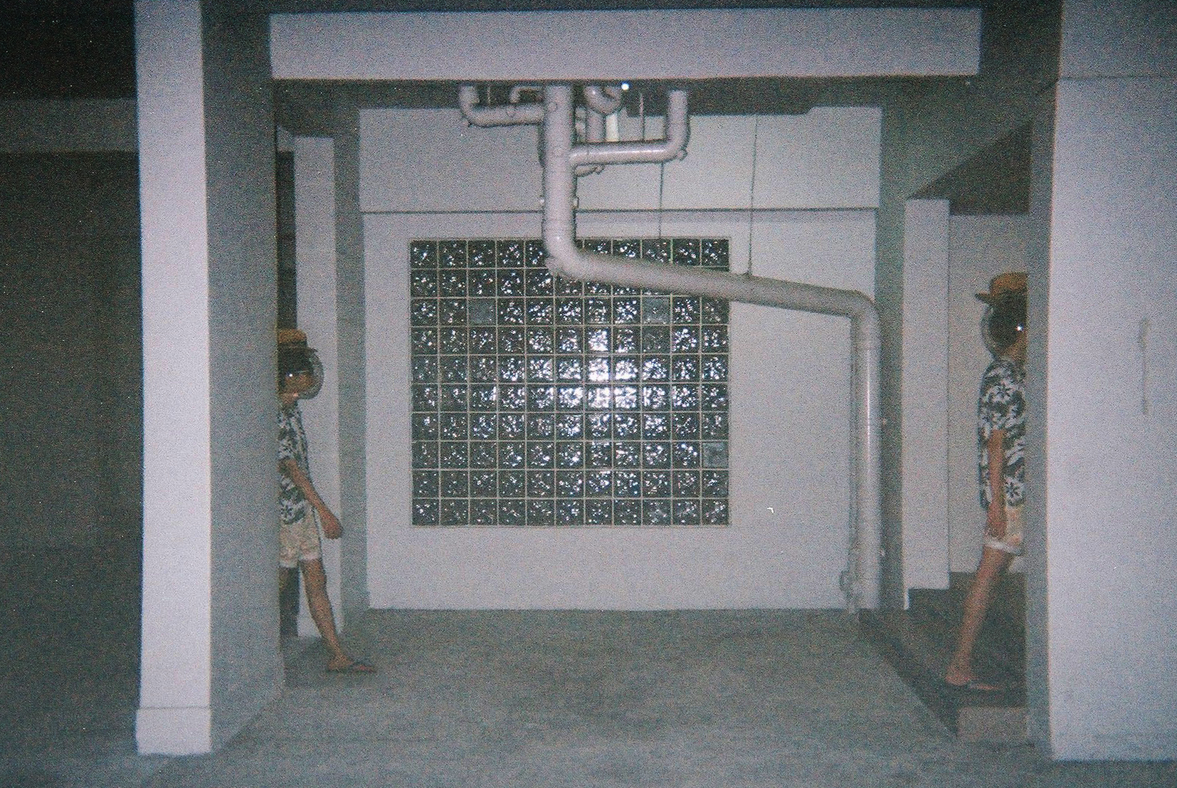
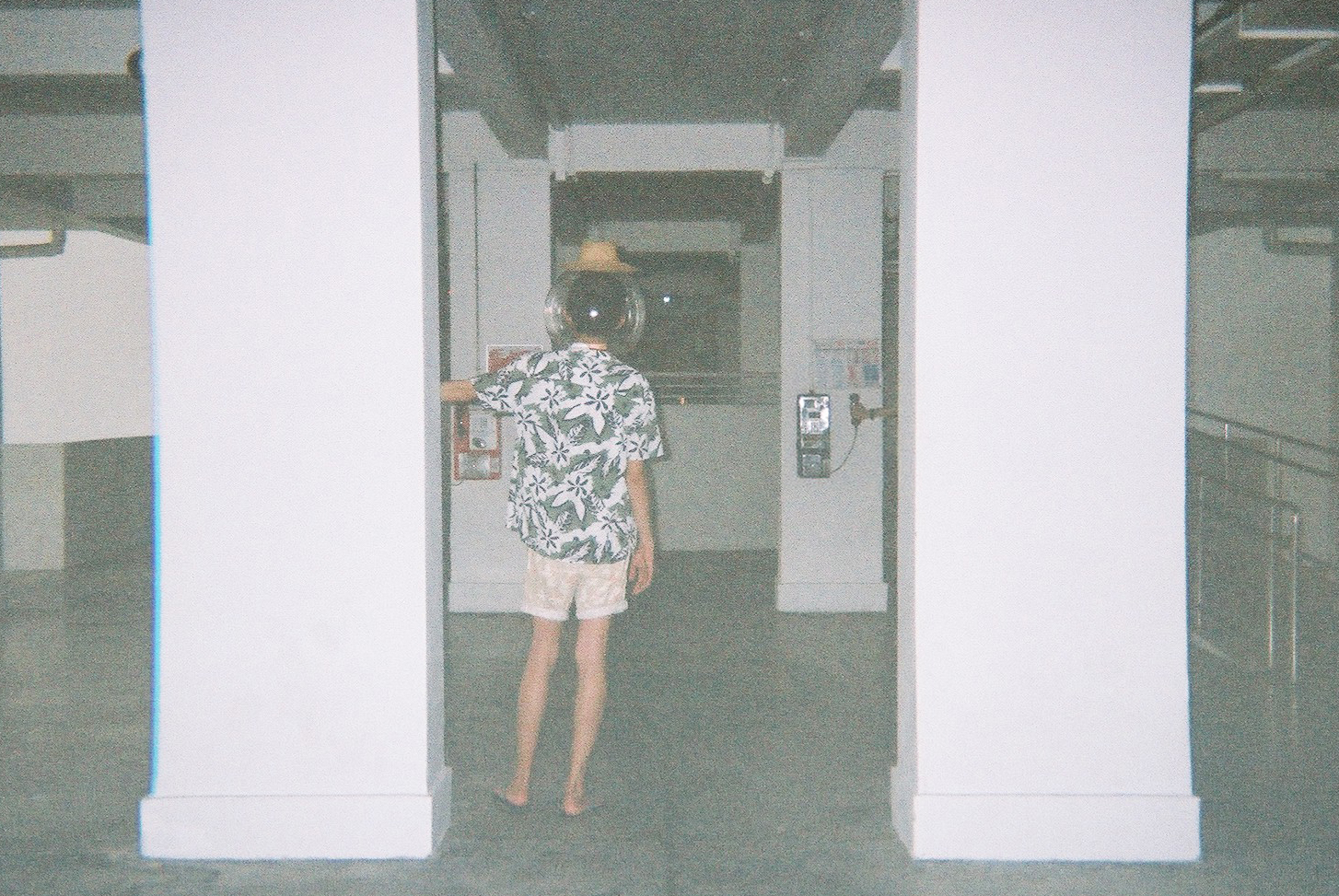
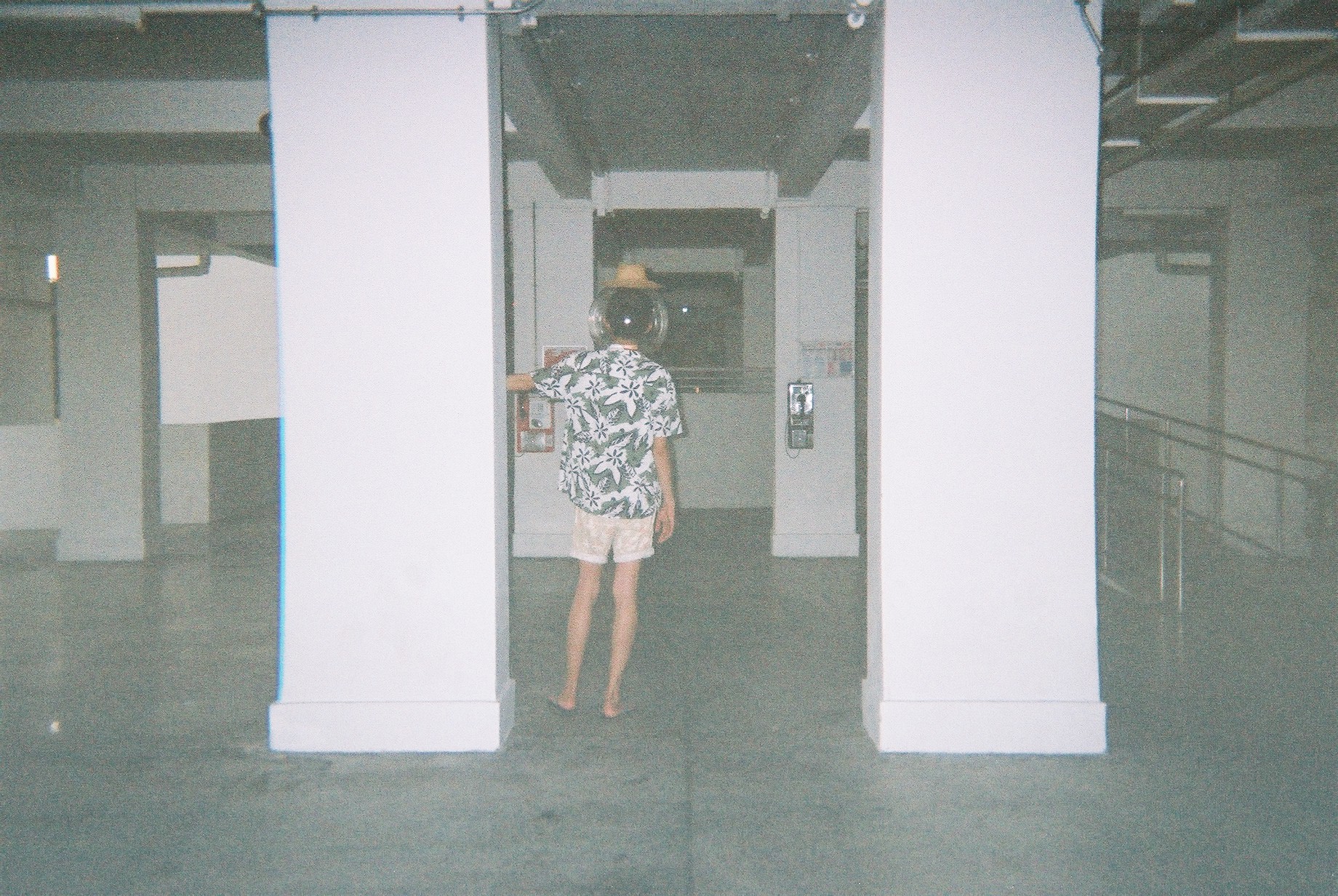
Halfway through, I found an actual fish bowl in an aquarium shop and I went for it! So the second half of the photos are Jeremy with an actual fish bowl on his head.
Here are some shots:
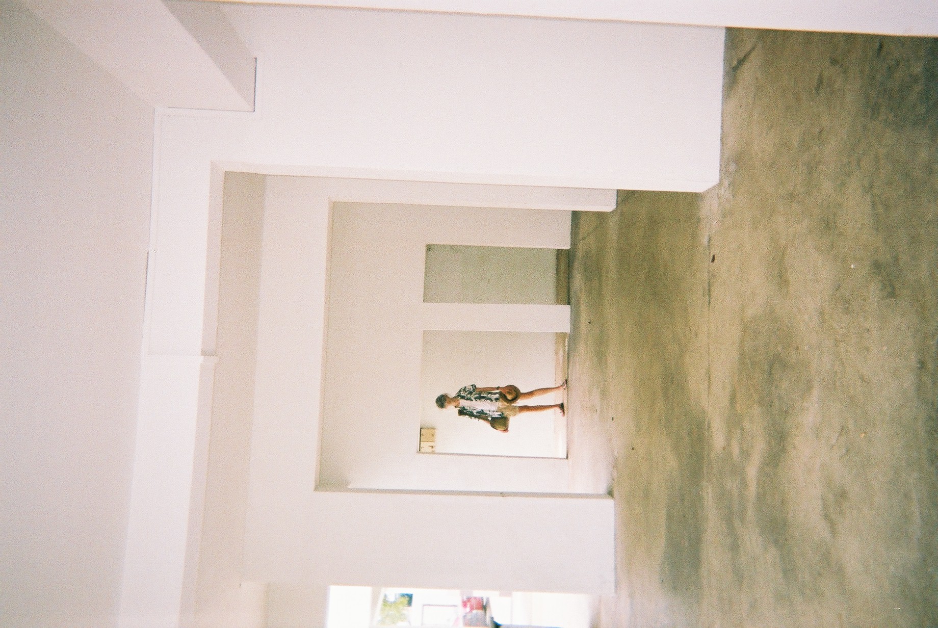
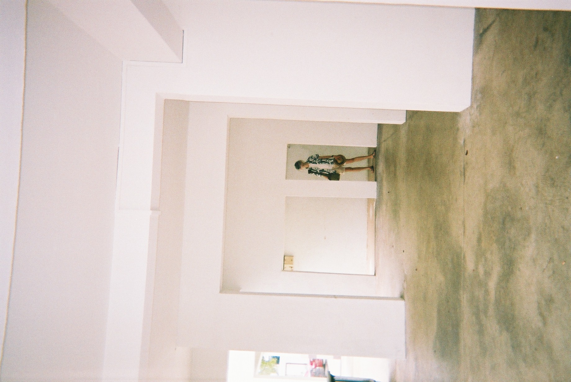
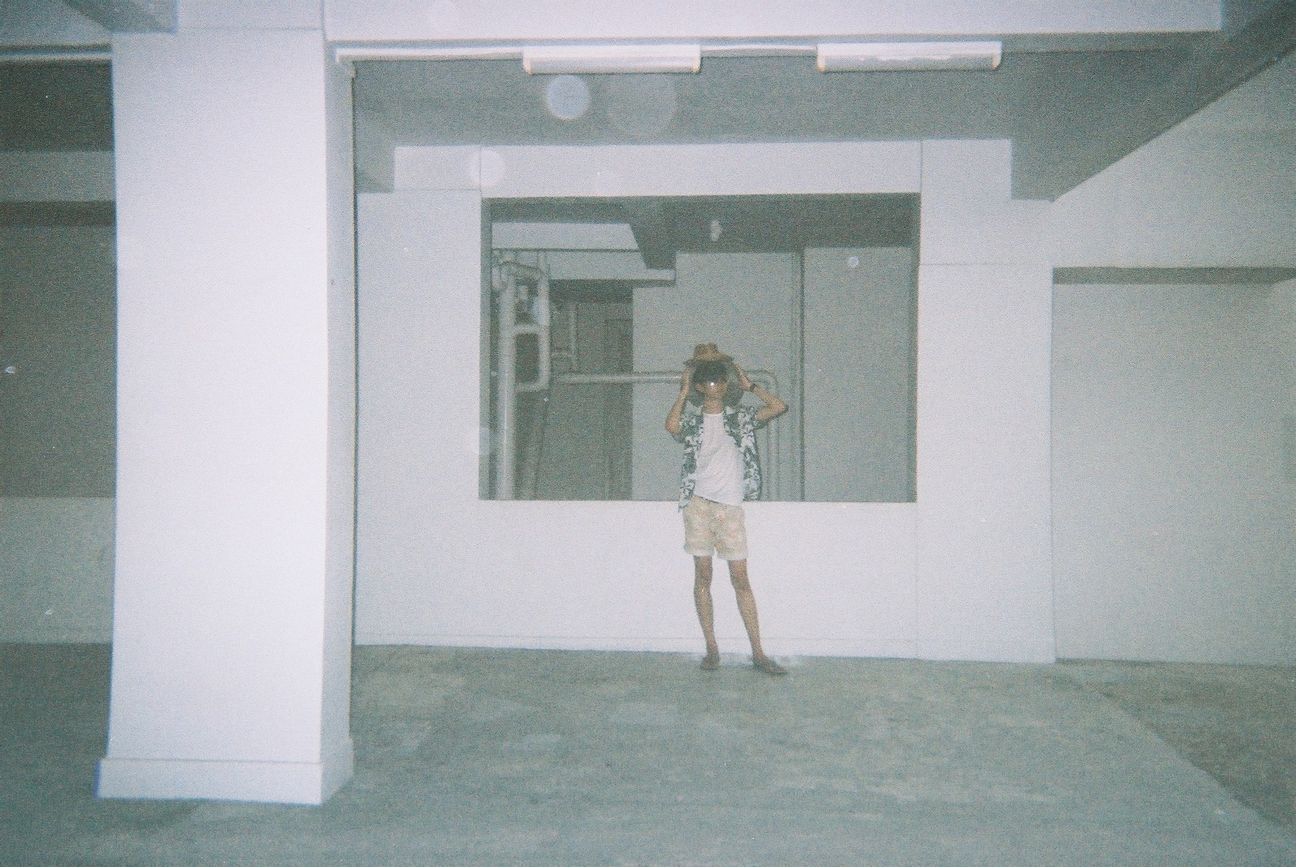
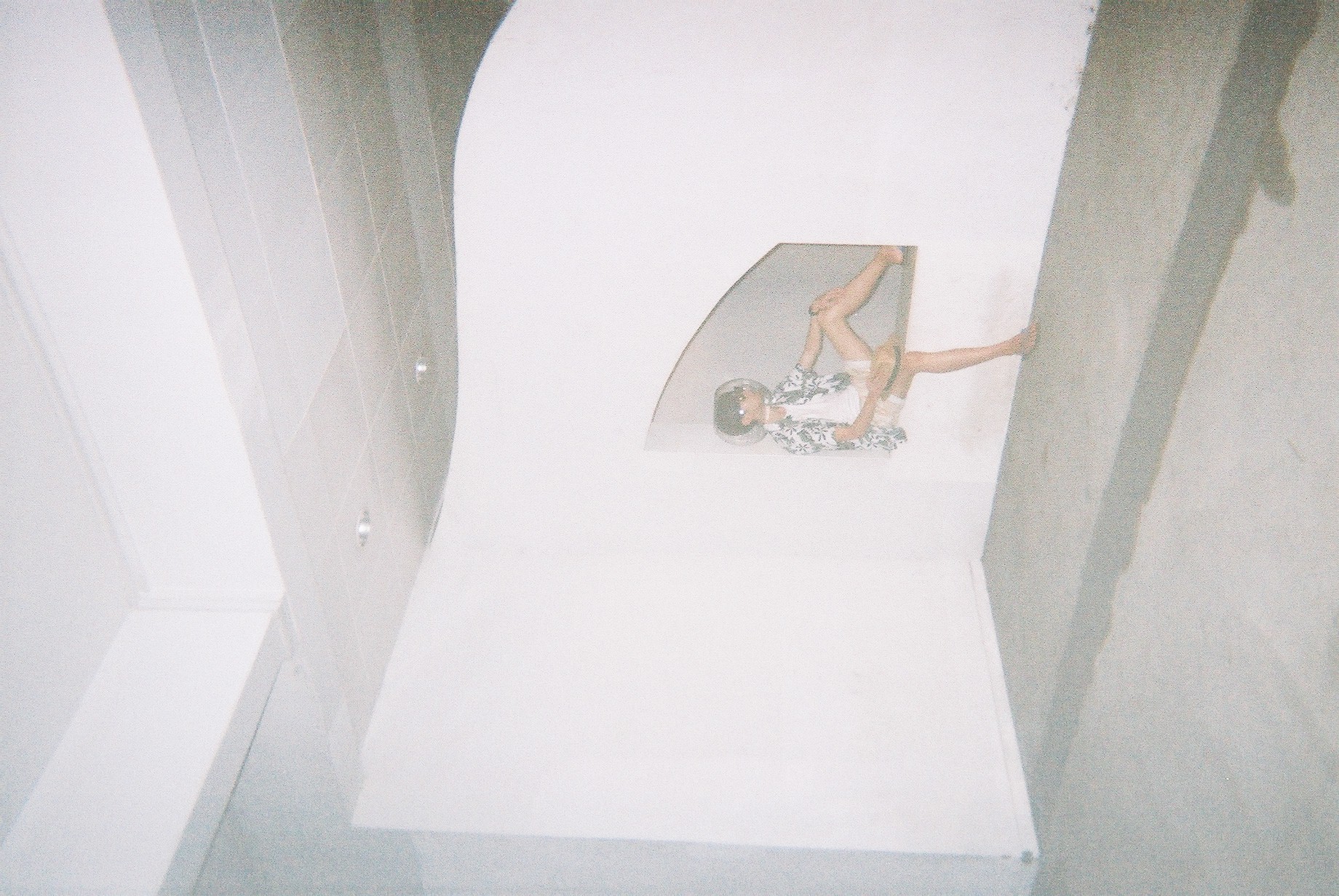
These are from the disposable camera.
The shots from the DSLR:
Getting the ball to be in the frame properly took a few tries and this can only be done on DSLR so it’s worth trying out first before taking on disposable camera!
Although the quality is MUCH better, I decided to stick to the disposable film shots as it really creates some sentimental value and uniqueness.
Photo edits
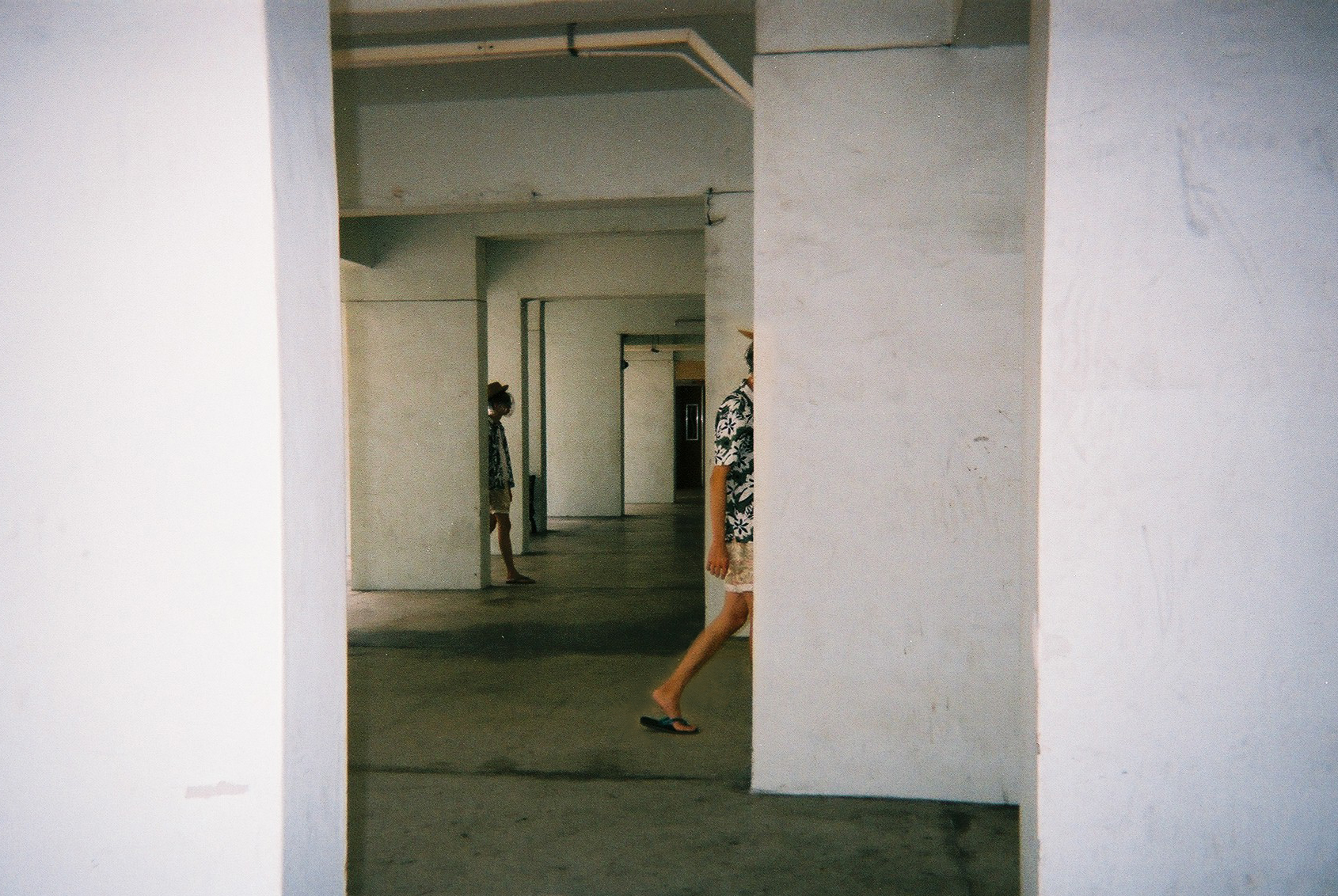
So in order to get the effect of the “portal” and “strangeness”, I decided to photoshop my friend such that two of himself is in the frame.
This is one example of said edit, but on a DSLR photo. I tried around with editing the DSLR shots before moving to the films.
Here are some examples of the shots I have edited. These are to convey the “portalling” between pillars.
Zine!
So finally, I went to do on the ACTUAL ZINE!!!
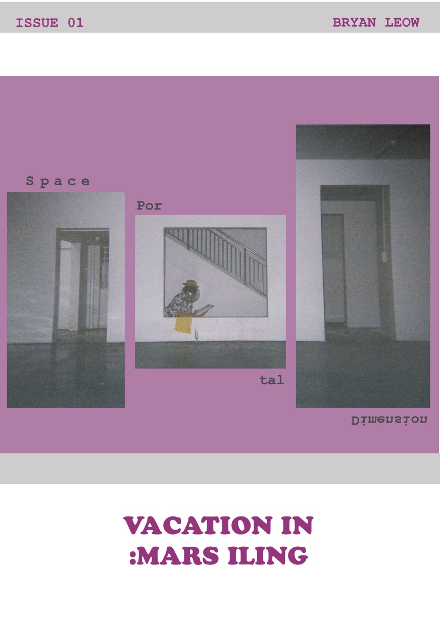
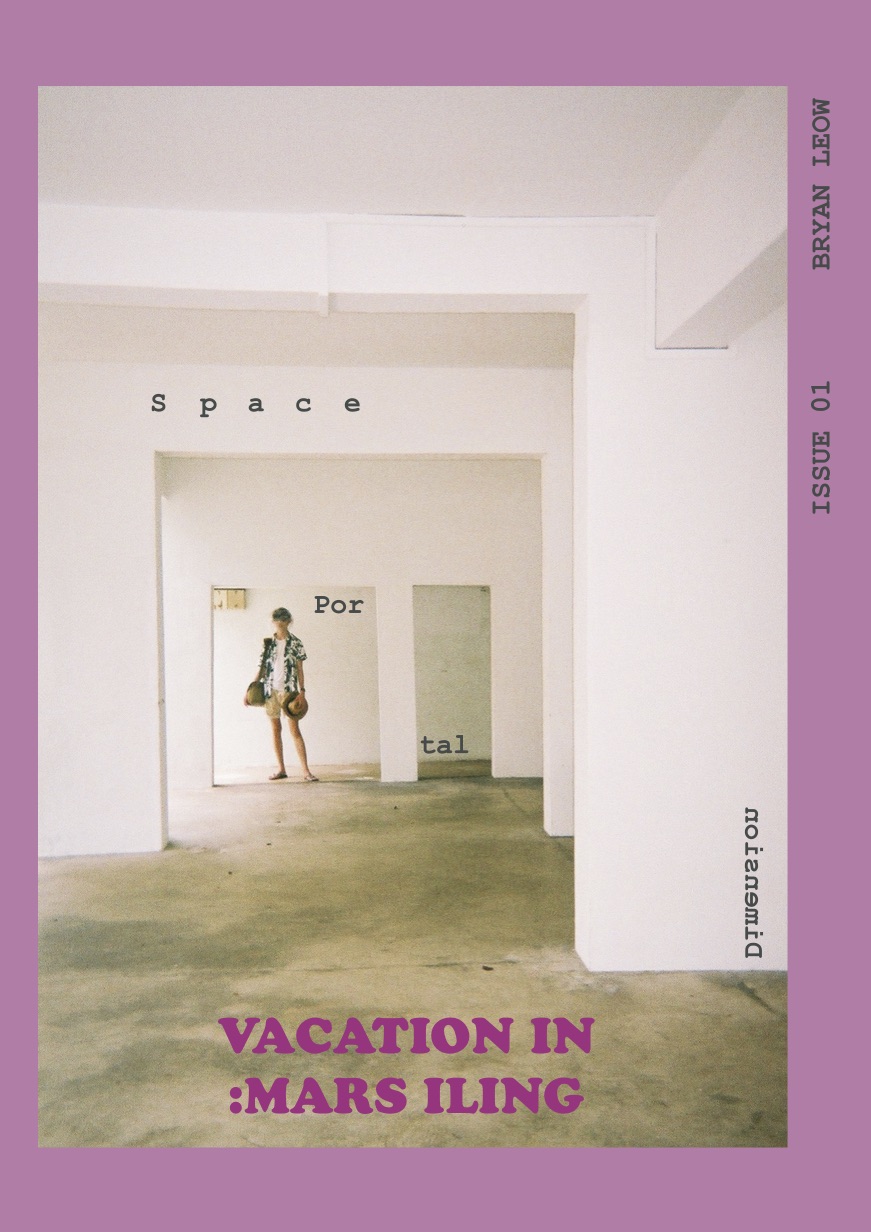
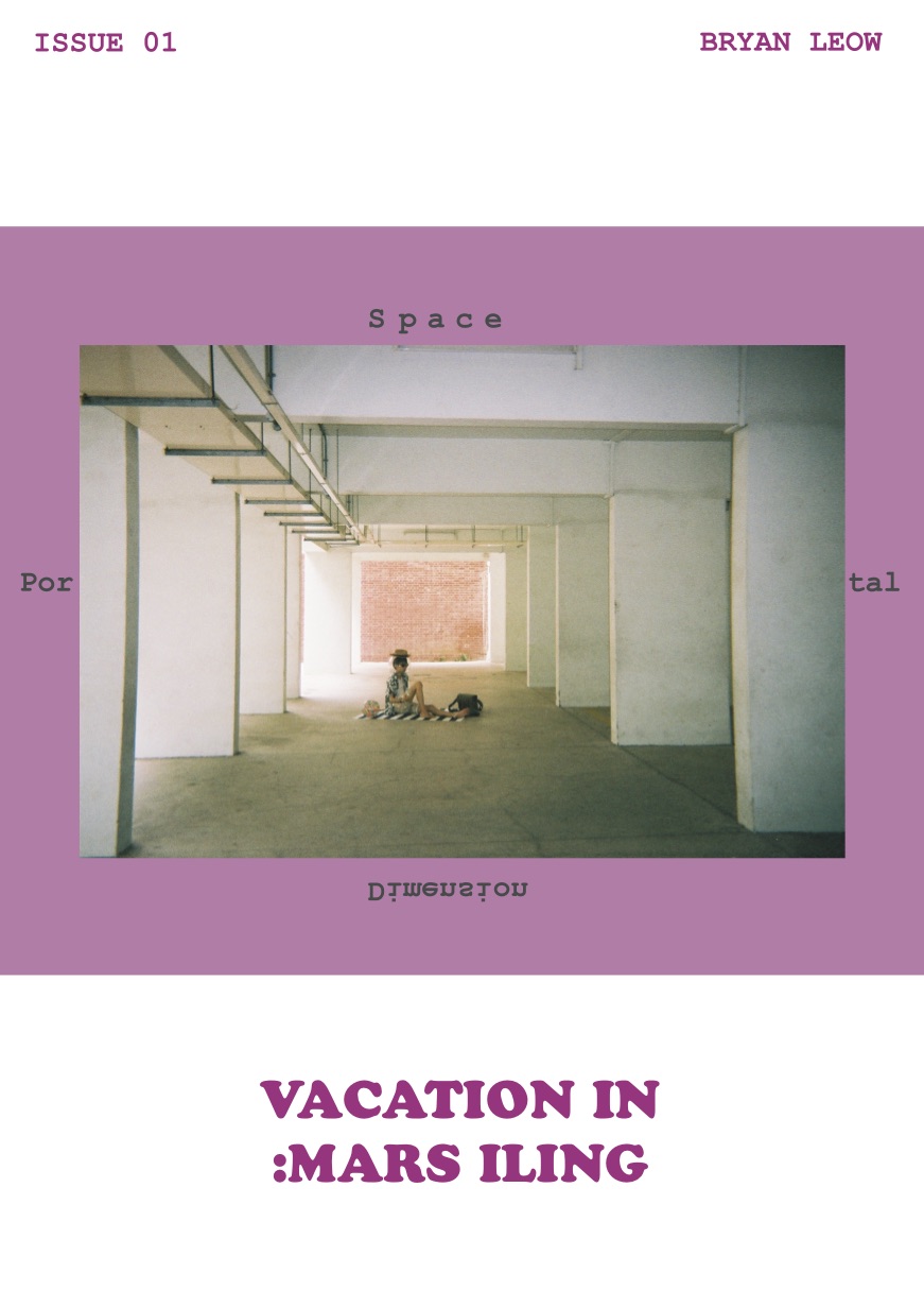
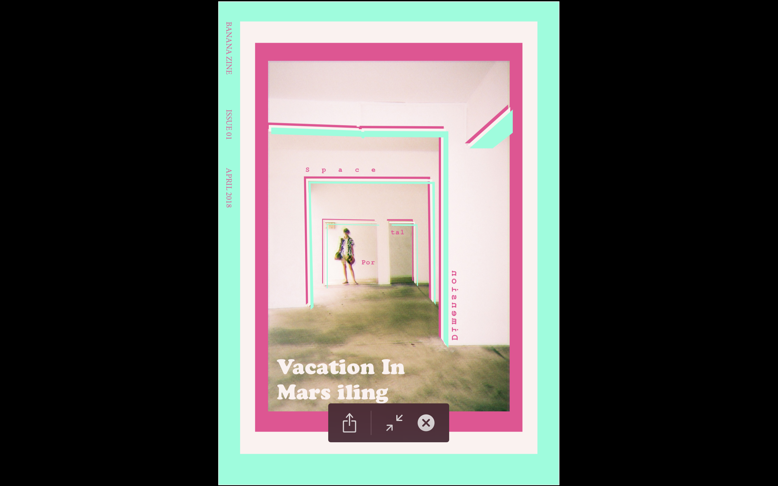
I separated the zine into 3 parts: Space, Portals, and Dimensions.
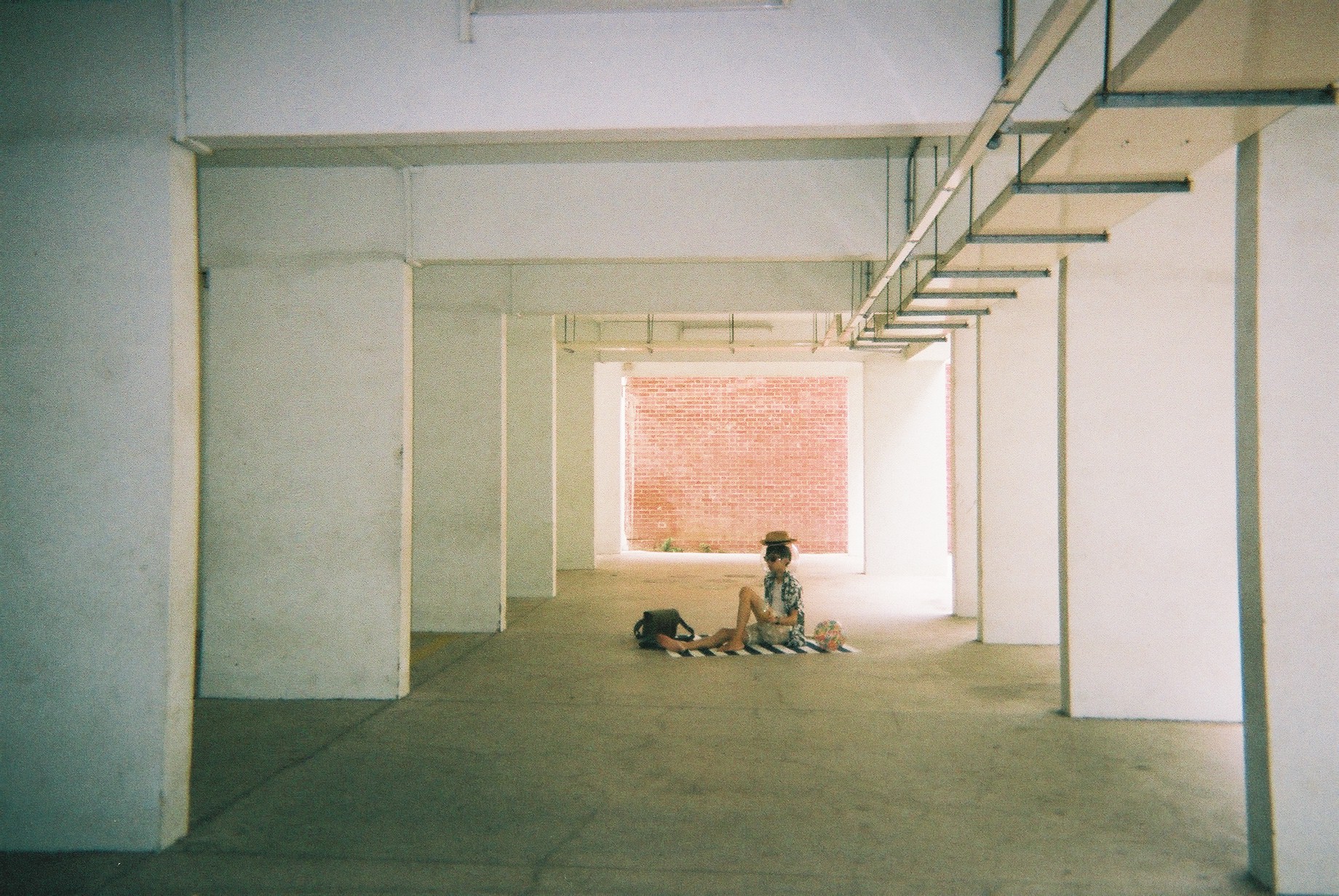
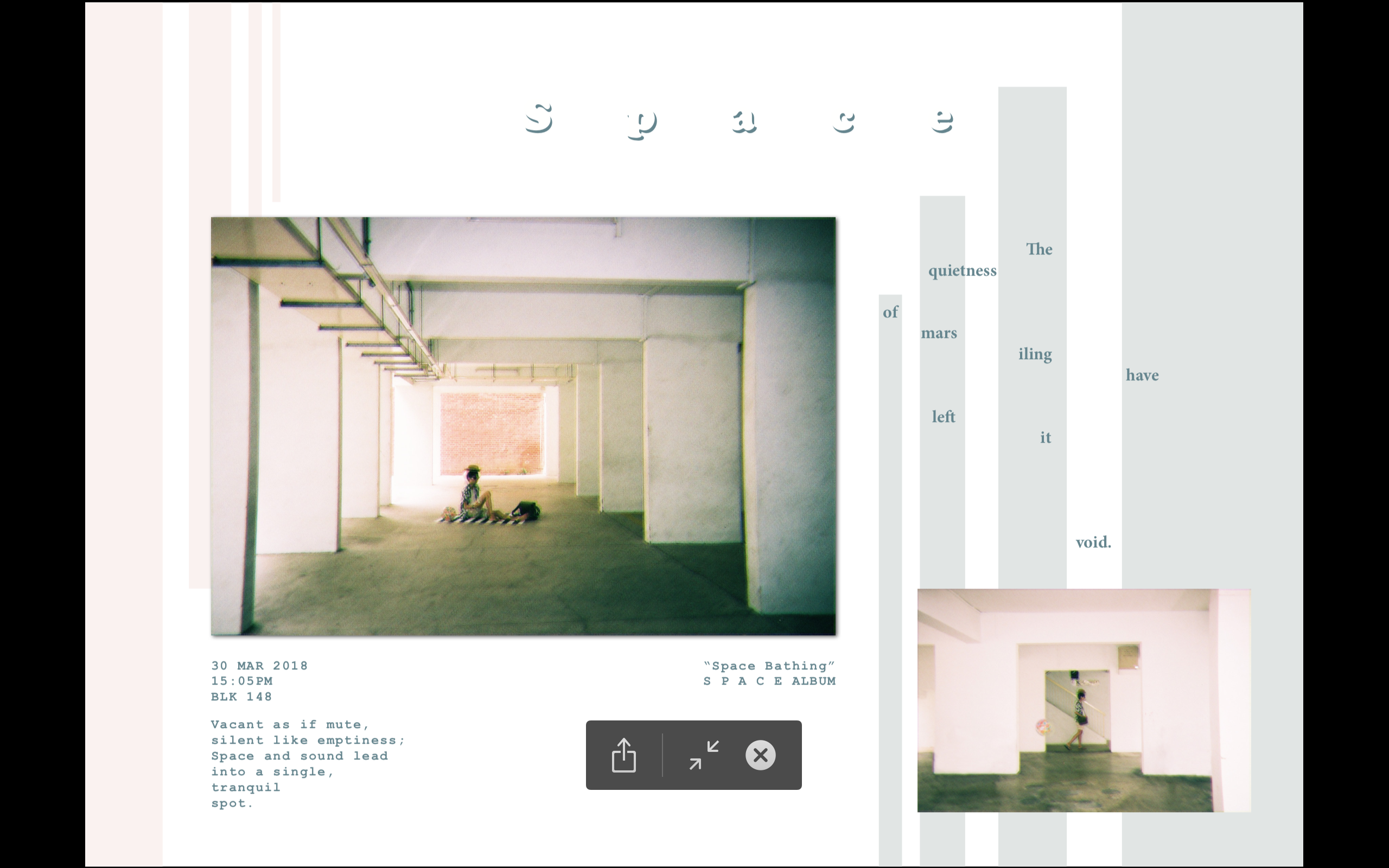
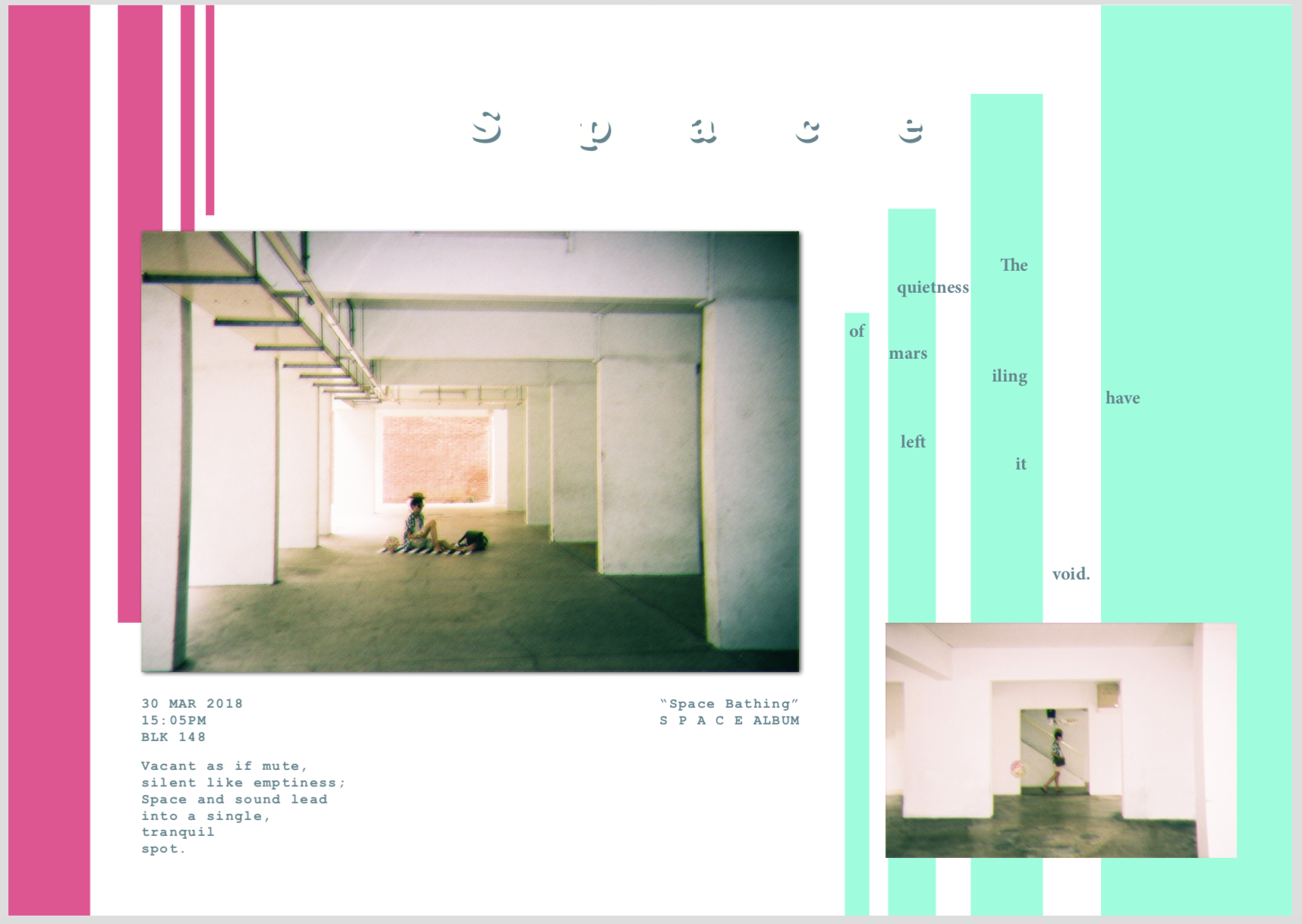
Space – Showcase the quietness of the location by using spaciousness
Portals – Show the transportation from a world I am familiar with into a different world (Mars iling)
Dimensions – Show the strangeness of Mars iling
Using some inspiration from Rubbish famzine by HolyCRAP, as well as zines from my moodboard, I decided to create a vacation documentary that is not just personal, but also minimalistic.
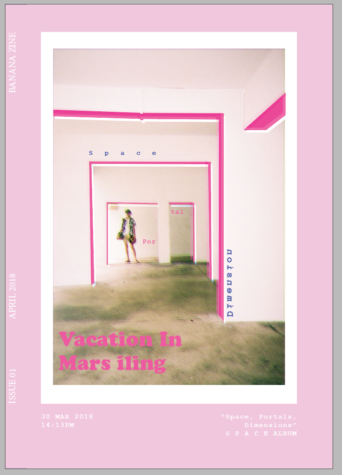
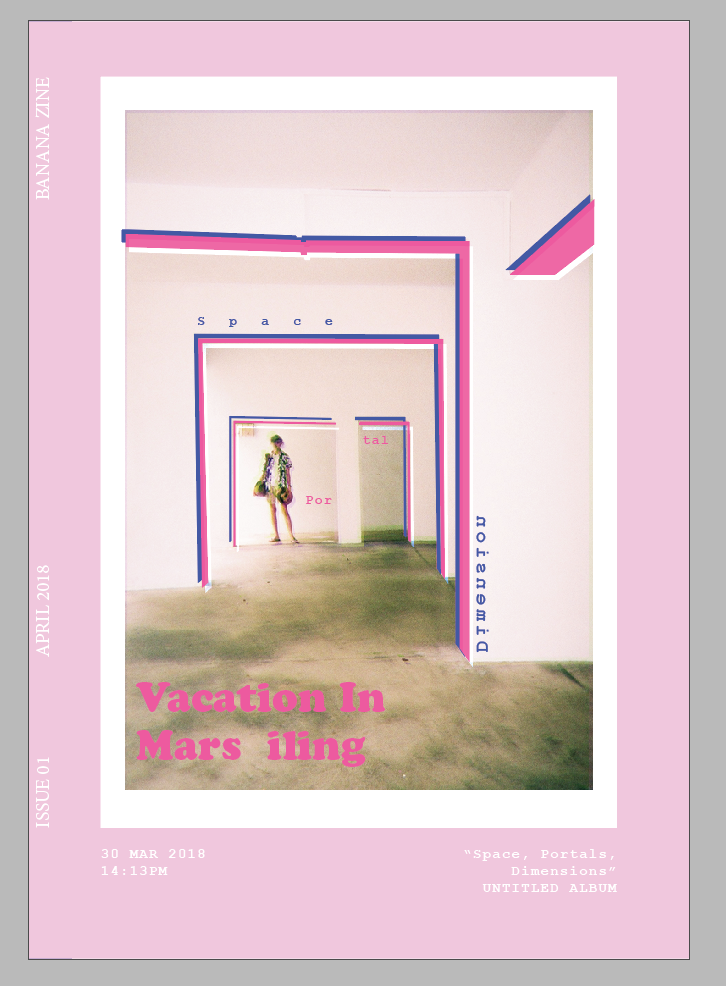
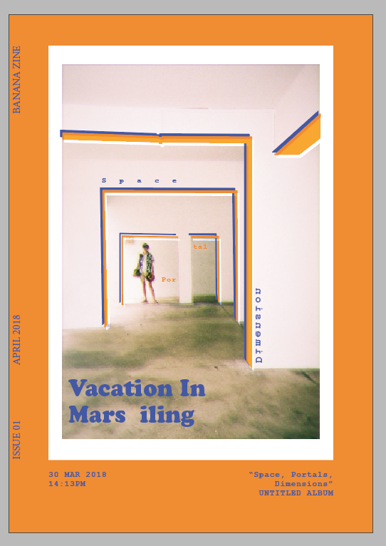
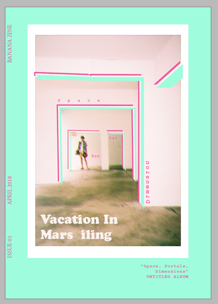
I started with a few variations of my cover page:
Then, I tried out some spreads:
With these, I consulted and selected my cover page. I also got the feedback that my images are all the same size, which is undesirable. I wanted to try for the photobook effect where all images are the same size, but it seems to not be working. I was more harsh on my image selections and tested out new spreads.
Evolution of my Cover Page
trying out adding graphics onto the photoAdding more stuffsexperimenting with the colour schemediscovered a nice scheme using complementary colours
Evolution of SPACE Spread
experimented with adding more images as layouts as I don’t want to waste my imagesAdding void deck appearance to add complexityAdded pillars using gestalt’s law to imply pillarsadded some poetic linesswitched colour palette
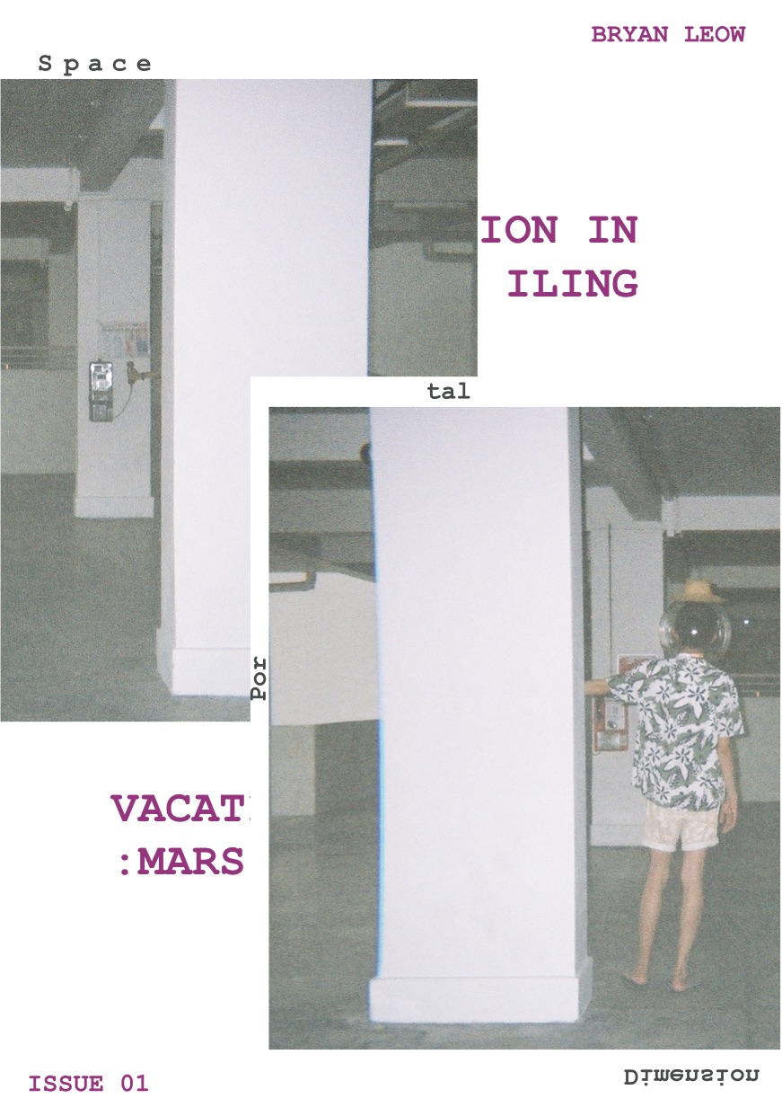
Evolution of Portal Spread
added images to not waste them, and also added duality by making the 2nd part pinkdecided not to have the images and added the word portaladded more colour and glitch, which amplifies the portal effect
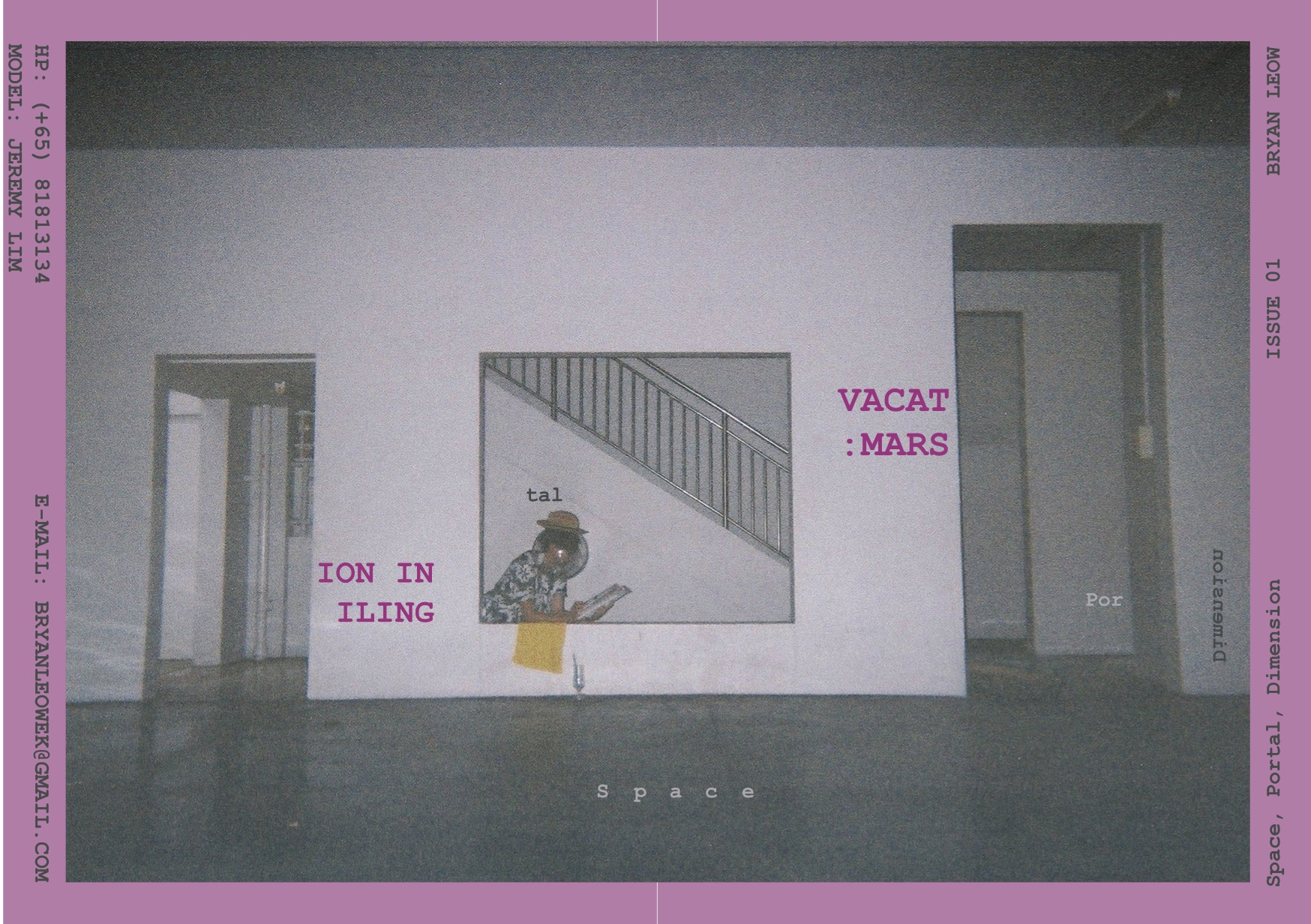
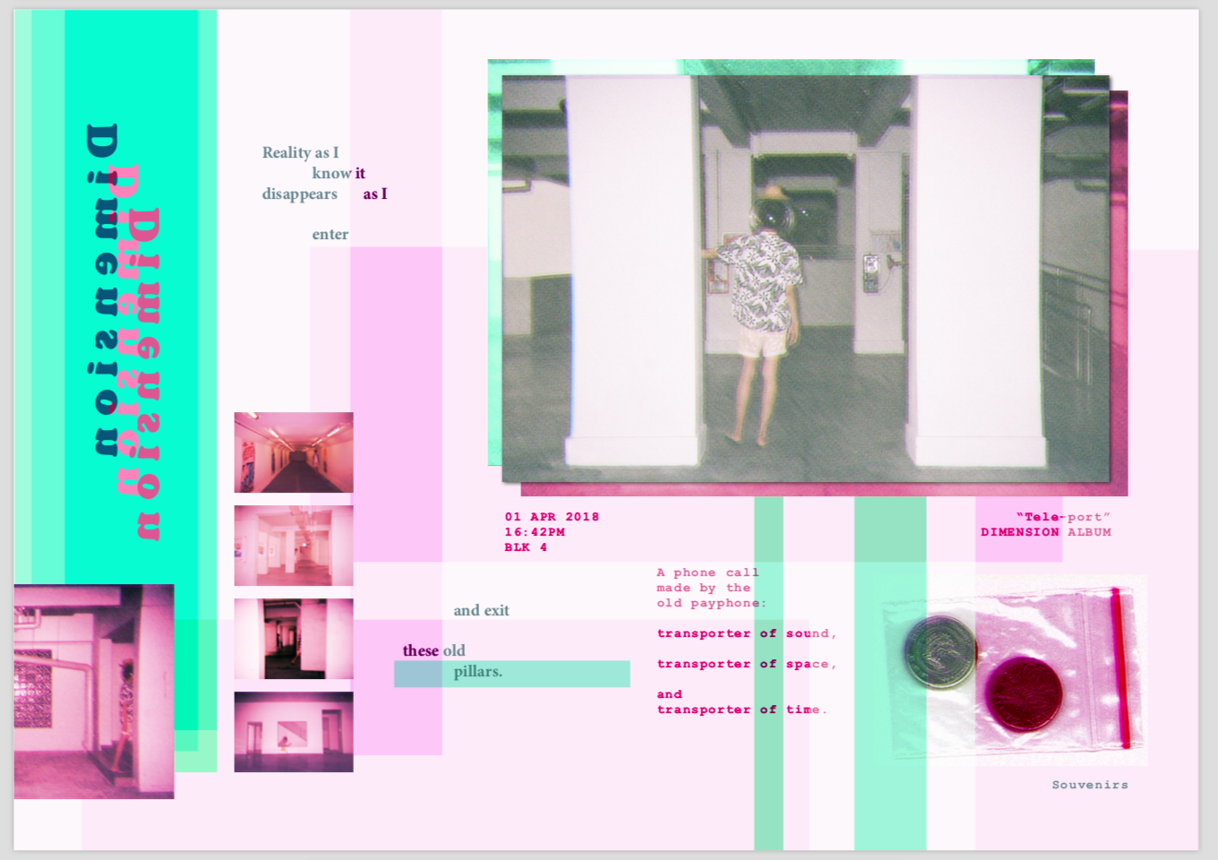
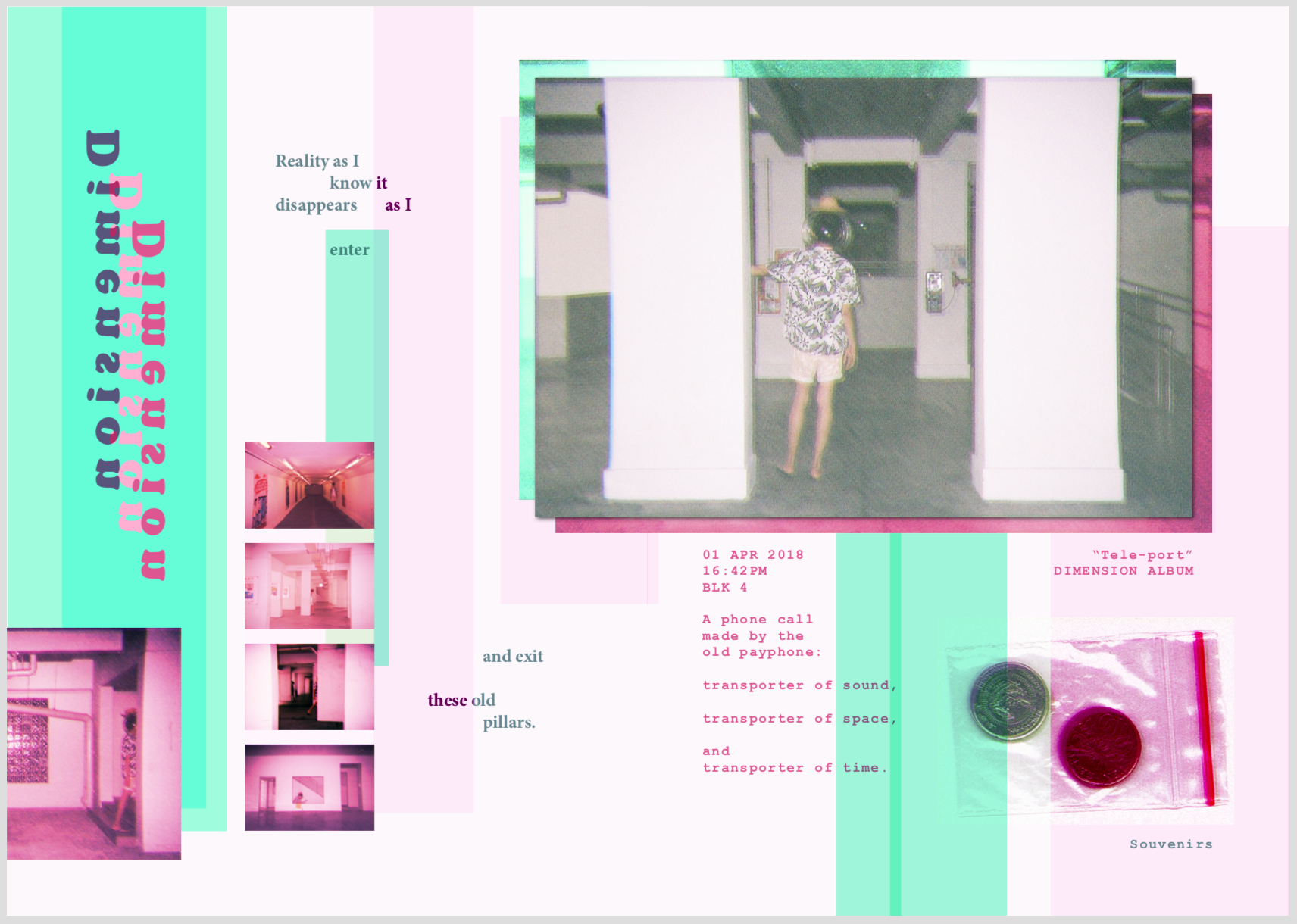
Evolution of Dimension Spread
I had the most difficulty with this spread as I don’t really know what to do with it. I added a lot of elements to experimentDecided that the portal has got to go, and focused the page mostly to dimensionsglitching it up to showcase the idea of a world that’s beyond our own
FINAL
Overall, all my images are glitched somewhat to create a more otherworldly feel, although I try not to overdo it so as to keep it subtle.
For the cover page, I chose this image because it embodies everything I want to convey in the zine. It also have the best composition and colours. I really love the pink that the disposable camera created, which reminded me of the photographer nguan. This inspired me to use the pink scheme. I used a mint-green colour to complement the pink, creating a zine that is unconventional, energetic, but strange.
The extra graphics I added are to frame the model, as well as to bring out the pillars.
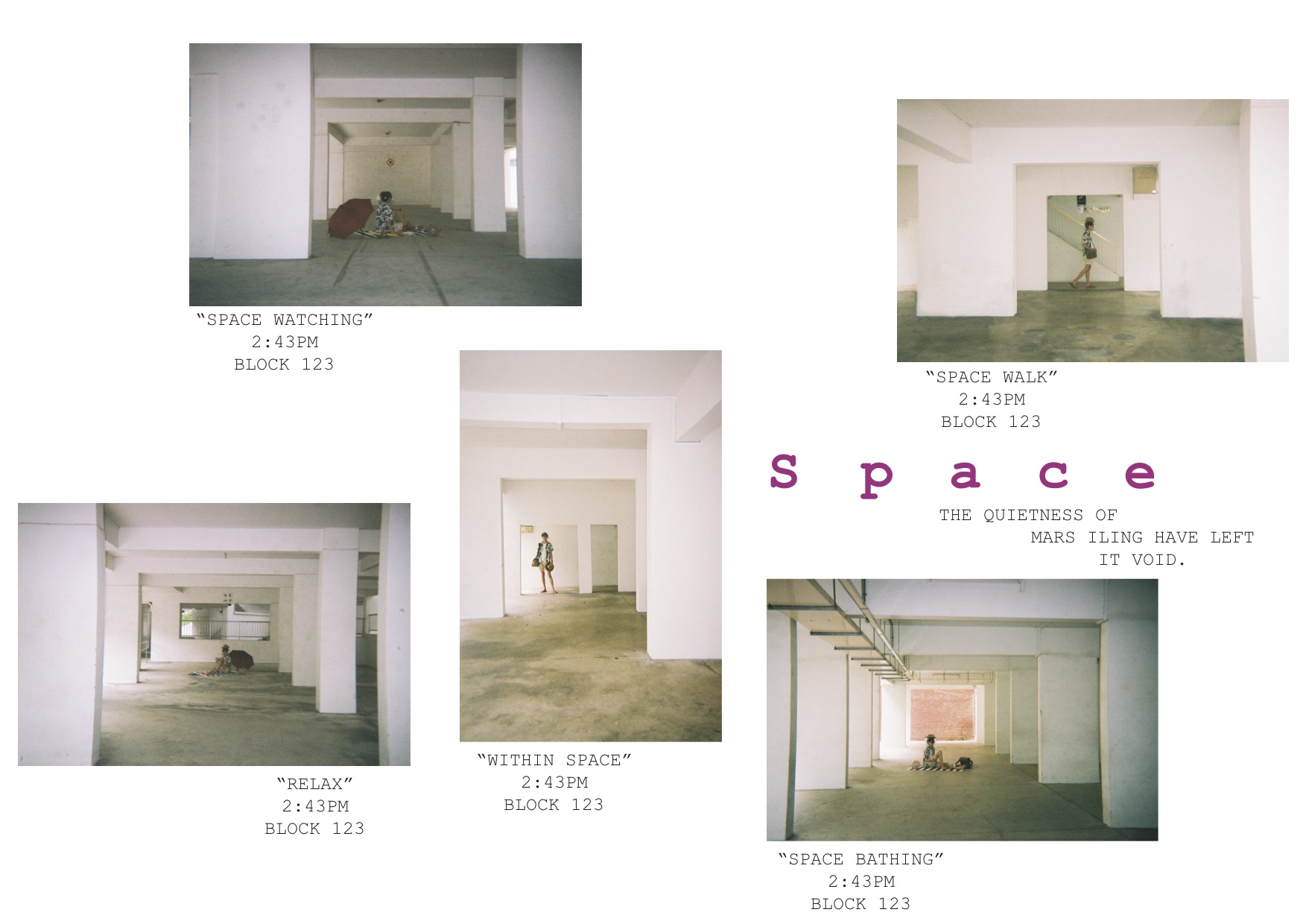
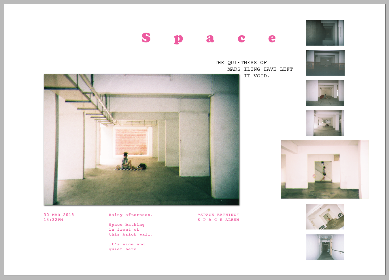
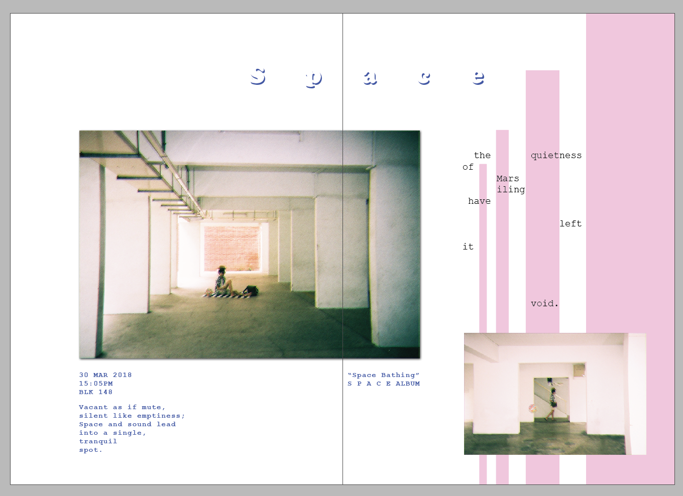
For this spread, I spaced out the kerning for the word “Space” so that I can get the message across by typography. The whole page was supposed to be very spacious and empty, but it does not fit the other pages. So I added in the complementary colour scheme to make it harmonious. The lines are arranged to look like pillars so I can show that the idea of space and quietness is in the spaces between the pillars and void decks.
The image used was a 4R image of the tourist sitting on the beach mat enjoying himself. This is to convey the idea of a vacation right from the beginning so as to set the mood. The poetry is used to explain what I am trying to do with the space to depict emptiness. At the same time, as this zine is supposed to be personal, I want it to be expressive and not just informative. I want the information to be understood through expression.
The text at the right side is spaced to not just amplify the idea of space, but also to create the idea of the texts aligning to the pillars.
Finally, the image on the right is another image that I want to show to depict the holiday-ness that goes together with the spaciousness.
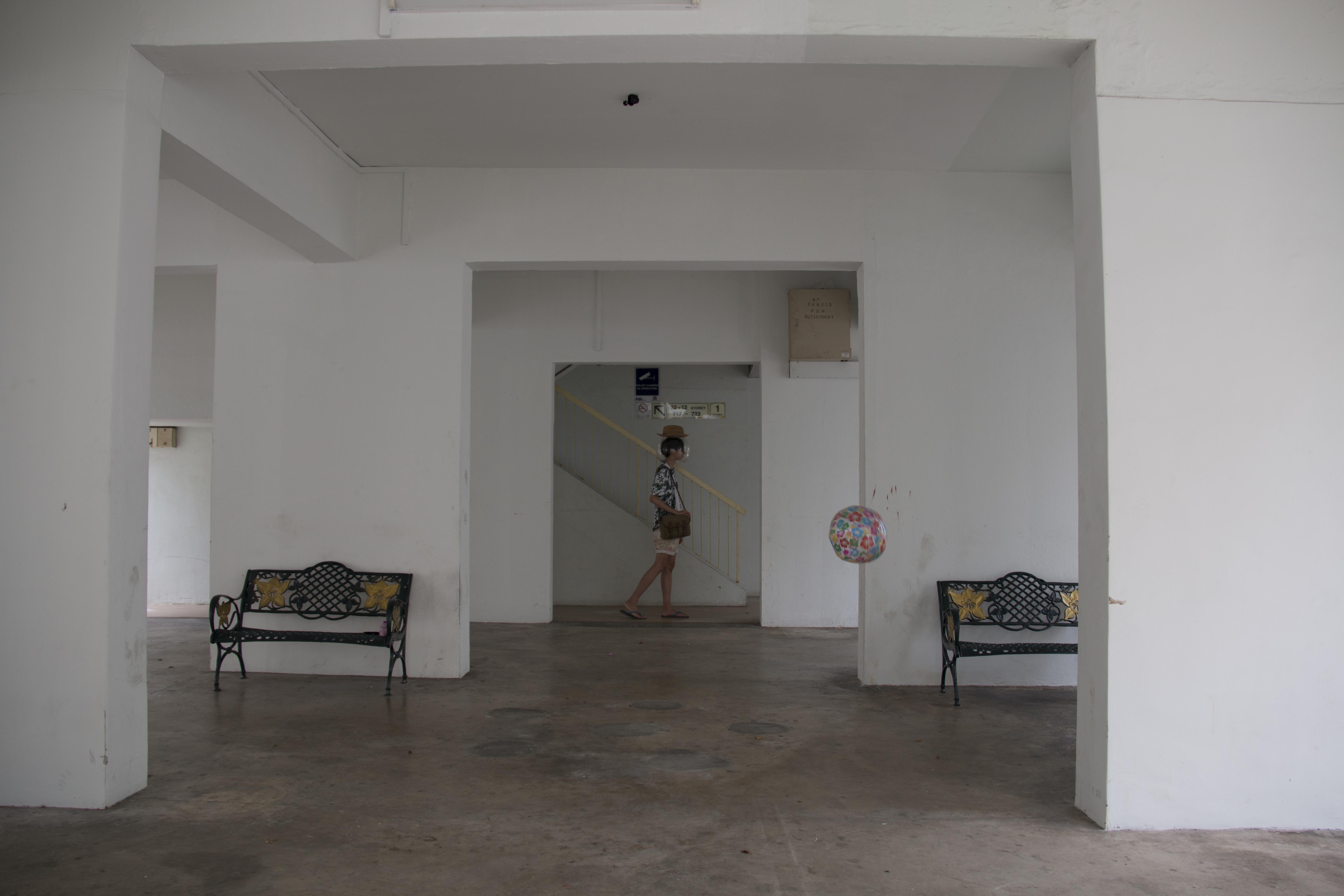
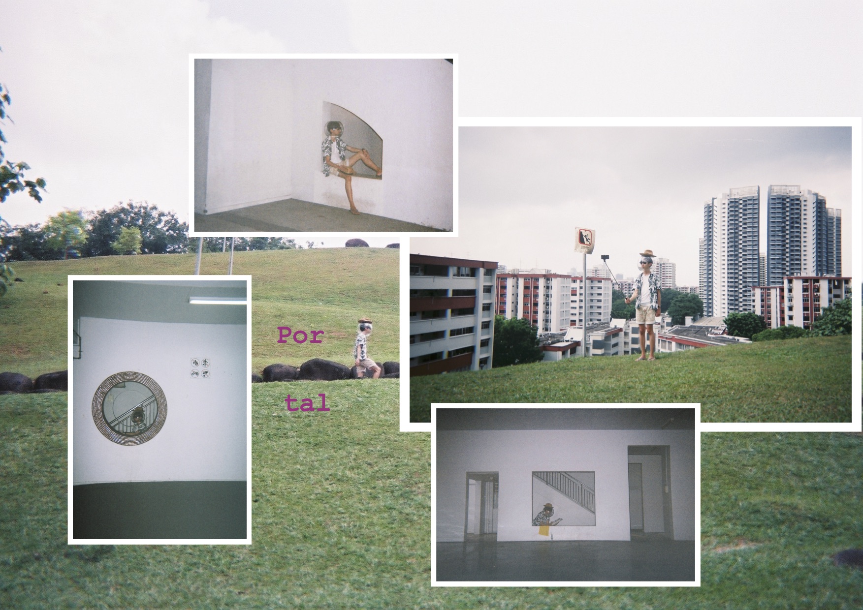
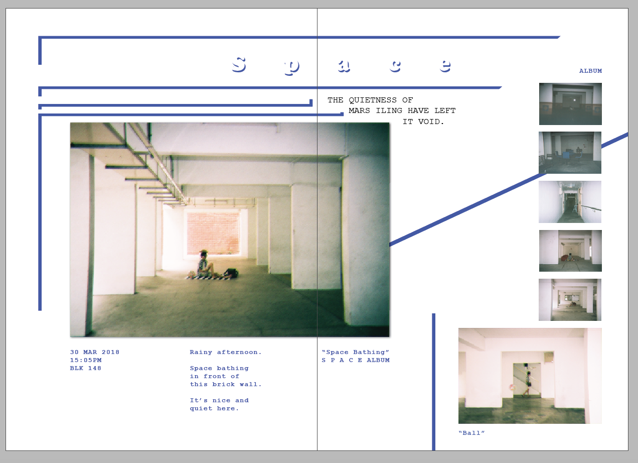
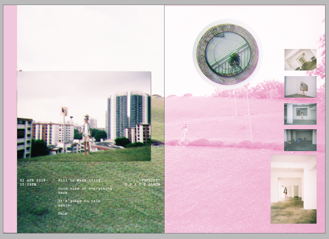
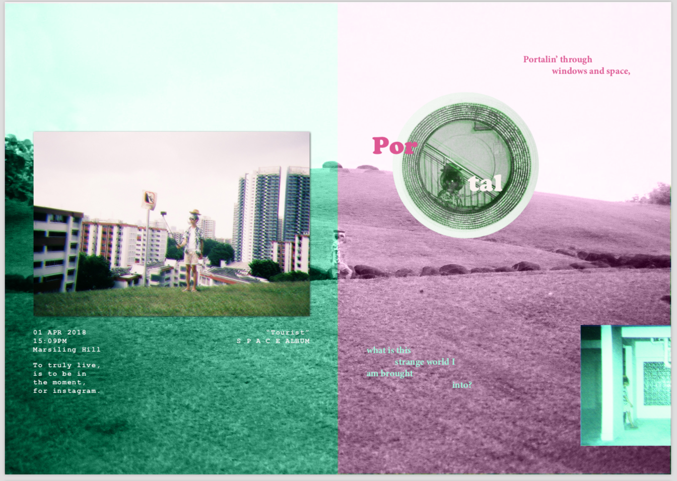
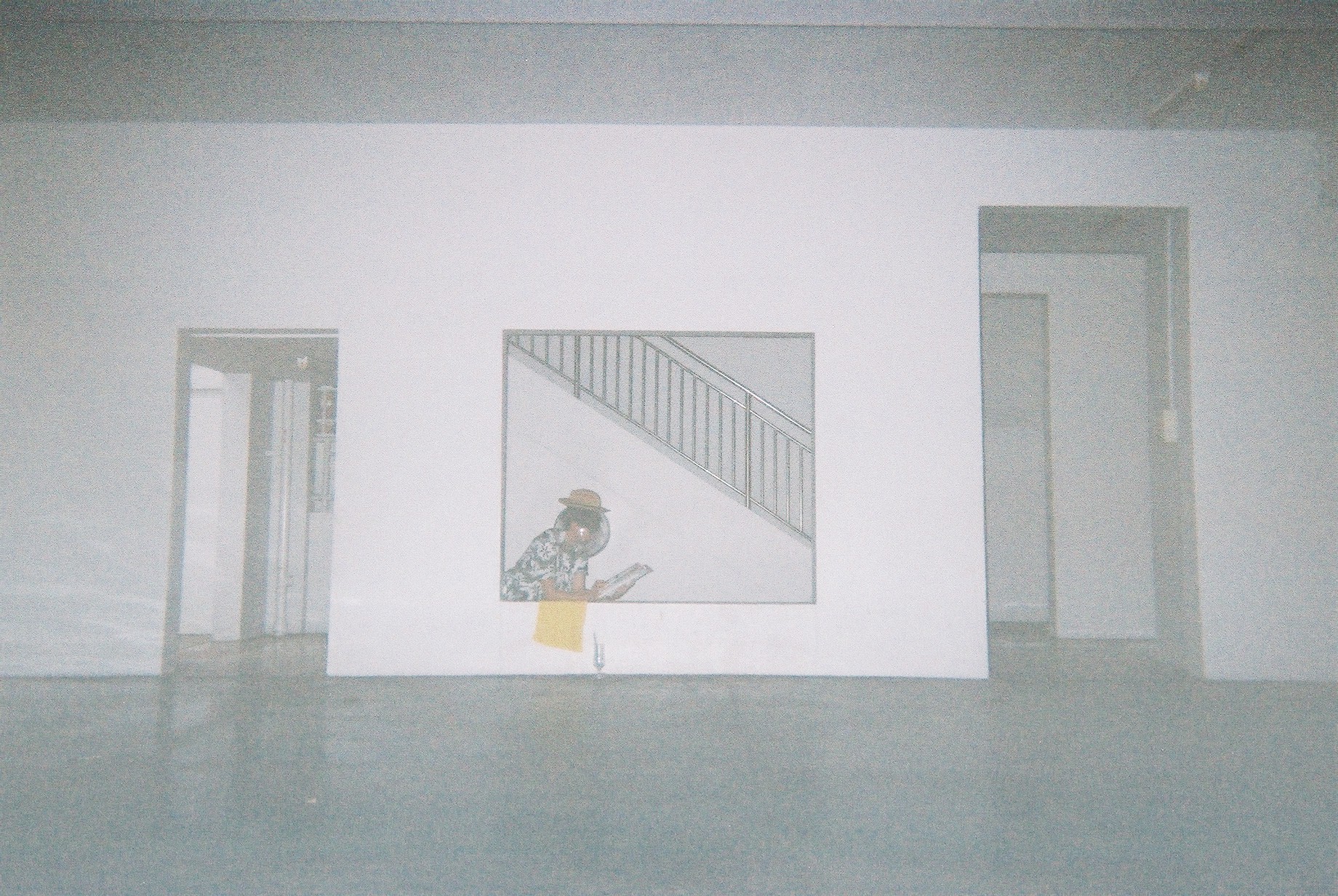
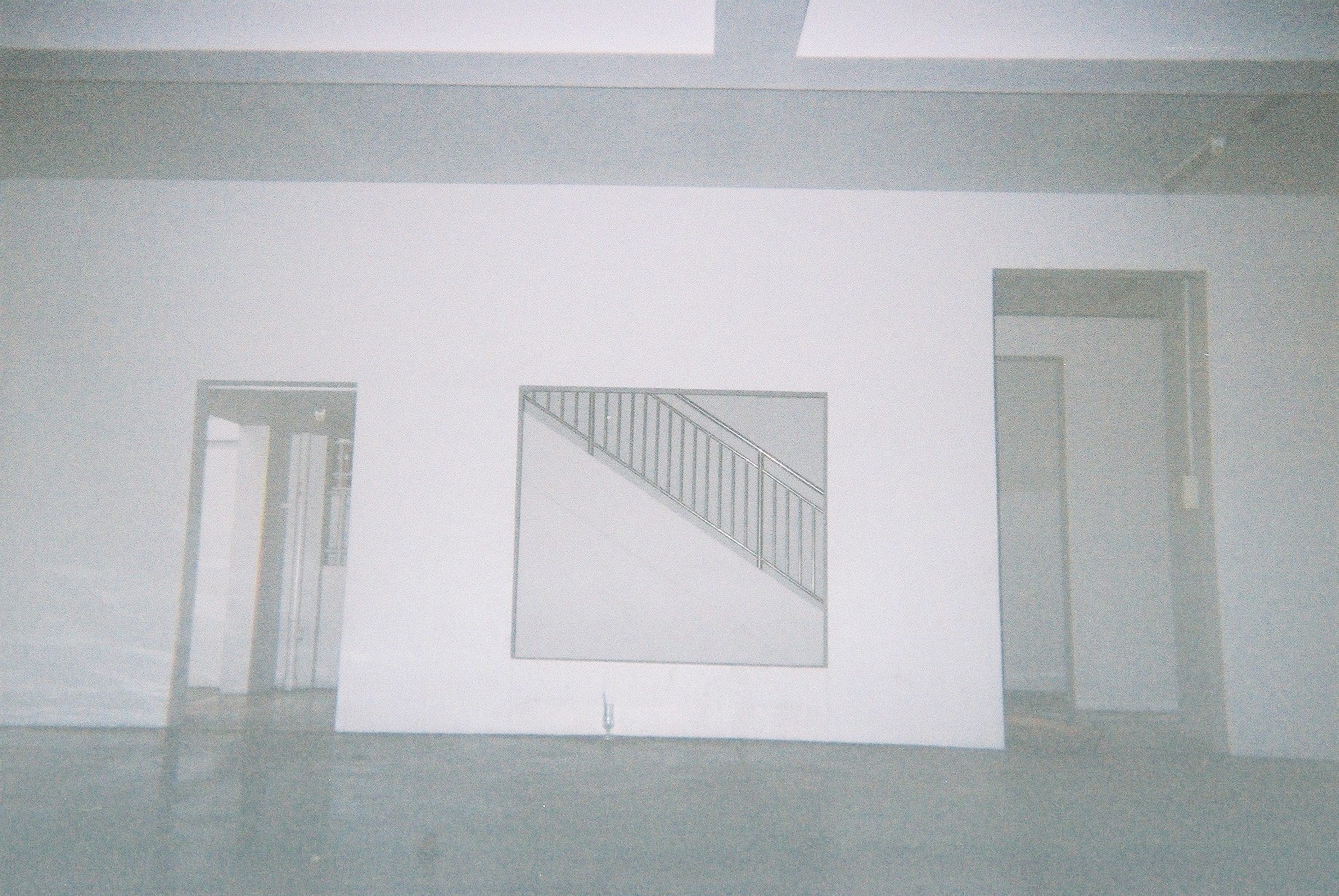
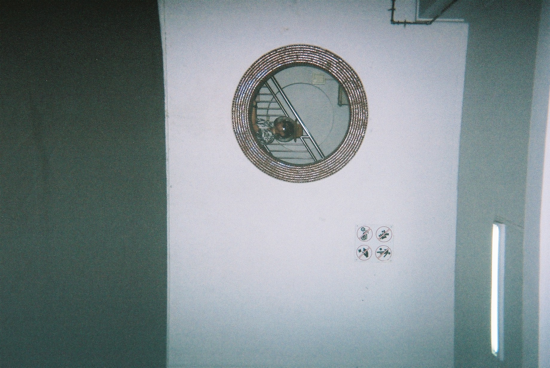
This spread talks about portals. Although the background does not have much to do with it, I really liked it as I think it have a lot of potential to be an image that covers the entire spread. I instead use the difference between an outdoor and an indoor area to suggest the idea of portals. The odd placement of the circular HDB void deck window in the middle of the spread is to add on to the idea of portals and strangeness. The usage of the complementary green/pink is very present here. This is to expand on the idea of duality in portals. In terms of placement of texts, photos, and colours, I have played around with increasing the space between linked objects to distant them. eg, distancing a single image with 2 colours, but they are linked in the same image, or distancing two sentences, even though they go together.
Another thing I did here is to connect the photo of Jeremy holding the selfie stick with the background. The grass and buildings align with the background, creating a separate, yet interlinked relationship between the image and background.
The poetry and the subject’s touristy action is a representation of the tourist. Again, I made sure to make him very stereotypically touristy. The background of the image is also a suggestion of emptiness as there are nobody there. I also purposely made the poem pretentious so as to convey the pretentiousness of stereotypical tourists.
Finally, I added half an image on the bottom right side so as to link the spread to the next page, conveying another idea of portals. In this case, it’s the portal from one page to another.
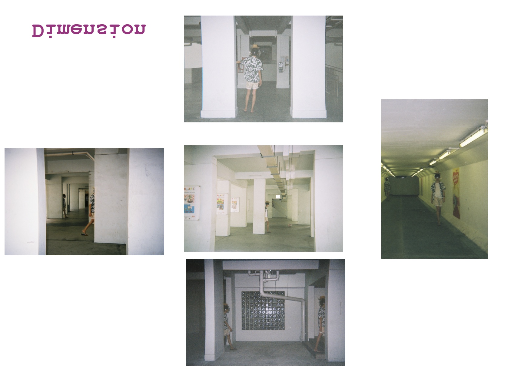
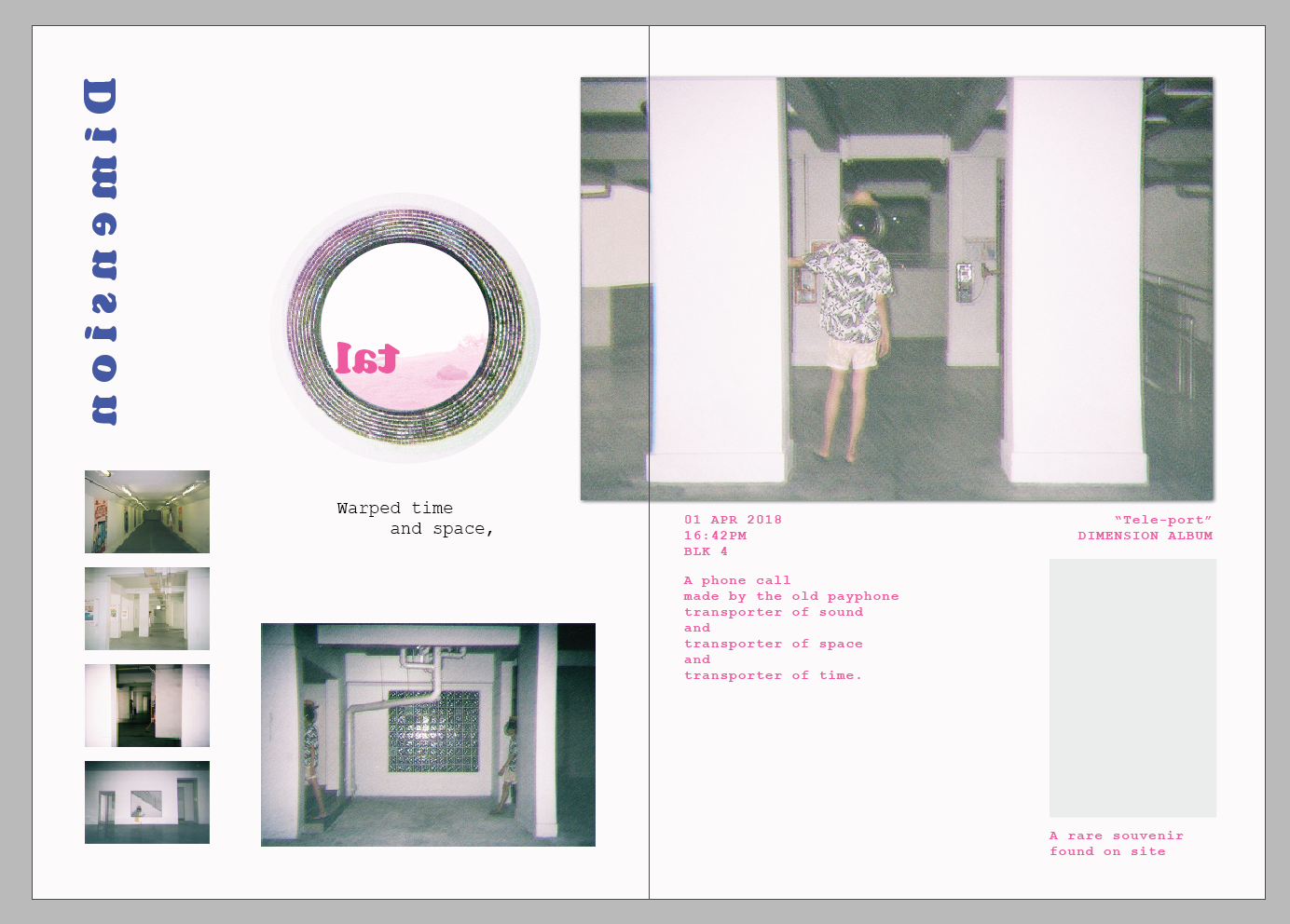
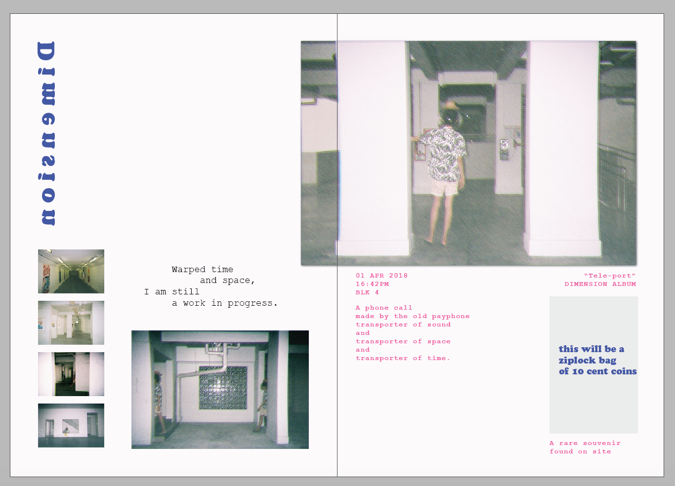
This spread is about dimensions. I combined the first two spread together to create this page — a combination of space and portals. Repeated and glitched “pillars” are created to show the idea of space, but also in a different world. I try to arrange everything vertically, so as to construct the pillars like in the first spread. The usage of all images present here are images of Jeremy entering from one pillar and exiting another pillar. This helps convey strangeness, and some sense of portalling.
In the 4R image, Jeremy is holding a telephone. This is to represent tourists’ curiosity with strange object, specifically objects with heritage like an old telephone. It suddenly clicked in me that phone is a representation of a transportation of sound. I tied everything together like this:
Jeremy is going through a portal through space
the phone represents sound, which is the main thing I am focusing on actually about Marsiling, which is that it is quiet
At the same time, this telephone is old, so its also a link in time
Combining everything together, I formed the poem.
The colours, again, I used the complementary scheme that is consistent to my other spreads.
At the bottom right, I added a ziplock containing two 10 cents coin, which I labelled as “souvenirs”. This is a representation of tourists keeping souvenirs found in foreign lands. This concludes what I think about what tourists in Mars iling will do, as well as concludes my perception of Mars iling.
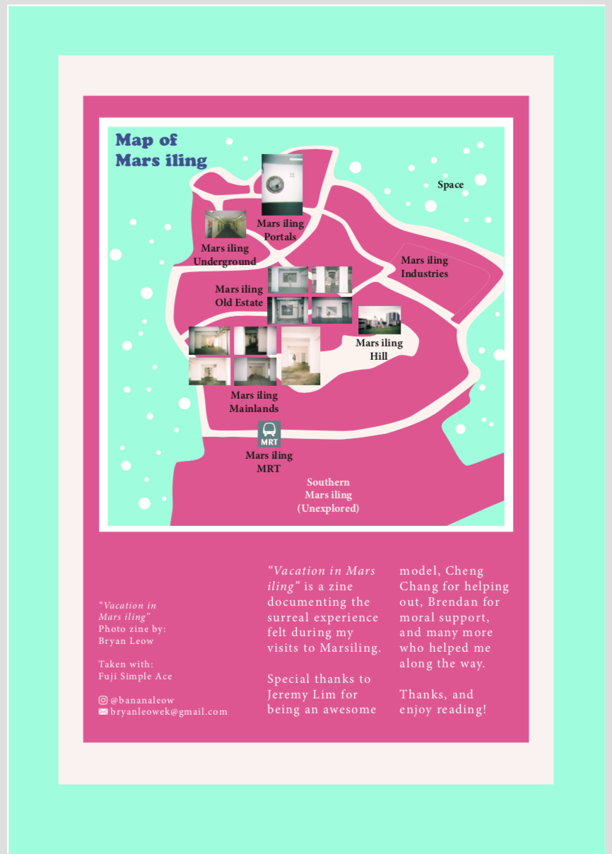
On the last page, I included credits and contact details, as well as a map. In the map, I try to label the different parts of Mars iling, categorising them into zones that I find define each area best. In specific areas, I placed the few significant images that I took at the area to let readers know which image is from which zone. I try to make it as if Mars iling is a planet, which is why I added “stars” and a label “space” outside the map.
And that’s my zine!
LASTLY
I’d like to show off all my disposable camera photos. I REALLY LOVE THEM.
Takeaways & Reflections
I really enjoyed this project, even though it was really tough. I am really grateful of my friend Jeremy for carrying all the camera equipment and props around Marsiling with me for two days. I enjoyed shooting with an intention in mind and directing the shots, as I have never done it before and it’s about time I actually do something that helps me to train my assertiveness and decisiveness. I also enjoyed thinking about the art concept and direction, and generally love the idea of having props and weird props around. There was even once I wanted to buy an inflatable flamingo float just for this shoot and I held back. I REALLY LOVE THE BEACH I GUESS?
OH. and I was also exposed to like a lot of different zines and that PUMPED ME UP a lot. They are really nice to look at and inspiring.
I also have discovered a new love for film and I really would love to go do more photoshoots from now on.
About the zine, I have relearnt how to use InDesign, and it’s quite good even though I disliked it at first. I was a bit reluctant to use it as I was too comfortable with illustrator. After a while, I decided to bring everything to Indesign so as to try it out. That was when I realised that the guides and spreads in InDesign actually makes everything easier.
One more thing is I learnt about composition, layout, and colours. These are always important, but I finally knew how to control it in pages.
I am proud to have created this zine even though I could still improve it, and even though I am not pursuing graphics design, I believe I’ll continue making zines for fun!