And so the final project for VC1 begins.
The first step was to explore the different types of folds.
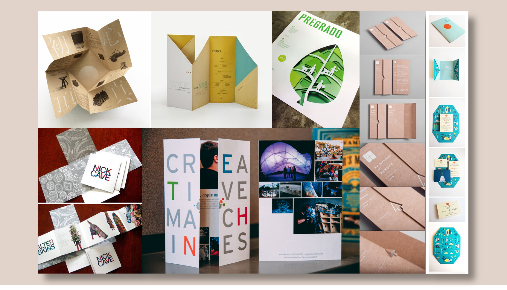
I started by researching on some interesting (and doable) folds or brochure designs.
After which, I experimented with several folds which I thought I could work with.
1st Experimental Fold


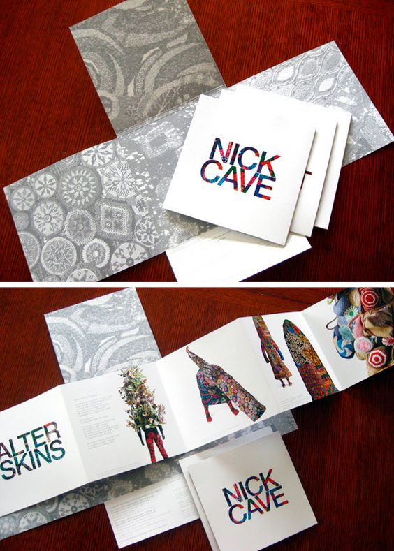
Inspired by:
2nd Experimental Fold

Generally, the comments received for the first and second folds were the same. Firstly, an outer brochure makes it look more like a packaging. Rather than using different sheets of paper, I should explore the brochure using a single sheet of paper. Another comment was that I had too many folds which did not contribute to the message I wanted to send. Hence, I could reduce the number of folds and get straight to the message I would like to send.
3rd Experimental Fold

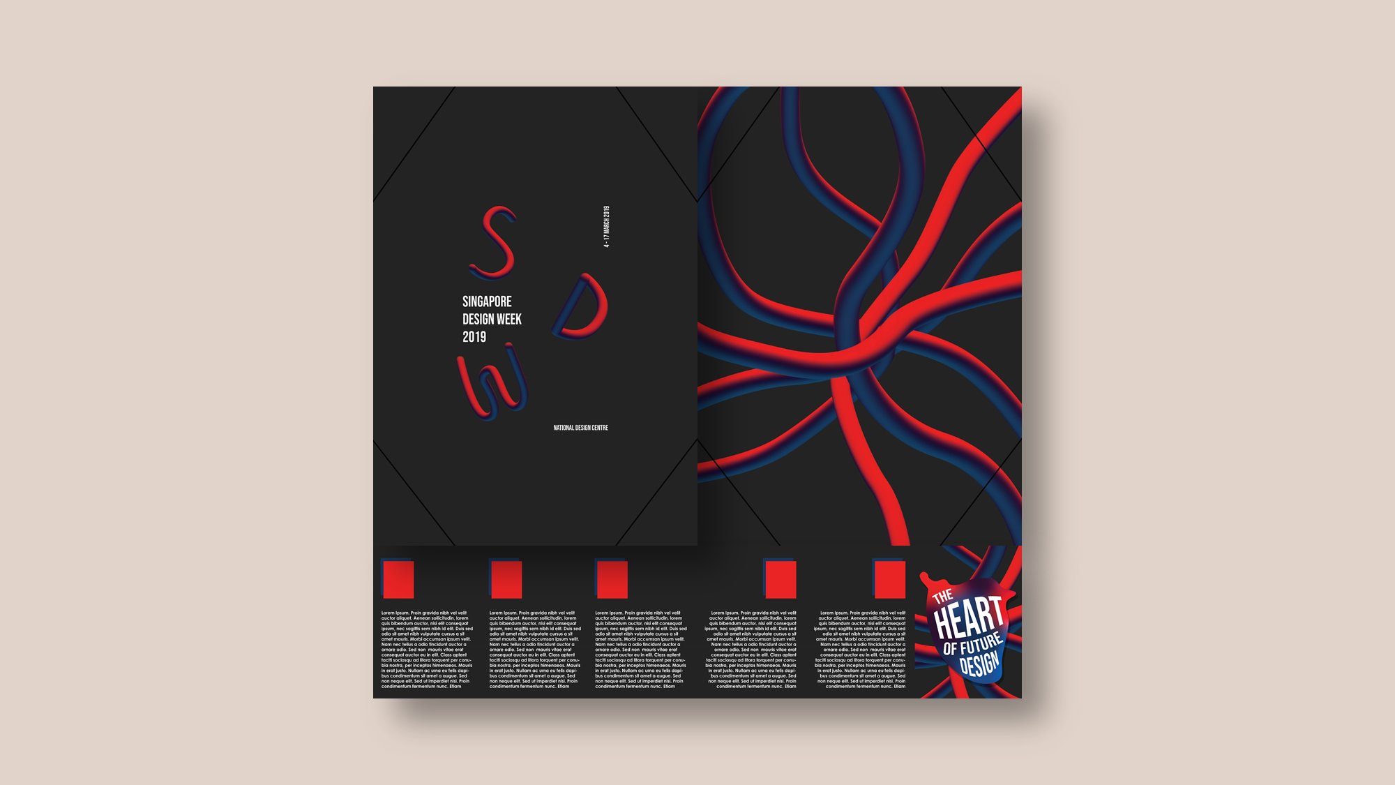
Using the accordion fold, I intended to die cut the slogan, “The Heart of Future Design” on the front page. However, the comment received was that I did not consider the meaning of the page from the back. If I were to die cut a page, it should add meaning to the page be it from the front or back of the page.
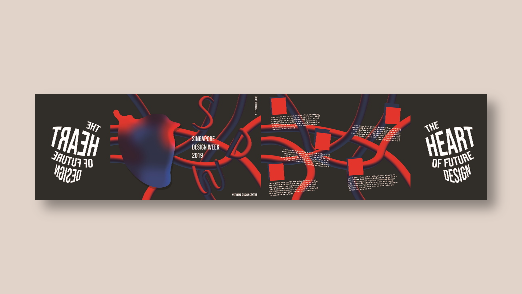
With the comments in mind, I decided to work with the first fold and try a different variation of a gate fold.
1st Draft
Further developing from the first experimental fold, I first began with observing how people would instinctively open the fold. I began by asking people around me to open the fold which did not had any words on it. Naturally, everybody had different ways of opening the fold be it horizontally or vertically. After which, I added the words “SDW” on the fold horizontally, in hopes that this would help people decide which way to open the fold. The results? 4 out of 5 people opened it following the direction of the words (horizontally).
Then, I began designing the brochure.

Several comments during consultation:
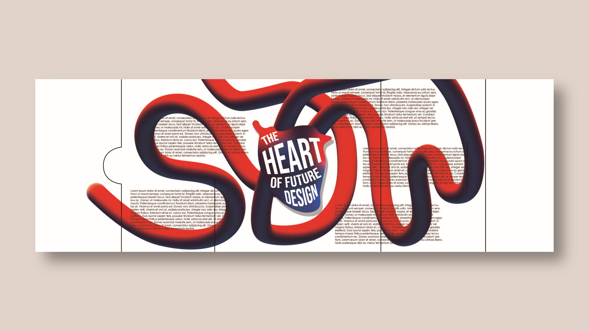
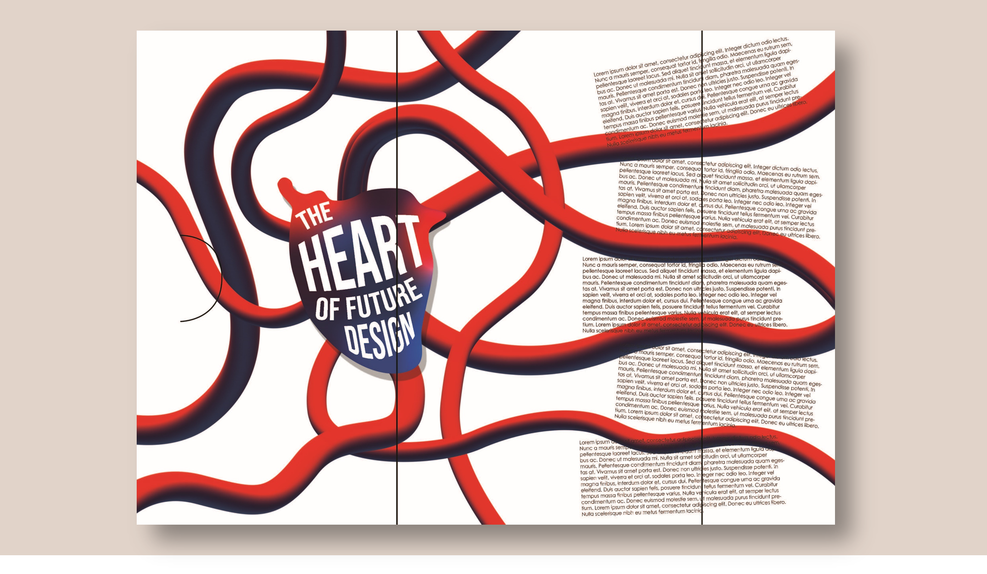
- There was a lack of contrast, especially for the inside of the brochure. There were too many elements that were fighting for your attention. Hence, creating more contrast will help the problem.
- There was no need to continually emphasize “SDW”. Thus, I could forgo the “SDW” inside the brochure.
- There was a lack of visual interest in the inside of the brochure. A suggestion was that I create a new visuals that could encapsulate the artist bios.
- I could also look into the meaning of what the new visuals could be.
- For the outside brochure, there was no central focus and that I should use the veins to direct the gaze towards the center of the brochure.
2nd Draft

For this exploration, I wanted to create a different variation of the gate fold. However, I decided to work on for the first draft for the final submission.
We have come to the end of my design process for this assignment. To have a look at the final brochure, click here final brochure.