Ikebana means flower kept alive. The flower arrangement in Ikebana can be a lot more complex than the Western way of arranging flowers. Ikebana dates back to 7th century when floral offerings were made at altars to the spirits of the dead. Later they were placed in the tokonoma alcove of a home. By the middle of the 15th century, Ikebana achieved the status of an art form independent of its religious origin.
Ikebana is a process of creating a flower arrangement in silence, allowing the designer to meditate on the beauty of nature and gain inner peace. Space is also an integral part of Ikebana, where space is not meant to be filled, but created and preserved through the arrangements. This ties into other principles of Ikebana including minimalism, shape and line, form, humanity, aesthetics, and balance.
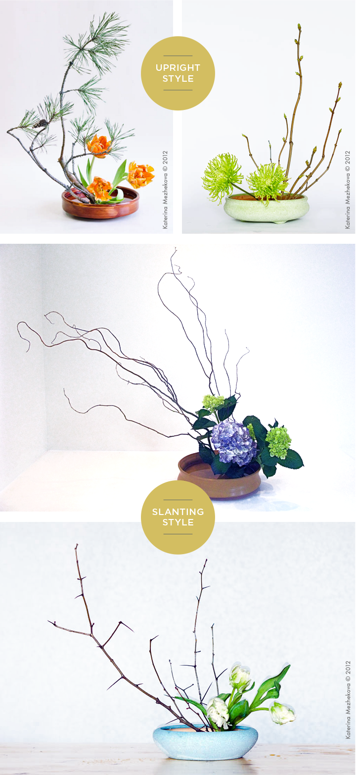
Below are examples of 2 types of Moribana styles, upright and slanting.
I just have to say, the minimalism is just on point. Personally, I prefer the slanting style because it is completely different from any other flower arrangement styles you see. As much as I love flowers, I feel that some Western flower arrangements are just overloaded with flowers. Ikebana has a perfect balance between the flower pot, branches and flowers. It just exudes it’s own gracefulness and minimalism in each arrangement.
Taste/Food Research
I decided to explore some Japanese food since my overall concept that I was going for was Japanese.
When it comes to Japanese cuisine, some of the food that comes into mind are: sushi, curry, ramen, tempura, takoyaki, mochi, sashimi, seafood, soba, etc.
Warning: Photos below might make you hungry. You have been warned.
In a lot of this Japanese food, you often see the use of soy sauce which adds a salty flavour to each dish. For example, dipping sushi into soy sauce or seasoning for ramen. Soy sauce is an important part of the Japanese cuisine.
Also, Japan is known for its green tea. They have created countless renditions of green tea such as, matcha ice cream, matcha coffee, matcha mochi and many more. Green tea is also usually served before or after a meal in Japanese culture.
Japanese Winter cuisine
Some food that Japanese eat during winter are oden, yosenabe, ramen and sweet potato. Because of the cold season, the Japanese tend to prefer hot, soupy dishes and avoid cold dishes. I believe this is probably to warm them up. During winter, some seasonal fruits that also becomes popular are apples and citrus fruits (yuzu, oranges).
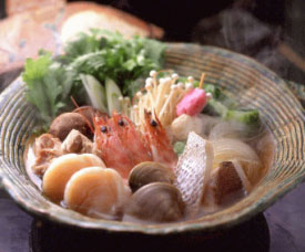
Yosenabe
In yosenabe, you see a lot of different ingredient in one bowl. To me, I feel like the dominant could be the prawns because of its bright colour and size. Another possible dominant could be the vegetables. The other ingredients could be the sub-dominant. The subordinate could be that pink ingredient.
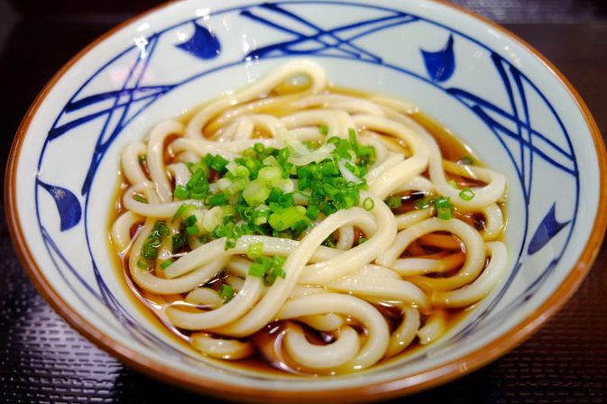
Udon
The dominant in this udon would have to be the noodles. The sub-dominant being the brown sauce and subordinate is the green onion sprinkled on top.
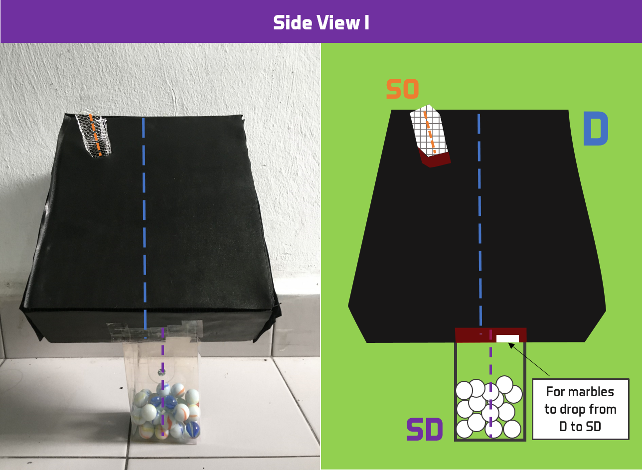
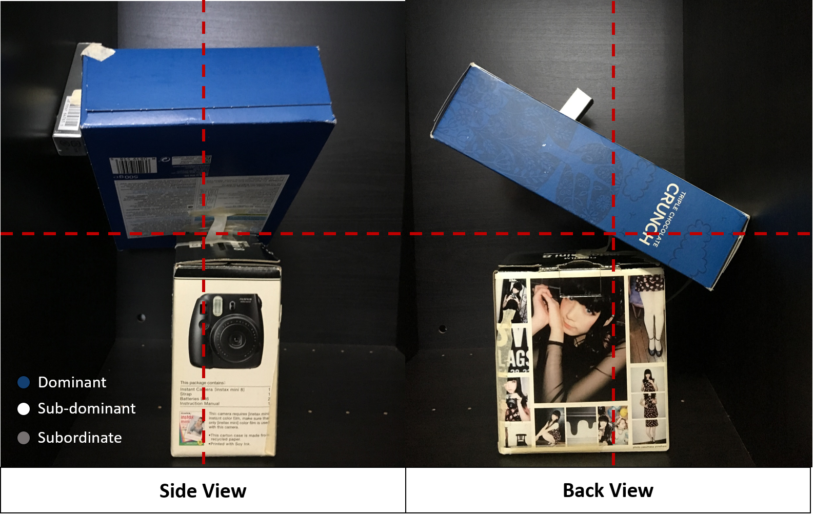
Being able to work with diagonals was a blessing however, it proved to be tedious. Since I was working with diagonals, I thought why not use it to my advantage and create a structure in which something can roll through all 3 boxes. Hence, this rolling action emphasizes the diagonal dynamics of the structure.
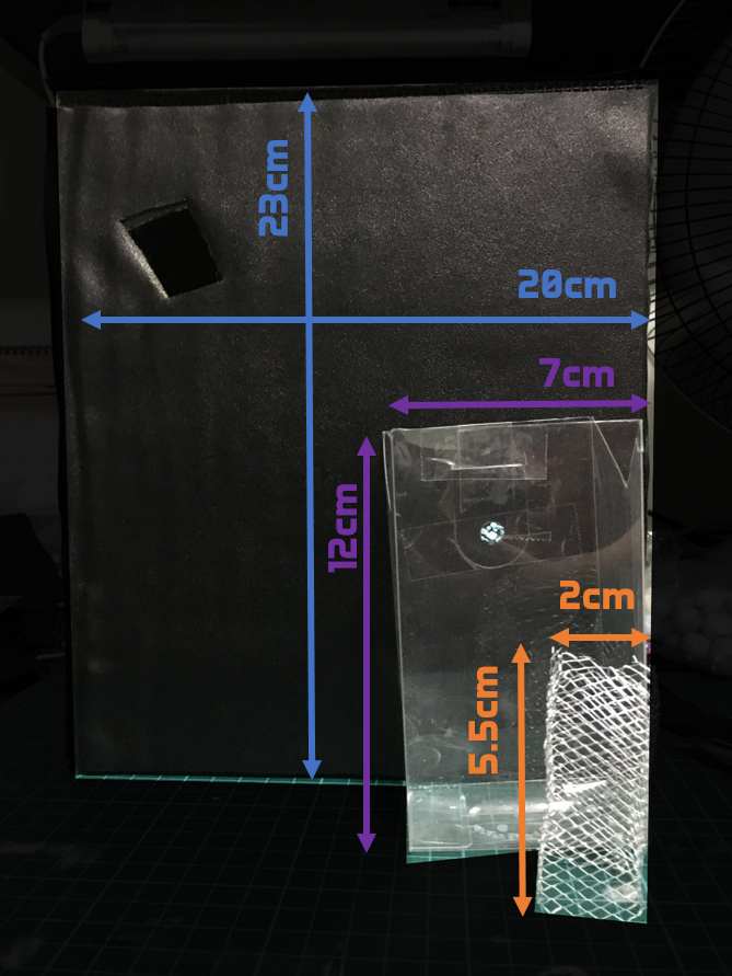
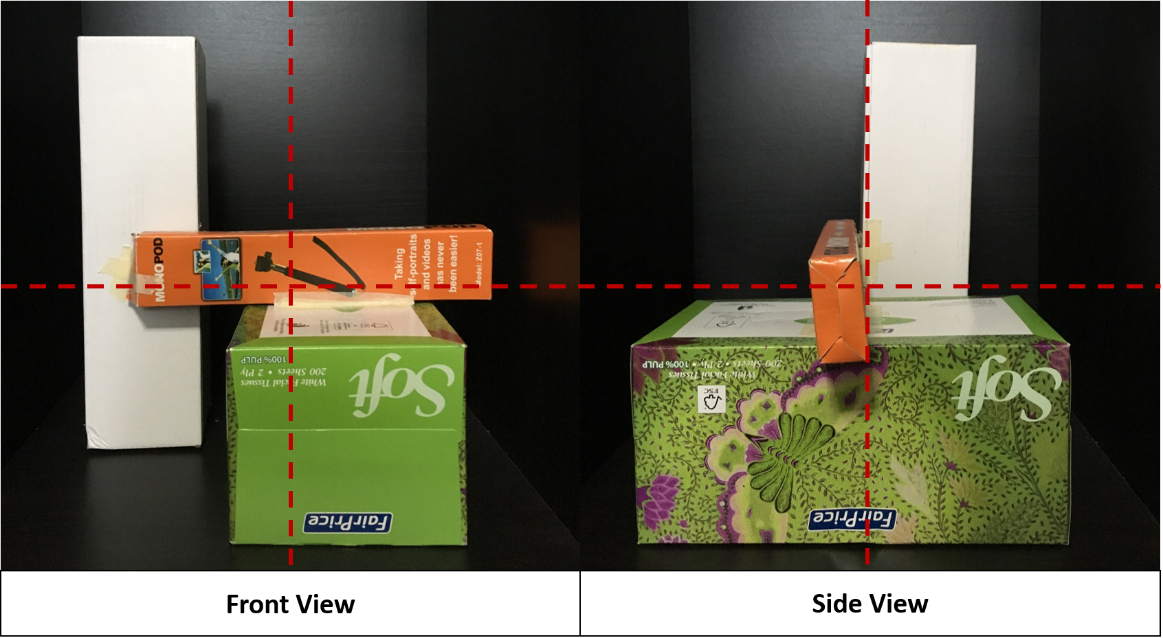
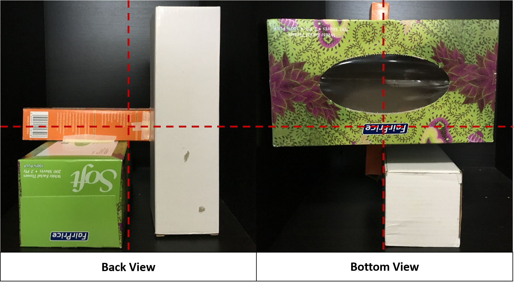
Size
I wanted to display the idea of discordance by having the dominant placed over the sub-dominant or subordinate. However, it was not possible for the subordinate to withstand the weight of the dominant and sub-dominant on its own. Thus, I used the sub-dominant as my base.
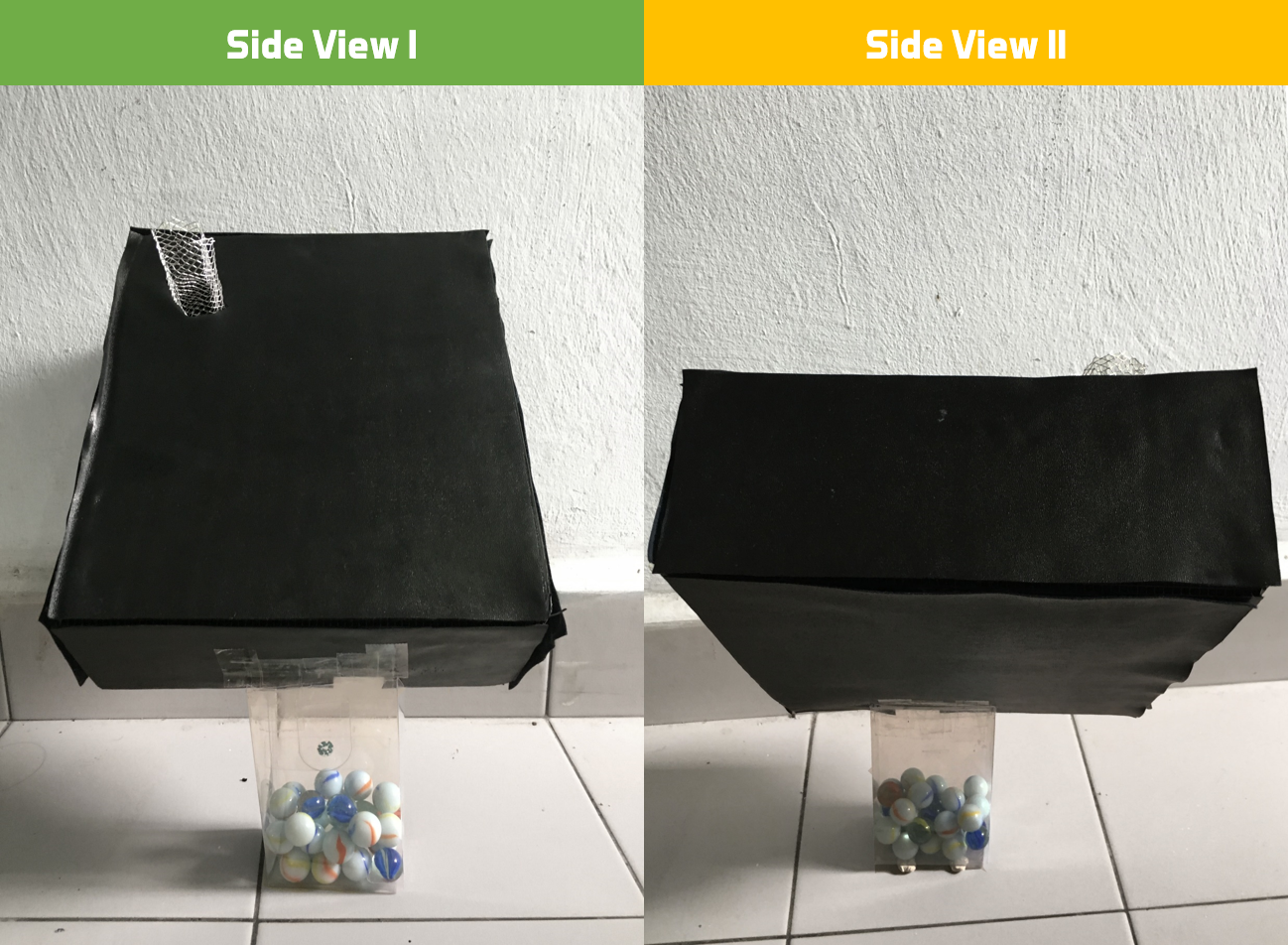
I carefully selected the sub-dominant, which is the only box which was not made from scratch. Using the sub-dominant as a gauge of size, I crafted the dominant and subordinate boxes to appear more/less than half of the size of the sub-dominant.
Material
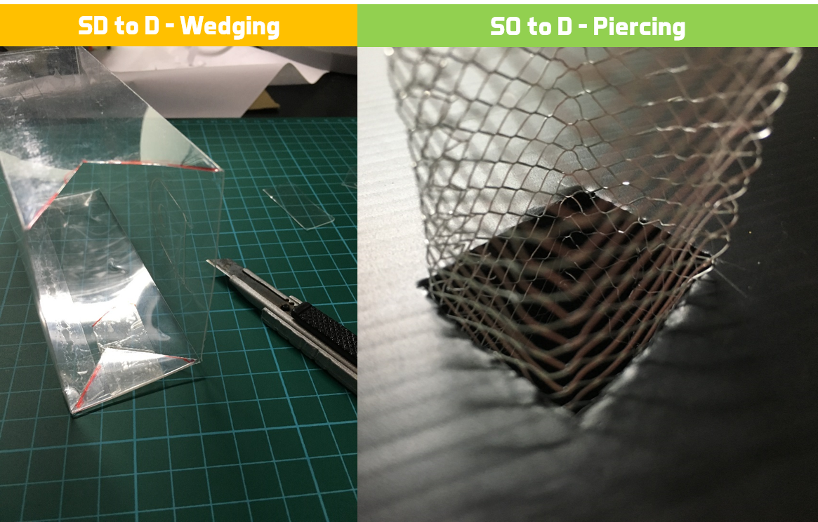
To further induce the sense of discordance into the model, I chose to use 3 CONTRASTING materials for each box that you don’t usually see together.
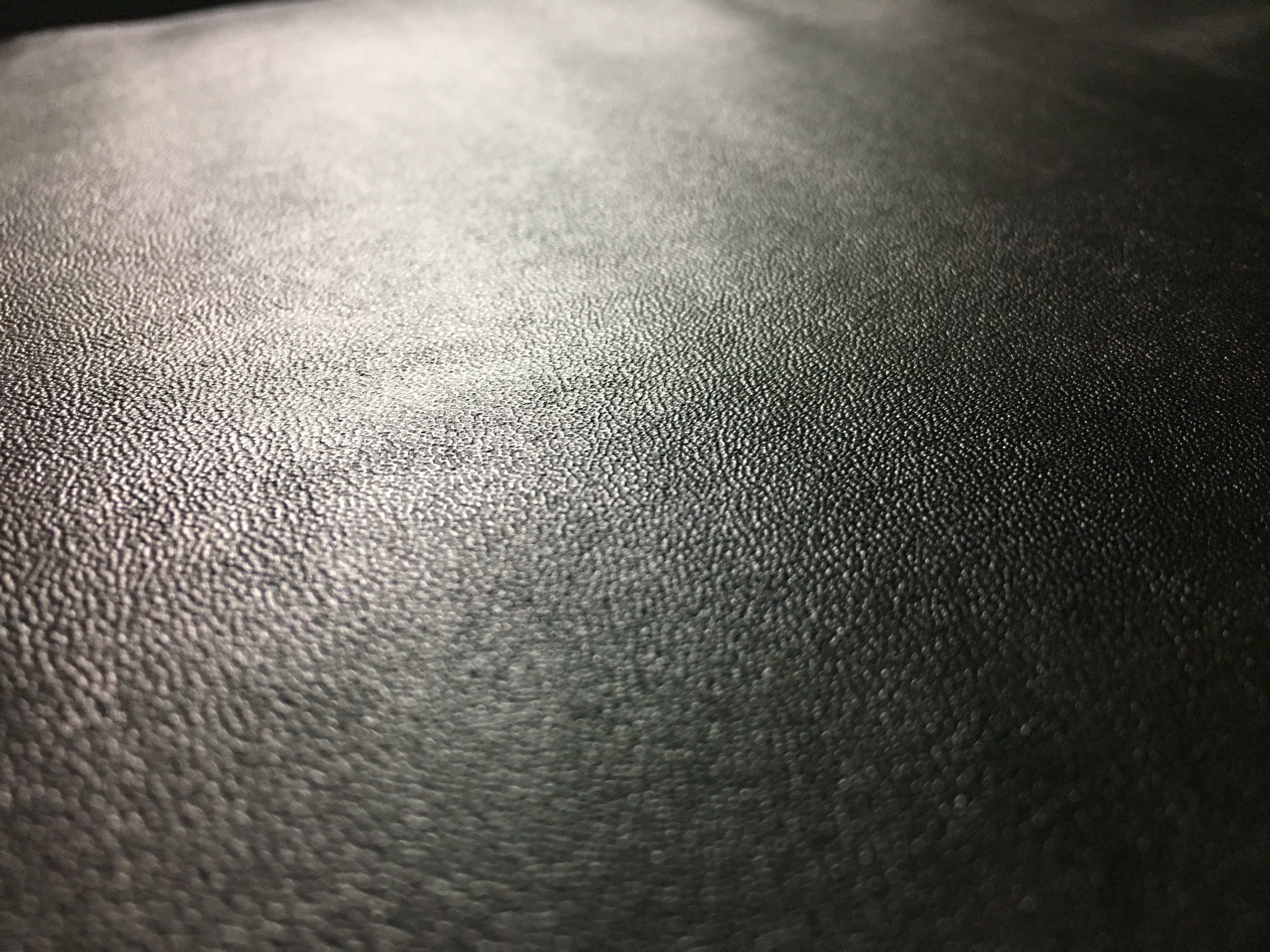
Dominant:
Using an opaque black corrugated board, I created a box of a much larger scale than the sub-dominant. I chose black to give it a huge contrast against the transparent sub-dominant. Adding leather over the box gave it a new dimension and texture from the other two boxes. Initially I wanted to use fur to give it an even greater texture, sadly broke Fizah couldn’t afford to get the extravagant, luxurious fur.
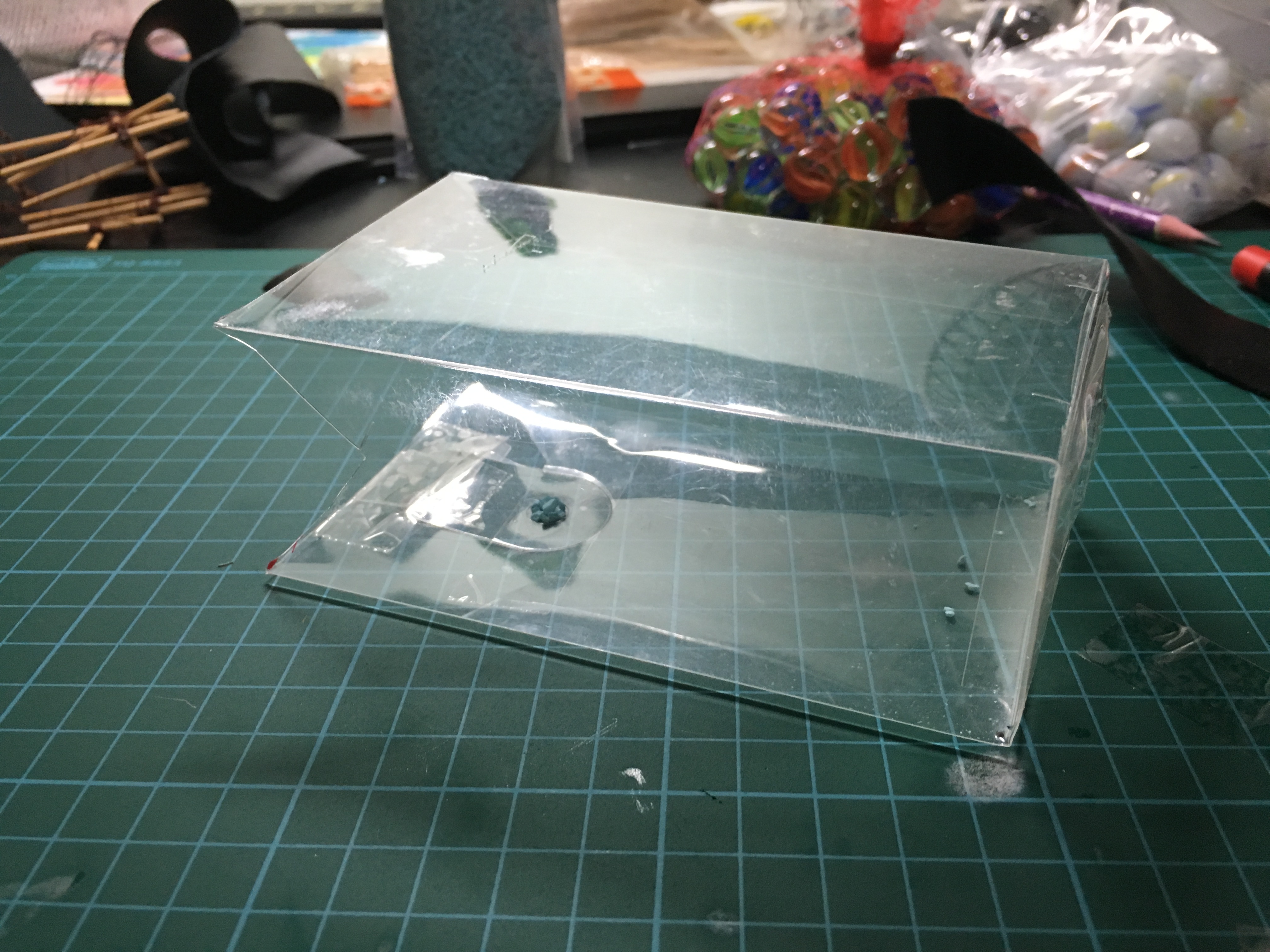
Sub-dominant:
I decided to go with a transparent plastic box. Transparency can sometimes be associated to the material being less sturdy and lighter in WEIGHT. To elaborate the idea of discordance, I wanted the base to be transparent to give it this weaker and light dynamic. Adding marbles will help to stabilize the structure and give the sub-dominant some WEIGHT.
Subordinate:
I found it hard to find the right material for the subordinate. I experimented with using thin wires and satay sticks but to no avail.
I kept searching for a material that would be suitable, and soon my hero came along.
Wire mesh to the rescue.
The wire mesh gives a stark CONTRAST to the leather dominant and transparent plastic sub-dominant. In terms of colour, it is silver and shiny which is different from the other two. The leather box is opaque and the plastic is transparent, so I wanted the sub-dominant to be see through but not completely.
Methods of attaching boxes
Application
Macro
“Hidden Slide”
A slide for children to play in the park. The actual slide is hidden in a big box as an element of surprise so that the children wouldn’t know where the slide is going.
Micro
“Coin Bank”
A glass transparent coin bank so that we can see how much we have saved up and break when you need money.
Conclusion
Some challenges I faced was the sizing of my boxes. Cheryl explained to me how my boxes were initially too similar in size and hence, we’re unable to differentiate between the dominant, sub-dominant and subordinate. This was difficult because I was constraint to the sizes of my boxes, however when I was able to use any materials I wanted, I could control the sizes better and easier.
The other challenge was choosing the right materials that matches with the word “Discordance”. What and how do I relate the idea of discordance into my materials? After a little brainstorming, I came up with the idea to use 3 different materials so that each material CONTRASTS with each other in terms of texture and colour.
I believe I could have improved on the craftsmanship of my model. Unfortunately, in a sudden turn of events, the model wasn’t able to stand on its own even after putting in a lot of marbles. This could have been due to the sheer weight of the dominant which the sub-dominant could not hold. I think I could have used acrylic instead which is much more studier, and would prevent the structure from falling over so easily. Nonetheless, I will take this as a learning curve and will not repeat the same mistakes
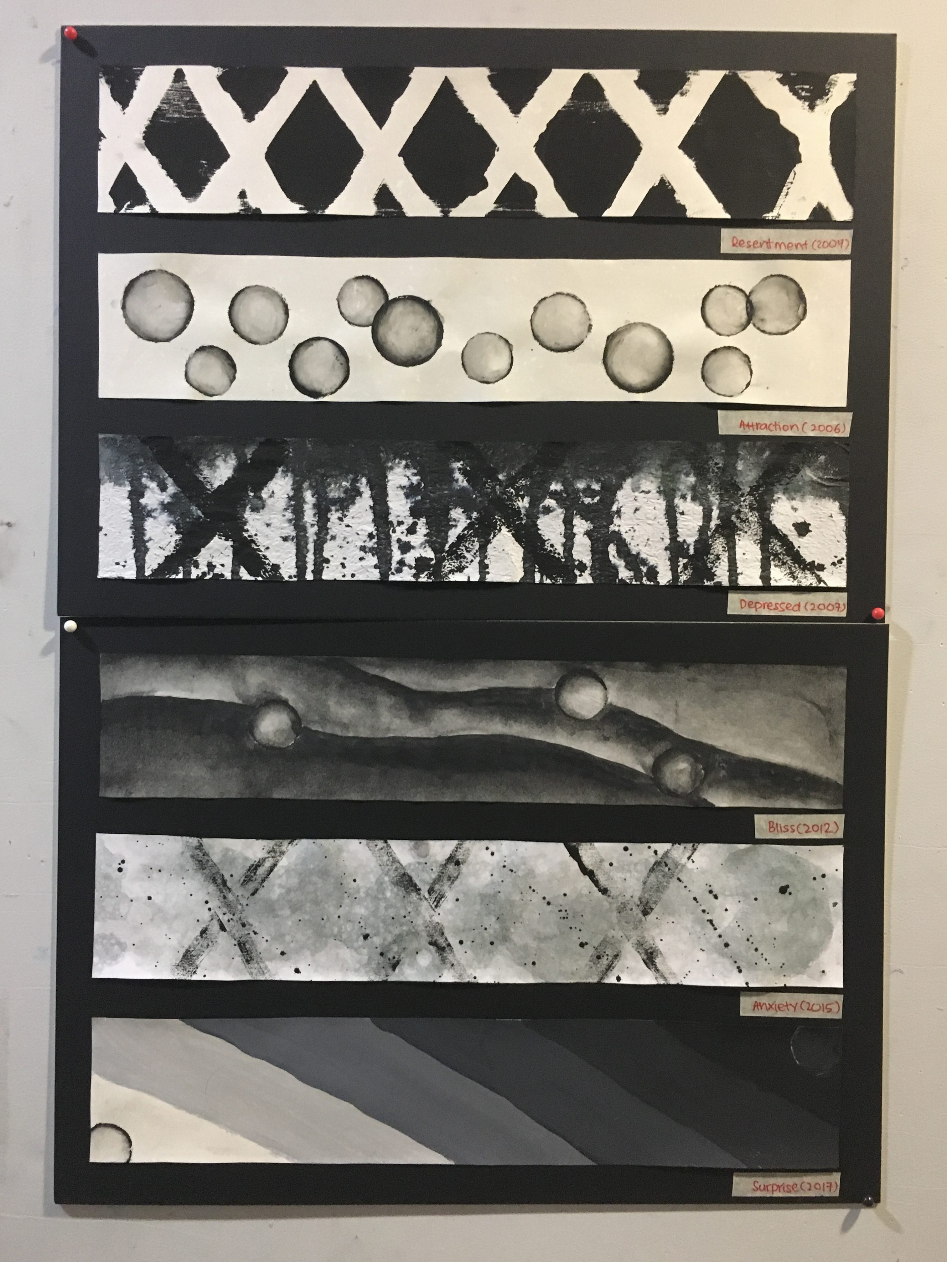
I believe emotions are expressed differently from person to person. For example, different people express their happiness differently, some may express it outwardly, some inwardly, some may even cry when they are happy. Hence, for this project I hope to reflect my perspective on how I personally express this emotion.
To covey this, each emotion corresponds to a specific year in my life where a particular event occurred of that significant emotional nature. This events have shaped me to be the person I am today. Hence, I reflected my growth throughout the years from those older incidences in the newer ones by including certain mark making of old events in the new ones. Also, to display the aging growth, I have used older textured papers for older events and fresh white papers for newer events.
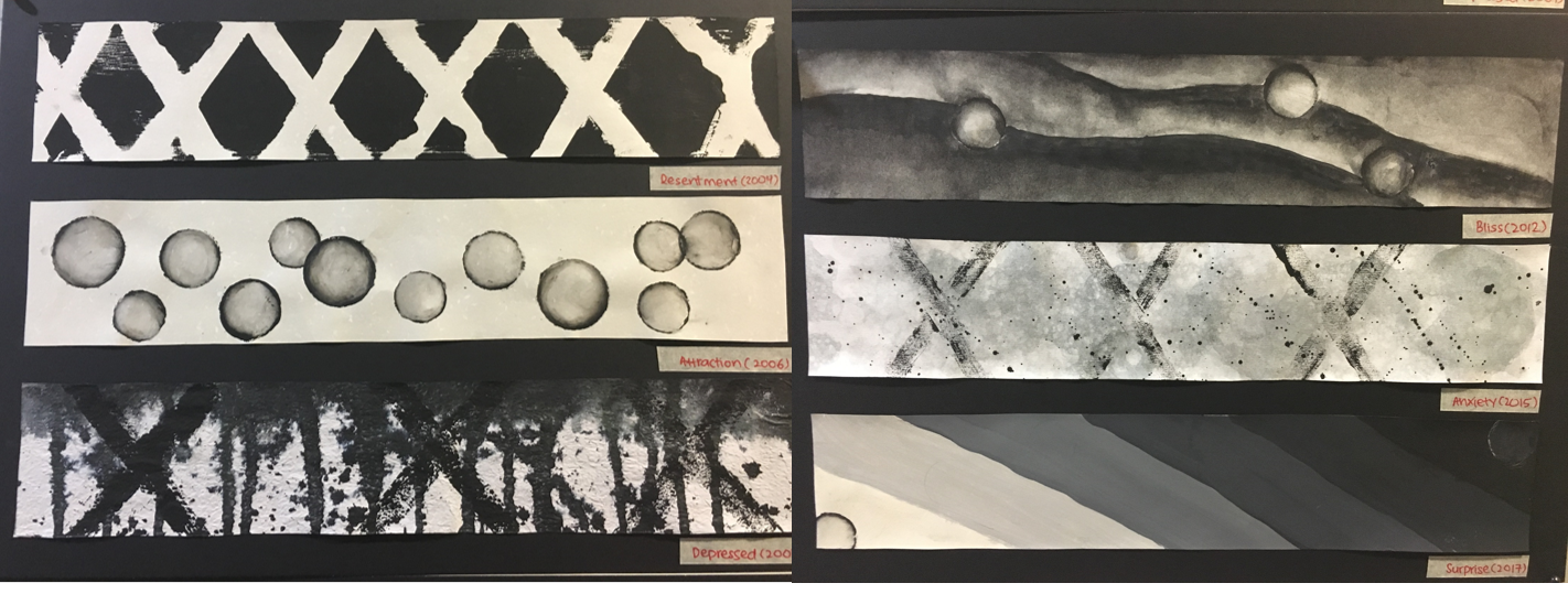
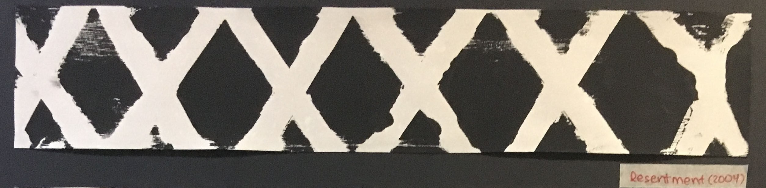
Resentment (Anger)
Year:
2004
Story:
Being bullied by people who I thought were my friends
Methodology:
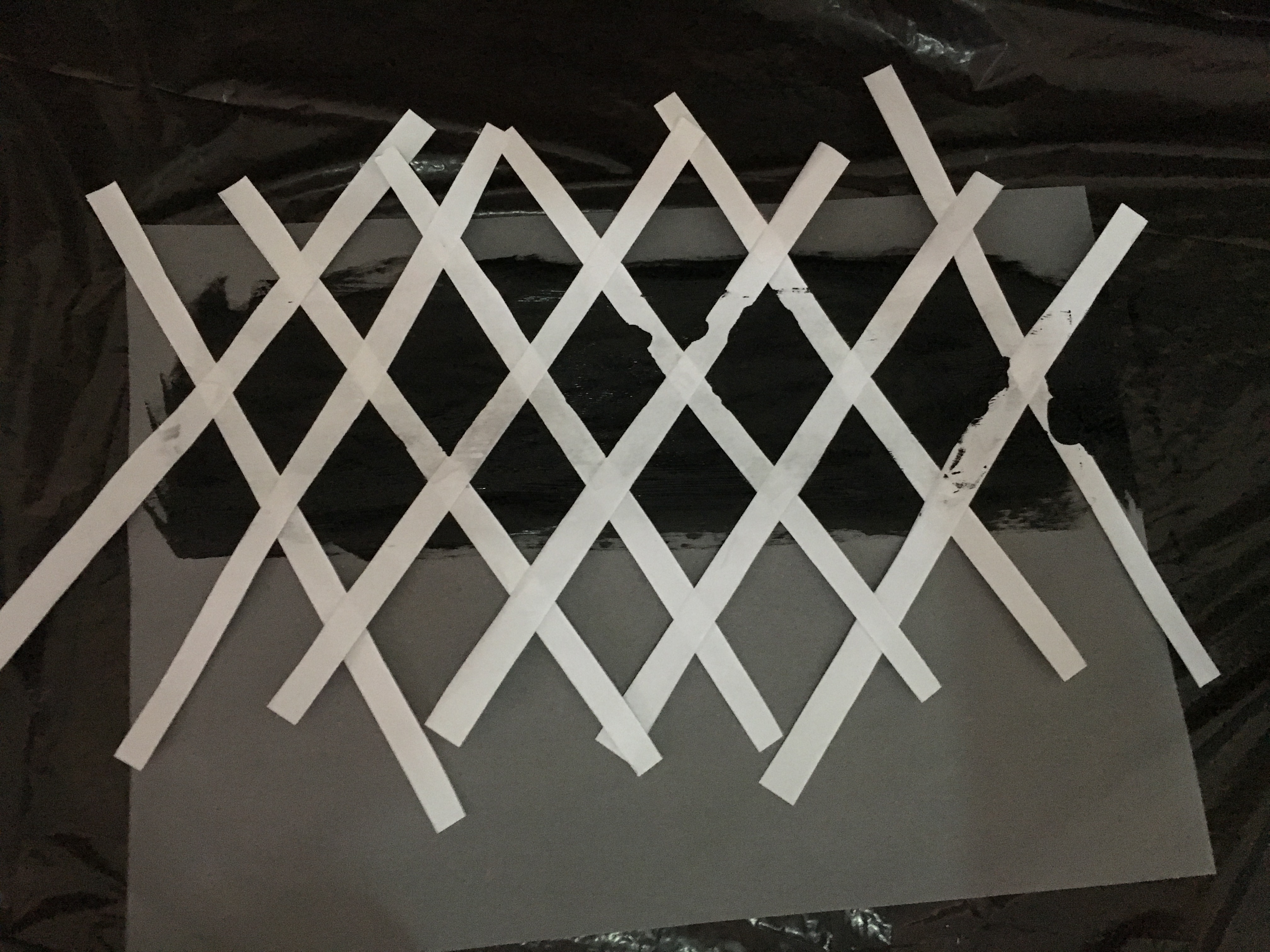
I cut out thin strips of paper and arranged them to form crosses
I placed the crosses above a layer of paint and place a sheet of paper over for the transfer
Meaning:
The crosses represents my resentment towards the people that bullied me.
The crosses are not perfect straight lines, and the paint bleeds through the white areas. This represent the resentment and frustration towards myself for not being able to forgive this people.
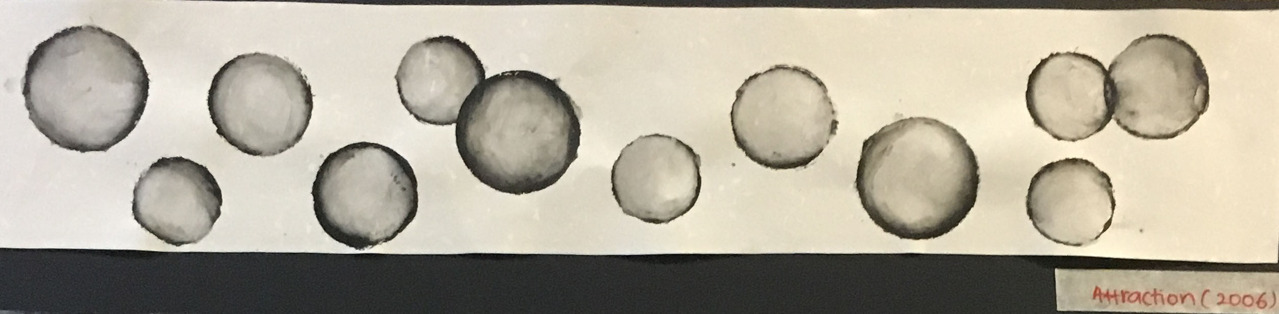
Attraction (Love)
Year:
2006
Story:
Experiencing my first crush
Methodology:
Using different sized bottle caps to create various circle shape all over the paper and adding a gradient using water colour for that bubble effect.
Meaning:
Bubbles represents the first time experience the bubbly feeling in the bottom of your stomach.
The negative space around the bubbles represents the pure innocence of puppy love and also illustrates how the bubbles are floating.
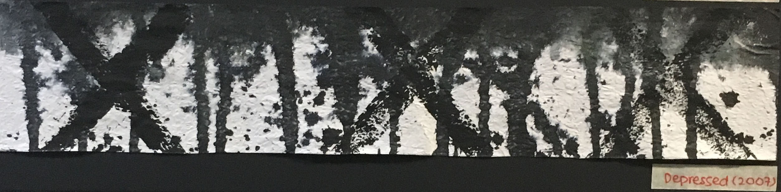
Depressed (Sadness)
Year:
2007
Story:
The day my sisters and I found out of my parent’s intention to divorce
(Includes some crosses from 2004 incident)
Methodology:
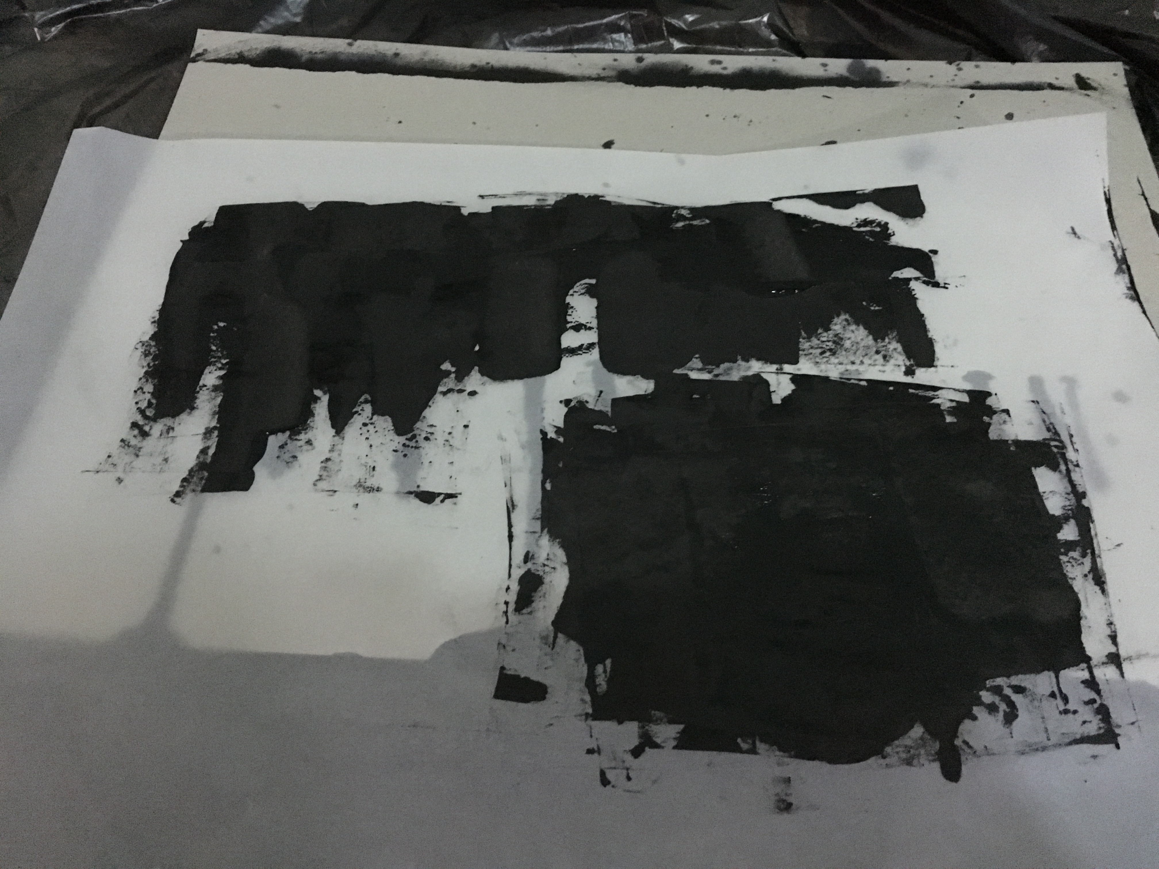
Firstly, I spritz the paper with some water and added water based paint on the top of the paper, allowing the paint to drip vertically onto the paper.
Then, using a stick and hitting it lightly to create a splattering effect.
Meaning:
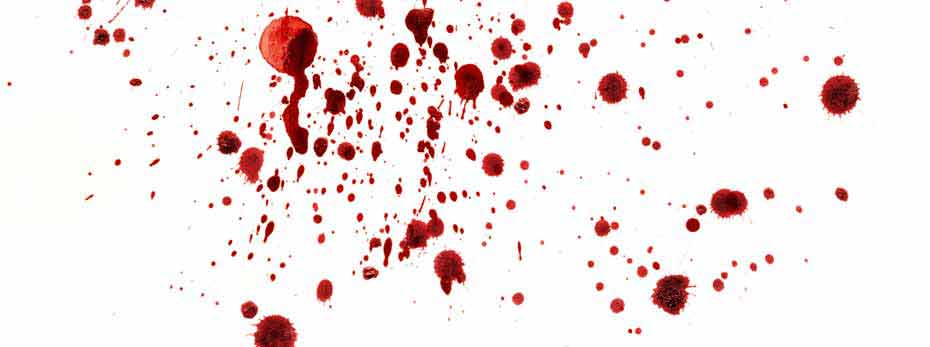
I wanted to illustrate the feeling of being ripped apart from the inside by representing this with blood.
Some methods I chose was blood splattering and dripping.
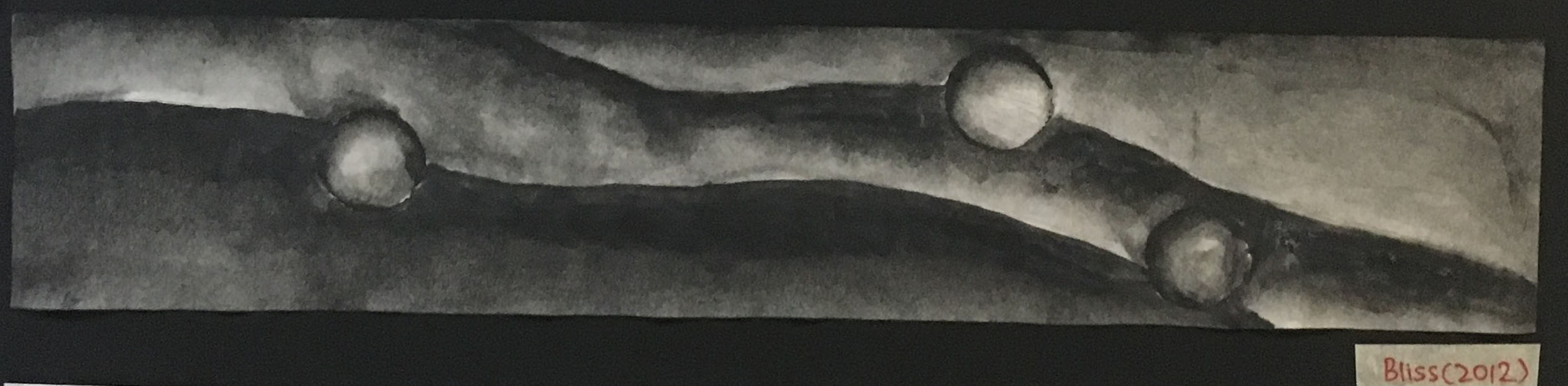
Bliss (Joy)
Year:
2012
Story:
A night walk on the beach, away from the stress of O levels.
(includes some bubbles from 2006 incident)
Methodology:
Using black paint of different intensity to create the outline of the waves and water colour to give it some gradient.
Meaning:
The gentle waves represent the peace and calmness from the stresses of O levels.
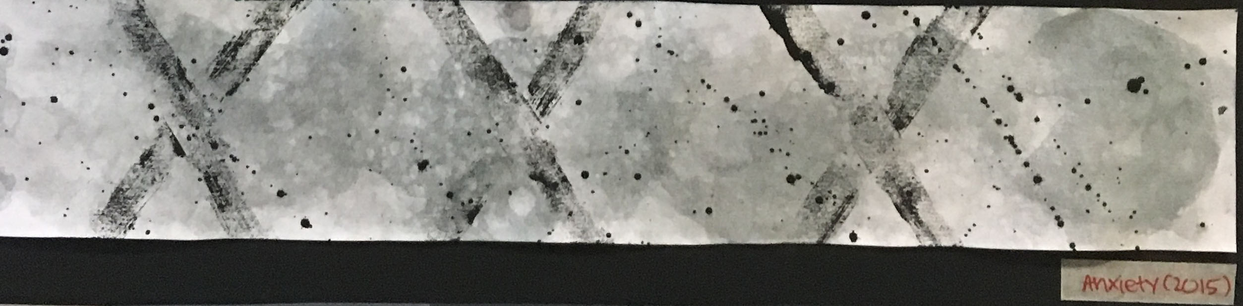
Anxiety (Fear)
Year:
2015
Story:
Internship – difficult boss, heavy workload, stressful situations
(includes some crosses from 2004 incident, some blood splattering from 2007 incident)
Methodology:
I poured some water based paint, water and soap into several cups. Using a straw, I created bubbles and placed the paper over the bubbles. This process is repeated to build up the colour intensity. The bubbles on the paper forms a cloudy effect.
Meaning:
The cloudy effect represents my inability to think straight and the messy thoughts that were going on inside my head.
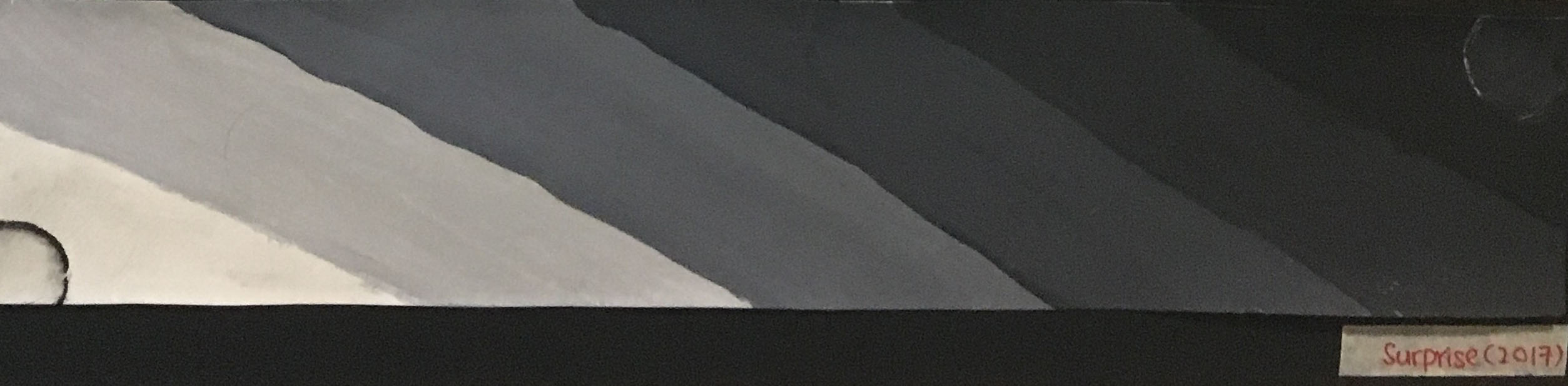
Surprise
Year:
2017
Story:
Receiving the results for University Application
(includes some bubbles from 2006 incident, some waves from 2012 incident)
Methodology:
Firstly using white paint at the beginning and gradually adding black paint to darken the colour, ending with black on the other end of the paper. Thus, creating a gradient.
Meaning:
The gradient effect is to illustrate the feeling of nothing to great excitement (0 to 100).
I decided to go with diagonal lines to relate it back to the Bliss emotions which showed gentle waves. The diagonal lines in this piece was more angular and rigid compared to the Bliss waves to show that surprise was a completely different emotion from that.
Conclusion:
One of my biggest challenges for this project was creating the bliss piece. It was difficult to recreate the emotions from that event. I wanted to recreate the waves from the beach that day, however, was worried that it would be too literal. Instead, I thought the gentle waves would represent the calmness.
Some things I believe I could have improved on for this project was exploring more visual meanings rather than representational meanings. Adding meanings to each bubbles, crosses, waves, blood in the newer events. I could have also used a more abstract way of expressing this emotions rather than being literal and representational.
A positive thing that I can replicate in projects to come is adding a personal touch to my artwork hence creating an emotional connection that other people could relate to.
I was slightly troubled with the word that I got. Everyone else seemed to get pretty straightforward words, but mine was a word that I couldn’t even understand. I created various models that would illustrate a “lack of harmony”.
Version 1:
3D Sketch Model 1
3D Sketch Model 2
After some consultation from Cheryl and the class, I found out that I could use more angular shapes to illustrate the word discordance. The boxes that I used were of similar sizes and I should choose boxes of various sizes instead.
I also thought that I did not understand discordance enough, hence decided to search it up a bit more.
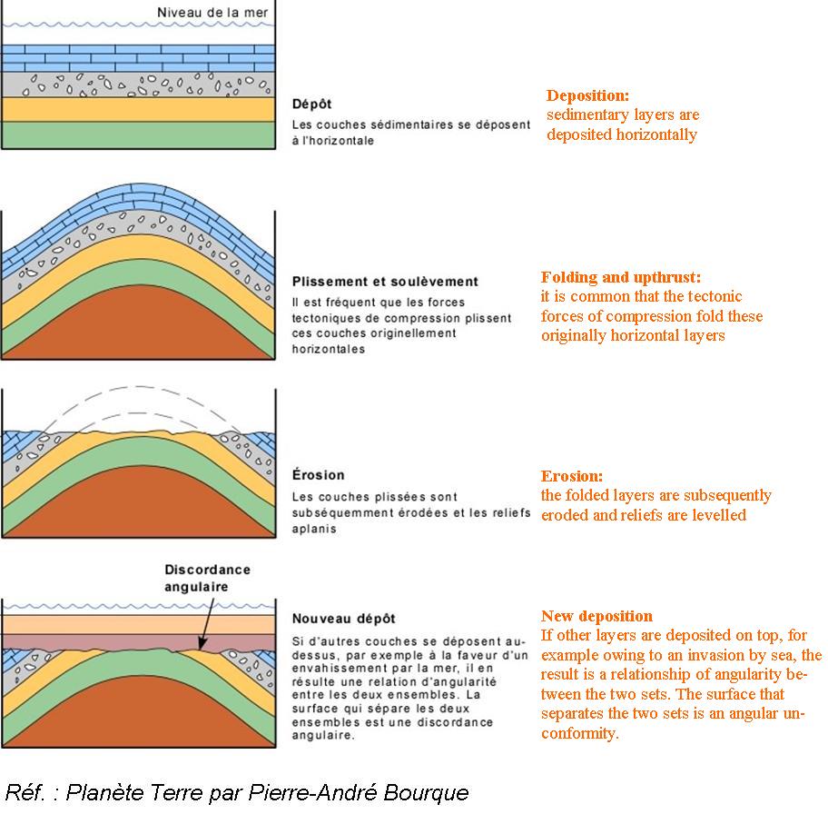
“Discordance “
Normal terms – Lack of agreement or harmony
Geology terms – lack of parallelism between adjacent strata, as in an angular unconformity.
Curious, I dug a little deeper into the geology term and here was what I found.
From there, I created new Version 2 models.
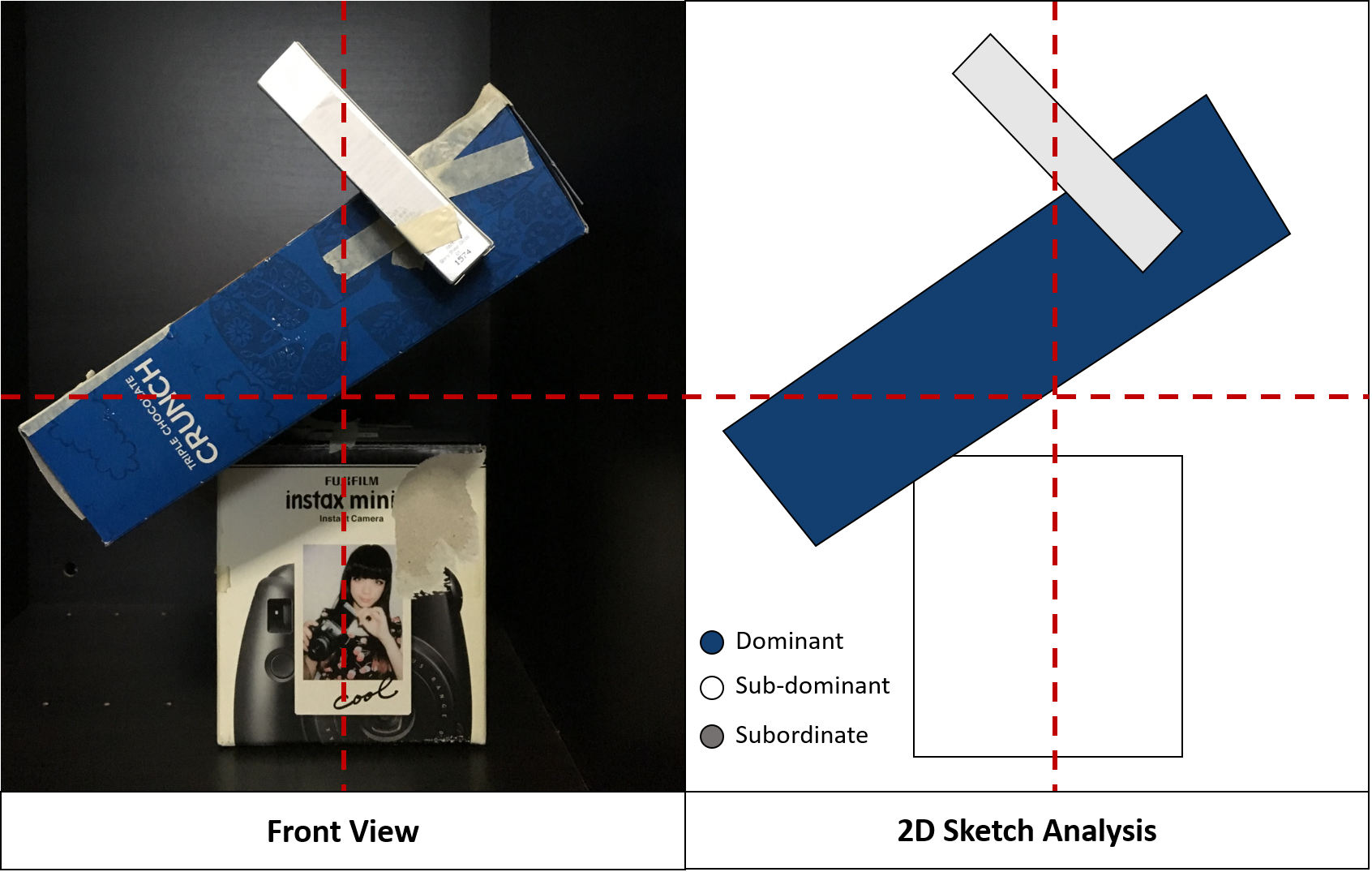
Version 2
3D Sketch Model 1
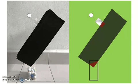
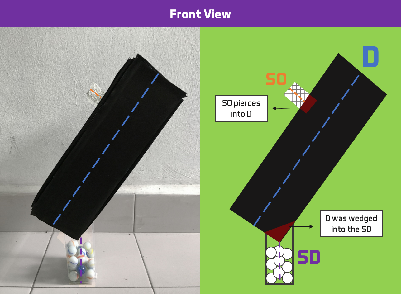
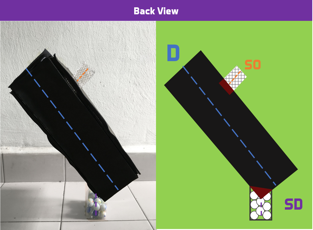
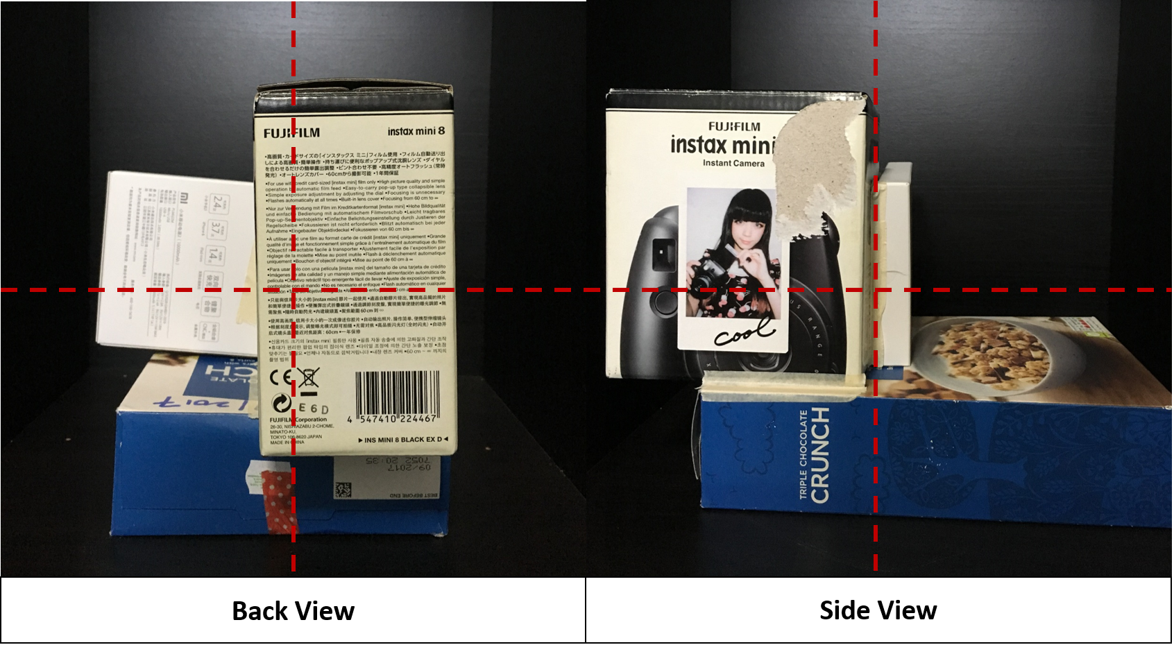
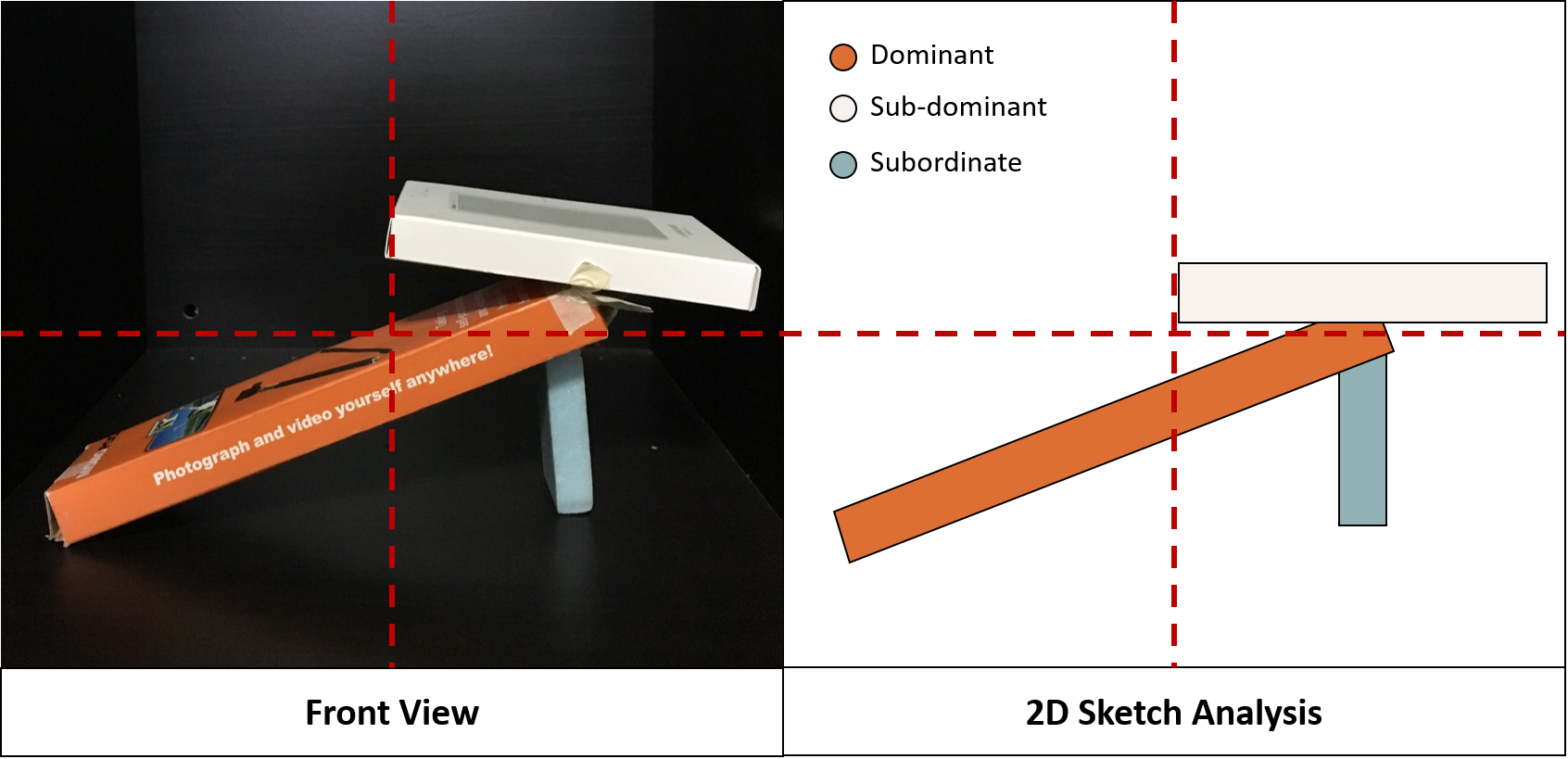
This model was created based of the usual meaning of discordance. I placed the dominant box as the centre whereas the subdominant as the anchor to hold the model in place. For both dominant and subordinate, I angled it to give it the discordance/disharmony/angular effect.
3D Sketch Model 2
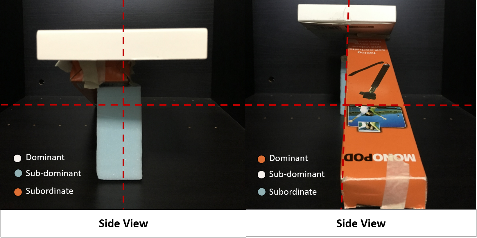
For this model, I decided to recreate the geology term instead. The orange box and white box forms an angular unconformity similar to the sediments in a discordance deposit. I used the subordinate as the anchor for this model. Notice also how the Dominant, Sub-dominant and Subordinate changes from each angle. This was done on purpose since my term is considered a “Rebel”.
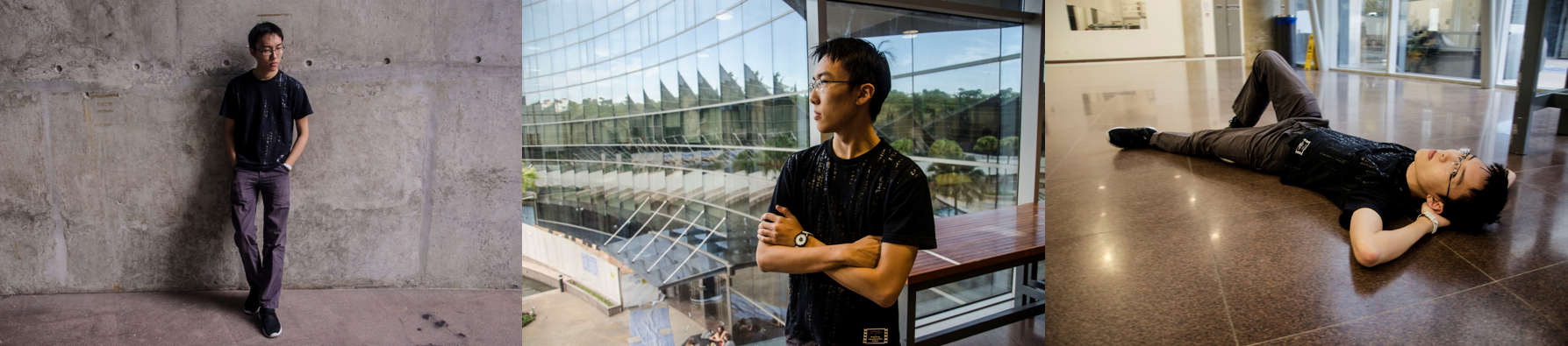
The first photo series I will be introducing is The Dark Side.
In this series, I wanted to highlight a different side of me which is darker.
Since I was using black and white, I had to play with light and dark colours in my photo by coordinating my clothes and even lipstick.
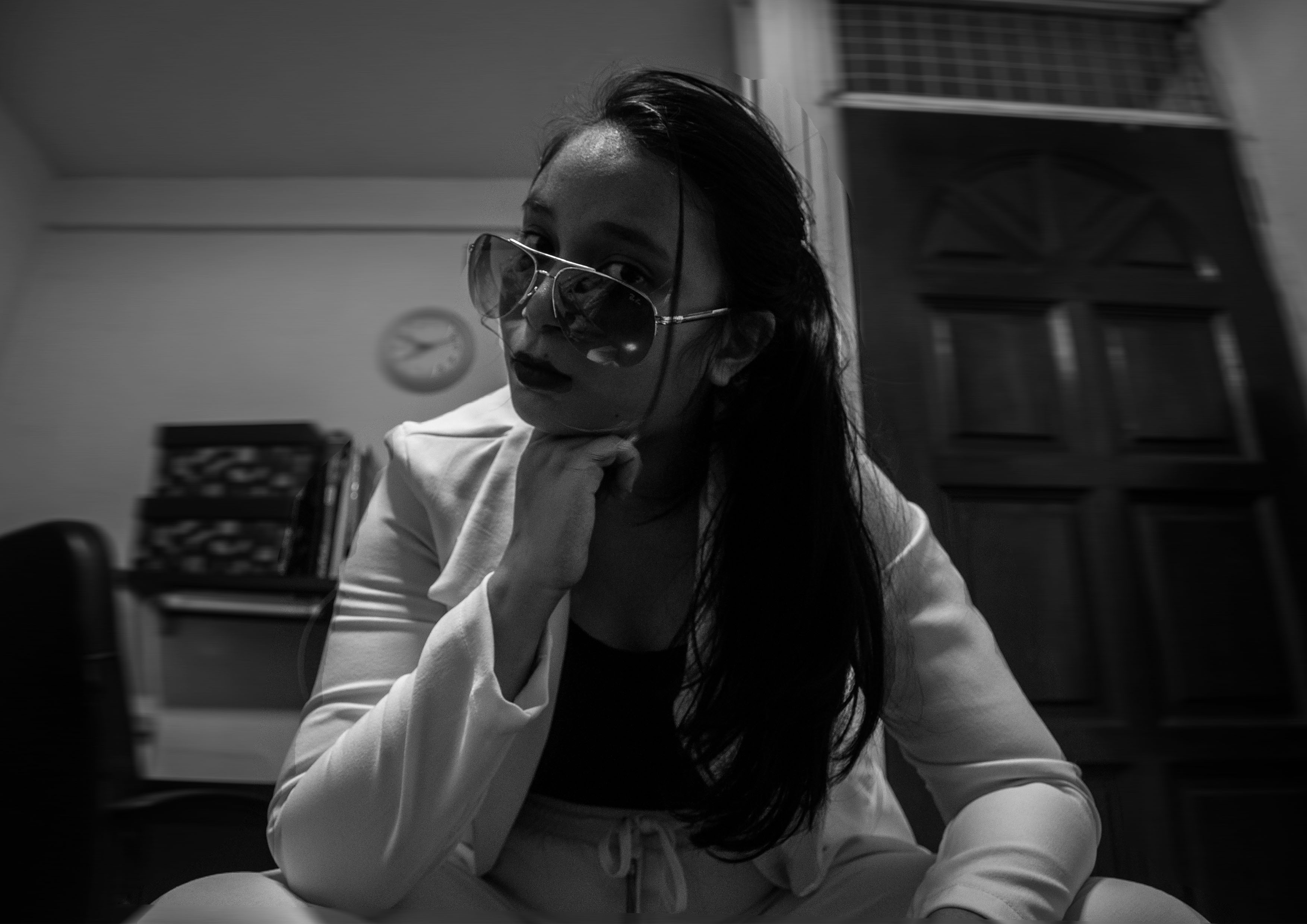
Task 1 – Hostile
The first photo, I wanted to reflect how people view me externally. I have had people tell me how I appear very hostile, especially when they met me for the first time. This hostile exterior makes me appear unfriendly and unapproachable.
To reflect this, I angled the camera from a slightly low angle to show dominance. I used dark lipstick to give off that scary feeling and give my lips a darker contrast. I used a white blazer for a lighter contrast from my hair which is black.
Task 1 – Emotional
Even though I have this hostile exterior, I actually have a softer side to me. I’m someone who gets emotional easily. I tend to cry in all sorts of situations; when I am angry, sad or happy. In this photo, I appear to look sad to reflect this emotional side of me. The focus for this shot is my emotions, hence I took a close up shot of myself.
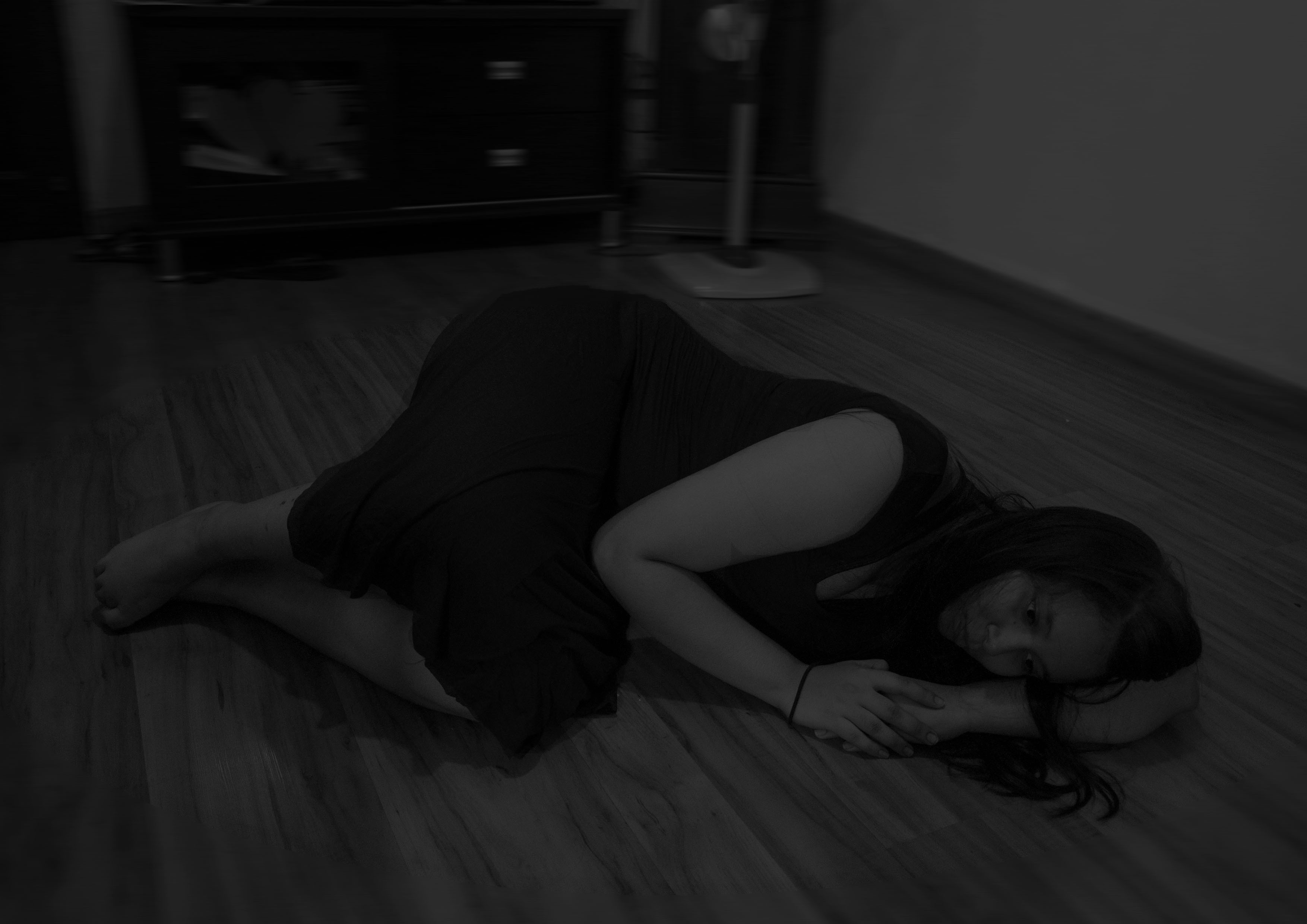
Task 1 – Vulnerable
This emotional side of me triggers this other complex of mine which is how vulnerable I get. I tend to trust people too easily and end up getting betrayed by them. I shot this image from a high angle to show my vulnerability and my position on the floor (curled up) represents my inability to get back up on my feet after being betrayed. The surroundings are darker to represent the darkness enveloping me.
Task 2
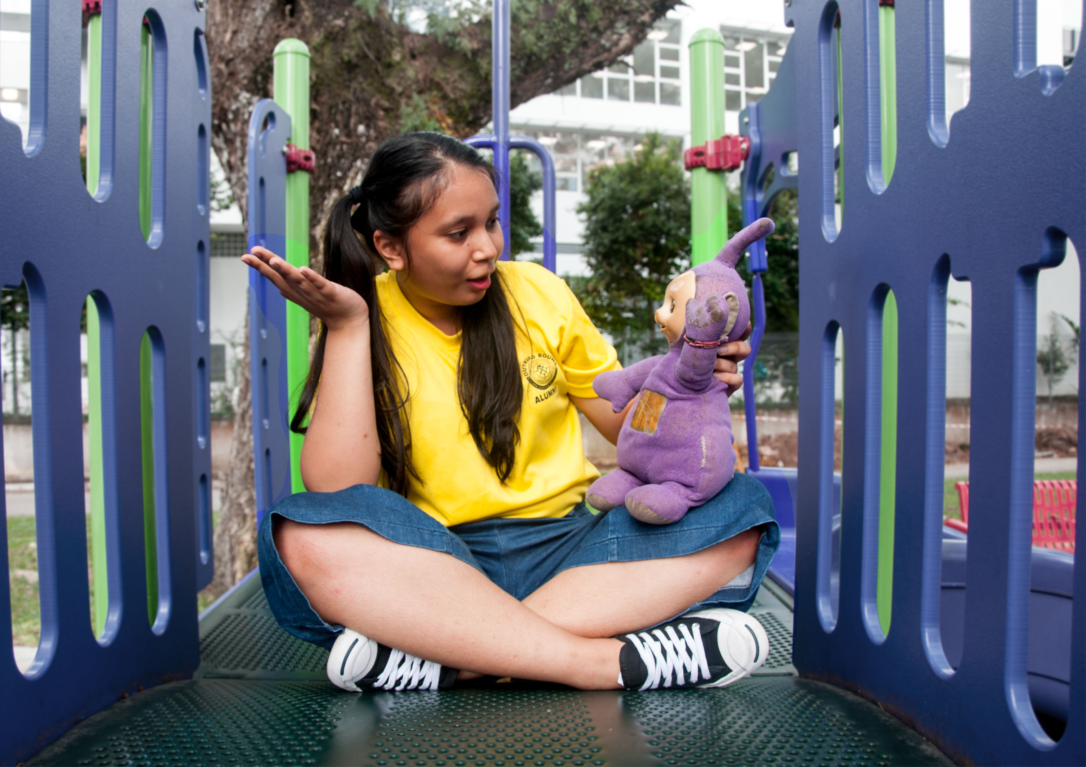
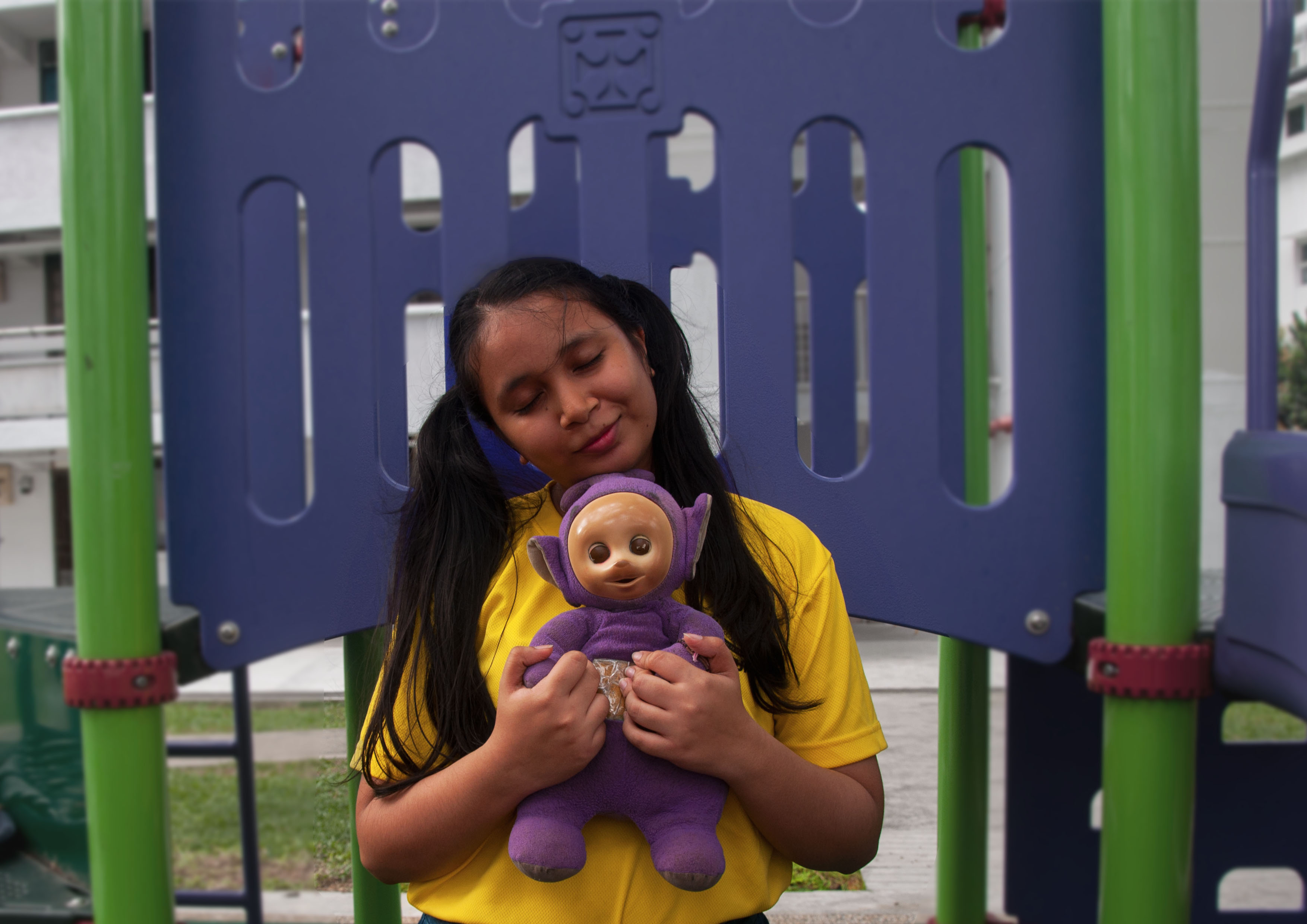
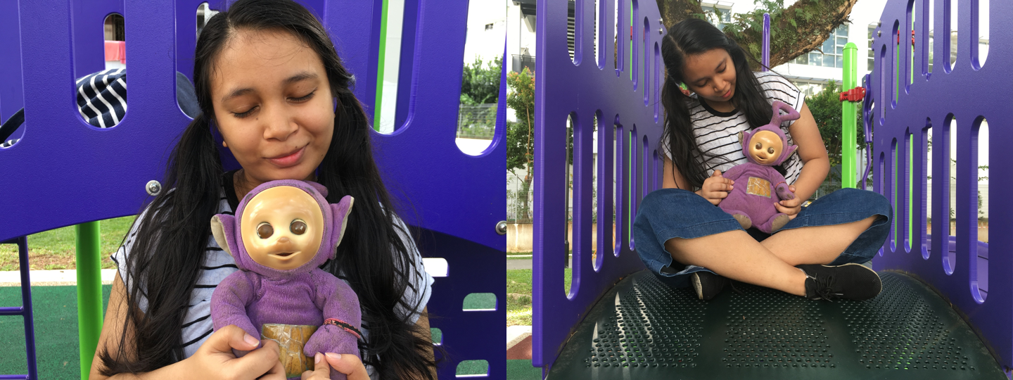
My second photo series is titled A Friend in Me, the object that I have chosen is my childhood toy, my Tinky WInky.
A little backstory, when I was younger, I was often left at home alone. One day while rummaging through some cupboards, I found my Tinky Winky and instantly fell in love with it. Somehow or rather, I created an imaginary friend out of him.
In this photo series, since I was showcasing my childhood toy, I decided to incorporate some other childhood elements such as tying my hair into 2 pigtails and taking the photos at a playground.
Task 2 – A friend
In the first photo, I wanted it to represent the action of me talking to him like as if he was a real person when there was nobody around. The photo was taken in a full body shot interacting with the object. Since my object would appear small if I were to stand next to it, I decided to sit down instead.
Task 2 – Trust
In the second photo, it depicts my trust in this “friend” of mine, and how I used to think that we were constantly looking out for each other. This shot was taken close up to showcase my emotions towards the object. I have also positioned the object in such a way that it appears to be looking at me.
Task 2 – Adore
In the last photo, it shows my adoration for this little friend of mine, and when I’m with him, it feels like there is someone there to get me through the difficult phases in my life. This shot was taken in a medium scale showcasing some of the playground.
Task 3
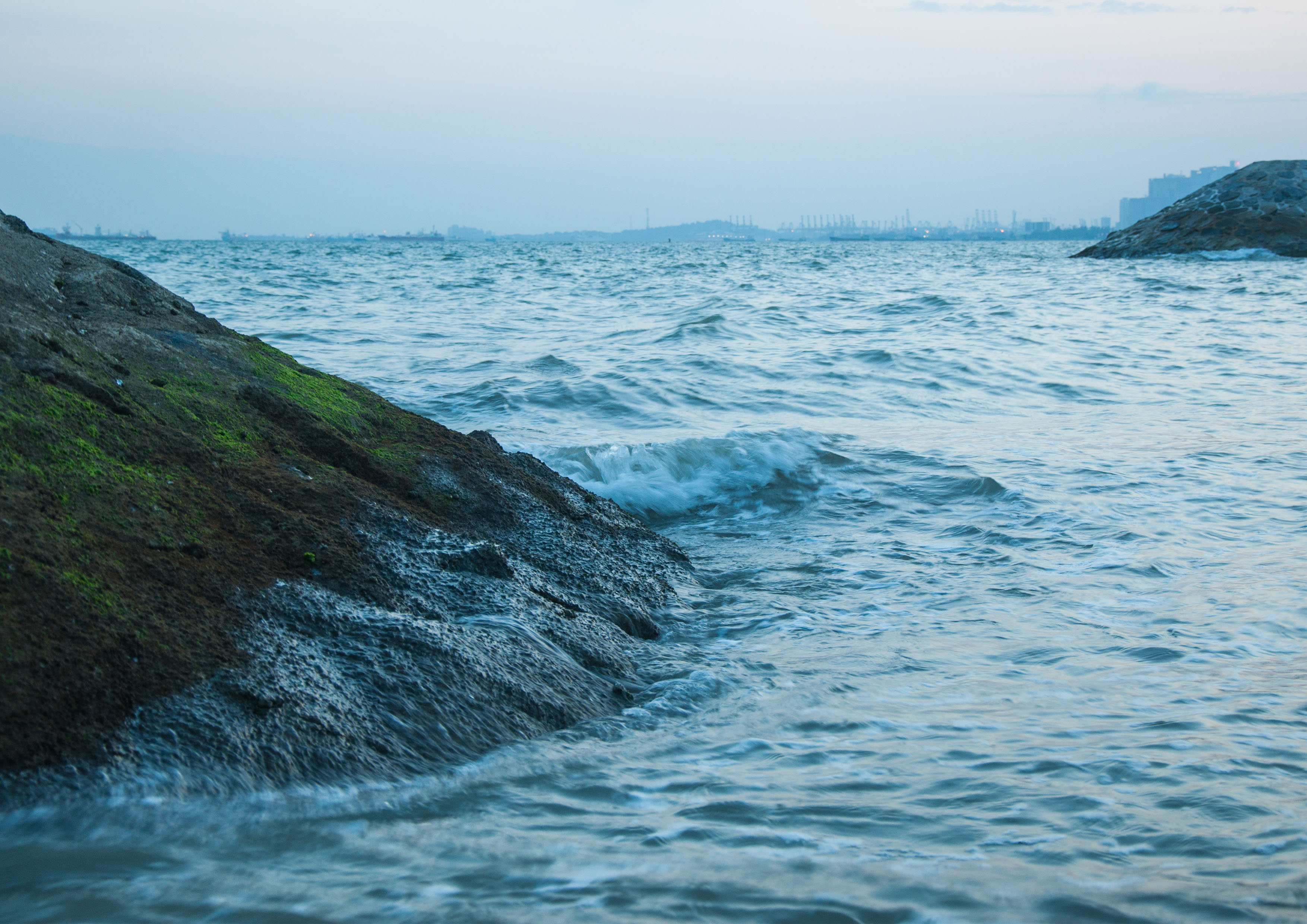
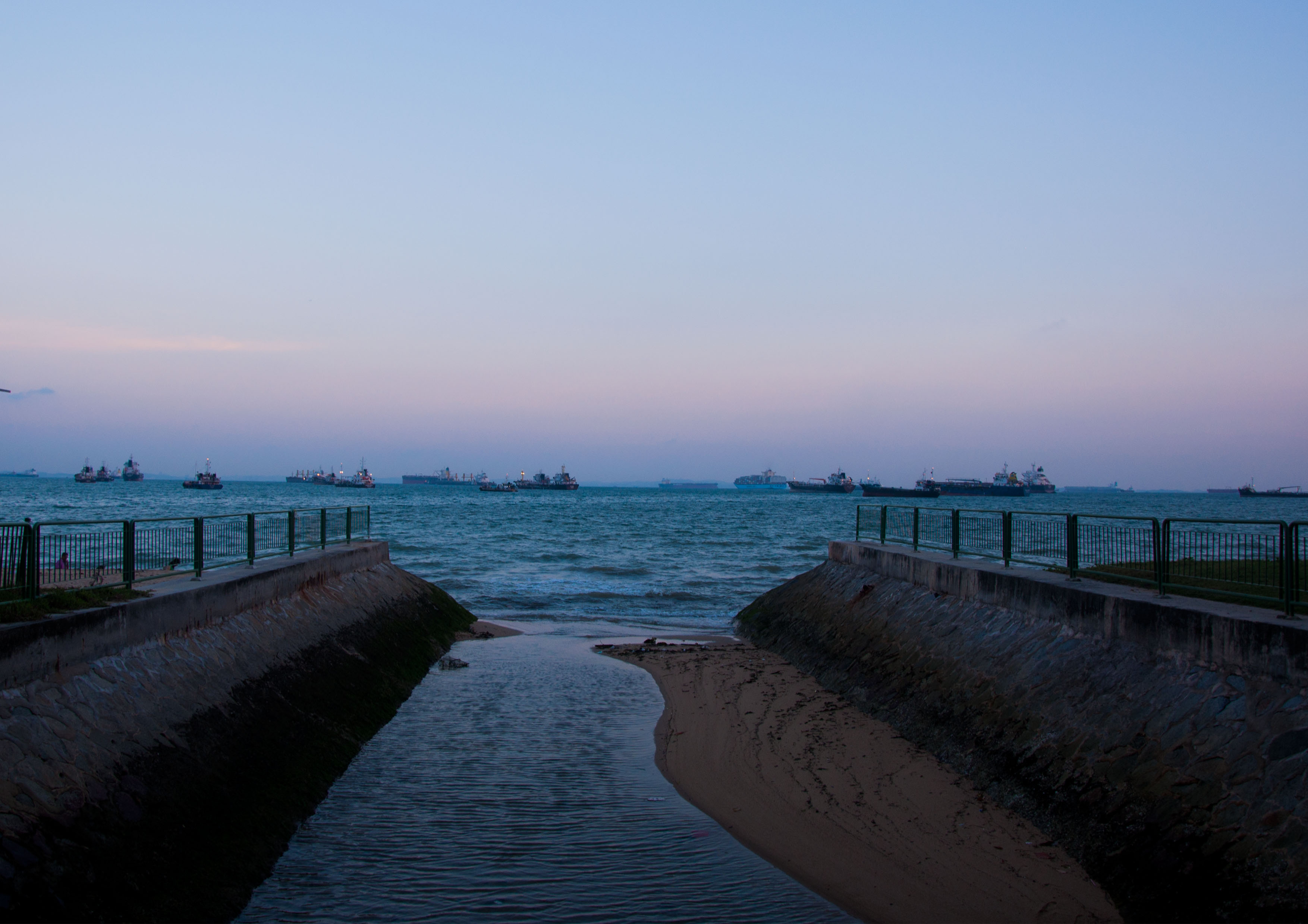
In my final photo series for Task 3, I have titled it as Escapism. The place I have chosen is the beach at East Coast Park. I am a nature girl and when I need some time away from the hustle and bustle of the city, this is where I escape to. This is the place that makes me forget all of my problems.
Task 3 – Crashing waves
The sound of waves crashing is comforting, watching the waves crash onto shore brings me peace. When I’m there, you would usually find me perched on top of the breakwaters just staring out into the sea. Hence, I captured a mid-range shot of the waves crashing on to the breakwaters.
Task 3 – Lonely Bar
ECP is a place that holds a lot of memories from camping out with my family, bbqing with my friends, cycling. However, no matter how many times I have explored ECP, somehow I always seem to be finding something new there. For example, this bar which I have never stumbled upon until the day I went down for the shoot. I positioned the camera in such a way that allows the bar to be in the centre of the frame.
Task 3 – Horizon
In my last photo, you see the convergence where the water from the canal meets with the sea in the centre of the photo. This convergence takes up half of the image, while the other half is taken up by the uninterrupted sky. You don’t get to see the sky like this in the city. Looking up at the sky reminds me how small I am to this world and how there are so many people living under the same sky who are going through difficult times. I think about how lucky I am to be here, to have food, shelter, companions. Makes me appreciative of the world around me.
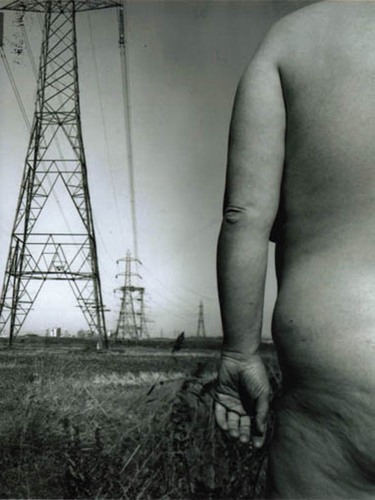
I did some research into Jo Spence’s Remodelling Photo History (Industrialization). The image features a portrait of a nude female, being Jo Spence herself, who dominates almost half of the picture and the rest of her body goes out of frame. In the background you see tall industrial structures whereas in the foreground you see the fading grass, both of this adds to the cynical effect of the image. The picture illustrates her feminism and protest against modernism in open landscapes.
For the first task, I was inspired by this piece of work where she used grey scale to convey a dark and sinister image. I decided to mimic this since it tied in with my theme which was The Dark Side.
Process
Here are some of the photos that I took that didn’t make the cut and below are some reasons why.
Task 1
Left: The lighting in this photo was perfect however I thought this photo did not reflect the right emotions. It did not showcase the emotional side of me.
Right: For this photo, I thought of snapping a shot of tears flowing down my eyes. Unfortunately, the camera wasn’t able to focus properly at the right spot. Also, when I adjusted the colours of the photo to black and white, the tears were not visible.
Task 2
Left: Lei commented that the photo was a little too close and that I could afford to showcase more of the playground in the shot.
Right: The colours of the playground stood out more compared to my childhood toy which was washed out. The viewer’s attention would be to the brightly coloured playground (purple and green) instead of my toy and I. A suggestion from Lei was to wear a brightly coloured shirt that compliments my purple coloured toy.
Task 3
Initially, I wanted to showcase this series in 4 themes; Waves, Sand, Sunset and Food. However, after consultation with Lei, I realised that I should showcase ECP in a not so cliché way and that the photos I took of the sunset and sand were very typical “Instagram” shots. Hence, I stayed clear of this shots and selected photos that showcase a different side of ECP.
Conclusion
All in all, I understood how changing the scale and framing of a photo can alter or strengthen the meaning behind a picture. Some of the challenges I faced was the inability to control the camera while posing. I had to rely on using the timer and tripod for most of my shots. Hence, I wasn’t able to control the focus of the camera to my liking. It was much easier to be behind the camera where I have full control of the angling and focus of the camera. Nonetheless, this project has been a great adventure to discover the art of photography.
I started my mark making journey in class by experimenting on several methods and materials that could be used.
In class experimentation:
Materials:
Wires
Flowers
Cotton wool
Leafs
My first attempt was an epic failure but hopefully success comes with failure.
Using the flowers and leafs, I did not consider that the thickness of the object would affect the print. The flower I used was baby’s breath which was a little too thin so only the outline of the flower appeared on the print and small details inside the flower was not reflected.
Second attempt was slightly better. The wire I used was still slightly too thin so I made sure to go around every nook and cranny. This proved to have worked better as the outline of the wire was more clearly defined. I also used cotton wool to create clouds above the wire tree.
My third attempt was using aluminum foil to create texture. I crumpled a piece of aluminum and spread it out and placed it over the linoleum. After which, I placed the parchment paper over the linoleum.
Own Time Own Target Experimentation
I experimented with some of my ideas that I had in my mind to see whether it is executable or whether it looks presentable.
Resentment (Anger)
I used tape to create white crosses on the black painted paper.
Outcome:
The paint bled onto the tape thus creating a messy, jagged cross. I felt that the tape was too thick and would like to explore using a thinner replacement (strings? Paper?) instead.
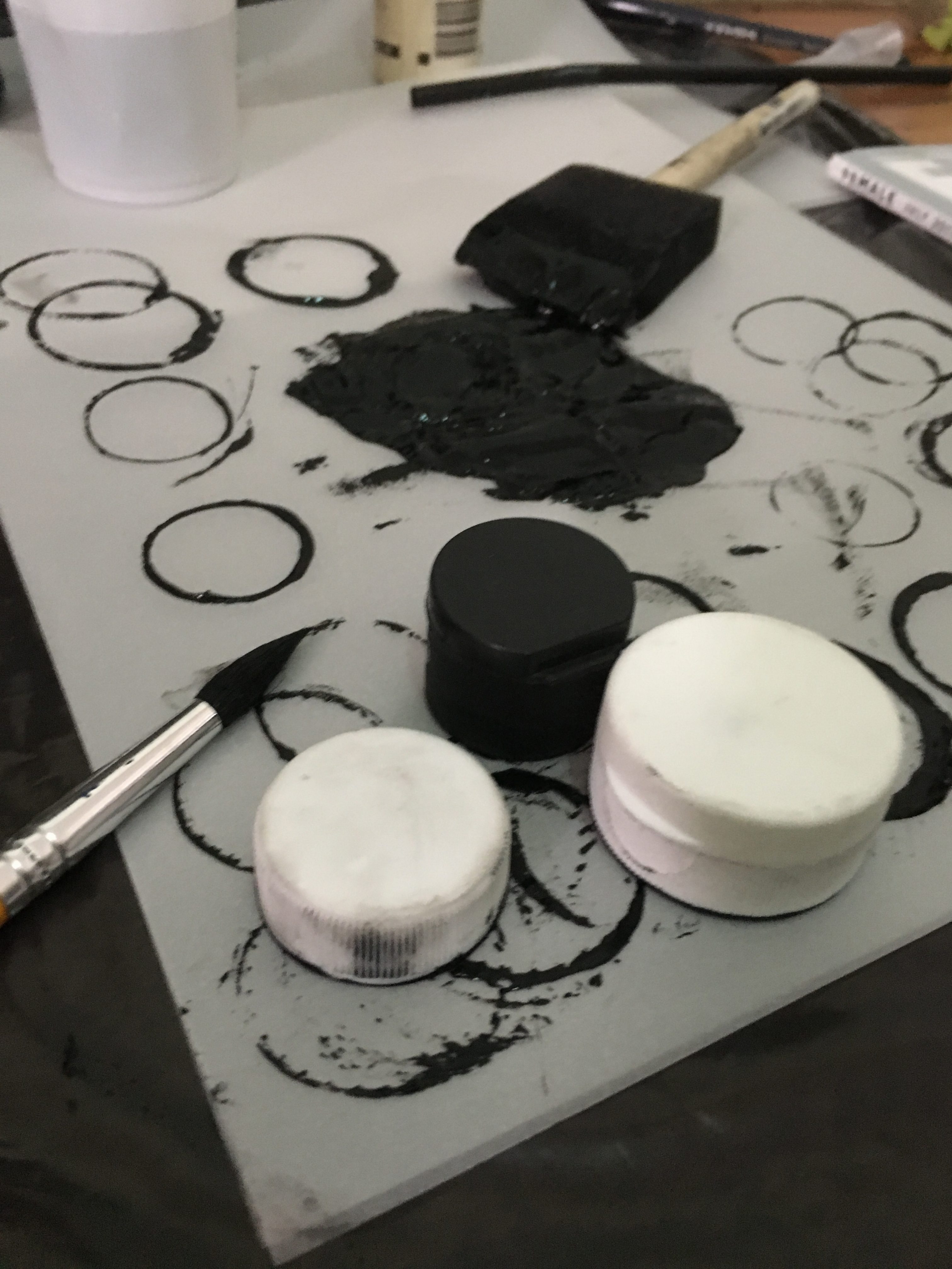
Attraction (Love)
I found an interesting method on YouTube where the artist used bottle caps to create the shape of bubbles (circle) and using water to blend it in.
Outcome:
My first attempt I used too much paint, hence the “bubbles” are too dark. From there, I adjusted the amount of paint by transferring the excess paint on another piece of paper before I transfer it to actual paper.
Depressed (Sadness)
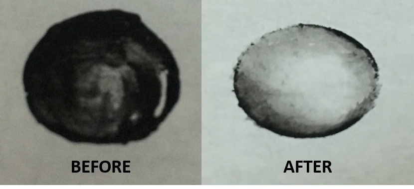
I wanted to reflect blood on the paper. Some ways I thought of reflecting blood are dripping, splattering and cuts.
To create that drip effect, I sprayed the paper with some water. I proceeded to place some block paint on the top of the paper. However, the paint was not dripping. I decided to try using water based paint instead which successfully created the drip effect. I also sprayed more water on the block paint and it started to drip too.
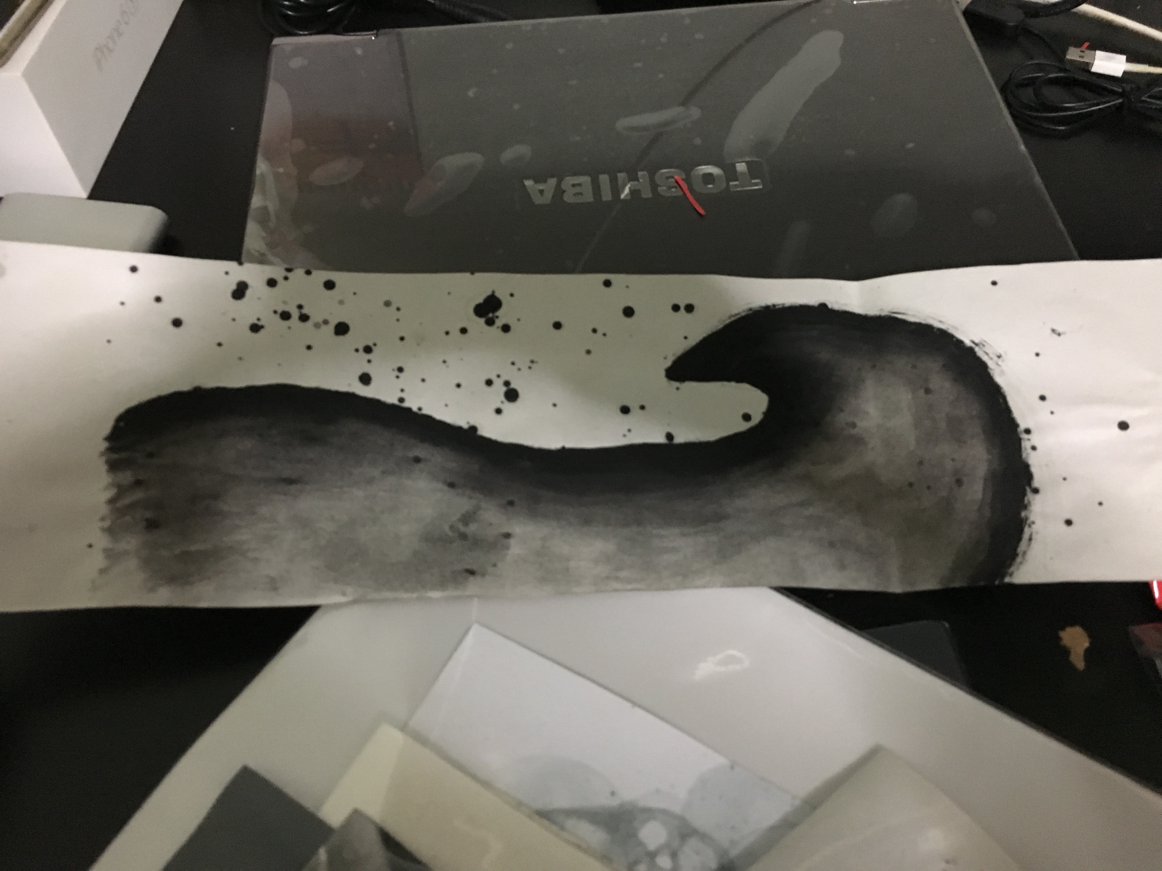
Bliss (Joy)
To create waves and starry sky.
Outcome:
At first, I wanted to create a scraping effect to reflect waves. However, it just appeared like a big black blob of mess.
I replaced this with creating a wavy pattern and using water colour for blending. To create that starry sky, I used 2 brushes, 1 with paint and hit it against each other. However, I found that this method was too literal. I shall explore other methods to convey my emotion.
Anxiety (Fear)
I wanted to create a cloudy effect and decided to experiment on using bubbles. After watching a YouTube video, I experimented on a method using cups, black ink, water and soap. Using a straw, I mixed the contents of the cup and blew into the cup to create bubbles.
Outcome:
I learned not to place the paper too close to the cups to prevent the shape of the cup from transferring to the paper. It was also a building up process, so I had to do it a number of times to build up the shape. What I think I can improve on is the colour intensity (use block paint instead of water based paint?)
Surprise
Create a gradient effect using brushes and black/white paint.
Outcome:
I started with black and gradually adding white to make it lighter which resulted in the colours to be too dark to reflect the 0 to 100 feeling. For the final artwork, I will be using white paint and gradually adding black paint.


