


“But better to not know which moment may be your last. Every morsel of your entire being alive to the infinite mystery of it all.” – Captain Jack Sparrow, Pirates of the Caribbean: On Stranger Tides (2011)
Concept
My interpretation of the quote is how humans will go through their life and eventually, everyone will meet with death.
Methodology
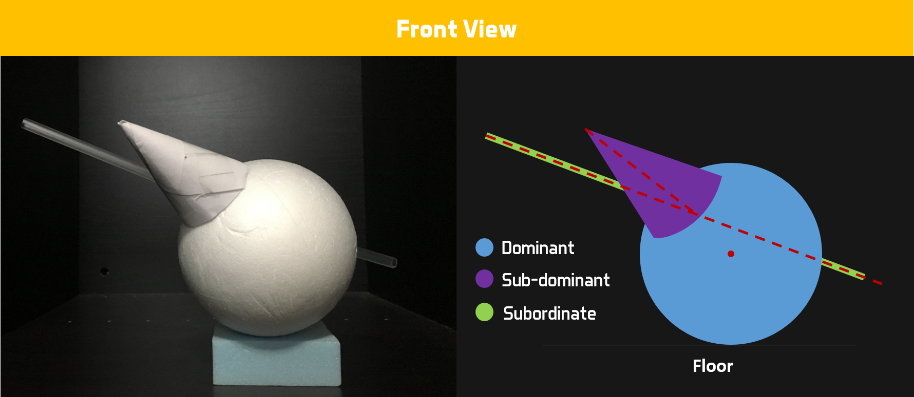
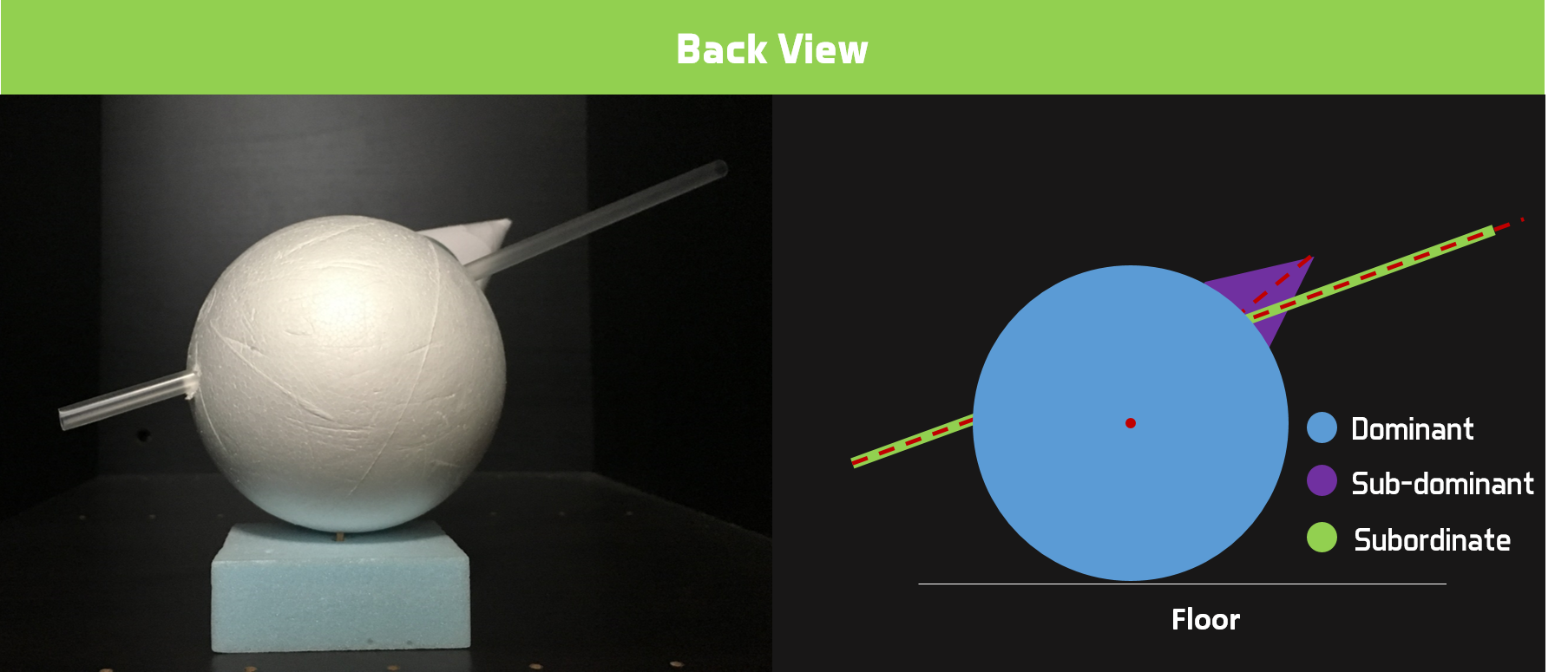
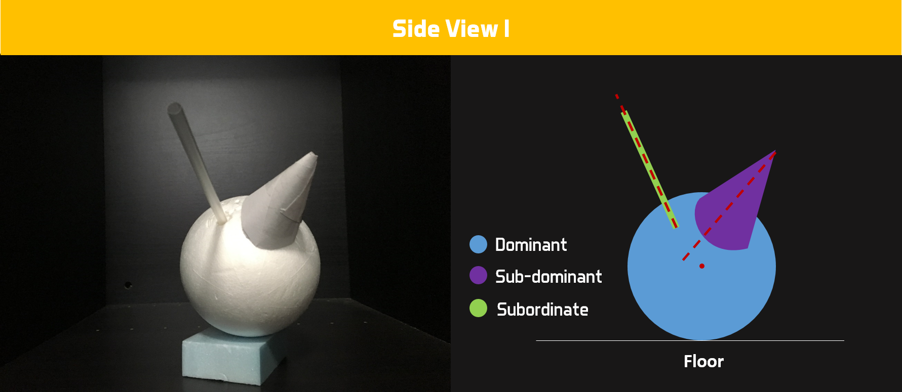
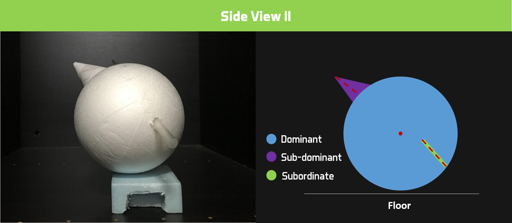
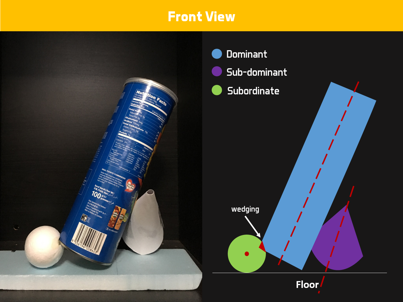
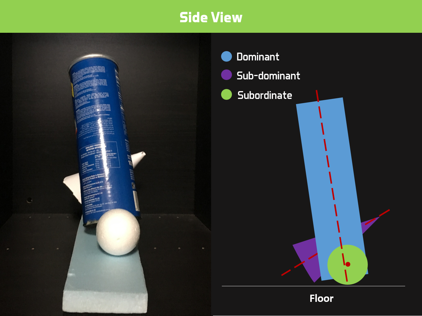
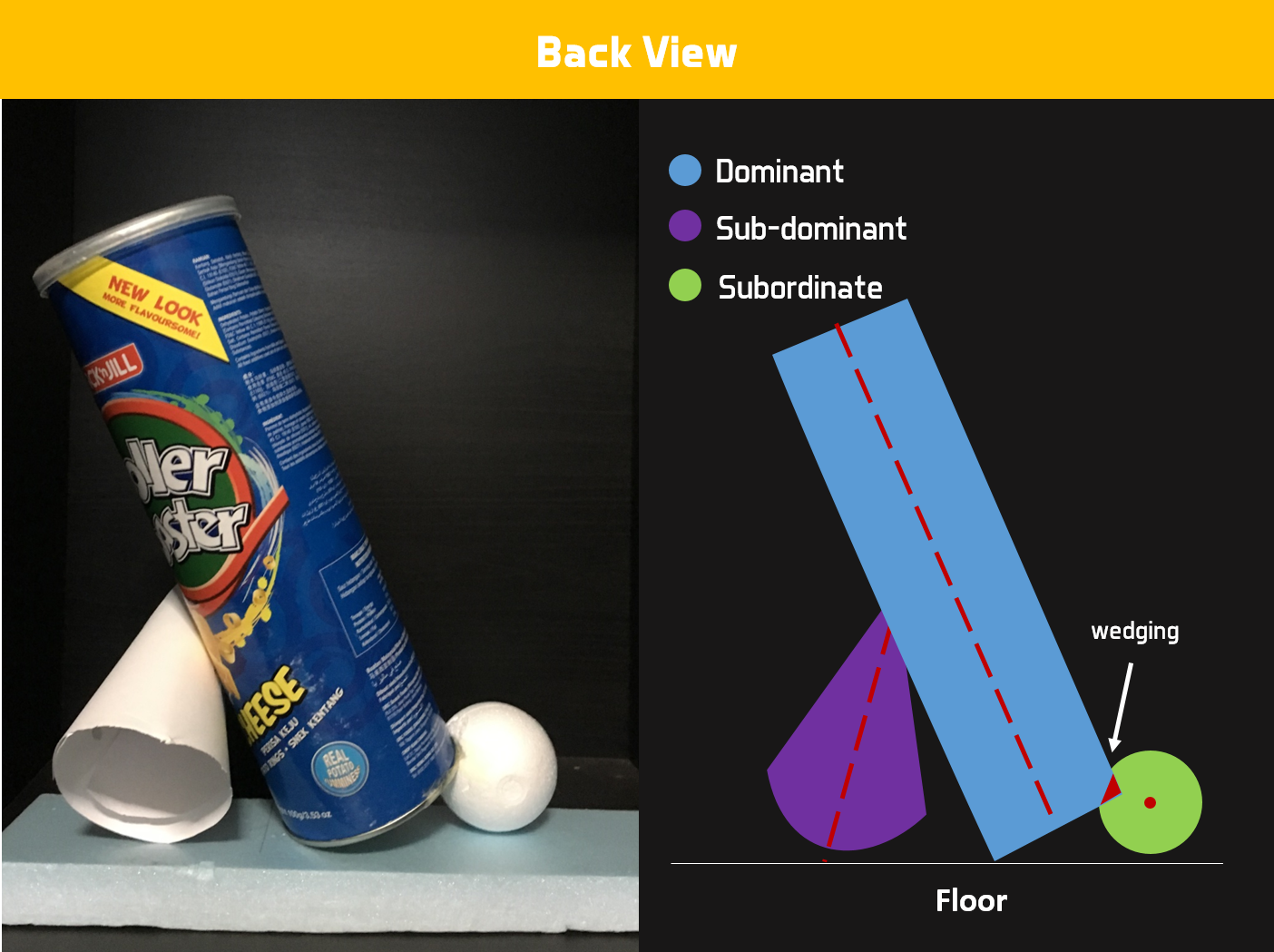
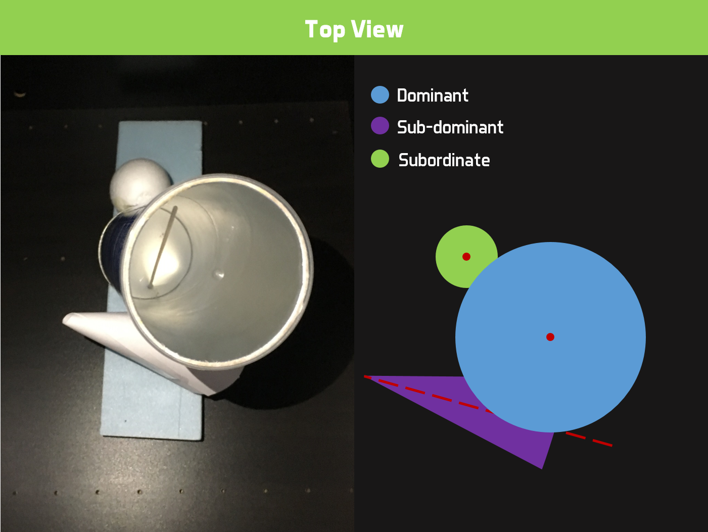
The different clocks represent the different times in your life. I scaled the clock from small to big with the smallest one behind to give depth to the print. A silhouette of a person can be seen leaping from one clock to the other, this represents us moving to different phases of our lives. The final clock in the series, the wristwatch is the biggest in scale as it is the emphasis of the print. The placement of the clocks and the hands of the clocks are position as to bring our gaze to the wristwatch. The face of the watch is replaced with a deep hole which represents the end of life. Another silhouette can be seen falling into this hole. The contrast in colours between the two human figures shows the distinction between life and death. Also, the background depicts a warping clock which adds depth to the composition.

Initial Idea:
My interpretation of the quote in Ver 1 & 2 was about knowing when you are going to die.
Version 1: I wanted to display this in Ver 1 by having a clock and magnifying glass, the wormhole represents death. During the first consultation, the comment I received was that the composition was too literal.
Version 2: I changed the subject to a wristwatch with a deep hole and a person falling into it. The background was changed to question marks in order to relate it back to the idea of mystery. In the second consultation, general comments from the group were that the background was not necessary/relevant and that the arm was not obvious.
Version 3: I added more clocks to the mix, and this concept was used as a basis for my final print. In the final consultation, the group mentioned about not having enough depth and contrast. Another advice they gave me was to adjust the sizes of the clocks to build greater emphasis.
“Dreams feel real while we’re in them. It’s only when we wake up that we realize something was actually strange.” – Cobb, Inception (2010)

Concept
Being pulled away from reality to a strange dream.
Methodology
For this composition, I was inspired by Salvador Dali’s works such as Persistence of Memory (1931), which exudes this unearthly, other dimension themes.
The boy can be seen being pulled away from earth in order to show the idea of being dragged from reality. For it to be a strange reality, I thought of using floating islands, big butterflies (that are bigger than dolphins) and people riding on flying dolphins. The placement of butterflies and dolphins helps to guide the eyes to the centre of the composition. Also, the couple floating in mid-air is placed in the centre to further give emphasis to them.

Initial Idea:
I initially wanted the emphasis on the idea of floating islands as an alternate universe. Hence, I placed 3 different sized islands. The person was portrayed to be on the moon.
Ver 1: I used this design for my first experimentation silkscreen printing. The threshold outcome of the islands appeared to look completely black and details within the island were lost. During the consultation, Joy advised on adjusting the contrast to help with this.
Ver 2: I further edited the images of the islands so that there was more contrast between the black and white. I changed the big island and moon to something that was much clearer. However, I realised that the composition did not create a strong enough impact and storyline.
“I solemnly swear that I am up to no good.”— Harry Potter, Harry Potter and the Prisoner of Azkaban (2004)

Concept
A marriage between irony (protagonist vs antagonist/ hero vs villain). I broke down this quote to two parts: solemnly swear; no good. You normally associate “no good” with villains rather than heroes. However, this quote was spoken by the hero of the show – Harry Potter. This is ironic because he is supposed to be doing good as a hero, not doing “no good”. “Solemnly swear” means to make a promise and I thought promises are most common in weddings.
Methodology
I selected the main male antagonist of the show – Lord Voldemort, and the main female protagonist – Hermione Granger. Fortunately for Hermione, I was able to find an image of her in a dress, dancing. However, this was not the case for Voldemort. In order to give the impression of him being at his wedding, I added a bowtie to his outfit. Also, I had to edit his arms slightly to make him appear as if he is dancing. For an extra touch, I gave Hermione a veil. Both of the characters can be seen staring at each other dancing under the wedding arch. I wanted the emphasis to be on both of them, thus I scaled them to be the main subjects of the composition. Their gaze at each other also helps to guide our eyes to the pair.

Initial Idea:
Ver 1: A combination of half of Harry Potter’s face (protagonist) and half of Joker’s face (antagonist) with a background of a map and footsteps to relate to the story behind the quote (Marauders Map). Also adding two hands in a pinky promise gesture to represent “solemnly swear”. After the first consultation with Joy, I realised that it was too literal to actually include Harry Potter’s face.
Ver 2: Through the feedback, I decided to dismiss the idea of using his face, and instead represent him in some of his popular characteristics – lighting scar and glasses. This was where I decided to include the idea of marriage. However, I thought that this composition did not express the idea of marriage well enough.
Ver 3: This was my final concept. During group consultation, many mentioned about some technical adjustments I should make such as making Voldemort’s head more apparent, using a different veil and making them stand out more. I asked the group whether I should use Harry Potter characters or more relatable characters that everyone knows, and in reply, they said that it was more interesting to use Harry Potter characters.
“The flower that blooms in adversity is the most rare and beautiful of all.” — The Emperor, Mulan (1998)
 Concept
A ballerina who represent rarity and beauty facing adversities in order to bloom. For this composition, I wanted to stretch the idea of adversity in different methods. Firstly, the mountains she is on has sharp spikes. Secondly, the flower was replaced with a Venus flytrap which can close on her and devour her at any time. Lastly, “blooming” in the night when it is commonly associated with the day. The blood splatters represent her struggles she faced while climbing to the top.
Methodology
For this composition, I mainly had to get a good balance because I was using many different images. The moon at the top helps to balance the mountain and Venus flytrap at the bottom. Also, the ballerina is looking/pointing at the direction of the moon, this helps to balance it out even further. The emphasis for this composition was placed on the ballerina by scaling her bigger.

Initial Idea:
A blooming ballerina in a flower on a mountain.
Ver 1: For this composition, I thought that there was too much emphasis on the moon, whereas the ballerina had the least emphasis.
Ver 2: During group consultation, some mentioned that I could flip the ballerina so that she is facing the moon to have a better balance. Also, the blood stains appeared to be in a mess and had no clear direction.

Experimentation
This was my first time silk screening so I really did not know what to expect. During the process of silk screening, everything was going well until I started jet spraying my screen. I brought the nozzle too close to the screen, which caused it to lose its details and also resulted in peeling. Lesson Learn: Don’t bring the nozzle too close.

When printed (setting aside the jet spray mistake), it lost all the small details and the shape of the island was not clear. After printing, I realised that I need to work on the contrast of my images in order to include the small details.

Final
Learning from my mistakes during the first experimentation, I created more contrast in my final design. To make it stand out on the tote bag, I used threshold for all my images and altered it so that it is completely black and white with no grey.
During the jet spraying, I was extra careful about the distance. PS. I freaked out when I saw other people going too close with the jet.
I first tested the print on paper which came out well.

I was ready to try on a tote bag. But I wanted to be extra careful so I experimented using another tote bag. Oh boy did I made the right decision.

The mistake I made was pausing halfway through the paint coating process causing an uneven coating. Also, I didn’t put enough paint. Lesson Learnt: Don’t pause halfway, finish it with one clean swipe.
Finally, taking all this into consideration, I did my final print and it turned out well.

Research
Surrealism
Surrealism started in the early 1920s. Similar to Automatism, Surrealists artists allows the unconscious mind to express itself as a way to unlock the imagination. Their artworks show no sign of rationalism and realism, they believe in how the rational mind suppresses the power of our imagination. Artists of the surrealism movement created paintings out of their imagination which may appear to not make sense but with photographic precision. Their work features the element of surprise and unexpected juxtapositions.
Salvador Dali
Dali opted for his own style of automatism by making use of the unconscious mind, termed “paranoiac critical”, where he simulates delusion while maintaining one’s rationality. Dali himself referred to this form as an “irrational knowledge”.
Some of the themes that are reflected in Dali’s works are eroticism, death, and decay. His drawings were influenced by autobiographical material and childhood memories. His work contains many ready-interpreted symbolism, ranging from fetishes and animal imagery to religious symbols.
One of his famous works include the Persistence of Memory (1931)

Dadaism
Dada or Dadaism was an art movement of the European avant-garde in the early 20th century. This art movement was developed in reaction to World War I. Dada artists, similar to Surrealist Artist, rejected the idea of logic, rationalism, realism and aestheticism of the modern society. Hence, their work reflects nonsense and irrationality. Since this art movement was closely tied in with WW1, Dada artist reflects their discontent with violence, war and nationalism in their work.
Hannah Höch
Most of her work focuses on criticising gender issues such as androgyny, political discourse, and shifting gender role. In her works, she gathers photographic elements from popular forms of media, such as newspapers and magazines, and collages them in uncanny ways. The fact that these elements she included in her works were taken from this sources, further validates her message about gender issues. For her works, she dismembers and reconstructs these photographic elements.
One of her popular artworks is the Cut With the Kitchen Knife Through the Last Weimar Beer-Belly Cultural Epoch in Germany (1919-20).