Ego: Colour Theory and Artist Reference

In this post, I’ll be sharing my research on 2 parts; Colour Theory & Artist Reference

Part I: Colour Theory

We now begin our journey working with colours.

All this while, our works were in black and white. The idea of using colours excites me but at the same time terrifies me. Hopefully, the following research will put me in ease.

Let’s begin.

Colour Wheel

Primary Colours:

Red, Blue and Yellow

Secondary Colours:

Orange, Green and purple.

This colours are created by mixing the primary colours together.

Orange – Red + Yellow

Green – Blue + Yellow

Purple – Red + Blue

Tertiary Colours:

This colours are form by combining a primary and secondary colour next to each other.

Colour Harmony

Monochromatic

One colour in varying intensity is used in this scheme.

Artist: Chuck Groenink, Image from: http://chuckgroenink.tumblr.com/post/53645683109/its-summer-who-else-wants-a-cabin-on-a-snowy
Artist: Jessica Hoffman,
Image from: https://jessicahoffmanportfolio.weebly.com/monochromatic-painting.html


Image from: https://www.behance.net/gallery/44278055/Illustration-2016-(part-2)

Analogous

Uses colours that are next to each other.


Image from: https://i.pinimg.com/originals/fb/32/0e/fb320e3bf36e31e163eb54cf864be884.jpg
Image from: https://i.pinimg.com/originals/61/d0/05/61d005424eec19a368a44dd275b95a79.jpg


Complementary

Colours that are opposite each other on the colour wheel.

Image from: http://zevendesign.com/color-harmony-hulk-wears-purple-pants/
Image from: https://www.houzz.com/complimentary-color-scheme-ideas

Split Complementary

Use of 1 base colour and 2 colours adjacent.

Image from: http://www.aridglamor.com/2014/03/spinning-the-color-wheel-mixing-colors-part-2/
Image from: https://creativecolor.files.wordpress.com/2012/08/two-eggplants-ink-watercolor-color-scheme-game-chris-carter-artist-analogous-split-complements-082712-web.jpeg

Triad

Use 3 colours that are evenly spaced between each other.

Image from: https://kayfriday.deviantart.com/art/X-Men-Cyclops-Triadic-Color-Scheme-348941414
Image from: https://www.homedit.com/triadic-color-scheme/

Part II: Artist Reference

Pop Art Research

For this project, I decided to use the pop art style in my illustrations.

The use of popular, mass culture objects and media stars are a common theme in Pop Art. This movement follows the return to a more objective, universally accepted form of art after Abstract Expressionism. It rejects the idea of ‘high art’ and pretensions of other contemporary Avant grade art.

Andy Warhol

An artist that perfectly exemplifies Pop Art is Andy Warhol. His artworks were heavily influenced by imagery of mass-culture: advertising, comics, newspapers, TV and the movies. His works mainly consisted of literal paintings and silk-screen prints of popular objects and media stars.

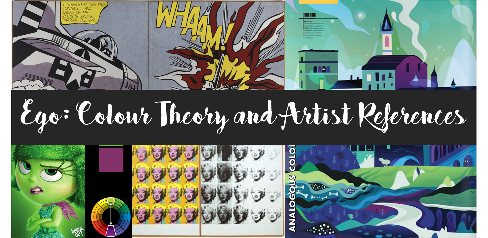
‘Marilyn Diptych’ (1962)

Image from: http://www.tate.org.uk/art/artworks/warhol-marilyn-diptych-t03093

This artwork features 20 silkscreen painting of Marilyn Monroe who died in 1962 from overdosed. The photograph used in this painting was from a publicity photograph from the 1953 film Niagara. He fused 2 themes: death and the popularity of a celebrity. The repetition of the image was to show her omnipresence in the media. The contrast between the vivid colours on the left and the black and white painting on the right, also the fading effect on the right was to highlight Monroe’s mortality.

‘Campbell’s Soup Cans’ (1962)

Image from: https://www.moma.org/learn/moma_learning/andy-warhol-campbells-soup-cans-1962

This work features 32 different varieties of Campbell’s soup. It appears to resemble the mass produced, printed advertisements, however, it was entirely hand-painted, with the exception of the fleur de lys pattern ringing each can’s bottom edge is hand-stamped. He ensured that each can was replicated accurately without any discrepancies and the only difference is the labels of the cans to distinguish them by variety.

Roy Lichtenstein

Roy Lichtenstein, another prominent figure in the Pop Art movement was influenced by the imagery on comic strips. Hence, in many of his works, Ben-Day dots, black outlines and bold colours were prevalent. He wanted to stress the artificiality of his images by painting them as though it were commercially printed; using single-colour Ben-Day dots that newspaper used.

‘Whaam!’ (1963)

Image from: http://www.tate.org.uk/art/artworks/lichtenstein-whaam-t00897

This acrylic and oil painting is based on an image from All American Men of War published by DC comics in 1962. He displayed this powerfully charged scene from the comic in an impersonal manner, leaving viewers to decipher the meanings for themselves. The use of bold colours; red and white; and black outlines are obvious in this artwork.

‘Drowning Girl’ (1963)

Image from: https://www.moma.org/learn/moma_learning/lichtenstein-drowning-girl-1963

This artwork is based on “Run for Love!,” the melodramatic lead story in DC Comics’ Secret Love #83, from 1962. In the initial comic strip, the drowning girl’s boyfriend appears in the background, clinging on to a capsized boat. Lichtenstein decided to remove him from his painting and solely display the drowning girl instead. Similar to his other works, he wanted to make it look like it was commercially printed by drawing black outlines and painting them in primary colours and Ben-day dots.

Research on Mark Making

Never having taken Art, mark making is a new concept to me. Hence, I embarked on a research to find out more about mark making.

What is Mark Making?

To describe different lines, patterns and textures we create in a piece of art.

Automatic Mark Making Techniques

Creating art by suppressing conscious control and allowing the unconscious mind to take over the creative process.

Examples of Automatic Techniques:

Decalcomania –a piece of paper or glass is laid over a painted surface and then removed. This action creates suction, pulling at the paint to form a scaly, biomorphic texture

An example of a decalcomania artwork is Max Ernst’s Europe After the Rain, 1940-1942

Picture from: https://www.artsy.net/article/jessica-beyond-painting-the-experimental-techniques-of-max


Frottage – a technique of taking a rubbing from an uneven surface as a basis of art

An example of a frottage artwork is Max Ernst’s The Entire City 1934

Picture from: http://www.tate.org.uk/art/artworks/ernst-the-entire-city-n05289


Fumage – impressions made by smoke of a candle or kerosene lamp on a piece of paper/canvas

An example of a fumage artwork is Wolfgang Paalen’s Fumage 1937.

Picture from: https://www.wikiart.org/en/wolfgang-paalen/fumage-1937


Grattage – technique of scraping wet/dry paint from the canvas using a blade (palette knife/spatula)

An example of a grattage artwork is Max Ernst’s Forest and Dove (1927)

Picture from: http://www.tate.org.uk/art/art-terms/g/grattage


Torn Paper Collage – torn up/cut up paper are randomly placed on a sheet of paper which are then glued down or using torn up paper of an image which is then placed randomly according to the fall of the paper

Sand Painting – glue is randomly smeared on canvas then sand sprinkled upon it. After it dries, it can be further manipulated using brushes/knifes

Froissage – crushing a piece of paper then smoothing it out. When soaked with paint/ink, the creases takes up the colour, creating a veined effect.

Artist/Artwork References:

Gunpowder Drawings by Cai Guo-Qiang

  • Cai places sheets of specially made paper on the floor and sets up gunpowder fuses and loose explosive powders to create silhouetted forms on the canvas.
  • Once the setup is completed, he ignites a fuse at one end of the work.
  • With loud bangs, the ignited gunpowder rips across the surface of the paper, lighting the explosives according to the form that was created.
  • What was interesting about his work was that he demonstrated his interest in the relationship between matter and energy in which matter; referring to the gunpowder; explodes into energy; ignition of gunpowder and explosive; and transforms to matter in another state; the charred drawing.
  • His work displays charts of time (time taken to setup the gunpowder), process (igniting the gunpowder) and transformation (how the gunpowder transform into a charred drawing on the canvas).

Yves Klein

  • Best known for his trademark ultramarine pigment, which he patented as International Klein Blue in 1961
  • He created anthropometry paintings, for which Klein smeared nude women with blue pigment and used them as human brushes on canvas. Sometimes this process was displayed in elaborate public performances.
  • I found that this method was very intriguing, even though it is unconventional or controversial. I thought of exploring the idea of using the body to create mark makings, for example, using my feet, elbows, hands, etc.
  • The idea of using an art piece as a form of performance was something that I think adds a new dimension to the artwork. Not only does it become a visual art, but it also serves as a performing art. The act of engaging the public to view the process of the artwork, I believe allows the audience to understand the process and actual art itself better.
Pictures from: https://www.artsy.net/artist/yves-klein