thinking about you. // simple sound and haptic device

An app that sends a signal to your loved ones through
a wearable device to transmit a love message.


Concept

For the final product, I imagine the wearable device to be remotely connected to an app, so another party can select from a list of messages they would like to send, and this message will be sent to their loved ones (wearing the device) through vibrations.

Due to the limited time (also lack of knowledge about creating an app), for the prototype, I replicated the interface of the app on Processing instead.

The idea is to create another love language in the form of vibrations. Each love message is translated into a unique vibration.

app interface


wearable device

Because the idea has to do with love, I thought it would be good to send the message to our heart. Thus, the vibration module is strategically located on the left side of the upper chest.


With my new knowledge of laser cutting, I thought why not laser cut some patterns onto my design. Furthermore, I wanted to add some texture and aesthetics to my design. (I chose this pattern cause it has geometric heart shapes in it)

Work Flow
  1. Sketching out – click here to see the sketches
  2. Buying sensors and materials
  3. Research on vibration motor module
  4. Creating different vibrations for different messages
  5. Connecting the Arduino to Processing
  6. Creating the app visuals
  7. Laser cutting the felt
  8. Sewing
  9. Installing the hardware onto the wearable
  10. Refining code
thoughts

By far, one of my favourite projects. It was super fun learning how to sew and laser cut. Of course, I still have a lot to learn, but this is a great start.

I felt that my craftsmanship for this project did improve compared to the last project. However, there is still room for improvement. The cutting of the felt wasn’t as clean as I wanted it to be. Sewing not that perfect either. Also, I didn’t think through the clasping at the base of the vest properly, hence it looks a little awkward at the bottom.

Thankfully, the coding side of this project was rather simple, since the vibration motor module works just like a bulb with only 2 states, high and low. The only issue I encountered was figuring out how to make the vibration stop after a couple of rounds which I eventually fixed by creating another mode comprising of just the low state.

All in all, it was an enjoyable project!

Project: Multimodal // Ideation and Concepts

Thinking about you.

A device that sends a signal to their loved ones to tell them that they are thinking of them.

For the final product, I imagine it to be connected to an app, so someone can select from a list of messages they would like to send, and this message will be translated and sent to their loved ones through vibrations that they can feel. For example:

____ Thinking about you

__.__ Missing you

.__. Love you

Because it is to do with love, I thought it would be good for it to be close to the heart. Hence, the wearable should cover the chest area which is in line with where the body feels love the most, according to the diagram below.

Due to time constraint, I won’t be able to produce an actual app with that technology but instead, I intend to create the visuals of the app on Processing and participants can select the message they would like to send through that visuals.


Critical Vehicle // Reading Response

Started as some political monologue that slowly changes into a design manifesto to descriptions of his artwork. I have to say that it was very difficult to comprehend this reading. (I probably say that for almost every reading)

Right of the bat, he terms himself as a “nomad”. Describing himself by saying that in each of his projects, the meaning is “strongly grounded in its specific terrain.”

Even though I felt that that is a very bold statement to say, especially how he mentions nomads know the characteristics of the terrain better than native residents. Nonetheless, the context of what he was saying is important – when building an interactive space, we should understand the terrain that it is being built on. The installation/artwork should in a way morph according to the terrain that it is on. Thus, an installation or artwork should integrate into the context of a location.

What is a critical vehicle?

“is an ambitious and responsible medium – a person or piece of equipment – that attempts to convey ideas and emotions in the hope of transporting to each human terrain a vital judgement toward a vital change”

I guess a way I would interpret critical vehicle is a speculative kind of artwork that engages viewers to think from a different perspective.

Interrogative Design

A design can be considered as interrogative when “it takes a risk, explores, articulates, and responds to the questionable conditions of life in today’s world, and does so in a questioning manner.”

An interesting statement mentioned that hit home was, “Design must articulate and inspire communication of real, often difficult lived-through experience, rather than operate as a substitute for it.”

I believe in creating art with meaning and using art as a platform to create or engage discussions. “Art for art’s sake” doesn’t really resonate with me.

In a way, interrogative design highlights the negativity of a context, by showing the “ugly truth” behind it that is ever so often kept hidden from the world.

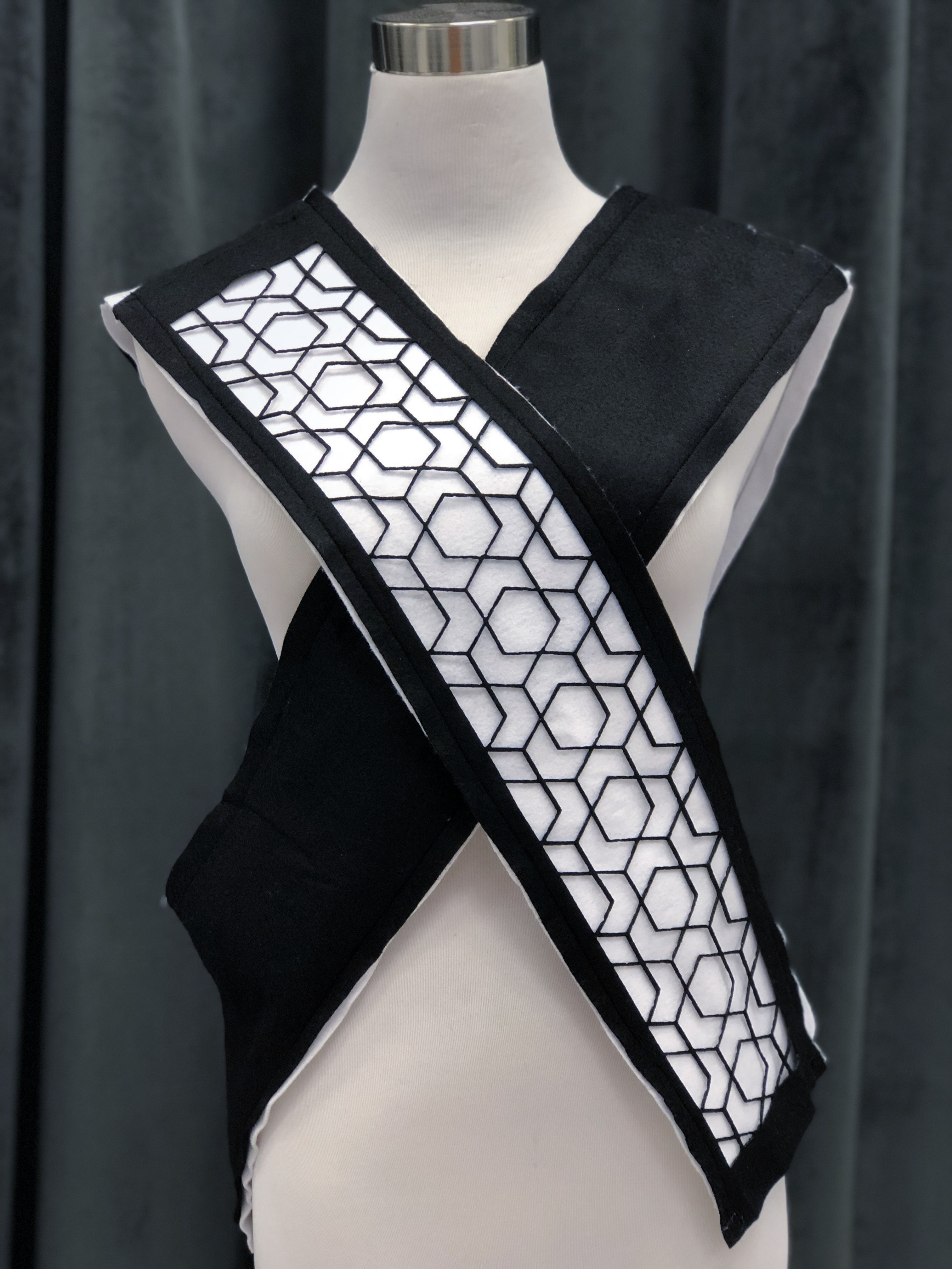
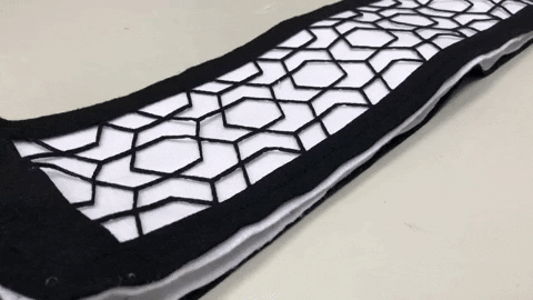
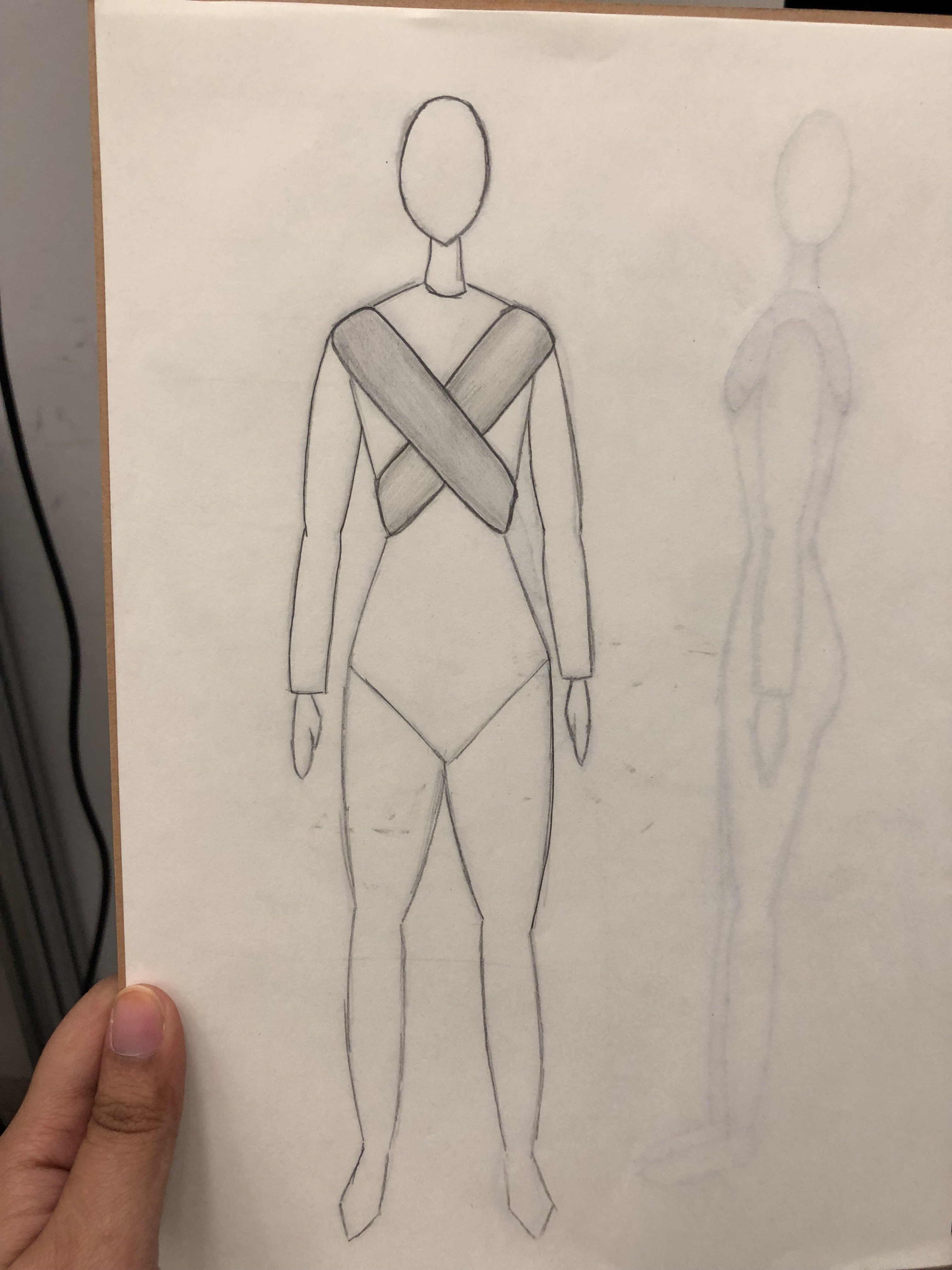
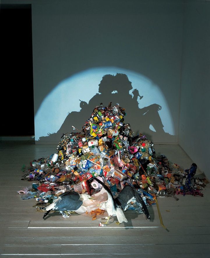
The example of the bandage in the article, I thought really exemplifies the idea of interrogative design which I had never thought of. Whilst a bandage is meant for healing wounds, it also acts (unintendedly) as a signifier to everyone that you are injured. The usual response when someone sees a bandage on you is probably “what happened?!”, which essentially goes to show that the bandage is an indicator that you have gone through some harm.

Bringing this back to interactive spaces. How can we apply interrogative design to a space?

To bring a change, the wrong has to first be highlighted. When coming up with a theme or context for a space, we should consider highlighting the “ugly truth” of the context, instead of covering it up.

For example, when the topic could be about environmental issues. I think it is important to show the negative impacts faced by the environment for the message to get across effectively.

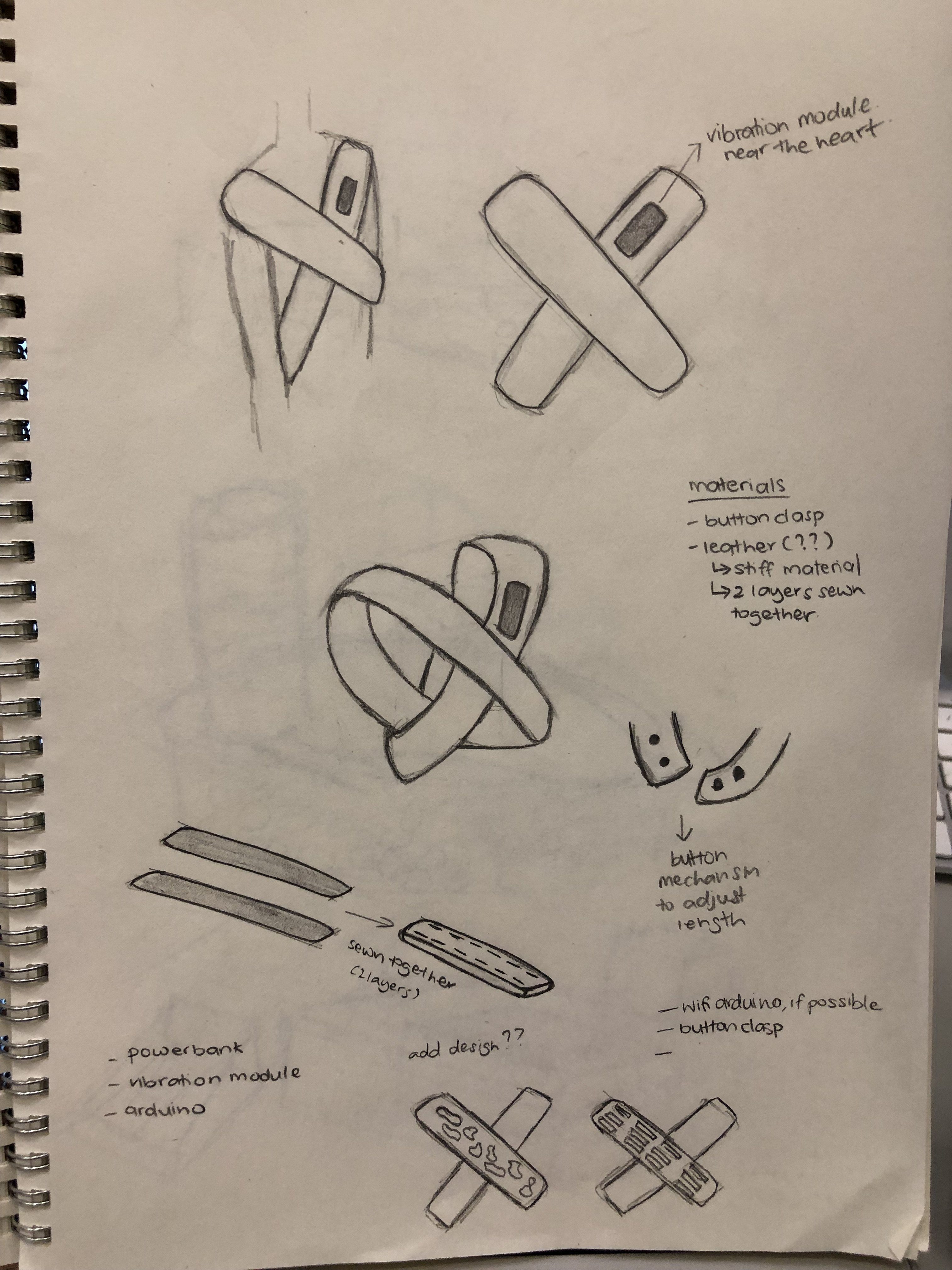
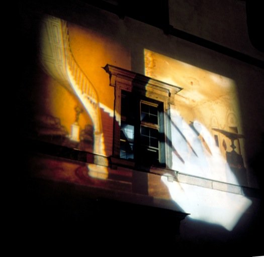
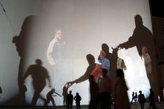
Projects: City Hall Tower Projections and the Homeless vehicle

Jumping straight to the projects that he has embarked on. I believe in many of these projects, he gave a voice to the vulnerable, unheard and overlooked. And I honestly do admire and commend him for these projects.

The strength of the City Hall Tower Projections to me was how he used an existing monument to his advantage. A monument that is highly regarded and relatable to people, and imposes an unrelated context onto it, thus making the monument unfamiliar and yet familiar at the same time.

I think what we can learn from this project is to ensure that our participants are able to somehow relate or be familiar with our space, and introduce the uncomfortable context into that. Because if we were to throw our participants into something that they aren’t familiar with at all, they might be taken aback and don’t respond as to how we want them. The familiarity can be advantageous as people tend to gravitate towards something that they are familiar with.

For Homeless Vehicles, some may not agree with me but I don’t really see it as art, rather a product or vehicle that could improve the lives of the homeless.

In both of these projects, we see how he highlighted the “ugly truth” in order to send the message across. Moreover, we can see how his artworks could incite conversations and question in its viewers.

Conclusion

When I first read this article, I had a negative judgement of the artist. However, as I continued reading on, I started seeing the passion that he brings to his art, how he hopes to create a change through his art and that is very admirable.

Even though it was a very difficult reading, I have definitely gained some insights into interrogative design which can be useful when I’m creating artworks that have strong, impactful messages.

Rafael Lozeno Hemmer // Reading Response

Relational Architecture

“the technological actualisation of buildings and
the urban environment with alien memory”

Reading some of his interviews, he coined the termed relational architecture because he felt that “interactive” has become too vague. Essentially, my interpretation is that “relational architecture” just refers to “interactive architecture”.

In his interactive architecture, he “transforms the dominant narratives of a specific building or urban setting by superimposing audiovisual elements to affect it, effect it and recontextualise it.

Interpreting this in my own way, my understanding is that he juxtaposes audio and visuals onto an architecture to change the meaning of that building.

How does this relate to Interactive Spaces? I guess it brings into question how an interactive installation impacts the meaning of a space. Does it change the purpose of the space? Does it give new meaning?

Lozano-Hemmer’s works can be described as a mixture of interactive and performance art – “Lozano-Hemmer invites the spectator performatively to imagine and construct alternative bodies – physical, architectural and urban.”

Displaced Emperors, Relational Architecture 2
Image from: http://www.lozano-hemmer.com/artworks/displaced_emperors.php

“In Displaced Emperors, even the body of the participant becomes vulnerable to appropriation as it is tracked by the cultural property symbol.”

Cultural property symbol = “is the only type of marking recognized under international law for protecting cultural property during a period of armed conflict.”

I may interpret this wrongly but I’m guessing Lozano-Hemmer was trying to show the shared culture between these two countries and how they are interlinked. In a way, I would consider it a little satirical, as he imposes the cultural property symbol onto participants to show the ridiculousness of culture appropriation.

This theme doesn’t exactly come in handy in Interactive Spaces, but what we can learn from this installation is how he brought different elements into the existing architecture thus transforming the building. The piece is not just for some visual pleasures, it is speculative in a sense that it gets people thinking and questioning.

Especially in an interactive space, I believe it is important that participants leave that space with a thought in my mind rather than leave blindly with just an Instagram photo to post.

Body Movies: Relational Architecture 6
Image from: http://www.lozano-hemmer.com/artworks/body_movies.php

“challenged this passive spectatorship of the mediated city with projection.”

A key thing we can learn from this artwork is how the work may not function the same way in different spaces.

As shown in this piece, there were different reactions to the artwork in different countries, furthermore, the reactions may not be what is expected.

Thus, when building an interactive space, the context or background of the location should always be taken into consideration. A question that we could think about when planning the location of the artwork is “will this artwork function differently in someplace else?”

Conclusion

In the majority of his artworks, it requires “bodily participation of the viewers in order to manifest and behave”.  Thus the technological and performative aspect are interlinked and can only exist with the other. Through that, they begin to question their relationship with the machine.

For the final project where technology is added into the mix, I believe it would come in handy if we also look into the relationship between our participants and the technology.


project 1 // ideation and concepts

Another rendition of the Let Go and Move On idea, which you can find here:

evoke body and movement without presence idea

I was thinking of a way on how to improve the design of the idea. I decided that maybe its better to let go of the garbage concept because firstly, it may not be “aesthetically pleasing”. Also, wouldn’t want to attract any unwanted pest, do we? Secondly, it requires participants to contribute an object which might be an inconvenience to them.

After much thought, here is the new idea:

CONCEPT

Based on the previous idea, the artwork is a sentimental piece that delves on people’s negativity. As we approach the middle of the semester, many people seem to be clouded by some sort of negativity, be it from school, friends, family, etc. Personally, I’ve been struggling with managing my negativity too and I wished that there was an outlet for me to let go of these emotions. Thus, I hope that this artwork encourages the students of ADM to turn their negative energy into something positive.

IDEA

From my understanding, analogue refers to no technology and technically, mechanics isn’t technology, right?

Anyways, the artwork first begins with participants writing down something negative on a ball that they experience recently that they wish to let go.

Picture from https://www.canva.com/photos/MADGyIIplI0-photo-of-ball-pit-balls/

Afterwhich, they will insert the ball into the slot indicated and will hear the sound of the ball rolling down. The ball will eventually exit the box and join the rest of the ball in the ball pit.

Taken from https://thekidshouldseethis.com/post/stainless-steel-rolling-ball-sculptures-by-kinetic-artist-tom-harold

(Of course, the rolling ball set up won’t be this complicated, but this is an example of how the ball will be moving around in the box.)

As more and more people participate in this “cleansing” activity, the pit will be filled with more balls for people to play around in. Thus, transforming these negative balls into a joyful experience.

Soooo… More people participating = MORE BALLS

Why a ball pit?

I wanted some form of reward system so that participants receive something for letting go of their negativity and hopefully, playing inside the ball pit brings a little joy to them. The idea is basically to transform this negative energy that has been implanted onto the ball into something positive that they can have fun with.

SET UP

The set up seems a little complicated, so here is a sketch:

Other ideas

Confetti

Similar to the ball pit idea, but instead, uses confetti. When participants insert their negative letter into the slot and pull down the lever, their letter will disappear and they will be showered with confetti to celebrate the act of being rid of the negativity.

However, the set up seems quite tedious, as I’ll have to set up a booth sort of structure with multiple pulley systems.

Vending Machine

When you insert your negative letter into the vending machine (like inserting cash), the snack that they receive in return is a positive note to cheer them up.

Wasn’t too fond of this idea because it seemed like a passive interaction.


INTER-MISSION // reflections

Who are they?

“INTER—MISSION is an art collective dedicated to discourses of technology in art initiated in 2016 by Urich LAU and TEOW Yue Han. Focusing on interdisciplinary and collaborative works in video art, audiovisual, performance, installation and interactive art. The collective aims to inhabit the gap between technologically engaged artworks, artists and audiences.” – from their website

From this statement, we understand that this is an initiative started by a group of artist that discusses the use of technology in art in their works .

“INTER—MISSION builds transnational networks to promote sustained dialogue and engagement with media practices. It creates a space that encourages collaboration, reflection and participation in our ever-changing technological environment through interactive performances, installation, video screenings, international and interdisciplinary dialogues, and knowledge sharing.” – from their website

Quite self-explanatory. They use various mediums in their artworks that are meant to engage with the audience.

The lapse project

As with the rest of their artworks, the Lapse Project focuses on technology in art. However, it focuses on the Singapore context regarding the accelerated digitisation of the environment. In my opinion, this is probably in relation to Singapore’s future plans to be a SMART nation.

Using digital manipulation, the installation highlights the idea of “lapse” by erasing Singapore’s art museums displayed through various mediums. Personally, I feel that this is a commentary on the disappearance of Singapore’s identity with the advancement in technology.

VR LAPSE

In this virtual reality experience, viewers are situated where the Arts House stood, that had been “digitally erased”. As an important historical monument in Singapore, viewers were to reflect on the disappearance of the building.

Taken from https://inter-mission.art/The-Lapse-Project-1

What stood out in this artwork was the medium chosen.

The virtual reality experience provided viewers with a different perspective and when viewers remove this goggles, they return back to reality. It is interesting because the experience in VR shows the absence of the Arts House, however, the exhibition was being held inside the Arts House. So, when viewers remove the goggles, they are immediately made aware of the presence of the building that they are currently situated at. I believe that the artwork could possibly have a different impact if it was in a different building.

24HR LAPSE

Visitors from 24 hours ago are reflected on the CRT monitor – the past and present seem to coexist in the same space. I believe this is befitting in the context of the venue the exhibition was located in. The Arts House has a long history and is now being used as an art venue. The memories of the past are still reflected in the walls and interior of the building but the building now holds new meaning to the present.

PANORAMA LAPSE

In this artwork, various monuments, such as the National Museum, National Gallery, and Singapore Art Museum are digitally erased.

Taken from https://inter-mission.art/The-Lapse-Project-1

You know the phrase “Absence makes the heart grow fonder”?

I felt that this exhibition exemplifies that. Often times, these buildings are overlooked, but the absence of these 3 cultural institutions will become apparent and leave a big gap in the surroundings. Personally, as much as I’m aware of the existence and historic significance of these buildings, I’m not “appreciative” of them. I would just walk past and don’t pay much attention to it.

This made me wonder, why is it that we only take notice when it’s gone?

ConclusioN

I may not have visited this exhibition in person, but the message of the exhibition is very clear. It seemed like very thought-provoking artworks that encourage visitors to reflect on the significance of the history and cultures of the buildings in Singapore and how technology might impact this impression in the future.


Siah Armajani: Spaces for the Public. Spaces for Democracy // Response

The “Siah Armajani: Spaces for the Public. Spaces for Democracy” exhibition was held at NTU CCA. We had the opportunity to visit the exhibition and have a staff walk us through the artwork.

So here are my thoughts on the exhibition:

The Sacco and Vanzetti Reading Room #3

“The installation embodies all the major strands of the artist’s work over the last sixty years: utopian architecture, the power of language, the idea of art as a conduit for social and political understanding and the creation of a more engaged public life.” – Michael McCanne

The Reading Room is designed to be inviting and functional for visitors, however, it is also said to give off an uninviting feeling.

I believe this contrasting feeling is depicted through the use of materials. The 2 wooden cabins are juxtaposed with benches or racks arranged with pencils that resemble spikes.


To be very honest, I didn’t experience the uninviting feeling. Personally, I felt that the space was too big, where the distance between the artworks allowed for the “escape” from the uneasiness. I felt very at peace while in one of the reading rooms with a single seat. It was a space that invited me to stay around and to read a book. Since it was far from the spike benches, I wasn’t too impacted by it.

In the image above, we see how the chairs are positioned with the pencil-spiked table. When I first saw it, I thought it resembled a chessboard so I was confused by the purpose of it.

I believe this was the only instant throughout the entire exhibition where an uncomfortable feeling can be justified. The pencils did not allow for the usage of the table so when we were writing the feedback, I was annoyed at the fact that I wasn’t able to use the table because the pencils were in the way. Furthermore, the position of one of the chairs was purposely placed to not face the table which was really annoying. This set up was definitely perplexing.

The space launched an open call for individuals or groups to engage with the books. However, I would like to question the productiveness of the space in a group setting. Because in such a big and empty space, any sound or voice just dissipates into the air. For example, when we were having the Q&A session, I could barely hear our guide or even the questions asked by my classmates, even though I was pretty close to them.

In reference to Peter Zumthor’s Atmosphere, one of the points he brought up was the “Sound of the Space”. In the context of the exhibition space, the sound of exhibition space just did not bode well together in a group setting.

Short films by Siah Armajani

As part of his exploration into technology, he produced several experimental films.

“explore how mathematical equations and computer programming can be used to generate the illusion of three-dimensional space and the passage of time on one-dimensional surfaces.”
– Metropolitan Museum of Art

  • Event, 1970, 6 min 41 sec
  • To Perceive 10,000 Different Squares in 6 Minutes and 55 Seconds,
    1970, 7 min 37 sec
  • Before/After, 1970, 1 min 50 sec
  • Inside/Outside, 1970, 1 min 40 sec
  • Rotating Line, 1970, 1 min 26 sec
  • Line, 1970, 1 min 16 sec

In my honest opinion, most of the short films were very repetitive in nature, thus you get the idea of what is being portrayed easily but after a while, it lost my attention. Nonetheless, the “animation” was definitely impressive for its time.

I don’t really have much to say about the films, however, I felt that it could be interesting for someone to recreate these short films with our current technology to see what can be produced.

Conclusion

As a whole, however, I felt that there was dissonance in the exhibition, with no correlation between the artworks. I felt that the Tomb artworks, as well as the Street Corners and the Short Films, did not match well with the Reading Room, which is what I perceived as the main icon of the exhibition. It felt like a cluster of separate exhibitions put together that did not tie in well with each other.

References
  • http://ntu.ccasingapore.org/exhibitions/siah-armajani/
  • https://www.artinamericamagazine.com/reviews/siah-armajani/
  • https://www.metmuseum.org/metmedia/video/collections/modern/siah-armajani-films

ideas // evoke the body and movement without presence

Idea 1 – The memory footprints (technology)

This idea came about from the concept of footprints in the sand. During the winter holidays, I went to a beach in Bintan. It wasn’t a very popular beach, so there weren’t many people in that area when I visited, however, footprints of someone who came before me were still there.

Photo by Aaron Burden on Unsplash

This inspired me to come up with an idea of an installation where a participant’s footprints are left behind.

The footprints of each participant who enters the space will be recorded. The footprints, however, would not be displayed immediately like how they are left on the beach. This footprint data is remembered by the system, and after a certain amount of time passes by, it will then be displayed replacing the previous footprints.

Hence, when participants are in the space, they are viewing the memory of the footprints from the past (a couple of minutes back) while also leaving behind their footprints for future participants (a couple of minutes later).

Idea 2 – let go and move on (analogue)

In The Law of the Garbage Truck, David J. Pollay shows us that by refusing to let others dump their “garbage” (negativity, anger, resentment) on us and letting it “pass by” instead, we become happier and more successful, both personally and professionally. And when we stop dumping garbage on others, we improve our relationships, strengthen our businesses and bring our communities together.

Inspired by the “Law of the Garbage Truck”, this idea is a more sentimental representation of body and movement.

Once in a while, we experience a bad day; waking up late for class, the queue for our morning coffee is way too long, forgetting your assignments back in hall, etc. This naturally builds up a lot of negativity in oneself, which we might impart on others, or others might impart on us.

This installation essentially encourages participants to leave their “garbage” or negativity behind.

Participants are to bring along an item such as a jar, bottle, can, basically anything that can contain a letter.

When participants enter the space, they’ll be informed to write down something that has brought up negative feeling that they wish to let go. It could be something that happened that day or something that has happened from awhile back.

As more and more participants leave behind their garbage, I imagine a garbage pile forming of many different objects with letters in them.

This garbage pile represents all the garbage that people have let go in order to move on with their lives. The body referring to the person who wrote the letter, and the movement is in the form of people leaving their garbage behind to move on with their lives.

At the end of the day, this pile of garbage is disposed of (or recycled), along with all the negativity from the participants.


the led project // process

Here you’ll find the process for the final outcome of the LED project – NameTag.

Links to other posts: final | sketches

workflow:
  1. Sketching and identifying materials needed
  2. Research into sensors and outputs
  3. Purchase materials
  4. Code and circuitry for servo motor and joystick
  5. Code and circuitry for RFID and LED Strip
  6. Crafting the shape and overall look of the artwork
Sketching and Research

To view the sketches, please click here: sketches.

Through the sketches, I identified the different materials that are required:

  • RFID Sensors
  • Joystick
  • LED Strip
  • Servo Motor
  • Keycards

Afterwhich, I researched into working with these materials.

Servo Motors and Joysticks

  • https://maker.pro/arduino/tutorial/how-to-control-servo-motors-with-an-arduino-and-joystick
  • https://create.arduino.cc/projecthub/RiddledExistence/controlling-a-servo-motor-with-thumb-joystick-46a4d3
  • https://roboindia.com/tutorials/arduino-servo-control-with-joystick/
  • https://www.youtube.com/watch?v=7VMbbm0s7lI

RFID 

  • https://www.brainy-bits.com/card-reader-with-an-arduino-rfid-using-the-rc522-module/
  • https://www.youtube.com/watch?v=KQiVLEhzzV0
  • https://circuits4you.com/2018/10/03/interfacing-of-rfid-rc522-with-arduino-uno/
  • https://www.viralsciencecreativity.com/tutorials/arduino-rfid-sensor-mfrc522-tutorial

LED

  • https://github.com/marmilicious/FastLED_examples/blob/master/palette_example2.ino
  • https://www.youtube.com/watch?v=7CDgxgyALWQ
  • http://fastled.io/tools/paletteknife/
Code and circuitry for servo motor and joystick

Since I only needed to use the x-axis of the joystick, I eliminated the y-axis and also adjusted the code to ensure that it only moves when the joystick is pushed to either left or right.

Code and circuitry for RFID and LED Strip

The difficult but fun part of coding this was making the LED strip coloured differently based on each card. Using PaletteKnife, I made use of the presets created by artists.

I didn’t want the colours to be static, thus I adjusted the code to include movement in the LED light which wasn’t working at first. However, I realised that the delay of the RFID was affecting the LED lights, thus adjustments were made there.


Crafting

Unfortunately, I’m pretty weak at crafting, hence I spent a lot of time struggling to form the shape and aesthetic of the artwork. Furthermore, I wanted to make sure that all the wires were compact together and hidden. This is to also ensure that the wires don’t get tangled while turning.

In all honesty, I was pretty disappointed by the final look of the sculpture. Nonetheless, I have learned the importance of proper planning of the structure of your artwork before execution. In future, I hope to create more clean crafts by planning properly and making use of proper measurements. Would definitely try using 3D printing or laser cutting.

I hope that as we progress to the next few projects, I’ll be able to improve on my craftsmanship and create more high-quality finishes.

AURA by Nick Verstand // inspiring artwork

“Studio Nick Verstand has created an immersive audiovisual installation that reinterprets people’s emotions as pulsing light compositions.” – excerpt from Nick Verstand’s website.

context/Techniques

Making use of multiple wearable biosensors that detects participant’s brainwaves, heart-wave variability and galvanic skin response, these data are translated into a light composition, varying in form, colour and intensity, as a symbolic representation.

For a change of visualisation of participant’s emotion, the installation includes an audio component to influence participant’s emotions.

“AURA explores how this perceptual process influences the understanding of ourselves and of each other. The installation symbolises the materialisation of (internal) metaphysical space into (external) physical space.” – excerpt from Nick Verstand’s website.

The medium used as mentioned on the website: biosensors, RGB lasers, hazer, 8.1 speaker system, NAP framework

The installation visually pays tribute to Anthony McCall’s Solid Light Works, in exploring light as a medium.

Anthony McCall “Solid Light Works” at Pioneer Works, New York, 2018
AURA by Nick Verstrand


Who?

Designed by Nick Verstand, a contemporary artist, “researching human perception through spatial audiovisual compositions”.

Just a simple look at his previous works on his website nickverstand.com, we can see a common theme in many of his artworks that encompasses the idea of human perception such as;

  • Between Mind and Matter (“exploring the subtle and diffuse transition space between physical and perceived reality)
  • ANIMA (investigates the emotional relationship between humans and artificial entities)
ANIMA by Nick Verstand
Between Mind and Matter by Nick Verstand
Reception

The installation was exhibited in the Dutch Design Week, the largest design event in northern Europe, hosted in the Netherlands. The DDW features over more than 2600 designers with 350,000 visitors.

AURA was selected as one of Dezeen’s top 10 installations of 2017, an architecture and design magazine.

Reflection

I am a sucker for artworks that invokes or encompasses human emotions.

As a designer, I envisioned creating artworks targeting social or environmental issues. Thus, Nick Verstand’s artworks are great examples of installations with a social context.

Just last semester, Bryan and I created an interactive artwork titled Inter-macy, that discusses the physical relationship between 2 people by visualizing participant’s heart rate on LED strips. The visualization was also influenced by the participants’ physical interaction with one another through holding hands. Click here to have a look at our project: Inter-macy.

In a way, I see some resemblance between Inter-macy and AURA. One thing that stood out in AURA for me was the material used. The RGB lasers, often used in his works, has some sort of psychedelic effect which is entrancing, keeping participants captivated. Furthermore, the addition of a hazer adds to the experience, making the visuals even more bewitching.

Also, I found it interesting how he created this artwork as a personal experience for the participants. I believe the individualize experience allows participants to be absorbed into the artwork and to reflect on their emotions.

However, one thing I would question is the location of the installation. I believe the space or location of the artwork affects the emotions or feelings of a person. When in an exhibition space, I believe our emotions are greatly influenced by the atmosphere of the space. AURA does include a sound component that is suppose to change up participant’s emotions. However, I think it would be interesting to place this installation in a public space where the atmosphere doesn’t impact a person’s emotions. Hence, we would be able to see more variation in emotions.

My beliefs are that emotions are unique to each person. As much as we universally can feel a certain emotion; sad, angry, happy, etc; our perception of an emotion may not coincide with another’s perception. In essence, my idea of sadness or happiness may not be the same as you.

To me, AURA not only puts into question your own perception of emotions but the emotions of those around you. The visualization of the emotions of others that you might not detect through observing their facial expression or body language, you get a sneak peek into someone’s else emotions in that experience.

References
  • http://nickverstand.com/projects/aura/
  • https://www.frameweb.com/news/highlights-of-dutch-design-week-2017
  • https://www.frameweb.com/news/frame-lab-nick-verstand-presents-meditative-experience-esper-inspired-by-materialized-emotions
  • https://www.dezeen.com/2017/12/11/top-10-installations-review-2017-design/
  • https://www.dezeen.com/2017/11/25/aura-installation-translates-emotions-into-beams-of-light-studio-nick-verstand-dutch-design-week/
  • https://www.urdesignmag.com/design/2017/11/27/aura-interactive-audiovisual-installation-nick-verstand/
  • https://www.digitalambiance.com/aura-by-nick-verstand/