| Title: | Societal Expectations |
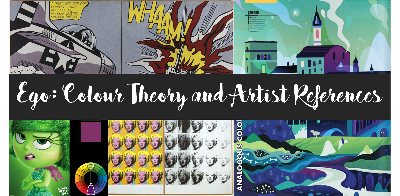
| Style: | Pop Art |
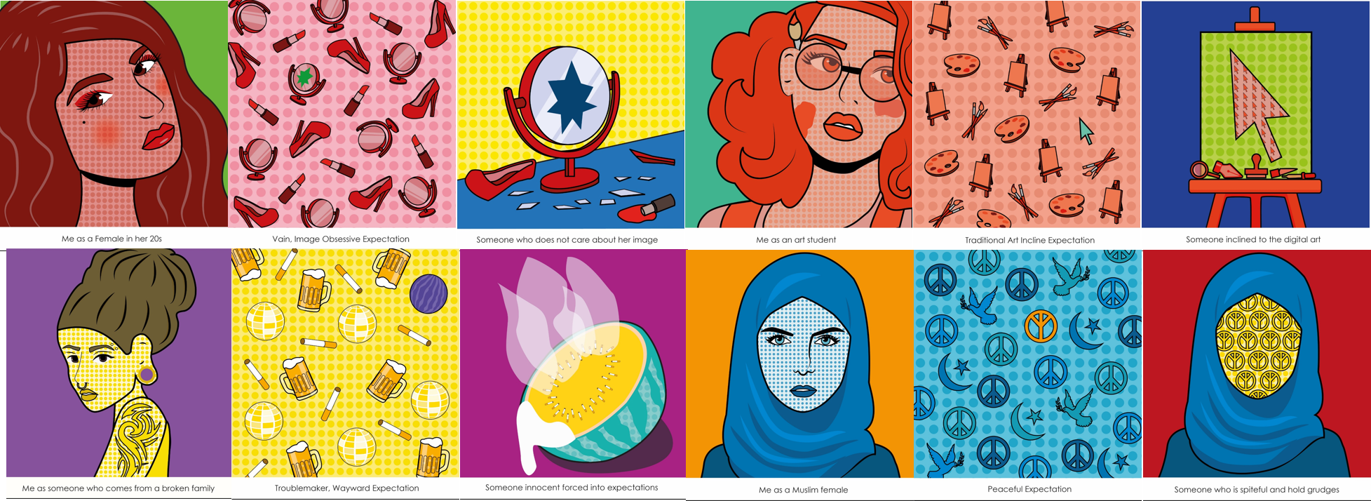
| Theme: | Stereotypes of various demographics that I belong to.
1) Female in her 20s 2) Art Student 3) Broken Family 4) Muslim Female |
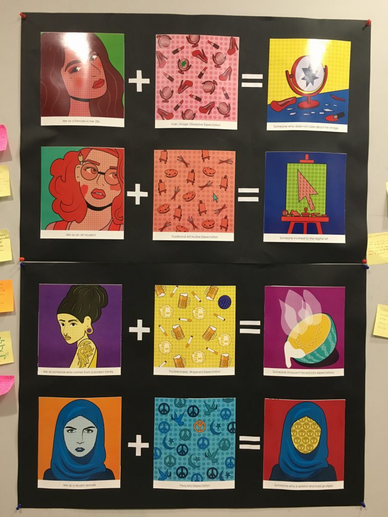
Concept
I believe there are certain stereotypes that people expect of me as a certain demographics. These stereotypes may be true for some, but are not applicable to me. Hence, I chose to display these society stereotypes and also how I don’t conform to these ideas.
Me
In the “Me” panels, I would like to highlight the stereotypical outer imagery of what the society expects me to look like as that specific demographic.
I used Ben-day dots as the skin of the characters, inspired by Roy Lichtenstein’s artworks.
Consistent throughout all 4 “Me” panels, I used complimentary colour scheme.
Setting
For the “Setting” panels, objects or symbols, that are stereotypically associated with that demographics, are displayed in a repetitive patterned like a background. I was inspired by Andy Warhol’s use of repetitive imagery of popular objects and media stars respectively in ‘Campbell’s Soup Cans’ and ‘Marilyn Diptych’. Similar to Andy Warhol’s intention, I wanted to repeat this motif to illustrate the omnipresence of these objects in each demographics.
I’ve also added a twist to each panel, signifying that I am not someone who fits into these moulds that the society has created for me.
Instead of using a single colour background, I decided to create a Ben-day dot patterned background which I felt helped the objects stand out.
In the ‘Settings’ panel, I primarily used monochromatic for the repeated patterns, as for the twist, I used a complementary colour. The objects that are commonly associated with the demographics are all in a monochromatic colour scheme to illustrate the single stereotype that society expects. The complementary colour in the twist creates a contrast and thus attracts the attention of viewers.
Me in Setting
In these panels, my intention was to illustrate my “anti-stereotype” in the setting of the stereotypical image. Hence, I represented myself in a way that I’m breaking this mould. I used triadic colours in all 4 four of these panels.
Female in her 20s
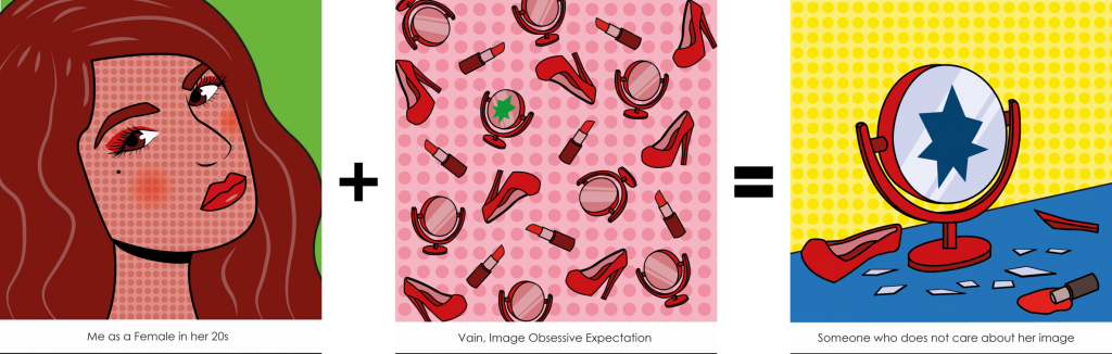
Me
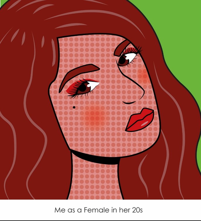
An outward imagery stereotype that is common for females in their 20s is that they care a lot about their image and obsession with beauty. There is this expectation that you should look good and dress well, I see this often in my own life with my mother and grandmother who would tell me that I should wear some makeup or wear nicer clothes or even wear some jewellery. Hence, I created this image of someone who uses a lot of makeup and has some highlights in her hair. I also included this beauty mark just below her eyes because this spot symbolises beauty.
Using complementary colours; red and green.

Progress
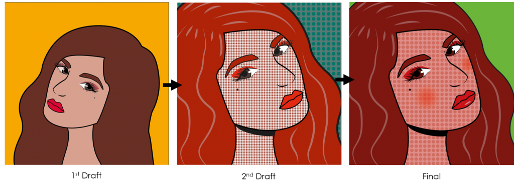
1st Draft: Colours did not reflect any colour scheme, change skin colour to follow colour scheme, add highlights to hair.
2nd Draft: Need to add more makeup to the character.
Setting
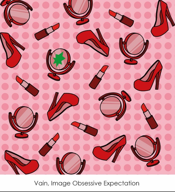
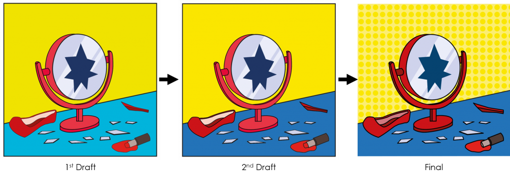
A common stereotype is that the society believes females in her 20s are vain, and obsessive about their looks. Thus, I displayed lipsticks, mirror and heels as objects that people would associate with this stereotype.
For the twist, I placed a crack on one of the mirrors to symbolise how I don’t conform to this stereotype.
Using monochromatic colour; red; and complementary colour; green.

Progress
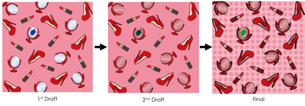
1st Draft: The blue mirror was a little too distracting, could be changed to a lighter shade of red.
2nd Draft: Crack on mirror not obvious enough. Strokes should be consistent throughout entire panel. Add some background texture.
Me in Setting
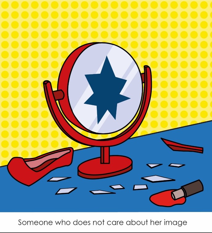
To show the rebel against this stereotype, I created the illustration of a broken mirror, a broken heel, and a melted lipstick. This represents how as a person, I don’t follow this expectation of the society and that I am not someone who cares about my outer image.
Using triadic primary colours; red, yellow and blue.

Progress
1st Draft: Change to a darker shade of blue
2nd Draft: Strokes should be consistent throughout entire panel.
Art Student
Me
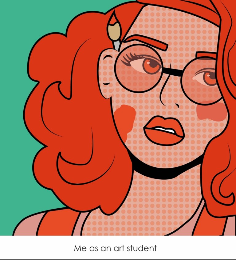
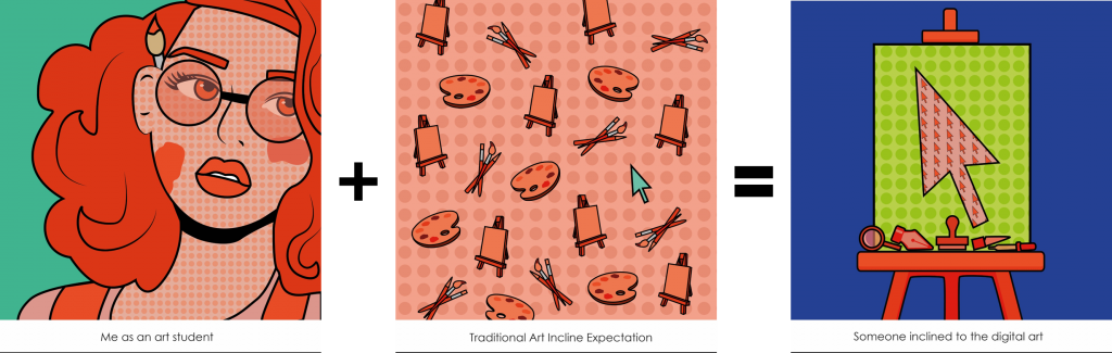
Before I came to ADM, as I spoke to my friends who aren’t Art students, I found that a lot of them had the impression that Art students are those that dress well and in a millennial term “hipsters”. I created this illustration which non-Art students would picture Art students to look like. Thus, I had the character have a paintbrush behind her ear (a typical image often found on media), paint on her face, big bushy hair and wearing “hipster” glasses.
Using complementary colours; red-orange and blue-green.

Setting
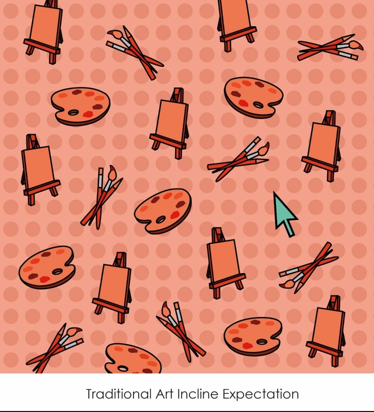
When I tell someone that I am an art student, they make an assumption that I can draw, colour and paint well. To illustrate this assumption of art students being able to do traditional art, I use objects such as easels, paintbrushes, pencils and palettes.
For the twist, I added a cursor to represent my rebel against traditional art.
Using monochromatic colour; red-orange and complementary colour; blue-green.

Me in Setting
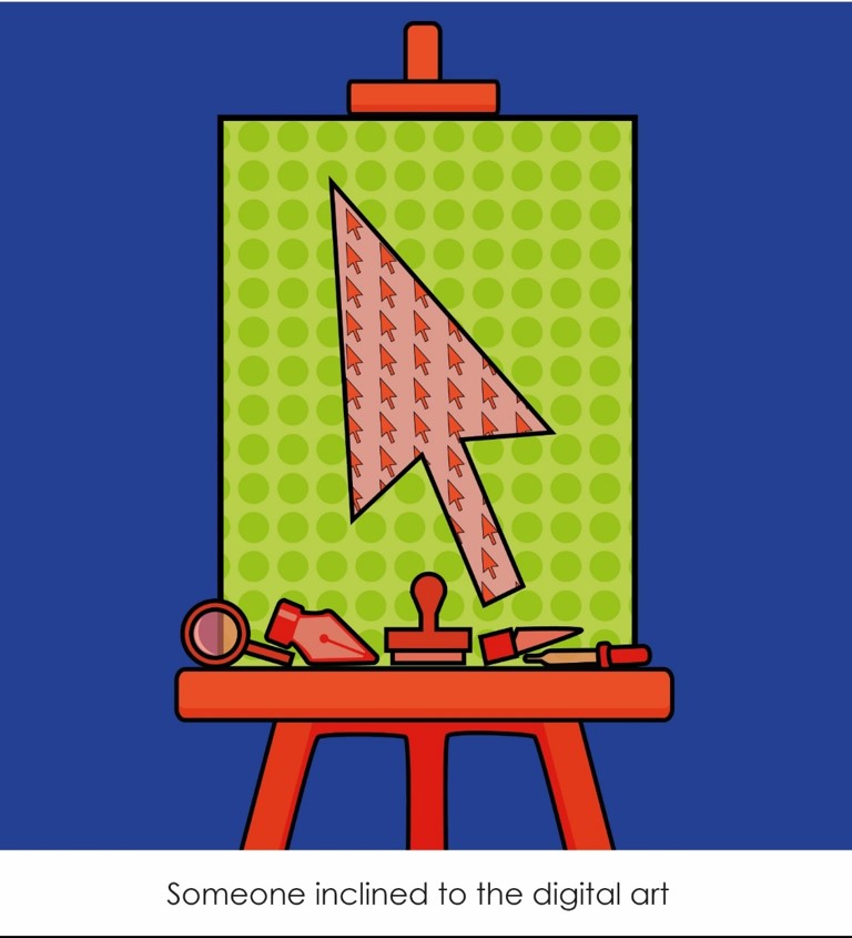
The idea is to display the irony in using both traditional and digital objects. The easel and canvas are used in traditional art for painting and drawing, thus I created this “painting” of a cursor filled with cursors inside it. On the easel which you would normally find traditional art tools like pencils, brushes, palettes, have been replaced with digital tools such as the pen tool, knife tool, clone stamp tool, zoom tool and eyedropper tool.
Using triadic colours; red-orange, blue-purple and yellow-green.

Broken Family
Me
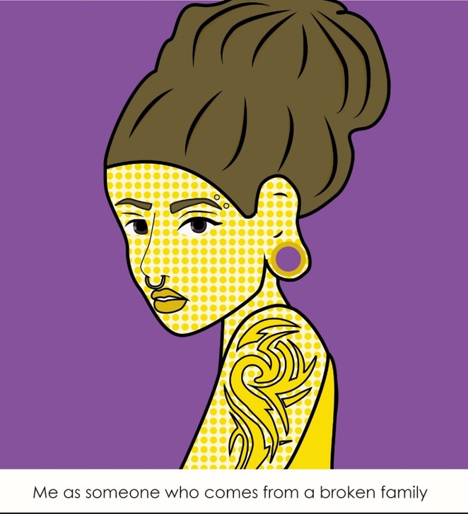
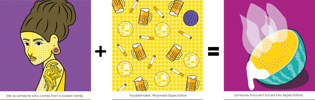
A very common remark I get from my relatives were how they were glad that I turn out well despite my family background. From this remark, it is obvious that they have an expectation that people who come from broken families are wayward and troublemakers. Hence, I created an image of a “troublemaker” with tattoos, piercings and a huge ear hole.
Use of complementary colours; yellow and violet

Progress
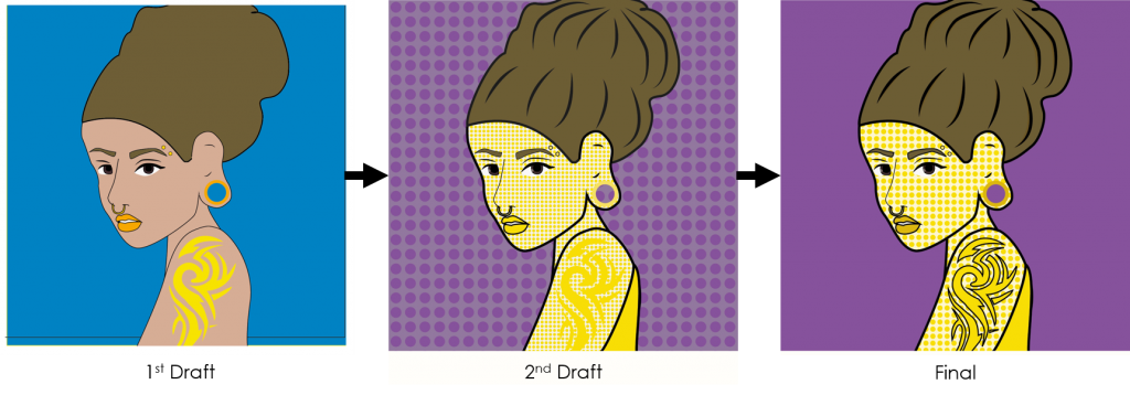
1st Draft: Use complementary colours instead. Change skin colour to a yellow tinge. Add shadows to her hair.
2nd Draft: Tattoo not obvious. Change polka dot background so that it does disrupt the attention.
Setting
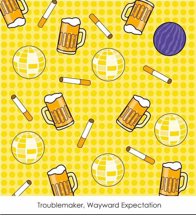
I illustrated this idea of wayward by displaying cigarettes, beer, and a disco ball representing smoking, drinking and clubbing which are not viewed positively. The twist I included in this composition is a watermelon in replacement of a disco ball.
Use of monochromatic colour; yellow and complementary colour; violet.

Progress
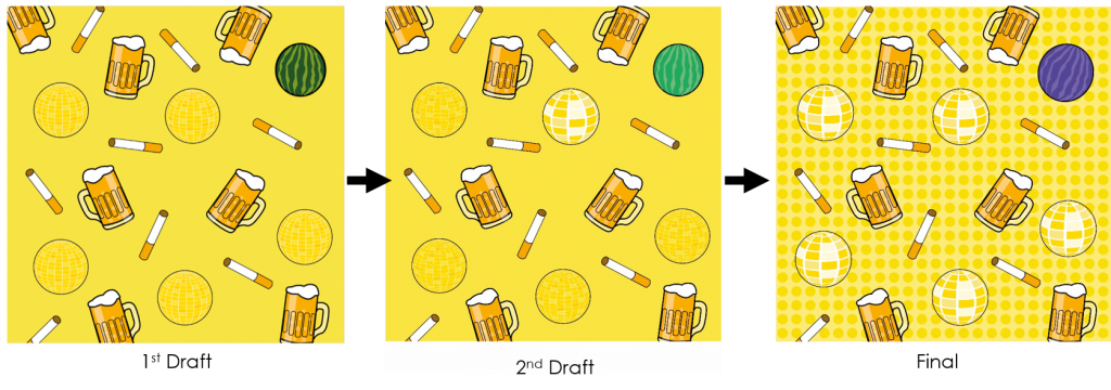
1st Draft: Disco balls are not obvious enough, change colour of watermelon to a complementary colour
2nd Draft: Disco Ball is more recognisable. My concern was changing the colour of the watermelon would result in the inability to identify it as a watermelon.
Me in Setting
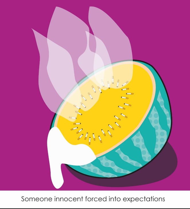
To illustrate how society forces these wayward expectations on me but ultimately, I do not conform to their expectations and as illustrated, I remain an innocent watermelon.
Use of triadic tertiary colours; yellow-orange, blue-green and red-violet.

Progress
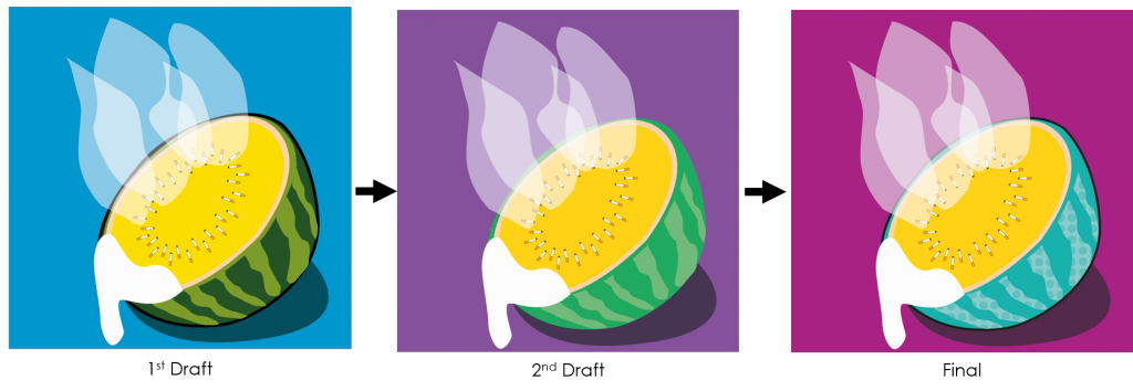
1st Draft: There is no distinct colour scheme.
2nd Draft: Wrong use of triadic colours, should be changed to red-violet, yellow-orange and blue-green instead.
Muslim Female
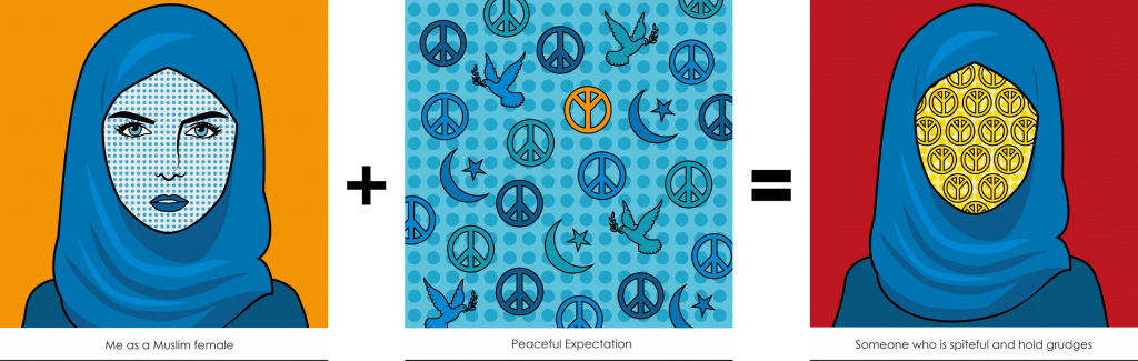
Me
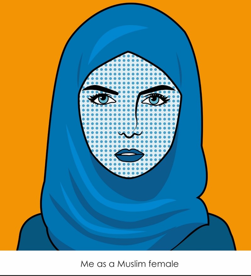
One of the most common question I get from people I just met is “Why don’t you wear a tudung?” This question alone showcases how people expect to see all Muslim female to wear a hijab. Hence, the character is seen with a hijab on.
Use of complementary colours; blue and orange.

Progress
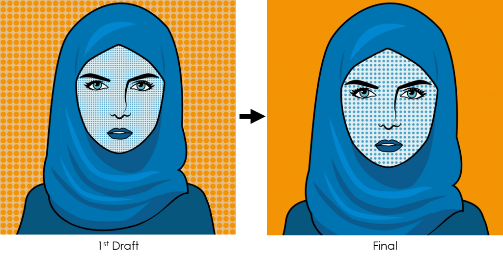
1st Draft: The Ben-day dots on the skin can be slightly bigger. I found that the dots in the background is a little distracting.
Setting
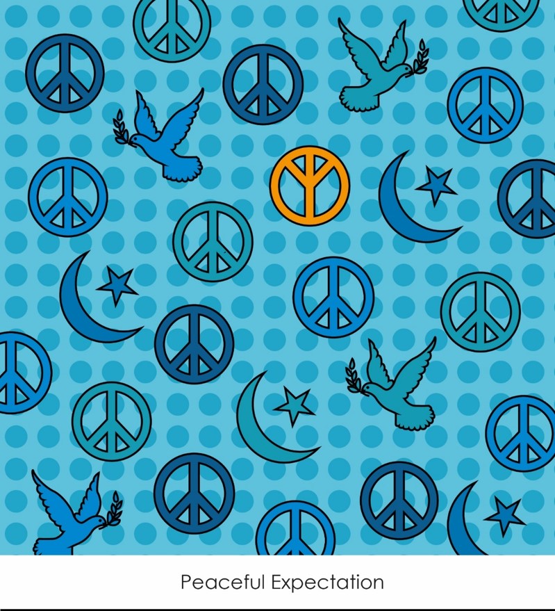
Islam in itself means peace. Hence, especially in the Muslim community, there is an expectation that as a Muslim, you should be a peace loving person. The twist I have included is an inverted peace sign to signify that I am “anti-peace”.
Use of monochromatic colour; blue; and complementary colour; orange.

Progress
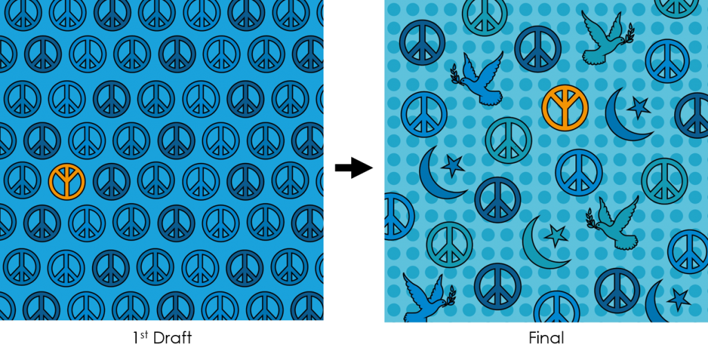
1st Draft: I felt that the composition appeared too flat. A suggestion was to use more symbols of peace similar to my other compositions.
Me in Setting
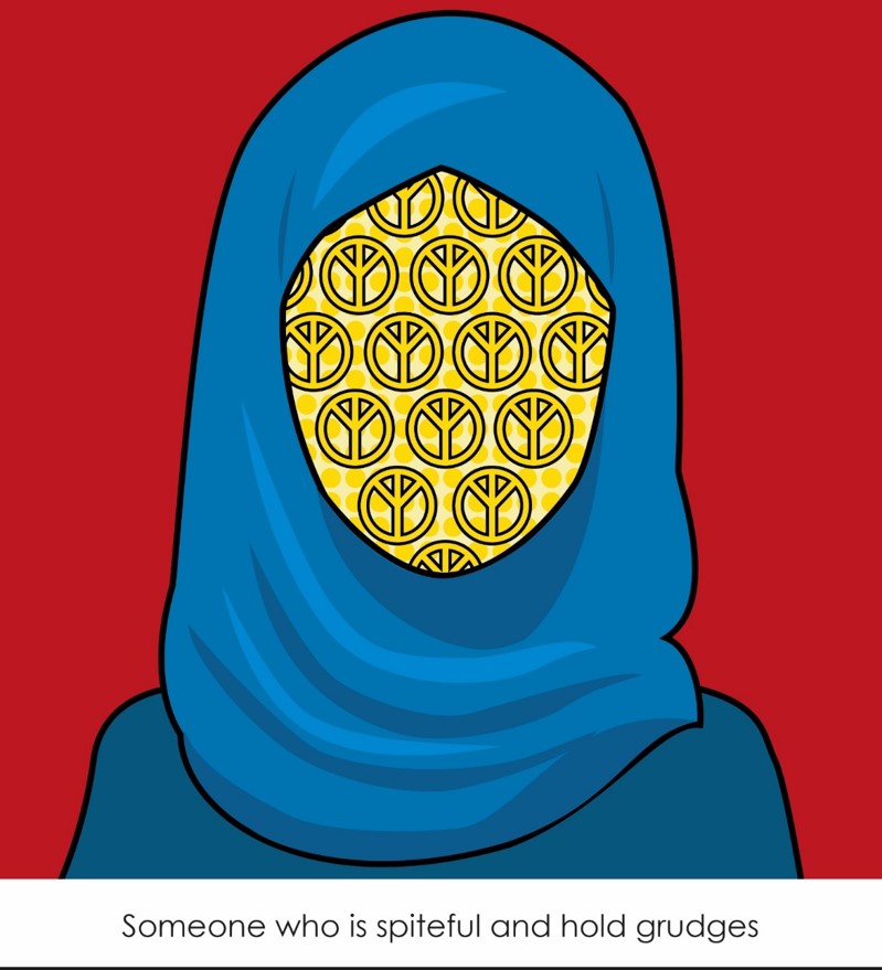
To show my “anti-peace” notion by having a face covered by inverted peace signs which represent how I am the opposite of peaceful. Also, I have a hostile resting face, which is reflected by the idea of “face full of anti-peace”.
Use of triadic colours; red, blue and yellow.

Progress
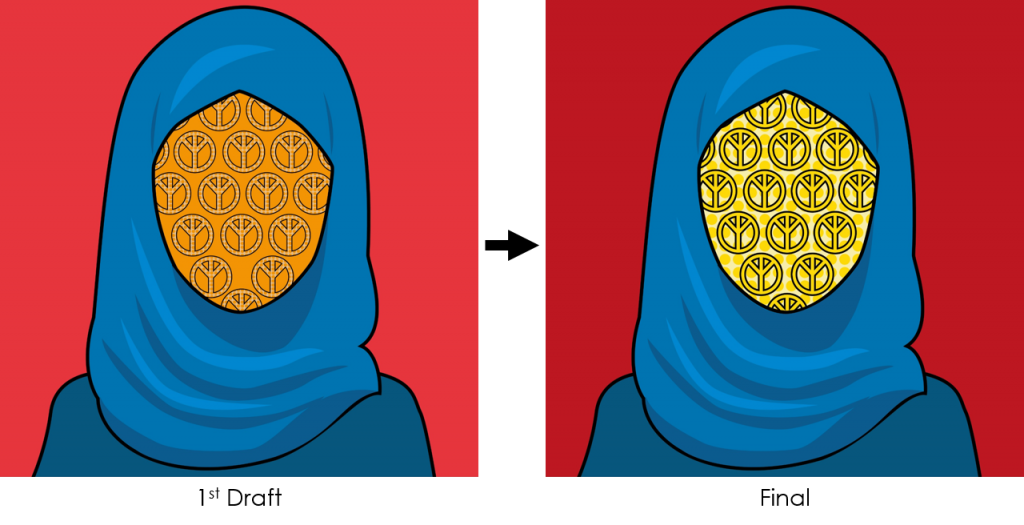
1st Draft: Wrong use of triadic colour scheme; should change to red, blue and yellow. The ben-day dots in the inverted peace sign not obvious.
Overall colour schemes


Reflection
I enjoyed the freedom that we were allowed in the use of mediums in this project. A lot of the classmates reflected their own style into their compositions and that reminded me that it is time for me to find my own style of illustration.
Link to previous post
Colour Theory & Research: https://oss.adm.ntu.edu.sg/nora0020/ego-colour-theory-and-artist-reference/