Let’s start from the very beginning.
This could easily be one of my projects with the most sketches and drafts, so bare with me as I ramble on about how it has developed from the beginning to the end.
First Sketch/Draft
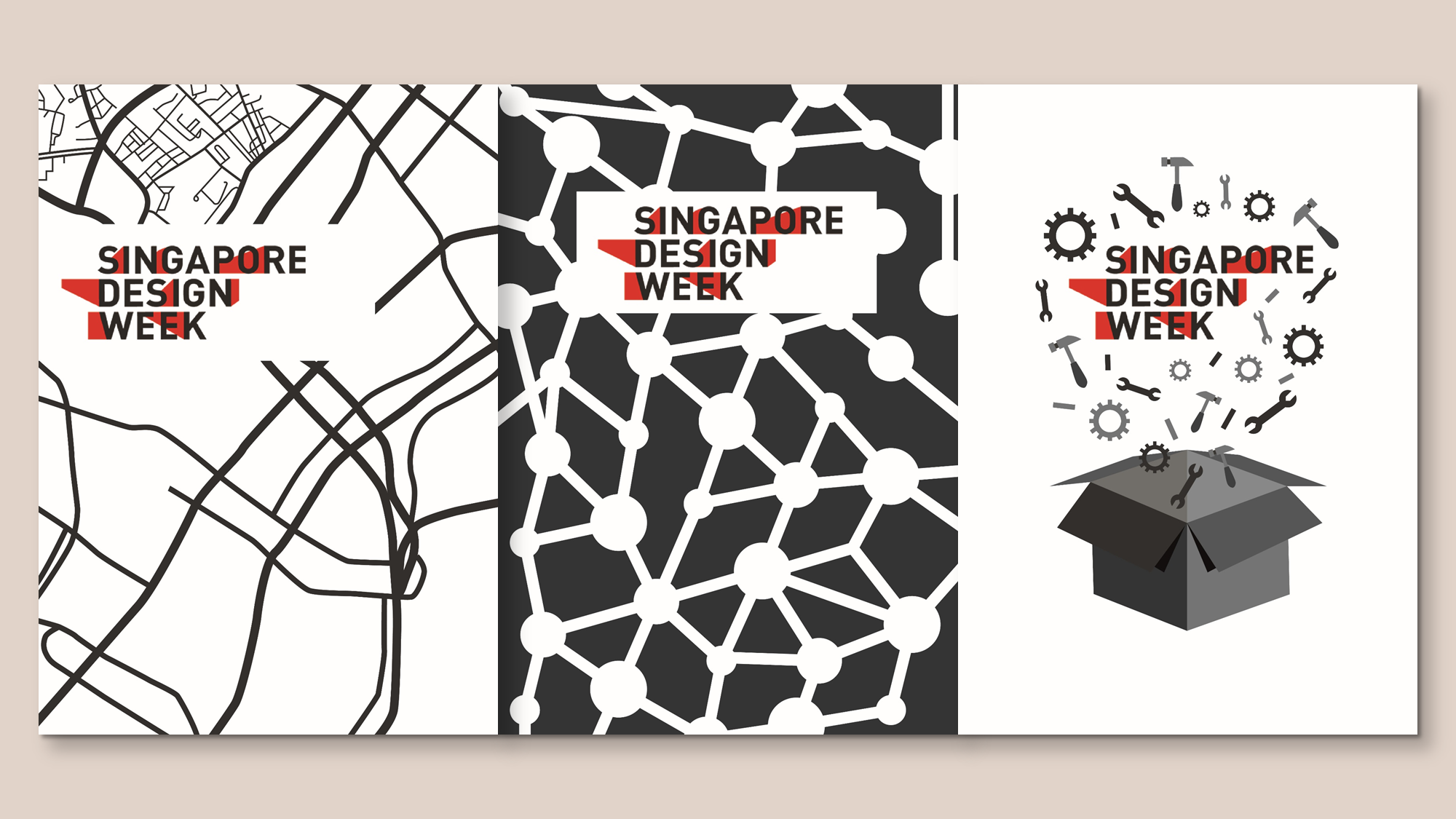
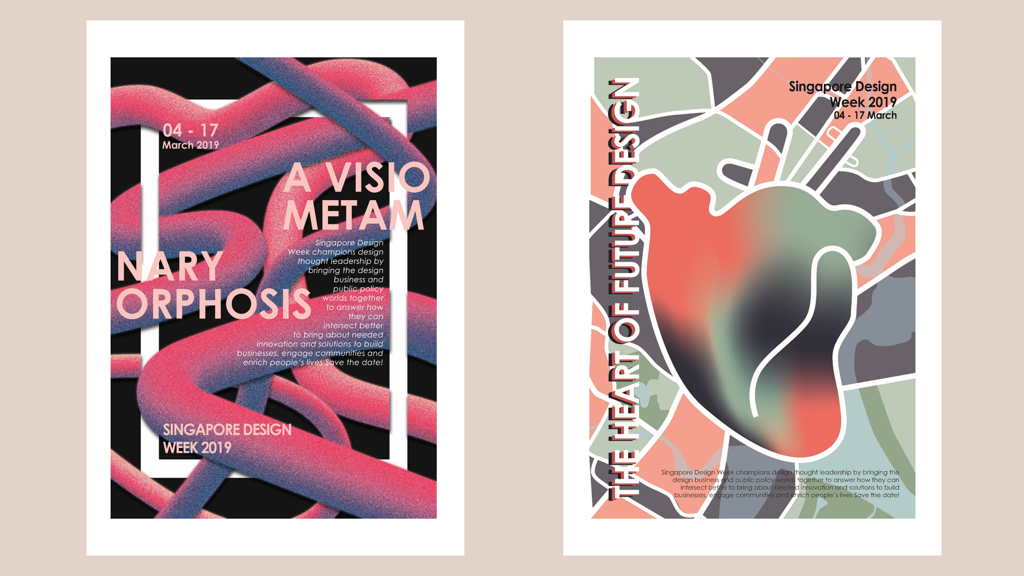
Left: The Heart of Future Design (Singapore/Heritage)
Inspired by the aim of putting Singapore on the map, one of my ideas was to create an abstract road map motif.
Centre: A Visionary Metamorphosis (Community/Interlace)
As SDW aims to become the hub that connects designers, I was inspired to create a motif connecting motif to showcase that.
Right: The New Design Revolution (Leadership/Innovation)
With the main aim of SDW being a venue to showcase innovation, I figure that the concept of “thinking out of the box” might work.
Initially, the response I got from the class was generally quite good, with many pushing me to go for the first idea (map). Hence, I decided to continue working on that theme. Nonetheless, I wanted to try out the second idea (interlacing).
Here are some other sketches I worked on during my design process.
Second Draft
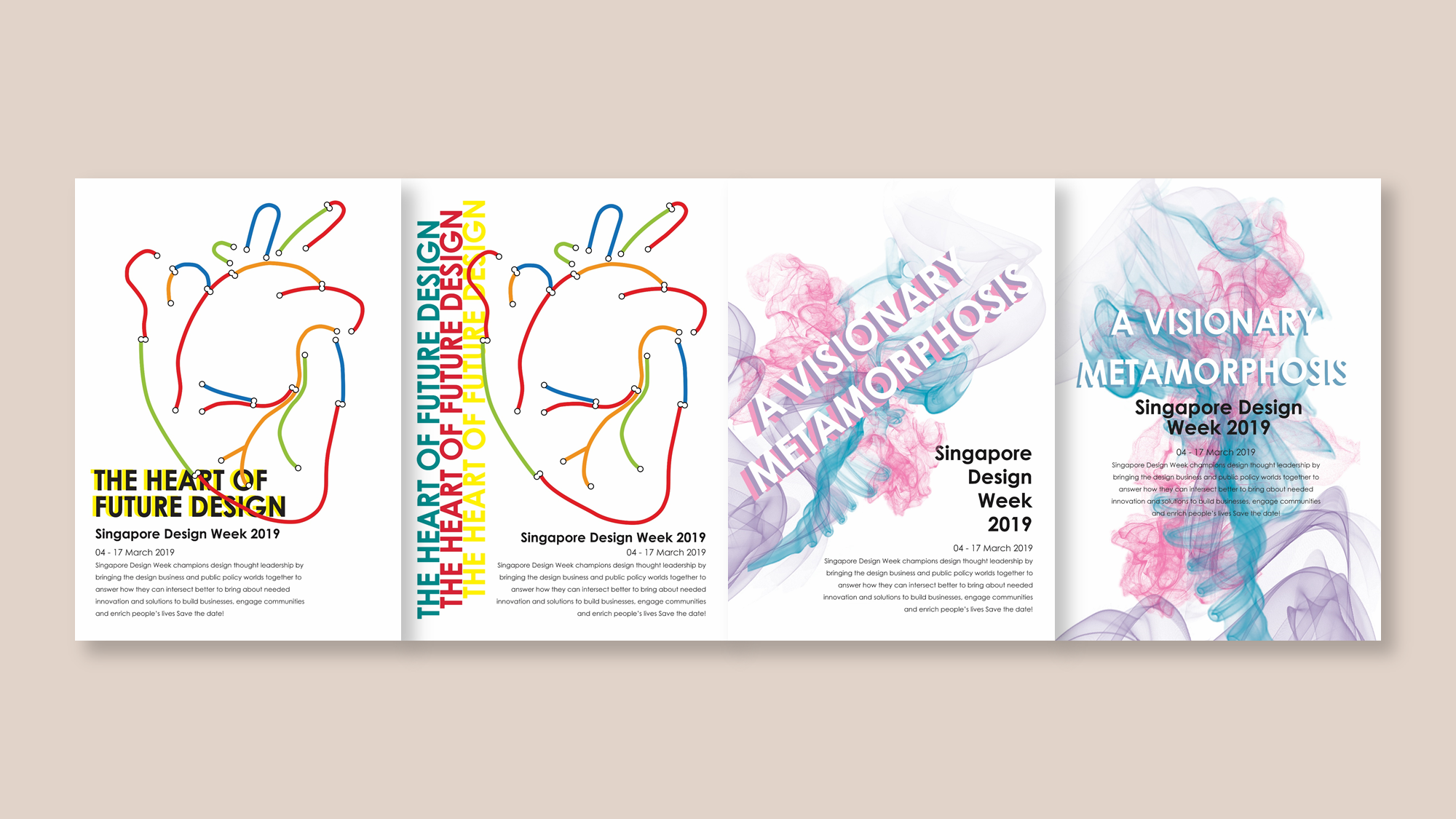
As mentioned previously, I started expanding on the first 2 ideas.
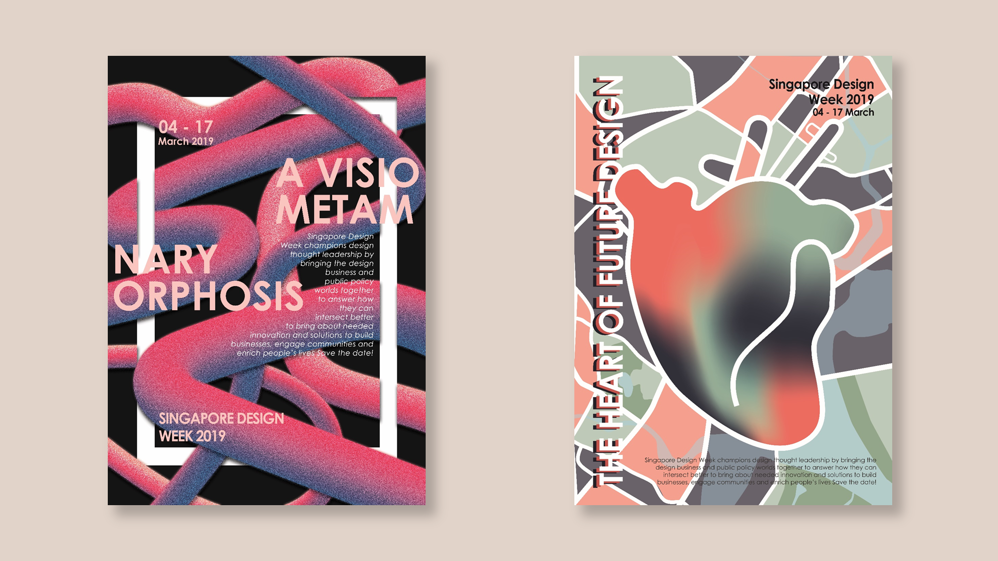
A Visionary Metamorphosis
Using a “3D” gradient pipes to create an interlacing composition.
I was excited by the outcome of this composition, to be honest. However, I received some critique over this design. Firstly, the class felt that the concept was not strong enough, the meaning behind the pipes were not clear and the white frame didn’t appear to have any sort of meaning (purely aesthetics). Nonetheless, people found the placement of the slogan interesting, but the class highlighted that it was hard to read. In conclusion, my concept needs to be stronger.
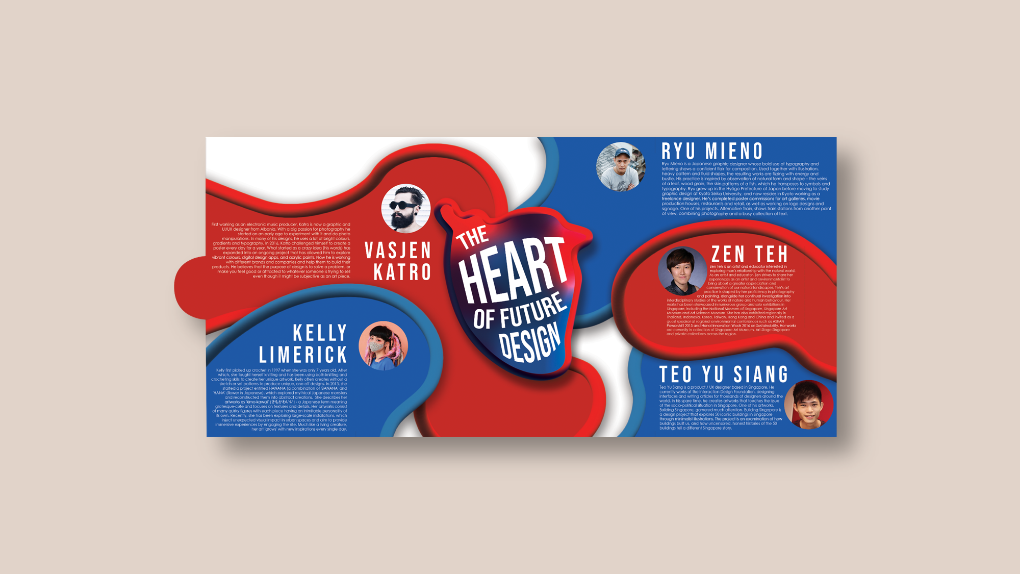
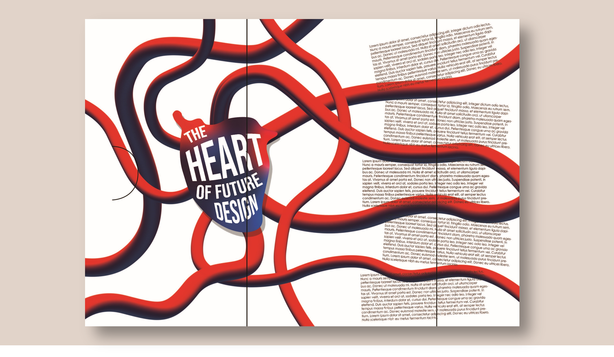
The Heart of Future Design
Building on to the map idea, I created a more abstract image of the map of the surrounding area of National Design Centre. I incorporated the heart at the centre of the map. However, I was really not satisfied with how this turned out. The colours did not look right, and it felt too messy. So, I didn’t really showcase this design because I was too embarrassed.
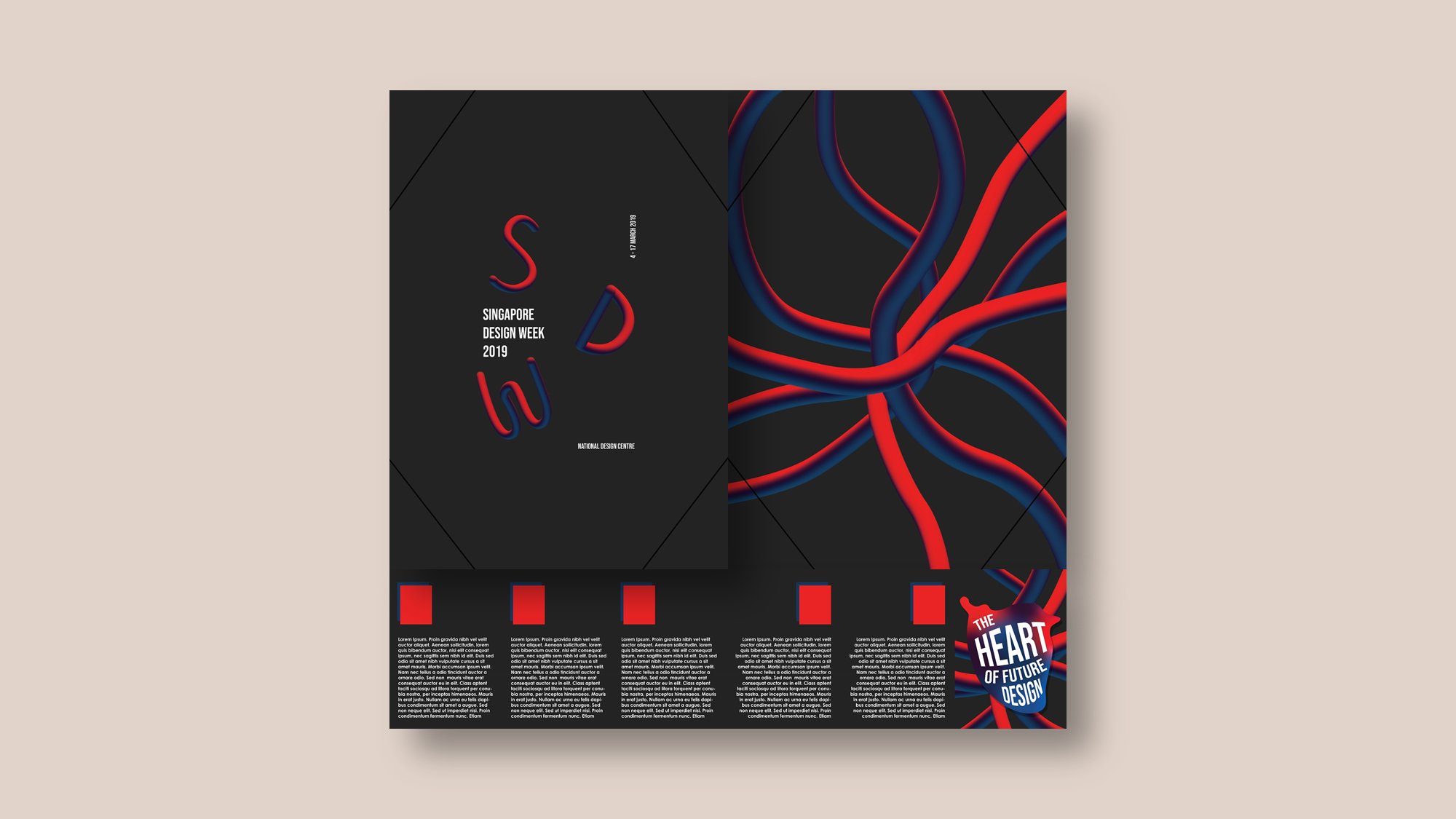
Third Draft
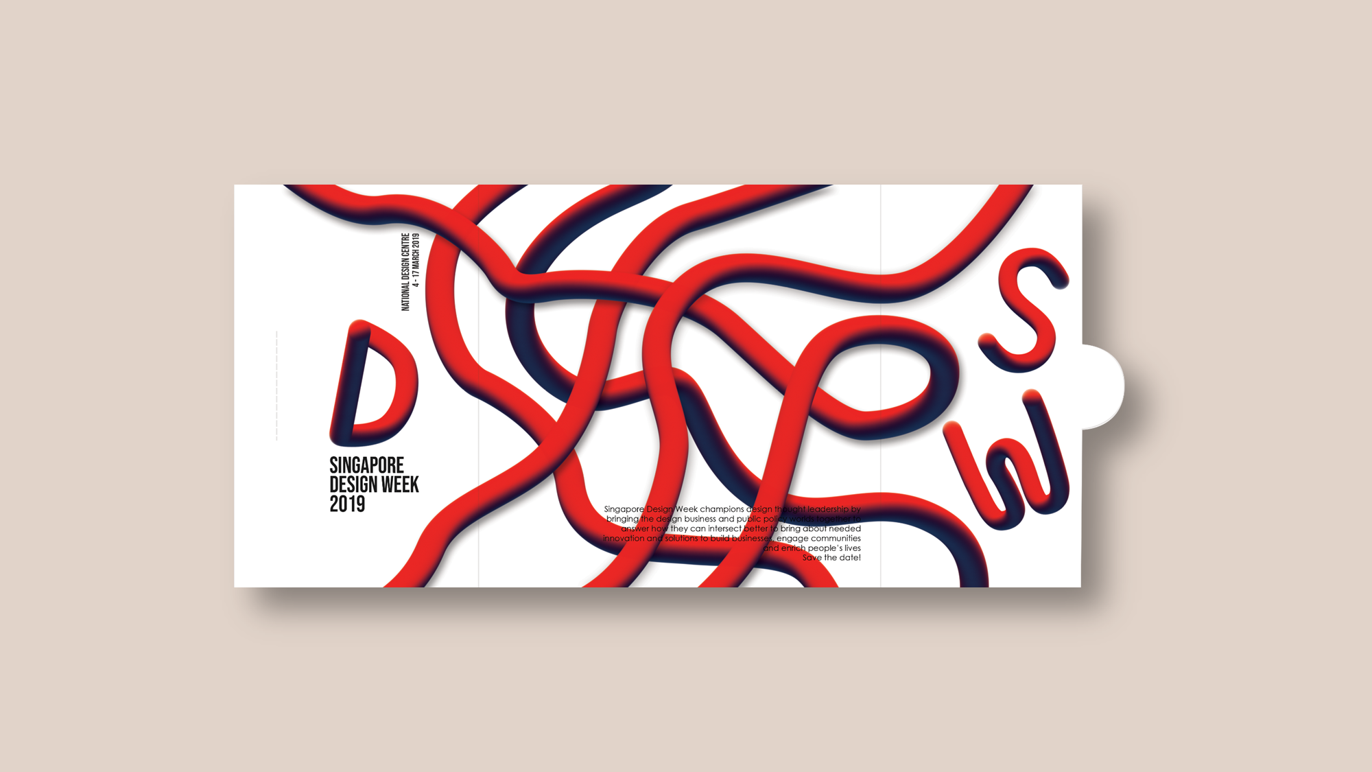
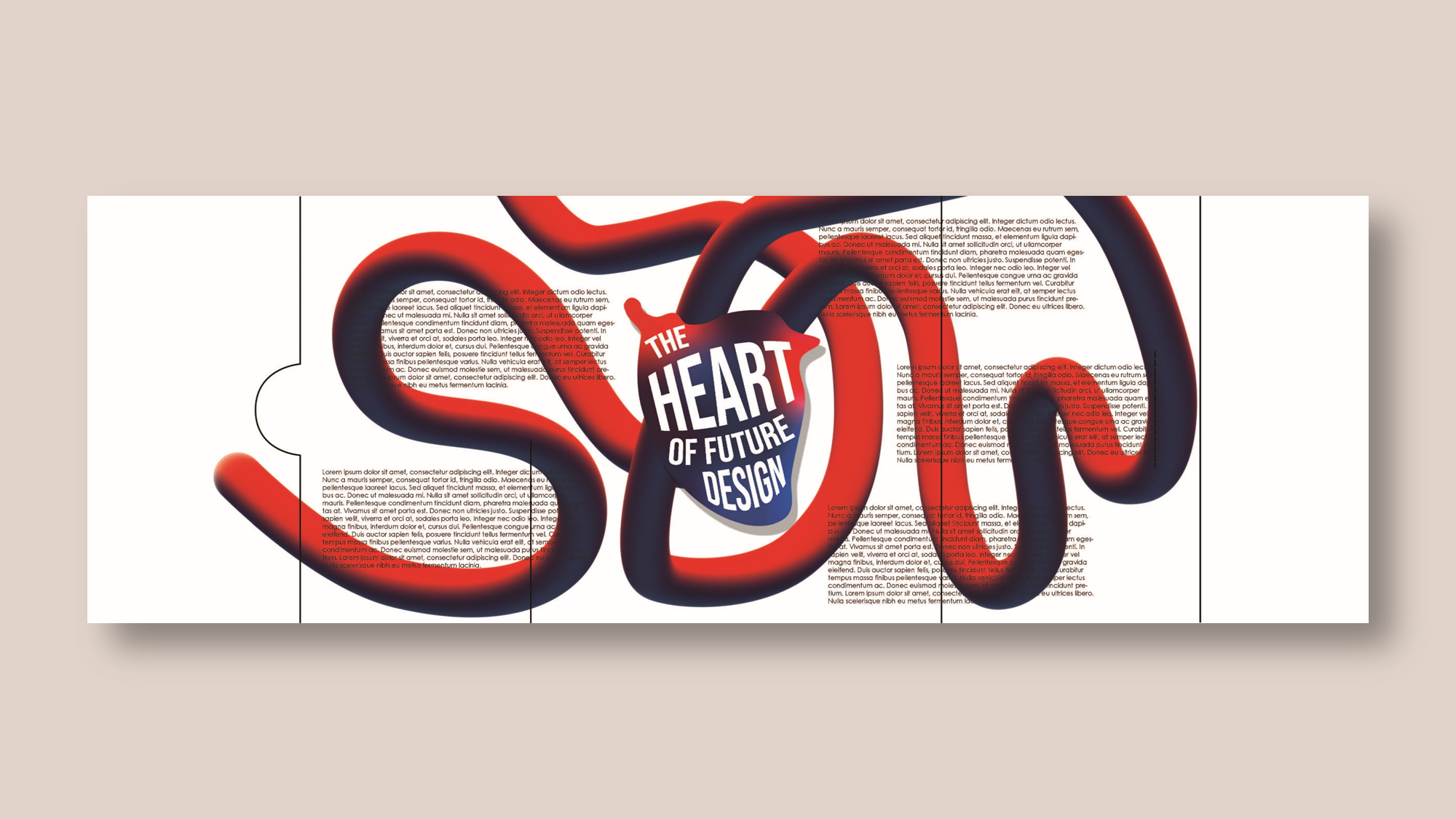
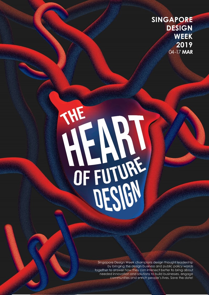
To further strengthen my concept, I decided to go with the slogan “The Heart of Future Design”.
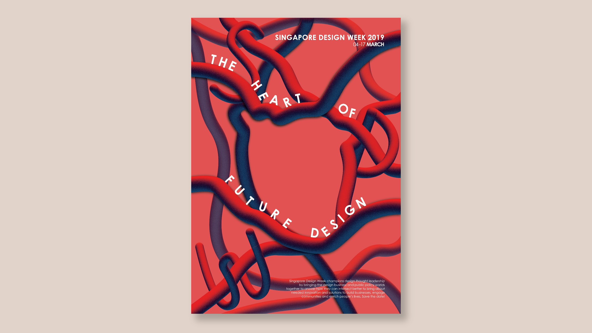
I fused my favourite elements from each composition, combining the pipes and heart.
I was starting to feel proud of my design (finally). To be honest, I was really in a complete dazed after the previous consult.
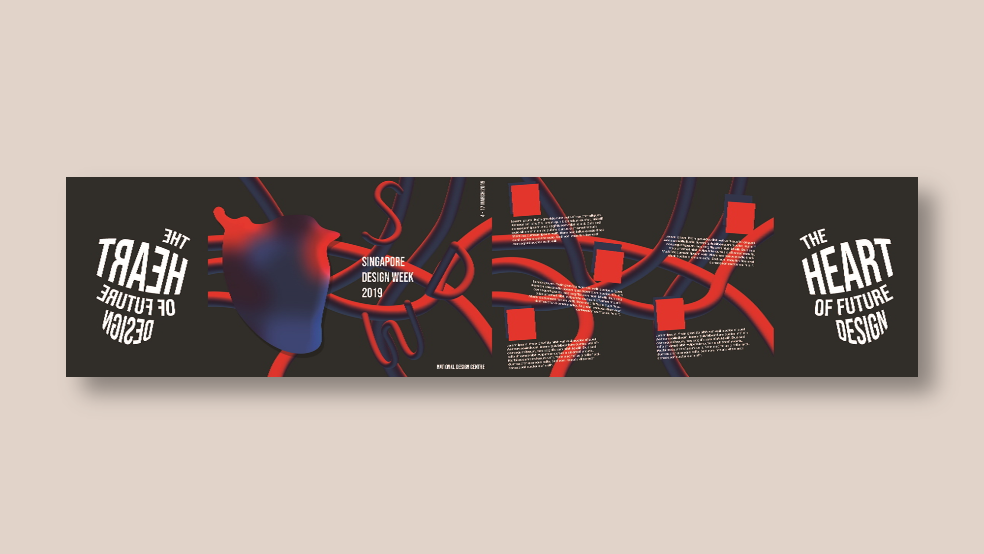
However, there were still much to improve on. The general consensus from the class was that it was too red, the “SDW” is not obvious enough, the heart in the centre needs to be more prominent, play more with the placement of the slogan.
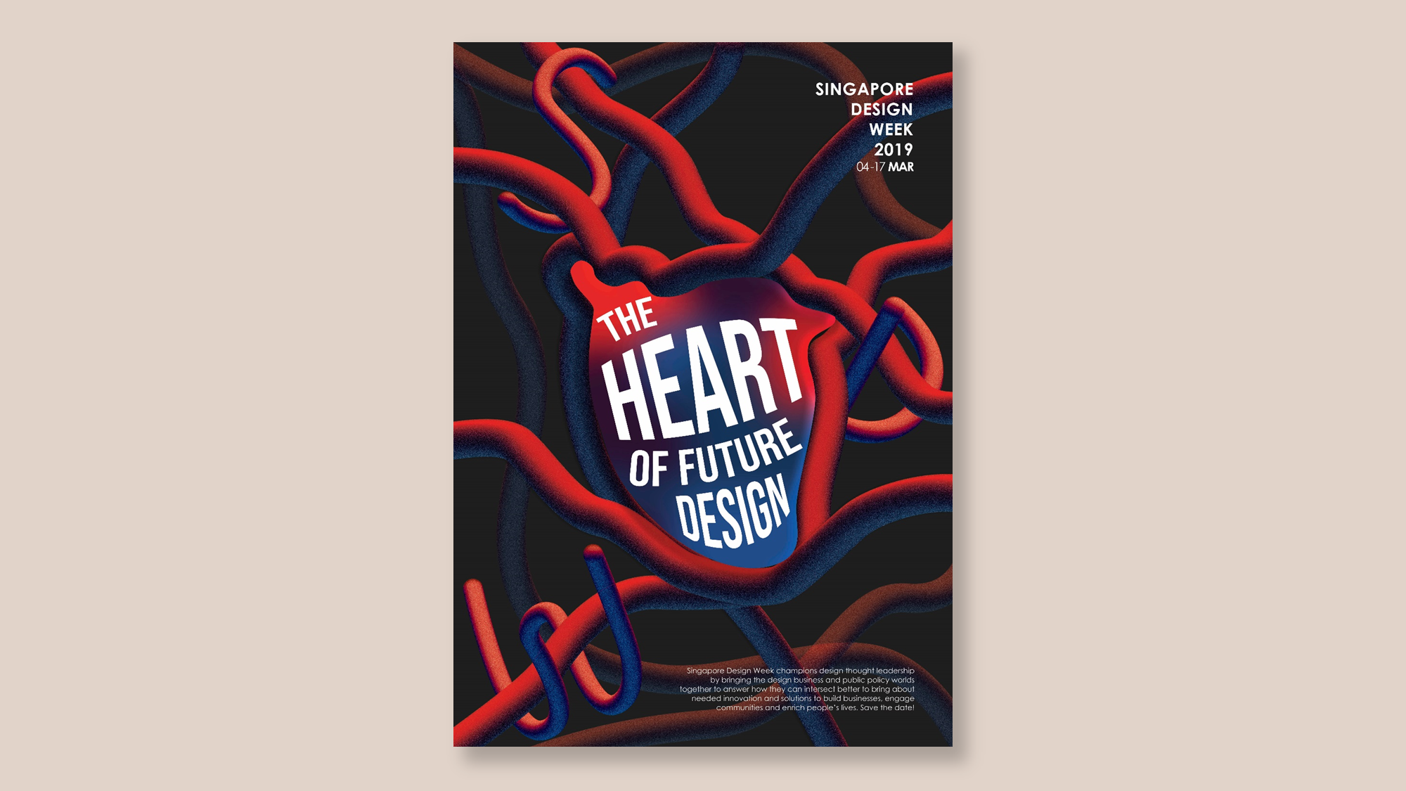
With that, I arrive at my final artwork, you can see my process and final artwork here: final | brainmap + moodboard | research | interesting poster.