the heart of future design // final brochure

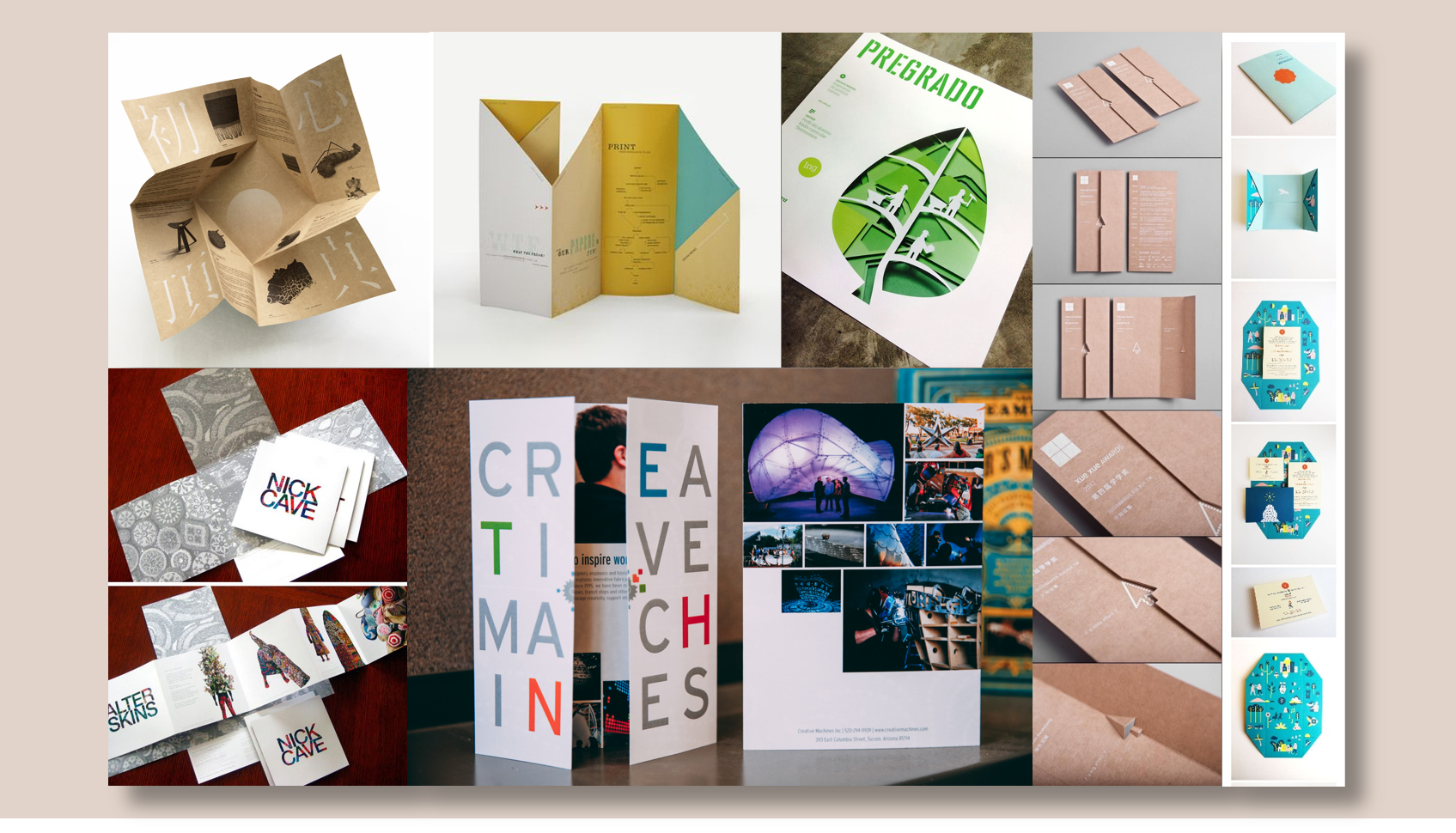
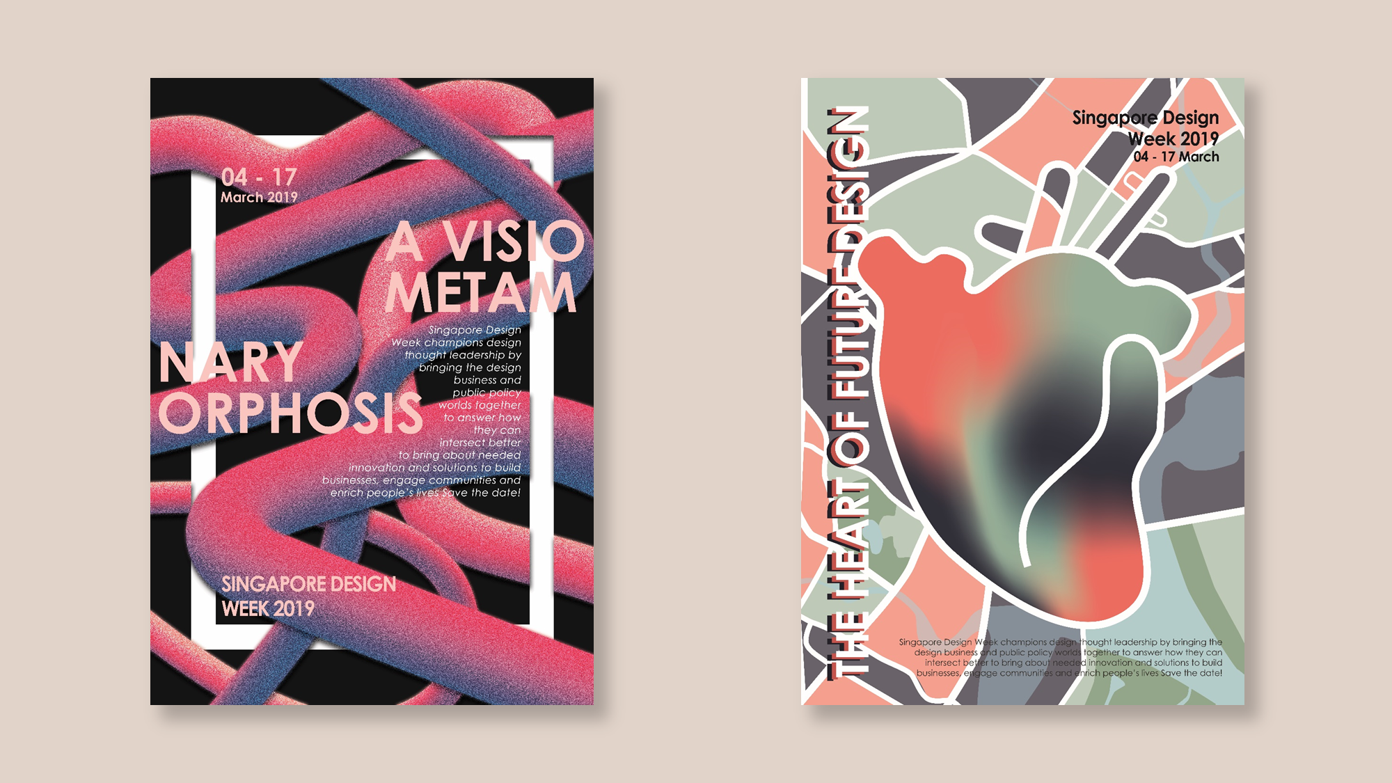
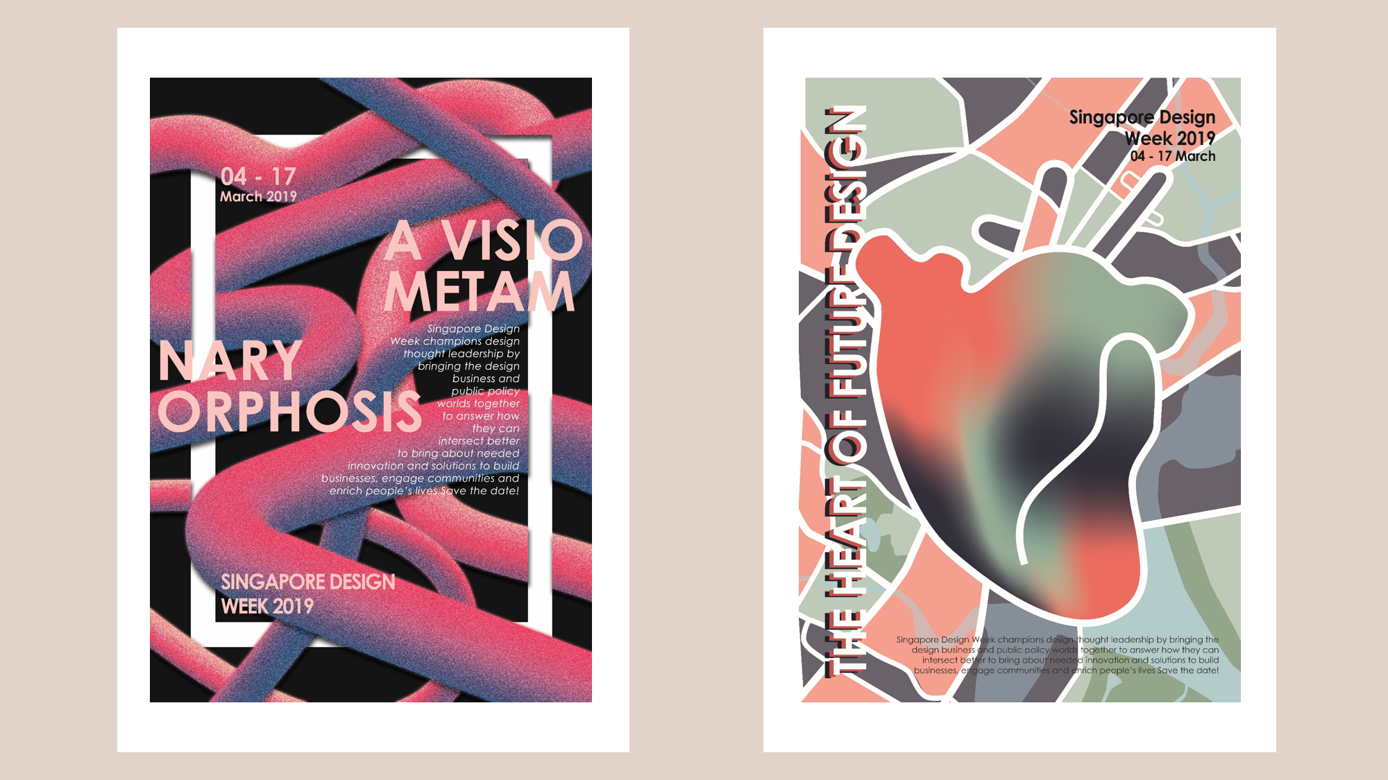
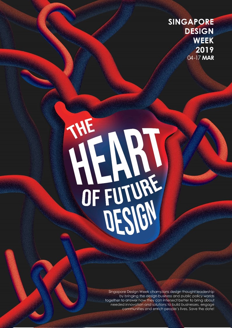
Building on the idea of “The Heart of Future Design”, I created a brochure with the same elements as the poster as well as creating new ones.

I decided to use the gate fold with a simple cut out and slit to keep the fold from being ajar. This was also to illustrate the idea of viewers having to unlock the brochure to get to the “heart” which is the first thing you see when you open the brochure.
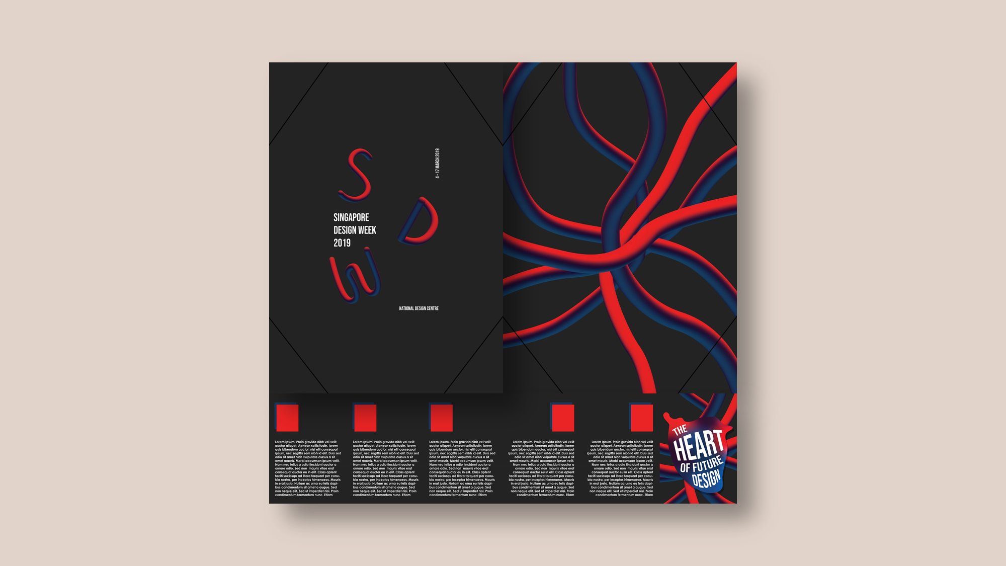
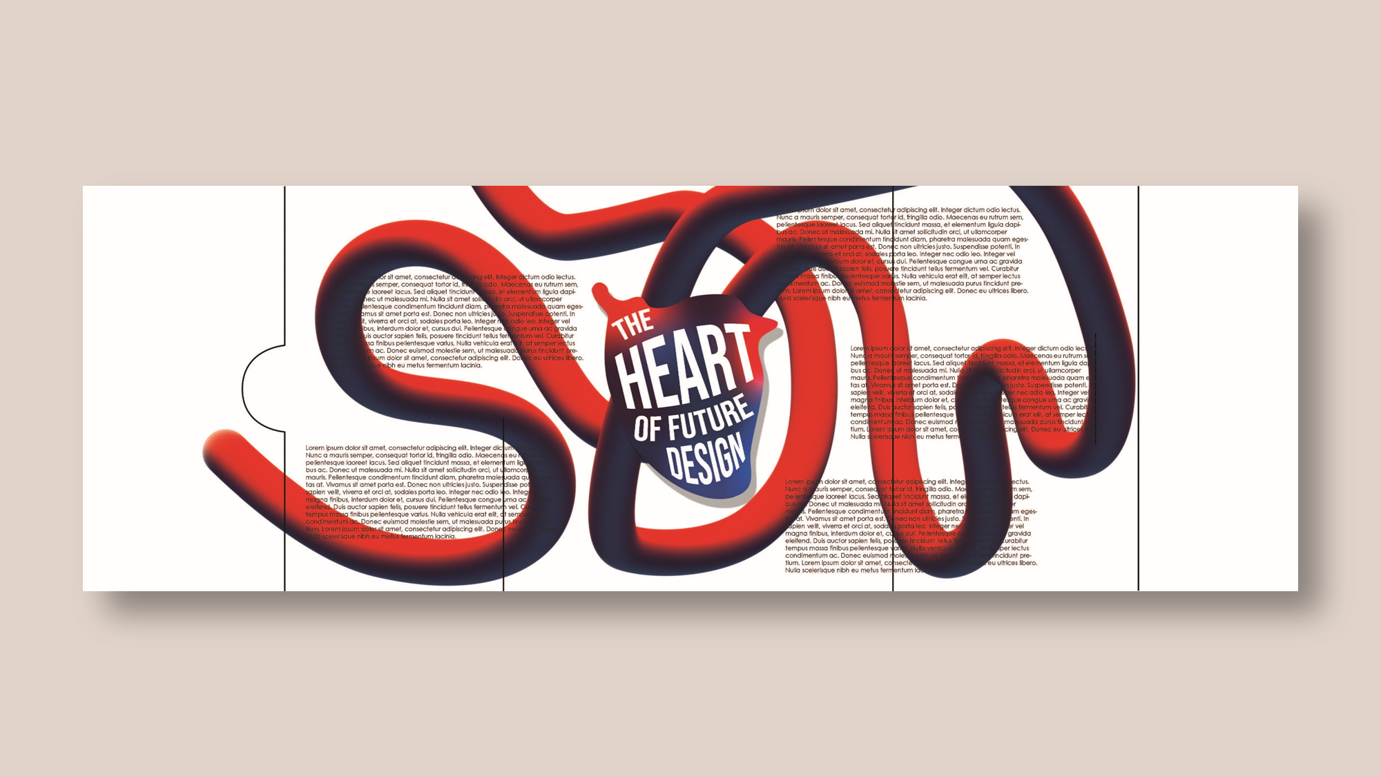
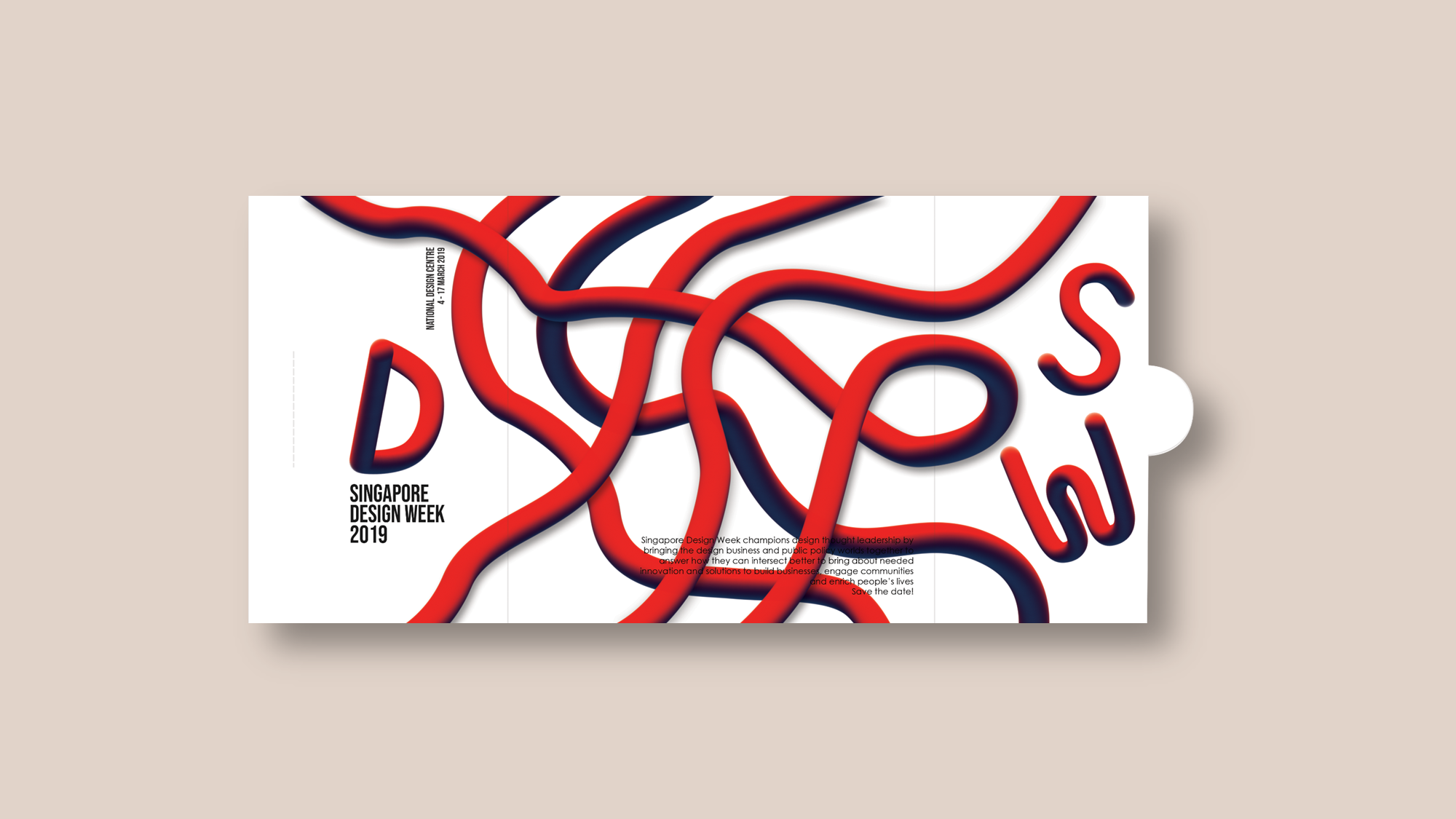
Outside

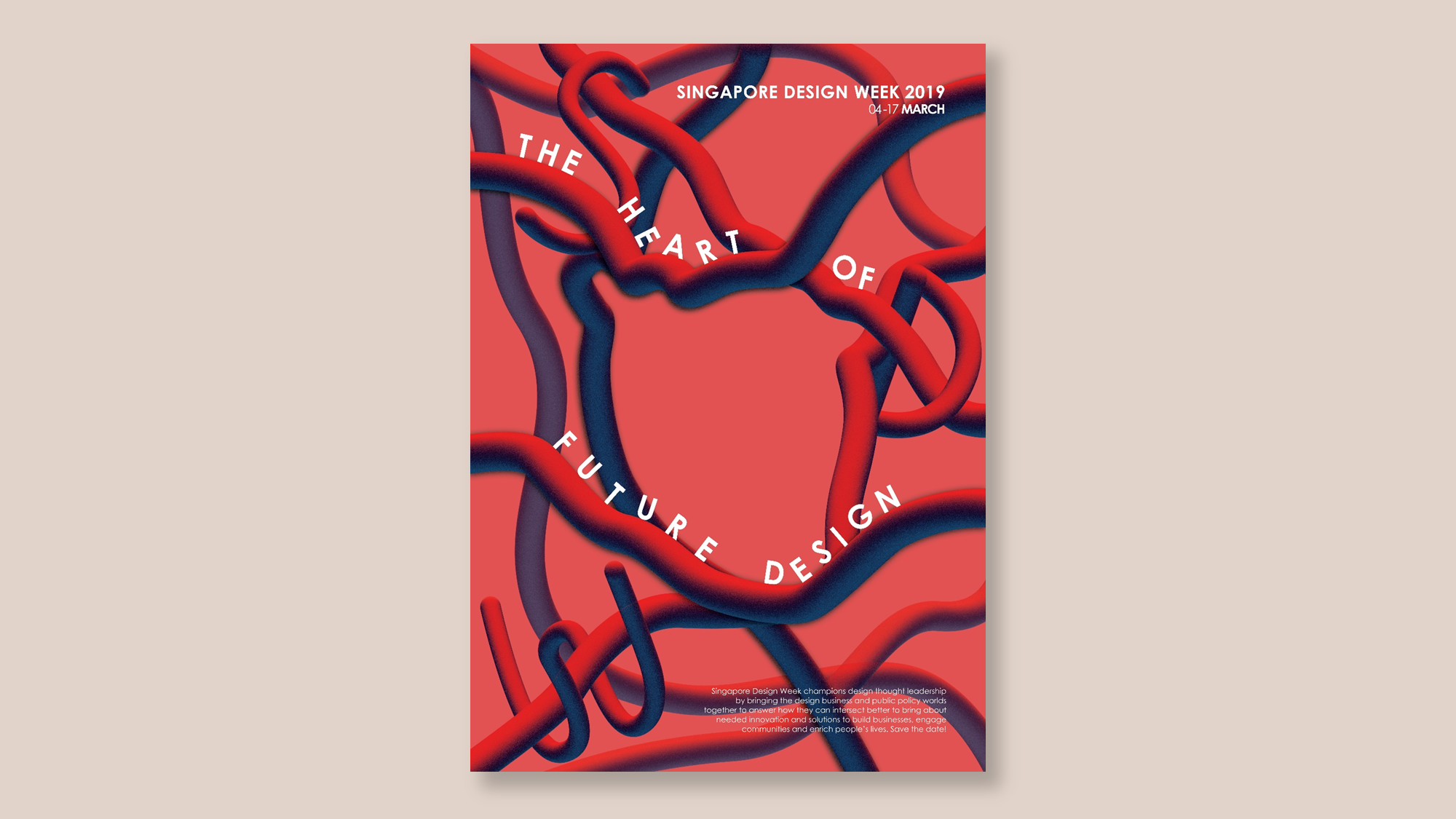
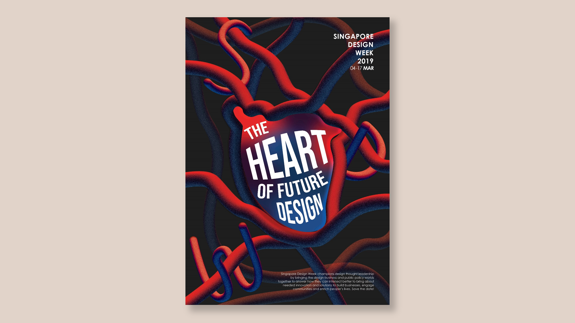
For the outside of the brochure, I wanted to keep it simple with the interlacing veins running around. Also by placing “SDW” and “Singapore Design Week” at the front and central cover of the brochure, allows viewers to immediately know the purpose of the brochure.

Initially, while doing the mockup, I didn’t realise that because the two sides meet in the center, the veins should I align for it to appear to flow properly. However, I decided to prevent having any veins intersecting the central area of the to ensure that the focus is on the title “SDW”. I also made use of the veins to aid the gaze towards the title.
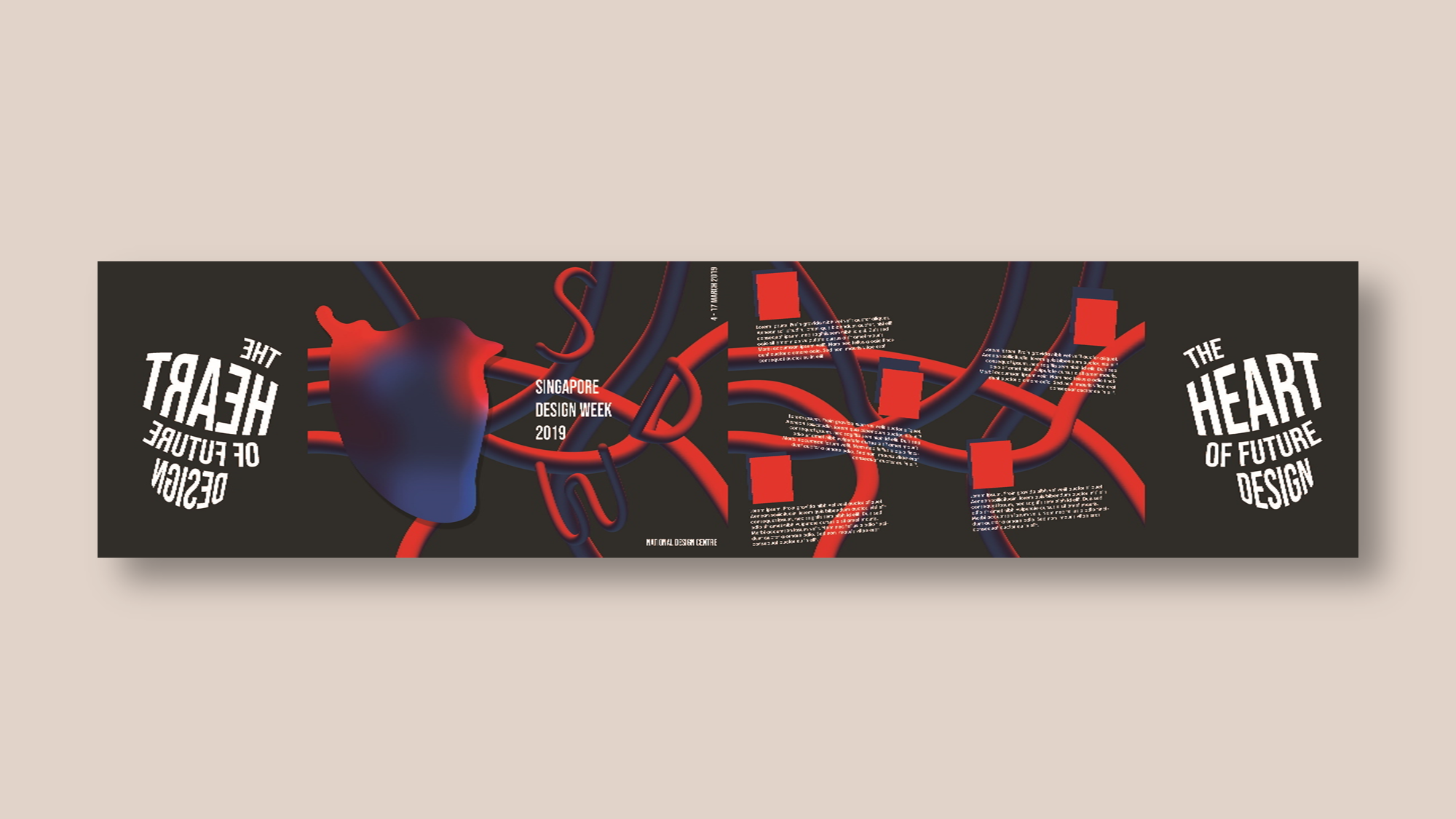
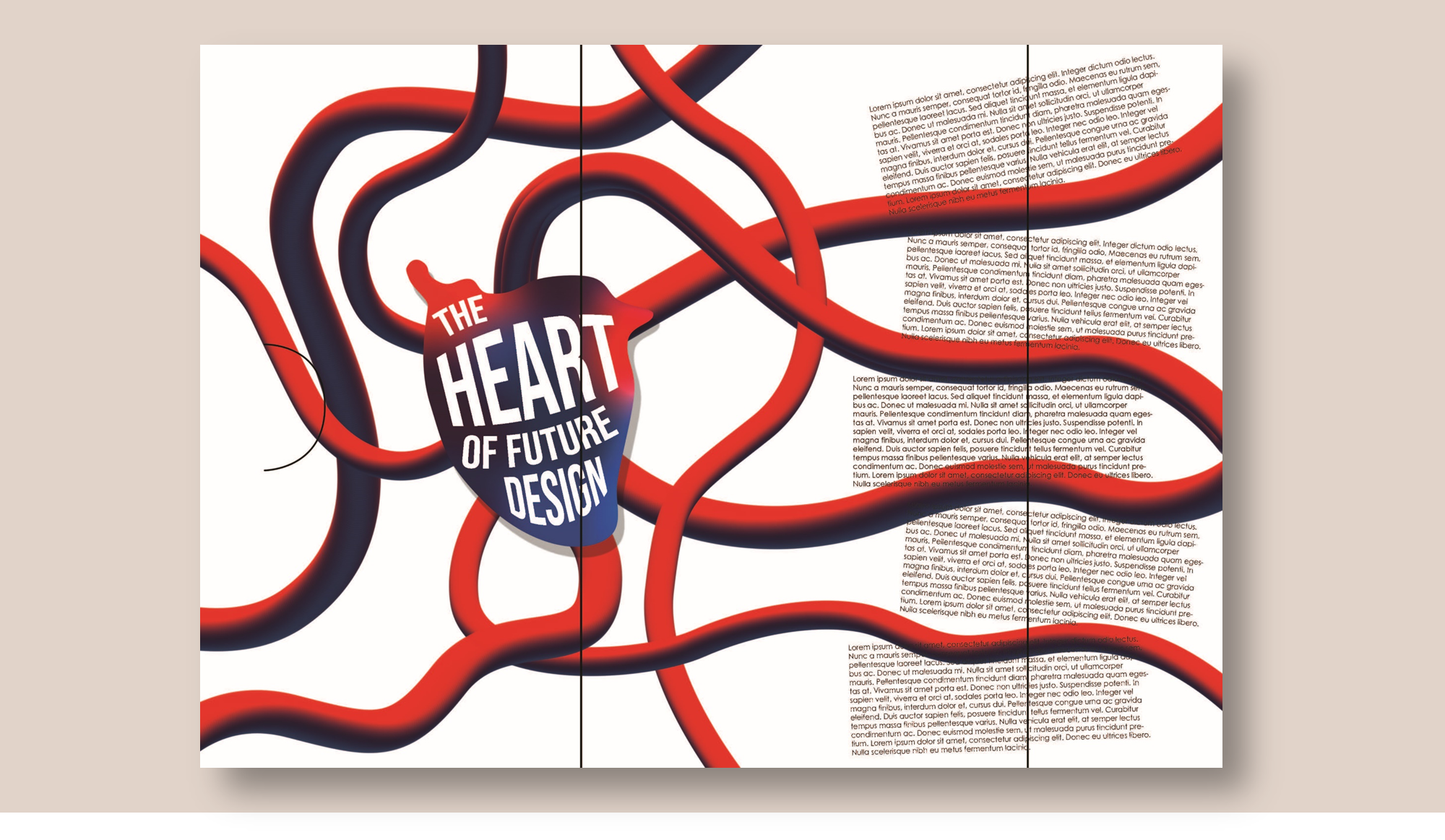
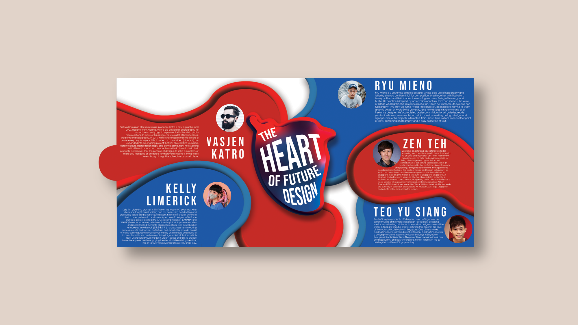
Inside

To create a contrast between the inside and outside of the brochure, I decided to use a bright red and blue. By creating a new element which is the blood cells looking blobs, it also creates an element of surprise from the cover of the brochure. I left several white areas to allow for some breathing spaces. The main issue I had while creating this composition was alignment. I was trying to avoid having any images or words cutting across the fold.

Improvements

Here are some comments received during critique:

  • While trying to keep to the 150 word limit, I had to resort to keeping the words small. The feedback received was that the words were too small, and that I could increase the size of the brochure. The margins and text were also too tight.
  • I could have added more white areas of the right side of the inside brochure to balance the composition out better.
  • For the outside of the brochure, the blurb could not be seen. I should have considered moving the veins around to allow for room for the blurb.

This comes to the end of my VC1 journey. To have a look at the design process, click here design process.


the heart of future design // design process brochure

And so the final project for VC1 begins.

The first step was to explore the different types of folds.

I started by researching on some interesting (and doable) folds or brochure designs.

After which, I experimented with several folds which I thought I could work with.

1st Experimental Fold


Inspired by:

2nd Experimental Fold

Generally, the comments received for the first and second folds were the same. Firstly, an outer brochure makes it look more like a packaging. Rather than using different sheets of paper, I should explore the brochure using a single sheet of paper. Another comment was that I had too many folds which did not contribute to the message I wanted to send. Hence, I could reduce the number of folds and get straight to the message I would like to send.

3rd Experimental Fold

Using the accordion fold, I intended to die cut the slogan, “The Heart of Future Design” on the front page. However, the comment received was that I did not consider the meaning of the page from the back. If I were to die cut a page, it should add meaning to the page be it from the front or back of the page.

With the comments in mind, I decided to work with the first fold and try a different variation of a gate fold.

1st Draft

Further developing from the first experimental fold, I first began with observing how people would instinctively open the fold. I began by asking people around me to open the fold which did not had any words on it. Naturally, everybody had different ways of opening the fold be it horizontally or vertically. After which, I added the words “SDW” on the fold horizontally, in hopes that this would help people decide which way to open the fold. The results? 4 out of 5 people opened it following the direction of the words (horizontally).

Then, I began designing the brochure.

Several comments during consultation:

  • There was a lack of contrast, especially for the inside of the brochure. There were too many elements that were fighting for your attention. Hence, creating more contrast will help the problem.
  • There was no need to continually emphasize “SDW”. Thus, I could forgo the “SDW” inside the brochure.
  • There was a lack of visual interest in the inside of the brochure. A suggestion was that I create a new visuals that could encapsulate the artist bios.
  • I could also look into the meaning of what the new visuals could be.
  • For the outside brochure, there was no central focus and that I should use the veins to direct the gaze towards the center of the brochure.
2nd Draft

For this exploration, I wanted to create a different variation of the gate fold. However, I decided to work on for the first draft for the final submission.

We have come to the end of my design process for this assignment. To have a look at the final brochure, click here final brochure.

the heart of future design // design process poster

Let’s start from the very beginning.

This could easily be one of my projects with the most sketches and drafts, so bare with me as I ramble on about how it has developed from the beginning to the end.

First Sketch/Draft

Left: The Heart of Future Design (Singapore/Heritage)

Inspired by the aim of putting Singapore on the map, one of my ideas was to create an abstract road map motif.

Centre: A Visionary Metamorphosis (Community/Interlace)

As SDW aims to become the hub that connects designers, I was inspired to create a motif connecting motif to showcase that.

Right: The New Design Revolution (Leadership/Innovation)

With the main aim of SDW being a venue to showcase innovation, I figure that the concept of “thinking out of the box” might work.

Initially, the response I got from the class was generally quite good, with many pushing me to go for the first idea (map). Hence, I decided to continue working on that theme. Nonetheless, I wanted to try out the second idea (interlacing).

Here are some other sketches I worked on during my design process.

Second Draft

As mentioned previously, I started expanding on the first 2 ideas.

A Visionary Metamorphosis

Using a “3D” gradient pipes to create an interlacing composition.

I was excited by the outcome of this composition, to be honest. However, I received some critique over this design. Firstly, the class felt that the concept was not strong enough, the meaning behind the pipes were not clear and the white frame didn’t appear to have any sort of meaning (purely aesthetics).  Nonetheless, people found the placement of the slogan interesting, but the class highlighted that it was hard to read. In conclusion, my concept needs to be stronger.

The Heart of Future Design

Building on to the map idea, I created a more abstract image of the map of the surrounding area of National Design Centre. I incorporated the heart at the centre of the map. However, I was really not satisfied with how this turned out. The colours did not look right, and it felt too messy. So, I didn’t really showcase this design because I was too embarrassed.

Third Draft

To further strengthen my concept, I decided to go with the slogan “The Heart of Future Design”.

I fused my favourite elements from each composition, combining the pipes and heart.

I was starting to feel proud of my design (finally). To be honest, I was really in a complete dazed after the previous consult.

However, there were still much to improve on. The general consensus from the class was that it was too red, the “SDW” is not obvious enough, the heart in the centre needs to be more prominent, play more with the placement of the slogan.

With that, I arrive at my final artwork, you can see my process and final artwork here: final | brainmap + moodboard | research | interesting poster.


the heart of future design // final poster


Why The Heart of Future Design?

Heart = “a hub where the best design talents and businesses from Singapore and Asia converge to be showcased to the world;”

Future Design = “needed innovation and solutions to build businesses, engage communities and enrich people’s lives”

I derived my slogan primarily from these two sentences. Singapore Design Week (SDW) hopes to make Singapore the hub or centre of design. Thus, the heart of design. SDW aims to engage designers to create innovative solutions for the future. Thus, future design.

Why this design?

In the initial phase of my design process, I came up with two designs for different slogans. To know more about these designs, have a look at my design process post here: design process.

I incorporated the elements that I liked from each composition.

Left: The gradient pipes

Right: The heart in the centre

The pipes coming from different directions, creates a form of a heart in the centre of the composition. This represents the different stakeholders of the design industry converging to the hub. Furthermore, the colours of the pipes, red-blue gradient, were chosen to resemble the human veins.

The addition of a gradient heart fill on top of the outline, allows for the heart to stand out more. The slogan is placed inside the heart with an arching effect to create a 3D effect to the heart.

Improvements

Looking back at my poster, I think there are some adjustments that could have been made.

I think I was focused on the motifs of the composition, that I may not have paid enough attention to the text. Thus, some of the text may have been left untreated.

I think segregating the “Singapore Design Week 2019, 04 – 17 Mar” from the slogan created a disparity between the text and slogan. What I would have improved on was to seamlessly integrate the text together with the slogan to form one collective entity.

That is all for this project! To see the process of how I came to the final composition, click here design process | brainmap + moodboard | research | interesting poster.

final // hope

Concept

When I think back to the times I was hoping for something, I realised that when I’m hoping for something, I’m hoping for some sort of change in my life. For example, to be happier, to be closer to someone, for a better love life. All of these which involves some sort of change.

Then I thought, why do I want a change? Because I don’t want things to always stay the same, I want to grow. Grow as a better person, grow a close friendship, grow an everlasting relationship.

Hence, this forms the two key themes I would like to express in my project which are Change and Growth as my own interpretation of hope.

I decide to use two different icons to represent each theme. Change represented by a butterfly, and growth represented by a flower.

Throughout my compositions, you’ll see the process of a butterfly taking flight and the process of a flower blooming.

Why butterflies? I wanted it to resemble or represent the release of butterflies which is common in several events. For example, during funerals, the release of butterflies represent the deceased soul fluttering away or hope for the future. During weddings, it demonstrates a new chapter of the couple’s lives and positive change. During graduations, it displays how education has matured and transformed the graduate into an adult with a bright future.

So, the idea of the release of butterflies stems from the the idea to embrace a new CHANGE.

The blooming flower on the other hand represents growth and to grow to something beautiful.

STAGE 1

In this composition, I integrated a flower that has not bloomed and a butterfly at rest.


STAGE 2

This composition features a half bloomed flower and a butterfly preparing to take flight.

STAGE 3

For my final design, it takes the form of a fully bloomed flower and a flying butterfly.


To have a look at the design process click here design process.

thought process // hope

what is hope to me?

When you are hoping for something, you are asking or wishing for something to happen. for example, “I hope to get good grades for this assignment”. So who are we wishing to or rather who is listening to our hopes and wishes? For me, when I make wishes, I direct them to God.

naturally, i associated hanging mobiles with children hospitals. so who are children wishing to?

children are young, so they may or may not feel strongly or understand the idea of God. Then it hit me.

  • When a child drops a tooth, he/she will leave the tooth under the pillow, hoping the tooth fairy would come by to give him/her a dollar.
  • All throughout the year, children behave well so that they end up on Santa’s nice list, hoping to get the present that they wanted.
  • Little girls hope that one day, a fairy godmother will appear to make their dreams come true
  • Children rubbing a lamp, hoping that a genie will pop out to grant them 3 wishes.

So what am i getting here?

Children find hope in these fictional or fairy tale characters. – Create a positive and negative shapes with fairy tale characters that are relevant to children.

However, after discussions with the class, I realised that my idea was overly complicated and that I should ease on the concept.

Nonetheless, I didn’t want the ideas I already came up with to go to waste, thus, I decided to build on it. Throughout all the designs I came up with previously, I extracted the motif of wings. I continued to build on the idea of incorporating wings with different meanings.

wings + seedlings

A seedling is a young plant that grows from a seed. With the proper amount of moisture, light and temperature conditions, the seedling will grow. Thus, it could represent a hope for growth.

I thought the vines of a leaf could resemble wings, hence I worked with that idea in mind.

wings + tree

A tree could represent many things, such as life, prosperity, strength and stable growth. I thought I could make use of the branches of a tree to form the shape and vines of a butterfly.

However, the feedback I received was that the sharp edges of the branches did not exactly embody the idea of hope. The absence of leaves on the tree also gave it a scary, ominous vibe. I was advised if I wanted to go through with this idea, I had to smoothen the sharp edges of the branches.

wings + flower

Different types of flowers could have different meanings. However, what I wanted to show was the blooming of the flower which represents the growth of a flower. The growth into something beautiful and breathtaking.

I received feedback that the bottom design looked too illustrative for a logo design and that I should avoid using gradients in my designs. I was informed to add more details to the wings.


Final Idea

After much consideration, I decided to build on the idea with a flower and incorporate it with butterflies. You can find the final concept which I will describe in greater detail in my final post that you can find here  final post.

Stage 1 – unblooming flower + resting butterfly

The image below shows the progression from its initial design (1 to 4). Some feedback that I received for the 4th design was that the form was too busy and there were too many jagged edges. I should also adjust the scale of the wings to make it look more like a petal.

Stage 2 – half bloomed flower + butterfly taking flight

As suggested, I added details to the wings. For the first design, I added some simple shapes onto the wings. But I felt that it didn’t exemplify the idea of butterfly enough, hence I added more details to the wings. However, I was informed to reduce the number of lines on the wings of my second design.

Stage 3 – fully bloomed flower + flying butterfly

The second design to me felt like 2 separate forms; a flower and a butterfly; placed on top of each other. I was thinking that I can incorporate the pattern of the wings into the rest of the petals.

With all this in mind, I began working on my final designs. To see the final outcome of this project, click here.


FIFTY YEARS OF SINGAPORE DESIGN Exhibition

The exhibition entails Singapore’s fifty year development in the design scene from the early 1960s up to now, presenting “iconic, popular and pivotal designs” that shaped the design scene in Singapore.

It features designs from 4 different design practices:

Observations

Being a young nation, naturally the design scene is also very young. The development and economy of Singapore for over fifty years had a huge impact on the design industry. For example, during the early years of independent Singapore (1965 – 1975), the design scene was focused on building the foundations for infrastructure, national identity, and craft & technical skills. As Singapore’s economy booms (1975 – 1985), we see the shift of focus towards industrial design as well as tourism. Soon came the advancement of technology (1985 – 1995),and yet again we see a shift towards a more modern, technological designs. I could go on, but I think you probably got the point. The design scene is heavily reliant and adapts to the growth and progression of Singapore. Hence we must always keep up with the country’s advancement.

Future goals / key trust for design in Singapore

Keyword: Innovation-driven economy & a loveable city

Five broad, strategic thrust:

  1. Infuse design into our national skill set
  2. Expand the role of design in businesses and government
  3. Strengthen the competitiveness of design firms
  4. Bring design into the community
  5. Develop the Singapore Design brand

I think it is evident that Singapore is trying to embrace design more. The design industry is still rather new to me. However, from what I heard from my peers and the community, design is still look down upon. Let’s face it, there are still form of prejudice against designers, especially when you meet your relatives during a family gathering and you tell them that you are a designer. Odds are, they’ll give you the “Did you have nothing else better to do?” look and start comparing you with your cousins who are lawyers, doctors or teachers.

Nonetheless, with the Design 2025 Masterplan to spread design in businesses, governments, communities, and schools, hopefully people start losing the prejudice against design as design starts to be integrated into their everyday lives.

Often times, people find that Singapore have no opportunities for artists or designers to flourish and many decide to cast aside their passion for a more stable future. With the new initiative, people can find the motivation to reignite or pursue their passion for the Arts. Thus having more people in the Design industry to find and create innovative solutions.


the interesting poster.

As the event name suggest, the poster is promoting an event called the “Altitude Jazz Festival”. In the poster, we see the component of “Altitude” depicted in a vector of mountains and “Jazz” is shown through what we can assume is a trumpet at the bottom of the poster.

Looking at the poster, I feel calm and at the same time excited. I think the calmness is attributed to the smooth lines and curves in the poster. The excitement I think was from the vibrant colours.

The seamlessly integration of the two different components (Altitude and Jazz) together stood out for me. The poster has a good balance of positive and negative spaces, hence it doesn’t feel cluttered or messy. The “clouds/smoke” helps to guide the flow of how the poster should be read from top to bottom.The colours used in the composition is very vibrant and youthful. The usage of primary colours, I felt helped to contribute to the youthful imagery.

The visuals and colours really help in capturing the attention, however, I did wish that the text could have been integrated into the poster better.