final // hope

Concept

When I think back to the times I was hoping for something, I realised that when I’m hoping for something, I’m hoping for some sort of change in my life. For example, to be happier, to be closer to someone, for a better love life. All of these which involves some sort of change.

Then I thought, why do I want a change? Because I don’t want things to always stay the same, I want to grow. Grow as a better person, grow a close friendship, grow an everlasting relationship.

Hence, this forms the two key themes I would like to express in my project which are Change and Growth as my own interpretation of hope.

I decide to use two different icons to represent each theme. Change represented by a butterfly, and growth represented by a flower.

Throughout my compositions, you’ll see the process of a butterfly taking flight and the process of a flower blooming.

Why butterflies? I wanted it to resemble or represent the release of butterflies which is common in several events. For example, during funerals, the release of butterflies represent the deceased soul fluttering away or hope for the future. During weddings, it demonstrates a new chapter of the couple’s lives and positive change. During graduations, it displays how education has matured and transformed the graduate into an adult with a bright future.

So, the idea of the release of butterflies stems from the the idea to embrace a new CHANGE.

The blooming flower on the other hand represents growth and to grow to something beautiful.

STAGE 1

In this composition, I integrated a flower that has not bloomed and a butterfly at rest.


STAGE 2

This composition features a half bloomed flower and a butterfly preparing to take flight.

STAGE 3

For my final design, it takes the form of a fully bloomed flower and a flying butterfly.


To have a look at the design process click here design process.

thought process // hope

what is hope to me?

When you are hoping for something, you are asking or wishing for something to happen. for example, “I hope to get good grades for this assignment”. So who are we wishing to or rather who is listening to our hopes and wishes? For me, when I make wishes, I direct them to God.

naturally, i associated hanging mobiles with children hospitals. so who are children wishing to?

children are young, so they may or may not feel strongly or understand the idea of God. Then it hit me.

  • When a child drops a tooth, he/she will leave the tooth under the pillow, hoping the tooth fairy would come by to give him/her a dollar.
  • All throughout the year, children behave well so that they end up on Santa’s nice list, hoping to get the present that they wanted.
  • Little girls hope that one day, a fairy godmother will appear to make their dreams come true
  • Children rubbing a lamp, hoping that a genie will pop out to grant them 3 wishes.

So what am i getting here?

Children find hope in these fictional or fairy tale characters. – Create a positive and negative shapes with fairy tale characters that are relevant to children.

However, after discussions with the class, I realised that my idea was overly complicated and that I should ease on the concept.

Nonetheless, I didn’t want the ideas I already came up with to go to waste, thus, I decided to build on it. Throughout all the designs I came up with previously, I extracted the motif of wings. I continued to build on the idea of incorporating wings with different meanings.

wings + seedlings

A seedling is a young plant that grows from a seed. With the proper amount of moisture, light and temperature conditions, the seedling will grow. Thus, it could represent a hope for growth.

I thought the vines of a leaf could resemble wings, hence I worked with that idea in mind.

wings + tree

A tree could represent many things, such as life, prosperity, strength and stable growth. I thought I could make use of the branches of a tree to form the shape and vines of a butterfly.

However, the feedback I received was that the sharp edges of the branches did not exactly embody the idea of hope. The absence of leaves on the tree also gave it a scary, ominous vibe. I was advised if I wanted to go through with this idea, I had to smoothen the sharp edges of the branches.

wings + flower

Different types of flowers could have different meanings. However, what I wanted to show was the blooming of the flower which represents the growth of a flower. The growth into something beautiful and breathtaking.

I received feedback that the bottom design looked too illustrative for a logo design and that I should avoid using gradients in my designs. I was informed to add more details to the wings.


Final Idea

After much consideration, I decided to build on the idea with a flower and incorporate it with butterflies. You can find the final concept which I will describe in greater detail in my final post that you can find here  final post.

Stage 1 – unblooming flower + resting butterfly

The image below shows the progression from its initial design (1 to 4). Some feedback that I received for the 4th design was that the form was too busy and there were too many jagged edges. I should also adjust the scale of the wings to make it look more like a petal.

Stage 2 – half bloomed flower + butterfly taking flight

As suggested, I added details to the wings. For the first design, I added some simple shapes onto the wings. But I felt that it didn’t exemplify the idea of butterfly enough, hence I added more details to the wings. However, I was informed to reduce the number of lines on the wings of my second design.

Stage 3 – fully bloomed flower + flying butterfly

The second design to me felt like 2 separate forms; a flower and a butterfly; placed on top of each other. I was thinking that I can incorporate the pattern of the wings into the rest of the petals.

With all this in mind, I began working on my final designs. To see the final outcome of this project, click here.

 

hannes koch & florian ortkrass.

Founders of Random International, a group of London-based artists who combined technology and natural elements to create temporary, interactive installations.

famous artworks:

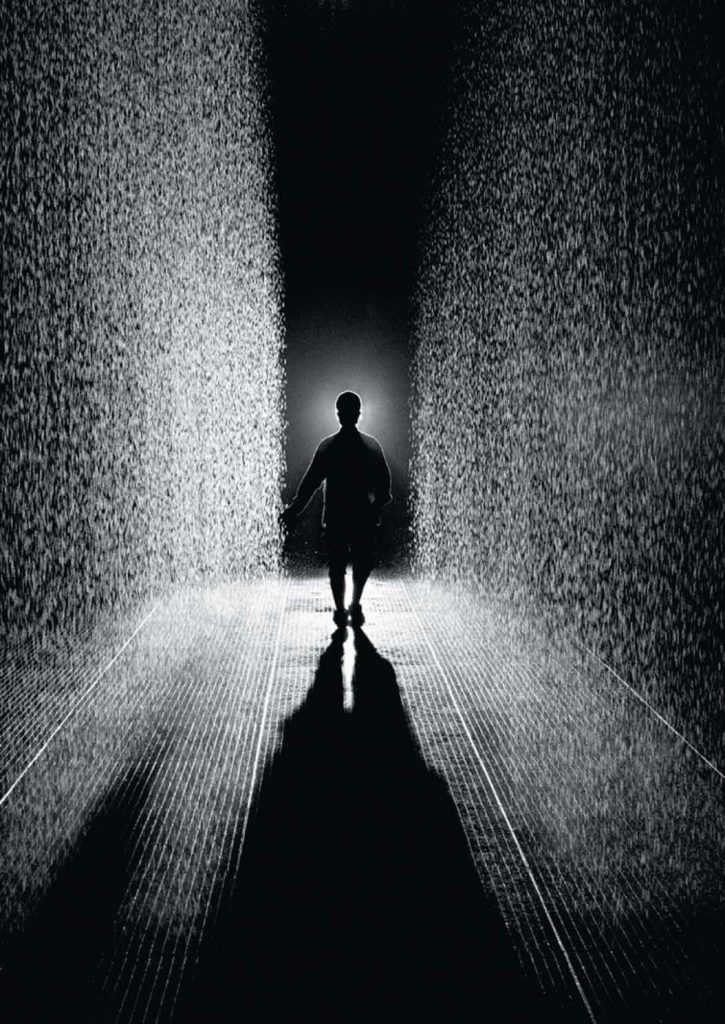
Rain Room

Rain Room, MoMA

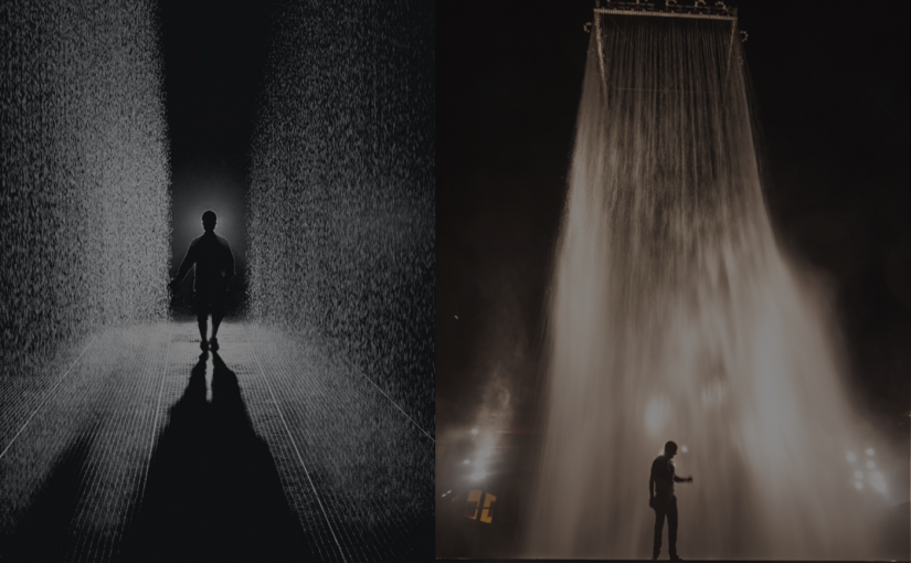
Walk through rain without getting wet. Sensors on the floor detects a human body which will pause the falling water.

Tower

The rain shower installation.

FIFTY YEARS OF SINGAPORE DESIGN Exhibition

The exhibition entails Singapore’s fifty year development in the design scene from the early 1960s up to now, presenting “iconic, popular and pivotal designs” that shaped the design scene in Singapore.

It features designs from 4 different design practices:

Observations

Being a young nation, naturally the design scene is also very young. The development and economy of Singapore for over fifty years had a huge impact on the design industry. For example, during the early years of independent Singapore (1965 – 1975), the design scene was focused on building the foundations for infrastructure, national identity, and craft & technical skills. As Singapore’s economy booms (1975 – 1985), we see the shift of focus towards industrial design as well as tourism. Soon came the advancement of technology (1985 – 1995),and yet again we see a shift towards a more modern, technological designs. I could go on, but I think you probably got the point. The design scene is heavily reliant and adapts to the growth and progression of Singapore. Hence we must always keep up with the country’s advancement.

Future goals / key trust for design in Singapore

Keyword: Innovation-driven economy & a loveable city

Five broad, strategic thrust:

  1. Infuse design into our national skill set
  2. Expand the role of design in businesses and government
  3. Strengthen the competitiveness of design firms
  4. Bring design into the community
  5. Develop the Singapore Design brand

I think it is evident that Singapore is trying to embrace design more. The design industry is still rather new to me. However, from what I heard from my peers and the community, design is still look down upon. Let’s face it, there are still form of prejudice against designers, especially when you meet your relatives during a family gathering and you tell them that you are a designer. Odds are, they’ll give you the “Did you have nothing else better to do?” look and start comparing you with your cousins who are lawyers, doctors or teachers.

Nonetheless, with the Design 2025 Masterplan to spread design in businesses, governments, communities, and schools, hopefully people start losing the prejudice against design as design starts to be integrated into their everyday lives.

Often times, people find that Singapore have no opportunities for artists or designers to flourish and many decide to cast aside their passion for a more stable future. With the new initiative, people can find the motivation to reignite or pursue their passion for the Arts. Thus having more people in the Design industry to find and create innovative solutions.


the interesting poster.

As the event name suggest, the poster is promoting an event called the “Altitude Jazz Festival”. In the poster, we see the component of “Altitude” depicted in a vector of mountains and “Jazz” is shown through what we can assume is a trumpet at the bottom of the poster.

Looking at the poster, I feel calm and at the same time excited. I think the calmness is attributed to the smooth lines and curves in the poster. The excitement I think was from the vibrant colours.

The seamlessly integration of the two different components (Altitude and Jazz) together stood out for me. The poster has a good balance of positive and negative spaces, hence it doesn’t feel cluttered or messy. The “clouds/smoke” helps to guide the flow of how the poster should be read from top to bottom.The colours used in the composition is very vibrant and youthful. The usage of primary colours, I felt helped to contribute to the youthful imagery.

The visuals and colours really help in capturing the attention, however, I did wish that the text could have been integrated into the poster better.