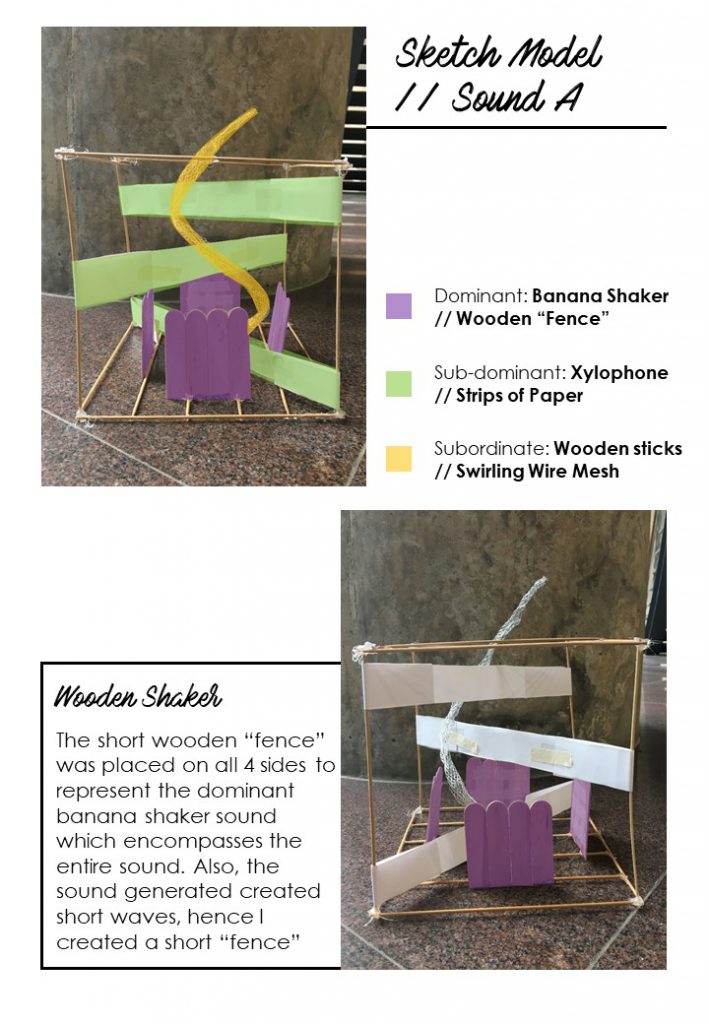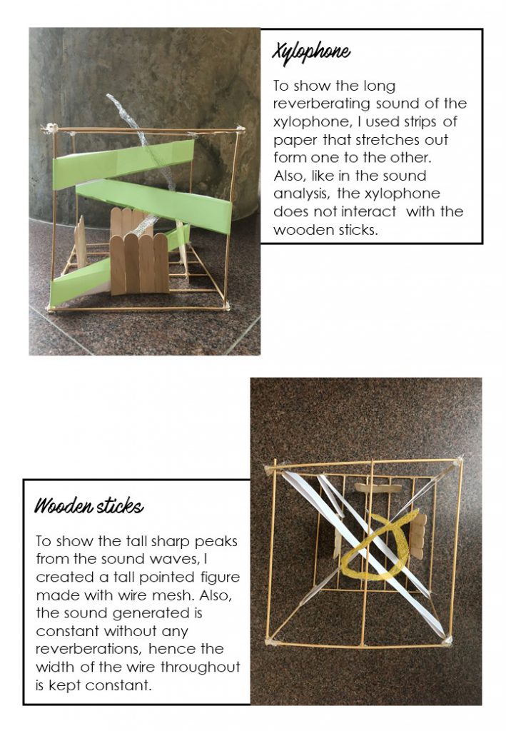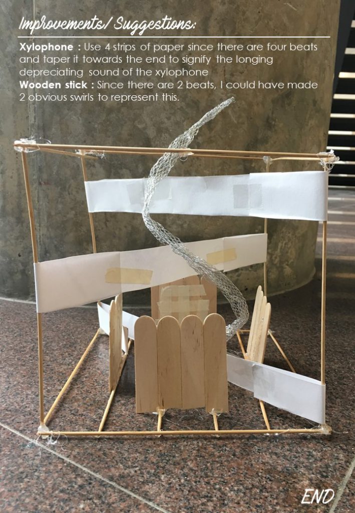
FILM
Link: https://vimeo.com/244330517
ABOUT
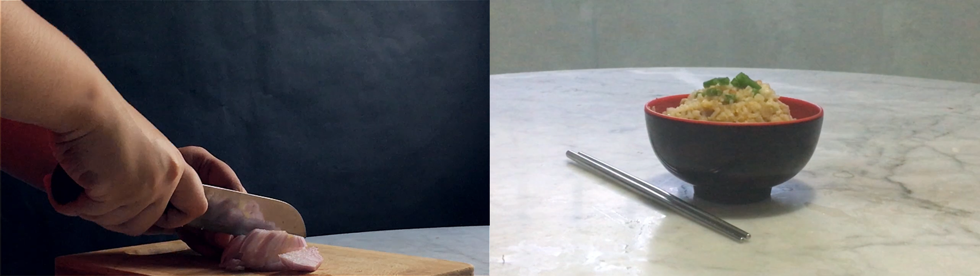
A slow-motion film showing the process of cooking fried rice, a local dish common throughout every race in Singapore.
I hope to highlight the effort put into cooking our home-cooked meals by our unsung heroes; our mothers, fathers, grandparents, siblings or maid. By capturing the process of cooking an everyday meal in a mesmerizing way, I hope that the audience has a better appreciation of what usually would be a mundane daily cooking.
I wanted to create content that almost everybody can relate to. I am aware that it is impossible to, there will be exceptions. Initially, I wanted it to be about a mother’s cooking, however, after consideration, I realised that everybody has different predicaments thus may not be able to relate to mother’s cooking. To be completely honest, even for me, I am not able to relate.
Thus, I changed the idea to a home-cooked meal which I hope more people can relate to.
The idea was generated during my brainstorming process when I thought of some things that everybody loves. Hence, I decided to go with the topic of food because who doesn’t like food?
After which, I reflected on my own life where food comes along and thus thought of the meals my father prepared. Seeing him come home from work, despite being tired, he prepares dinner for the family to the best of his ability. Unfortunately, with my own circumstances, it has been difficult to thank and show my appreciation towards him. Hence, I created this film in dedication to the unsung hero that is my father.
NEW CONCEPT
Initially, I wanted to recreate the idea of heaven from Project 3 through space. However, after setting out my objective of being relatable to my audience, I decided to think of new ideas instead. Especially for my idea of heaven, I believe the idea is heavily influenced by my idea of what heaven should be and thus this may not be relatable to my audience.
COMMUNICATE
My goal for this project is to remind the audience to appreciate the love and thought put into making our home-cooked meals. I feel that we tend to overlook the effort that our mother, father, grandparents, maid or even siblings put into cooking our meals. I hope after watching the film, my audience will go home and remember to show their appreciation or just a say a simple thank you to their loved ones for their effort.
EDITED TIME
I’ve chosen to do the film in slow motion to capture the process in a captivating and mesmerizing way. Also, the film follows a sequential step by step process of cooking fried rice. Thus, creating a linear edited time.
RHYTHM, MOVEMENT, CAUSATION, DURATION
I wanted to create a rhythm in my film by having a change in the shots every few seconds rather than showcasing the entire process which you would normally see on a cooking show.
In the first part of the film, the transition between each shot is a cut, whereas the second part, the transition turns into a fade. I wanted to highlight the change in the meaning between this two parts, thus I used different movements.
I wanted people to view the film at first as a mesmerizing cooking show, after which the film would unexpectedly change to something with a deeper meaning. Hence, in the front part of the film, there is the expectation for the viewers to watch the sequential process of cooking fried rice and I break this expectation by adding the message about coming home to a home-cooked meal.
I could not really decide on the duration of the film before filming because I wasn’t sure how long I should time each scene. The rough estimation I had was about 3-5 minutes. After filming and editing, I decided that 5 minutes was enough to captivate the audience and at the same time show the mesmerizing process of cooking a home cooked meal.
PROCESS
Before starting my filming, I had to do some research on how to make fried rice.
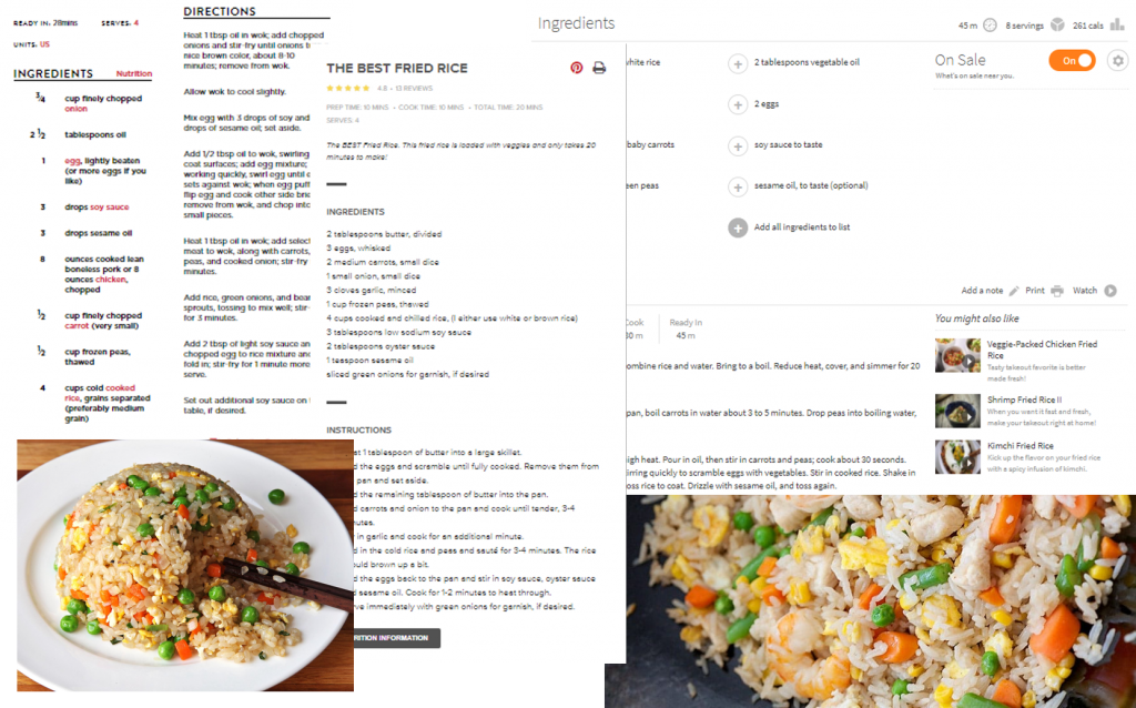
From the research, I extracted the ingredients that are required and also the step by step process of cooking fried rice.
Ingredients
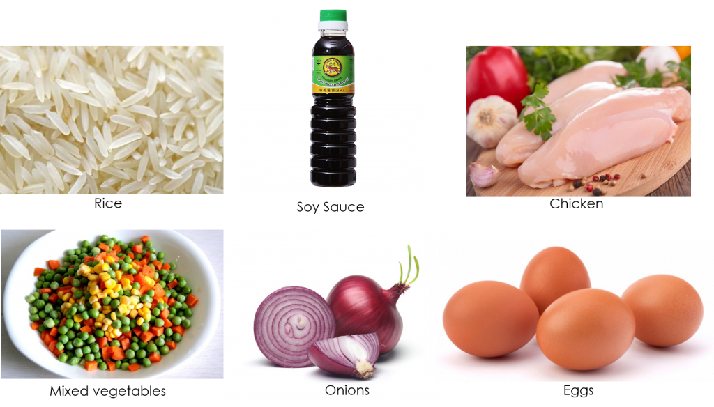
Sequence
The step by step process of cooking fried rice is crucial to creating the sequence of the film. The sequence of the film follows the process diligently. Hence, from the research I derived the sequence below:
| Scene No. | Step |
| 1 | Cooking rice |
| 2 | Chopping onions |
| 3 | Chopping chicken meat |
| 4 | Pouring out mixed vegetables |
| 5 | Starting fire |
| 6 | Pouring onion into pot |
| 7 | Stir-frying chicken |
| 8 | Pouring in onions |
| 9 | Stir-frying onions |
| 10 | Adding mixed vegetables |
| 11 | Stir-frying altogether |
| 12 | Drop in cooked chicken meat |
| 13 | Mixing together |
| 14 | Drop an egg into pot |
| 15 | Mixing everything |
| 16 | Add in cooked rice |
| 17 | Stirring all the ingredients |
| 18 | Drizzle in some soy sauce |
| 19 | Topping it off with spring onions |
| 20 | Table setting shots |
Filming
Initially, I wanted to do the filming and cooking on my own but I realised that that is a difficult feat to perform. Hence, I got the help of my sister to assist me in cooking it while I film the process.
For the filming, I used my iPhone 6s configured to 1080p at 60fps on normal video mode to capture the process with the help of a tripod.
Here is a short behind the scenes footage of the process:
Editing
To edit the videos taken and create the slow motion effect, I used Adobe Premiere Pro CS6. This was my first time using Premiere Pro, as I usually work with Adobe After Effects. Fortunately, my experience with After Effects and other video editing tools helped with learning how to use Premiere Pro much easier.
All the videos taken were recorded at 60fps and imported to a 25fps sequence which allowed for the slow motion effect. However, I realised that the slow-motion effect was not obvious enough, thus I decided to speed some parts of the video by 2 times, mimicking what it would look like normally.
To create this edgier and cinematic look to the first part of the film, I added a cool tone on top of it whereas, for the second part, I opted for a warmer tone to illustrate the idea of home.

I added in music to help add to this contrast between this two parts, the front part being a slow immersive music and the second part being a cheerful, homely song.
Part 1
Part 2
Music credits: bensound.com
CHALLENGES
Finding the right camera
I decided to borrow a DSLR camera from my friend to do the filming. The main reason why I wanted a DSLR was that I wanted high-quality shots and manual focus. However, I forgot to take into consideration that not all cameras are able to capture videos at 60fps. Unfortunately, the camera could only capture up to 24fps. I checked with the camera provided by the school and it could only capture up to 25fps. As suggested by Lei, I had to resort to using my iPhone 6S which offers the option of filming at 1080p with 60fps. However, the camera did not provide with best quality videos up to my expectation.
Exporting video
After I was done with editing, it was time to export my video and choosing the appropriate exporting setting. However, the estimated time it would take to export was about 5-8 hours. I have heard the horror stories of the time needed for exporting videos on Premiere Pro, but I completely forgot about it at that time. I did not expect it to be that long and I didn’t accommodate 5-8 hours for exporting. Hence, I had to resort to reducing the quality and size of the video export which helped in reducing the exporting time to 3 hours instead. I believe this could have been due to the slow processor of my laptop so I believe if I intend on using Premiere Pro in the future, I should invest in a newer and better laptop.
CONCLUSION
It is sad to say goodbye to 4D. It has been an amazing journey learning many new things such as photography and videography. Being new to the Arts scene, I haven’t developed my own style in many areas including 4D. Getting an opportunity to view my classmate’s own style coming to life has motivated me to discover my own style.