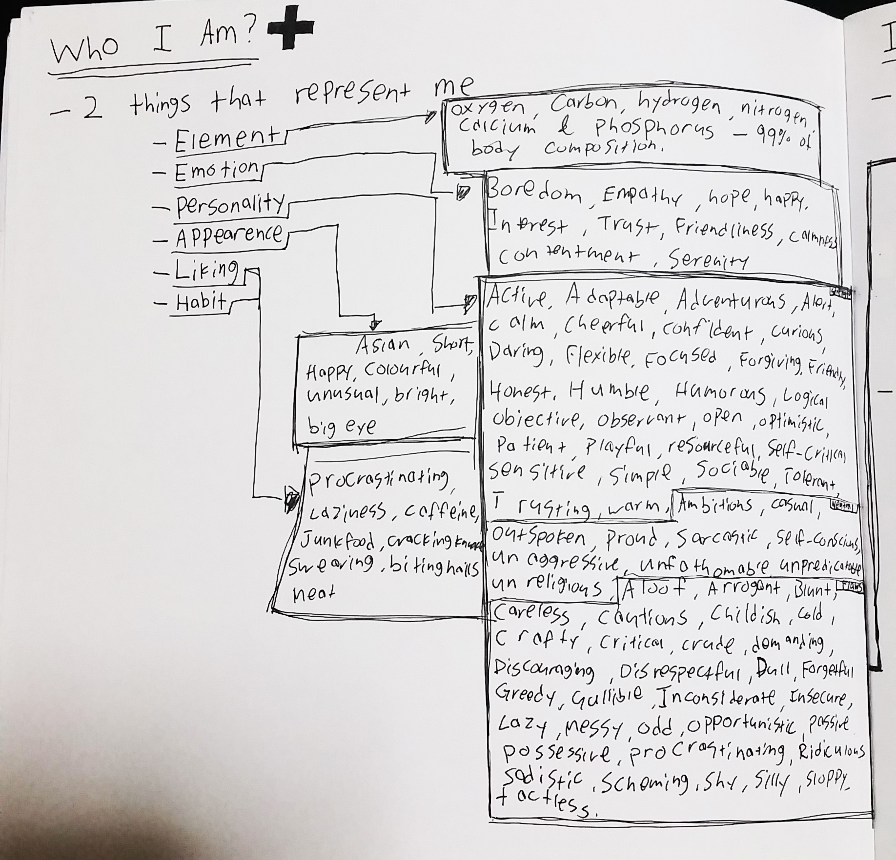
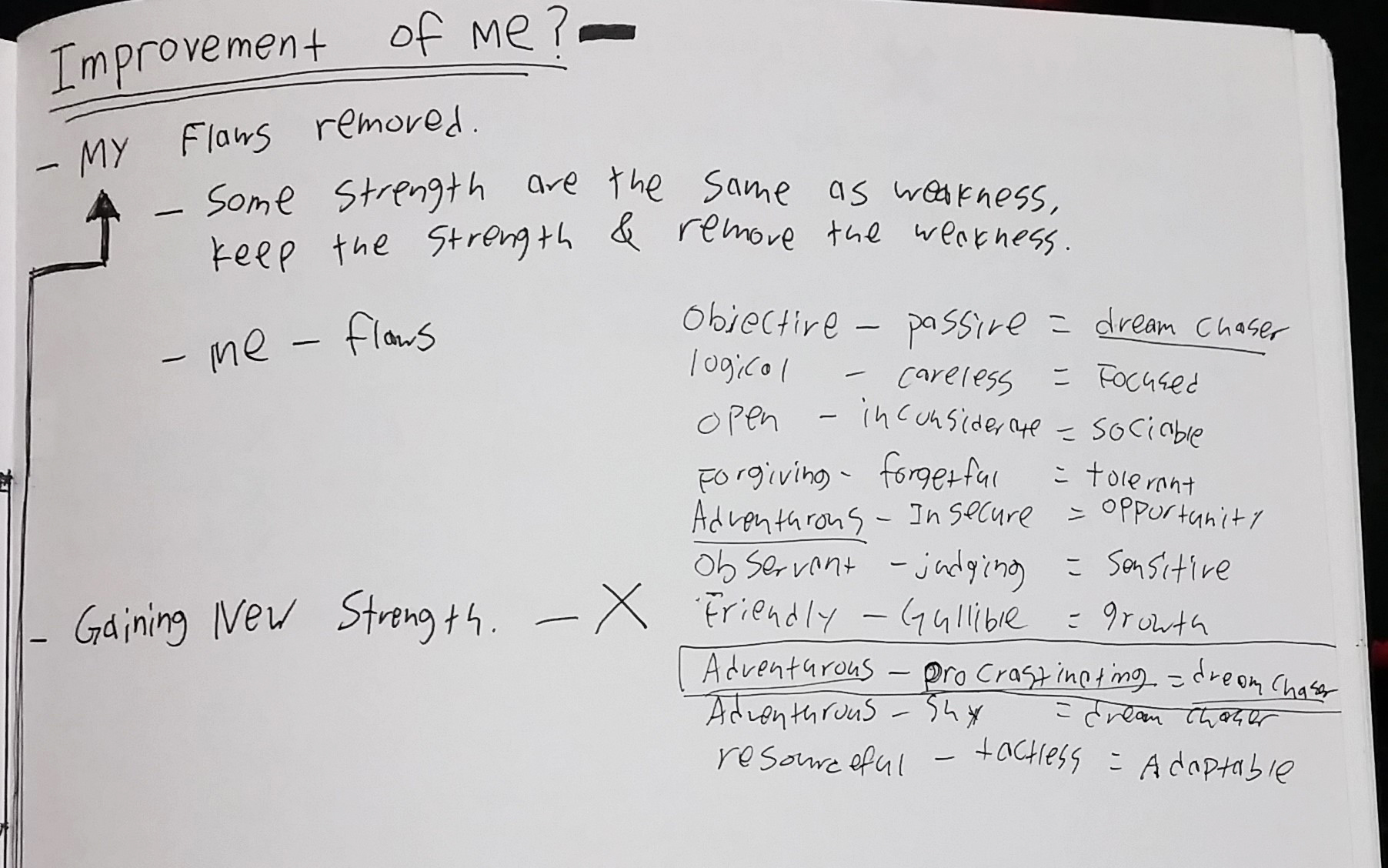
At first, i thought that i will only need to do the Humpty Dumpty rhyme. So my first reaction is to check out what the rhyme is….
Humpty Dumpty sat on a wall,
Humpty Dumpty had a great fall.
All the king’s horses and all the king’s men
Couldn’t put Humpty together again
so first thought is important and so i am going to elaborate it.
Humpty Dumpty sat on a wall,
Humpty Dumpty is supposed to be an egg, so he sat on the wall.. but what is an egg doing on the wall? is he a young egg? teenage egg? adult egg or old egg?
Humpty dumpty could be an egg, or could be not an egg..
- 1 – if he is not an egg, then what is he? – old man? – some naughty boy who likes to climb walls?
- 2 – actually i think it would be better because humpty dumpty is depicted as an egg in our culture, so by using some “common sense” to make my message clearer.. atleast viewer wont go “where is your humpty dumpty in the picture”
- 3 – so if humpty dumpty is an egg, what is he like? i personally like to depict him as an old man. because the older they are, the more story could be told.
- 4 – an old egg. what kind of egg is he? i would like to have some sense of humor in the personality which are easily shown through a single picture, maybe a lecherous old egg? maybe something from 50 shade of grey? it will bring contrast to the story as it supposedly was an childhood rhyme, but bringing some adult thing into it makes it interesting.
- 5- so what is Humpty Dumpty doing on the wall? reading a book? escaping from something? peeping? yeah peeping might be a good one.
Humpty Dumpty had a great fall.
so the common sense of this sentence is that humpty dumpty fell down from the wall. i think it is boring so instead of using the “fall” as in “falling down”… how about the “fall” as in “autumn”? just changing the different meaning of the same word will change the whole sentence.
Humpty Dumpty had a great Autumn.
- how? how is great great? Great as in Awesome…. so how do i depict awesome? thinking of the back ground story of humpty dumpty – old lecherous egg, what will be awesome to him? the answer is clear.
- something to do with maybe drugs? woman? 50 shade of grey(this project is in black and white so i think this will be quite nice)
All the king’s horses and all the king’s men.
- Repetitive nature due to the King’s horses and King’s men
- symmetry could be bought out using the repetitive pattern of the horses and men
- high contrast will be a good way to show the difference between the subject and background.
This is when I knew that we are not bounded by only one rhyme, we could do all the rhymes and choose which is the best 4 among it.
so I approached this project differently, to see which sentence of the rhymes could be interesting and i could visualize the outcome of the sentence.. so out of the 12, I chose the following.
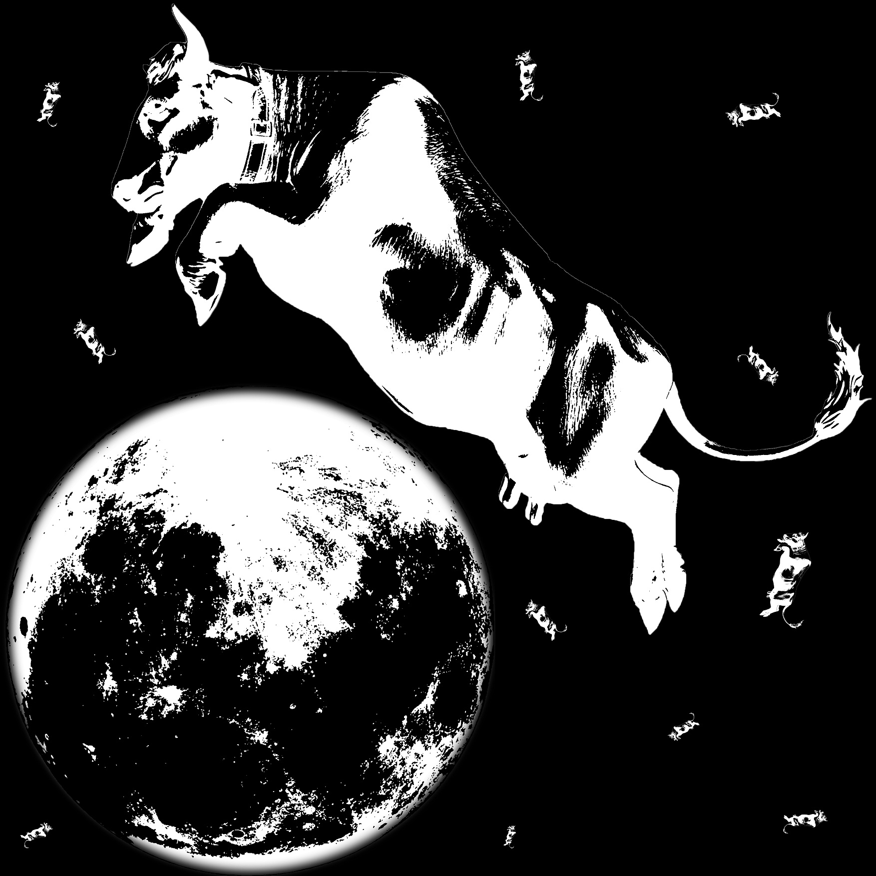
The cow jumped over the moon.
There was an old woman who lived in a shoe.
She had so many children, she didn’t know what to do;
She gave them some broth without any bread;
Then whipped them all soundly and put them to bed.
Humpty Dumpty sat on a wall,
Humpty Dumpty had a great fall.
All the king’s horses and all the king’s men
I decided to work on photoshop and illustrator to see what i could do with them and edit it along the way
The cow jumped over the moon Version 1
 Emphasis on the cow and the moon, with little detail other than the cow, the moon and some stars. high contrast of white with black to make the moon and cow stand out. straight forward idea with element of the picture centralized and in the box (no element is being cropped off)
The cow jumped over the moon Version 2
 The main cow is being tilted to give a movement to it, again, no element is being cropped off from the picture and every thing is constrained by the box, however the cow is being duplicated to substitute the stars to make the composition more interesting.
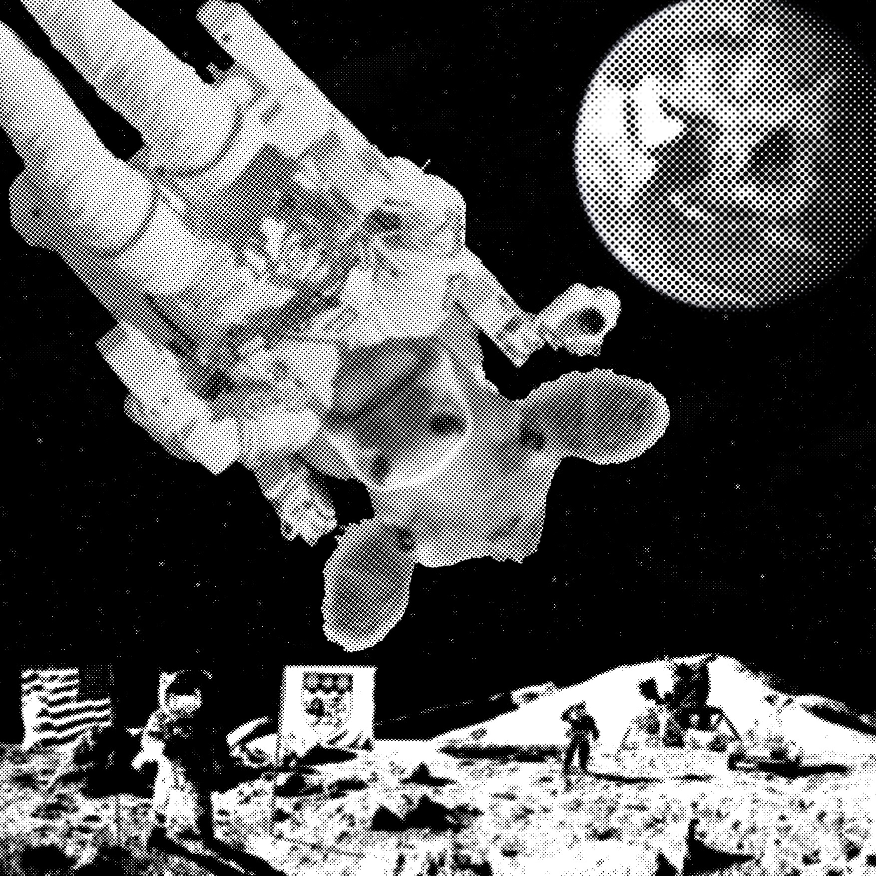
The cow jumped over the moon Version 3 Different approach, the main focus will be the cow where the head is in the middle of the picture, the moon is slightly cropped to shift the overall visual weight of the picture towards the middle. I like this composition however i could only choose four and this is my fifth.
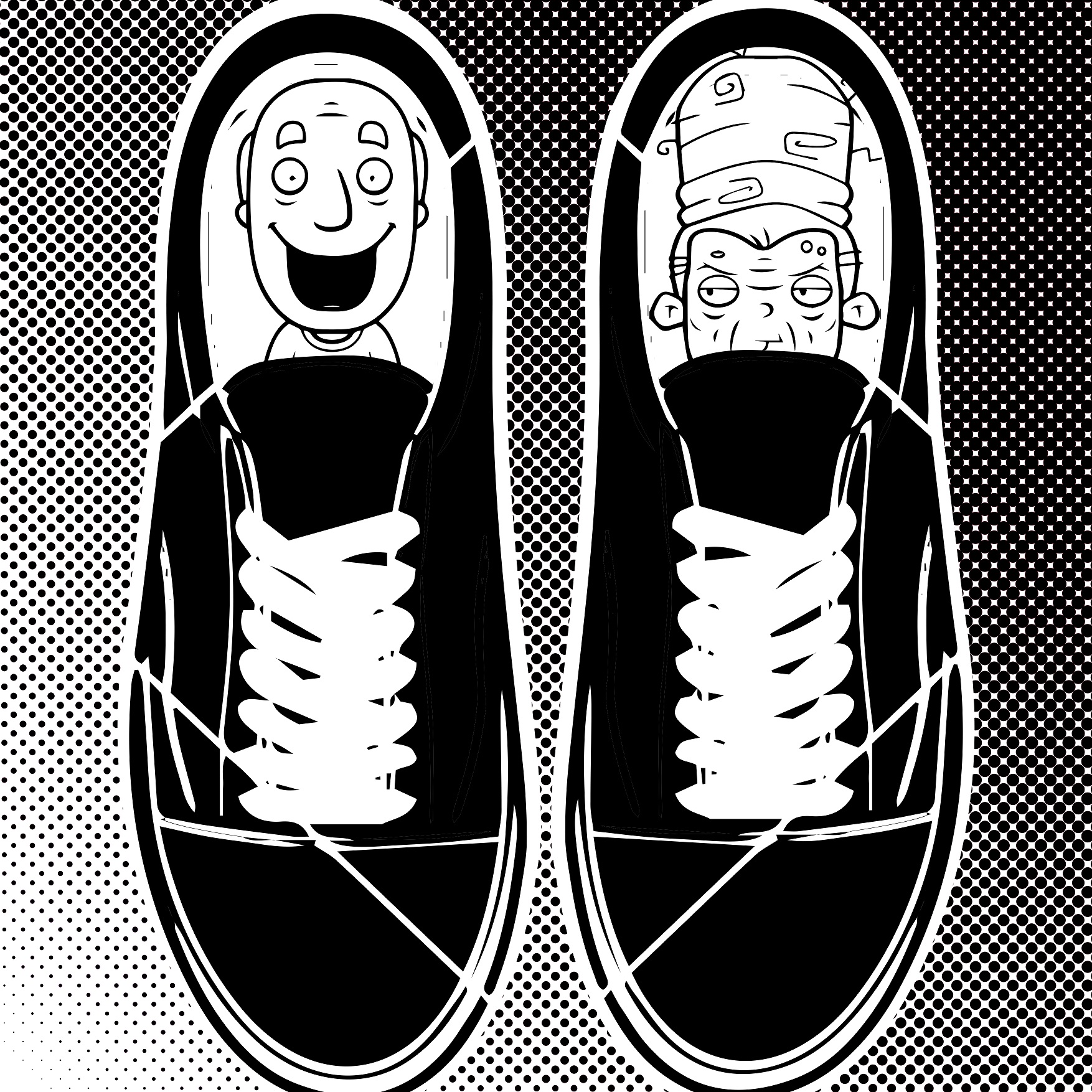
There was an old woman who lived in a shoe.
 My first thought about this sentence was ” what was there other than an old woman? did she have a partner? perhaps an old man?”
the contrast of an old grumpy woman and a smiley old man could have a background story as usually shoes comes in a pair, and the personality of the old woman and the old man is a big contrast but placed side by side, in the same shoe. personally i think this is interesting.
She had so many children, she didn’t know what to do. The background of the picture is repeated pattern of a boy and a girl which colours are inverted, while the foreground of this picture shows a woman with a face without expression, centralized in the picture for a stable feel.
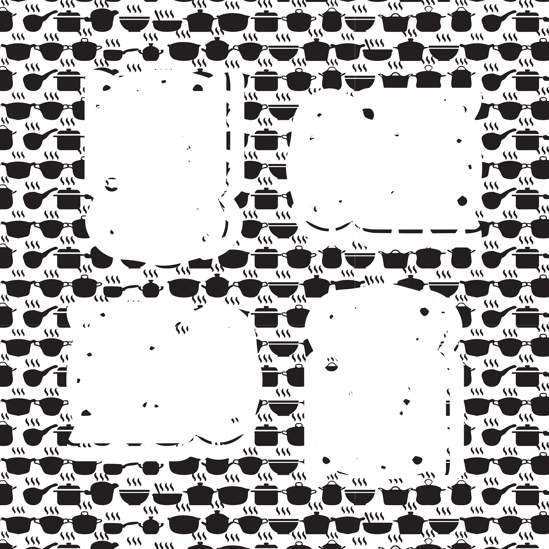
She gave them some broth without any bread V1

Repeated patterns of pots, bowls and some pans as background to bring out the implied lines of bread which symbolized that there are no bread present. the breads are also placed repetitively and in the center with different orientation for a slightly interesting composition, however in this, the bread is not clear.
She gave them some broth without any bread V2

To bring make the bread clearer, round circles are formed around the bread which i think the bread in this is too obvious and there is no implied lines anymore.. and after the consultation, maybe one bread at the center is better than 4 bread.
She gave them some broth without any bread V3
 By retaining the four circles, the background was cleared but filled into the circles, the bread is still in the black circle because i like the contrast, however the blank bread is filled with the background but with lesser contrast.
She gave them some broth without any bread V4
 The background tone was darken to bring the focus to the bread.
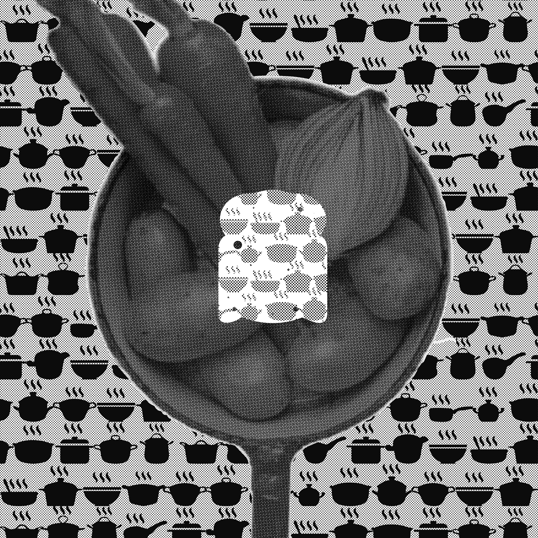
She gave them some broth without any bread V5- Final
 Instead of an empty black circle to contrast the bread, a photo of a pan with vegetables are use for a human touch to make the picture warmer than just vector, this very well contrast with the vector background and i think this is much better than before. I like this composition and this will be chosen.
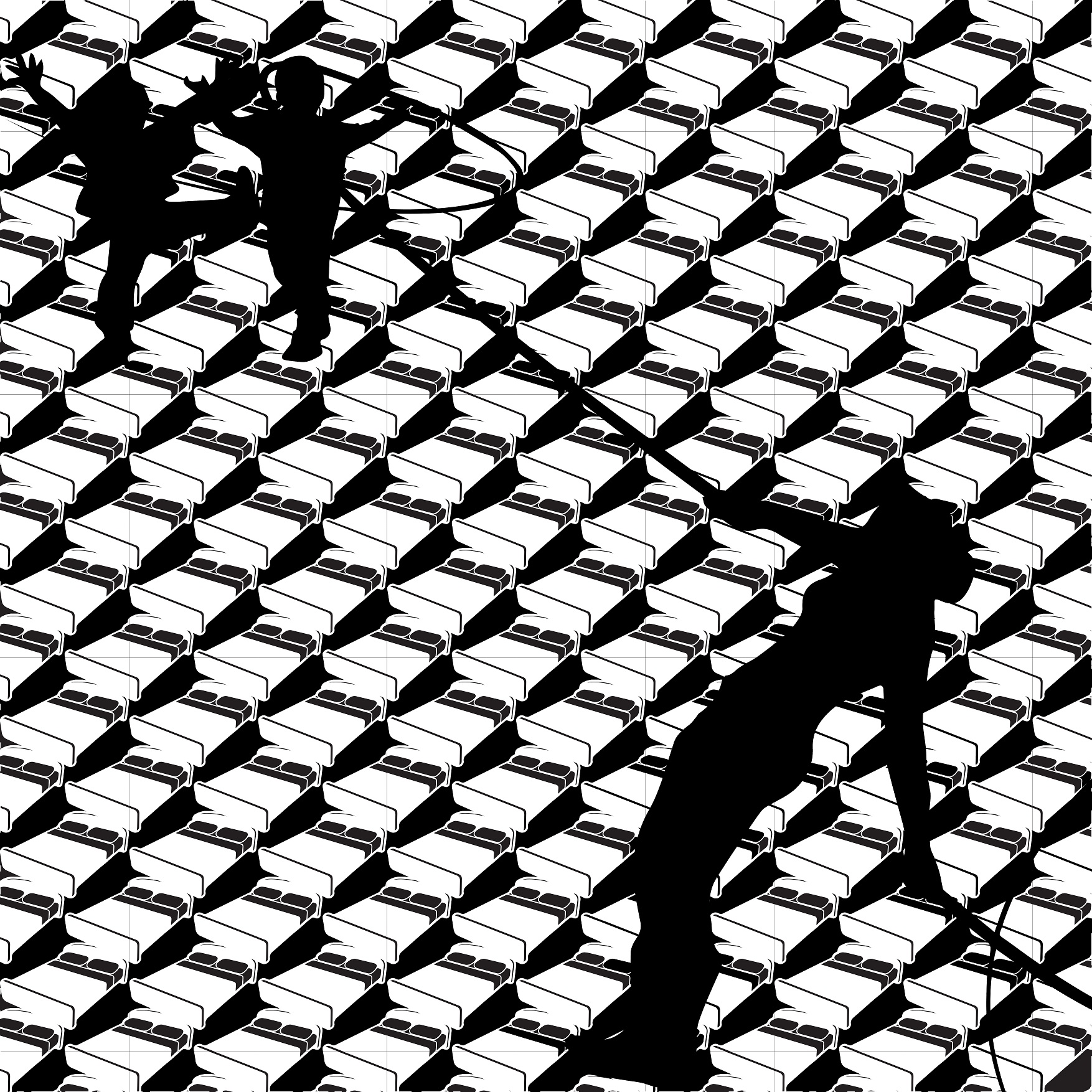
Then whipped them all soundly and put them to bed.
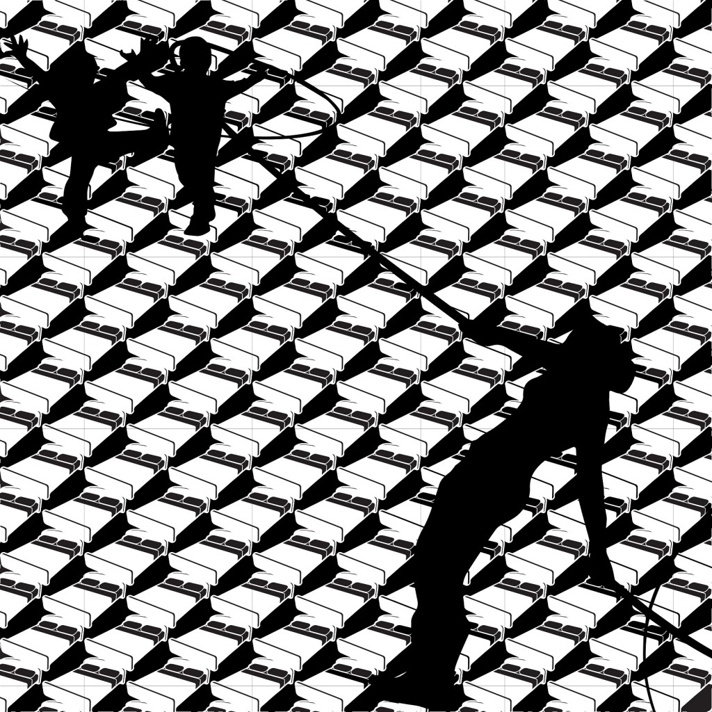 Repeated patterns of beds are used while in the foreground, there is an action and diagonal lines used to make the composition more dynamic.
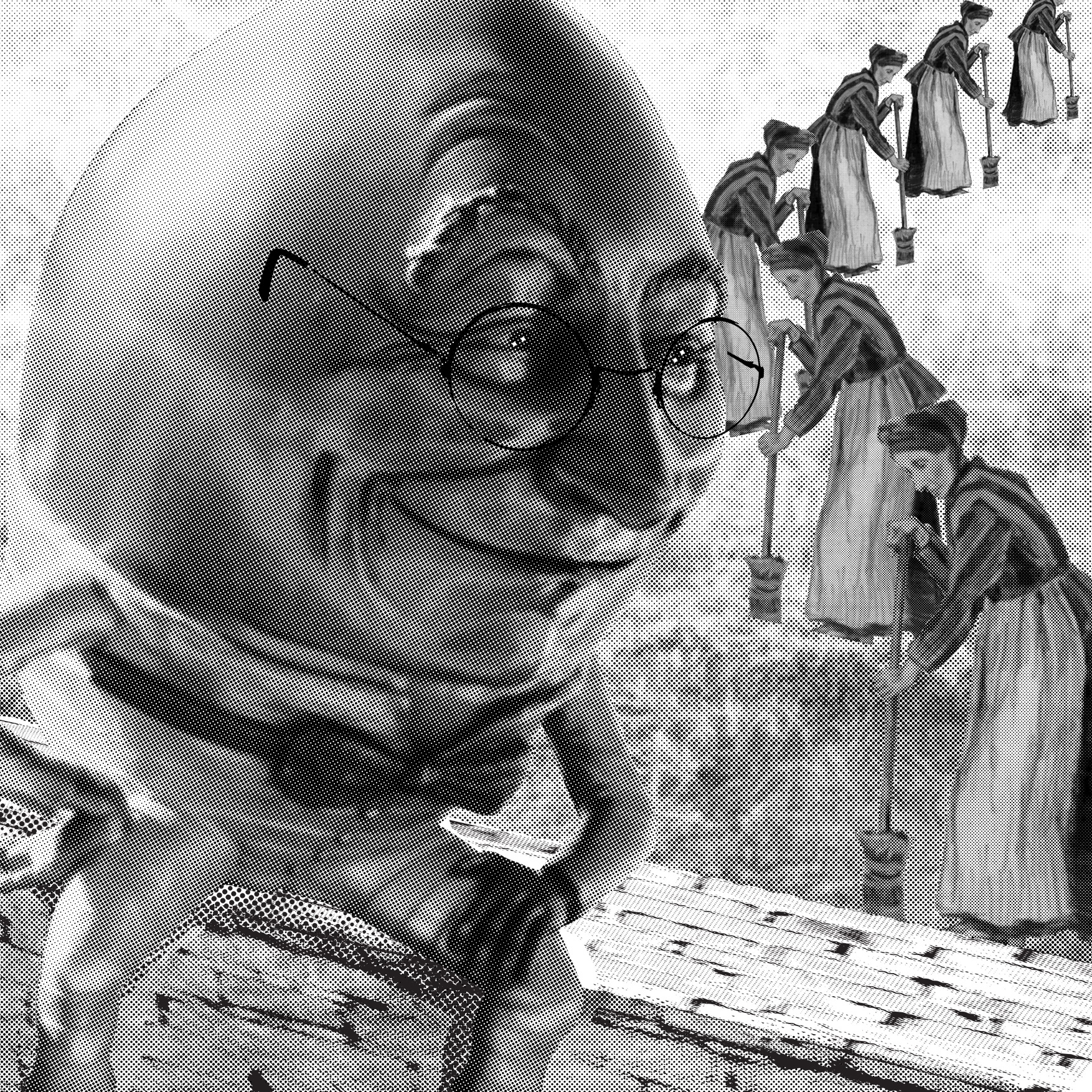
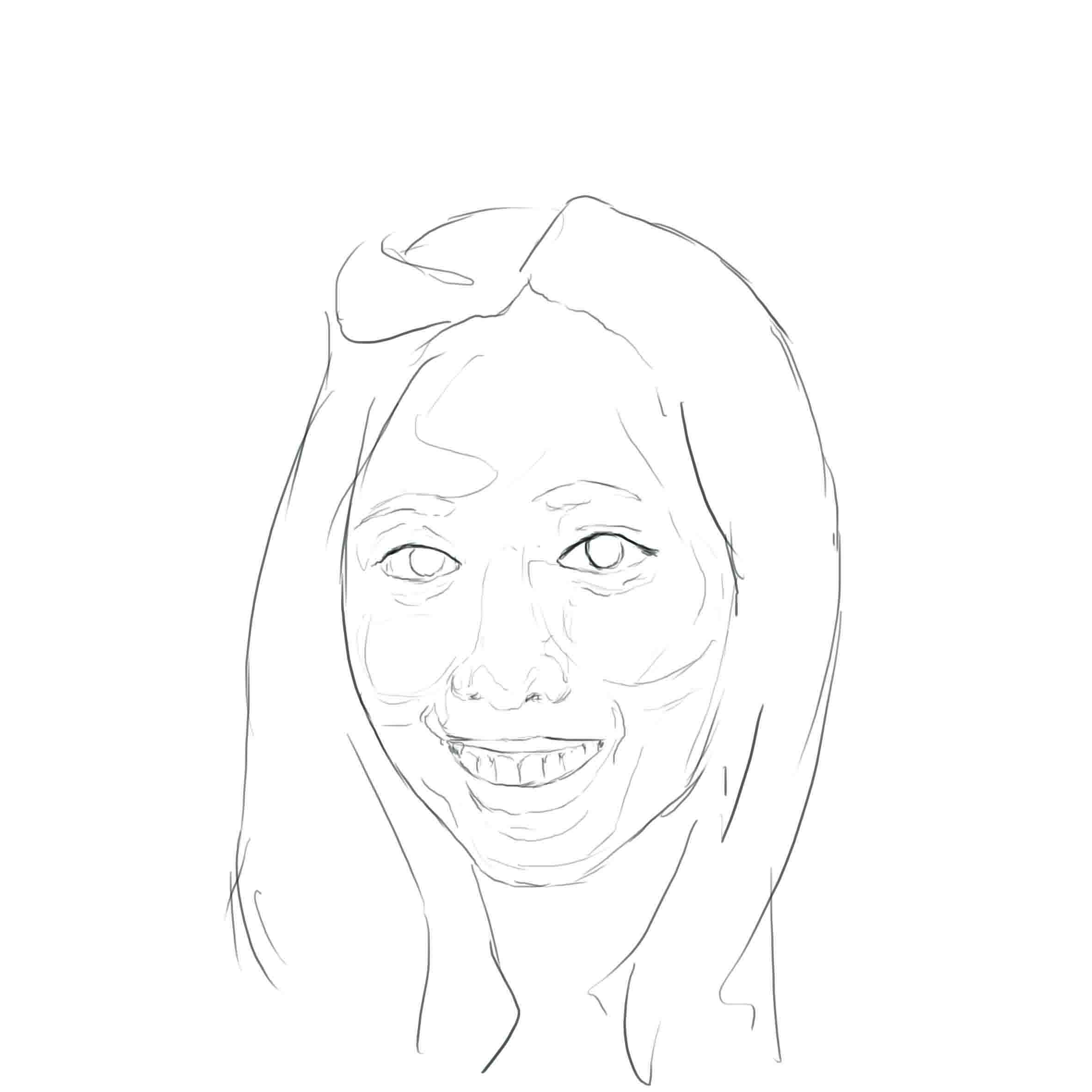
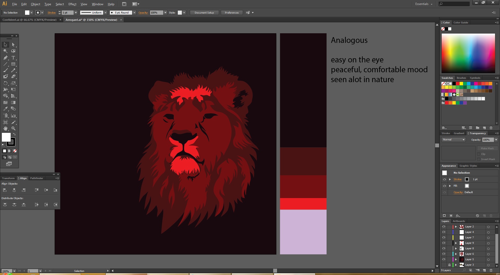
Humpty Dumpty sat on a wall V1

Humpty Dumpty in the picture is still and the woman in the picture is moving in direction towards the center and to the corner, repeated use of the woman is to balance out the weight of Humpty Dumpty as he is being cropped by the box and feels heavier, if only one woman was used, the picture will look heavier on the left.
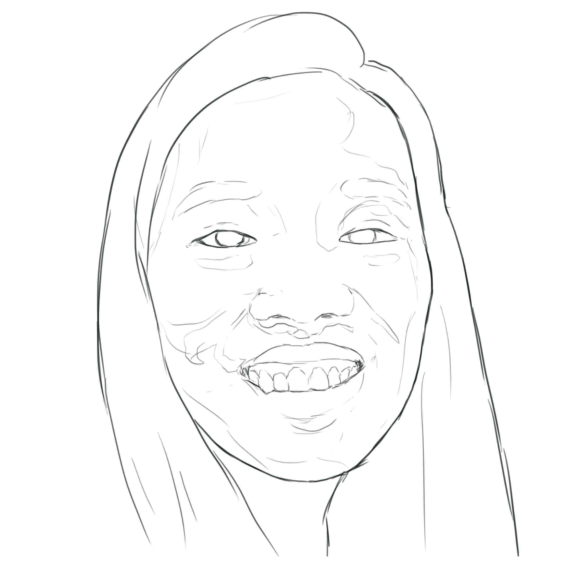
Humpty Dumpty sat on a wall V2
 HD in the previous composition is not dark enough and blend into the background, therefore contrast is increased to make HD pop out. I like this composition and therefore chose it as one of my final.
Humpty Dumpty had a great fall V1
 HD is placed in the center of the composition and the circle was placed to help viewers to focus in the middle because the leaves is pulling attention from HD. there is also a contrast between the background of leaves and HD as there is a dark outline around HD.
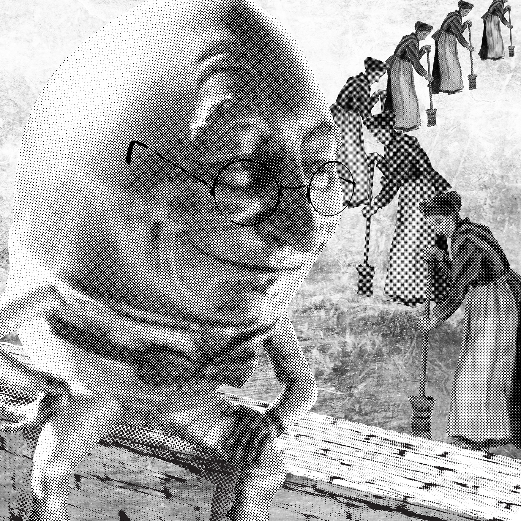
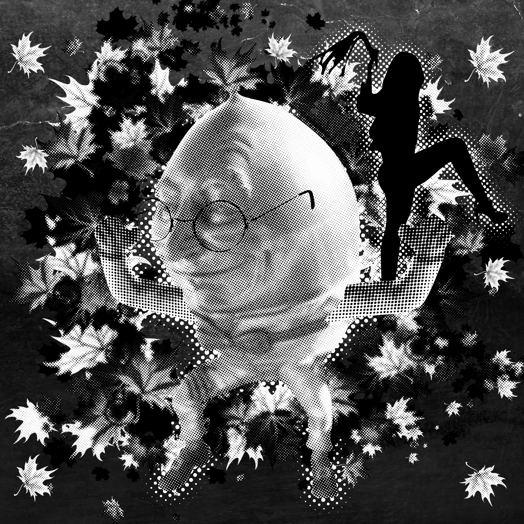
Humpty Dumpty had a great fall V2 Again, Hd is placed in the middle, a silhouette of a girl with a whip is added into the picture, i liked this more as the face of the HD is more comical and there is a lecherous face there, however the contrast of HD and the background is too low.
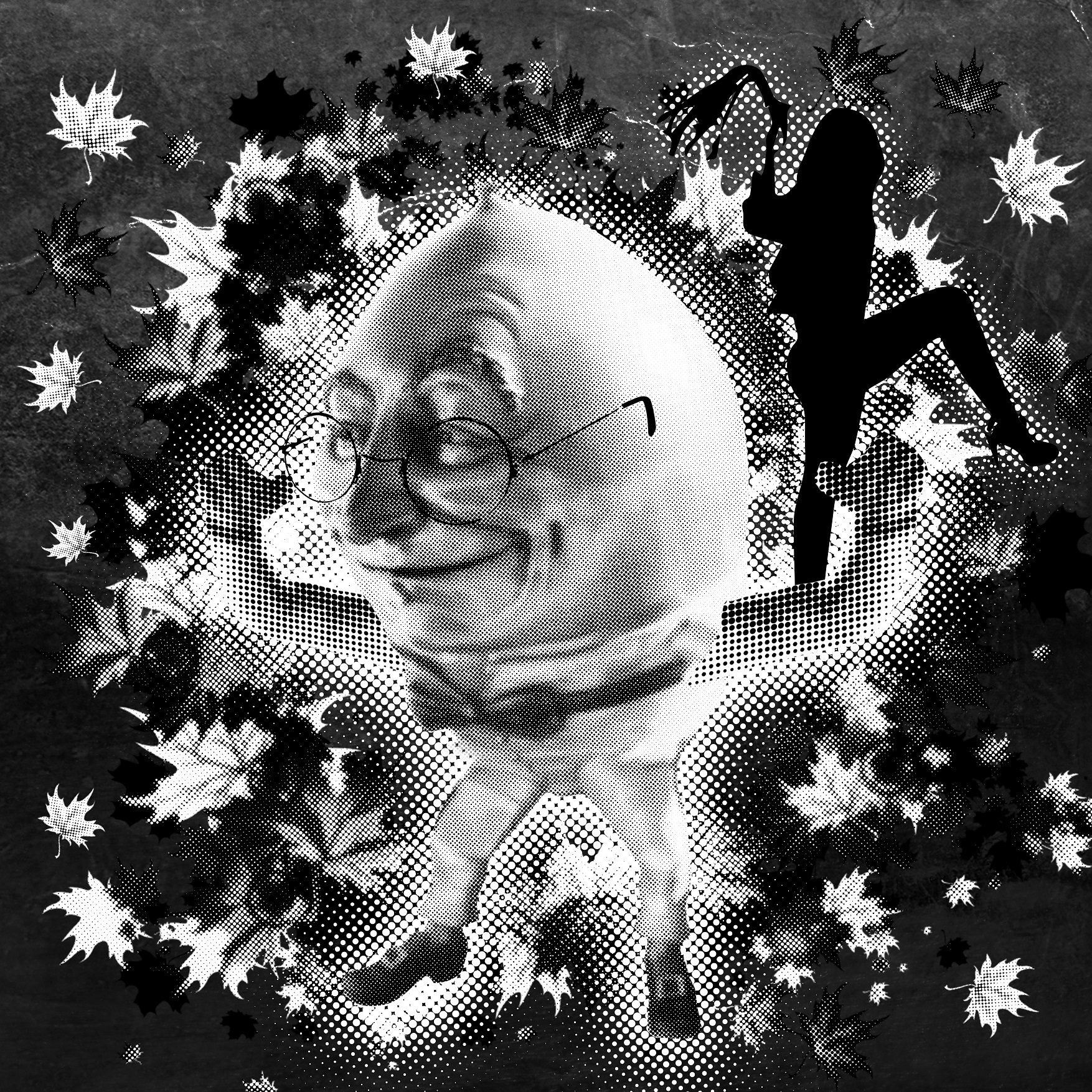
Humpty Dumpty had a great fall V3
 inverted the background colour to black to make the contrast of HD bigger and more focused. outer glow is also used to ensure that both HD and the silhouette stands out. there is still room for further improvements.
Humpty Dumpty had a great fall v4
the addition tree is removed for a clearer picture, the mass of leaves is shrink to leave more empty space and therefore better focus, however the contrast of HD face is too low and there is a lost of detail.
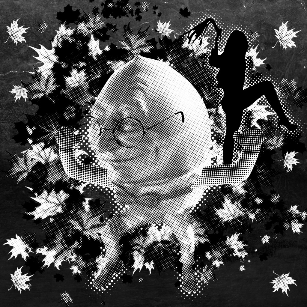
Humpty Dumpty had a great fall V5

changed HD position from sitting to standing, increased the detail on the face which further shows that he had a GREAT FALL. I like this composition and this will be chosen.
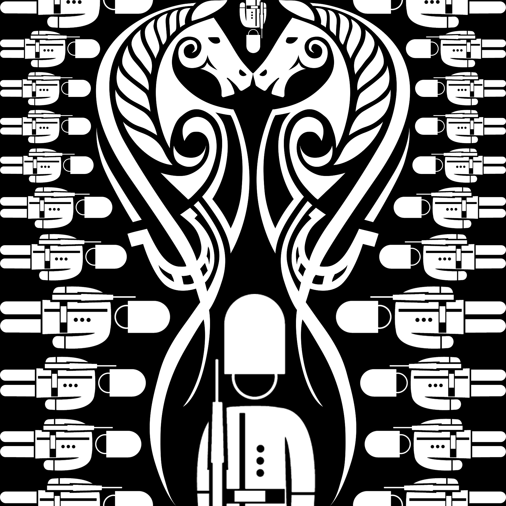
All the king’s horses and all the king’s men V1
 symmetry, repetitively pattern with different sized of kingsmen, the biggest one in the middle and the 2 giant horse capture the attention of viewer, there are also empty spaces to enhance the contrast of subject and the background, however there is little human touch and the composition seems cold.
All the king’s horses and all the king’s men V2
the background is changed to a castle, however i feel this is a weaker idea than the previous.
All the king’s horses and all the king’s men V3
 Different approach, symmetry, repetitive pattern, harmony is also used. however there is also little human touch as it is all vector.
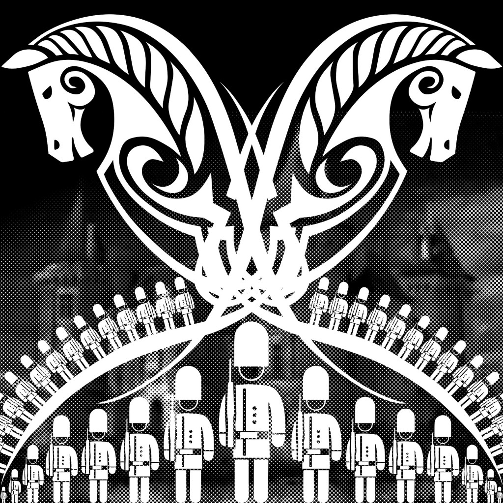
All the king’s horses and all the king’s men V4
lower the contrast the kingsmen on the side to bring further focus to the main subject. I really like this composition and this will be chosen.


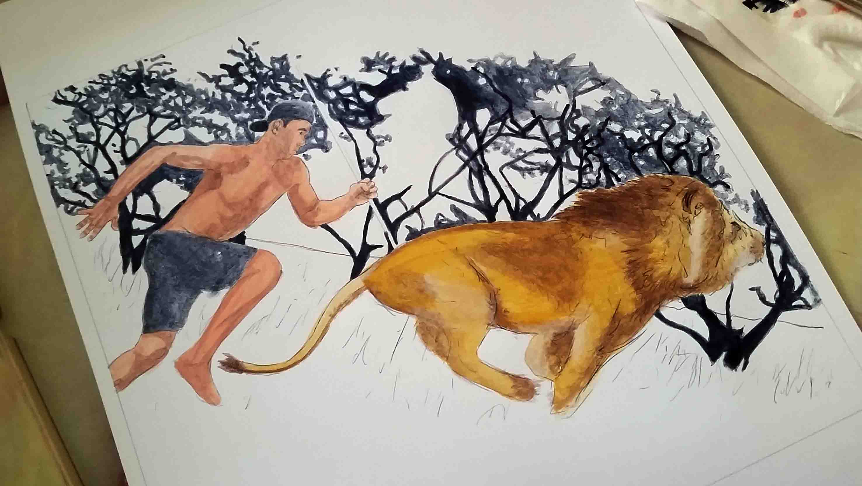


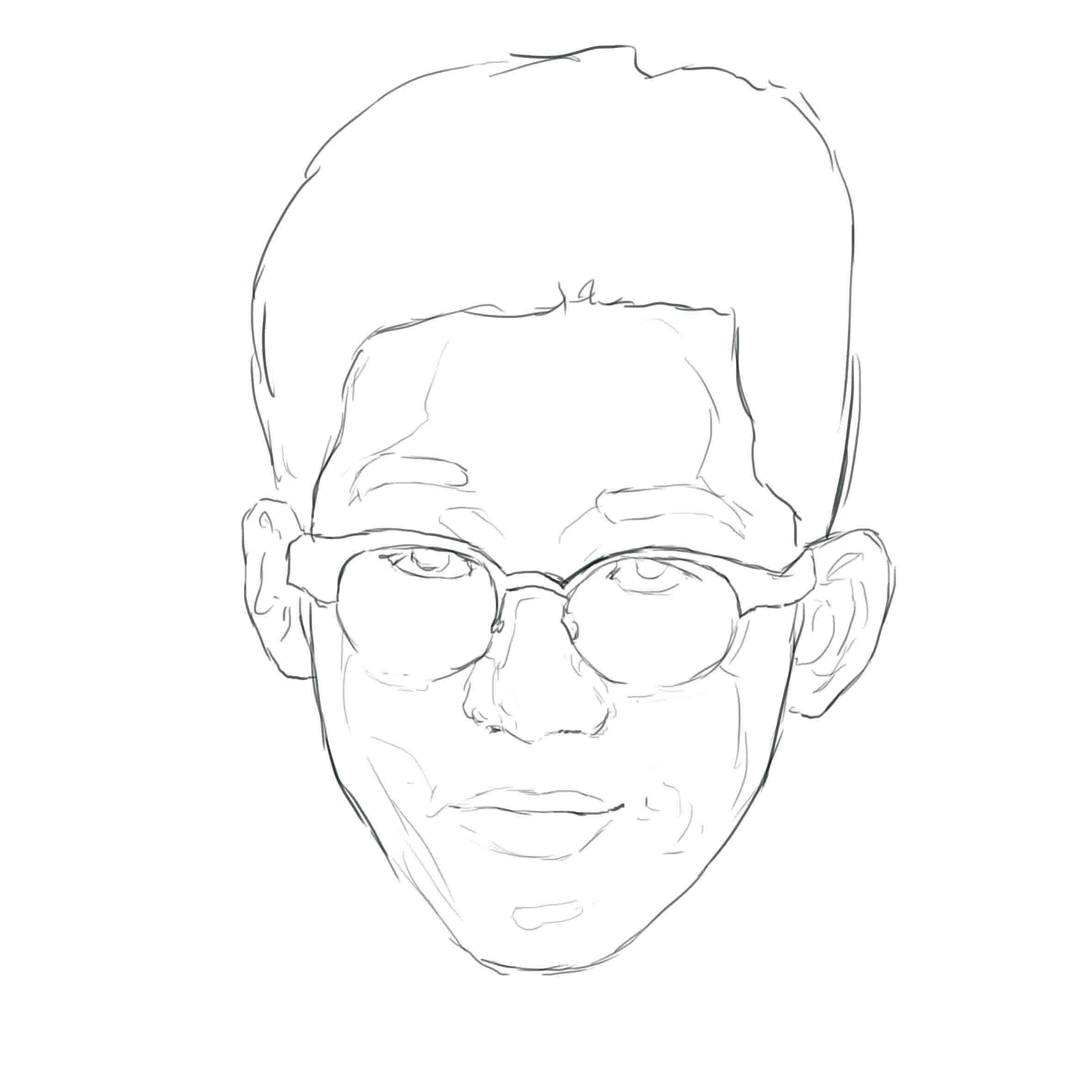
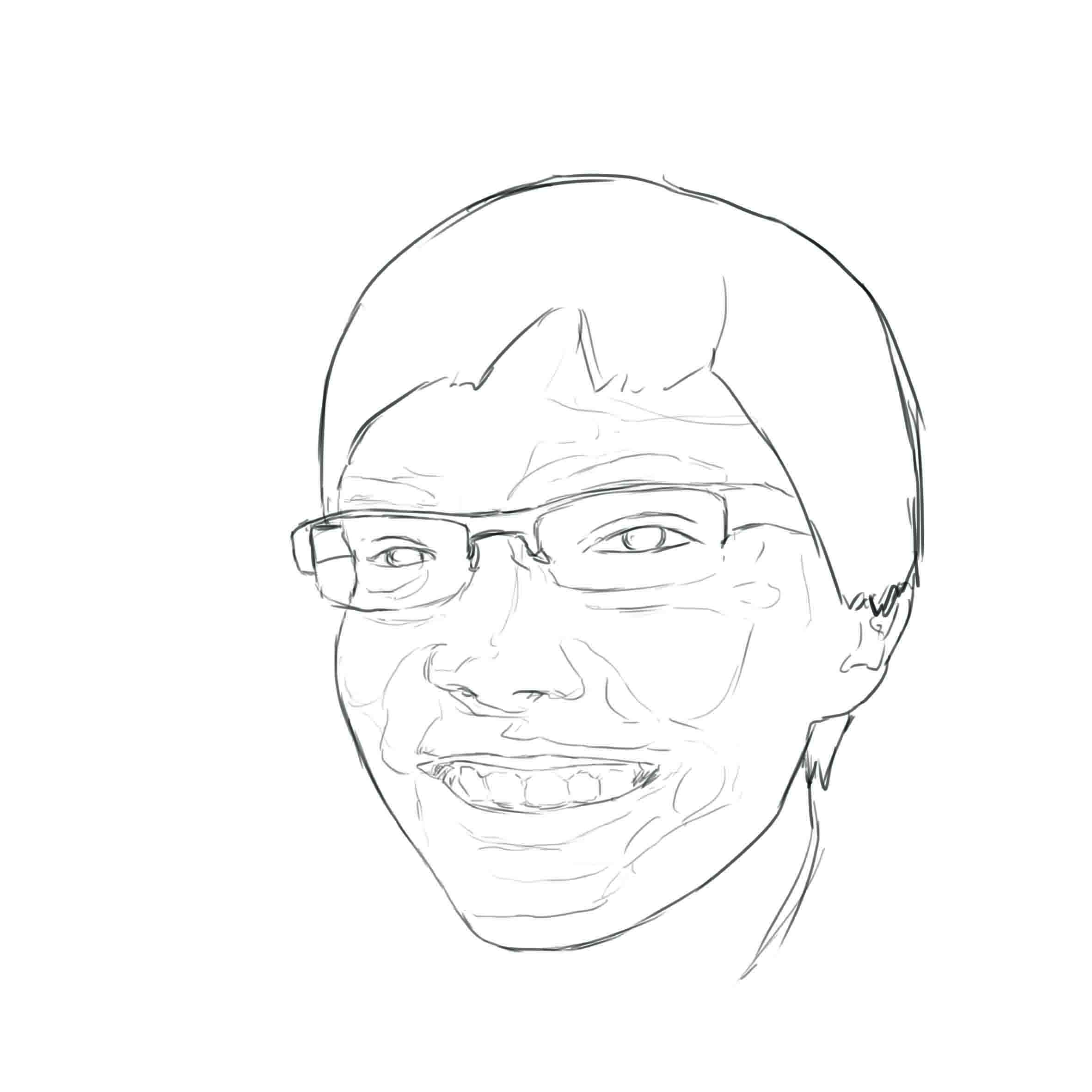


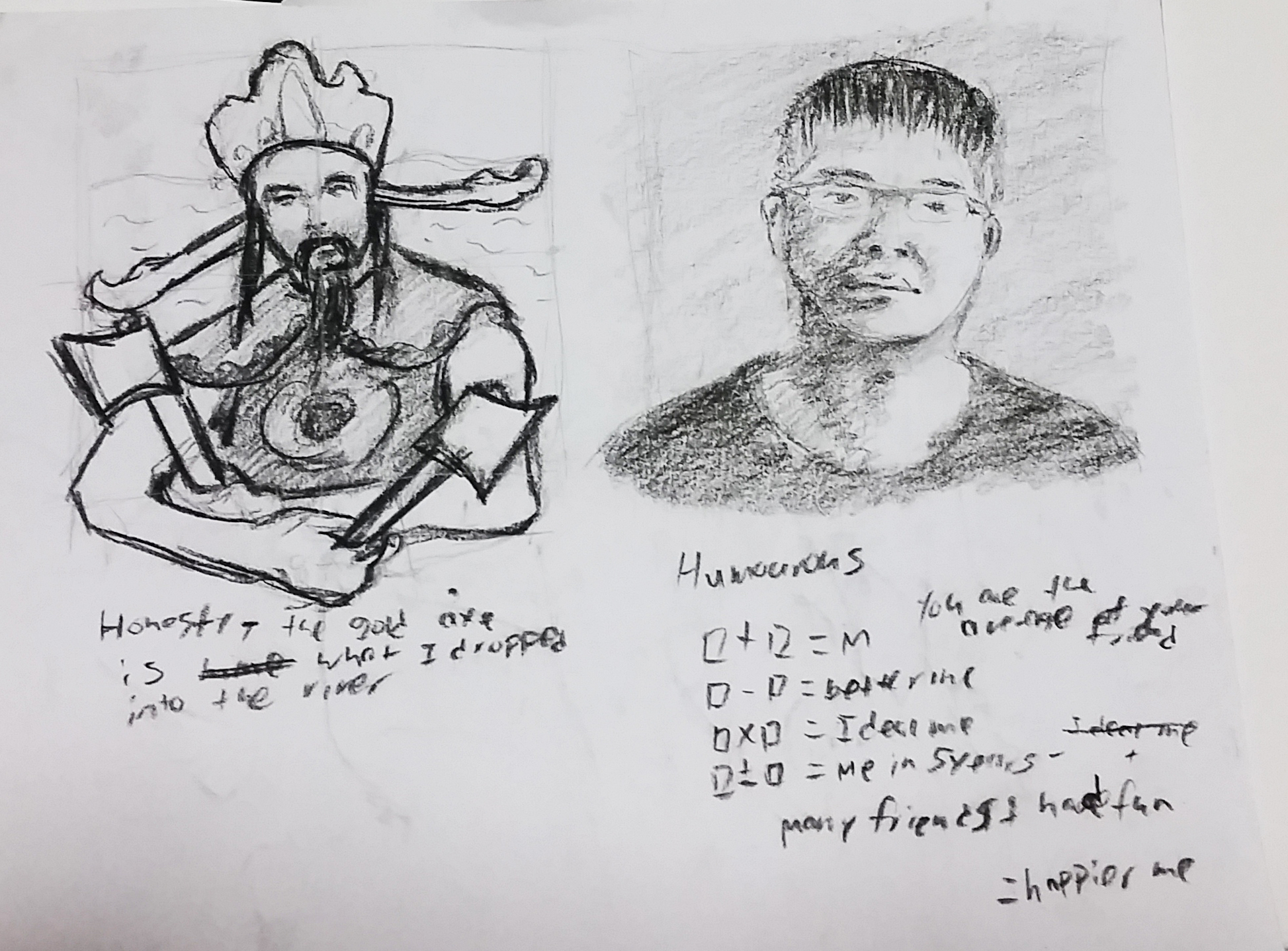


 for the honesty, i decided to use a childhood story of mine to depict honesty, but with a twist.