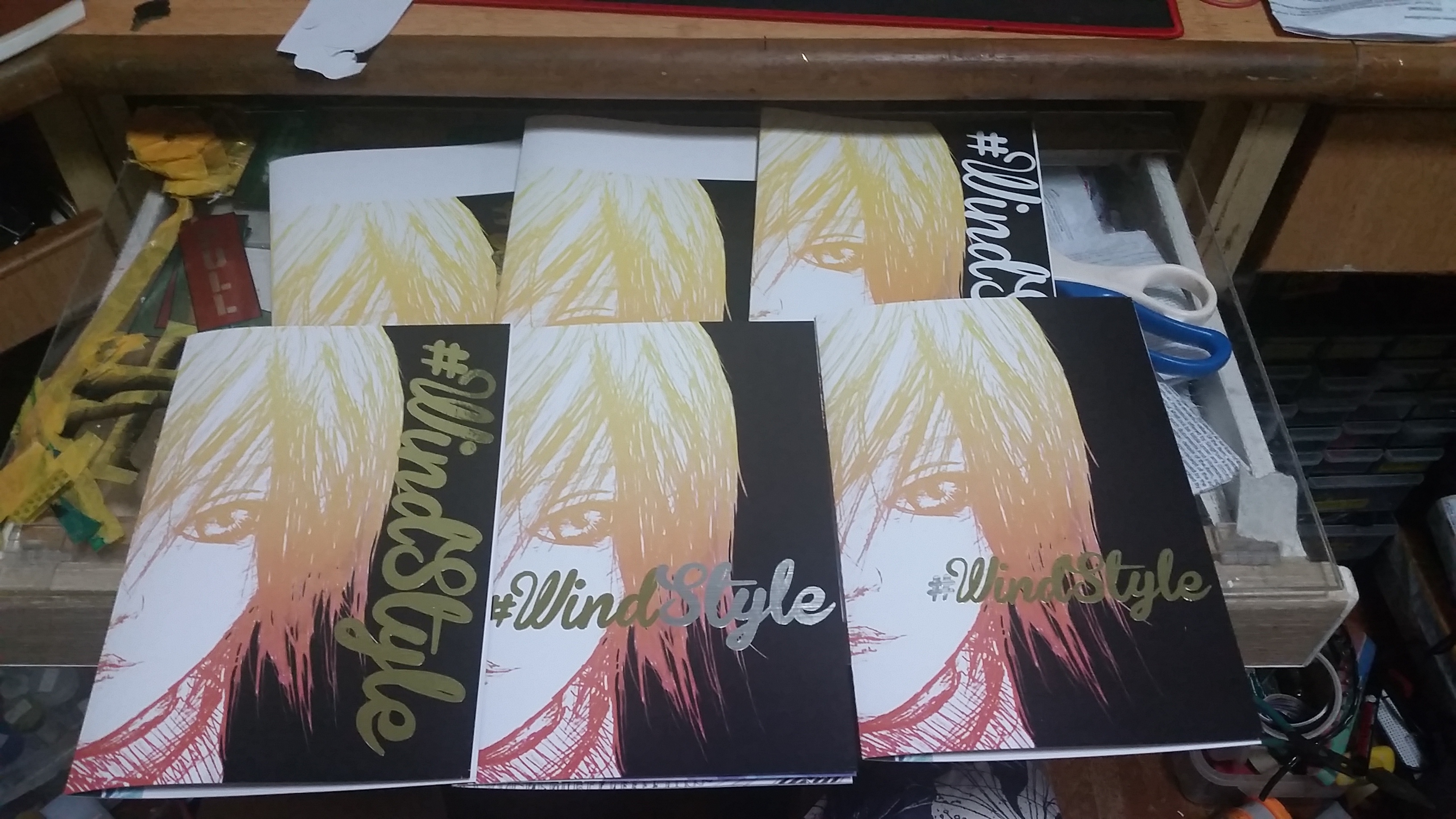
The final work is done in 6 different style as this is a “point of view” project, therefore I think it would be better if the style of the final work are all different so as to take the project away from the artist(me) and the viewer wont think that the work comes from the same artist as I want to show different perspective so a single style wont be sufficient. However, all my works are stringed by 1 element- Humor, by bringing things that would break the ordinary impression of Buddha.
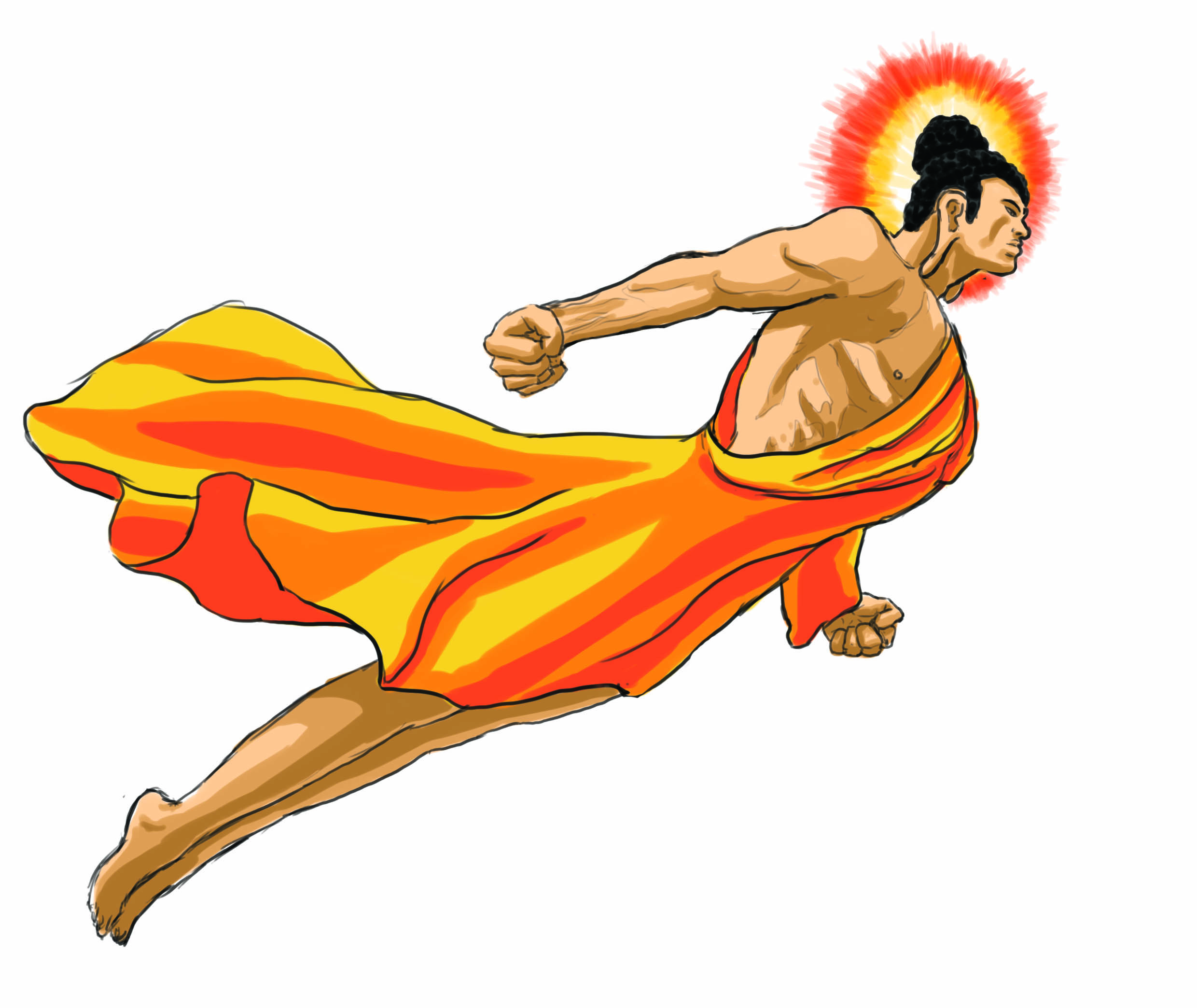
Buddha in the point of view of Buddhist is:
Holy

I’ll start off with the the point of view of a Buddhist, as they are the primary “subscriber” of Buddha, they should take the first place.
In this work, I used a mixed of photo(background) and drawings(foreground). The the complementary colour of the sky with the orangy robe of the Buddha bring the focus to the huge flying Buddha figure which occupy most of the top half of the work, the hierarchy of Buddha is clear as the placement, the size and is “framed” out by the shining light, the “monk” worshipping Buddha in the picture is added to be small to contrast the largeness of the Buddha(imagine the picture without the monk, the Buddha wont look big at all)
The point of this picture is that “Anything that glows is holy, anything that flies are better than those who can’t.” so I drew a muscular Buddha in an explosive flying pose to break the ordinary impression of Buddha is a skinny/plump guy who sit under the bodhi tree all day.
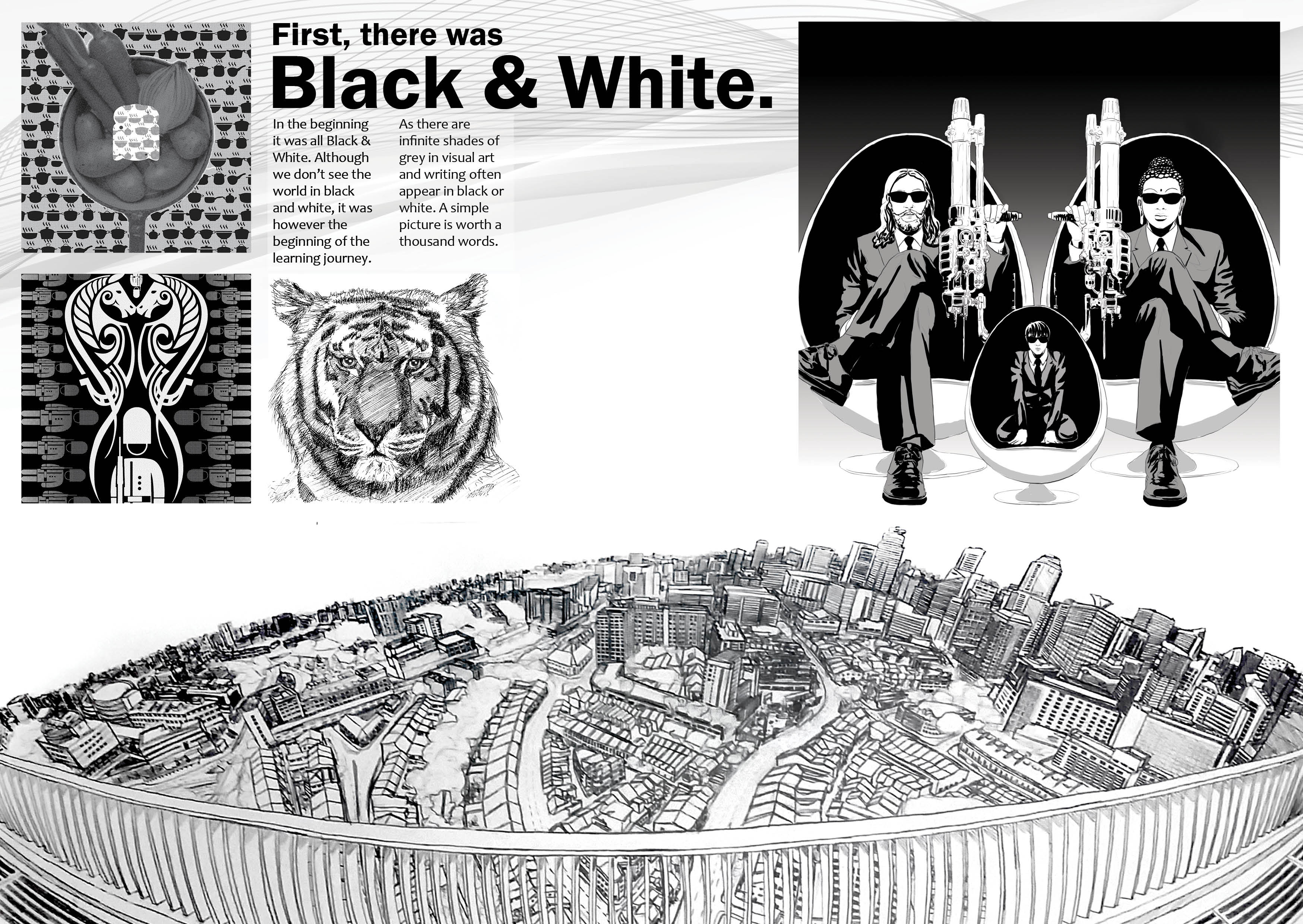
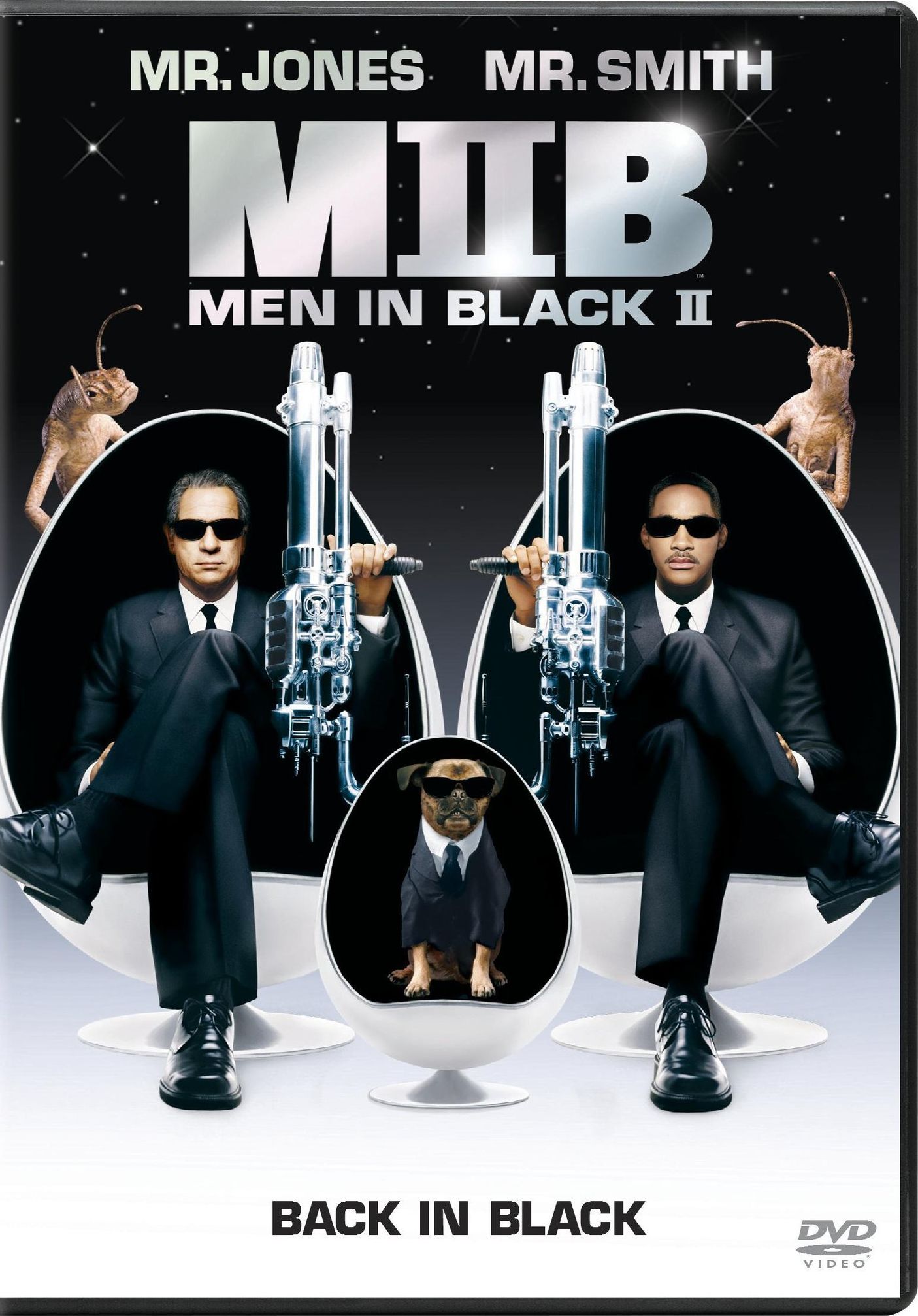
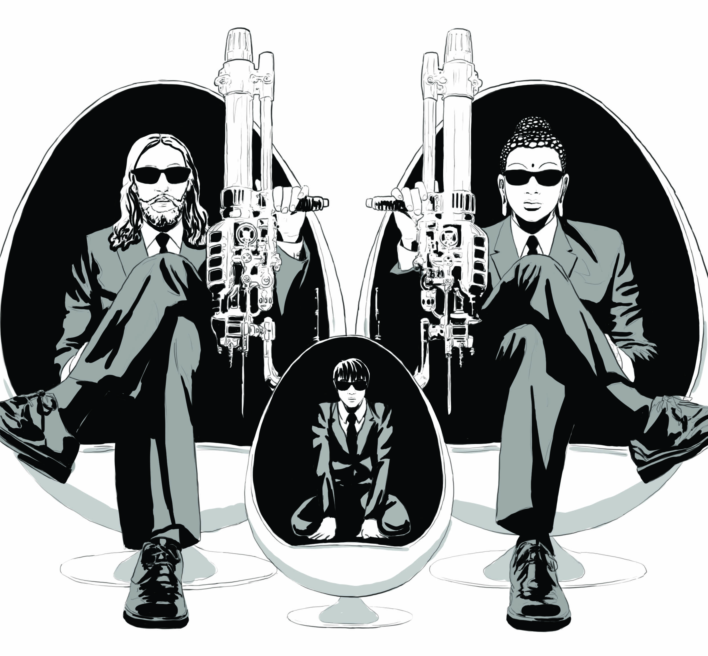
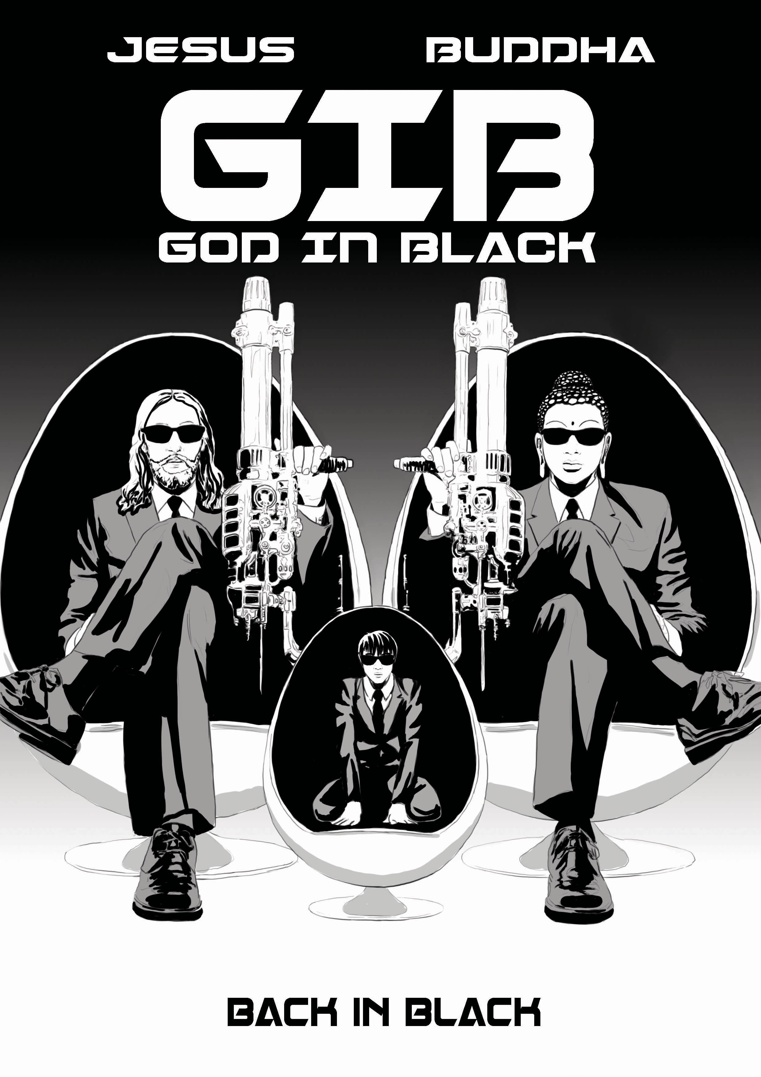
Buddha in the point of view of Jesus is:
Brother

After researching about “Brother”, “Duo” and lots of “cool dudes” i found a poster of Man In Black 2, it is SUPER similar to what I have in mind – “cool, shades and guns” and in the poster, there is an additional bonus! the DOME SHAPE CHAIR THAT REPRESENT THE HALO OF JESUS AND BUDDHA!! THIS IS PERFECT~
So, I simply make it a black and white piece drawn in the manga style to bring out the COOLNESS in it, however I dont want people to think that this is an original work, I intend to show that I copied it off the original work straight and changing the elements of it, that will be the funny part of my work, its more like a parody/spinoff/fanart instead of an original work.
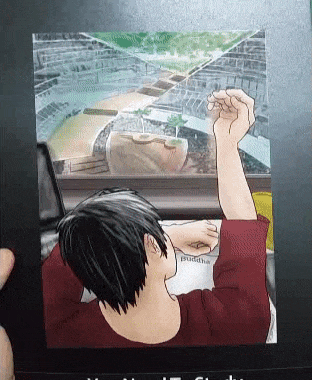
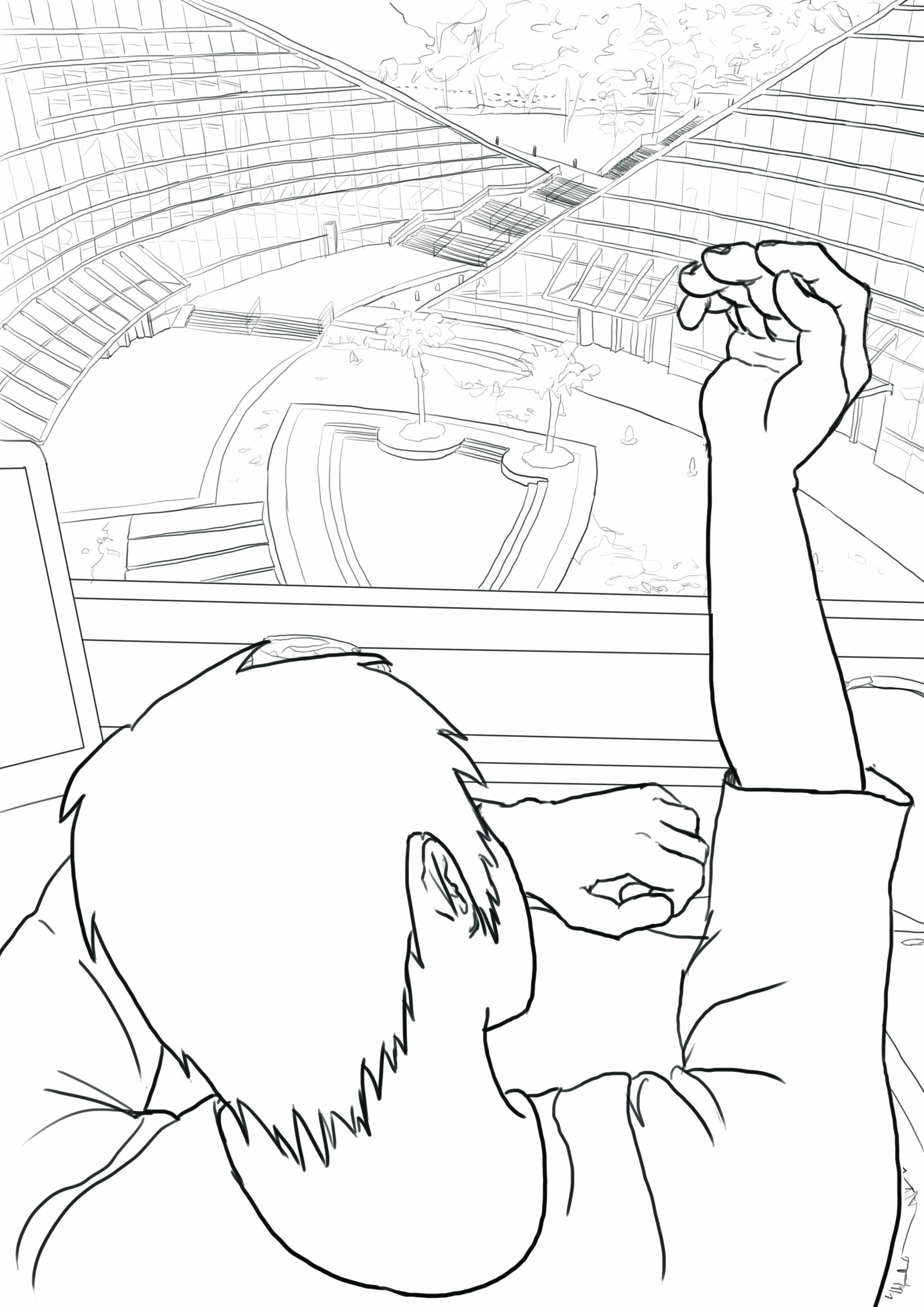
Buddha in the point of view of ADM is:
You Need To Study.
Every ADM student will know Buddha, because its tested, most of us studied, some died while studying (not literally I hope).
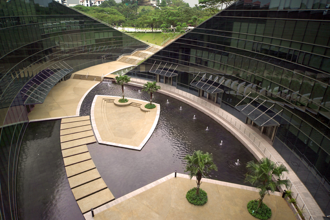
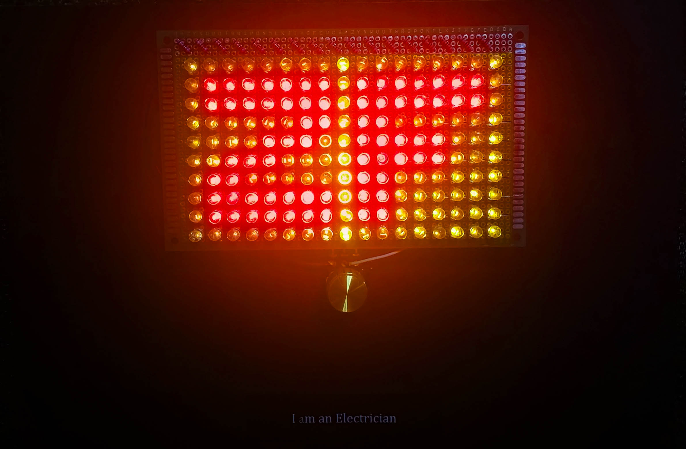
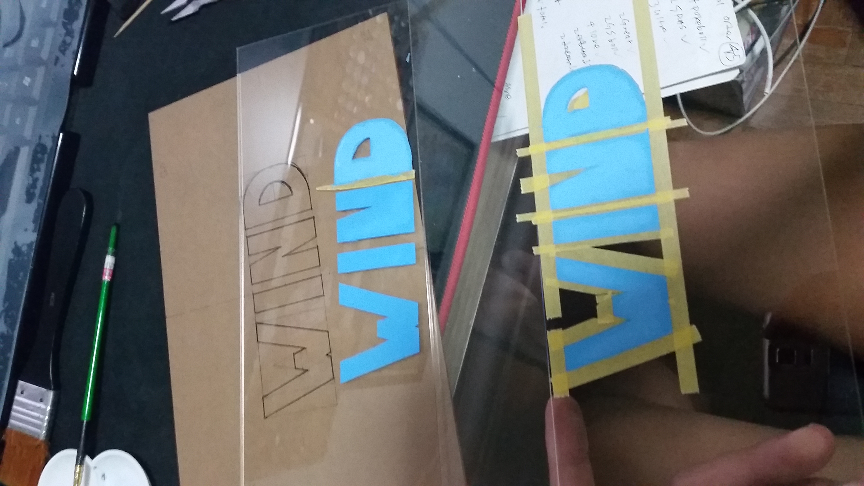
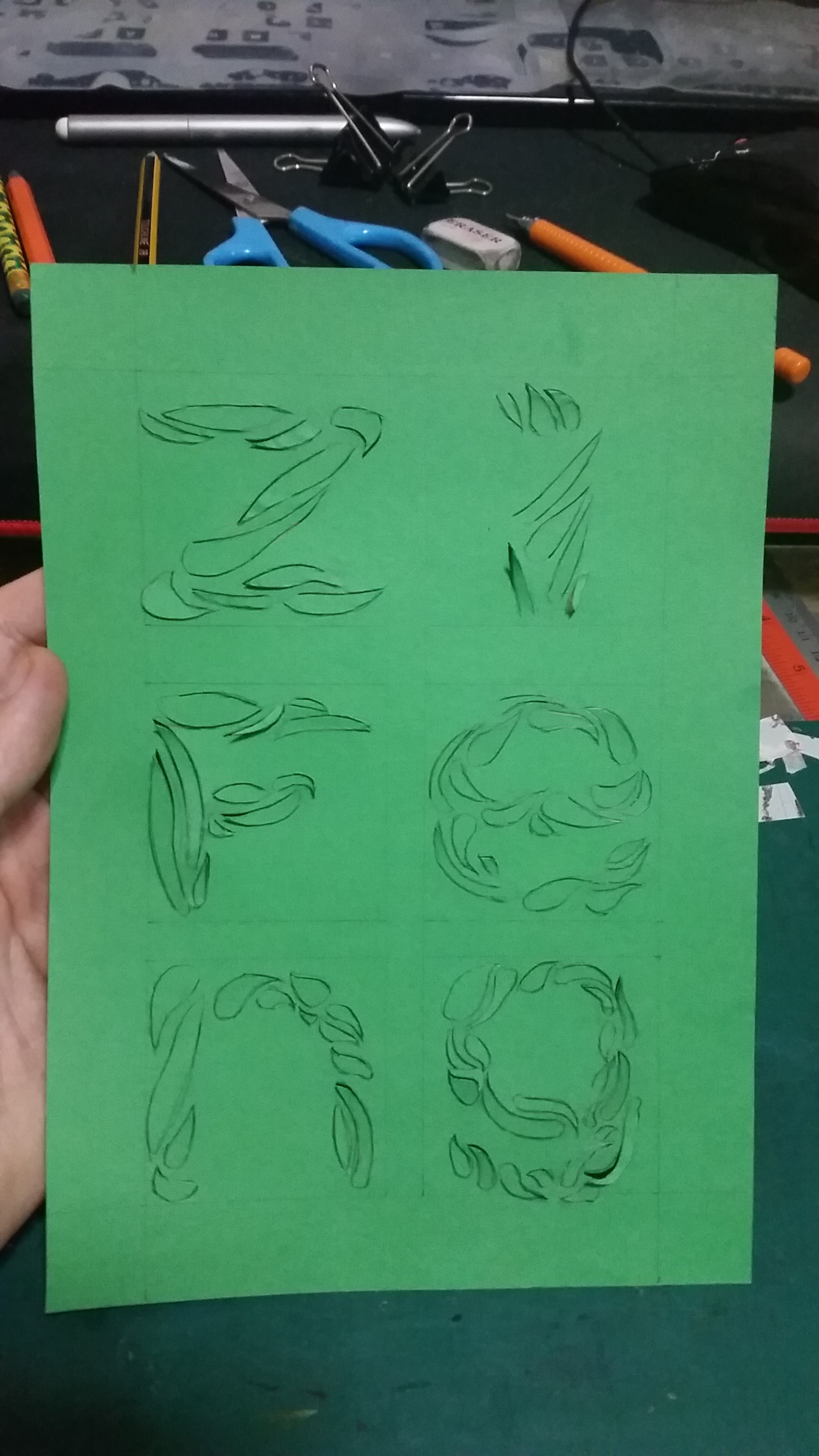
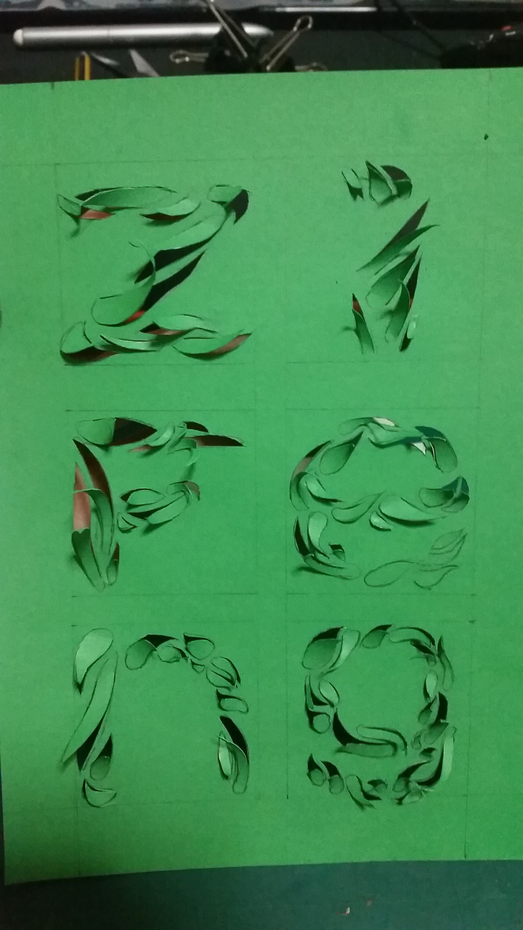
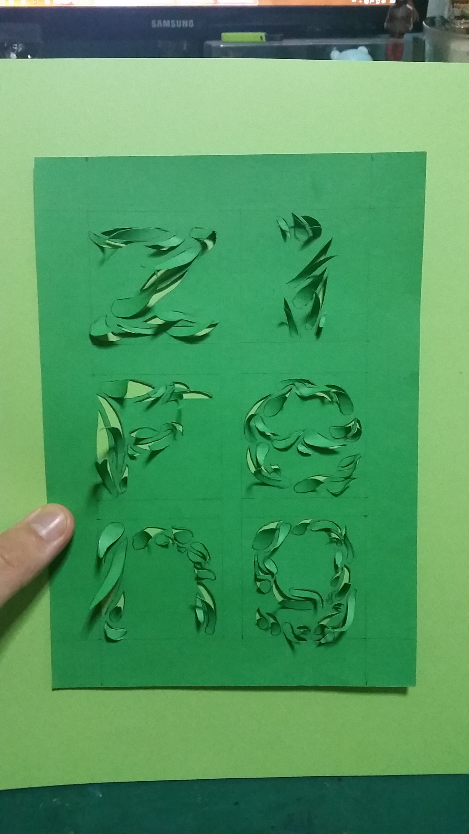
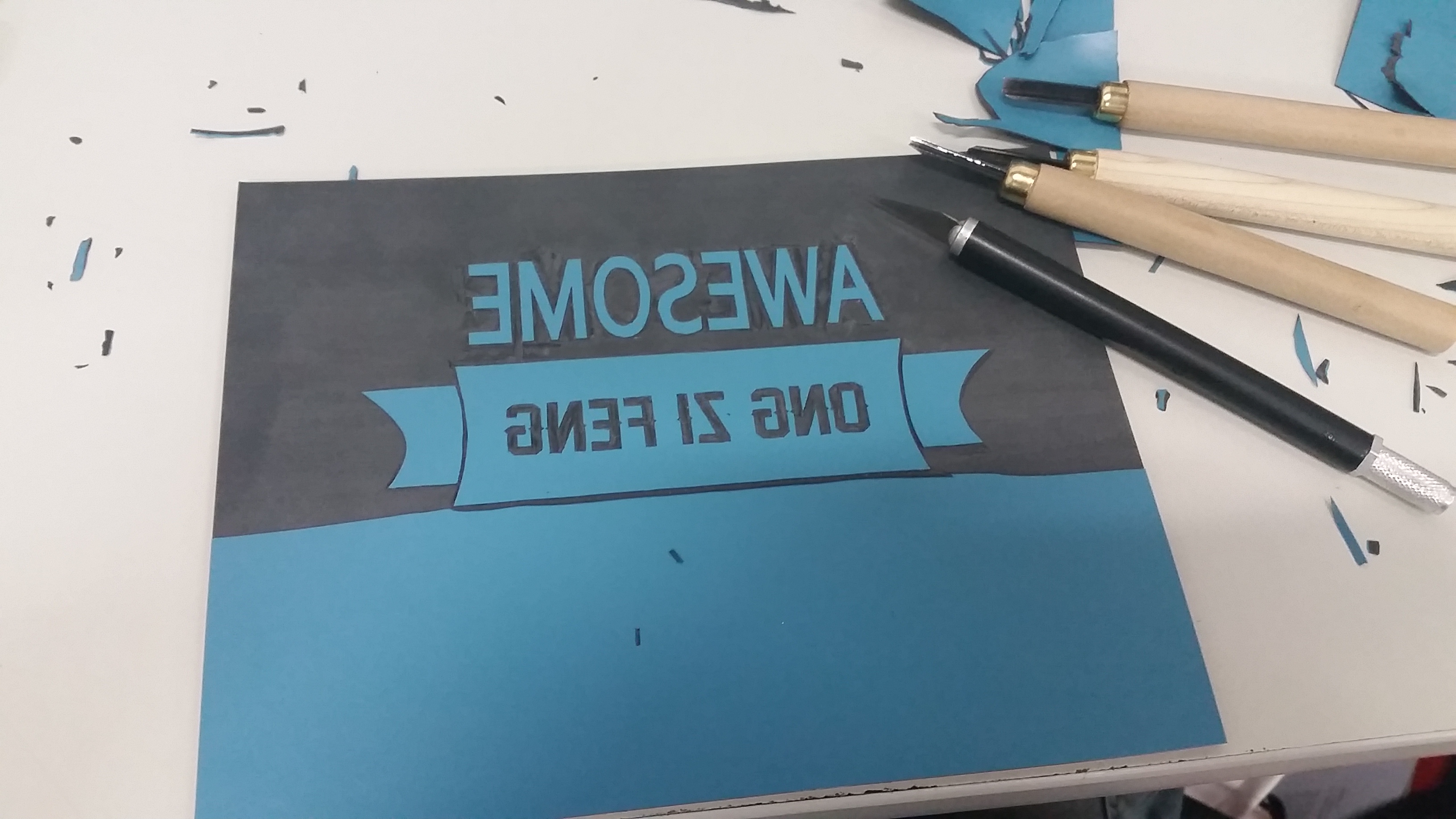
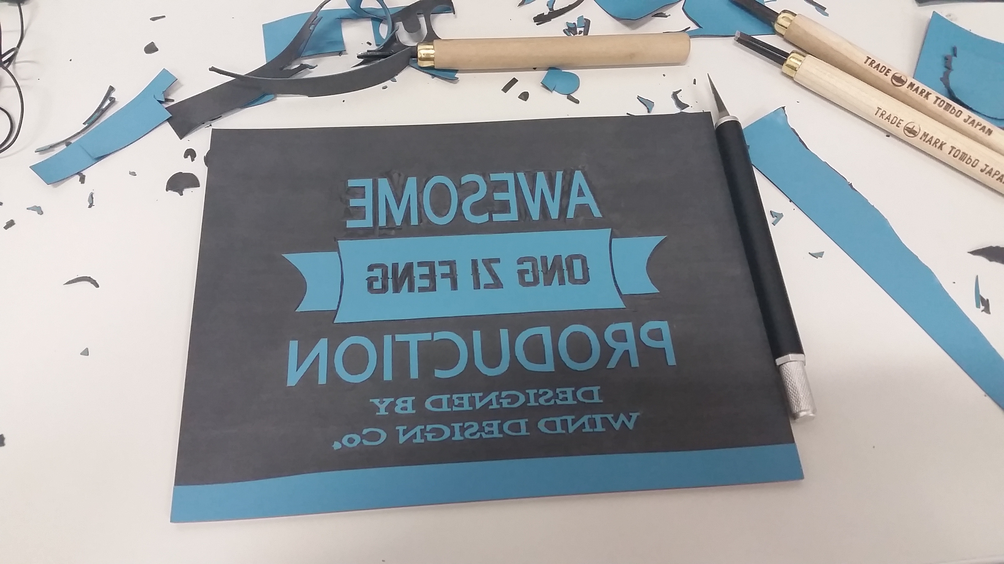
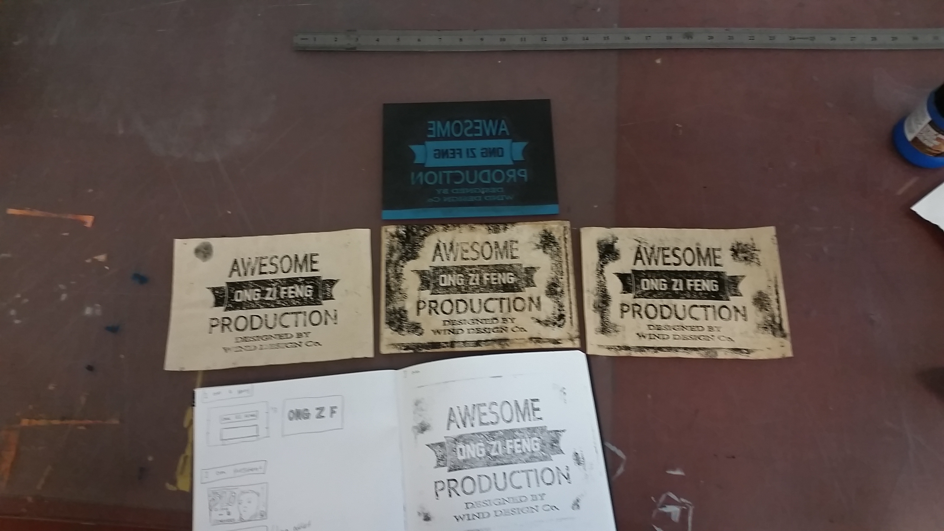
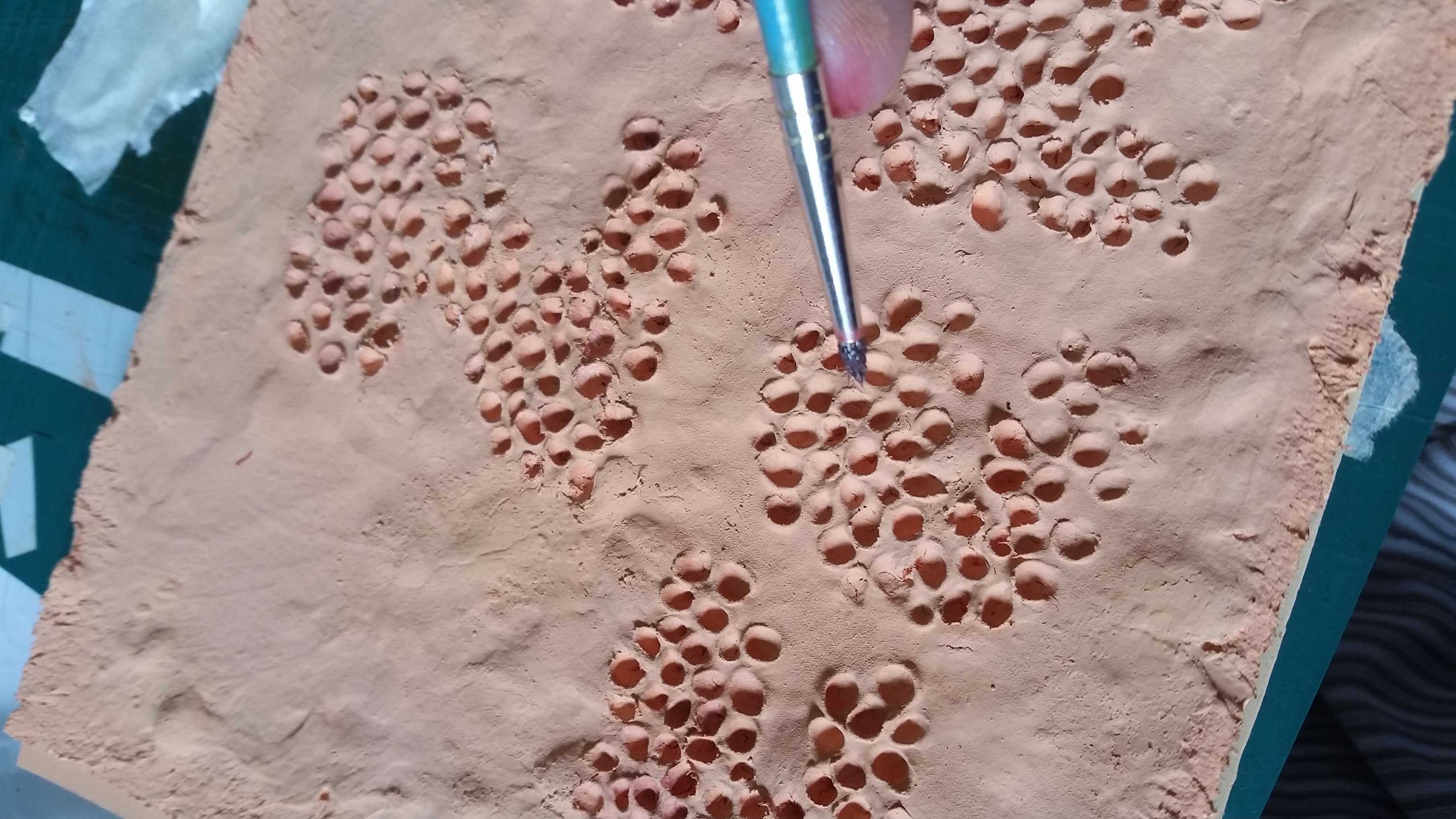
For the final work, I tried to cut and laminated the window to give it different texture and made the “glass” of the window more glossy to give further effect of there is a piece of glass there. gif below to show the gloss difference of the “glass” and other parts.
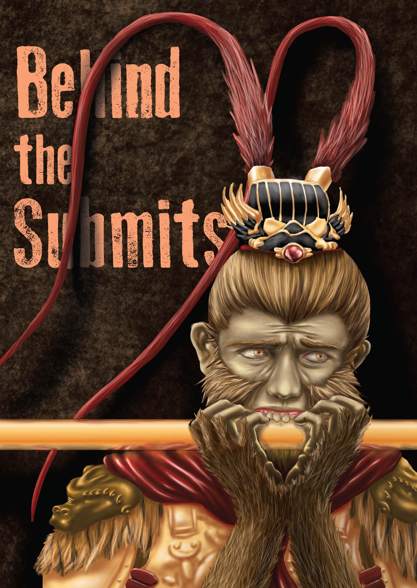
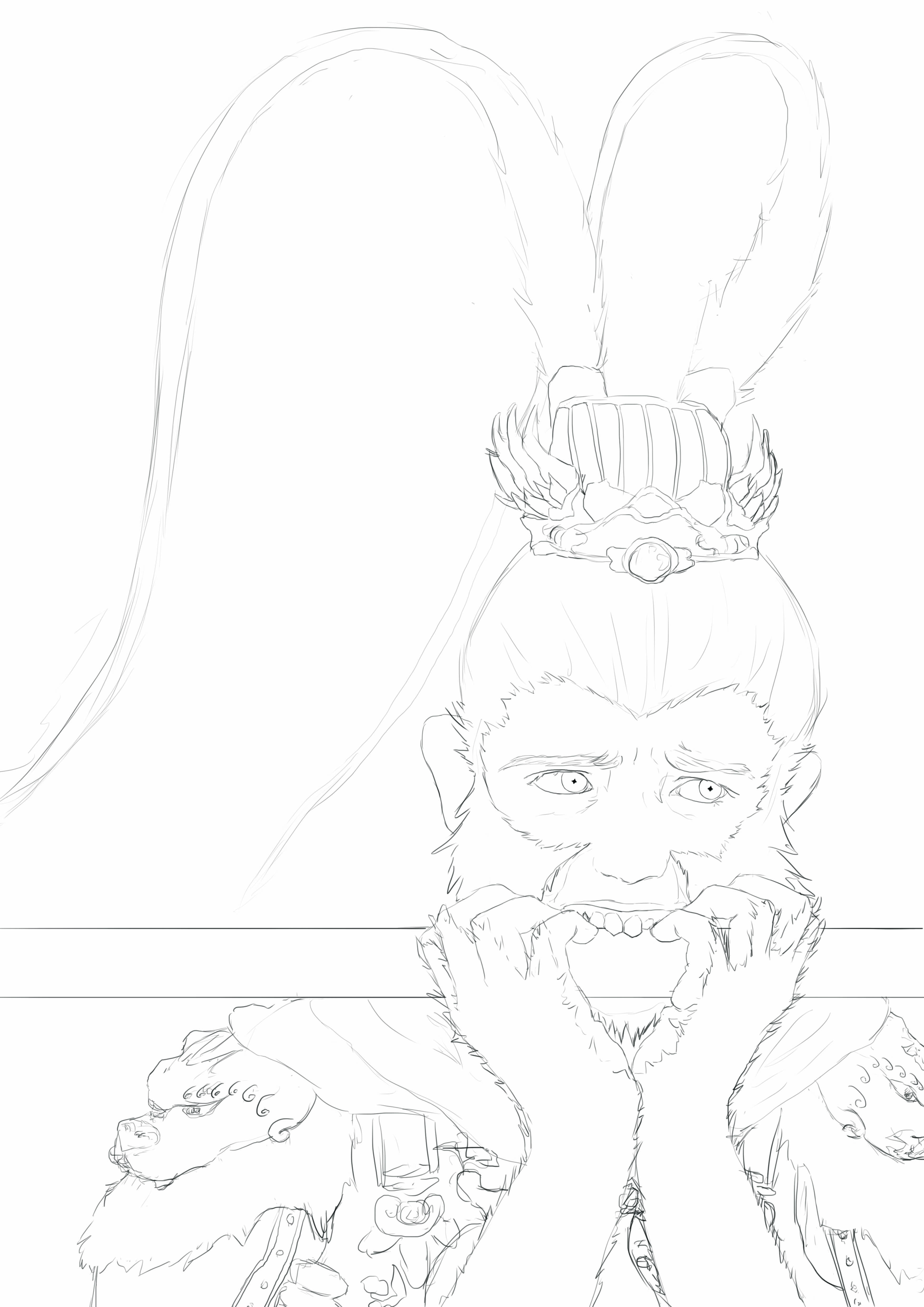
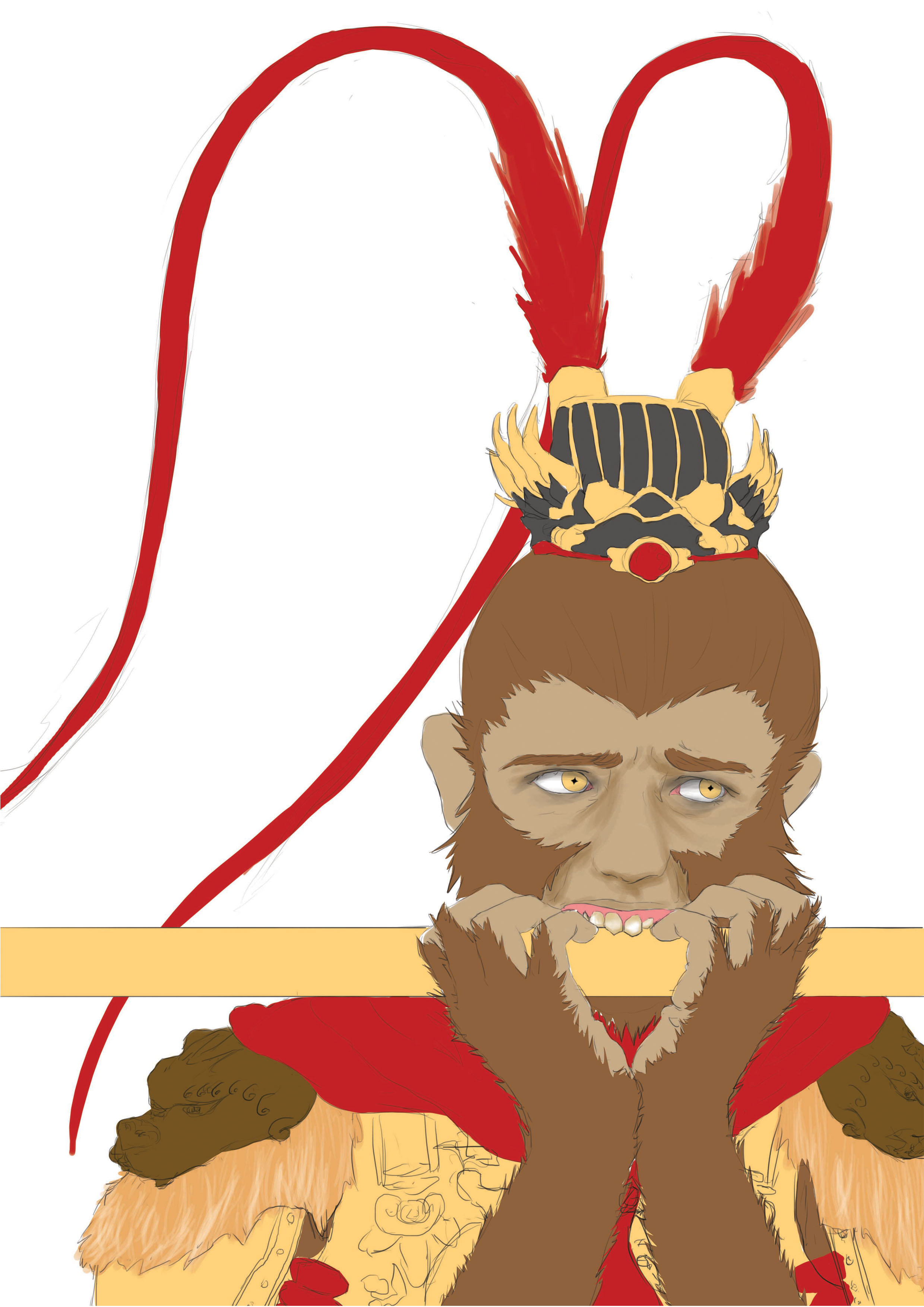
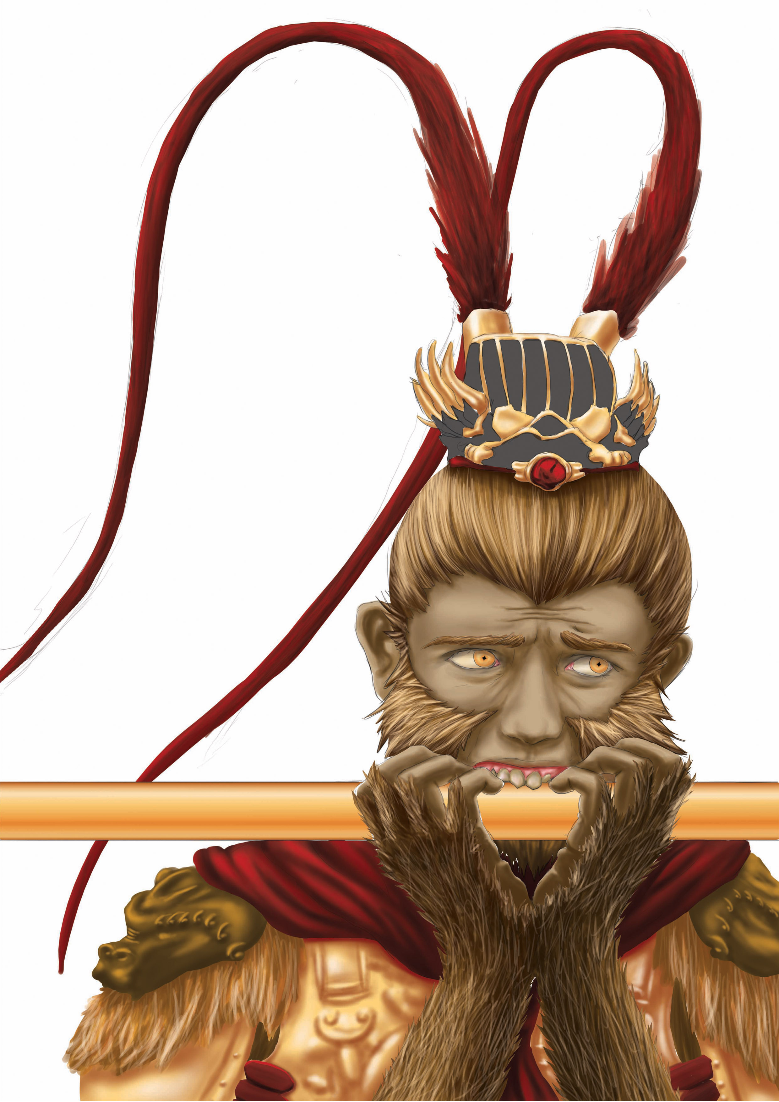
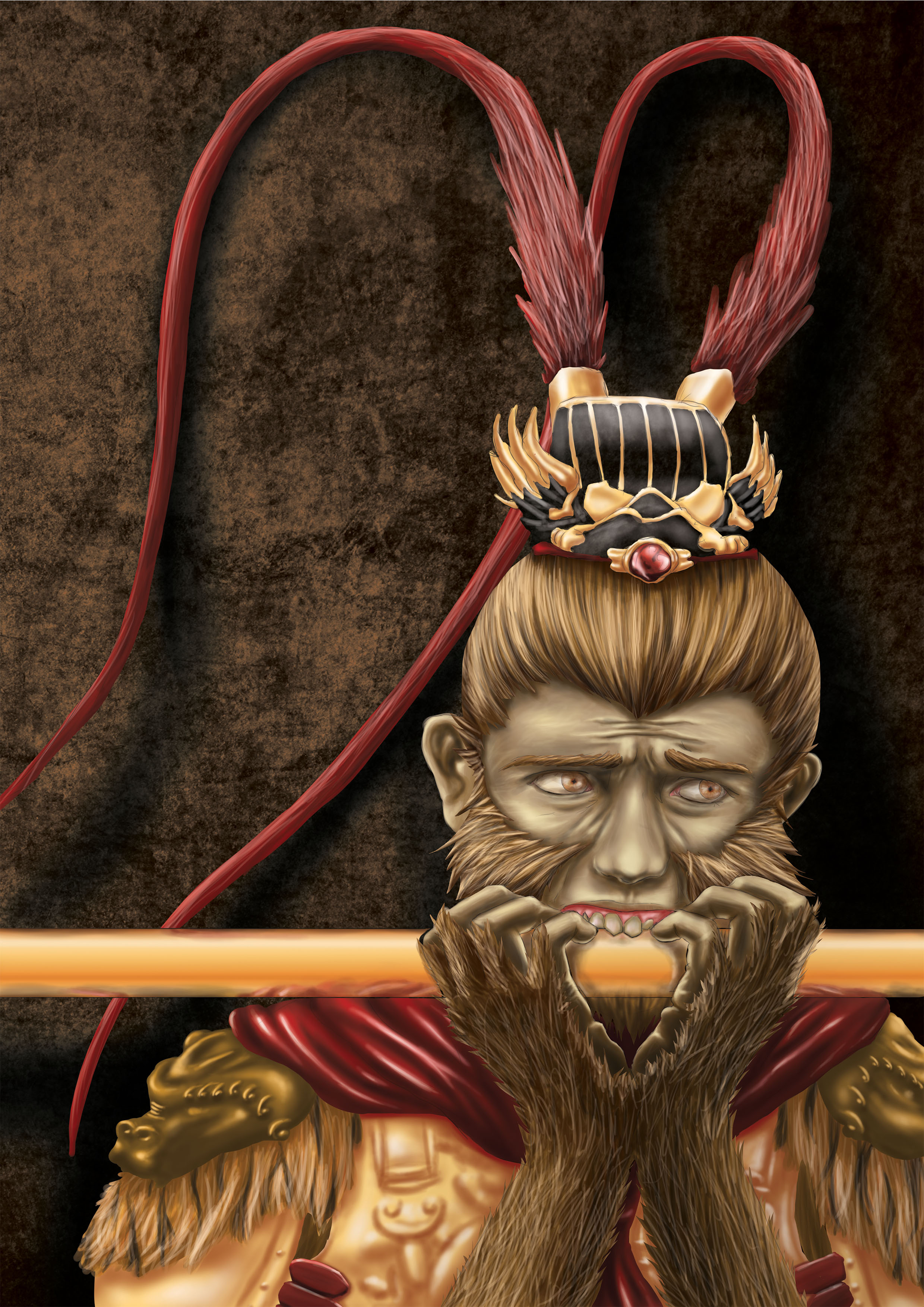
Buddha in the point of view of Monkey God is:
Afraid

The only realistic work, Monkey God is always portrayed as magnificent, cool, powerful, agile, confident, playful etc.etc.
I’ll take away all of that. leaving the monkey god a set of fancy outfit and his Golden Rod, as there is totally no reference for this picture, this is really hard to draw and I spent lots of time to finish this piece, drawing the hair strand by strand, highlight and shadow, highlight and shadow.
The colour scheme is chosen to be analogous and on the warmest side because there should not be a cool element in here. The monkey god is placed around bottom 1/4 of the picture, heavily cropped body and the active space removed (the main subject moving/looking into the picture instead of out of it, but in this case the monkey god is looking out of the picture hence no active space) to make him feel small and losing all the confident
For the final, I printed 2 of the same piece on different paper(gold sticker and white paper), cut out the golden part from the gold sticker to give all the gold a reflective surface to enhance the overall texture!

The final work.
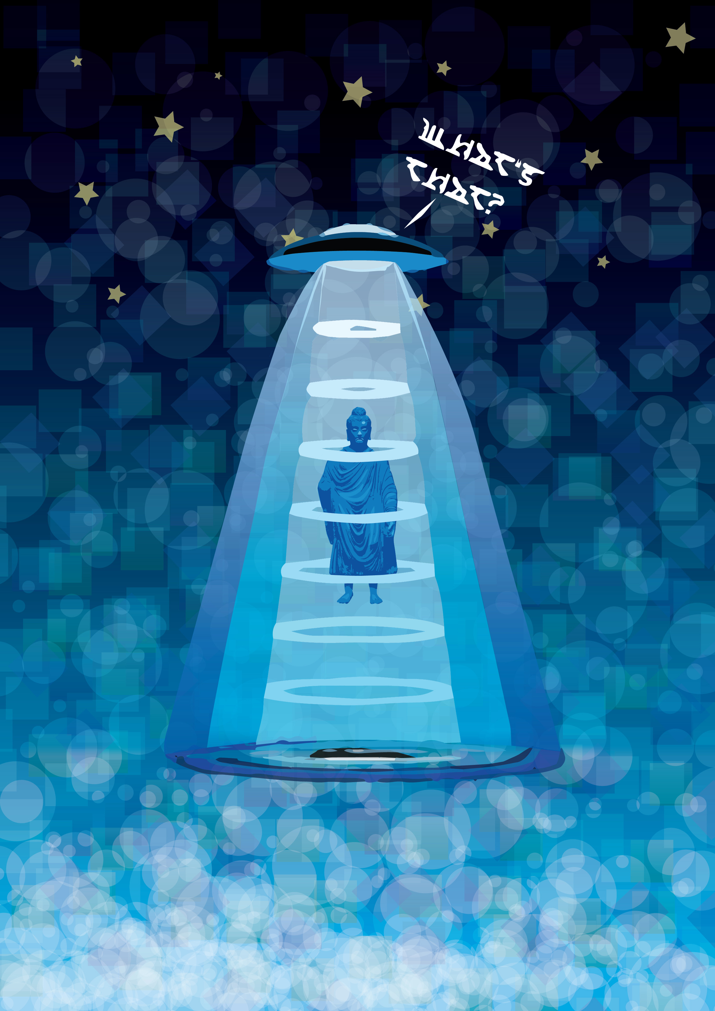
Buddha in the point of view of Alien is:
“Whats that?”

A Vector art of Buddha in the POV of Alien, If Buddha is omnipresent, Buddha will be in space, however the problem is that Buddha is only part of human culture and so alien wont know who or what a Buddha is even he is floating around in the galaxy. SO! due to culture difference of alien, they will catch Buddha and do experiment on him and probably probing him too. the background is set to be space themed, using transparent squares and circles shape of various blue and greens plus white to give the feeling of childishness, playfulness and activeness. The stars in the background is to give the whole composition a set of points to fix everything in their place, it serves a purpose like a pin, imagine the picture without the stars, it would look relatively plain and the background would no longer look like background.
lastly, it is a triangular composition with the Buddha in the middle, the base is filled with white”bubbles” to counter the white of UFO and the beam coming down, giving the whole composition a sense of stability even if the UFO is flying and nothing really touches the ground.
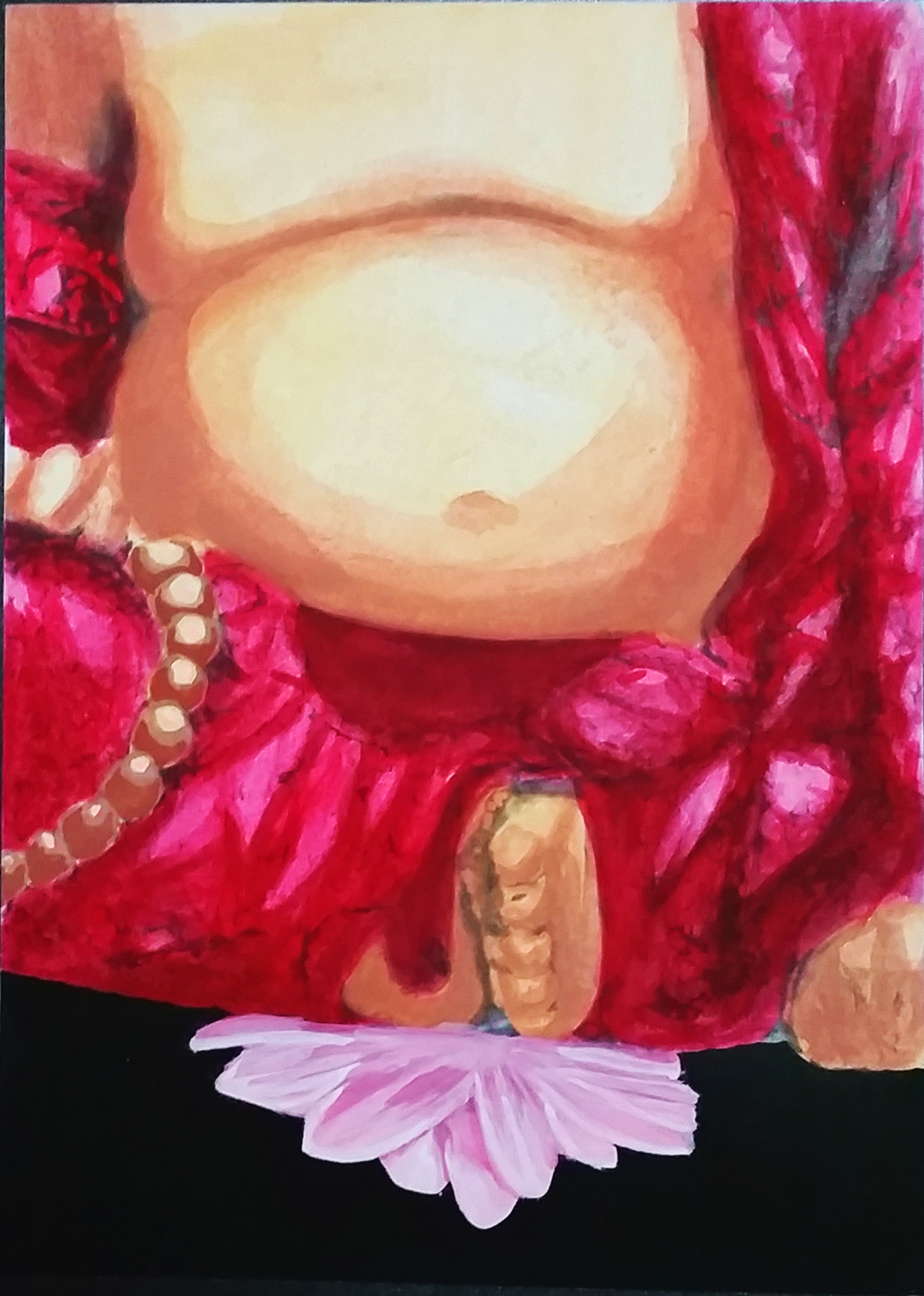
Buddha in the point of view of a Lotus is:
Heavy

The only hand painted piece to break all common theme until now – Digital art. Drawn in water color and the main subject of this is the heavily cropped laughing Buddha but in this work, the main subject is not the main focus, the viewers first look will be the Buddha due to the size, but very soon the attention will be drawn to the lotus flower instead due to 2 reasons
1- the contrast between the blackest black and the almost whitest white in the whole composition, sitting right next to each other.
2- Theoretically there will be shadow cast by the Laughing Buddha, there is no shadow on the lotus, suggesting that it is not normal, anything that break the ordinary will draw attention.
in the visual weight, red is heavier than pink and it is overwhelmingly heavier by the amount of red above the pink, the laughing buddha is also cropped to suggest that “there are more weight thats outside of the picture” also, the flower is “weigh” by the red from the top and surrounded by black which is the heaviest visual colour, making it compressed and have”no where to be pushed into”, making the lotus flower fully oppressed.


