2D Sem 2 Project 1 – TYPO – Final 4


I am a Vandaliser2016-02-15 19e3

The most Straightforward piece among my 4 final, self explanatory, Yellow is used because it is the loudest and brightest colour, i want it to have the BANG effect, the red splutter in the middle bring out the yellow even more.

I am a 3D Artist
2016-02-14 23e4

I really like the effect of this piece, if I separate them into pieces, it would not look anywhere nice, but if I stack them together, the 3D effect is really striking. especially the drop shadow between each layers add to the effect!

I am Trypophobic
2016-02-15 19e2

Really very disturbing for me, but the more I look at it, the more OK I become. Because I look at it so much when making it, I kind of force myself to fight my slight phobia and overcome it just a bit.

I am an Electrician2016-02-15 19e12016-02-15e2

Looking at the real thing, the background is gold, therefore the yellow LED fade with the background, making the red appear slightly more red than it is. I think the knob is a very cool effect as anything that allows interactions would better having none.

2D Sem 2 Project 1 – TYPO – Process/execution/Experimentation

I Am The President
NAMECARD

I REALLLLYYYY like this one, but I think I am not going to use this as one of my final as the typo of this work isnt really showint that i am the president, whats doing the work is the overall image which is a ripoff of $10 Singapore note, which made this really funny!

I Am a Ninjaninja

My initial idea was to use it as black on black, because the small letter ‘e’ and the capital letter ‘N’ forms a human shape, and the shape of ‘e’remind me of a ninja which fits into my black on black idea, after some exploration in the font and such, this is the result of experimentation, the background image is one of the best i could find, however the resolution kind of destroy it, maybe gonna find some other background for it or discard this totally.

I Am a VandaliserVandaliser

Another potential piece as a final, graffiti is the first thing that came to my mind when talking about typography, because i used to like the style of graffiti painting, the “illegal” part of it makes it VERY EXCITING!! *i had not done it btw* another reason i liked graffiti is the vibrancy in most of the street graffiti, it is loud, expressive and sometime aggressive, which i think its great as a form of expression as well as a great art.

I Am a 3D Artist2016-01-14 22.34.03

Wind is my English name! I used it when I was backpacking as the Ang Mor cant really pronounce Zi Feng, so the Feng = Wind.

At first i draw the type by hand, afterward I gave up and use masking instead, its more accurate this way!  carefully measure up the centralization and traced it using acrylic paint, why blue? because its the wind. wind feels bluish for me if i have to give it a colour.
2016-01-15 14.04.09Why dandelion? because Wind cant really be seen and something need to be used to show it, something classy and elegant like dandelion is used to give the feeling of a cool breeze (not tornado or hurricane!)

Spent alot of time just to do this, total of 10 layers of acrylic, painted each layer by layer, one of the easier part is the alignment of every layer and paint (easy as in skill, totally not easy as in time wise.), the harder part is to get the dust off between every layer..( difficult in skill & time wise, 2 surface each piece, after I cleaned the bottom of the top layer, I have to re-clean the top of the bottom layer again, removing all fingerprint and dust isnt easy, imagine sticking 20 piece of screen protector on your phone without any dust in between, its crazy!!)


I Am There2016-01-18 22.18.40

Started on the idea of White on White, tiny little font in the middle of huge blank background (not really, its just a A5, so tiny font will do) carefully cut out 1mm styrene sheet of my name.. e n g is extra difficult to cut due to the curve and the inside angle. lots of trimming must be done.

As I need the shadow to drop at certain angle, I need to carefully place the typo so it do not sit in the dead center of the A5, I have to take in the consideration of where the shadow will fall and my centralized position of the typo will be “popout text + shadow” it seems like a minute difference, but it is these minute difference differentiate a perfect piece from a regular ones. So in conclusion, the position of the typo will be slightly to the top left of the “supposed center” to counter the distance of the drop shadow created.
2016-01-22 09.37.59 sticking cutted out styrene name on A5 styrene sheet by using the thin cement which is used to build plastic model, it simply melts the styrene and fused together when it dries.2016-01-22 09.38.27 2016-01-22 10.03.12 Airbrushing white on white on white just to remove any difference in texture, imperfection during cutting and make sure it look like its popping out from the paper. BUT SOMETIMES ACCIDENT HAPPENS!!!2016-01-22 10.23.37After the accident happens, i have to sand the thing down and rework it.
2016-01-22 10.07.00resume airbrushing after sanding.

I Am Old

oldthis is an illustrator file which i am going to transfer it by lino printing 
Print
and this is what i am going to carve on the lino. still thinking about the way to transfer the print accurately. hmmm i’ll see what i can do..

I Am an Electrician

Electrician always start to learn circuit using the most basic exercise, to learn how to light up LED lights. seems easy but theres some calculation to be done so as not to burn your LEDs, which i burnt a few due to my inexperience.

2016-01-13 09.25.04
2016-01-15 10.46.32

I tried to form the word FENG on the bread board but its not sufficient to do so so i guess i need more LEDs (round instead of rectangular) a bigger board, which after some research online, there is no breadboard(the white plate which i stick my LEDS onto it) thats so big, i need to buy  circuit board and solder one by one. THIS WILL BE HARD! i’ll see what i can do.

I Am a Gardener

2016-01-23 21.54.51The most time consuming process, the carving out of the leaves.

2016-01-23 22.08.31 this is how it looks right after cutting out2016-01-23 22.20.07 and this is how it looks after the “rolling” of the leaves2016-01-23 22.23.06and against a lighter shade of green as backing, i kind of liked this and looking at the “g” it gave me another idea of I Am.. which is…..

I Am a Trypophobic

2D Sem 2 Project 1 – TYPO – Process/execution/Experimentation Part 2

I Am an Electrician Part 2

2016-01-26 20.05.16

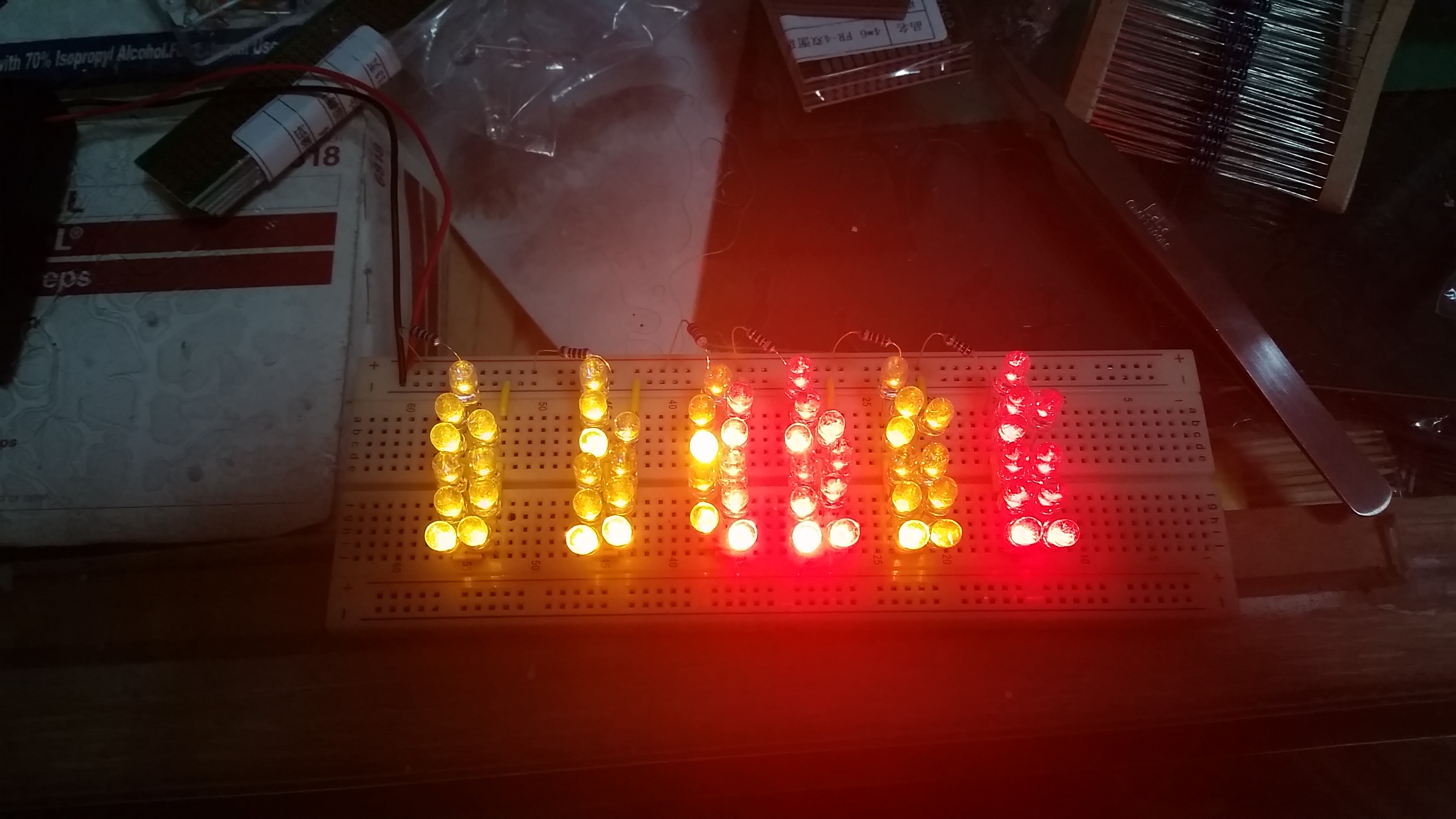
I bought my LEDs, i need to calculate the power required to light up 10 LED in a series and parallel them in a series of 10s, according to calculation, it wont work as there is not enough power from 4 AA batteries to light up 10 LED in series, but in practical, they light up fine and i don’t know why. but atleast it works~~ WOOOOOO~

2016-01-26 20.27.38

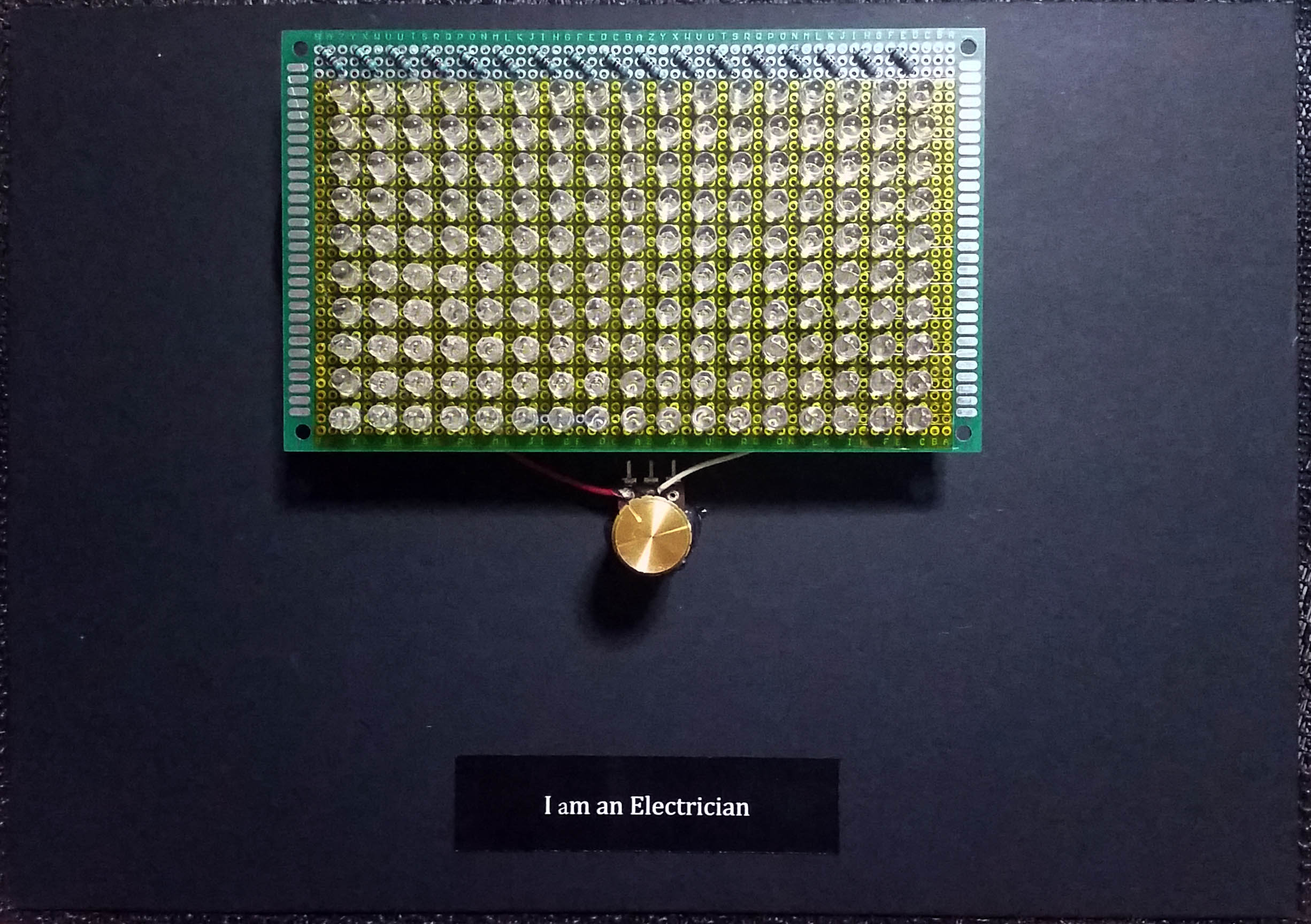
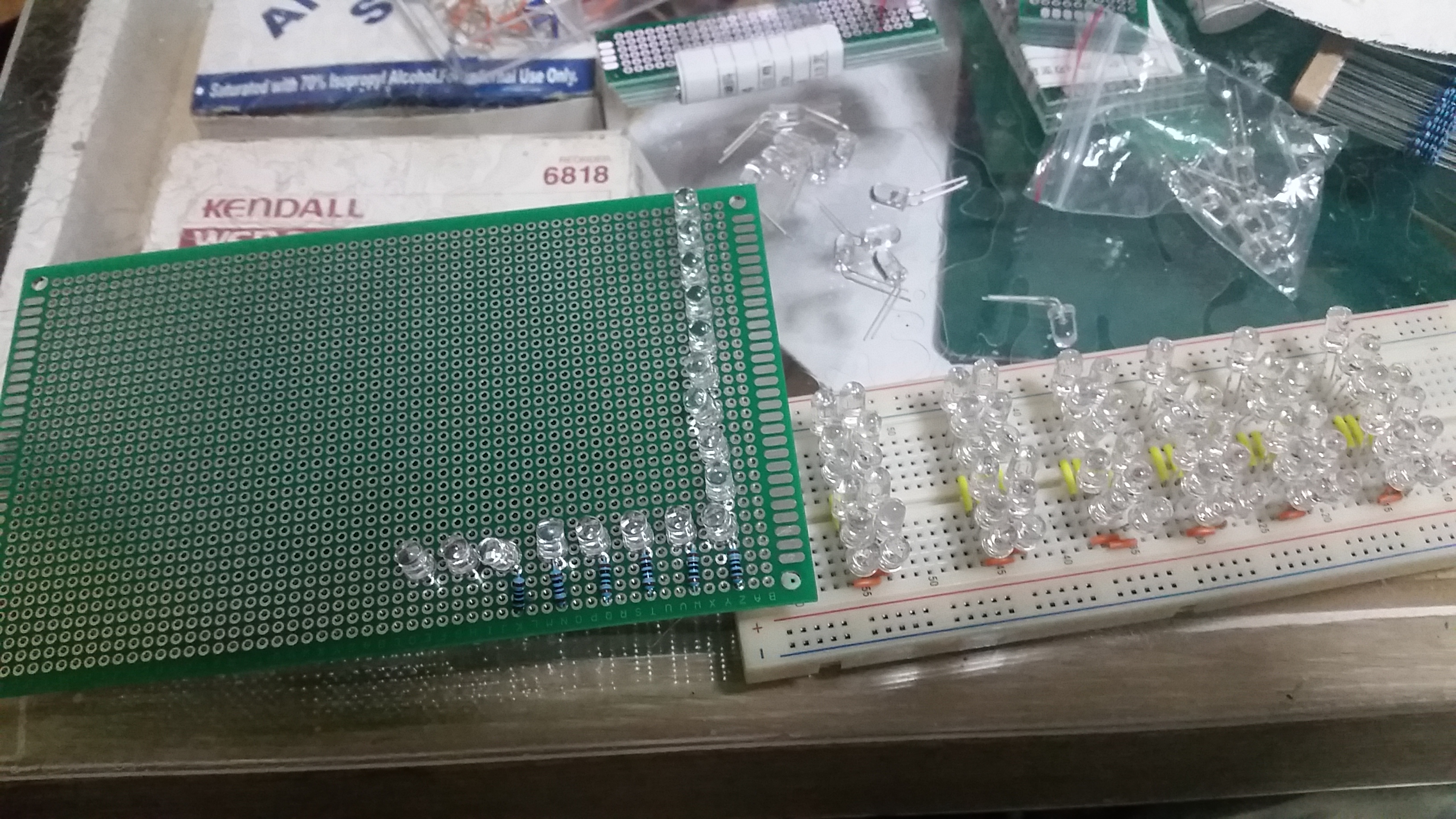
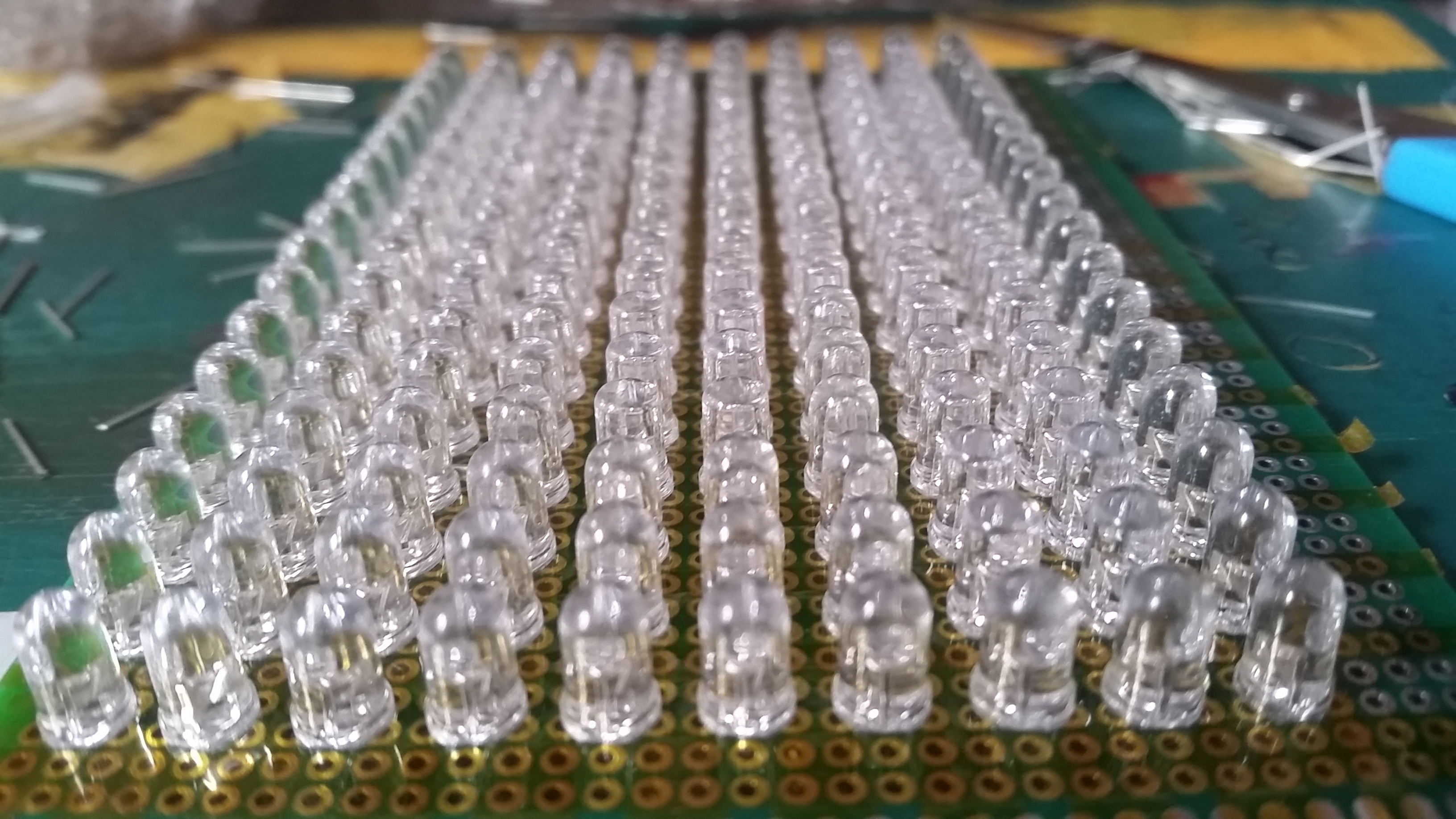
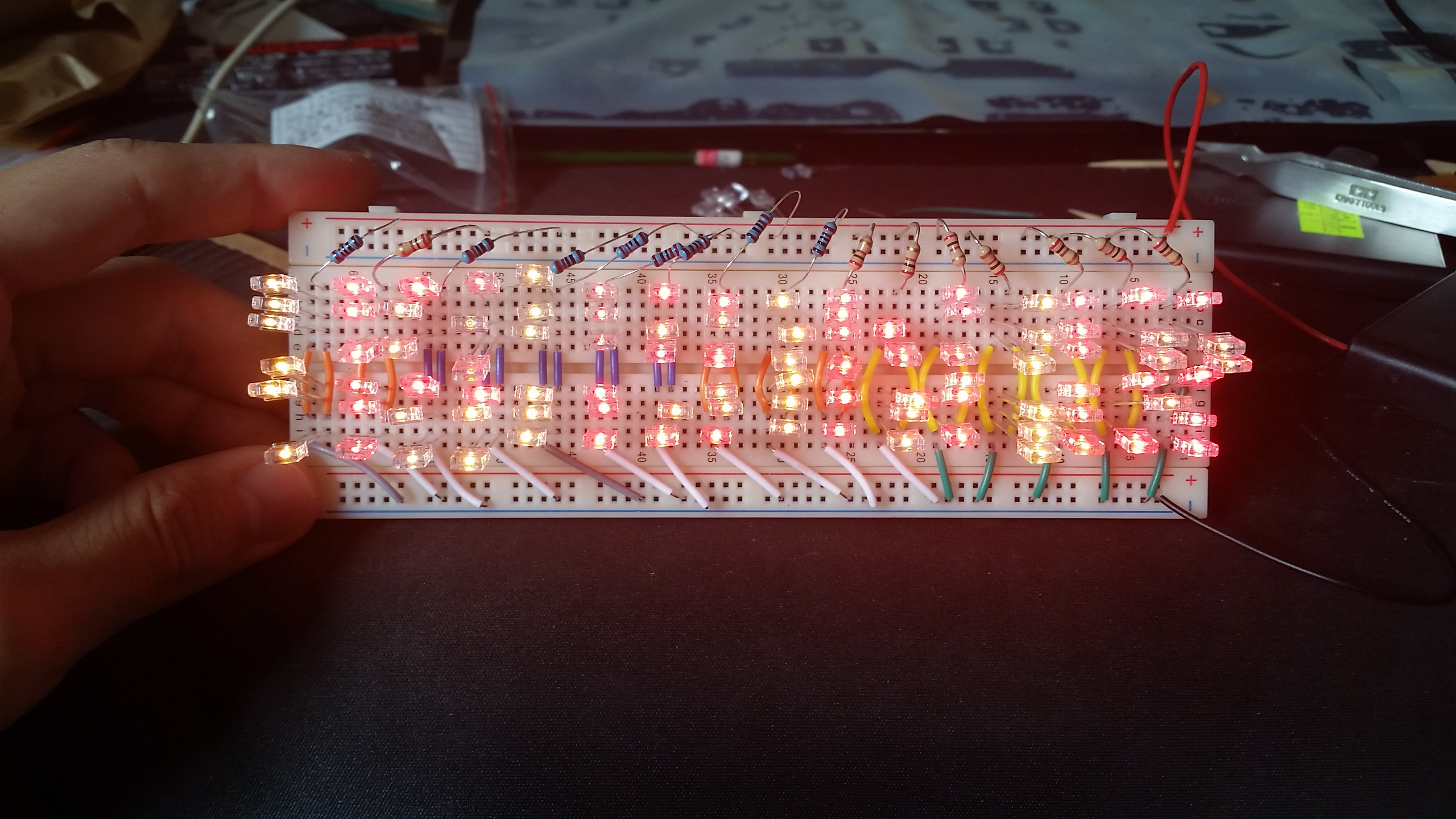
so now i have to count how many LED I need in total, after calculations, theres 17 column and 10 row, so… 170 LEDs!!! OMGGGGG! each LED has 2 leg and i need to solder 340 times!! + the 17 resistor with 2 side, that makes 374 solders! and 374 is excluding the holes i need to solder to joint everything……… TIME CONSUMING!!! but i’ll do it.

2016-02-10 23.51.03

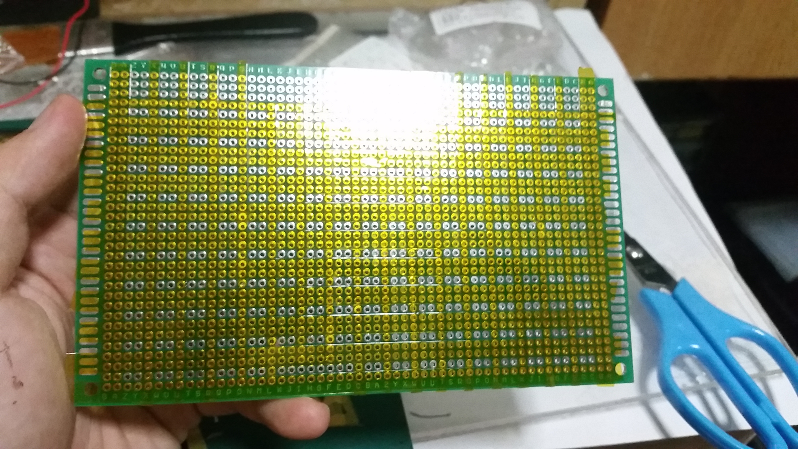
After calculating the amount of LED i need, now i need to mark out every position of the LED so as to not make mistake when i solder.(the gold ones are covered with heat resistance tape

2016-02-11 09.44.46

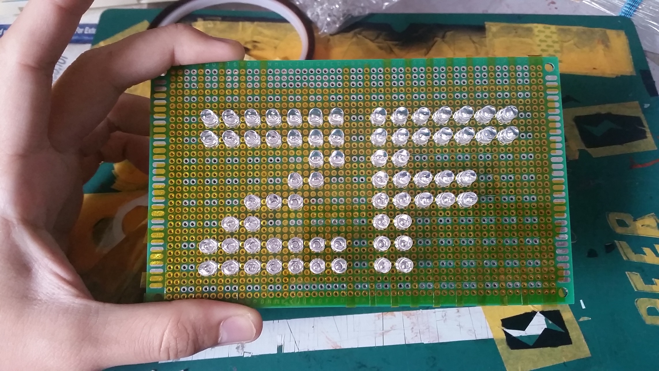
Plot my Red LED first, so i dont mix them up after i start to solder, this took alot of time even i havent start soldering as i need to cut the leg of the LEDs and bent them so they sit there without falling off.
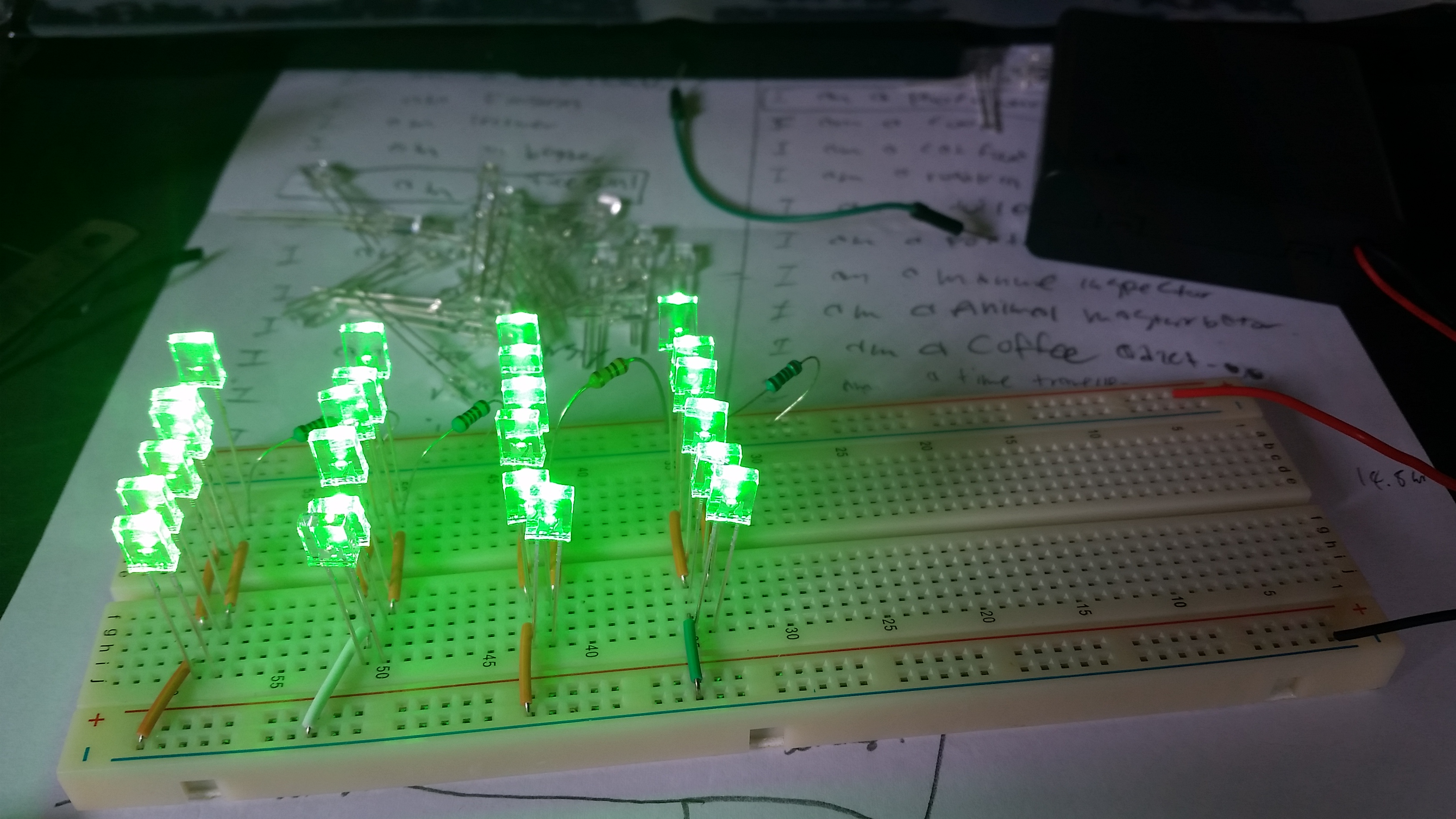
2016-02-11 11.35.44

Now the Yellow LEDs

2016-02-11 12.05.23

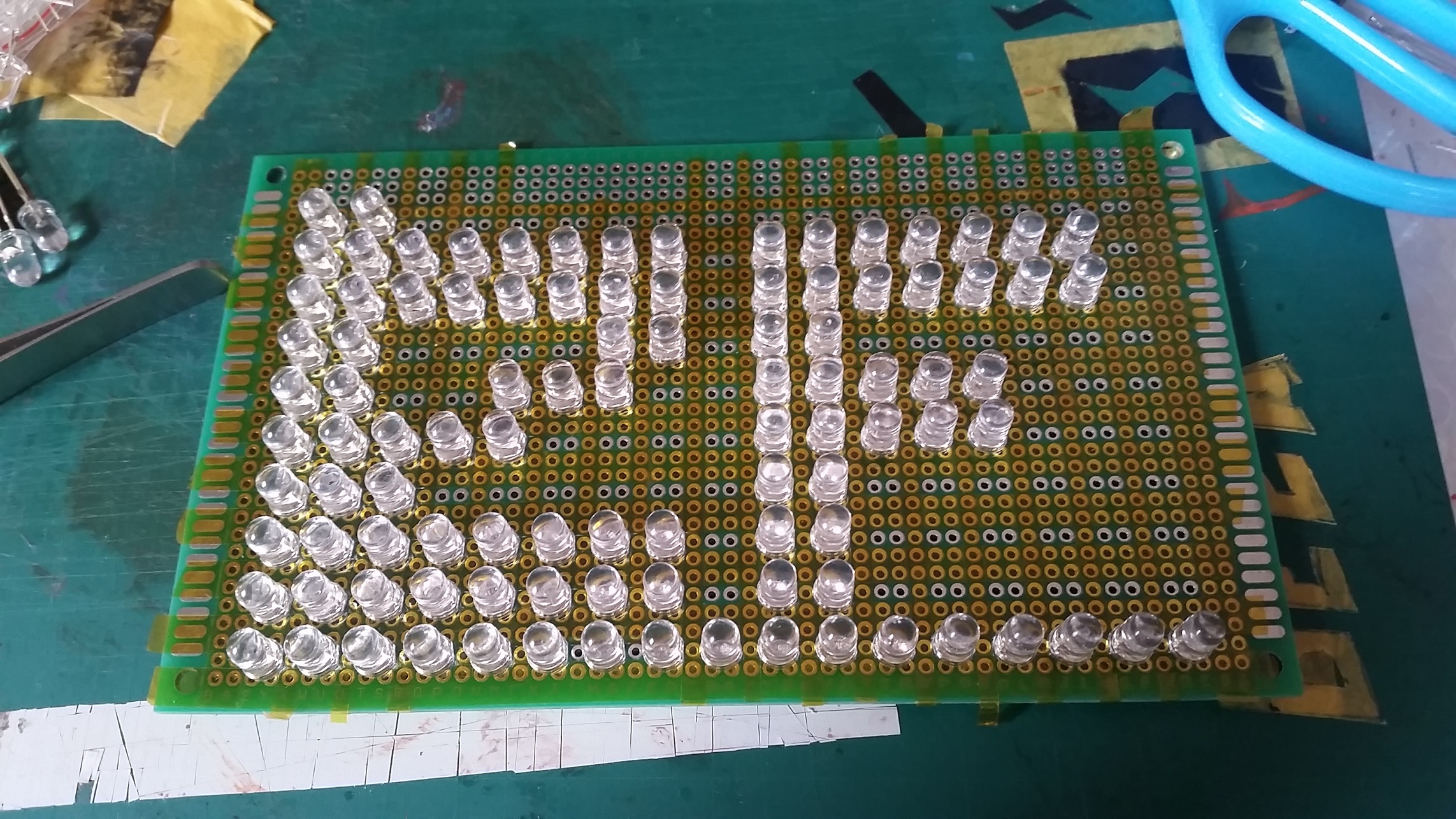
The last LED!!!! I AM DYINGGGGGGGGG

2016-02-11 12.06.27

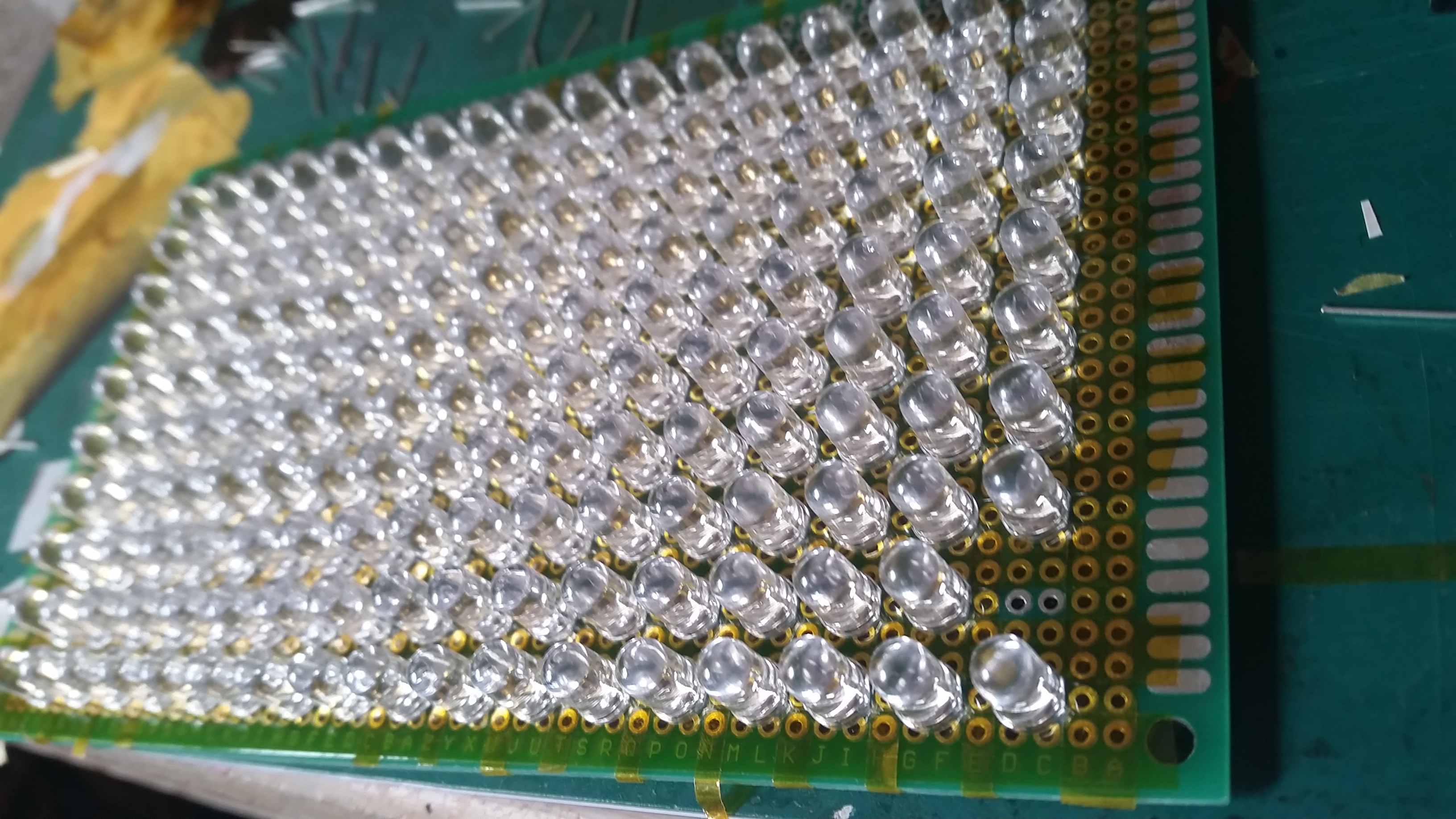
does it remind you of star wars’s storm troopers? nah i dident watch star wars but it remind me of them. neatly organised round white helmets. *insert darthvader theme song*2016-02-11 22.47.47
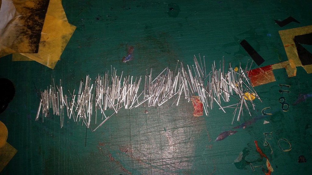
Look at my stormtrooper’s leg, LOTS OF THEM! 340 to be exact, this is the massacre to their legs, and to my legs too, i think some flew all over my room and i wont be surprised to step on a few this few days.

2016-02-12 00.32.50
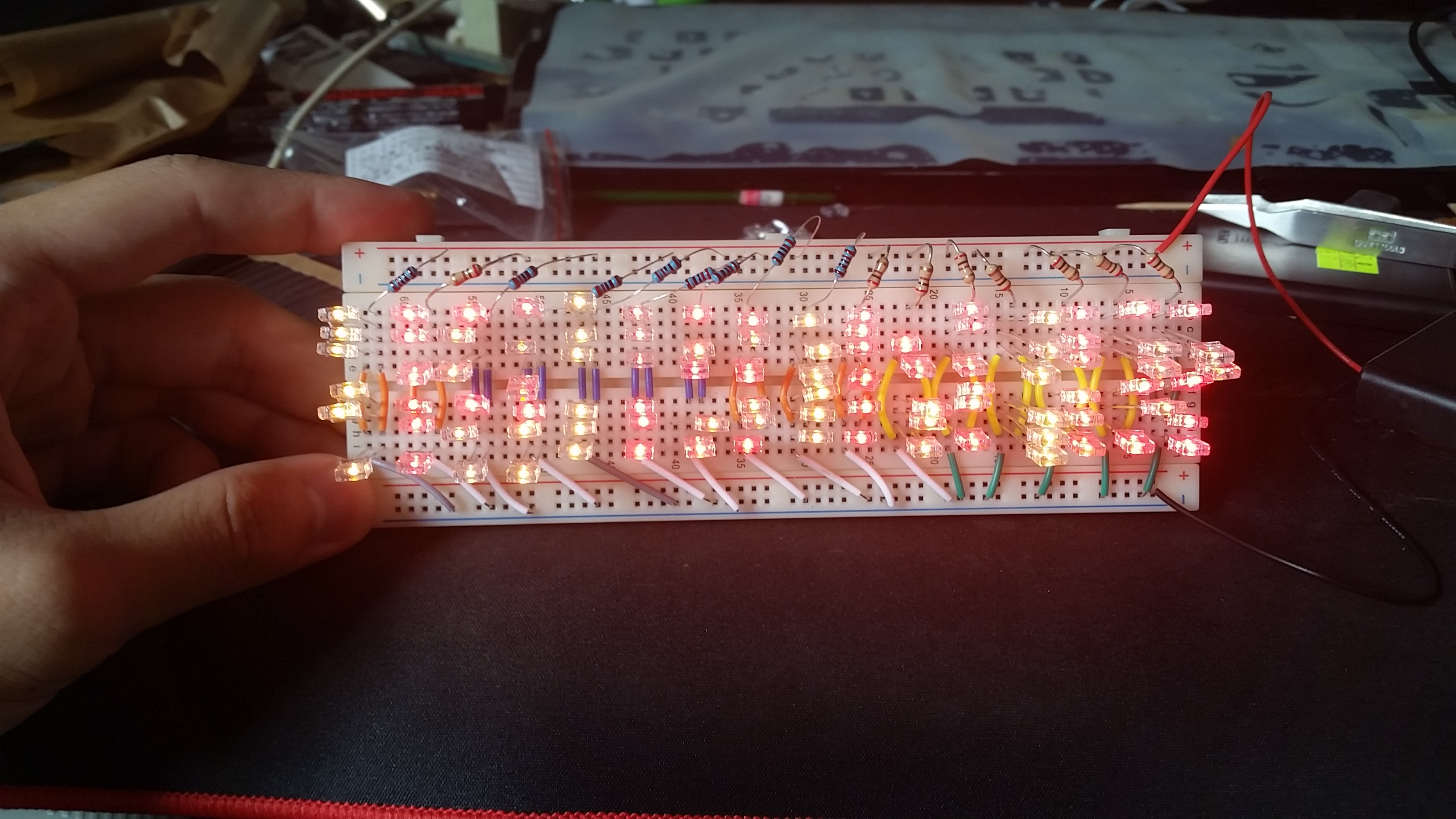
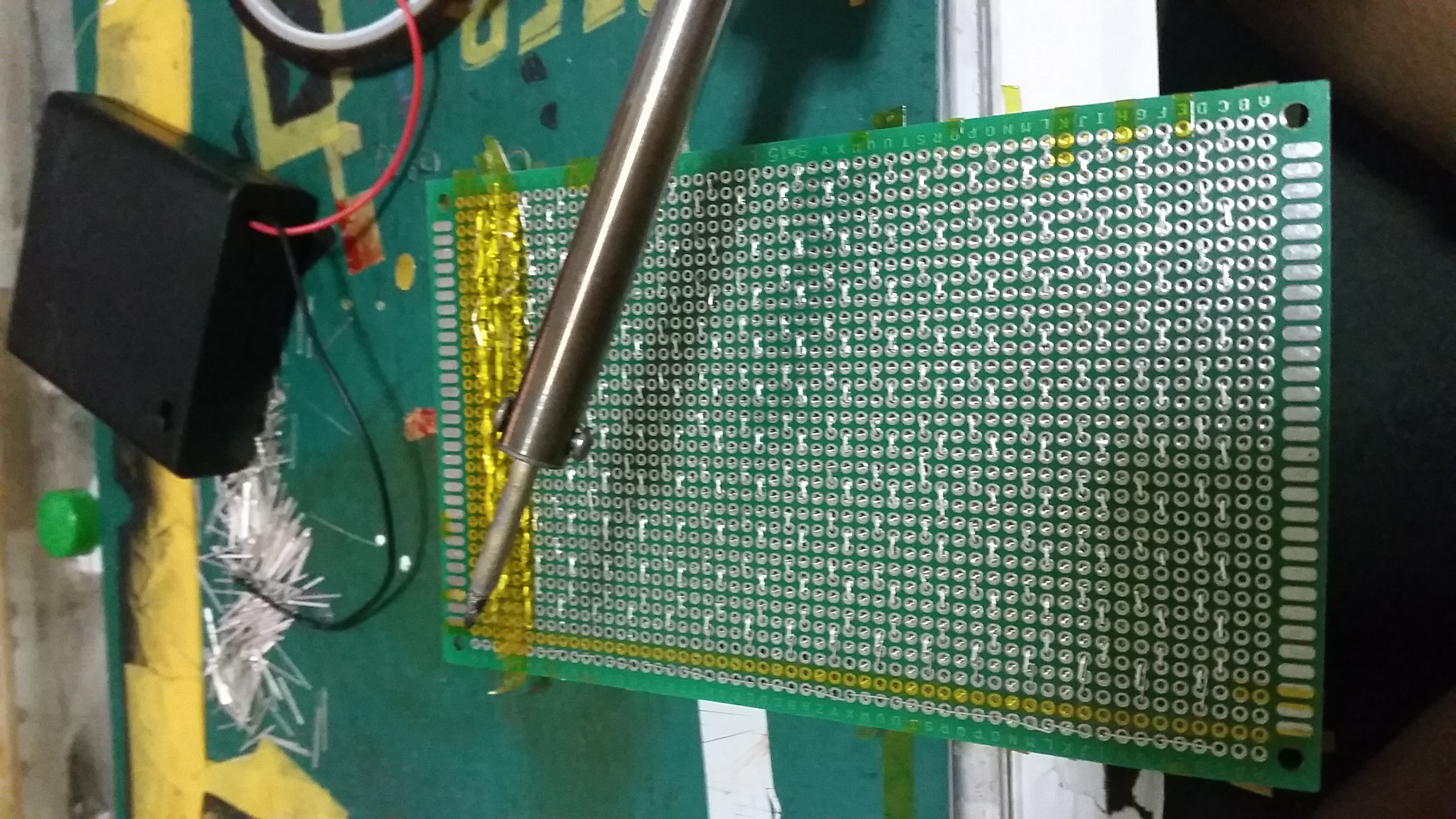
the hard part will be soldering, SUPER TIME CONSUMING! there are 17 rows, but each LED has 2 leg, so i need to solder 34 rows WITHOUT MISTAKE!
2016-02-12 18.13.05

ANNNNNNDDDD I accidentally burnt out whole row of LEDs (10) after soldering so now i need to buy desolderer and learn how to desolder my LED to replace them…. STUPID ME!

2016-02-12 19.50.16
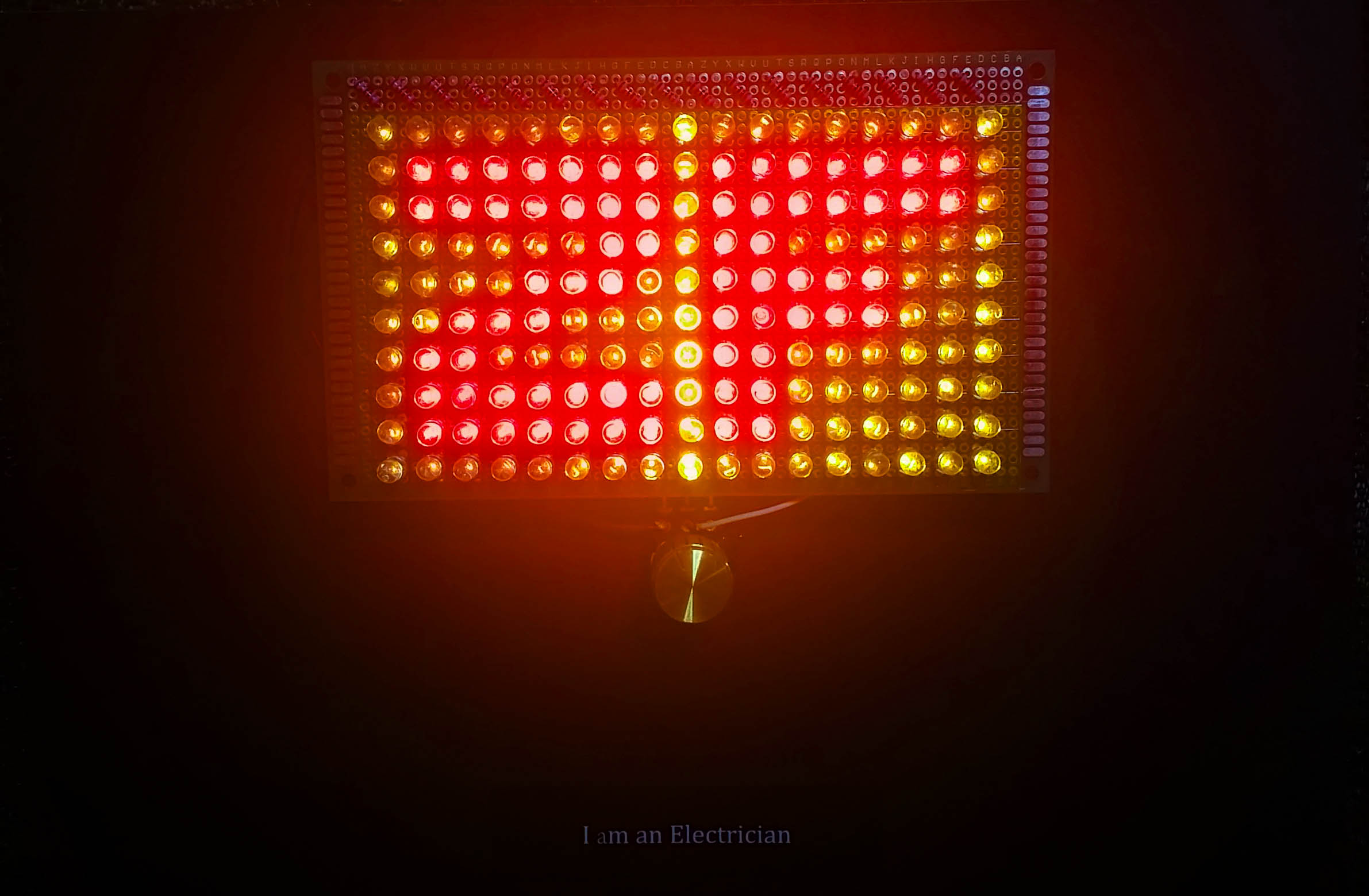
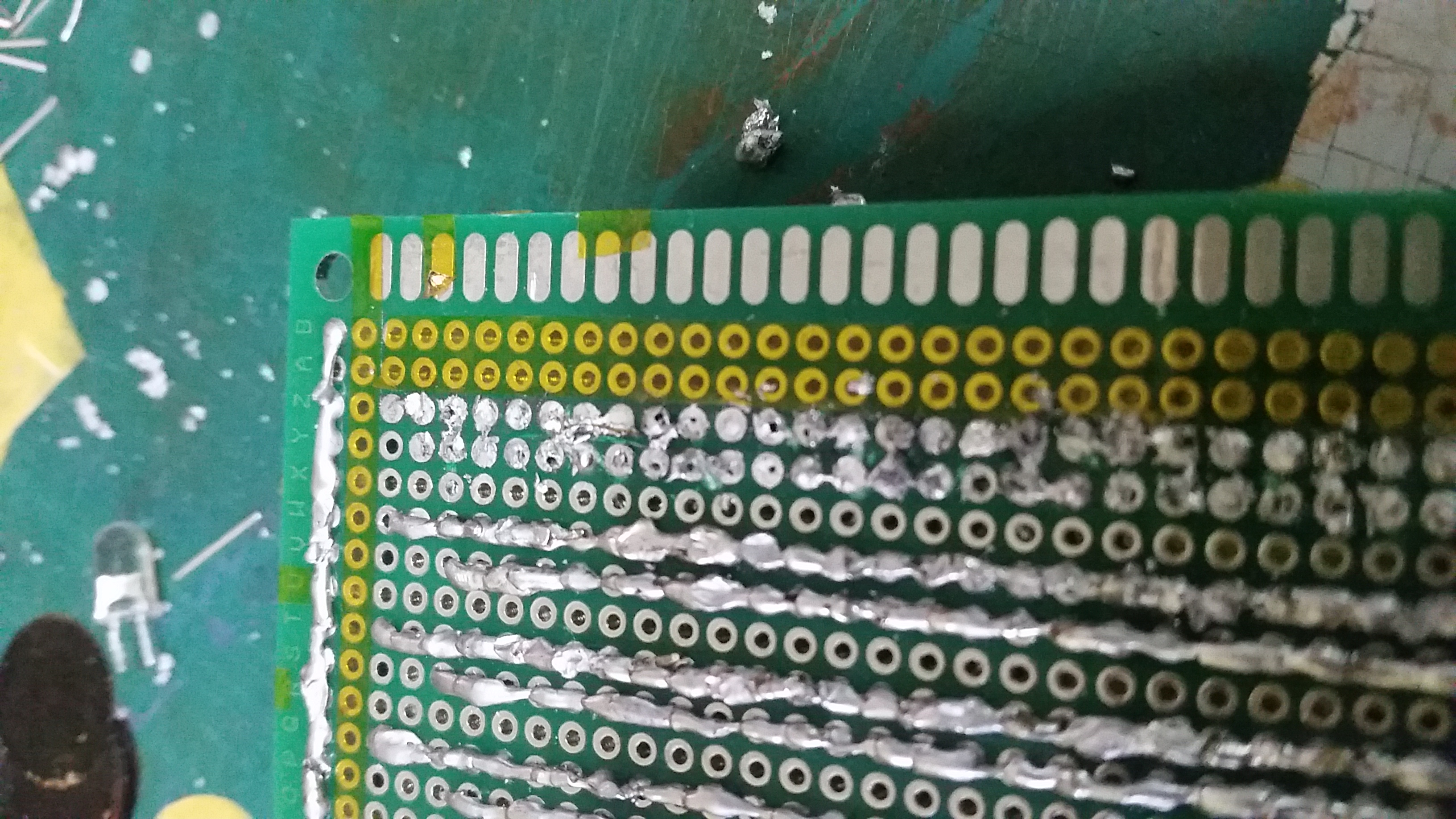
Its hard work and SUPER time consuming but everytime I test it, I got this sense of achievement, LOOK AT MY LIGHTED UP STORM TROOPERSSSS~~

I Am a Sailor

2016-01-16 22.26.49I really liked this, but there is no typographic portrait in this so I cant really use this, the text here doesnt show that I am a sailor. so I came up with the 2nd version.
2016-02-02 09.35.21

This definitely suit the category of typographic portrait but I dont really like it anymore as it lack the “daring” and “thrilling” part for me.

I Am Hallucinating

2016-01-16 20.37.15
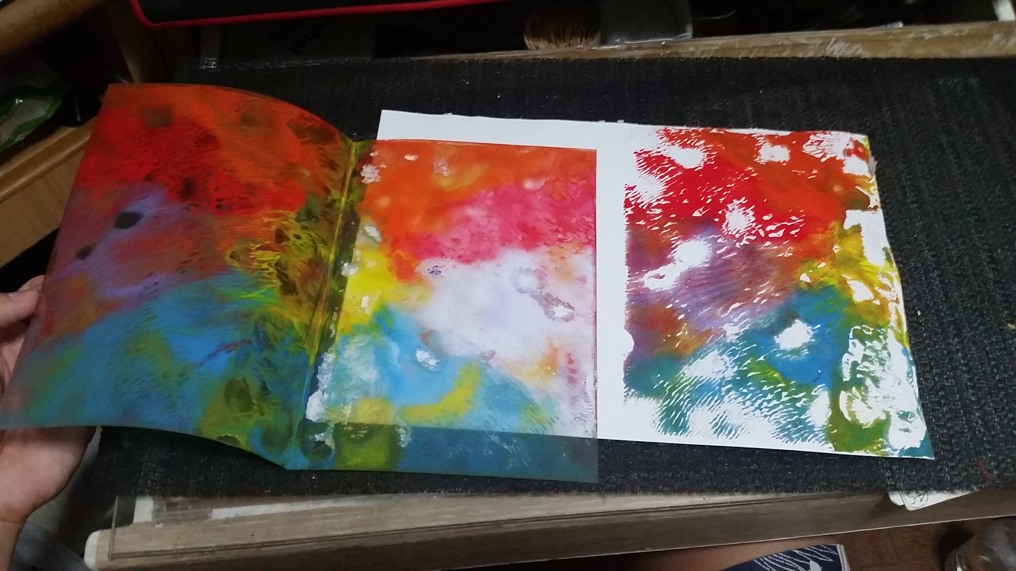
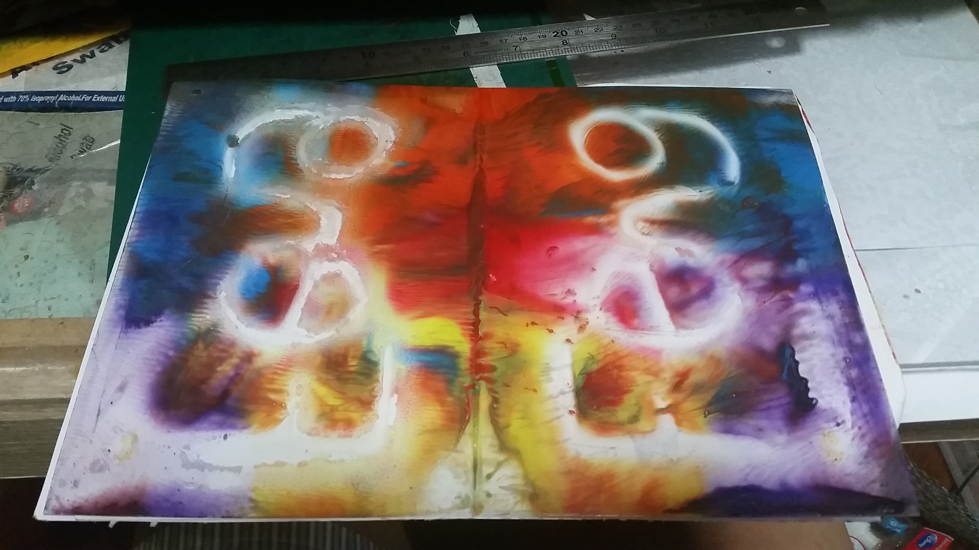
Hallucinating is me in my own world, so I could see vibrant colours which doesnt really make sense and I couldn’t know how will it look like until i finished it. It is a mix of glue and acrylic paint on thick clear plastic sheet. Left is the plastic sheet and right is after I stamped it on paper.

2016-02-14 23.15.35 2016-02-14 23.15.47

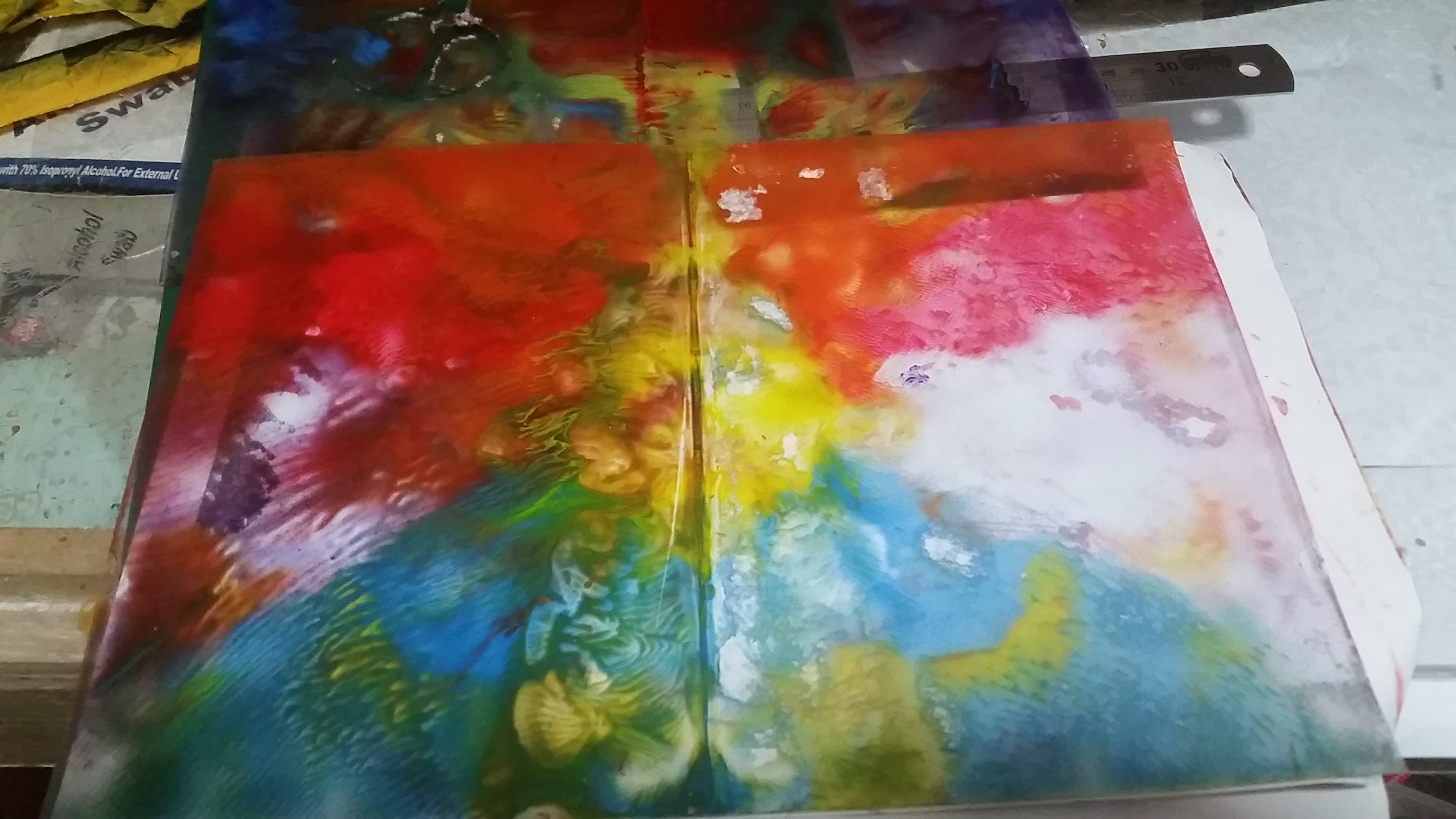
I redo it a few times to see more variation and nope. 2016-02-14 23.16.09

I kind of like the one at right, but nope, its not good enough to be used as my final.
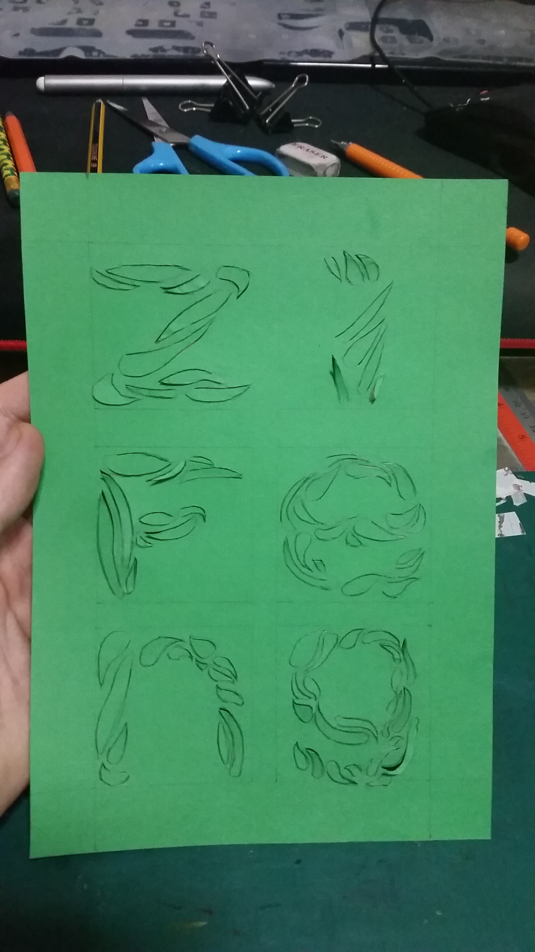
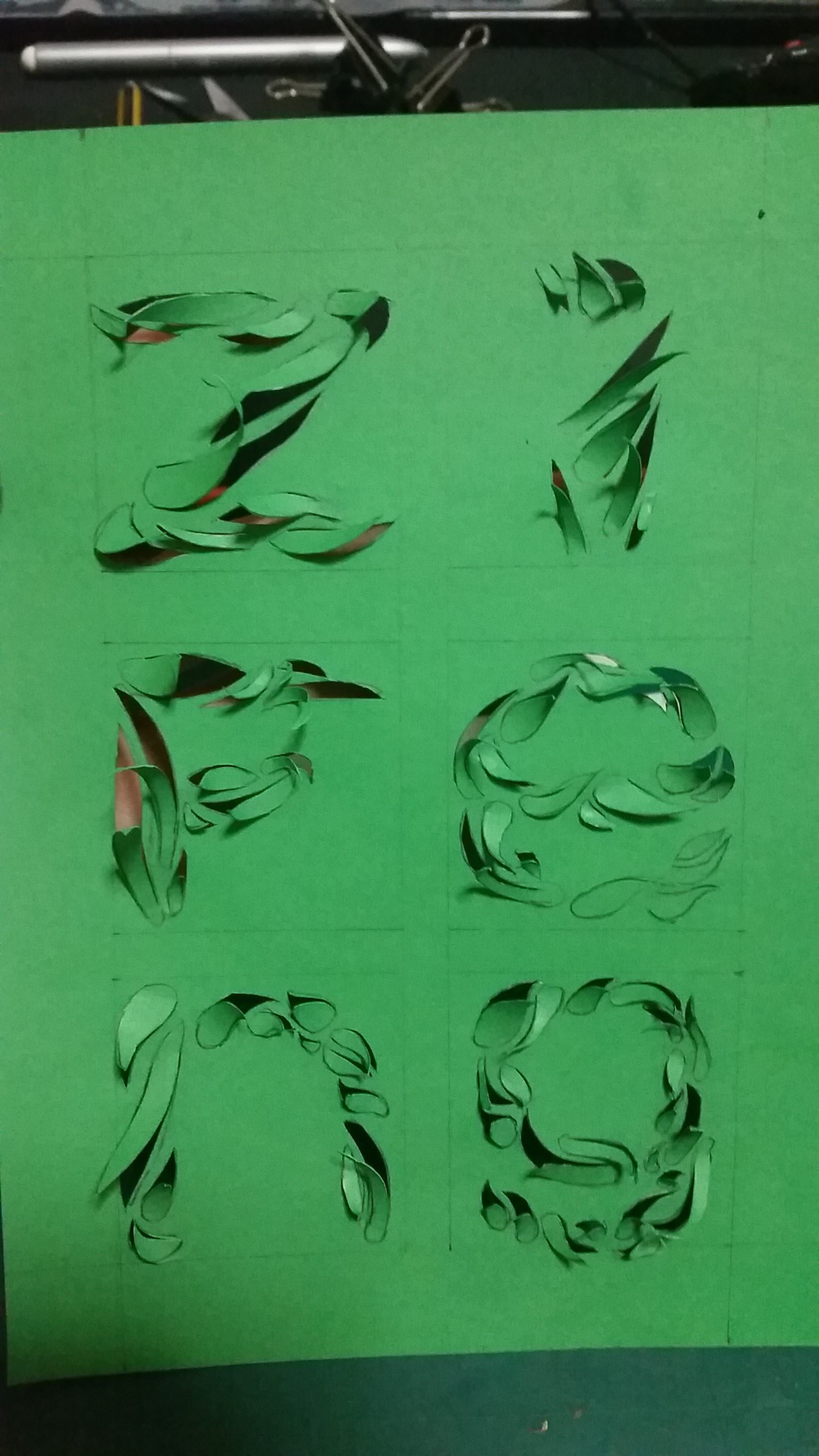
I Am Old Part 2

2016-01-26 13.52.08 
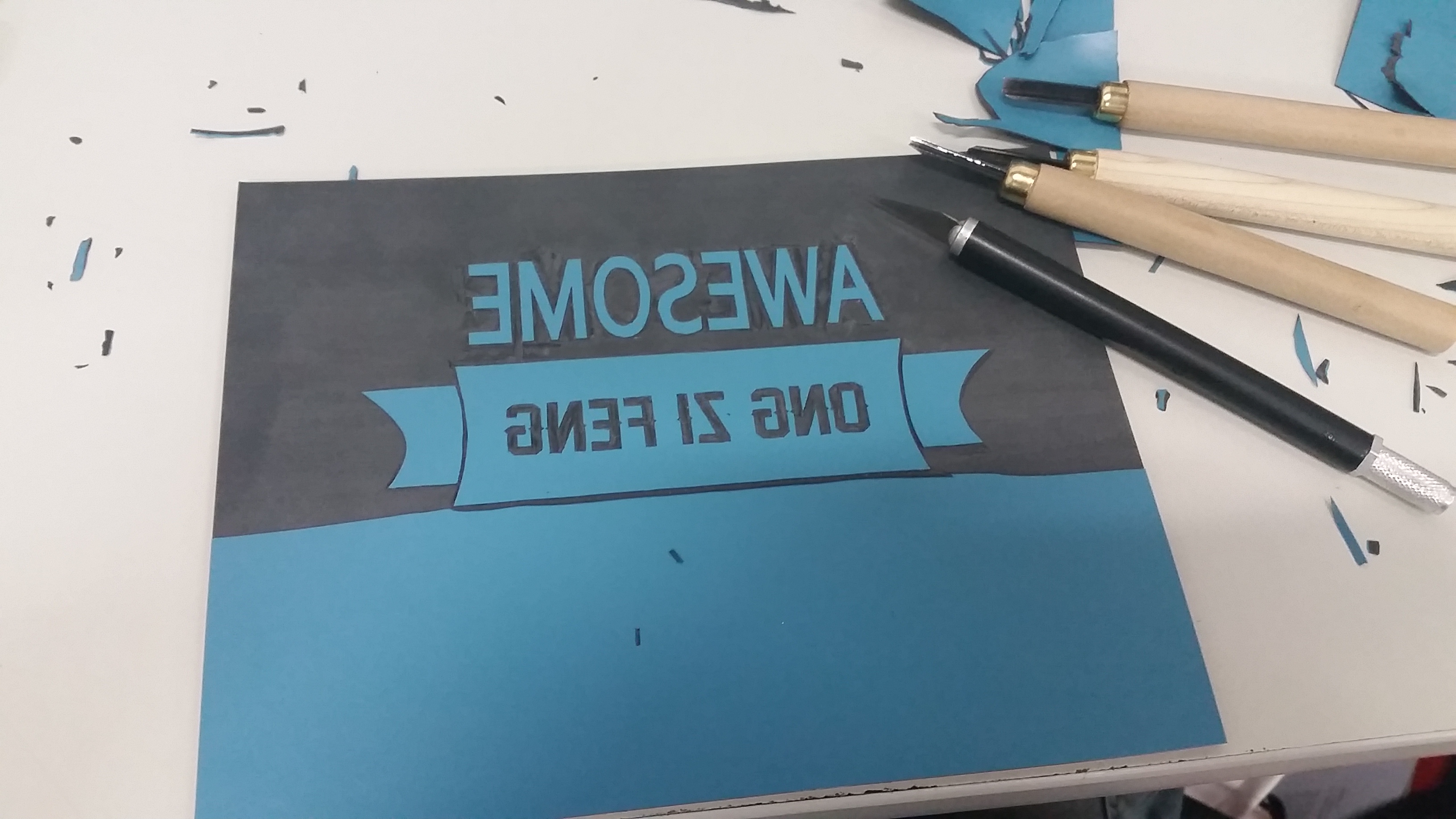
Lino cut! AFTER FEW HOURS OF CUTTING, I LEARNT THAT I COULD PEEL INSTEAD OF CUT. WELLL IT SAVES SO MUCH TIME AND ACHIEVE BETTER FINISH!
2016-01-26 14.49.15
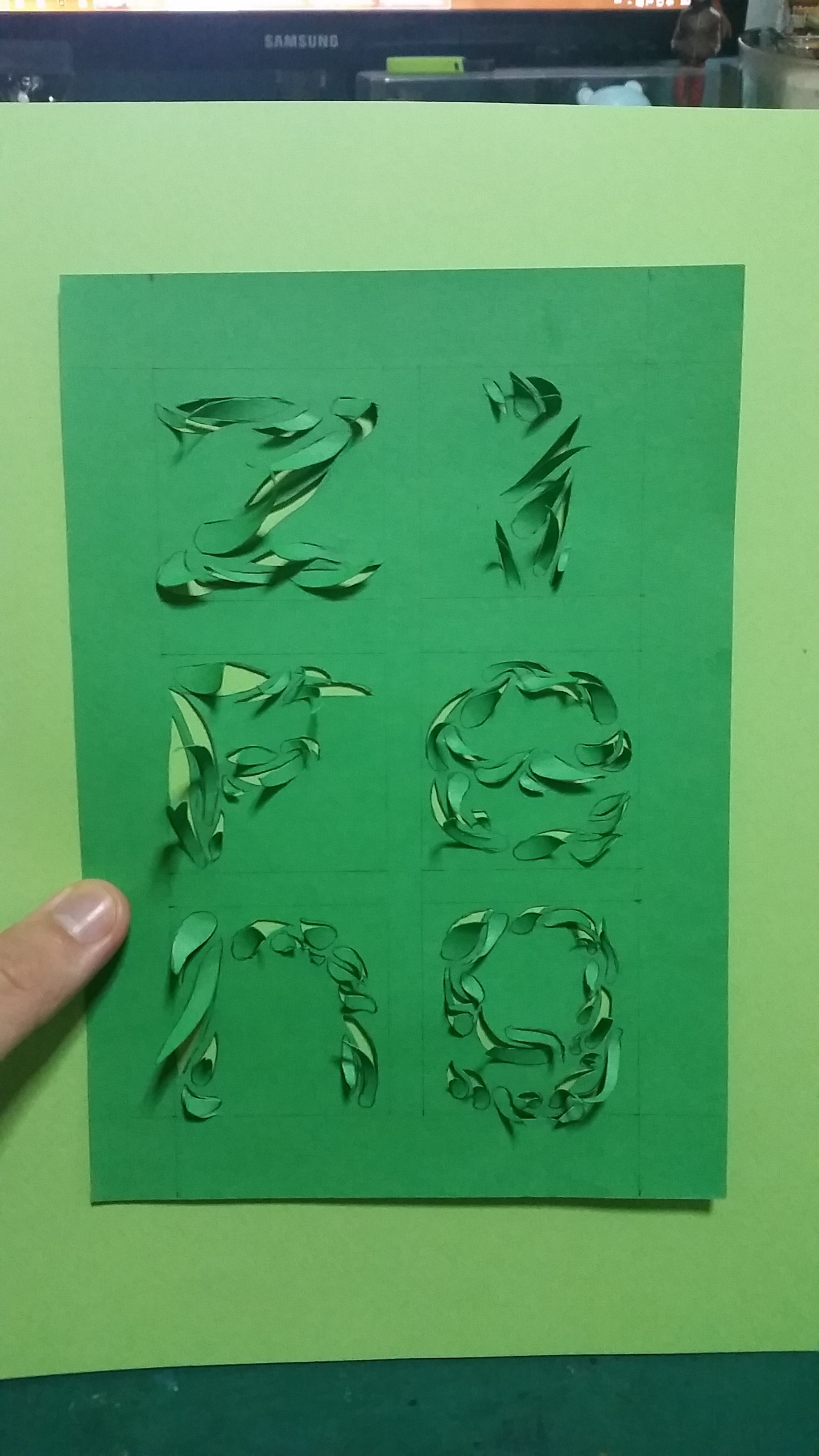
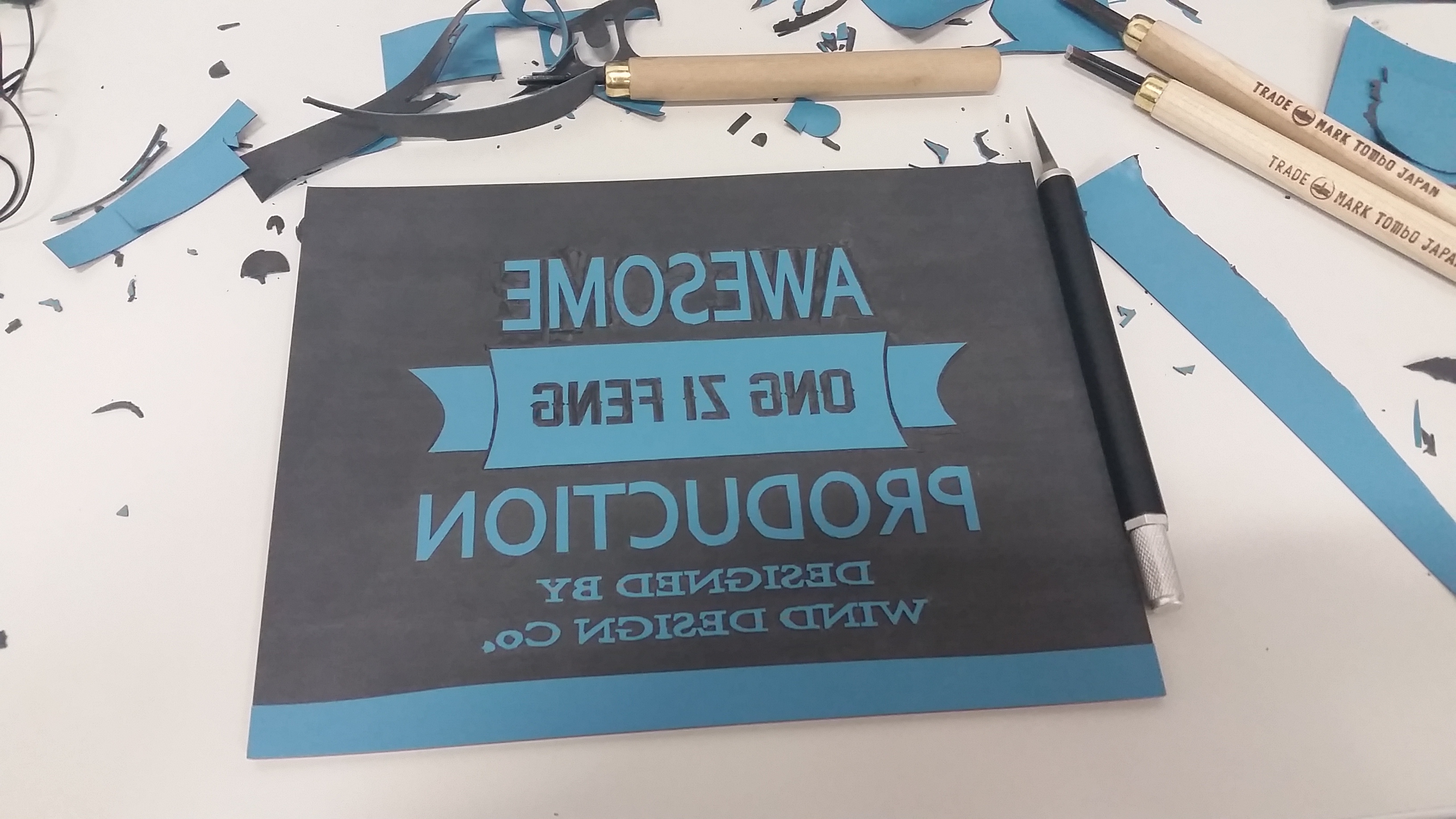
The finished lino cut.
2016-02-02 09.04.44
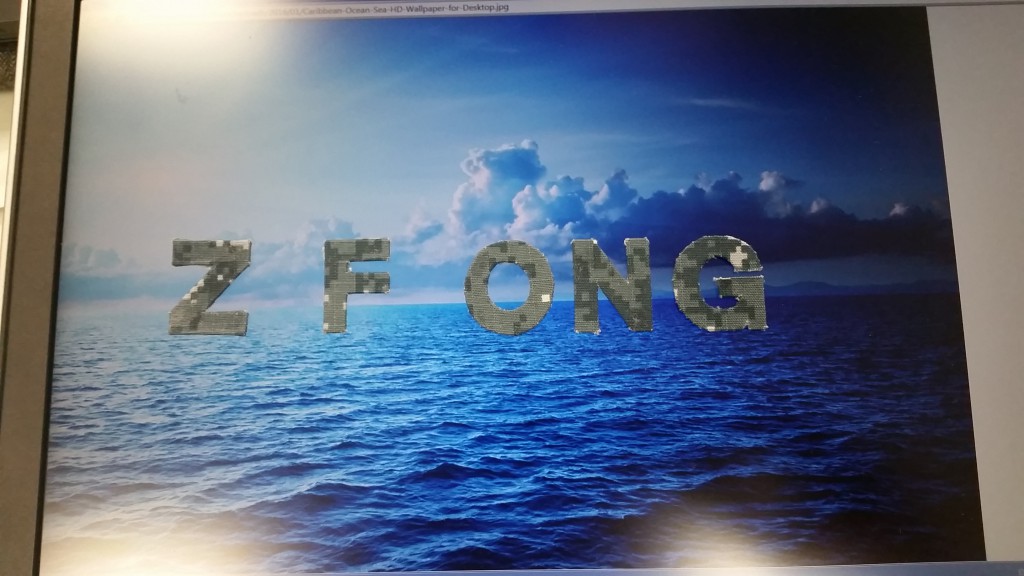
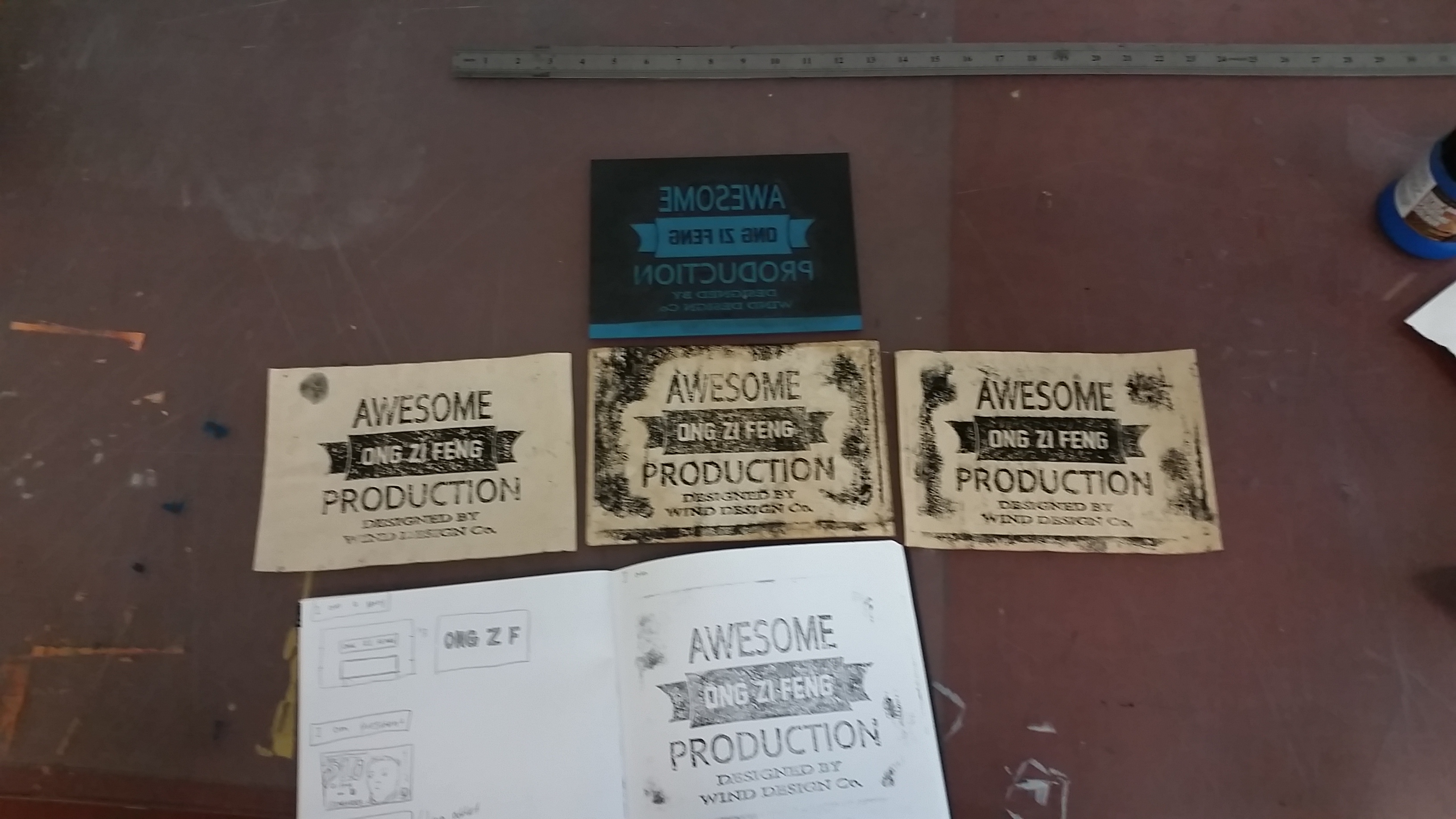
Stamp them on old looking paper which I make by dappling kopi o kosong onto the paper. I REALLLLYY like this as i put some effort into it, but the final result didn’t have the “Old” in my “ONG ZI FENG” so i didn’t use this as final. (Lucky the project require 4 final as opposed to 6 =DD) HAHAHA~

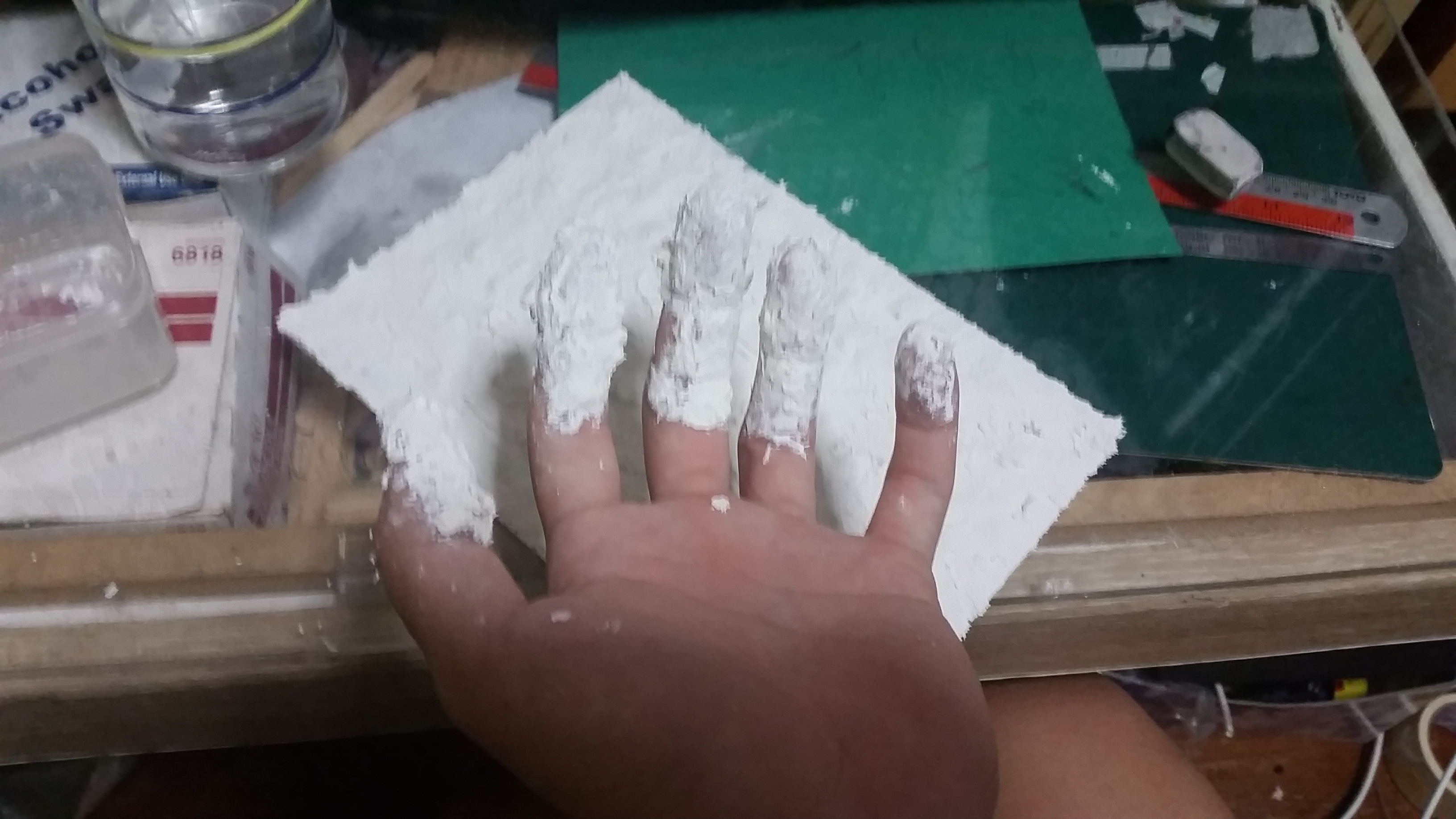
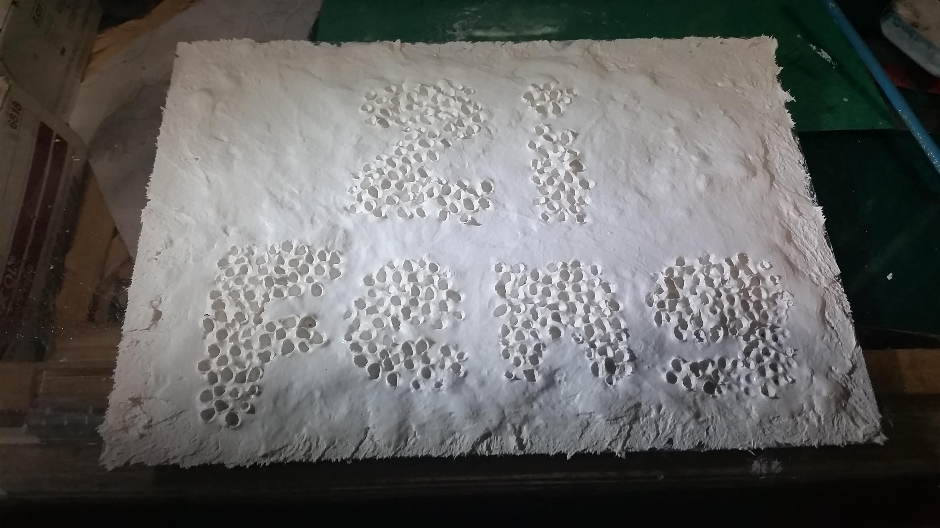
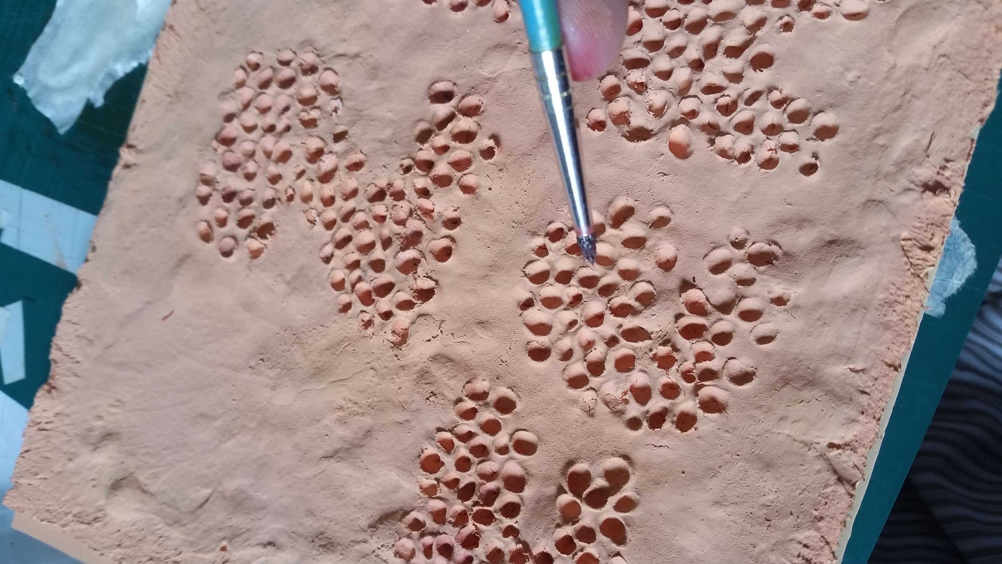
I Am Trypophobic Part 2

2016-02-02 17.37.04

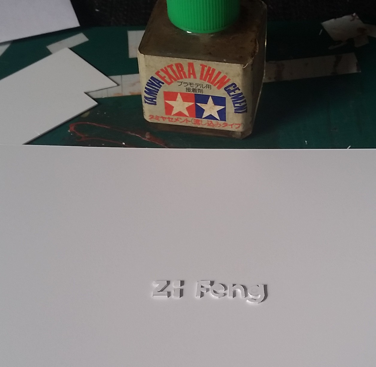
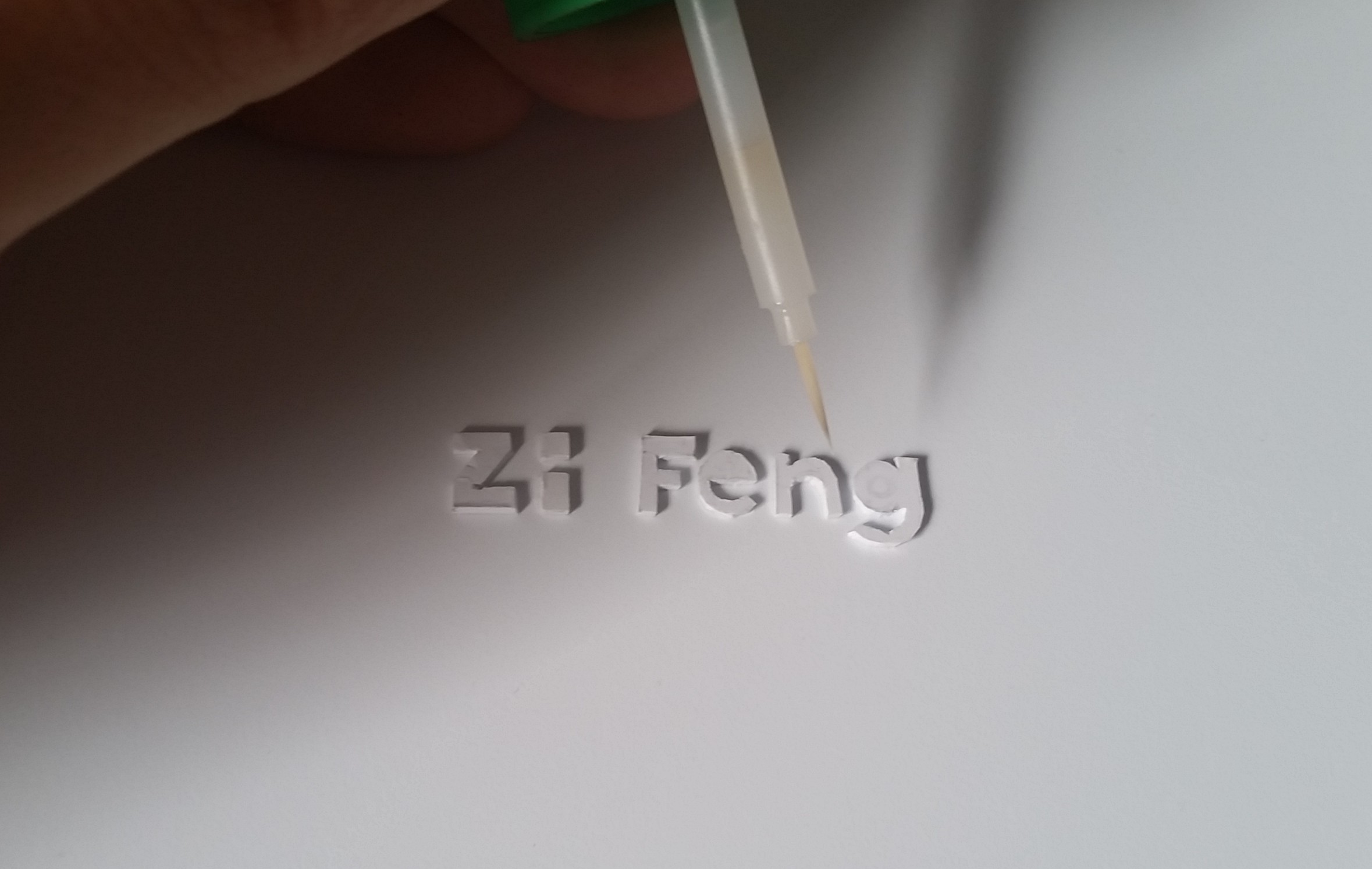
My clay cracked after it dried so I need to fix all cracks using Tamiya putty to make sure they don’t crack again.

2016-02-03 08.25.54
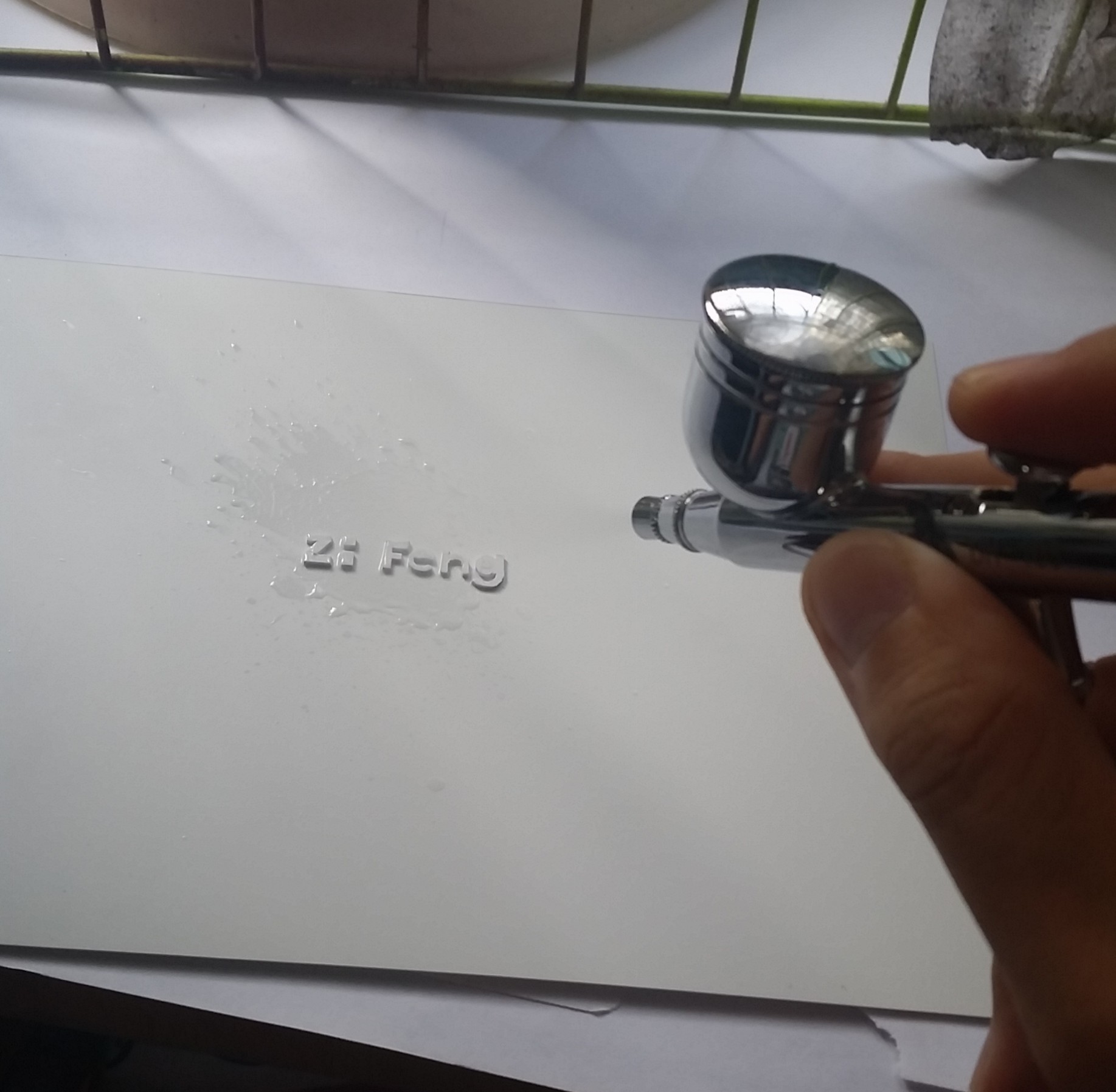
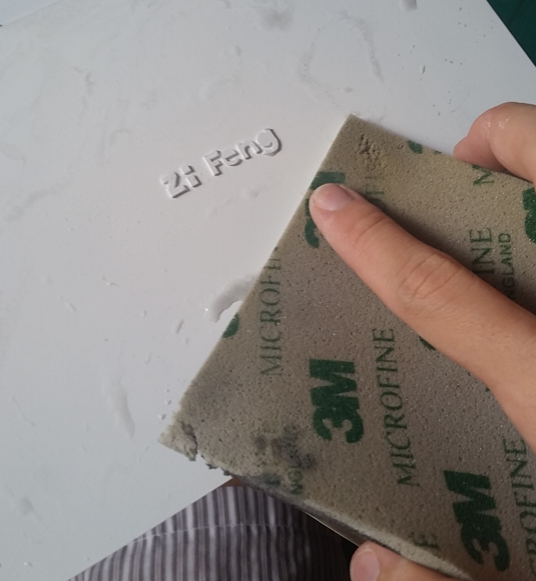
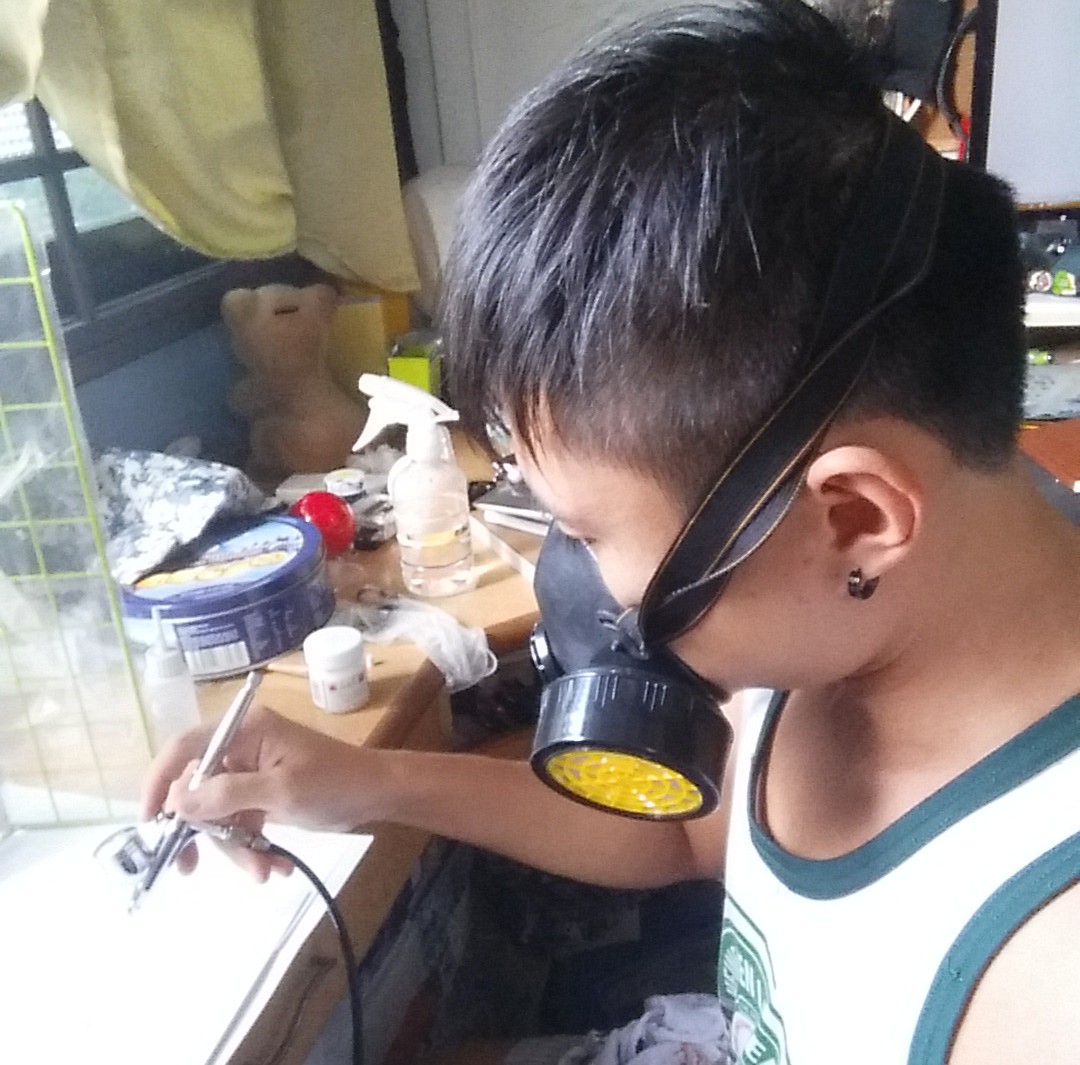
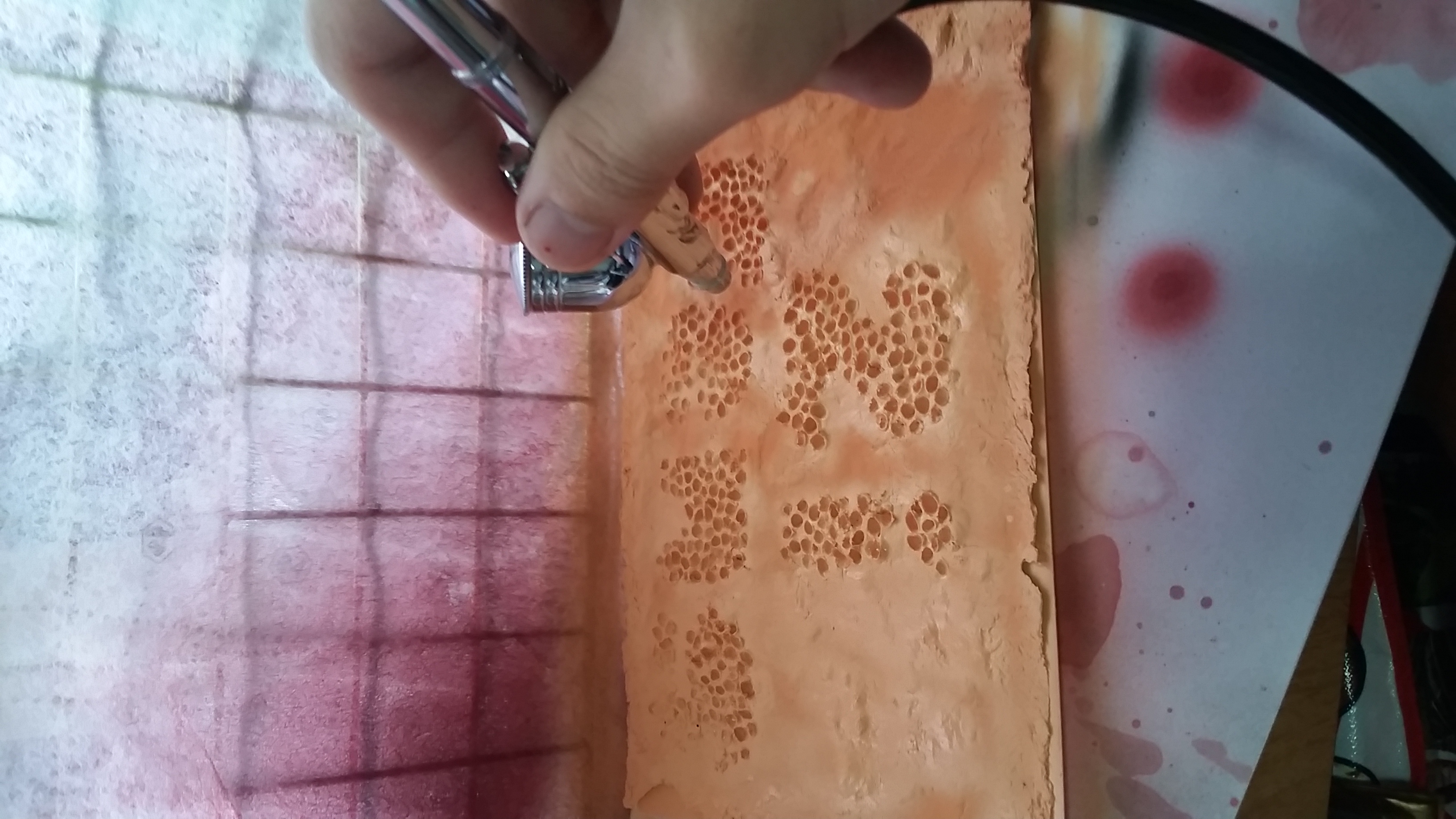
after I fixed all my cracks, I need to spray them into skin colour to give the ITCH that I am feeling right now. I think its more disgusting when it is skin colour, because we can relate to it, imagine them growing on your scalp….. yes…. your head is itchy now.
2016-02-03 08.31.25

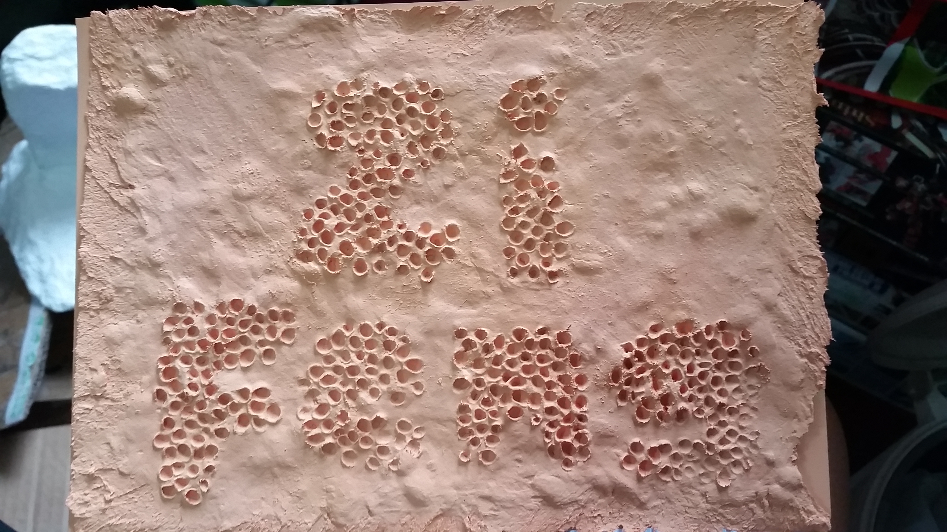
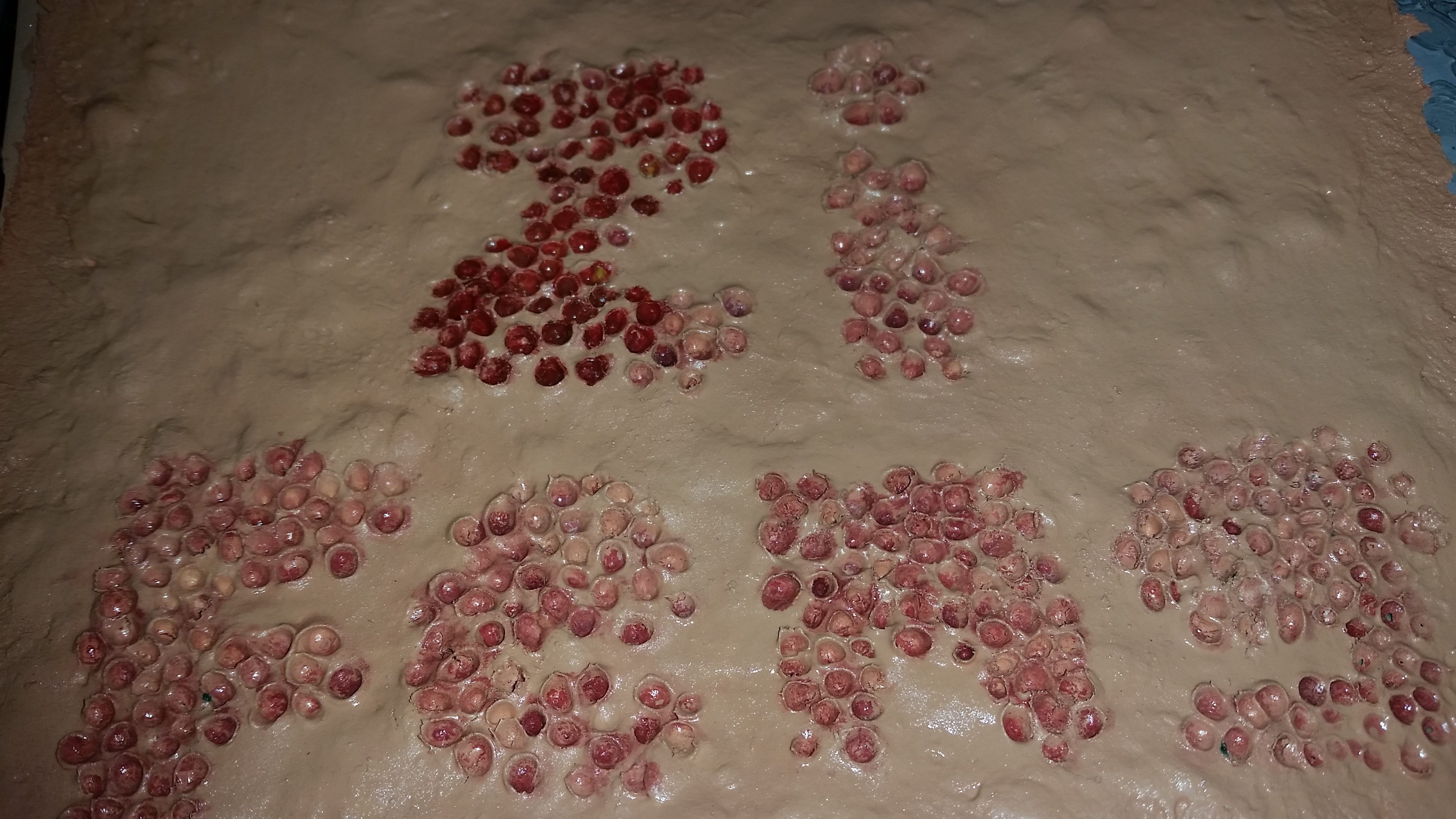
The done piece. now i need to add depth, blood, “disgusting” and “itch” to it.

2016-02-03 09.29.10

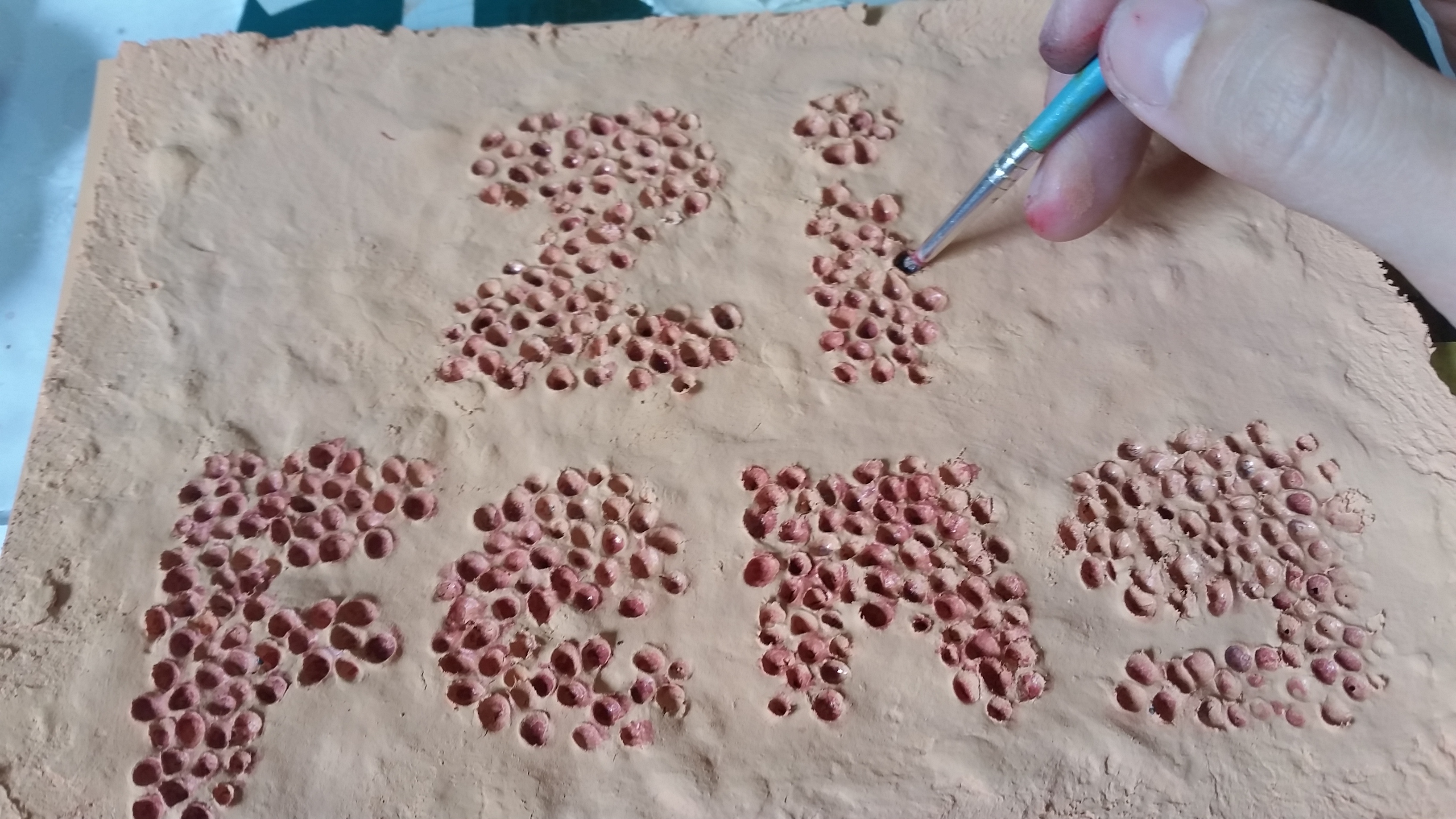
some shading, shadow and abit of dried blood.

2016-02-10 22.26.04

after i coat it with a layer of white glue to give it a slight shine + MORE BLOOD IN THE HOLES OMGGGGGGGGG! I AM DYINGGG


2D Sem 2 Project 1 – TYPO – Research

First thing first, as always.

Understanding/Interpretation of project.

There are many things to be researched, by breaking down the project into 6 “I Am _____________”

simply said, this means that I could use any noun

A noun (from Latin nōmen, literally meaning “name”)[1] is a word that functions as the name of some specific thing or set of things, such as living creatures, objects, places, actions, qualities, states of existence, or ideas.

Examples :

I Am Einstein (People)

I Am a Lion (Animal)

I Am a Eraser (Object)

I Am a Theme park (Place)

I Am Running (Action)

I Am Handsome (Quality)

I Am Dead (State of existence)

I Am Thinking about this. (Idea)

just using the definition of “Noun” I’ve got 8 categories to choose from, and I am sure there are much more than that. (Job, Mental state or anything funny.)

I Am….

3D Artist
Navy
Vandaliser
Trypophobics
Electrician
Old

There
Yusof Ishak/president
Hallucinating
Ninja
Gardener

Colourblind
Millionaire
Acupuncturist
Crime Scene Investigator
Archeologist
Engraver
Chinese


Hungry
Sorry
Pokemon Trainer
Artist
Product Designer
World Changer
Einstein
Lecturer
Beggar
Freesoul
Anything
A Stone
A Tree
Old
Thirsty
Running
Drawing
Speechless
Nothing
Funny
Dying
Dead
Forgotten
Bipolar
Disabled
Having Narcolepsy
Gamer
Anti Social
Amanioic
Overlord
Photojournalist
Chef
Catfood Quality Controller
Roadkill Collector
Toilet Cleaner
Manure Inspector
Animal Masturbator
Coffee Adict
Time Traveller
Glass Blower
Sculptor
Dissociative identity disorder
Herbalogist
Humble

RESEARCH!!!

http://www.careerplanner.com/ListOfCareers.cfm

A list of careers which many of whichI had never thought before there is a name for it. Picked out a few which has potential for 2D like Acupuncturist, Archeologist and Engraver

There are many things i diden know that it will affect design and feeling just by typography, i knew its important but dident really researched about it, now i know something about – Colour, Emphasis, Font choice, Shape Photography typo, Feeling and Emotion and Alignment of type

This is a slightly more in depth video of typography which i learnt alot technical knowledge which i dident know exist. baseline, X height, Descender, Ascender, Serif & San Serif and Kerning.


Method,

draw in black on white, scan it, invert and overlay onto a background