
like I said, I will keep trying, i cant judge weather my work looks ok or not (again, im really bad in laying out and choosing font)
so I just keep doing different versions of the same thing, by doing this, I hope I can learn which style suits me other than #WindStyle. and how to develop a sense of laying out, by asking around
“WHICH 1 NICER ARH???”
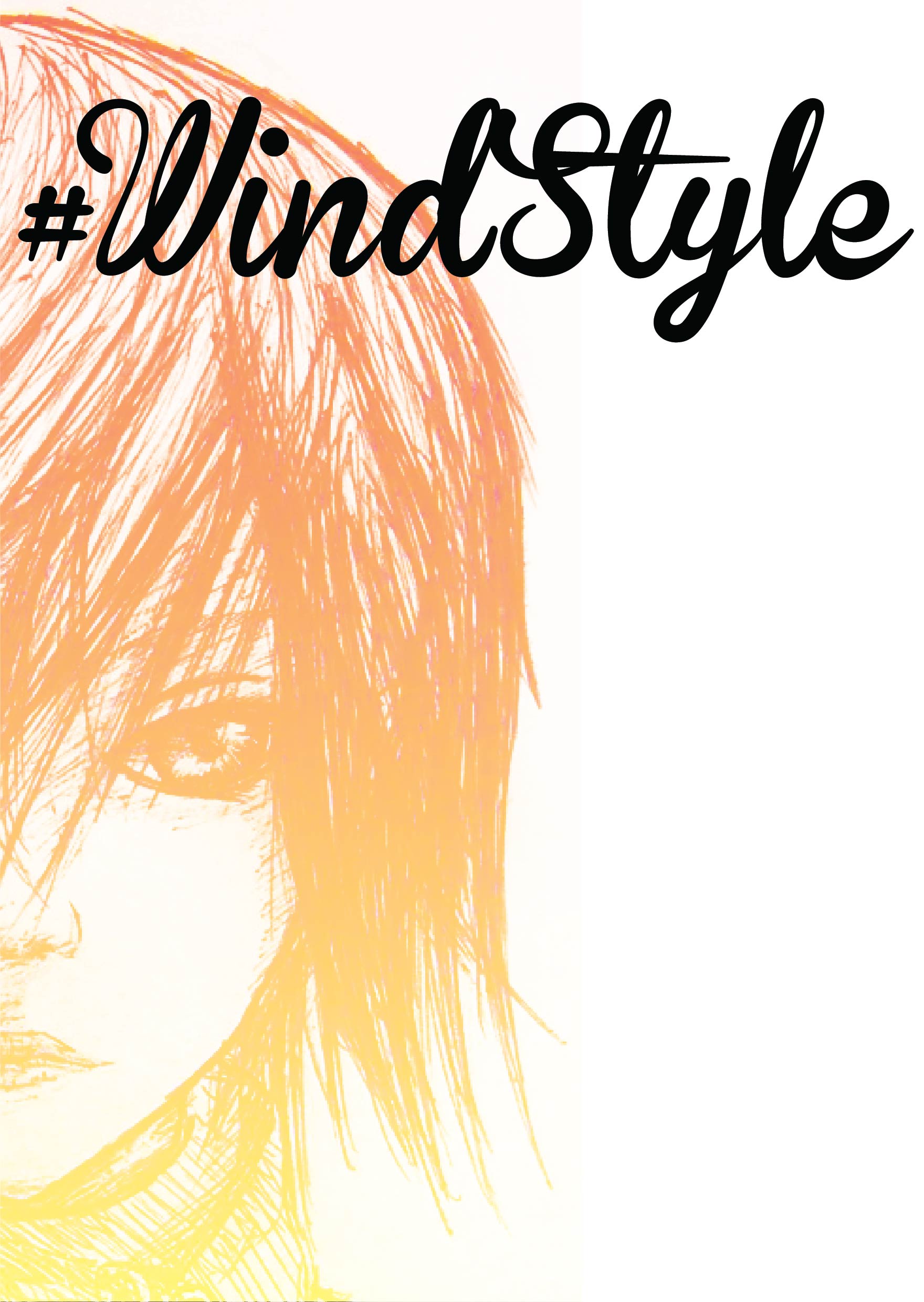
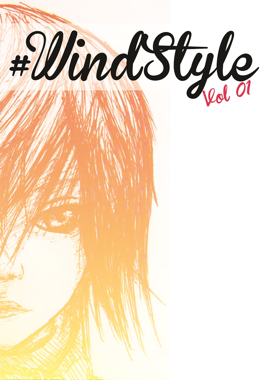

Yes simple thing like placing one TITLE I ALSO PLAY SO LONG, just this simple thing spent a few hours of my life. SERIOUS.
place here looks weird, place there looks ok, go do other stuffs and come back, my ok become weird so i heed to re position things.
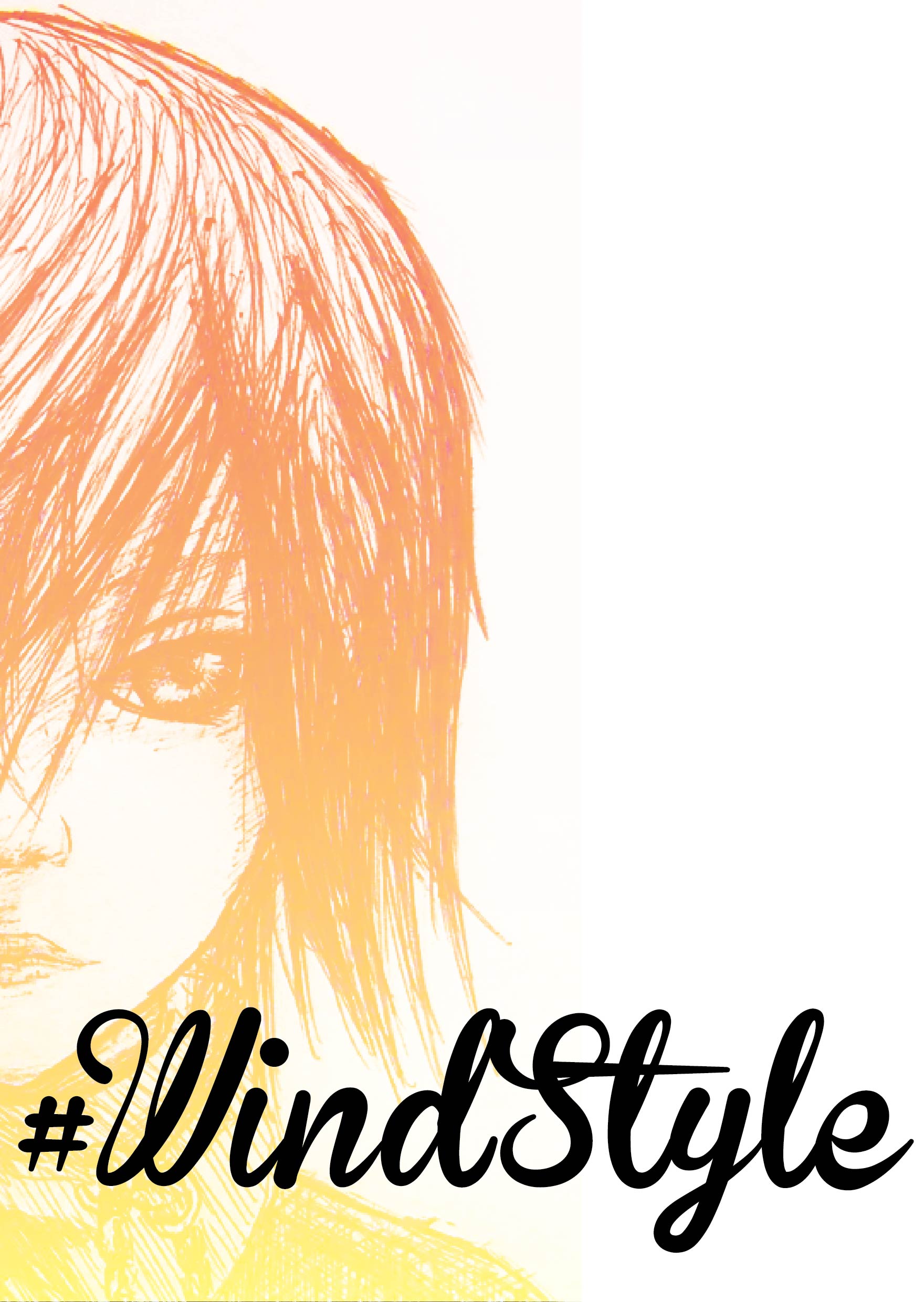
thats for coverpage, and after that.. the other 6pp……
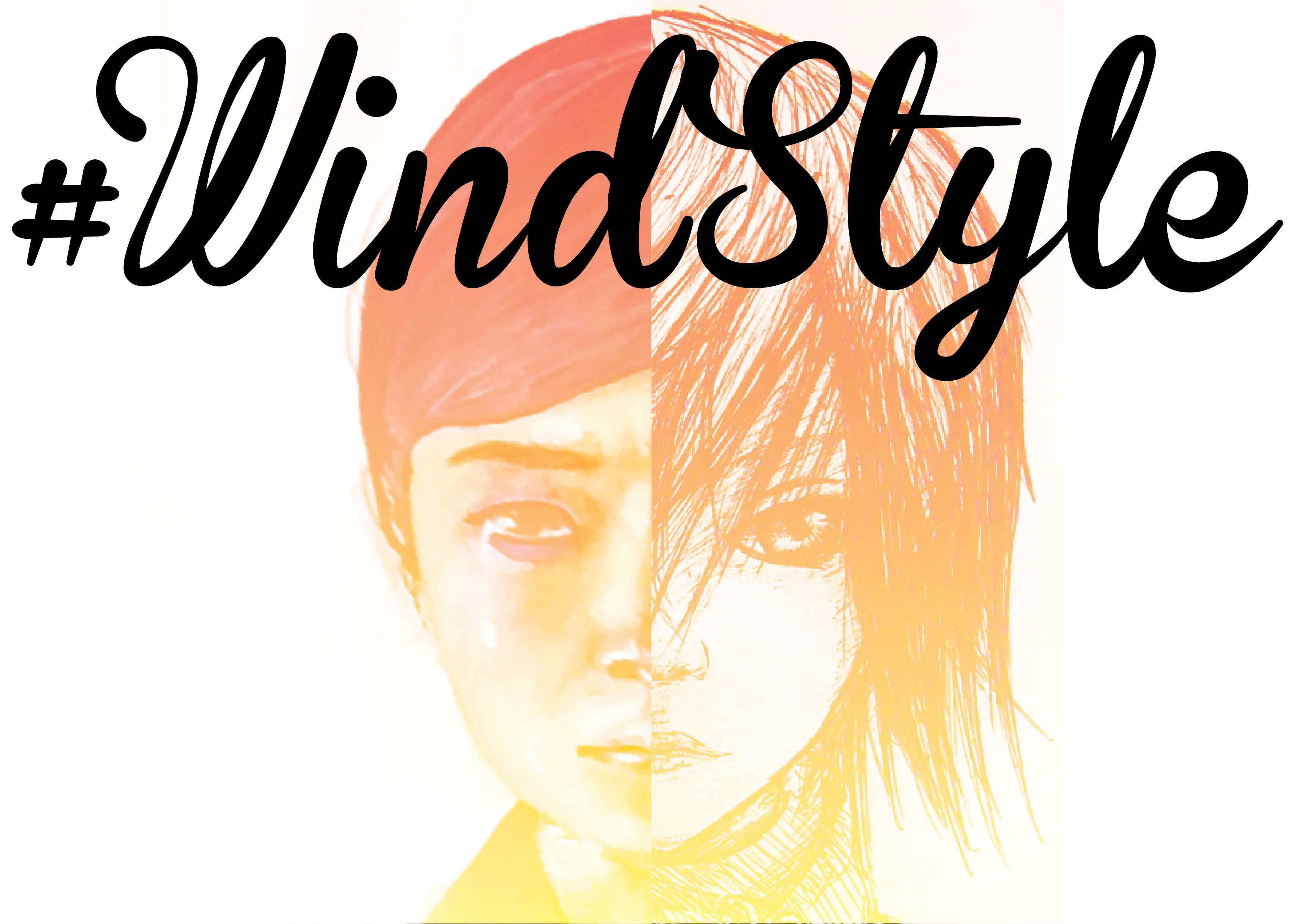
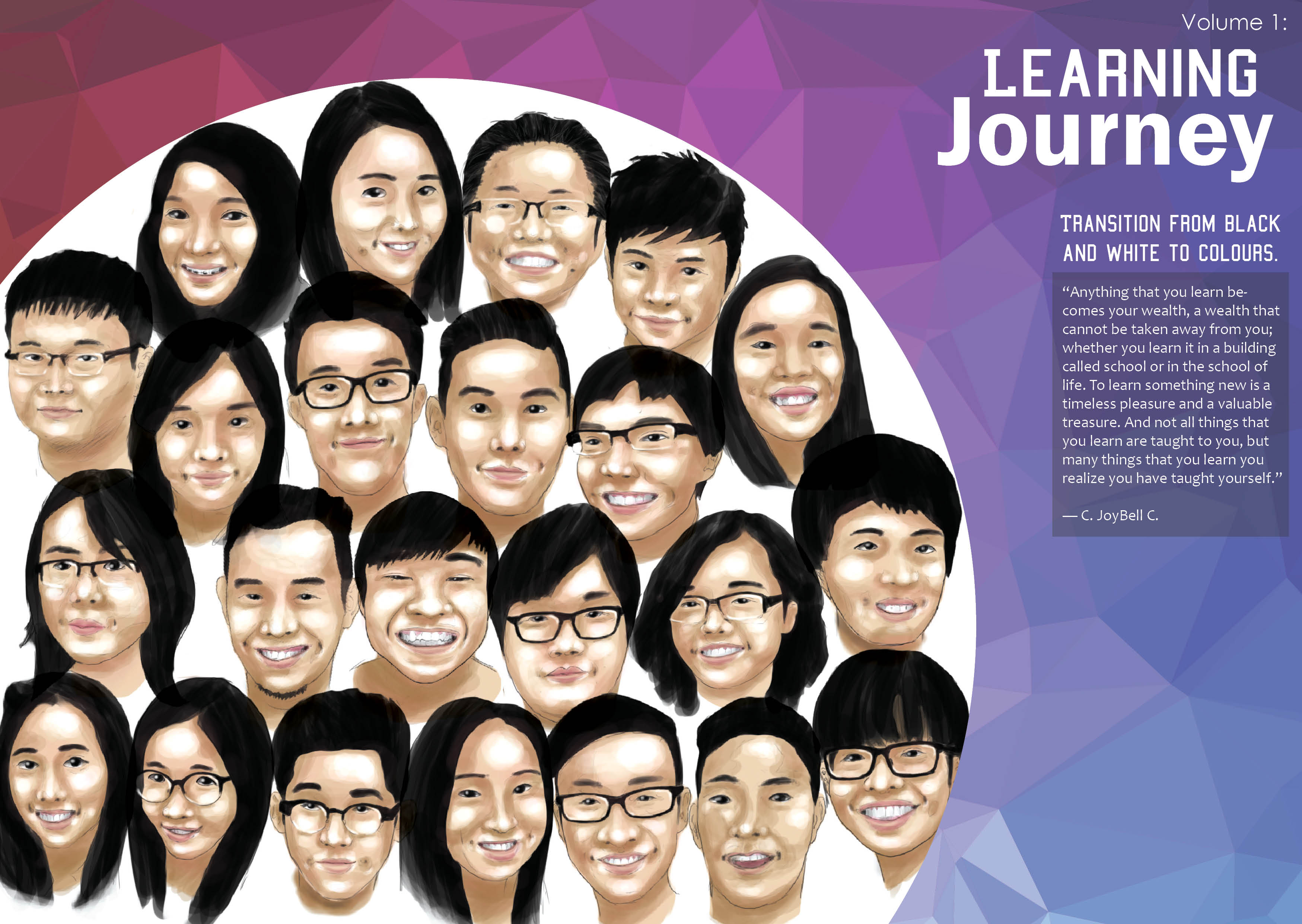
This is the only spread i confirmed after consultation and Shirley advice me to shift the circle from the middle of the spread to cropped at around 2/3 of the spread for it to be more visual appeal and i think it also concentrate all breathing space to one side and it will look much better this way.
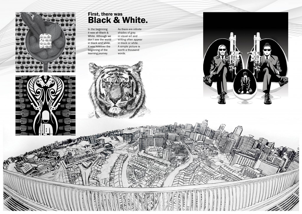
Page 4&5, the black and white. at first there was no breathing space so i took Shirley advice to 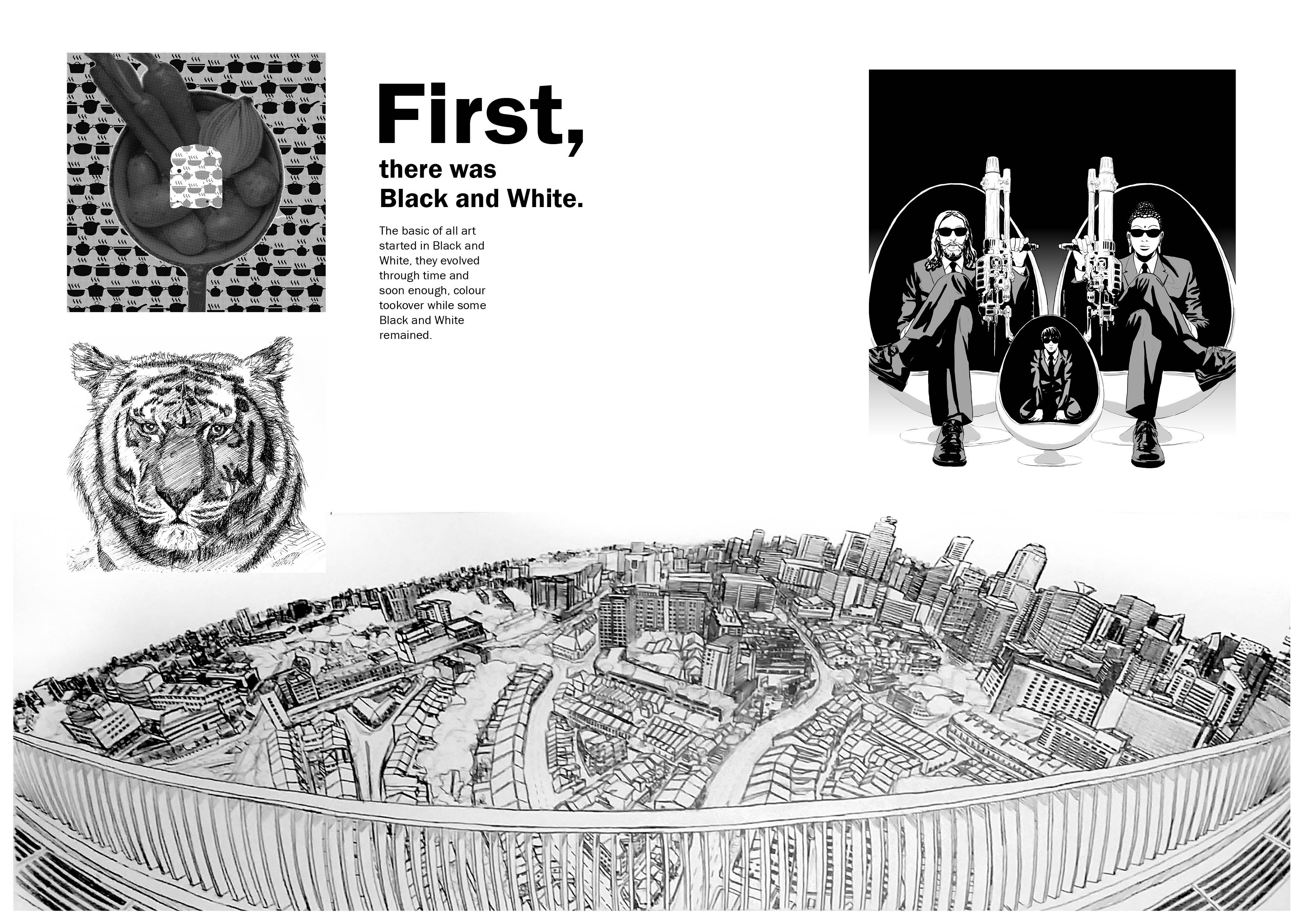
For page 6 & 7, i hange from 6 small tumbnail to 2 to give it more breathing space

After adjusting all of this again and again. i realise this is totally not my thing, luckily i diden go into Visual Communication.. wheww~~