This time, we attached the circuit into our cardboard prototype.

We did write the codes, but they didn’t work the way we wanted to, so for the presentation, we just tested out the sensitivity of the photoresistors. At first I was a bit worried that the photoresistors wouldn’t be a very good sensor, but they turned out to be more sensitive than I expected.

Feedback received from the presentation:

  • Use backlight instead of LEDs on the gap so it won’t interfere with the photoresistors
  • Add ambience noise (e.g. whispers) to attract audience
  • Play around with the volume

So now, the things that we need to focus on are:

  • Think of the materials we need and the exact amount of each of those
  • Start making the story: think of how many recordings to make and the length for each one
  • Settle the code

Video of the class presentation:


After that, I went back and tried to fix the code. We need to make a circuit where when the light that falls on the photoresistors is on the minimum (darkest), the sound will start playing. Since we don’t have ethernet shield to read SD card (is that what we need?), for now the sounds are just from the buzzer. Here’s the working circuit.

However, I’m still not sure whether we need the sounds to overlap each other when both of them are triggered or not, but for now there will only be one sound played regardless of the number of sensors activated.

As for now, I think we’ll need to just try the different things first and make sure the electrical component works.


Group: Vania, Dan Ning

So we went to the National Design Centre. I’ve seen the exhibition a few times, but I’ve never actually paid attention closely to them.

Some types of design practices I saw:

Product design


Graphic design


Fashion design


Architecture


Over the years, I could see that in the beginning (starting from the 1965-1975), Singapore was still very focused on building the country. Design was made with a clear purpose to serve the needs of the people, instead of actually building the identity of the nation. However as time passed, design in Singapore began to take shape. A lot of design was made to promote Singapore’s national identity, especially when Singapore started to be noticed globally. As new technologies were introduced, Singapore slowly got modernized, but even until now the design in Singapore never really left the roots. Now the design in Singapore, I feel, is modernized, yet still really showing the national identity. Design is also not just “art”; it’s always used to improve other sectors such as economy and education.

I think even in the future, the goal for design in Singapore is to continue to develop fresh ideas that not only are aesthetically pleasing, but also contribute to Singapore’s growth and promote national identity at the same time. While that is not easy, I feel that Singapore designers are moving in the right direction. I can see some designs nowadays that combine some of the ideas – like, combining modernization and national identity.

Design continues to be of importance, and I feel like people’s awareness of that will only grow from now. Some things that used to just be functional, now can possess aesthetic values – a simple example is HDB buildings which walls are painted in pleasing colors or certain colors to create rainbow / gradient. And as more people see the significance of design, more people will be encouraged to think critically about it, and design in Singapore will hopefully grow to be better.

Here are the two posters that I find interesting.


Poster for Frankfurt exhibition by Kazumasa Nagai (from http://theanimalarium.blogspot.com/2011/01/life-is-change.html)


I found this on Pinterest and can’t find who made it. (from https://www.designspiration.net/save/1446483313272/)


I will be talking about the second poster, the yellow one.

This poster is promoting a festival of industrial design in Sydney, and the slogan is “Ignored Everyday”. At first I’m really interested because of the minimalist appearance, with only yellow and black colors. My eyes were immediately drawn to the title due to the black highlights that contrasted the yellow background. After that, I shifted to the yellow paperclip, which didn’t blend with the background due to the outline and the shadow. It created a visual interest that makes people question, “Why a paperclip?” And that prompts the audience to read the information provided.

The information is written using sans serif fonts, which makes the whole look consistent and simple. All of them used black color, which contrasted the bright yellow background very well. I feel that the font size of the festival information could be a little bit bigger because the font is very narrow and thin, which compromises the readibility – but overall, I think it’s eye-catching, simple, and effective.

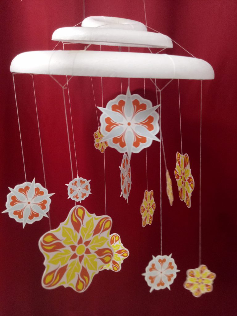
The theme for my project is the spring that comes after winter – the starting of hope, an early spring.

Winter is something that is associated with death, with coldness. On the contrary, spring symbolizes the birth of life and warmth. I want to symbolize hope as something that you can find even in the hardest moments.

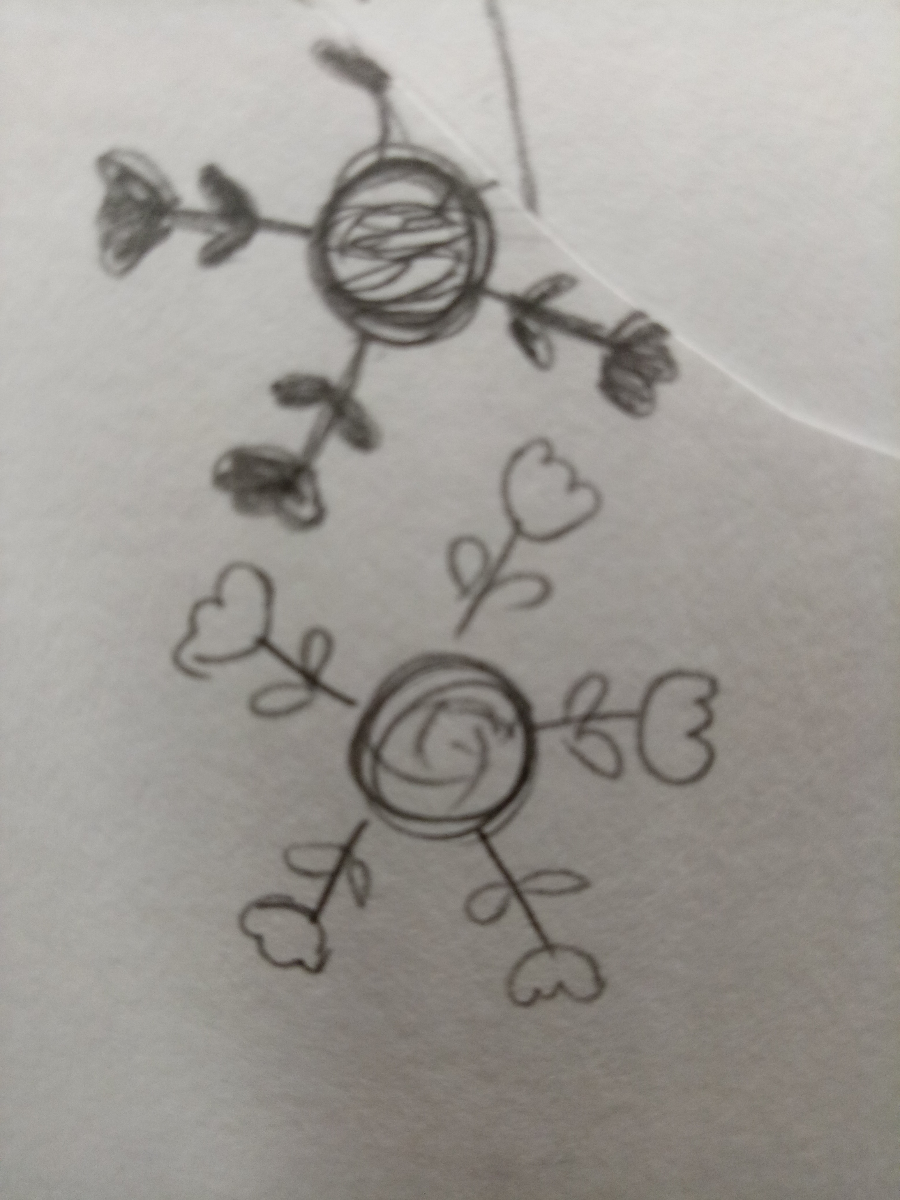
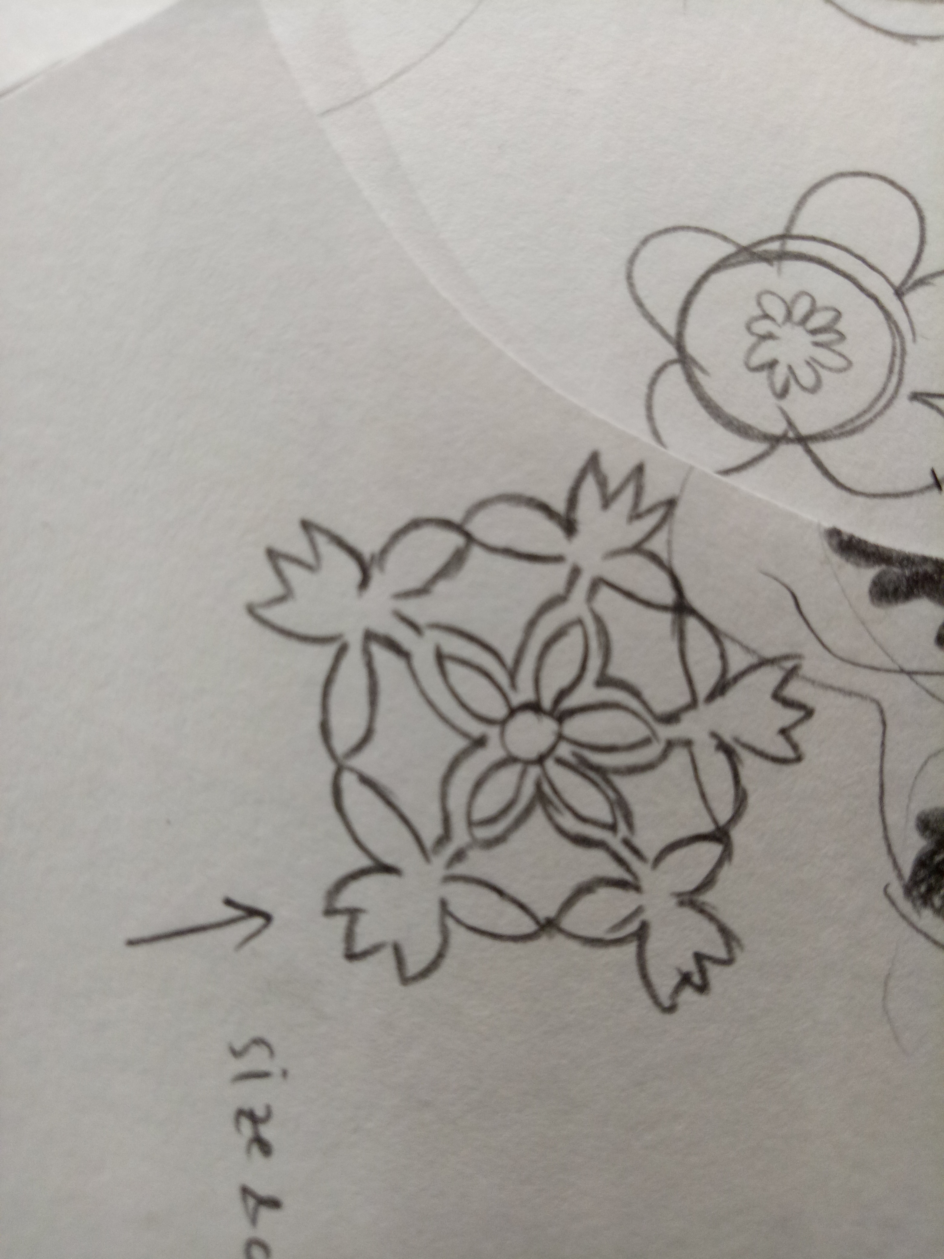
My initial idea was to create a snowflake design made of flowers, but after the first presentation, I got the idea of putting the “spring” using the negative space in the snowflakes instead.

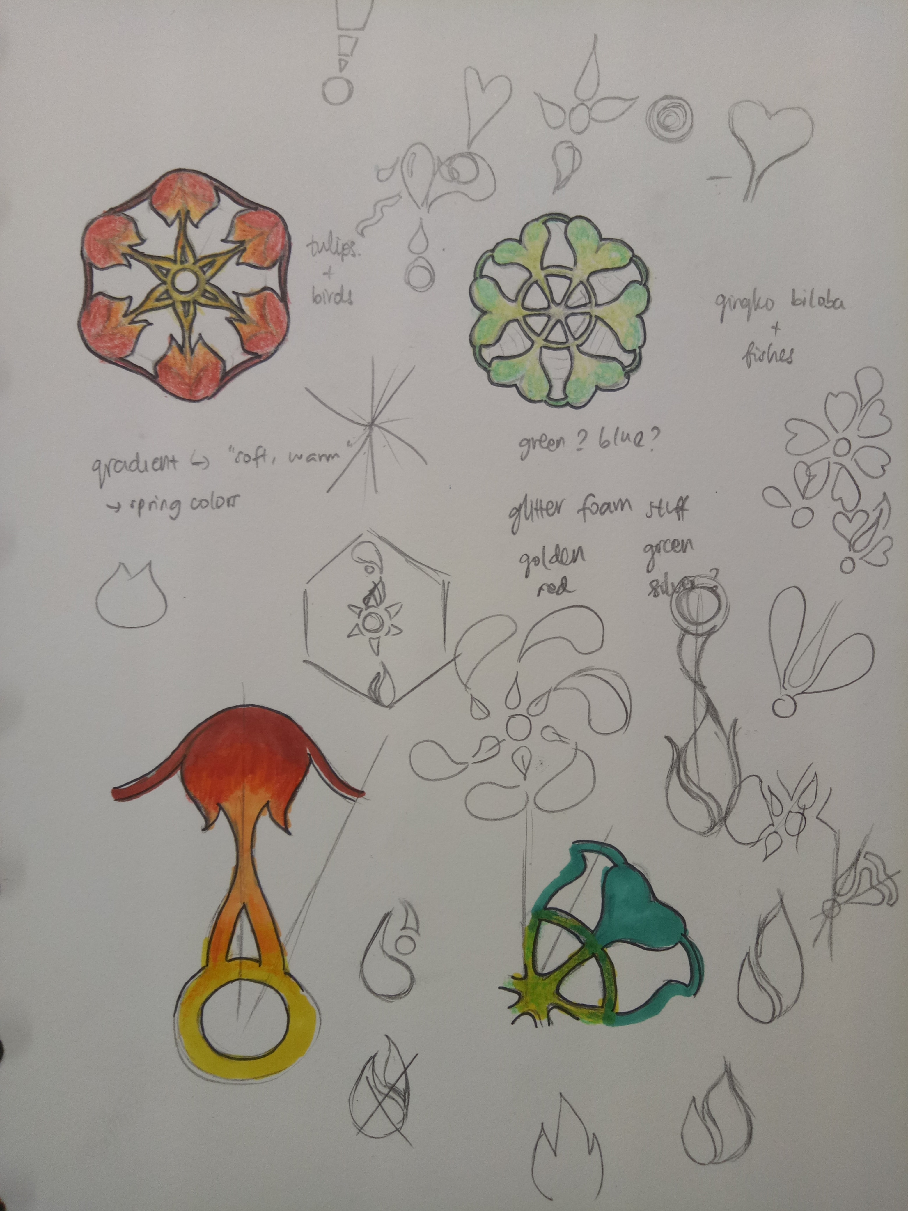
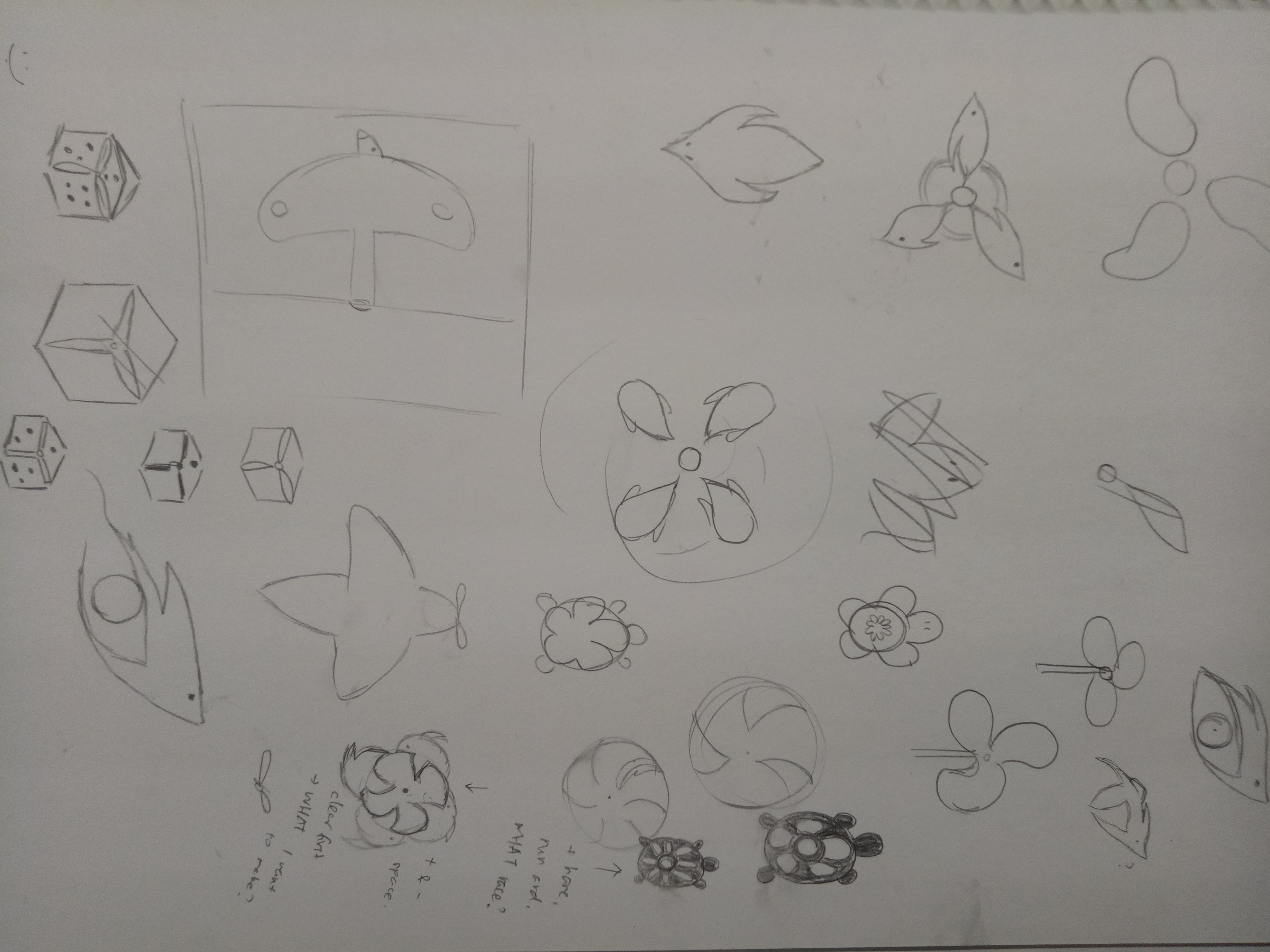
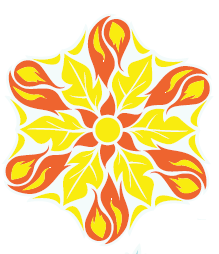
The very first design that I did was all connected because I was still thinking of the shape as something that needs to be able to be cut out from a paper. Moreover, the shapes are all either vague or too obvious. So after consultation, I tried to break free from the cut out form, combining the idea of winter and spring. The things that I chose to symbolize spring is sun, fire, water, and plants.

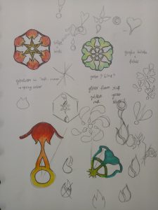
I made two snowflake designs. The first one is made of the shapes of leaf, sun, and fire. I chose yellow and red as the colors, as I want it to be triadic with the blue snowflake color.

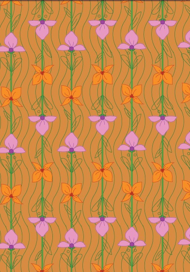
The second one is made of the shapes of flower, water, and gingko biloba (a type of tree that grows in Japan and blooms in spring). For the colors, I chose orange and two tones of blue, playing on the complementary colors.

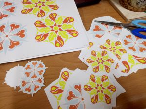
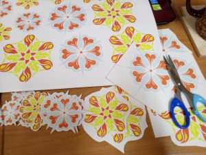
I gave a pale blue color to define the snowflake shapes, but they got lost after printing. The slight difference between the red and orange was also lost, making them look like the same color. The yellow was definitely too bright as well. (This taught me not to print last-minute.)

I arranged them randomly, with three foam circles on top to represent a cloud. I used nylon strings because I want it to be invisible, so it looks more like snowing, but it turned out really messy. I couldn’t really tie them properly. My craftsmanship is… bad. The paper cuts are pretty messy (I didn’t know something like x-acto knife exists before, or even if I spelled that right) and I only glued them with glue stick. I did leave them for hours under heavy books, but I forgot to attach the string so I had to rip them open again.

“I can cut all of these in 30 minutes”


*1 hour later* “…well I’m halfway there”


My bad.

Craftsmanship aside, I actually like my end design. It’s something I’ve never thought of before, and I felt like I understand more about forms after doing this. Positive-negative space is not as easy as it seems, no matter how cool they seem. I do think that I’m not pushing myself out of my comfort zone enough, that I still could do better – but overall, I’m satisfied. I did kind of lost my purpose halfway and realized that the mobile did not really represent hope; the blue color gave some cold feeling to it. Moreover, some of the edges for the snowflakes are quite harsh. I agree that at first glance it doesn’t convey hope, but I think that if you look at it closer, you can see the hope in it, and that goes with my initial idea.

I was so worried the day before submission because I felt like I haven’t done enough. Well, true, I could have done more, but I’m content with what I have made. Hopefully from now on I can make better and better works.

UPDATE: I took off all the fishing lines and replaced them with strings. Initially I poked the strings through the foam circles using a needle, and it was fine but it started falling apart the day I planned to submit it. I fixed them hastily with masking tape. It doesn’t look as neat, but it actually looks better than the fishing line.

Here’s my final design!


The theme for this project is hope. I started out by searching for keywords that symbolize hope; stars, candle, fire, dove, flower, butterfly, sun, rainbow, fish…

In the end, there are a lot of keywords that can be used to describe hope. Hope is different for everyone, after all.

I started by looking for some themes. I came up with two major ideas.


Yin and Yang

I want to represent that life is always balanced; in goodness, there is always something bad – but conversely, in badness, there is always something good as well.

My plan is to make koi fish and arrange them differently; one school of fish will be “swimming” upwards, but one fish in that school of fish would be going against the flow (going downwards). Another school of fish will be doing the reverse, “swimming” downwards with one fish going upwards. Their colors can work inversely, or maybe complementary colors. But with that idea, I actually hadn’t really though about the positive-negative form (which is the whole idea of the project), so I thought I should scrap the idea off.

(Unfortunately, I lost my sketch for this one.)


Early Spring

This idea came from when I was looking at snowflakes cut-out tutorials from Pinterest.

I was thinking that the shapes of snowflakes are really interesting and unique, since they are all different from one another. At first I was thinking of making the snowflakes flower-shaped, but then after the first presentation I realized that I could make use of the negative space instead of just leaving them meaningless.

In the end I chose to work with the “early spring” idea. At first I wasn’t sure if I should go with the idea since my others smaller ideas, which I haven’t really thought through, were said to have some potentials as well. Like the birds and propeller idea, or the tortoise idea, which could be developed following the story of the hare and the tortoise.

I was debating between the tortoise and the snowflake in the end, but I couldn’t really think of an original, exciting story for the hare and the tortoise, as well as the positive-negative space.

I didn’t think that it would be so difficult to play and make use of a form. Whenever someone makes use of positive-negative space – for example, when I see posters or advertisements that use those, I would notice them, but never think much about it. In the end, when I tried making it myself, I spent myself stressing about it. How do I make a form that is subtle, but noticeable, yet interesting and can convey my idea as well?

I finally chose the snowflake idea – “early spring”, simply because its form is the one that I can picture the clearest (and also because it’s the one I like the most). See my final post for the end result of my idea!

Our idea is to portray a gap in people’s understanding by portraying them using physical gaps on a door.

Our prototype was kind of a miniature of what the actual thing is going to be. Our whole idea is revolved around a story that would be revealed after “exploring” around the door, but we didn’t have a story yet. We put earphones behind the cardboard door and played some e-book as substitute.

For the set of actions we required the participant to do, we only told the participant to approach the door and just try to listen carefully. At first she looked unsure of what to do since the sound from the earphone was very soft, but then she could still catch the sound. She began exploring different spots on the door and I tried to match that by playing different recordings as she moved, but I couldn’t keep up and she didn’t get what the recordings were about either, so it just confused her. But she did think that she felt like eavesdropping (which is kind of our idea) due to the low volume, so that’s good. She also said that the concept is interesting, and if the gaps do play different recordings or sounds, she would be interested to test all of them to find out. She also added that at first she wasn’t sure of what to do because the door was a plain piece of cardboard with no handle or keyhole, but if there is a handle and keyhole, she would know naturally that the participants are expected to open the door.

Feedback we received:

  • The door may not have to be real-life size, it can just be something like a dollhouse
  • The concept of revealing a story is interesting; maybe we can make the door have several screens inside, so you can open it up like pages of a book to fit in the concept
  • We can make use of the gaps between door and door frame to put in speakers, but we can also put in a lot of keyholes instead so participants will have to continuously find keys to progress with the story. Moreover, it will be visually intriguing.
  • We can also make use of different heights of people; so maybe in one big door, there are smaller doors. The different gaps will play different people’s sounds, e.g. a small door will play a child’s sound and a big door will play an adult’s door. So we can make a story but through different perspectives.
  • One-person experience would be better. If the door is placed in an empty room, people will definitely be compelled to approach the door and find out more about it.

As for now, what we have to do based on the feedback is to focus on what we want to do first. Now we received a lot of feedback because we still have a lot of things we can play around with, and we still haven’t decided which idea to use exactly. After we decided on one idea, only then we can move forward with the project.

I do think this bodystorming helped a lot because the feedback we received are really valuable. They provide objective opinions and point out the strength and weaknesses we didn’t see in the beginning. At first I was really worried that people won’t be interested to find out about the door, but the participant told me she would be interested and even gave her idea on how to improve on that. Moreover, I can see other people’s works and learn from their troubleshooting as well.

Group members: Vania, Dan Ning

Watch our bodystorming process here:

Sometimes, I feel like people living in Singapore lead a very structured, scheduled life. Compared to the people of Indonesia (I was born and raised in Indonesia), everything in Singapore feels very organized, to the point of rigidity. When I first came to Singapore, I was surprised by the stark difference between Singapore and Indonesia.

At first, I thought Singapore would be a “follow-the-rules” country, which hinders creativity. However as I spent more time in Singapore, I realize while there may be a lot of rules, as long as you can justify yourself, creativity is not being frowned upon.

I represent that discovery of mine with this Bauhaus piece; the blue circles are all in the box, seemingly following a set pattern; but actually inside every single blue circle there is a little yellow triangle that can go out of the box and explore more possibilities (represented by different shapes and sizes of the triangles).


Bauhaus piece

I was just walking around when I spotted something that piqued my interest: two different type of flowers growing in the same pot. The first one is bougainvillea, while another one is… some kind of orchid? To be honest, I’m not sure, although I see it around a lot.

You can’t really see but they share the same pot. It’s hard to find a nice angle.

It’s something really simple, often overlooked, but to me it represents Singapore. It shows that from one common ground, there can be different flowers produced – which to me portrays the diversity in Singapore. Inspired by that, I made this Art Nouveau pattern. The two different flowers share the same stalk, to show that they have a common ground. I added flowing lines at the background to represent the flow of life, hence overall this piece represents the life of Singaporeans, harmony in diversity.

My piece