Process

Thumbnails

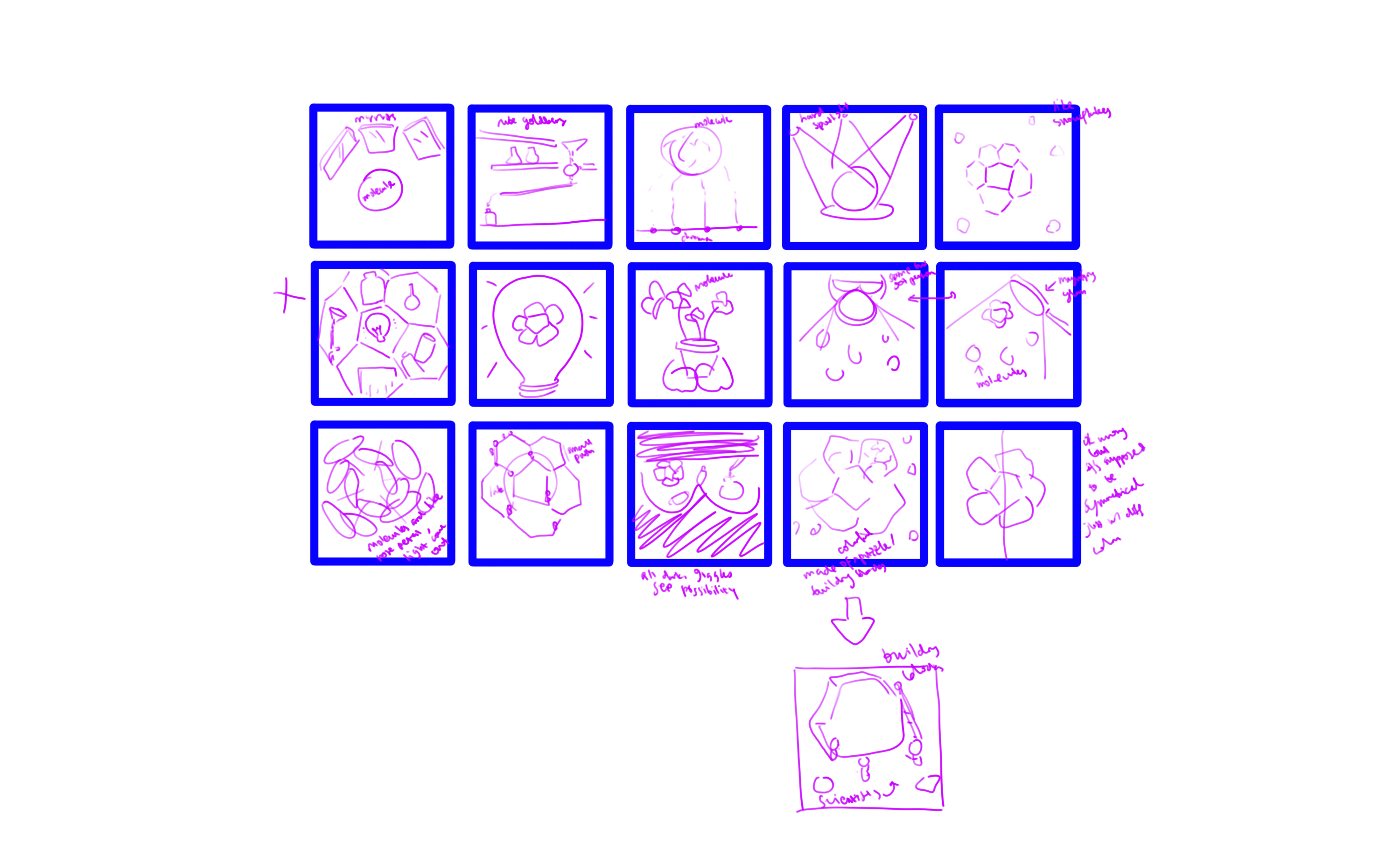
I came up with the thumbnails. Some of the keywords that I used in my ideation process are light, mirror/reflection, possibilities, symmetry, beauty, research, and discovery.
 

Sketches

From the thumbnails, I decided on three of the strongest ideas.

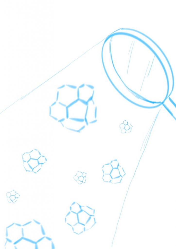
  1. Corannulenes under the hard spotlight from magnifying glass. Straightforward, simple, illustrating discovery and research. The corannulenes would be in different colors to suggest possibilities. I was thinking of making them look like falling snowflakes.
    Idea 1

  2. Corannulene in the center as the main character, with mirrors surrounding it and showing reflections of the different possibilities of what it could be. The focus is on possibility and variability in research and discovery.
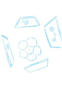
    Idea 2


  3. I’m not sure what it is but it’s sort of like pinball machine/Rube Goldberg machine/just some kind of mechanism, like an arcade game where a ball rolls down to the bottom. Instead of a ball, a corannulene will roll down. It portrays the fun and insightful side of research.
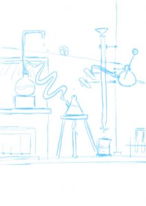
    Idea 3


I asked for feedback from Professor Ela and she really liked the mirror idea (idea 2). To be honest, that is not my favorite idea (mine is idea 3). I wasn’t sure whether I should go with the idea that I liked the most or the one that the client liked the most. In the end, I went with idea 2. It is not going out of my comfort zone per se, since I don’t have any comfort zone (I am not that well-versed in illustration yet…) so I thought it’d be a good exercise for when I go out into the “real world” to follow what the client likes more. It is, in a way, a challenge I posed to myself.


Moodboard

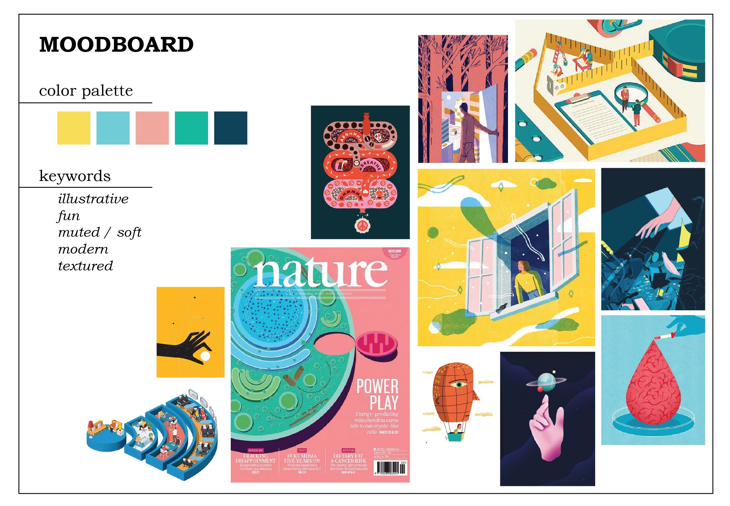
I want to practice drawing flat illustrations more, so here is my moodboard. I love the soft colors, especially the pink and yellow, and wanted to try using them.

I had some difficulties as I was envisioning idea 3 with this art style. For idea 2, I thought I had to go with a more realistic style for it to fit, but then I thought again, why not. Just try it. So I didn’t change my original moodboard and decided to just… go with it.
Final

This is my final result.
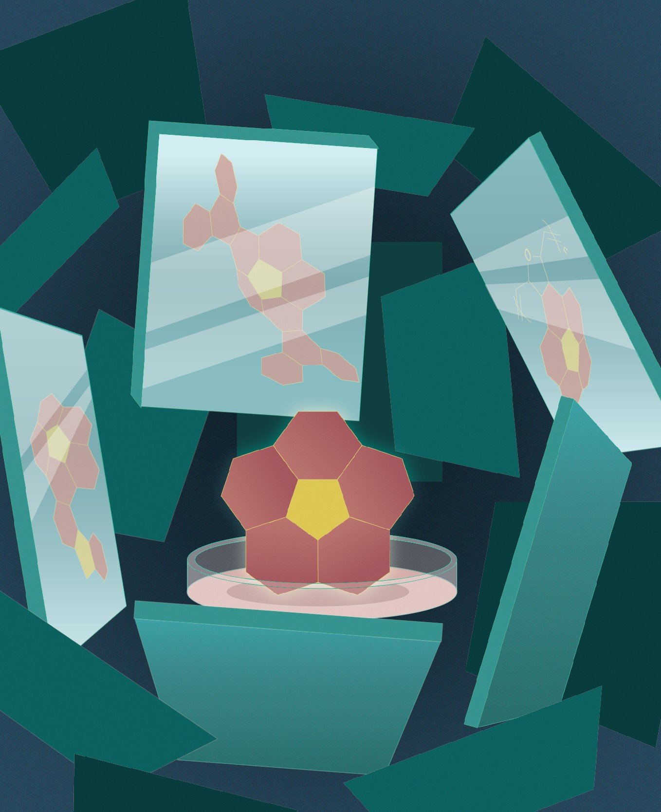
 

I put the corannulene in a petri dish to emphasize the fact that it is a molecule because one of the feedbacks that I got from my friend(s) is that they didn’t recognize it as a molecule, especially because I used color fill on them instead of the molecular skeleton. Taking into account the fact that the title of the journal would be in white, I used dark colors as the background. To draw attention to the corannulene, I gave it a bright color, although now I’m wondering if the pink and the yellow are too eye-catching.

My biggest struggle is giving depth to the whole composition. I added more mirrors with darker colors to illustrate mirrors that are further away, but it still fell flat. I also added noise (which made my Illustrator run slow…). In the end, I added gradients to most of the elements and a slight glow to the corannulene as an attempt to “save” the flatness. It’s still lacking, but it’s admittedly much better than before. However, I really should have made the gradient on the background more contrasting. I could also do better with my color choices.

I didn’t want to use gradients at first because they often turned out duller in prints compared to in screen, and prone to printing failures. I wanted to use a stipple brush for a shadow effect, but I am not sure how to do that (even after watching a video on how to do that) and I was running out of time (yes, I have terrible time management) so I took the shortcut which is using gradients.

There are so many things I could do better. However, it has passed! I’m kind of relieved since I was struggling and stressing over this assignment so much, and the result is certainly not the best I could’ve done, but I’ll give myself a pat on the back. All in all, that had been a great exercise for me.
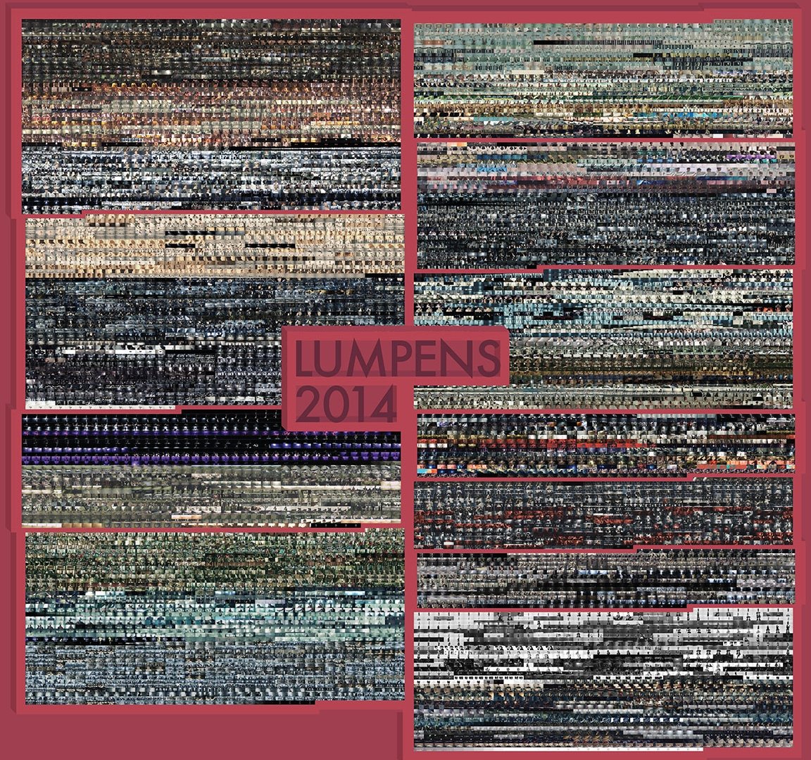
Lumpens: Pursue the Fantasy of Visual and Auditory Senses


Who?

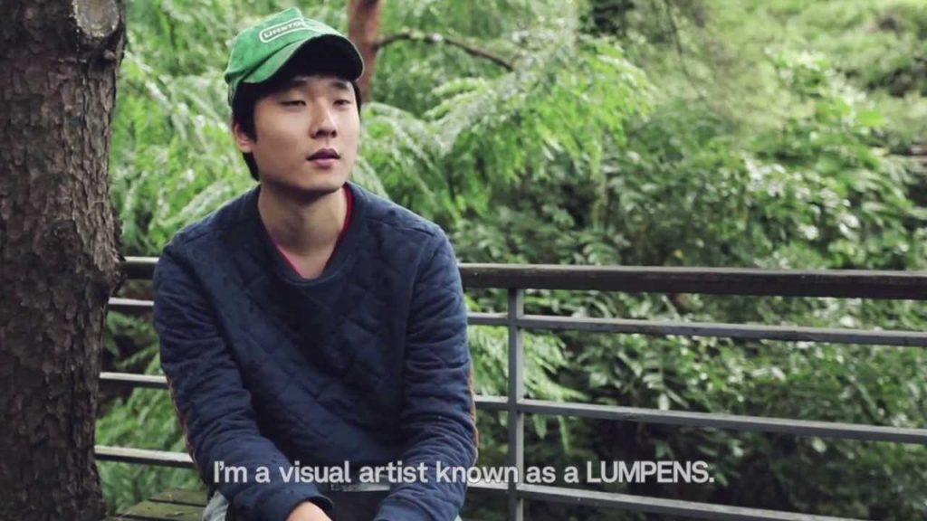
Although what he does may not be what I am (and probably would be) doing, I admire Lumpens—a group of directors and producers in the field of video production, mostly specialized in the production of music videos (MVs), TV advertisements, experimental films, and visual art, based in South Korea. They were created by Choi Yong-Seok in 2009 and consist of 4 people, but Lumpens usually refers to Choi Yong-Seok specifically.

I came to know them as they directed a lot of BTS music videos, which I enjoy immensely.


Choi Yong-Seok, the creator of Lumpens who is also known as Lumpens himself.


Why?

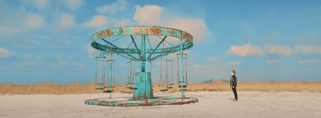
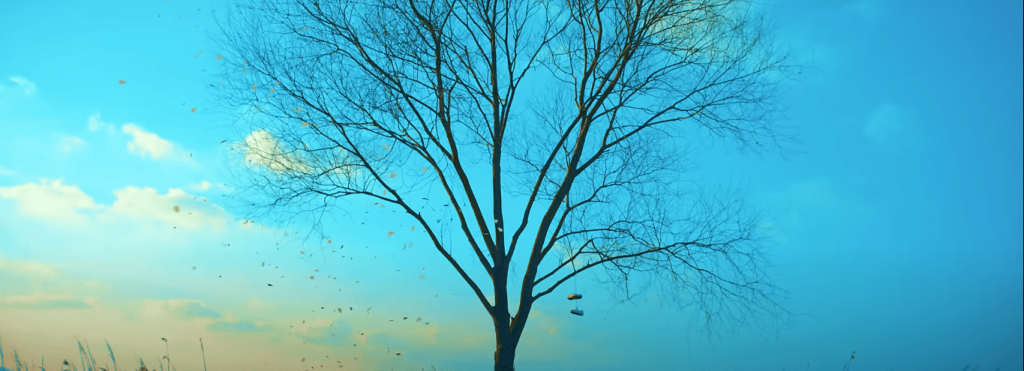
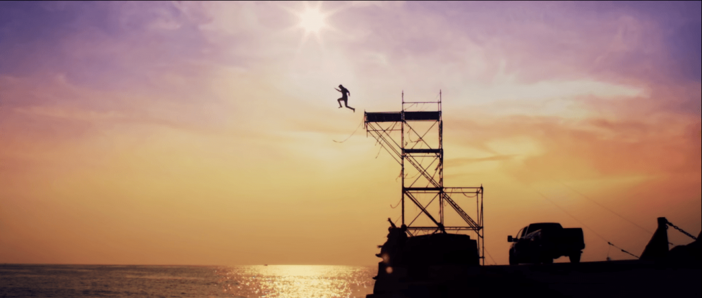
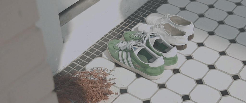
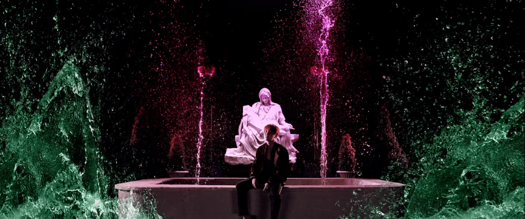
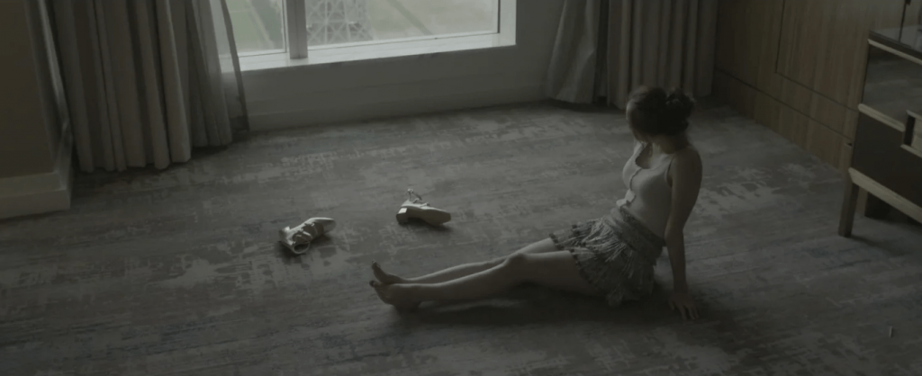
Firstly, they like to insert stories and/or references into their MVs; especially with the stories, it gave his MVs a cinematic feeling. One of my favorite MVs is BTS’s “Spring Day”.

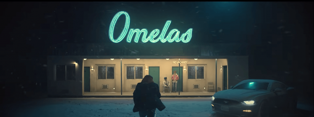
I love the quiet aesthetics (the use of colors and how they match with the song lyrics), and also the implied (and obvious) references (Snowpiercer—a movie about inequality, The Ones Who Walk Away from Omelas—a philosophical fiction about injustice, and the Sewol ferry disaster—the sinking of a ferry which sparked social and political reactions in South Korea).


Some of the shots from the MV:


It gives depth to what people perceive as “just a music video” due to the hidden meanings and messages, on top of being aesthetically pleasing.


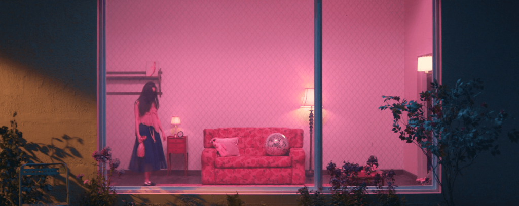
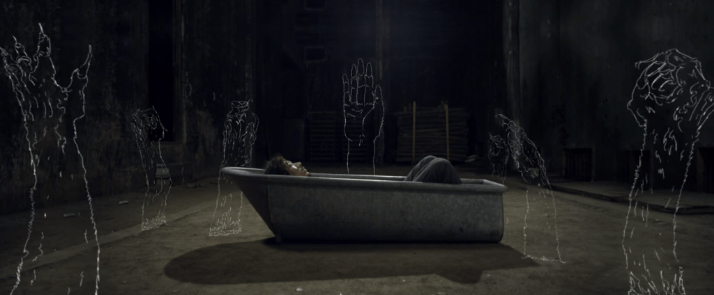
Other favorite shots from various of his MVs:


Secondly, I admire Choi Yong-Seok’s way of thinking. He graduated from a Visual Communication major, but he always wanted to express himself outside of the “screen”. He started making videos and exhibitions as personal activities. It’s almost as if he didn’t intend to be a director, but he just did his own thing to have fun and learn, and somehow, that’s how he became one. It reminds me that sometimes, things are that simple. You just have to work on what you like and be confident in yourself, and not worry too much, too far into the future.


[304 words]


References:

http://lumpens.com/about/

https://thesunnytown.wordpress.com/2015/03/18/october-2013-cuvism-lumpens-interview/

https://youtu.be/8NUtpJX_h6I

https://www.youtube.com/watch?v=Tye1ONFeKis&feature=emb_title

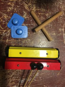
For the group mood box, we decided to use the other recording (the one I didn’t use). For that sound, we used rhythm sticks, triangle, and zig zag board.

Instruments used

This is the sound.

Here is my waveform analysis for the sound.

Mood Box

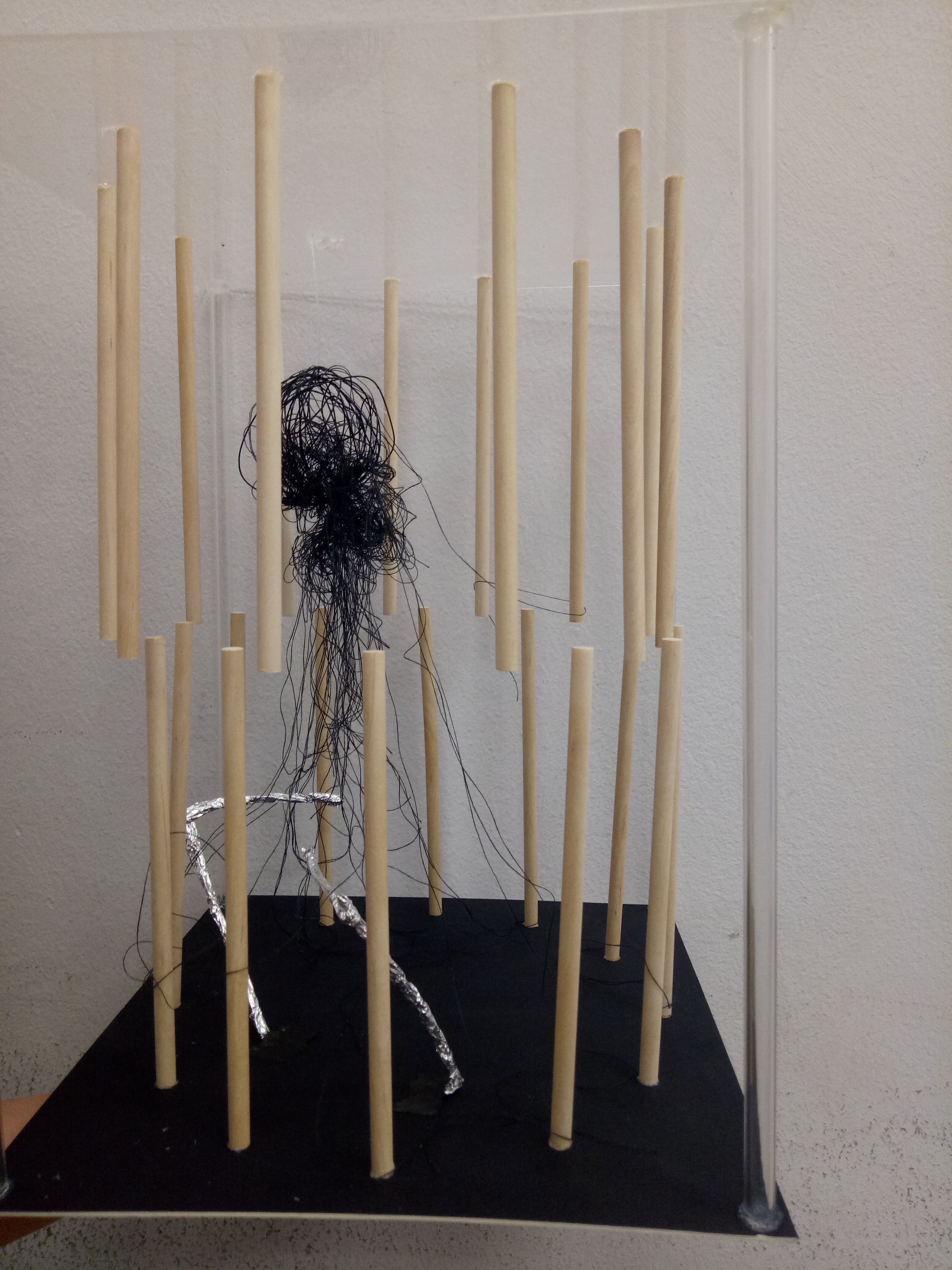
Here is our final group mood box.


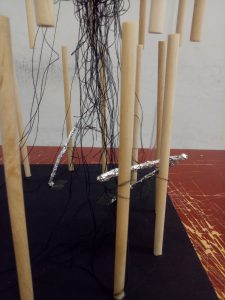
We put the model in a circular arrangement to represent repetition, although there is some kind of starting point indicated by the positioning of the wire (wrapped with aluminium foil) and the ball of wire and thread.

Zoomed in


The wooden sticks represent the dominant, constant sound of rhythm sticks. They sound very stable and straightforward, hence we placed wooden sticks in the straight directions. The up-and-down positioning suggests that the sound is all over the place.

The wires wrapped with aluminium foil represent the subordinate, which is the zig zag board. The texture of crumpled foil suggested the rough, edgy sound of the friction. The sharp cuts of the sound is represented by the sharp edge of the wires.

The subdominant sound, which is the triangle, is represented by the ball made of wire and thread. The thread tangled all over the place since the sound of the triangle kind of “melted” into the entire recording and enveloped the other sounds.

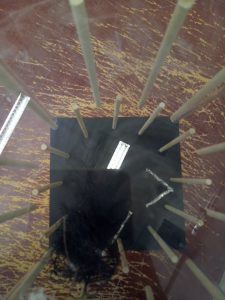
Top view


We also tried to make the frame “invisible” by using transparent acrylic and tubes to frame.

We put black as the base and thread color to give a darker, more mysterious mood; but it is the calming kind of darkness.


Reflection

The challenges when creating this model:

One, the positioning of the up-and-down wooden sticks. We couldn’t get the positions right although we tried using several different methods; they always ended up a bit off.

Two, using the right amount of glue. If we used too much (especially on the transparent acrylic), it would look very messy. If we used too little, they wouldn’t stick very stably.

In the end, we required more time than we actually predicted due to those challenges. However I think our end result is good as our intention is clearly expressed in the model.

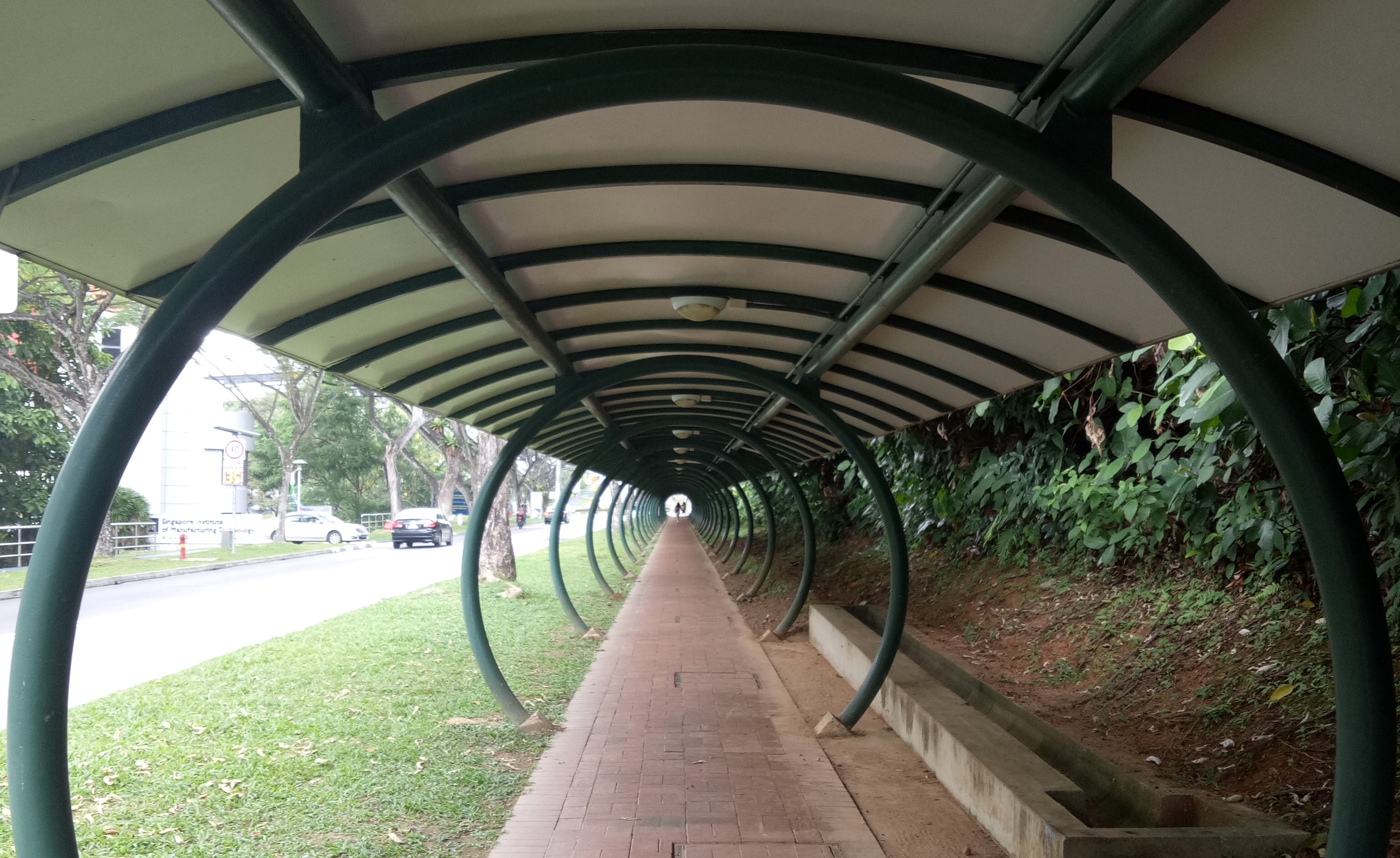
Today, we learned about the use of perspective to create the illusion of depth within a frame. In a frame, there can be multiple perspectives or no perspective; but in creating depth, the commonly known perspectives are one-point perspective, two-point perspective and three-point perspective. The numbers suggested the amount of vanishing points apparent in that one frame.

As a class exercise, we have to walk around ADM building to capture those three perspectives using our cameras. Let’s see what I take:


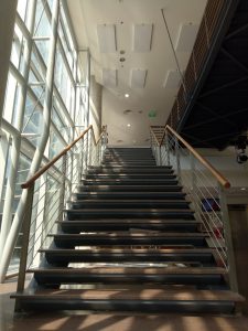
One-point perspective

There is one vanishing point here; that is, at the top of the stairs, which makes it the focus.


Two-point perspective

There are two vanishing points here, and they intersect at the corner. Our eyes are naturally drawn to the corner.


Three-point perspective

There are three vanishing points now. Usually to create the three-point perspective, we take picture from high eye level or low eye level.