The four jobs that I (tentatively) chose are barista, gamer, thief, and electrician.
Initial Sketches
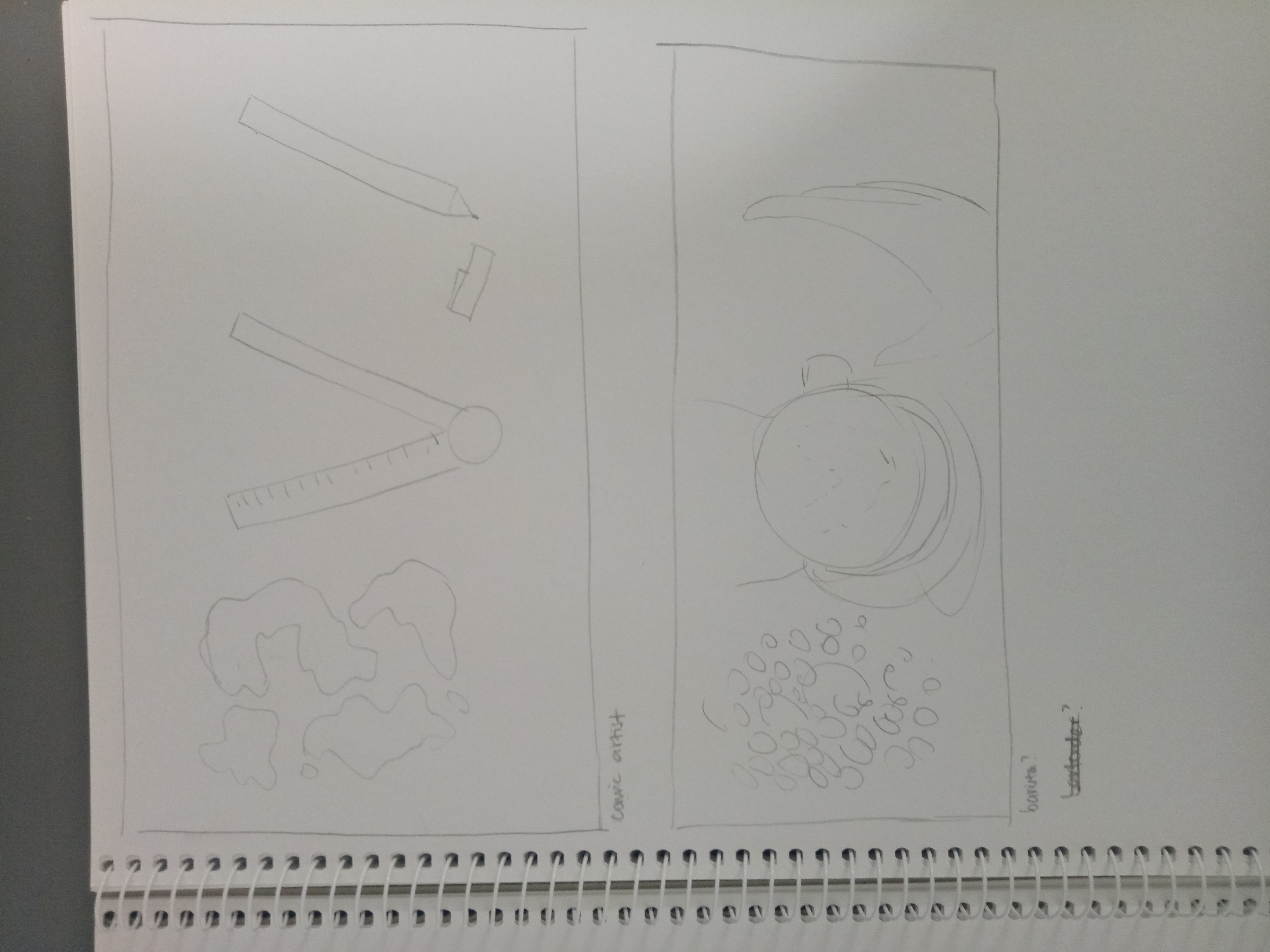
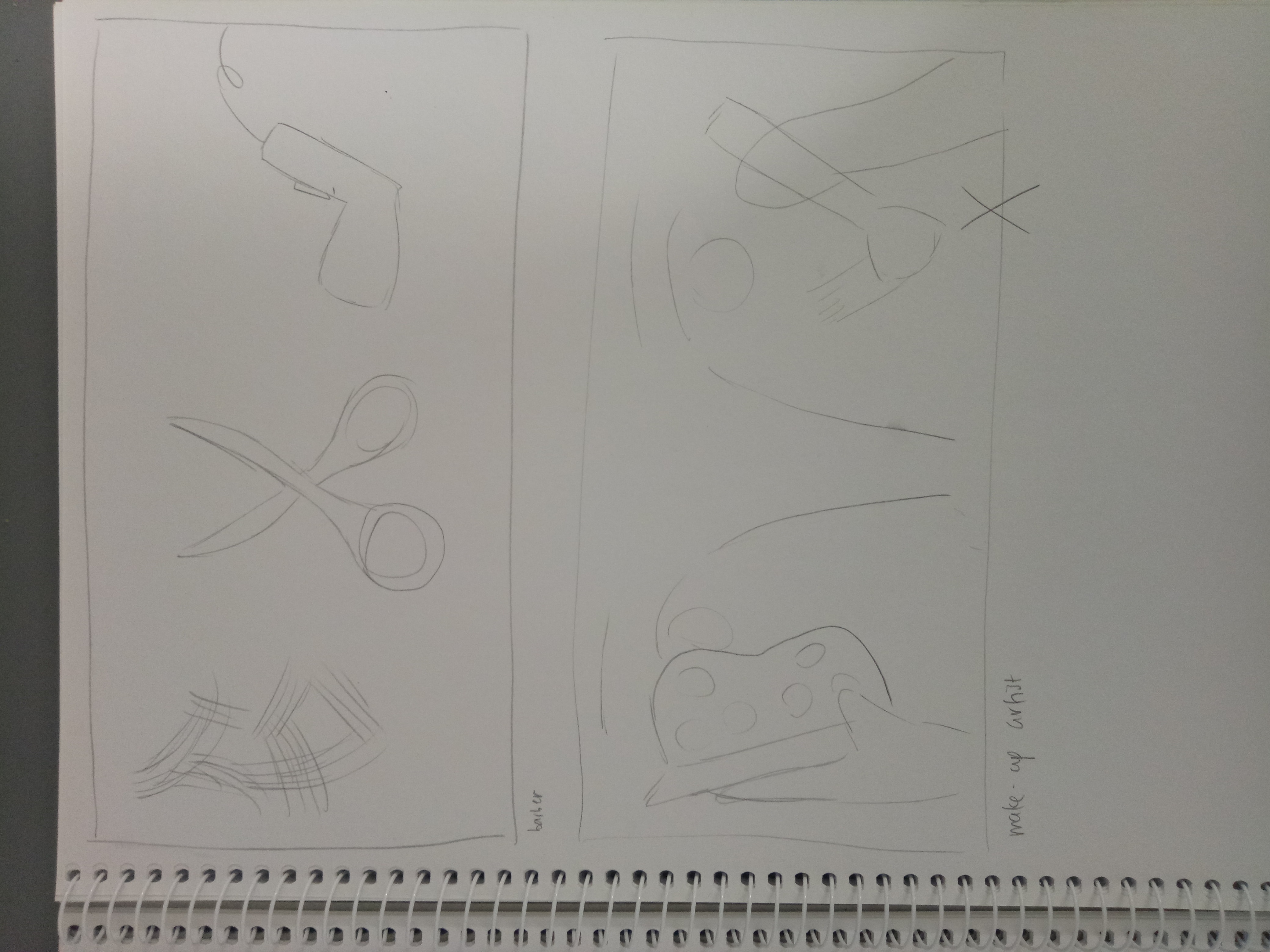
Those are two of my earliest sketches. As you can see, they’re heavily image-driven; so I scrapped all of them off.
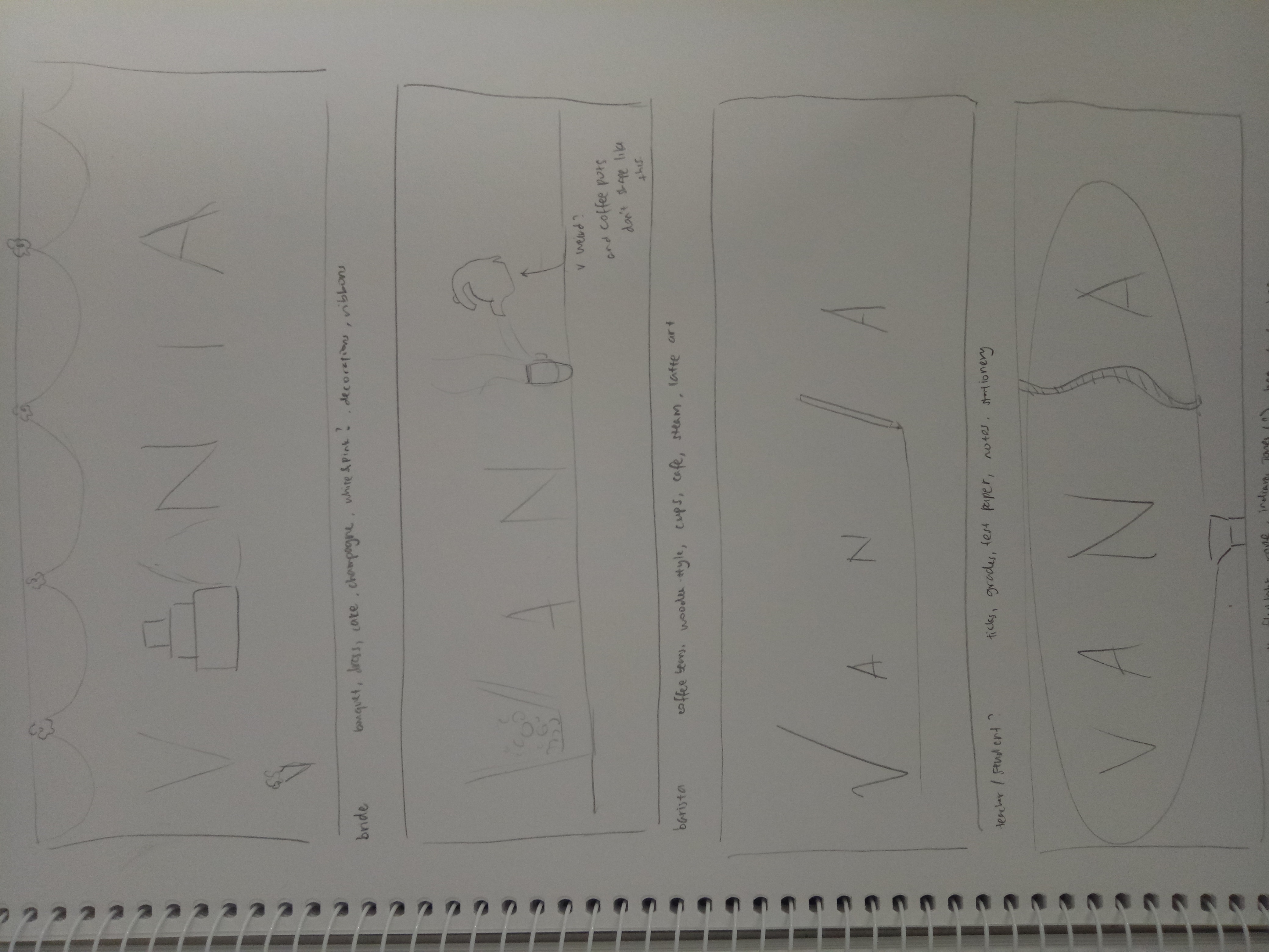
I made other sketches, but this time they’re too simple (see below). But somehow I have a better view of what my idea has to be; they have to be manipulated to show the techniques, but they can’t be too picture-driven as it will take the attention away from the letters.

Final Sketches
1. Barista

Keywords: coffee, latte art, coffee cups, steam, coffee beans, coffee grinder, cafe (usually associated with wood / warm colors)
I intentionally made the latte art as simple as I could because I wanted the attention to be purely on the letters, but then it looked pretty boring and didn’t really reflect latte “art”, so I will edit the latte art. I was thinking of using a wood-colored background and add some shadow, so maybe I will try it out to see if it’s too much.
2. Gamer

Keywords: characters, start / play button, consoles, pixels
I always associate “games” with “pixels” since it reminds me of the earlier games (actually I get the inspiration from Mario Bros), so I really, really want to do pixel art for this idea. It took me pretty long but I managed to make this (thank goodness).
However just from the interface, you can’t really tell of the “gamer” idea. It can be game designer or developer as well. So I plan to add a character and a “start” button underneath to emphasize the idea that someone is playing.
3. Thief
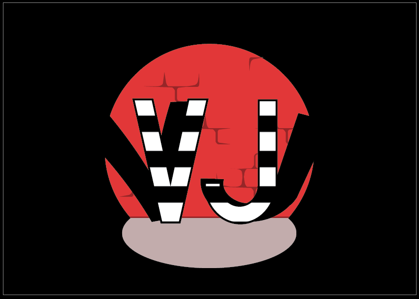
Keywords: illegal, getting caught, shady / dark atmosphere, guns, stolen goods (money), mafia, action
I know it’s very hard to tell that it’s criminal. It kind of looks like magicians performing onstage.
My idea is to make it look like they “get caught” (hence, the spotlight) when doing something bad. I used the striped pattern to replicate the image of a prisoner (which is related to something illegal), but I think the idea is not conveyed very well and it can be a lot of things instead (people may see criminal, or prisoner, or magician probably). So I need to edit it to make it more specific.
4. Electrician
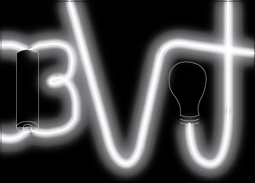
Keywords: light, circuits, battery, electricity, switch, cables, transformers, light bulb, LED, resistor
To be honest, that is a bad one.
I wanted to make out the letters using cables, but they didn’t turn out nice so I added the “glow” effect to make them like neon lights instead, but now the whole thing didn’t look like electrician at all. This one needs a lot of changes.
Takeaways
For most of my sketches, you can’t really tell what the exact occupation is, although you can guess something close to it. So the problem is I don’t make the pictures specific enough; I’ll have to research more about symbolism and semiotics related to the occupations I want to use.
I’ve never been very good at digital art (actually, I just learned Illustrator recently) so this is a challenge as well as a good learning experience for me. I learned more about Illustrator such as how to make glow effects, how to make clipping mask, how to unite two different things, etc. However due to this lack of knowledge I’m doing this project slower, as when there are things I don’t know how to do effectively, I still try to make them–and they either turn out bad or I wasted a lot of time doing them… or both. So I’ll have to do more research and learning about this platform I’m using as well.
UPDATE!
After I wasted a lot of my sleeping time to think, I decided to change a few ideas of mine.
For thief, I fixed it so it looked more like “in action” by adding gold coins and a hole on the brick wall, suggesting that they’re in the middle of stealing.
Gamer and barista will stay the same; the only difference is that I’m adding background to both of them.
For barista, the latte art will be much, much softer than my process illustration since after I did some research, latte art doesn’t really have sharp edges.

My reference picture [taken from https://makezine.com/2016/01/03/skill-builder-steam-milk/]
I also made the art more “fancy” and although (to me) it sort of takes the attention away from the letter, I think the letters are still recognizable so it should be fine.
As for the electrician, I think I’m completely scrapping the idea. I realized that from the beginning I was going backwards with the electrician job; I thought of what to make first rather than what job I want to convey, which makes me confused in the end. Because of that I couldn’t make good progress with my electrician, so I decided to just stop and start a new one. It’s probably a bit late, but I think I could manage it since now I have better idea on what to create. So,
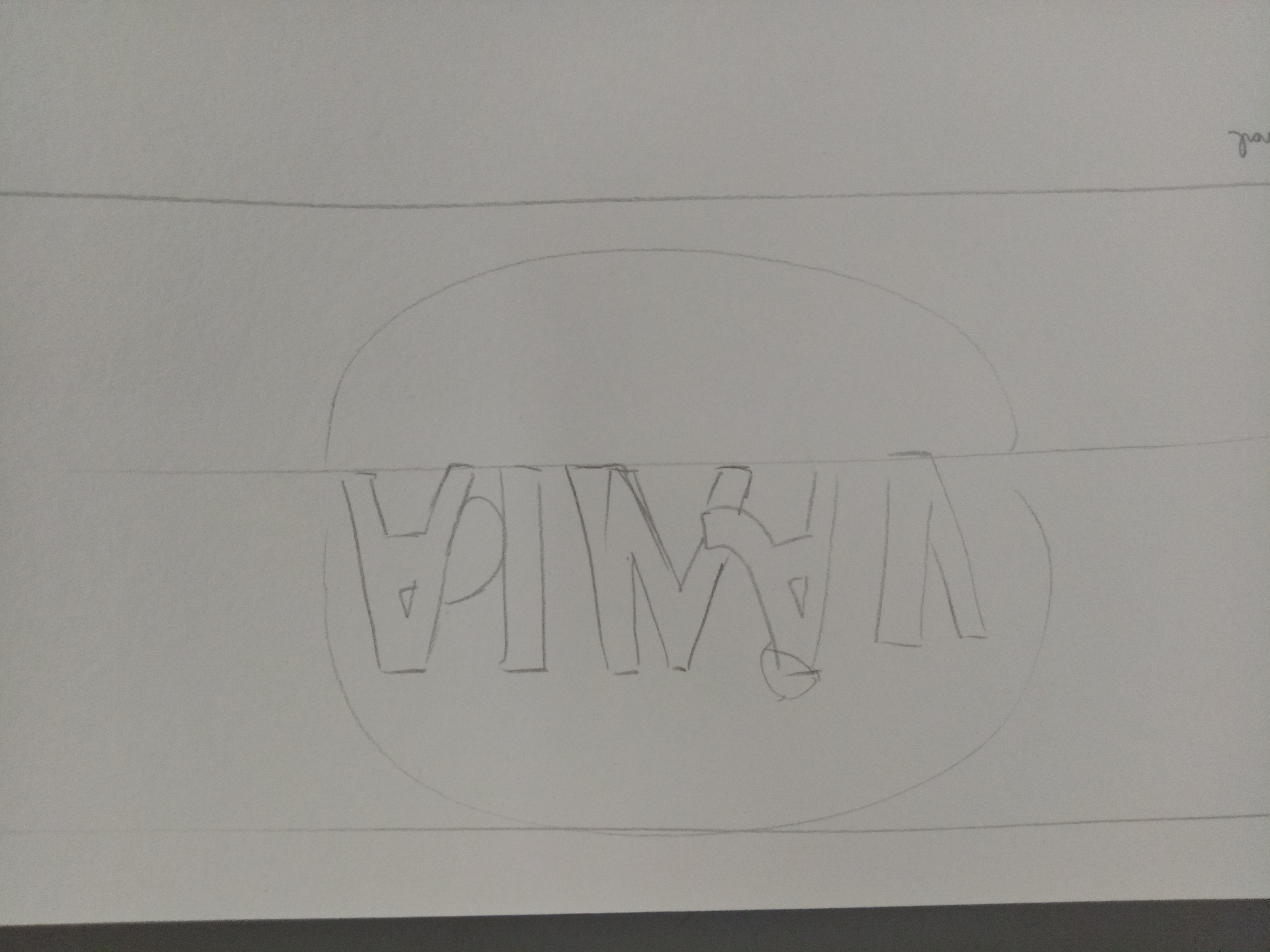
4. Watchmaker
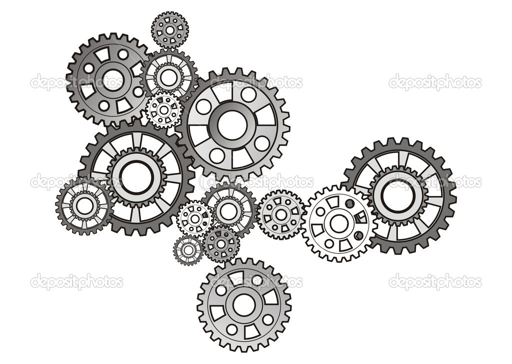
[from https://www.pinterest.com/pin/300896818830991738/?lp=true]
My idea is to simply put the letters of my name and fill in the letters with the gears of a watch. I won’t use much colors, probably just black and white and some grey.
I’m thinking of making one of the letters look like a pocket watch.
I just realized that all my four jobs have different style (kind of) of illustrations. I don’t know whether it is a good thing because it can mean that I’m flexible, but that can also show that I haven’t found my own style yet. That’s true, though–I haven’t really had my own style yet, so I think this is a good opportunity too to explore various styles for me.