Recap

So, the event that I chose to do is a stand-up comedy show that is a little dark and/or sarcastic. The concept is lemon-related puns with a lemon as the main character for the design.

The collaterals that I decided on are a poster promoting the show, a bottle label, and six-pack packaging for the bottles. The idea is the audience will be given a bottle for free to drink during the event, but they can choose to purchase packs of the drinks after the event. (Disclaimer: the drink is lemonade. This is a lemon event, after all. But for the sarcastic points, I do admit that they look like alcoholic beverages.)


Process & Final

Poster

So I came up with the character (lemon) and the “title”: When Life Gives You Lemons. Here are some of the drafts:
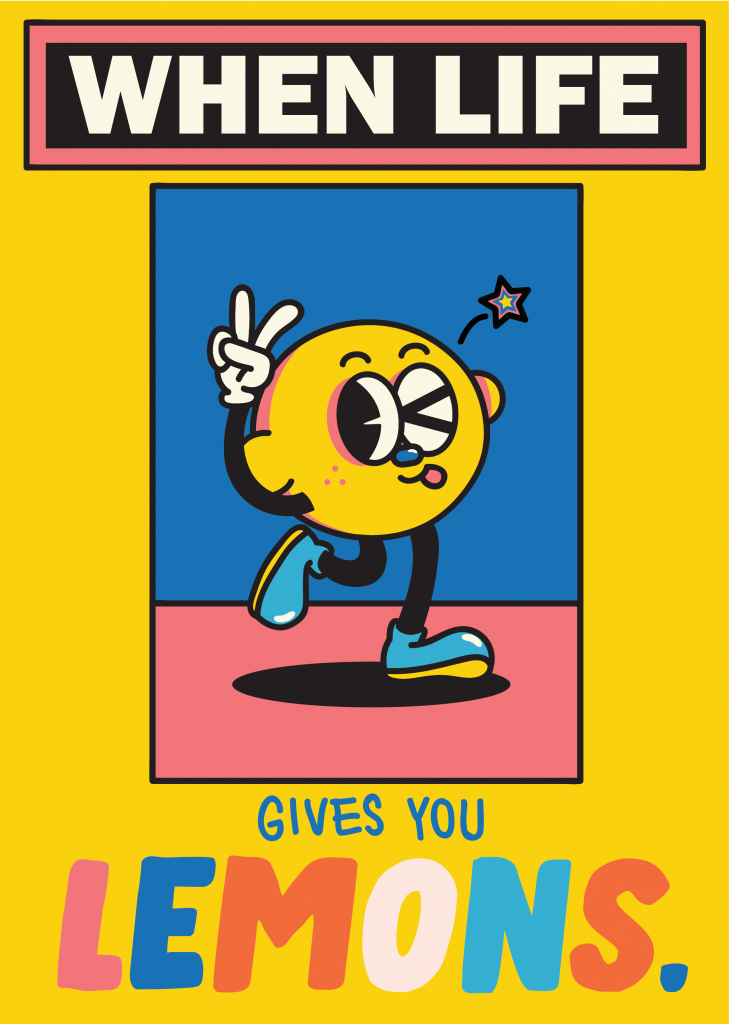
At first I came up with this, but it felt very limiting and way too similar to Yeye Weller’s style.
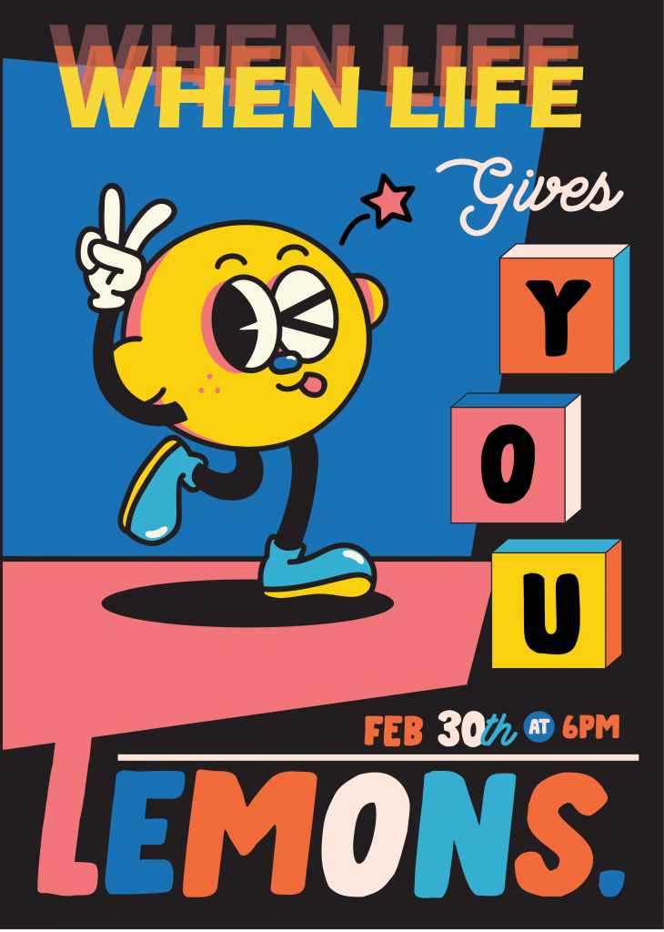
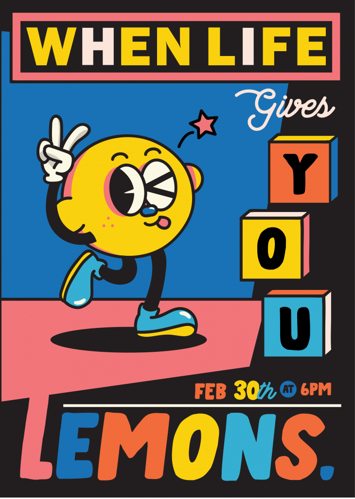
 

After some trial and error, here is the final poster:
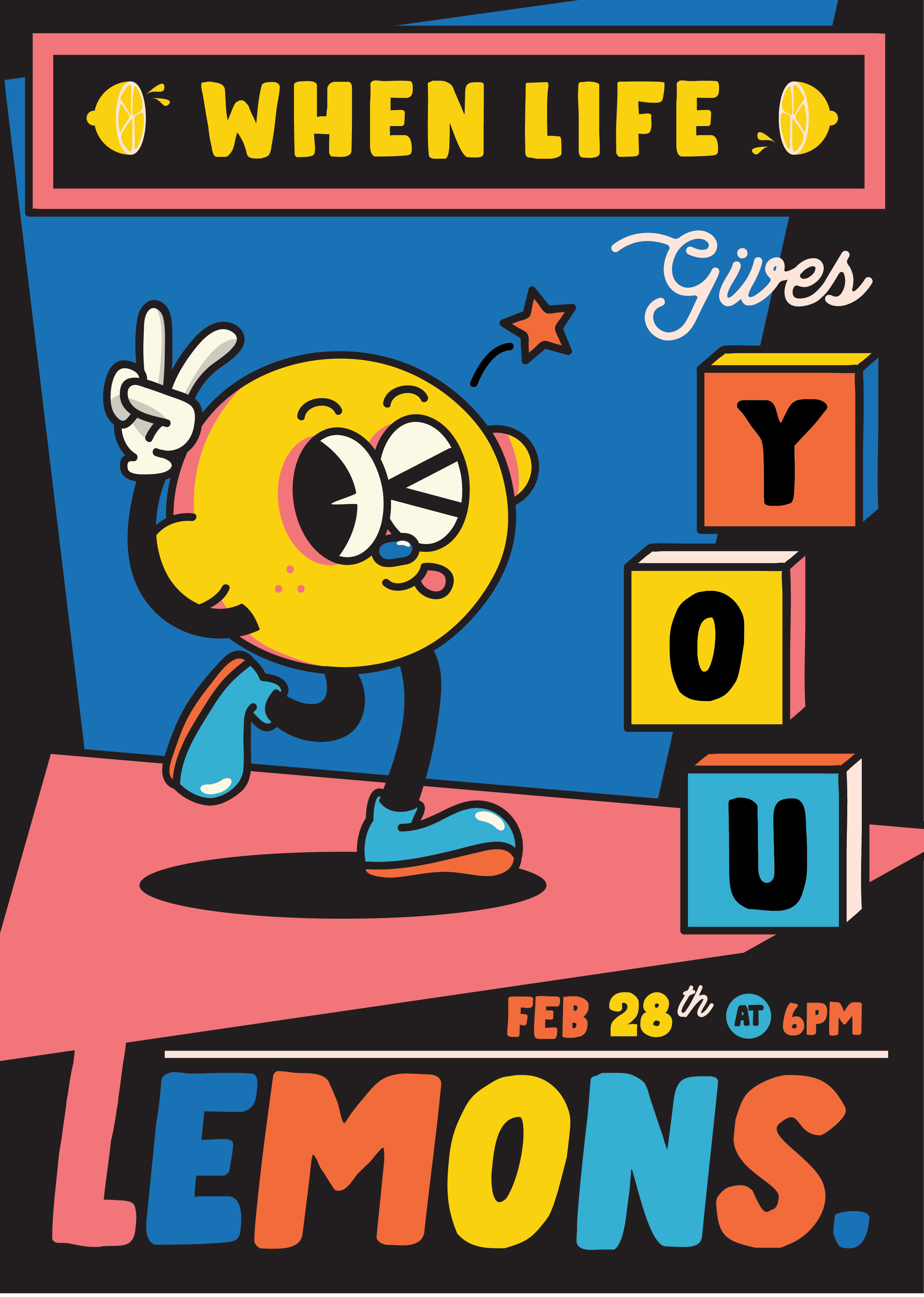
 

For the typefaces, I chose a thick handwritten-style font, paired with an elegant yet friendly cursive for contrast. I think they make a good pair in the theme I’m going for.

The biggest challenge with this poster was adjusting the colors, but I’m satisfied with the end result.


Bottle Label

So for the drinks, I used a pun with lemonade and called the drink “lemon-aid”. Since it’s an “aid”, my immediate idea was to draw the lemon sick or injured. Also, since the concept of the event is pretty dark, I figured that drawing a lemon cut in two will be perfect. So that’s what I did.

Here’s how the label looks like:
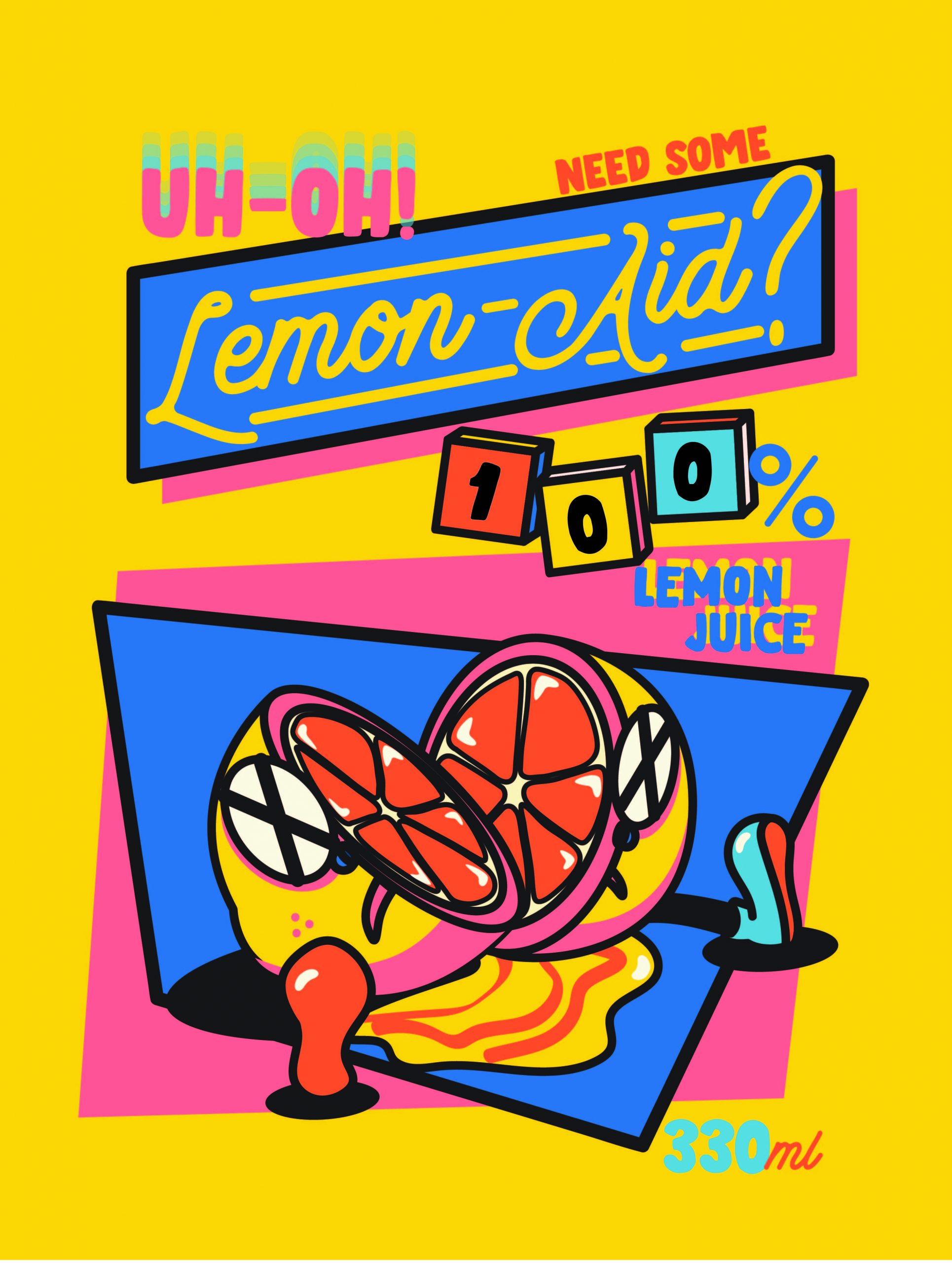
 

It’s definitely not perfect, but I’m really happy with how it turned out. Again, adjusting the colors is one of the biggest challenges I faced in the design process.


Six-Pack Box

Again, same with the other two, my issue was adjusting colors. So pretty much I did a lot of trial and error with different colors.

Another issue that I had was the composition. Unlike the poster and the bottle label, I wasn’t sure what to put at the front and how to arrange them in a way that is still within the theme, interesting, yet not too similar to my previous designs.

This is my first draft:
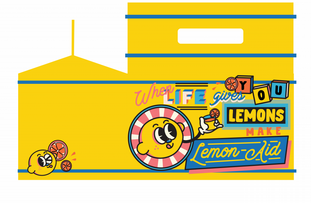
When I put it on the mockup file, I thought that having different colors for the side and front would be fun. Also, the side was too empty and it was too much of a “drop” compared to the front, so I added more stuff to the side. Here is the final:


Others

Besides the collaterals, I also made a label for the neck of the bottle.

I came up with two designs for the neck label:
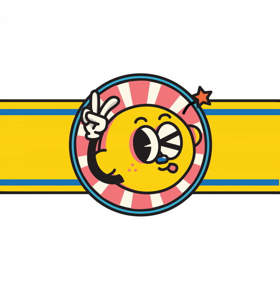
I decided to go with the first one after trying both out on the mockup file since it looks less packed.


Final (Bottle & Box)

Putting everything together on the mockup file, here’s how they look like (minus the poster):
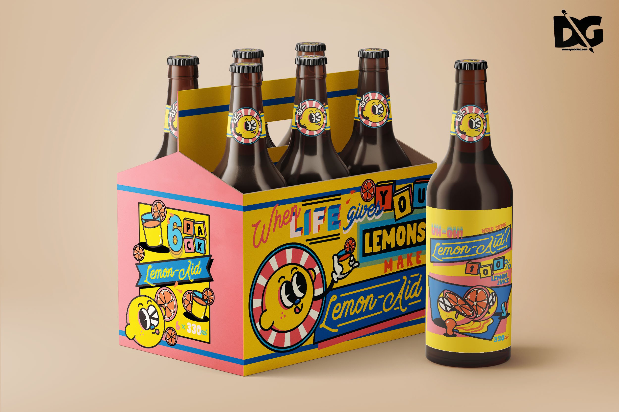
 

I think it turns out fun and cute while being a little sarcastic, just the way I wanted it.


Reflection

I find out that I really like doing this style. Also, that designing with this style is not as easy as it looks. I’ve always been drawn to flat illustrations and softer colors, but doing things with a fixed set of strong colors is actually good for me since I’m weak in color composition.

While doing this project, I asked for my friends’ opinions a lot (since we study together a lot) and I find that I can be quite stubborn with my ideas. When they give me feedback, I keep trying to justify why I did it that way. Now I’m a little worried about having to deal with clients in the future.

Adjusting colors has always been a big weakness for me, and I think there’s no other way rather than trial and error to come up with the best color composition. The thing is sometimes I’m not patient enough; when I see something that’s “pretty good”, I tend not to continue trying and settle with that. Which is also why feedbacks from my friends helped a lot in pushing me out of that comfort zone.

In addition, since the style for the design direction is more playful and “packed”, I had to be smart with the arrangement and styling of the words. Even just adjusting which component comes in front can make a huge difference in creating the overall look.

Also, designing things for 2D and 3D objects are similar, yet different. I had to adjust the label for the bottle several times to make it fit better with the face of the bottle, considering the way the bottle curved and everything.

All in all, I had a really good time working on this assignment. I think it’s become one of my favorite works. I might just use the concept and the character for something else in the future.

Here’s the link to my Google Drive folder for the final PDFs. Cheers!
Process

Thumbnails

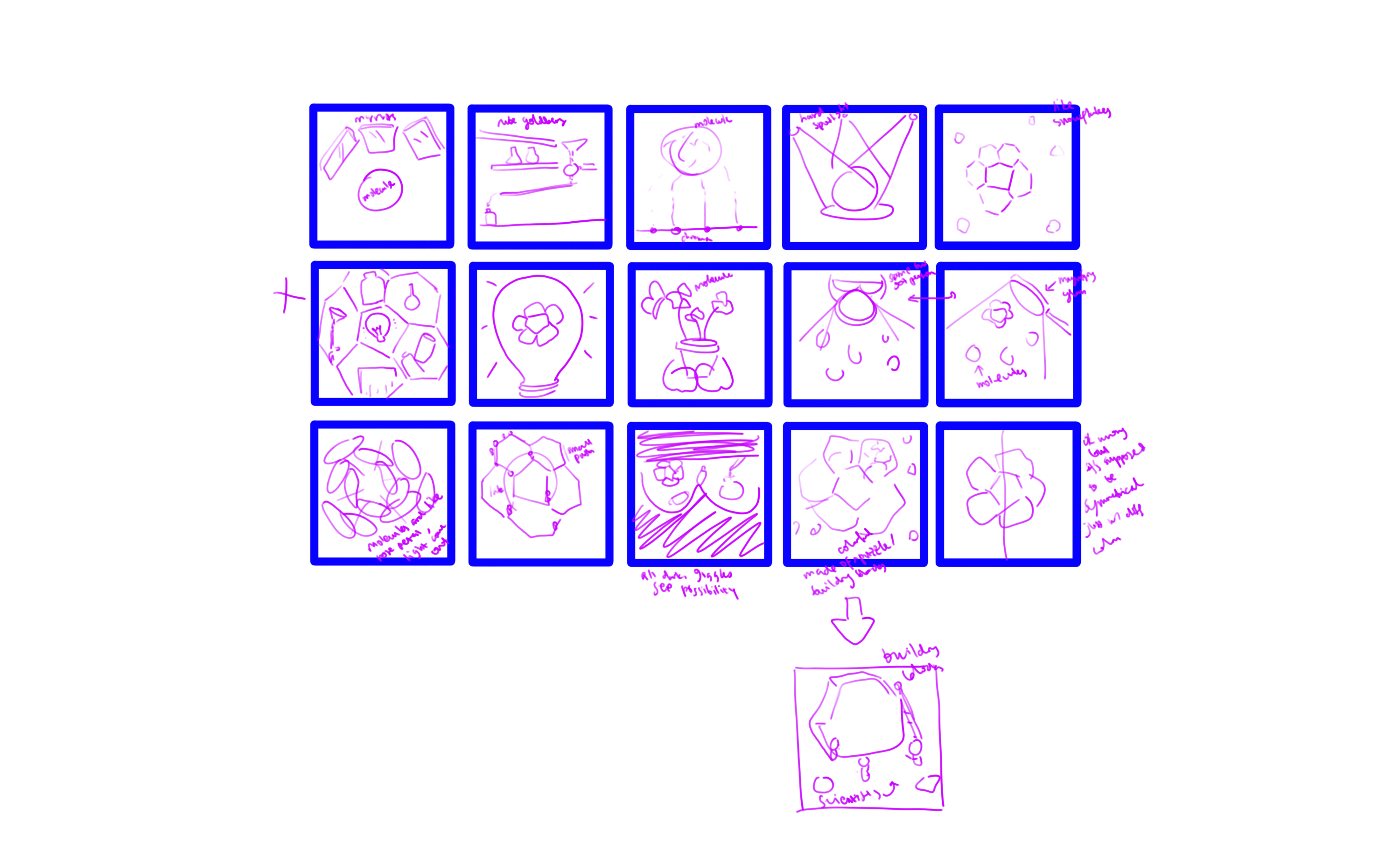
I came up with the thumbnails. Some of the keywords that I used in my ideation process are light, mirror/reflection, possibilities, symmetry, beauty, research, and discovery.


Sketches

From the thumbnails, I decided on three of the strongest ideas.

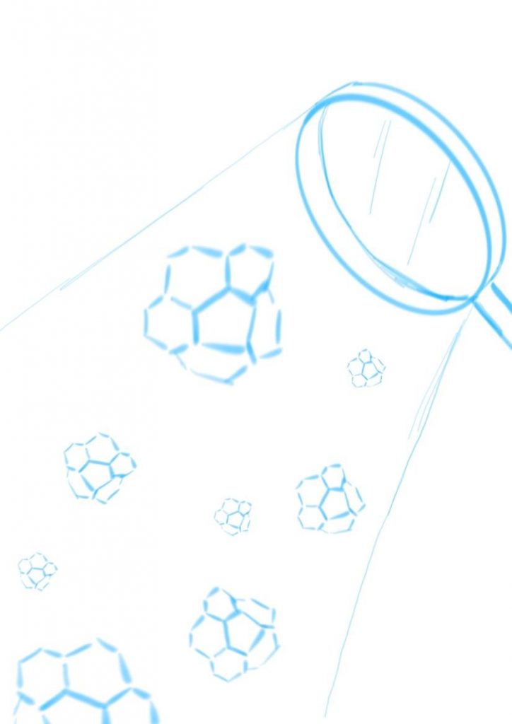
  1. Corannulenes under the hard spotlight from magnifying glass. Straightforward, simple, illustrating discovery and research. The corannulenes would be in different colors to suggest possibilities. I was thinking of making them look like falling snowflakes.

    Idea 1

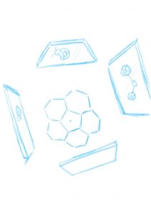
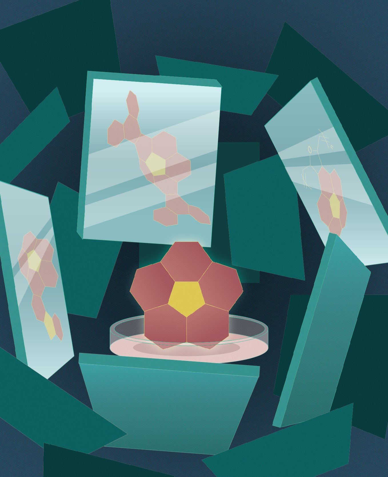
  2. Corannulene in the center as the main character, with mirrors surrounding it and showing reflections of the different possibilities of what it could be. The focus is on possibility and variability in research and discovery.

    Idea 2


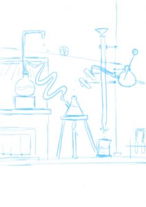
  3. I’m not sure what it is but it’s sort of like pinball machine/Rube Goldberg machine/just some kind of mechanism, like an arcade game where a ball rolls down to the bottom. Instead of a ball, a corannulene will roll down. It portrays the fun and insightful side of research.

    Idea 3


I asked for feedback from Professor Ela and she really liked the mirror idea (idea 2). To be honest, that is not my favorite idea (mine is idea 3). I wasn’t sure whether I should go with the idea that I liked the most or the one that the client liked the most. In the end, I went with idea 2. It is not going out of my comfort zone per se, since I don’t have any comfort zone (I am not that well-versed in illustration yet…) so I thought it’d be a good exercise for when I go out into the “real world” to follow what the client likes more. It is, in a way, a challenge I posed to myself.


Moodboard

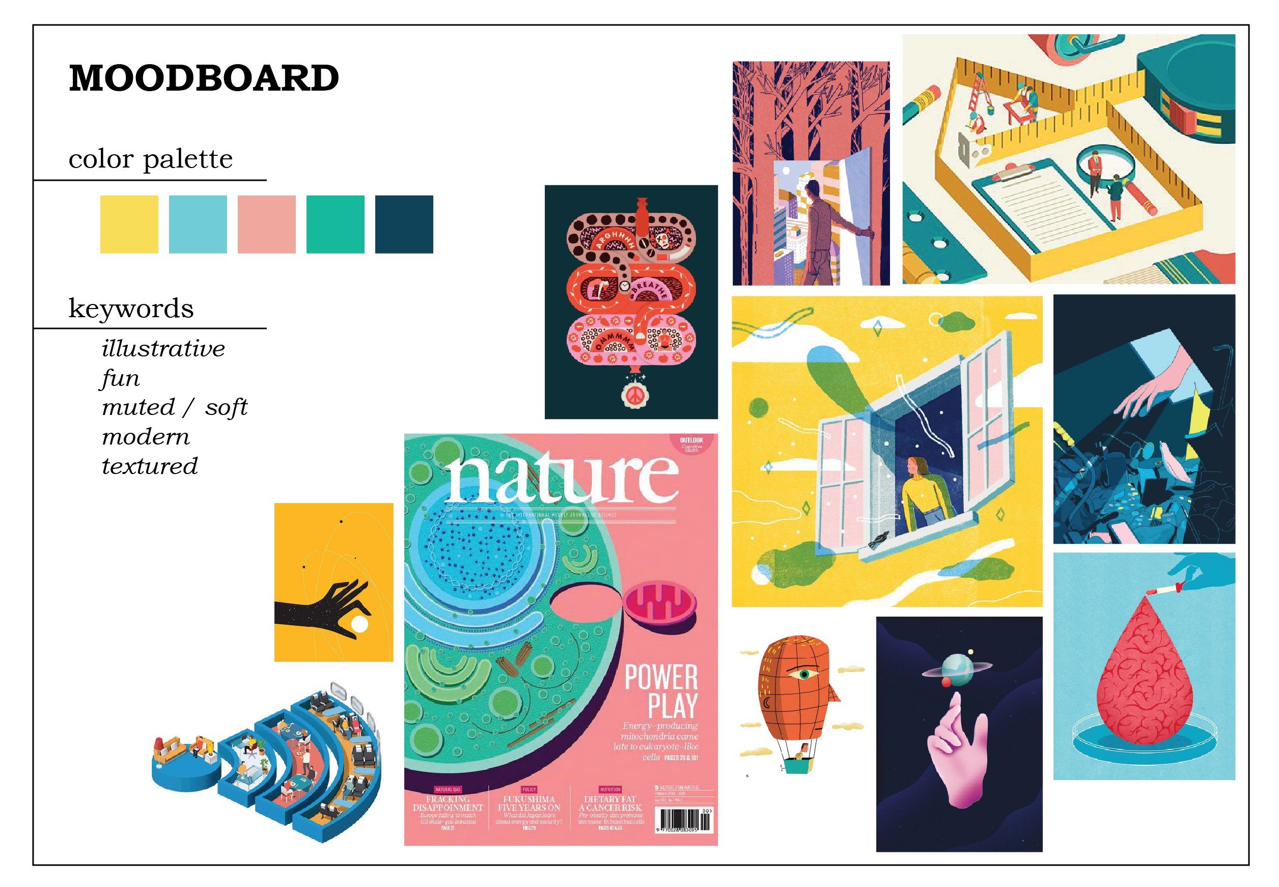
I want to practice drawing flat illustrations more, so here is my moodboard. I love the soft colors, especially the pink and yellow, and wanted to try using them.

I had some difficulties as I was envisioning idea 3 with this art style. For idea 2, I thought I had to go with a more realistic style for it to fit, but then I thought again, why not. Just try it. So I didn’t change my original moodboard and decided to just… go with it.

Final

This is my final result.


I put the corannulene in a petri dish to emphasize the fact that it is a molecule because one of the feedbacks that I got from my friend(s) is that they didn’t recognize it as a molecule, especially because I used color fill on them instead of the molecular skeleton. Taking into account the fact that the title of the journal would be in white, I used dark colors as the background. To draw attention to the corannulene, I gave it a bright color, although now I’m wondering if the pink and the yellow are too eye-catching.

My biggest struggle is giving depth to the whole composition. I added more mirrors with darker colors to illustrate mirrors that are further away, but it still fell flat. I also added noise (which made my Illustrator run slow…). In the end, I added gradients to most of the elements and a slight glow to the corannulene as an attempt to “save” the flatness. It’s still lacking, but it’s admittedly much better than before. However, I really should have made the gradient on the background more contrasting. I could also do better with my color choices.

I didn’t want to use gradients at first because they often turned out duller in prints compared to in screen, and prone to printing failures. I wanted to use a stipple brush for a shadow effect, but I am not sure how to do that (even after watching a video on how to do that) and I was running out of time (yes, I have terrible time management) so I took the shortcut which is using gradients.

There are so many things I could do better. However, it has passed! I’m kind of relieved since I was struggling and stressing over this assignment so much, and the result is certainly not the best I could’ve done, but I’ll give myself a pat on the back. All in all, that had been a great exercise for me.
Filter 1: Client

For this project, I asked my non-ADM friend to become my client. (She’s happy to do it.)

We have known each other for years, so suffice to say, I know her pretty well. I asked her about what she’s passionate about nowadays and she said sustainability; she’s been trying to reduce plastic usage more by bringing her own lunchbox for take-away food from the canteen and always using reusable bags when shopping.

Recently she encountered something that made her realize that a lot of people around her are aware of sustainability issues, yet are not moved to do something about it, and it made her rather upset.

Taking that, I put two keywords together: nature and sadness.

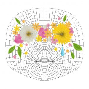
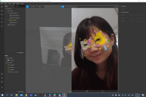
Here is the artwork.

Nature here is symbolized by flowers and leaves. I chose a daisy and a sunflower as the main flowers as those are my friend’s favorite flowers. Since my friend is a bright and positive person, I chose a bright color palette for the flowers in general, with occasional pale white flowers to balance out the daisy. Yellow and orange are especially her favorite colors.

As for the sadness, I put a single teardrop. It also portrays the loneliness of being alone, since she felt that she was fighting with the issue alone sometimes. Since the flowers are mainly yellow-white-orange-pink, the blue teardrop stands out well.

I also outlined the entire artwork with glowing pencil texture, but it’s not very visible. I wanted to give it a handmade feeling since my friend loves arts and crafts. I made it “glowy” to represent her confidence, the way she carries herself.

At first, I created the flower to cover the eyes completely to represent blindness to the issue of sustainability, but it might not look good as a filter, so I create openings for the eyes. I wanted to portray the saying “see no evil, speak no evil, hear no evil” but I got stuck on thinking of what elements to put. I didn’t want to ruin the composition altogether by adding too many unnecessary details, so I decided to focus on one, which is the eye part.

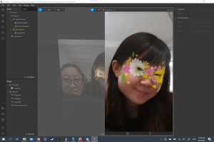
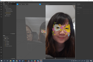
Here’s how it looks on her:

(She was excited to model for me.)

It does look a little weird on some types of faces since the brown centers of the flowers are located right at the corner of the eyes, but I’m quite satisfied with how it looks on my friend.


Filter 2: Self

One thing I need to say: I like BTS. I chose three BTS songs that I love the most, and I feel, represent me in different ways. (Also disclaimer: it didn’t take me very long to decide on this. Really, whenever I have projects about myself or my interests, my personality is suddenly reduced to either mental health or K-pop or both.)

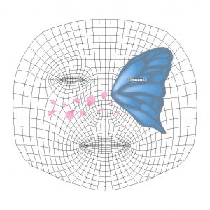
Before I go into the explanation, here is my artwork.

The half-wing of a butterfly represents the loss of hope and the inability to live up to potential. I am not the most positive person and I also have issues with self-esteem, so I think it’s a perfect representation of my inner problems. It is also linked to a BTS song titled “Butterfly”, which speaks about the fear of losing loved ones. In a sense, it also relates to me. In this pandemic, I can’t return back to my home country, so I’m really concerned about my family back in Indonesia and whether they are doing well.

The color of the butterfly is blue and grey, which is the title for another BTS song: “Blue & Grey”. The song symbolizes depression and loneliness as the colors blue and grey, and I relate to that a lot.

Lastly, the flower petals are the symbolization of the song “Spring Day” (because there’s a line that says “Flower blossoms are falling”), which is about longing to meet loved ones. This relates back to the point about my current situation of not being able to return home, and the desire to do so.

For the technicality, I tried to make it look more sentimental since the topics that I’m symbolizing are mostly emotional ones. I like how it turns out; it’s simple yet aesthetic, and there’s a nice balance between the somber blue and grey and the lively pink. Overall they look like they are symbolizing the arrival of spring (referral to “Spring Day” again?) and budding of new hope, which contrasts my representation of the half-winged butterfly. (I hope it makes sense.)

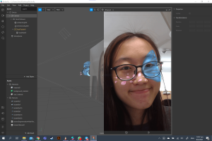
Here’s me with the filter:

I think it doesn’t look half bad on me. I still really like the colors. Blue just happens to be my favorite color as well.


Reflection

After I finished creating these, I was excited to see how they look on the faces. However, I was (and am) worried that it may be too simple. This is almost my first time creating digital illustrations (I’ve also never drawn anything by hand and scanned it digitally). I don’t know what my style is; I don’t know what to do, I don’t know how to blend colors. Time passed by so fast when you know nothing.

However, despite that worry, I’m still satisfied with how they turn out. Mostly though, it’s just me, just doing it. I didn’t think much about stylization, honestly, because I’m lost myself. So I told myself to just draw and that’s how it turns out. I suppose I should have dug deeper to find my style. For now, I’m happy just exploring. One step at a time!

Also, you can see that I drew the flowers first before the butterfly since the flowers are all drawn on one layer while the butterfly is very beautifully layered. I have learned from my mistakes.

I still feel like I should’ve done more, adding more elements? But this is what I can make within the time. So. Yeah.

Through the interview, I also learned the differences when I’m making things for myself compared to when I’m making things for others. For me, it was easy to just create something very personal. Also, when I’m creating for others, inevitably I’m adding things that reflect my perception of them.

All in all, this has been a fun project. Learning about Spark AR is interesting, and I can feel my own personal development throughout this assignment as well. Hope I can do better next time.


Here’s the link to the assignment folder!


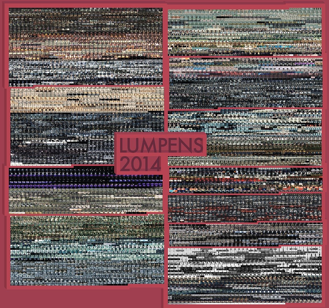
Lumpens: Pursue the Fantasy of Visual and Auditory Senses


Who?

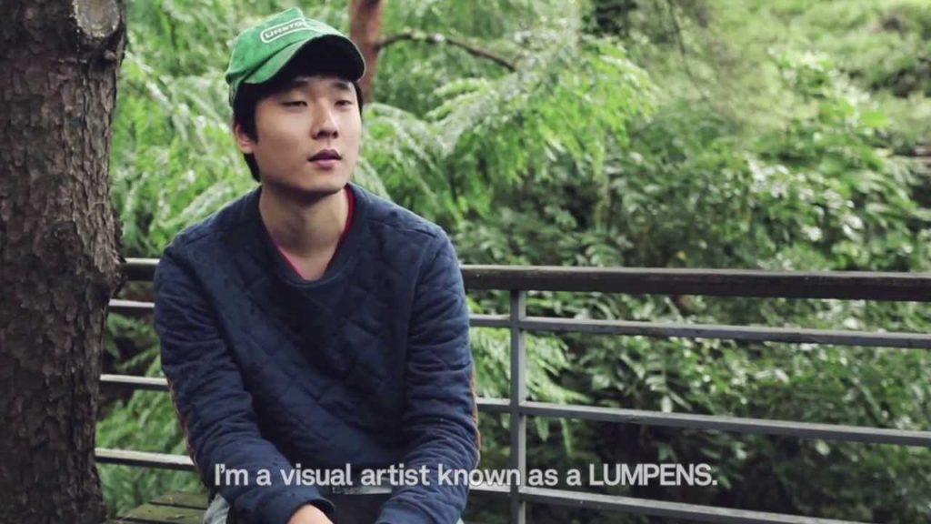
Although what he does may not be what I am (and probably would be) doing, I admire Lumpens—a group of directors and producers in the field of video production, mostly specialized in the production of music videos (MVs), TV advertisements, experimental films, and visual art, based in South Korea. They were created by Choi Yong-Seok in 2009 and consist of 4 people, but Lumpens usually refers to Choi Yong-Seok specifically.

I came to know them as they directed a lot of BTS music videos, which I enjoy immensely.


Choi Yong-Seok, the creator of Lumpens who is also known as Lumpens himself.


Why?

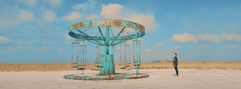
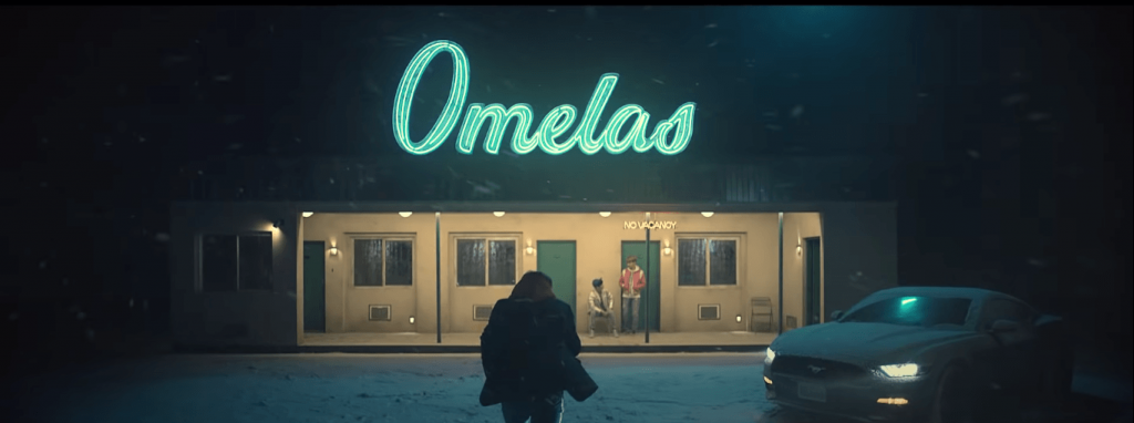
Firstly, they like to insert stories and/or references into their MVs; especially with the stories, it gave his MVs a cinematic feeling. One of my favorite MVs is BTS’s “Spring Day”.

I love the quiet aesthetics (the use of colors and how they match with the song lyrics), and also the implied (and obvious) references (Snowpiercer—a movie about inequality, The Ones Who Walk Away from Omelas—a philosophical fiction about injustice, and the Sewol ferry disaster—the sinking of a ferry which sparked social and political reactions in South Korea).


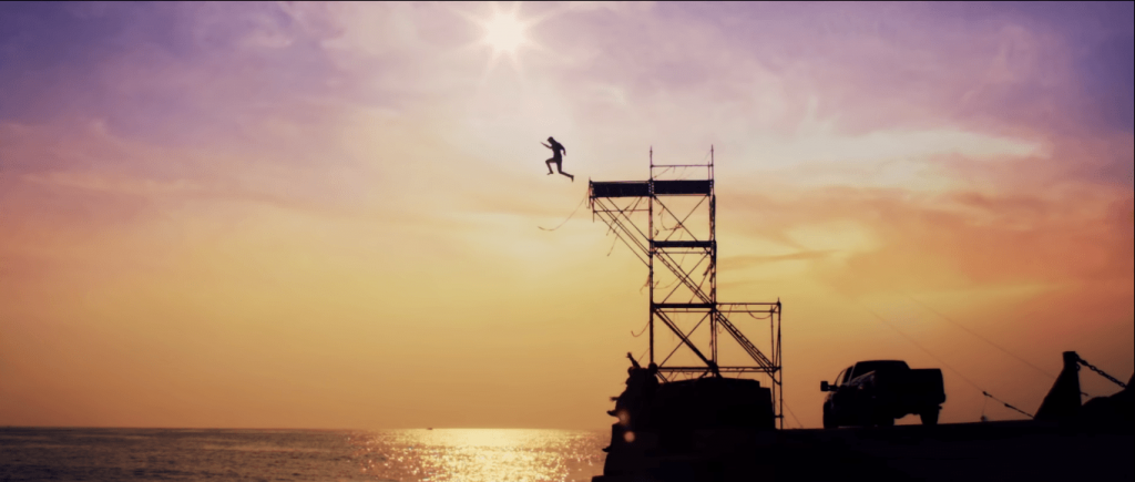
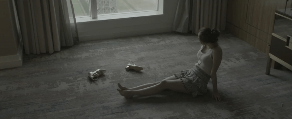
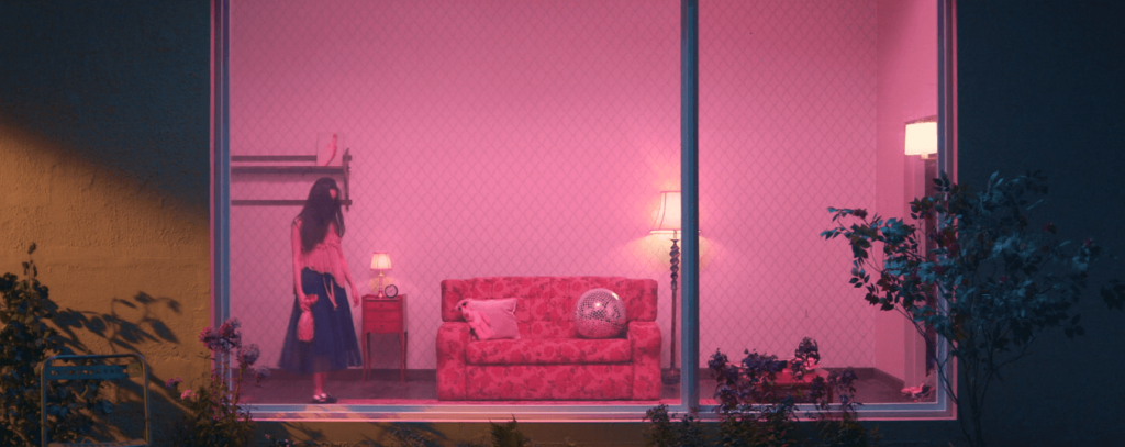
Some of the shots from the MV:


It gives depth to what people perceive as “just a music video” due to the hidden meanings and messages, on top of being aesthetically pleasing.


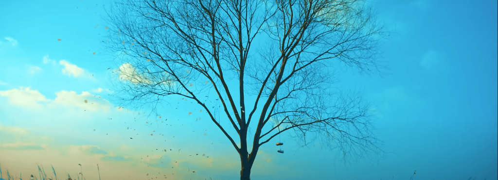
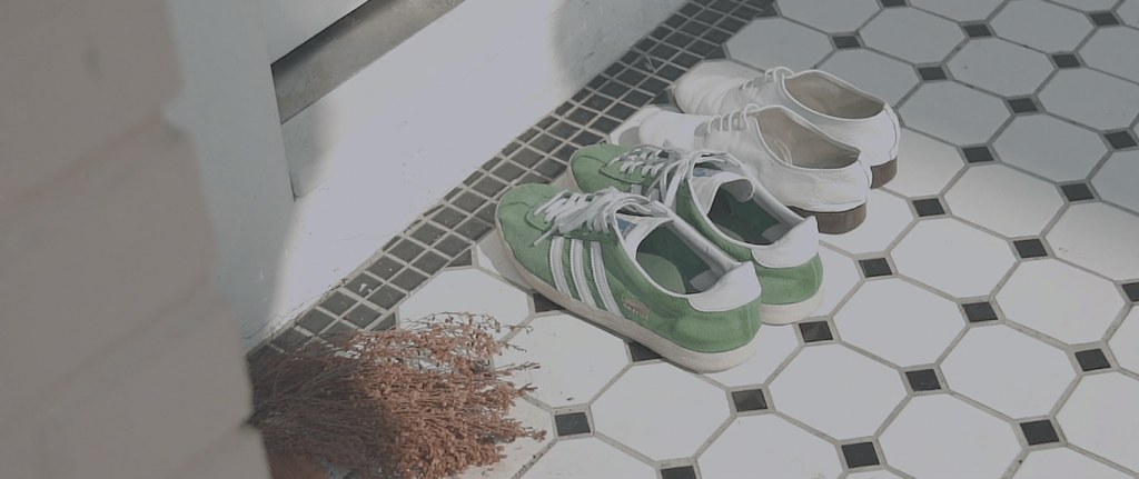
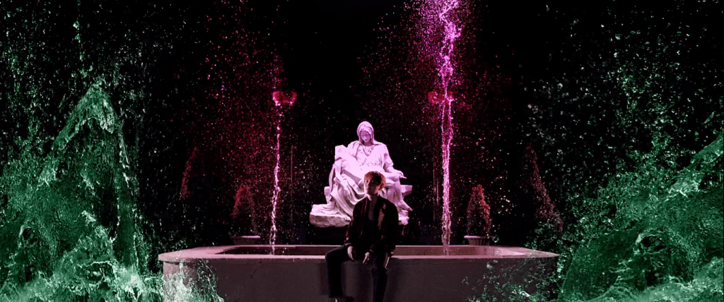
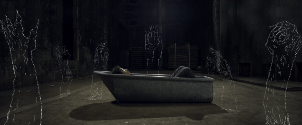
Other favorite shots from various of his MVs:


Secondly, I admire Choi Yong-Seok’s way of thinking. He graduated from a Visual Communication major, but he always wanted to express himself outside of the “screen”. He started making videos and exhibitions as personal activities. It’s almost as if he didn’t intend to be a director, but he just did his own thing to have fun and learn, and somehow, that’s how he became one. It reminds me that sometimes, things are that simple. You just have to work on what you like and be confident in yourself, and not worry too much, too far into the future.


[304 words]


References:

http://lumpens.com/about/

https://thesunnytown.wordpress.com/2015/03/18/october-2013-cuvism-lumpens-interview/

https://youtu.be/8NUtpJX_h6I

https://www.youtube.com/watch?v=Tye1ONFeKis&feature=emb_title

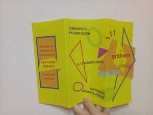
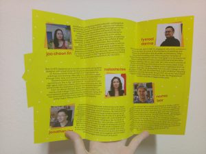
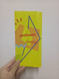
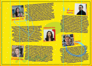
For my final brochure, I decided to use gate fold design – but it’s not completely gate fold since the first page are pretty much overlapping. It’s kind of styled like normal trifold, but the first and second page are not covering each other completely. (Honestly, I don’t know what this is called.)

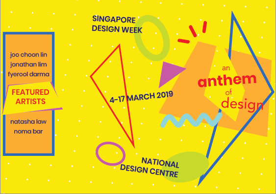
Here is my final design:

Physical copy

Front view when opened

Inside view when opened

Fully closed

I folded it wrongly at first. Since it’s glossy, it’s very obvious. (I’m sorry.)


Digital

outside view when opened

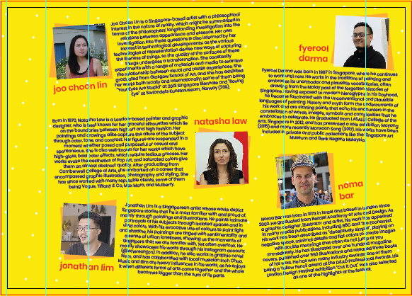
inside view when opened


For the front page, I’m sure I want to use a design similar to my poster from project 2 (see here) and put the details on the back page. I wasn’t sure about what to put on the second page at first since there won’t be much space. I thought of putting the details (the dates, etc) there, but there wasn’t enough space to make it look like those details are important, so I put them at the back. After trying out, I decided to put the names of the artists there, sort of like an “opening”.

I chose red and dark blue as the main eye-catchers, since they stand out the most when put with the yellow background.

As for the inside page, I put elements there at first. However, they don’t help to lead the eyes, and make the overall look more messy since it looks as if the elements were just thrown in without purpose. It also somewhat makes the texts harder to read. I was worried that just yellow with the polka-dotted background would be too plain, but since the page is packed with texts, it doesn’t look empty.

how it looks with elements


I added some geometrical shapes behind the photos of the artists to instill the elements that I incorporate in my front page. At first I wanted to make the photos circle, but I realize that my “title” design is quite angular despite having circles because the main elements in the design are the angular line and the trapezium lookalike. After trying out both design, I decided that squares are better, also because there are already circles (the polka-dots) in the background.

I also slanted the photos and the texts to add the “fun” element and make the whole look not as rigid, but I do think it does look slightly messy.

One big problem that I had was the texts; since I had to reach up to ~150 words, the texts are very chunky and space-consuming. I wanted to stick with overall A4 size, so I hope the texts didn’t turn out too small.


Afterthoughts?

I have made a brochure before (for my part-time job), but since it was a professional brochure, the layout was much more rigid and easier to arrange. Moreover, I just had to stick with the NTU-approved colors and font, so there was not much “trying out” to do. When I was making this, I really felt the need to be creative, to be fun, to be quirky. I was trying to find a really complicated, unique fold design at first. I felt pressured by the title “anthem” that I created myself.

But then, in the end, I decided to forget all about it and just focus on creating a brochure first. I feel that above anything, a brochure has to cater to the needs of the audience – in this sense, to inform them about the featured artists of SDW, while still incorporating the whole theme / slogan of the event. That doesn’t necessarily mean I have to be “oh-so-different” – I just have to stick with what I have to do, and not try to do too much at once.

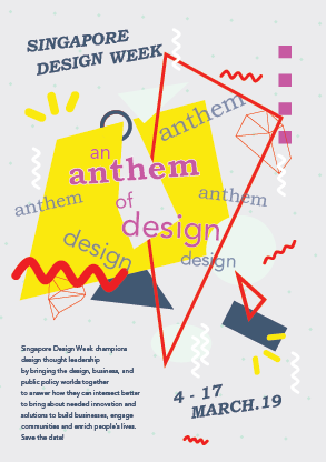
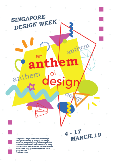
I decided to go with the slogan “An Anthem of Design”. Following my research and development post, I mentioned that the draft I made was not reflecting the spirit of anthem that I wanted, so I created a second draft.

I found inspiration for this from Pinterest, especially the color scheme. (I’m bad with colors.) Here is the image that I used for inspiration:

However, turns out that the pale grey background was muting the energy of the poster. I really liked the pale color since it makes the bright shapes stand out, but I do agree that everything does not seem as exciting as it potentially can be. I changed it to white afterwards.

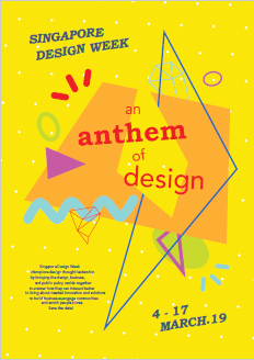
Based on the feedback, I then tried just changing the background with any color that I think are “exciting”: I used green, orange, blue, etc. But eventually I settled with the color yellow, since it looks the most playful in my opinion. Here is my final design:

At first I wanted to use red as a “guide” for people to read the parts, but apparently the dark blue catches more attention, so in the end I changed the color font to dark blue and refrain from using that color for the other shapes, except for the one shape that I want to use as a line guide. Since the slogan is kind of special, I used red for it. I also didn’t use red for any other shapes.

I also change the orientation of the shapes to create some kind of contrast. I took out all the shapes from the canvas and realized, I used so many shapes, it’s confusing even for me. So I cut down the number of shapes to make it less messy and to create more focus. I also cut down the colors that I used. After that, I just play around, putting the shapes one by one.

I took away the squares at the side too. At first I wanted to show that although it’s something fun and very free-spirited, there is still some kind of pattern or order to it. But then it does look like it’s framing the whole shape, restricting the canvas somewhat, so I took it out and enlarged the shapes instead.


Afterthoughts?

It wasn’t perfect. In fact, there are still things I can improve on. I was so focused on playing with the shapes and colors that I didn’t experiment much with the font types. But I think my design definitely improved from the beginning, and I actually had fun arranging the layout. I think this project pushes me out of my comfort zone. When I went to consult and showed my first drafts, I realized that I usually play safe with my designs, choosing something with less colors and less “experimental”, especially since I think my sense of colors is not as good. It might not be the best, but I’m satisfied with what I have made.

For this project, we’re supposed to make a poster for Singapore Design Week. I took out some keywords from the event description like design, innovation, engaging, etc and brainstormed them, finding phrases or words that are short and simple to be made into a slogan.

As for the art style, I am more inclined towards the flat illustration styles instead of something realistic.

So with the basic ideas and style somehow “settled”, I started out with a few concepts:


1. Design as innovation

So my first idea is something along the line that conveys the idea that design is something innovative, and that design is something everybody can think of or produce.

When I think of innovation, I think of new ideas, so I thought of a light bulb to represent the innovative part. As for the slogan, I thought of something simple like “Think Design” since it captures attention immediately and encourages people to consciously think of design.

However, I think it turned out very ordinary; there’s nothing special or exciting about it. It doesn’t really convey the idea of being innovative, and it doesn’t have personality.

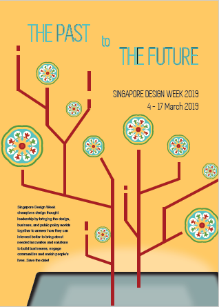
2. Design as a bridge through time

I was thinking of something that could get through the gap of generations, so I wanted to use something that represented the past, combined with something that represented the future. I chose Peranakan patterns to represent the past and something technology-like for the future. (I wanted to make it look like there are branches of lights coming out of the screen.)

I had a lot of troubles coming up with the slogan; I was thinking something like “The Past and The Future”, or “Design Through Time”, but nothing really catches my attention. Besides, I wasn’t sure about the layout and color as well. I think this draft looks awful.


3. Design as connection

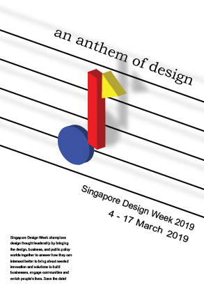
For this last one, I was looking for inspiration from the past SDW poster slogan. Their slogan is “A March of Design” (which, I think, is really smart since SDW is held in March). I wanted “connection” to be the concept; so I want it to be something that everybody knows and can relate to, something that everybody shares. Then I thought of the word “anthem” (by accident) and I liked it, hence the slogan: “An Anthem of Design”.

Since it’s about anthem, I wanted to create something shaped like a tone at first, but using geometric shapes (like Bauhaus). But it turned out very stiff and didn’t convey the excitement and energy of an anthem.


In the end, I decided to work on the third idea: An Anthem of Design.

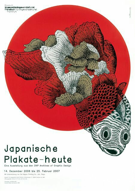
Here are the two posters that I find interesting.


Poster for Frankfurt exhibition by Kazumasa Nagai (from http://theanimalarium.blogspot.com/2011/01/life-is-change.html)


I found this on Pinterest and can’t find who made it. (from https://www.designspiration.net/save/1446483313272/)


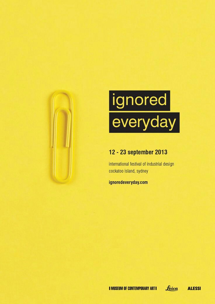
I will be talking about the second poster, the yellow one.

This poster is promoting a festival of industrial design in Sydney, and the slogan is “Ignored Everyday”. At first I’m really interested because of the minimalist appearance, with only yellow and black colors. My eyes were immediately drawn to the title due to the black highlights that contrasted the yellow background. After that, I shifted to the yellow paperclip, which didn’t blend with the background due to the outline and the shadow. It created a visual interest that makes people question, “Why a paperclip?” And that prompts the audience to read the information provided.

The information is written using sans serif fonts, which makes the whole look consistent and simple. All of them used black color, which contrasted the bright yellow background very well. I feel that the font size of the festival information could be a little bit bigger because the font is very narrow and thin, which compromises the readibility – but overall, I think it’s eye-catching, simple, and effective.

The theme for my project is the spring that comes after winter – the starting of hope, an early spring.

Winter is something that is associated with death, with coldness. On the contrary, spring symbolizes the birth of life and warmth. I want to symbolize hope as something that you can find even in the hardest moments.

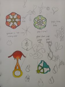
My initial idea was to create a snowflake design made of flowers, but after the first presentation, I got the idea of putting the “spring” using the negative space in the snowflakes instead.

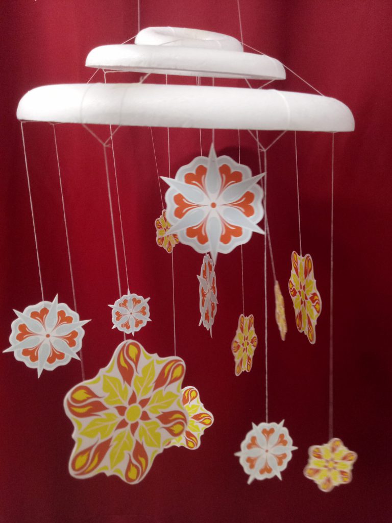
The very first design that I did was all connected because I was still thinking of the shape as something that needs to be able to be cut out from a paper. Moreover, the shapes are all either vague or too obvious. So after consultation, I tried to break free from the cut out form, combining the idea of winter and spring. The things that I chose to symbolize spring is sun, fire, water, and plants.

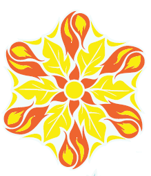
I made two snowflake designs. The first one is made of the shapes of leaf, sun, and fire. I chose yellow and red as the colors, as I want it to be triadic with the blue snowflake color.

The second one is made of the shapes of flower, water, and gingko biloba (a type of tree that grows in Japan and blooms in spring). For the colors, I chose orange and two tones of blue, playing on the complementary colors.

I gave a pale blue color to define the snowflake shapes, but they got lost after printing. The slight difference between the red and orange was also lost, making them look like the same color. The yellow was definitely too bright as well. (This taught me not to print last-minute.)

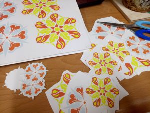
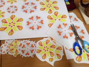
I arranged them randomly, with three foam circles on top to represent a cloud. I used nylon strings because I want it to be invisible, so it looks more like snowing, but it turned out really messy. I couldn’t really tie them properly. My craftsmanship is… bad. The paper cuts are pretty messy (I didn’t know something like x-acto knife exists before, or even if I spelled that right) and I only glued them with glue stick. I did leave them for hours under heavy books, but I forgot to attach the string so I had to rip them open again.

“I can cut all of these in 30 minutes”


*1 hour later* “…well I’m halfway there”


My bad.

Craftsmanship aside, I actually like my end design. It’s something I’ve never thought of before, and I felt like I understand more about forms after doing this. Positive-negative space is not as easy as it seems, no matter how cool they seem. I do think that I’m not pushing myself out of my comfort zone enough, that I still could do better – but overall, I’m satisfied. I did kind of lost my purpose halfway and realized that the mobile did not really represent hope; the blue color gave some cold feeling to it. Moreover, some of the edges for the snowflakes are quite harsh. I agree that at first glance it doesn’t convey hope, but I think that if you look at it closer, you can see the hope in it, and that goes with my initial idea.

I was so worried the day before submission because I felt like I haven’t done enough. Well, true, I could have done more, but I’m content with what I have made. Hopefully from now on I can make better and better works.

UPDATE: I took off all the fishing lines and replaced them with strings. Initially I poked the strings through the foam circles using a needle, and it was fine but it started falling apart the day I planned to submit it. I fixed them hastily with masking tape. It doesn’t look as neat, but it actually looks better than the fishing line.

Here’s my final design!


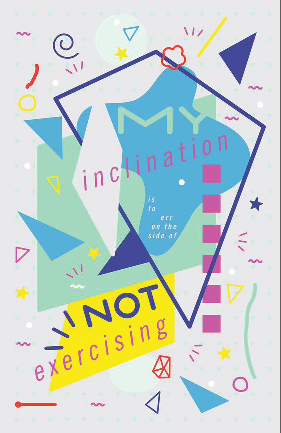
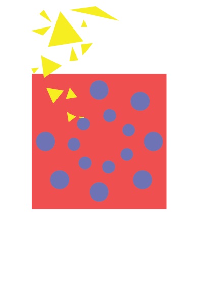
Sometimes, I feel like people living in Singapore lead a very structured, scheduled life. Compared to the people of Indonesia (I was born and raised in Indonesia), everything in Singapore feels very organized, to the point of rigidity. When I first came to Singapore, I was surprised by the stark difference between Singapore and Indonesia.

At first, I thought Singapore would be a “follow-the-rules” country, which hinders creativity. However as I spent more time in Singapore, I realize while there may be a lot of rules, as long as you can justify yourself, creativity is not being frowned upon.

I represent that discovery of mine with this Bauhaus piece; the blue circles are all in the box, seemingly following a set pattern; but actually inside every single blue circle there is a little yellow triangle that can go out of the box and explore more possibilities (represented by different shapes and sizes of the triangles).


Bauhaus piece