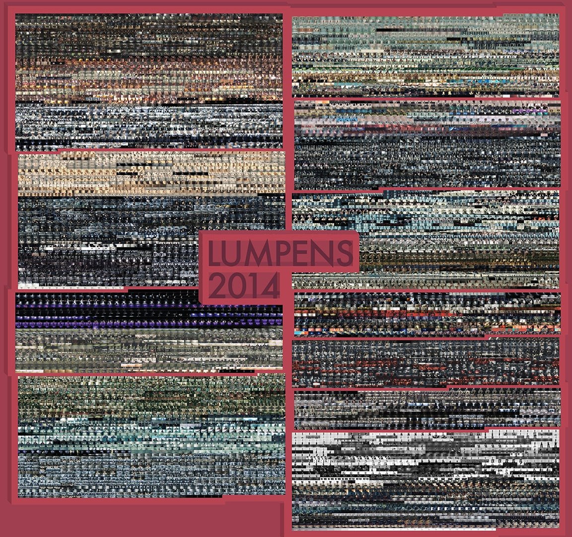
Lumpens: Pursue the Fantasy of Visual and Auditory Senses
Who?
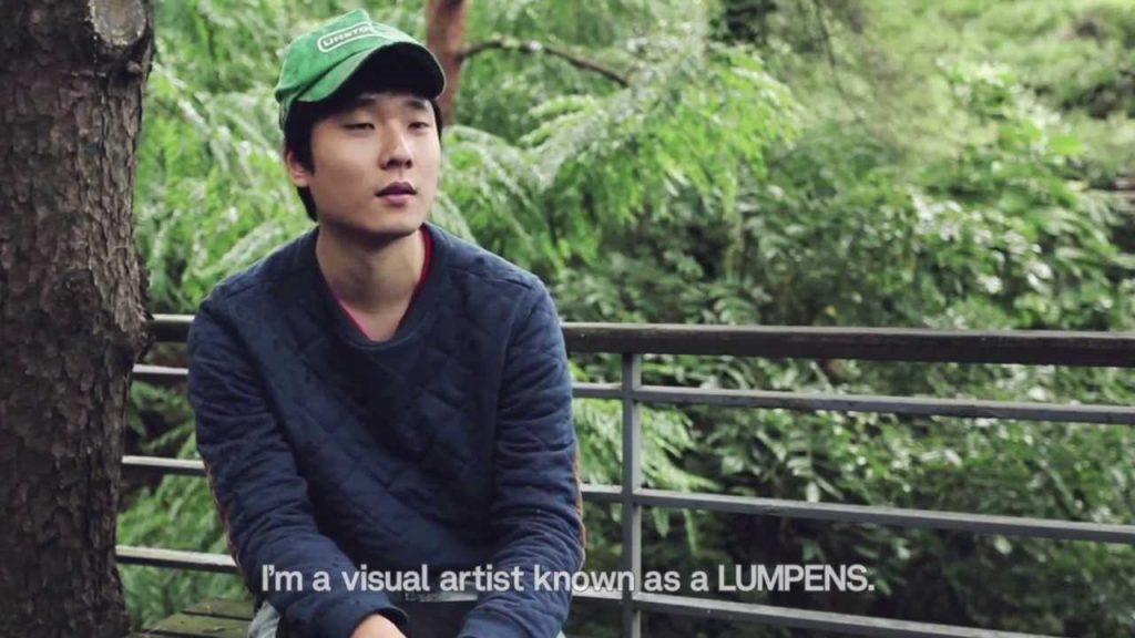
Although what he does may not be what I am (and probably would be) doing, I admire Lumpens—a group of directors and producers in the field of video production, mostly specialized in the production of music videos (MVs), TV advertisements, experimental films, and visual art, based in South Korea. They were created by Choi Yong-Seok in 2009 and consist of 4 people, but Lumpens usually refers to Choi Yong-Seok specifically.
I came to know them as they directed a lot of BTS music videos, which I enjoy immensely.
Choi Yong-Seok, the creator of Lumpens who is also known as Lumpens himself.
Why?
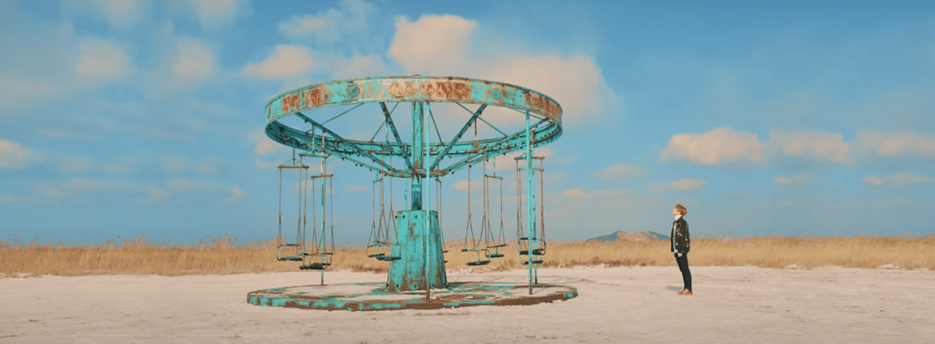
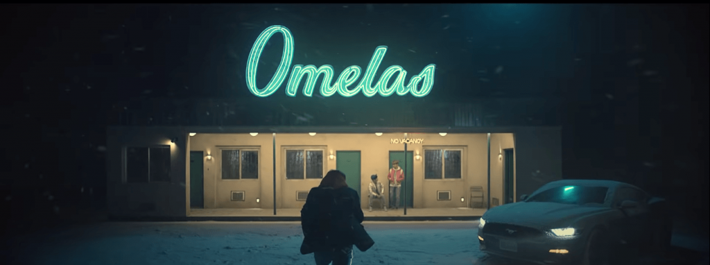
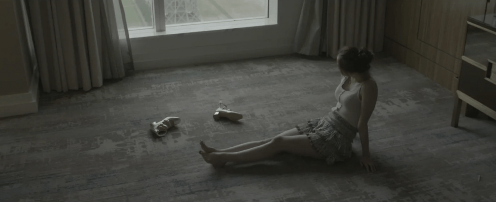
Firstly, they like to insert stories and/or references into their MVs; especially with the stories, it gave his MVs a cinematic feeling. One of my favorite MVs is BTS’s “Spring Day”.
I love the quiet aesthetics (the use of colors and how they match with the song lyrics), and also the implied (and obvious) references (Snowpiercer—a movie about inequality, The Ones Who Walk Away from Omelas—a philosophical fiction about injustice, and the Sewol ferry disaster—the sinking of a ferry which sparked social and political reactions in South Korea).
Some of the shots from the MV:
It gives depth to what people perceive as “just a music video” due to the hidden meanings and messages, on top of being aesthetically pleasing.
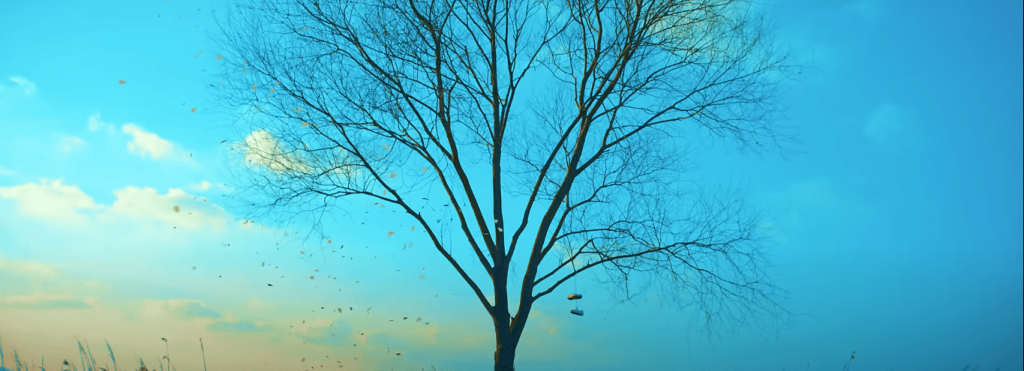
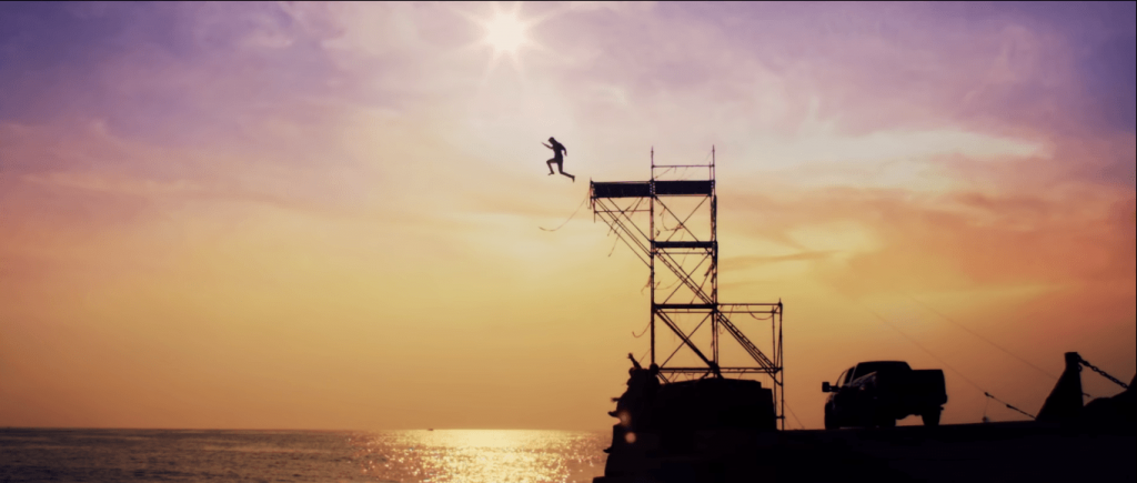
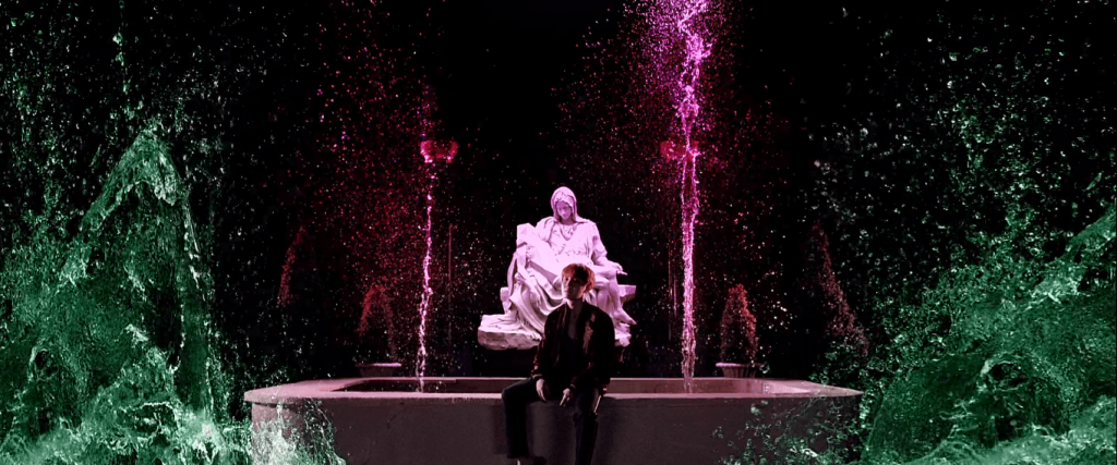
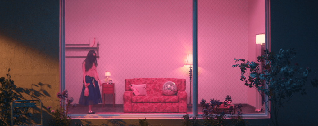
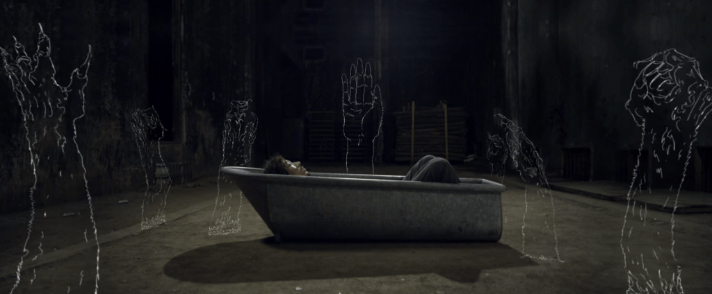
Other favorite shots from various of his MVs:
Secondly, I admire Choi Yong-Seok’s way of thinking. He graduated from a Visual Communication major, but he always wanted to express himself outside of the “screen”. He started making videos and exhibitions as personal activities. It’s almost as if he didn’t intend to be a director, but he just did his own thing to have fun and learn, and somehow, that’s how he became one. It reminds me that sometimes, things are that simple. You just have to work on what you like and be confident in yourself, and not worry too much, too far into the future.
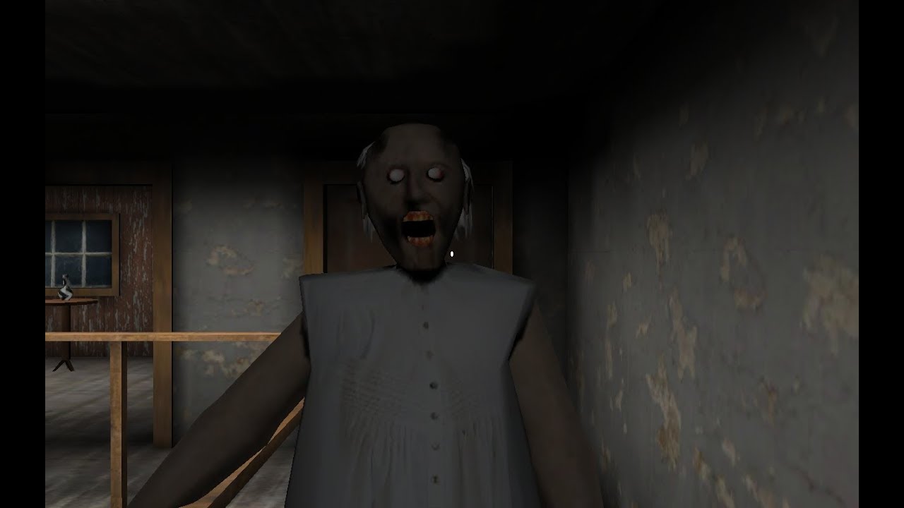
Henry Jenkins’ Game Design as Narrative Architecture discussed the argument between ludologists and narratologists. This argument regarding the necessity of narrative in games came from a lot of different aspects, but in my opinion, the most important factor is that there is a very narrow understanding of what a narrative is and how to convey them. A lot of people argued that narrative had to be paragraphs of texts or long-winded dialogues; something that has a clear beginning, conflict, and resolution. In fact, it is not necessarily so. For example, the horror game Granny doesn’t have a clear story: how did the player get there? What is wrong exactly with the grandma? But everyone knows there must be a story behind it; that is what compels the character to escape.
Granny
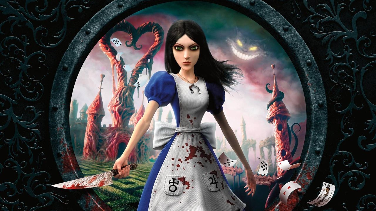
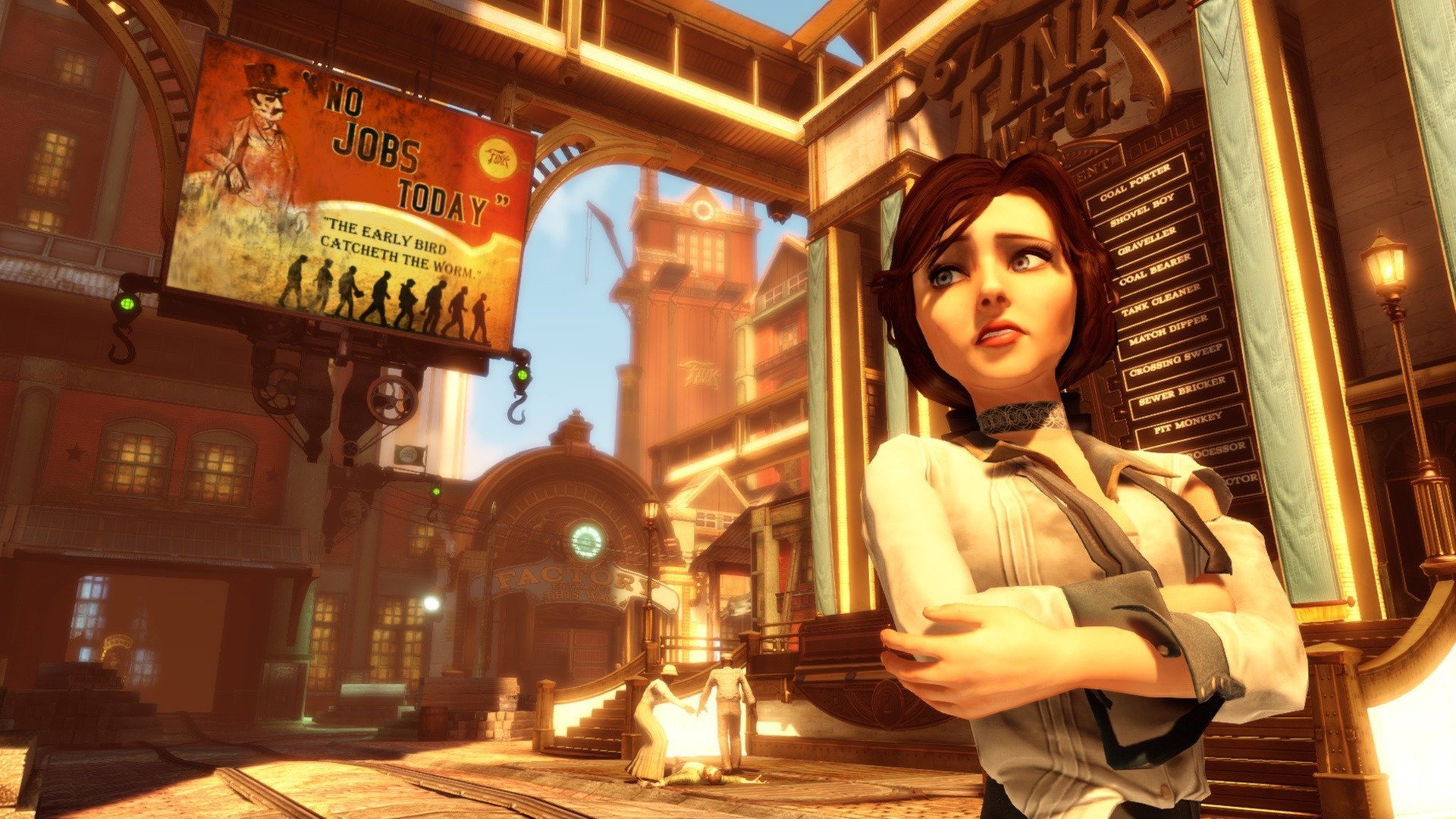
In the article, Jenkins mentioned various ways to tell a narrative without relying on words. In short, game designers can always use other things such as visuals (such as the background, the appearance of the characters), actions, and even the audience’s prior knowledge (like the game Alice, which made use of the knowledge of the story Alice in Wonderland) to enhance the experience of gaming. Especially visuals—books might spend pages trying to describe the fantasy world, but through game, it could be establish in one scene (e.g. the background, costumes, and technology in Bioshock Infinite can express the timeline and maybe even country it’s probably set at).
Alice
Bioshock Infinite
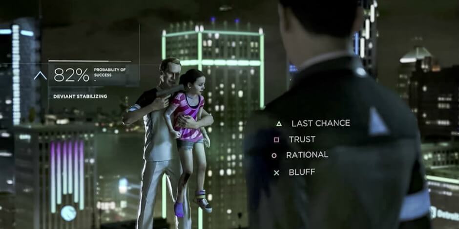
One might argue that visuals could also be achieved through movies—and here is where the interactivity of games comes into play. Adams said that interactivity is “almost the opposite of narrative”, and I disagree. Interactivity, in my opinion, is a form of narrative. Although a story might be predetermined to the letters, when the players are able to do something to trigger the uncovering of the story, they will undoubtedly feel more connected to the narrative. The difference between game and movie, hence, is when people watch movie, they are aware that they are watching someone else’s “life”. Meanwhile in games, the interactivity encourages people to think that it is their lives. Moreover, there are more games that try to provide alternative endings to the storyline in order to make things more engaging for the player—ranging from simple two or three endings (e.g. Undertale) to various endings to the point that it’s difficult for two people to sync their choices perfectly (e.g. Detroit Become Human).
Undertale
Detroit Become Human
I think this relates a lot to my project since we’re giving the players a certain plot for them to follow, with predetermined backstory and characters (comparing to The Sims, where those points might have to be developed by the players themselves). We do try to implement interactivity through choice-based actions—but the choices need to be important enough for the players to actually feel engaged. I think that’s a challenge that we’ll have to overcome in the making of the game.
“Simplicity, clarity, singleness: These are the attributes that give our lives power and vividness and joy as they are also the marks of great art.”
—Richard Holloway
Minimalism is an intriguing concept for me. It leaves a lot of “blanks” in the interpretation that everyone can fill in the blanks however they like. There is no right or wrong answer, but there is always an answer that is closer to the artists’ intention.
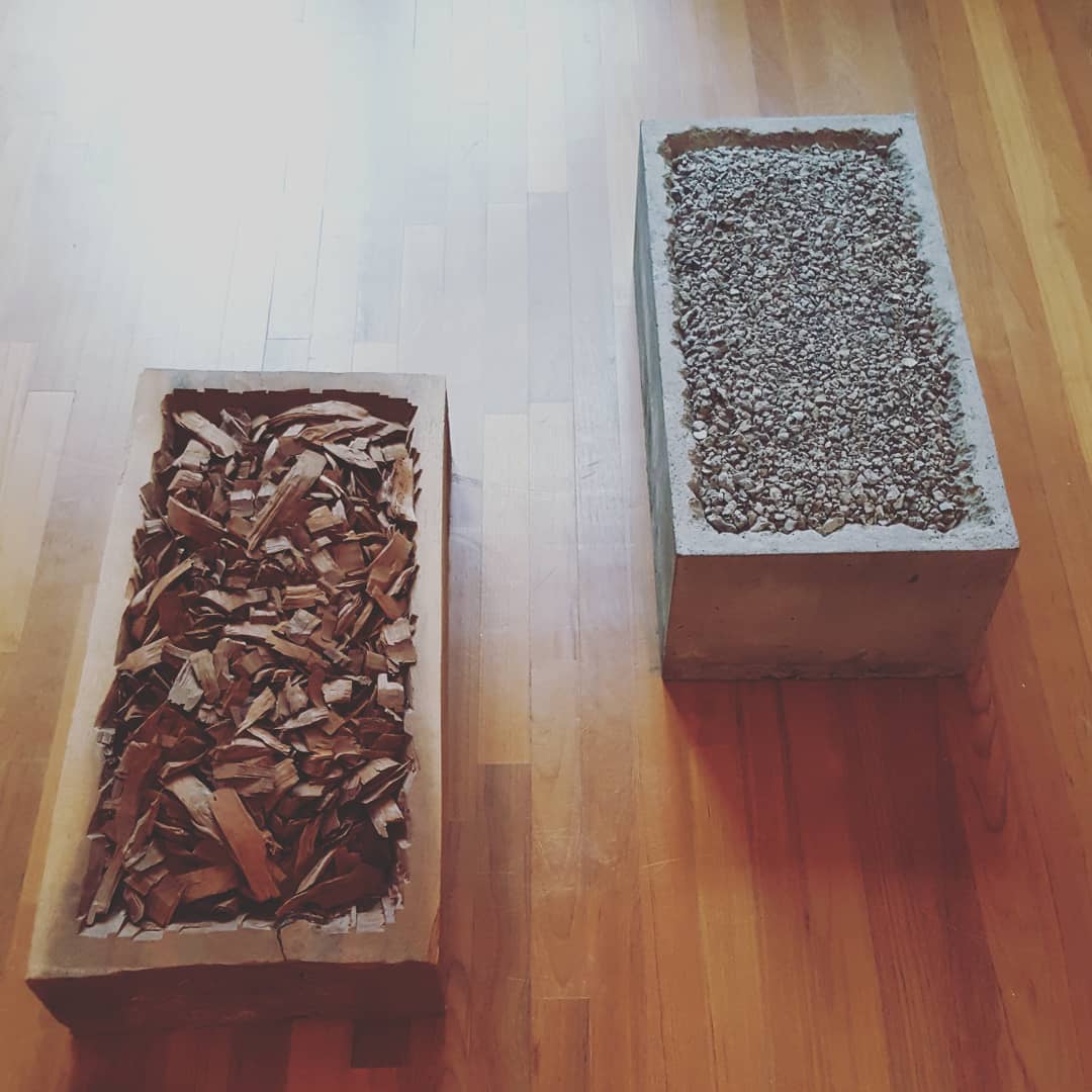
One of the artworks that I found interesting is Oneness of Concrete (1971) and Oneness of Wood (1969) which are parts of Jiro Takamatsu’s Oneness series (1969 – 1972).
Oneness of Concrete & Oneness of Wood by Jiro Takamatsu
I feel that in that simplicity—breaking things and fitting them back together—I can actually form a narrative inside my head. A tale about how sturdy things can still be broken. A story about how something can still be “whole” in its brokenness. A question of identity, finding beauty in the broken, life and death. There are plenty other narratives I can think of. The piece itself is almost poetic, I’d say.
While I think it’s essential for art to tell a narrative, I don’t think it’s good to enforce that. Letting the audience form their own narrative is just as powerful. Ironically, this is contrasting with my group’s project, where we are feeding the audience with our story. However, I think the “minimalism” can still be found in the way we tried to “show” (and not tell) the audience what’s happening, let them interpret the severity of the situation themselves, and give them a certain degree of freedom to act.
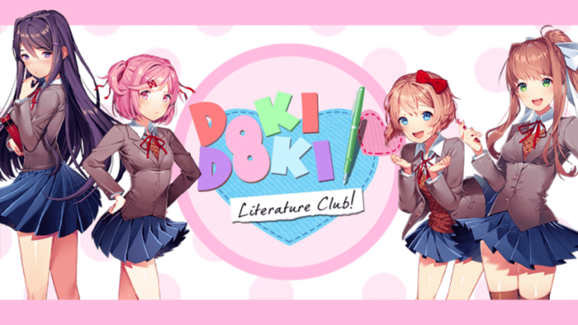
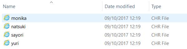
Doki Doki Literature Club (DDLC) is a visual novel created by Team Salvato, a game development studio founded in 2017 by Dan Salvato. It has the premise of a dating simulation game.
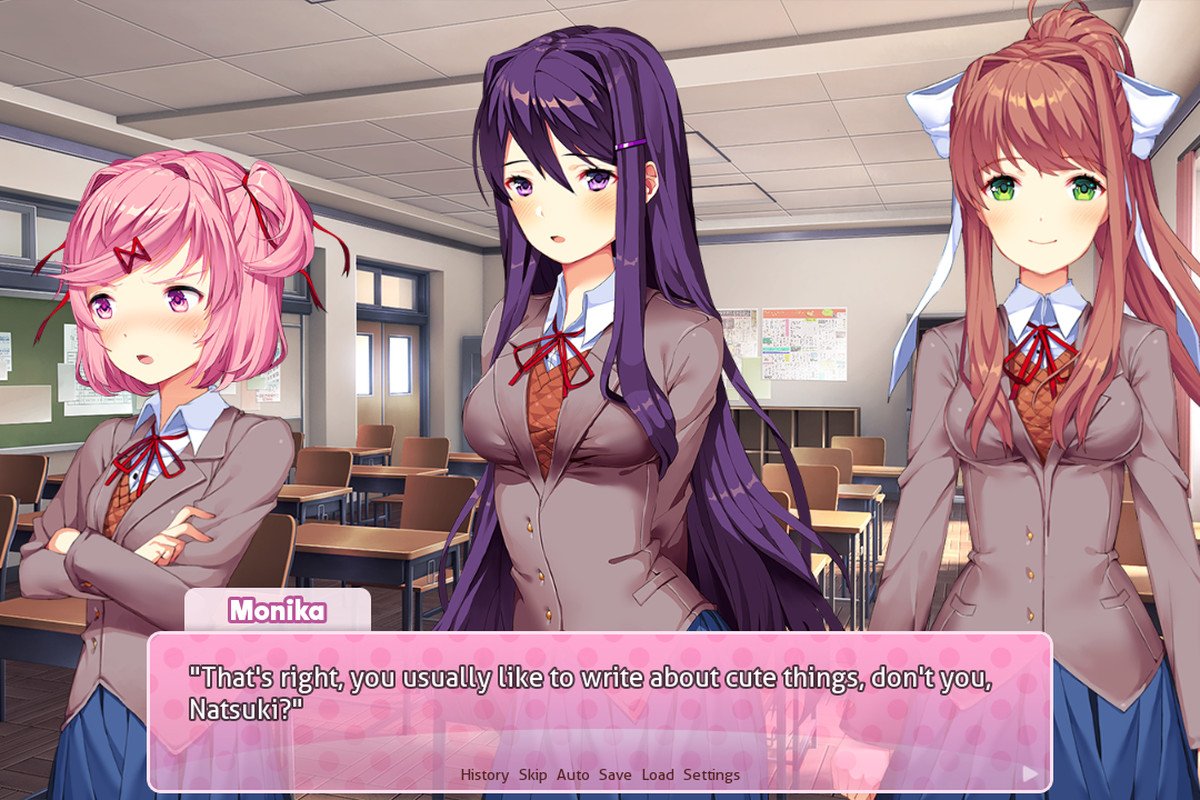
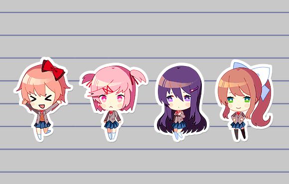
You play as the male protagonist who is invited by your obnoxious childhood friend, Sayori, to join the club of which she is the vice-president: the Literature Club. You reluctantly agree in hopes of quieting her down. In the club, you meet three other girls–Natsuki, the petite girl who can’t be honest sometimes; Yuri, the sophisticated girl with a taste for mysteries; and Monika, the popular and dependable club president.
Gameplay
It’s mostly text-based (since it’s a visual novel), but there are some interactions. You can gain favor from the girl of your choice by choosing them directly when prompted to (e.g. when being asked who you want to help, etc) and by creating poems. Since it is a Literature Club, you will have a “homework” of creating a poem every day. The way you create poem is by choosing the words you want from several lists of words. Different words will appeal to different girls; for example, the mature girl will prefer complicated words, and the cute girl will prefer fluffy, simple words.
The next day, in the club, you can show your poem to the girls and they will give their opinions on it (depending on what words you chose). As they develop better opinion of you, you will get to know them better.
[Just a thought: they call it a “Literature Club” but really, it’s more of a “Poem Club” since all they make are poems.]
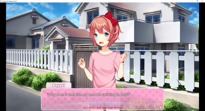
Screenshot of the gameplay. [https://www.polygon.com/2017/10/22/16512204/doki-doki-literature-club-pc-explained]
Making poems [https://www.polygon.com/2017/10/22/16512204/doki-doki-literature-club-pc-explained]
Twist
However, as you progress through the game, you will find out the darker side of the characters. You find out in the end that their issues are “triggered” and even “enhanced” by Monika, who is aware that all of them are in some kind of a dating game. Some of the characters end up dead in less than pleasant ways because of that.
In the game, Monika does not have a route–you cannot “get together” with her. Monika poses questions about the culture of dating games; why do the characters not have any “choice” whether they want the protagonist or not? Why are the characters always so obsessed with the protagonist? And she will mention that she does what she does to the other characters because she falls in love with you, which inevitably makes the audience sympathize with Monika. However, is that really justifiable for her to drive her friends to the brink of madness, just because the world is “unfair”?
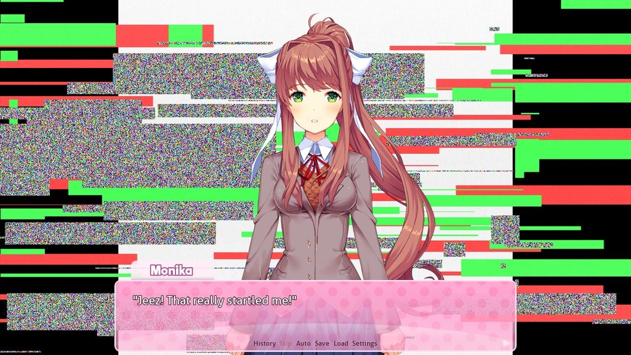
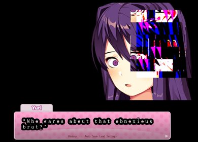
The color palette of this game consists mostly of bright pastel colors, which enhances the cute and comforting mood. The contrast then becomes stronger compared to the moment after the story takes a dark turn, where the visuals will change. At first the change will be small and unnoticeable; the screen turning red for a split second or a very quick glitch moment. But then it will grow to be something bigger; change of fonts, change of the characters’ personality or appearance, etc.
I feel that those small changes can give a lot of impact; it unsettles the players in a subconscious way, compared to a direct way where a bloody dead person is shown on the screen. (Although this game definitely has the direct way as well.)
Paired with the visuals, the music also starts off bright and cheerful, and slowly changes. The song is the same, but there is slight changes in the tempo, key, and volume that, again, subconsciously unsettle players.
Characters
All the characters in this game have so-called problems. Sayori has depression, Yuri is obsessed and enjoys cutting herself, Natsuki is abused by her father, and Monika is obsessed with the protagonist to the point that she deletes her friends’ character files so she can monopolize the protagonist.
Those make the characters feel more realistic. They all still some kind of cookie-cut personalities or archetypes–which is totally fine, since there is no such thing as an original personality anyway. But what defines them is how they interact with each other and how they act to handle their so-called problems. Through their different ways of coping, audience can readily relate and sympathize. That’s why I think the characters in this game are very well fleshed out, and although the concept of the story itself is not new, the characters can make the story good. It makes me think that a narrative doesn’t have to be complicated, as long as you can find a mean to make people relate in some ways to the narrative–in this game, through the characters and the difficulties they face.
Use of Files
In order to progress with the game, at a certain point, you have to open the game’s files and delete a file. Moreover, if you open some of the files, they will show special images that you won’t see in the game, or descriptions that hint at the idea that someone is breaking the fourth wall. I think it’s an effective and interesting way to show that a character is “self-aware” instead of just showing a monologue like “I feel like someone is controlling us”.
However, the downside is that players may not be aware of this. It’s not common for people to open up the game’s files while playing or actively altering the files as a part of the gameplay. I think it robs some level of excitement when you have to research to find out how to progress in the game. Some people who are not aware of that just leave the game in the loop, unknowing that you can actually progress, because the loop does look like a proper ending. (It is the so-called “bad ending”.)
In order to progress, you need to delete Monika’s file at one point. [https://gameplay.tips/guides/1299-doki-doki-literature-club.html]
Interactivity
Since it is a visual novel, the interactivity is definitely lacking. However, aside from that, the thing that I find a bit tedious about this game is its nature of repetition.
In order to fully understand the game or to get the “true” ending, you will have to play the game more than once–ideally three times. Since this is a text-based visual novel, the texts and conversations can be chunky to the point that I feel they are dragging the gameplay. There is an option to skip the texts, but they might also skip the small changes in the unread dialogues, resulting in you skipping things you don’t know. However, contrary to my opinion, some people actually say that they wish there is more time for them to interact with the girls.
In addition, there is a very fixed way to playing this game–in order to progress, you have to do this exact action, and you have to do this, and so on.
The choices you made matter very little since it only has one fixed ending. Moreover, since the gameplay was making poems but the ending has nothing to do with that, it makes me wonder what the point of the entire interaction is.
Theme
Besides addressing the problem with dating games, the game also touches on the subject of mental health issues. Sayori, is suffering from depression. Dan Salvato based her on his own acquaintance who suffered from depression, making her character’s emotions and expressions highly realistic and even relatable to a certain degree.
Since the game is not promoted as something about mental health, I think it will expose more about that to people who are not interested in understanding mental health in the first place. Sayori uses simple expressions to try to explain her depression. I think that’s an effective way to show people what depression actually feels like, and actually intrigues people to learn more about mental illnesses.
“People become disturbed when forced to think about things they don’t want to, or shown a reality that they always try to ignore,” he said. “But humans aren’t rational creatures. It’s when we’re emotionally charged that we become inspired to do something for ourselves, or for others.”
Since this game contains disturbing contents, there are warnings at the beginning of the game and even in the download page. However despite of those, children and people who are easily triggered still play it anyway. Firstly, because they are curious. Secondly, because it “doesn’t look that bad”.
Dan Salvato made this game out of his “love-hate relationship with anime” as he wanted to address the culture of anime–cute, moe stuffs. He always liked things that take a sudden dark turn and he integrated it into DDLC. But looking at how people think that “it won’t be that bad because it has a cute interface”, is it wrong of him to do so? Can it be considered false advertisement, even if he already explicitly put warnings?
Conclusion
All in all, I think DDLC is a good visual novel. It certainly sticks with me. It evokes a lot of emotions–especially sympathy for Sayori who committed suicide in the end due to her depression. In the story, regardless of whatever you said to her, you won’t be able to save her. That’s sad, but it’s honestly realistic. It makes me feel sympathetic towards people who are suffering from mental illnesses.
I even sympathized with the “villain”, Monika. What she does isn’t justifiable, but she is just trying to achieve her dream. The world is unfair, but do we have to accept that as a fact, or does everything we can to deny that? And when we do try to deny that, where do we draw the line between “acceptable” and “unacceptable” effort?
The game is long, and tedious sometimes. I can only play it all the way through because I watched a playthrough and I just want to experience it myself. But in the end, since watching the playthrough makes me want to play it myself… I guess in a way, it is a “good” game then.
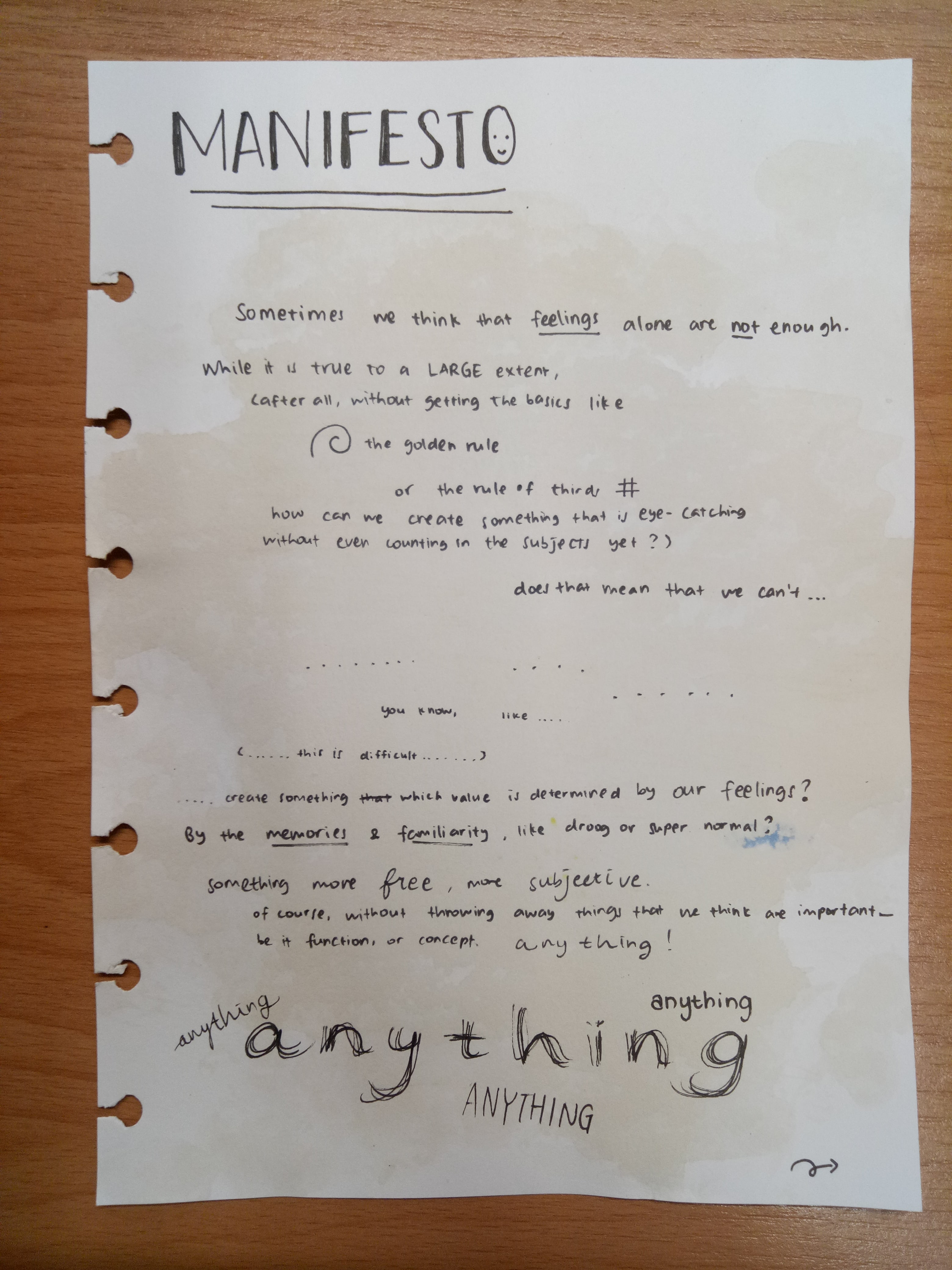
Sometimes we think that feelings alone are not enough. While that is true to a large extent (after all, without getting the basics like the golden rule or rule of thirds, how can we create something that is eye-catching without even counting in the subjects yet?), does that mean that we can’t…
…
You know, like…
(…this is difficult…)
…Create something which value is determined by our feelings? By the memories and familiarity, like Droog or Super Normal? Something more free, more subjective. Of course, without throwing away things that we think are important—be it function, or concept. Anything!
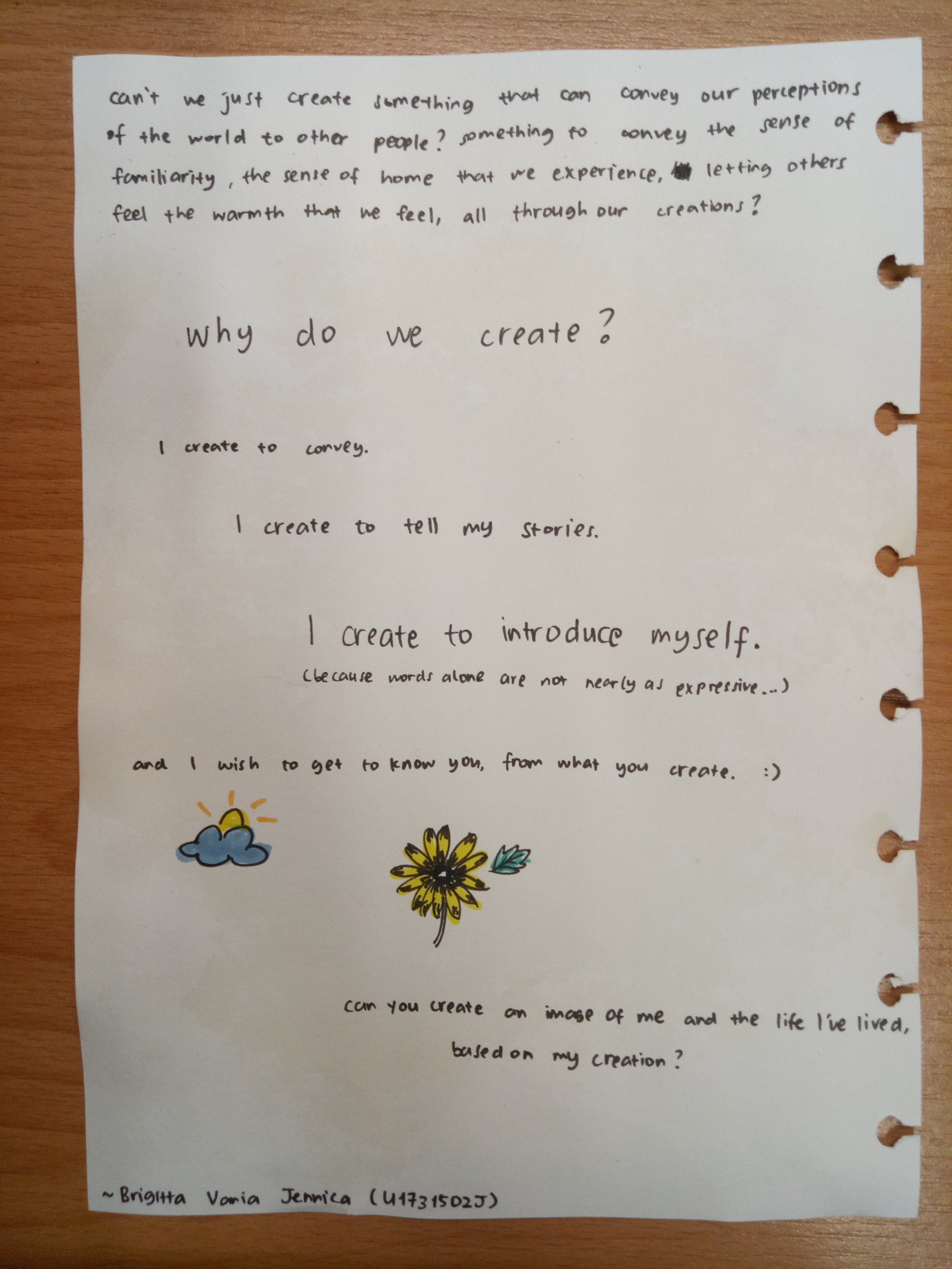
Can’t we just create something that can convey our perceptions of the world to other people? Something to convey the sense of familiarity, the sense of home that we experience, letting others feel the warmth that we feel, all through our creations?
Why do we create? I create to convey. I create to tell my stories. I create to introduce myself.
(Because words alone are not nearly as expressive…)
And I wish to get to know you, from what you create.
Can you create an image of me and the life I’ve lived, based on my creation?
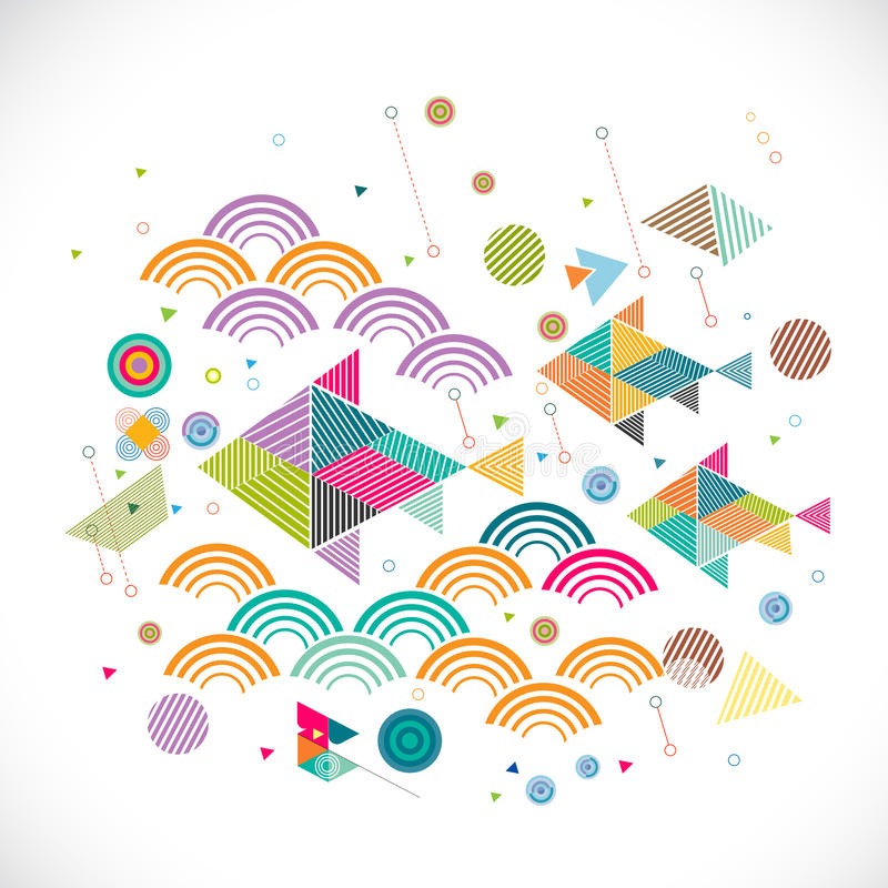
The theme for this project is hope. I started out by searching for keywords that symbolize hope; stars, candle, fire, dove, flower, butterfly, sun, rainbow, fish…
In the end, there are a lot of keywords that can be used to describe hope. Hope is different for everyone, after all.
I started by looking for some themes. I came up with two major ideas.
Yin and Yang
I want to represent that life is always balanced; in goodness, there is always something bad – but conversely, in badness, there is always something good as well.
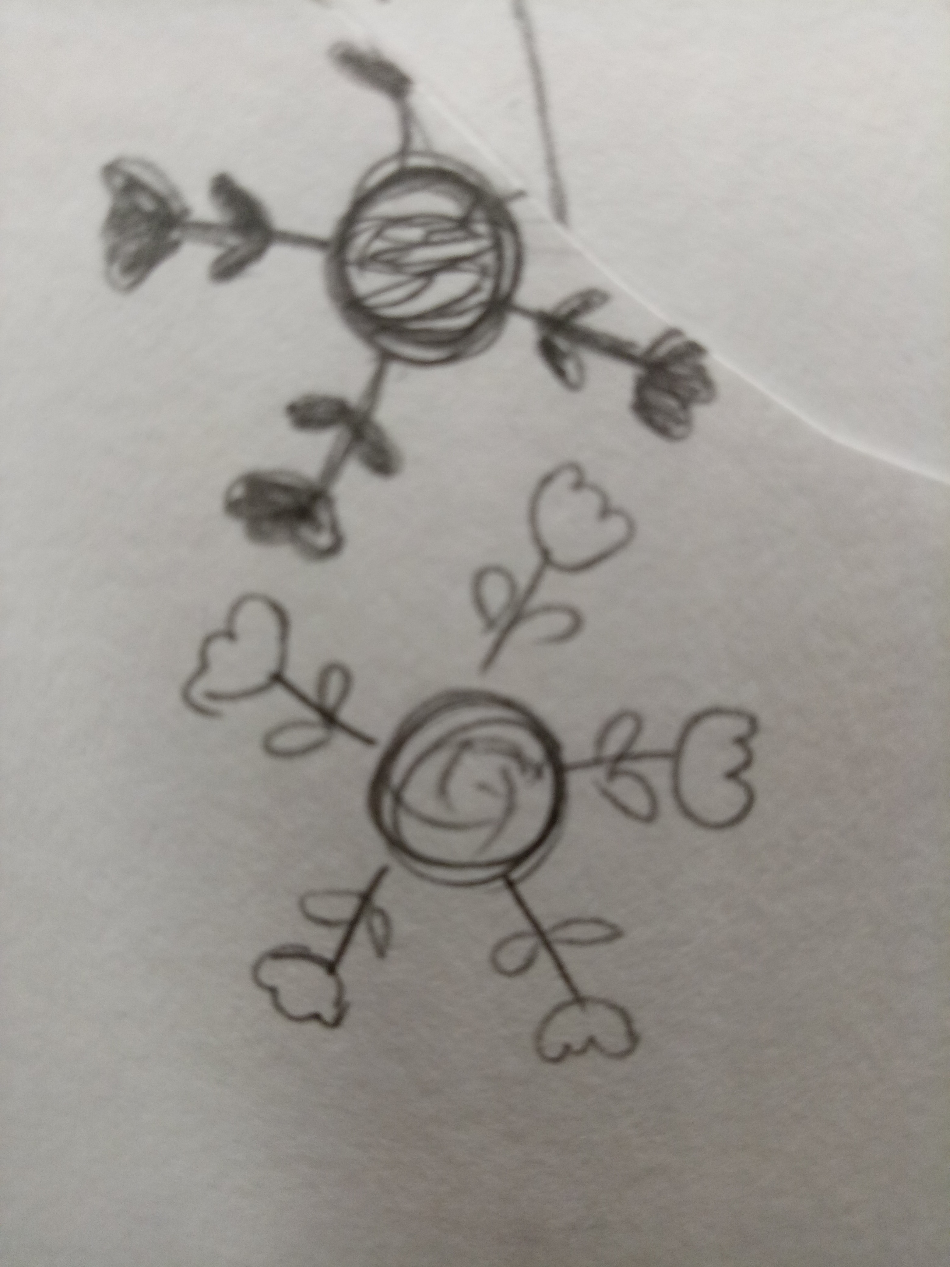
My plan is to make koi fish and arrange them differently; one school of fish will be “swimming” upwards, but one fish in that school of fish would be going against the flow (going downwards). Another school of fish will be doing the reverse, “swimming” downwards with one fish going upwards. Their colors can work inversely, or maybe complementary colors. But with that idea, I actually hadn’t really though about the positive-negative form (which is the whole idea of the project), so I thought I should scrap the idea off.
(Unfortunately, I lost my sketch for this one.)
Early Spring
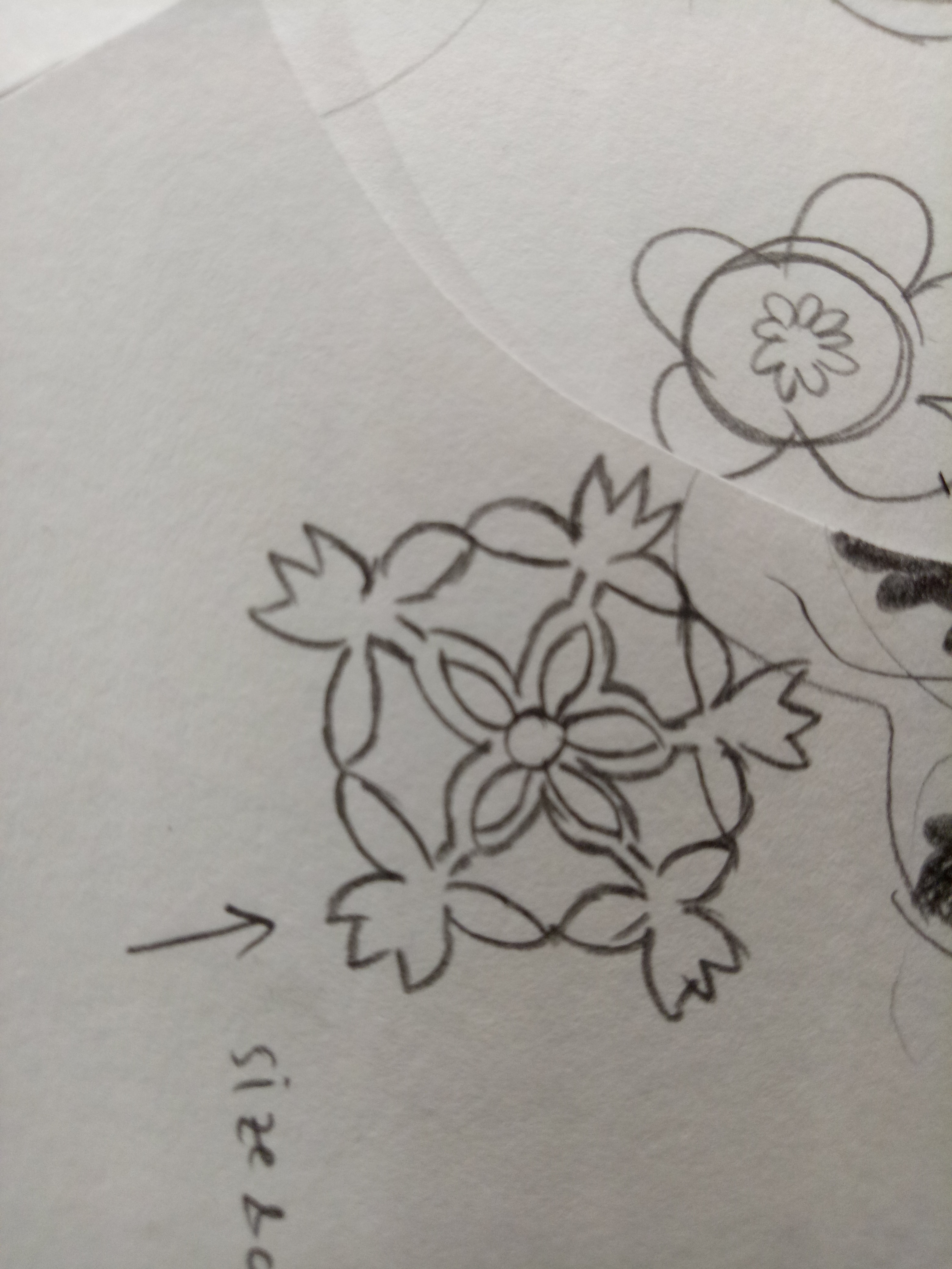
This idea came from when I was looking at snowflakes cut-out tutorials from Pinterest.
I was thinking that the shapes of snowflakes are really interesting and unique, since they are all different from one another. At first I was thinking of making the snowflakes flower-shaped, but then after the first presentation I realized that I could make use of the negative space instead of just leaving them meaningless.
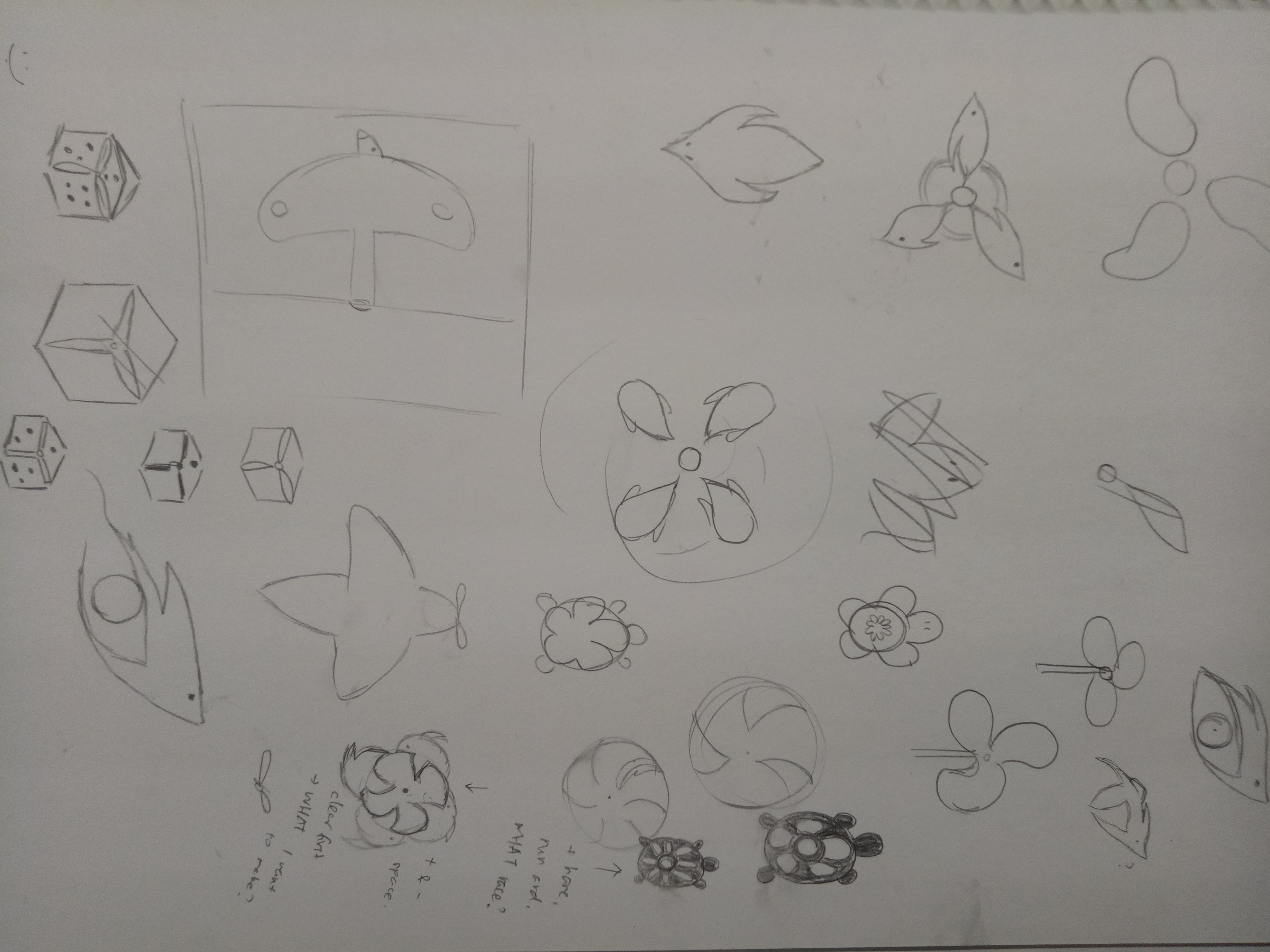
In the end I chose to work with the “early spring” idea. At first I wasn’t sure if I should go with the idea since my others smaller ideas, which I haven’t really thought through, were said to have some potentials as well. Like the birds and propeller idea, or the tortoise idea, which could be developed following the story of the hare and the tortoise.
I was debating between the tortoise and the snowflake in the end, but I couldn’t really think of an original, exciting story for the hare and the tortoise, as well as the positive-negative space.
I didn’t think that it would be so difficult to play and make use of a form. Whenever someone makes use of positive-negative space – for example, when I see posters or advertisements that use those, I would notice them, but never think much about it. In the end, when I tried making it myself, I spent myself stressing about it. How do I make a form that is subtle, but noticeable, yet interesting and can convey my idea as well?
I finally chose the snowflake idea – “early spring”, simply because its form is the one that I can picture the clearest (and also because it’s the one I like the most). See my final post for the end result of my idea!
The theme that I’m trying to convey is ignorance towards preservation, especially poaching activities, in Labrador Park. Labrador Park is the only rocky seashore left in mainland Singapore, with abundance of marine life. Due to illegal poaching and other reasons such as safety, the beach area has recently been closed to public.
I feel that not enough people know about those aforementioned facts (or maybe they know, but choose not to be concerned about it) and that is why I want to take the theme up. However that proved to be a big challenge for me because my intention is to show the ignorance or lack of knowledge, but the zine just came out very vague (i.e. people can’t tell at all what my place is). I want to say that it proves my point that people are unaware, but I still feel a little concerned since it wouldn’t go with the zine brief.
In the end I went with something I’m more comfortable with, that is, by focusing on the narrative and flow instead of the actual layout. I’m also concerned since it looks more storybook-ish rather than a zine, and although it’s very reflective of my personality, it may not be very suited for the project.
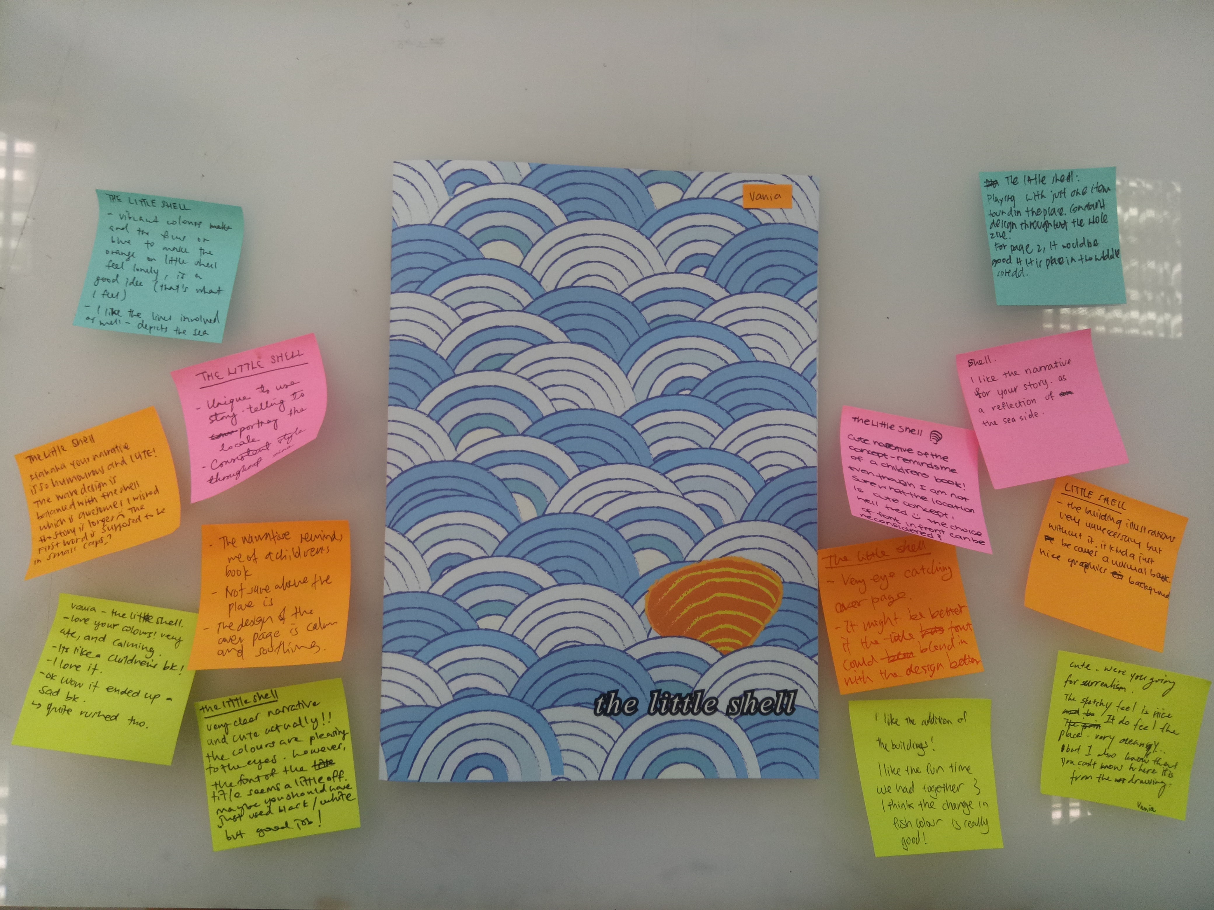
Here is my final zine!
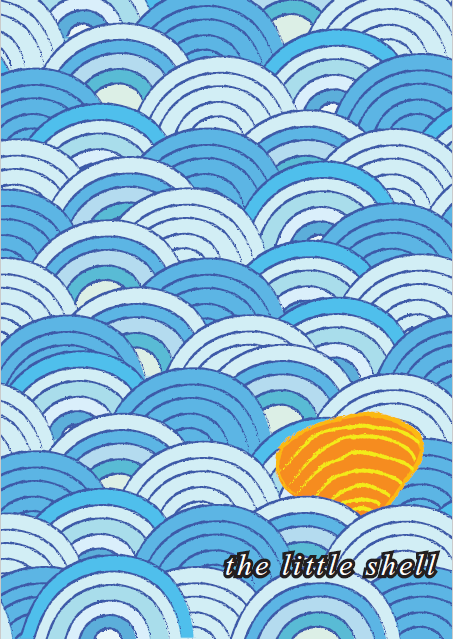
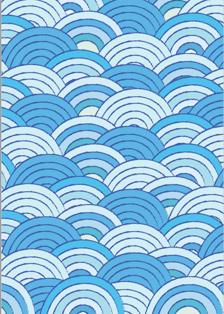
cover page
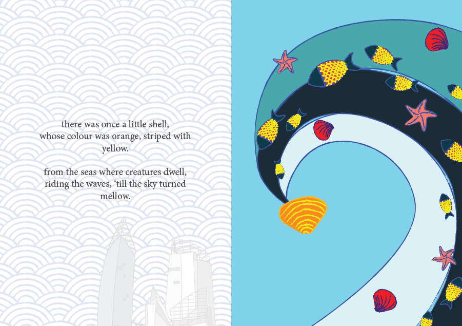
page 1 and 2
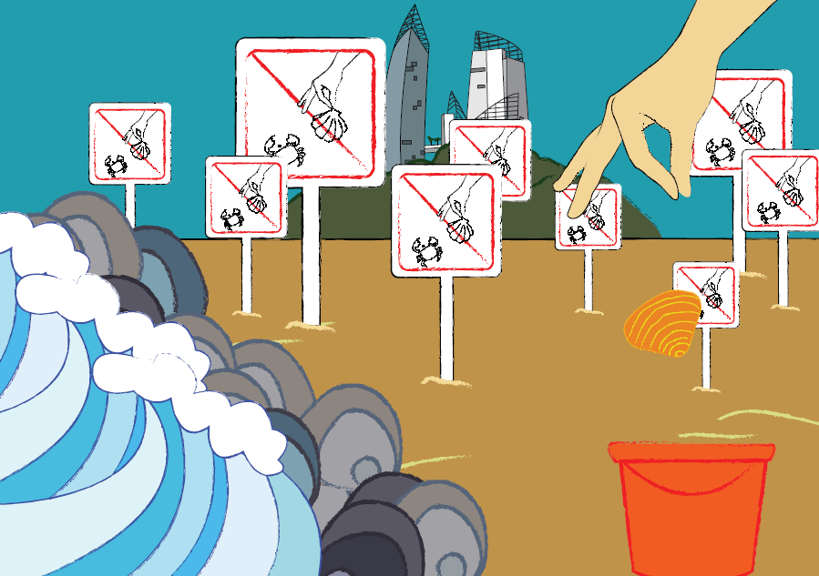
page 3 and 4
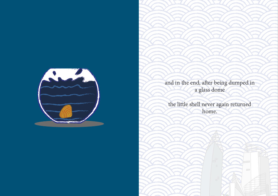
page 5 and 6
back cover page
So the narrative revolves around a little shell who gets poached for aquarium decoration. Since the zine is intended more for children, I want to evoke the feeling more that “sea creatures too don’t want to be separated from their home”.
About the cover page
The cover page took me way too long to make, since at first I made one row of waves and just copy-pasted everything, but my friend said it’s too repetitive so I went through the trouble to make the rows one by one so they all look more varied. To be honest I really love the colors that I used. For the pages I used different blues for the backgrounds and the blues get darker at different pages because I want the feelings to slowly become “darker”.
About the narrative
The first and last page inside kind of envelope the whole experience with narrative; I received a comment saying they wish the narrative is a bit longer. I feel that that may reduce the impact since if the narrative is too long people will get bored faster, especially children.
By the way, I tried so hard to make a rhyming poem, and I actually think they’re okay. Maybe I should’ve chosen a different font, but I actually feel like this font is enough since it fits the storybook feeling. I also received comments saying that I should have capitalized the first letter. I did that at first, but then the letter stands out (of course) and I don’t really like the overall look, so I stuck with the all-small letters.
About the pattern
As for the background pattern on the first and last page, at first I only made the sea waves pattern but after consulting, I realized that it lacks representation of the place so I added the buildings that you can view there. Some people say it adds more characters, some people say it’s kind of out of place, but I like it.
About the character
I choose orange as the shell color because I want a contrast to the blue, since I already know from the beginning I will use a lot of blue. I tried red, but I think it comes out too jarring. Orange provides a warmer, friendlier feeling while staying bright.
I choose a shell because it’s simple to make, and also I want it to blend with the sea waves at first.
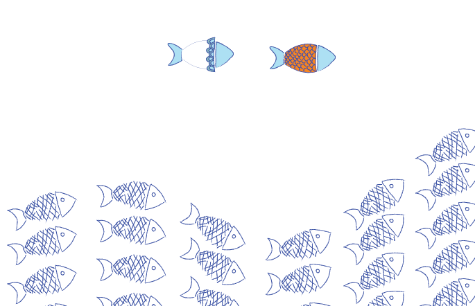
About page 2
In the wave, I added different sea creatures to tell audience about the diversity. The yellow scales on the fish provides a line that people can follow to see the orange shell at the end. For the other creatures, I outlined them blue and use mainly red-dark orange-pink so they won’t draw too much attention. I want the shell to be the star of the page.
About page 3 and 4
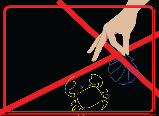
At first I only put one sign there, and it looks very empty. So I put an excessive number of signs there instead to show that there are efforts in preserving the sea, it’s just that people choose to ignore them. In some ways, it’s a sarcastic remark to point out people’s ignorance. I put rocks right by the waves to illustrate Labrador Park’s rocky shorelines. The characteristics are also shown by the sign, which is considered pretty unique of Labrador Park, and the buildings which can be viewed from Labrador Nature Reserve. I do regret not putting in more characteristics (like the Dragon’s Tooth Gate or some of the war relics?), maybe I could have put them floating between the sea waves pattern on other pages or something.
At the right side of the page, you can see a hand dropping a shell into a bucket. The hand gesture may be a little unclear, it looks like someone is picking up something instead.
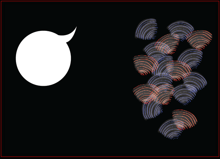
About page 5
This is the page I had the least trouble with, because I had envisioned this ending right from the start. I just now think that maybe the aquarium shouldn’t be placed right in the center of the page, but a little bit lower so the shell looks like they’re “falling” from its positioning in other pages. For this page, I made the shell’s color darker so as to say that it’s losing its vibrancy after being separated from home, and subconsciously saying that even if you take a beautiful shell for yourself to decorate your aquarium with, it won’t look as beautiful there compared to when it’s in the sea.
Overall
I’m actually really happy about how my zine turns out! Looking back, I never thought I would have made this. I like the flow of the story, however again, it feels more storybook-ish than a zine. I was worried it’s not graphic design-ish enough, but then I decided to go with something more reflective of my personality and focus on the narrative instead. I realize I wasn’t pushing myself out of my comfort zone enough and decided to play with something I know I can do better at; I definitely should have explored more.
I tried to portray the characteristics of the places more by adding the buildings, but still maybe the characteristics aren’t portrayed enough since people can’t tell about the place at all. (Which proves my point of lack of knowledge, but goes against the brief.)
For the software, I used mostly Adobe Illustrator, but I can’t make a whole page and just copy-pasted them to InDesign because I used the chalky brush stroke, and it came out very pixelated in InDesign. (Turns out it’s just my display preference, but I only noticed it later.) Because of that there’s a lot of layers in InDesign and it took forever compressing them into a PostScript file (I spent an hour at the printing place trying to make it right, fortunately the people are so nice to wait for me and even teach me what to do). My laptop is laggy especially bad whenever I use InDesign, so I have to be smart in choosing what to create in Illustrator and what to create in InDesign and I spent more time than I should have (I also took shortcuts), but luckily they turn out as I want them to.
As for the printing, surprisingly I didn’t have a lot of problems with it. I went to RJ Papers and took my time looking at different papers. I didn’t know there are so many different kinds of papers before! I was considering between using a glossy, magazine-style paper or the paper that I used in the end (I forgot the name, I think it’s Maple Bright?). Glossy paper will make my color pop up more, but it feels colder somehow, so I decided to use the maple paper to convey a warmer feeling of “home” to fit in with my narrative. I choose the 170 gsm one because I want it to be thicker, so it feels nicer to flip.
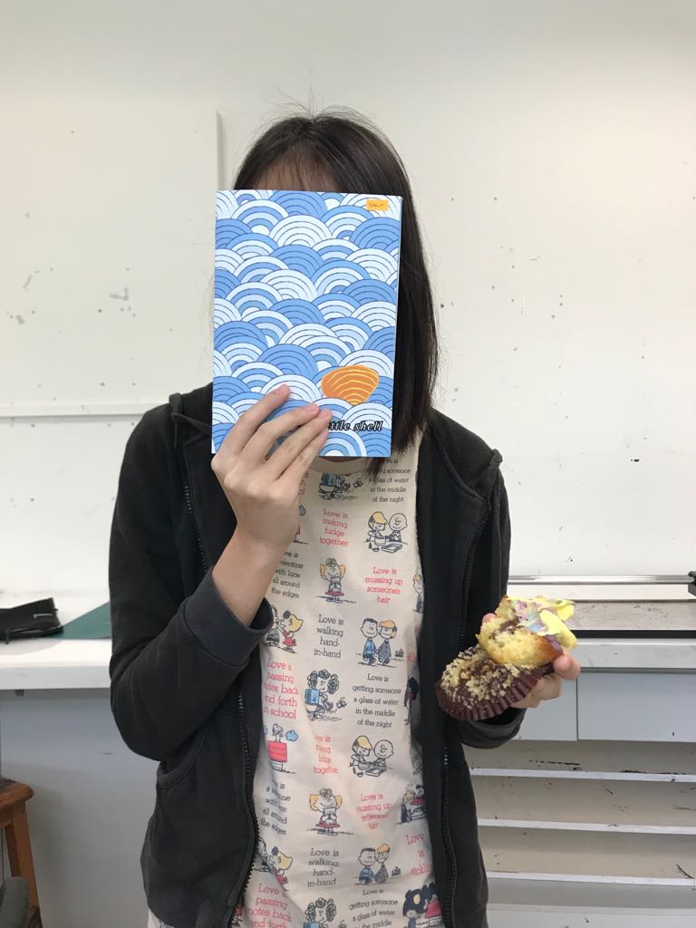
The colors come out exactly how I wanted them, except for the hand on the 4th page–the printed hand is too yellow compared to my digital illustration, but that’s fine. The different shades of blue came out brilliantly and I like them very much. I even printed an extra zine for myself to keep.
My final zine and feedback (thanks for the comments!)
Me, my zine, and cupcake
All in all, it’s a valuable experience for me. At first I wasn’t sure if I could do it, but I did, and I’m proud of myself (although it actually is something that I am supposed to do so I shouldn’t be too proud of it). I learn a lot more about my style and work attitude. I also learn to ask help from my friends more, be it to comment or to guide me in using software. I was always reluctant to ask for comments because I tend to take things negatively, so I’m glad that my friends are willing to put up with my stubbornness and continued to give me insights.
And thanks to the people who say it’s cute. I think my zine is cute too.
The place assigned for me is Labrador Park. It’s my first time visiting Labrador Park, so it was a totally new experience for me. I had no idea what to expect, so I did some research before visiting it.
Labrador Park is unique since it is designated as both nature reserve and coastal park, adding on to the fact that it was formerly a fort built by the British forces in Singapore before World War II. There are a lot of interesting aspects that I take from my visit.
Labrador Nature Reserve
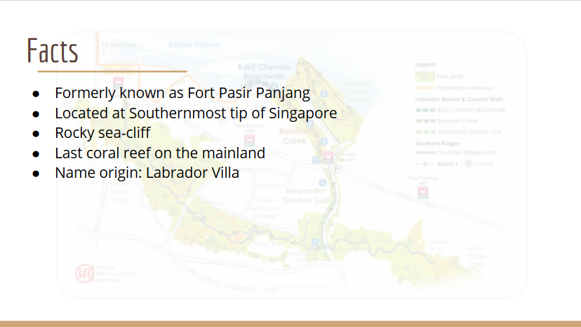
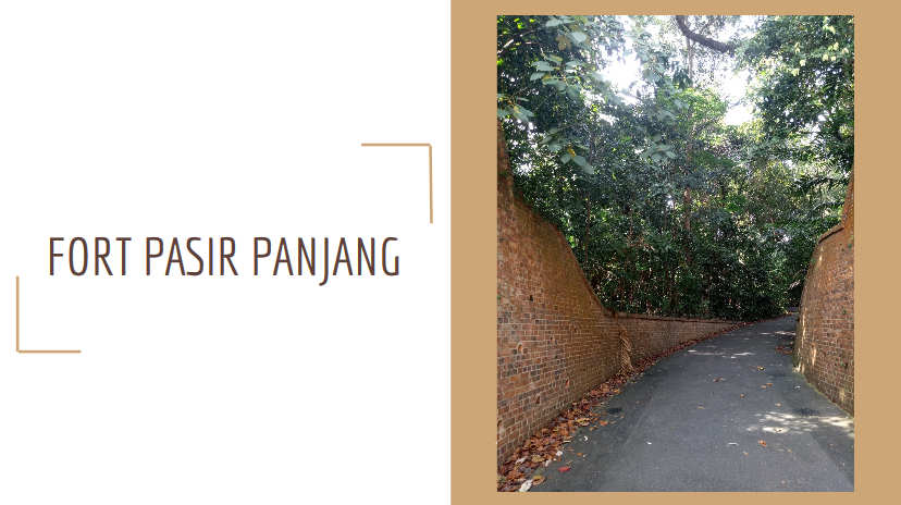
Labrador Park was previously known as Fort Pasir Panjang, one of coastal artillery forts built to defend Singapore’s waters since it was believed at that time that if Singapore was to be attacked, the attack would come from the sea.
It was designated as nature reserve in 2002.
The name Labrador is derived from “Labrador Villa”, the name of the residence of a prominent ship chandler, George John Mansfield. It was built in 1881.
Labrador Park contains the last coral reef and the only rocky sea-cliff on the mainland of Singapore. Although it had a diversity of marine life, it has been greatly reduced by development and illegal activities such as poaching.
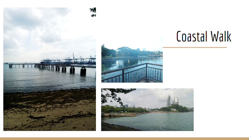
The coastal walk of the nature reserve is 16.8 ha in length and is divided into three segments; Alexandra Garden Trail, Berlayer Creek Mangrove Trail, and Bukit Chermin Boardwalk.
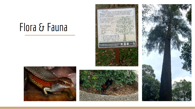
There are a lot of species of flora and fauna there. I actually saw some birds (too fast for me to take photo of), chickens (I didn’t dare to come too close), insects, butterflies, and squirrels. Apparently there are more than 70 species of birds and 30 species of butterflies there. There’s also an animal named pangolin which I didn’t get to see, but I heard it’s special to Labrador Park.
There are also signboards in front of several trees that contain information. They’re interactive since they use first-person POV, as if the trees are telling the stories themselves.
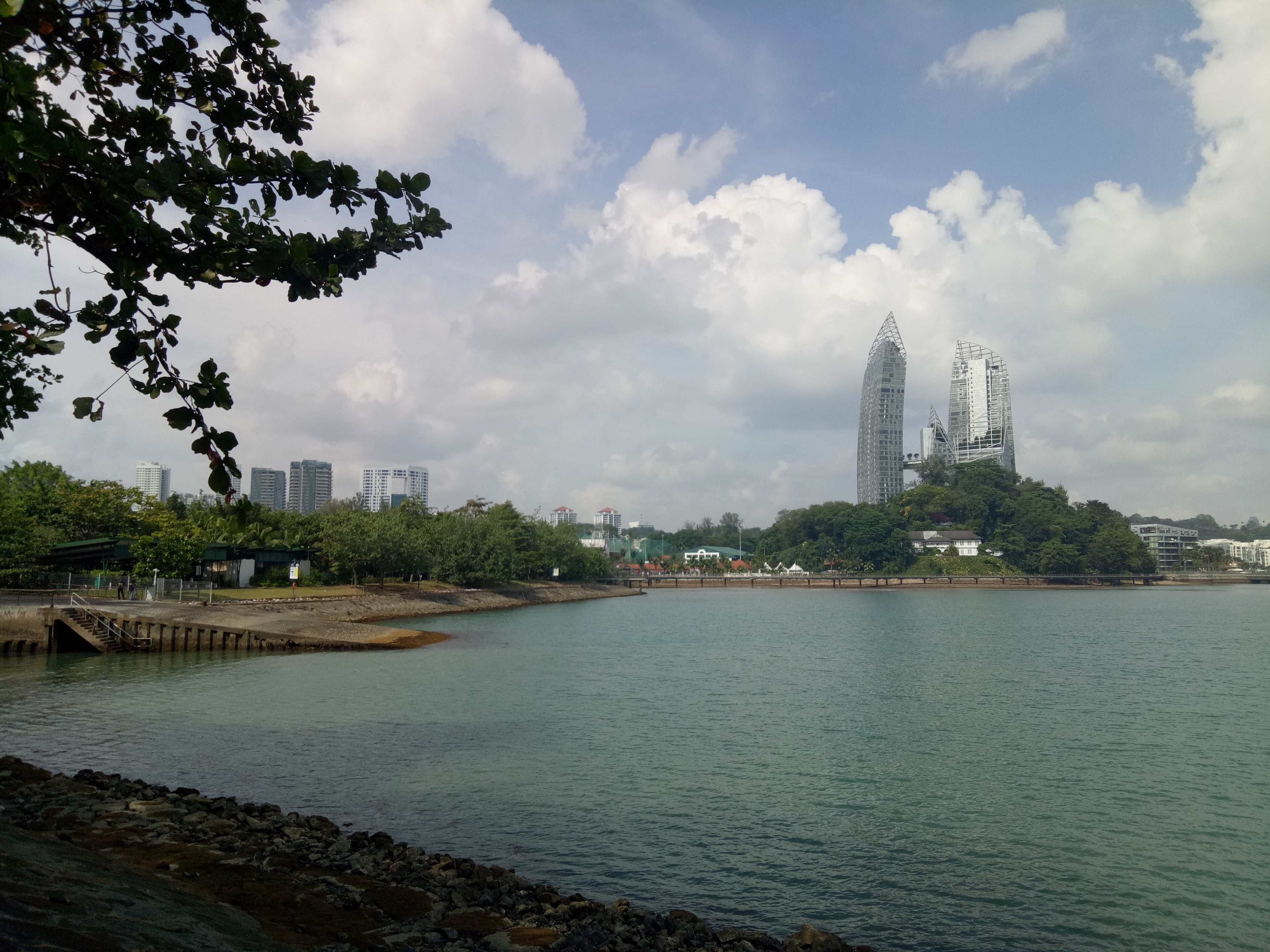
The view from the jetty was beautiful, although there are a lot of cargo ships, and you can also see the buildings not so far away.
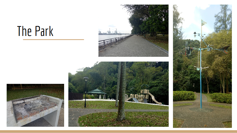
The park is very family-friendly. There are several toilets located throughout the place, BBQ pits, playgrounds, fitness corner, jogging and cycling trails, promenade, and shelters. There are also a lot of parking lots for cars and bicycles. Surprisingly when I came in the afternoon, the place wasn’t very packed; maybe because it was a Monday. There are some people here or there, but not as busy as Botanics Garden, for example.
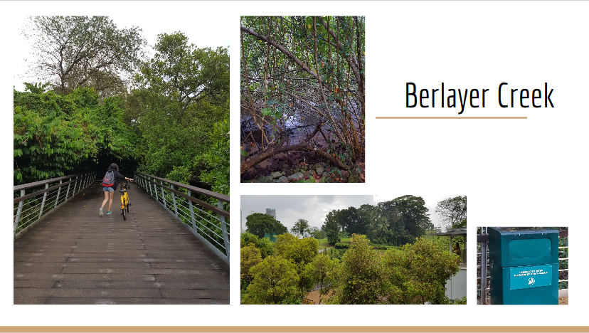
I was interested in this spot because of the mangroves. There are around 14 mangrove plant species there, and a lot of stray animals. Even the trash cans there are made to deter animals from rummaging through the trash.
The swamps are directly connected to the bay, which is why there are kind of small currents on the swamps which I think is interesting (it’s not just stagnant water like I expected).
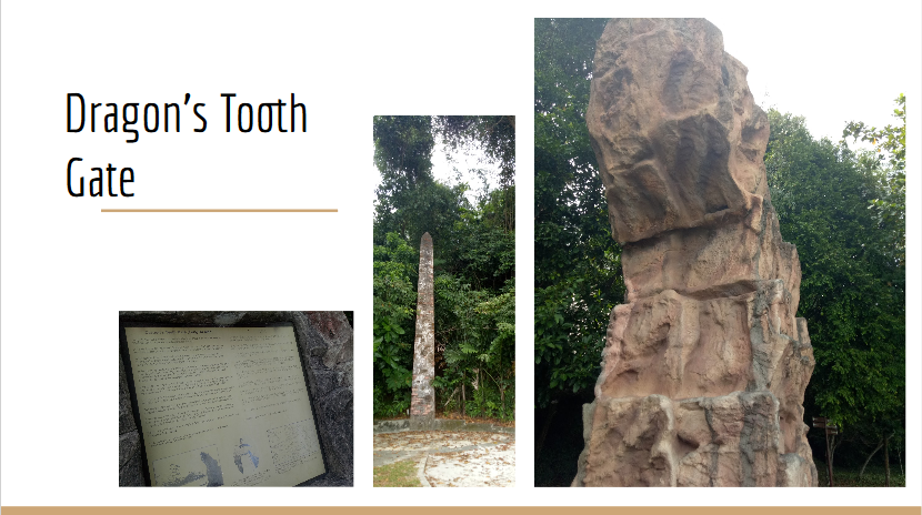
It’s the landmark in Labrador Park, and a literal translation from its name in Mandarin, Long Ya Men. It’s a rock outcrop that is shaped like a tooth. Actually the 7.5 m rock is a replica, built in 2005. The actual one was blown up by the British in 1848 to widen the straits. It was used as navigational marker for ships, and located near a white obelisk which was the original Western harbor limit.
Fort Pasir Panjang
Fort Pasir Panjang was the former name of Labrador Park. Here, I explored the war memorial areas in the nature reserve.
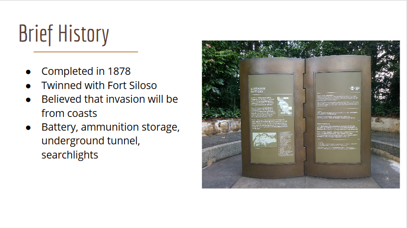
Due to the possibility of war outbreak in 1938, the equipment there was constantly upgraded.
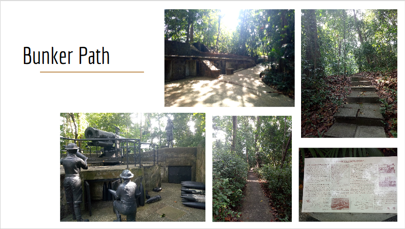
There are two paths; nature path and bunker path. However I chose to go through the bunker path, which contains the monuments.
There’s a monument of 6-inch gun barrel, which could shoot down ships from 10 miles away (!) and the gunners. There are also underground tunnels which are 46 m and 63 m long and between 2.5 m and 4 m high, forts, and bunkers. There are a lot of signboards along the way, explaining a lot of things. Although they are very wordy, some of them are pretty interesting and they would make a good learning journey (in fact, when I was in the nature reserve, there’s a group of primary school students which I assumed was having a learning journey).
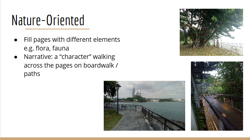
Zine Ideas
My first idea is to focus on the flora and fauna of the area and introducing different species. The style would be more illustrative, like a children’s book, and the background will be primarily blue and green to show the nature. There would be a character walking across the pages, to show that “someone” is exploring the place, because I want to convey my experience of “exploring” the place for the first time.
My second idea is to draw the contrast between the past and the present. I think the idea is interesting because in the past it is a fort, a war-ready place, while now it is more of an entertainment area. I was thinking of making a progressive narrative; so the pages next to each other will be very contrasting (one will be more “cheerful” and shows the park “now”, while the other will be “darker” and shows the “fort”). Another idea for the execution is to start the stories of both the past and the present simultaneously from both the front and the back of the zine, until they meet in the middle in the playground. I got that inspiration since the playground has both the machine gun monument and playground stuffs like swings there.
Afterthoughts
In the end, I realize that both of my ideas were lacking in originality. I think it’s because I don’t try to explore a specific aspect of the park itself, but rather generalizing by trying to include everything.
Because of that, I developed new zine ideas (although I haven’t really thought them through yet):
My first idea is to use the idea of signboards as the design. As I mentioned, there are a lot of signboards throughout the park; I think it would be interesting to make my pages look like signboards. I want to explore more about the informative side of the park, but I’m not sure about what to include – it could be the flora and fauna, or the monuments (but isn’t that similar to my original nature-oriented idea?).
Another idea is to explore the atmosphere there. Although we can see high-rise buildings clearly, the place feels very peaceful and “detached” from the hustle and bustle of city life.
I was thinking of combining the “atmosphere” with my idea of contrasting past and present. Instead of just seeing past and present, I want to draw as many contrasts in the place as possible; nature vs technology, serendipity vs hustle-bustle, land vs sea, peace vs war, welcoming vs pushing out. I think it’s quite interesting, but I don’t know if it’s still too broad because that way, it will be hard to “connect” all the pages of the zine.
My last idea is to focus on the idea of redevelopment and poaching that has greatly changed the sea form around the coastal area. I want to draw from the point of view of the marine life, and the style would maybe more like a comic-style.
I should do more research.
UPDATE!!!
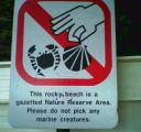
After thinking of a new theme, I finally decided to do something along the line of ignorance; how people usually are not concerned about the efforts to preserve the marine life, despite the warnings and changes.
I’m inspired by the sign because apparently in Labrador Park, the signs are pretty unique in style compared to other places.
Here are some of my initial sketches for the pages.
I realized if I do bring those sketches together, there isn’t any narrative to it; they all look very disconnected. So I decided to make a character to make the pages flow better.
At first I also wanted to use black as the base color since I want to play with more lines only, and I feel that the color comes out nicer when put against black. However considering that the zine will be intended for mostly children, it may not be too cheerful / too children-like, so I scrapped the idea.
In order to incorporate some characteristics of the place, I decided to put a part of the view from Labrador Park; rocky shoreline and the buildings that you can see from afar from the bay.
Theme aside, I look at different styles of art. I want to do something bright with different shades of blue, and some yellow and red here and there.
Some of my style ideas:
I especially like the one with a lot of lines since it gives a simple, clean look. But then since my target audience will be mostly children, I also want to give it a rougher, more playful feeling, while still being able to evoke emotions that “people have been ignorant”. To impose the feeling, I decided to write a short narrative in the style of poem. Although it may be too “complicated” for children, my intended audience will not be extremely young kids but rather around 10 years and above of age, when the children are beginning to gain maturity from understanding things that are expressed indirectly.
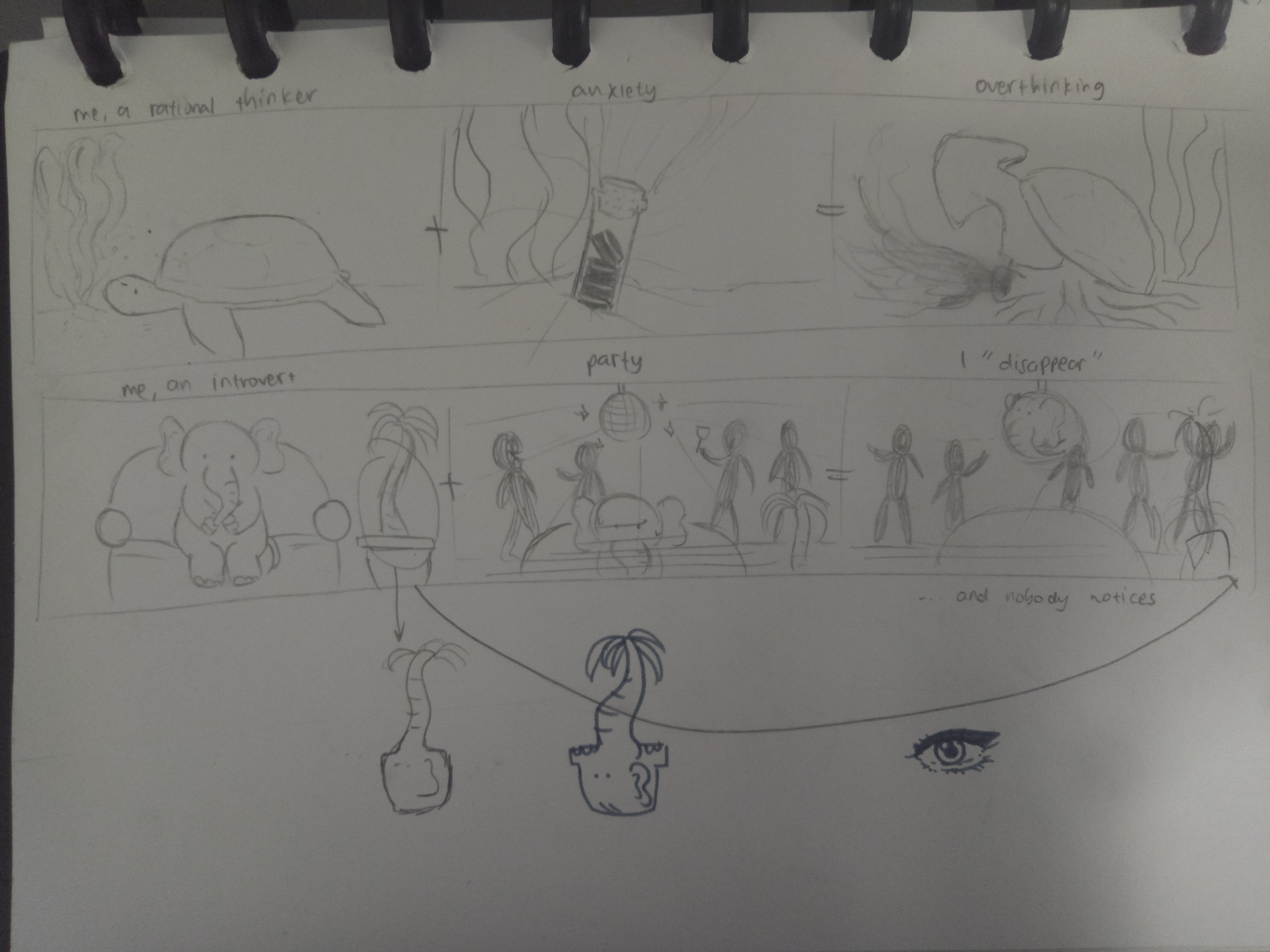
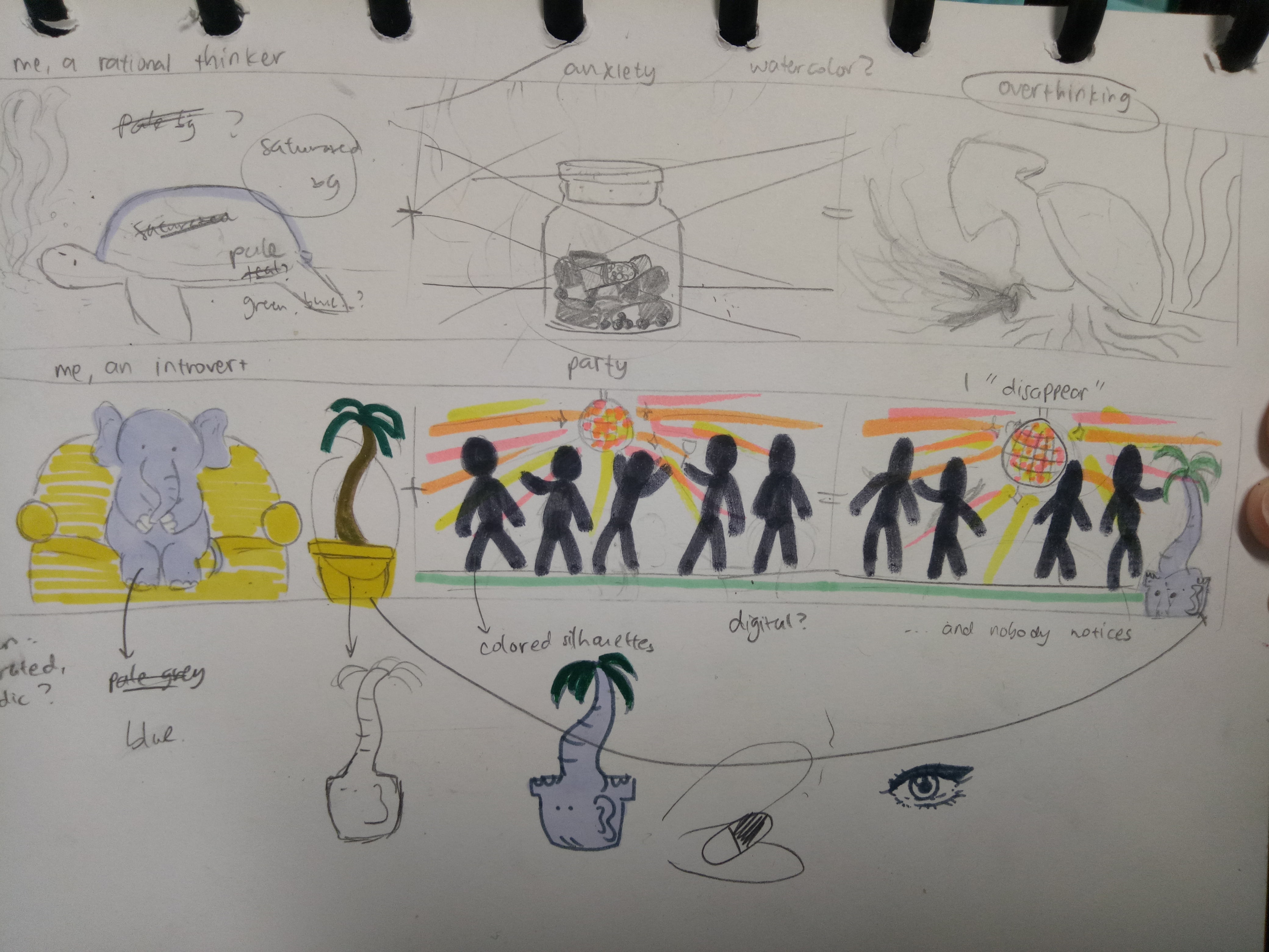
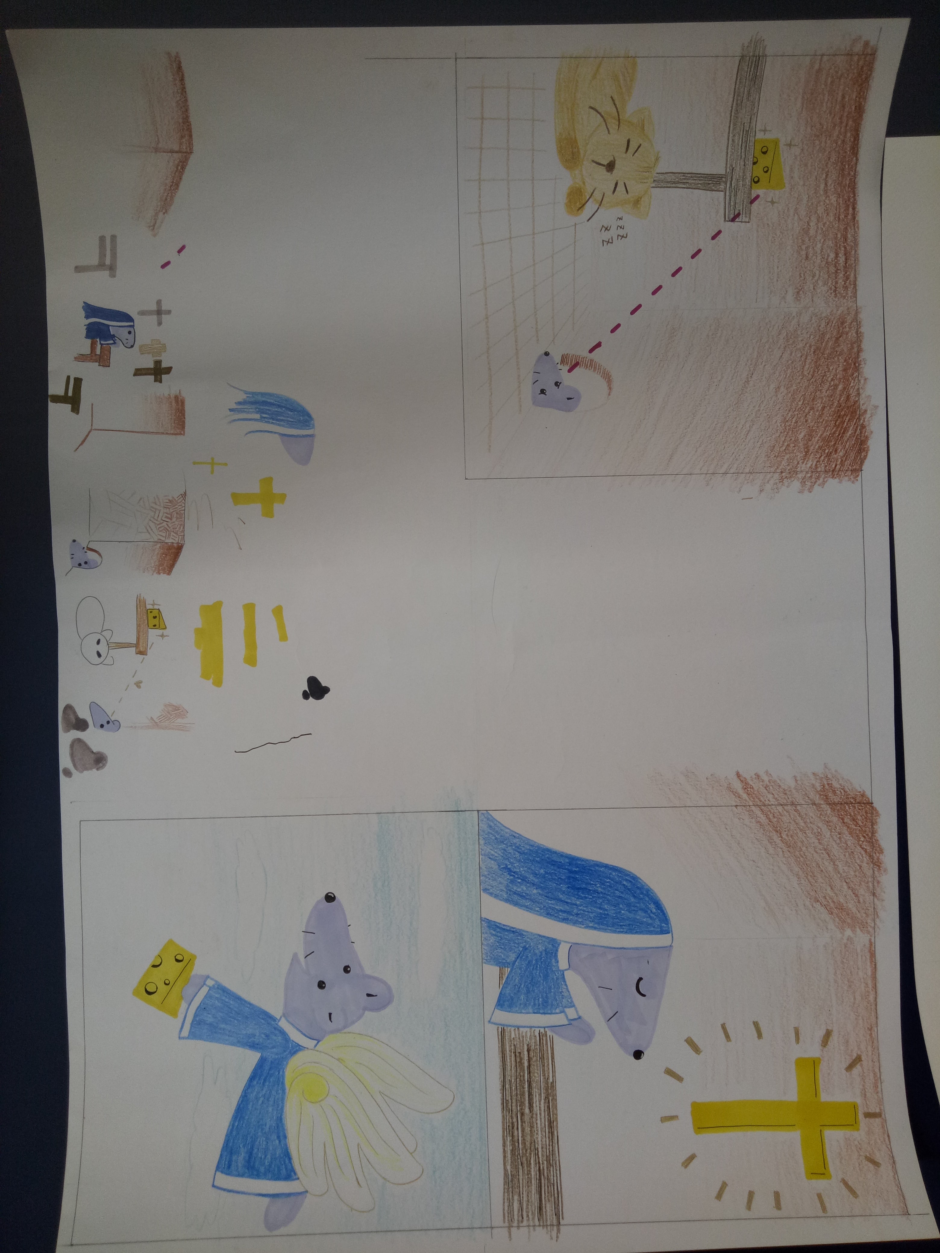
Here are my end results for this project! Featuring: the mouse, the elephant, the banana, and the turtle.
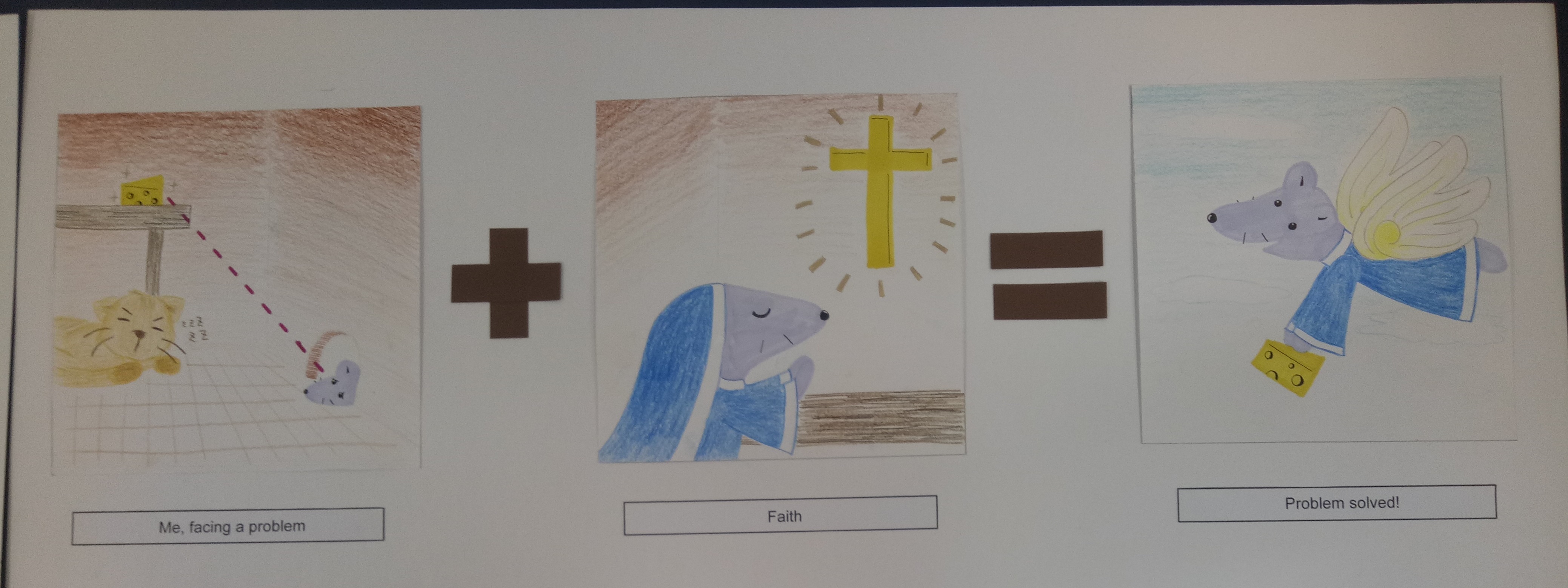
1. The Mouse
Me, facing a problem + Faith = Problem solved!
I represent myself as a mouse because (I think) my Chinese zodiac is a rat, so my family at home sometimes refers to me as the “mouse” in the family.
The story is that the mouse wanted to get the cheese but was hindered by the presence of the cat. So the mouse began going to church and gained a pair of wings, which enabled her to overcome the problem.
This is the representation of me when I face a hindrance or problem in doing something. The “faith” here is represented by going to church, but actually it’s not necessarily a religious faith. It can also represent faith in my own abilities, since I tend to think that I can’t do things before I actually try them. By having faith, I can actually overcome my troubles in achieving what I want.
I chose to use colored pencils and markers because I wanted to work with something simple, and I wanted to give a child-like vibe. I used markers for the important objects in the panels as emphasis. As for the colors, I used similar colors (shades of brown) for the first panel except for the mouse and cheese because I wanted to emphasize their significance. The background of the second panel also has brown color to create some connection between the panels. From the second to the third panel, the mouse wore the same habit (apparently the uniform that nuns wear is called a “habit”) to create a connection.
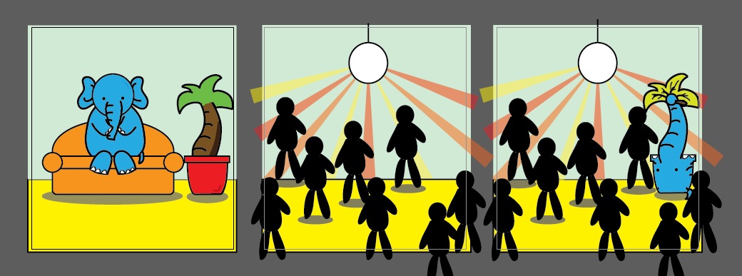
2. The Elephant
Me, an introvert + Party = I “disappear”
I used an elephant because of the phrase “elephant in the room” – it’s there, but people don’t talk about it.
The story is that the elephant is so introverted that when she went to a party, she blended in right away with the surrounding and became unnoticed. It was as if she became a furniture, a part of the background.
The elephant represents my introverted and awkward side. I’m not good around strangers, and even within my circle of friends, I’m not good at interacting with people in big groups. In a sense, I’m physically there, but it feels like I “disappear”.
I used the color blue for the elephant because blue is my favorite color. The sofa in the first panel is orange to complement the blue elephant. I used yellow for the floor since yellow and orange are analogous colors. The background (the wall) is supposed to be pale blue, but the color came out a little differently than I expected. I used blue background to emphasize the feeling of the blue elephant “blending” into the environment.
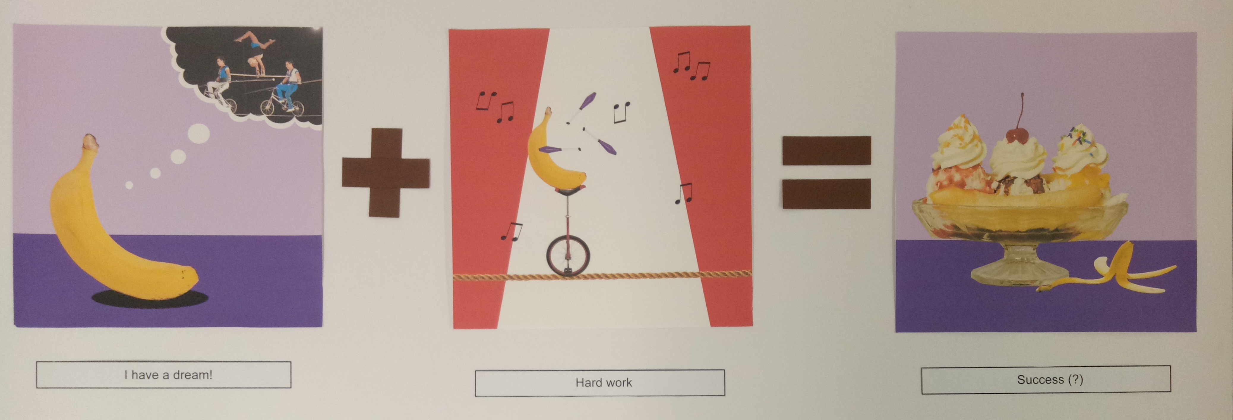
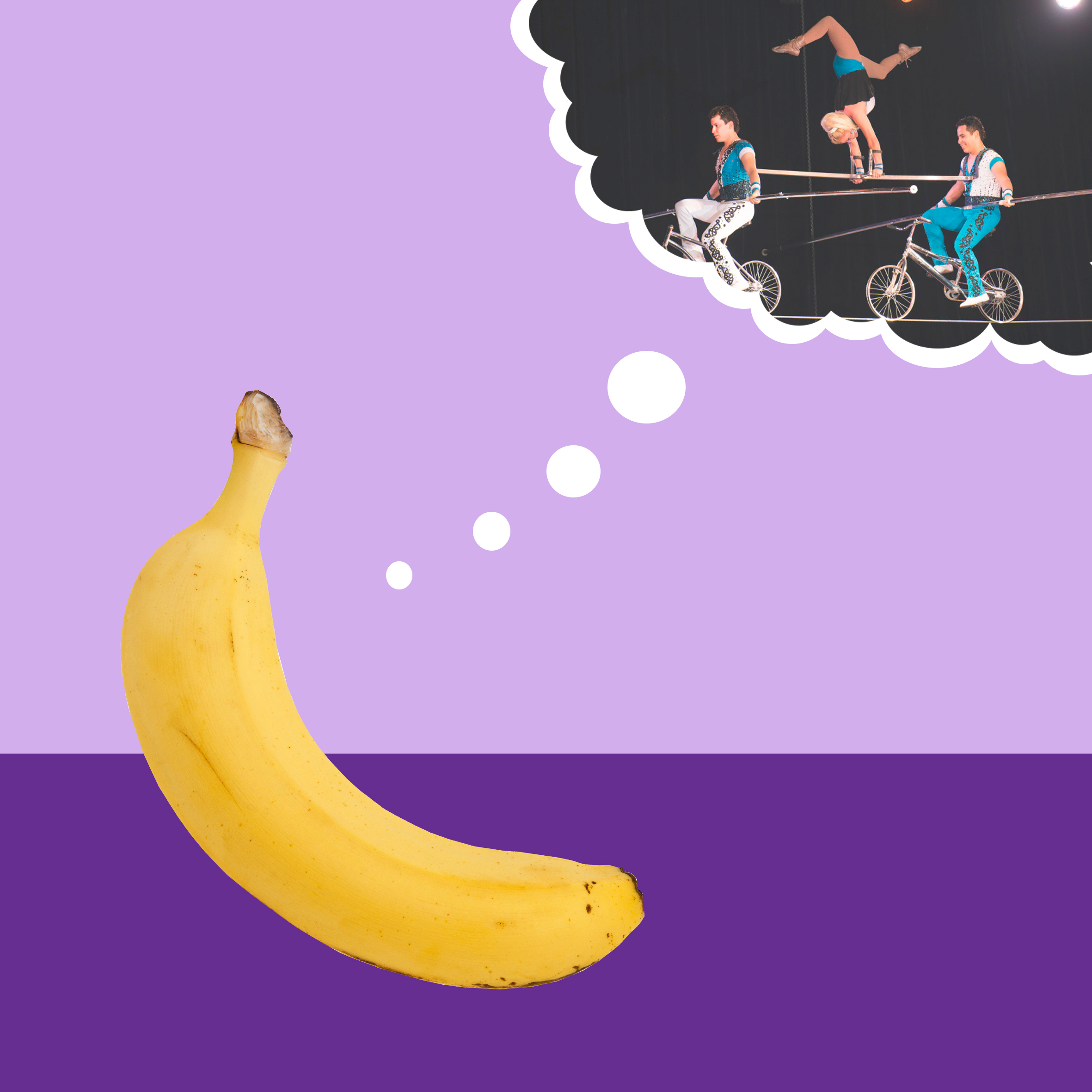
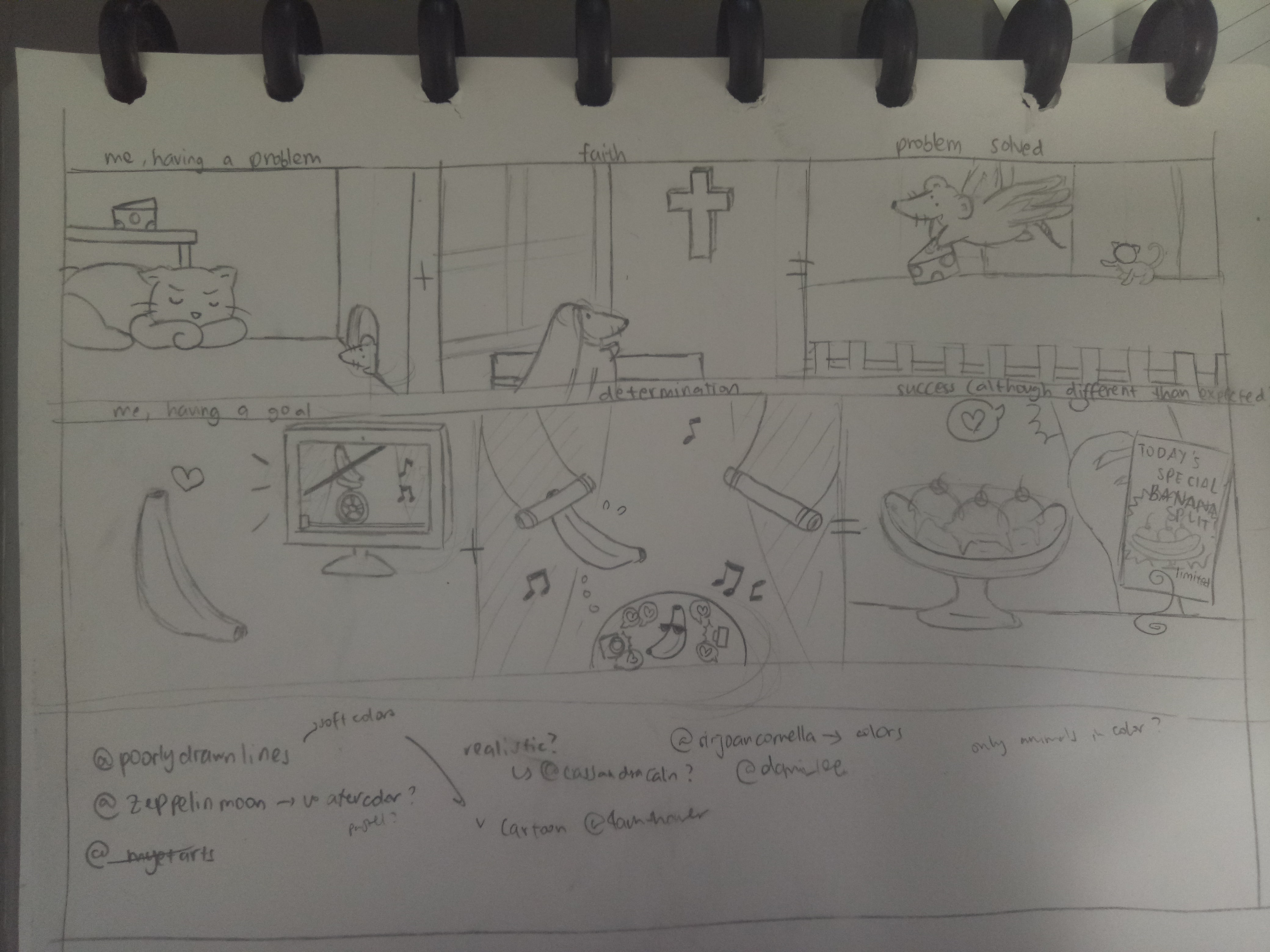
3. The Banana
I have a dream! + Hard work = Success (?)
Banana is one of my favorite fruits. That’s why.
The story is that the banana wanted to become an acrobat. To achieve that dream, the banana worked hard to practice circus acrobat. In the end, the banana became banana split instead. (It’s a pun, because split is kind of a gymnastic movement, and gymnastic is usually related to acrobat.)
To me, it is a good representation of me when I set a goal for myself. Sometimes we dream high and work hard for it, but the end result is not exactly as we want. However that doesn’t mean you’re not successful – you still succeed, although the success might be different from your initial intention. That’s how I feel sometimes when the end result of my work is not exactly like how I want it to be, but I know I worked hard for it, and thus the journey still makes a success in the end.
I used purple background for the first and third panel to complement the yellow banana. As for the second panel, I used the red-and-white background to show that it’s a circus. I used purple juggling pins to make some sort of connection between the panels.
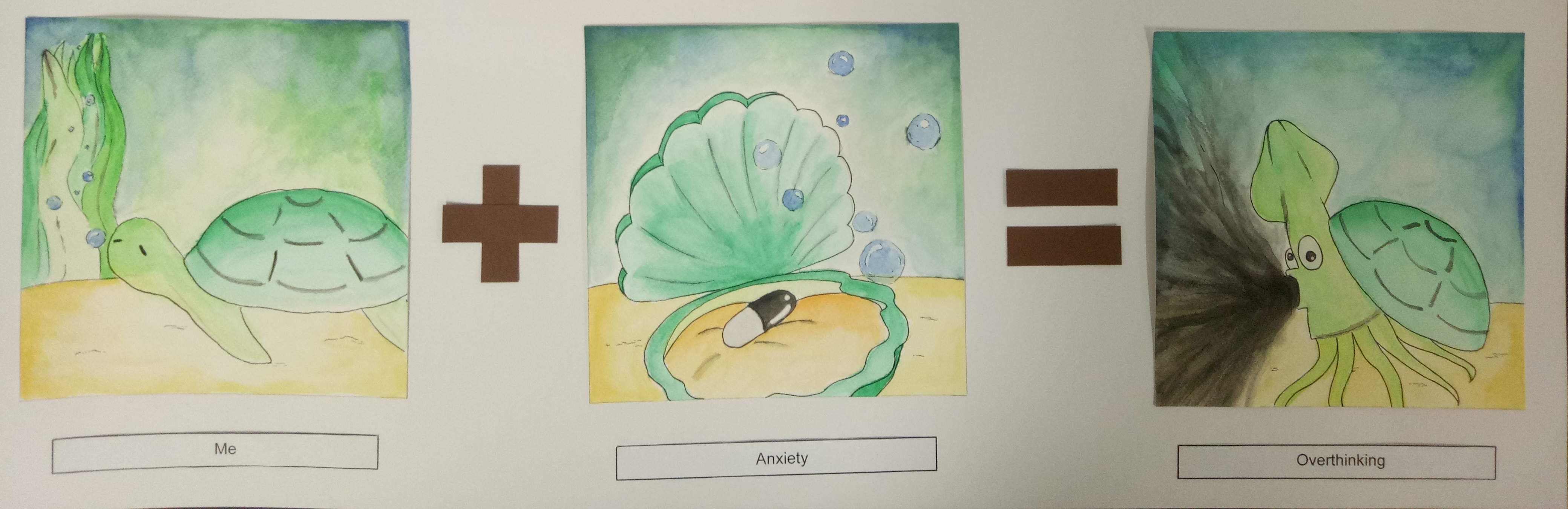
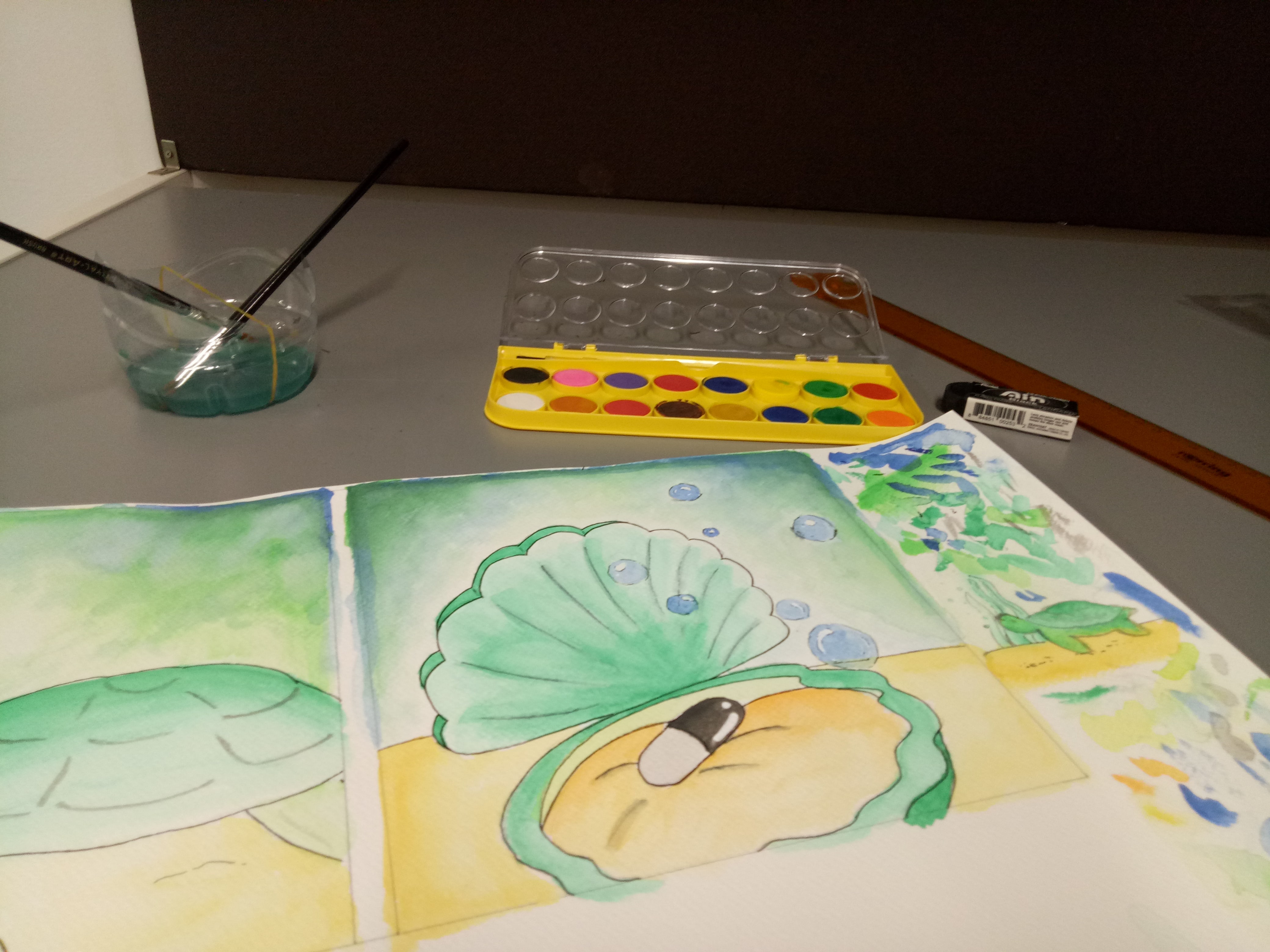
4. The Turtle
Me + Anxiety = Overthinking
Turtle, in my opinion, is a very chill animal. I like it because I’m a chill person (most of the time), so I feel that I can relate to it.
The story is that the turtle, a very chill animal, was just chilling. But then the turtle ate a mysterious black pill and turned into an ink-spewing sotong. (This story sounds more reasonable in my head, but now that I wrote it down, I understand why my friend – to whom I showed my sketches – looked extremely confused.)
The turtle represents me as a person. Usually I’m very chill and somehow normal, but when I’m anxious (I represent anxiety with the black pill), I tend to overthink trivial things until they muddle my thoughts. I represent the state of overthinking with the black ink muddling the seawater. In a sense too, the sea represents my thoughts. It’s usually very calm and clear before I start getting anxious.
I used mainly cool colors like green and blue for this one since I want to give the calm vibe to represent my thoughts. I used some yellow and orange also for the seabed and the inside of the shell as green-yellow are nice analogous pair and blue-orange are complementary.
Reflection
I had trouble deciding what style to go with, so in the end, I told myself, why not just try different styles?
Since I didn’t really do art before studying here, I didn’t have an idea what my style would be like. I’m not even sure what technique I’m good at. So I decided that this project can be a good opportunity to explore my options more, and see what technique or style I’m more comfortable with. It’s really fun, and it’s a really good learning experience for me. I realize that working digitally ensures a “cleaner” result (and there’s undo button as well), but it requires a lot of time (or maybe just because I’m not used to it). I spent a lot of time tracing the outline of the banana split. Also, I learned some illustrator techniques, which I find to be really fun.
Working traditionally is faster, yet since I’m a messy person, there’s bound to be some mess. Moreover, there’s no undo button, so I have to be extra careful. I think the mouse story is really messy since the colored pencils smudged a little. As for the watercolor, I actually had a lot of fun doing it. I’ve always liked watercolor, although I’ve never really worked with them. I just tried putting layers of colors and smudging them with more water. Although they’re very messy (I didn’t expect the pen lines to smudge that much), in fact, I really like how they turn out.
Coming up with ideas isn’t the hardest part – the hardest part is realizing the ideas. I realize that it’s not enough to just have a good idea; I have to consider the feasibility and the aesthetics as well.
I also learn that doing projects is not a show of skills. I’m worried at first because I feel that I’m lacking in skills and experience, and thus my work might turn out “less” compared to other people. I’m scared that my work may be too simple, too child-like – what if I look like I don’t put in enough thought or effort into this?
But then again, why should I compare myself to other people? This is my project, and I’m proud of what I have done. Looking back, I have definitely improved – from someone who never used Photoshop to someone who can create a story using Illustrator. You see, when you’re at the bottom, there’s nowhere else to go but up.
All in all, this project has been a really fun and enlightening ride.
For this final project, I think I have a lot of difficulties trying to figure out what style I should go for. There are so many choices, but of course I have to choose rationally, considering the amount of time I have and my skills as well.
Research: Style
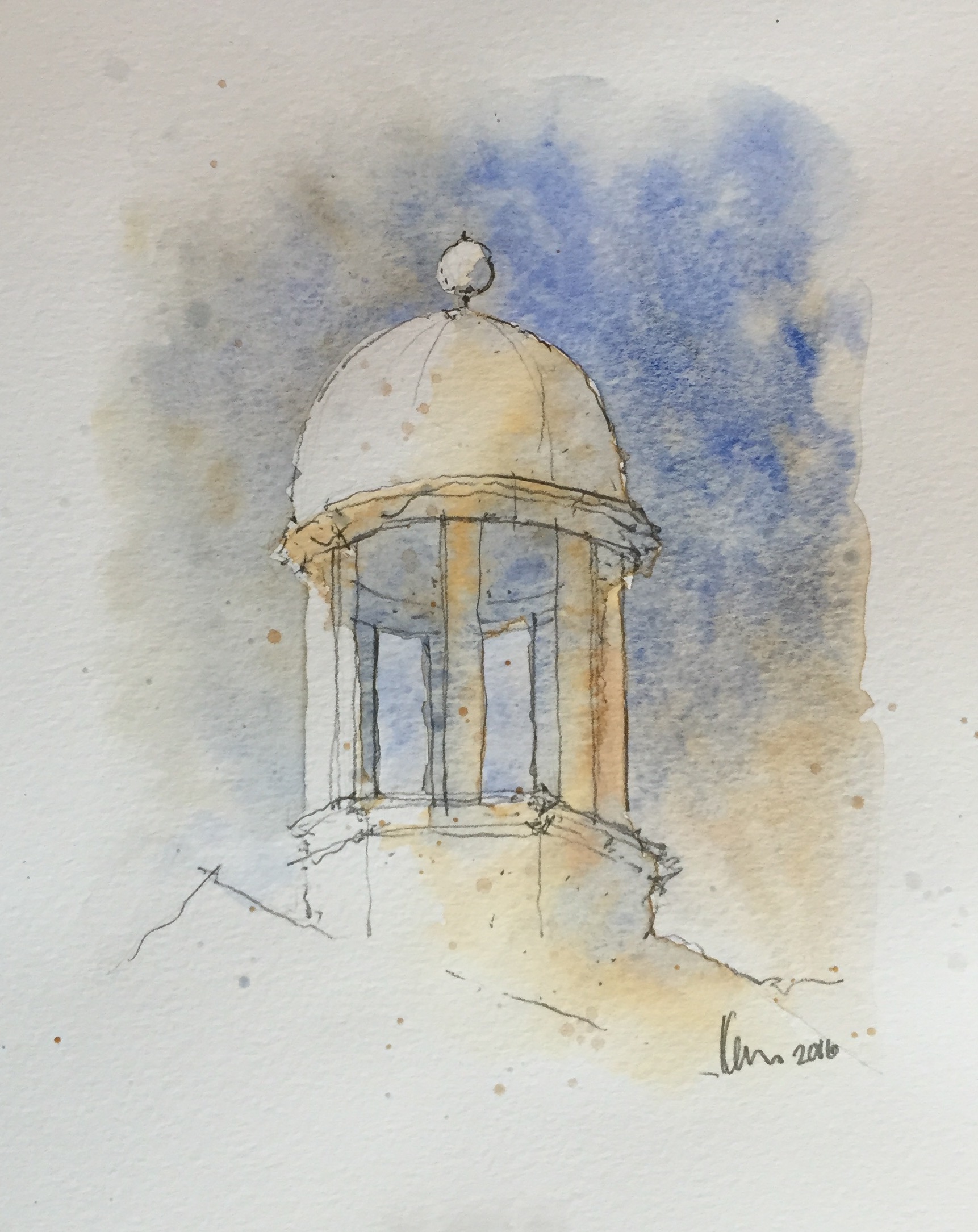
As for the style, at first I was thinking of doing some “watercolor”-ish style because I like soft colors and lines, but then I realized that it might be difficult (especially since I don’t really use watercolor).
Something like this. [taken from https://watercolorblast.wordpress.com/styles-of-rapid-watercolor-sketch/]
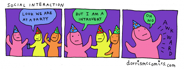
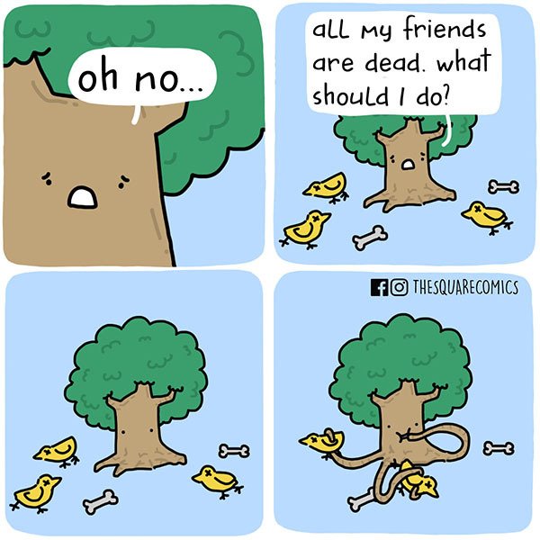
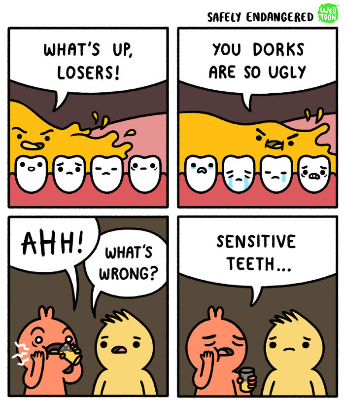
So I turned to other simpler styles and from Instagram, I found some comic artists whose style I really enjoy because they’re simple, yet they can convey the intended messages effectively. Here are some of my references;
instagram.com/dorrismccomics (Artist: Alex Norris)
instagram.com/safely_endangered (Artist: Chris McCoy)
In general, the three artists use thick outlines, simple art style, and bright colors. I’ll need some time, but I think I can make something with that style using Adobe Illustrator.
I’m also thinking of combining “realistic” photos and plain digital color background. That idea is inspired by movies that mix animation and real actors in one frame, like Space Jam.
A scene from the movie Space Jam (1996)
Research: Color
I found a website where they provide color palettes to download, and from there I found a lot of analogous color palettes that I think can work, like this one:
[taken from http://www.color-hex.com/color-palettes/?keyword=analogous]
But I will look at other types of color palettes as well, like the triadic color scheme, for example. I’ll see which one can bring out my ideas best.
[taken from https://shannon-brinkley.com/blogs/shannon-brinkley-studio-1/color-confidence-for-quilters-part-4-triadic-color-palettes]
Experiment
Here are my concepts.
In the end, since I couldn’t decide on one style, I ended up using four different styles.
The first one I did is just a combination of various things, such as colored pencil and copic marker.
Colored pencil, pen, and marker
I wanted it to have a cartoon-ish, childish look. I also didn’t give an outline because I think it will look less cute if I did. I used the markers only for the important figures, such as the cheese, the mouse, and the cross. For the wings, I used gold pen (which I used for the “shiny” effects as well). I used minimal coloring for the background because I feel that too much color would distract viewers from the actual point.
For the second one, I used Photoshop to merge pictures.
Photoshop trial
I showed that one to my friend and he said that my “contemporary art is on point”. I feel like the end result is interesting, although it is plainer than I expected. I chose purple background to complement the yellow banana.
The third style that I tried is watercolor.
Watercolor experiment
End results (mirrored image)
They actually turned out better than I expected. I never really tried watercolor before, so I watched a couple of YouTube videos before trying it out. It was messy and there was some smudges, but overall, I actually love the end result. I think I would do more watercolor in the future. I especially like how the background turned out. I used mainly calm colors like green and blue, which made the color black stood out even more.
Lastly, I used Illustrator.
Illustrator trial
This is my first time actually using Adobe Illustrator, so I needed a really long time just to create those three panels. I used blue elephant because blue is my favorite color, and pale blue background to emphasize the idea of “blending in”. The sofa and floor are orange and yellow to complement the blue.
All in all, I actually enjoy making all of those. Although they take a lot of time to create, I had fun experimenting with different tools and styles. I just hope they turn out well in the end.