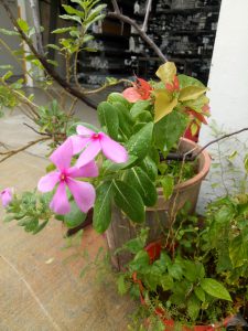
I was just walking around when I spotted something that piqued my interest: two different type of flowers growing in the same pot. The first one is bougainvillea, while another one is… some kind of orchid? To be honest, I’m not sure, although I see it around a lot.

You can’t really see but they share the same pot. It’s hard to find a nice angle.

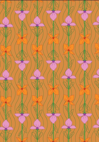
It’s something really simple, often overlooked, but to me it represents Singapore. It shows that from one common ground, there can be different flowers produced – which to me portrays the diversity in Singapore. Inspired by that, I made this Art Nouveau pattern. The two different flowers share the same stalk, to show that they have a common ground. I added flowing lines at the background to represent the flow of life, hence overall this piece represents the life of Singaporeans, harmony in diversity.

My piece

I’ve never gone to Night Light Festivals previously, so this is a new experience for me. It was fun – my friend and I walked from place to place, exploring the installations. They are very spread out, which may be good since people have more places to explore, but it makes it difficult for people who want to go through everything in one go. I visited several of the installations, and I think they look magnificent.


Hyperbands by KopI/O

Pulse by Galina Mihaleva, Hedren Sum, Pat Pataranutaporn, Kathrin Albers, Audrey Ng

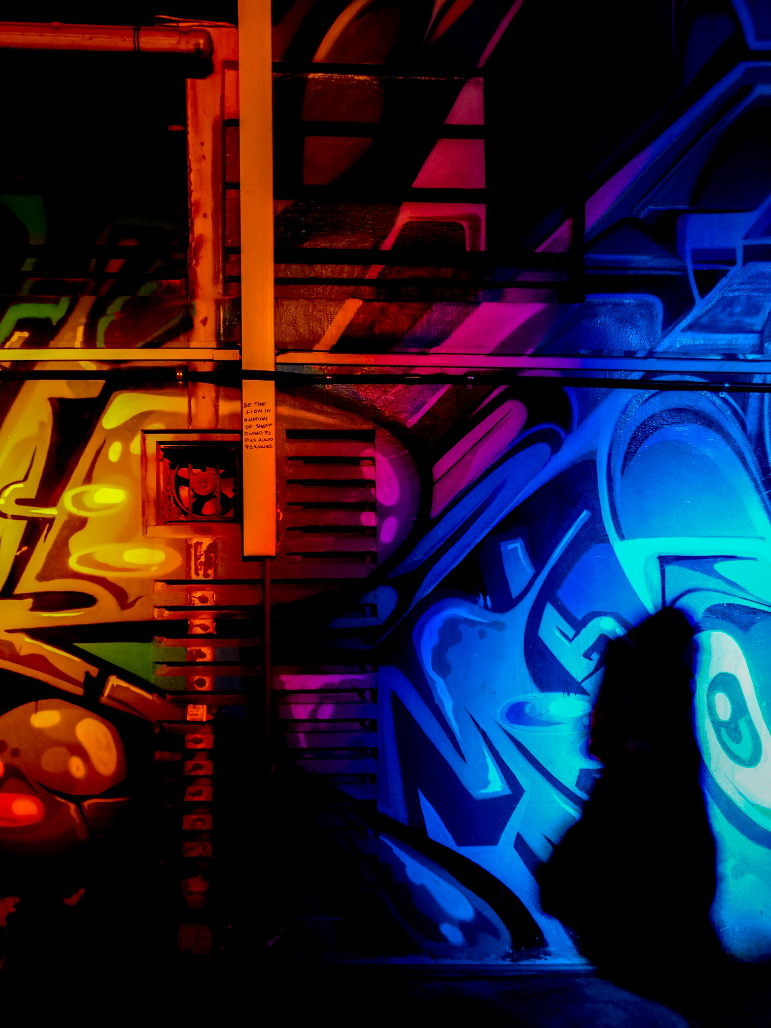
Graffiti Alive by Arup

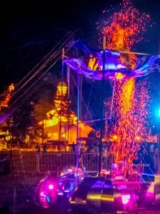
Ember Rain by Starlight Alchemy

That being said, I have chosen two installations for me to talk about.

Orbit

By LiteWerkz X 3M

This is the first installation that I went to. From afar, I could see a group of spheres – some of them lighting up, some of them don’t.

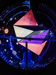
As I walked closer, I could see the see-through spheres, with quirky geometric shapes inside. The spheres were lined with lights so that we could see the insides of the spheres even in the darkness. Circular shapes were adorning the surface of the spheres. In the middle of the spheres, there is one sphere that is different from the others – it has circular objects that light up instead of geometric shapes inside the see-through sphere. A nearby sign informed us to try taking picture of the spheres with a flash.

At first, I took pictures without flash first.

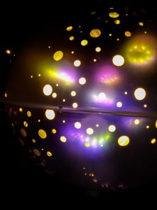
After that, I tried taking picture with flash. The picture was so different from what I expected:

Upon closer inspection, I found out that the circular-shaped stickers were actually made out of 3M retroreflective materials. When given light (i.e. the camera flash), the stickers reflected light and gave the effect as if they were sources of lights (!). That’s the interactive part of the installation. Moreover, I think there’s motion sensors inside the spheres that triggered the lights inside the sphere, so the lights will only light up when you spin the sphere. (I wanted to post a video, but it’s so hard to post a video in OSS, i.e. I can’t.)

It reminds me of a galaxy (and apparently that was the intention of the installation, based on the description put in the National Heritage Board website), not in the appearance only, but also because it gave me a sense of wonder when I tried to find out how the thing works.

I think the installation is interesting for that reason, and also that the design of the geometric shapes are all unique; there’s also a center piece which is a bigger sphere that attracts attention although it actually works the same way as the others. However the fact that everything works in the same way may dull people’s interest quickly, and people may not take their time to see the spheres one by one; they may just check one or two and leave (that’s what I did). In addition, it might not look very good when no one is interacting with it.


The Leap of Faith

By Teng Kai Wei

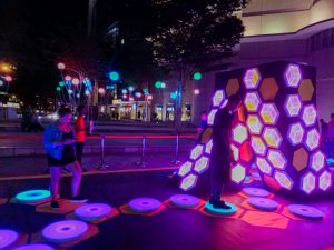
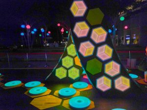
Even from a distance, I could see the lights from the installation. At once, it captured my attention. My first thought is that it looks beautiful, and it reminded me a bit of hopscotch. From the explanation board, I found out that the intention of the installation is to encourage people to take a “leap of faith”, to trust in yourself while going on a journey to reach your destination.

The anatomy looks simple; it seems that the plates are equipped with pressure sensors, so when someone steps on it, the color will change. Moreover, the original color of the plates will change constantly; hence if you step on it after some time, the color change will be different. I found that interesting, and may compel people to re-do the experience. In addition, the color change is unique as well; when you step on it, the color effect will resemble a ripple.

There’s also some kind of sculpture in the middle with geometric-shaped lights. I am not sure what the intention is, but it probably acts as a center, which could also be used to represent the “destination”.

Anyway, it’s really interesting to see different people interacting with it; I could see how different people can be. Little kids jumped from plate to plate excitedly, exploring every single plate although the resulting light would be the same; adults stepped on each plate carefully, looking around, deciding where to step next. Some people travelled back and forth; some people just walked across nonchalantly, even stepping down on the ground when they needed to make a jump across the plates.

I enjoyed playing around with that installation. I do think it would be better placed over water to actually force people to step on the plates, but I realize that may be dangerous and more difficult to set up. The lights were also constantly changing, which made the installation looked beautiful without anyone interacting with it, and noticeable even from a distance.


All in all, I found the installations really intriguing. I could see how even with instructions, people interact differently with the installations. I could also see how important it is to compel people to interact with the installations, and that depending on how they could interact, people could easily get bored by the installations or may not even be interested to interact at all. I realize I’m not familiar with the anatomy of the installations, which left me guessing a lot of times. However, I really enjoyed looking at those; definitely would go there again.

The theme that I’m trying to convey is ignorance towards preservation, especially poaching activities, in Labrador Park. Labrador Park is the only rocky seashore left in mainland Singapore, with abundance of marine life. Due to illegal poaching and other reasons such as safety, the beach area has recently been closed to public.

I feel that not enough people know about those aforementioned facts (or maybe they know, but choose not to be concerned about it) and that is why I want to take the theme up. However that proved to be a big challenge for me because my intention is to show the ignorance or lack of knowledge, but the zine just came out very vague (i.e. people can’t tell at all what my place is). I want to say that it proves my point that people are unaware, but I still feel a little concerned since it wouldn’t go with the zine brief.

In the end I went with something I’m more comfortable with, that is, by focusing on the narrative and flow instead of the actual layout. I’m also concerned since it looks more storybook-ish rather than a zine, and although it’s very reflective of my personality, it may not be very suited for the project.

Here is my final zine!

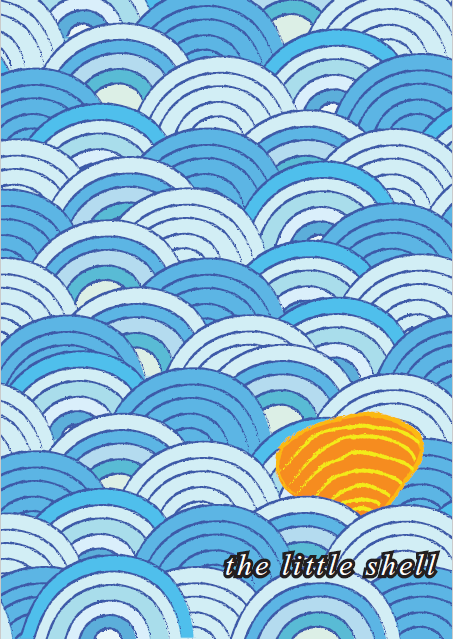
cover page

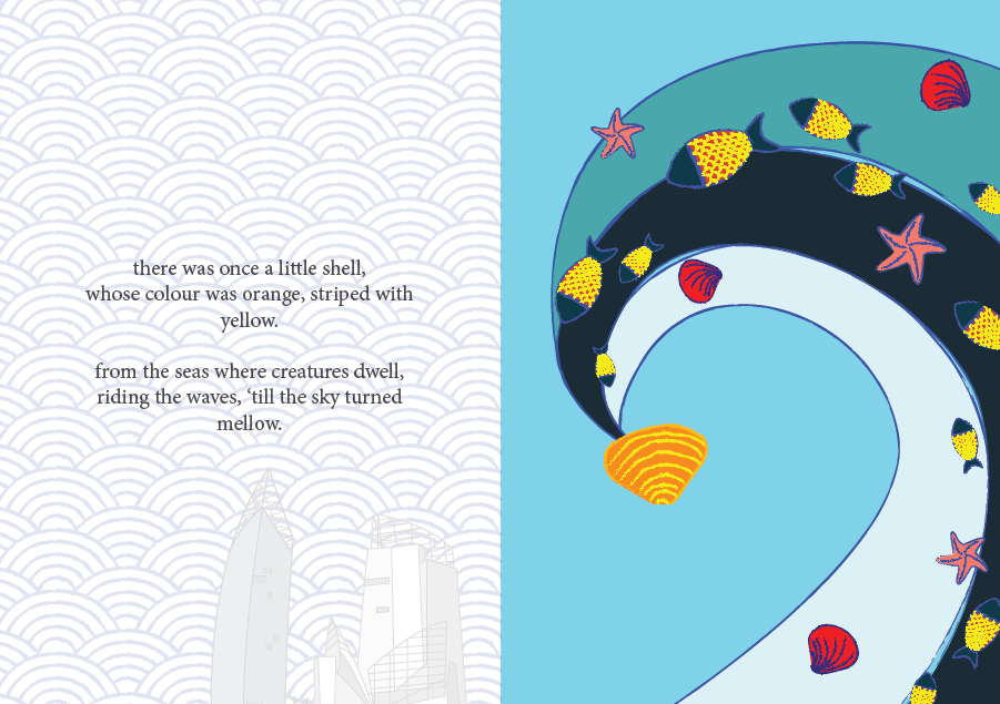
page 1 and 2

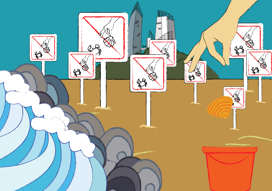
page 3 and 4

page 5 and 6

back cover page


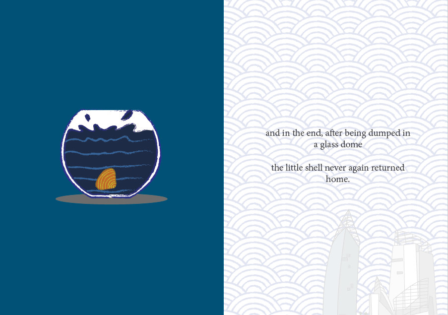
So the narrative revolves around a little shell who gets poached for aquarium decoration. Since the zine is intended more for children, I want to evoke the feeling more that “sea creatures too don’t want to be separated from their home”.

About the cover page

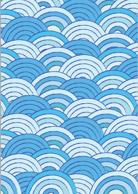
The cover page took me way too long to make, since at first I made one row of waves and just copy-pasted everything, but my friend said it’s too repetitive so I went through the trouble to make the rows one by one so they all look more varied. To be honest I really love the colors that I used. For the pages I used different blues for the backgrounds and the blues get darker at different pages because I want the feelings to slowly become “darker”.

About the narrative

The first and last page inside kind of envelope the whole experience with narrative; I received a comment saying they wish the narrative is a bit longer. I feel that that may reduce the impact since if the narrative is too long people will get bored faster, especially children.

By the way, I tried so hard to make a rhyming poem, and I actually think they’re okay. Maybe I should’ve chosen a different font, but I actually feel like this font is enough since it fits the storybook feeling. I also received comments saying that I should have capitalized the first letter. I did that at first, but then the letter stands out (of course) and I don’t really like the overall look, so I stuck with the all-small letters.

About the pattern

As for the background pattern on the first and last page, at first I only made the sea waves pattern but after consulting, I realized that it lacks representation of the place so I added the buildings that you can view there. Some people say it adds more characters, some people say it’s kind of out of place, but I like it.

About the character

I choose orange as the shell color because I want a contrast to the blue, since I already know from the beginning I will use a lot of blue. I tried red, but I think it comes out too jarring. Orange provides a warmer, friendlier feeling while staying bright.

I choose a shell because it’s simple to make, and also I want it to blend with the sea waves at first.

About page 2

In the wave, I added different sea creatures to tell audience about the diversity. The yellow scales on the fish provides a line that people can follow to see the orange shell at the end. For the other creatures, I outlined them blue and use mainly red-dark orange-pink so they won’t draw too much attention. I want the shell to be the star of the page.

About page 3 and 4

At first I only put one sign there, and it looks very empty. So I put an excessive number of signs there instead to show that there are efforts in preserving the sea, it’s just that people choose to ignore them. In some ways, it’s a sarcastic remark to point out people’s ignorance. I put rocks right by the waves to illustrate Labrador Park’s rocky shorelines. The characteristics are also shown by the sign, which is considered pretty unique of Labrador Park, and the buildings which can be viewed from Labrador Nature Reserve. I do regret not putting in more characteristics (like the Dragon’s Tooth Gate or some of the war relics?), maybe I could have put them floating between the sea waves pattern on other pages or something.

At the right side of the page, you can see a hand dropping a shell into a bucket. The hand gesture may be a little unclear, it looks like someone is picking up something instead.

About page 5

This is the page I had the least trouble with, because I had envisioned this ending right from the start. I just now think that maybe the aquarium shouldn’t be placed right in the center of the page, but a little bit lower so the shell looks like they’re “falling” from its positioning in other pages. For this page, I made the shell’s color darker so as to say that it’s losing its vibrancy after being separated from home, and subconsciously saying that even if you take a beautiful shell for yourself to decorate your aquarium with, it won’t look as beautiful there compared to when it’s in the sea.

Overall

I’m actually really happy about how my zine turns out! Looking back, I never thought I would have made this. I like the flow of the story, however again, it feels more storybook-ish than a zine. I was worried it’s not graphic design-ish enough, but then I decided to go with something more reflective of my personality and focus on the narrative instead. I realize I wasn’t pushing myself out of my comfort zone enough and decided to play with something I know I can do better at; I definitely should have explored more.

I tried to portray the characteristics of the places more by adding the buildings, but still maybe the characteristics aren’t portrayed enough since people can’t tell about the place at all. (Which proves my point of lack of knowledge, but goes against the brief.)

For the software, I used mostly Adobe Illustrator, but I can’t make a whole page and just copy-pasted them to InDesign because I used the chalky brush stroke, and it came out very pixelated in InDesign. (Turns out it’s just my display preference, but I only noticed it later.) Because of that there’s a lot of layers in InDesign and it took forever compressing them into a PostScript file (I spent an hour at the printing place trying to make it right, fortunately the people are so nice to wait for me and even teach me what to do). My laptop is laggy especially bad whenever I use InDesign, so I have to be smart in choosing what to create in Illustrator and what to create in InDesign and I spent more time than I should have (I also took shortcuts), but luckily they turn out as I want them to.

As for the printing, surprisingly I didn’t have a lot of problems with it. I went to RJ Papers and took my time looking at different papers. I didn’t know there are so many different kinds of papers before! I was considering between using a glossy, magazine-style paper or the paper that I used in the end (I forgot the name, I think it’s Maple Bright?). Glossy paper will make my color pop up more, but it feels colder somehow, so I decided to use the maple paper to convey a warmer feeling of “home” to fit in with my narrative. I choose the 170 gsm one because I want it to be thicker, so it feels nicer to flip.

The colors come out exactly how I wanted them, except for the hand on the 4th page–the printed hand is too yellow compared to my digital illustration, but that’s fine. The different shades of blue came out brilliantly and I like them very much. I even printed an extra zine for myself to keep.

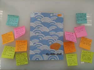
My final zine and feedback (thanks for the comments!)


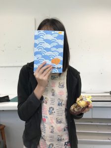
Me, my zine, and cupcake


All in all, it’s a valuable experience for me. At first I wasn’t sure if I could do it, but I did, and I’m proud of myself (although it actually is something that I am supposed to do so I shouldn’t be too proud of it). I learn a lot more about my style and work attitude. I also learn to ask help from my friends more, be it to comment or to guide me in using software. I was always reluctant to ask for comments because I tend to take things negatively, so I’m glad that my friends are willing to put up with my stubbornness and continued to give me insights.

And thanks to the people who say it’s cute. I think my zine is cute too.

It’s been a really fun journey!

Here are my end results for this project! Featuring: the mouse, the elephant, the banana, and the turtle.

1. The Mouse
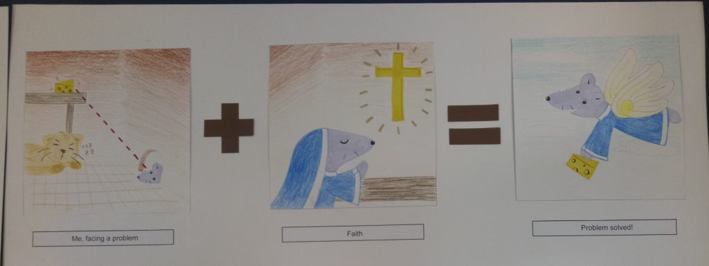
Me, facing a problem + Faith = Problem solved!


I represent myself as a mouse because (I think) my Chinese zodiac is a rat, so my family at home sometimes refers to me as the “mouse” in the family.

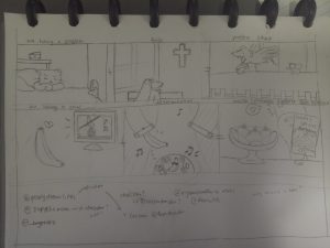
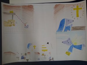
The story is that the mouse wanted to get the cheese but was hindered by the presence of the cat. So the mouse began going to church and gained a pair of wings, which enabled her to overcome the problem.

This is the representation of me when I face a hindrance or problem in doing something. The “faith” here is represented by going to church, but actually it’s not necessarily a religious faith. It can also represent faith in my own abilities, since I tend to think that I can’t do things before I actually try them. By having faith, I can actually overcome my troubles in achieving what I want.

I chose to use colored pencils and markers because I wanted to work with something simple, and I wanted to give a child-like vibe. I used markers for the important objects in the panels as emphasis. As for the colors, I used similar colors (shades of brown) for the first panel except for the mouse and cheese because I wanted to emphasize their significance. The background of the second panel also has brown color to create some connection between the panels. From the second to the third panel, the mouse wore the same habit (apparently the uniform that nuns wear is called a “habit”) to create a connection.


2. The Elephant
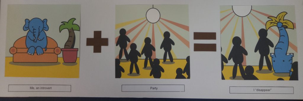
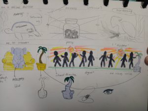
Me, an introvert + Party = I “disappear”


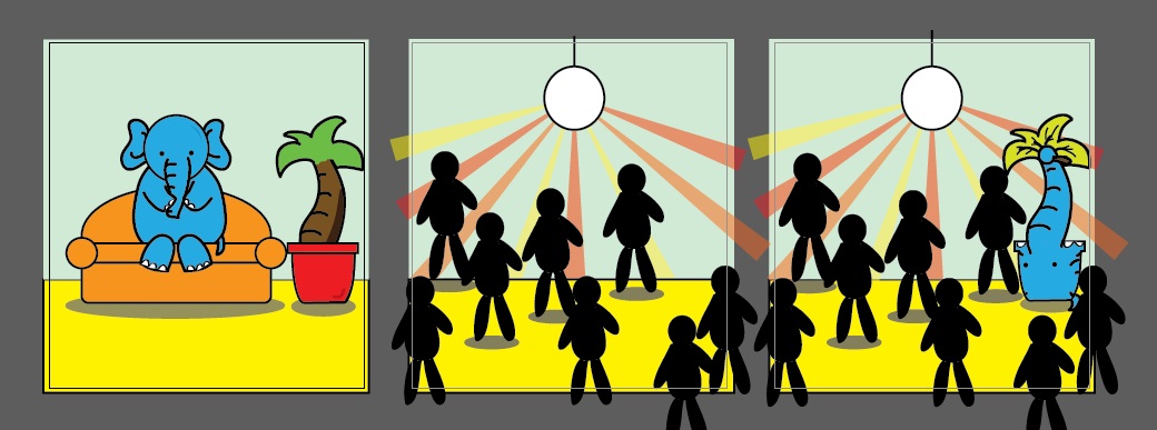
I used an elephant because of the phrase “elephant in the room” – it’s there, but people don’t talk about it.

The story is that the elephant is so introverted that when she went to a party, she blended in right away with the surrounding and became unnoticed. It was as if she became a furniture, a part of the background.

The elephant represents my introverted and awkward side. I’m not good around strangers, and even within my circle of friends, I’m not good at interacting with people in big groups. In a sense, I’m physically there, but it feels like I “disappear”.

I used the color blue for the elephant because blue is my favorite color. The sofa in the first panel is orange to complement the blue elephant. I used yellow for the floor since yellow and orange are analogous colors. The background (the wall) is supposed to be pale blue, but the color came out a little differently than I expected. I used blue background to emphasize the feeling of the blue elephant “blending” into the environment.


3. The Banana
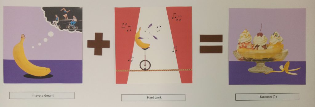
I have a dream! + Hard work = Success (?)


Banana is one of my favorite fruits. That’s why.

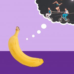
The story is that the banana wanted to become an acrobat. To achieve that dream, the banana worked hard to practice circus acrobat. In the end, the banana became banana split instead. (It’s a pun, because split is kind of a gymnastic movement, and gymnastic is usually related to acrobat.)

To me, it is a good representation of me when I set a goal for myself. Sometimes we dream high and work hard for it, but the end result is not exactly as we want. However that doesn’t mean you’re not successful – you still succeed, although the success might be different from your initial intention. That’s how I feel sometimes when the end result of my work is not exactly like how I want it to be, but I know I worked hard for it, and thus the journey still makes a success in the end.

I used purple background for the first and third panel to complement the yellow banana. As for the second panel, I used the red-and-white background to show that it’s a circus. I used purple juggling pins to make some sort of connection between the panels.


4. The Turtle

Me + Anxiety = Overthinking


Turtle, in my opinion, is a very chill animal. I like it because I’m a chill person (most of the time), so I feel that I can relate to it.

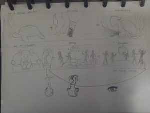
The story is that the turtle, a very chill animal, was just chilling. But then the turtle ate a mysterious black pill and turned into an ink-spewing sotong. (This story sounds more reasonable in my head, but now that I wrote it down, I understand why my friend – to whom I showed my sketches – looked extremely confused.)

The turtle represents me as a person. Usually I’m very chill and somehow normal, but when I’m anxious (I represent anxiety with the black pill), I tend to overthink trivial things until they muddle my thoughts. I represent the state of overthinking with the black ink muddling the seawater. In a sense too, the sea represents my thoughts. It’s usually very calm and clear before I start getting anxious.

I used mainly cool colors like green and blue for this one since I want to give the calm vibe to represent my thoughts. I used some yellow and orange also for the seabed and the inside of the shell as green-yellow are nice analogous pair and blue-orange are complementary.


Reflection

I had trouble deciding what style to go with, so in the end, I told myself, why not just try different styles?

Since I didn’t really do art before studying here, I didn’t have an idea what my style would be like. I’m not even sure what technique I’m good at. So I decided that this project can be a good opportunity to explore my options more, and see what technique or style I’m more comfortable with. It’s really fun, and it’s a really good learning experience for me. I realize that working digitally ensures a “cleaner” result (and there’s undo button as well), but it requires a lot of time (or maybe just because I’m not used to it). I spent a lot of time tracing the outline of the banana split. Also, I learned some illustrator techniques, which I find to be really fun.

Working traditionally is faster, yet since I’m a messy person, there’s bound to be some mess. Moreover, there’s no undo button, so I have to be extra careful. I think the mouse story is really messy since the colored pencils smudged a little. As for the watercolor, I actually had a lot of fun doing it. I’ve always liked watercolor, although I’ve never really worked with them. I just tried putting layers of colors and smudging them with more water. Although they’re very messy (I didn’t expect the pen lines to smudge that much), in fact, I really like how they turn out.

Coming up with ideas isn’t the hardest part – the hardest part is realizing the ideas. I realize that it’s not enough to just have a good idea; I have to consider the feasibility and the aesthetics as well.

I also learn that doing projects is not a show of skills. I’m worried at first because I feel that I’m lacking in skills and experience, and thus my work might turn out “less” compared to other people. I’m scared that my work may be too simple, too child-like – what if I look like I don’t put in enough thought or effort into this?

But then again, why should I compare myself to other people? This is my project, and I’m proud of what I have done. Looking back, I have definitely improved – from someone who never used Photoshop to someone who can create a story using Illustrator. You see, when you’re at the bottom, there’s nowhere else to go but up.

All in all, this project has been a really fun and enlightening ride.
For this final project, I think I have a lot of difficulties trying to figure out what style I should go for. There are so many choices, but of course I have to choose rationally, considering the amount of time I have and my skills as well.

Research: Style

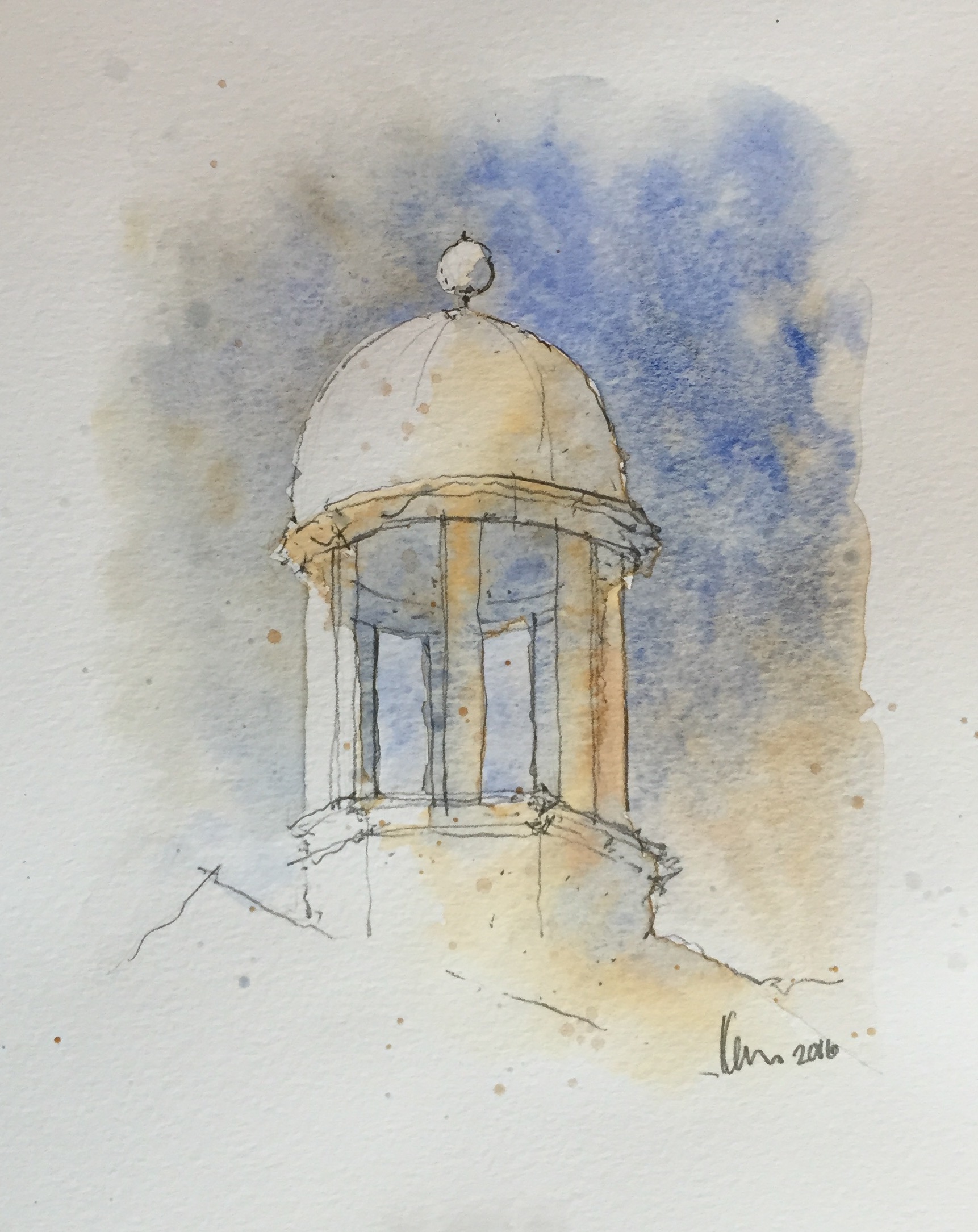
As for the style, at first I was thinking of doing some “watercolor”-ish style because I like soft colors and lines, but then I realized that it might be difficult (especially since I don’t really use watercolor).

Image result for watercolor styles

Something like this. [taken from https://watercolorblast.wordpress.com/styles-of-rapid-watercolor-sketch/]


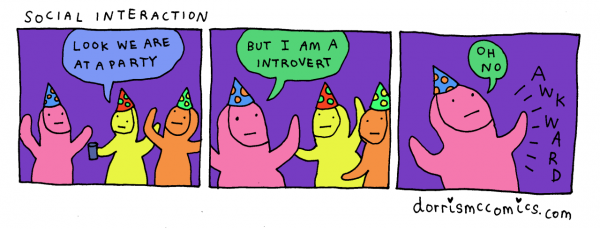
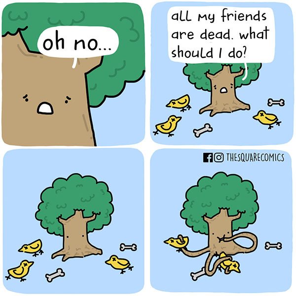
So I turned to other simpler styles and from Instagram, I found some comic artists whose style I really enjoy because they’re simple, yet they can convey the intended messages effectively. Here are some of my references;


Image result for dorrismccomics

instagram.com/dorrismccomics (Artist: Alex Norris)


Image result for thesquarecomics

instagram.com/thesquarecomics (Artist: Alvin Juano)


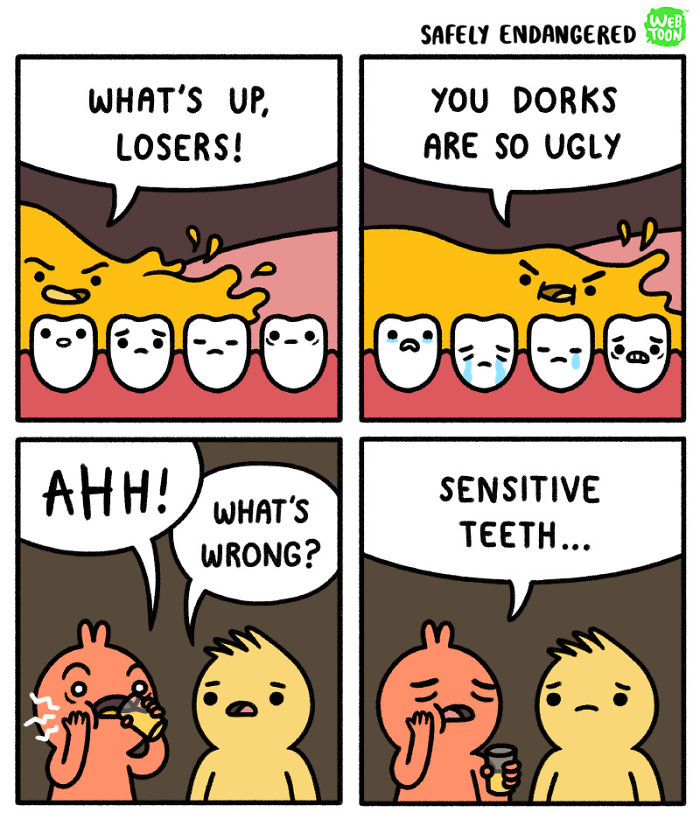
Image result for safely endangered comic

instagram.com/safely_endangered (Artist: Chris McCoy)


In general, the three artists use thick outlines, simple art style, and bright colors. I’ll need some time, but I think I can make something with that style using Adobe Illustrator.

I’m also thinking of combining “realistic” photos and plain digital color background. That idea is inspired by movies that mix animation and real actors in one frame, like Space Jam.


Image result for space jam

A scene from the movie Space Jam (1996)


Research: Color

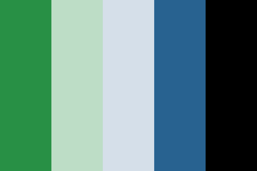
I found a website where they provide color palettes to download, and from there I found a lot of analogous color palettes that I think can work, like this one:

Image result for analogous color palettes

[taken from http://www.color-hex.com/color-palettes/?keyword=analogous]

But I will look at other types of color palettes as well, like the triadic color scheme, for example. I’ll see which one can bring out my ideas best.
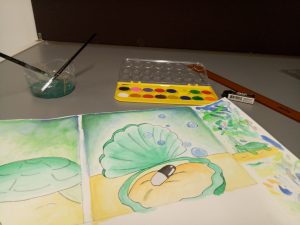
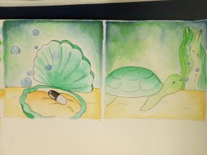
Image result for triadic color palettes

[taken from https://shannon-brinkley.com/blogs/shannon-brinkley-studio-1/color-confidence-for-quilters-part-4-triadic-color-palettes]


Experiment

Here are my concepts.


In the end, since I couldn’t decide on one style, I ended up using four different styles.

The first one I did is just a combination of various things, such as colored pencil and copic marker.


Colored pencil, pen, and marker


I wanted it to have a cartoon-ish, childish look. I also didn’t give an outline because I think it will look less cute if I did. I used the markers only for the important figures, such as the cheese, the mouse, and the cross. For the wings, I used gold pen (which I used for the “shiny” effects as well). I used minimal coloring for the background because I feel that too much color would distract viewers from the actual point.

For the second one, I used Photoshop to merge pictures.


Photoshop trial


I showed that one to my friend and he said that my “contemporary art is on point”. I feel like the end result is interesting, although it is plainer than I expected. I chose purple background to complement the yellow banana.

The third style that I tried is watercolor.


Watercolor experiment

End results (mirrored image)


They actually turned out better than I expected. I never really tried watercolor before, so I watched a couple of YouTube videos before trying it out. It was messy and there was some smudges, but overall, I actually love the end result. I think I would do more watercolor in the future. I especially like how the background turned out. I used mainly calm colors like green and blue, which made the color black stood out even more.

Lastly, I used Illustrator.


Illustrator trial


This is my first time actually using Adobe Illustrator, so I needed a really long time just to create those three panels. I used blue elephant because blue is my favorite color, and pale blue background to emphasize the idea of “blending in”. The sofa and floor are orange and yellow to complement the blue.


All in all, I actually enjoy making all of those. Although they take a lot of time to create, I had fun experimenting with different tools and styles. I just hope they turn out well in the end.