I tried to find the keywords from the quotes and find elements to represent them.
Quote 1
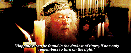
“Happiness can be found even in the darkest of times, if one only remembers to turn on the light.” -Harry Potter and the Prisoner of Azkaban (2004)
Keywords:
Light, happiness = light bulb, a little girl (represents hope), intricate background
Dark times = dark surroundings
At first I wanted to use daffodils to represent happiness, because in the flower language, daffodil means happiness. However my first draft turned out awful; there are just too many things going on, but they are not interacting with each other.
In the end, things are kept simple. The light bulb acts as a source of light or “hope”. Hope is also represented by the face of a little girl. As for the part “happiness can be found”, it implies that happiness is actually there, but we just can’t see it because it’s obscured by the darkness. Hence happiness can be represented by the intricate background that is slowly revealed by the light. In further distance, it looks all black and dark due to the absence of light.
I put the light bulb off the center so it won’t be symmetrical. Also, the face of the girl inside the light bulb is facing to the right side, to lead our eyes into the dark void all around the canvas.

Final
Quote 2
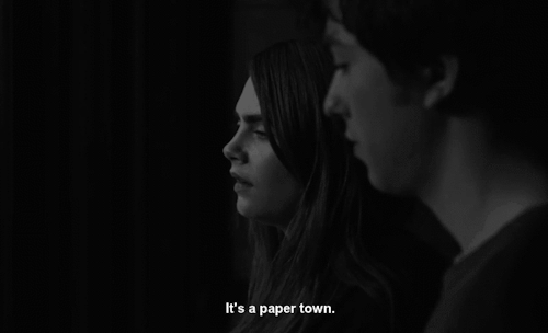
“A paper girl for a paper town.” -Paper Towns (2015)
Keywords:
Paper = fake, mask, mirror
I used a lot of masks to represent a lot of “fake” people, which represent a “paper town”. As for the girl, I used a broken mirror as a face. It represents the idea of fakeness as a broken mirror can’t show exactly what’s reflected there.
At first I wanted to use the mirror as a background and use human figures looming at the girl to show a “paper town” but it didn’t turn out very nicely. Actually I even wanted to use the figure of Cara Delevigne (the main actress in the movie Paper Towns) as the girl but I couldn’t find a perfect picture of her. To save time tracing path, I purposely searched for pictures of girls with straight hair.
The whole canvas actually looked pretty symmetrical if not for the broken mirror. At first I considered adding something else, but I liked the idea of using the broken mirror to “break” the symmetry. I also didn’t want to make the canvas more jam-packed since there were a lot of masks as the background.
The symmetry also represented uniformity, which can be caused by herd mentality. Usually people tend to follow popular beliefs although that go against their own convictions. For me, that is the idea of “fakeness”.

Final
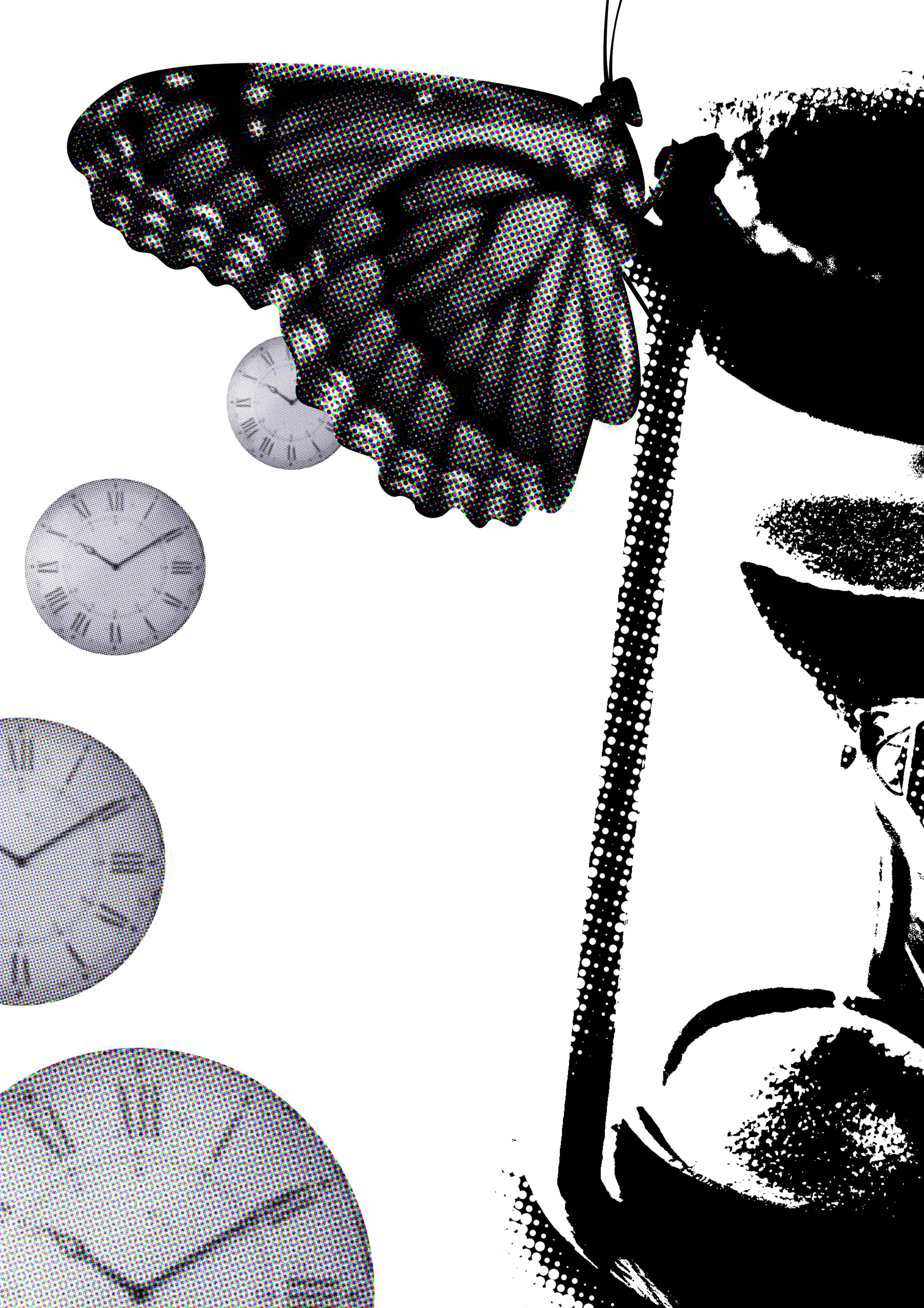
Quote 3
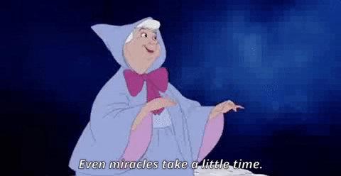
“Even miracles take a little time.” -Cinderella (1950)
Keywords:
Miracle = butterfly
Time = hourglass, clocks
I represented miracles with a butterfly, since just like Cinderella who turned from rags to riches, beautiful butterflies were once ugly caterpillars too. The change or the rebirth is representative of the “miracle”.
As for the time, I used two things; hourglass and clocks. Hourglass indicates more about a time that is running out. In a way, it is implying that in the end, if you wait long enough, something (in this case, a miracle) will happen.
The clocks leading to the butterfly were supposed to represent time passing and to lead us to the result of a miracle, which is the butterfly.
I wanted to put magical elements in it at first such as a magical wand or glittery effect, but it looked very childish, so I scrapped it off.
To make the picture looks more dynamic, I tilted the hourglass and put it slightly off the canvas. The clocks were also placed in a curve and were getting smaller to lead our eyes to the butterfly.
Final
Quote 4
“It’s not like there isn’t air inside.” -Narnia: The Lion, The Witch and the Wardrobe (2005)
Keywords:
Inside = a confined space
Air = atmosphere, wind, sky
I used a jar to represent “inside”. I made it look transparent to make it the overall look more cohesive. Moreover, the transparency also suggests that there is actually a very thin line between “inside” and “outside” – it’s only the confines of walls. To emphasize the idea of “inside”, which is contrasting with “outside”, I put a scenery as a background.
The jar is slightly open and clouds are coming out from it. For me, the quote is saying that things that usually can be found outside can be found inside as well. Talking about air, I connect it with the sky, and hence the clouds.
Actually I did a pretty positive interpretation of this quote although it was meant to be mocking. Edmund, the character who said that quote, was arguing with his siblings. They told him to go play outside with them to get some air and he countered with that quote sarcastically.
I made the jar disproportionately bigger to make the comparison between the inside and the outside easier. I also put more things at the lower half (the jar and the scenery) to balance out the void at the top. I filled around two-thirds of the top part with clouds, leaving a completely empty void above the jar area, which should be roughly one-ninth of the canvas.

Final
Reflection
Somehow my gifs are not moving and I don’t know why.
I have no experience using Photoshop before, so it was a challenge (especially the tracing part – I am not patient enough sometimes). Moreover I had troubles interpreting the quotes and turning them into a cohesive picture. My interpretations are bits and pieces that did not speak to each other at all, resulting in a very disconnected picture. I have to admit, I really have a lot of problems with this project.
Even with these finalized pictures, although I am happy with them, I realize they’re far from perfect.
I hope I can use this as a stepping stone and for me to learn so I don’t repeat the same mistakes again.