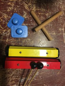
For the group mood box, we decided to use the other recording (the one I didn’t use). For that sound, we used rhythm sticks, triangle, and zig zag board.

Instruments used

This is the sound.

Here is my waveform analysis for the sound.

Mood Box

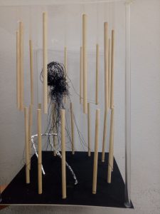
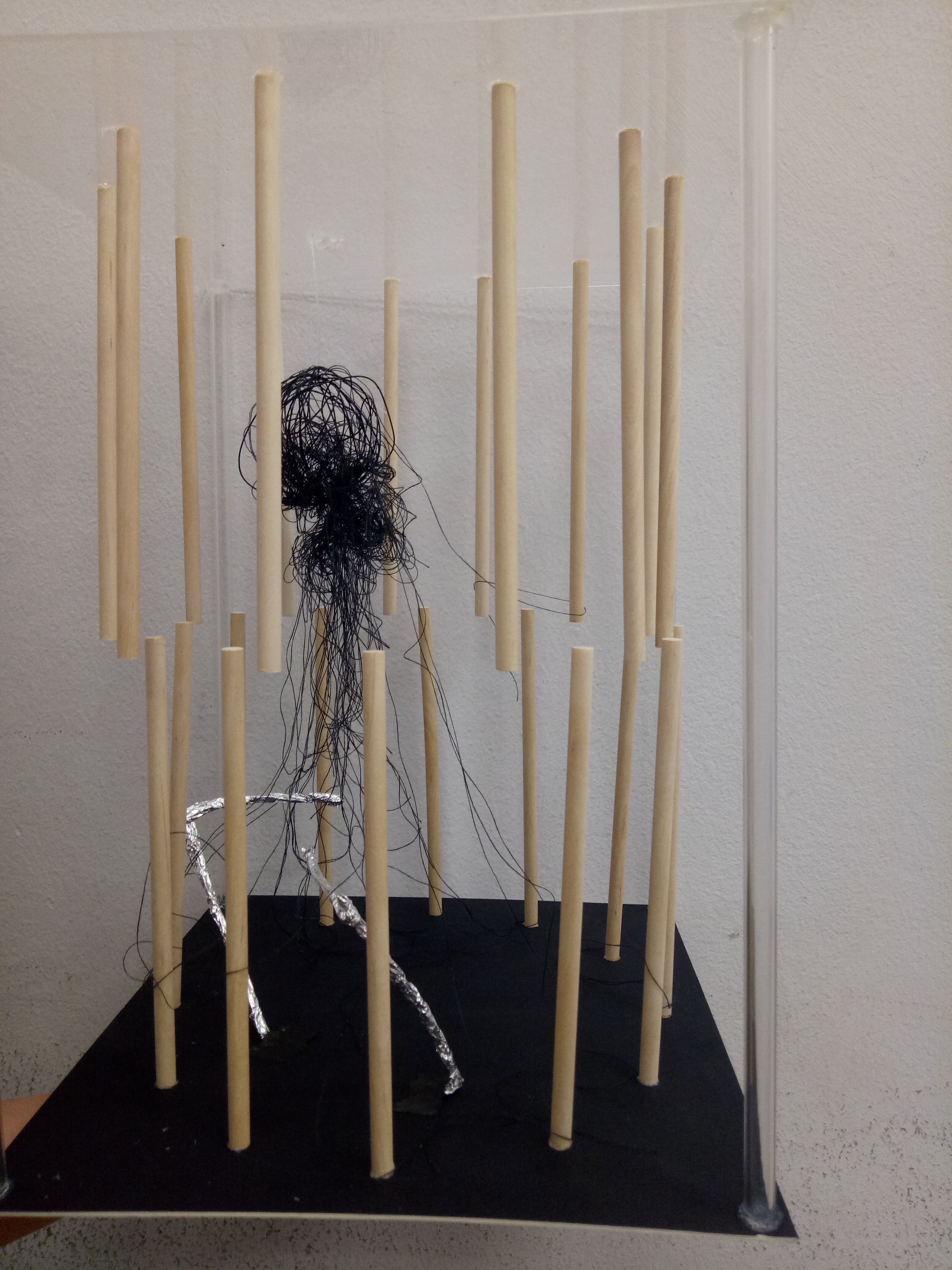
Here is our final group mood box.


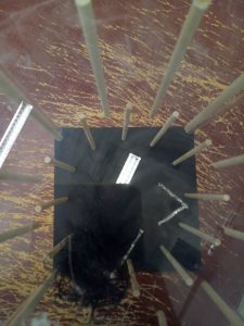
We put the model in a circular arrangement to represent repetition, although there is some kind of starting point indicated by the positioning of the wire (wrapped with aluminium foil) and the ball of wire and thread.

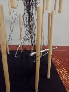
Zoomed in


The wooden sticks represent the dominant, constant sound of rhythm sticks. They sound very stable and straightforward, hence we placed wooden sticks in the straight directions. The up-and-down positioning suggests that the sound is all over the place.

The wires wrapped with aluminium foil represent the subordinate, which is the zig zag board. The texture of crumpled foil suggested the rough, edgy sound of the friction. The sharp cuts of the sound is represented by the sharp edge of the wires.

The subdominant sound, which is the triangle, is represented by the ball made of wire and thread. The thread tangled all over the place since the sound of the triangle kind of “melted” into the entire recording and enveloped the other sounds.

Top view


We also tried to make the frame “invisible” by using transparent acrylic and tubes to frame.

We put black as the base and thread color to give a darker, more mysterious mood; but it is the calming kind of darkness.


Reflection

The challenges when creating this model:

One, the positioning of the up-and-down wooden sticks. We couldn’t get the positions right although we tried using several different methods; they always ended up a bit off.

Two, using the right amount of glue. If we used too much (especially on the transparent acrylic), it would look very messy. If we used too little, they wouldn’t stick very stably.

In the end, we required more time than we actually predicted due to those challenges. However I think our end result is good as our intention is clearly expressed in the model.

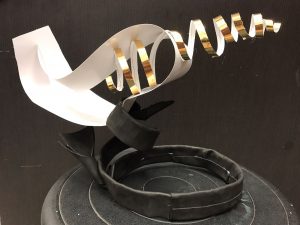
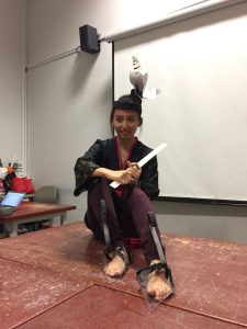
For this project, I worked together with Sabrina and Pei Wen. We decided to make a head gear and a pair of shoes.

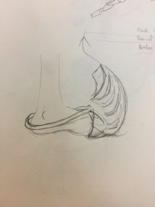
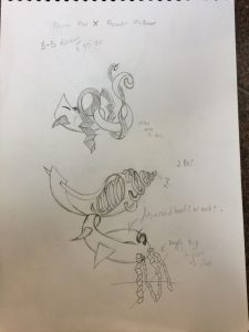
Here are some of the sketches.

Shoes sketch

Head gear sketch


The head gear is supposed to represent our pleasant scents, while the shoes represent our unpleasant scents. Our pleasant smells are tea, candles, and hay; our unpleasant smells are carrot juice, damp clothes, and toothpaste.

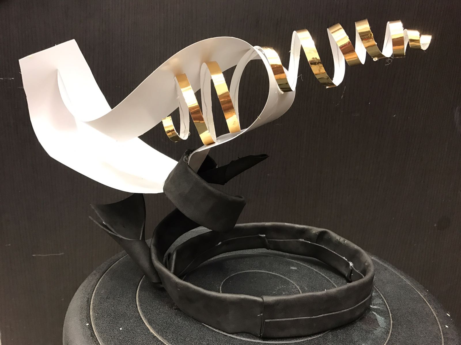
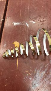
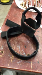
Head Gear


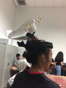
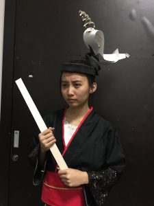
For the head gear, the idea is to go “up”, so we made the components pointing upwards as much as possible. We used wire wrapped in black craft foam as the base to make it strong yet comfortable for the head. To keep the upper parts light, we used art card and thin wire wrapped in gold paper for the other elements.

The idea of going “up” represents tea and candle, which usually produce steam (which floats up). The strong head gear, which grounded the elements to the head, represents hay.


Shoes


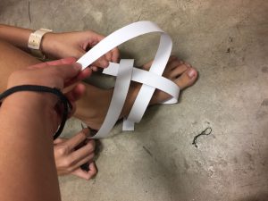
We tried it first using art card.

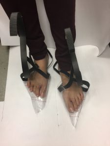
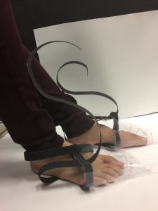
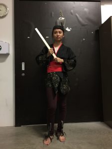
As for the shoes, we tried to incorporate the same idea, that is, to go “up”. Hence we made the corrugated board strips go high until they touch around the leg area.

The jaggy texture of corrugated board looks like flow of water, which represents damp clothes, and also looks like toothpaste when put on toothbrush. Meanwhile, the shoes are shaped with pointy end, which represent the shape of carrots. The plastic shoes were also kept together by strings to show tension and discomfort.


End Result


Although I feel that there is very little time, I am quite satisfied with the end product. It was challenging to combine different ideas into one and incorporate them into a product with interesting yet reasonable design, but it was a fun challenge to conquer. Here’s Sabrina modeling our accessories!


Lastly, thanks to Pei Wen and Sabrina for being great people to work with!

After we tackled rectilinear shapes, now we’re moving to curvilinear stuffs like cones, cylinders, and spheres. Cutting foams into those shapes isn’t easy at first (and it still isn’t until now, actually) but it gets better with practice.

Here are some of the models I created. Pardon the masking tapes, since all of them unexpectedly crumbled down after I brought them to class, probably due to me swinging the plastic bag they were in.

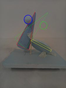
[Red – dominant, yellow – subdominant, blue – subordinate, green – correction]

Model 1
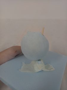
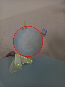
This model doesn’t actually have a story, I just tried putting things together. I like the proportion, since the roles are very clearly defined, although I could work with the presentation. I used a lot of masking tape since the tip of the cone came off unexpectedly.

The cylinder looks almost perpendicular to the base, and it couldn’t be seen from some angles due to the sphere as well. So the cylinder probably needs to be moved up and angled more to make the overall look more dynamic.

The apex of the cone also looks hidden by the sphere which is not good, since the apex is supposed to be the cone’s main appeal. The cone may need to be angled more so less of the apex is “hidden” by the sphere. As for now, the balance looks precarious, but maybe independent angle will work better.

Model 2
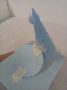
The idea for this model is “falling”. I wanted to make the whole thing looked like the sphere is going to fall and the cone is trying to catch it, and the cone now is going to fall too, so the cylinder is trying to catch it. The angle of the cylinder is independent, and the cone is just slightly floating.

As for the sizes, the sphere could be smaller. The cone could be longer and bigger to give it more weight. The cylinder could have a slightly smaller diameter, and maybe be thinner.

In order to incorporate more of the “falling” idea, the cone should be put at a more “dangerous” angle.

Model 3

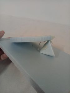
For this one, the most important point is the cradled sphere. It looks somewhat like a child being “protected” and “cradled” (of course) by the “parents”, or the obviously bigger cylinder and cone in this situation. Moreover, the cone and cylinder are dependent while the sphere is nicely cradled in the middle, which emphasizes the idea of the two “parents” working together for the sake of the “child”.

Of course, the sphere needs to be slightly bigger because now it couldn’t be seen properly from some angles. But other than that, I feel that the proportions are quite okay. I just need to make sure that the cone and the cylinder don’t look like they’re perpendicular to each other.


Autumn
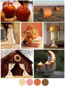
https://www.pinterest.com/pin/29343835041617544/

As for my final model, I based it off model 3. My word is “autumn” (which is what I wanted!) and I have done some research about that. Autumn is usually associated with maturity, and to me, autumn can also represent transition as it is somehow the transition season between the bright summer to cool winter.
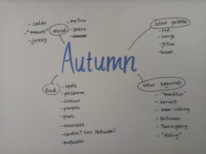


Rough mindmap


At first I was thinking of using model 2 due to the idea of falling (and autumn = falling leaves, right?), but model 3 has a more interesting look and the story can somehow fit as well. Since model 3 has the idea of a “child being cradled“, I think we can relate that to “transition to maturity“. A child that needs to be taken care of at first before it can transition to maturity, to become like the parents.

Autumn can also represent “serenity” and “calmness“, and I think that can add to the story. The fact that the child/sphere is still being cradled despite the idea of wanting to mature shows that the parents/cone and sphere are not in a rush to push the child/sphere to mature.

As for the food, I haven’t thought of any yet. I did gather ideas about autumnal foods (such as persimmon, chestnut, apple, pear, mushroom, and pumpkin) but I still have no idea how I want to incorporate them into my model. I was thinking of using sturdy foods as the “parents” and soft one for the “child”.

In addition, as for the branch, since there is a void behind the sphere, maybe the branch should be behind and piercing through the cylinder, pointing fairly low. It can incorporate the idea of falling and strengthen the hold of the cylinder to the model, symbolizing the sturdiness of the cylinder. (I think the cylinder can be the dad, since it’s the dominant shape and looks sturdier, so the cone can be the mom.)


Final Model (Fail)


For me, this task is really challenging.

At first I had the idea of using pumpkin as the cylinder. That sounded good to me since pumpkin is sturdy, and it would represent my idea well. Besides, pumpkin has a vibrant orange color and is one of the most popular autumn fruit (because of Halloween).
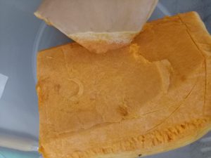
Pumpkin (before cut). I marked the outline and I still messed up.

However, the pumpkin turned out to be harder than I expected. I cut myself by accident while cutting it. After I did cut it, I kept on making mistakes, so I kept trying to cut a little bit more to save the shape. In the end, it turned out to be really, really small that it might as well be the subdominant. Because of this unpredictability, I didn’t manage to complete my project in time. I was so disappointed.
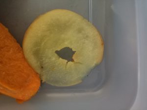


It’s too flabby to be dependent.

Moreover, I planned to use apple crisps as the cone. I wanted to put them into a bowl and microwave them, but again, it didn’t turn out as expected. I guess I should’ve used an oven. The heat from the microwave wasn’t enough, so the apples just turned to be really flabby instead.
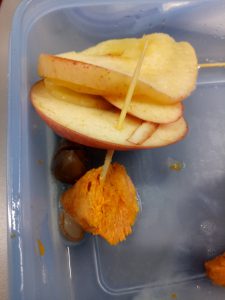
Flabby apple and pumpkin (after cut). Sigh.


I tried it again, but there wasn’t enough ingredients, time, nor patience. Hence I decided to just scrap the whole thing and come up with a new idea.


Final Model (Final)
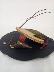


This time, instead of focusing on the food, I changed my perspective and focused on the other aspects of autumn and on my original story idea (the family thing).

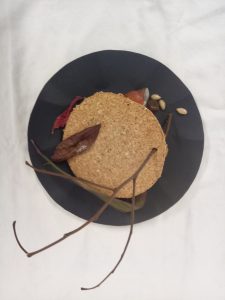
For the dominant (cylinder), I actually cut a cork board. The color and texture of the cork board made it look like a piece of ground, which fits the branch very well since the branch is piercing through the cylinder. Ground can represent the sturdiness of the “father”.

For the subdominant (cone), my idea came from the Latin word “cornucopia” which means “horn of plenty”. It is used to represent abundance in the old times, as it would be overflowed with flowers, fruits, and corn, which are the things usually harvested. The idea of “abundance” linked with “harvest”, and autumn is known as the season of harvest.

The cornucopia idea is implemented by making the cone looked like a basket (dark brown color) and things are spilling out of it (pumpkin seeds and chestnut). Both are autumnal food, and they also act as subordinates.

Cradled between the cone and the cylinder is the subordinate (sphere). I made it by putting together two chewy candies. I think candies are representative of Halloween. The candies are red in color since they are apple-flavored, and apple is one of the popular autumnal fruits. The red color gives highlight to the mainly brown look.

In relation to my “family” idea, I think chewy candy can represent children well since they still can be shaped (i.e. not stiff). Children still have the capacity to grow and change. That contrasted the cylinder/”dad” and the cone/”mom” which have fixed, sturdy shapes and more “mature” colors.

There is a huge void on top of the cylinder to counter the subordinates near the cone. I added a few dried leaves which could act as subdominants in order not to make the void too much. My idea is to combine the branch and dried leaves as one entity, so it looked as if the leaves fell to the ground from the branch.

Since most of my things are on the “plate”, I made the branch point upwards to balance the visual.

I learned a lot from this project, mainly because I have failed on the final model. I learned to be more flexible and not to dwell on mistakes for too long. It was a great learning experience.
The phrase that I got from the Pandora’s box was “the golden rule”, or probably better known as the golden ratio.

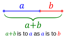
It was hard for me to illustrate that since I had no idea about it before, so I conducted a research and tried to make something based on my interpretation.  In mathematics, two quantities are in the golden ratio if their ratio is the same as the ratio of their sum to the larger of the two quantities. So basically the fraction of the length of object A compared to object B should be similar to the fraction of the length of object B compared to object C – the golden rule is all about fractions.

Taken from https://en.wikipedia.org/wiki/Golden_ratio


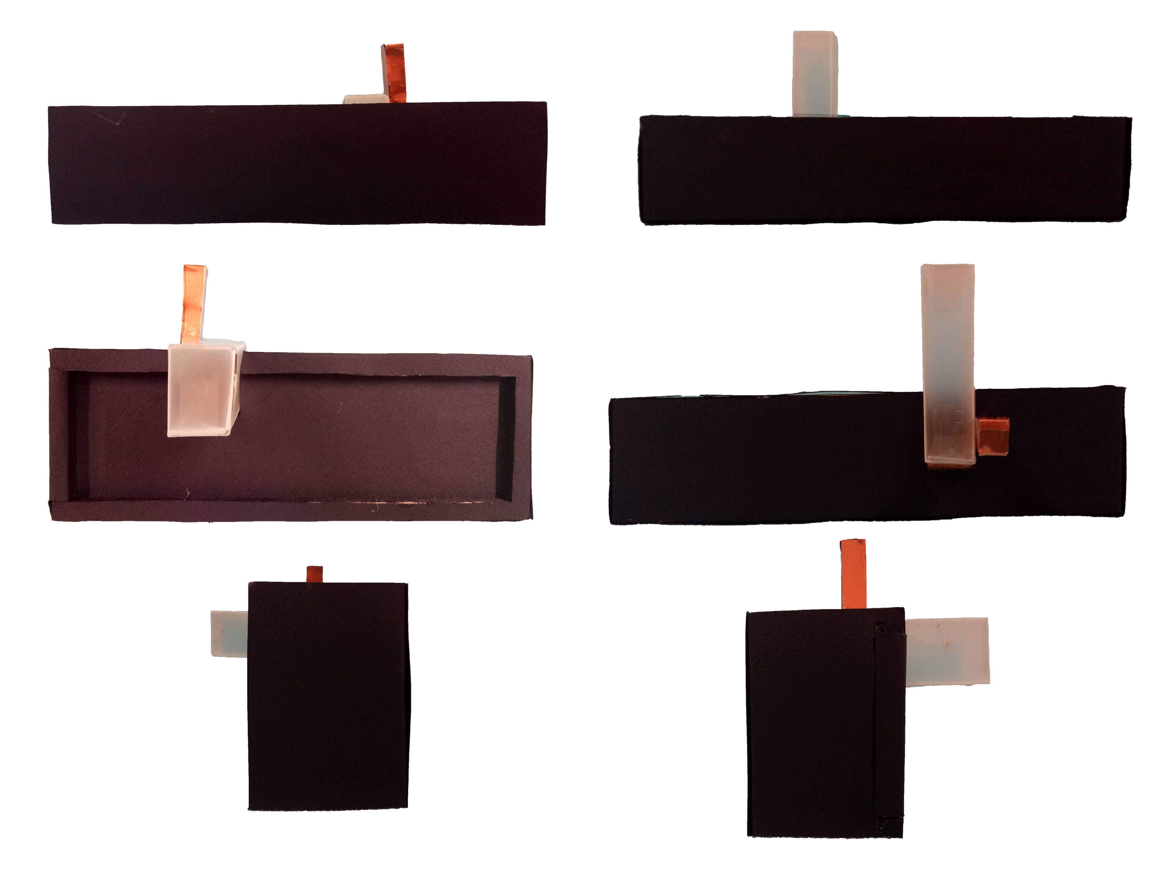
Based on that interpretation, I have made a few models. I tried to use all similarly-looking boxes in a model, so I can emphasize the comparison of the fractions more easily.


Model 1

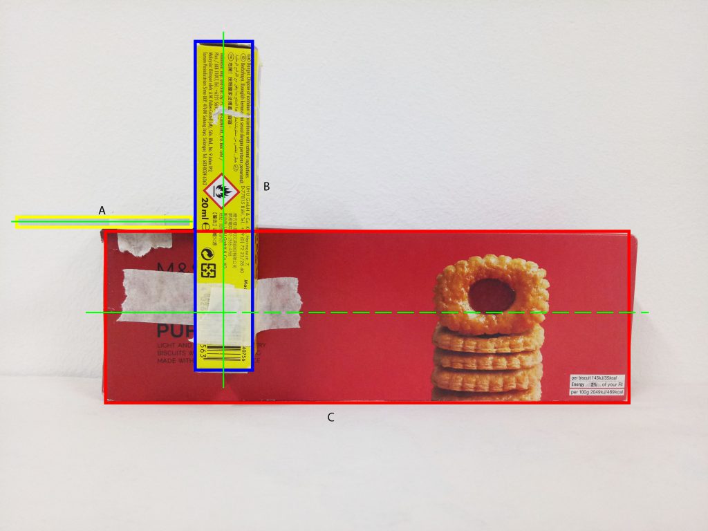
[Red – dominant, blue – subdominant, yellow – subordinate, green line – principle axis]

I used all the slender, lean-looking boxes for this model.The sizes of the boxes were quite good in my opinion, since I can tell the different roles clearly.

The application of golden rule here is that the ratio between A to B is roughly the same compared to the ratio between B to C (refer to the picture), which is roughly 0.55.

However, the fraction is too great since now the length of B is more than half of C. Ideally B should be around one-third to half of C. Similar idea needs to be applied to A as well in regards to B.

At first, I feel that the positioning is okay since I can see all three boxes from every different angles. However, the placement is actually a mess; I completely disregard the rule of thirds . Ideally, the subdominant should be shifted a little bit more to the right and up so it is placed at the intersection of the imaginary grids. As for the subordinate, I should either move it to the left more or to the right.


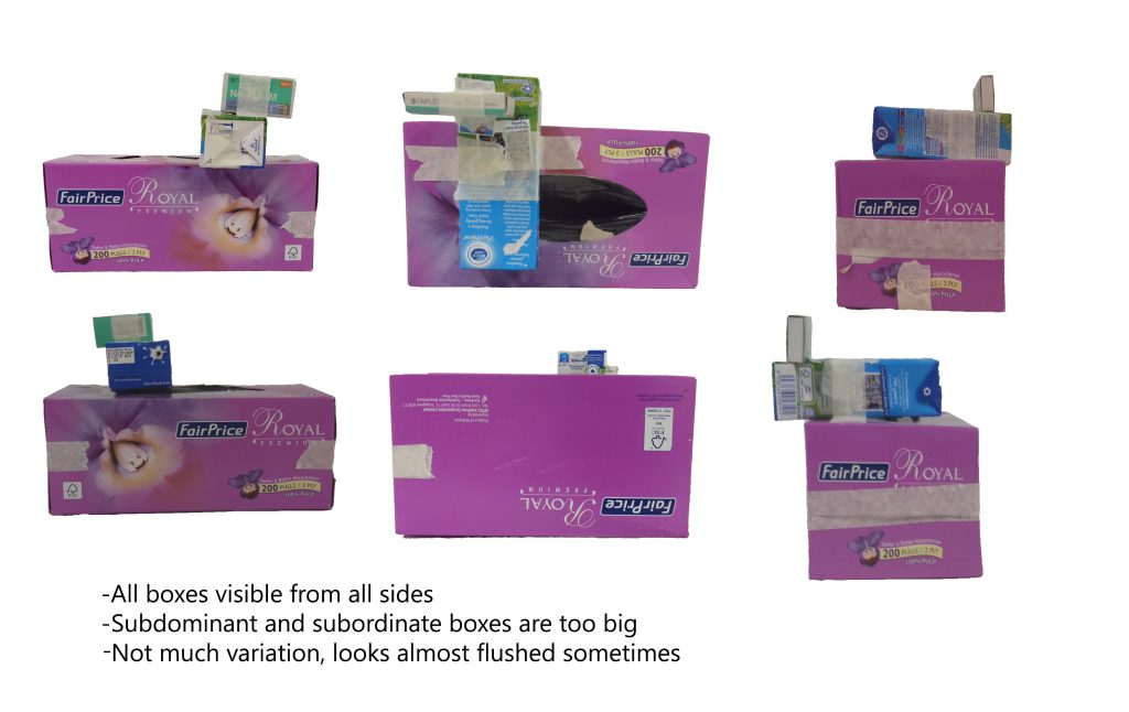
Model 2

[Red – dominant, blue – subdominant, yellow – subordinate, green line – principle axis]

For this one, I used the slightly bulkier types of boxes. The roles of the boxes are quite clear although the subdominant and subordinate can be made smaller.

I used a slightly different calculation for this one. Instead of comparing the same length (i.e. longest axis for all), I compared the longer side of the dominant box to the shorter side of the subdominant box. Basically, instead of comparing B with D (see the picture above), I compared A with B instead. In this model, A and B roughly have the same length, and C and D also roughly have the same length.
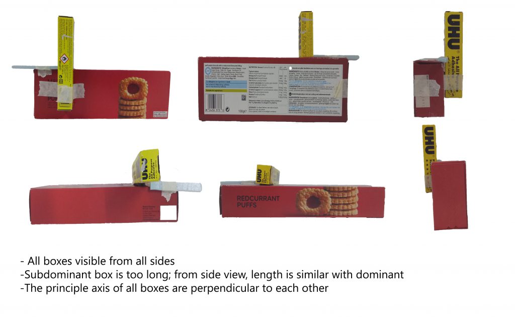
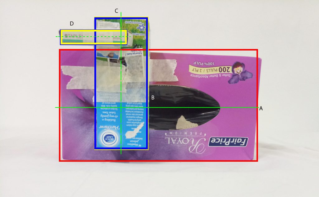
However, due to that calculation, the non-dominant boxes become too big, so that comparison cannot work.

Again, I ignored the rule of thirds in the placement; they are almost there, but not quite. The subdominant box needs to be shifted up a little and the subordinate needs to be shifted left or right – preferably left, so it would be “protruding” out and easier to see from other angles.


Final Model

For the final model, I based it off the first model since the proportions for the second one don’t work well.

I was excited to make the final model with the actual materials because of the idea I had.

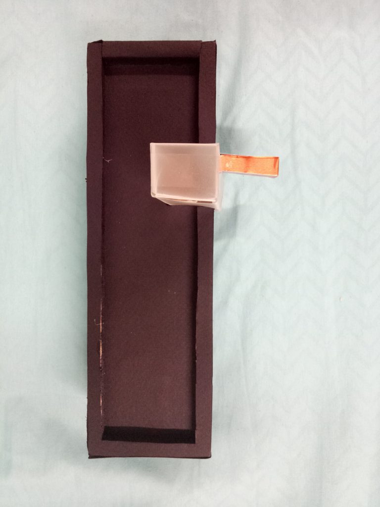
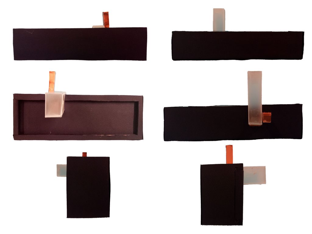
My idea is to make a puzzle box. To put it simply, in order to open the dominant box, the whole entity needs to be disassembled first (the non-dominant boxes have to be taken out first).

Material used: wood (covered with black paper and black marker), semi-transparent paper, wood (covered with bronze paper)


From one side, the subordinate box is hidden. The idea is that since the subordinate box acts as the “key” to unlocking the whole thing, I feel like it will give a more mysterious effect if the key isn’t immediately spotted.

The subdominant is semi-transparent to balance the opacity of the wooden boxes.

At first I wasn’t sure I could make an actual, working puzzle box (although technically, this one can’t work too…) so I was thinking of just using plain solid wood box as the dominant, then I would just wedge the other two boxes in. However by chance I found the required materials, so I just needed to do some sawing and covering-up (they still took me hours and they still don’t come out perfect. Sorry for bad crafting skills).

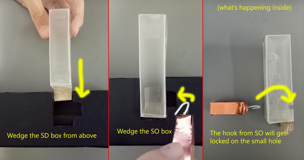
The so-called mechanism is just attaching things to the boxes. For the subdominant box not to be able to come out, I put a piece of wood as stopper. For the subordinate box to act like the key, I attach a hook to lock it with the subdominant box.

This is roughly how it works.

When the dominant box is opened, you can see reflective paper at the bottom of the box. I thought it was a great idea because the exterior of the box is all black (which gives a mysterious feeling), and reflective paper is somehow contrasting the all-black idea.


It’s not very obvious, but it’s reflective paper. Ignore the bad crafting skills.


It’s like human life! Life is mysterious and full of “puzzles” (pun intended) to solve. When you solve those “puzzles”, you can learn more about yourself… you can do some “self-reflection” (again, pun intended)!


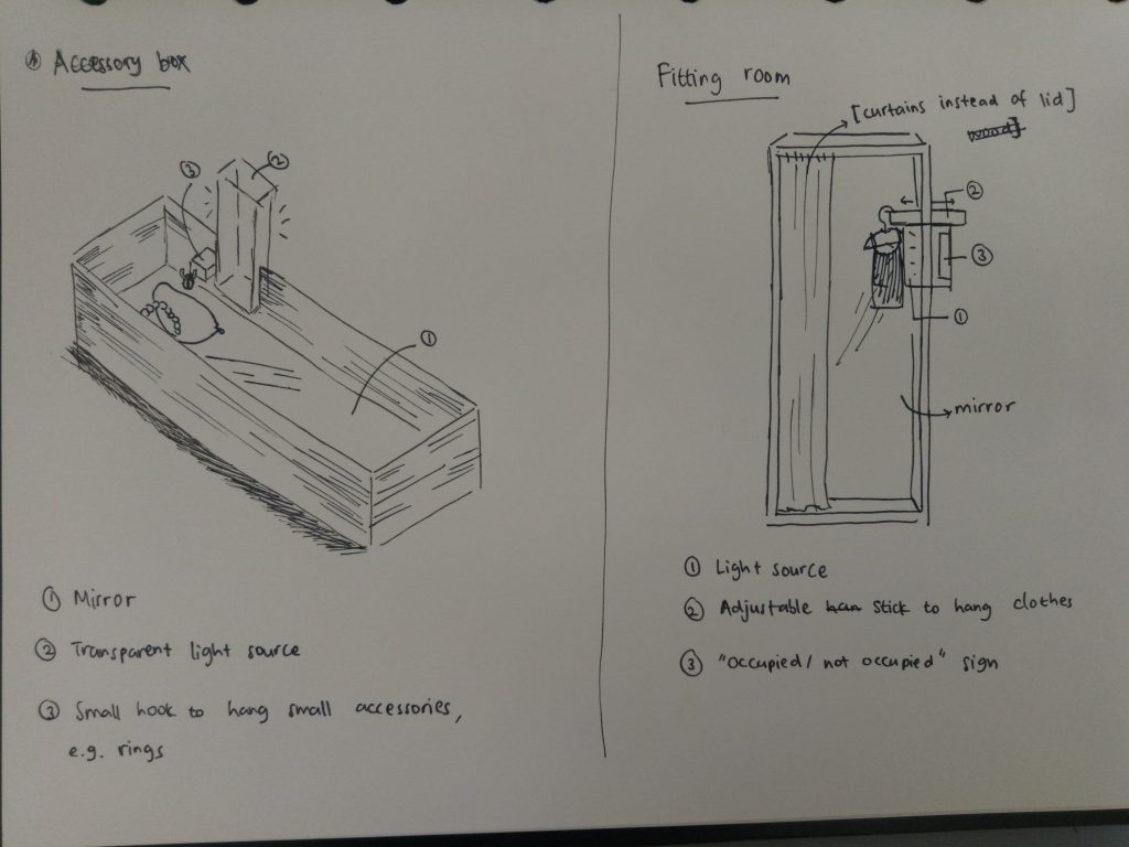
Real-Life Application (besides a punny puzzle box): accessory box and fitting room.


In hindsight, I really enjoyed the process of doing this project (although it stressed me out as well). I learned a lot more about design, about how to keep things visually interesting and eye-catching. Instead of playing around with size and mass, the use of different materials or colors can also shift people’s attention.

I also learned that planning is an important part in designing in order not to waste time and material, although even when you finish designing something, that doesn’t mean you can’t make amendments to it. (Like my idea at first; I just made the basic parts first. I added the holes in the SD and the hook in the SO afterwards.)

I do realize that my crafting skill is very lacking, so I hope in the next assignments I can improve on that. Nevertheless, it had been a fun ride.

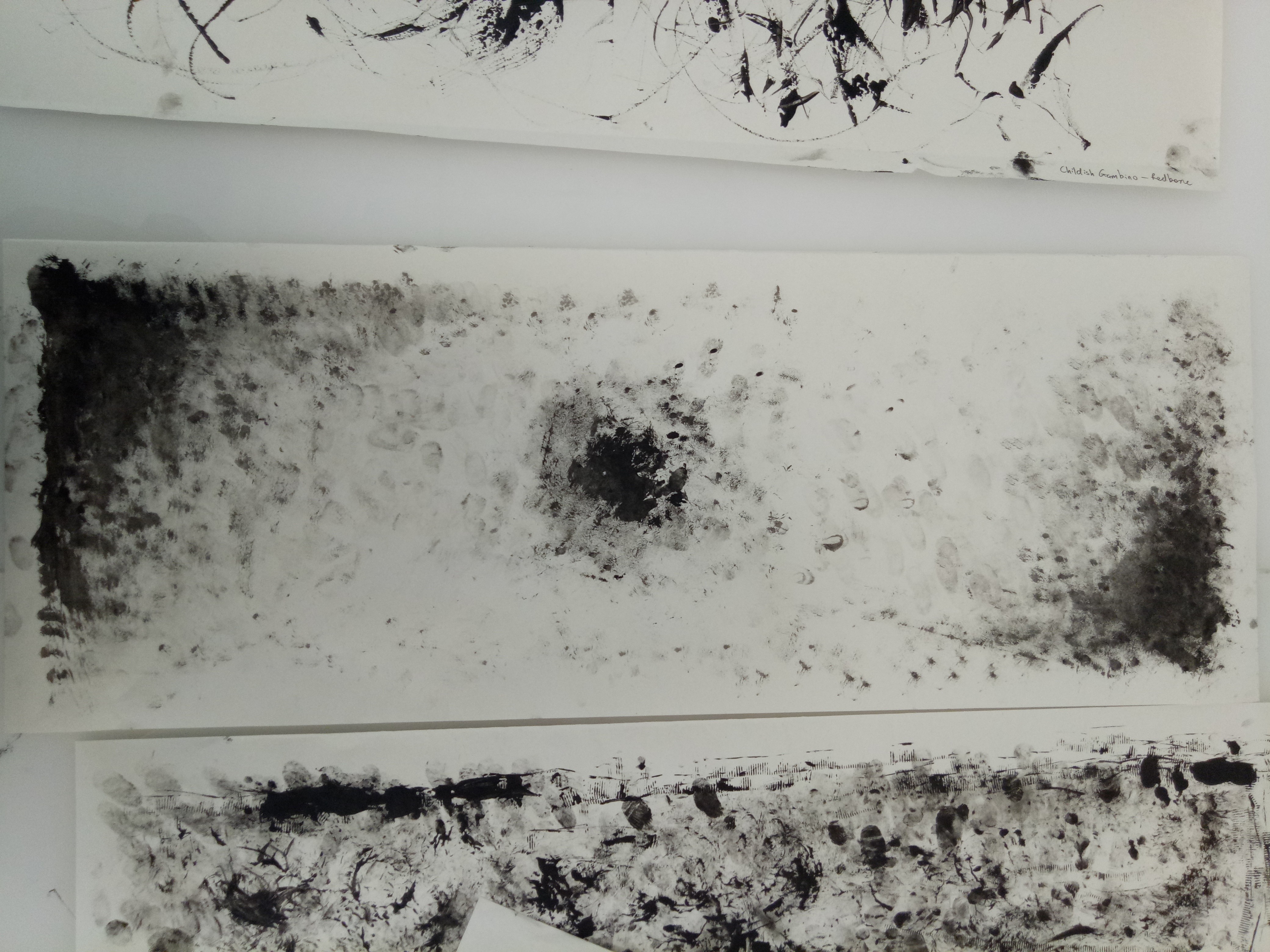
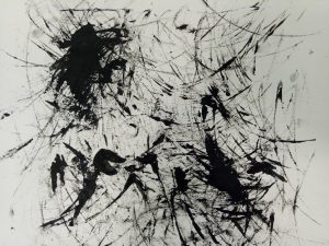
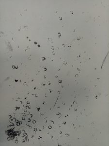
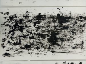
We did some mark-making experiment in class this week, and it was fun!

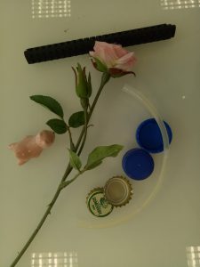
I didn’t bring a lot of tools, actually. Here are the things I brought: a fake rose, a paperweight, a brush marker, some bottle caps, and a used, bent glow stick.

The texture came out very faintly.


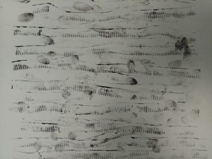
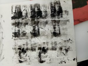
First, I tried using my bottle cap. I didn’t think it worked out very well; since there is a slight difference in height, the sharp texture didn’t come out as much as I expected.


After that, I switched to the other type of bottle cap. I like how this one turned out.

I rolled it on the paper.

Result (with my fingerprints)


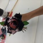
I also tried using my fake rose, although I was hesitant at first. I thought it wouldn’t make an interesting texture, but it turned out quite well.

I rolled the petals on the paper in a circular motion.

Result


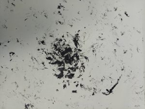
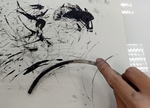
So was the experiment with the glow stick.

I rolled it around on paper, and use my hand as a pivot before dabbing them on the paper in a circular motion.

Result

I also tried using the end of the glow stick, dabbing it on paper.


I decided not to use my paperweight and brush marker, partially because I didn’t want to get them dirty. For the brush marker, I intended to make small circular shapes, but I used the end of the glow stick and it worked okay, so I didn’t need the brush marker. As for the paperweight, I thought it wouldn’t work very well because the bottom part was slightly convex; I guessed it would turned out like the first bottle cap.

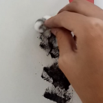
After that, I turned to my friends to borrow their tools. One of the items that I got was a dry leaf. At first I tried pressing it on the paper, hoping for the texture of the leaf to be printed, but it didn’t. So in the end I dragged the leaf instead.

Result


I also got a cotton ball. I dabbed it on the paper.

Result


The last tool that I got to borrow was a plastic knife. I used both the sharp edge and the flat side to give different ink thickness.

Result


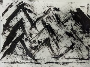
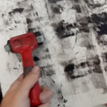
Besides those, I also used the tools available in the studio, such as brush and roller.

Result (with roller)


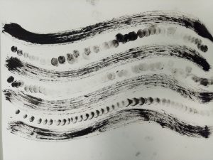
I used brush for the flowy parts and my fingers for the circles.


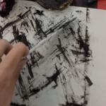
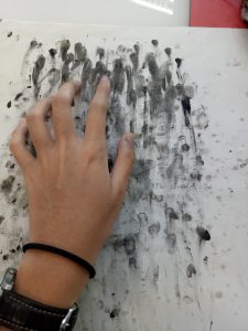
I used my fingers to put fingerprints on the paper before by dabbing them, and I tried dragging my fingers as well. It created an interesting result.

For the next class, I hope I can experiment using more tools. I’m thinking of using candies, stapler bullets, and coins. Let’s see if I can make something even more interesting.