The place assigned for me is Labrador Park. It’s my first time visiting Labrador Park, so it was a totally new experience for me. I had no idea what to expect, so I did some research before visiting it.

Labrador Park is unique since it is designated as both nature reserve and coastal park, adding on to the fact that it was formerly a fort built by the British forces in Singapore before World War II. There are a lot of interesting aspects that I take from my visit.


Labrador Nature Reserve

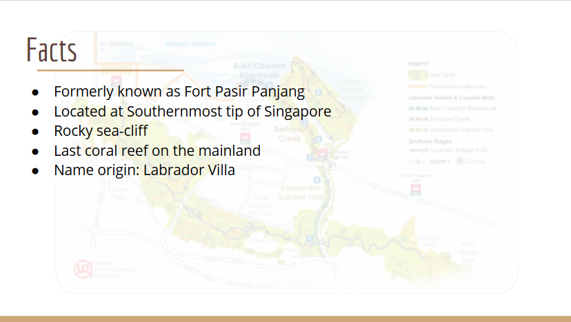
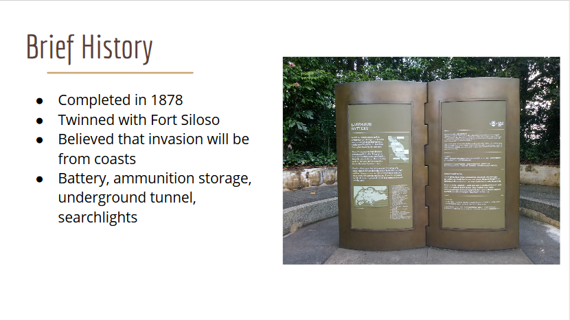
Labrador Park was previously known as Fort Pasir Panjang, one of coastal artillery forts built to defend Singapore’s waters since it was believed at that time that if Singapore was to be attacked, the attack would come from the sea.

It was designated as nature reserve in 2002.

The name Labrador is derived from “Labrador Villa”, the name of the residence of a prominent ship chandler, George John Mansfield. It was built in 1881.

Labrador Park contains the last coral reef and the only rocky sea-cliff on the mainland of Singapore. Although it had a diversity of marine life, it has been greatly reduced by development and illegal activities such as poaching.

The coastal walk of the nature reserve is 16.8 ha in length and is divided into three segments; Alexandra Garden Trail, Berlayer Creek Mangrove Trail, and Bukit Chermin Boardwalk.


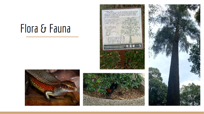
There are a lot of species of flora and fauna there. I actually saw some birds (too fast for me to take photo of), chickens (I didn’t dare to come too close), insects, butterflies, and squirrels. Apparently there are more than 70 species of birds and 30 species of butterflies there. There’s also an animal named pangolin which I didn’t get to see, but I heard it’s special to Labrador Park.

There are also signboards in front of several trees that contain information. They’re interactive since they use first-person POV, as if the trees are telling the stories themselves.


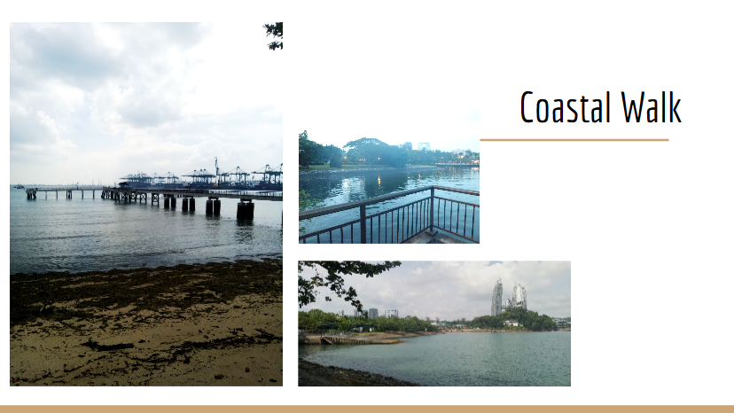
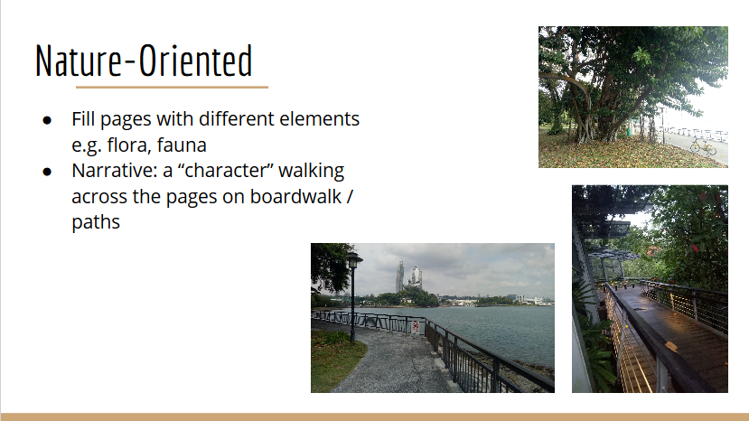
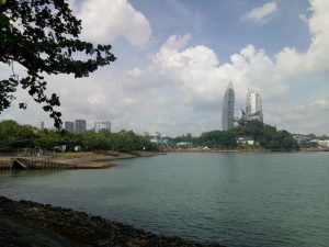
The view from the jetty was beautiful, although there are a lot of cargo ships, and you can also see the buildings not so far away.


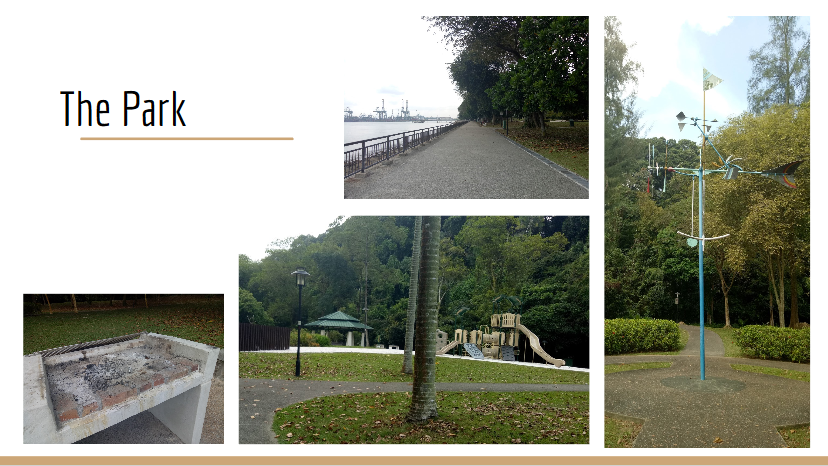
The park is very family-friendly. There are several toilets located throughout the place, BBQ pits, playgrounds, fitness corner, jogging and cycling trails, promenade, and shelters. There are also a lot of parking lots for cars and bicycles. Surprisingly when I came in the afternoon, the place wasn’t very packed; maybe because it was a Monday. There are some people here or there, but not as busy as Botanics Garden, for example.


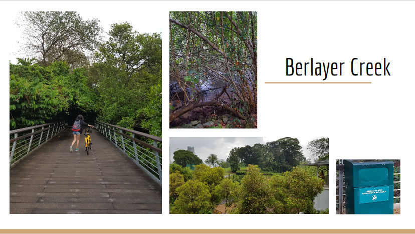
I was interested in this spot because of the mangroves. There are around 14 mangrove plant species there, and a lot of stray animals. Even the trash cans there are made to deter animals from rummaging through the trash.

The swamps are directly connected to the bay, which is why there are kind of small currents on the swamps which I think is interesting (it’s not just stagnant water like I expected).


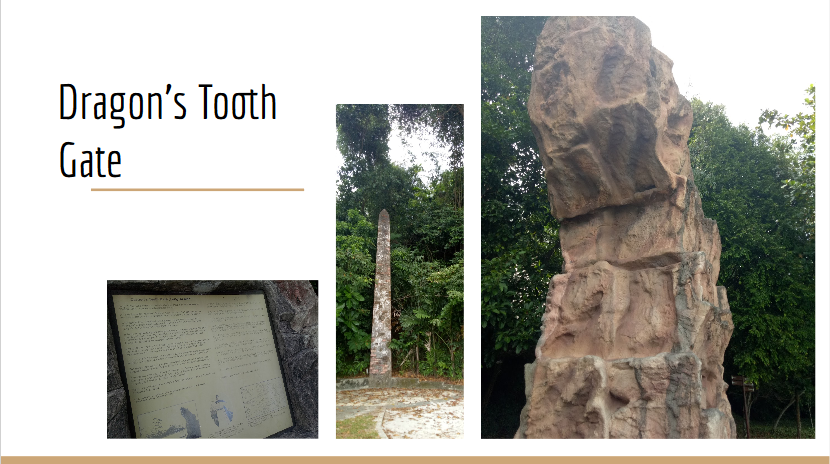
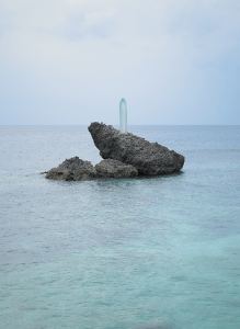
It’s the landmark in Labrador Park, and a literal translation from its name in Mandarin, Long Ya Men. It’s a rock outcrop that is shaped like a tooth. Actually the 7.5 m rock is a replica, built in 2005. The actual one was blown up by the British in 1848 to widen the straits. It was used as navigational marker for ships, and located near a white obelisk which was the original Western harbor limit.


Fort Pasir Panjang

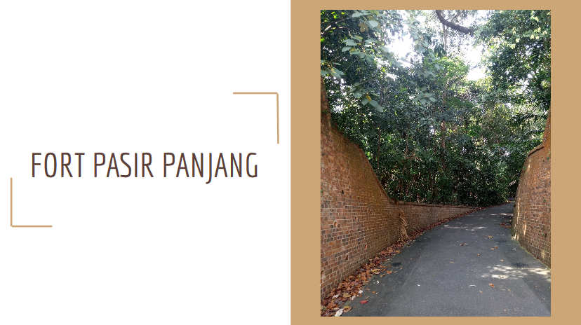
Fort Pasir Panjang was the former name of Labrador Park. Here, I explored the war memorial areas in the nature reserve.

Due to the possibility of war outbreak in 1938, the equipment there was constantly upgraded.


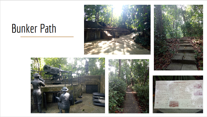
There are two paths; nature path and bunker path. However I chose to go through the bunker path, which contains the monuments.

There’s a monument of 6-inch gun barrel, which could shoot down ships from 10 miles away (!) and the gunners. There are also underground tunnels which are 46 m and 63 m long and between 2.5 m and 4 m high, forts, and bunkers. There are a lot of signboards along the way, explaining a lot of things. Although they are very wordy, some of them are pretty interesting and they would make a good learning journey (in fact, when I was in the nature reserve, there’s a group of primary school students which I assumed was having a learning journey).


Zine Ideas

My first idea is to focus on the flora and fauna of the area and introducing different species. The style would be more illustrative, like a children’s book, and the background will be primarily blue and green to show the nature. There would be a character walking across the pages, to show that “someone” is exploring the place, because I want to convey my experience of “exploring” the place for the first time.


My second idea is to draw the contrast between the past and the present. I think the idea is interesting because in the past it is a fort, a war-ready place, while now it is more of an entertainment area. I was thinking of making a progressive narrative; so the pages next to each other will be very contrasting (one will be more “cheerful” and shows the park “now”, while the other will be “darker” and shows the “fort”). Another idea for the execution is to start the stories of both the past and the present simultaneously from both the front and the back of the zine, until they meet in the middle in the playground. I got that inspiration since the playground has both the machine gun monument and playground stuffs like swings there.


Afterthoughts

In the end, I realize that both of my ideas were lacking in originality. I think it’s because I don’t try to explore a specific aspect of the park itself, but rather generalizing by trying to include everything.

Because of that, I developed new zine ideas (although I haven’t really thought them through yet):

My first idea is to use the idea of signboards as the design. As I mentioned, there are a lot of signboards throughout the park; I think it would be interesting to make my pages look like signboards. I want to explore more about the informative side of the park, but I’m not sure about what to include – it could be the flora and fauna, or the monuments (but isn’t that similar to my original nature-oriented idea?).

Another idea is to explore the atmosphere there. Although we can see high-rise buildings clearly, the place feels very peaceful and “detached” from the hustle and bustle of city life.

I was thinking of combining the “atmosphere” with my idea of contrasting past and present. Instead of just seeing past and present, I want to draw as many contrasts in the place as possible; nature vs technology, serendipity vs hustle-bustle, land vs sea, peace vs war, welcoming vs pushing out. I think it’s quite interesting, but I don’t know if it’s still too broad because that way, it will be hard to “connect” all the pages of the zine.

My last idea is to focus on the idea of redevelopment and poaching that has greatly changed the sea form around the coastal area. I want to draw from the point of view of the marine life, and the style would maybe more like a comic-style.

I should do more research.


UPDATE!!!


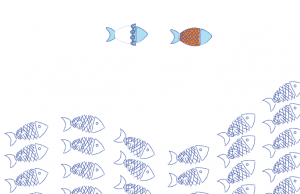
After thinking of a new theme, I finally decided to do something along the line of ignorance; how people usually are not concerned about the efforts to preserve the marine life, despite the warnings and changes.

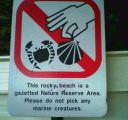
I’m inspired by the sign because apparently in Labrador Park, the signs are pretty unique in style compared to other places.

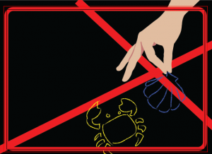
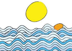
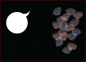
Here are some of my initial sketches for the pages.

I realized if I do bring those sketches together, there isn’t any narrative to it; they all look very disconnected. So I decided to make a character to make the pages flow better.

At first I also wanted to use black as the base color since I want to play with more lines only, and I feel that the color comes out nicer when put against black. However considering that the zine will be intended for mostly children, it may not be too cheerful / too children-like, so I scrapped the idea.

In order to incorporate some characteristics of the place, I decided to put a part of the view from Labrador Park; rocky shoreline and the buildings that you can see from afar from the bay.


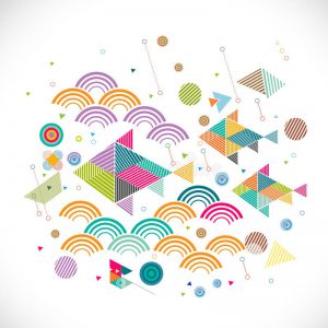
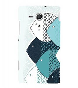
Theme aside, I look at different styles of art. I want to do something bright with different shades of blue, and some yellow and red here and there.

Some of my style ideas:


I especially like the one with a lot of lines since it gives a simple, clean look. But then since my target audience will be mostly children, I also want to give it a rougher, more playful feeling, while still being able to evoke emotions that “people have been ignorant”. To impose the feeling, I decided to write a short narrative in the style of poem. Although it may be too “complicated” for children, my intended audience will not be extremely young kids but rather around 10 years and above of age, when the children are beginning to gain maturity from understanding things that are expressed indirectly.

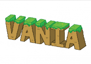
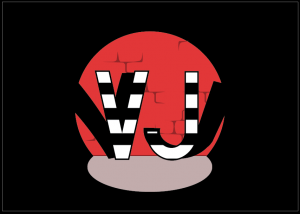
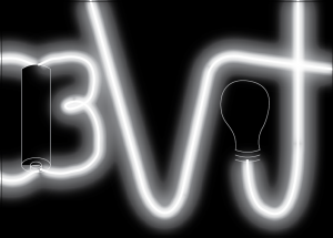
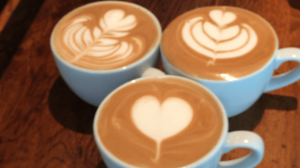
The four jobs that I (tentatively) chose are barista, gamer, thief, and electrician.


Initial Sketches

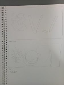
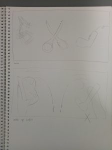
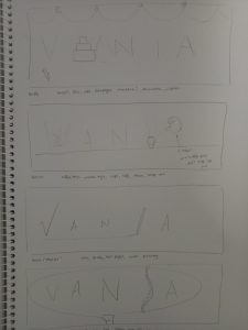
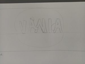
Those are two of my earliest sketches. As you can see, they’re heavily image-driven; so I scrapped all of them off.

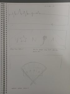
I made other sketches, but this time they’re too simple (see below). But somehow I have a better view of what my idea has to be; they have to be manipulated to show the techniques, but they can’t be too picture-driven as it will take the attention away from the letters.


Final Sketches

1. Barista

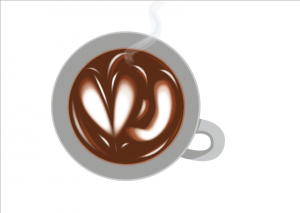
Keywords: coffee, latte art, coffee cups, steam, coffee beans, coffee grinder, cafe (usually associated with wood / warm colors)

I intentionally made the latte art as simple as I could because I wanted the attention to be purely on the letters, but then it looked pretty boring and didn’t really reflect latte “art”, so I will edit the latte art. I was thinking of using a wood-colored background and add some shadow, so maybe I will try it out to see if it’s too much.


2. Gamer

Keywords: characters, start / play button, consoles, pixels

I always associate “games” with “pixels” since it reminds me of the earlier games (actually I get the inspiration from Mario Bros), so I really, really want to do pixel art for this idea. It took me pretty long but I managed to make this (thank goodness).

However just from the interface, you can’t really tell of the “gamer” idea. It can be game designer or developer as well. So I plan to add a character and a “start” button underneath to emphasize the idea that someone is playing.


3. Thief

Keywords: illegal, getting caught, shady / dark atmosphere, guns, stolen goods (money), mafia, action

I know it’s very hard to tell that it’s criminal. It kind of looks like magicians performing onstage.

My idea is to make it look like they “get caught” (hence, the spotlight) when doing something bad. I used the striped pattern to replicate the image of a prisoner (which is related to something illegal), but I think the idea is not conveyed very well and it can be a lot of things instead (people may see criminal, or prisoner, or magician probably). So I need to edit it to make it more specific.


4. Electrician

Keywords: light, circuits, battery, electricity, switch, cables, transformers, light bulb, LED, resistor

To be honest, that is a bad one.

I wanted to make out the letters using cables, but they didn’t turn out nice so I added the “glow” effect to make them like neon lights instead, but now the whole thing didn’t look like electrician at all. This one needs a lot of changes.


Takeaways

For most of my sketches, you can’t really tell what the exact occupation is, although you can guess something close to it. So the problem is I don’t make the pictures specific enough; I’ll have to research more about symbolism and semiotics related to the occupations I want to use.

I’ve never been very good at digital art (actually, I just learned Illustrator recently) so this is a challenge as well as a good learning experience for me. I learned more about Illustrator such as how to make glow effects, how to make clipping mask, how to unite two different things, etc. However due to this lack of knowledge I’m doing this project slower, as when there are things I don’t know how to do effectively, I still try to make them–and they either turn out bad or I wasted a lot of time doing them… or both. So I’ll have to do more research and learning about this platform I’m using as well.


UPDATE!

After I wasted a lot of my sleeping time to think, I decided to change a few ideas of mine.

For thief, I fixed it so it looked more like “in action” by adding gold coins and a hole on the brick wall, suggesting that they’re in the middle of stealing.

Gamer and barista will stay the same; the only difference is that I’m adding background to both of them.

For barista, the latte art will be much, much softer than my process illustration since after I did some research, latte art doesn’t really have sharp edges.


My reference picture [taken from https://makezine.com/2016/01/03/skill-builder-steam-milk/]

I also made the art more “fancy” and although (to me) it sort of takes the attention away from the letter, I think the letters are still recognizable so it should be fine.

As for the electrician, I think I’m completely scrapping the idea. I realized that from the beginning I was going backwards with the electrician job; I thought of what to make first rather than what job I want to convey, which makes me confused in the end. Because of that I couldn’t make good progress with my electrician, so I decided to just stop and start a new one. It’s probably a bit late, but I think I could manage it since now I have better idea on what to create. So,

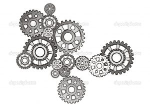
4. Watchmaker

[from https://www.pinterest.com/pin/300896818830991738/?lp=true]

My idea is to simply put the letters of my name and fill in the letters with the gears of a watch. I won’t use much colors, probably just black and white and some grey.

I’m thinking of making one of the letters look like a pocket watch.


I just realized that all my four jobs have different style (kind of) of illustrations. I don’t know whether it is a good thing because it can mean that I’m flexible, but that can also show that I haven’t found my own style yet. That’s true, though–I haven’t really had my own style yet, so I think this is a good opportunity too to explore various styles for me.

For this final project, I think I have a lot of difficulties trying to figure out what style I should go for. There are so many choices, but of course I have to choose rationally, considering the amount of time I have and my skills as well.

Research: Style

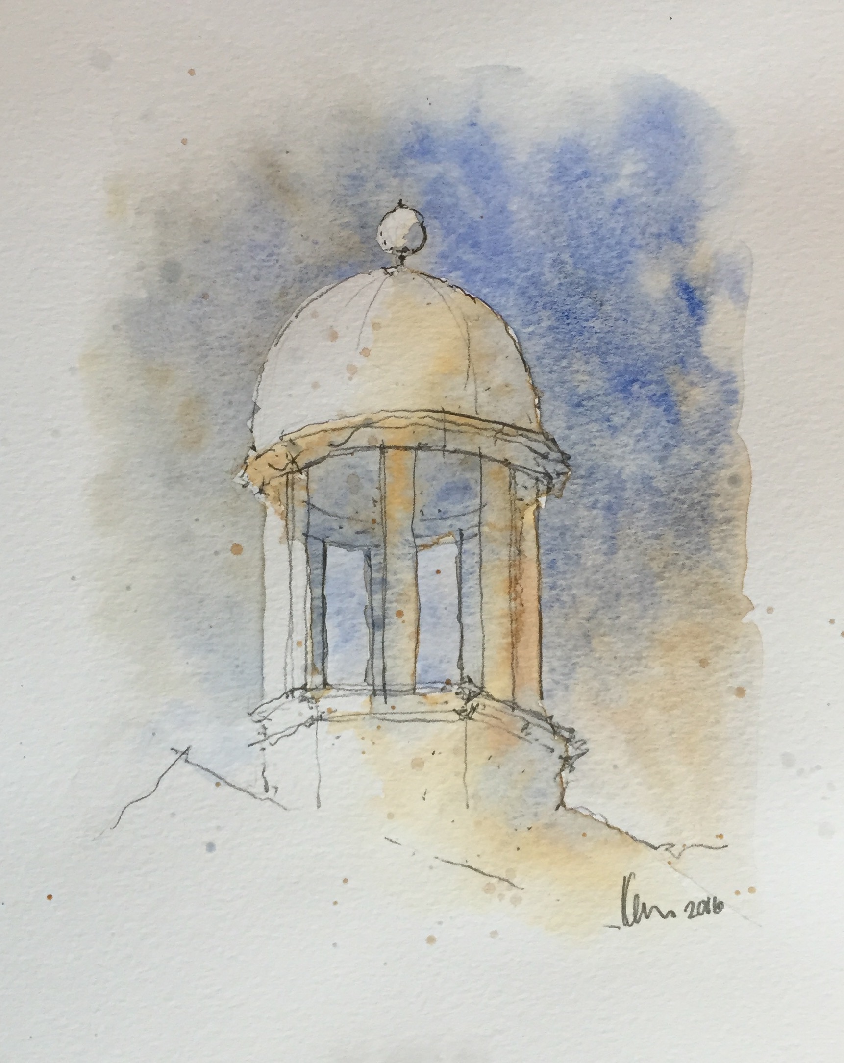
As for the style, at first I was thinking of doing some “watercolor”-ish style because I like soft colors and lines, but then I realized that it might be difficult (especially since I don’t really use watercolor).

Image result for watercolor styles

Something like this. [taken from https://watercolorblast.wordpress.com/styles-of-rapid-watercolor-sketch/]


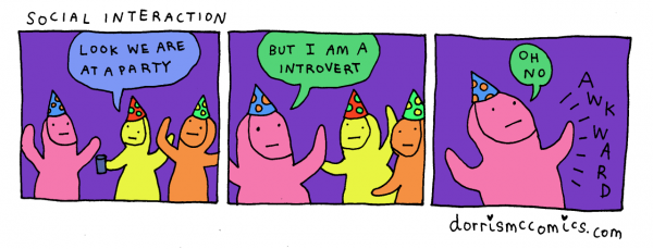
So I turned to other simpler styles and from Instagram, I found some comic artists whose style I really enjoy because they’re simple, yet they can convey the intended messages effectively. Here are some of my references;


Image result for dorrismccomics

instagram.com/dorrismccomics (Artist: Alex Norris)


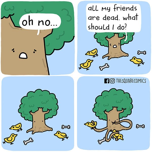
Image result for thesquarecomics

instagram.com/thesquarecomics (Artist: Alvin Juano)


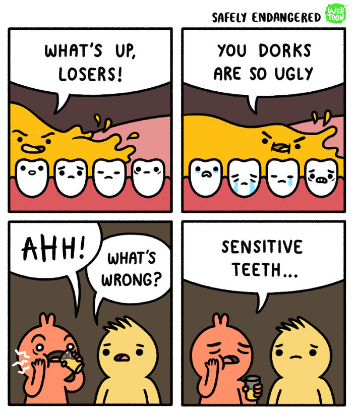
Image result for safely endangered comic

instagram.com/safely_endangered (Artist: Chris McCoy)


In general, the three artists use thick outlines, simple art style, and bright colors. I’ll need some time, but I think I can make something with that style using Adobe Illustrator.

I’m also thinking of combining “realistic” photos and plain digital color background. That idea is inspired by movies that mix animation and real actors in one frame, like Space Jam.


Image result for space jam

A scene from the movie Space Jam (1996)


Research: Color

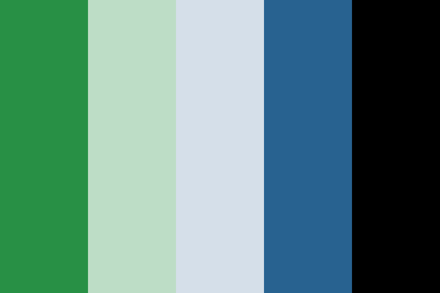
I found a website where they provide color palettes to download, and from there I found a lot of analogous color palettes that I think can work, like this one:

Image result for analogous color palettes

[taken from http://www.color-hex.com/color-palettes/?keyword=analogous]

But I will look at other types of color palettes as well, like the triadic color scheme, for example. I’ll see which one can bring out my ideas best.
Image result for triadic color palettes

[taken from https://shannon-brinkley.com/blogs/shannon-brinkley-studio-1/color-confidence-for-quilters-part-4-triadic-color-palettes]


Experiment

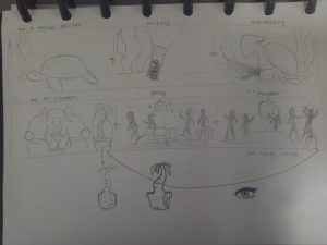
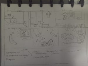
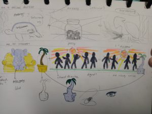
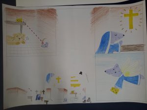
Here are my concepts.


In the end, since I couldn’t decide on one style, I ended up using four different styles.

The first one I did is just a combination of various things, such as colored pencil and copic marker.


Colored pencil, pen, and marker


I wanted it to have a cartoon-ish, childish look. I also didn’t give an outline because I think it will look less cute if I did. I used the markers only for the important figures, such as the cheese, the mouse, and the cross. For the wings, I used gold pen (which I used for the “shiny” effects as well). I used minimal coloring for the background because I feel that too much color would distract viewers from the actual point.

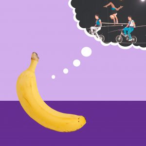
For the second one, I used Photoshop to merge pictures.


Photoshop trial


I showed that one to my friend and he said that my “contemporary art is on point”. I feel like the end result is interesting, although it is plainer than I expected. I chose purple background to complement the yellow banana.

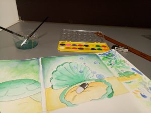
The third style that I tried is watercolor.


Watercolor experiment

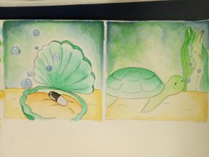
End results (mirrored image)


They actually turned out better than I expected. I never really tried watercolor before, so I watched a couple of YouTube videos before trying it out. It was messy and there was some smudges, but overall, I actually love the end result. I think I would do more watercolor in the future. I especially like how the background turned out. I used mainly calm colors like green and blue, which made the color black stood out even more.

Lastly, I used Illustrator.


Illustrator trial


This is my first time actually using Adobe Illustrator, so I needed a really long time just to create those three panels. I used blue elephant because blue is my favorite color, and pale blue background to emphasize the idea of “blending in”. The sofa and floor are orange and yellow to complement the blue.


All in all, I actually enjoy making all of those. Although they take a lot of time to create, I had fun experimenting with different tools and styles. I just hope they turn out well in the end.

Modular design, or “modularity in design”, is a design approach that subdivides a system into smaller parts called modules or skids, that can be independently created and then used in different systems.

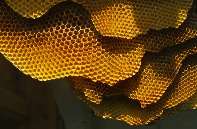
Examples of naturally-formed modular structure:

Image result for modular nature

Bee hives

Related image

Human tissue cell

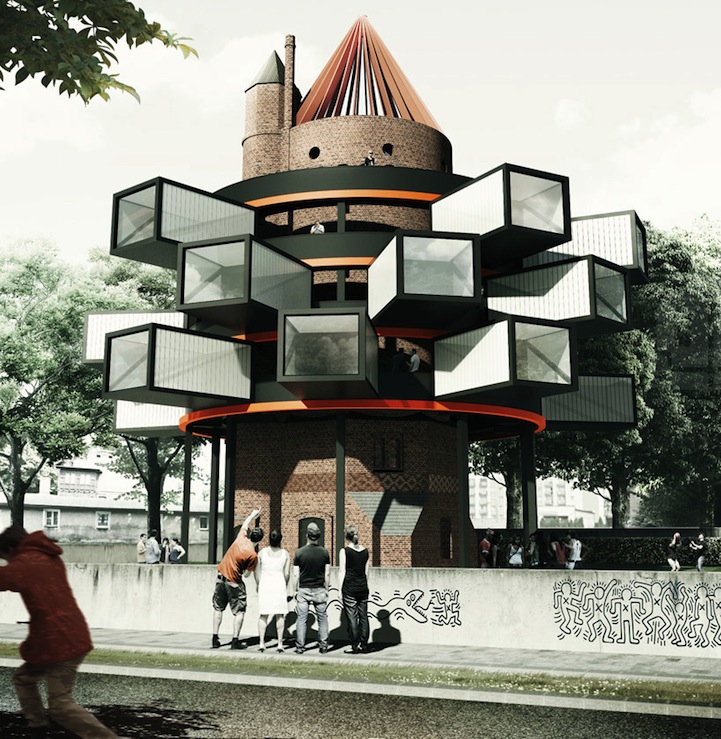
As I was searching for examples of buildings with modular design, I stumbled upon this building.
Image result for modular architecture

Tower 2.0 by Adam Wiercinski

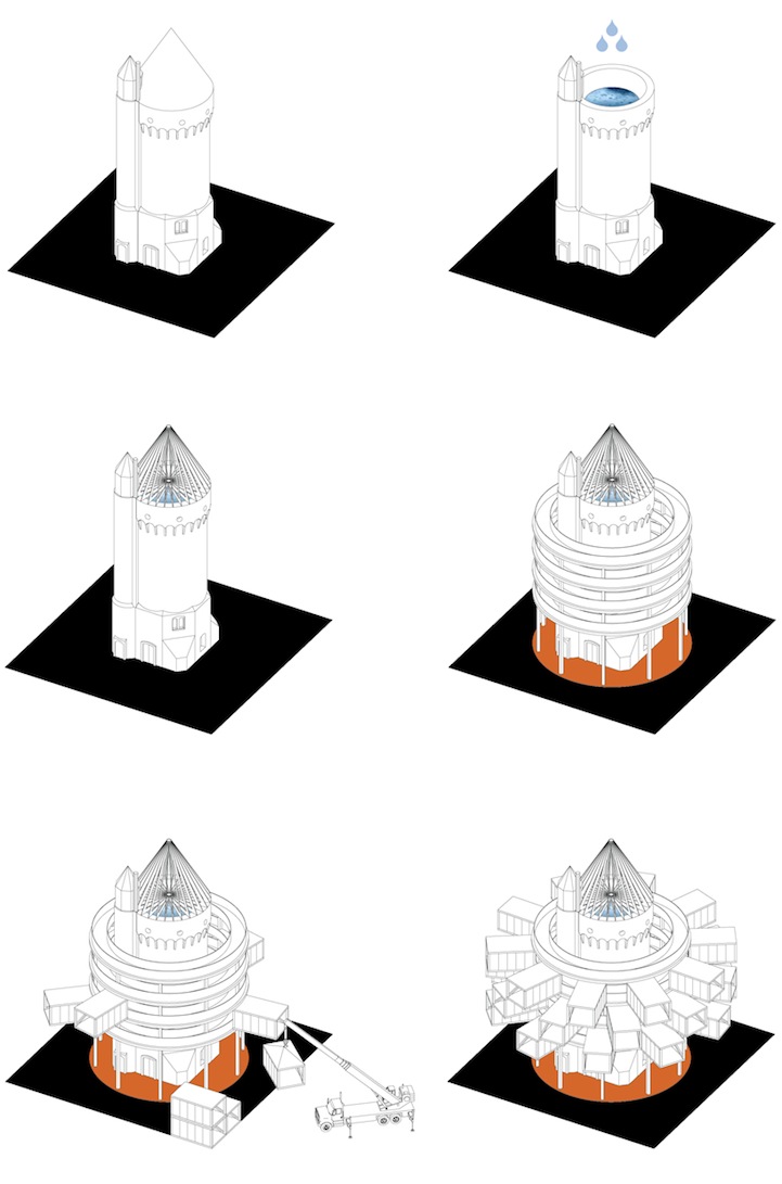
This building is initially a water tower, but Polish architect Adam Wiercinski had proposed to revive the historical building into a multipurpose venue.

Here’s the concept project. [Taken from http://mymodernmet.com/adam-wiercinski-tower-2-0]

I think it’s interesting because the revamp, which consisted of adding the “rings” at the outside of the centric tower, essentially kept the core intact and preserved its history – but at the same time, not only would the building look much more dynamic after the changes, it would also be multi-functional. Somehow, to me, it kind of looks like a city (which is what this assignment is about in the end!).


Individual Mood Box

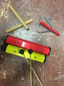
My group consists of me, Nok Wan, and Jing Yi. The sound that I represented into a mood box is created by playing rhythm sticks, resonating tone bars, and a triangle.

This is the sound.

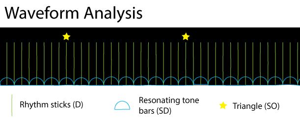
My waveform analysis


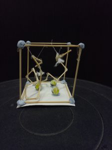
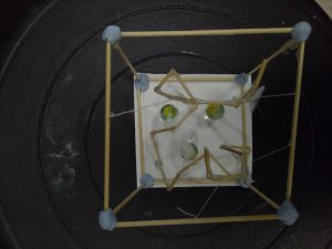
Here is my individual mood box.

Side view

Top view


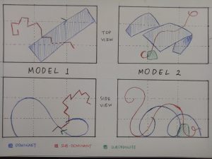
To me, the dominant (rhythm sticks) sounds like something that is constantly hitting an invisible wall, hence the broken arrangement. Since the sound is constant throughout the recording, I feel as if it’s taking all the space inside the box.

The subdominant (resonating tone bars) sounds very clear to me, but also very heavy. I feel like a marble is a perfect representation for it (although I should have put four of them). They are put in an arrangement such that you don’t know where they start to represent its repetitive nature.
Lastly, the subordinate (triangle) is the almost-unnoticeable cotton. I wanted to make it more spread out, but it was hard to arrange cotton. For me, the triangle sound is very light and airy, hence the cotton. Since it’s always on beat with the rhythm sticks, I stuck the cotton to the dominant.

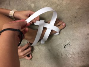
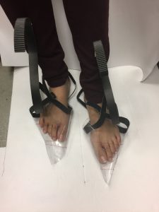
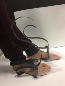
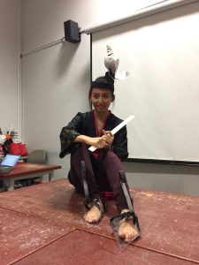
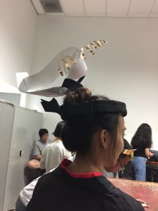
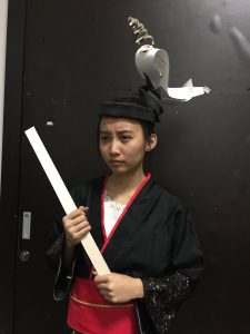
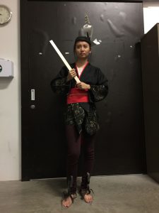
For this project, I worked together with Sabrina and Pei Wen. We decided to make a head gear and a pair of shoes.

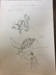
Here are some of the sketches.

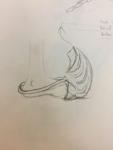
Shoes sketch

Head gear sketch


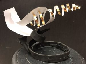
The head gear is supposed to represent our pleasant scents, while the shoes represent our unpleasant scents. Our pleasant smells are tea, candles, and hay; our unpleasant smells are carrot juice, damp clothes, and toothpaste.

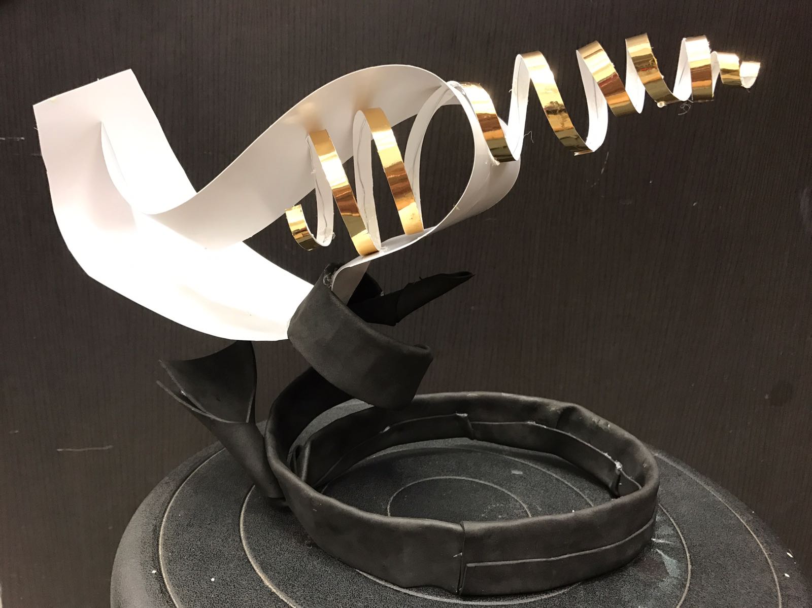
Head Gear


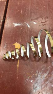
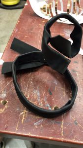
For the head gear, the idea is to go “up”, so we made the components pointing upwards as much as possible. We used wire wrapped in black craft foam as the base to make it strong yet comfortable for the head. To keep the upper parts light, we used art card and thin wire wrapped in gold paper for the other elements.

The idea of going “up” represents tea and candle, which usually produce steam (which floats up). The strong head gear, which grounded the elements to the head, represents hay.


Shoes


We tried it first using art card.

As for the shoes, we tried to incorporate the same idea, that is, to go “up”. Hence we made the corrugated board strips go high until they touch around the leg area.

The jaggy texture of corrugated board looks like flow of water, which represents damp clothes, and also looks like toothpaste when put on toothbrush. Meanwhile, the shoes are shaped with pointy end, which represent the shape of carrots. The plastic shoes were also kept together by strings to show tension and discomfort.


End Result


Although I feel that there is very little time, I am quite satisfied with the end product. It was challenging to combine different ideas into one and incorporate them into a product with interesting yet reasonable design, but it was a fun challenge to conquer. Here’s Sabrina modeling our accessories!


Lastly, thanks to Pei Wen and Sabrina for being great people to work with!

Bottle Sculpture


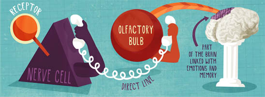
How is smell related to memories?

Our memory is triggered by a lot of things; what we see, what we touch, what we feel. What we smell can also trigger memories. In fact, scent is one of the greatest trigger of memory. The concept of recollecting memories with the use of scent is also called olfactory memory.

Image result for scent memory
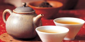
My pleasant smell is the smell of Chinese tea…


…while my unpleasant smell is the smell of carrot juice.


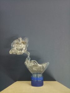
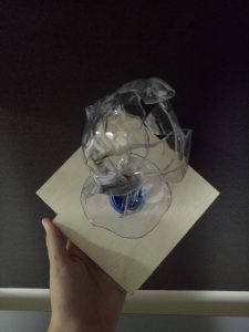
Here is my bottle sculpture.

Front view

Top view

The base (dominant part) is supposed to represent a cup. The rest of the sculpture has the idea of going “up” because I want to portray a “steaming cup”, which represents my pleasant smell. At the top there is just a whole chunk of wrinkled bottle, which shows something very “cringy” and unpleasant for me, and even almost nauseating.

At first I wanted to make the wrinkly part by cutting some holes in the bottle and then heating it, but it didn’t turn out as expected.


Planar Model


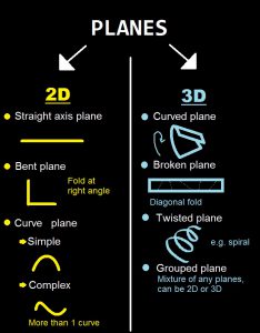
A plane is an element with surface direction without mass.

There are two types of plane, 2D and 3D. The difference is, if you look from above, 2D planes fit in a rectilinear shape, whereas 3D planes don’t.

Types of planes

Here are my planar models.


2D analysis of my models

Model 1

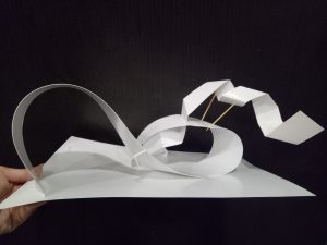
I used a grouped plane for the dominant, broken plane for the subdominant, and bent plane for the subordinate. I tried to make the curves for the dominant at two-thirds and one-third of the total height respectively. I filled the void above the shorter curve using the subdominant. I put the subordinate at the same area as the subdominant to leave the bigger curve area empty, to contrast with the “crowd” at the other side. In a sense, it is also a form of counter-balancing.
From top view, I made the subdominant point away to kind of fill in the empty area at the top corner.


Model 2

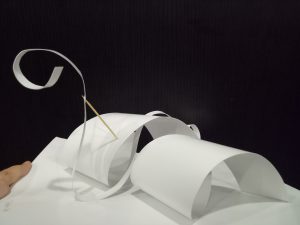
For this one, I used twisted plane for the dominant, grouped plane for the subdominant, and a straight plane for the subordinate. I just realized that actually both of my models are similar in a sense that I made the subdominant go up and leave the rest of the area above empty.
From top view, the corners are generally empty while the center part is fully covered by the dominant and even the subdominant.

To me, this model looks like a snake in a playground for some reason. That was my initial idea for that, but I don’t think I convey it well enough.


I feel like I should have explored more with the ideas I want to convey, because although I did use different types of planes and different arrangements, they have similar vibes.

For this assignment, we are supposed to make a story about long-lost friend using still images and audio. To be honest, I’m bad at this. Extremely bad. But well, I tried.

Our group’s story is based on my story about my long-lost friend. Back in Indonesia, I had a childhood friend – her name is Smita. She was my best friend, but because I left for Singapore, we didn’t keep in touch. We still follow each other’s social media, but we rarely talk or meet even when I go back for holiday. (Typical modern friendship.)

We try to imagine what my childhood friend has become now, and since I really don’t know what’s happening in her life right now, there are literally countless possibilities.

She might have become a spy for all I know.

And that’s our story idea.

What if she really become a spy, and I happen to stumble upon her one day?


Process and Research

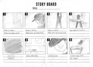
The four of us took a lot of time brainstorming the storyboards, and even a lot more time shooting. At first we didn’t have a clear storyboard, hence we just took pictures and realized afterwards that a lot of key scenes were missing. We did fix it afterwards, though.

Here is a part of our first storyboards. Thanks Christina for your awesome drawing.


Since our story is about a spy (kind of), the genre is roughly thriller/mystery. After we conducted research (I ended up reading a manga of which the movie Old Boy was based on) (we looked at some of Alfred Hitchcock’s work as well), we could see that the scenes in those types of movies usually have dark tones, so we try to give off similar feelings. The spy character usually dressed in dark colors with obscured faces, so our “spy”, Esther, was dressed similarly in dark-colored attire and even wearing a black cap to obscure her face.

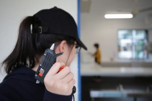
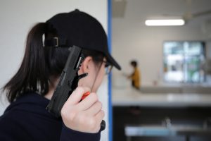
We encountered a problem with the lack of resources; since it is a spy movie, the presence of a gun is almost like a given. However we don’t have a gun. We used glue gun instead, and apparently it was so obvious it became hilarious. In the end, we edited the pictures.

Before edit

After edit


Moreover, we couldn’t really find a good setting. Spy movies usually have very specific backgrounds such as industrial buildings or underground buildings to make secret conversations, but we just tried our best to make do with what we have. Living quarters may look unlikely as death scene settings, but I’m sure there are thriller movies where the victims are killed in their own houses. It is not weird because house, or rather home, is where people usually put their guard down, even professionals. Hence actually I feel that it’s very reasonable for someone to be killed in their living quarters.

I feel that our story portrays more of the conflicts that are happening between people (Smita and I, Smita and the kidnapper, Smita and the victim) than the internal conflicts (e.g. someone’s personal struggle in achieving something), hence making the story seem simplistic. I thought simple, straight-forward stories will be easier to deliver, but apparently it’s just as hard. It’s especially hard to portray the people’s expressions since neither Esther nor I could act. We kept on laughing during the takes.


Final Conclusion

This task is, again, a challenge for me. However because of this, I become more conscious of what makes a movie good, and I don’t think I can watch a movie the same way again. Movies have proven to be more complicated than a mere entertainment.

Before I give you the video, let me give the summary of the story (spoiler alert):

Vania and Smita (played by Esther) were childhood friends. One day, they had to separate as Smita was accepted into the University of London (fictional place). They said goodbye and went their own ways. However, on the way, Smita was kidnapped by an unknown person and drugged. Due to the effect of the drug, Smita lost her memories and she was made into a spy by that unknown person.
One day, a long time after that, Smita was receiving instructions from the unknown person to kill someone when Vania accidentally saw her. Excited to find her old friend, Vania said hi, but Smita ignored her. Curious to prove that the person really was Smita, Vania followed her and found out that she really was Smita. At that moment, Smita was about to kill her target. Vania saw that and tried to stop her. They struggled for a while, resulting in Smita bumping her head and regaining her memories. However, due to their struggle before, Smita accidentally killed Vania.


Special thanks to my group mates who have put up with me; Esther (thanks for the acting), Christina (thanks for the storyboard and editing), Yan Ran (thanks for the pictures). Here’s the video.

(I don’t know why I can’t upload the video here.)


https://vimeo.com/238788227

The phrase that I got from the Pandora’s box was “the golden rule”, or probably better known as the golden ratio.

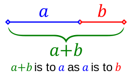
It was hard for me to illustrate that since I had no idea about it before, so I conducted a research and tried to make something based on my interpretation.  In mathematics, two quantities are in the golden ratio if their ratio is the same as the ratio of their sum to the larger of the two quantities. So basically the fraction of the length of object A compared to object B should be similar to the fraction of the length of object B compared to object C – the golden rule is all about fractions.

Taken from https://en.wikipedia.org/wiki/Golden_ratio


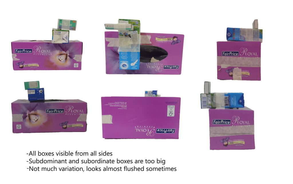
Based on that interpretation, I have made a few models. I tried to use all similarly-looking boxes in a model, so I can emphasize the comparison of the fractions more easily.


Model 1

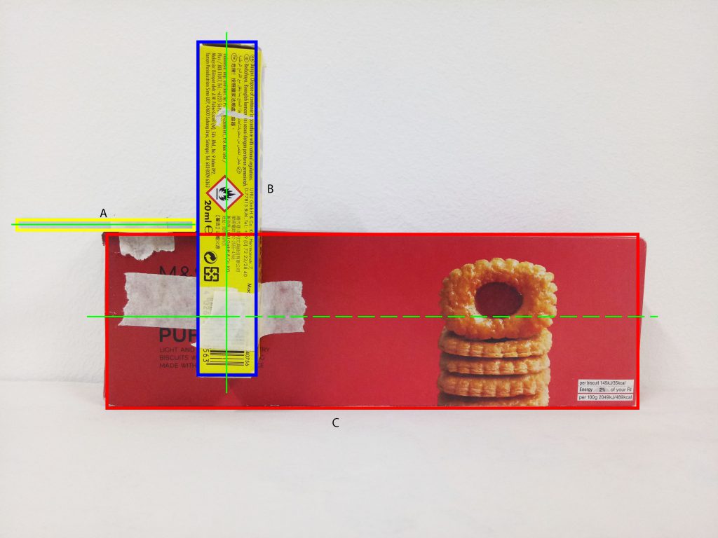
[Red – dominant, blue – subdominant, yellow – subordinate, green line – principle axis]

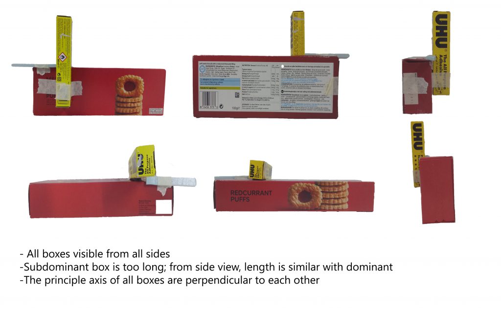
I used all the slender, lean-looking boxes for this model.The sizes of the boxes were quite good in my opinion, since I can tell the different roles clearly.

The application of golden rule here is that the ratio between A to B is roughly the same compared to the ratio between B to C (refer to the picture), which is roughly 0.55.

However, the fraction is too great since now the length of B is more than half of C. Ideally B should be around one-third to half of C. Similar idea needs to be applied to A as well in regards to B.

At first, I feel that the positioning is okay since I can see all three boxes from every different angles. However, the placement is actually a mess; I completely disregard the rule of thirds . Ideally, the subdominant should be shifted a little bit more to the right and up so it is placed at the intersection of the imaginary grids. As for the subordinate, I should either move it to the left more or to the right.


Model 2

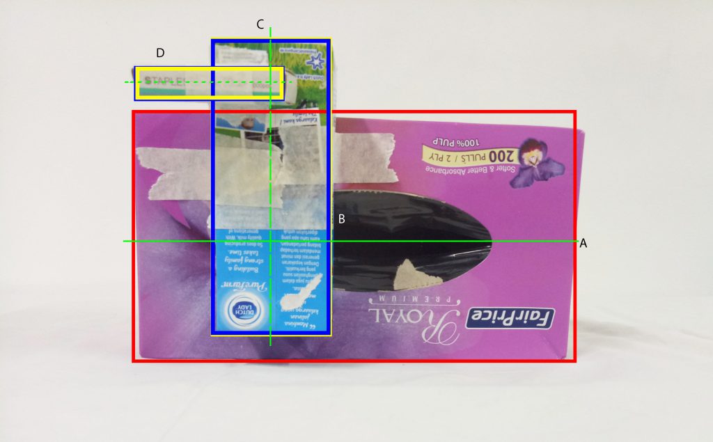
[Red – dominant, blue – subdominant, yellow – subordinate, green line – principle axis]

For this one, I used the slightly bulkier types of boxes. The roles of the boxes are quite clear although the subdominant and subordinate can be made smaller.

I used a slightly different calculation for this one. Instead of comparing the same length (i.e. longest axis for all), I compared the longer side of the dominant box to the shorter side of the subdominant box. Basically, instead of comparing B with D (see the picture above), I compared A with B instead. In this model, A and B roughly have the same length, and C and D also roughly have the same length.

However, due to that calculation, the non-dominant boxes become too big, so that comparison cannot work.

Again, I ignored the rule of thirds in the placement; they are almost there, but not quite. The subdominant box needs to be shifted up a little and the subordinate needs to be shifted left or right – preferably left, so it would be “protruding” out and easier to see from other angles.


Final Model

For the final model, I based it off the first model since the proportions for the second one don’t work well.

I was excited to make the final model with the actual materials because of the idea I had.

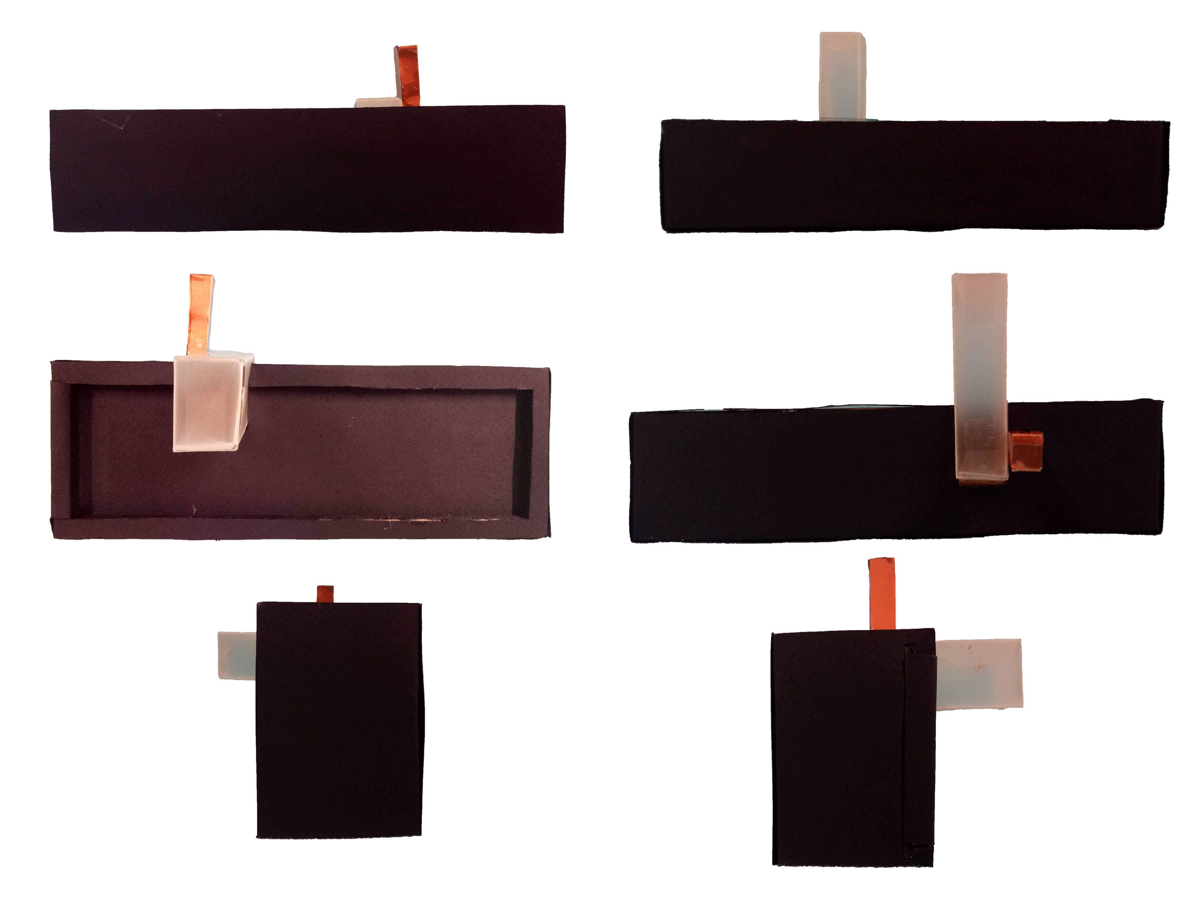
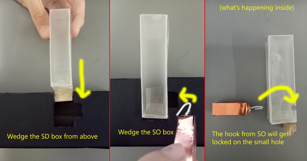
My idea is to make a puzzle box. To put it simply, in order to open the dominant box, the whole entity needs to be disassembled first (the non-dominant boxes have to be taken out first).

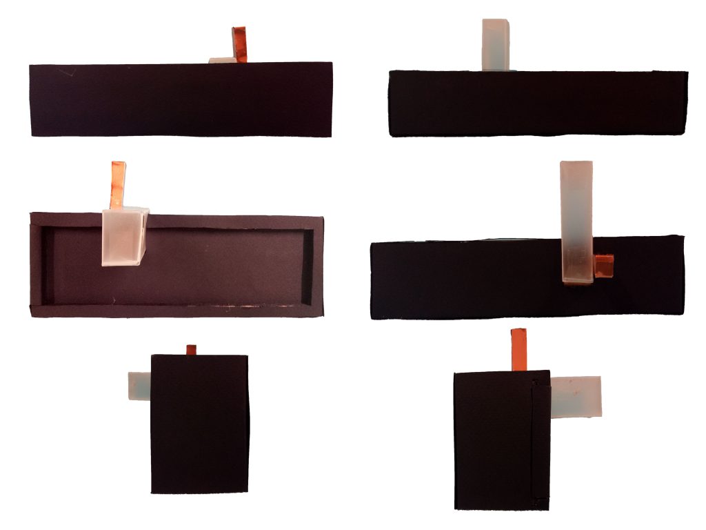
Material used: wood (covered with black paper and black marker), semi-transparent paper, wood (covered with bronze paper)


From one side, the subordinate box is hidden. The idea is that since the subordinate box acts as the “key” to unlocking the whole thing, I feel like it will give a more mysterious effect if the key isn’t immediately spotted.

The subdominant is semi-transparent to balance the opacity of the wooden boxes.

At first I wasn’t sure I could make an actual, working puzzle box (although technically, this one can’t work too…) so I was thinking of just using plain solid wood box as the dominant, then I would just wedge the other two boxes in. However by chance I found the required materials, so I just needed to do some sawing and covering-up (they still took me hours and they still don’t come out perfect. Sorry for bad crafting skills).

The so-called mechanism is just attaching things to the boxes. For the subdominant box not to be able to come out, I put a piece of wood as stopper. For the subordinate box to act like the key, I attach a hook to lock it with the subdominant box.

This is roughly how it works.

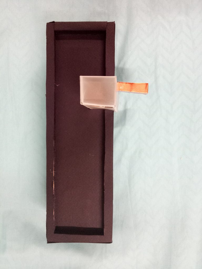
When the dominant box is opened, you can see reflective paper at the bottom of the box. I thought it was a great idea because the exterior of the box is all black (which gives a mysterious feeling), and reflective paper is somehow contrasting the all-black idea.


It’s not very obvious, but it’s reflective paper. Ignore the bad crafting skills.


It’s like human life! Life is mysterious and full of “puzzles” (pun intended) to solve. When you solve those “puzzles”, you can learn more about yourself… you can do some “self-reflection” (again, pun intended)!


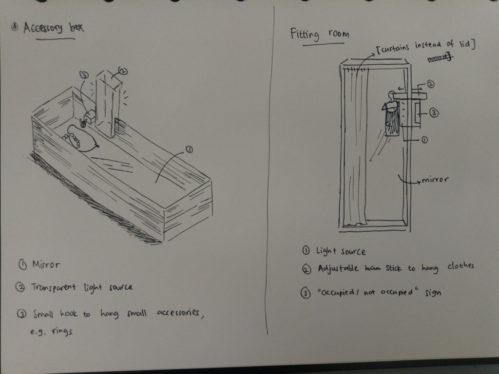
Real-Life Application (besides a punny puzzle box): accessory box and fitting room.


In hindsight, I really enjoyed the process of doing this project (although it stressed me out as well). I learned a lot more about design, about how to keep things visually interesting and eye-catching. Instead of playing around with size and mass, the use of different materials or colors can also shift people’s attention.

I also learned that planning is an important part in designing in order not to waste time and material, although even when you finish designing something, that doesn’t mean you can’t make amendments to it. (Like my idea at first; I just made the basic parts first. I added the holes in the SD and the hook in the SO afterwards.)

I do realize that my crafting skill is very lacking, so I hope in the next assignments I can improve on that. Nevertheless, it had been a fun ride.

I found this project to be a challenge.

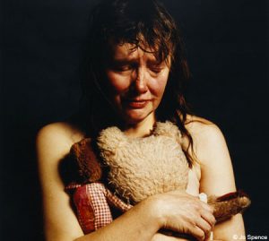
I looked up some of the reference artists to find inspiration. Some of them really captured my attention, like Jo Spence’s self-portraits, for example. I was also intrigued by Richard Billingham’s works. From my Google image search, I found a lot of self-portraits done by him. Compared to Spence, I found Billingham’s works to be more “relatable” since he used a lot of colored background, or background which features a lot of other things. However, I think they are similar in a way that they capture a lot in a seemingly simple picture.

One of Jo Spence’s works. [Taken from http://metro.co.uk/2008/07/03/jo-spence-self-portraits-246644/]

One of Richard Billingham’s works. [Taken from https://www.theguardian.com/artanddesign/2016/mar/13/richard-billingham-tower-block-white-dee-rays-a-laugh-liz]


As for landscape picture, I found a picture by Mariko Mori that I really like. It looks very relaxing and balanced to me, maybe due to the idea of vastness captured here. Similarly, the idea of vastness is also reflected in some of Catherine Opie’s work (which I came to enjoy).

Mariko Mori’s work that I really like. [Taken from http://www.tokyoweekender.com/2016/06/artist-mariko-mori-brings-a-mysterious-ring-to-the-rio-olympics/]

One of Catherine Opie’s works. [Taken from http://www.tfaoi.com/aa/8aa/8aa298.htm]


I hope I can integrate the idea of simplicity in my works too.

“It is all a game of construction – some with a brush, some with a shovel, some choose a pen.”

-Jackson Pollock


This is one of Pollock’s artwork, “Ocean Greyness”. [Taken from https://www.guggenheim.org/artwork/artist/jackson-pollock]

I have no idea what mark-making is at first, so I did a little bit of research. I found out the usual stuffs – the explanation of what mark-making really is, its history, and the artists who often apply mark-making techniques in their artworks. (I like Jackson Pollock’s works.) However, I also read something that I found interesting, which is what makes a mark-making “good”.

So what constitutes the facility for ‘good’ mark-making by being aware of marks that:

  1. Are appropriate to our intentions – right for the job.
  2. Are ‘alive’ and embody and express the ‘life-energy’ of their maker, the artist.
  3. Help to communicate and express qualities of light and its invisible energy, and the material substance, form, volume, and surface of the objects we are drawing.
  4. Present the eye with changes of pace and rhythm that collectively offer variety and interest. [The rich and varied texture of nature and the world around us is our guide].
  5. Express and stretch the properties of the medium that the drawing is made from.

[Quoted from http://www.utdallas.edu/~melacy/pages/Drawing/AS01_MarkMaking_DrawingProjects/MarkMaking.html with changes]


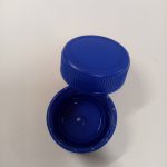
This is what I planned to bring at first.

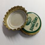
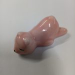
After reading that, I feel like I should try to explore more ideas, so as to find one that I feel is more “alive” to me and to provide more variety – not only to make it more interesting for the audience, but also for me to better express my ideas. In my previous post I mentioned using bottle caps, but I would probably bring other things (like my brush pen or my paperweight?). My idea is to bring things that can be found in my room, because that’s simple and easy, yet the results may be surprisingly good. (I hope.)


I think maybe other types of bottle caps might be a good idea.


And this is my paperweight.


After all, there shouldn’t be right or wrong; people have different ideas and choose to use different tools. It is just about who is able to present their ideas more effectively, more attractively, and more expressively.

All in all, I’ll have fun learning and experimenting. I’m looking forward to tomorrow (I mean today).