Reflection: Week 13

Back with the reminder game but this time round I decided to look more into Typograms because it reminded me of one of my favourite childhood games called Dingbats. They both have the same idea of embedding the bigger idea into the pictorial form.

Reading more into Herb Lubalin, it is very interesting to find out that he was actually color blind and hence allowing him to focus more on the type, without getting distracted by everything else.

I was also reading up on an article regarding him working for Coca Cola and also working for the publisher that wants to bring down Coca Cola at the same time. It seems like even though the most logical sense was to work for the bigger cooperation considering financial benefits, however what the publisher could offer him was total creative freedom. In times of his frustration with the advertising industry had to do with feeling restricted by client briefs, he knew he did not want to loose touch with this creative liberty. Inspirational.

Reflection: Week 12

Maybe because it brought back memories of having to draw ‘bar models’ in primary school to solve math problems, I was very intrigued in the concept of Isotype, short for “the international system of typographic picture education”, and the role it had in Graphic design.

Honestly, initially, maybe due to its prevalence even up til now, I never thought to think that this form of visual communication was a part of design. I have always thought that the logic behind Isotypes, which is to use quantities of the same icon instead of enlarging to represent relativity, was a given and not something to be created.

Starting off, an essential task of Gesellschafts- und Wirtschaftsmuseum museum, where Otto Neurath was founder, was to inform the Viennese about their city. Neurath came up with various pictorial charts using the, then known as, Vienna method. He nailed with creating sort of an universal language in which he was able to turn complex information to something ANYONE could understand and was self explanatory. This was also aided by “words, title, arrangement, type, number and color of symbols, caption etc.”. These charts were more than what meets the eye.

First off, these charts should not be seen as just rows of little man but instead Neurath’s wife believed Isotype charts could “introduce people to problems new to them without influencing them in a particular direction”. They both felt they owed it to the layman to help them understand statistics and the surrounding situations. However it also raises the question of how much should the truth be compromises for the sake of aesthetics and simplicity.  It was found that in the chart below, that between the original and the visualised data, there was a maximum discrepancy of 56.2% (from 128 to 200 families).

Secondly, Isotype also sees the bridging between science and design. It is an example of how mathematical analytics and creative thinking processes can go hand in hand in constructive ways. At this point, I feel a necessary need to bring up the exhibition Marie Neurath: Picturing Science. To think that someone who originally studied math and science created that, it really brings hope to the potentiality of being a T-shaped person in which this mod is aimed towards.


Reflection: Week 11

What caught my attention in Week 11’s lecture was the story of Alphonse Mucha’s coincidental success. Alphonse Mucha happened to be at the right place right time when Sarah Bernhardt needed a new design for the prolongation of her theatrical run. Since it was the holidays, none of the artists, at the publishing firm which Mucha was working in, was available- leaving him with the job. After his posters were published, it caused an immediate sensation and hence, Bernhardt invited Mucha to come along side her as the artistic director of her productions, designing posters, stage sets, costumes, and jewellery for her productions.

So, this made me curious as to WHY and WHAT made his poster so ‘good’ that landed him such as success.

To start off, titled Gismonda, it was also the Greek melodrama Bernhardt was to star in and direct. Even though posters were common then, Mucha’s creation of a narrow, life size composition was what stole the show. Its mere dimensions were 216 x 74.2 cm – it was an almost life-sized Sarah Bernhardt.

Mucha also leeched onto the developments of lithographic printing to develop this piece which was a daring risk for the job.

The way Mucha depicted women was also interesting, in Gismonda, he actually placed a man at Bernhardt’s feet! The poster created also portrayed her as “The Divine Sarah” enhanced with the arch across her head, almost as if a halo.  She was also dressed in the costume of a Byzantine noblewoman with an orchid headdress and floral stole. His works might be linked to popularising the Art Nouveau’s asthetics however unlike many of Art Nouveau’s most clichéd elements, such as the long, looping lettering, these never appear in Mucha’s images. Instead elements of eastern European folk art can be seen credited to Mucha’s attachment with his Czech identity and hence the inclusion of Slavic motifs.

Hence, it seems Mucha’s innovative and refreshing style reflected in Gismonda was what earned him his career.


Reflection: Week 9

What drew my attention from the previous lecture was Rhinoceros (1515) by Albrecht Dürer. The intricacy behind this the woodcut print was astounding. The term “Math letter forms” used in class also caught my attention. 

Apparently, when the artist was creating this piece, he has never seen a Rhinoceros before because it was rare to spot one in Europe then. He took inspiration from a sketch done in 1514

and also had to piece together various reports to create the creature. Perhaps it was his own flare or even lost in translation, he covered the creature’s legs with scales and the body with hard, patterned plates.

Focusing on the inscription, it is in German and it accounts of when King of Portugal, Manuel of Lisbon, brought such a living animal from India, called the rhinoceros to Europe in 1513 AD May. It also mentions of the rhinoceros being more superior to an elephant.

I believe that the typeface ‘Albert Dürer Blackletter’ created in 1500 was used in this piece.

Dürer applies a grid system into typography. His typographic grid proportions were 8 squares high, based on the human proportion of 8 heads high. The technically behind this could be attributed to his study on the aesthetic anatomy of human proportion. He believed that various mathematical figure (e.g straight lines, curves, circle) could be made beautiful by proportion.

According to Dürer,

… since architects, painters and others … are wont to set an inscription on lofty walls, it will make for the merit of the work that they form the letters correctly.”

In conclusion, Albert Dürer almost seem to embody the T-shaped person we are striving to learn in this course. He was a German painter, graphic artist, author, publisher, and mathematician but what really stood out was how he weaved and incorporated various skills together to seek “perfection”, in this context, his typography.

Week 3 to Week 5 Reflections on the History of Interactive Media

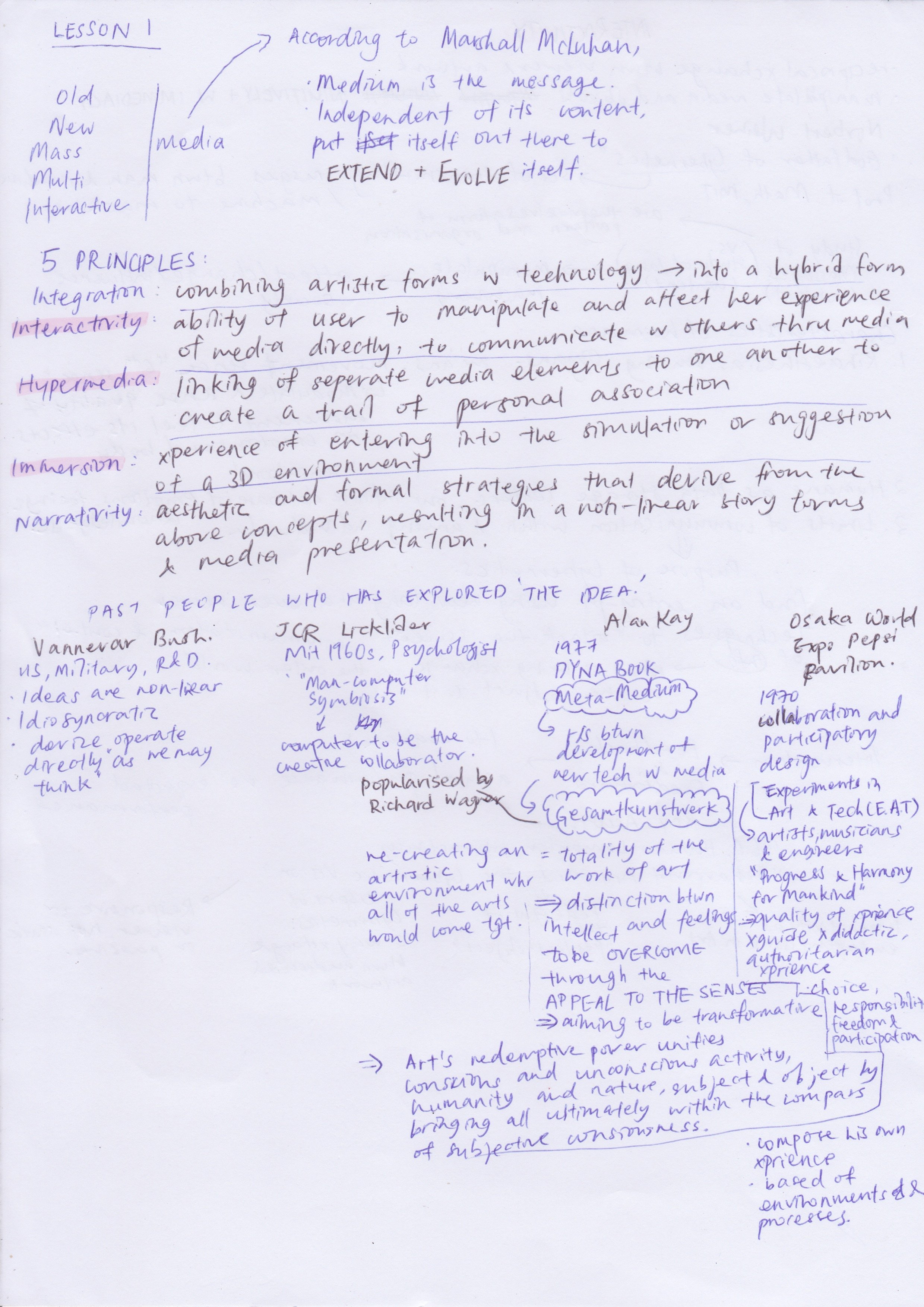
The above are notes I organised according to my own understanding for Week 3.

Reflection for Week 3:

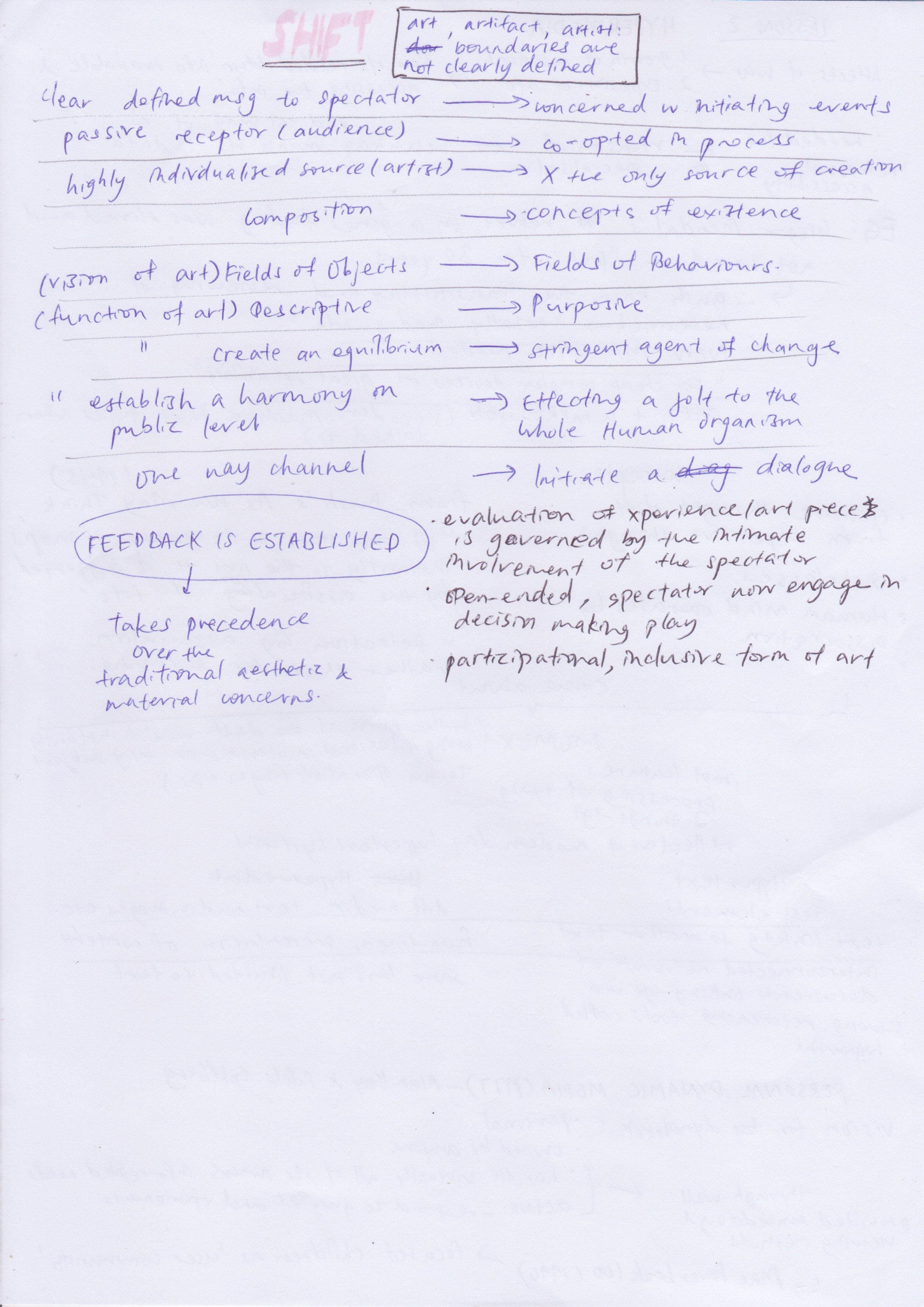
Essentially, what I took away from this particular lecture is that the power of interactivity has given spectators a greater ability to meaning make during to their involvement with the art piece. Based of their own experiences and their background, they would be able to evaluate and draw the content out to what is more palatable to them. However with that said, I believe that this does not compromise on the aspect of ‘challenge for change’ that interactive pieces aim to achieve. Instead, by involving the spectator into the art piece, it would have indirectly made them the medium of the message, and with that taking precedence over the traditional aesthetic and material concerns, I would see that the purpose of the art piece would be felt at a deeper level, one that resonates with the spectators. With that, then would I think that the spectator would be convicted on their own accord to initiate dialogues to be agents of change.

This was initially an idea that I wrestled with. Considering that there are still people who could not accept such a form as art, should we still push for such works and continue to cater to the mass? After hearing the class response, where it is only through the continuation of producing such works that people would come to learn and appreciate ‘interaction’ in art, that allowed me to see the broader picture of ‘interactive’ art. ‘Interactive’ art of itself is a notion of change. We are entering grounds that challenges the roles of artists, artefacts and art, grounds where art is responsive to viewers and no longer just static or passive, grounds where there are non predictable outcomes. This in and of itself is a cultural change or challenge to influence society.

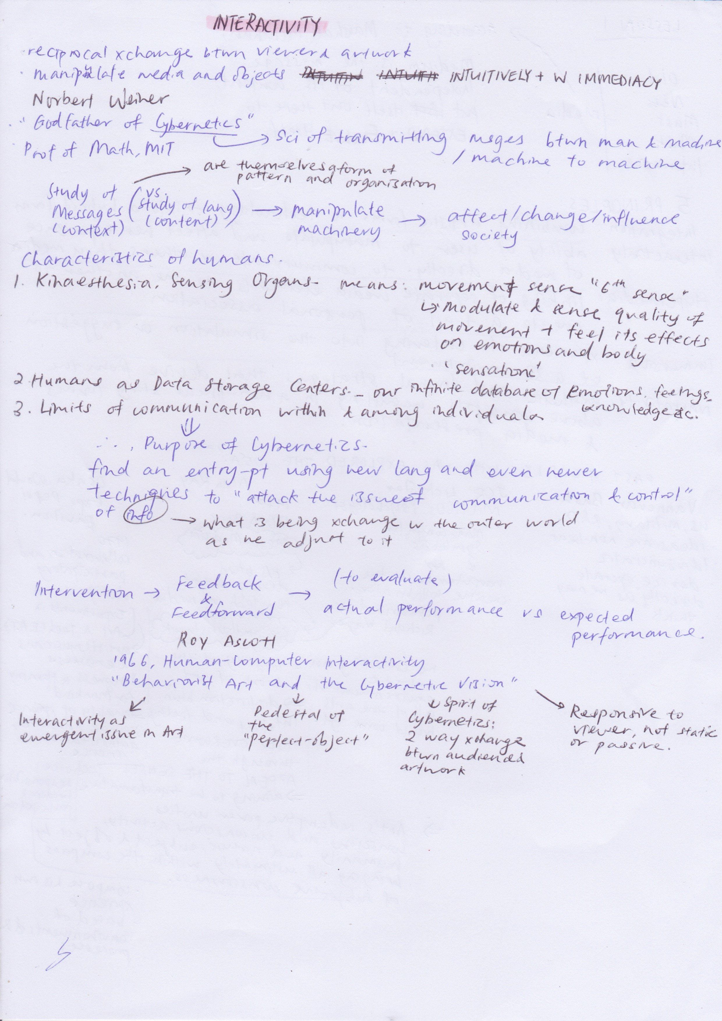
The above are notes I organised according to my own understanding for Week 4.

Reflection for Week 4:

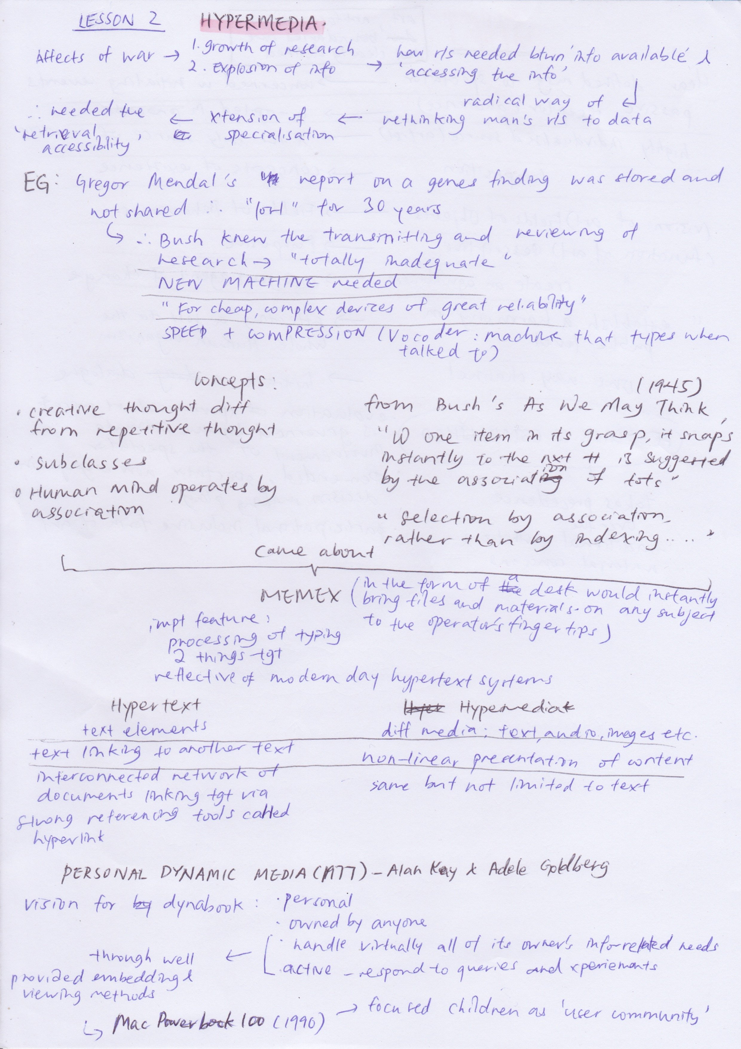
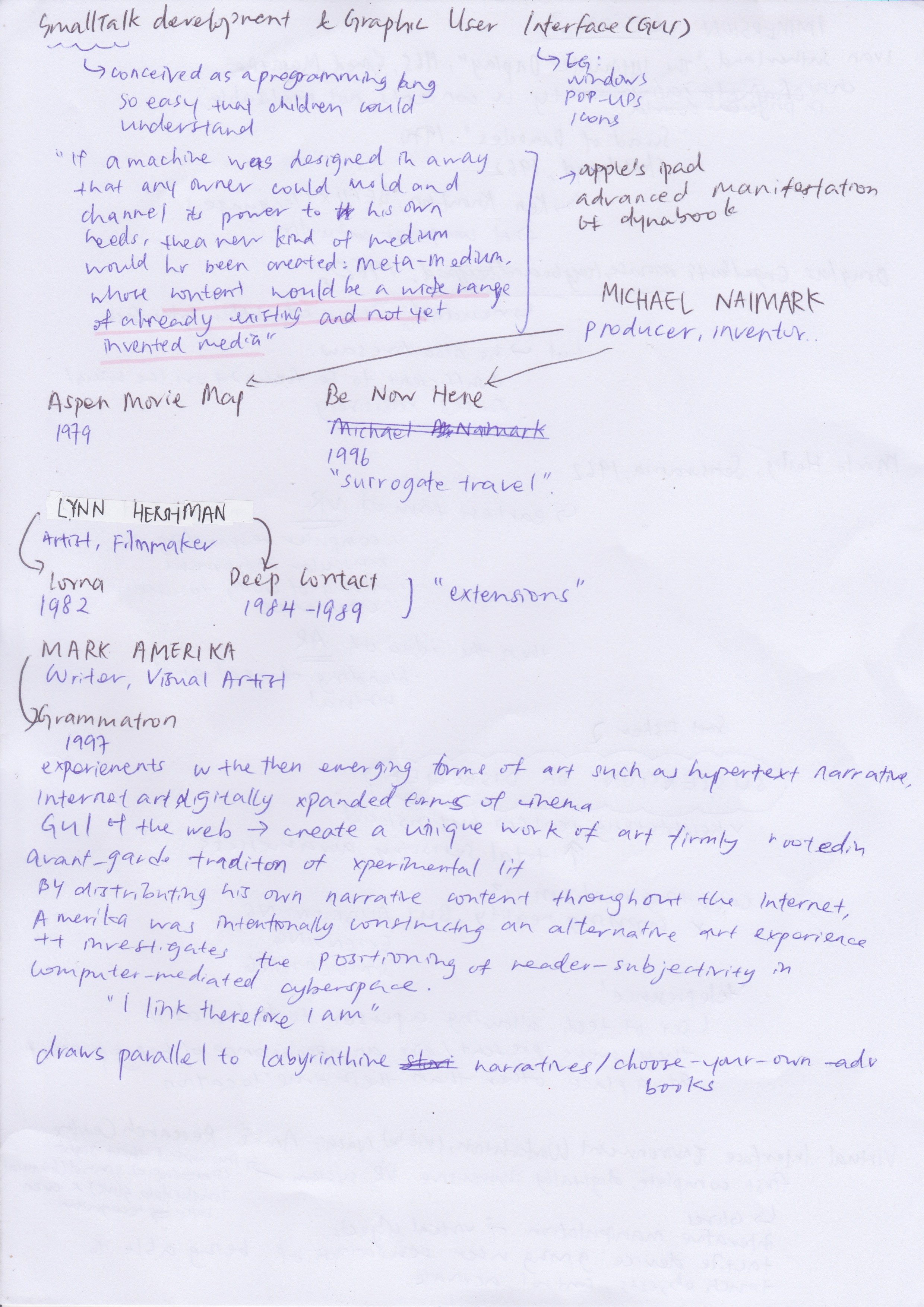
During the lecture for hypermedia, I actually felt very frustrated because I could not see how what I was learning benefitted art, instead of it not just being another milestone in the technological research department.

After going through the content again, I was drawn to the phase ‘create a trail of personal association’.  Hypermedia acted as points in which aided for spectators to come up with their own narration while on “free” exploration. By distributing various media points throughout the art work, this is actually a construction of an alternative art experience in which it explores the positioning of the spectator, contributing to a vast collection of diverse perspectives.

To me, this draws parallel to labyrinthine narratives where there is a sense of ownership and hence a sense of involvement. With the element of choice, this aids the process of making ‘personal associations’. After all with the human mind operating by association, more than anything else, I am sure with hypermedia, engagement is guaranteed.

The above are notes I organised according to my own understanding for Week 5.

Reflection for Week 5:

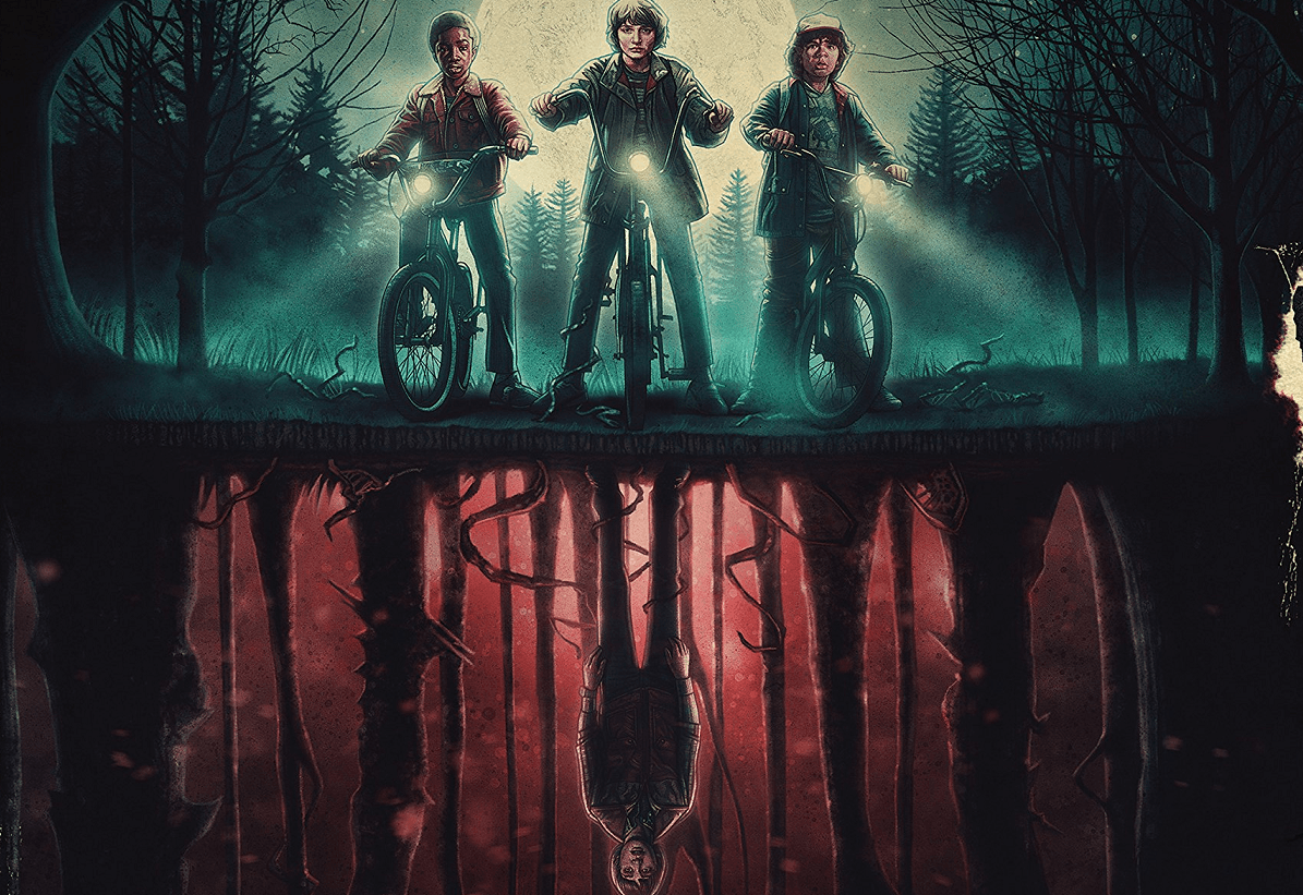
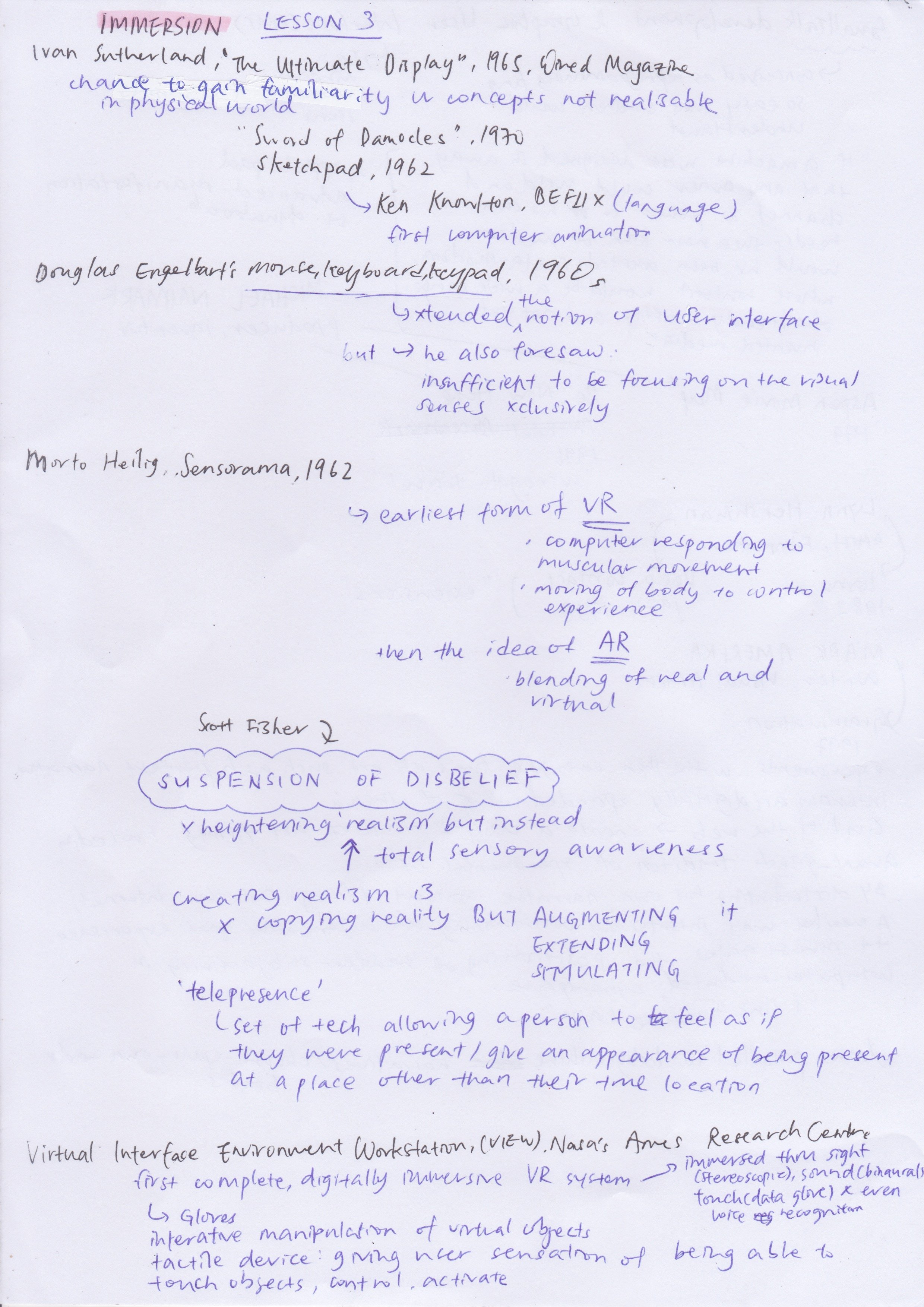
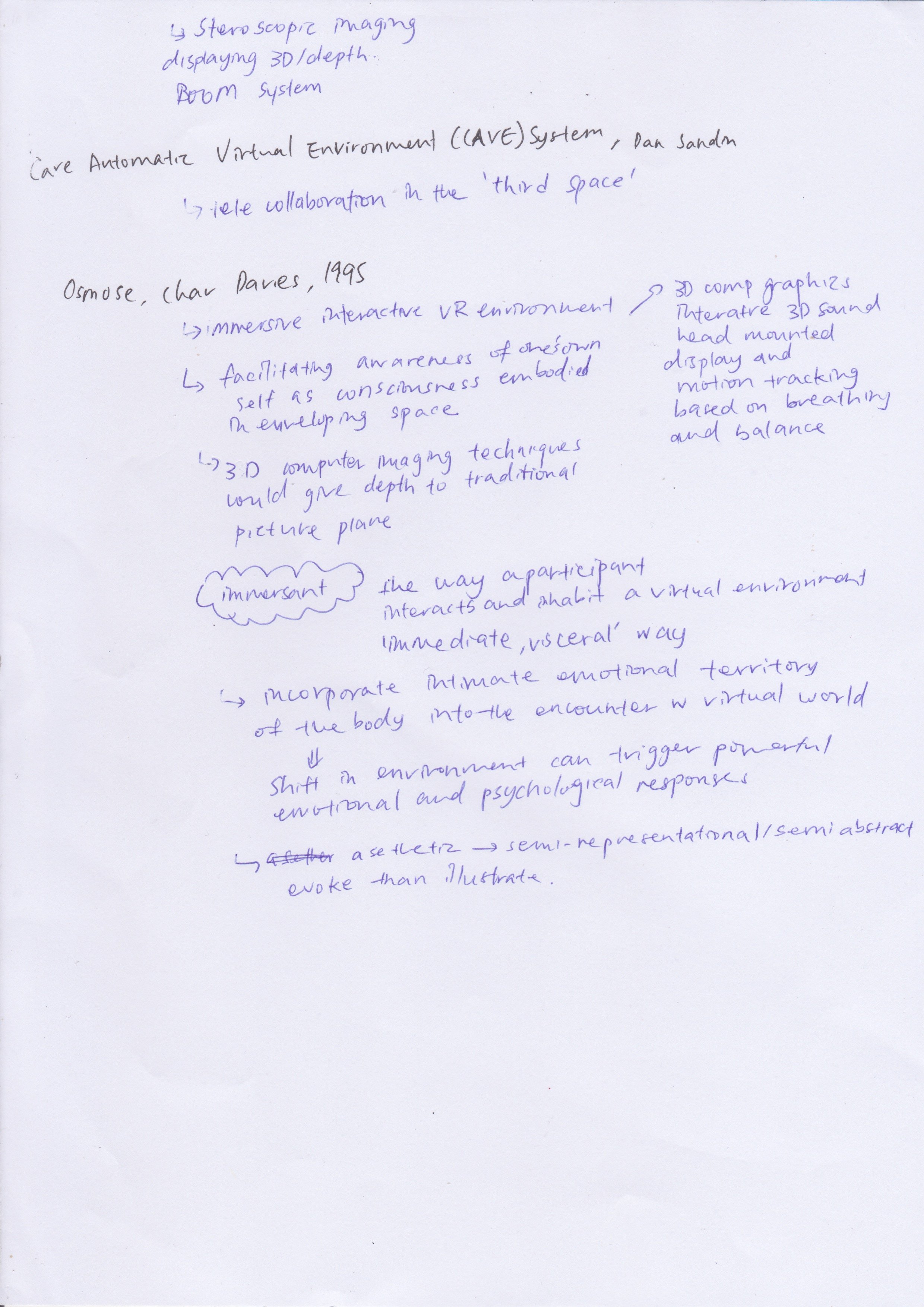
I. COULD. NOT. STOP. THINKING. ABOUT. STRANGER. THINGS. I easily understood this lecture because I kept thinking how a ‘immersive parallel environment’ was just like The Upside Down in the show. Just like how The Upside Down resembled the actual world but was instead a ‘darker’ place with the veins and the slime, AR doesnt aim to copy reality but instead to augment, extend and stimulate another environment.

The concept of ‘Suspension of Disbelief’ really blew my mind. Immersive works really just has the power to overcome the distinction between intellect and feelings through the appeal to our senses. This raise in sensory awareness to provoke emotions in my opinion is honestly a genius idea. Too many times, I have heard someone saying they would not believe a certain something something unless they were there/ have seen it with their own eyes. (Almost like how Jonathan didn’t believe his mother about Will’s presence) Hence, with an immersive interactive environment, not only will in aid the spectator in believing the message but even the significance/ severity would literally be felt.

Personally, I think that the idea of the third space being more of a bridge between the physical and the psychic, instead of trying to be latter, in itself acknowledges the differences between the both and while at it, provides the communal spaces for various spectators to come together share this new ‘reconciliation’. Drawing back to ‘Ready Player One’, this would be like how the different characters could adorn new avatars to share a space together despite coming from different backgrounds. This is very important in helping one to loose themselves from the previously mentioned ‘intellect’ and then to trigger powerful and emotional psychological responses.


Cover Image by Dhawal Bhanushali/Mashable India